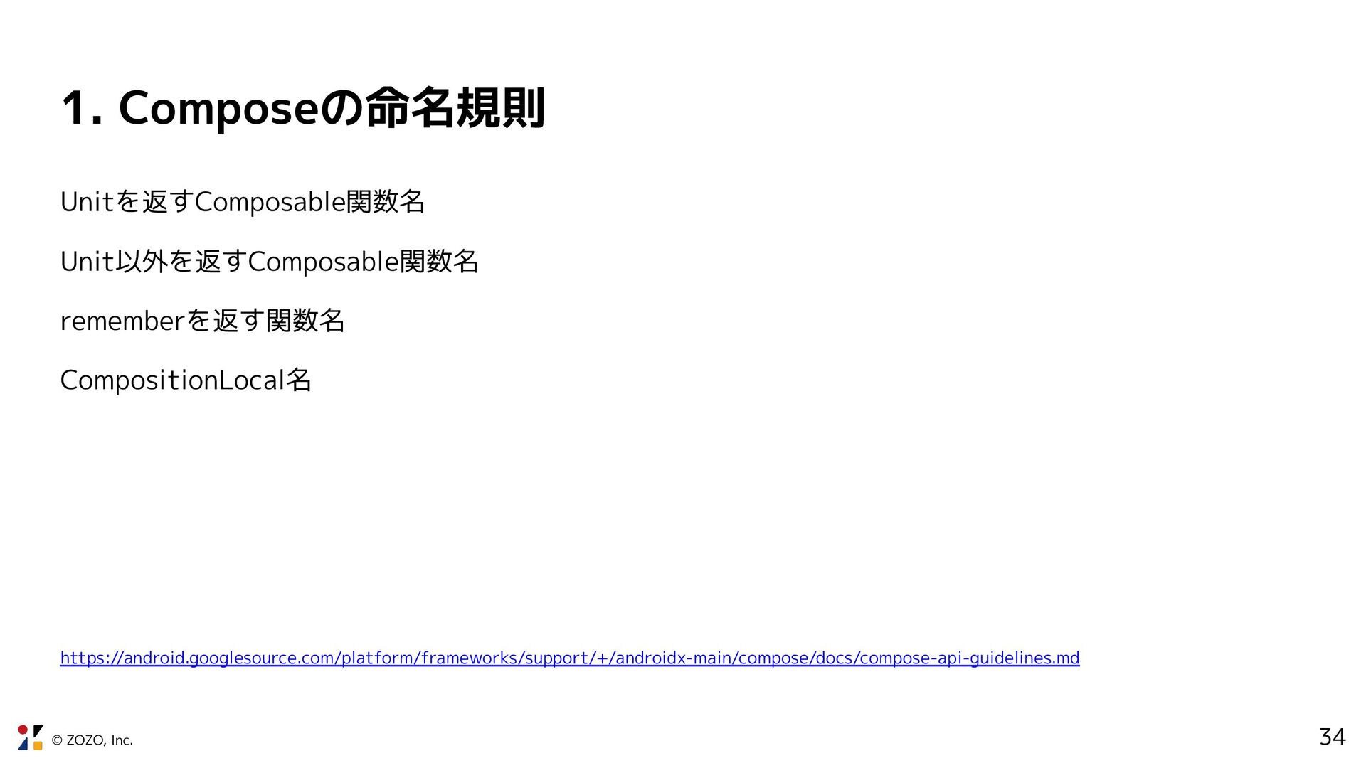
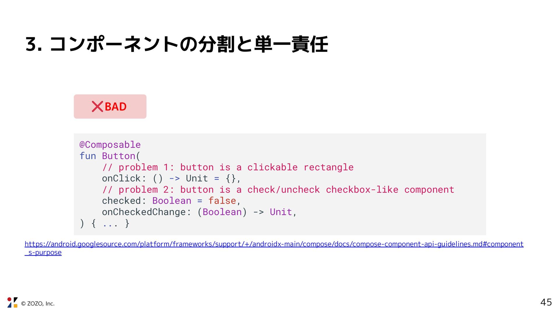
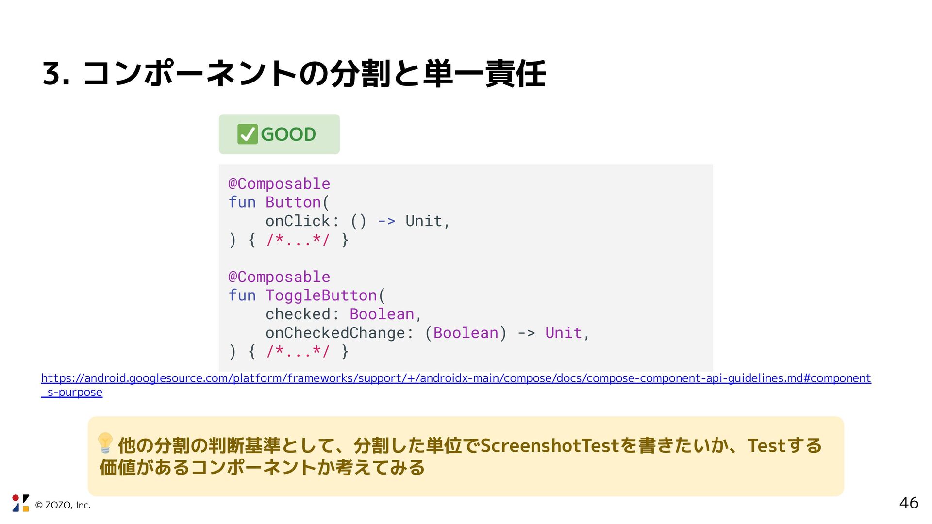
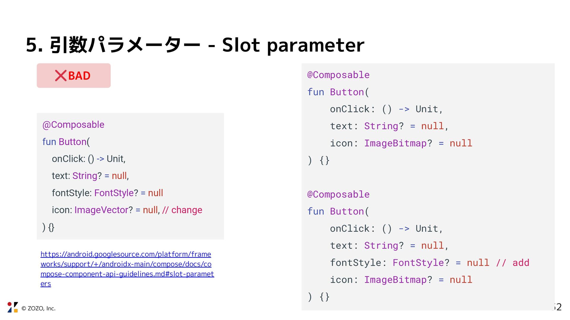
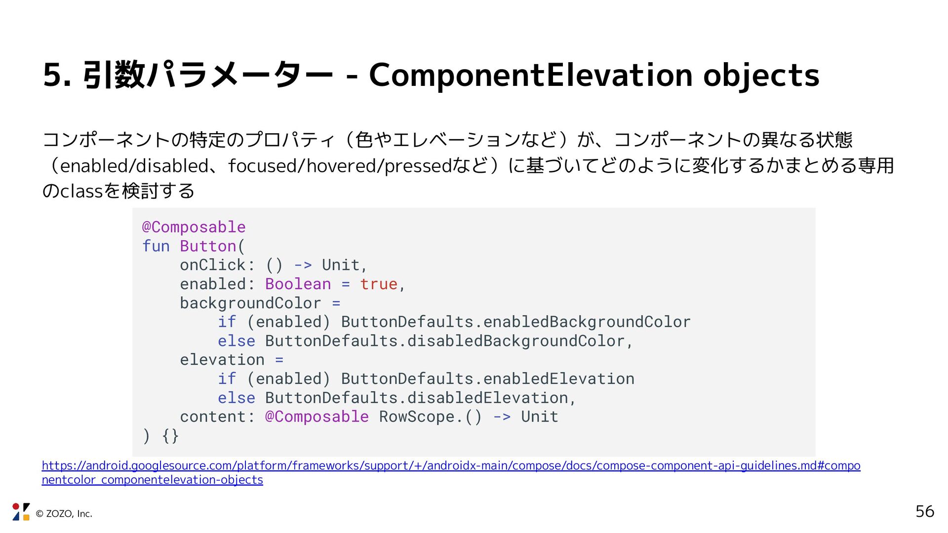
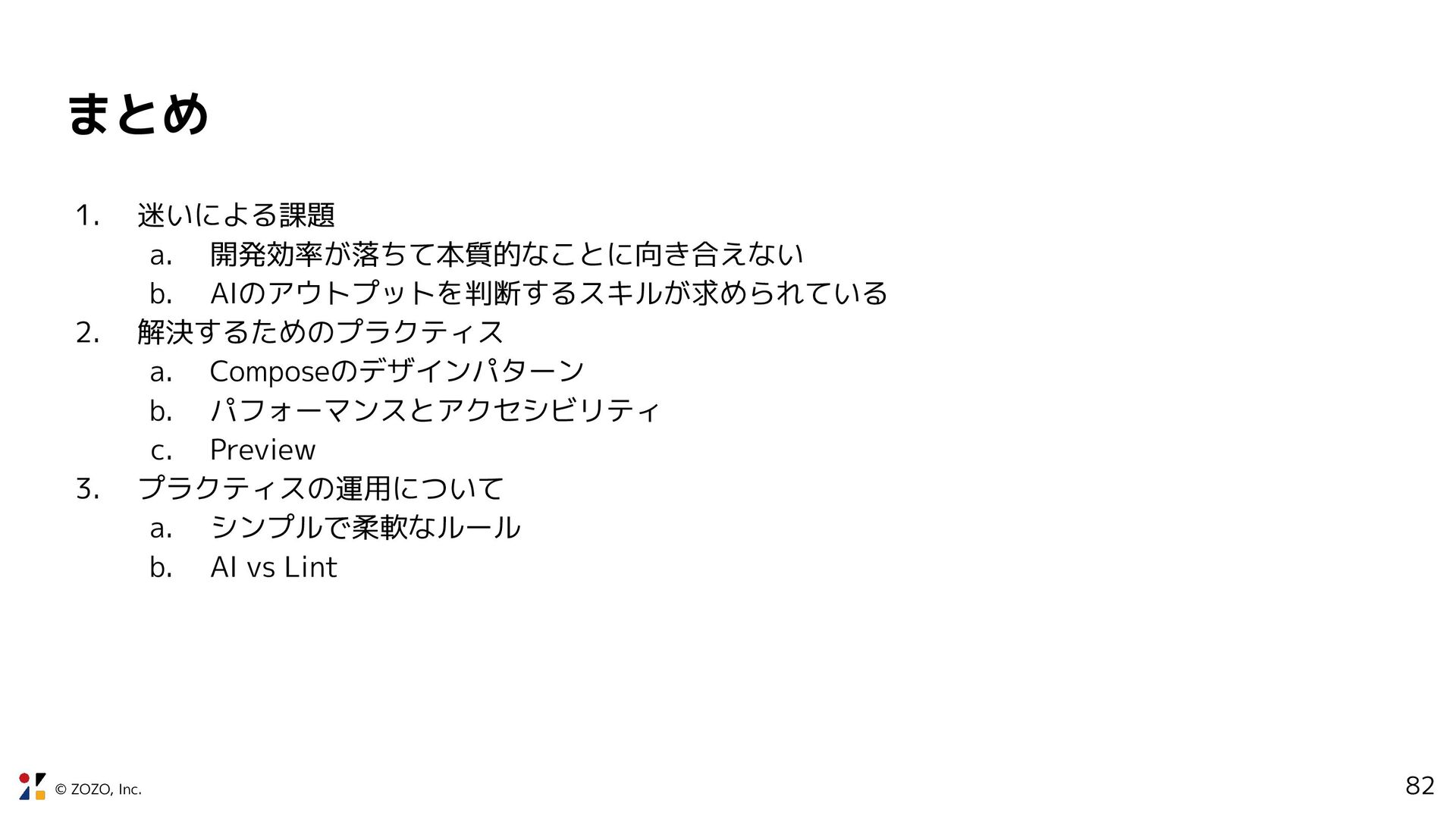
problem 1: button is a clickable rectangle onClick: () -> Unit = {}, // problem 2: button is a check/uncheck checkbox-like component checked: Boolean = false, onCheckedChange: (Boolean) -> Unit, ) { ... } https://android.googlesource.com/platform/frameworks/support/+/androidx-main/compose/docs/compose-component-api-guidelines.md#component _s-purpose BAD
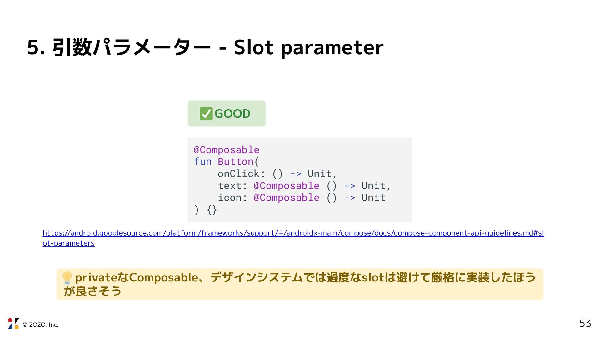
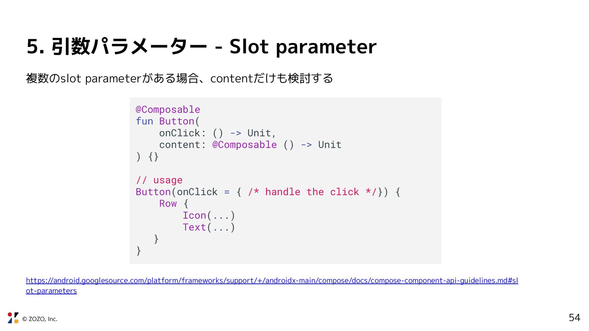
ot-parameters @Composable fun Button( onClick: () -> Unit, text: @Composable () -> Unit, icon: @Composable () -> Unit ) {} GOOD privateなComposable、デザインシステムでは過度なslotは避けて厳格に実装したほう が良さそう
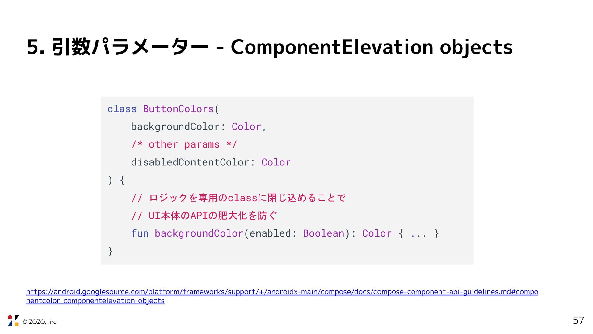
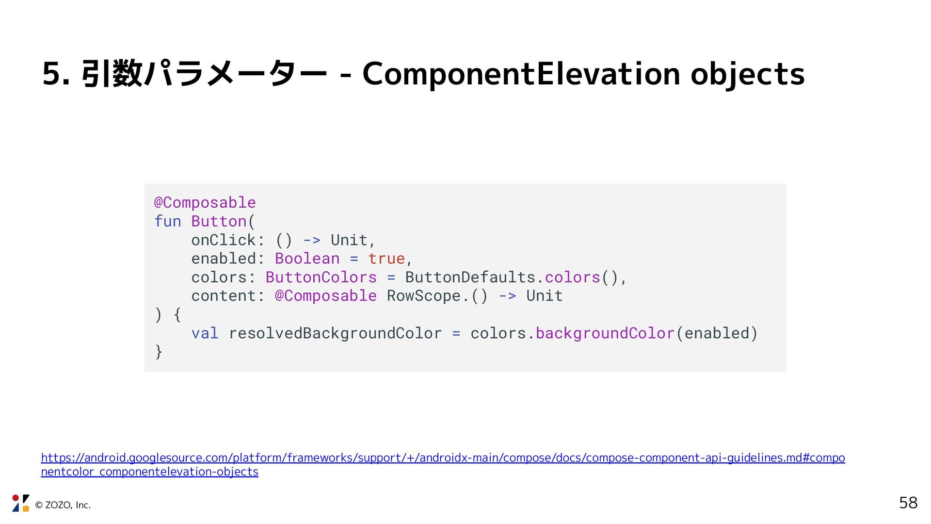
nentcolor_componentelevation-objects class ButtonColors( backgroundColor: Color, /* other params */ disabledContentColor: Color ) { // ロジックを専用のclassに閉じ込めることで // UI本体のAPIの肥大化を防ぐ fun backgroundColor(enabled: Boolean): Color { ... } }
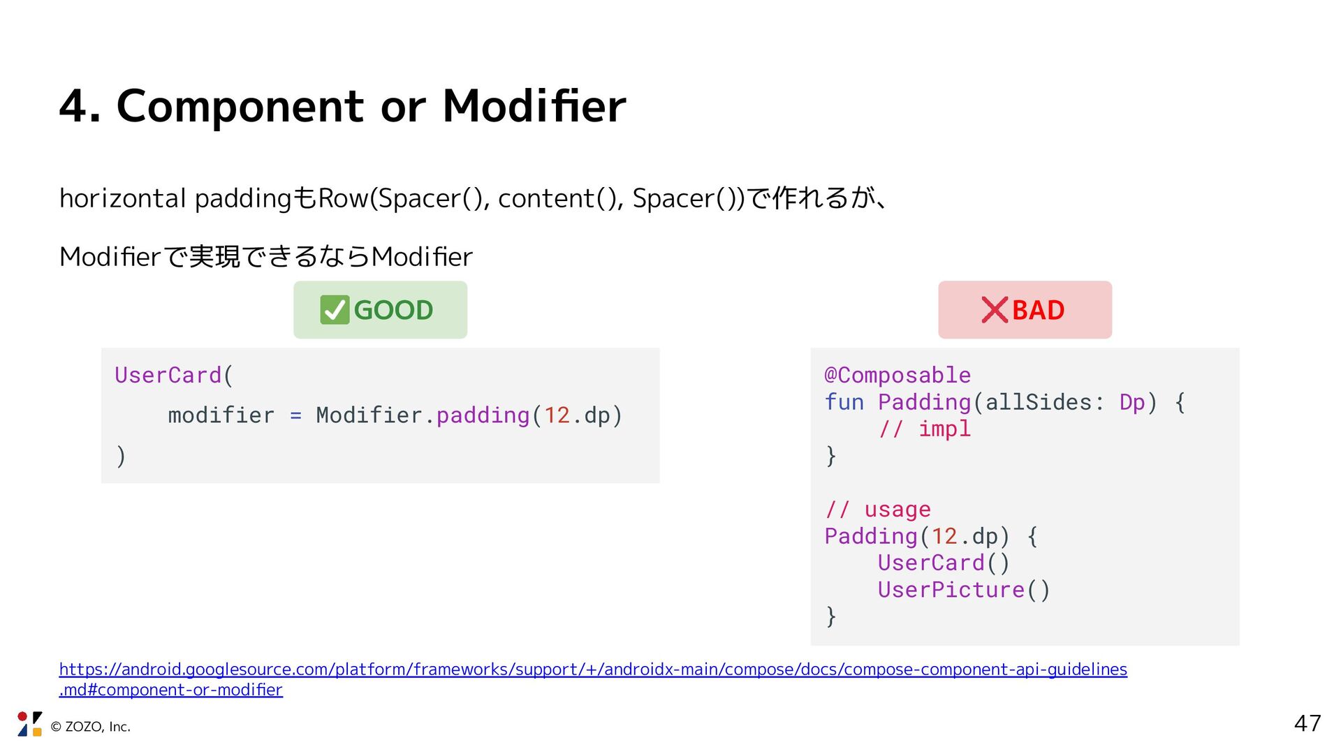
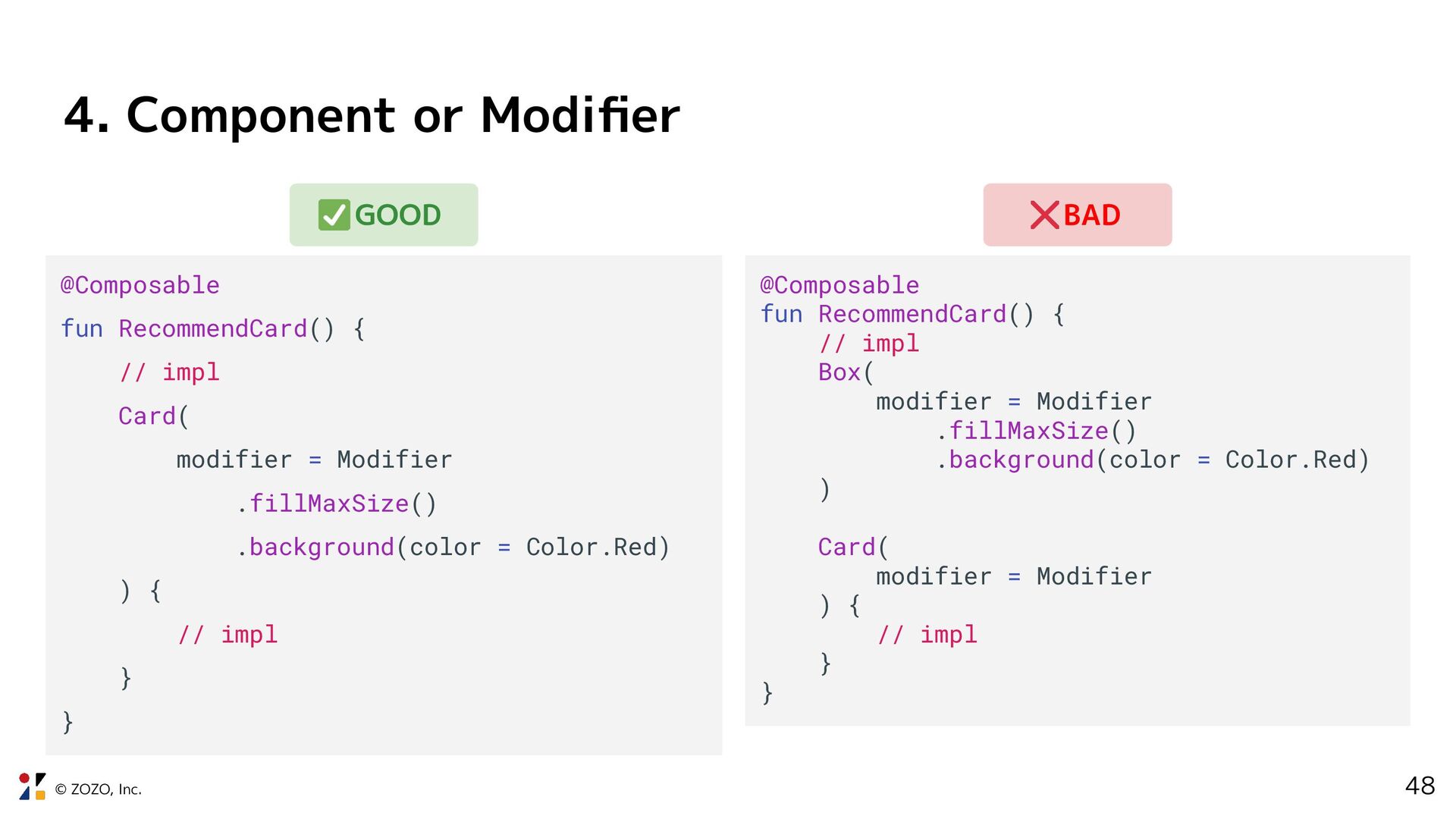
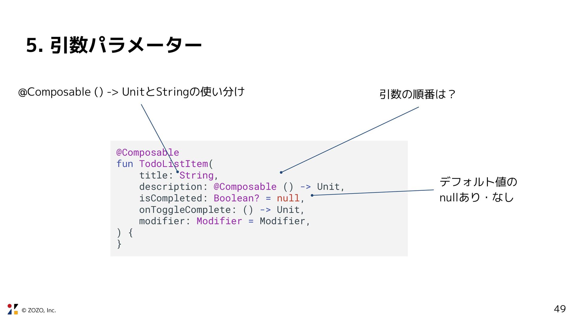
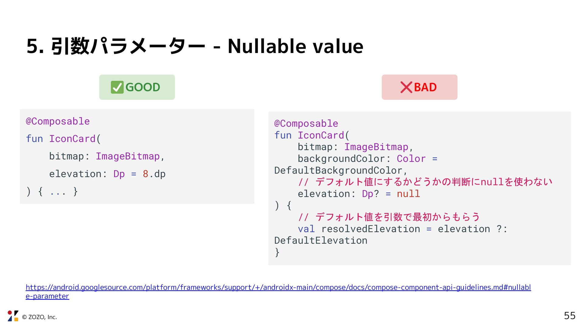
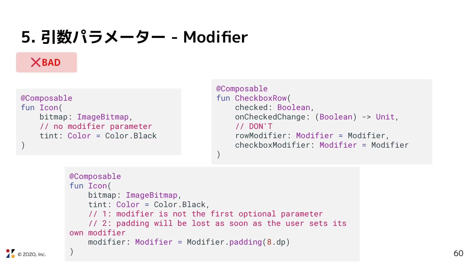
Icon( bitmap: ImageBitmap, // no modifier parameter tint: Color = Color.Black ) @Composable fun CheckboxRow( checked: Boolean, onCheckedChange: (Boolean) -> Unit, // DON'T rowModifier: Modifier = Modifier, checkboxModifier: Modifier = Modifier ) @Composable fun Icon( bitmap: ImageBitmap, tint: Color = Color.Black, // 1: modifier is not the first optional parameter // 2: padding will be lost as soon as the user sets its own modifier modifier: Modifier = Modifier.padding(8.dp) ) BAD
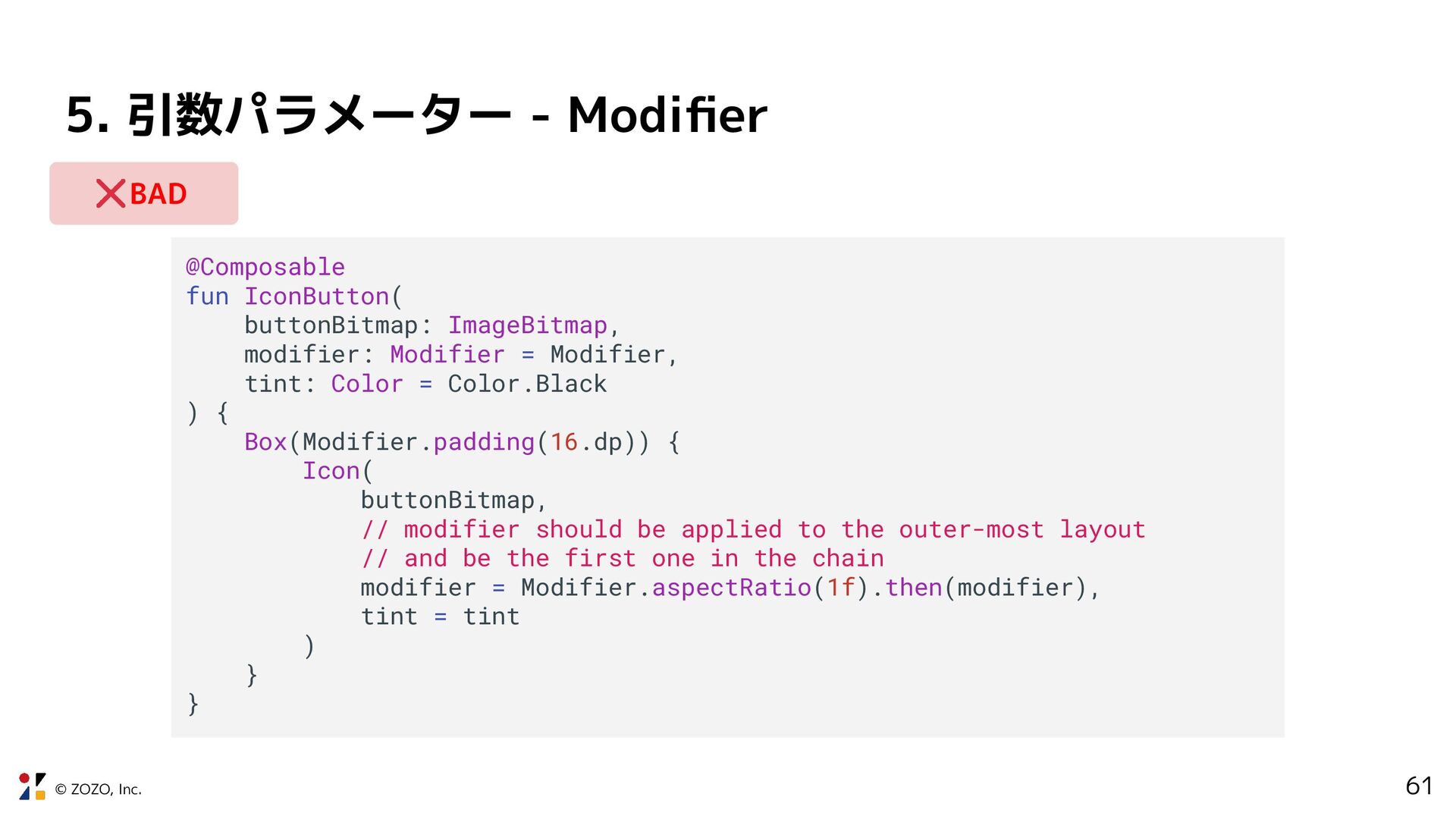
IconButton( buttonBitmap: ImageBitmap, modifier: Modifier = Modifier, tint: Color = Color.Black ) { Box(Modifier.padding(16.dp)) { Icon( buttonBitmap, // modifier should be applied to the outer-most layout // and be the first one in the chain modifier = Modifier.aspectRatio(1f).then(modifier), tint = tint ) } } BAD
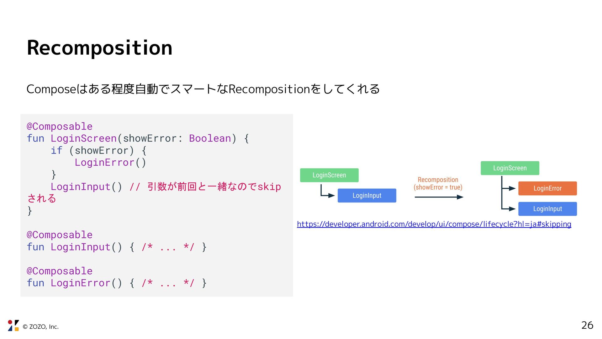
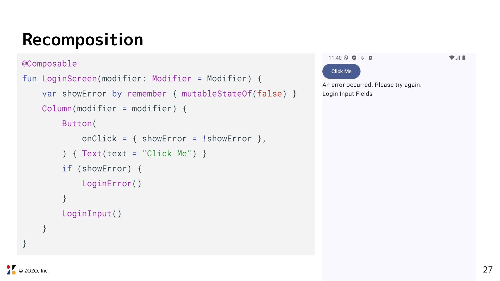
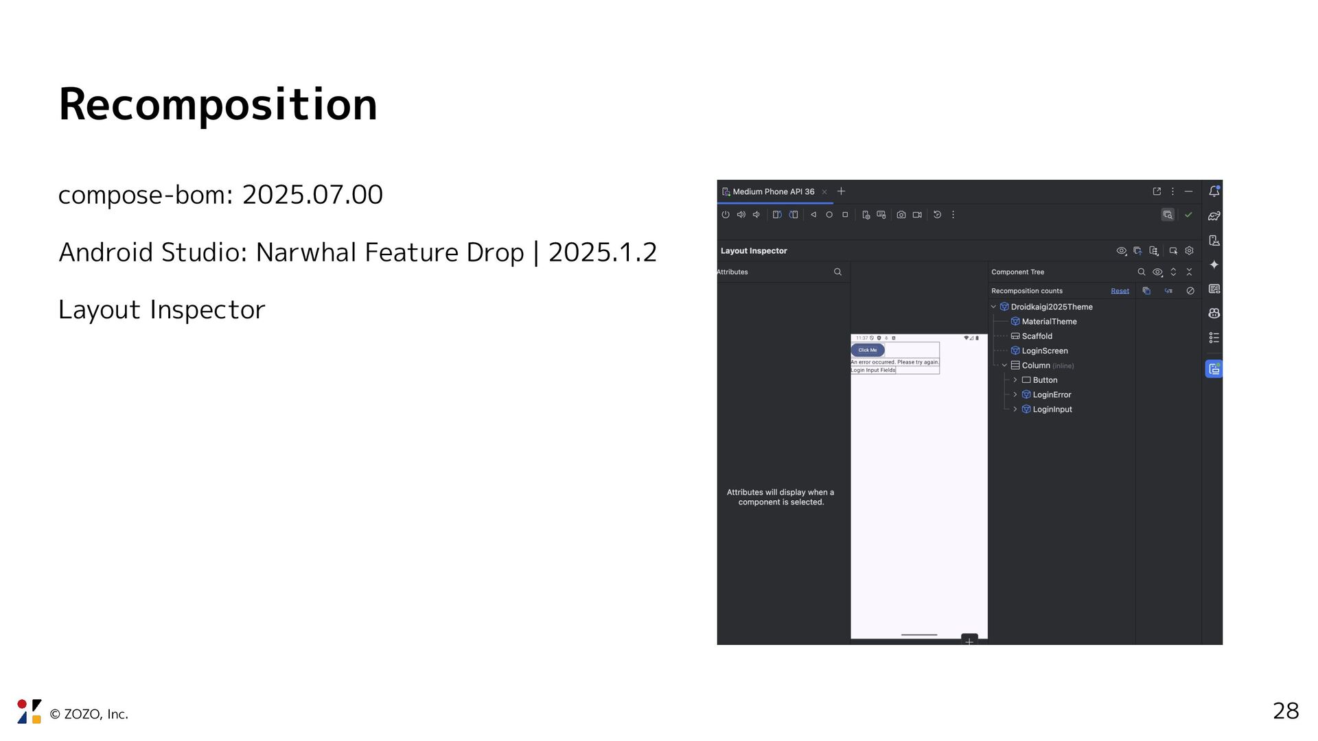
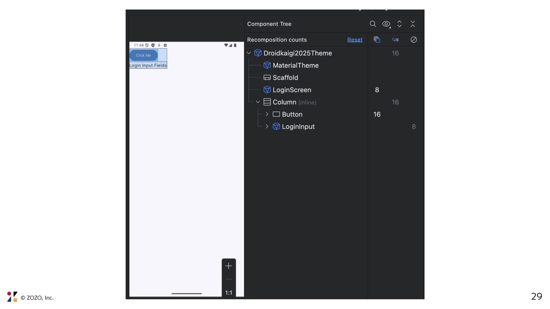
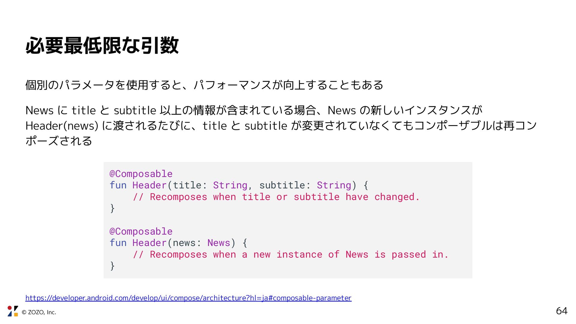
subtitle 以上の情報が含まれている場合、News の新しいインスタンスが Header(news) に渡されるたびに、title と subtitle が変更されていなくてもコンポーザブルは再コン ポーズされる @Composable fun Header(title: String, subtitle: String) { // Recomposes when title or subtitle have changed. } @Composable fun Header(news: News) { // Recomposes when a new instance of News is passed in. } https://developer.android.com/develop/ui/compose/architecture?hl=ja#composable-parameter
 zozotech
 kikuchikakeru
 bitkey
 hacobu
 shibuiwilliam
.jpeg) enpipi
enpipi
 joker1007
 gotalab555
 unachang113
 doragt
 applism118
 daitak
 j5ik2o
 bkeepers
 sstephenson
 chriscoyier
 brettharned
 bluesmoon
 lara
lara
 michaelherold
 deanohume
 caitiem20
 quramy
 afnizarnur
 ammeep