Upgrade to Pro
— share decks privately, control downloads, hide ads and more …
Speaker Deck
Features
Speaker Deck
PRO
Sign in
Sign up for free
Search
Search
d3.js + mobile
Search
binx
August 10, 2012
4.4k
11
Share
Embed
Copy iframe code
Copy JS code
Copy link
Start on current slide
d3.js + mobile
binx
August 10, 2012
More Decks by binx
See All by binx
On the Importance of Iteration
binx
0
140
Designing for Spacecraft Operations
binx
2
650
Place and Space
binx
0
550
Error: Success
binx
0
550
Peak Visualization?
binx
1
620
The Data Visualization Hustle
binx
2
490
People, Not Users
binx
2
270
Data Collection and Memory
binx
1
250
The Road To Code
binx
1
420
Featured
See All Featured
[Rails World 2023 - Day 1 Closing Keynote] - The Magic of Rails
eileencodes
38
2.9k
Digital Ethics as a Driver of Design Innovation
axbom
PRO
1
330
BBQ
matthewcrist
89
10k
Marketing to machines
jonoalderson
1
5.5k
What the history of the web can teach us about the future of AI
inesmontani
PRO
1
630
We Have a Design System, Now What?
morganepeng
55
8.2k
How to Talk to Developers About Accessibility
jct
2
270
Game over? The fight for quality and originality in the time of robots
wayneb77
1
210
The Cost Of JavaScript in 2023
addyosmani
55
10k
SEO Brein meetup: CTRL+C is not how to scale international SEO
lindahogenes
1
2.8k
Making Projects Easy
brettharned
120
6.7k
Information Architects: The Missing Link in Design Systems
soysaucechin
0
990
Transcript
d3.js + mobile Rachel Binx, Stamen Design
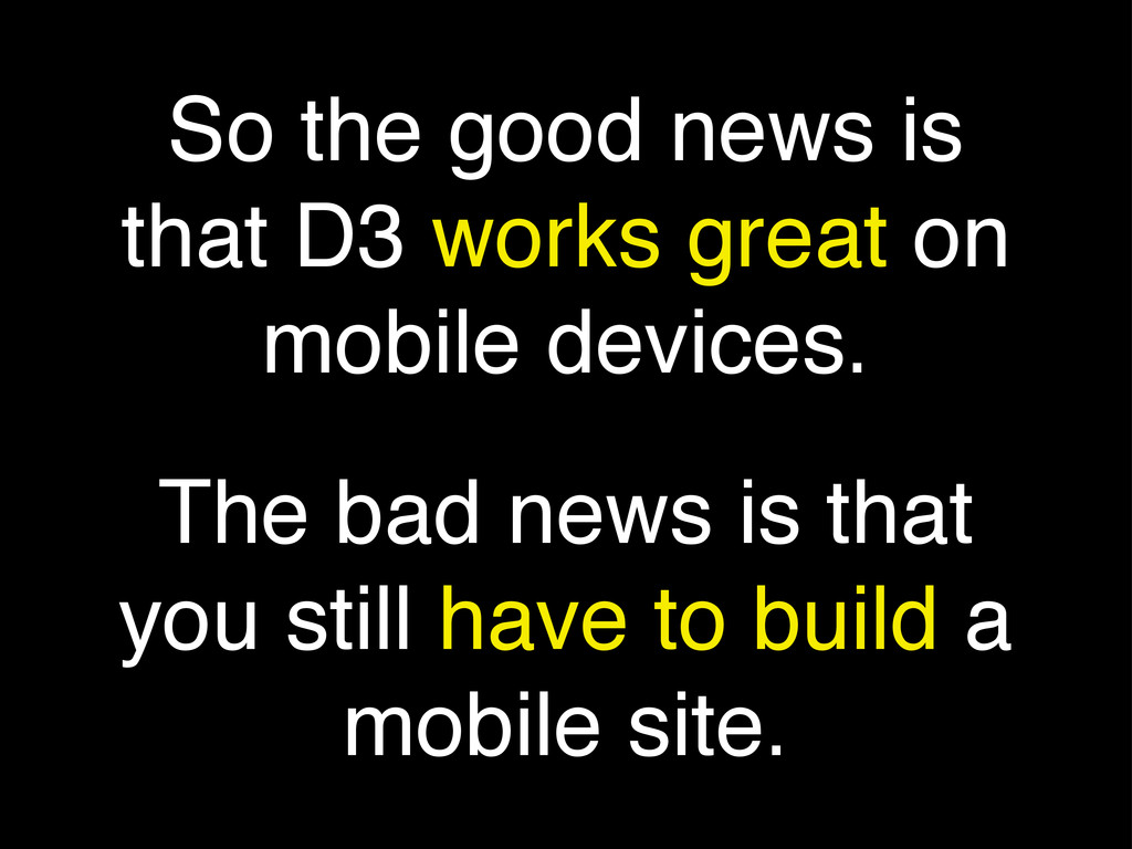
So the good news is that D3 works great on
mobile devices. The bad news is that you still have to build a mobile site.
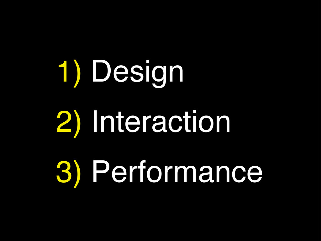
1) Design 2) Interaction 3) Performance
Tools of the Trade
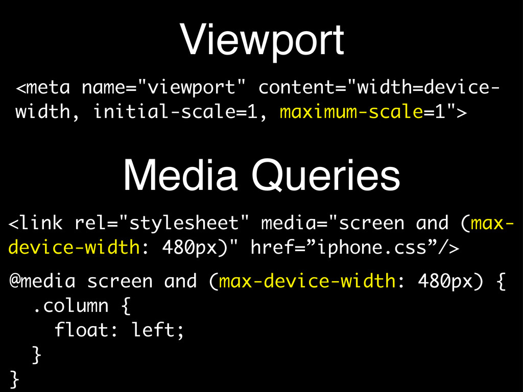
Viewport <link rel="stylesheet" media="screen and (max- device-width: 480px)" href=”iphone.css”/> <meta
name="viewport" content="width=device- width, initial-scale=1, maximum-scale=1"> @media screen and (max-device-width: 480px) { .column { float: left; } } Media Queries
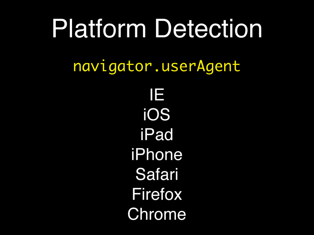
Platform Detection navigator.userAgent IE iOS iPad iPhone Safari Firefox Chrome
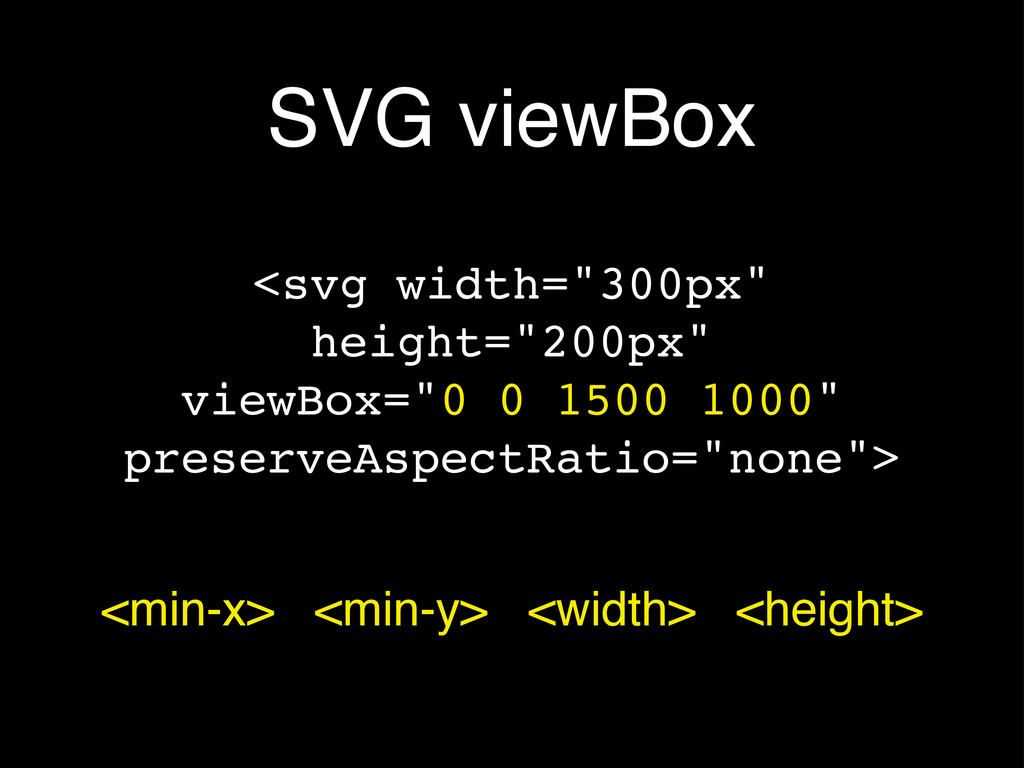
SVG viewBox <svg width="300px" height="200px" viewBox="0 0 1500 1000" preserveAspectRatio="none">
<min-x> <min-y> <width> <height>
Tiny Screens! • Anything interactive on your page: make it
much larger • You will not have a cursor to indicate interaction models - consider labeling everything • Quite simply: remove all subtly
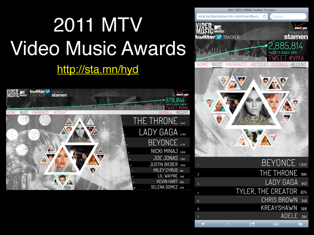
2011 MTV Video Music Awards http://sta.mn/hyd
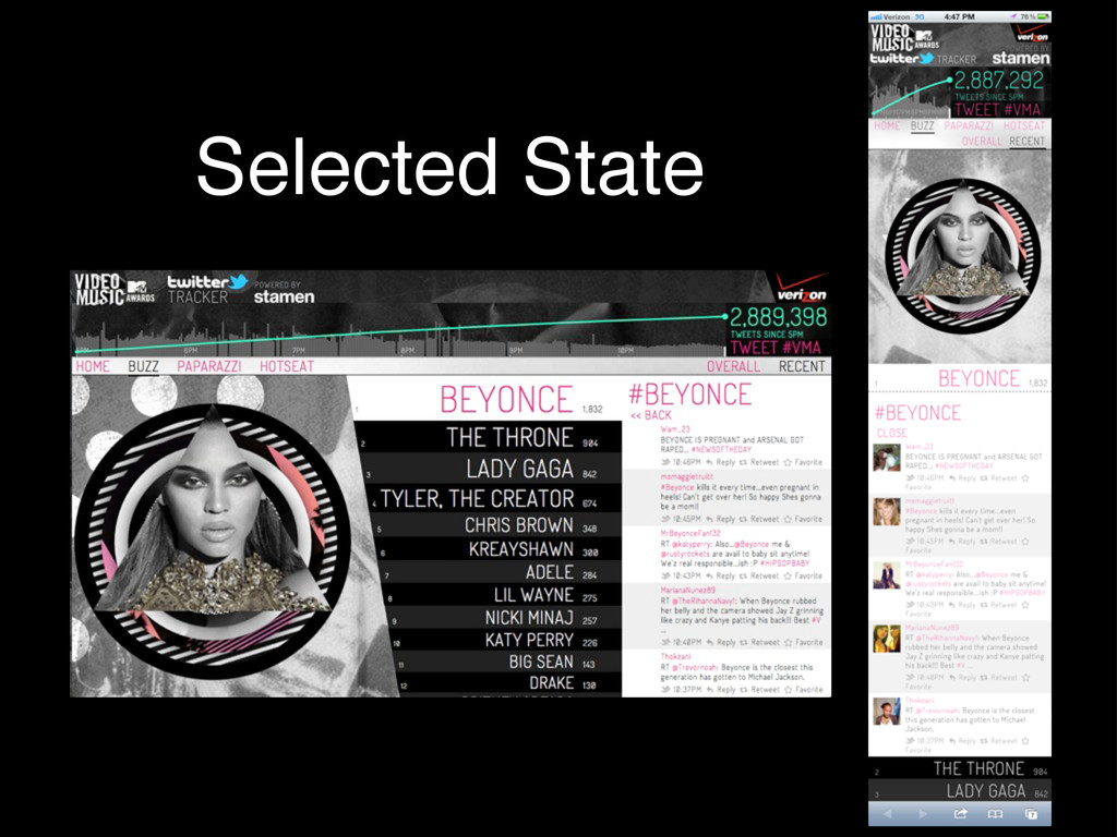
Selected State
Interaction Models
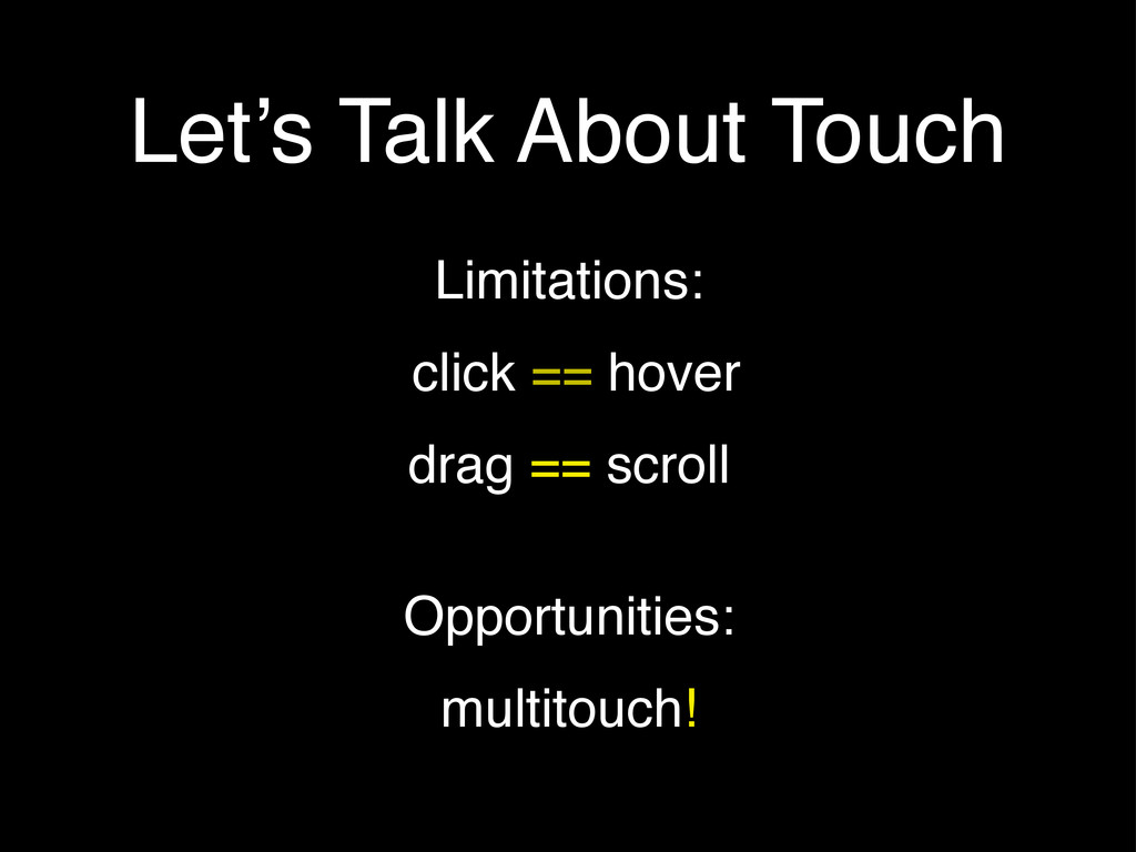
Let’s Talk About Touch Limitations: click == hover drag ==
scroll Opportunities: multitouch!
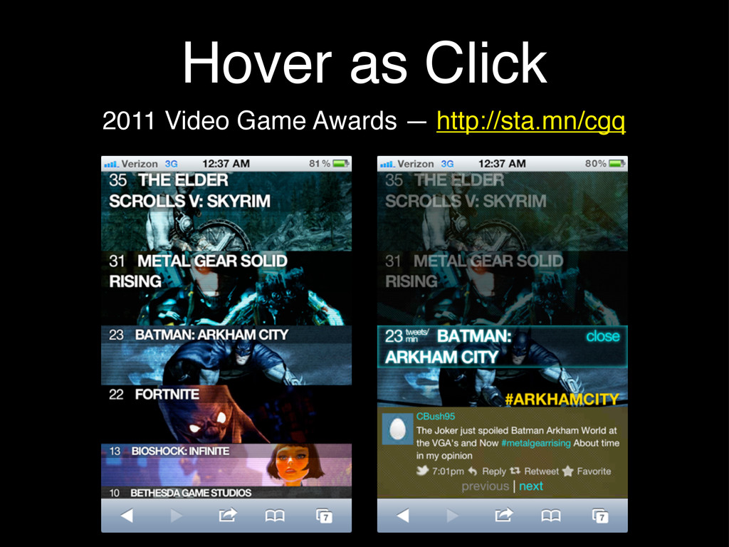
Hover as Click 2011 Video Game Awards — http://sta.mn/cgq
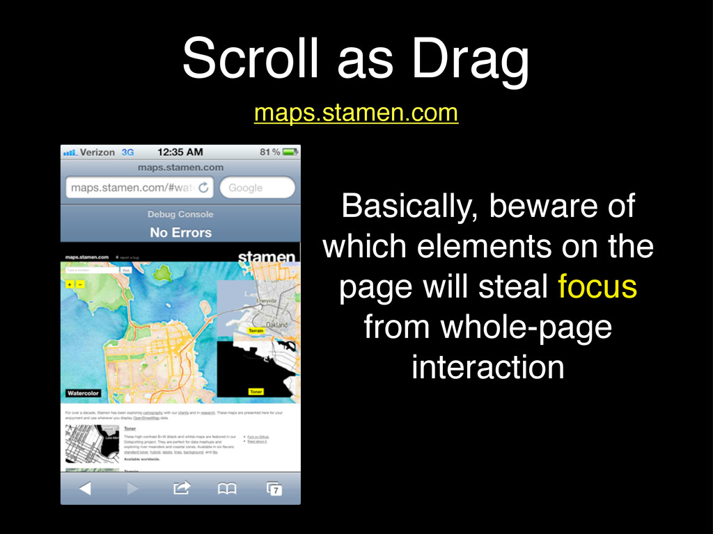
Scroll as Drag maps.stamen.com Basically, beware of which elements on
the page will steal focus from whole-page interaction
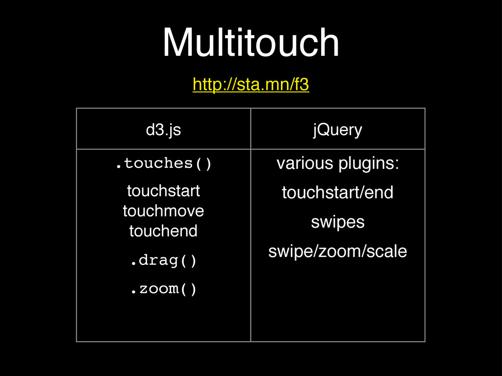
Multitouch http://sta.mn/f3 d3.js jQuery .touches() touchstart touchmove touchend .drag() .zoom()
various plugins: touchstart/end swipes swipe/zoom/scale
Saucy Animations
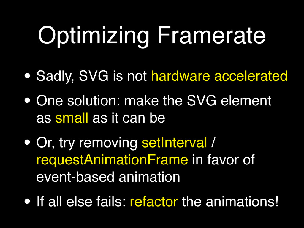
Optimizing Framerate • Sadly, SVG is not hardware accelerated •
One solution: make the SVG element as small as it can be • Or, try removing setInterval / requestAnimationFrame in favor of event-based animation • If all else fails: refactor the animations!
Event-Based Animation 2012 NewNowNext Awards — http://sta.mn/rnm
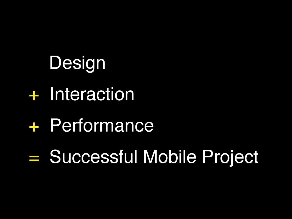
Design + Interaction + Performance = Successful Mobile Project
Thanks!
[email protected]
@rachelbinx
 binx
binx
 eileencodes
 axbom
axbom
 matthewcrist
 jonoalderson
 inesmontani
 morganepeng
 jct
jct
 wayneb77
 addyosmani
 lindahogenes
 brettharned
 soysaucechin
![Thanks! [email protected] @rachelbinx](https://files.speakerdeck.com/presentations/502563086773ba000200c6a8/slide_19.jpg)