Upgrade to Pro
— share decks privately, control downloads, hide ads and more …
Speaker Deck
Features
Speaker Deck
PRO
Sign in
Sign up for free
Search
Search
CSS Layout w/ HTML5 & CSS3
Search
Sponsored
·
Ship Features Fearlessly
Turn features on and off without deploys. Used by thousands of Ruby developers.
→
Cesar
August 14, 2015
Programming
110
2
Share
Embed
Copy iframe code
Copy JS code
Copy link
Start on current slide
CSS Layout w/ HTML5 & CSS3
Cesar
August 14, 2015
More Decks by Cesar
See All by Cesar
Webpack
cesar2535
1
480
Front-End workflows
cesar2535
0
99
Other Decks in Programming
See All in Programming
アルゴリズムは何を圧縮しているのか ─ Haskell から育った「圧縮代数」というメンタルモデル
naoya
16
3.3k
共通化で考えるべきは、実装より公開する型だった
codeegg
0
210
気圧・高度・GPSを記録&可視化するアプリ「Koudo」を作った話
hjmkth
1
350
信頼性について考えてみる(SRE NEXT 2026 miniLT)
hayama17
0
160
SLOをサービス品質の共通言語にするために 取り組んできたこと
wakana0222
0
480
OS アップデート対応の取り組み方がもっと共有されてほしい
andpad
0
110
AIキャラアプリkaiwaの低遅延音声通話基盤をどう作ったか - AWS Gravitonで支える低遅延・低コストAI Agent基盤
mogamit
0
170
Go1.27で導入されるジェネリクスメソッドでできること
mackee
0
280
どこまでゆるくて許されるのか
tk3fftk
0
470
symfony/aiとlaravel/boost
77web
0
120
フィードバックで育てるAI開発
kotaminato
1
110
地域 SRE コミュニティ最前線 - ホンマでっかSRE勉強会
tk3fftk
0
220
Featured
See All Featured
Building a Scalable Design System with Sketch
lauravandoore
463
34k
Responsive Adventures: Dirty Tricks From The Dark Corners of Front-End
smashingmag
254
22k
Game over? The fight for quality and originality in the time of robots
wayneb77
1
220
Easily Structure & Communicate Ideas using Wireframe
afnizarnur
194
17k
SERP Conf. Vienna - Web Accessibility: Optimizing for Inclusivity and SEO
sarafernandez
2
1.5k
Save Time (by Creating Custom Rails Generators)
garrettdimon
PRO
32
3.7k
Why Mistakes Are the Best Teachers: Turning Failure into a Pathway for Growth
auna
0
180
Paper Plane (Part 1)
katiecoart
PRO
0
9.6k
Site-Speed That Sticks
csswizardry
13
1.3k
Heart Work Chapter 1 - Part 1
lfama
PRO
8
36k
Building Flexible Design Systems
yeseniaperezcruz
330
40k
GraphQLとの向き合い方2022年版
quramy
50
15k
Transcript
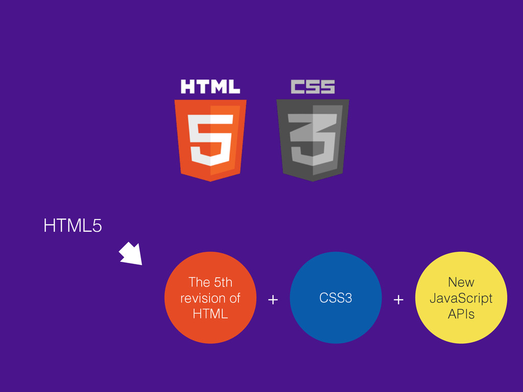
CSS Layout WITH
HTML5 The 5th revision of HTML CSS3 New JavaScript APIs
+ +
CSS3
https://en.wikipedia.org/wiki/HTML5
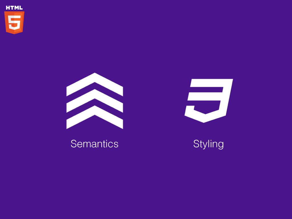
Semantics Connectivity Offline & Storage Multimedia 3D graphics & effects
Performance & Integration Device Access Styling https://developer.mozilla.org/en-US/docs/Web/Guide/HTML/HTML5
Semantics Styling
Semantics Styling <header>, <footer>, <article>, <section>, <aside>, <nav>, <figure>, <audio>,
<video>, …
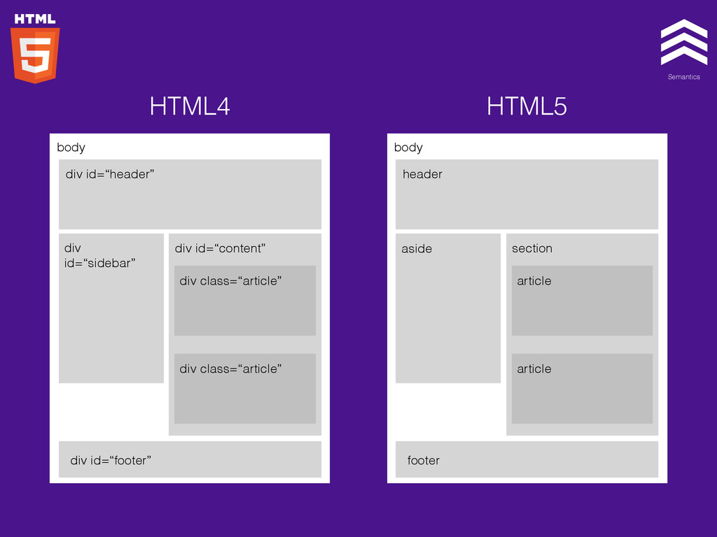
Semantics Styling body div id=“header” div id=“sidebar” div id=“content” div
class=“article” div class=“article” div id=“footer” body header aside section article article footer HTML4 HTML5
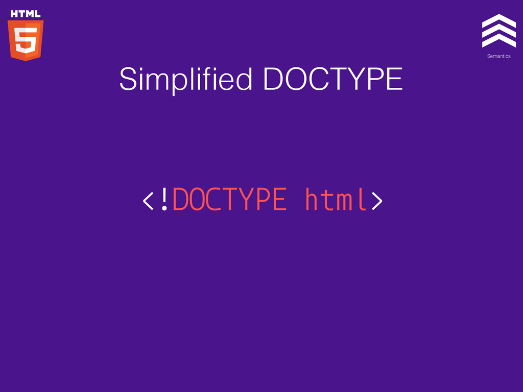
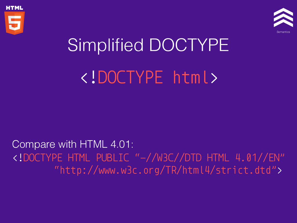
Semantics Styling <!DOCTYPE html> Simplified DOCTYPE
Semantics Styling <!DOCTYPE html> Compare with HTML 4.01: <!DOCTYPE HTML
PUBLIC “-//W3C//DTD HTML 4.01//EN” “http://www.w3c.org/TR/html4/strict.dtd”> Simplified DOCTYPE
Semantics Styling
Semantics Styling
Semantics Styling
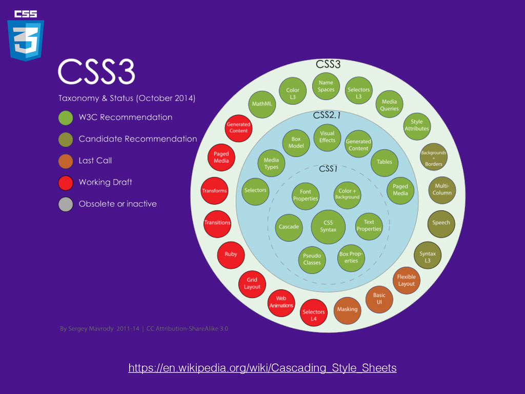
https://en.wikipedia.org/wiki/Cascading_Style_Sheets
• Selector • Box Model • Backgrounds & Border •
Text Effects • 2D/3D Transformations • Animations • Multiple Column Layout
box-radius: 5px; Box radius
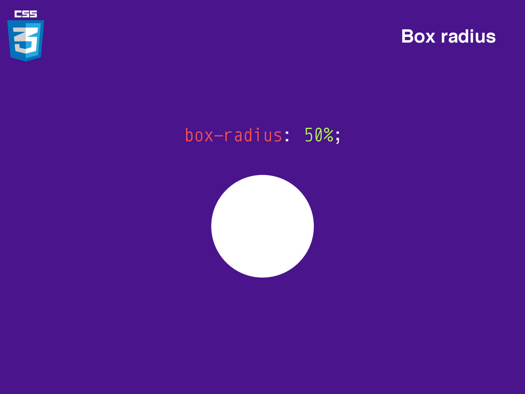
box-radius: 50%; Box radius
box-shadow: 1px 1px 0px pink; Box shadow
box-shadow: 1px 1px 0px pink, -1px -1px 0px green; Box
shadow
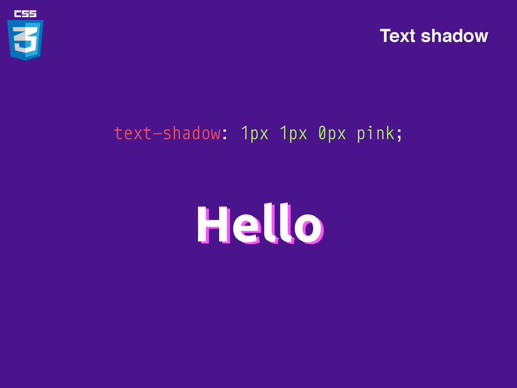
text-shadow: 1px 1px 0px pink; Hello Hello Text shadow
h1:before, h1:after { content: “*”; color: pink; } *Hello* Pseudo
elements
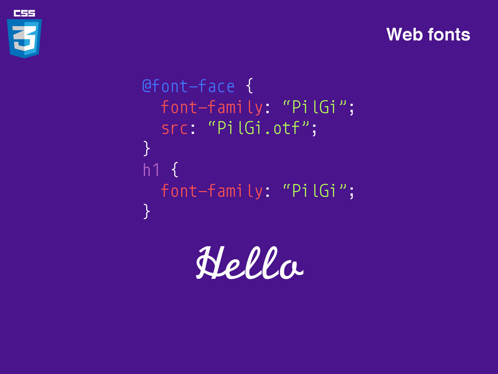
@font-face { font-family: “PilGi”; src: “PilGi.otf”; } h1 { font-family:
“PilGi”; } Hello Web fonts
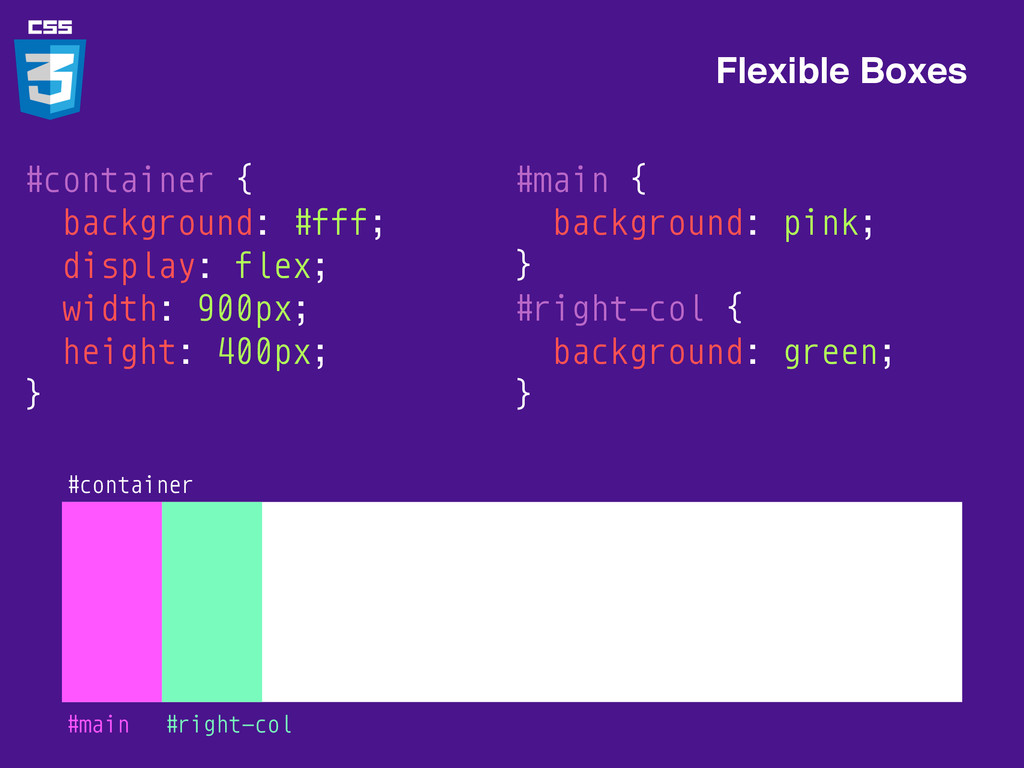
#container { background: #fff; display: flex; width: 900px; height: 400px;
} Flexible Boxes #container
Flexible Boxes #container #main { background: pink; } #right-col {
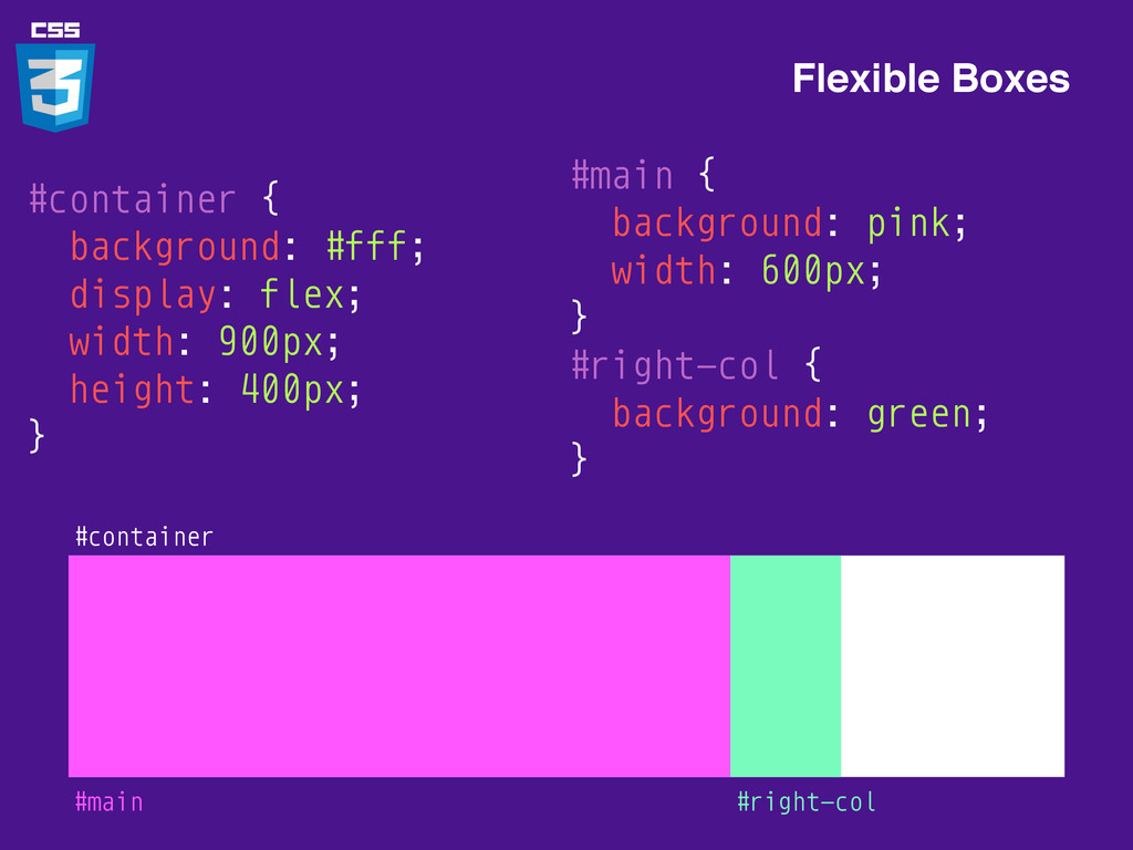
background: green; } #main #right-col #container { background: #fff; display: flex; width: 900px; height: 400px; }
Flexible Boxes #container #main { background: pink; width: 600px; }
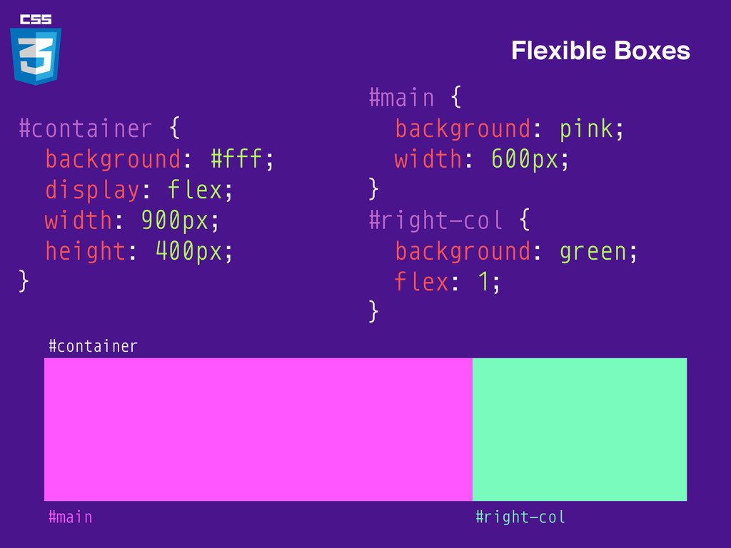
#right-col { background: green; } #main #right-col #container { background: #fff; display: flex; width: 900px; height: 400px; }
Flexible Boxes #container #main { background: pink; width: 600px; }
#right-col { background: green; flex: 1; } #main #right-col #container { background: #fff; display: flex; width: 900px; height: 400px; }
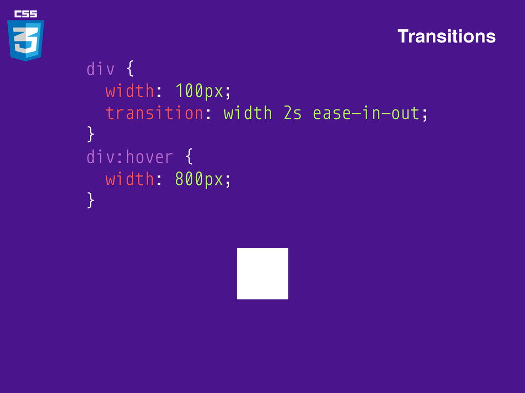
Transitions div { width: 100px; } div:hover { width: 800px;
}
Transitions div { width: 100px; } div:hover { width: 800px;
}
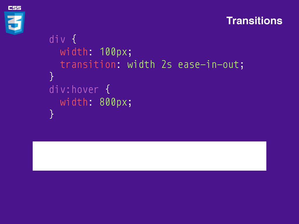
Transitions div { width: 100px; transition: width 2s ease-in-out; }
div:hover { width: 800px; }
Transitions div { width: 100px; transition: width 2s ease-in-out; }
div:hover { width: 800px; }
Transforms Hi div { transform: rotate(45deg); }
Don’t forget vendor prefixes -webkit-transform: rotate(45deg); -moz-transform: rotate(45deg); -ms-transform: rotate(45deg);
-o-transform: rotate(45deg); transform: rotate(45deg);
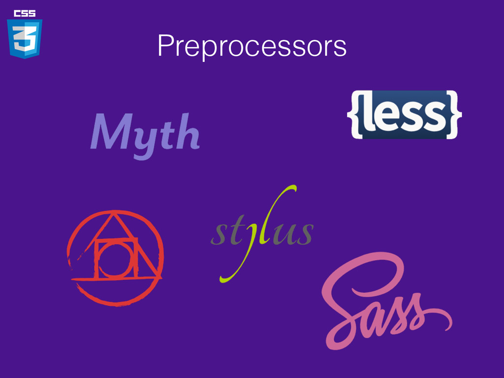
Preprocessors
Preprocessors .css .css .styl .sass .scss .less Myth Less Sass
Stylus Postcss
Preprocessors
Question?
CSS Layout
FLEXBOX
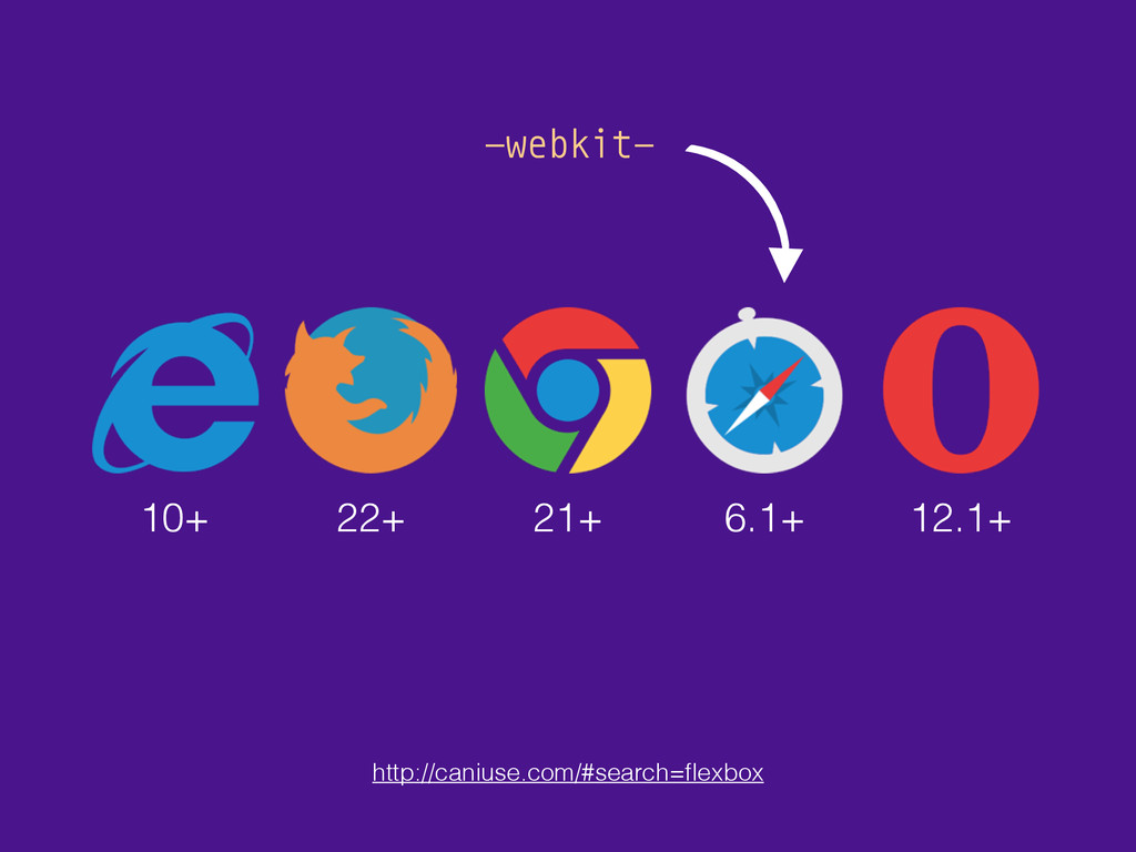
10+ 22+ 21+ 6.1+ 12.1+ http://caniuse.com/#search=flexbox -webkit-
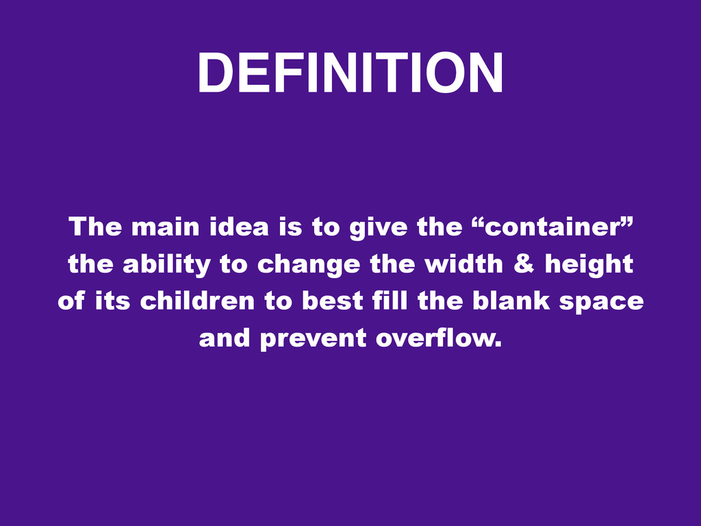
DEFINITION The main idea is to give the “container” the
ability to change the width & height of its children to best fill the blank space and prevent overflow.
TERMINOLOGY Flex Container 1 2 3 Flex Items
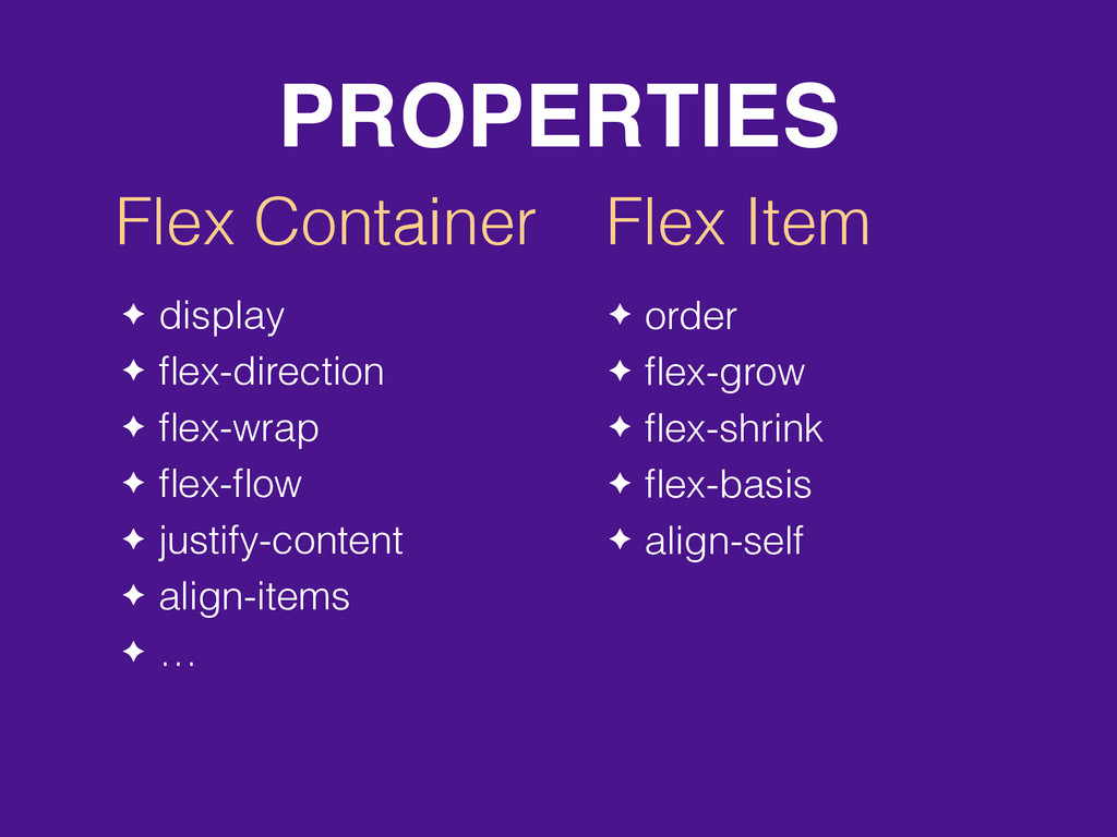
PROPERTIES Flex Container Flex Item ✦ display ✦ flex-direction ✦
flex-wrap ✦ flex-flow ✦ justify-content ✦ align-items ✦ … ✦ order ✦ flex-grow ✦ flex-shrink ✦ flex-basis ✦ align-self
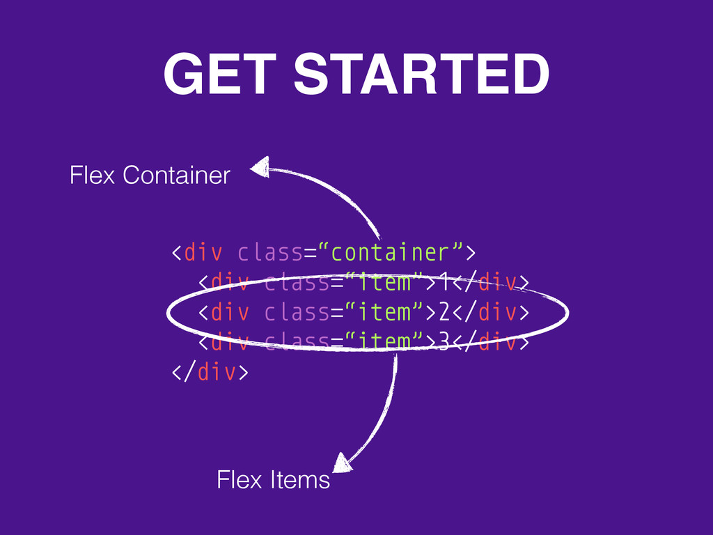
GET STARTED <div class=“container”> <div class=“item”>1</div> <div class=“item”>2</div> <div class=“item”>3</div>
</div> Flex Items Flex Container
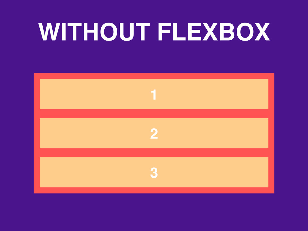
WITHOUT FLEXBOX 1 2 3
WITH FLEXBOX .container { display: flex; } 1 2 3
FLEX-CONTAINER PROPERTIES
flex-direction 1 2 3 row default 3 2 1 row-reverse
flex-direction 1 2 3 column 3 2 1 column-reverse
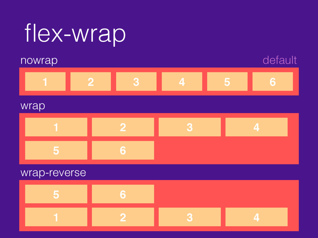
flex-wrap nowrap default 1 2 3 4 5 6 wrap
1 2 3 4 5 6 wrap-reverse 1 2 3 4 5 6
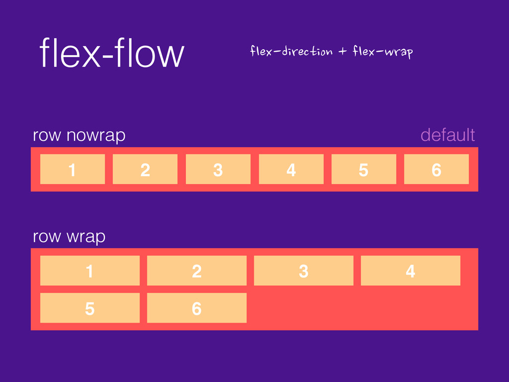
flex-flow row nowrap default 1 2 3 4 5 6
flex-direction
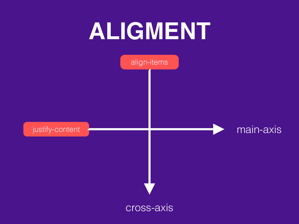
ALIGMENT align-items justify-content cross-axis main-axis
justify-content flex-start default 1 2 3 4 flex-end 1 2
3 4
justify-content center 1 2 3 4
justify-content space-between 1 2 3 4 space-around 1 2 3
4
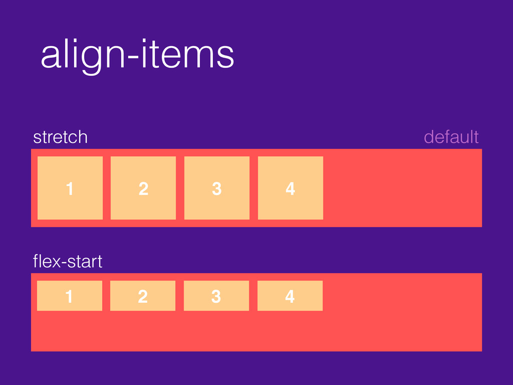
align-items stretch default 1 2 3 4 flex-start 1 2
3 4
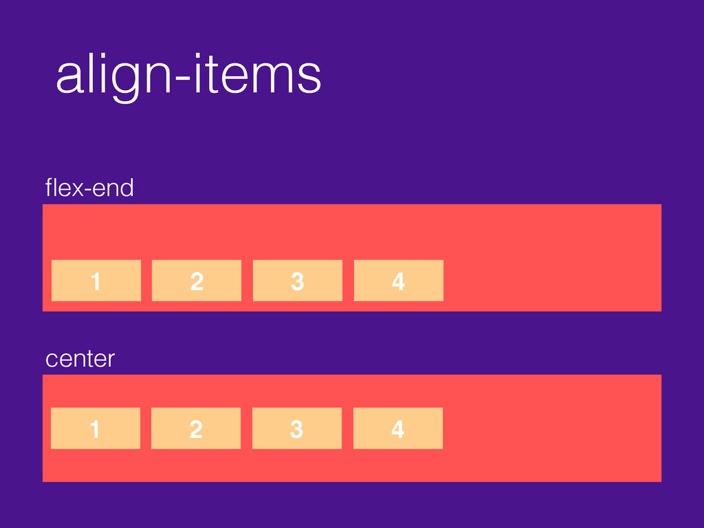
align-items flex-end center 1 2 3 4 1 2 3
4
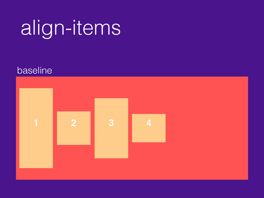
align-items baseline 1 2 3 4
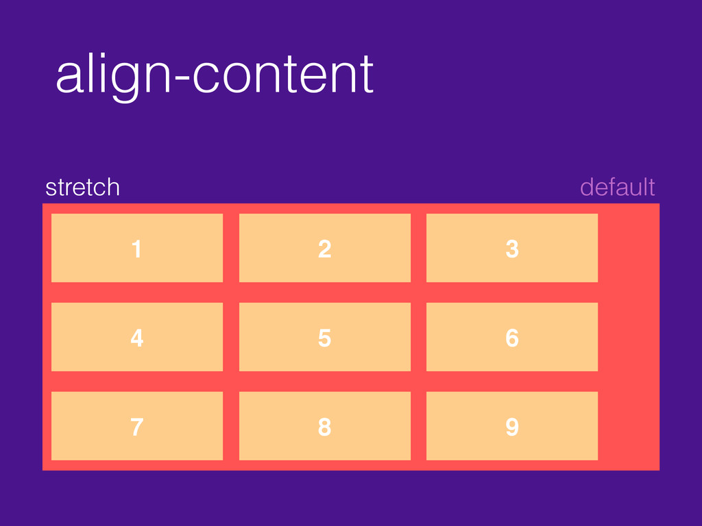
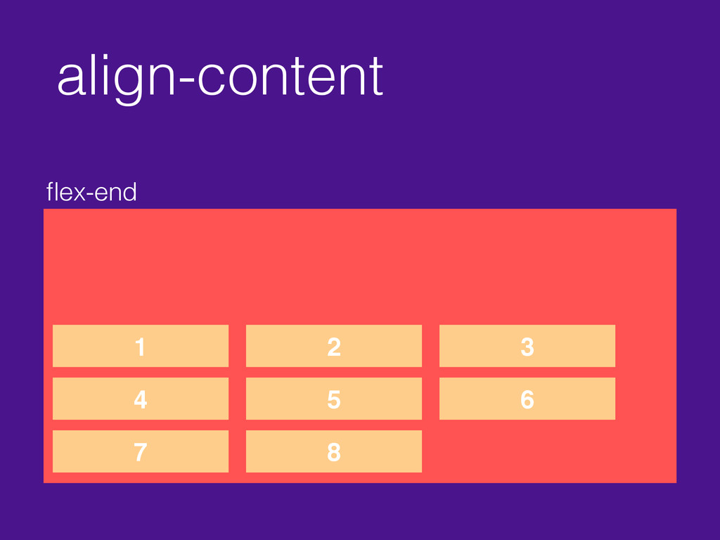
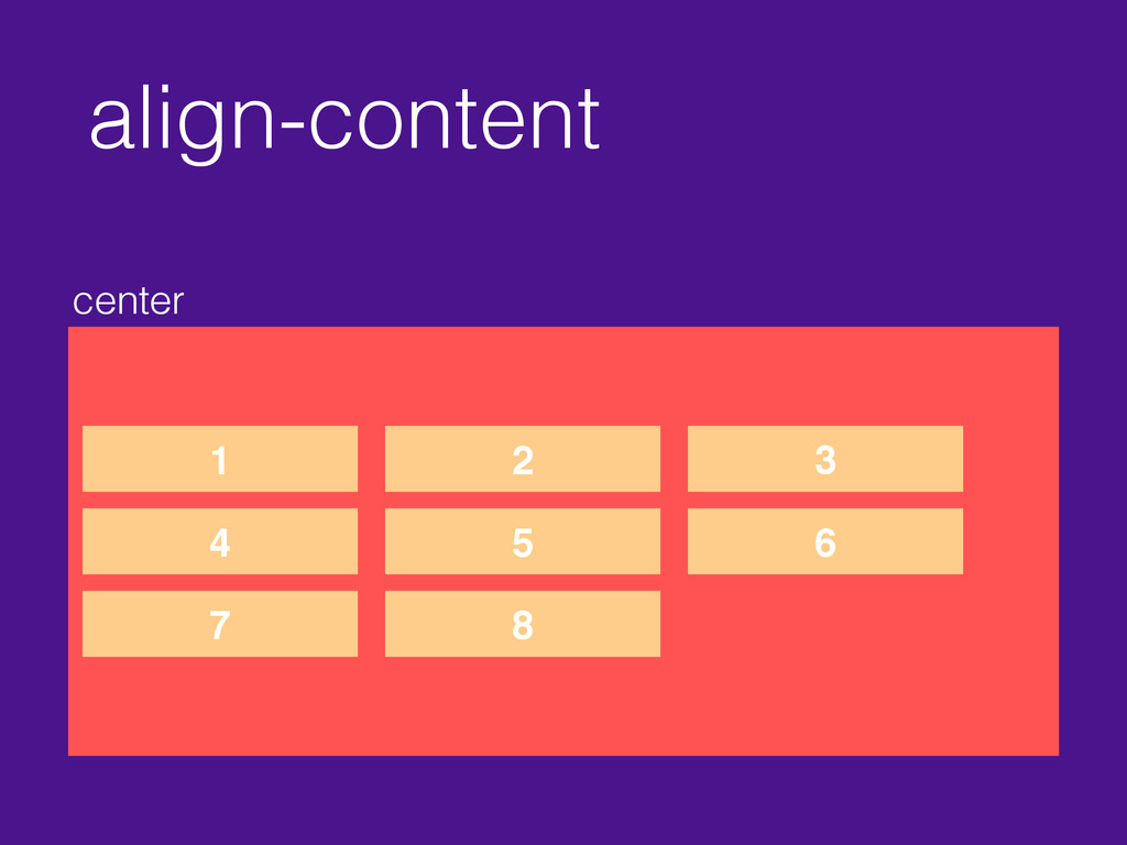
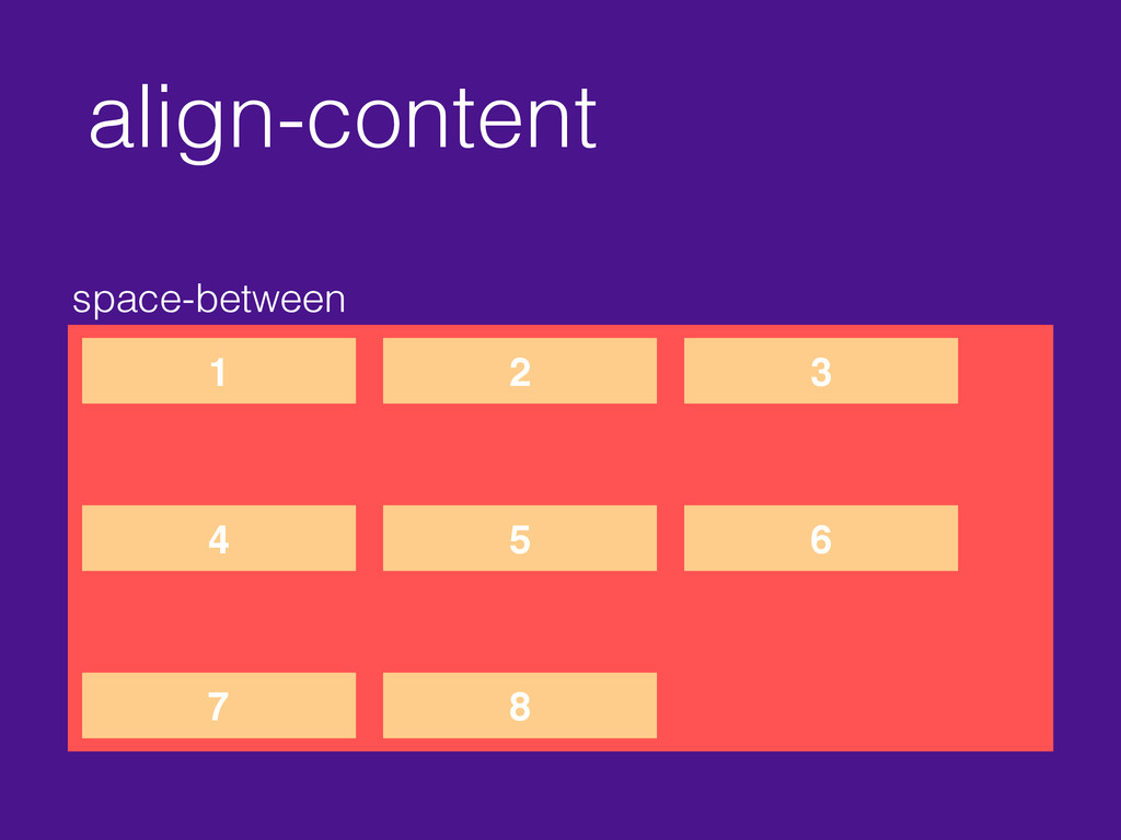
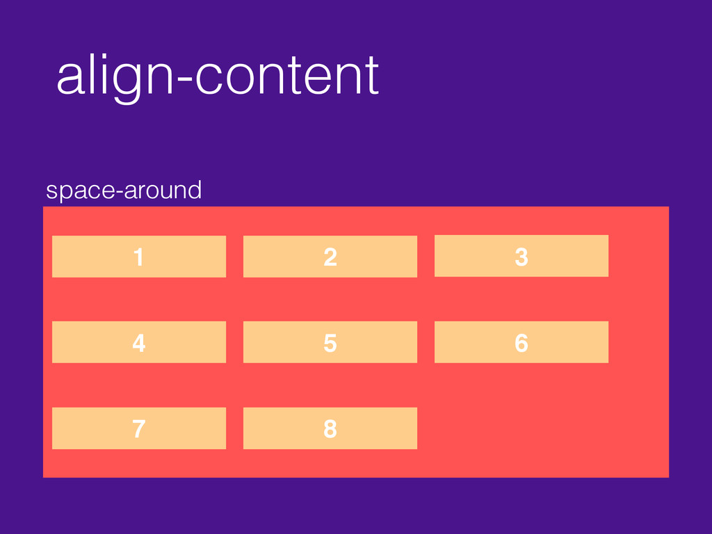
align-content stretch default 1 2 3 4 5 6 7
8 9
align-content flex-start 1 2 3 4 5 6 7 8
align-content flex-end 1 2 3 4 5 6 7 8
align-content center 1 2 3 4 5 6 7 8
align-content space-between 1 2 3 4 5 6 7 8
align-content space-around 1 2 3 4 5 6 7 8
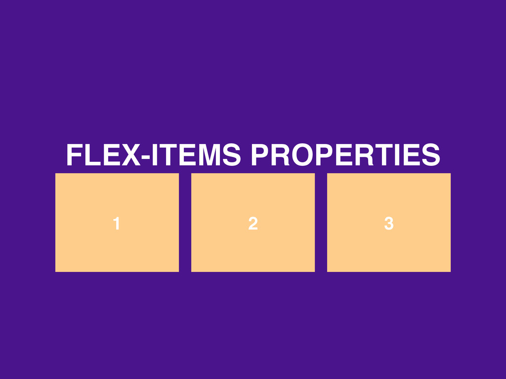
1 2 3 FLEX-ITEMS PROPERTIES
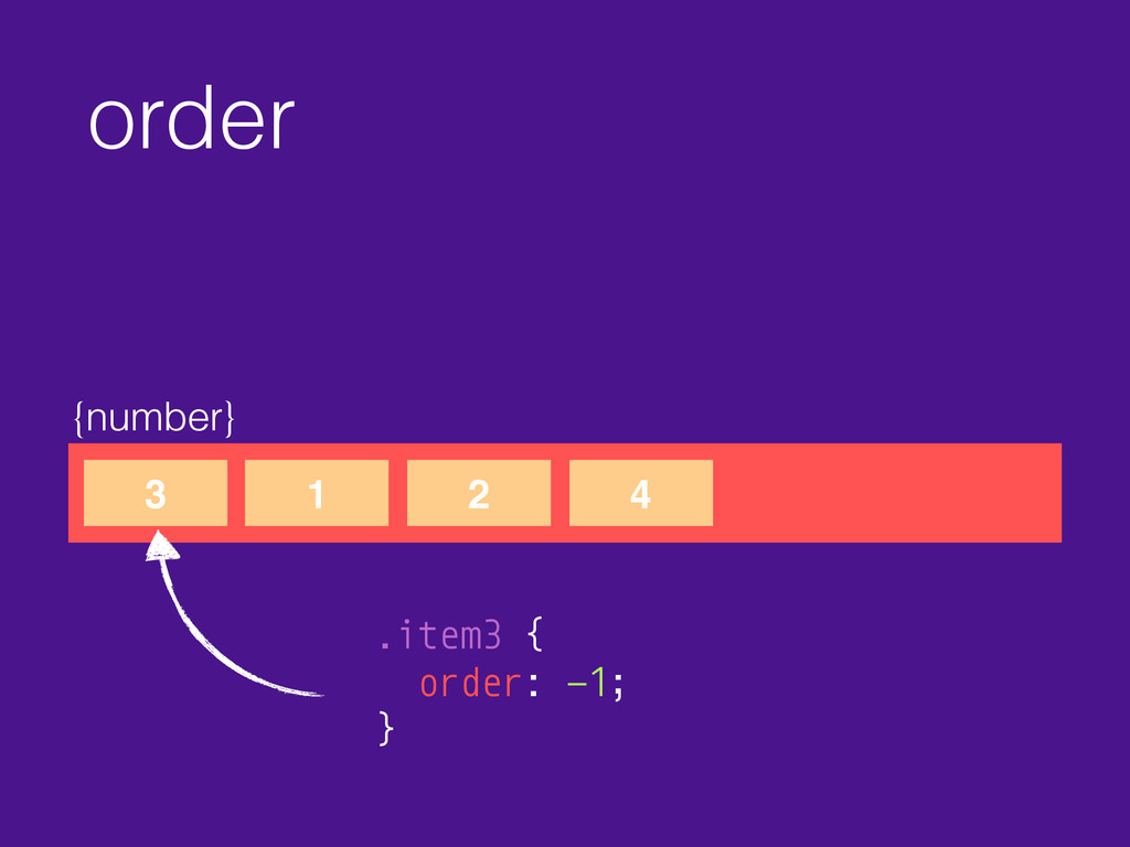
order {number} 3 1 2 4 .item3 { order: -1;
}
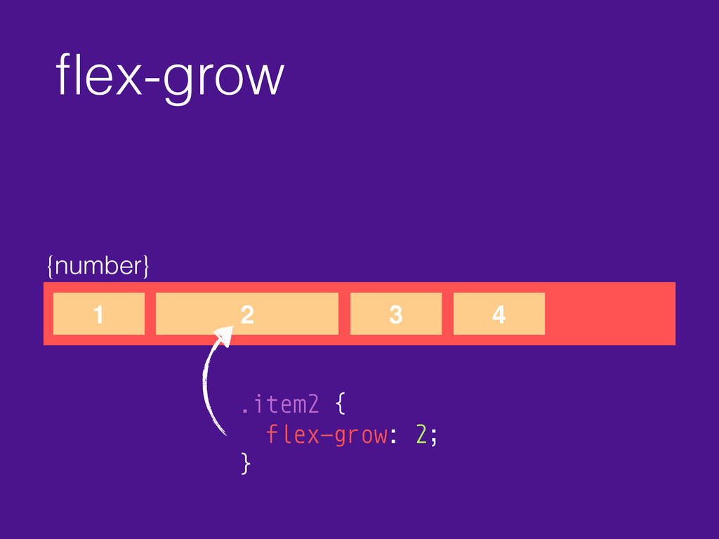
flex-grow {number} 1 2 3 4 .item2 { flex-grow: 2;
}
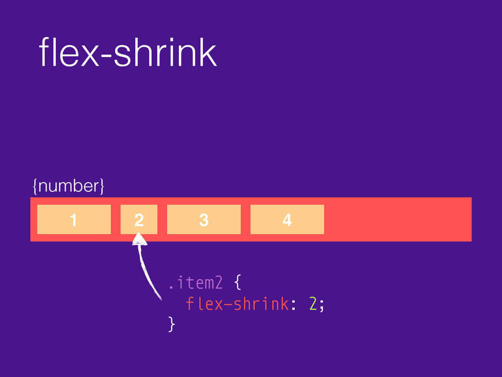
flex-shrink {number} 1 2 3 4 .item2 { flex-shrink: 2;
}
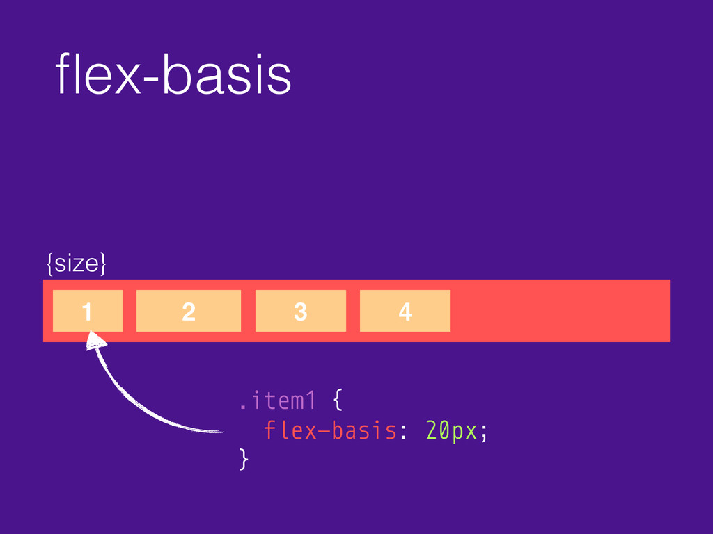
flex-basis {size} 1 2 3 4 .item1 { flex-basis: 20px;
}
flex {number} 1 2 3 4 .item { flex: 0
1 auto; } flex-grow
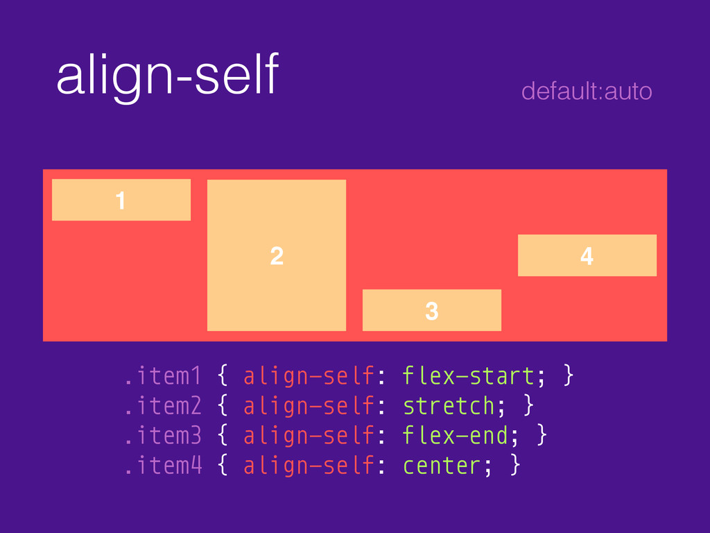
align-self 1 2 3 4 .item1 { align-self: flex-start; }
.item2 { align-self: stretch; } .item3 { align-self: flex-end; } .item4 { align-self: center; } default:auto
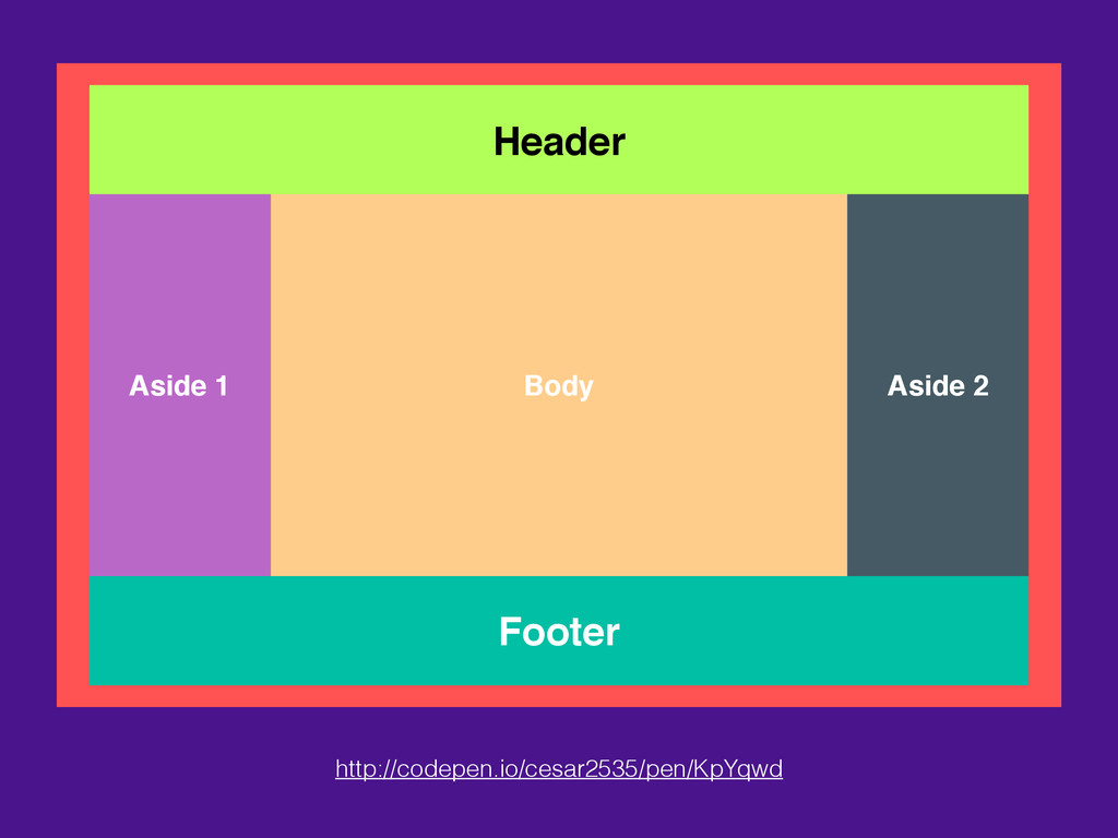
Header Footer Body Aside 1 Aside 2 http://codepen.io/cesar2535/pen/KpYqwd
RESOURCES Learn • https://scotch.io/tutorials/a-visual-guide-to-css3-flexbox-properties • https://css-tricks.com/snippets/css/a-guide-to-flexbox/ • http://heydesigner.com/flexbox/ • http://philipwalton.github.io/solved-by-flexbox/
• http://sixrevisions.com/css/learn-flexbox/ Bugs • https://github.com/philipwalton/flexbugs
Question? THANK!
 cesar2535
 naoya
naoya
 codeegg
 hjmkth
 hayama17
 wakana0222
 andpad
 mogamit
 mackee
 tk3fftk
 77web
77web
 kotaminato
 lauravandoore
 smashingmag
 wayneb77
 afnizarnur
 sarafernandez
 garrettdimon
 auna
auna
 katiecoart
 csswizardry
 lfama
lfama
 yeseniaperezcruz
 quramy