Upgrade to Pro — share decks privately, control downloads, hide ads and more …

Composing with accessibility in mind

Avatar for Jane Waitara Jane Waitara
November 29, 2023

Composing with accessibility in mind

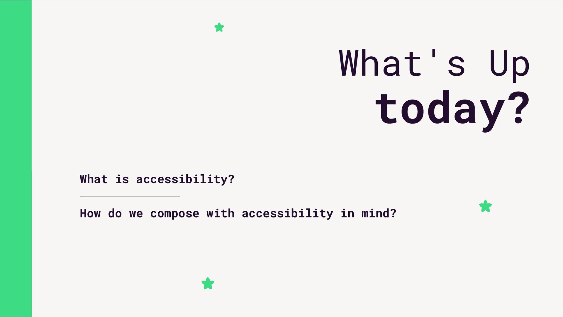
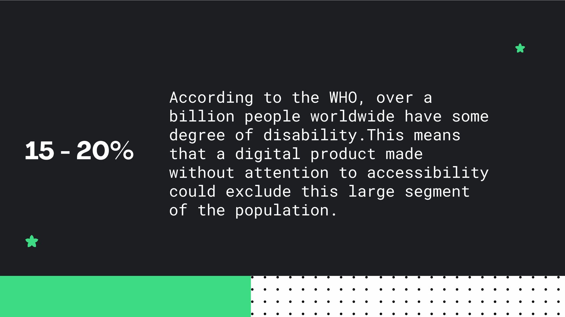
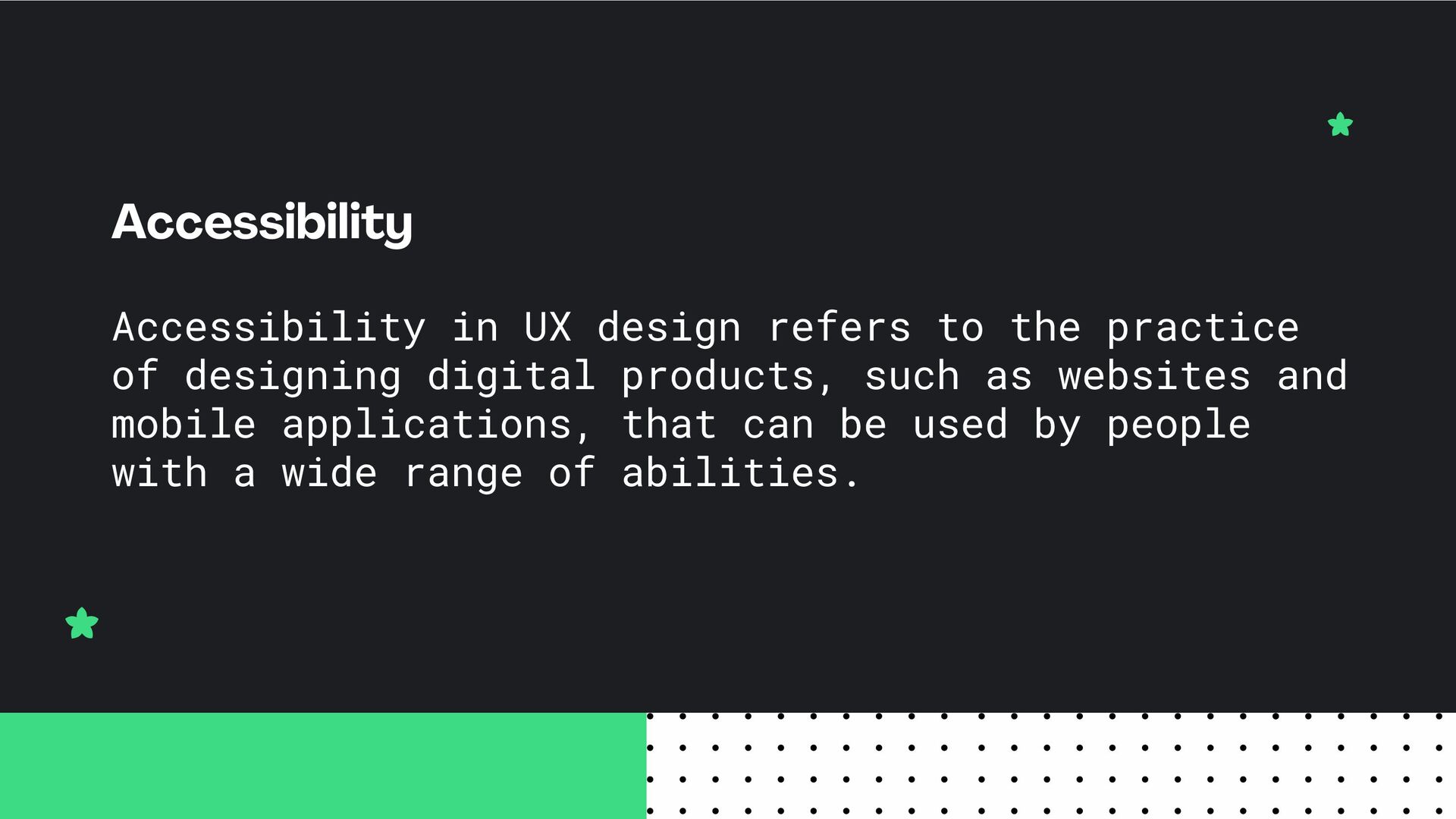
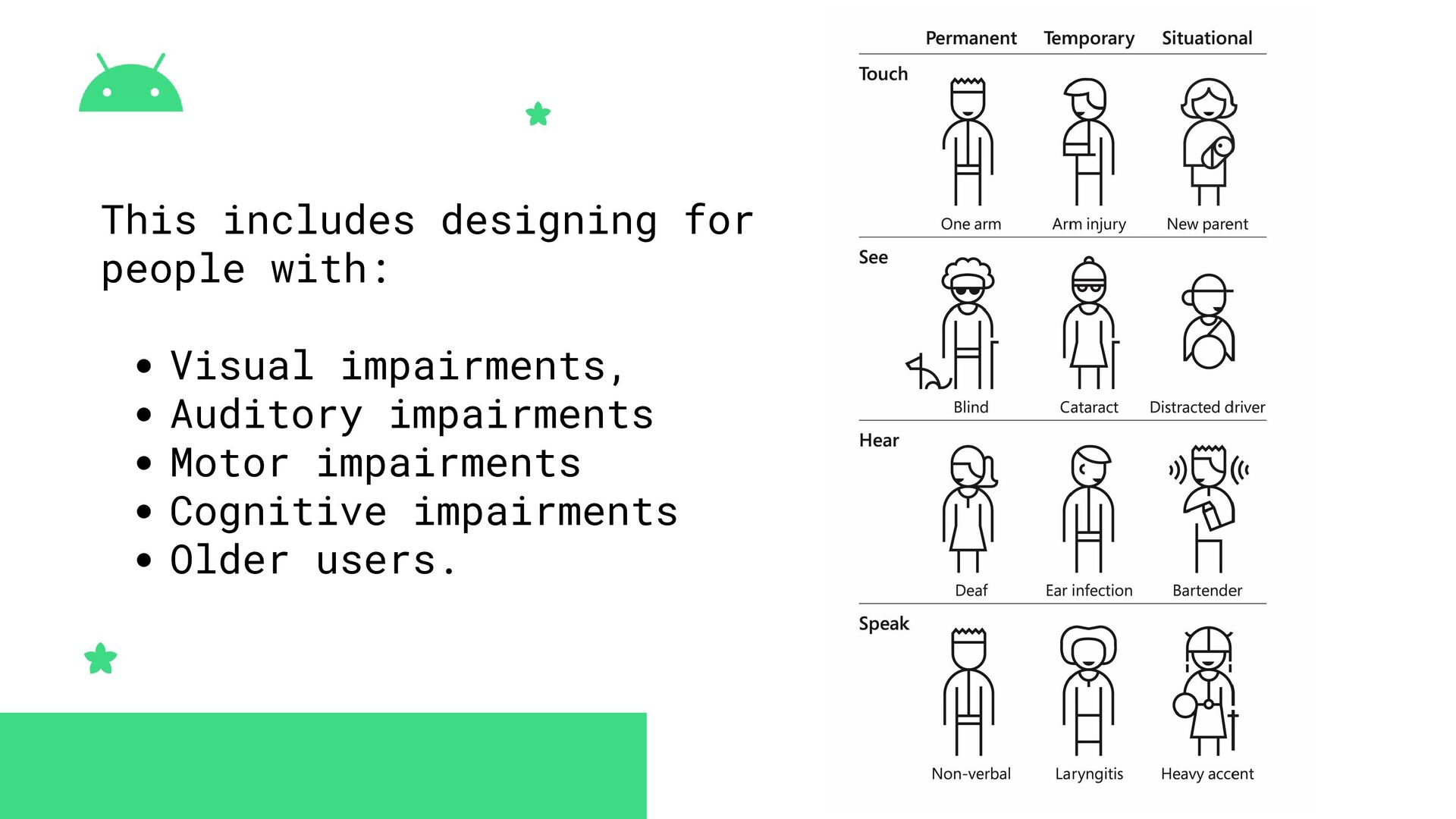
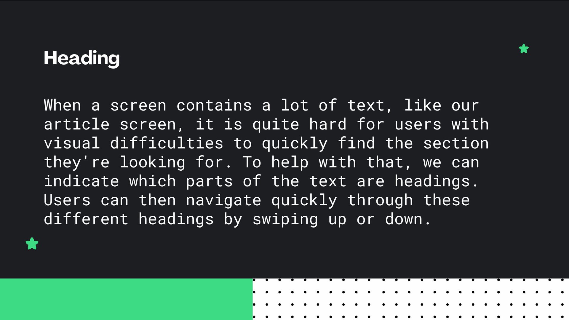
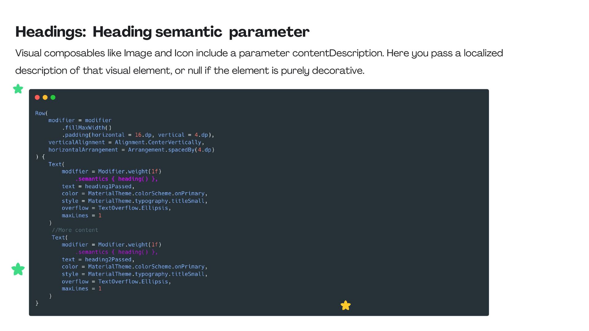
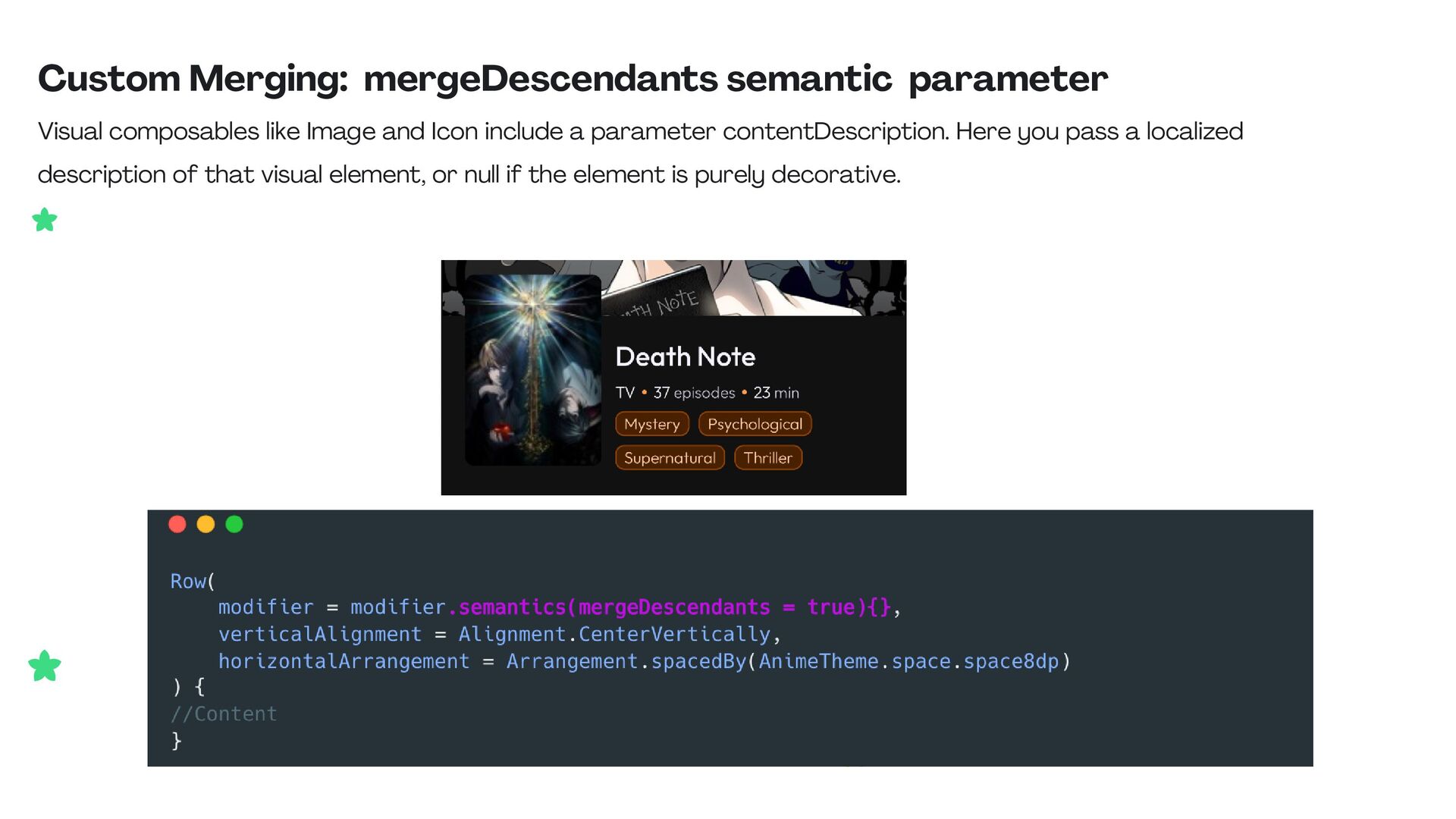
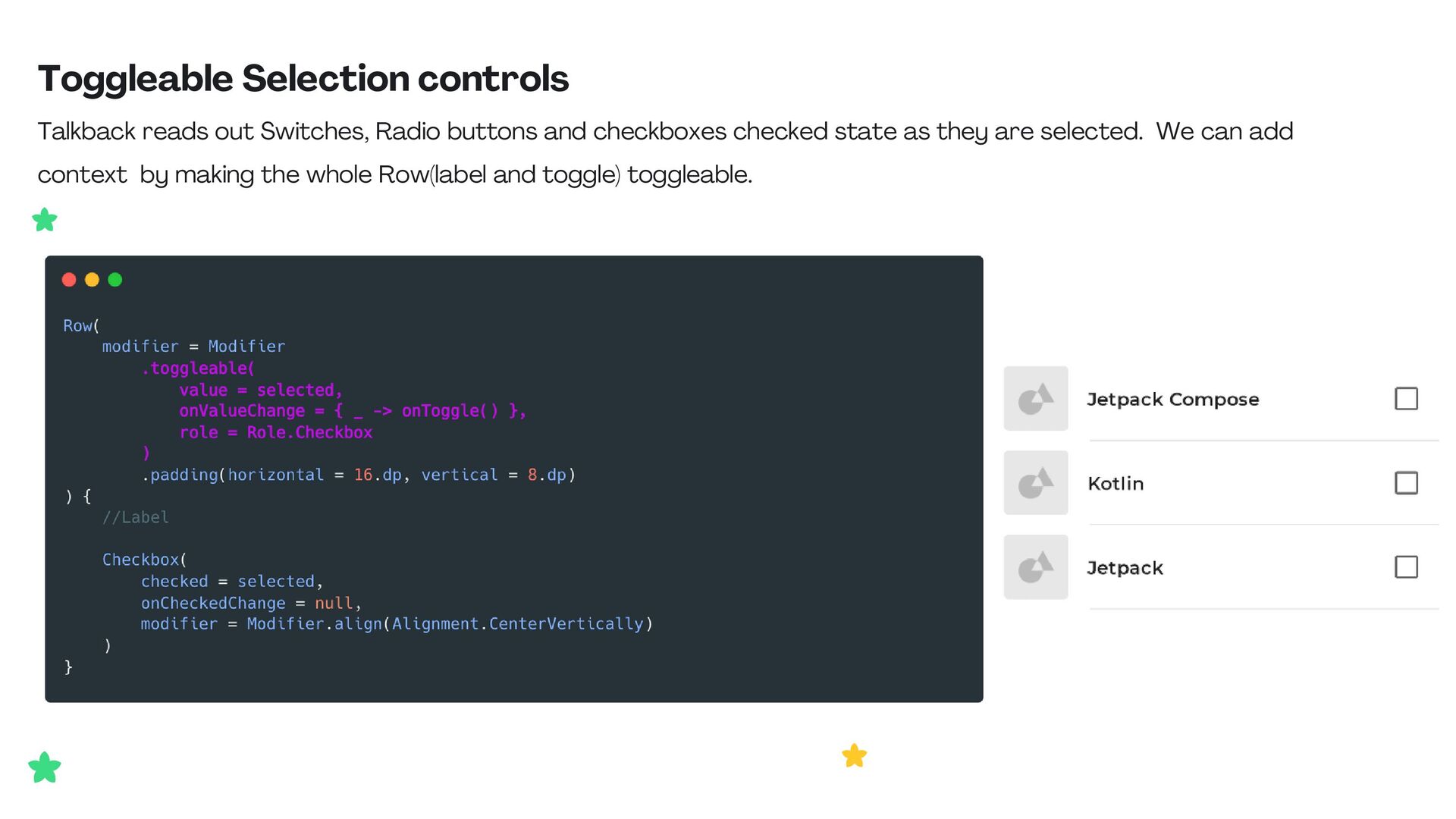
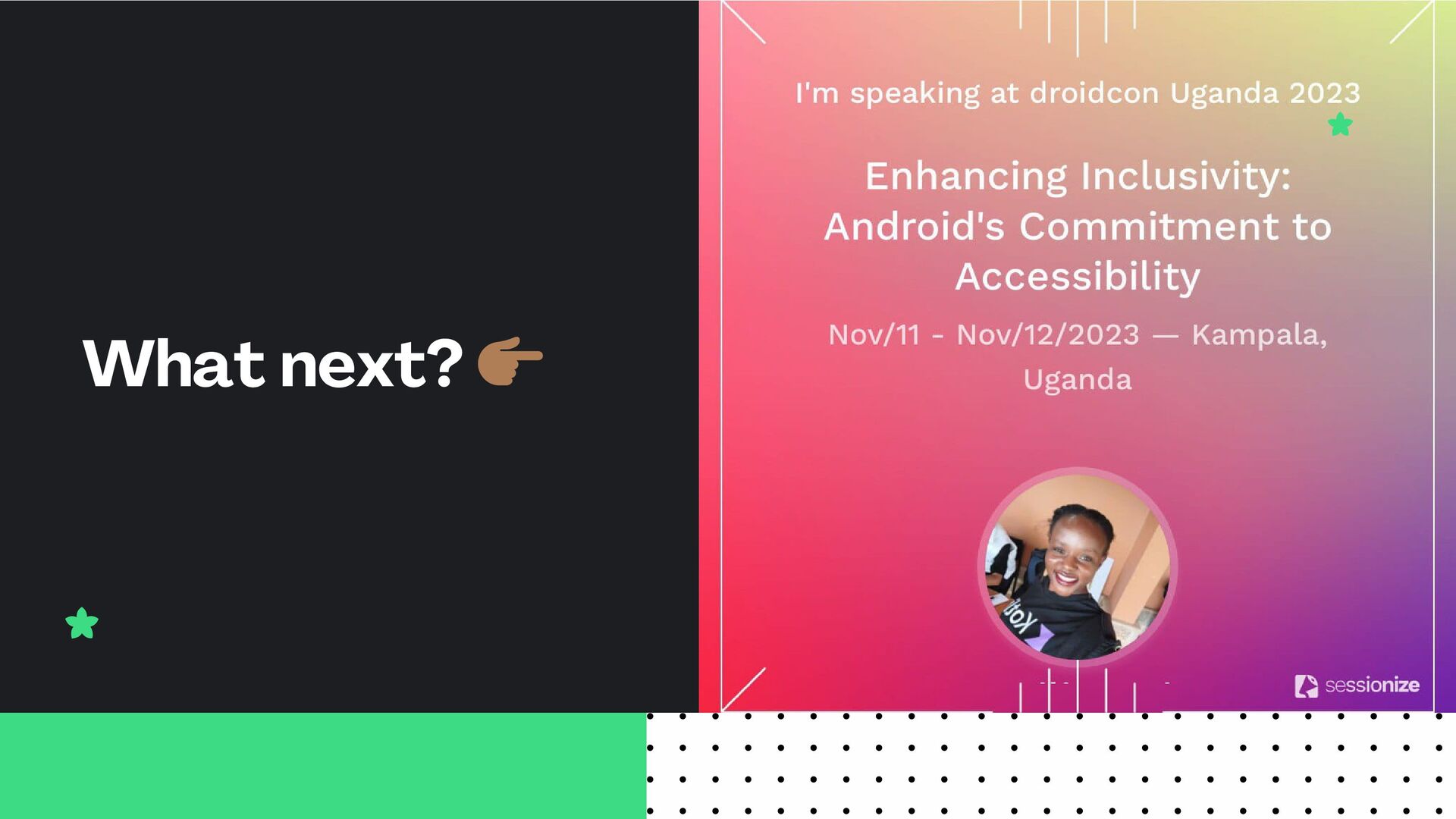
Embark on a journey of creativity and inclusivity in this Android talk, where we'll unravel the art of composing apps with accessibility as the centerpiece. Discover harmonious design principles and practical techniques that empower developers to create melodies of user experiences catering to a spectrum of abilities. We'll delve into real-world samples, equipping attendees to craft Android applications that resonate with everyone. Join us for an enriching discussion on making your app a symphony of accessibility.

Avatar for Jane Waitara

Jane Waitara

November 29, 2023
Tweet

Other Decks in Programming

Transcript

  1. According to the WHO, over a billion people worldwide have

    some degree of disability.This means that a digital product made without attention to accessibility could exclude this large segment of the population. 15 - 20%
  2. Accessibility in UX design refers to the practice of designing

    digital products, such as websites and mobile applications, that can be used by people with a wide range of abilities. Accessibility
  3. Any on-screen element that someone can click, touch, or otherwise

    interact with should be large enough for reliable interaction. You should make sure these elements have a width and height of at least 48dp. Touch Target Size
  4. Touch Target size: sizeIn Modifier If these controls are sized

    dynamically, or resize based on the size of their content, consider using the sizeIn modifier to set a lower bound on their dimensions.
  5. Clickable elements in your app by default don't provide any

    information on what clicking that element will do. Therefore, accessibility services like TalkBack will use a very generic default description. Click labels
  6. Click Labels: onClickLabel parameter We can provide a specific description

    that explains what will happen when the user clicks this element.
  7. Click Labels: semantics onClick modifier You can use the semantics

    modifier to set the click label on components which does not allow you to directly set the click label.
  8. Not every user of your app will be able to

    see or interpret visual elements that show in the app, like icons and illustrations. There's also no way for accessibility services to make sense of visual elements based on their pixels alone. This makes it necessary for you as a developer to pass more information on the visual elements in your app to the accessibility services. Visual elements description
  9. Visuals: contentDescription parameter Visual composables like Image and Icon include

    a parameter contentDescription. Here you pass a localized description of that visual element, or null if the element is purely decorative.
  10. When a screen contains a lot of text, like our

    article screen, it is quite hard for users with visual difficulties to quickly find the section they're looking for. To help with that, we can indicate which parts of the text are headings. Users can then navigate quickly through these different headings by swiping up or down. Heading
  11. Headings: Heading semantic parameter Visual composables like Image and Icon

    include a parameter contentDescription. Here you pass a localized description of that visual element, or null if the element is purely decorative.
  12. Custom Merging: mergeDescendants semantic parameter Visual composables like Image and

    Icon include a parameter contentDescription. Here you pass a localized description of that visual element, or null if the element is purely decorative.
  13. Toggleable Selection controls Talkback reads out Switches, Radio buttons and

    checkboxes checked state as they are selected. We can add context by making the whole Row(label and toggle) toggleable.