Upgrade to Pro — share decks privately, control downloads, hide ads and more …

Introducing the Android Design Support Library

Sponsored · Your Podcast. Everywhere. Effortlessly. Share. Educate. Inspire. Entertain. You do you. We'll handle the rest.

Introducing the Android Design Support Library

Slides of the talk "Introducing the
Android Design Support Library" I gave at GDG Milano.

Avatar for Riccardo Ciovati

Riccardo Ciovati

July 07, 2015
Tweet

More Decks by Riccardo Ciovati

Other Decks in Programming

Transcript

  1. Agenda ➔ Overview of the Android Design Support Library (~30m)

    ➔ Live Demo: Building a simple Material-style app with AppCompat and Design Support Library (~45m) ➔ Q&A - Discussion (~15m)
  2. What is the DSL? ➔ A set of components which

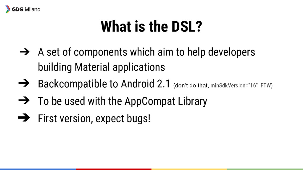
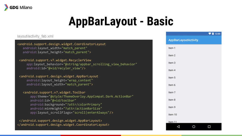
    aim to help developers building Material applications ➔ Backcompatible to Android 2.1 (don’t do that, minSdkVersion="16" FTW) ➔ To be used with the AppCompat Library ➔ First version, expect bugs!
  3. Getting Started It all begins with the Gradle dependency: dependencies

    { compile 'com.android.support:design:22.2.0' } build.gradle
  4. FloatingActionButton Floating action buttons are used for a promoted action.

    Guideline page: http://goo.gl/Pw9Twn ➔ Comes in two sizes: ◆ Default: 56dp ◆ Mini: 40dp ➔ Interface Button-like
  5. SnackBar Snackbars provide lightweight feedback about an operation by showing

    a brief message at the bottom of the screen. Snackbars can contain an action. Guideline page: http://goo.gl/QyMXXR Interface Toast-like
  6. TextInputLayout Widget for building Material text fields. Guideline page: http://goo.gl/wazbxZ

    ➔ Provides support for: ◆ Floating labels ◆ Display errors
  7. TextInputLayout layout/activity_text_input_layout.xml surnameInputLayout.setError("Can't be empty!"); <android.support.design.widget.TextInputLayout android:id="@+id/surname_input_layout" app:errorEnabled="true" android:layout_width="match_parent" android:layout_height="wrap_content">

    <EditText android:id="@+id/surname_edit_text" android:hint="@string/surname_hint" android:layout_width="match_parent" android:layout_height="wrap_content"/> </android.support.design.widget.TextInputLayout> TextInputLayoutActivity.java
  8. NavigationView Widget for implementing the Navigation Drawer pattern. Guideline page:

    http://goo.gl/sZZz3N ➔ To be used with DrawerLayout ➔ Handles items positioning and styling
  9. NavigationView <android.support.v4.widget.DrawerLayout xmlns:android="http://schemas.android.com/apk/res/android" xmlns:app="http://schemas.android.com/apk/res-auto" android:id="@+id/drawer_layout" android:layout_width="match_parent" android:layout_height="match_parent" android:fitsSystemWindows="true"> <!-- content

    --> <android.support.design.widget.NavigationView android:id="@+id/navigation_view" android:layout_width="wrap_content" android:layout_height="match_parent" android:layout_gravity="start" app:headerLayout="@layout/layout_navigation_view_header" app:menu="@menu/navigation_view_items"/> </android.support.v4.widget.DrawerLayout> layout/activity_navigation_view.xml
  10. NavigationView <android.support.v4.widget.DrawerLayout xmlns:android="http://schemas.android.com/apk/res/android" xmlns:app="http://schemas.android.com/apk/res-auto" android:id="@+id/drawer_layout" android:layout_width="match_parent" android:layout_height="match_parent" android:fitsSystemWindows="true"> <!-- content

    --> <android.support.design.widget.NavigationView android:id="@+id/navigation_view" android:layout_width="wrap_content" android:layout_height="match_parent" android:layout_gravity="start" app:headerLayout="@layout/layout_navigation_view_header" app:menu="@menu/navigation_view_items"/> </android.support.v4.widget.DrawerLayout> layout/activity_navigation_view.xml
  11. NavigationView <menu xmlns:android="http://schemas.android.com/apk/res/android"> <group android:checkableBehavior="single"> <item android:id="@+id/navigation_item_1" android:checked="true" android:icon="@drawable/ic_action_grade" android:title="@string/navigation_item_1"/>

    <item android:id="@+id/navigation_item_2" android:icon="@drawable/ic_action_grade" android:title="@string/navigation_item_2"/> </group> <item android:id="@+id/navigation_subheader" android:title="@string/navigation_subheader"> <menu> <item android:id="@+id/navigation_sub_item_1" android:icon="@drawable/ic_action_grade" android:title="@string/navigation_sub_item_1"/> <item android:id="@+id/navigation_sub_item_2" android:icon="@drawable/ic_action_grade" android:title="@string/navigation_sub_item_2"/> </menu> </item> </menu> menu/navigation_view_items.xml
  12. NavigationView public class NavigationViewActivity extends AppCompatActivity implements NavigationView.OnNavigationItemSelectedListener { @Override

    protected void onCreate(Bundle savedInstanceState) { super.onCreate(savedInstanceState); setContentView(R.layout.activity_navigation_view); //Setup NavigationView nv = (NavigationView) findViewById(R.id. navigation_view); nv.setNavigationItemSelectedListener(this); } @Override public boolean onNavigationItemSelected(MenuItem menuItem) { menuItem.setChecked(true); Toast.makeText(this, menuItem.getTitle(),Toast.LENGTH_SHORT).show(); return true; } } menu/navigation_view_items.xml
  13. TabLayout Helps you creating a Material tabs: Guideline page: http://goo.gl/Jpsqd4

    ➔ Play nicely with ViewPager ➔ Different type of tabs: ◆ Scrollable ◆ Fixed
  14. TabLayout <LinearLayout xmlns:android="http://schemas.android.com/apk/res/android" xmlns:app="http://schemas.android.com/apk/res-auto" android:layout_width="match_parent" android:layout_height="match_parent" android:orientation="vertical"> <android.support.design.widget.TabLayout android:id="@+id/tablayout" app:tabMode="scrollable"

    app:tabIndicatorColor="@android:color/white" android:background="?colorPrimary" android:layout_height="wrap_content" android:layout_width="match_parent"/> <android.support.v4.view.ViewPager android:id="@+id/viewpager" android:background="@color/light_grey" android:layout_height="0dp" android:layout_weight="1" android:layout_width="match_parent"/> </LinearLayout> layout/activity_tab_layout.xml
  15. TabLayout @Override protected void onCreate(Bundle savedInstanceState) { super.onCreate(savedInstanceState); setContentView(R.layout.activity_tab_layout); DummyAdapter

    adapter = new DummyAdapter (getSupportFragmentManager()); ViewPager viewPager = (ViewPager) findViewById(R.id.viewpager); viewPager.setAdapter(adapter); final Resources res = getResources(); int normalColor = res.getColor(R.color.dark_grey); int selectedColor = res.getColor(android.R.color.white); TabLayout tabLayout = (TabLayout) findViewById(R.id.tablayout); tabLayout.setTabTextColors(normalColor, selectedColor); tabLayout.setupWithViewPager(viewPager); } layout/activity_tab_layout.xml
  16. TabLayout @Override protected void onCreate(Bundle savedInstanceState) { super.onCreate(savedInstanceState); setContentView(R.layout.activity_tab_layout); DummyAdapter

    adapter = new DummyAdapter (getSupportFragmentManager()); ViewPager viewPager = (ViewPager) findViewById(R.id.viewpager); viewPager.setAdapter(adapter); final Resources res = getResources(); int normalColor = res.getColor(R.color.dark_grey); int selectedColor = res.getColor(android.R.color.white); TabLayout tabLayout = (TabLayout) findViewById(R.id.tablayout); tabLayout.setTabTextColors(normalColor, selectedColor); tabLayout.setupWithViewPager(viewPager); } layout/activity_tab_layout.xml
  17. CoordinatorLayout “CoordinatorLayout is a super-powered FrameLayout.” ➔ Coordinate the interaction

    between CoordinatorLayout’s children by using/defining Behaviours ➔ Anchor views to other CoordinatorLayout’s children
  18. CoordinatorLayout.Behaviour ➔ Define which views a view depends on and

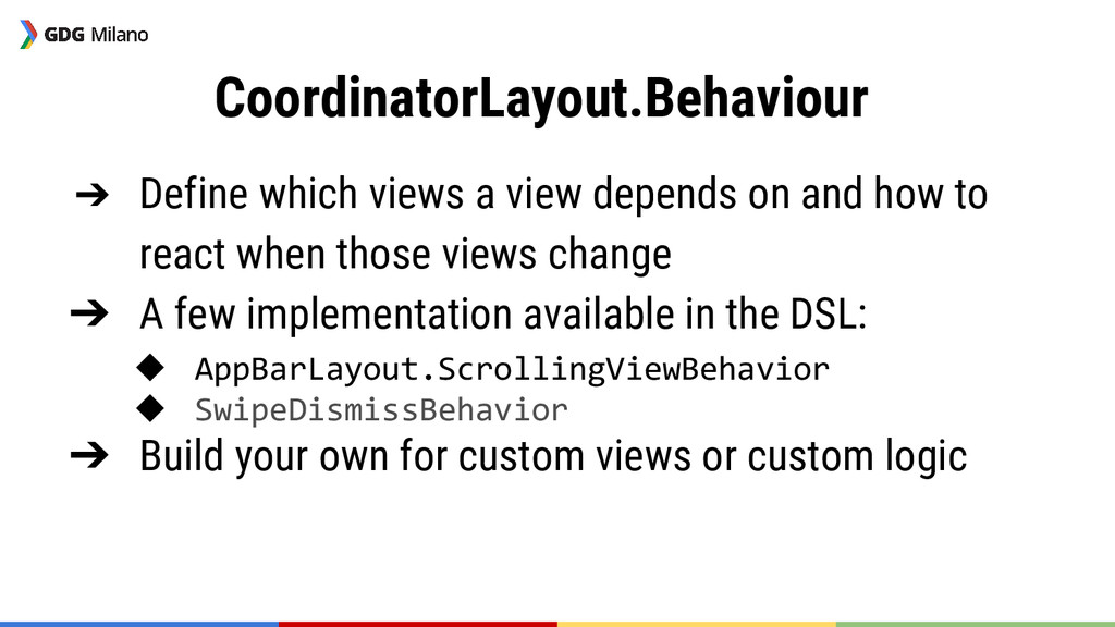
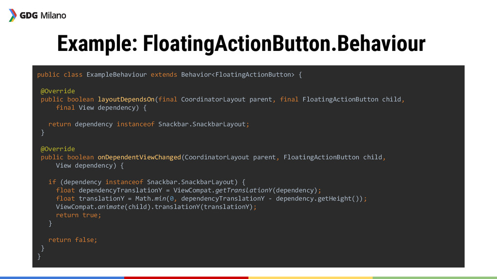
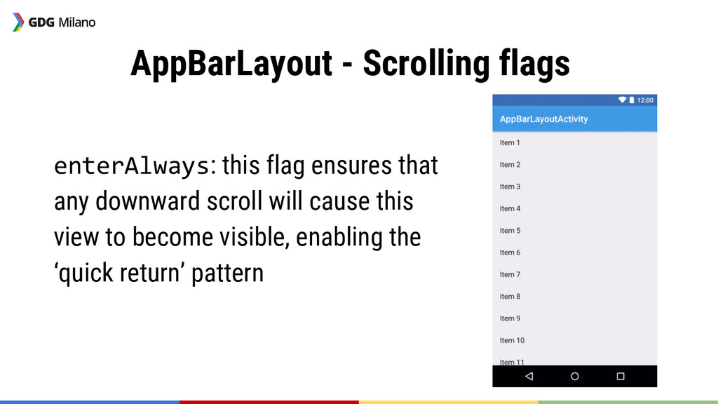
    how to react when those views change ➔ A few implementation available in the DSL: ◆ AppBarLayout.ScrollingViewBehavior ◆ SwipeDismissBehavior ➔ Build your own for custom views or custom logic
  19. Example: FloatingActionButton.Behaviour Goal: Translate the FAB so that it won’t

    be covered by the SnackBar. ➔ This is actually already implemented but it’s a nice example to understand the mechanism.
  20. Example: FloatingActionButton.Behaviour public class ExampleBehaviour extends Behavior<FloatingActionButton> { @Override public

    boolean layoutDependsOn(final CoordinatorLayout parent, final FloatingActionButton child, final View dependency) { return dependency instanceof Snackbar.SnackbarLayout; } @Override public boolean onDependentViewChanged(CoordinatorLayout parent, FloatingActionButton child, View dependency) { if (dependency instanceof Snackbar.SnackbarLayout) { float dependencyTranslationY = ViewCompat.getTranslationY(dependency); float translationY = Math.min(0, dependencyTranslationY - dependency.getHeight()); ViewCompat.animate(child).translationY(translationY); return true; } return false; } }
  21. Example: FloatingActionButton.Behaviour public class ExampleBehaviour extends Behavior<FloatingActionButton> { @Override public

    boolean layoutDependsOn(final CoordinatorLayout parent, final FloatingActionButton child, final View dependency) { return dependency instanceof Snackbar.SnackbarLayout; } @Override public boolean onDependentViewChanged(CoordinatorLayout parent, FloatingActionButton child, View dependency) { if (dependency instanceof Snackbar.SnackbarLayout) { float dependencyTranslationY = ViewCompat.getTranslationY(dependency); float translationY = Math.min(0, dependencyTranslationY - dependency.getHeight()); ViewCompat.animate(child).translationY(translationY); return true; } return false; } }
  22. Example: FloatingActionButton.Behaviour How do I use my own defined behaviour?

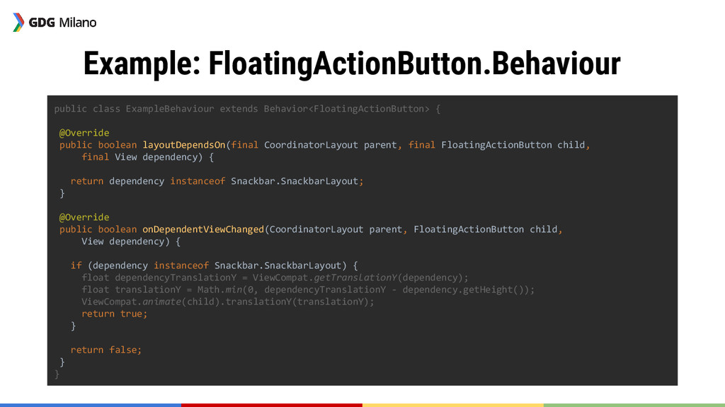
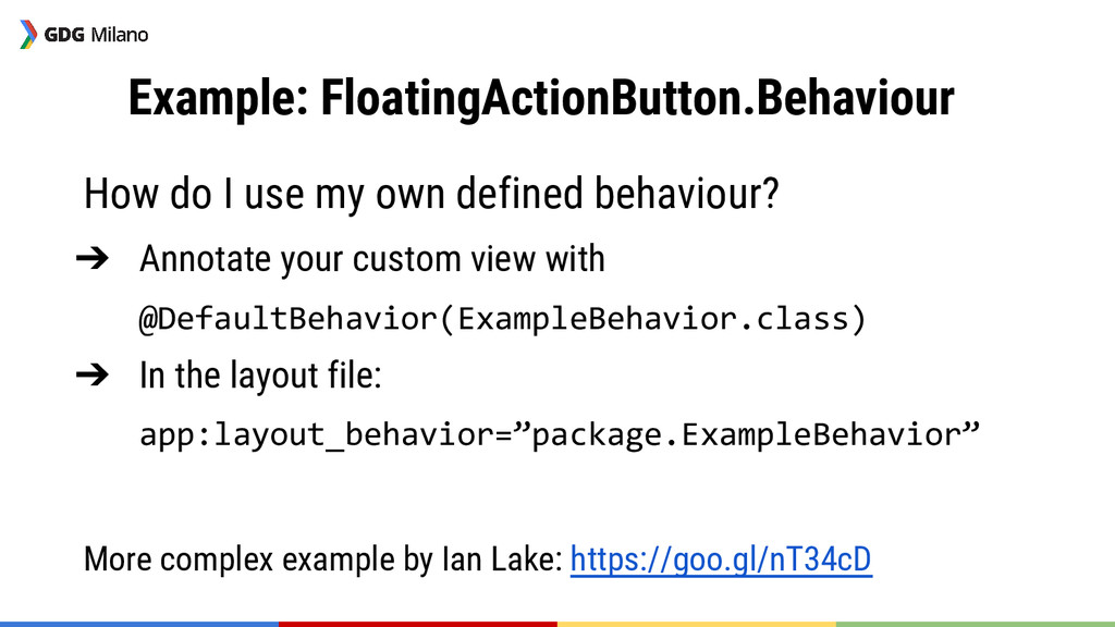
    ➔ Annotate your custom view with @DefaultBehavior(ExampleBehavior.class) ➔ In the layout file: app:layout_behavior=”package.ExampleBehavior” More complex example by Ian Lake: https://goo.gl/nT34cD
  23. Anchoring <android.support.design.widget.CoordinatorLayout android:layout_width="match_parent" android:layout_height="match_parent"> <LinearLayout android:layout_width="match_parent" android:layout_height="match_parent" android:orientation="vertical"> <View android:id="@+id/top"/>

    <View android:id="@+id/bottom"/> </LinearLayout> <android.support.design.widget.FloatingActionButton app:layout_anchor="@id/top" app:layout_anchorGravity="bottom|end"/> </android.support.design.widget.CoordinatorLayout> layout/activity_fab.xml
  24. AppBarLayout Helps you implementing various scrolling techniques, as shown in

    the guideline: http://goo.gl/JzqUbo Scrolling widgets must implement the NestedScrollingChild interface: ➔ RecyclerView ➔ NestedScrollView
  25. AppBarLayout - Basic <android.support.design.widget.CoordinatorLayout android:layout_width="match_parent" android:layout_height="match_parent"> <android.support.v7.widget.RecyclerView app:layout_behavior="@string/appbar_scrolling_view_behavior" android:id="@+id/recyler_view"/> <android.support.design.widget.AppBarLayout

    android:layout_height="wrap_content" android:layout_width="match_parent"> <android.support.v7.widget.Toolbar app:theme="@style/ThemeOverlay.AppCompat.Dark.ActionBar" android:id="@+id/toolbar" android:background="?attr/colorPrimary" android:minHeight="?attr/actionBarSize" app:layout_scrollFlags="scroll|enterAlways"/> </android.support.design.widget.AppBarLayout> </android.support.design.widget.CoordinatorLayout> layout/activity_fab.xml
  26. AppBarLayout - Scrolling flags enterAlways: this flag ensures that any

    downward scroll will cause this view to become visible, enabling the ‘quick return’ pattern
  27. AppBarLayout - Scrolling flags enterAlwaysCollapsed: When your view has declared

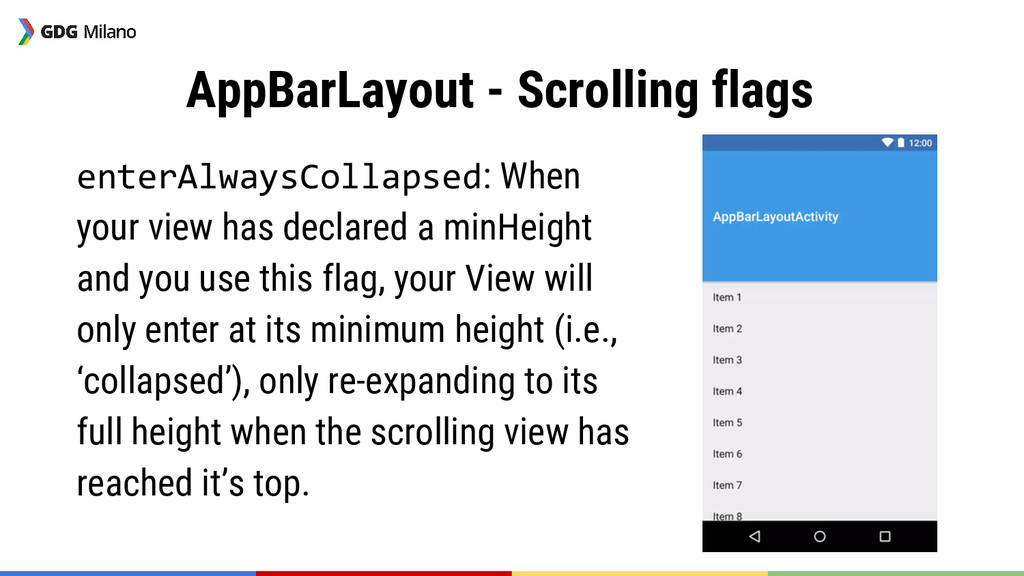
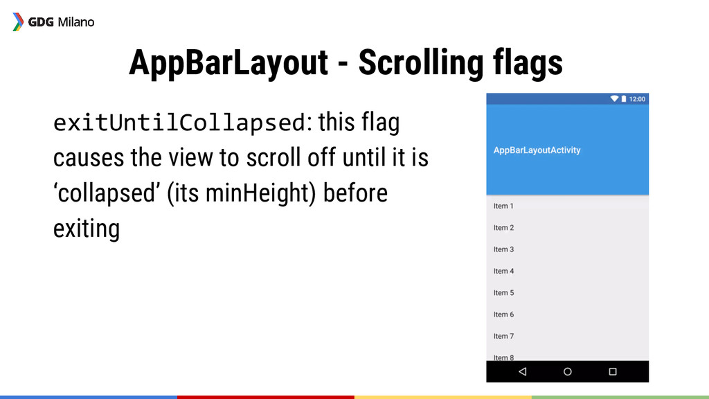
    a minHeight and you use this flag, your View will only enter at its minimum height (i.e., ‘collapsed’), only re-expanding to its full height when the scrolling view has reached it’s top.
  28. AppBarLayout - Scrolling flags exitUntilCollapsed: this flag causes the view

    to scroll off until it is ‘collapsed’ (its minHeight) before exiting
  29. References & Links ➔ Android Developers blog: http://goo.gl/g0ZoSA ➔ “Exploring

    the new Android Design Support Library”: https://goo. gl/R4KsSL ➔ Serie by Styling Android: http://goo.gl/6pZOMA ➔ Serie by Antonio Leiva: http://goo.gl/RCGylx ➔ “Introduction to CoordinatorLayout”: https://goo.gl/TuJJ1z ➔ “androiddesignsupport” StackOverflow tag