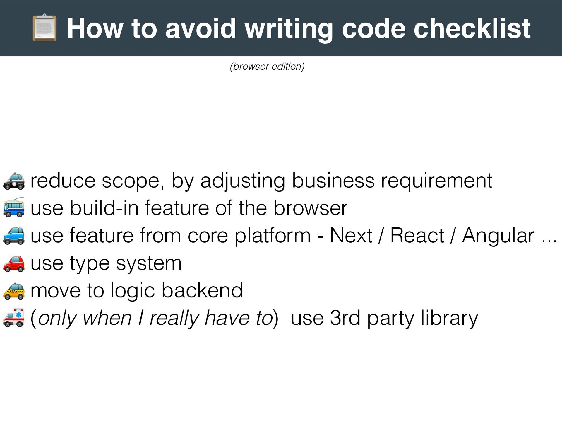
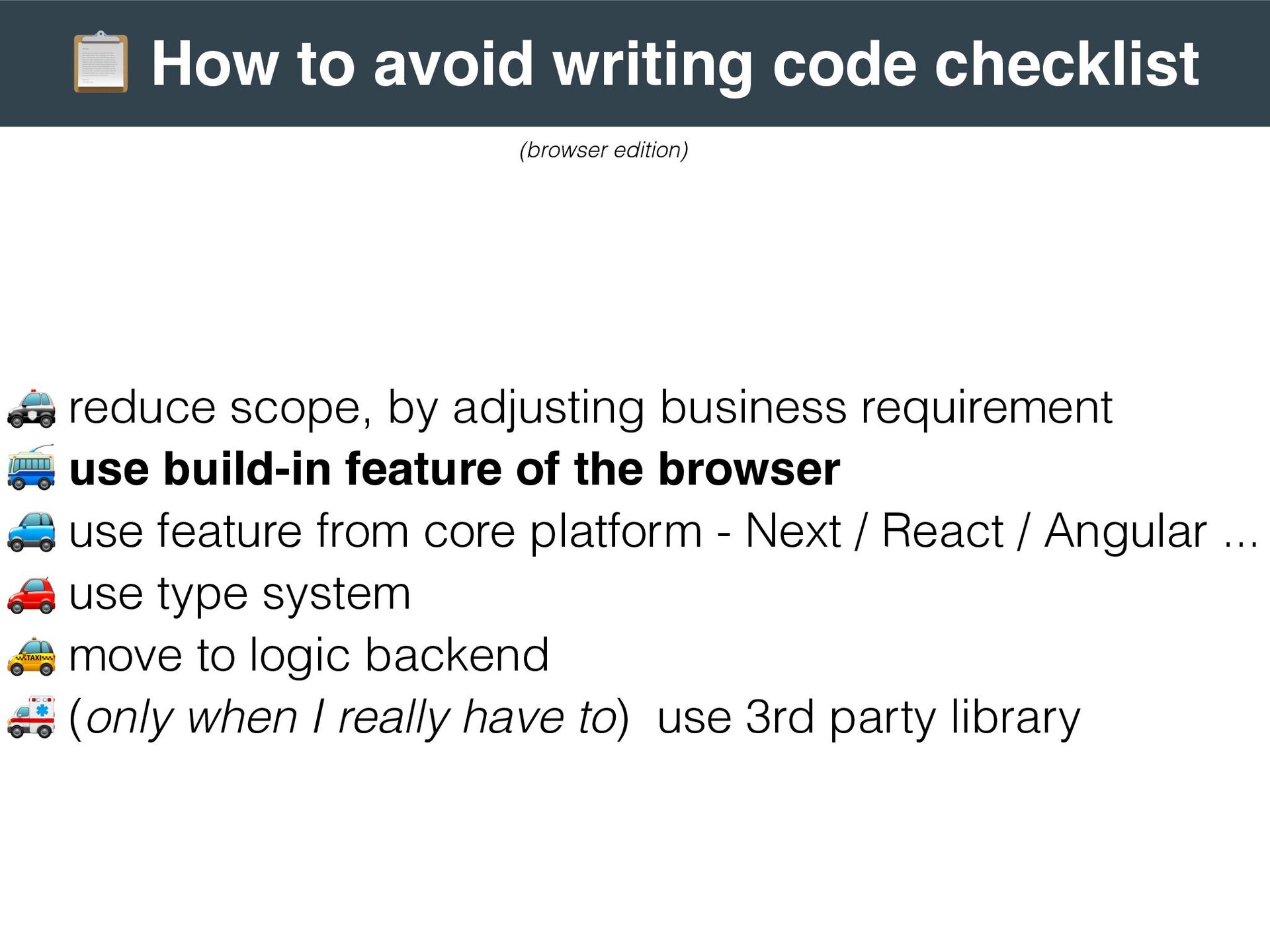
by adjusting business requirement . use build-in feature of the browser / use feature from core platform - Next / React / Angular ... 0 use type system 1 move to logic backend 2 (only when I really have to) use 3rd party library (browser edition)
by adjusting business requirement . use build-in feature of the browser / use feature from core platform - Next / React / Angular ... 0 use type system 1 move to logic backend 2 (only when I really have to) use 3rd party library (browser edition)
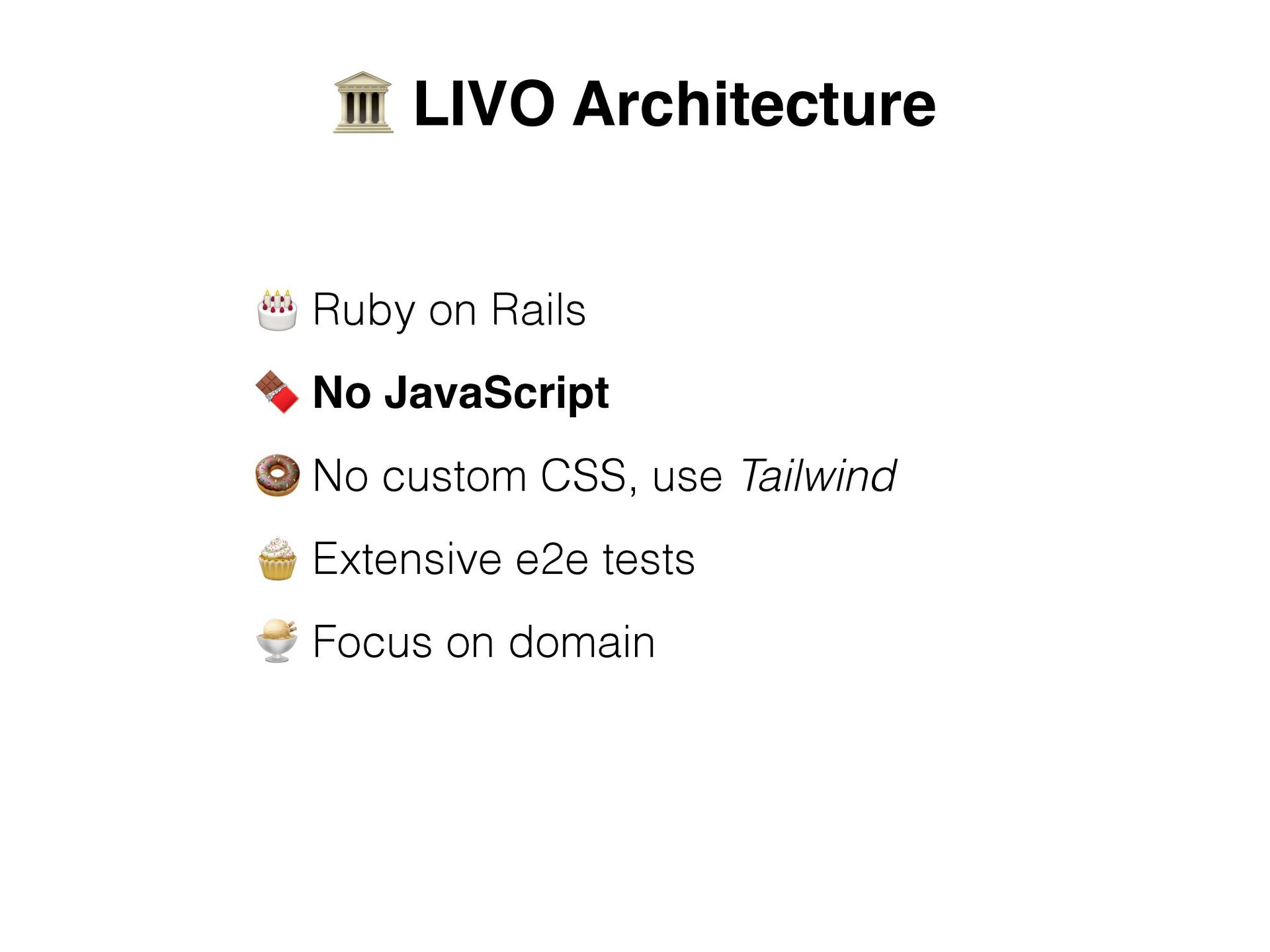
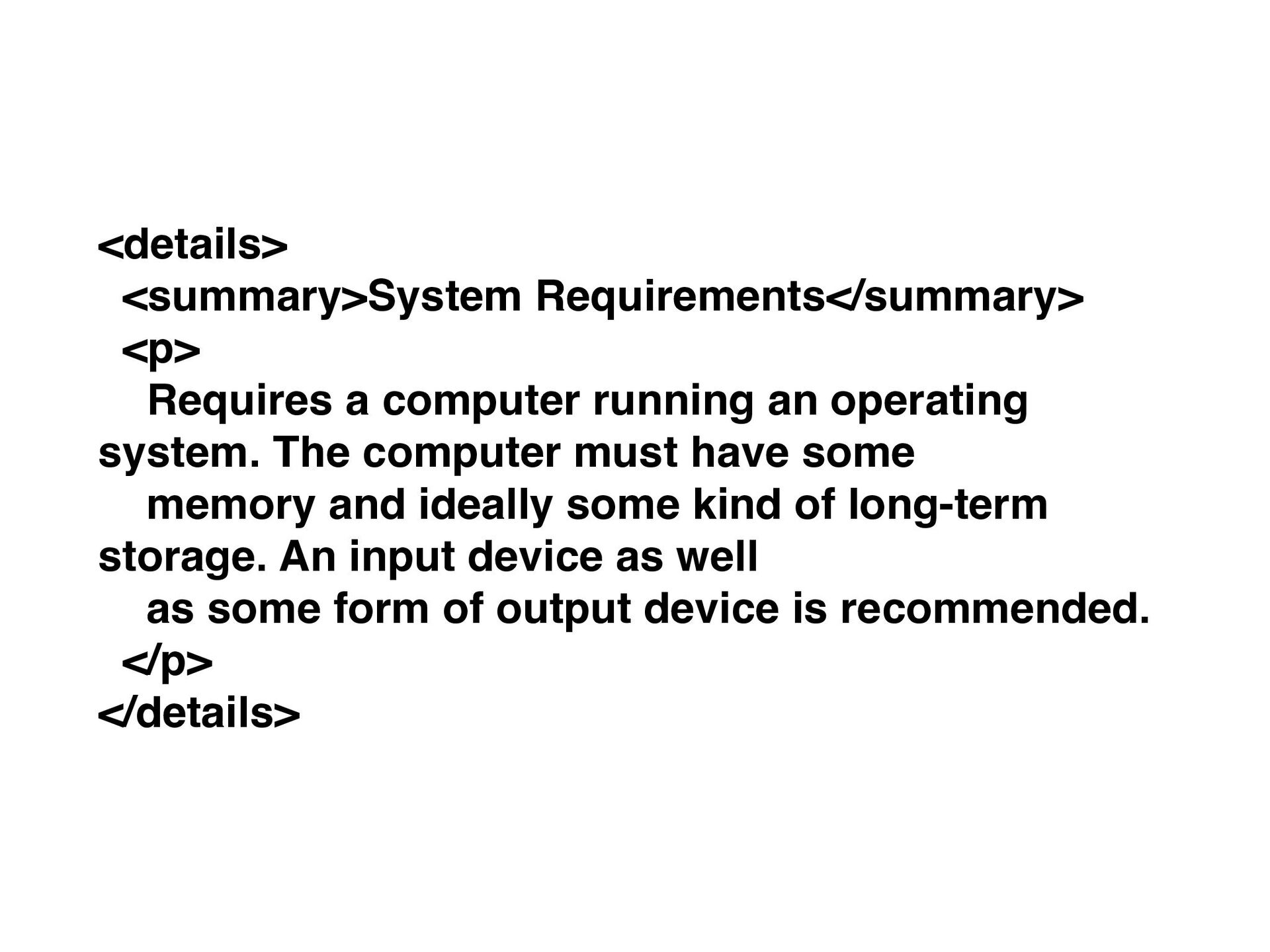
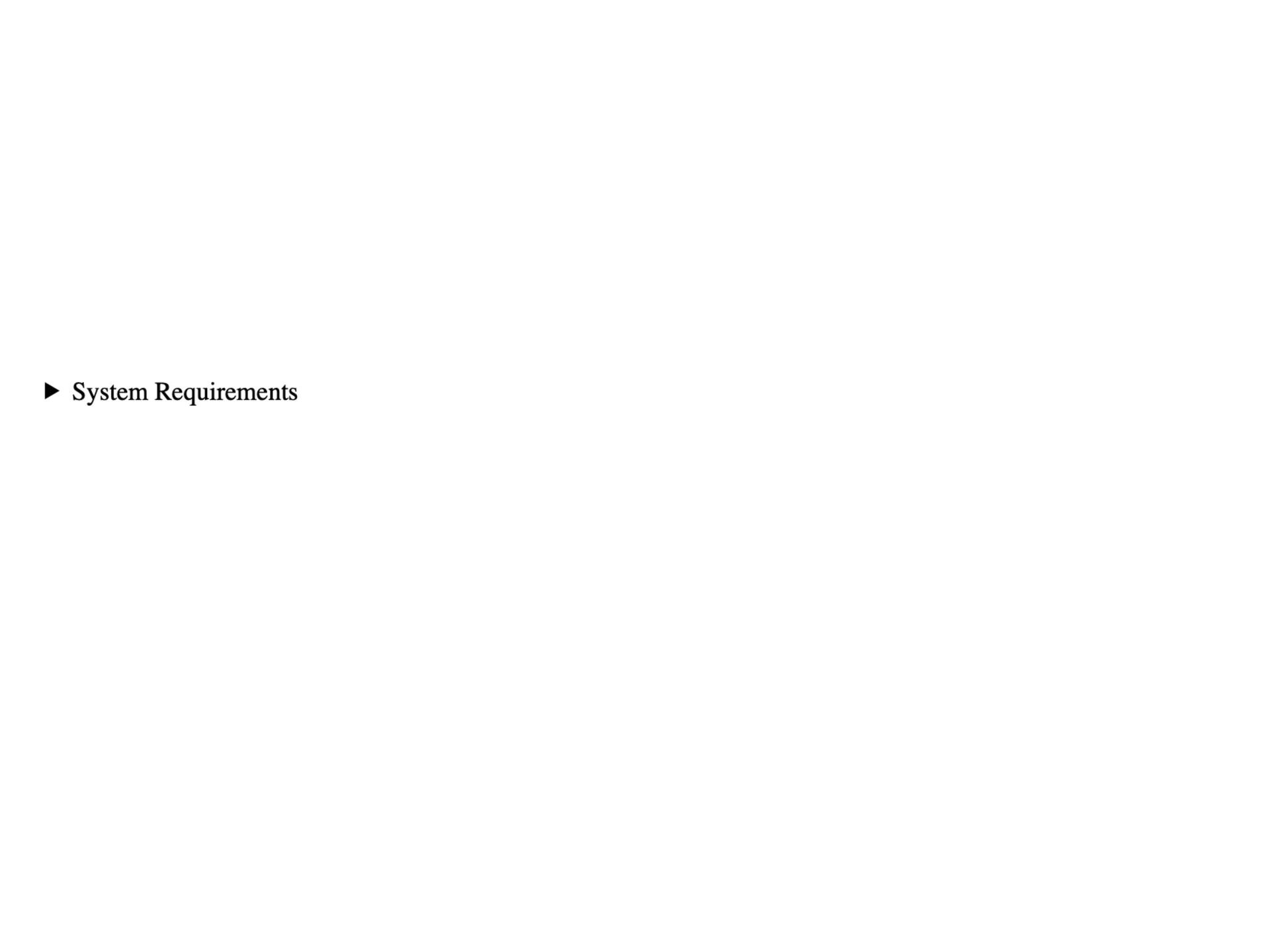
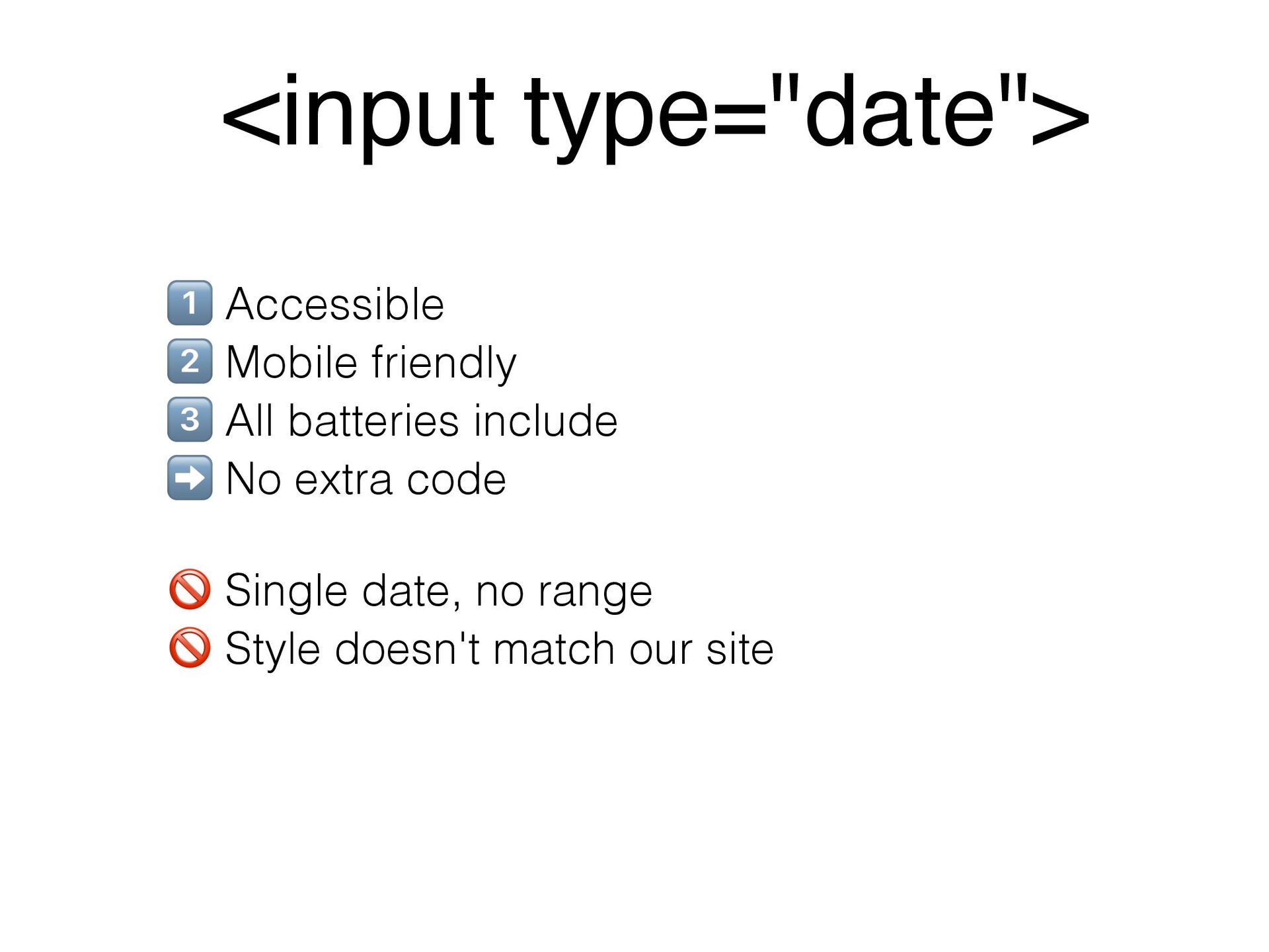
system. The computer must have some memory and ideally some kind of long-term storage. An input device as well as some form of output device is recommended. </p> </details>
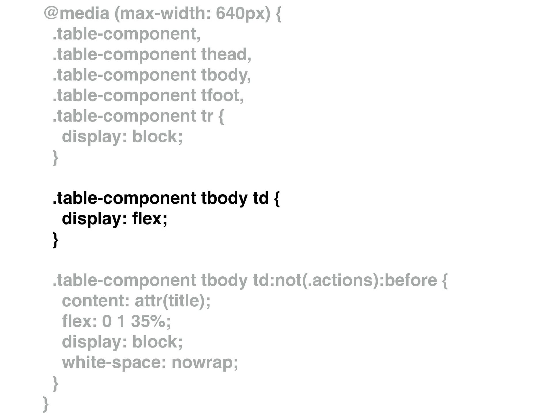
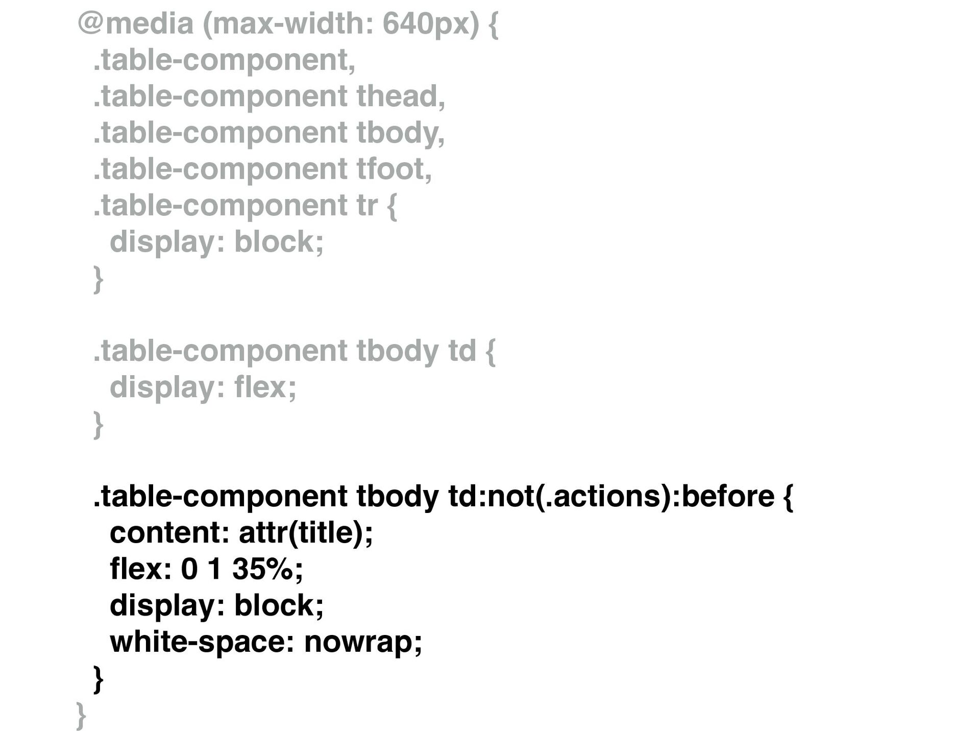
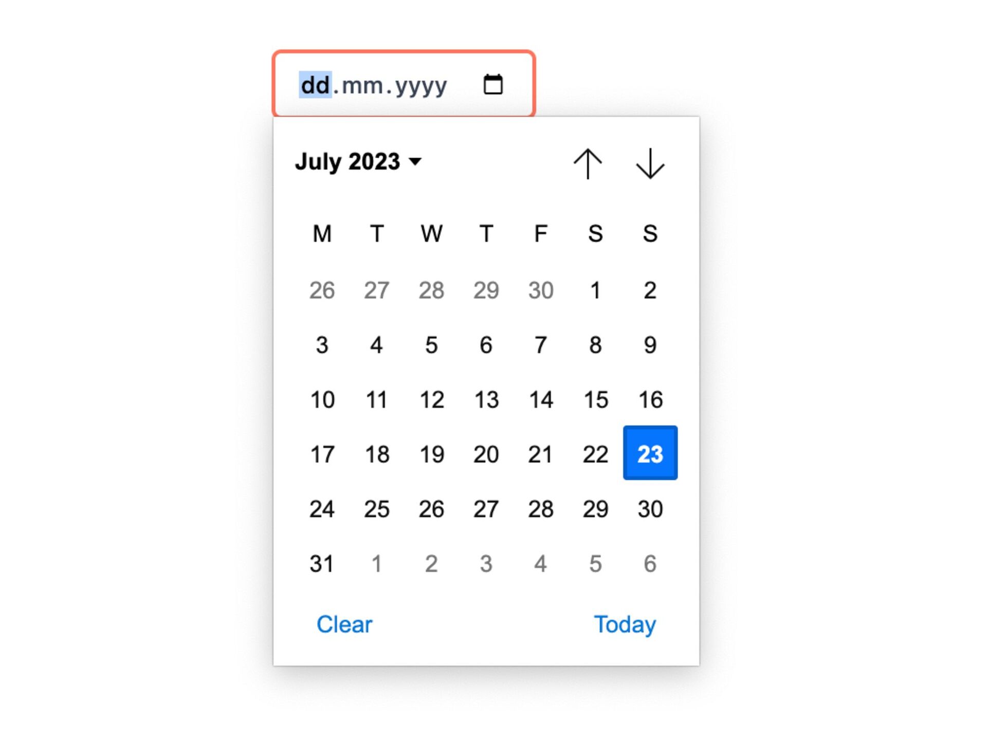
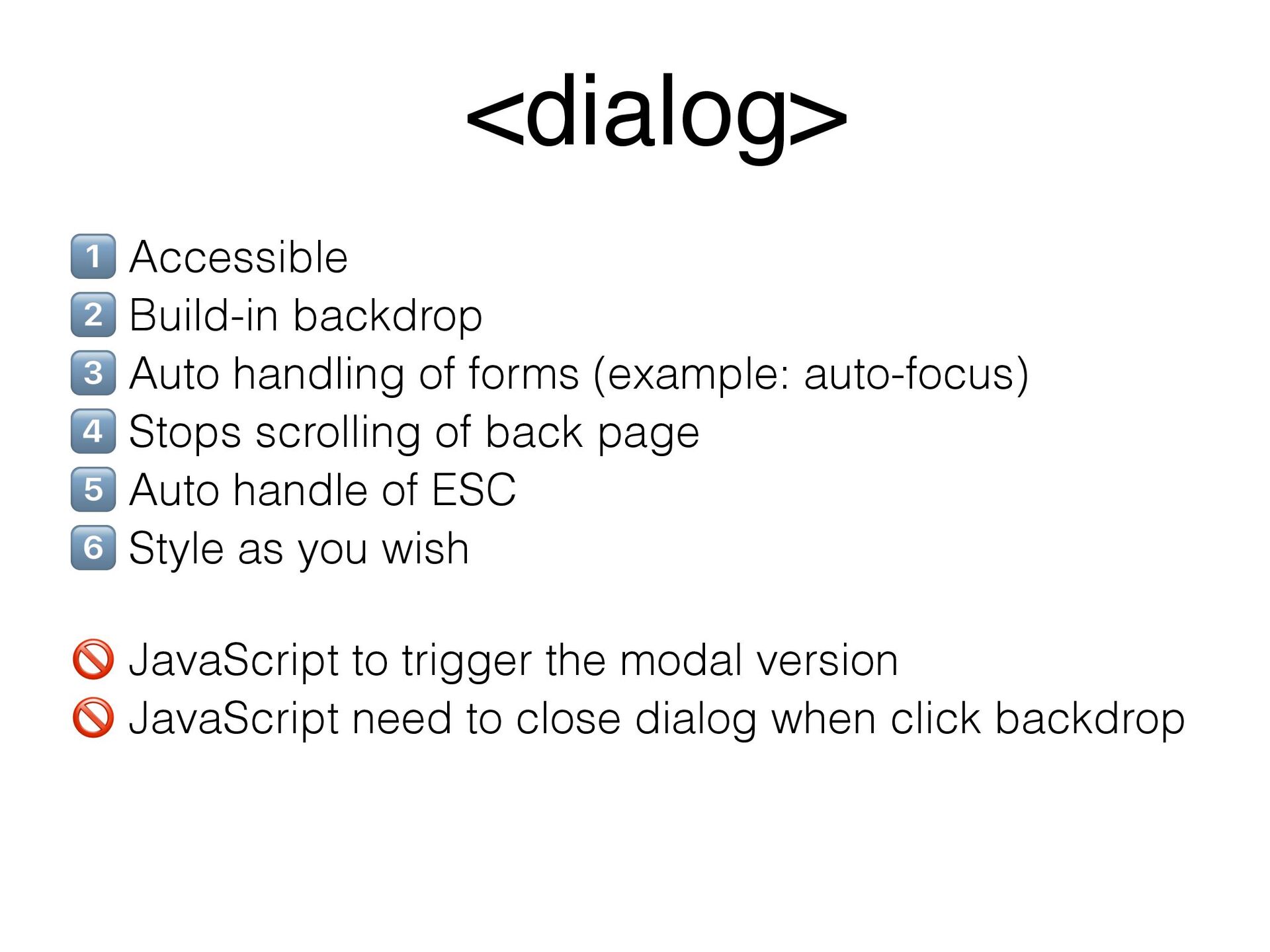
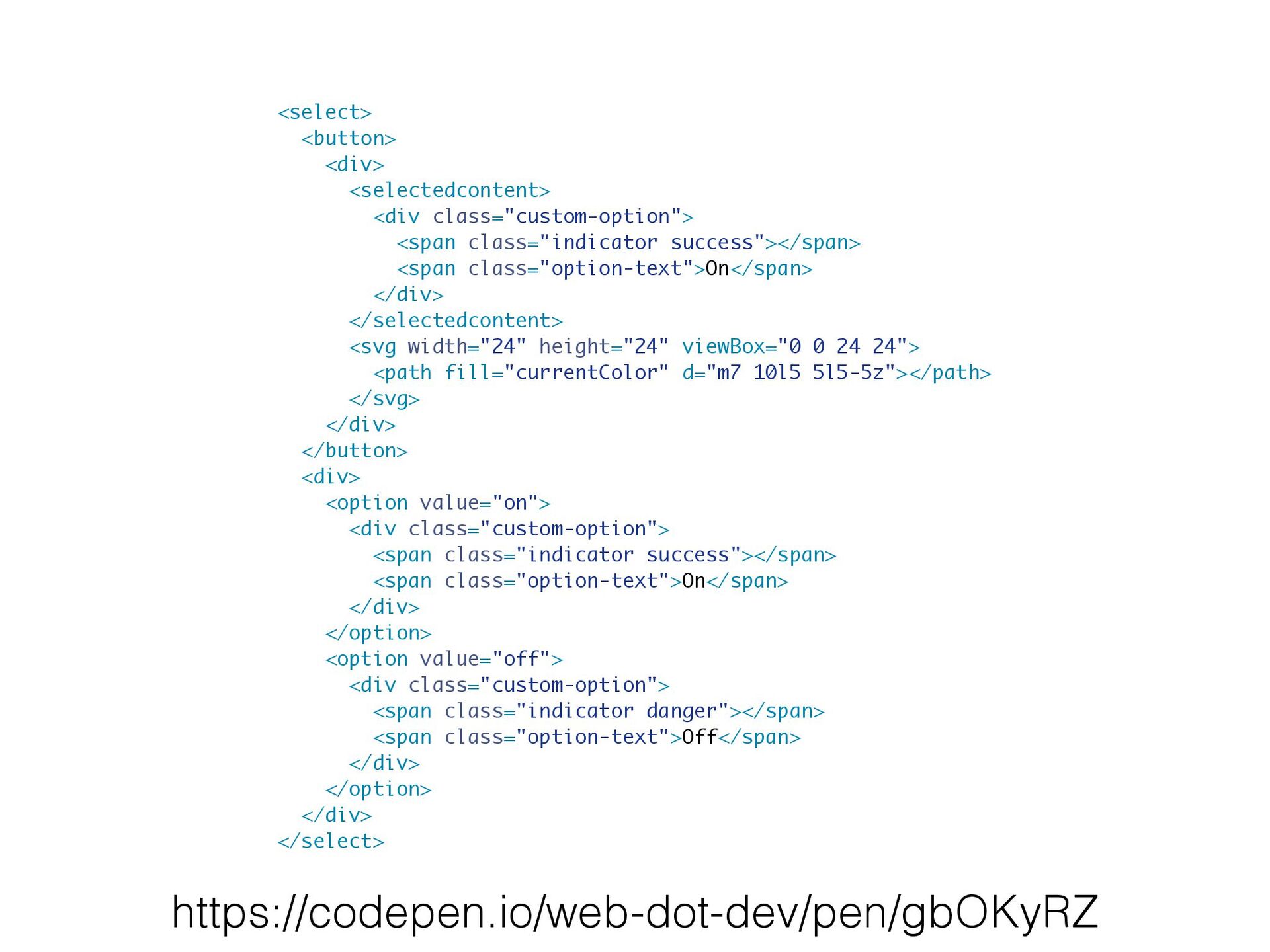
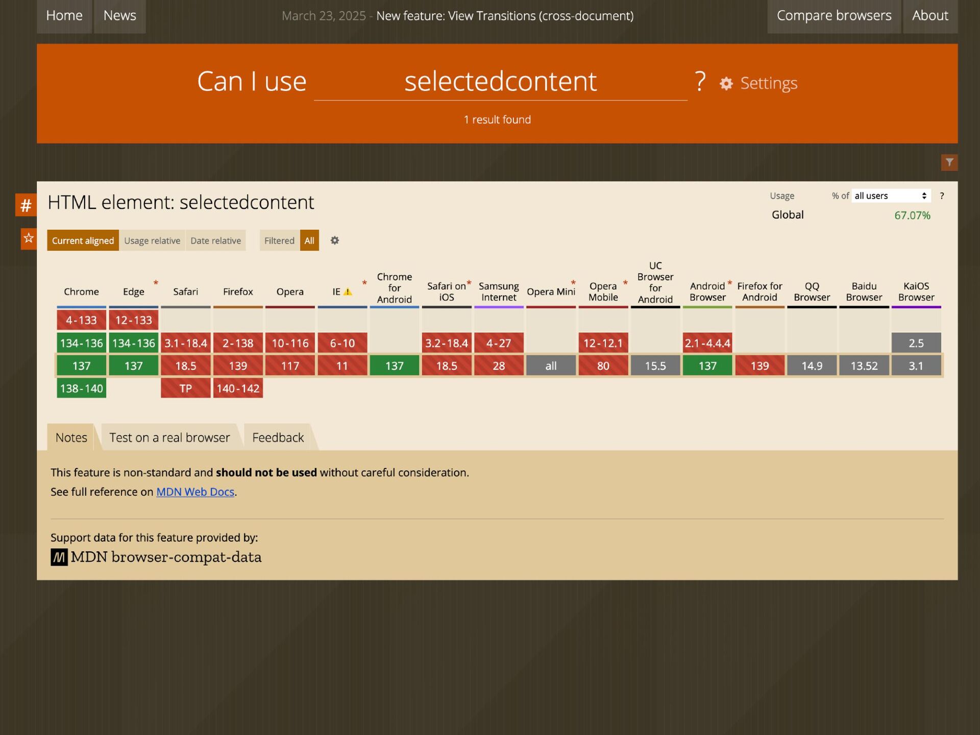
(example: auto-focus) 8 Stops scrolling of back page 9 Auto handle of ESC : Style as you wish 7 JavaScript to trigger the modal version 7 JavaScript need to close dialog when click backdrop <dialog>
 rstankov
 colly
colly
 kneath
 tmiket
 addyosmani
 kimpetersen
 jonrohan
 schlessera
 letsgokoyo
 jct
jct
 paigeccino
 cassininazir
 bkeepers
![function MyButton() { const [isHovered, setIsHovered] = useState(false); const className](https://files.speakerdeck.com/presentations/945780e845eb40ef9d116a9cd329c867/slide_27.jpg)
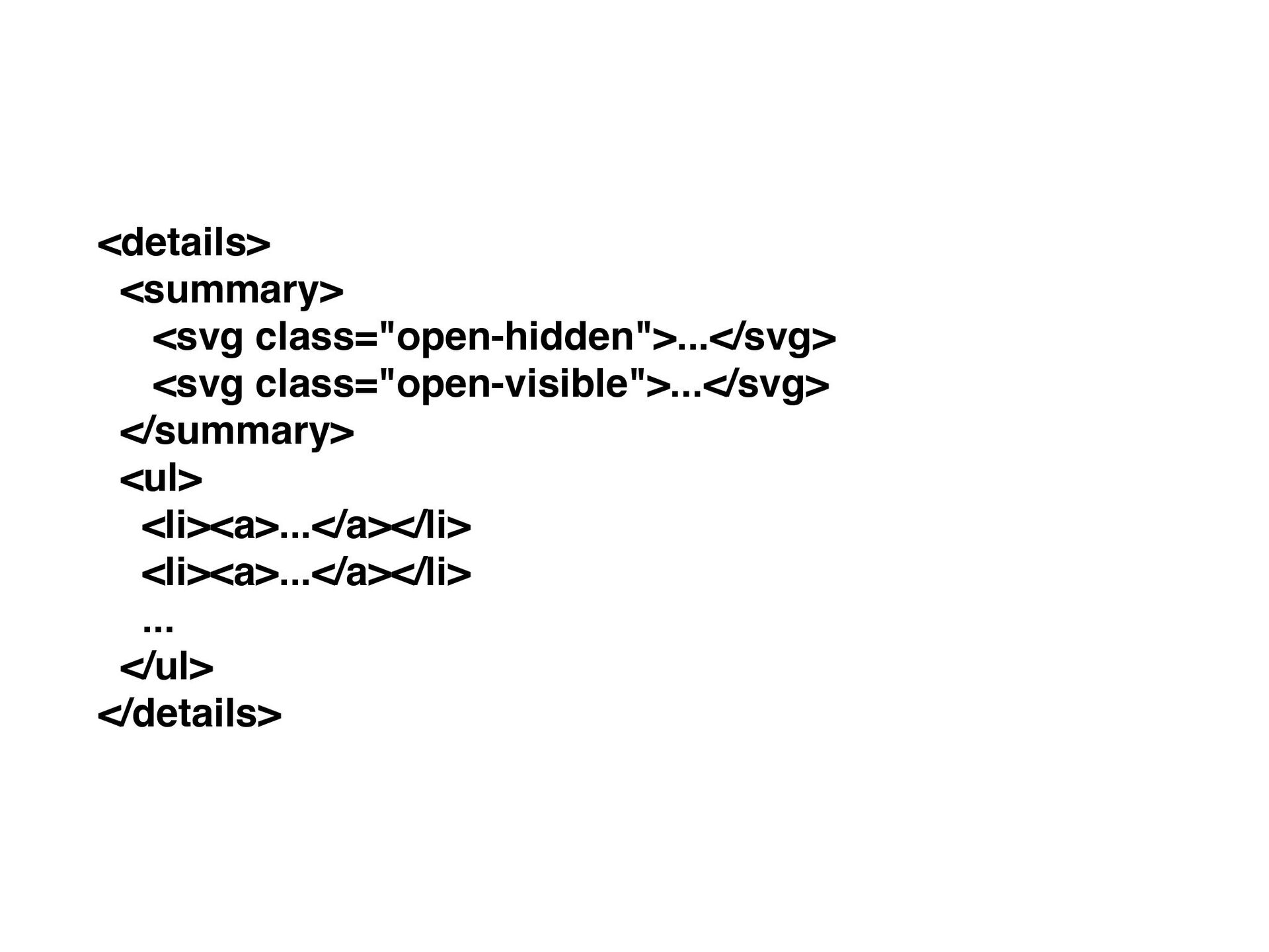
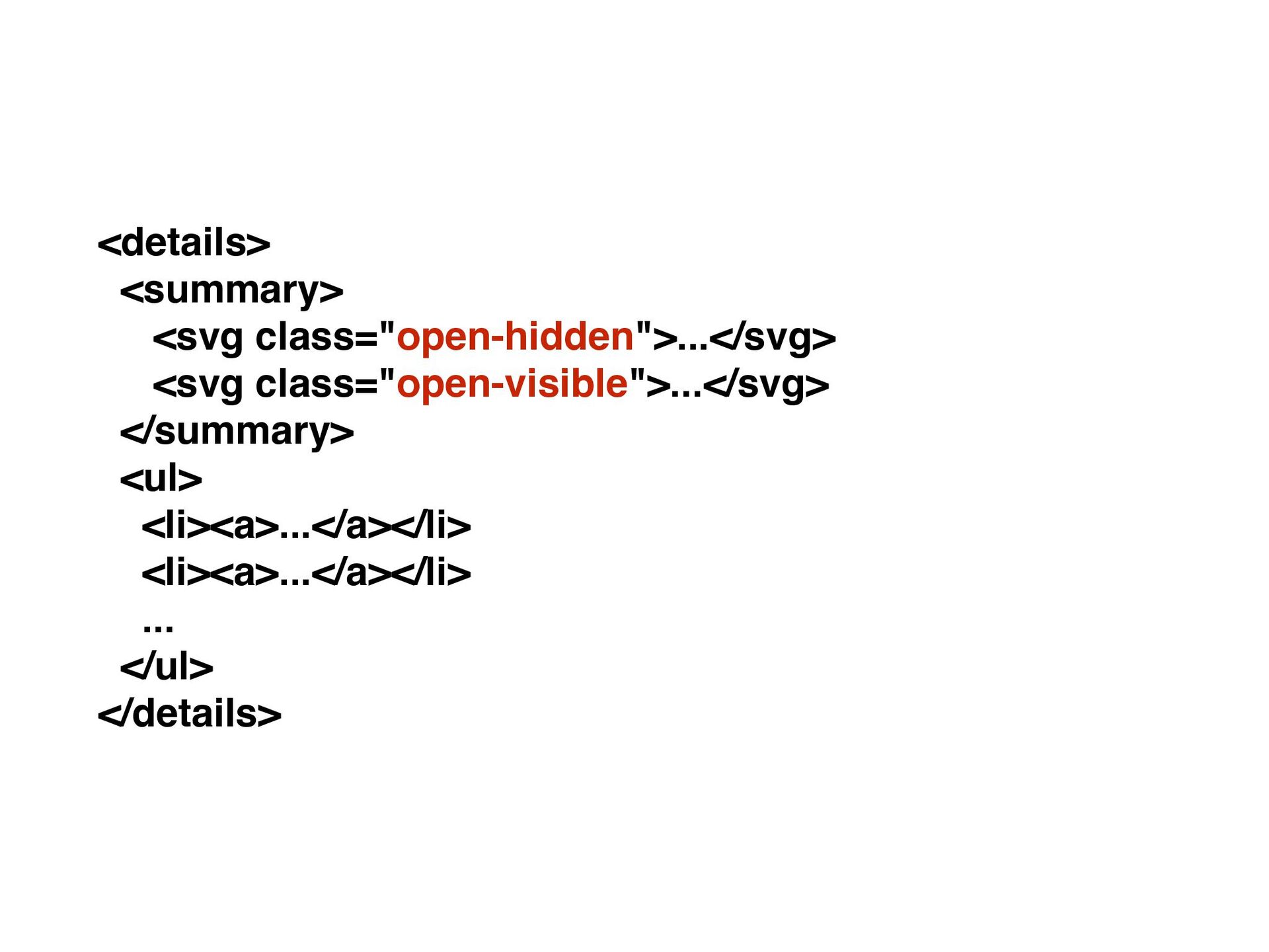
![details[open] .open-hidden { display: none; } details:not([open]) .open-visible { display:](https://files.speakerdeck.com/presentations/945780e845eb40ef9d116a9cd329c867/slide_45.jpg)
![import { setEventListners } from './utils'; setEventListners(document, { '[data-dialog]:click': (e)](https://files.speakerdeck.com/presentations/945780e845eb40ef9d116a9cd329c867/slide_65.jpg)
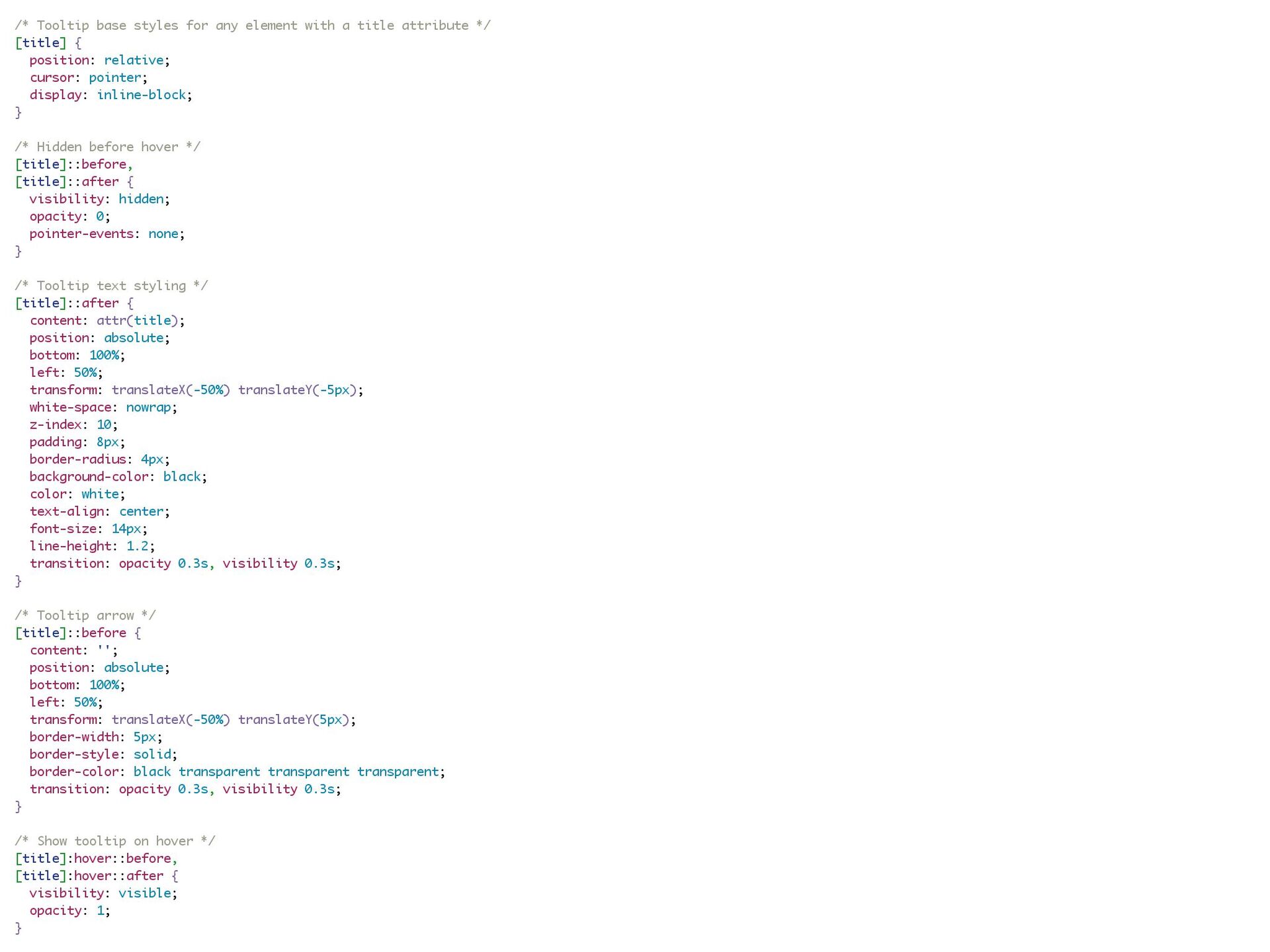
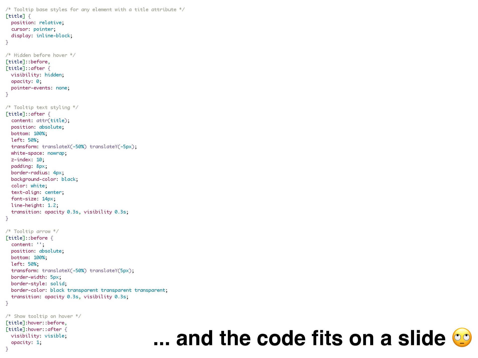
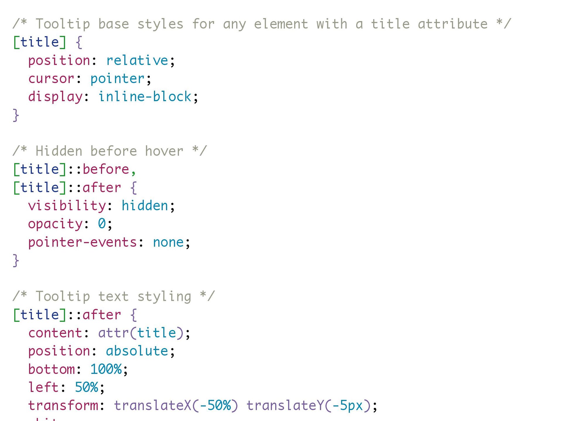
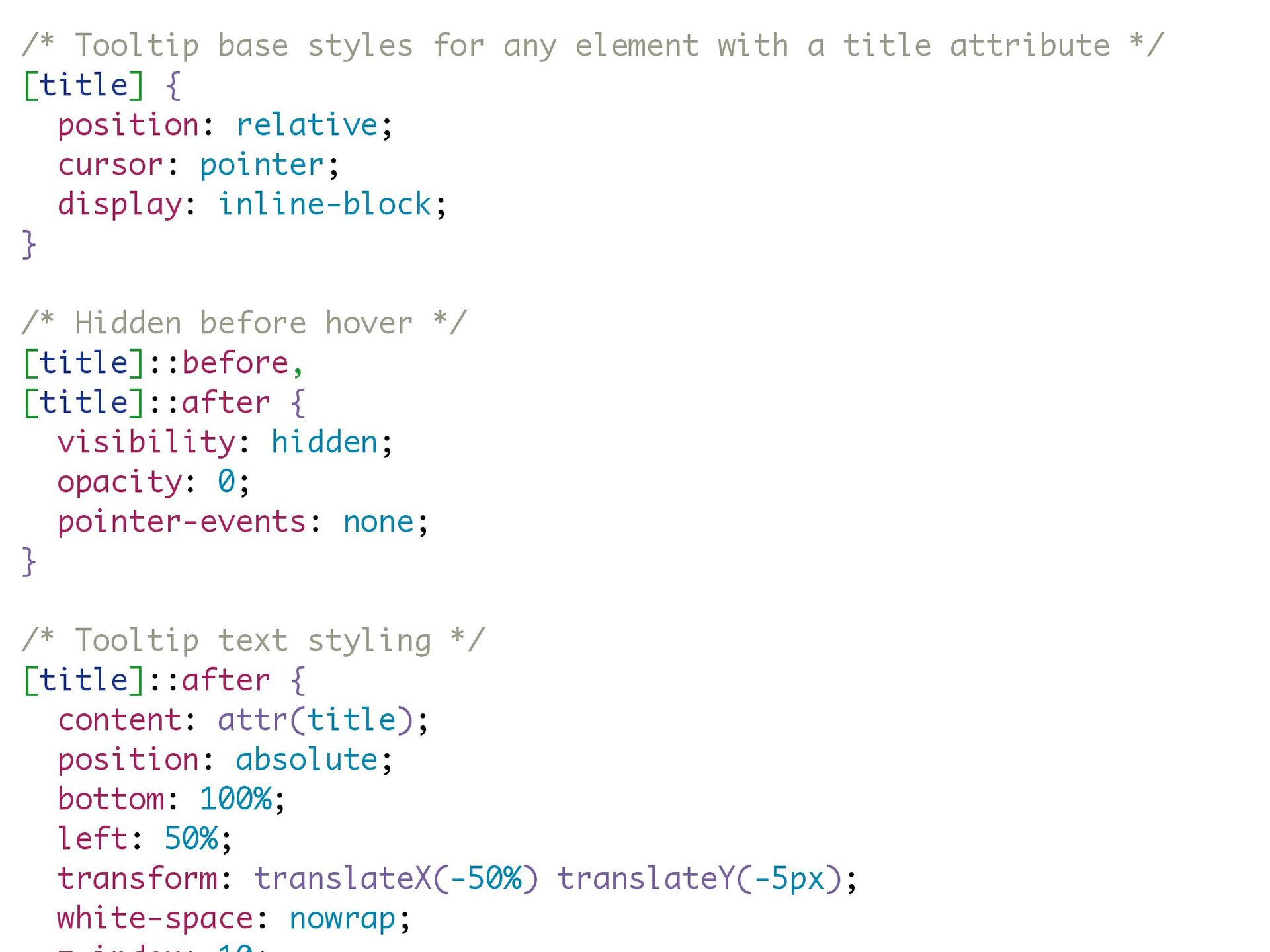
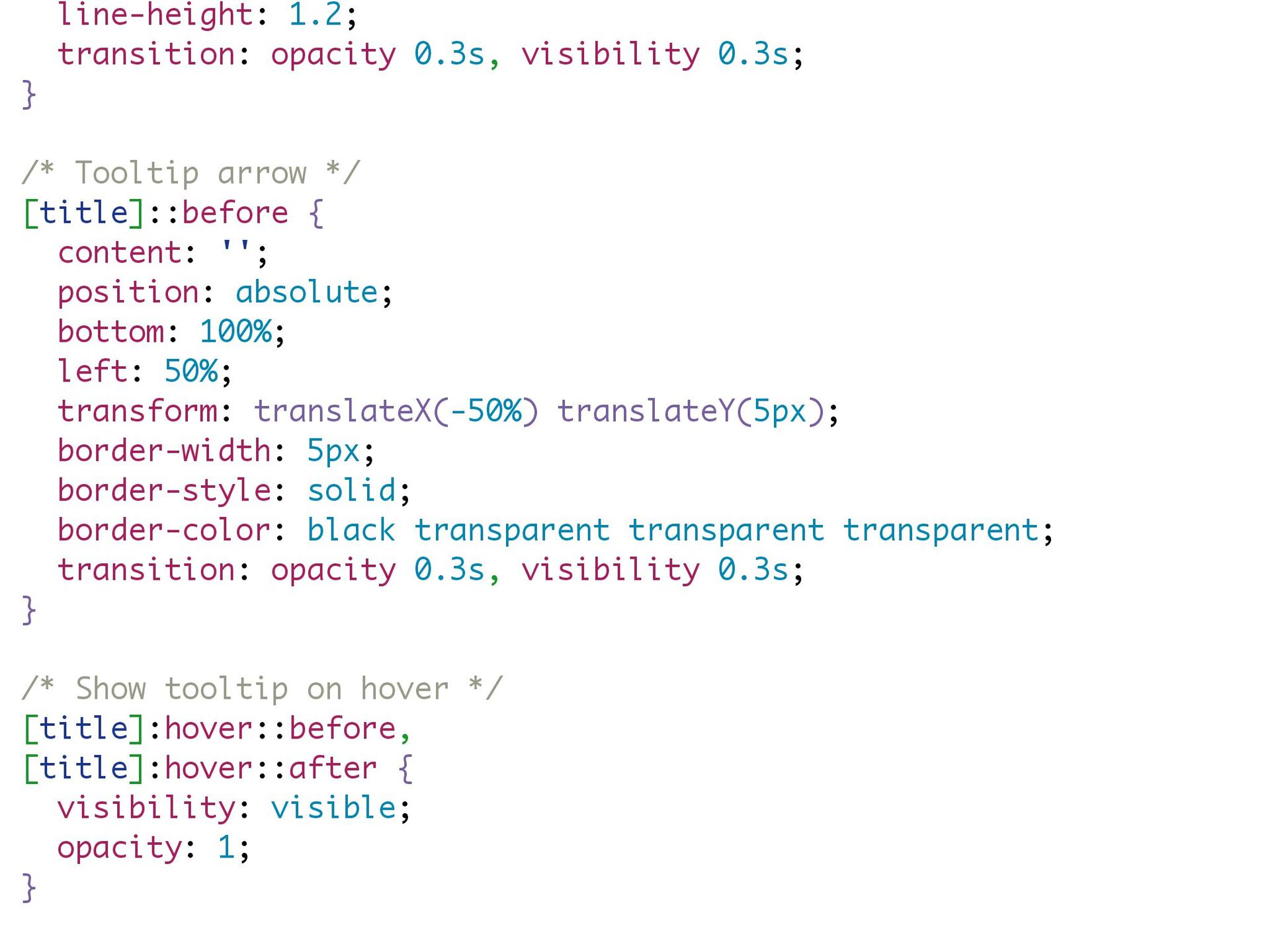
![pointer-events: none; } /* Tooltip text styling */ [title]::after {](https://files.speakerdeck.com/presentations/945780e845eb40ef9d116a9cd329c867/slide_78.jpg)