Upgrade to Pro
— share decks privately, control downloads, hide ads and more …
Speaker Deck
Features
Speaker Deck
PRO
Sign in
Sign up for free
Search
Search
Responsive Web Design
Search
Sayanee
May 15, 2012
Technology
310
3
Share
Embed
Copy iframe code
Copy JS code
Copy link
Start on current slide
Responsive Web Design
Sayanee
May 15, 2012
More Decks by Sayanee
See All by Sayanee
Podcasting with Jekyll
sayanee
1
1k
Rails API
sayanee
5
570
Learning with Open Source
sayanee
3
320
ECMAScript 6 - part 1
sayanee
3
430
ECMAScript 6 - part 2
sayanee
1
300
Minimalist Designer behind the curious Developer
sayanee
8
450
Responsive Web Design for Beginners
sayanee
9
990
Travel to Balkans + Hungary
sayanee
2
240
Styling with SASS
sayanee
9
650
Other Decks in Technology
See All in Technology
【Claude Code】鹿野さんに聞く 私の推しの並行開発環境 大公開 / claude-code-parallel-2026-07-15
tonkotsuboy_com
13
8.8k
ボーイスカウトルールでメモリやスキルを改善しよう
azukiazusa1
4
1.5k
「早く出す」より「事業に効く」 ── 顧客の業務サイクルから逆算するAI時代の二重ループ開発と「変化の設計者」 / devsumi2026
rakus_dev
1
420
複数プロダクト組織のAIネイティブ化における戦略 / AICon2026_kude
rakus_dev
0
160
Amplify Gen2でbackend.tsにCDKを定義する/しない事によるCDKの挙動の違いとユースケース
smt7174
1
440
AI Native なプロダクト組織の立ち上げ方 : 生産性 100 倍への挑戦
mikesorae
0
230
AIが当たり前の組織で エンジニアはどう育つか
nishihira
1
160
「顧客の声を聞かなければ何も始まらない」 ── 顧客の声から生まれた『AI返信補助機能』の開発プロセス / AICon2026_shikata_imai
rakus_dev
0
140
[2026-07-15] AI Ready なはずだったアーキテクチャと、見えてきた課題・次に目指す状態
wxyzzz
10
4k
マルチアカウント環境でSecurity Hubの運用、その後どうなった? / SRE NEXT 2026 miniLT会
genda
0
110
人とエージェントが高め合う協業設計
kintotechdev
0
100
AI時代のYAGNI:「爆速で無駄になった機能」からの学び / 20260720 Naoki Takahashi
shift_evolve
PRO
3
390
Featured
See All Featured
VelocityConf: Rendering Performance Case Studies
addyosmani
333
25k
KATA
mclloyd
PRO
35
15k
The Illustrated Children's Guide to Kubernetes
chrisshort
51
53k
Ten Tips & Tricks for a 🌱 transition
stuffmc
0
150
Unsuck your backbone
ammeep
672
58k
Jess Joyce - The Pitfalls of Following Frameworks
techseoconnect
PRO
1
190
Organizational Design Perspectives: An Ontology of Organizational Design Elements
kimpetersen
PRO
1
770
The AI Revolution Will Not Be Monopolized: How open-source beats economies of scale, even for LLMs
inesmontani
PRO
3
3.6k
Reflections from 52 weeks, 52 projects
jeffersonlam
356
21k
Evolution of real-time – Irina Nazarova, EuRuKo, 2024
irinanazarova
9
1.4k
Navigating the moral maze — ethical principles for Al-driven product design
skipperchong
2
420
Balancing Empowerment & Direction
lara
6
1.2k
Transcript
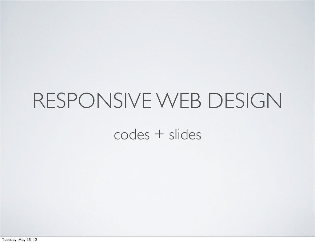
RESPONSIVE WEB DESIGN codes + slides Tuesday, May 15, 12
@sayanee_ Tuesday, May 15, 12
RESPONSIVE WEB DESIGN Tuesday, May 15, 12
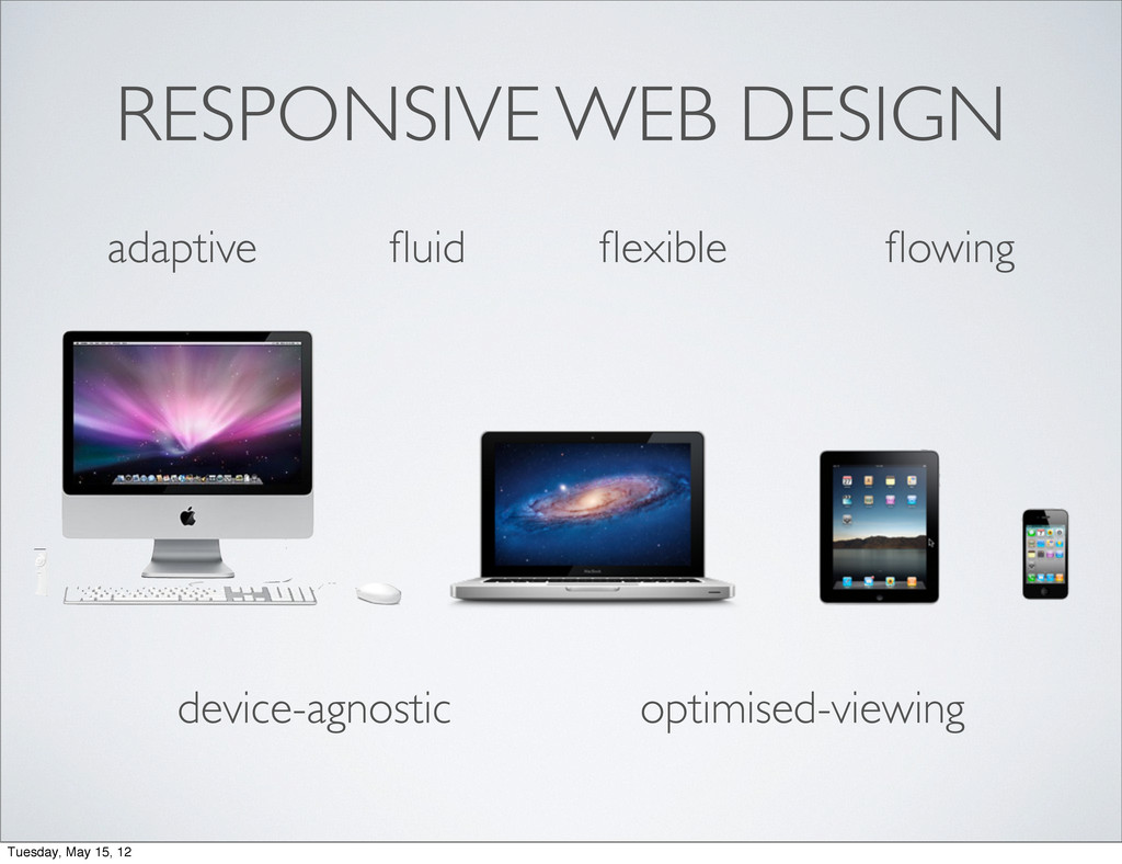
RESPONSIVE WEB DESIGN adaptive fluid flexible flowing Tuesday, May 15,
12
RESPONSIVE WEB DESIGN adaptive fluid flexible flowing device-agnostic optimised-viewing Tuesday,
May 15, 12
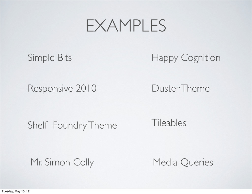
EXAMPLES Media Queries Happy Cognition Simple Bits Responsive 2010 Duster
Theme Shelf Foundry Theme Tileables Mr. Simon Colly Tuesday, May 15, 12
TOOLS Tuesday, May 15, 12
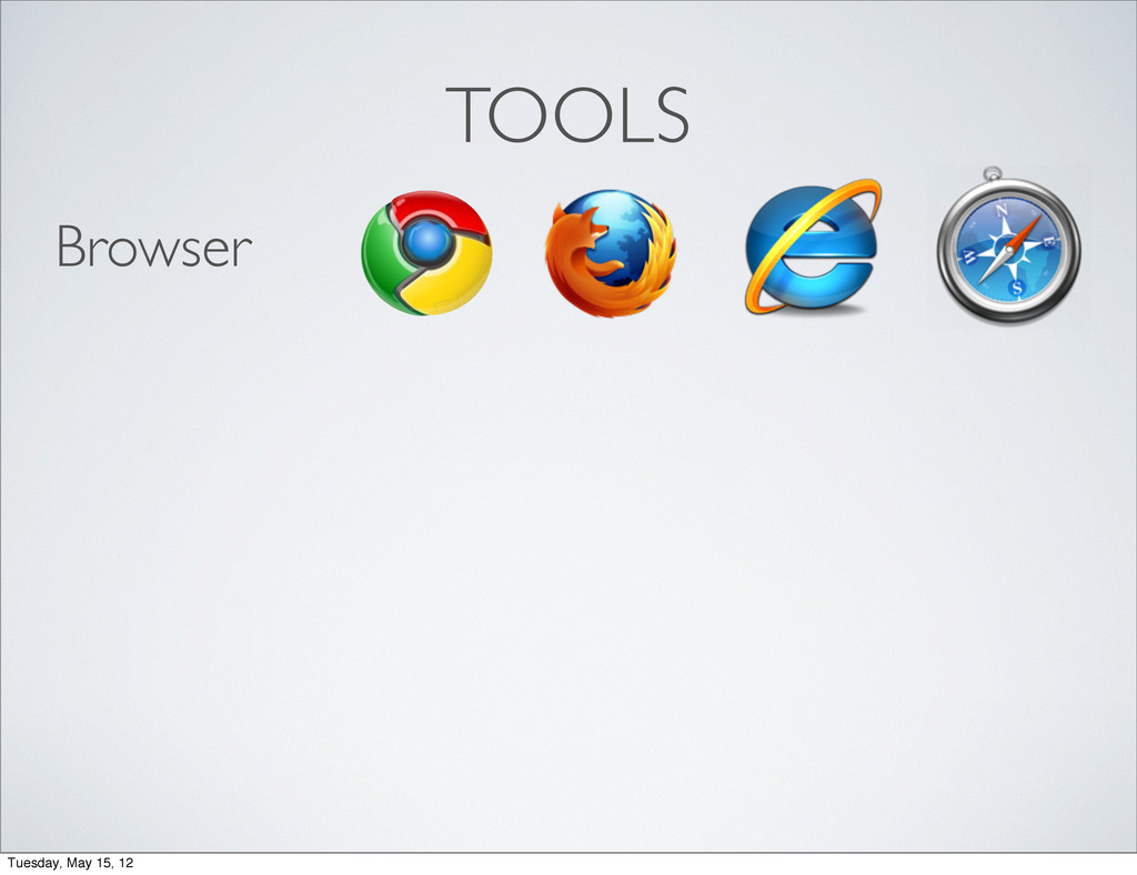
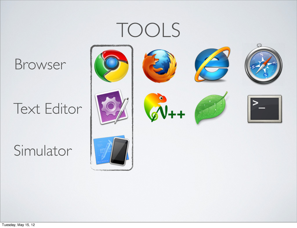
TOOLS Browser Tuesday, May 15, 12
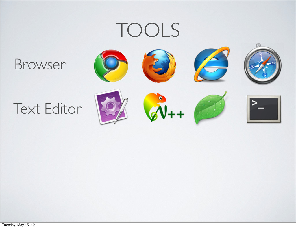
TOOLS Browser Text Editor Tuesday, May 15, 12
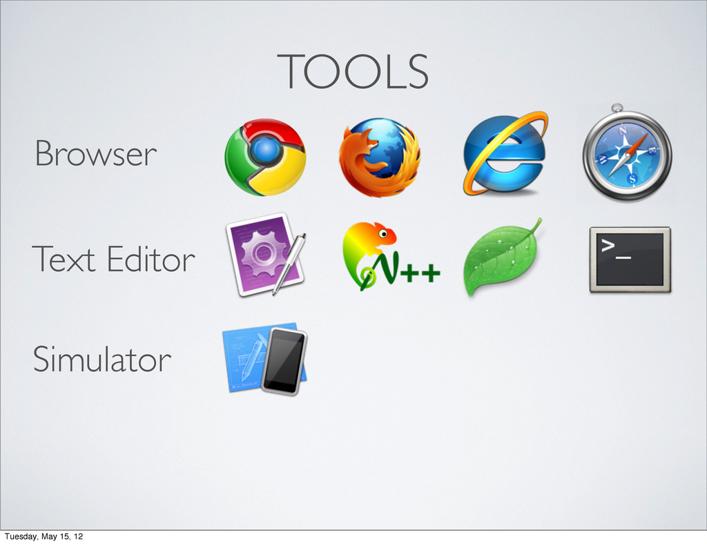
TOOLS Browser Text Editor Simulator Tuesday, May 15, 12
TOOLS Browser Text Editor Simulator Tuesday, May 15, 12
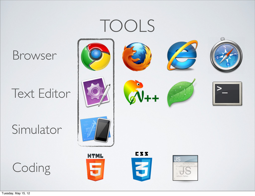
TOOLS Browser Text Editor Simulator Coding Tuesday, May 15, 12
#1 fluid layout #2 media queries #3 flexible media Tuesday,
May 15, 12
#1 fluid layout Tuesday, May 15, 12
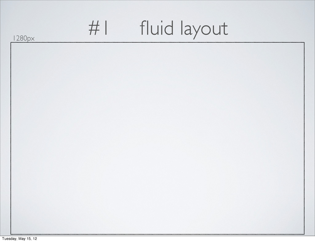
#1 fluid layout 1280px Tuesday, May 15, 12
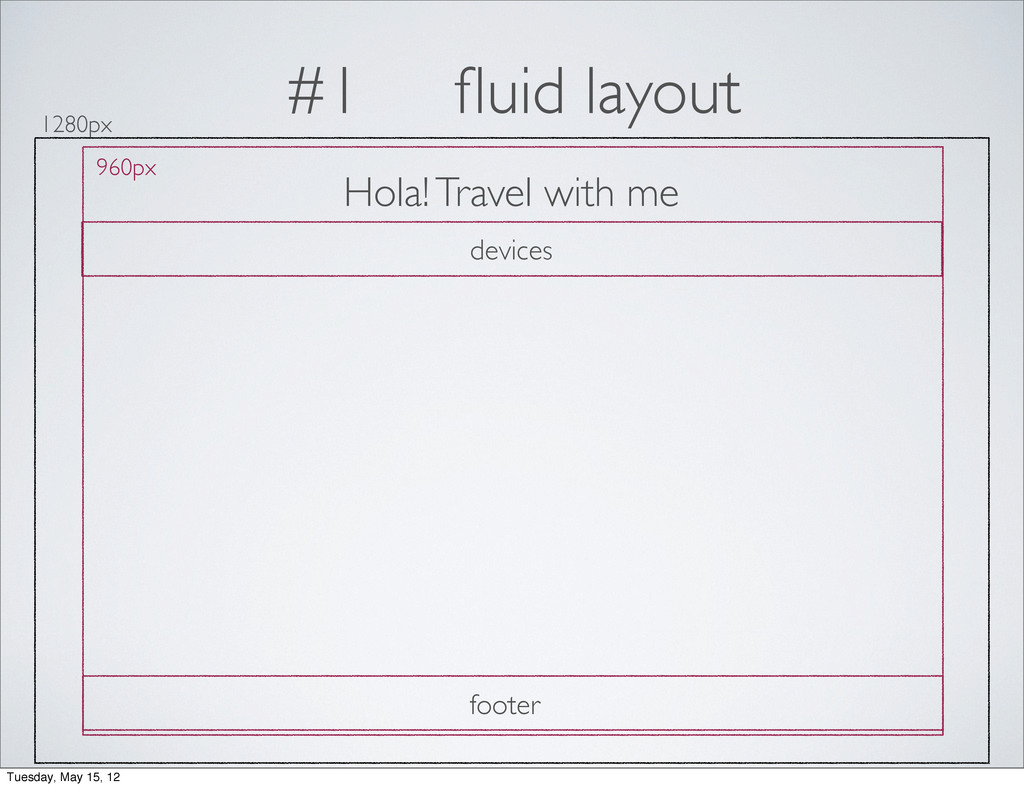
#1 fluid layout 1280px 960px Hola! Travel with me devices
footer Tuesday, May 15, 12
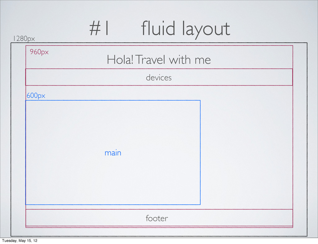
#1 fluid layout 1280px 960px Hola! Travel with me 600px
devices main footer Tuesday, May 15, 12
#1 fluid layout 1280px 960px Hola! Travel with me 600px
300px devices main sidebar footer Tuesday, May 15, 12
#1 fluid layout think in pixels percentages target / context
= result Tuesday, May 15, 12
#1 fluid layout 1280px 960px Hola! Travel with me 600px
300px devices main sidebar footer Tuesday, May 15, 12
#1 fluid layout 1280px 960px Hola! Travel with me 600px
300px devices main sidebar footer /1280px = 75% / 960px= 62.5% /960px = 31.25% 960px / 960px = 100% 960px / 960px = 100% Tuesday, May 15, 12
#2 media queries min-width landscape 1024px portrait 768px 1280px landscape
960px portrait 640px four layouts 1200px 1024px 768px 600px Tuesday, May 15, 12
#2 media queries 1200px 1024px 768px 600px Tuesday, May 15,
12
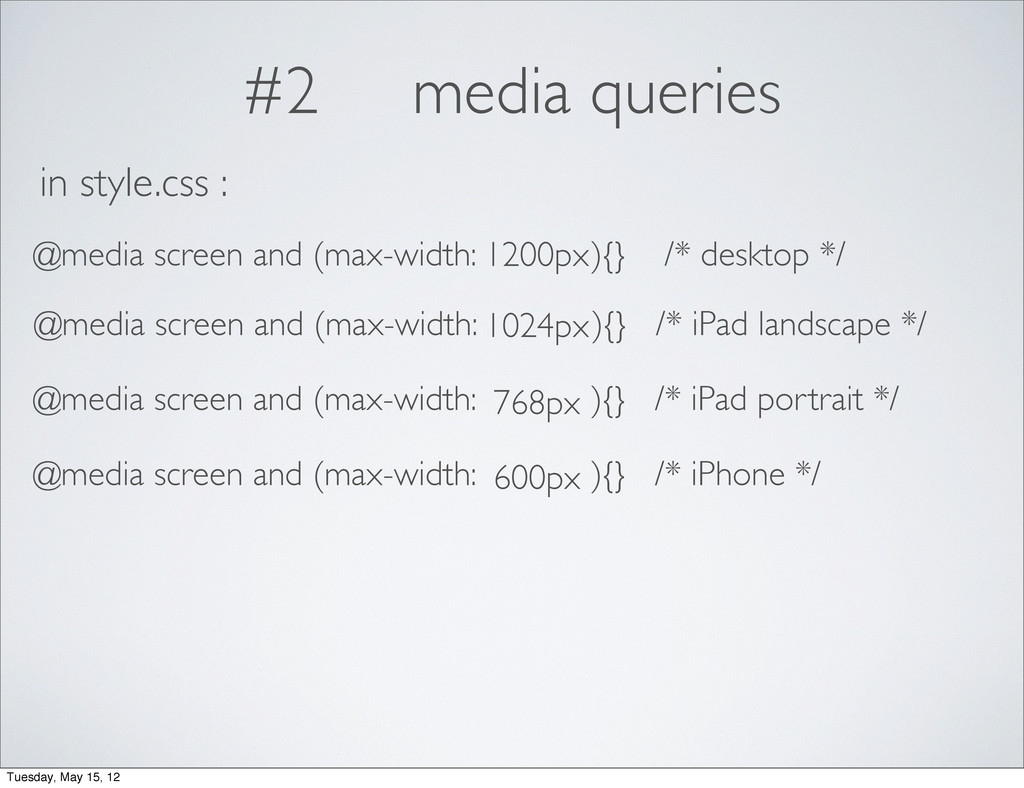
#2 media queries 1200px 1024px 768px 600px @media screen and
(max-width: ){} /* desktop */ in style.css : @media screen and (max-width: ){} /* iPad landscape */ @media screen and (max-width: ){} /* iPad portrait */ @media screen and (max-width: ){} /* iPhone */ Tuesday, May 15, 12
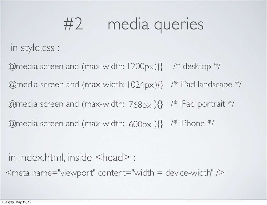
#2 media queries 1200px 1024px 768px 600px @media screen and
(max-width: ){} /* desktop */ in style.css : @media screen and (max-width: ){} /* iPad landscape */ @media screen and (max-width: ){} /* iPad portrait */ @media screen and (max-width: ){} /* iPhone */ in index.html, inside <head> : <meta name="viewport" content="width = device-width" /> Tuesday, May 15, 12
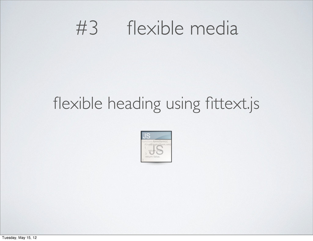
#3 flexible media img, embed, object, video { max-width:100% }
Tuesday, May 15, 12
#3 flexible media flexible heading using fittext.js Tuesday, May 15,
12
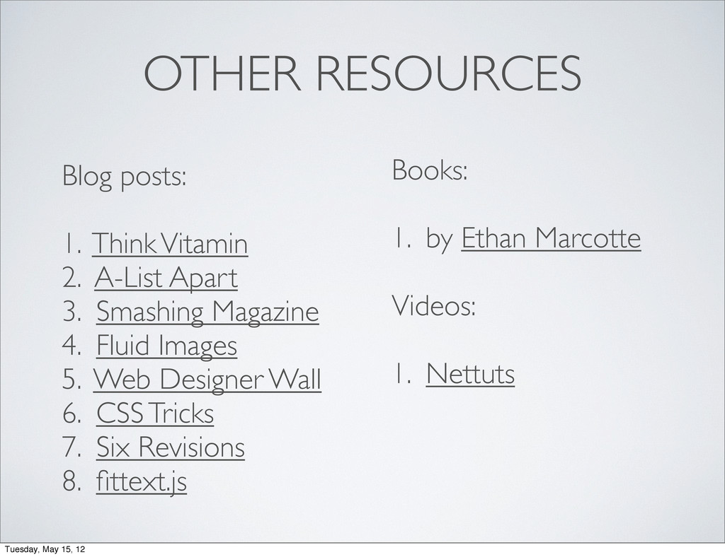
OTHER RESOURCES Blog posts: 1. Think Vitamin 2. A-List Apart
3. Smashing Magazine 4. Fluid Images 5. Web Designer Wall 6. CSS Tricks 7. Six Revisions 8. fittext.js Books: 1. by Ethan Marcotte Videos: 1. Nettuts Tuesday, May 15, 12
codes + slides Tuesday, May 15, 12
@sayanee_ Tuesday, May 15, 12
 sayanee
 tonkotsuboy_com
 azukiazusa1
 rakus_dev
 smt7174
 mikesorae
 nishihira
 wxyzzz
 genda
genda
 kintotechdev
 shift_evolve
 addyosmani
 mclloyd
 chrisshort
 stuffmc
 ammeep
 techseoconnect
 kimpetersen
 inesmontani
 jeffersonlam
 irinanazarova
 skipperchong
 lara
lara