Upgrade to Pro
— share decks privately, control downloads, hide ads and more …
Speaker Deck
Features
Speaker Deck
PRO
Sign in
Sign up for free
Search
Search
Das Tabelas ao Grid CSS
Search
Simone Amorim
April 29, 2017
Technology
160
0
Share
Embed
Copy iframe code
Copy JS code
Copy link
Start on current slide
Das Tabelas ao Grid CSS
A evolução de criação de layouts das tabelas ao Grid CSS
Simone Amorim
April 29, 2017
More Decks by Simone Amorim
See All by Simone Amorim
A Inclusão de Mulheres no Mercado de Tecnologia
simoneas02
0
76
Get start with react-test-library.
simoneas02
0
73
ES6 and Beyond pdf
simoneas02
0
210
Montando layouts em um mini game
simoneas02
2
280
Experiência na China Simone e Willany pareando <3
simoneas02
0
92
Front-end na vida real
simoneas02
0
230
It's me!!
simoneas02
0
130
Montando layouts em um mini game chamado Browser
simoneas02
1
220
It's me!!
simoneas02
0
280
Other Decks in Technology
See All in Technology
オブザーバビリティ、本当に活用できてる? 〜API連携×生成AIで成熟度を自動評価〜
dmmsre
1
3.1k
プロダクトだけじゃない、社内プロセスにおける自動化・省力化ノススメ
kakehashi
PRO
1
3.7k
完全自律ロボットを作りたくて、先に開発を自律させた話(ROS Japan UG #63 LT)
rryz09
0
510
「最後に責任を取るのはチーム」— 人間のPRレビューを最小化してアップデートしたメンタルモデル
jnishime_dresscode
0
610
SRE Lounge Hiroshimaへの招待
grimoh
0
640
ruby.wasmとPicoRuby.wasmに対応した仮想DOMライブラリを作ってる話 #kaigieffect_kaigi
sue445
PRO
0
150
人を動かすのは時間ではなく、納得感 〜新任EMが入社3ヶ月、組織を2回変えた話〜
kakehashi
PRO
3
220
技術イベント終了後、運営の 事後タスクは丁寧に (心がけています)/ #tamagawadev
nishiuma
1
100
ゼロをイチにする仕事が終わったあと
smasato
0
340
型は壁、Rustでもバグを直すな、表現できなくせよ
nwiizo
13
2k
SREとQA 二人三脚で進めるSLO運用/sre-qa-slo
sugitak
0
510
Terraform共通モジュールをチーム横断で“変えられる”運用へ ― リリースと適用の分離
kekke_n
1
2.9k
Featured
See All Featured
Taking LLMs out of the black box: A practical guide to human-in-the-loop distillation
inesmontani
PRO
3
2.3k
Groundhog Day: Seeking Process in Gaming for Health
codingconduct
0
240
How to Create Impact in a Changing Tech Landscape [PerfNow 2023]
tammyeverts
55
3.4k
Making the Leap to Tech Lead
cromwellryan
135
10k
Scaling GitHub
holman
464
140k
Ruling the World: When Life Gets Gamed
codingconduct
0
280
State of Search Keynote: SEO is Dead Long Live SEO
ryanjones
0
220
Unlocking the hidden potential of vector embeddings in international SEO
frankvandijk
0
870
HDC tutorial
michielstock
2
740
How to build an LLM SEO readiness audit: a practical framework
nmsamuel
1
800
Deep Space Network (abreviated)
tonyrice
0
220
How to optimise 3,500 product descriptions for ecommerce in one day using ChatGPT
katarinadahlin
PRO
1
3.7k
Transcript
Born 01/01/17
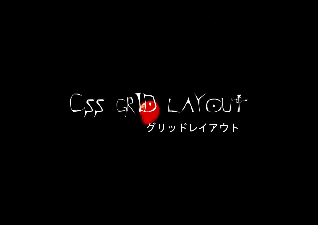
CSS GRID LAYOUT グリッドレイアウト
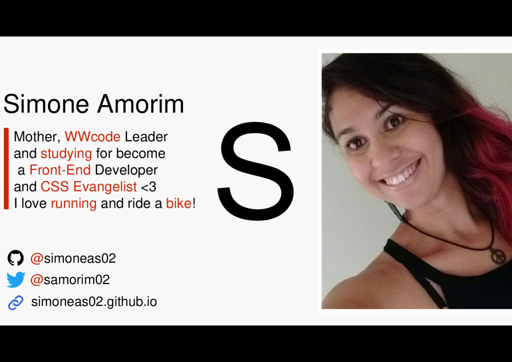
Simone Amorim Mother, WWcode Leader and studying for become a
Front-End Developer and CSS Evangelist <3 I love running and ride a bike! @samorim02 @simoneas02 simoneas02.github.io
CSS LAYOUTS ONTEM 昨日のCSSレイアウト
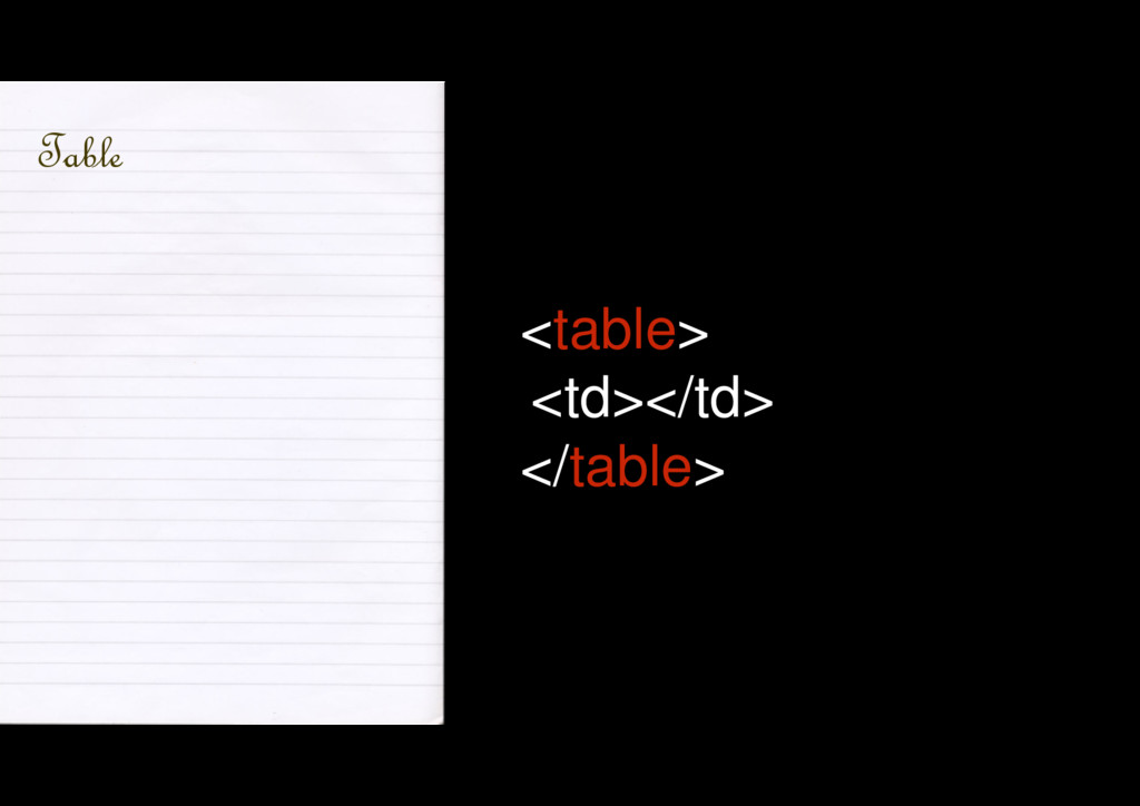
<table> <td></td> </table> Table
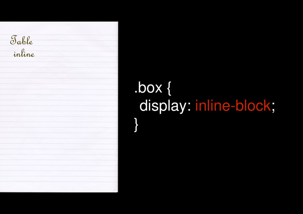
Table .box { display: inline-block; } inline
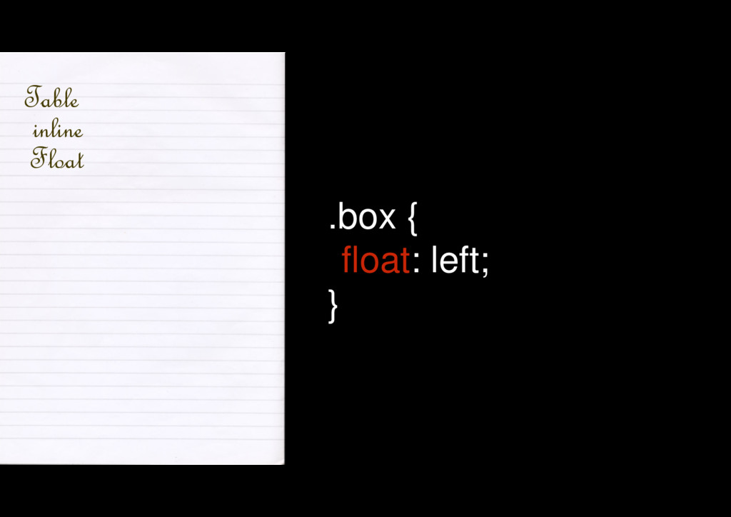
Table inline .box { float: left; } Float
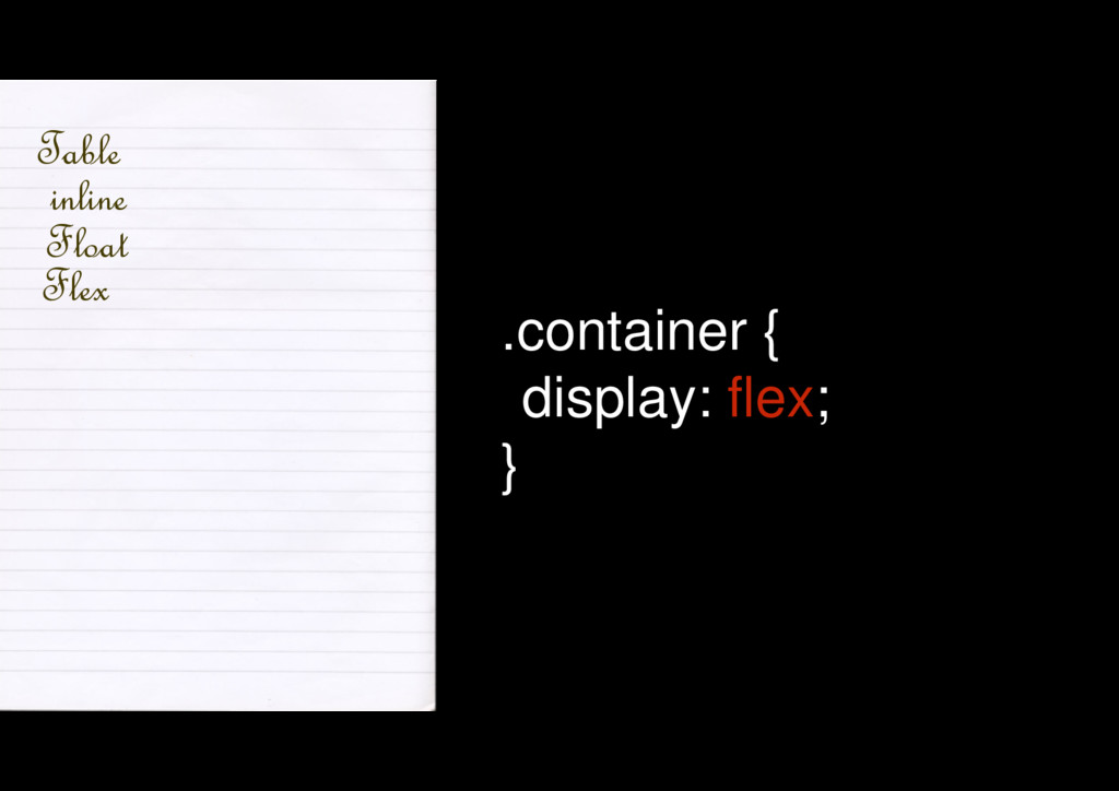
Table inline Float .container { display: flex; } Flex
Grid Layout?
Biblioteca ou framework?
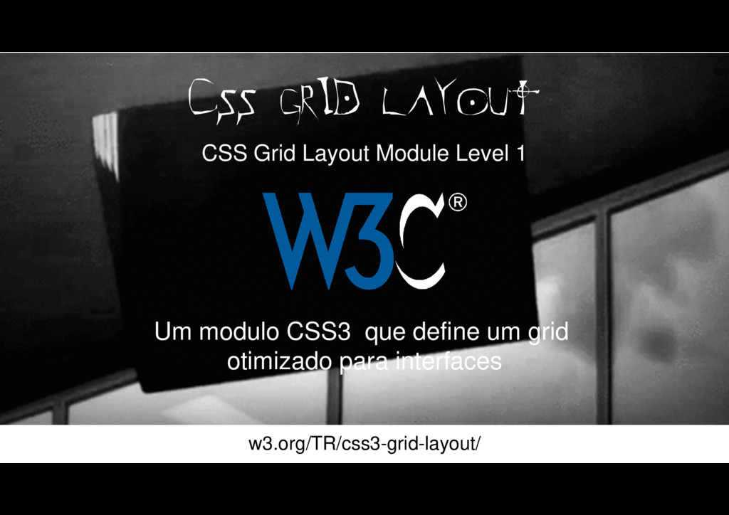
Um modulo CSS3 que define um grid otimizado para interfaces
CSS GRID LAYOUT CSS Grid Layout Module Level 1 w3.org/TR/css3-grid-layout/
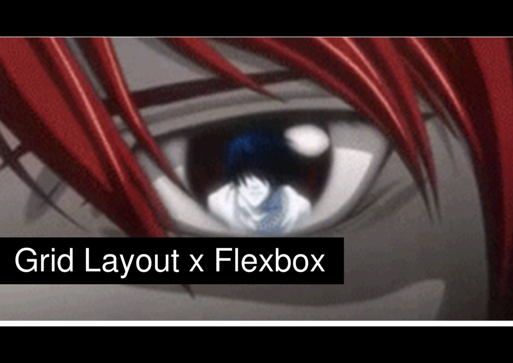
Grid Layout x Flexbox
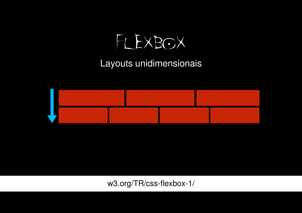
FLEXBOX Layouts unidimensionais w3.org/TR/css-flexbox-1/
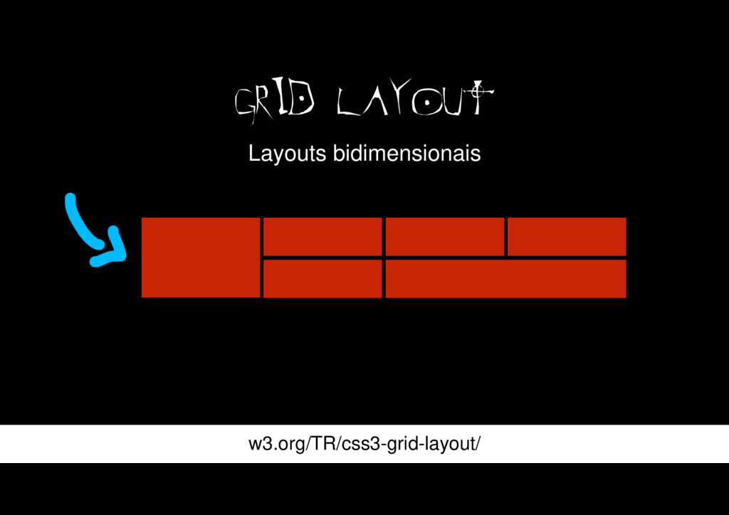
GRID LAYOUT w3.org/TR/css3-grid-layout/ Layouts bidimensionais
TERMINOLOGiA 用語
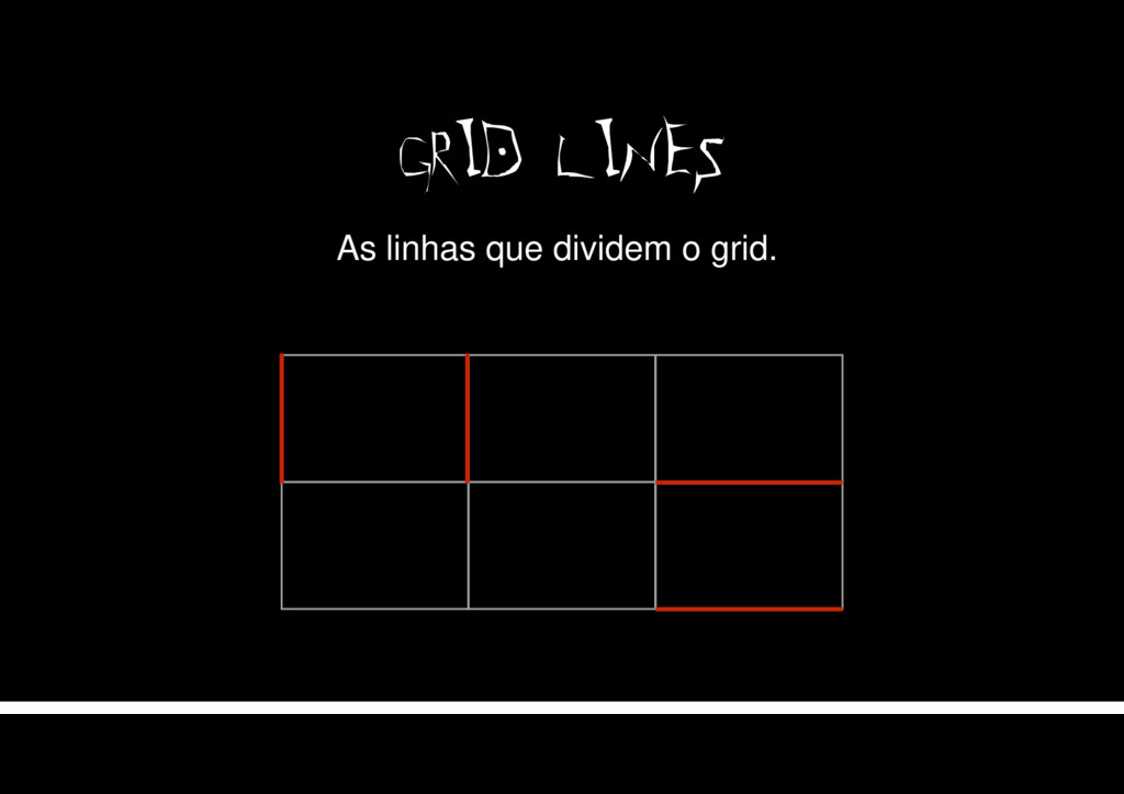
GRID LINES As linhas que dividem o grid.
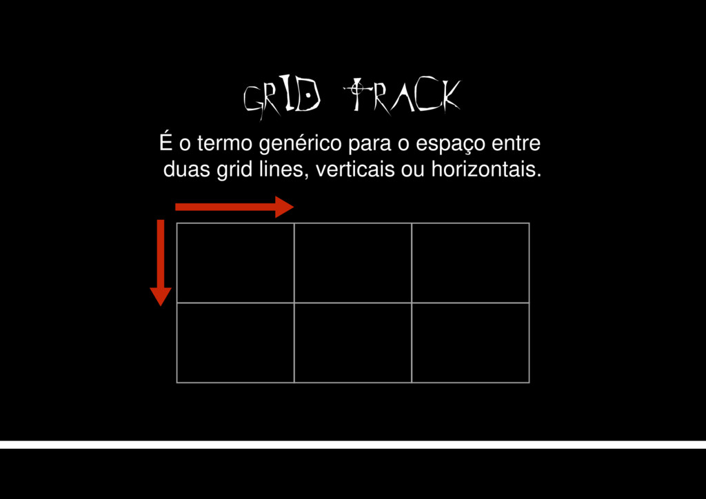
GRID TRACK É o termo genérico para o espaço entre
duas grid lines, verticais ou horizontais.
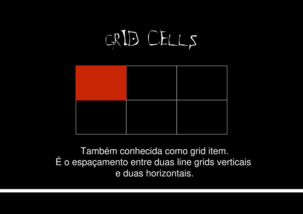
GRID CELLS Também conhecida como grid item. É o espaçamento
entre duas line grids verticais e duas horizontais.
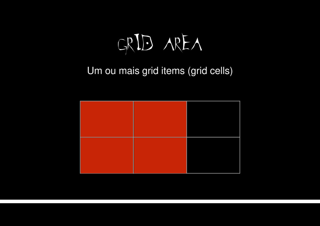
GRID AREA Um ou mais grid items (grid cells)
CODE コード
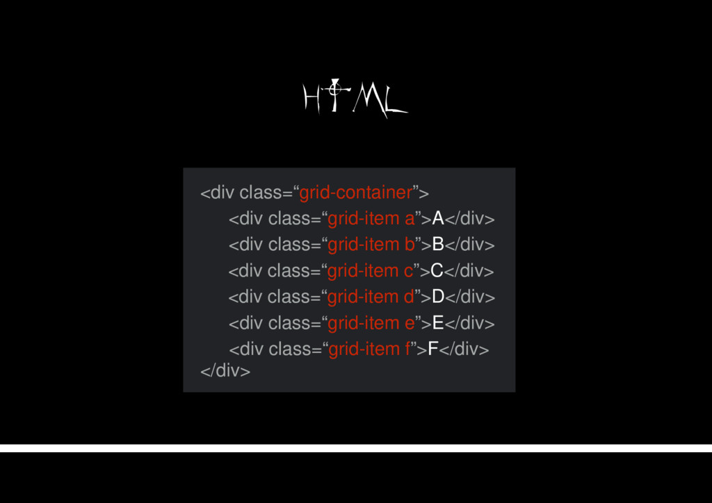
HTML <div class=“grid-container”> </div> <div class=“grid-item a”>A</div> <div class=“grid-item b”>B</div>
<div class=“grid-item f”>F</div> <div class=“grid-item e”>E</div> <div class=“grid-item d”>D</div> <div class=“grid-item c”>C</div>
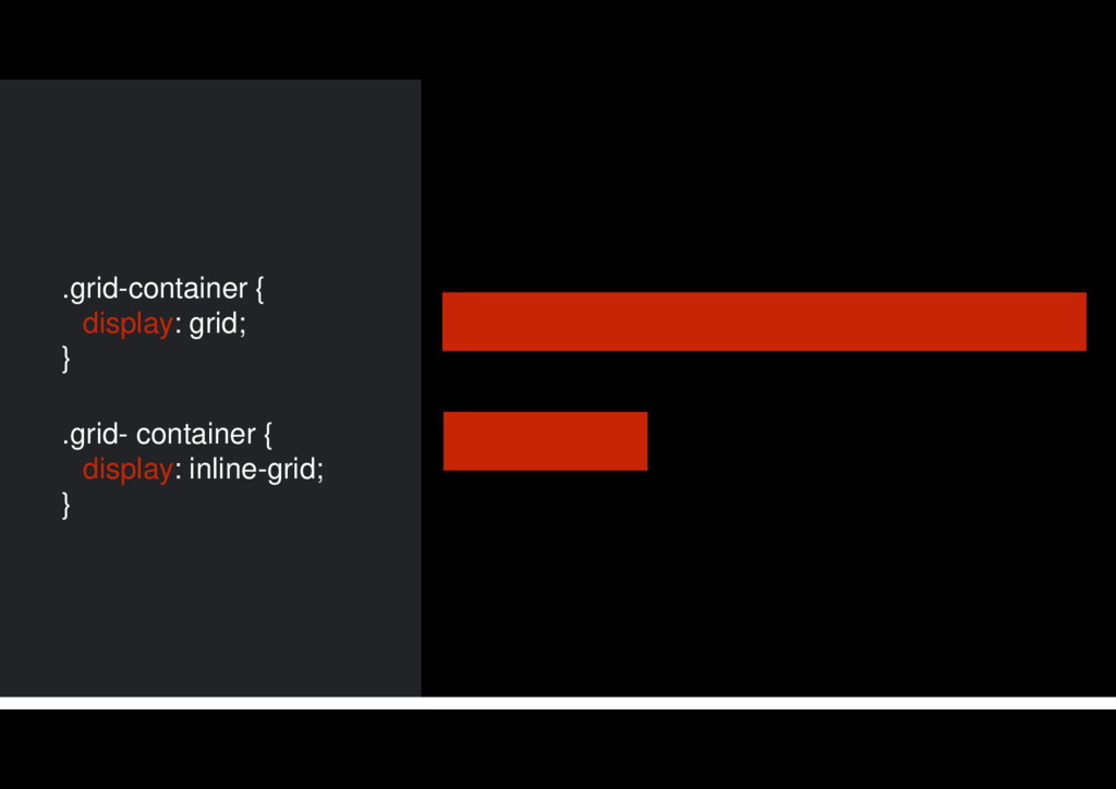
DEFININDO UM GRID GRIDの定義
.grid-container { display: grid; } .grid- container { display: inline-grid;
}
LINE-BASE PLACEMENT ラインベース配置
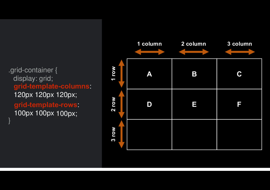
A B C D E F 1 column 2 column
3 column 2 row 1 row 3 row .grid-container { display: grid; } grid-template-rows: 100px 100px; grid-template-columns: 120px 120px 120px; 100px;
LINE-BASE POSITIONING ラインベース位置決め
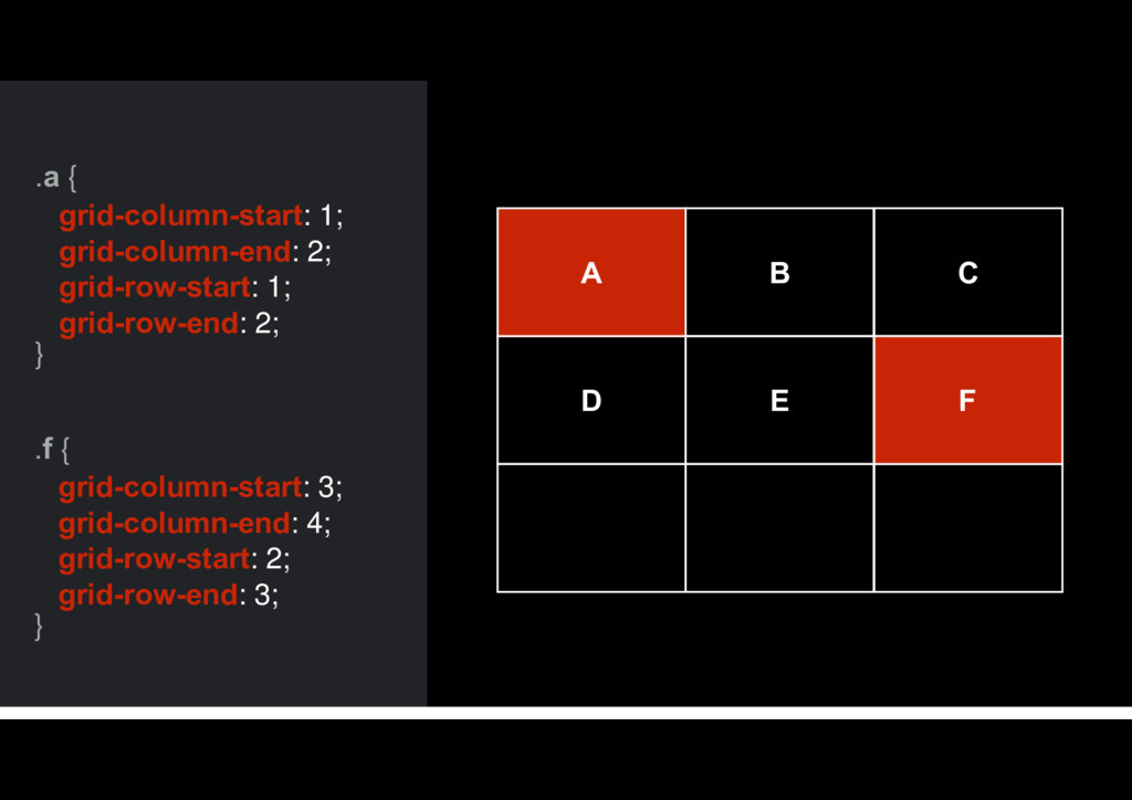
.a { } grid-column-start: 1; grid-column-end: 2; grid-row-start: 1; grid-row-end:
2; .f { } grid-column-start: 3; grid-column-end: 4; grid-row-start: 2; grid-row-end: 3; B C D A E F
SHORTHANDS ショーランズ
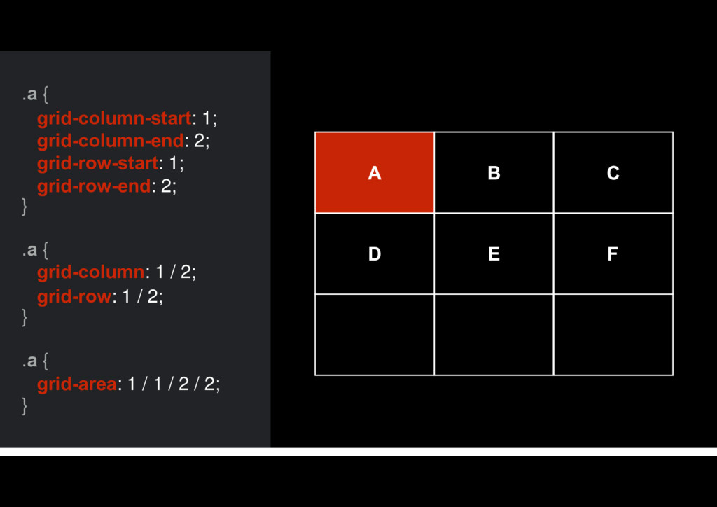
.a { } grid-column: 1 / 2; grid-row: 1 /
2; .a { } grid-column-start: 1; grid-column-end: 2; grid-row-start: 1; grid-row-end: 2; .a { } grid-area: 1 / 1 / 2 / 2; B C D A E F
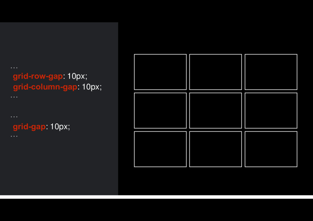
GRID GAP グリッドギャップ
… … grid-row-gap: 10px; grid-column-gap: 10px; … … grid-gap: 10px;
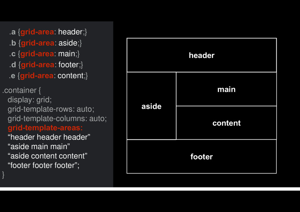
AREA NAMING エリア名
.a {grid-area: header;} .b {grid-area: aside;} .c {grid-area: main;} .d
{grid-area: footer;} .container { display: grid; grid-template-rows: auto; grid-template-columns: auto; grid-template-areas: “header header header” “aside main main” “aside content content” “footer footer footer”; } main header content aside footer .e {grid-area: content;}
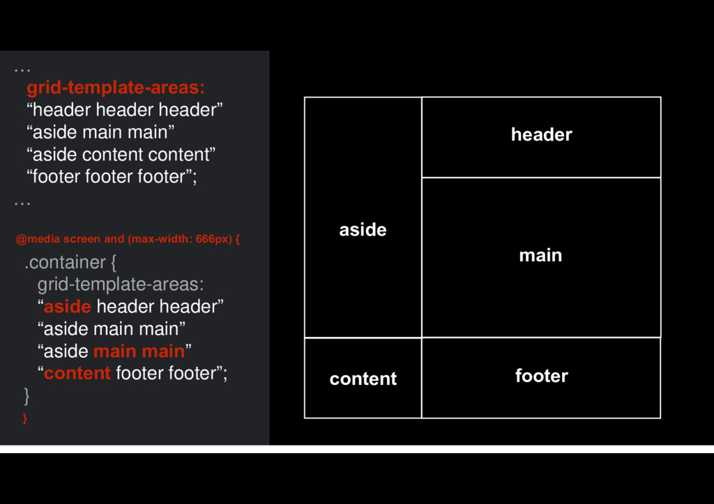
RESPONSIVE WEB DESIGN レスポンシブウェブデザイン
main header content aside footer @media screen and (max-width: 666px)
{ } … grid-template-areas: “header header header” “aside main main” “aside content content” “footer footer footer”; … .container { grid-template-areas: “aside header header” “aside main main” “aside main main” “content footer footer”; } main header content aside footer
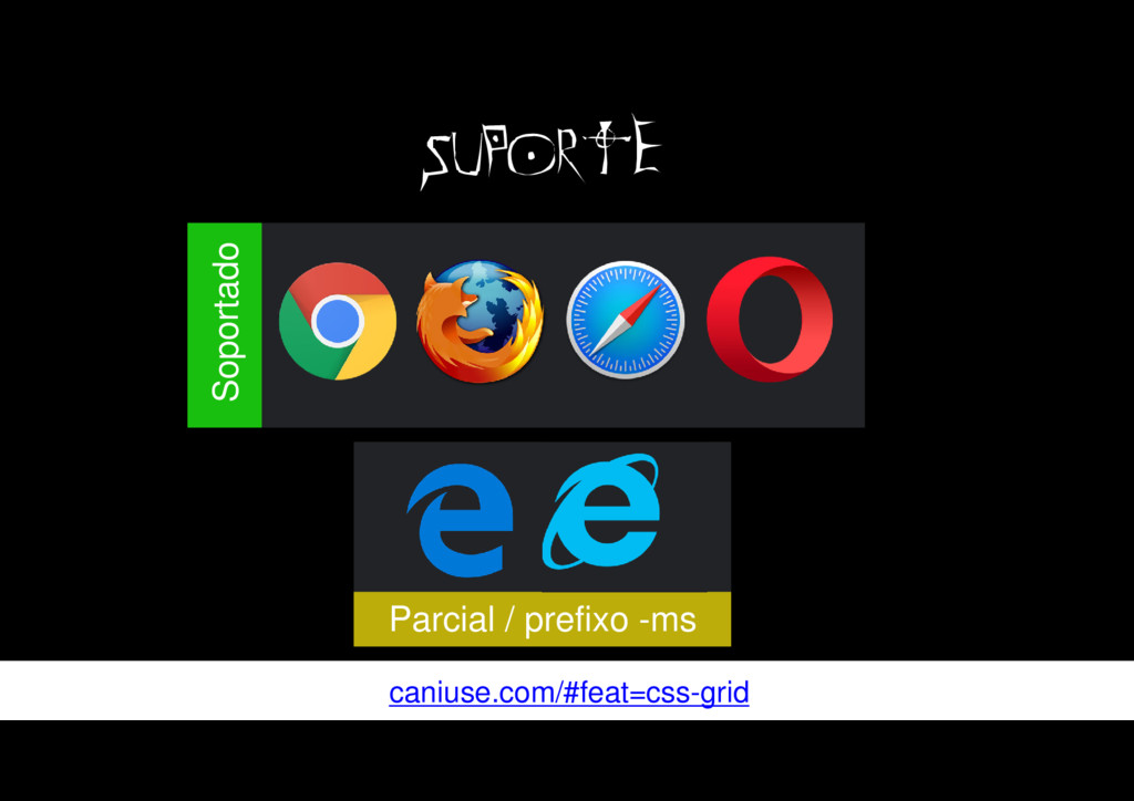
MAIS もっと
caniuse.com/#feat=css-grid SUPORTE Parcial / prefixo -ms Soportado
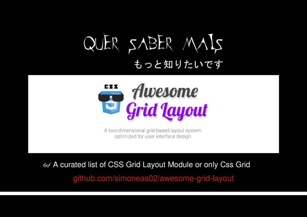
QUER SABER MAIS github.com/simoneas02/awesome-grid-layout A curated list of CSS Grid
Layout Module or only Css Grid もっと知りたいです
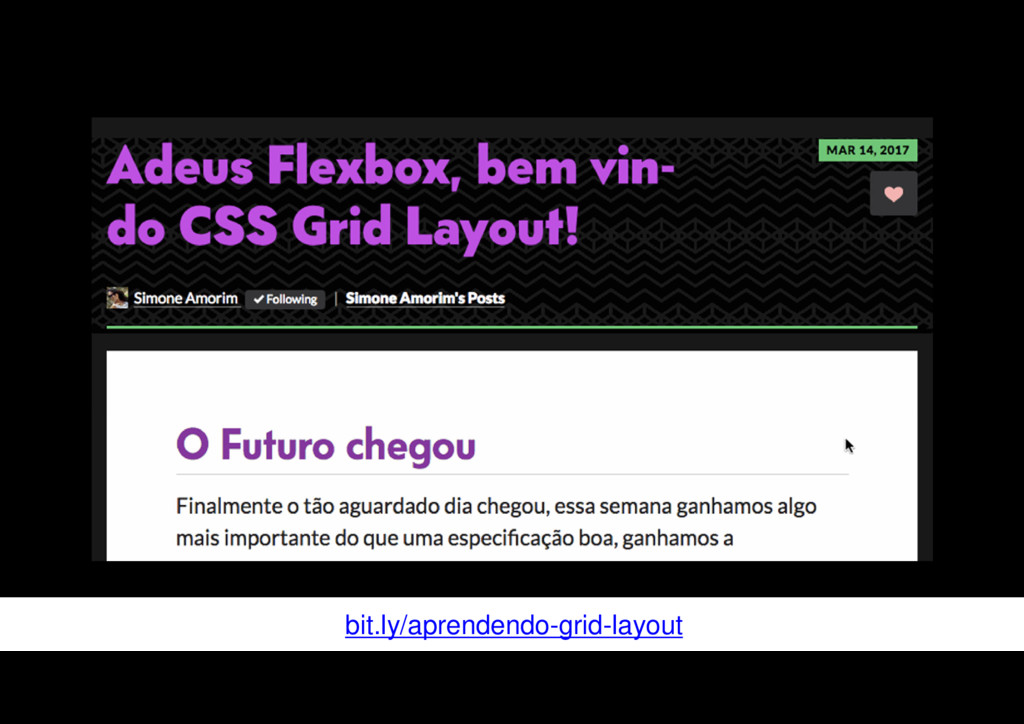
bit.ly/aprendendo-grid-layout
Freedom 03/04/17
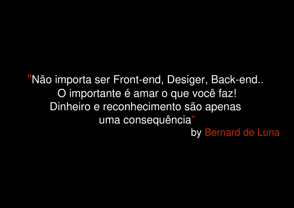
“Não importa ser Front-end, Desiger, Back-end.. O importante é amar
o que você faz! Dinheiro e reconhecimento são apenas uma consequência” by Bernard de Luna
None
 simoneas02
 dmmsre
 kakehashi
 rryz09
 jnishime_dresscode
 grimoh
 sue445
 nishiuma
 smasato
 nwiizo
 sugitak
 kekke_n
 inesmontani
 codingconduct
 tammyeverts
 cromwellryan
 holman
 ryanjones
 frankvandijk
 michielstock
 nmsamuel
 tonyrice
 katarinadahlin