Responsive web design challenges web designers to adapt a new mindset to their design processes as well as techniques they are using in design and code. This talk provides an overview of various practical techniques, tips and tricks that you might want to be aware of when working on a new responsive design project.
 smashingmag
 a2k
a2k
 takanorip
 terencebasart
 lynteo
 kenichiota0711
 klemens
 webnaut
 nagata03
 csswizardry
 pkshadeck
 jnunemaker
 chriscoyier
 geshan
 ryanjones
 kimpetersen
 kneath
 maggiecrowley
 stuffmc
 rkendrick25
 aarron
 cassininazir
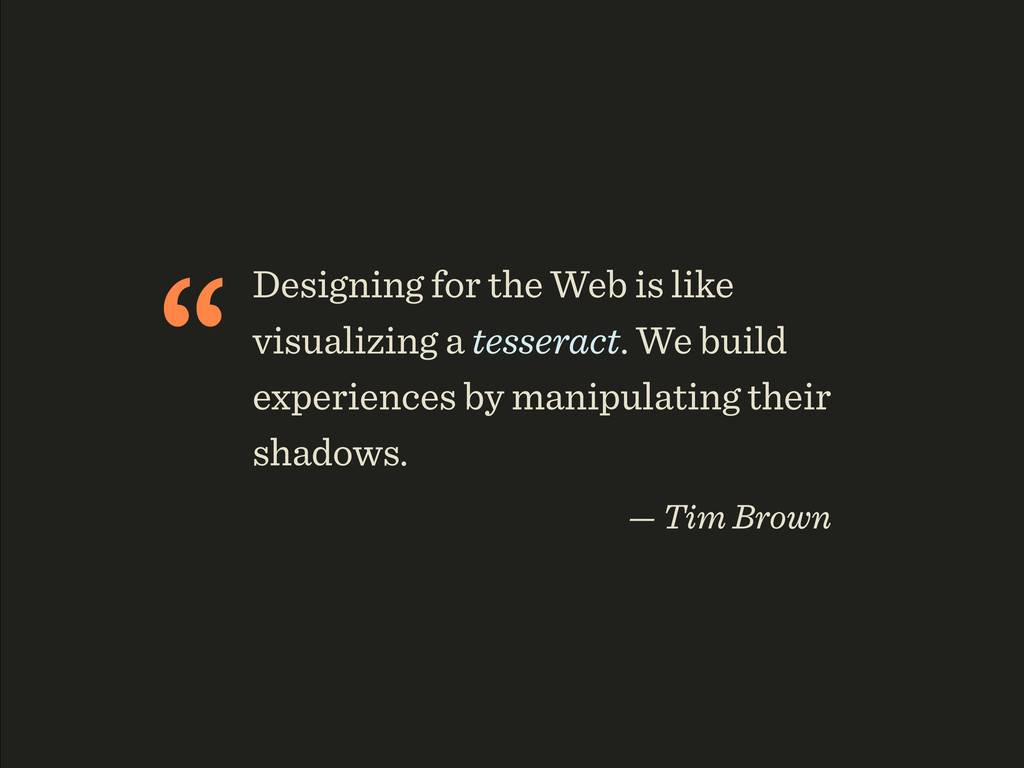
![“If you [...] had to choose between employing media queries](https://files.speakerdeck.com/presentations/93489b901c470130bc1e12313d140aaa/slide_45.jpg)