Upgrade to Pro
— share decks privately, control downloads, hide ads and more …
Speaker Deck
Features
Speaker Deck
PRO
Sign in
Sign up for free
Search
Search
Stephanie Briones
Search
Stephanie Briones
February 08, 2013
260
4
Share
Embed
Copy iframe code
Copy JS code
Copy link
Start on current slide
Stephanie Briones
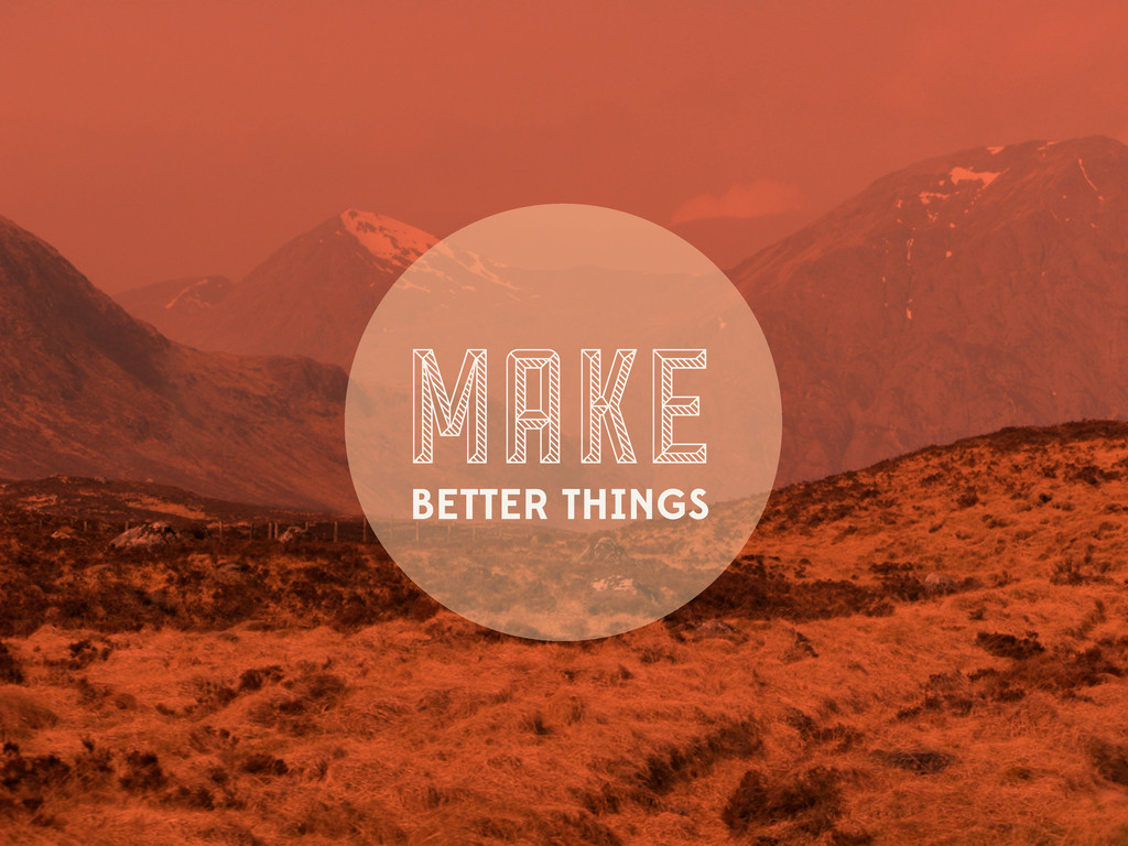
Make Better Things, a talk for developers.
Stephanie Briones
February 08, 2013
More Decks by Stephanie Briones
See All by Stephanie Briones
Stephanie Briones
smbriones
2
83
Featured
See All Featured
What's in a price? How to price your products and services
michaelherold
247
13k
Save Time (by Creating Custom Rails Generators)
garrettdimon
PRO
32
3.5k
Taking LLMs out of the black box: A practical guide to human-in-the-loop distillation
inesmontani
PRO
3
2.3k
SEOcharity - Dark patterns in SEO and UX: How to avoid them and build a more ethical web
sarafernandez
0
210
Odyssey Design
rkendrick25
PRO
2
700
Design and Strategy: How to Deal with People Who Don’t "Get" Design
morganepeng
133
19k
Agile Actions for Facilitating Distributed Teams - ADO2019
mkilby
0
210
Navigating Algorithm Shifts & AI Overviews - #SMXNext
aleyda
1
1.3k
The innovator’s Mindset - Leading Through an Era of Exponential Change - McGill University 2025
jdejongh
PRO
1
200
Fight the Zombie Pattern Library - RWD Summit 2016
marcelosomers
234
17k
A brief & incomplete history of UX Design for the World Wide Web: 1989–2019
jct
2
400
Claude Code どこまでも/ Claude Code Everywhere
nwiizo
65
56k
Transcript
MAKE BETTER THINGS
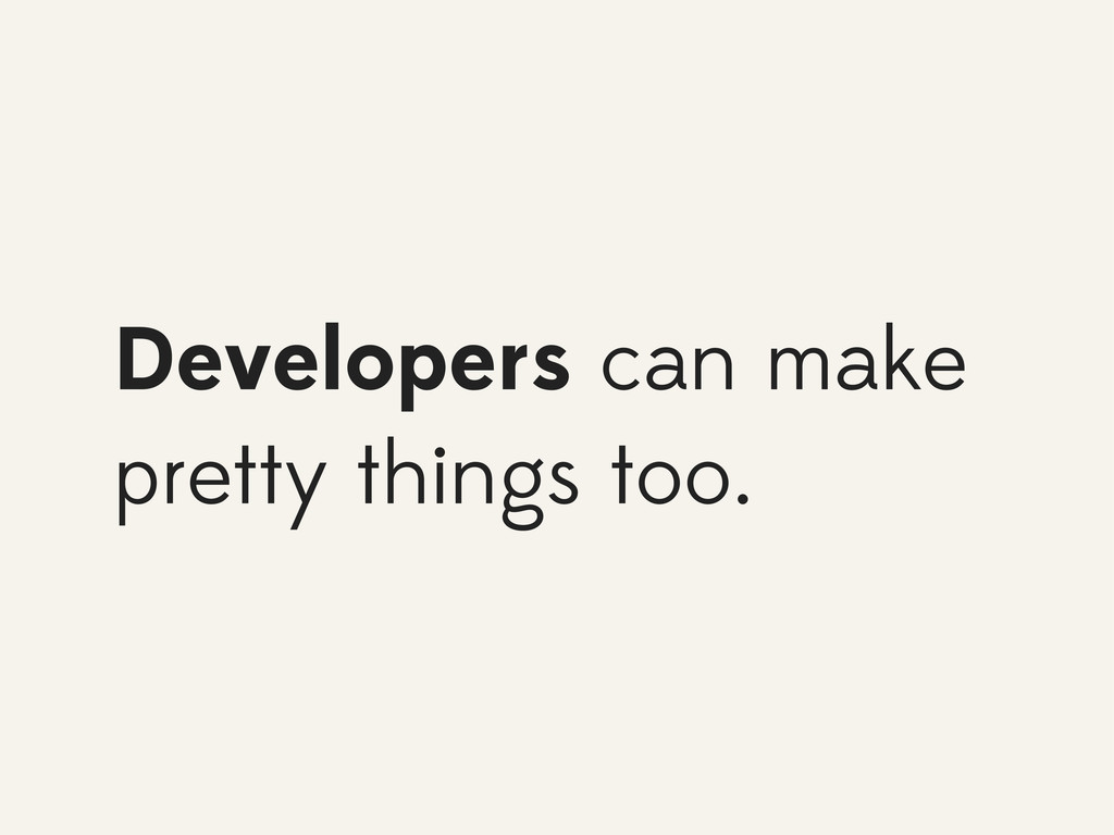
Developers can make pretty things too.
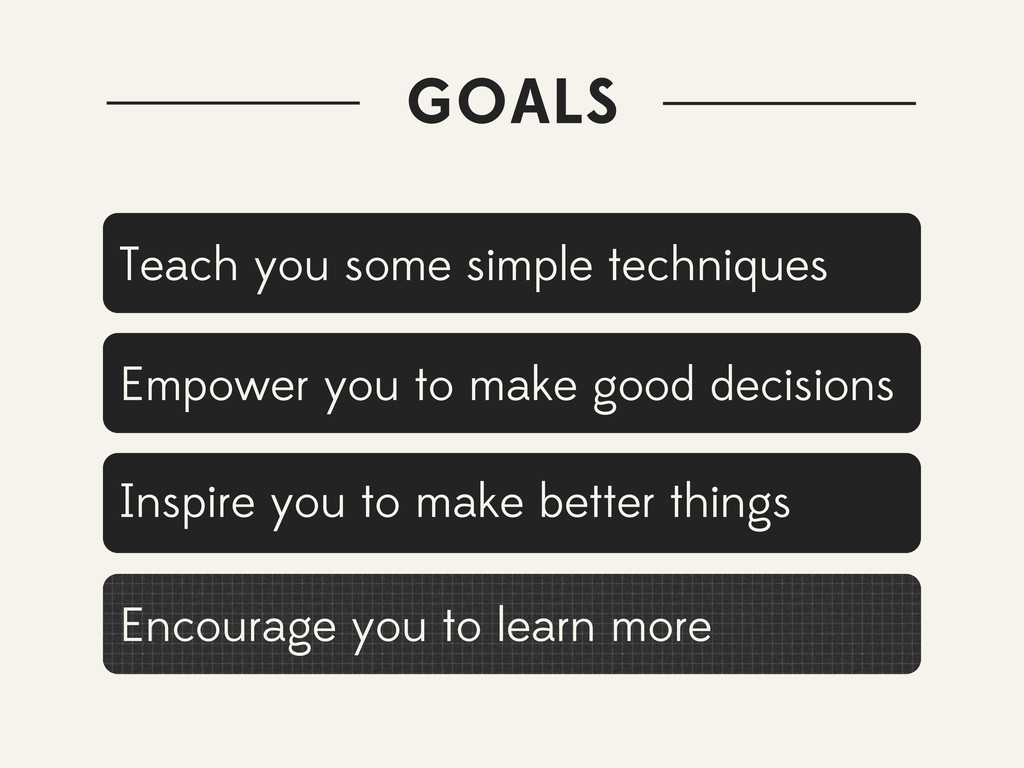
GOALS Teach you some simple techniques Encourage you to learn
more Empower you to make good decisions Inspire you to make better things
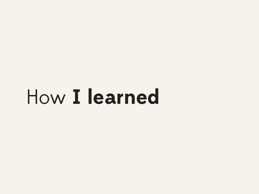
How I learned
You should learn
Let’s talk about design
Questions are welcome
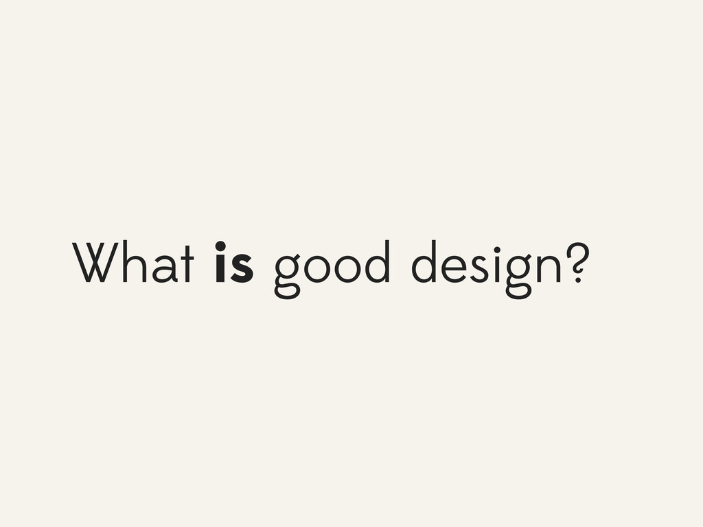
What is good design?
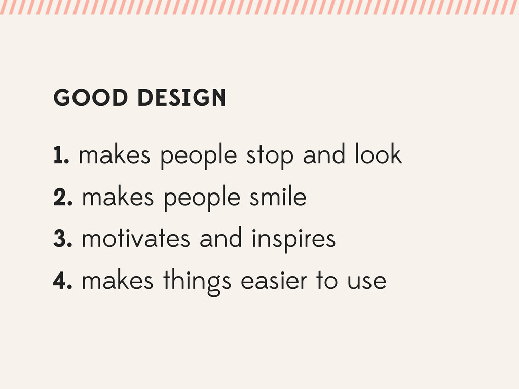
GOOD DESIGN 1. makes people stop and look 2. makes
people smile 3. motivates and inspires 4. makes things easier to use
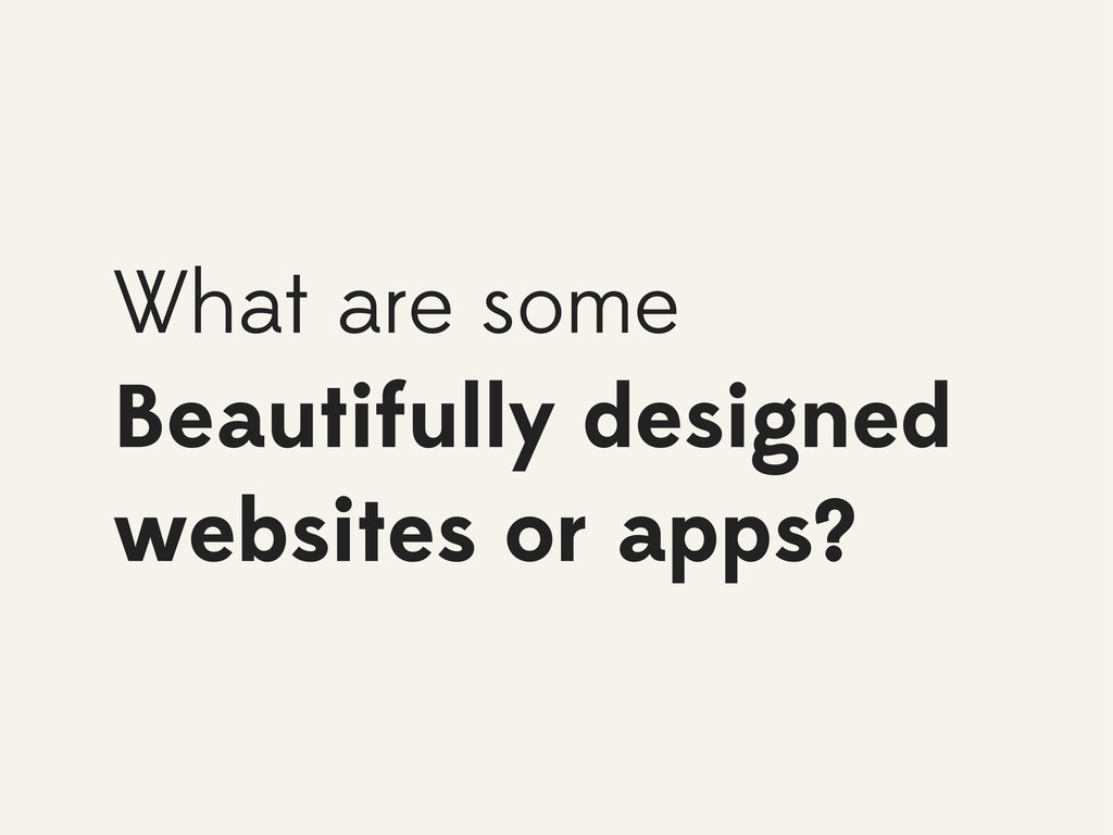
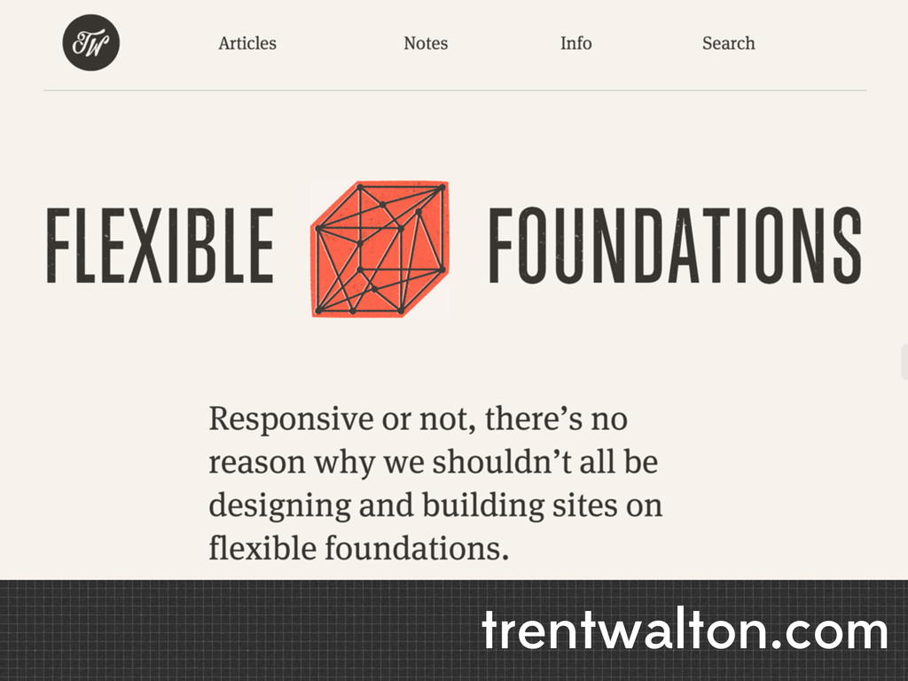
What are some Beautifully designed websites or apps?
trentwalton.com
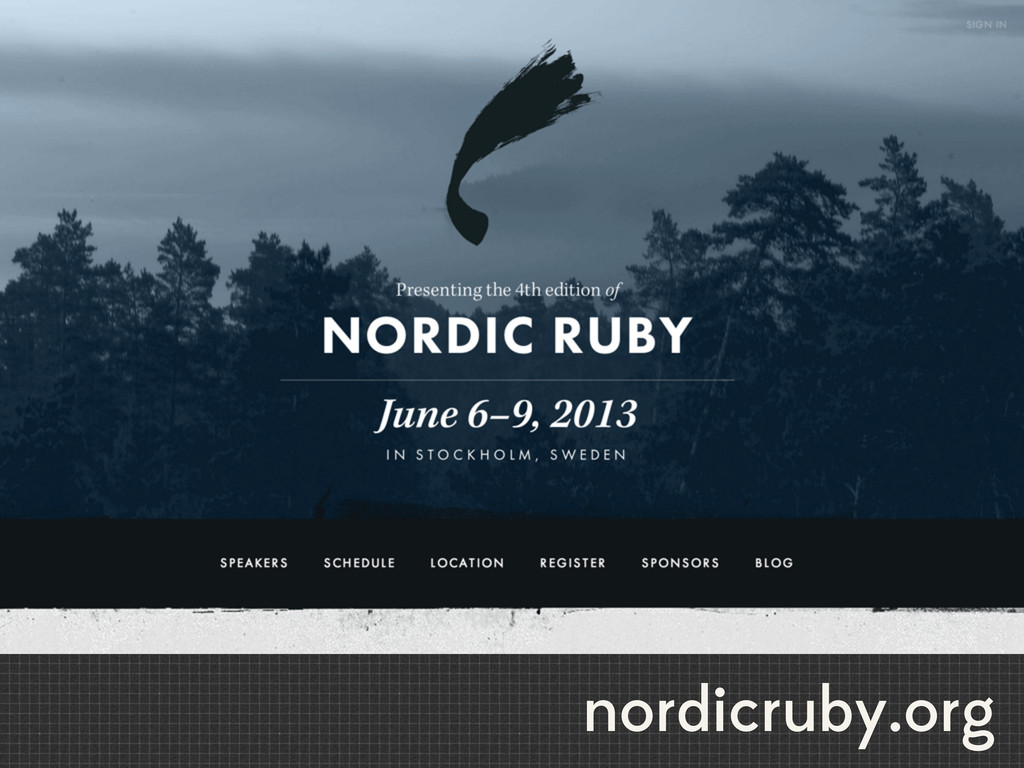
nordicruby.org
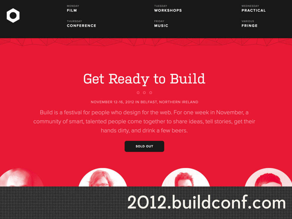
2012.buildconf.com
Why are these good?
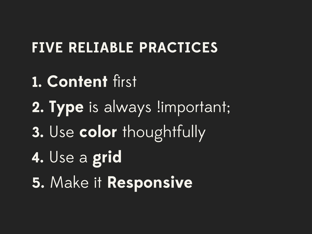
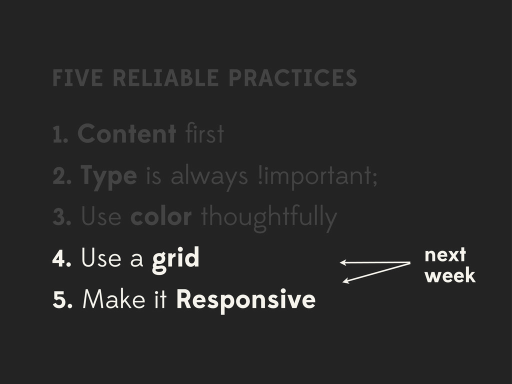
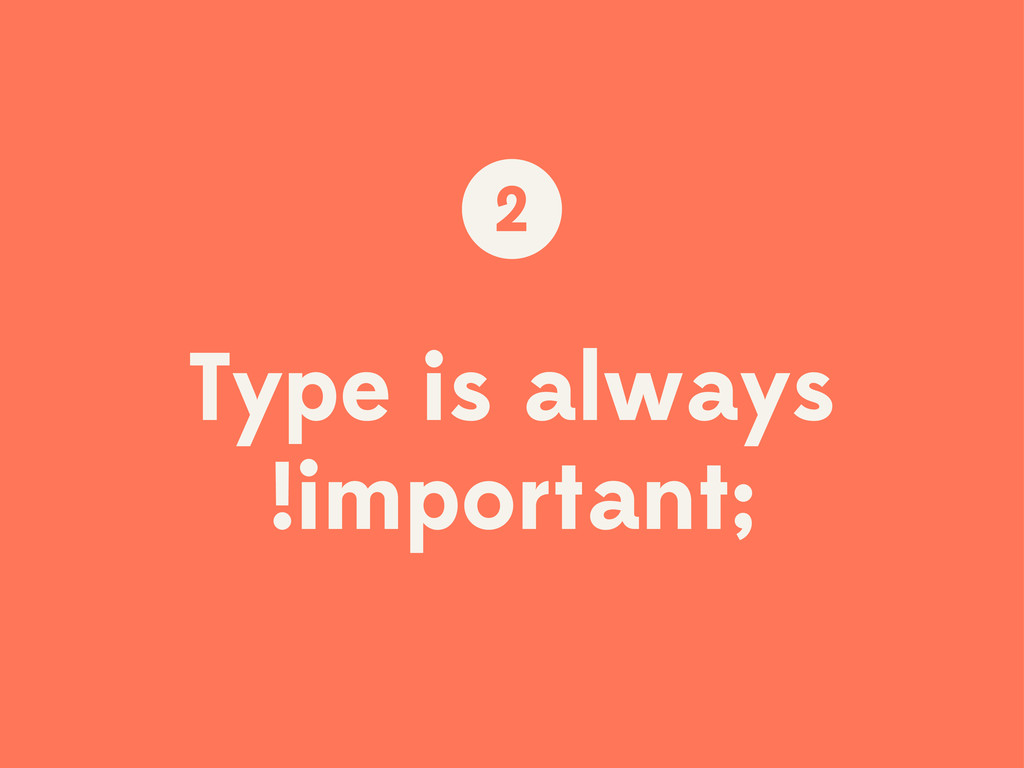
FIVE RELIABLE PRACTICES 1. Content first 2. Type is always
!important; 3. Use color thoughtfully 4. Use a grid 5. Make it Responsive
FIVE RELIABLE PRACTICES 1. Content first 2. Type is always
!important; 3. Use color thoughtfully 4. Use a grid 5. Make it Responsive next week
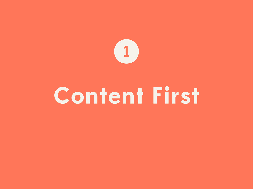
Content First 1
What is your content?
None
None
Type is always !important; 2
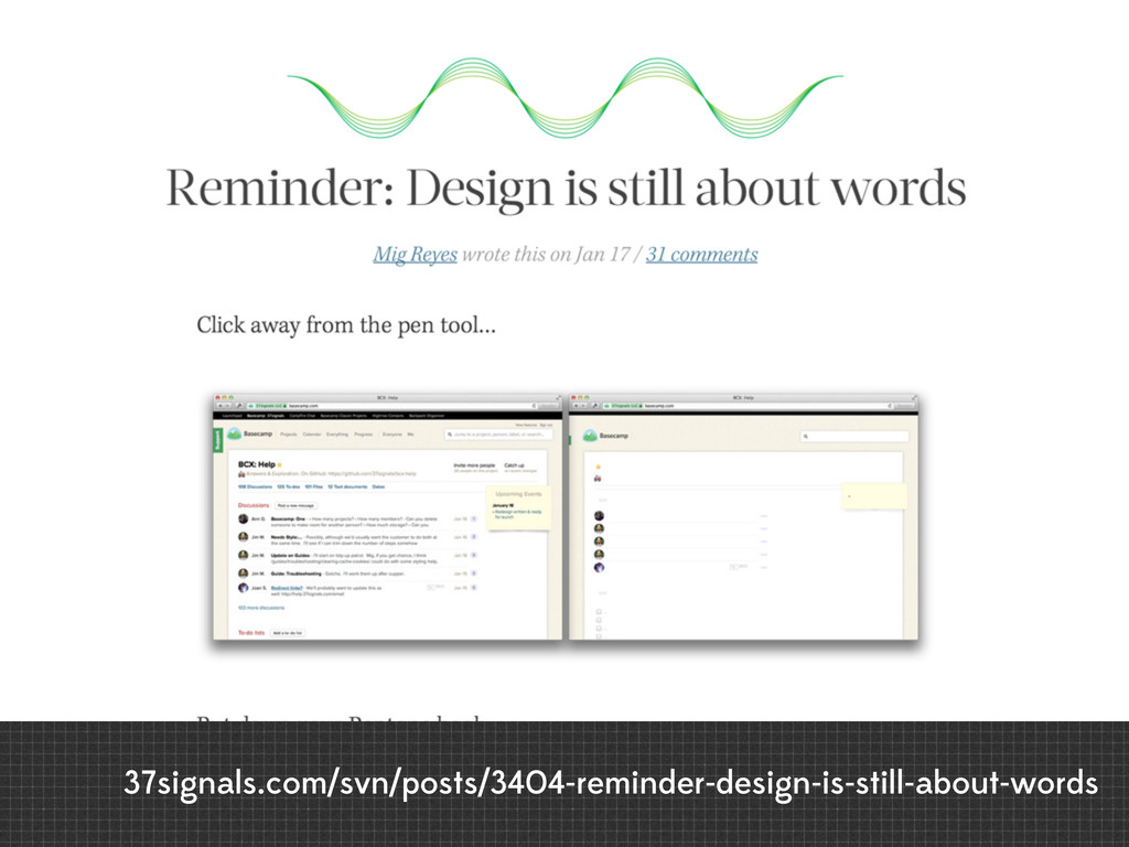
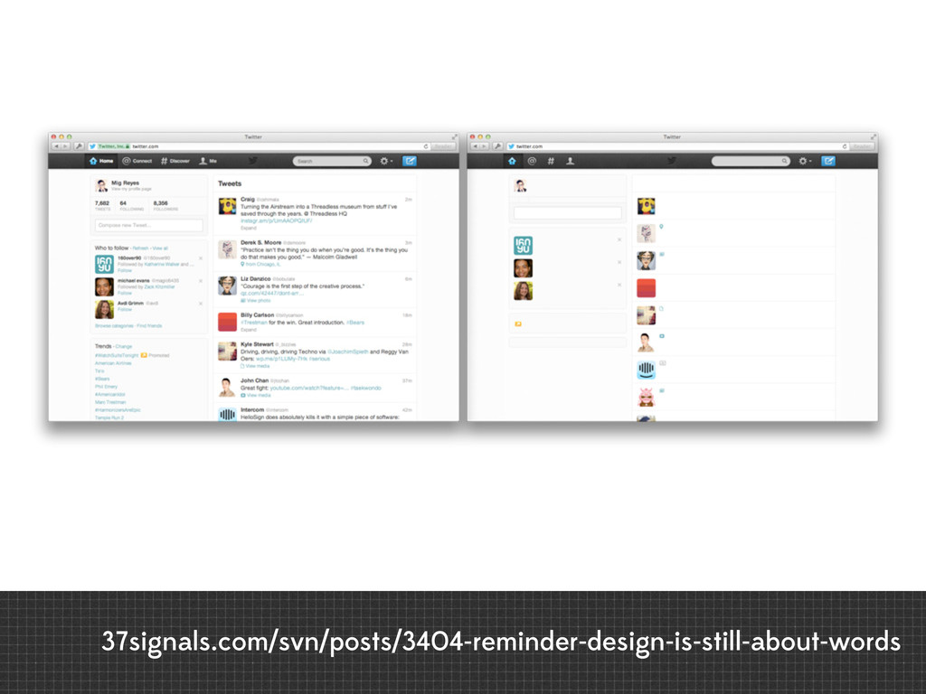
37signals.com/svn/posts/3404-reminder-design-is-still-about-words
37signals.com/svn/posts/3404-reminder-design-is-still-about-words
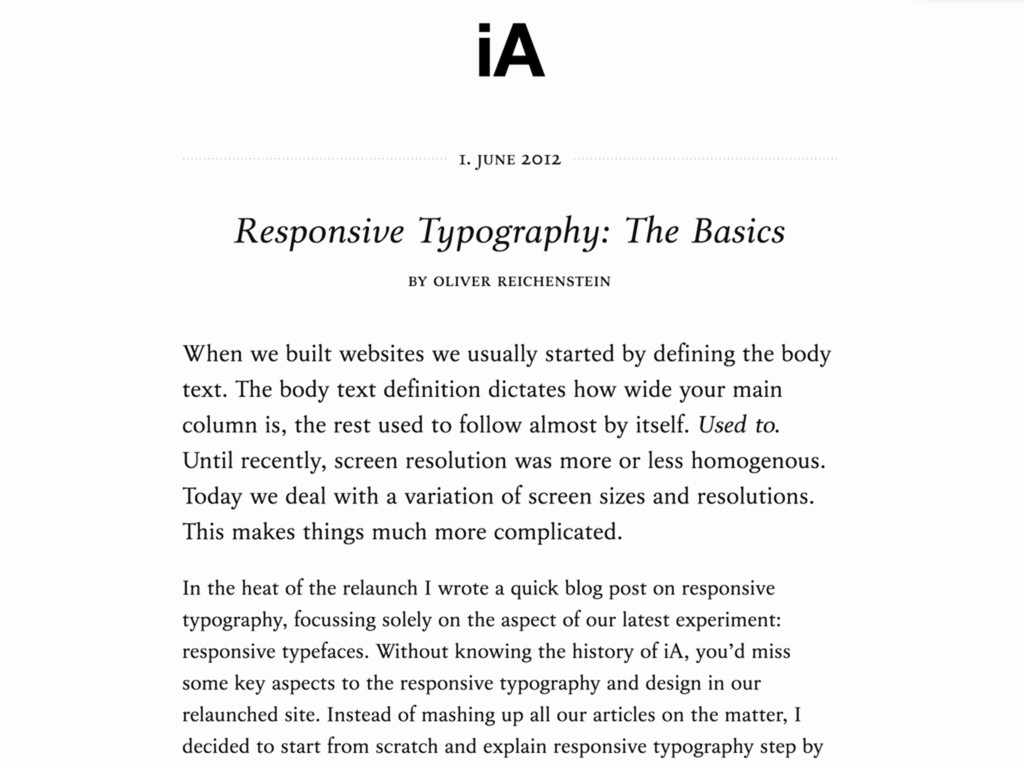
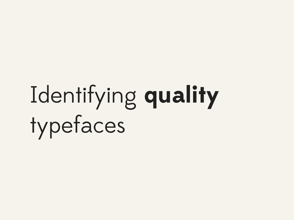
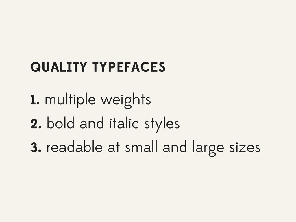
Identifying quality typefaces
QUALITY TYPEFACES 1. multiple weights 2. bold and italic styles
3. readable at small and large sizes
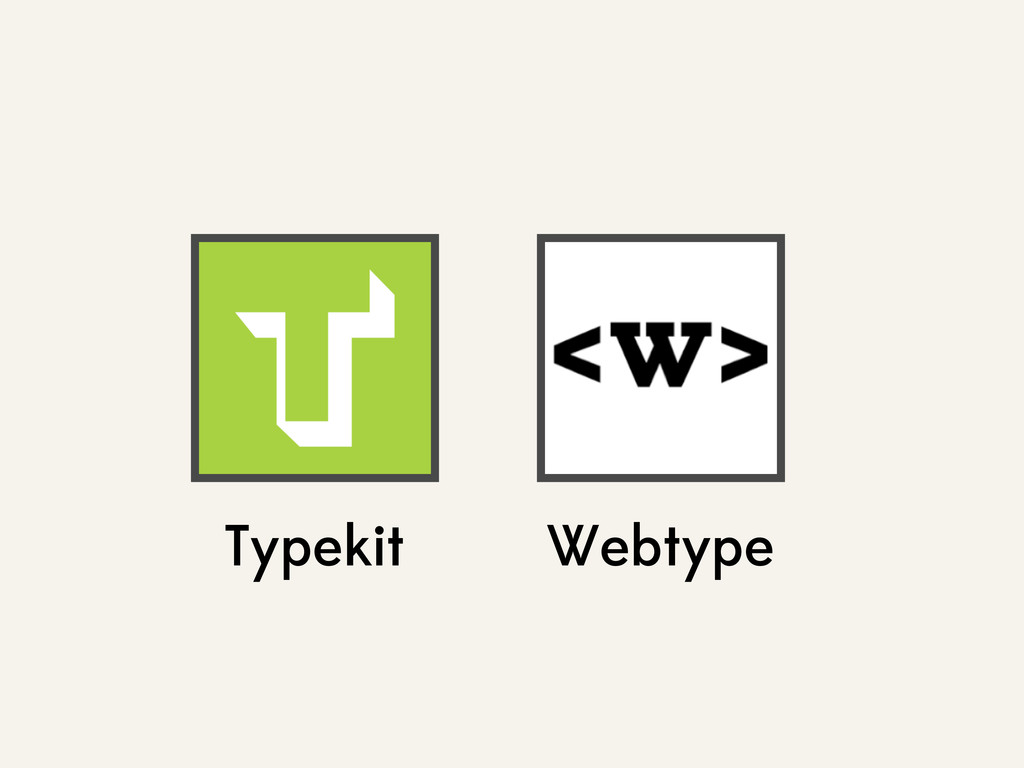
Typekit Webtype
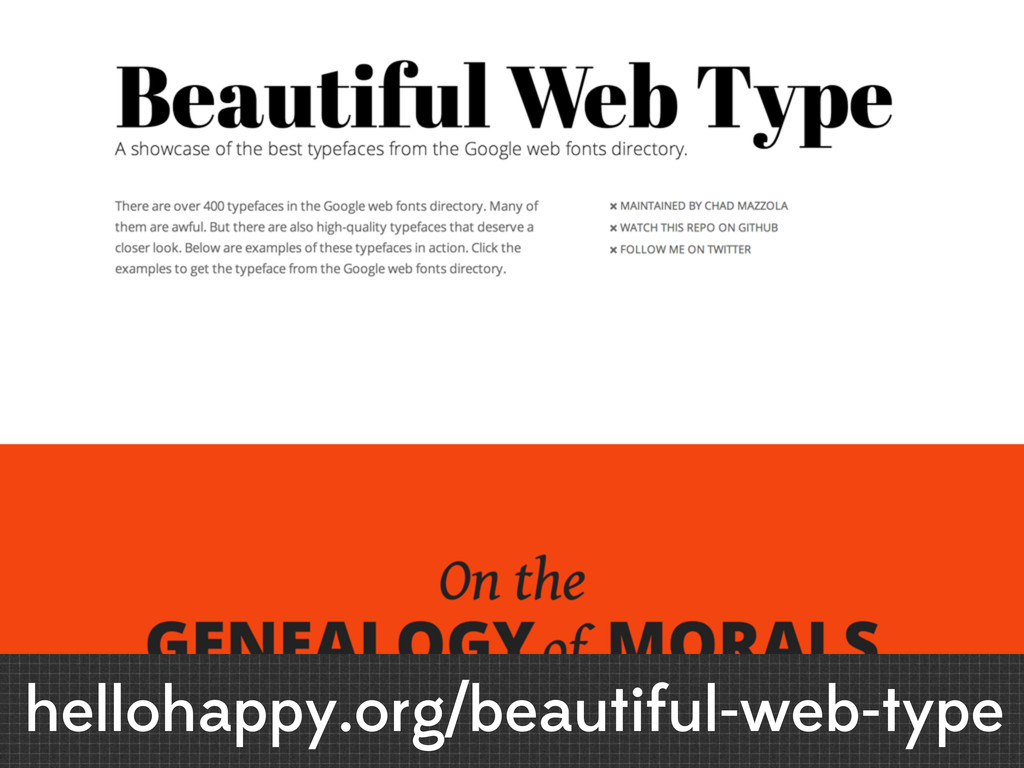
hellohappy.org/beautiful-web-type
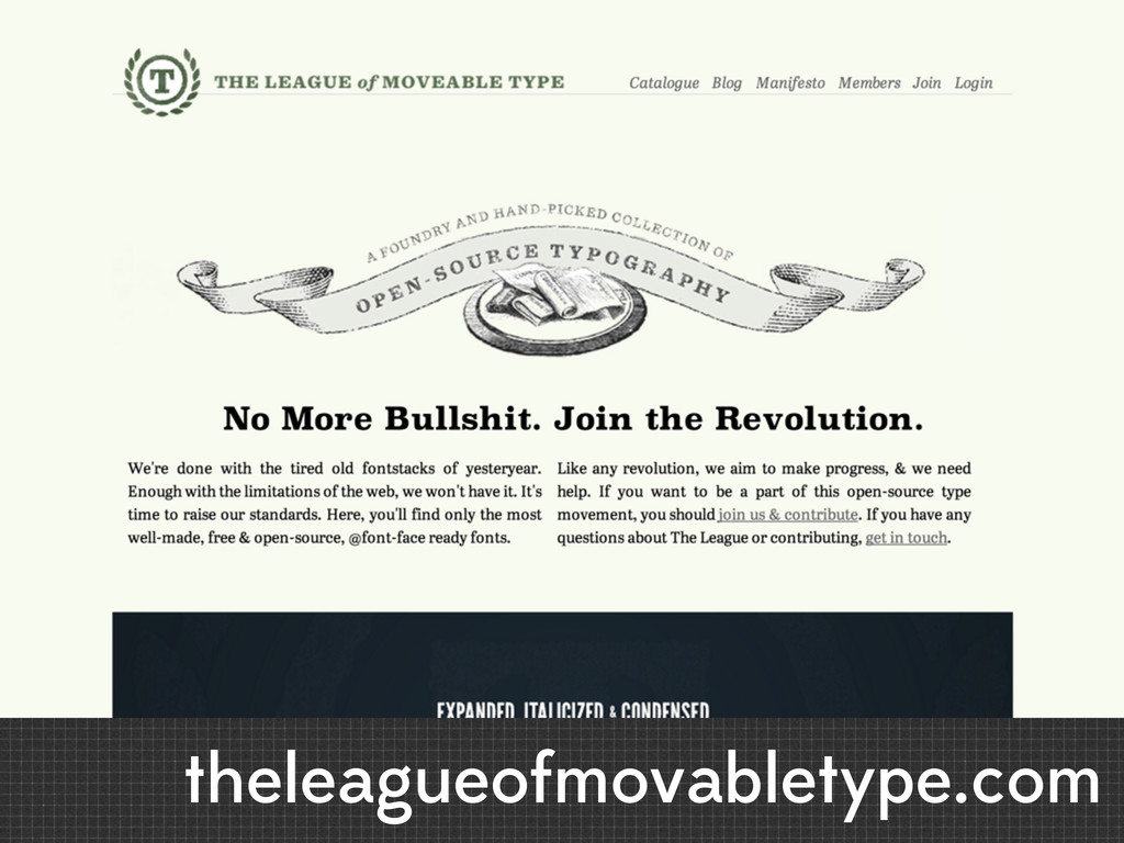
theleagueofmovabletype.com
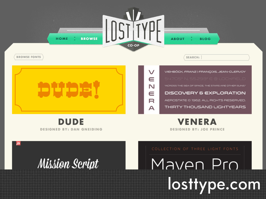
losttype.com
None
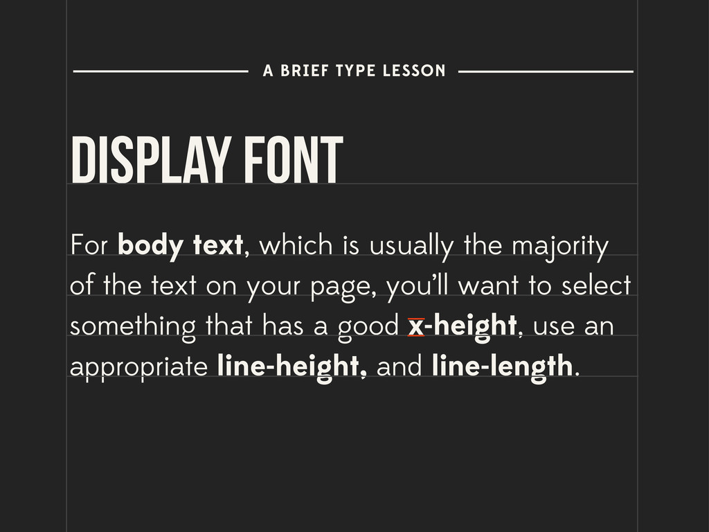
Display Font For body text, which is usually the majority
of the text on your page, you’ll want to select something that has a good x-height, use an appropriate line-height, and line-length. A BRIEF TYPE LESSON
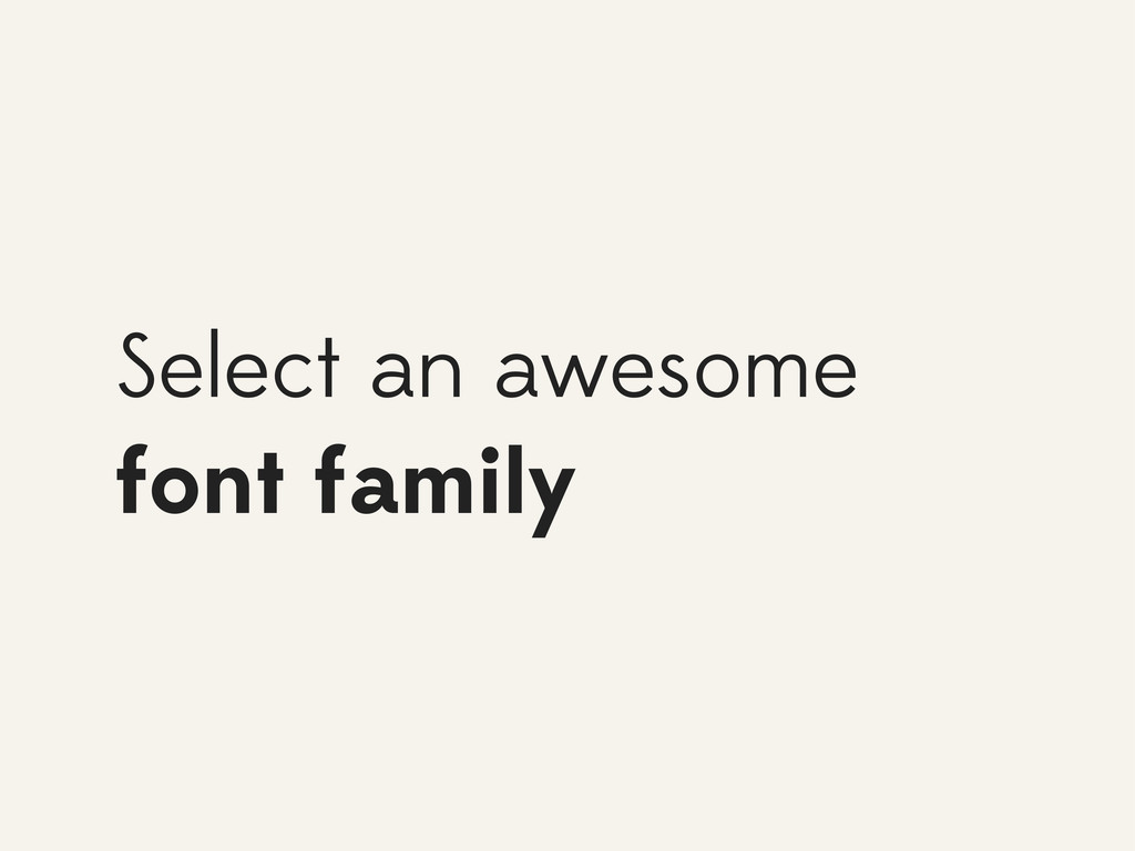
Select an awesome font family
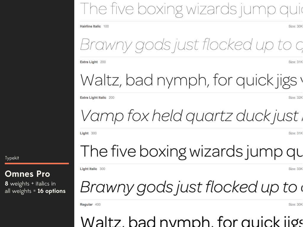
Omnes Pro 8 weights + italics in all weights =
16 options Typekit
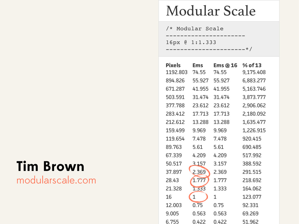
Use a modular scale
Tim Brown modularscale.com
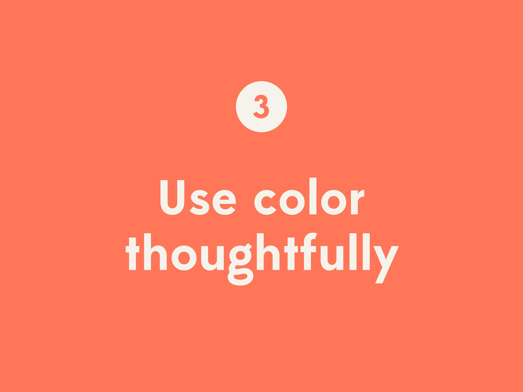
Use color thoughtfully 3
Selecting colors
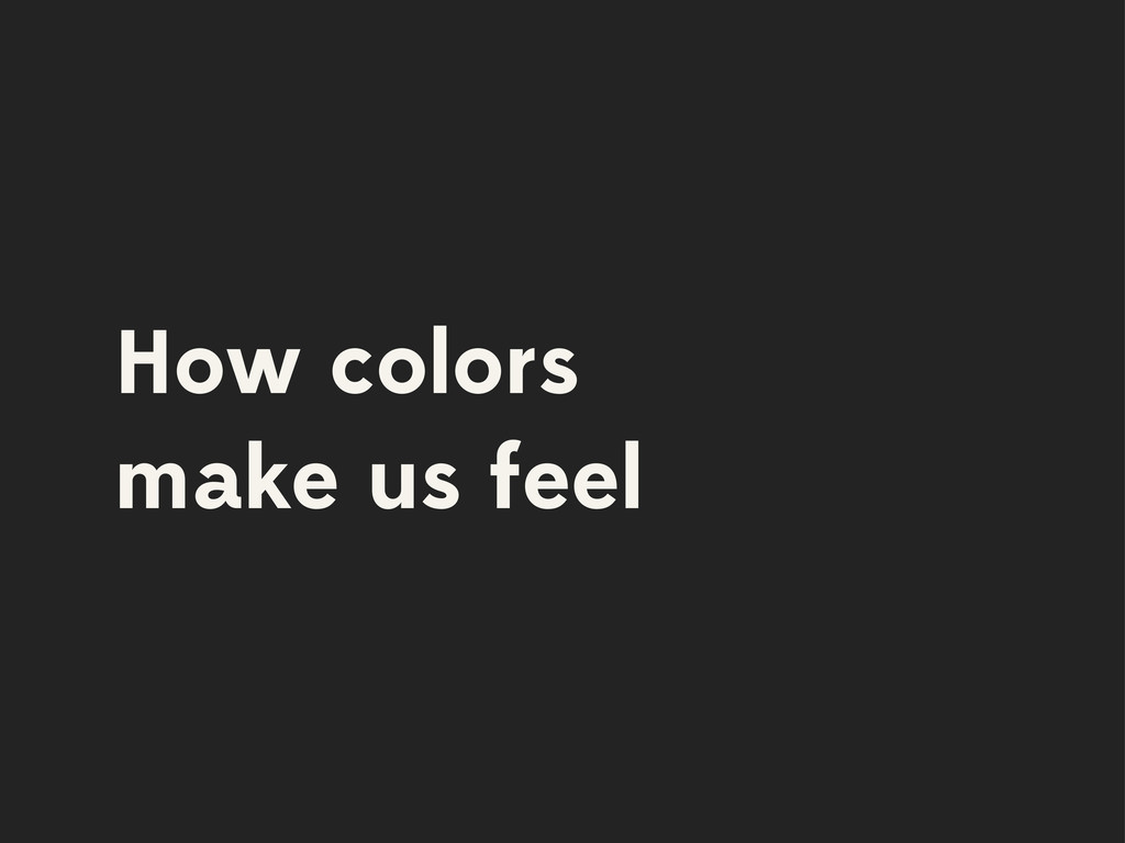
How colors make us feel
RED
None
YELLOW
None
GREEN
None
BLUE
None
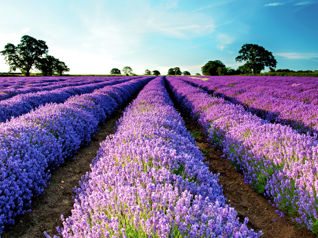
PURPLE
None
BLACK
None
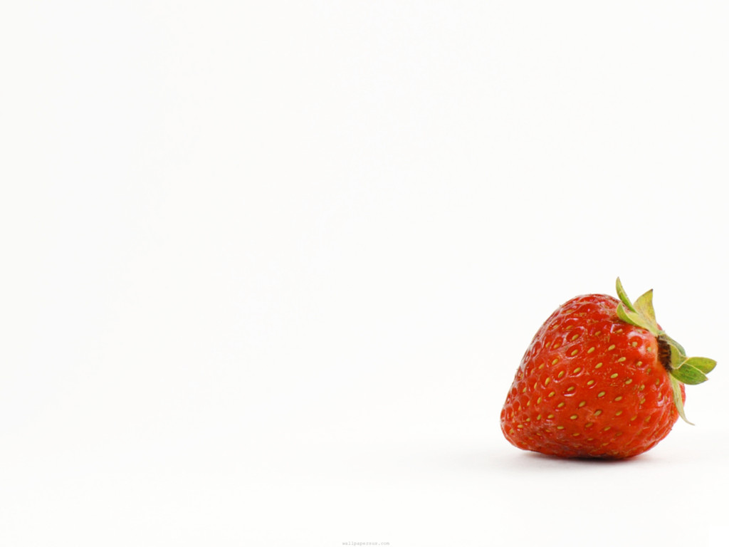
WHITE
None
None
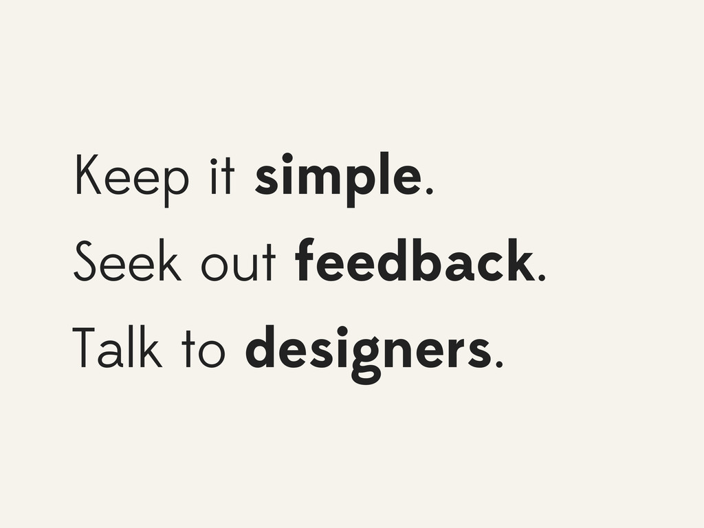
Some advice...
Keep it simple. Seek out feedback. Talk to designers.
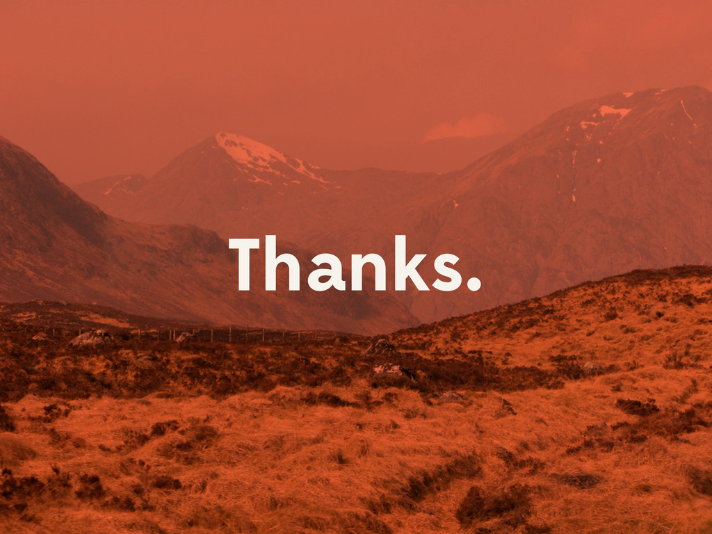
Thanks.
Image Credits: Blue: wallpoper.com/wallpaper/blue-tardis-369781 Red: www.avto.goodfon.com/ford/wallpaper-395830.html Yellow: topwalls.net/yellow-field-field-flowers-grass-house-landscape-nature-trees Purple: globeattractions.com/field-lavender-trees-sky-nature
Black: makeupbycherylh.com/2012/01/macbook-pro-15-inch-22-ghz-laptop.html Green: commons.wikimedia.org/wiki/File:Green_turtle_swimming.JPG White: www.hdwallpic.com/strawberries-white-background-1566.html ✎