Upgrade to Pro
— share decks privately, control downloads, hide ads and more …
Speaker Deck
Features
Speaker Deck
PRO
Sign in
Sign up for free
Search
Search
Stephanie Briones
Search
Stephanie Briones
February 15, 2013
83
2
Share
Embed
Copy iframe code
Copy JS code
Copy link
Start on current slide
Stephanie Briones
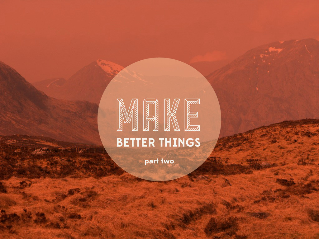
Make Better Things Part Two.
Stephanie Briones
February 15, 2013
More Decks by Stephanie Briones
See All by Stephanie Briones
Stephanie Briones
smbriones
4
260
Featured
See All Featured
It's Worth the Effort
3n
188
29k
Building a A Zero-Code AI SEO Workflow
portentint
PRO
0
600
Marketing Yourself as an Engineer | Alaka | Gurzu
gurzu
0
240
Rails Girls Zürich Keynote
gr2m
96
14k
JavaScript: Past, Present, and Future - NDC Porto 2020
reverentgeek
52
6k
Fashionably flexible responsive web design (full day workshop)
malarkey
408
66k
WCS-LA-2024
lcolladotor
0
650
JAMstack: Web Apps at Ludicrous Speed - All Things Open 2022
reverentgeek
1
480
Leadership Guide Workshop - DevTernity 2021
reverentgeek
1
310
Abbi's Birthday
coloredviolet
2
8.1k
Beyond borders and beyond the search box: How to win the global "messy middle" with AI-driven SEO
davidcarrasco
3
160
Product Roadmaps are Hard
iamctodd
PRO
55
12k
Transcript
MAKE BETTER THINGS part two
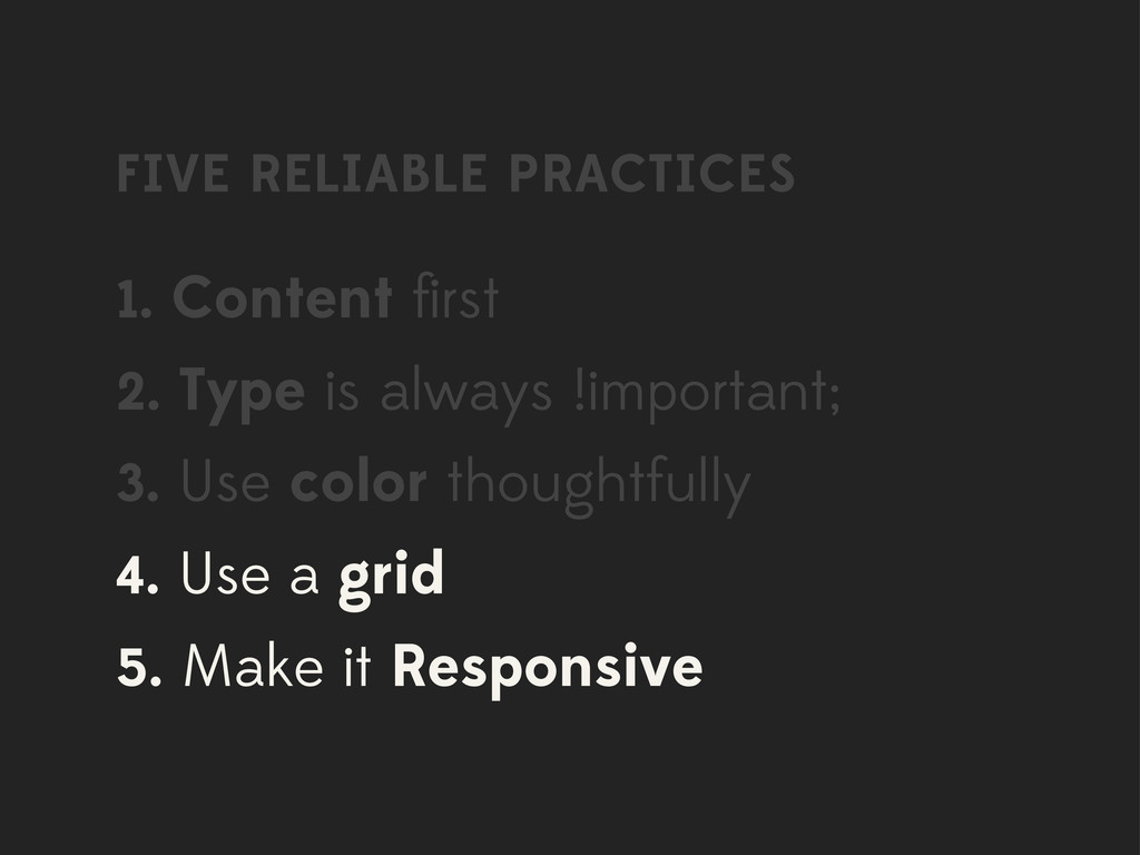
FIVE RELIABLE PRACTICES 1. Content first 2. Type is always
!important; 3. Use color thoughtfully 4. Use a grid 5. Make it Responsive
Questions are welcome
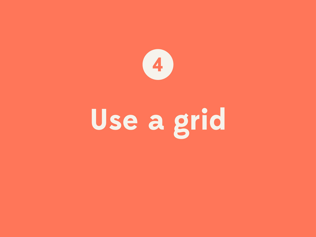
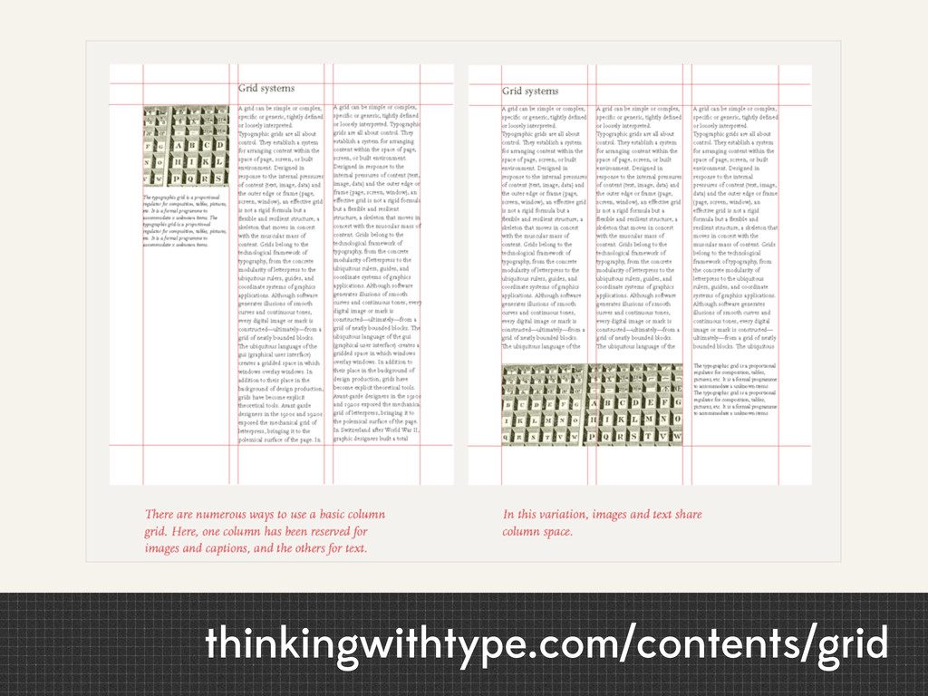
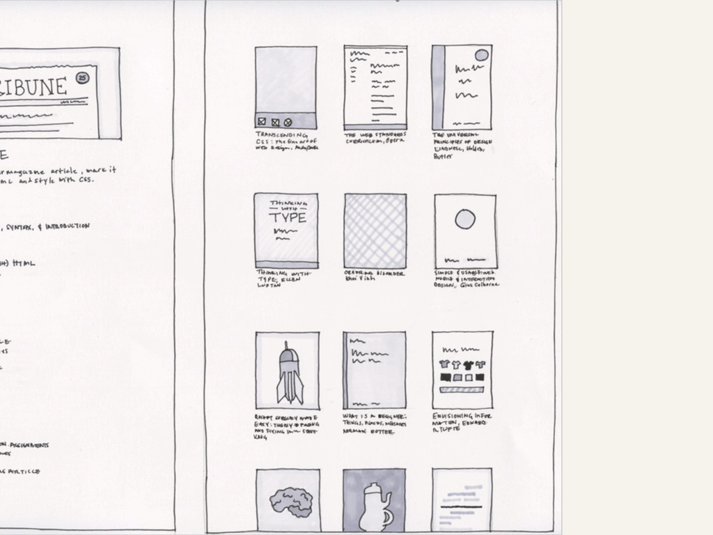
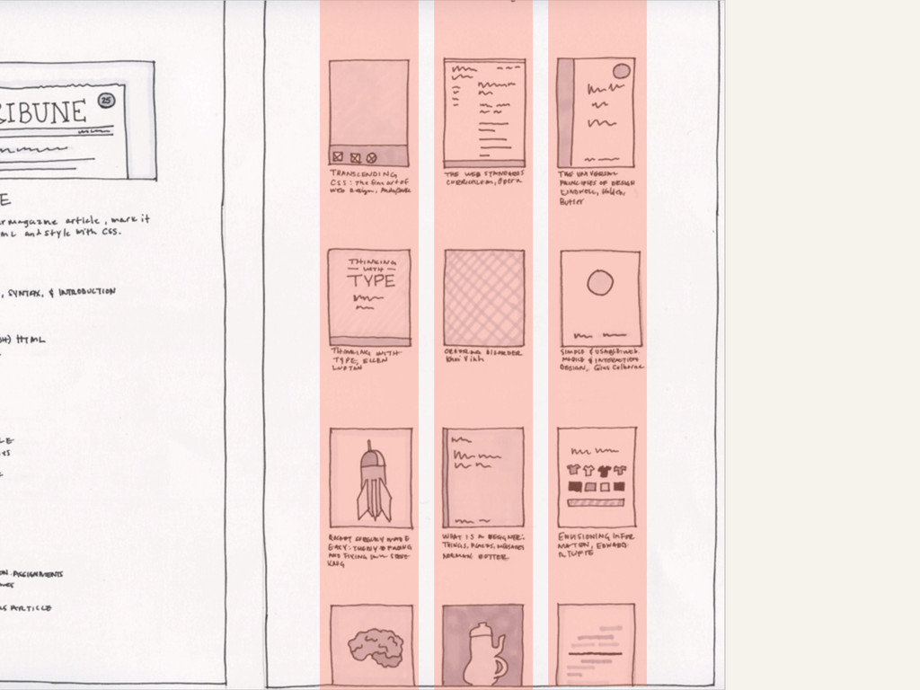
Use a grid 4
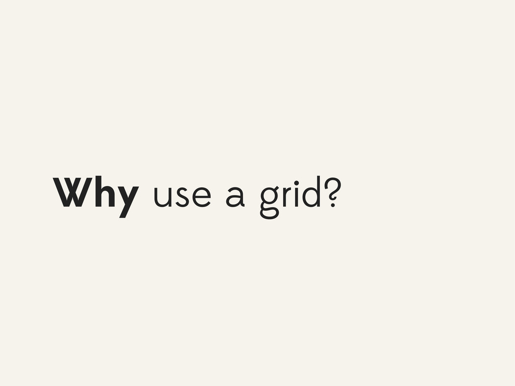
Why use a grid?
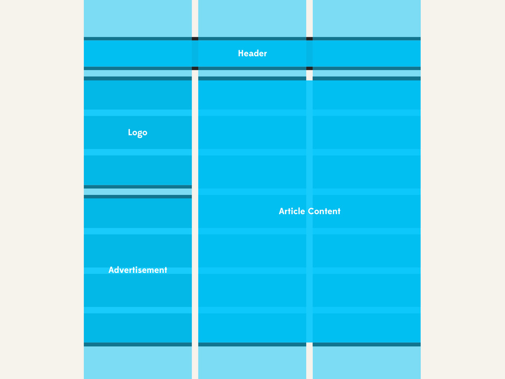
Advertisement Logo Article Content Header
None
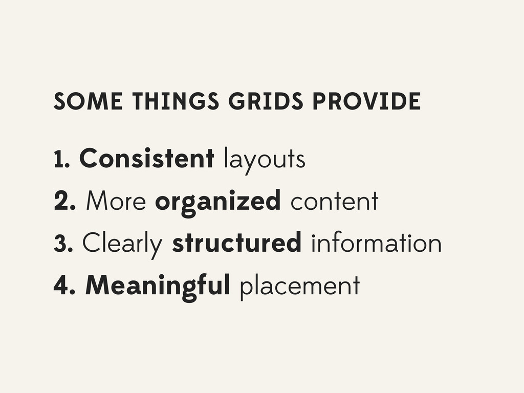
SOME THINGS GRIDS PROVIDE 1. Consistent layouts 2. More organized
content 3. Clearly structured information 4. Meaningful placement
thinkingwithtype.com/contents/grid
None
None
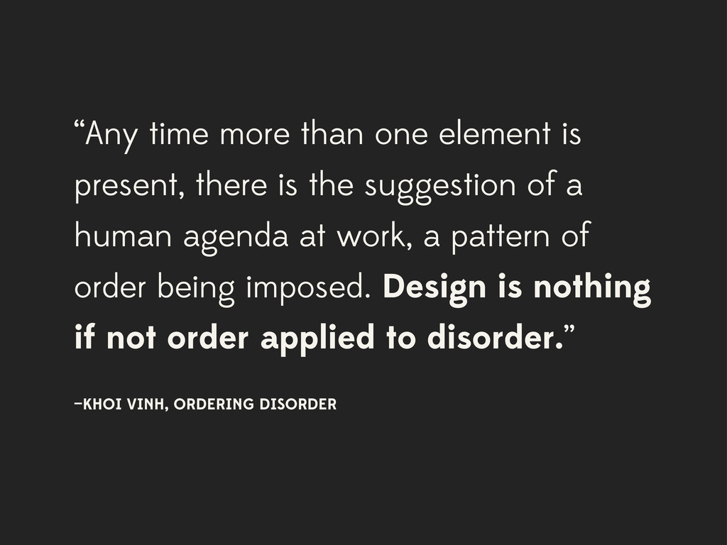
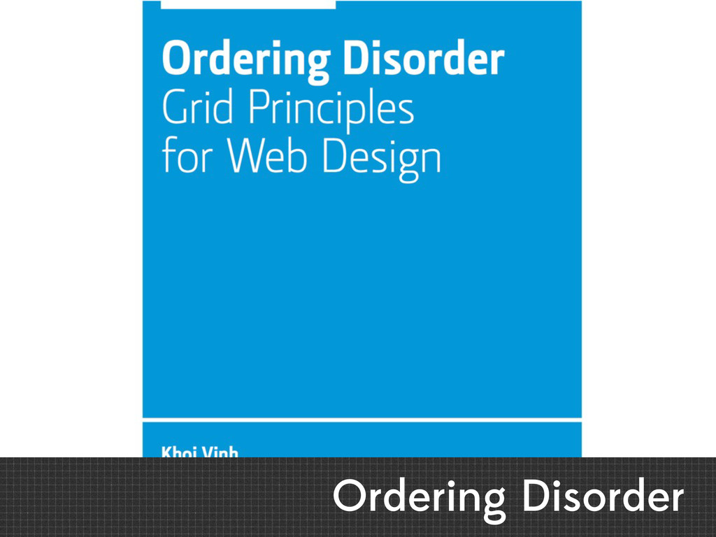
“Any time more than one element is present, there is
the suggestion of a human agenda at work, a pattern of order being imposed. Design is nothing if not order applied to disorder.” —KHOI VINH, ORDERING DISORDER
Start using grids
None
None
What I use
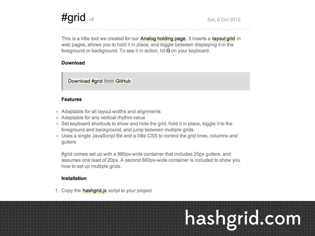
hashgrid.com
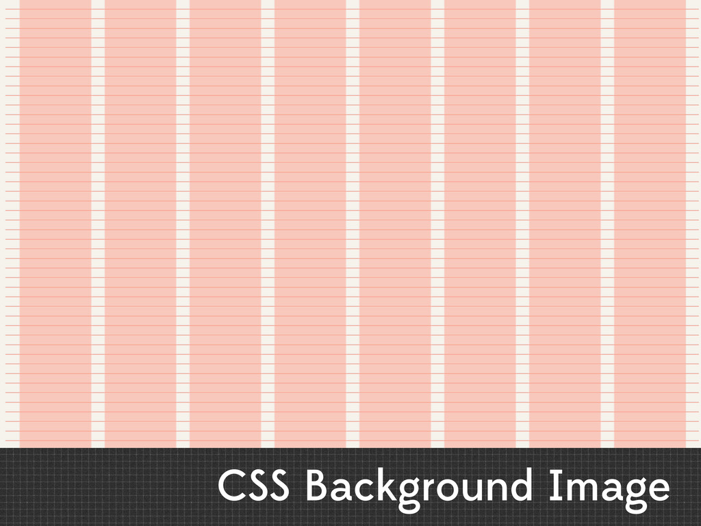
CSS Background Image
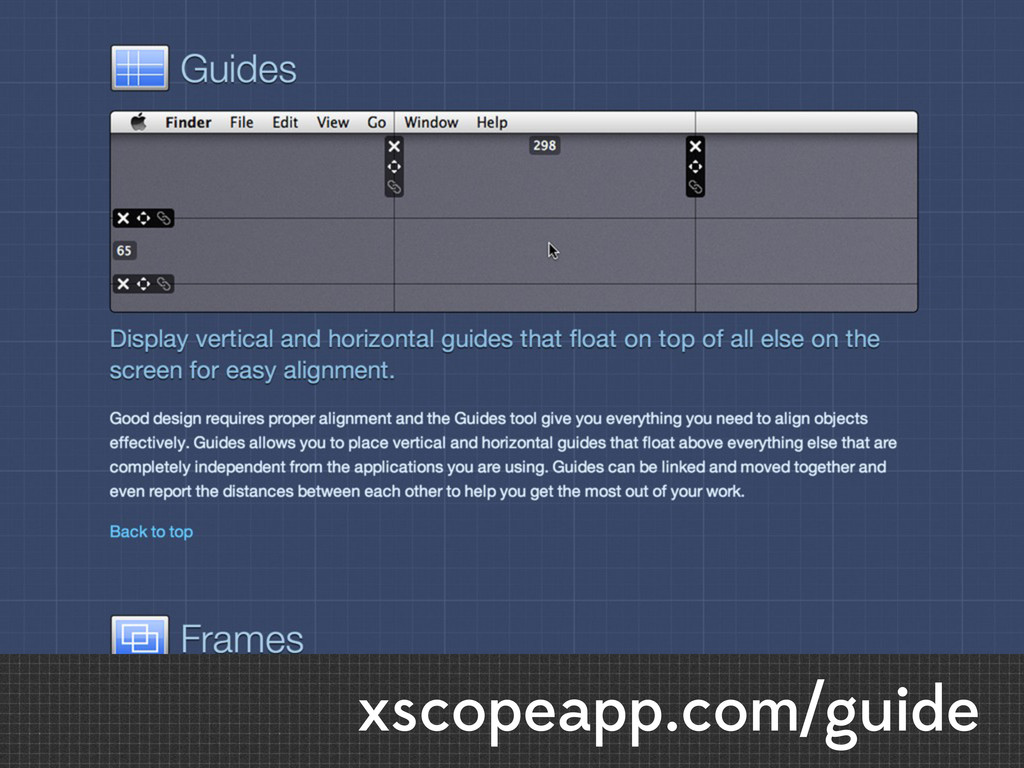
xscopeapp.com/guide
Ordering Disorder
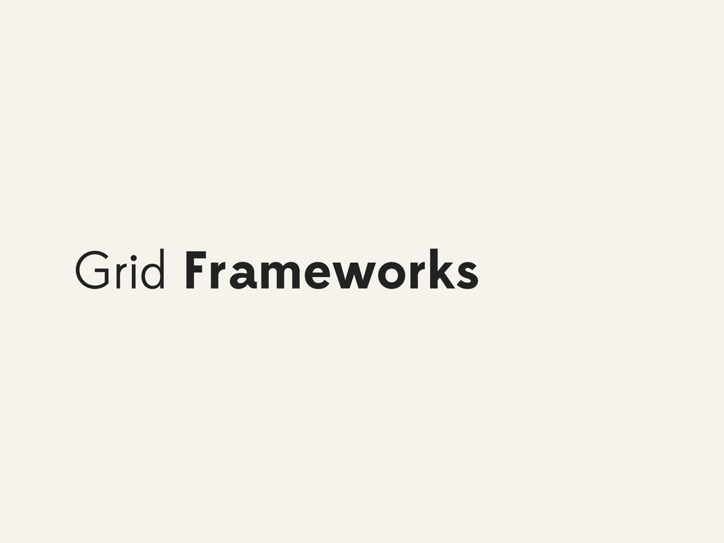
Grid Frameworks
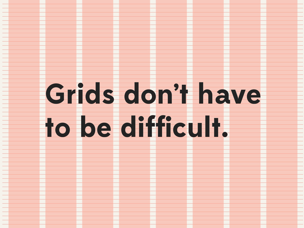
Grids don’t have to be difficult.
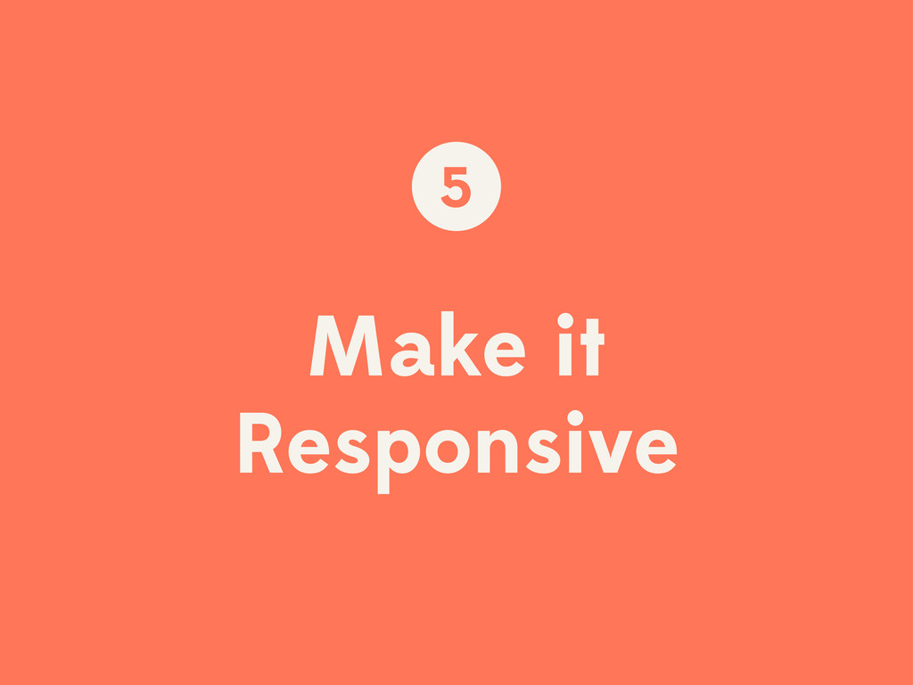
Make it Responsive 5
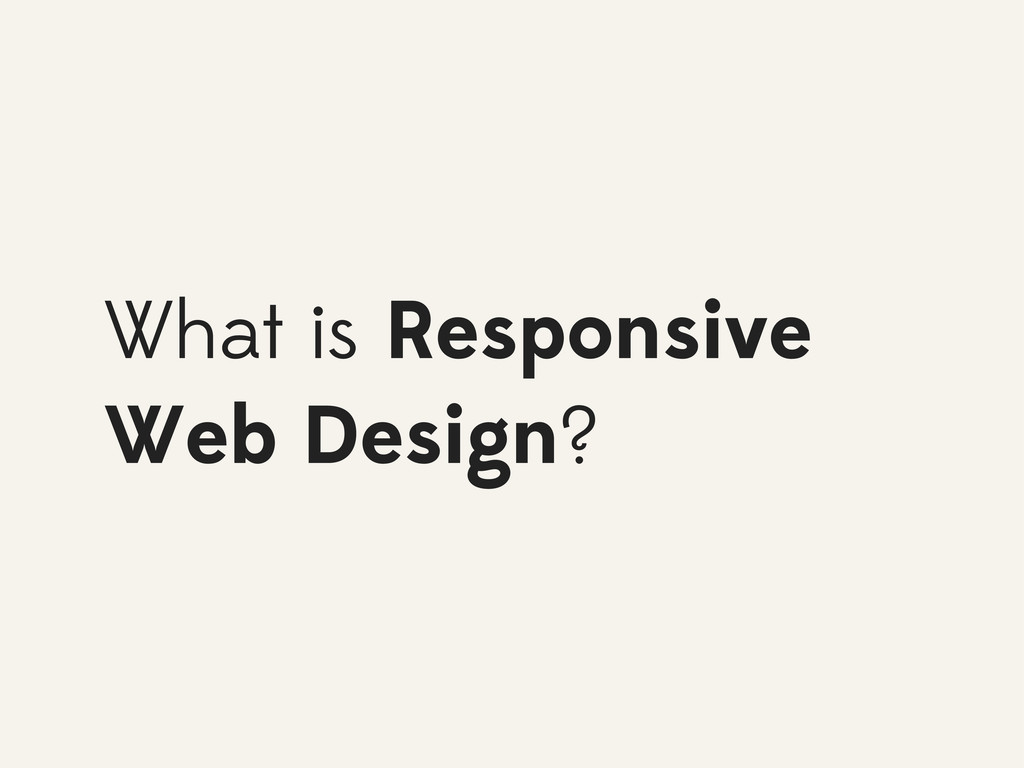
What is Responsive Web Design?
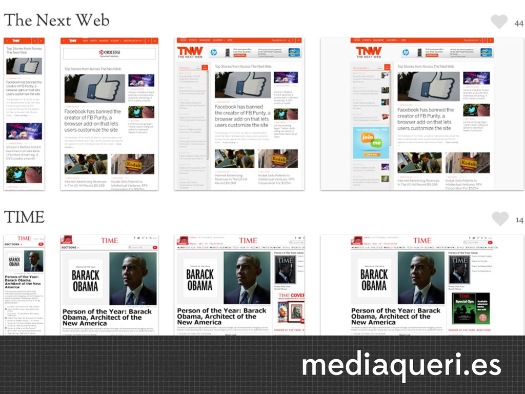
mediaqueri.es
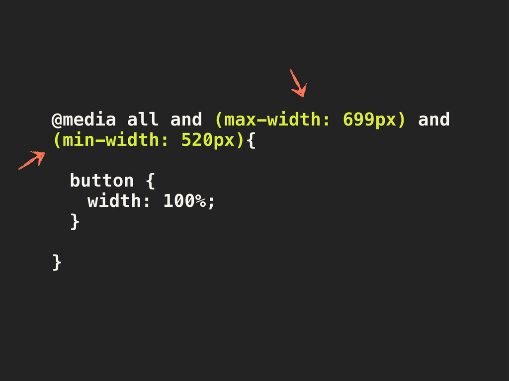
@media all and (max-width: 699px) and (min-width: 520px){ ! !
button { ! ! width: 100%;! ! } }
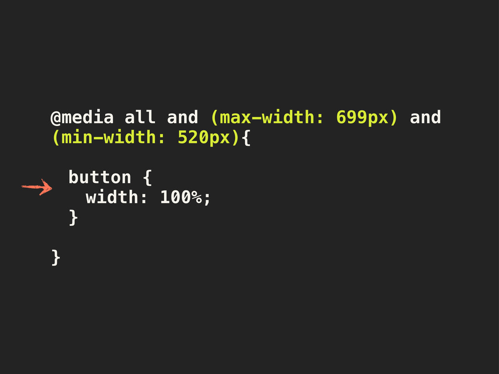
@media all and (max-width: 699px) and (min-width: 520px){ ! !
button { ! ! width: 100%;! ! } }
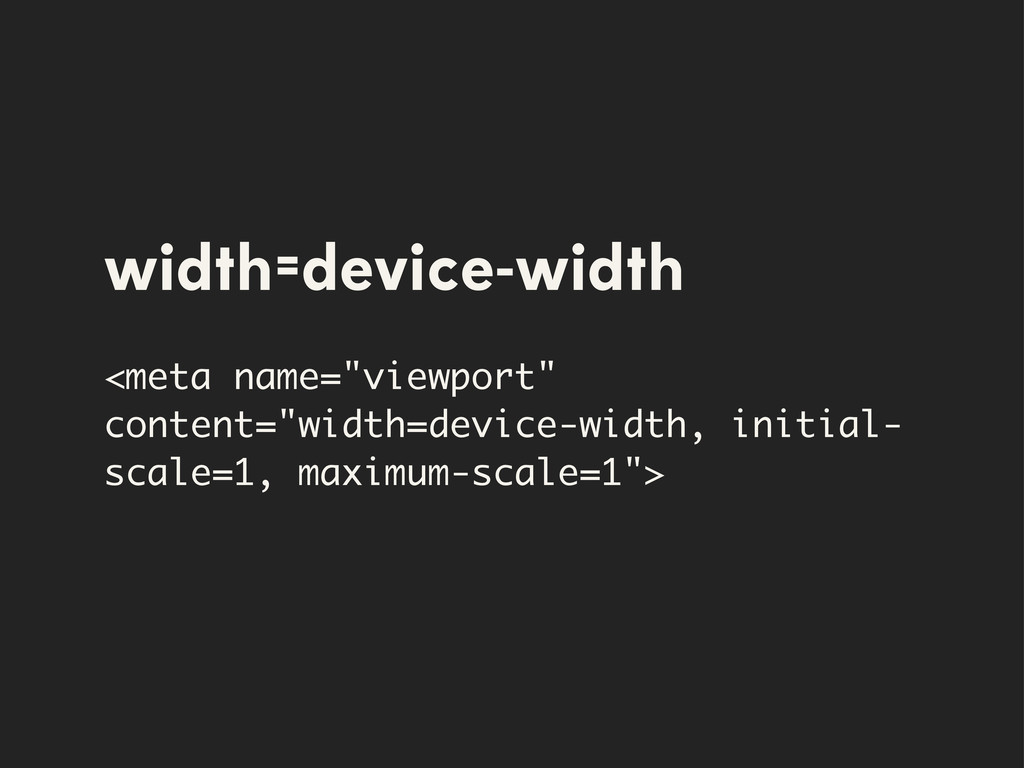
width=device-width <meta name="viewport" content="width=device-width, initial- scale=1, maximum-scale=1">
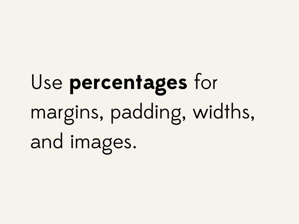
Use percentages for margins, padding, widths, and images.
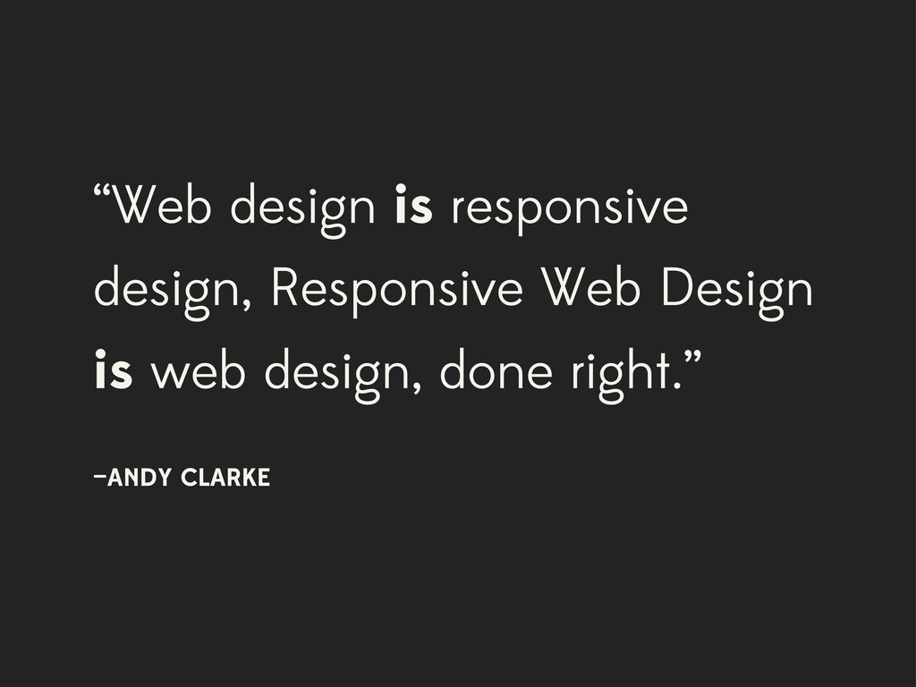
“Web design is responsive design, Responsive Web Design is web
design, done right.” —ANDY CLARKE
My Process
None
None
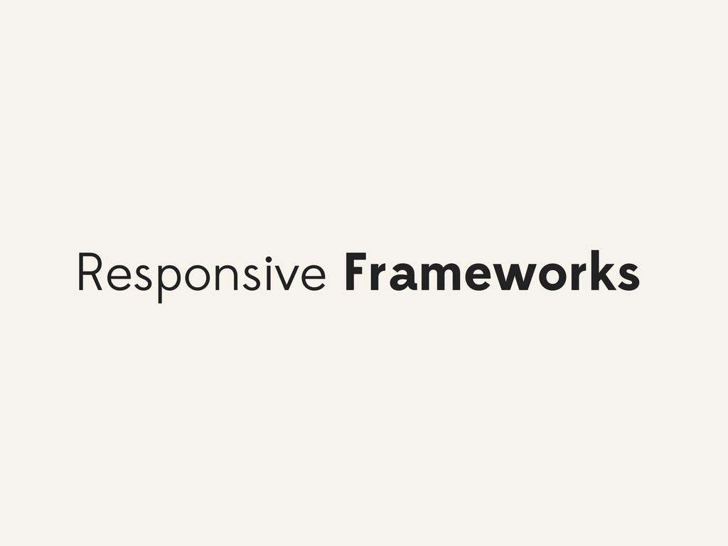
Responsive Frameworks
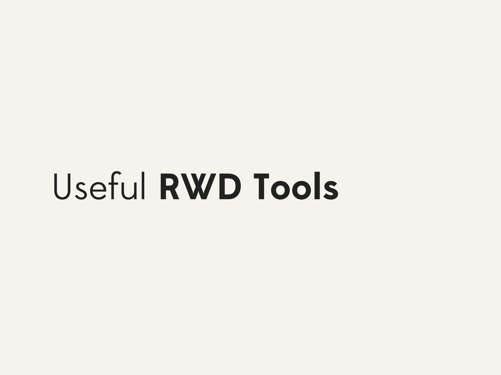
Useful RWD Tools
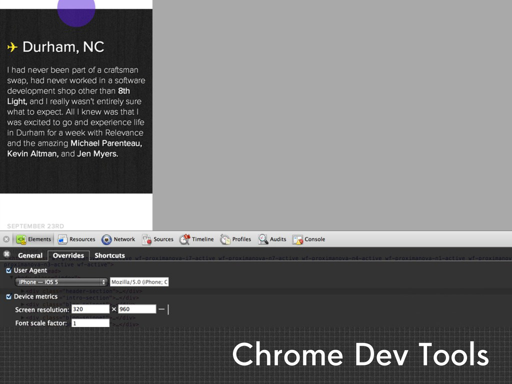
Chrome Dev Tools
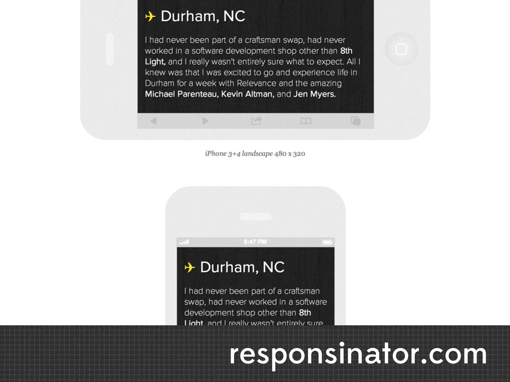
responsinator.com
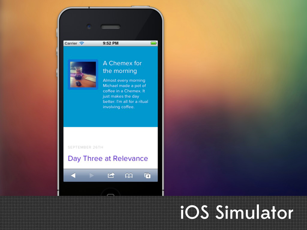
iOS Simulator
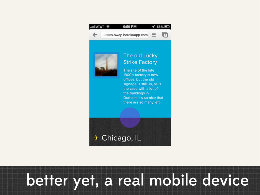
better yet, a real mobile device
xscopeapp.com/guide
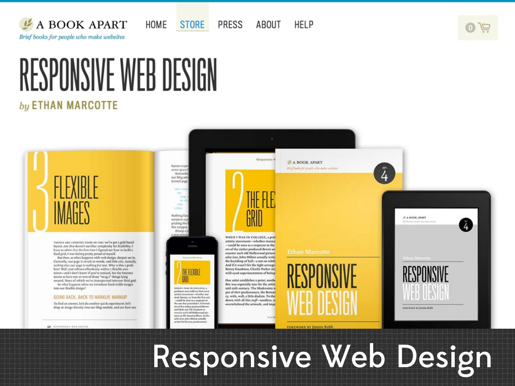
Responsive Web Design
Bonus Points
Don't forget the details Optimize for Retina
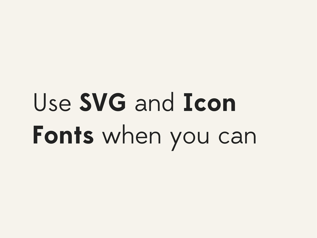
Use SVG and Icon Fonts when you can
thenounproject.com
css-tricks.com/examples/IconFont
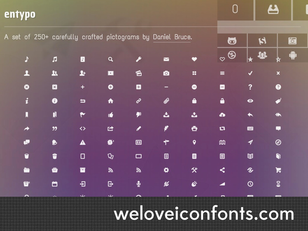
weloveiconfonts.com
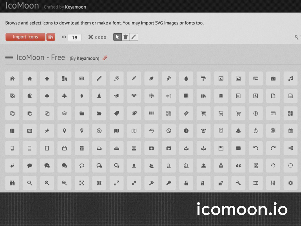
icomoon.io
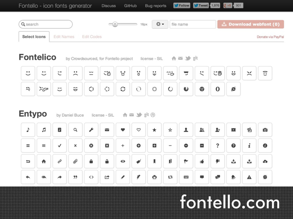
fontello.com
SOME ADVICE 1. Don't over-think grids 2. Build things fluidly
Thanks.
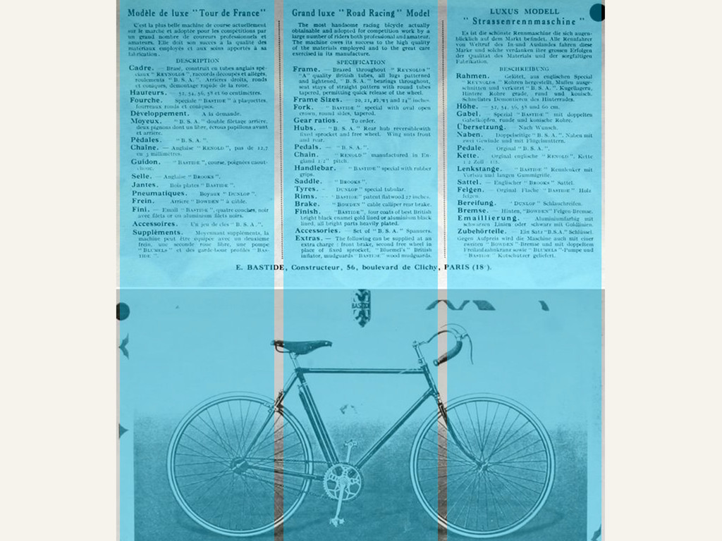
Image Credits: Vintage Bike Article: classiclightweights.co.uk/designs/bastide-hs.html ✎
 smbriones
 3n
3n
 portentint
 gurzu
gurzu
 gr2m
gr2m
 reverentgeek
 malarkey
 lcolladotor
 coloredviolet
 davidcarrasco
 iamctodd