Upgrade to Pro
— share decks privately, control downloads, hide ads and more …
Speaker Deck
Features
Speaker Deck
PRO
Sign in
Sign up for free
Search
Search
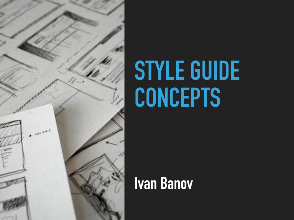
Style Guide Concepts
Search
Ivan Banov
July 01, 2016
Technology
500
6
Share
Embed
Copy iframe code
Copy JS code
Copy link
Start on current slide
Style Guide Concepts
Ivan Banov
July 01, 2016
More Decks by Ivan Banov
See All by Ivan Banov
XSS
ivanbanov
0
200
Grids Everywhere
ivanbanov
3
460
Other Decks in Technology
See All in Technology
ruby.wasmとPicoRuby.wasmに対応した仮想DOMライブラリを作ってる話 #kaigieffect_kaigi
sue445
PRO
0
150
[2026-07-15] AI Ready なはずだったアーキテクチャと、見えてきた課題・次に目指す状態
wxyzzz
10
4k
LLM/Agent評価:トップ営業の発言を「正解」にする 〜暗黙的正解による評価を営業資産に変える〜
takkuhiro
1
230
穢れた技術選定について
watany
18
5.7k
SRE Next 2026 何でも屋からの脱却
bto
0
1k
“それは自分の仕事じゃない"を 越えて行け
yuukiyo
1
490
伝票作成AIエージェントを支える、LLMOpsとインフラの選択肢 / AICon2026_takeda
rakus_dev
0
140
AI時代のPlaywright活用(システムテストを自動化する ー 実行エンジンにPla ywrightを選んだ理由)
ynisqa1988
1
690
関数型の考えを TypeScript に持ち込んで、テストしやすい純粋関数を増やす / Pure at the Core, Effects at the Edge: Bringing Functional Thinking into TypeScript
kaminashi
2
130
AIが当たり前の組織で エンジニアはどう育つか
nishihira
1
160
AI Coding Agent時代のcdk-nagガードレール 〜組織ルールを強制CIで守り抜く設計の挑戦〜
mhrtech
3
440
SRE本の知られざる名シーン / The Hidden Gems of Google SRE Book
nari_ex
2
430
Featured
See All Featured
Documentation Writing (for coders)
carmenintech
77
5.4k
JavaScript: Past, Present, and Future - NDC Porto 2020
reverentgeek
52
6k
Designing Dashboards & Data Visualisations in Web Apps
destraynor
231
55k
The Curse of the Amulet
leimatthew05
2
13k
Unlocking the hidden potential of vector embeddings in international SEO
frankvandijk
0
870
The browser strikes back
jonoalderson
0
1.4k
Faster Mobile Websites
deanohume
310
32k
Hiding What from Whom? A Critical Review of the History of Programming languages for Music
tomoyanonymous
3
990
No one is an island. Learnings from fostering a developers community.
thoeni
21
3.8k
Claude Code どこまでも/ Claude Code Everywhere
nwiizo
65
56k
Google's AI Overviews - The New Search
badams
0
1.1k
What's in a price? How to price your products and services
michaelherold
247
13k
Transcript
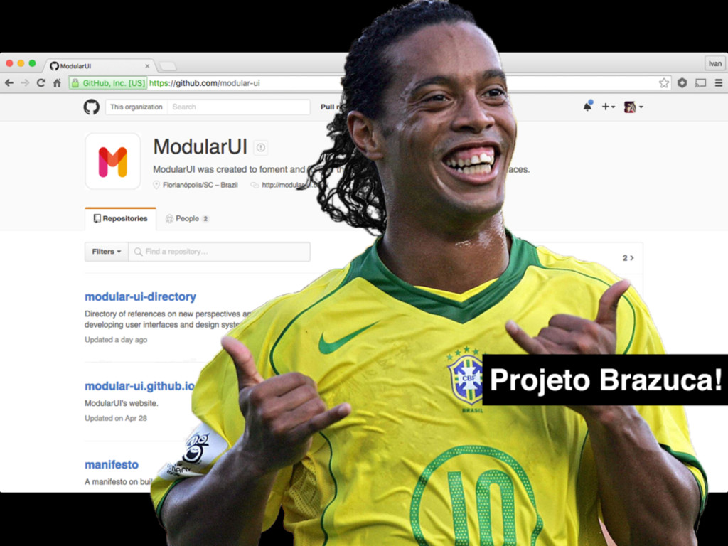
STYLE GUIDE CONCEPTS Ivan Banov
@BANKFACIL IVAN BANOV FRONTEND ENGINEER
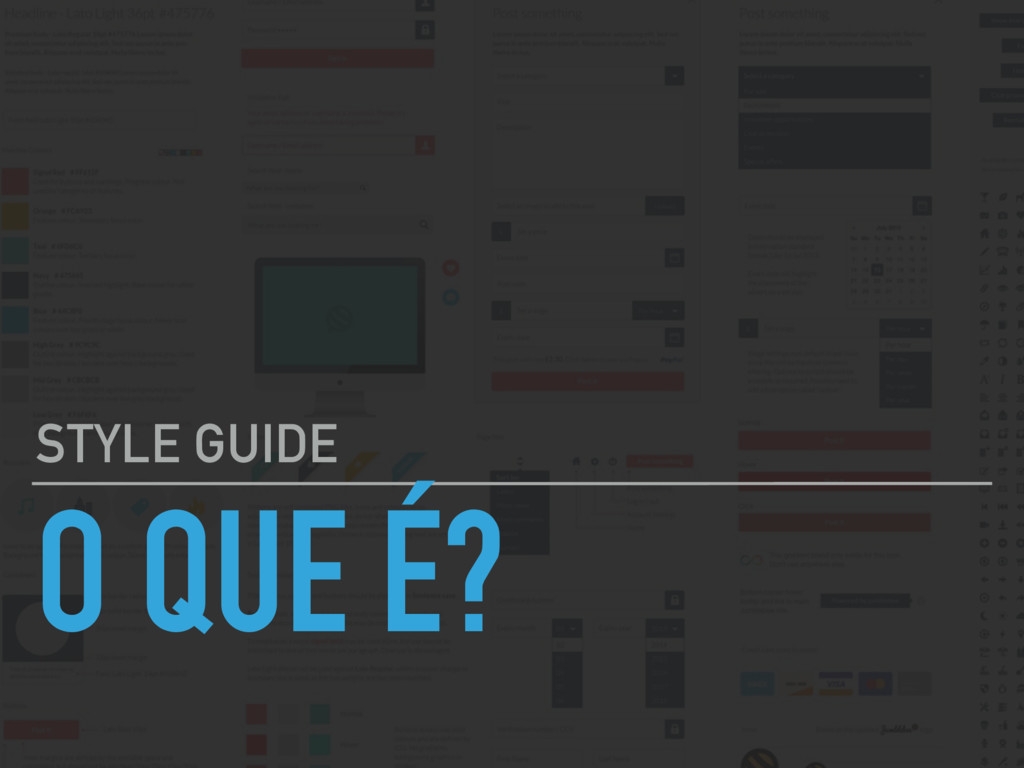
O QUE É? STYLE GUIDE
None
None
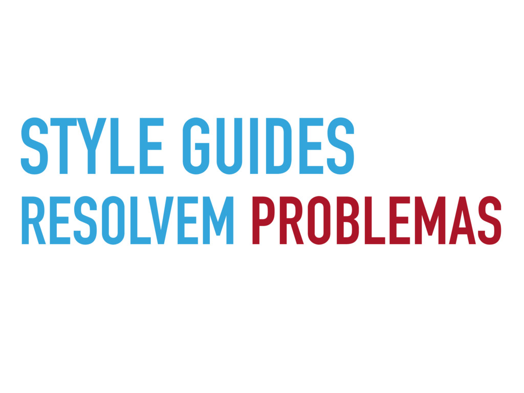
STYLE GUIDES RESOLVEM PROBLEMAS
STYLE GUIDES NÃO LIMITAM
STYLE GUIDES EVITAM PROBLEMAS
None
W H A T ?
None
None
None
None
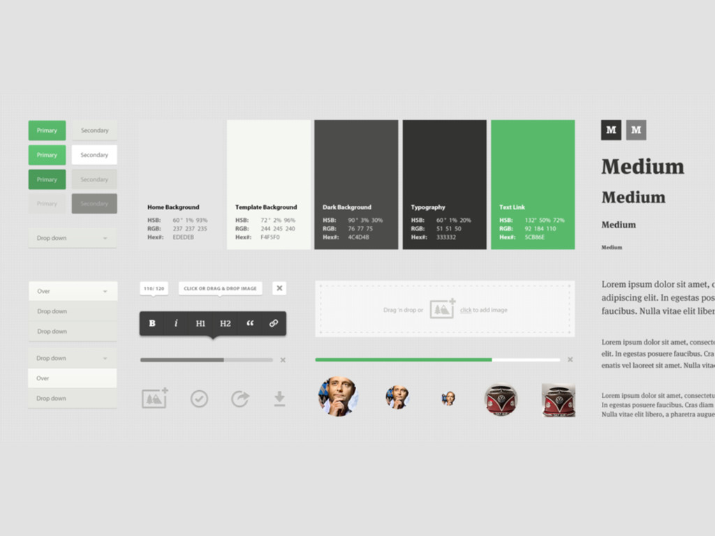
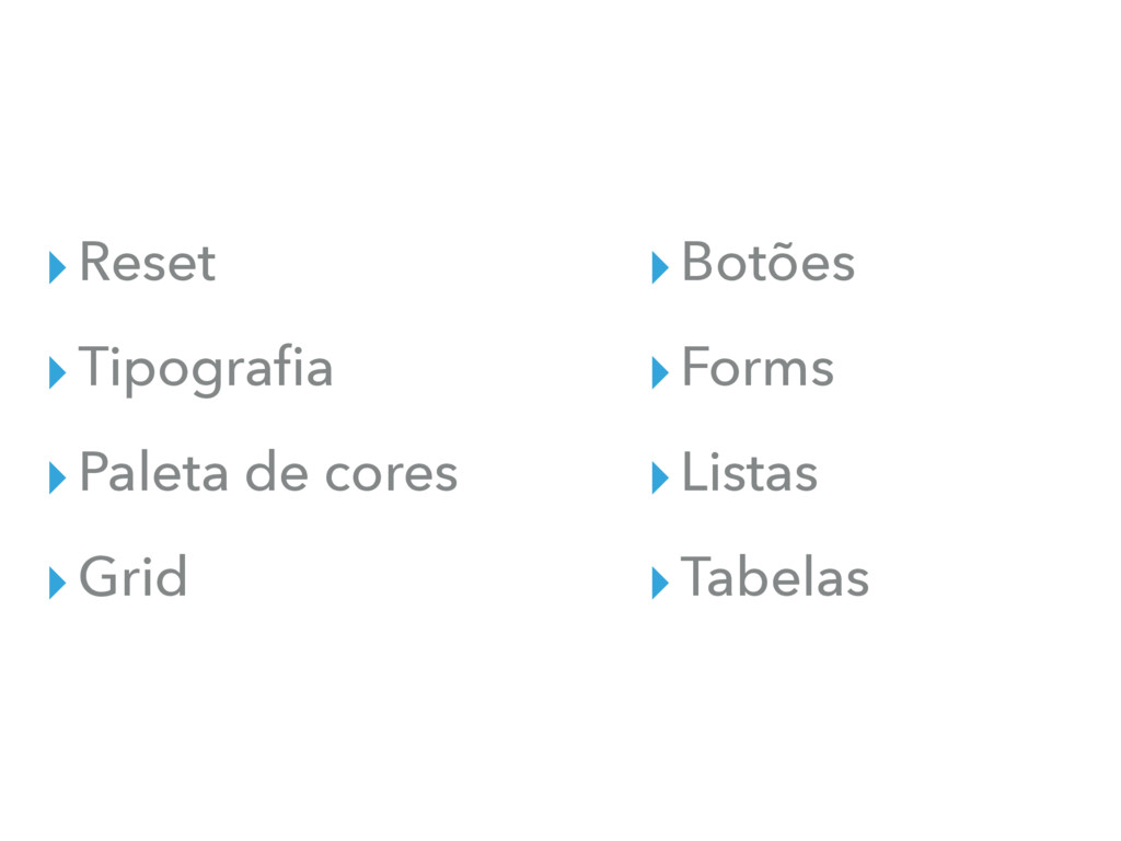
STYLE GUIDES DEFAULTS
▸Reset ▸Tipografia ▸Paleta de cores ▸Grid ▸Botões ▸Forms ▸Listas ▸Tabelas
None
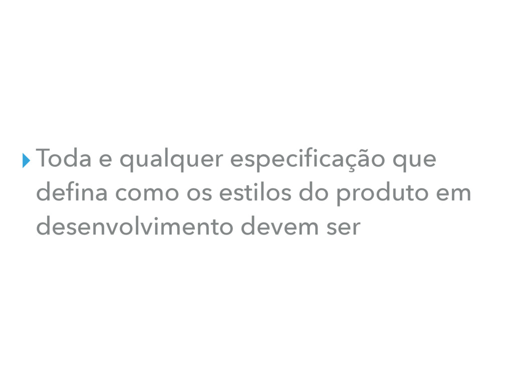
▸Toda e qualquer especificação que defina como os estilos do
produto em desenvolvimento devem ser
POR QUE? STYLE GUIDE
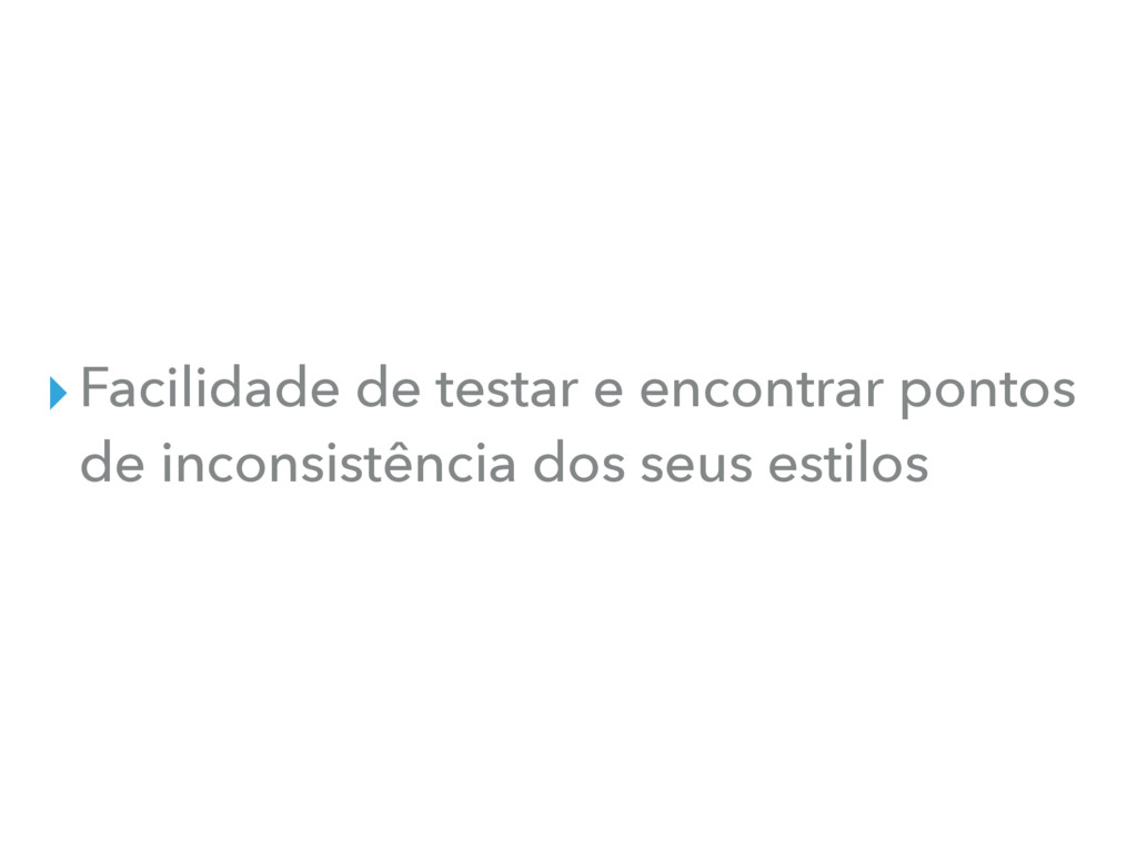
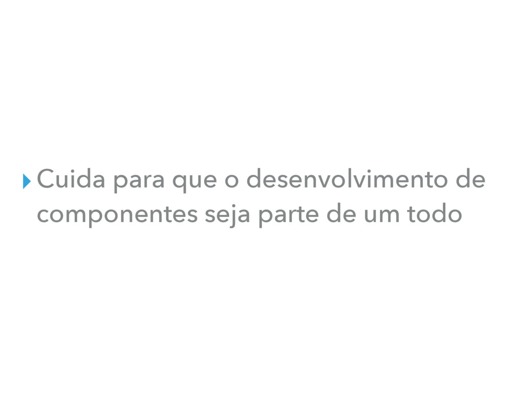
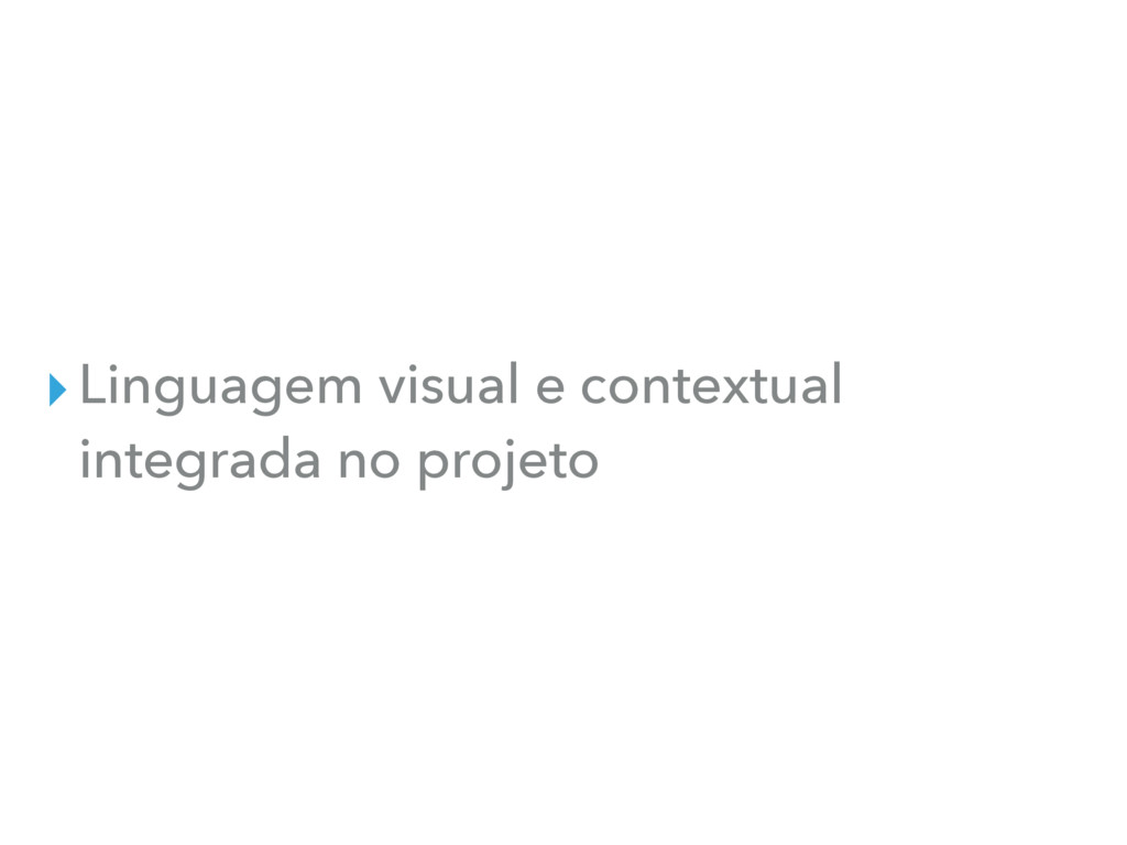
▸Facilidade de testar e encontrar pontos de inconsistência dos seus
estilos
▸Cuida para que o desenvolvimento de componentes seja parte de
um todo
▸Linguagem visual e contextual integrada no projeto
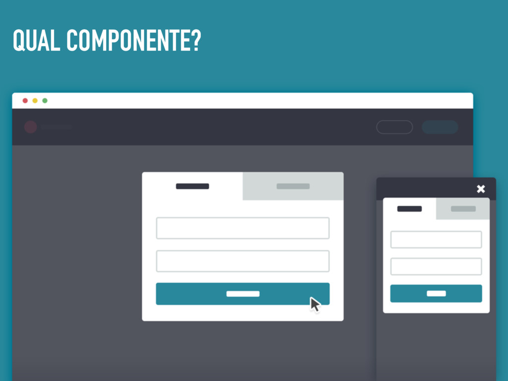
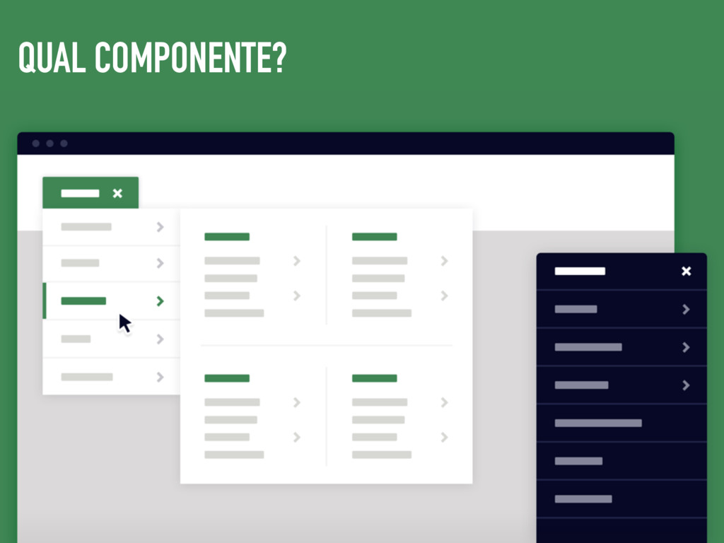
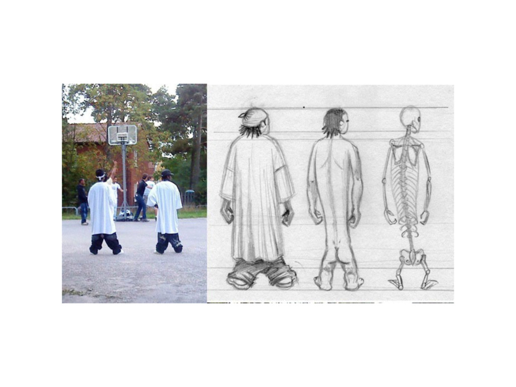
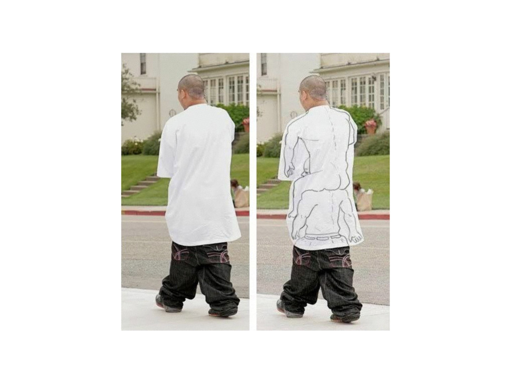
QUAL COMPONENTE?
QUAL COMPONENTE?
▸Pode ser complicado no começo, mas te trará paz a
longo prazo
None
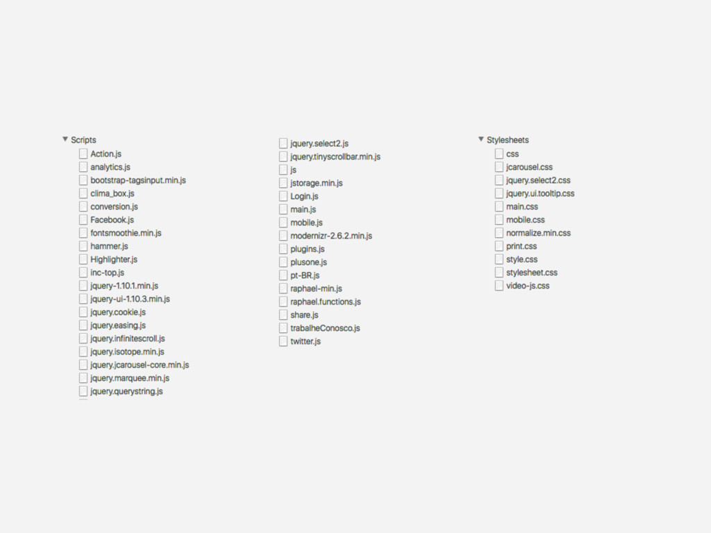
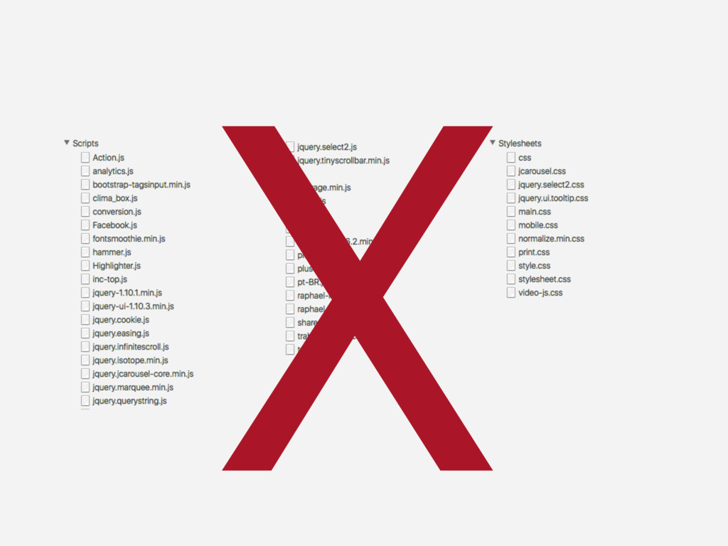
X
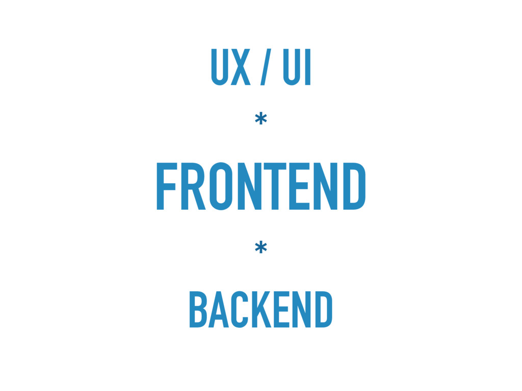
E POR ONDE EU COMEÇO? FRONTEND
None
UX / UI * FRONTEND * BACKEND
FRAMEWORK FRONTEND DEVE SUPORTAR A UI
None
None
None
FRAMEWORK É O CÓDIGO DO STYLE GUIDE
ADAPTAR UM FRAMEWORK
None
None
None
None
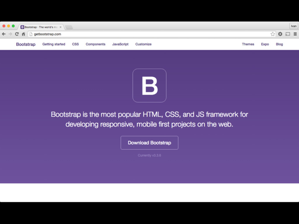
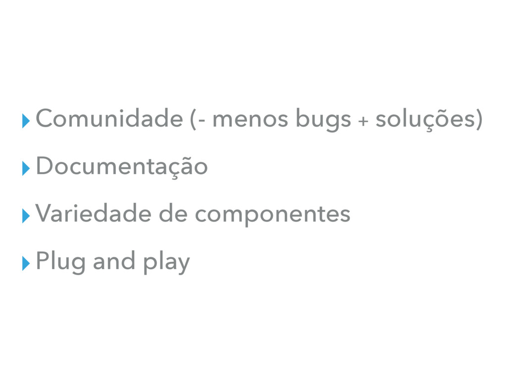
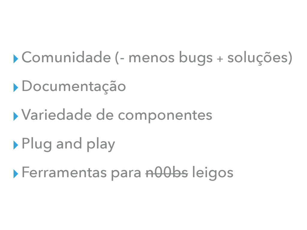
SOLUÇÃO PRONTA PRÓS
▸Comunidade (- menos bugs + soluções)
▸Comunidade (- menos bugs + soluções) ▸Documentação
▸Comunidade (- menos bugs + soluções) ▸Documentação ▸Variedade de componentes
▸Comunidade (- menos bugs + soluções) ▸Documentação ▸Variedade de componentes
▸Plug and play
▸Comunidade (- menos bugs + soluções) ▸Documentação ▸Variedade de componentes
▸Plug and play ▸Ferramentas para n00bs leigos
None
MENOS É MAIS
None
None
SOLUÇÃO PRONTA CONTRAS
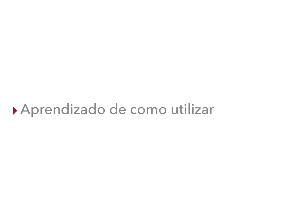
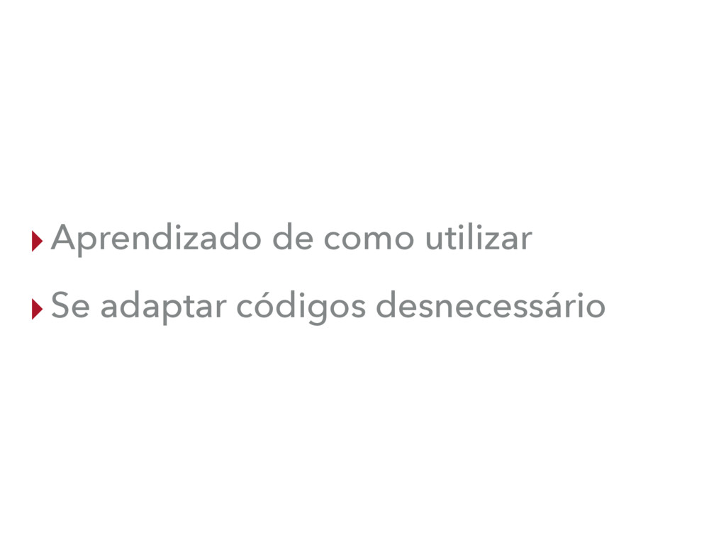
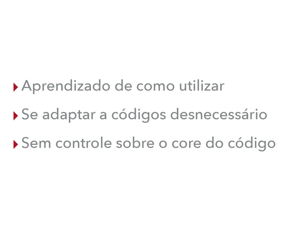
▸Aprendizado de como utilizar
▸Aprendizado de como utilizar ▸Se adaptar códigos desnecessário
▸Aprendizado de como utilizar ▸Se adaptar a códigos desnecessário ▸Sem
controle sobre o core do código
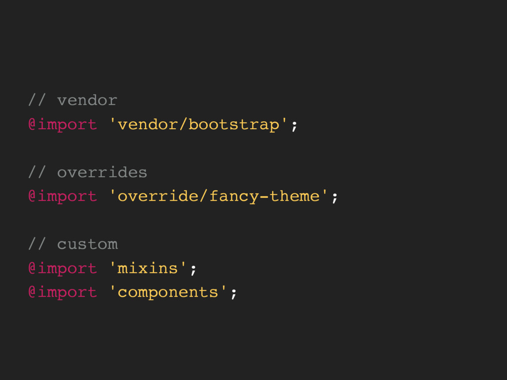
// vendor @import 'vendor/bootstrap'; // overrides @import 'override/fancy-theme'; // custom
@import 'mixins'; @import 'components';
DO IT YOURSELF
SOLUÇÃO CUSTOM PRÓS
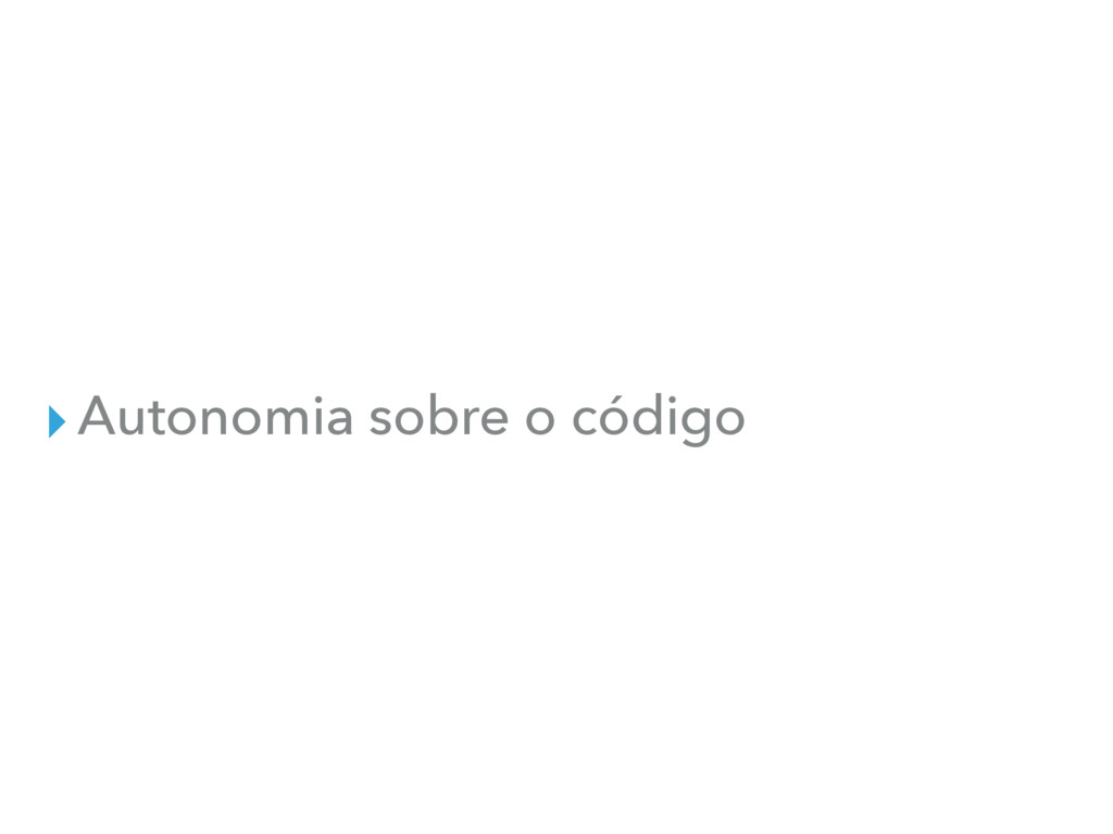
▸Autonomia sobre o código
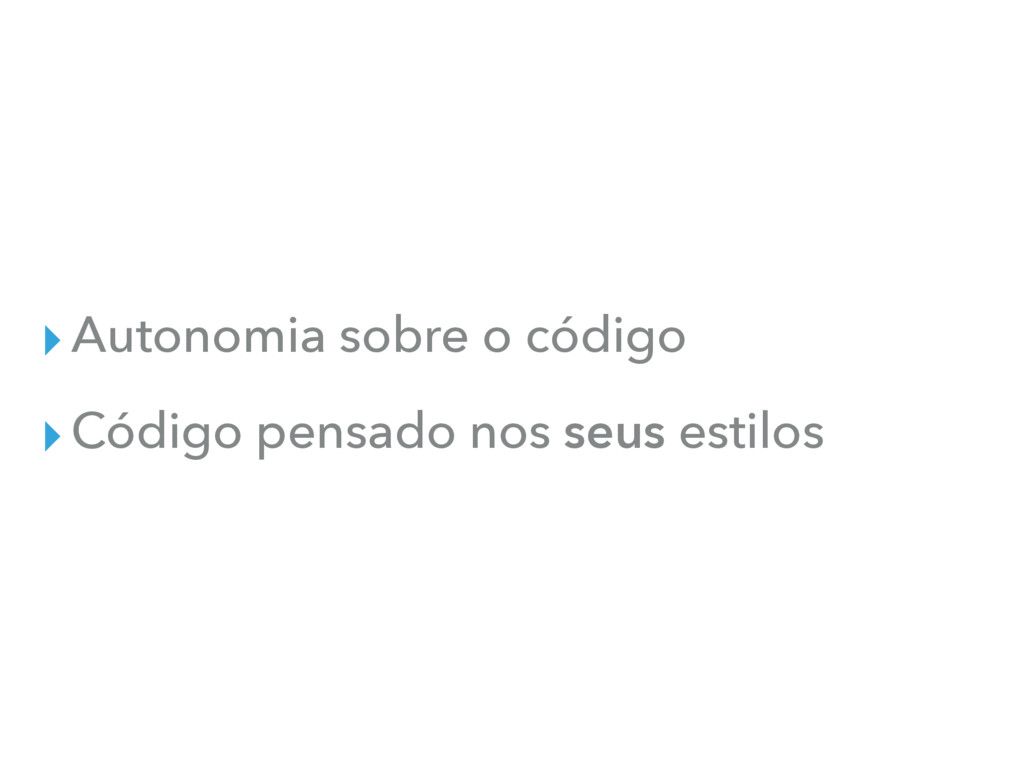
▸Autonomia sobre o código ▸Código pensado nos seus estilos
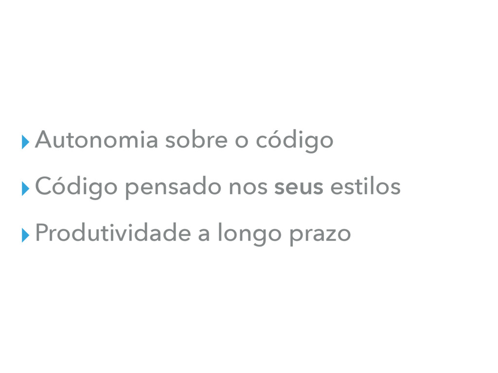
▸Autonomia sobre o código ▸Código pensado nos seus estilos ▸Produtividade
a longo prazo
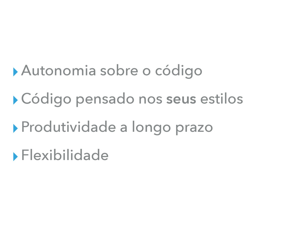
▸Autonomia sobre o código ▸Código pensado nos seus estilos ▸Produtividade
a longo prazo ▸Flexibilidade
SOLUÇÃO CUSTOM CONTRAS
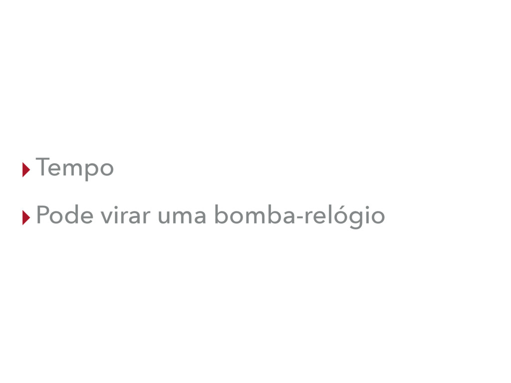
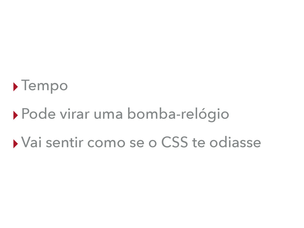
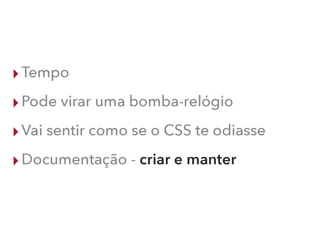
▸Tempo
▸Tempo ▸Pode virar uma bomba-relógio
▸Tempo ▸Pode virar uma bomba-relógio ▸Vai sentir como se o
CSS te odiasse
▸Tempo ▸Pode virar uma bomba-relógio ▸Vai sentir como se o
CSS te odiasse ▸Documentação - criar e manter
{ CSS } CODING
DESIGN » PROTÓTIPO » ESTRUTURA » CÓDIGO
None
TÉCNICAS E ESTRATÉGIAS
OOCSS OBJECT ORIENTED CSS
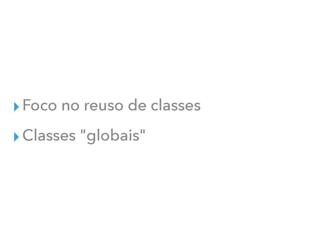
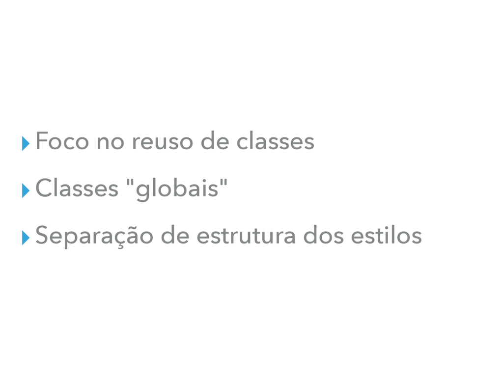
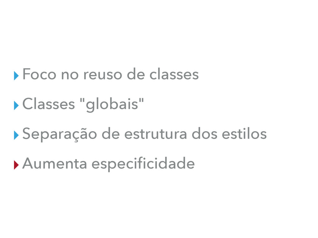
▸Foco no reuso de classes
▸Foco no reuso de classes ▸Classes "globais"
▸Foco no reuso de classes ▸Classes "globais" ▸Separação de estrutura
dos estilos
▸Foco no reuso de classes ▸Classes "globais" ▸Separação de estrutura
dos estilos ▸Aumenta especificidade
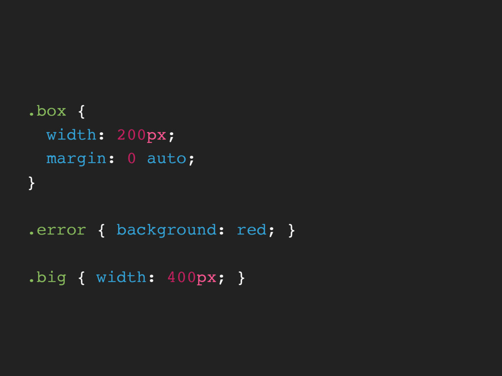
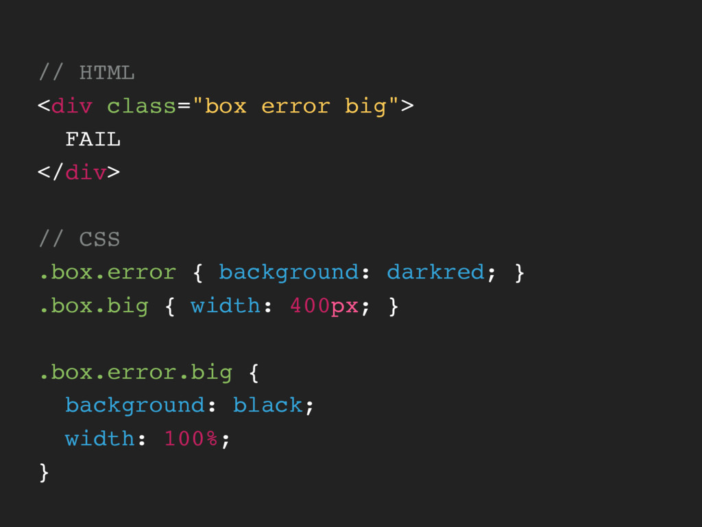
.box { width: 200px; margin: 0 auto; } .error {
background: red; } .big { width: 400px; }
// HTML <div class="box error big"> FAIL </div> // CSS
.box.error { background: darkred; } .box.big { width: 400px; } .box.error.big { background: black; width: 100%; }
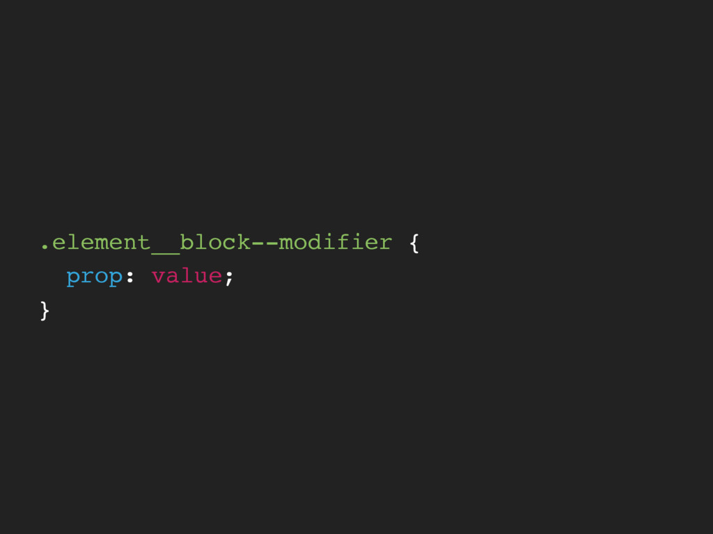
BEM BLOCK ELEMENT MODIFIER
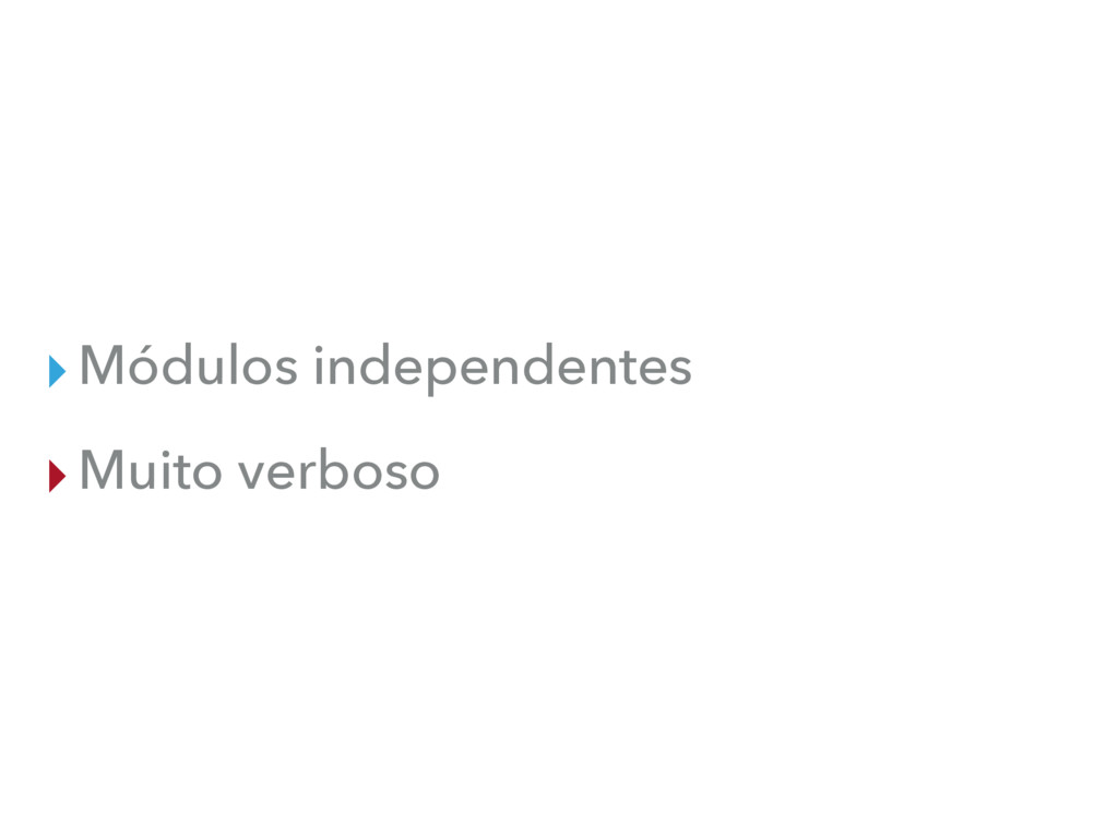
▸Módulos independentes
▸Módulos independentes ▸Muito verboso
None
.element__block--modifier { prop: value; }
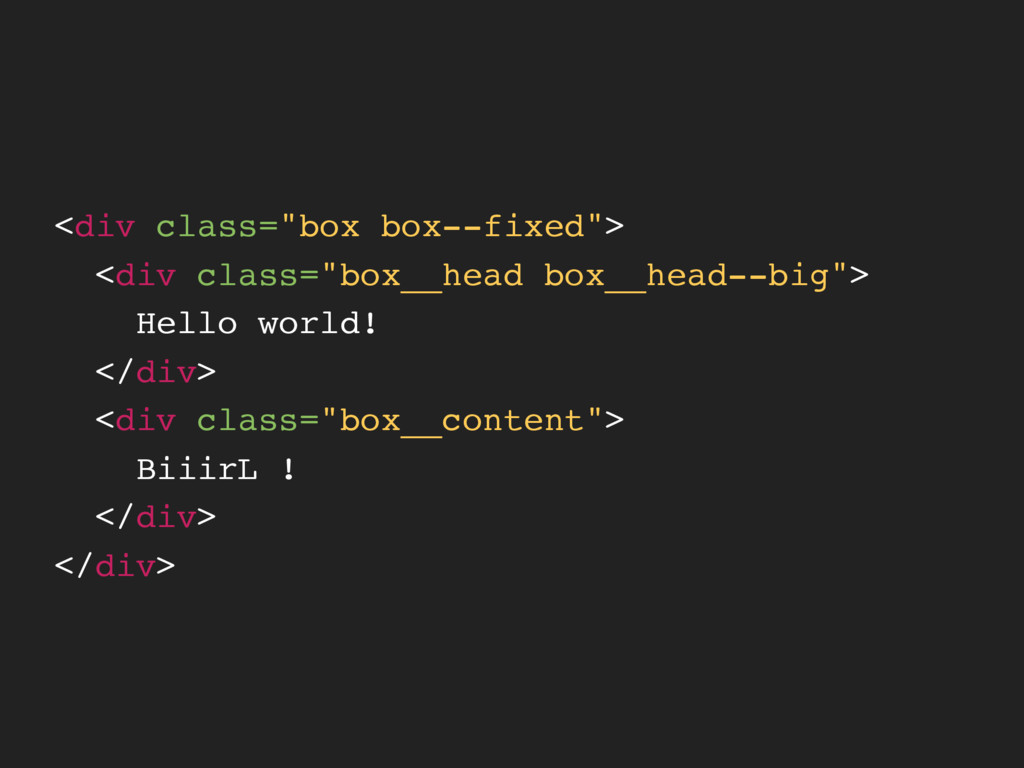
<div class="box box--fixed"> <div class="box__head box__head--big"> Hello world! </div> <div
class="box__content"> BiiirL ! </div> </div>
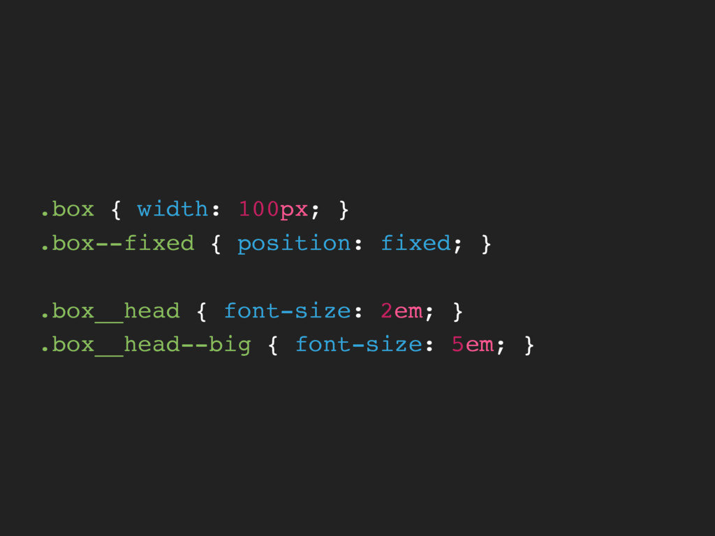
.box { width: 100px; } .box--fixed { position: fixed; }
.box__head { font-size: 2em; } .box__head--big { font-size: 5em; }
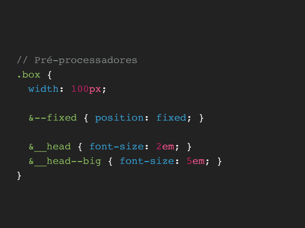
// Pré-processadores .box { width: 100px; &--fixed { position: fixed;
} &__head { font-size: 2em; } &__head--big { font-size: 5em; } }
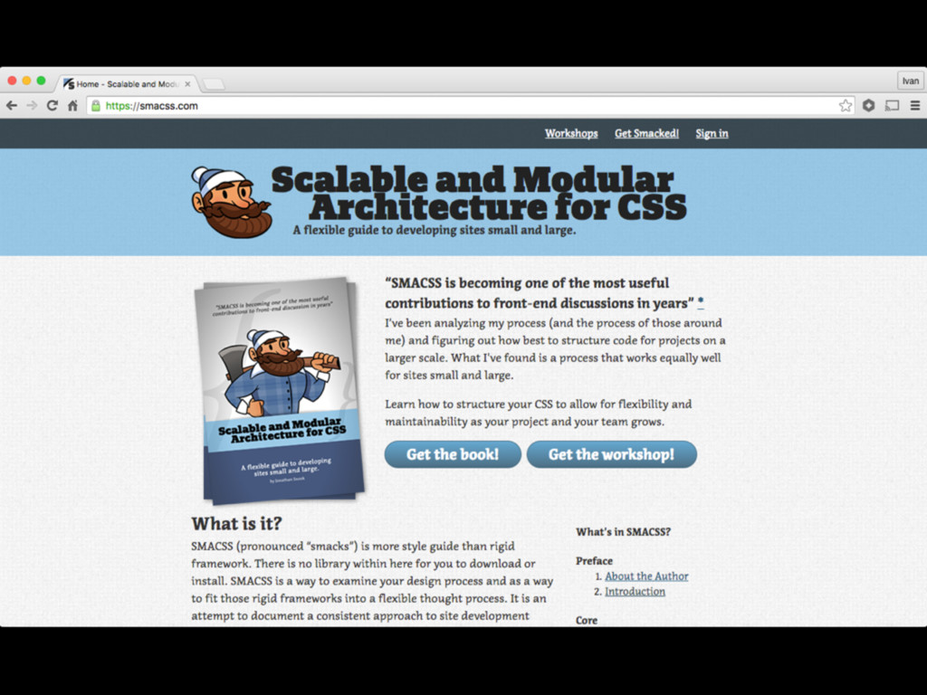
SMACSS SCALABLE AND MODULAR ARCHITECTURE FOR CSS
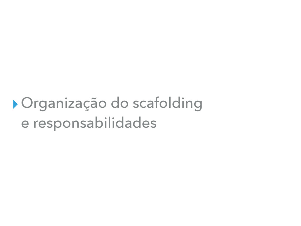
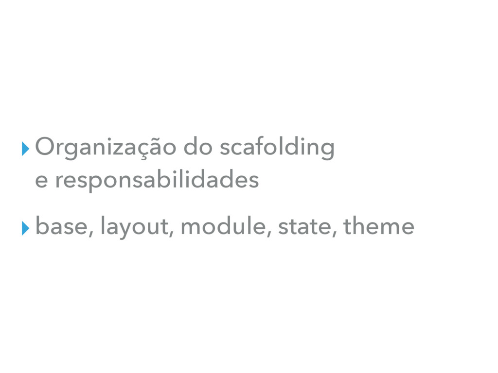
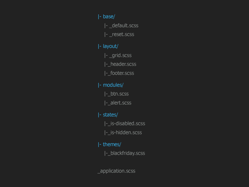
▸Organização do scafolding e responsabilidades
▸Organização do scafolding e responsabilidades ▸base, layout, module, state, theme
None
|- base/ |- _default.scss |- _reset.scss |- layout/ |- _grid.scss
|-_header.scss |-_footer.scss |- modules/ |-_btn.scss |-_alert.scss |- states/ |-_is-disabled.scss |-_is-hidden.scss |- themes/ |-_blackfriday.scss _application.scss
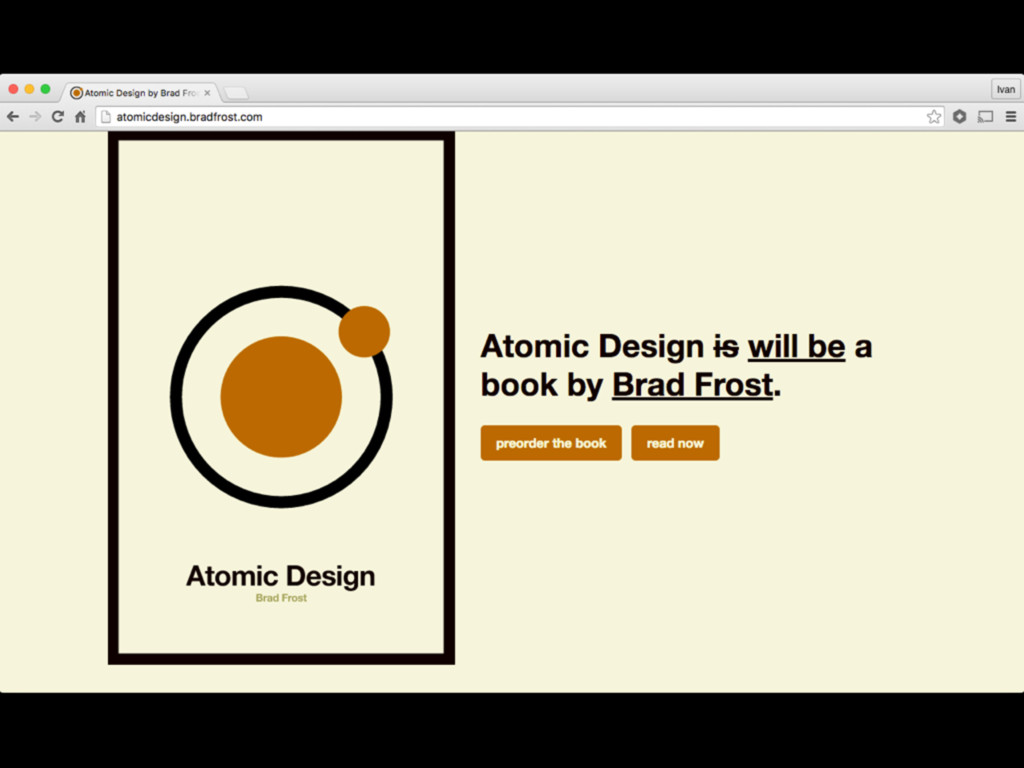
ATOMIC DESIGN
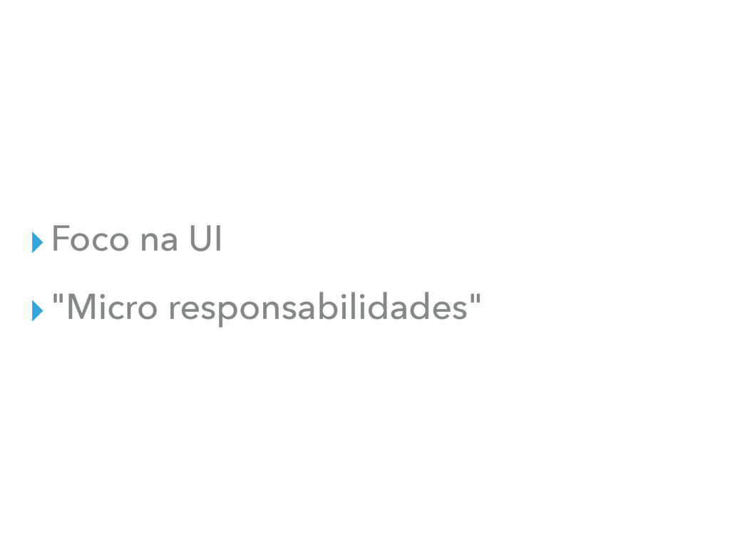
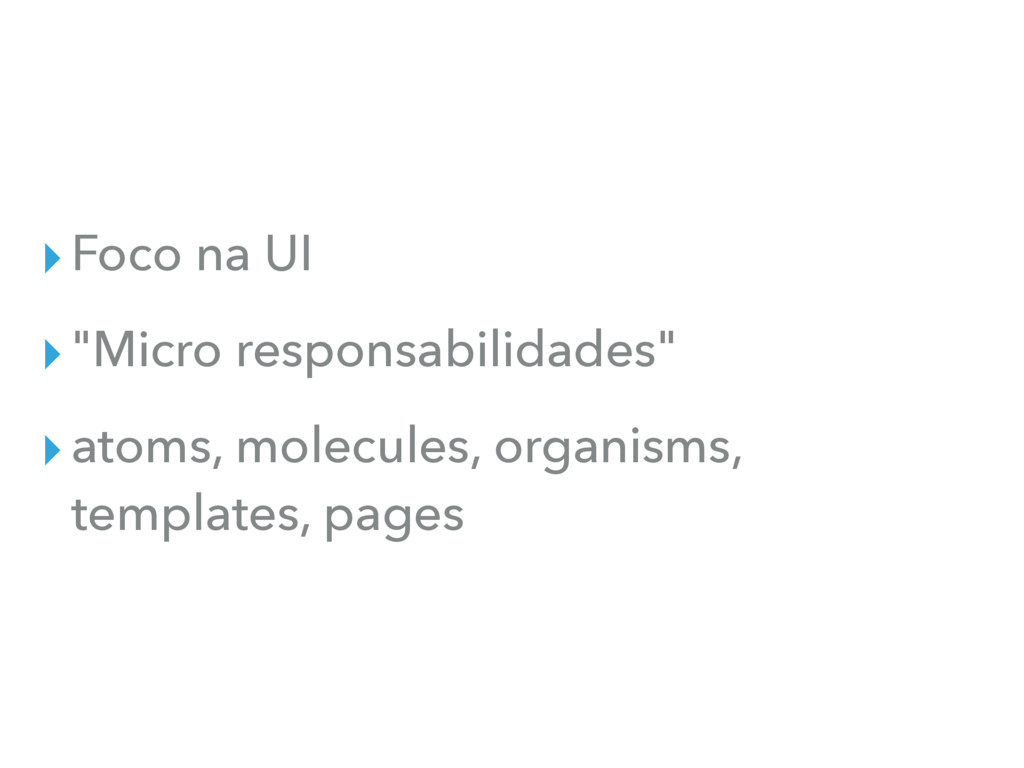
▸Foco na UI
▸Foco na UI ▸"Micro responsabilidades"
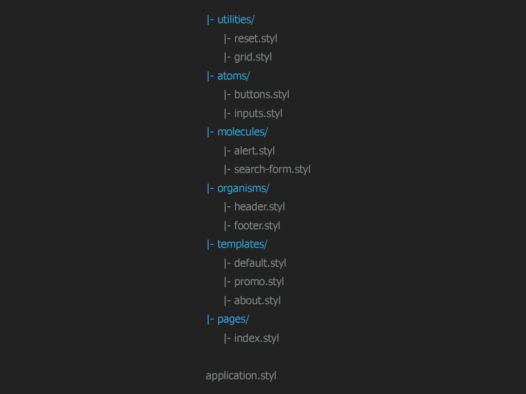
▸Foco na UI ▸"Micro responsabilidades" ▸atoms, molecules, organisms, templates, pages
None
|- utilities/ |- reset.styl |- grid.styl |- atoms/ |- buttons.styl
|- inputs.styl |- molecules/ |- alert.styl |- search-form.styl |- organisms/ |- header.styl |- footer.styl |- templates/ |- default.styl |- promo.styl |- about.styl |- pages/ |- index.styl application.styl
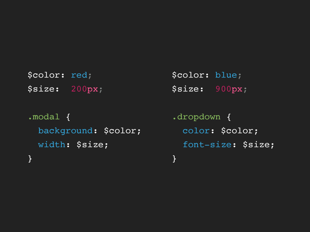
// Modal $modalColor: red; $modalSize: 200px; // Dropdown $dropdownColor: blue;
$dropdownSize: 20px;
$color: red; $size: 200px; .modal { background: $color; width: $size;
} $color: blue; $size: 900px; .dropdown { color: $color; font-size: $size; }
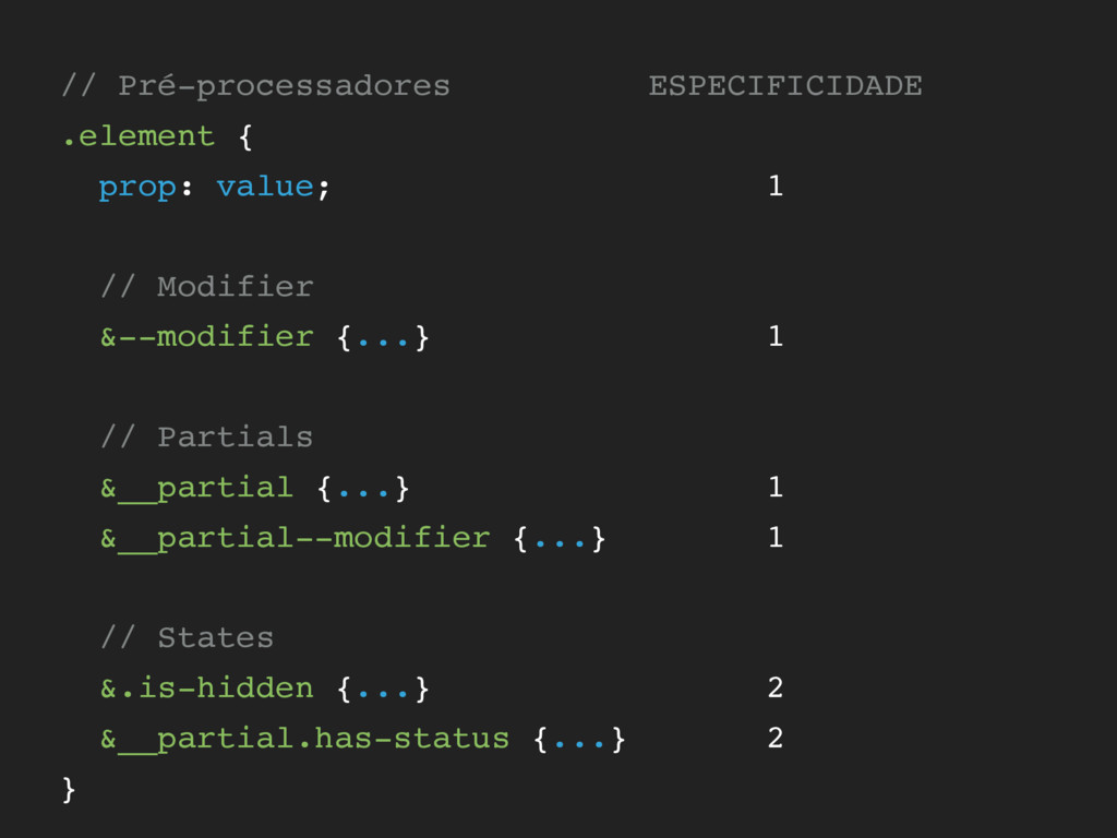
// Pré-processadores ESPECIFICIDADE .element { prop: value; 1 // Modifier
&--modifier {...} 1 // Partials &__partial {...} 1 &__partial--modifier {...} 1 // States &.is-hidden {...} 2 &__partial.has-status {...} 2 }
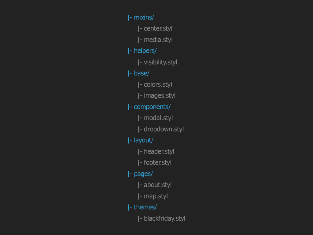
|- mixins/ |- center.styl |- media.styl |- helpers/ |- visibility.styl
|- base/ |- colors.styl |- images.styl |- components/ |- modal.styl |- dropdown.styl |- layout/ |- header.styl |- footer.styl |- pages/ |- about.styl |- map.styl |- themes/ |- blackfriday.styl
None
None
COMPONENTES CODING
None
SDD STYLE GUIDE DRIVEN DEVELOPMENT
STYLE GUIDE COMO PRIORIDADE PARA TODAS AS TASKS DE FRONT
E UX/UI
ANTES
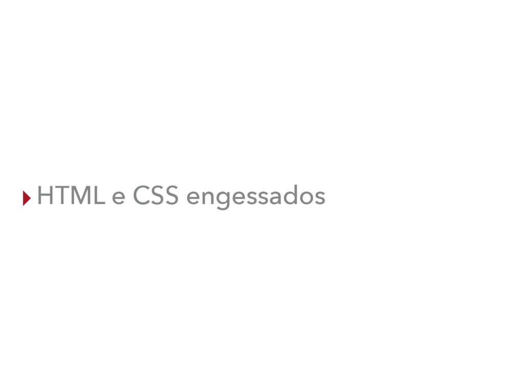
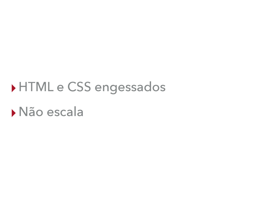
▸HTML e CSS engessados
▸HTML e CSS engessados ▸Não escala
DEPOIS
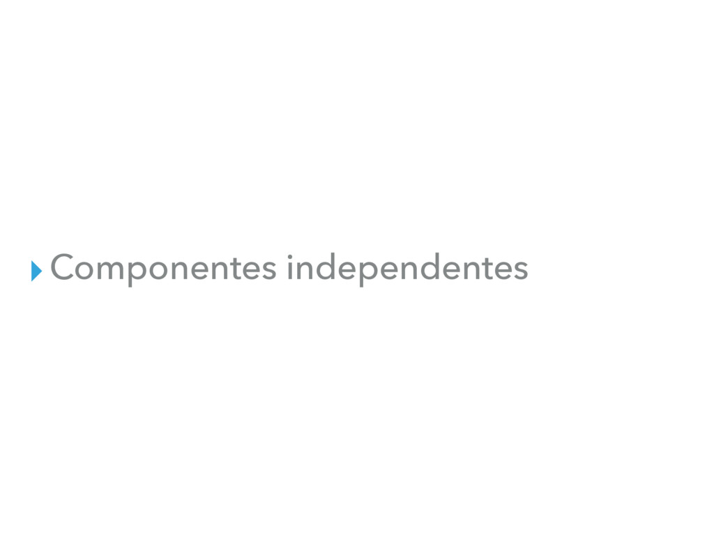
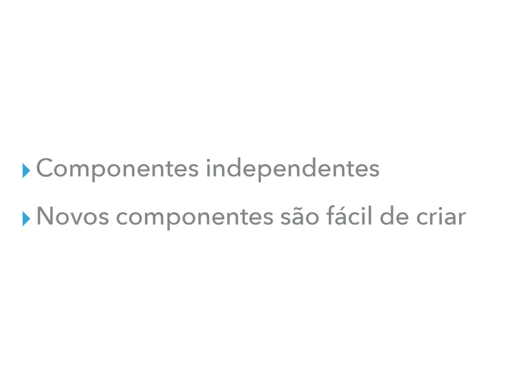
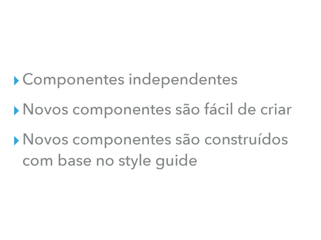
▸Componentes independentes
▸Componentes independentes ▸Novos componentes são fácil de criar
▸Componentes independentes ▸Novos componentes são fácil de criar ▸Novos componentes
são construídos com base no style guide
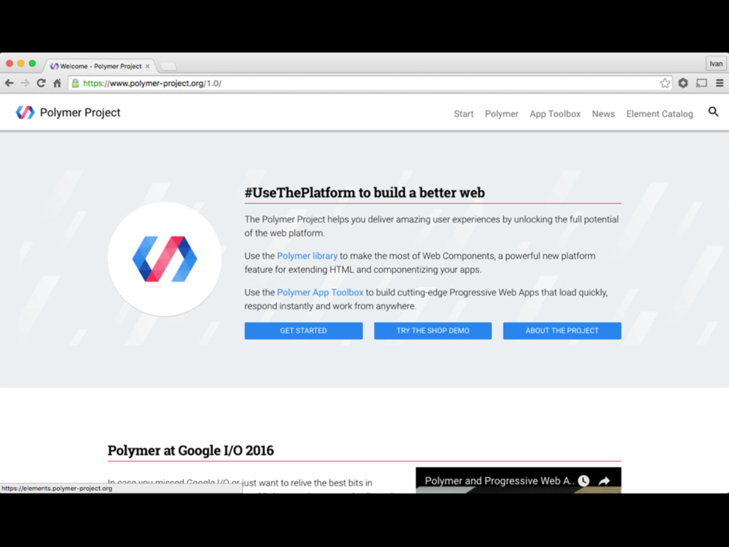
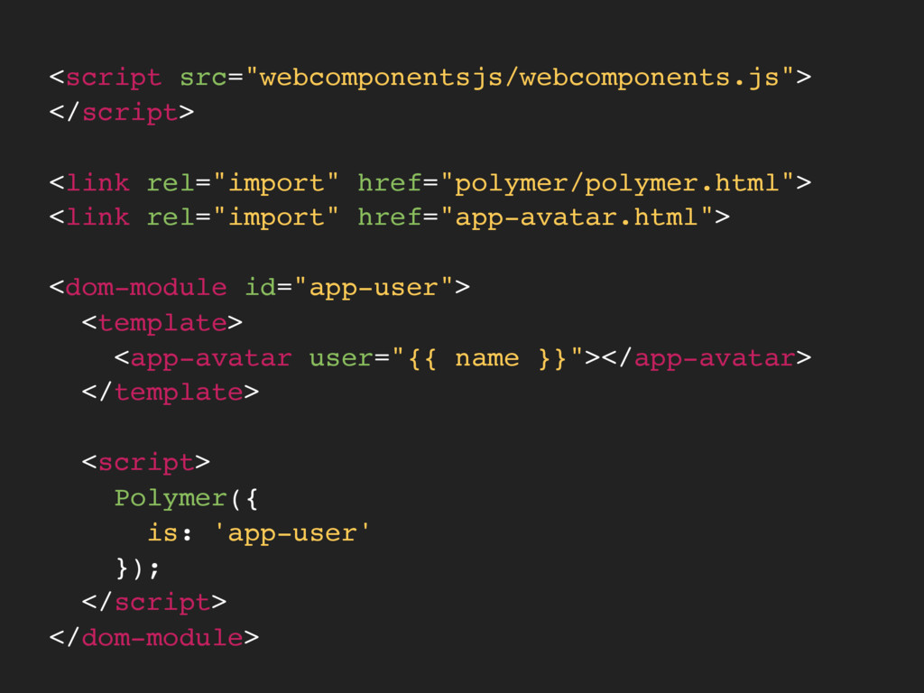
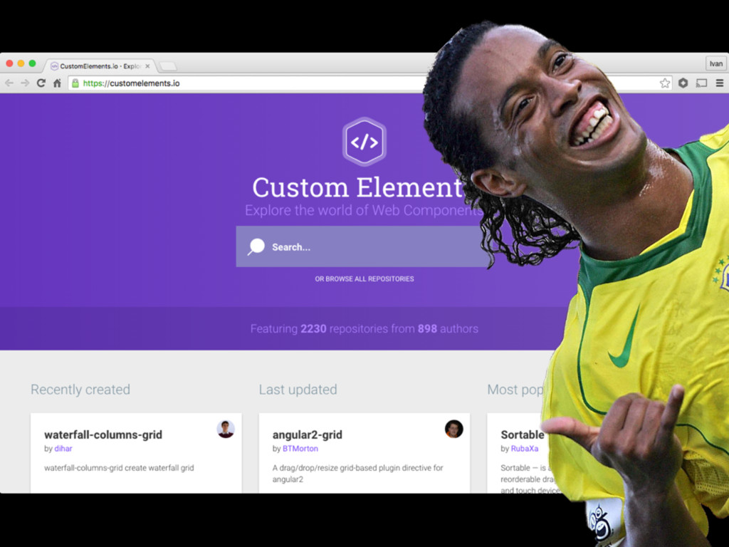
WEB COMPONENTS
None
None
<script src="webcomponentsjs/webcomponents.js"> </script> <link rel="import" href="polymer/polymer.html"> <link rel="import" href="app-avatar.html"> <dom-module
id="app-user"> <template> <app-avatar user="{{ name }}"></app-avatar> </template> <script> Polymer({ is: 'app-user' }); </script> </dom-module>
None
None
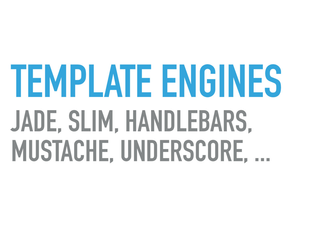
TEMPLATE ENGINES JADE, SLIM, HANDLEBARS, MUSTACHE, UNDERSCORE, ...
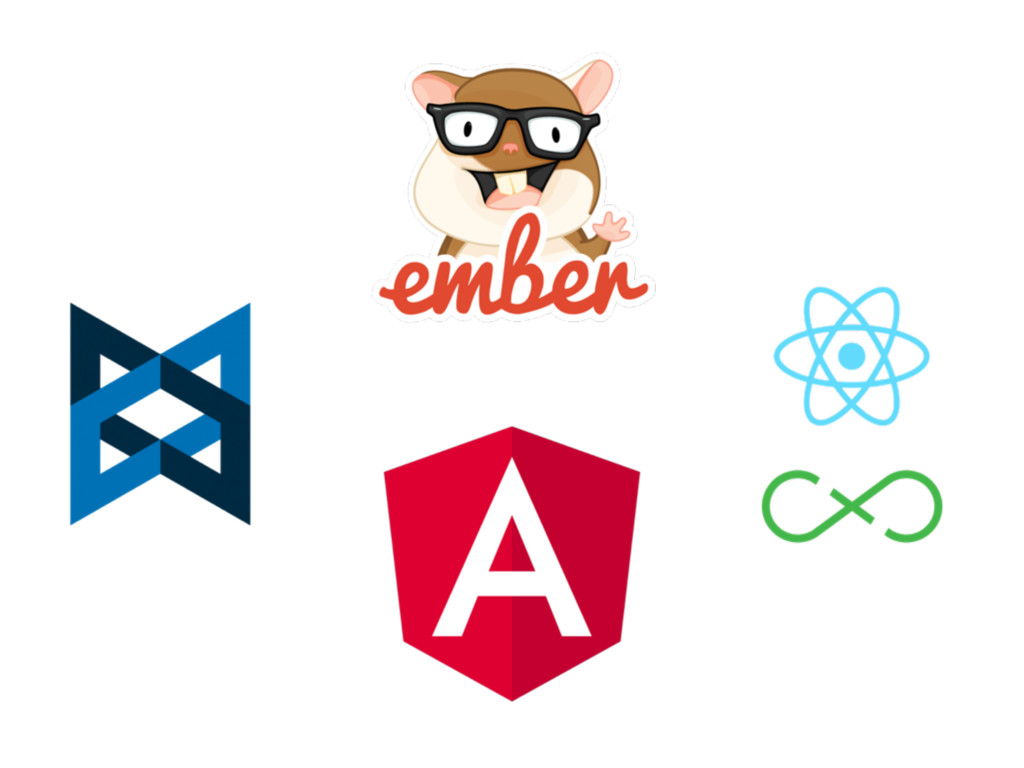
MV* FRAMEWORKS
None
DOCUMENTAÇÃO CODING
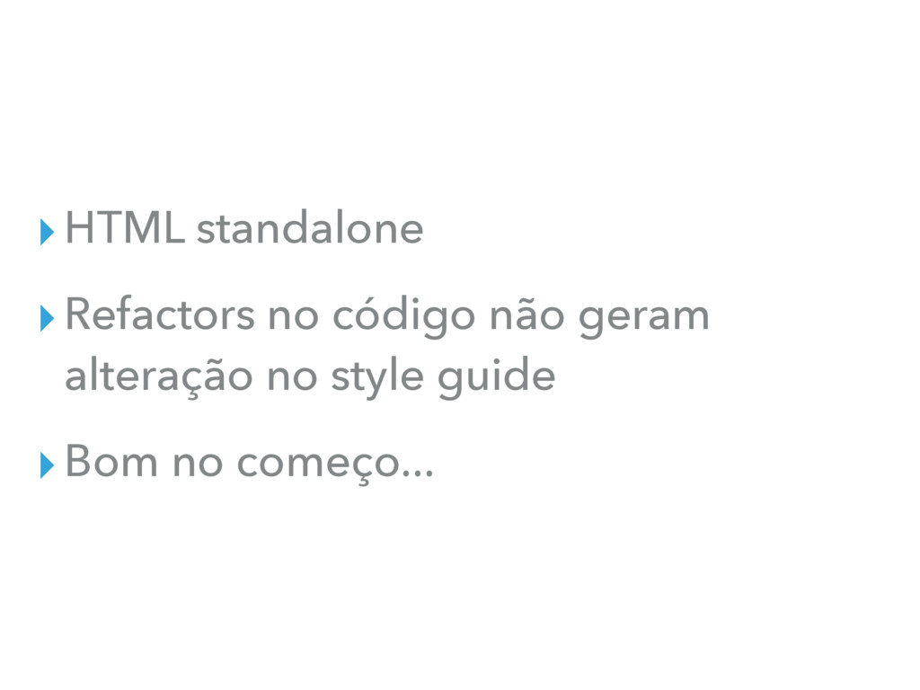
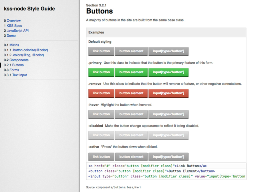
STATIC STYLE GUIDE
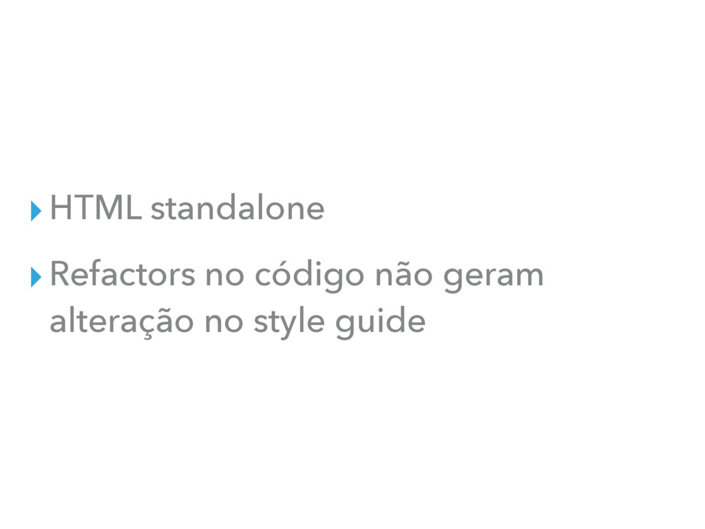
▸HTML standalone
▸HTML standalone ▸Refactors no código não geram alteração no style
guide
▸HTML standalone ▸Refactors no código não geram alteração no style
guide ▸Bom no começo...
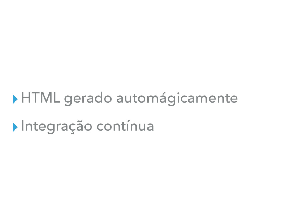
LIVING STYLE GUIDE
▸HTML gerado automágicamente
▸HTML gerado automágicamente ▸Integração contínua
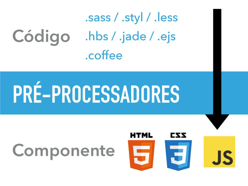
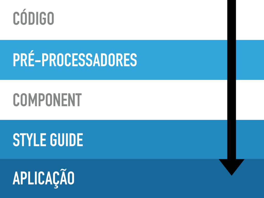
Componente PRÉ-PROCESSADORES Código .sass / .styl / .less .hbs /
.jade / .ejs .coffee
PRÉ-PROCESSADORES STYLE GUIDE APLICAÇÃO CÓDIGO COMPONENT
None
None
None
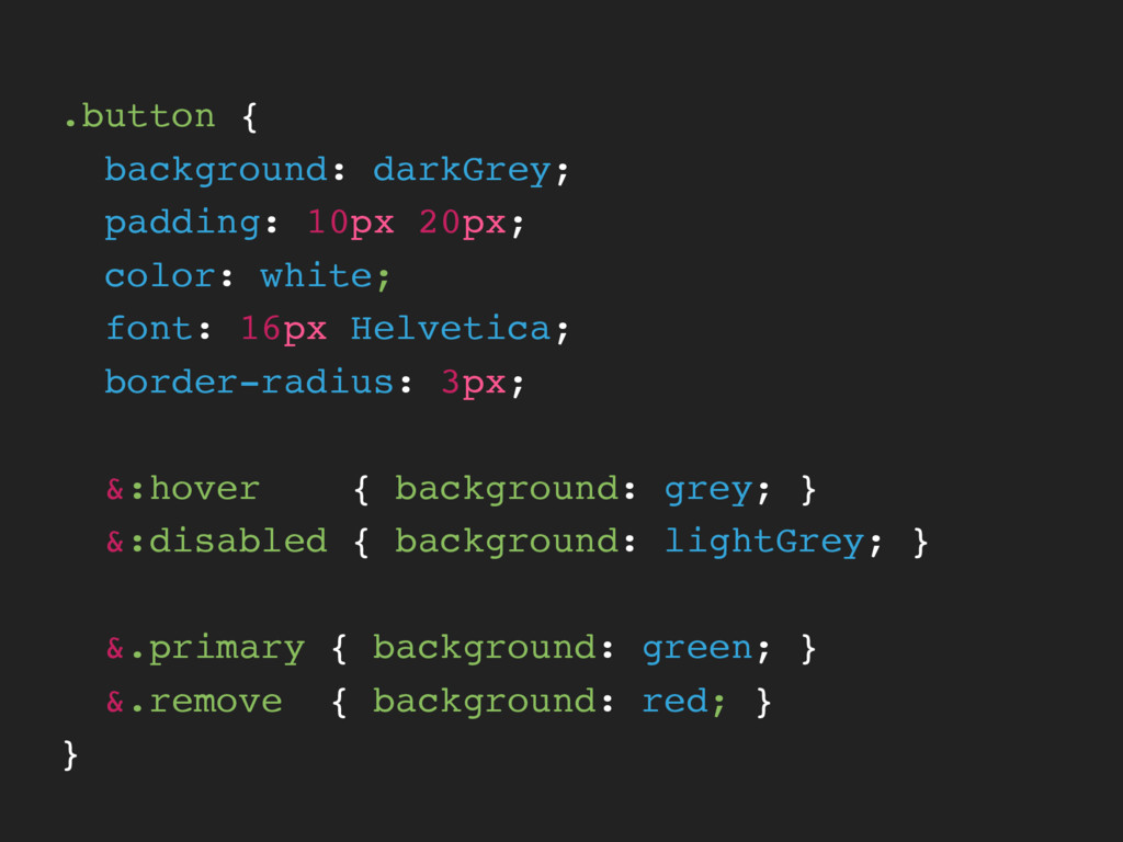
.button { background: darkGrey; padding: 10px 20px; color: white; font:
16px Helvetica; border-radius: 3px; &:hover { background: grey; } &:disabled { background: lightGrey; } &.primary { background: green; } &.remove { background: red; } }
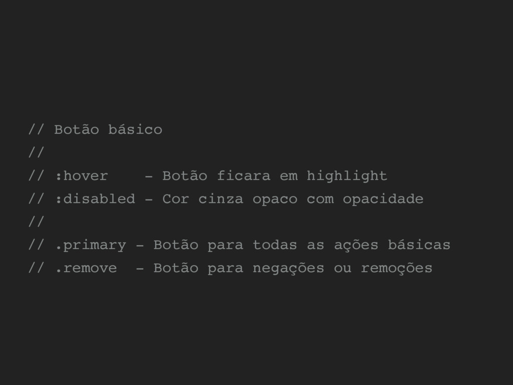
// Botão básico // // :hover - Botão ficara em
highlight // :disabled - Cor cinza opaco com opacidade // // .primary - Botão para todas as ações básicas // .remove - Botão para negações ou remoções
None
ENTÃO...
FAÇA ACONTECER
TODOS SÃO RESPONSÁVEIS
MANTENHA ESCALÁVEL
DEIXE VISÍVEL
FAÇA SER INCRÍVEL
OBRIGADO!
 ivanbanov
 sue445
 wxyzzz
 takkuhiro
 watany
 bto
bto
 yuukiyo
 rakus_dev
 ynisqa1988
 kaminashi
 nishihira
 mhrtech
 nari_ex
 carmenintech
 reverentgeek
 destraynor
 leimatthew05
 frankvandijk
 jonoalderson
 deanohume
 tomoyanonymous
 thoeni
 nwiizo
 badams
 michaelherold