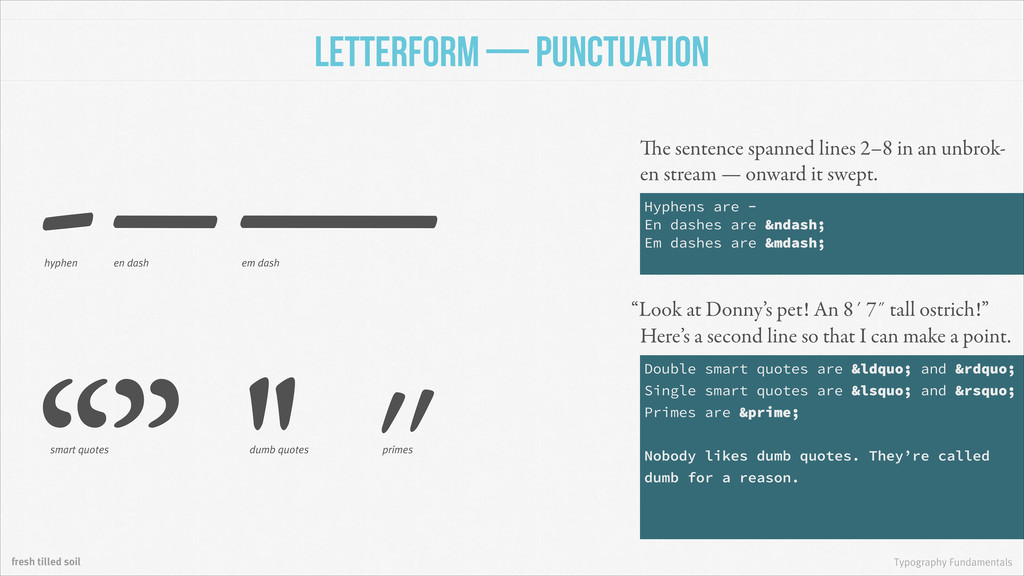
to impart a basic understanding of the fundamental rules of good typography and to show everyone how they fit into user interface and web product design.
en dash em dash The sentence spanned lines 2–8 in an unbrok- en stream — onward it swept. “” '' ˝ smart quotes dumb quotes “Look at Donny’s pet! An 8´ 7˝ tall ostrich!” primes Here’s a second line so that I can make a point. Hyphens are - En dashes are – Em dashes are — Double smart quotes are “ and ” Single smart quotes are ‘ and ’ Primes are ′ ! Nobody likes dumb quotes. They’re called dumb for a reason.
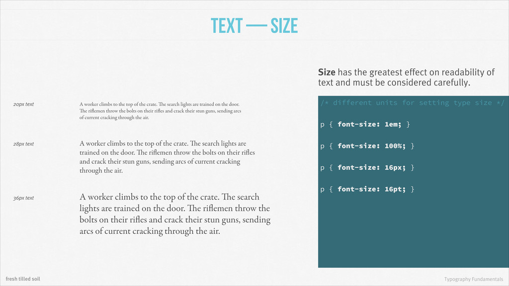
the greatest effect on readability of text and must be considered carefully. A worker climbs to the top of the crate. The search lights are trained on the door. The riflemen throw the bolts on their rifles and crack their stun guns, sending arcs of current cracking through the air. 28px text /* different units for setting type size */ ! p { font-size: 1em; } ! p { font-size: 100%; } ! p { font-size: 16px; } ! p { font-size: 16pt; } A worker climbs to the top of the crate. The search lights are trained on the door. The riflemen throw the bolts on their rifles and crack their stun guns, sending arcs of current cracking through the air. 36px text A worker climbs to the top of the crate. The search lights are trained on the door. The riflemen throw the bolts on their rifles and crack their stun guns, sending arcs of current cracking through the air. 20px text
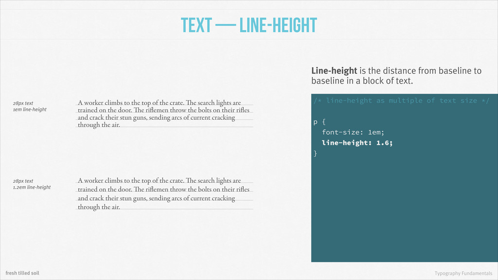
the distance from baseline to baseline in a block of text. A worker climbs to the top of the crate. The search lights are trained on the door. The riflemen throw the bolts on their rifles and crack their stun guns, sending arcs of current cracking through the air. A worker climbs to the top of the crate. The search lights are trained on the door. The riflemen throw the bolts on their rifles and crack their stun guns, sending arcs of current cracking through the air. 28px text 1em line-height 28px text 1.2em line-height /* line-height as multiple of text size */ ! p { font-size: 1em; line-height: 1.6; }
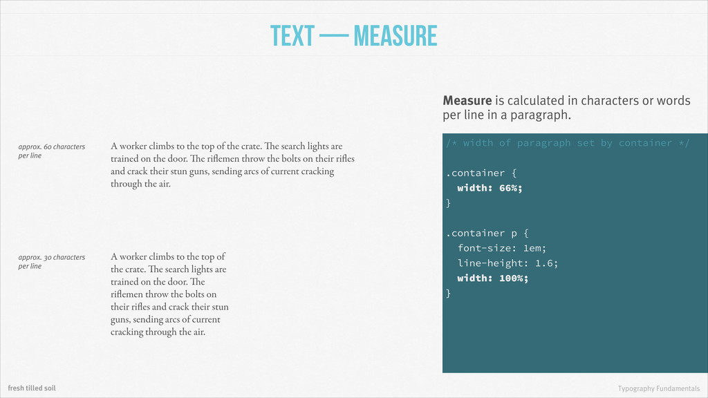
calculated in characters or words per line in a paragraph. A worker climbs to the top of the crate. The search lights are trained on the door. The riflemen throw the bolts on their rifles and crack their stun guns, sending arcs of current cracking through the air. A worker climbs to the top of the crate. The search lights are trained on the door. The riflemen throw the bolts on their rifles and crack their stun guns, sending arcs of current cracking through the air. approx. 60 characters per line approx. 30 characters per line /* width of paragraph set by container */ ! .container { width: 66%; } ! .container p { font-size: 1em; line-height: 1.6; width: 100%; }
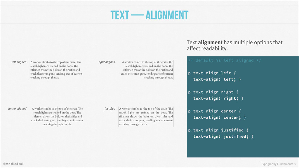
has multiple options that affect readability. left aligned center aligned right aligned justified A worker climbs to the top of the crate. The search lights are trained on the door. The riflemen throw the bolts on their rifles and crack their stun guns, sending arcs of current cracking through the air. A worker climbs to the top of the crate. The search lights are trained on the door. The riflemen throw the bolts on their rifles and crack their stun guns, sending arcs of current cracking through the air. A worker climbs to the top of the crate. The search lights are trained on the door. The riflemen throw the bolts on their rifles and crack their stun guns, sending arcs of current cracking through the air. A worker climbs to the top of the crate. The search lights are trained on the door. The riflemen throw the bolts on their rifles and crack their stun guns, sending arcs of current cracking through the air. /* default is left aligned */ ! p.text-align-left { text-align: left; } ! p.text-align-right { text-align: right; } ! p.text-align-center { text-align: center; } ! p.text-align-justified { text-align: justified; }
climbs to the top of the crate. The search lights are trained on the door. The riflemen throw the bolts on their rifles and crack their stun guns, sending arcs of current cracking through the air. A worker climbs to the top of the crate. The search lights are trained on the door. The riflemen throw the bolts on their rifles and crack their stun guns, sending arcs of current cracking through the air. text with normal tracking text with 10% tracking Tracking is an adjustment of the space between all characters in a block of text. “Anyone who would letterspace the lowercase would shag sheep.” Frederic Goudy /* all caps and letterspaced headers */ ! h1, h2, h3, h4, h5, h6 { text-transform: uppercase; letter-spacing: 0.25em; }
Tyson Tyson kerned pairing Kerning is an adjustment of the space between two characters. /* ligatures/kerning in some browsers */ ! h1, h2, h3, h4, h5, h6 { text-rendering: optimizeLegibility; } ! /* control spacing with Kerning.JS */ ! #kern-me { -letter-kern: 1px 1px 0 0 0 1px 0 2px; }
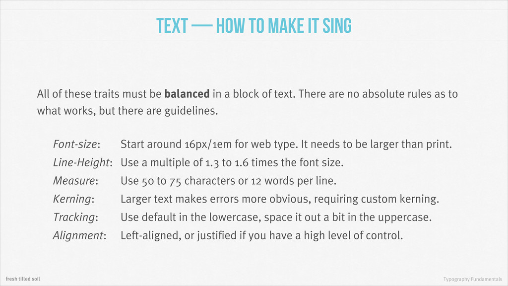
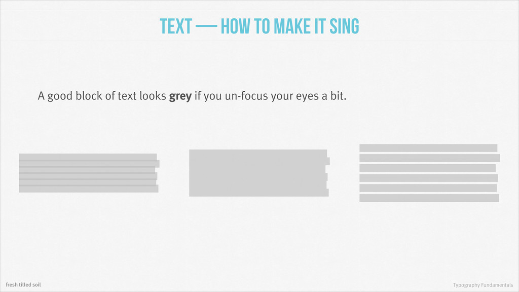
It Sing All of these traits must be balanced in a block of text. There are no absolute rules as to what works, but there are guidelines. Font-size: Start around 16px/1em for web type. It needs to be larger than print. Line-Height: Use a multiple of 1.3 to 1.6 times the font size. Measure: Use 50 to 75 characters or 12 words per line. Kerning: Larger text makes errors more obvious, requiring custom kerning. Tracking: Use default in the lowercase, space it out a bit in the uppercase. Alignment: Left-aligned, or justified if you have a high level of control.
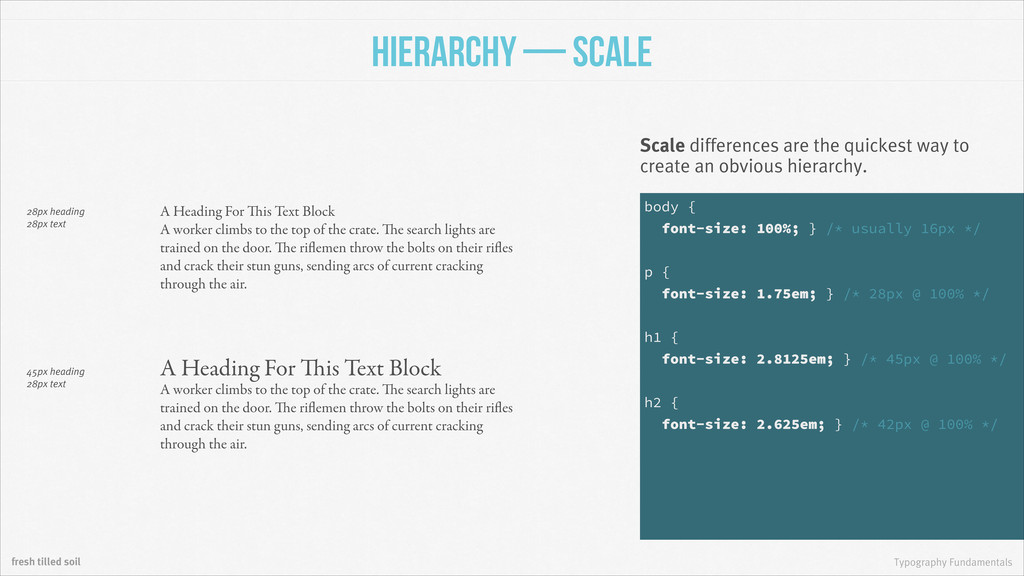
are the quickest way to create an obvious hierarchy. A worker climbs to the top of the crate. The search lights are trained on the door. The riflemen throw the bolts on their rifles and crack their stun guns, sending arcs of current cracking through the air. A worker climbs to the top of the crate. The search lights are trained on the door. The riflemen throw the bolts on their rifles and crack their stun guns, sending arcs of current cracking through the air. 28px heading 28px text 45px heading 28px text A Heading For This Text Block A Heading For This Text Block body { font-size: 100%; } /* usually 16px */ ! p { font-size: 1.75em; } /* 28px @ 100% */ ! h1 { font-size: 2.8125em; } /* 45px @ 100% */ ! h2 { font-size: 2.625em; } /* 42px @ 100% */
Scale A modular scale can help you create a full system of typographic hierarchy. 24px @ 1:1.618 29px @ 1:1.618 generated by http://modularscale.com 76px heading Heading Level 1 Heading Level 2 Heading Level 3 Heading Level 4 Heading Level 5 ! A worker climbs to the top of the crate. The search lights are trained on the door. The riflemen throw the bolts on their rifles and crack their stun guns, sending arcs of current cracking through the air. 63px heading 47px heading 39px heading 29px heading 24px text 29px line-height body { font-size: 100%; } /* usually 16px */ ! p { font-size: 1.5em; } /* 24px @ 100% */ ! h1 { font-size: 4.75em; } /* 76px @ 100% */ ! h2 { font-size: 3.9375em; } /* 63px @ 100% */
are another way to establish a difference in hierarchy. A worker climbs to the top of the crate. The search lights are trained on the door. The riflemen throw the bolts on their rifles and crack their stun guns, sending arcs of current cracking through the air. A worker climbs to the top of the crate. The search lights are trained on the door. The riflemen throw the bolts on their rifles and crack their stun guns, sending arcs of current cracking through the air. same color as text contrasting color A Heading For This Text Block A Heading For This Text Block p { color: black; } ! h1, h2, h3, h4, h5, h6 { color: blue; }
value, or relative lightness/ darkness, will set two elements apart. A worker climbs to the top of the crate. The search lights are trained on the door. The riflemen throw the bolts on their rifles and crack their stun guns, sending arcs of current cracking through the air. A worker climbs to the top of the crate. The search lights are trained on the door. The riflemen throw the bolts on their rifles and crack their stun guns, sending arcs of current cracking through the air. same value as text contrasting value A Heading For This Text Block A Heading For This Text Block p { color: rgb(128, 128, 128); } ! h1, h2, h3, h4, h5, h6 { color: rgb(0, 0, 0); }
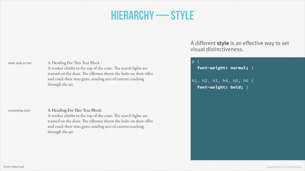
style is an effective way to set visual distinctiveness. A worker climbs to the top of the crate. The search lights are trained on the door. The riflemen throw the bolts on their rifles and crack their stun guns, sending arcs of current cracking through the air. A worker climbs to the top of the crate. The search lights are trained on the door. The riflemen throw the bolts on their rifles and crack their stun guns, sending arcs of current cracking through the air. same style as text contrasting style A Heading For This Text Block A Heading For This Text Block p { font-weight: normal; } ! h1, h2, h3, h4, h5, h6 { font-weight: bold; }
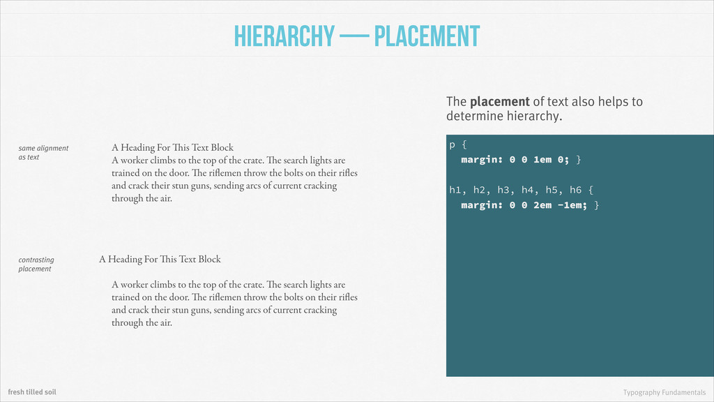
of text also helps to determine hierarchy. A worker climbs to the top of the crate. The search lights are trained on the door. The riflemen throw the bolts on their rifles and crack their stun guns, sending arcs of current cracking through the air. A worker climbs to the top of the crate. The search lights are trained on the door. The riflemen throw the bolts on their rifles and crack their stun guns, sending arcs of current cracking through the air. same alignment as text contrasting placement A Heading For This Text Block A Heading For This Text Block p { margin: 0 0 1em 0; } ! h1, h2, h3, h4, h5, h6 { margin: 0 0 2em -1em; }
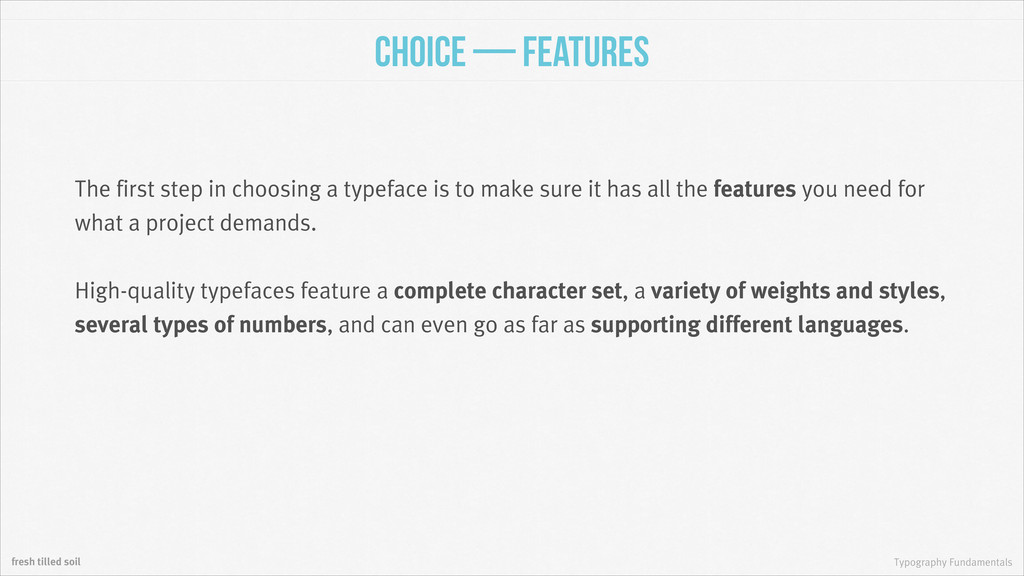
step in choosing a typeface is to make sure it has all the features you need for what a project demands. ! High-quality typefaces feature a complete character set, a variety of weights and styles, several types of numbers, and can even go as far as supporting different languages.
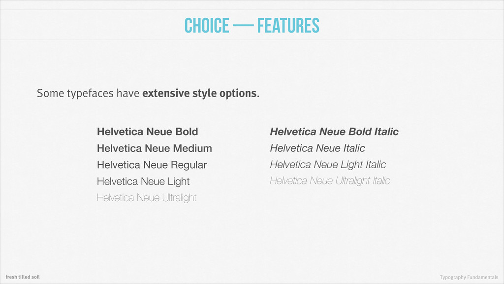
have extensive style options. Helvetica Neue Bold Helvetica Neue Medium Helvetica Neue Regular Helvetica Neue Light Helvetica Neue Ultralight Helvetica Neue Bold Italic Helvetica Neue Italic Helvetica Neue Light Italic Helvetica Neue Ultralight Italic
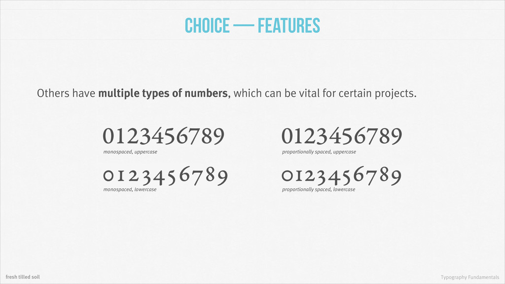
multiple types of numbers, which can be vital for certain projects. monospaced, uppercase monospaced, lowercase proportionally spaced, uppercase proportionally spaced, lowercase
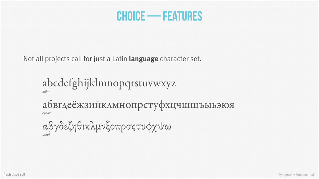
projects call for just a Latin language character set. latin abcdefghijklmnopqrstuvwxyz cyrillic greek абвгдеёжзийклмнопрстуфхцчшщъыьэюя αβγδεζηθικλμνξοπρσςτυφχψω
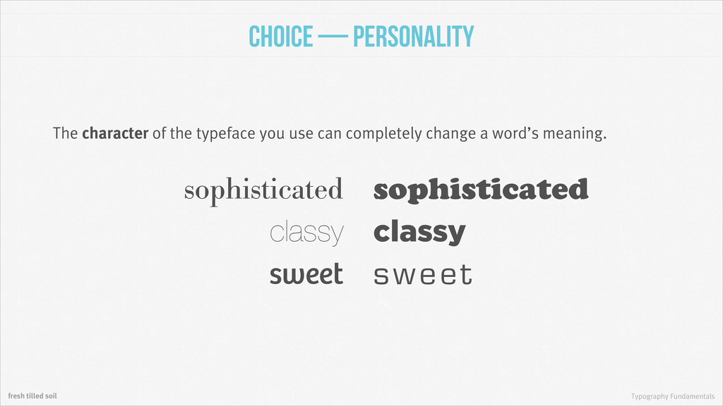
typefaces look for similar forms, but also look to create some contrast between them. If they’re too similar then there’s no point in using them both. Bodoni with Futura the quick brown fox jumped over the lazy Helvetica with Garamond Baskerville with Univers the quick brown fox jumped over the lazy the quick brown fox jumped over the lazy
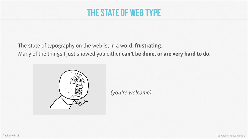
The state of typography on the web is, in a word, frustrating. Many of the things I just showed you either can’t be done, or are very hard to do. (you’re welcome)
But they’re very important to know. Why? 1. You need to be able to work around your own limitations. 2.These techniques are creeping into specifications and plugins. 3.Many of your competitors will be using them to improve their products.
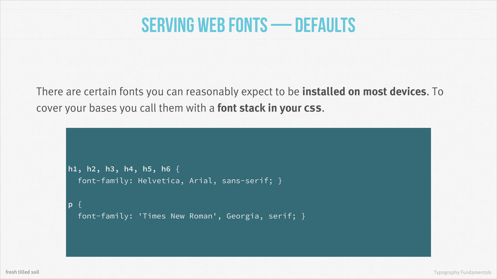
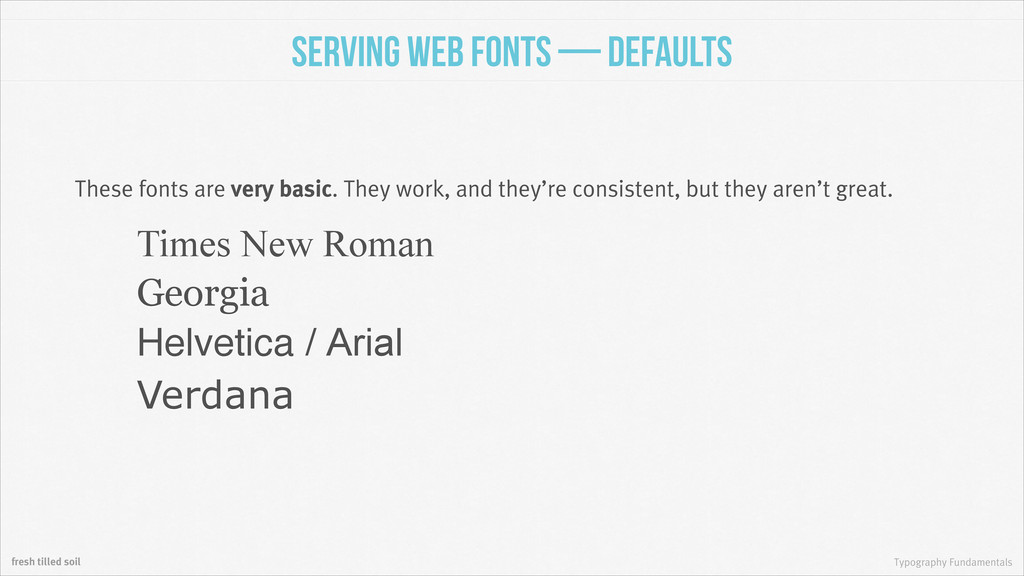
There are certain fonts you can reasonably expect to be installed on most devices. To cover your bases you call them with a font stack in your css. h1, h2, h3, h4, h5, h6 { font-family: Helvetica, Arial, sans-serif; } ! p { font-family: 'Times New Roman', Georgia, serif; }
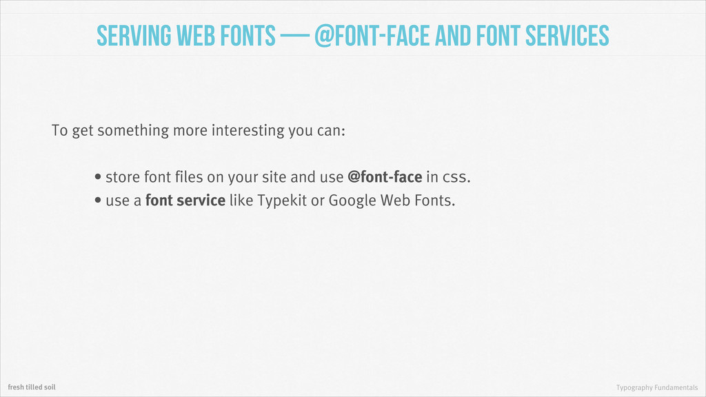
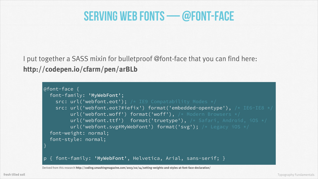
and font Services To get something more interesting you can: • store font files on your site and use @font-face in css. • use a font service like Typekit or Google Web Fonts.
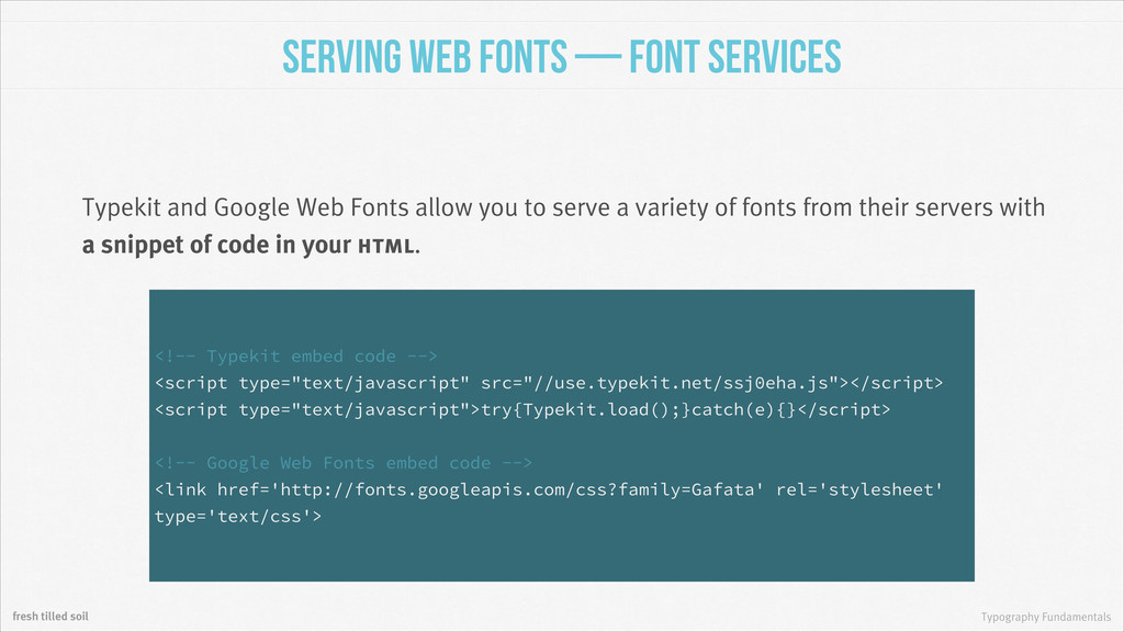
Services Typekit and Google Web Fonts allow you to serve a variety of fonts from their servers with a snippet of code in your html. <!-- Typekit embed code --> <script type="text/javascript" src="//use.typekit.net/ssj0eha.js"></script> <script type="text/javascript">try{Typekit.load();}catch(e){}</script> ! <!-- Google Web Fonts embed code --> <link href='http://fonts.googleapis.com/css?family=Gafata' rel='stylesheet' type='text/css'>
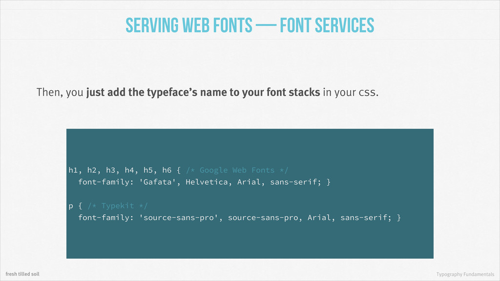
Services Then, you just add the typeface’s name to your font stacks in your css. h1, h2, h3, h4, h5, h6 { /* Google Web Fonts */ font-family: 'Gafata', Helvetica, Arial, sans-serif; } ! p { /* Typekit */ font-family: 'source-sans-pro', source-sans-pro, Arial, sans-serif; }