Share
Embed
Transcript
50 slides
-
Michael Jendryschik | itemis AG CSS Media Queries Auf Browser
und Geräte reagieren -
Michael Jendryschik • Konzipiert und entwickelt Websites, schreibt und spricht
darüber • http://jendryschik.de • Leiter Webentwicklung • http://www.itemis.de • Webkraut • http://www.webkrauts.de -
• Es gibt verschiedene Möglichkeiten, den Geltungsbereich von CSS auf
bestimmte Medien einzuschränken. -
CSS-Medientypen Typ Medium all alle Geräte aural Sprachbrowser braille Ausgabegeräte
mit Braillezeile embossed Brailledrucker handheld Handcomputer und Mobiltelefone print Drucker projection Projektion screen Computermonitore tty Ausgabemedien mit Festbreitenschrift tv Fernseher -
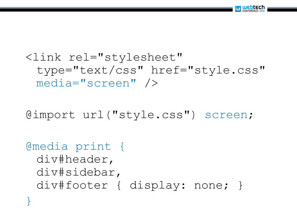
<link rel="stylesheet" type="text/css" href="style.css" media="screen" /> @import url("style.css") screen; @media
print { div#header, div#sidebar, div#footer { display: none; } } -
• Mit CSS Media Queries ist es möglich, die Einbindung
von CSS davon abhängig zu machen, ob ein Medium oder Ausgabegerät bestimmte Merkmale aufweist oder nicht. -
@media (min-width: 950px) { /* Regeln für breite Browserfenster */
} @media (min-width: 450px) and (max-width: 950px) { /* Regeln für Netbooks */ } @media (max-width: 450px) { /* Regeln für mobile Geräte */ } -
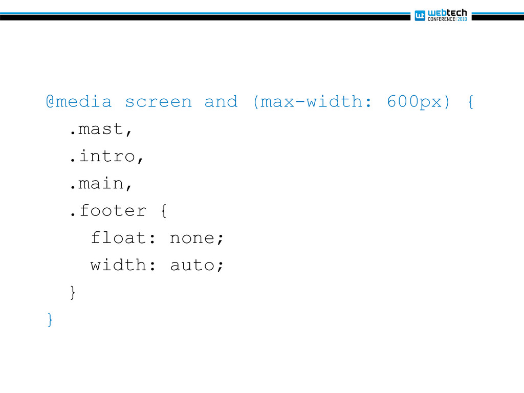
@media screen and (max-width: 600px) { .mast, .intro, .main, .footer
{ float: none; width: auto; } } -
@media screen and (max-width: 500px) { … } @media screen
and (max-width: 800px) { … } @media screen and (min-width: 1024px) { … } @media handheld and (max-device-width: 480px), screen and (max-device-width: 480px), screen and (max-width: 600px) { … } @media screen and (min-width: 920px) { … } @media screen and (min-width: 1350px) { … } @media screen and (min-width: 1500px) { … } @media only screen and (max-device-width: 480px) { … } @media only screen and (min-device-width: 768px) and (max-device-width: 1024px) { … } -
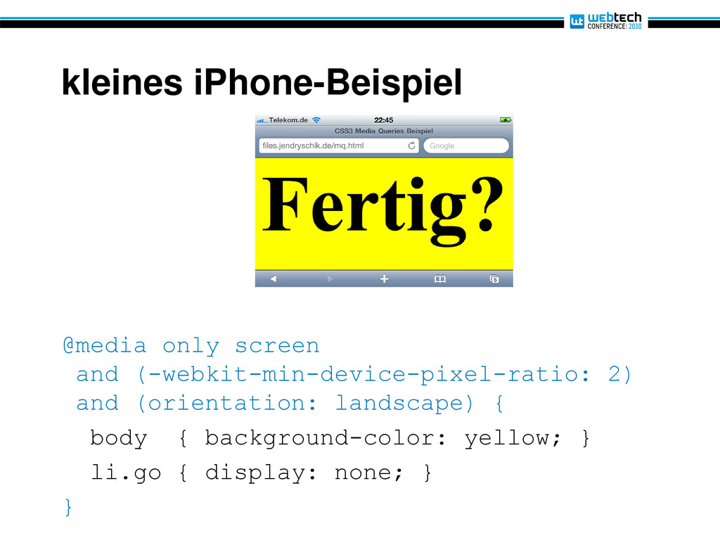
kleines iPhone-Beispiel @media only screen and (-webkit-min-device-pixel-ratio: 2) and (orientation:
landscape) { body { background-color: yellow; } li.go { display: none; } } -
kleines iPhone-Beispiel @media only screen and (-webkit-min-device-pixel-ratio: 2) and (orientation:
portrait) { body { color: white; background-color: green; } li.ready { display: none; } } -
• Media Queries sind logische Ausdrücke, die die Angabe von
Medientypen und bestimmten Medienmerkmalen miteinander verknüpfen. -
Bezeichnung Beispiel Media Query screen and (max-width: 300px) Medientyp screen
and (max-width: 300px) Verknüpfung screen and (max-width: 300px) Ausdruck screen and (max-width: 300px) Merkmal screen and (max-width: 300px) Wert screen and (max-width: 300px) -
• Das Schlüsselwort and drückt ein logisches Und aus. screen
and (max-width: 300px) (min-width: 450px) and (max-width: 950px) -
• Ein Komma steht für ein logisches Oder. @import url("style.css")
screen, projection; <link rel="stylesheet" type="text/css" href="style.css" media="screen and (min-width: 800px), projection and (min-width: 800px)" /> -
• Das Schlüsselwort not steht für eine logische Negation. <link
rel="stylesheet" type="text/css" href="style.css" media="not screen and (color)" /> -
• Das Schlüsselwort only ist ein Workaround für veraltete Browser,
die mit Media Queries nicht umzugehen wissen <link rel="stylesheet" type="text/css" href="style.css" media="only screen and (color)" /> -
Breite und Höhe Merkmal min/max Beschreibung width Ja Breite der
Anzeigefläche height Ja Höhe der Anzeigefläche device-width Ja Breite des Geräts device-height Ja Höhe des Geräts -
Gerät- und Viewportbreite • Achtung! Breite des Viewports ist häufig
größer als die des Geräts selbst <meta name="viewport" content="width=device-width"> Weitere Informationen: http://www.quirksmode.org/blog/ archives/2010/09/combining_meta.html -
Seitenverhältnis und Ausrichtung Merkmal min/max Beschreibung aspect-ratio Ja Verhältnis der
Merkmale width und height device- aspect-ratio Ja Verhältnis der Merkmale device-width und device-height orientation Nein Ausrichtung des Geräts -
Seitenverhältnis 16:9? @media only screen and (device-aspect-ratio: 16/9) { …
} @media screen and (device-aspect-ratio: 1280/720) { … } -
Horizontale oder vertikale Ausrichtung eines iPad? <link … href="ipad-portrait.css" media="(min-device-width:
768px) and (max-device-width: 1024px) and (orientation: portrait)" /> <link … href="ipad-landscape.css" media="(min-device-width: 768px) and (max-device-width: 1024px) and (orientation: landscape)" /> -
Farbmerkmale Merkmal min/max Beschreibung color Ja Farbtiefe des Geräts color-index
Ja Anzahl der Einträge in der Farb-Lookup-Tabelle des Geräts monochrome Ja Anzahl der Bits pro Pixel im Bildspeicher eines einfarbigen Geräts -
Schwarzweiß- oder Farbdrucker? <link rel="stylesheet" type="text/css" href="print-color.css" media="print and (color)"
/> <link rel="stylesheet" type="text/css" href="print-monochrome.css" media="print and (monochrome)" /> -
Abbildungsnachweis • http://www.digitale-chancen.de/transfer/assets/468.jpg • http://ceipntrasradelapiedad.files.wordpress.com/2010/03/braille.jpg • http://gadgets.boingboing.net/Palm-Pre-Disassembled.jpg • http://upload.wikimedia.org/wikipedia/commons/d/dc/Westermann_Druckerei_1890.png •
http://www.infocus.rbt-pressroom.eu/de/download/der-heimkino-projektor-sp8602-kommt-vielen- hochleistungsfhigen-eigenschaften-auf-den-markt-4.jpg • http://upload.wikimedia.org/wikipedia/commons/2/2c/Monitor_in_gutter.jpg • http://cmsdata.iucn.org/img/original/iberian_lynx_by_antonio_rivas.jpg • http://www.comcast.com/MediaLibrary/1/1/About/PressRoom/Images/LogoAndMediaLibrary/Photography/C ableNetworks/Teletubbies-Group2.jpg • http://www.audiobooks.at/images/cover/europa/DDF_132_CD.jpg • http://www.pm.ruhr-uni-bochum.de/imperia/md/images/pressestelle/einstein.jpg • http://img2.fengniao.com/product/28/473/ceOnyLQihT8xg.jpg • http://www.apple.com/iphone/ • http://wallpapers-diq.net/wallpapers/30/Firefox%2C_The_Browser%2C_Reloaded.jpg