Upgrade to Pro — share decks privately, control downloads, hide ads and more …

Demystifying Styles and Themes

Sponsored · Ship Features Fearlessly Turn features on and off without deploys. Used by thousands of Ruby developers.

Demystifying Styles and Themes

Avatar for Subhrajyoti Sen

Subhrajyoti Sen

January 23, 2021
Tweet

More Decks by Subhrajyoti Sen

Other Decks in Programming

Transcript

  1. Styles A set of key-values pairs where the key is

    a View attribute Speci c to a single view
  2. Styles A set of key-values pairs where the key is

    a View attribute Speci c to a single view Can't be changed once applied
  3. Styles <com.google.android.material.button.MaterialButton android:layout_width="wrap_content" android:layout_height="wrap_content" android:insetBottom="0dp" android:insetTop="0dp" android:text="Hello"/> <com.google.android.material.button.MaterialButton android:layout_width="100dp" android:layout_height="wrap_content"

    android:insetBottom="0dp" android:insetTop="0dp" android:text="Make Payment"/> <style name="ButtonStyle" parent="Widget.MaterialComponents.Button"> <item name="android:insetTop">0dp</item> <item name="android:insetBottom">0dp</item> </style>
  4. TextAppearance A set of key-values pairs speci c to TextView

    or it's subclasses. Can include only character level styling
  5. TextAppearance A set of key-values pairs speci c to TextView

    or it's subclasses. Can include only character level styling Can be changed once applied
  6. Theme A set of key-values pairs where the key is

    a Theme attribute Applies to a view hierarchy
  7. Theme A set of key-values pairs where the key is

    a Theme attribute Applies to a view hierarchy Can't be changed once applied
  8. Theme <LinearLayout android:layout_width="wrap_content" android:layout_height="wrap_content" android:theme="@style/Theme.BlrDroidThemes" app:layout_constraintTop_toTopOf="parent" app:layout_constraintStart_toStartOf="parent"> <style name="AppTheme" parent="Theme.MaterialComponents.DayNight.NoActionBar">

    <item name="colorPrimary">@color/colorPrimary</item> <item name="colorPrimaryDark">@color/colorPrimaryDark</item> <item name="colorSurface">@color/colorSurface</item> <item name="colorOnSurface">@color/colorOnSurface</item> </style>
  9. ThemeOverlay * <p>For filled buttons, this class uses your theme's

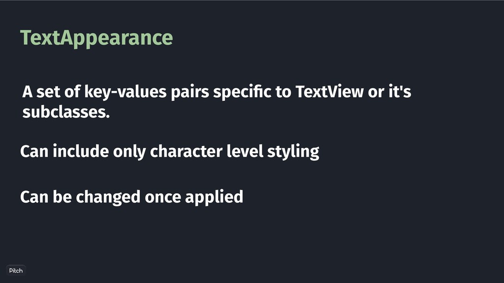
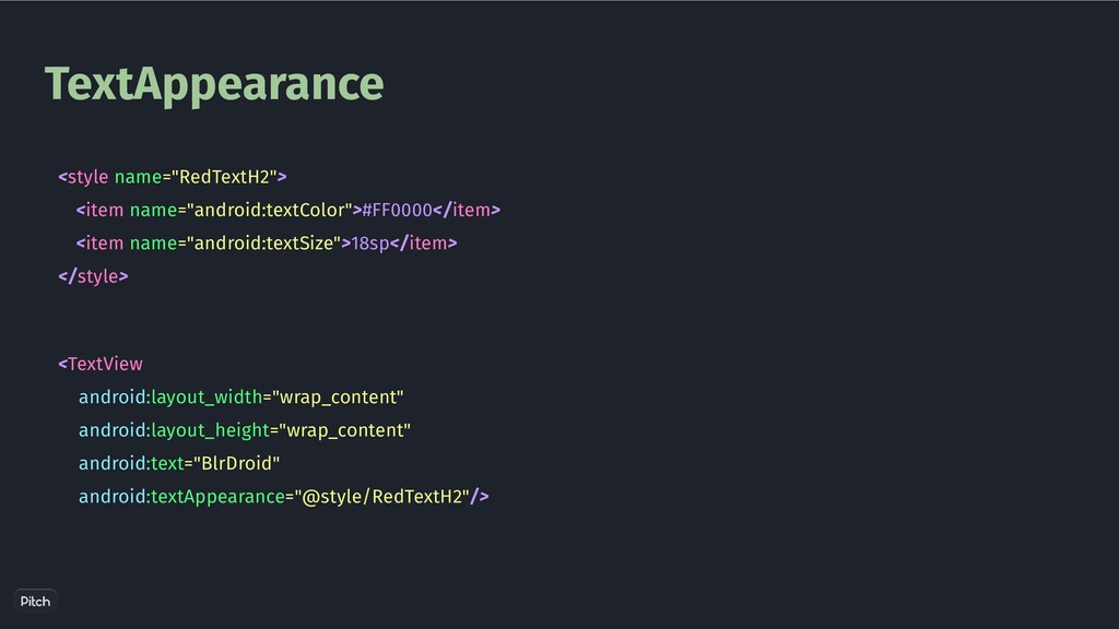
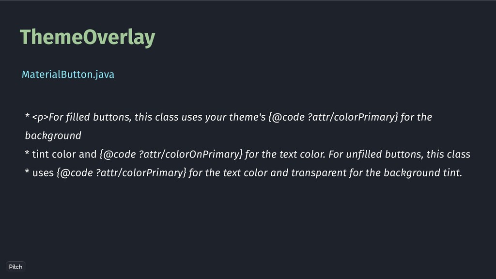
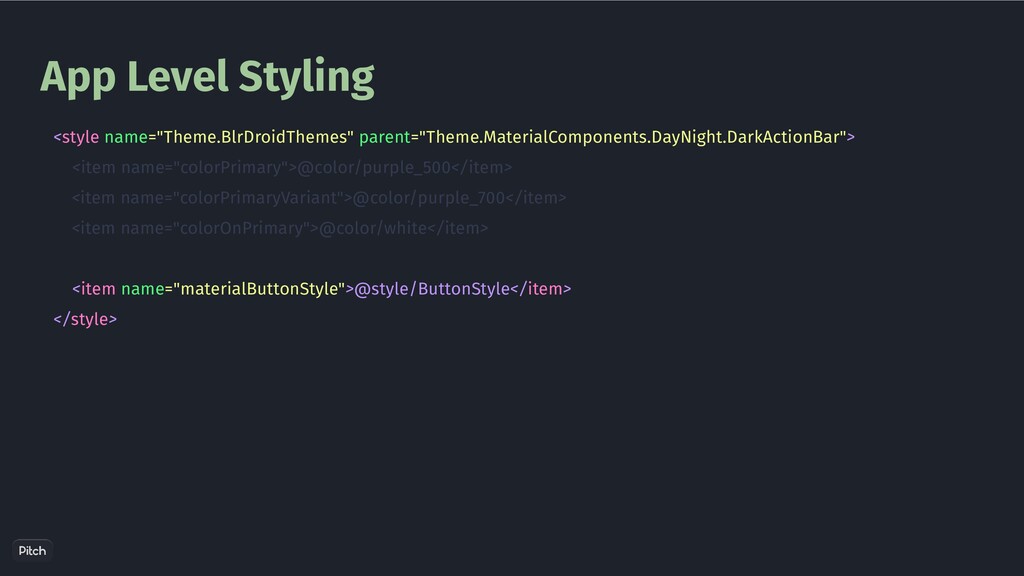
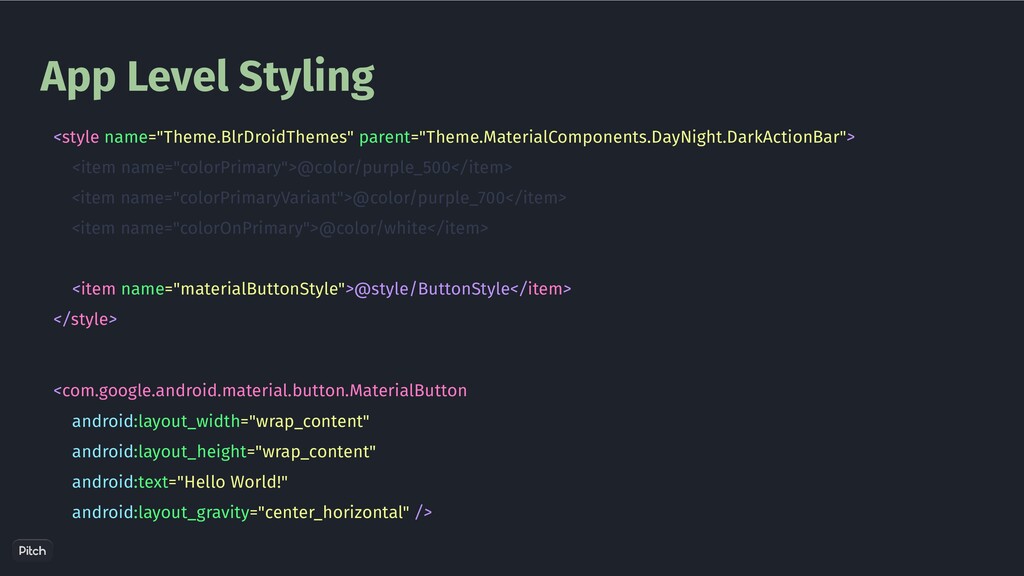
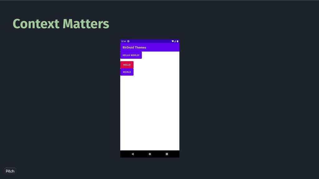
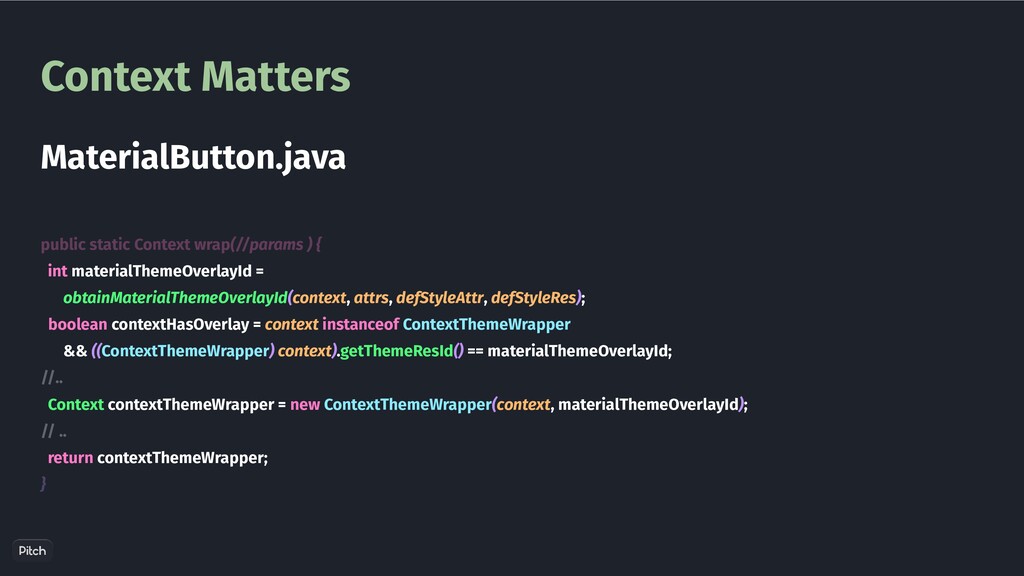
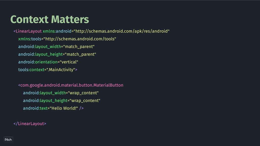
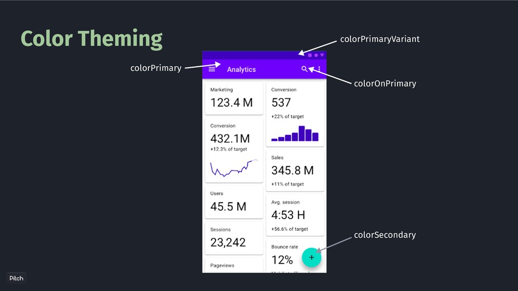
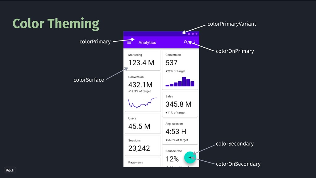
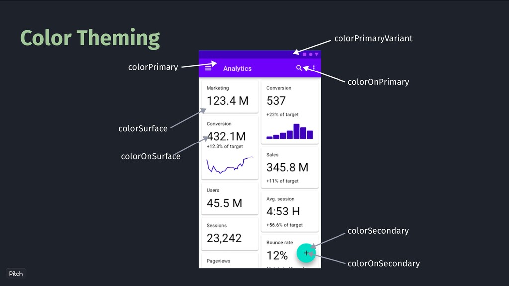
    {@code ?attr/colorPrimary} for the background * tint color and {@code ?attr/colorOnPrimary} for the text color. For unfilled buttons, this class * uses {@code ?attr/colorPrimary} for the text color and transparent for the background tint. MaterialButton.java
  10. App Level Styling <style name="ButtonStyle" parent="Widget.MaterialComponents.Button"> <item name="android:insetTop">0dp</item> <item name="android:insetBottom">0dp</item>

    </style> <com.google.android.material.button.MaterialButton android:layout_width="wrap_content" android:layout_height="wrap_content" android:text="Hello World!" style="@style/ButtonStyle" android:layout_gravity="center_horizontal" />
  11. App Level Styling <style name="Theme.BlrDroidThemes" parent="Theme.MaterialComponents.DayNight.DarkActionBar"> <item name="colorPrimary">@color/purple_500</item> <item name="colorPrimaryVariant">@color/purple_700</item>

    <item name="colorOnPrimary">@color/white</item> <item name="materialButtonStyle">@style/ButtonStyle</item> </style> <com.google.android.material.button.MaterialButton android:layout_width="wrap_content" android:layout_height="wrap_content" android:text="Hello World!" android:layout_gravity="center_horizontal" />
  12. Context Matters A context will be tied to a theme

    This theme can be different from the Activity/App theme
  13. Context Matters val contextThemeWrapper = ContextThemeWrapper( this, R.style.ThemeOverlay_RedPrimary ) val

    materialButton = MaterialButton(contextThemeWrapper) materialButton.text = "World" binding.linearLayout.addView(materialButton) Option - 1
  14. Context Matters public MaterialButton(@NonNull Context context, @Nullable AttributeSet attrs, int

    defStyleAttr) { super(wrap(context, attrs, defStyleAttr, DEF_STYLE_RES), attrs, defStyleAttr); // Ensure we are using the correctly themed context rather than the context that was passed in. context = getContext(); } MaterilButton.java
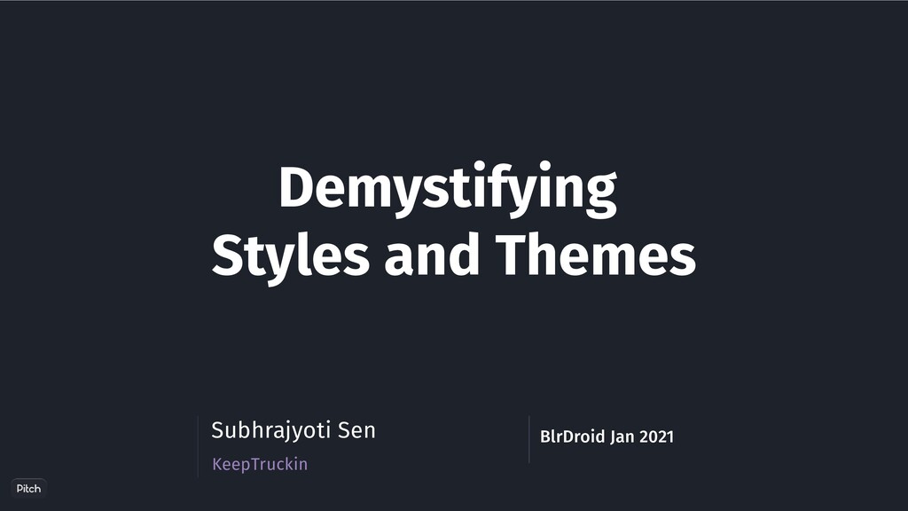
  15. Context Matters public static Context wrap(//params ) { int materialThemeOverlayId

    = obtainMaterialThemeOverlayId(context, attrs, defStyleAttr, defStyleRes); boolean contextHasOverlay = context instanceof ContextThemeWrapper && ((ContextThemeWrapper) context).getThemeResId() == materialThemeOverlayId; //.. Context contextThemeWrapper = new ContextThemeWrapper(context, materialThemeOverlayId); // .. return contextThemeWrapper; } MaterialButton.java
  16. Custom View Styling class ProgressButton @JvmOverloads constructor( context: Context, attrs:

    AttributeSet? = null, defStyleAttr: Int = 0 ) : View(context, attrs, defStyleAttr)
  17. Custom View Styling class ProgressButton @JvmOverloads constructor( context: Context, attrs:

    AttributeSet? = null, defStyleAttr: Int = 0, defStyleRes: Int = 0 ) : View(context, attrs, defStyleAttr, defStyleRes) {
  18. Custom View Styling class ProgressButton @JvmOverloads constructor( context: Context, attrs:

    AttributeSet? = null, defStyleAttr: Int = R.attr.progressButtonStyle, defStyleRes: Int = R.style.ProgressButtonStyle ) : View(context, attrs, defStyleAttr, defStyleRes) {
  19. Custom View Styling class ProgressButton @JvmOverloads constructor( context: Context, attrs:

    AttributeSet? = null, defStyleAttr: Int = R.attr.progressButtonStyle, defStyleRes: Int = R.style.ProgressButtonStyle ) : View(context, attrs, defStyleAttr, defStyleRes) { val typedArray = context.obtainStyledAttributes(attrs, R.styleable.ProgressButton, defStyleAttr, defStyleRes)
  20. Custom View Styling <resources> <attr name="progressButtonStyle" format="reference"/> </resources> defStyleAttr <style

    name="AppTheme" parent="Theme.MaterialComponents.DayNight.NoActionBar"> <item name="colorPrimary">@color/colorPrimary</item> <item name="colorPrimaryDark">@color/colorPrimaryDark</item> <item name="progressButtonStyle">@style/ProgressButtonStyle</item> </style>
  21. Color Theming <color name="white">#FFFFFF</color> <color name="blue">#0F6BDD</color> <color name="blueDark">#0C52A8</color> <style name="AppTheme"

    parent="Theme.MaterialComponents.DayNight.NoActionBar"> <item name="colorPrimary">@color/blue</item> <item name="colorPrimaryDark">@color/blueDark</item> <item name="android:colorBackground">@color/white</item> </style>
  22. Color Theming - Dark Mode? <color name="colorPrimary">#006837</color> <color name="colorPrimaryDark">#004012</color> <color

    name="colorSurface">#FFFFFF</color> <color name="colorOnSurface">#0B0A0A</color> values/colors.xml
  23. Color Theming - Dark Mode? <color name="colorPrimary">#BA86FC</color> <color name="colorPrimaryDark">#000000</color> <color

    name="colorSurface">#000000</color> <color name="colorOnSurface">#EAE4E4</color> values-night/colors.xml
  24. Color Theming - Dark Mode? <style name="AppTheme" parent="Theme.MaterialComponents.DayNight.NoActionBar"> <item name="colorPrimary">@color/colorPrimary</item>

    <item name="colorPrimaryDark">@color/colorPrimaryDark</item> <item name="colorSurface">@color/colorSurface</item> <item name="colorOnSurface">@color/colorOnSurface</item> </style>
  25. Shape Theming <?xml version="1.0" encoding="utf-8"?> <shape xmlns:android="http://schemas.android.com/apk/res/android" android:shape="rectangle"> <solid android:color="#00ffffff"

    /> <padding android:left="6dp" android:top="6dp" android:right="6dp" android:bottom="6dp" /> <corners android:radius="12dp" /> <stroke android:width="6dp" android:color="#ffffffff" /> </shape>