Upgrade to Pro
— share decks privately, control downloads, hide ads and more …
Speaker Deck
Features
Speaker Deck
PRO
Sign in
Sign up for free
Search
Search
Shape Design with Material Components
Search
Sponsored
·
Your Podcast. Everywhere. Effortlessly.
Share. Educate. Inspire. Entertain. You do you. We'll handle the rest.
→
umechanhika
September 27, 2019
Programming
260
3
Share
Shape Design with Material Components
Material ComponentsのShapeのガイドラインと、Shapeを用いてアプリを角丸デザインにした実例をご紹介します。
umechanhika
September 27, 2019
More Decks by umechanhika
See All by umechanhika
My Workspace [2020/08版]
umechanhika
0
110
My Workspace [2020/06版]
umechanhika
0
53
Badging for Tabs and Bottom Navigation
umechanhika
0
380
Capture view and Register to gallery
umechanhika
0
61
Firebase MLKit AutoML Vision Edgeを触ってみた
umechanhika
3
580
Google Play Consoleの時間指定公開のハマりポイント
umechanhika
1
1.6k
UIテスト初心者のチームにUIテスト自動化を導入した話
umechanhika
0
110
GoogleI/Oアプリのようなフィルター機能を実装する
umechanhika
2
540
Jenkins + Bitbucketでアプリリリースを自動化してみた
umechanhika
1
680
Other Decks in Programming
See All in Programming
PHPer、Cloudflare に引っ越す
suguruooki
2
210
運転動画を検索可能にする〜Cosmos-Embed1とDatabricks Vector Searchで〜/cosmos-embed1-databricks-vector-search
studio_graph
3
930
開発とはなにか、Essenceカーネルで見えるもの
ukin0k0
0
170
cloudnative conference 2026 flyle
azihsoyn
0
180
Spec Driven Development | AI Summit Vilnius
danielsogl
PRO
1
160
〜バイブコーディングを超えて〜 チームで実験し続けたAI駆動開発
tigertora7571
0
210
「なんか〇〇ライブラリで脆弱性あるみたいなんだけど。。。」から始める脆弱性対応 / First Steps in Vulnerability Response
mackey0225
2
120
When benchmarks go bad - what I learned from measuring performance wrong
hollycummins
0
390
決定論 vs 確率論:Gemini 3 FlashとTF-IDFを組み合わせた「法規判定エンジン」の構築
shukob
0
160
Programming with a DJ Controller — not vibe coding
m_seki
3
860
ソースコード→AST→オペコード、の旅を覗いてみる
o0h
PRO
1
130
Are We Really Coding 10× Faster with AI?
kohzas
0
170
Featured
See All Featured
Applied NLP in the Age of Generative AI
inesmontani
PRO
4
2.2k
Abbi's Birthday
coloredviolet
2
7.6k
Chasing Engaging Ingredients in Design
codingconduct
0
190
Design of three-dimensional binary manipulators for pick-and-place task avoiding obstacles (IECON2024)
konakalab
0
420
Put a Button on it: Removing Barriers to Going Fast.
kastner
60
4.3k
The Web Performance Landscape in 2024 [PerfNow 2024]
tammyeverts
12
1.1k
The Art of Programming - Codeland 2020
erikaheidi
57
14k
CSS Pre-Processors: Stylus, Less & Sass
bermonpainter
360
30k
Building the Perfect Custom Keyboard
takai
2
760
Collaborative Software Design: How to facilitate domain modelling decisions
baasie
1
220
Beyond borders and beyond the search box: How to win the global "messy middle" with AI-driven SEO
davidcarrasco
3
130
Thoughts on Productivity
jonyablonski
76
5.2k
Transcript
Shape Design with Material Components
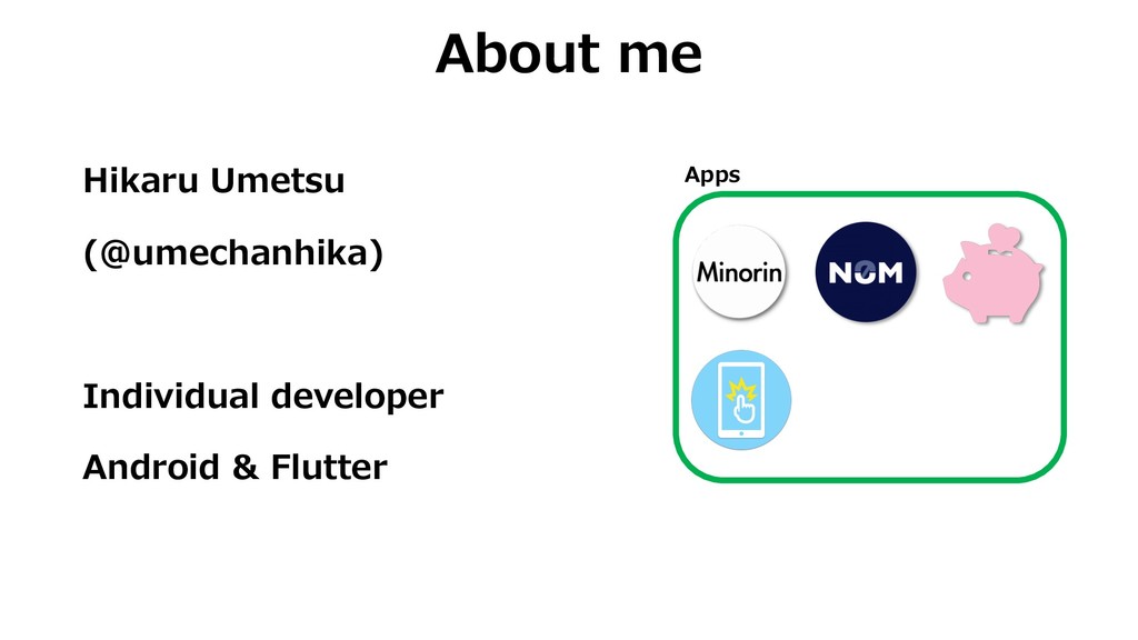
Hikaru Umetsu (@umechanhika) Individual developer Android & Flutter About me
Apps
The GOAL is to enable you to implement shape using
Material Components.
Introduction About shape Guideline How to implement Case study
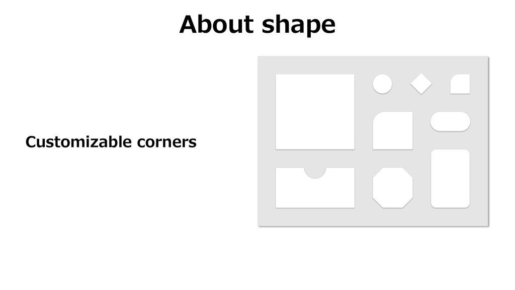
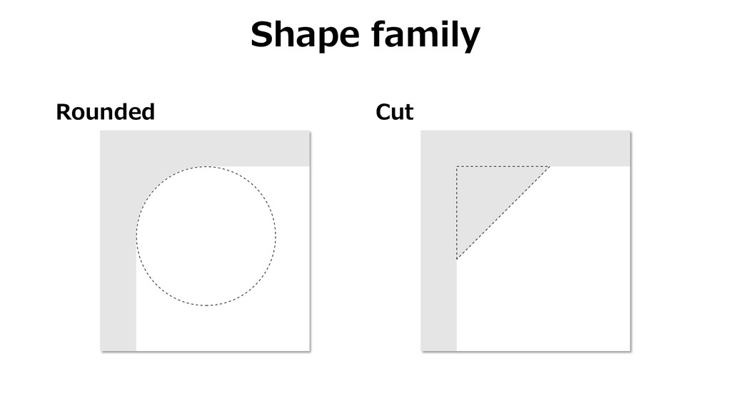
About shape Customizable corners
Guideline
Usage
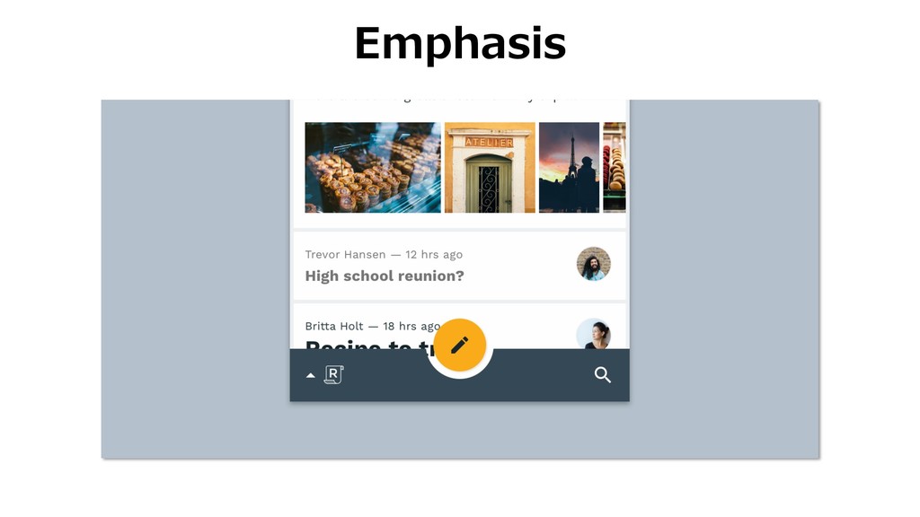
Emphasis
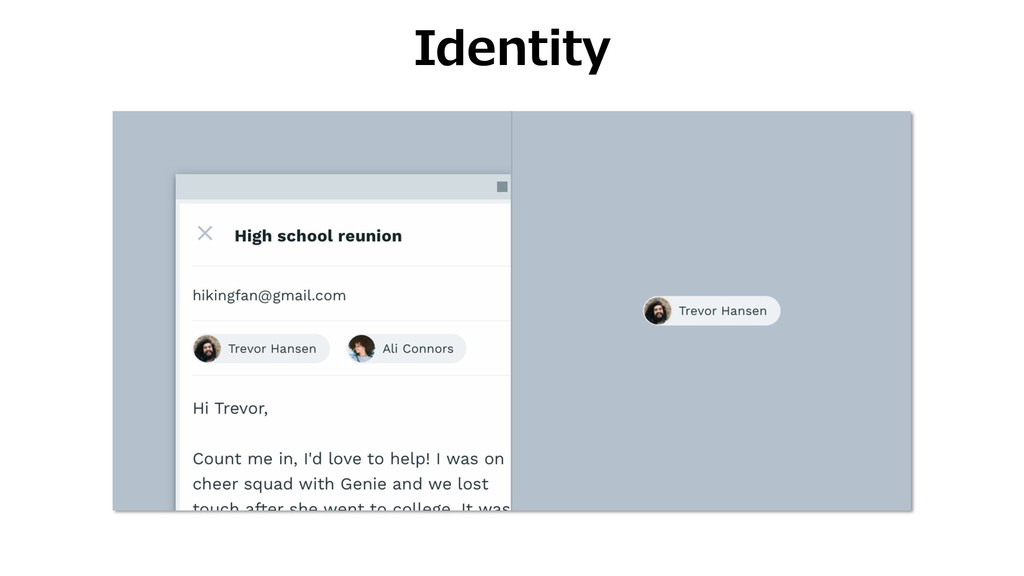
Identity
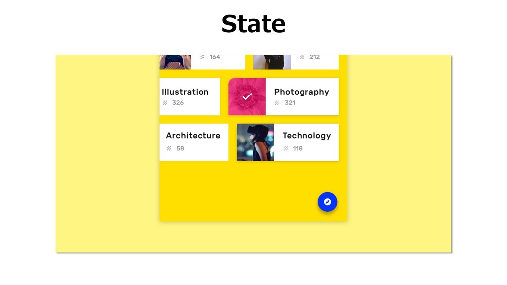
State
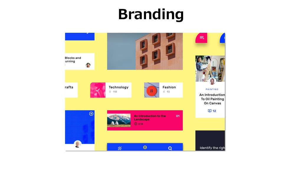
Branding
Attributes
Rounded Cut Shape family
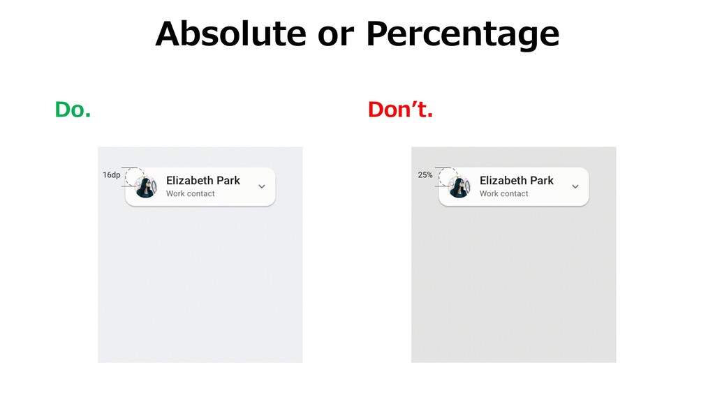
Absolute Percentage Shape size
Categories
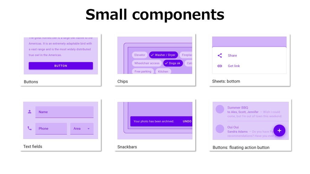
Small components
Medium components
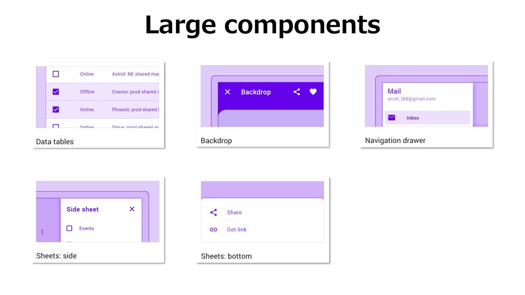
Large components
Caution
Do. Donʼt. Absolute or Percentage
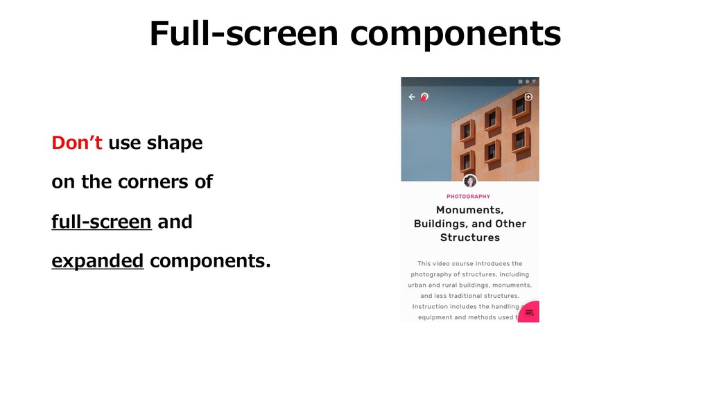
Full-screen components Donʼt use shape on the corners of full-screen
and expanded components.
How to implement
Apply categories <style name="SmallCompShapeAppearance" parent="ShapeAppearance.MaterialComponents.SmallComponent"> <item name="cornerFamily">cut</item> <item name="cornerSize">4dp</item> </style>
<style name="Theme.MyApp" parent="Theme.MaterialComponents.Light"> ... <item name="shapeAppearanceSmallComponent">@style/SmallCompShapeAppearance</item> ... </style>
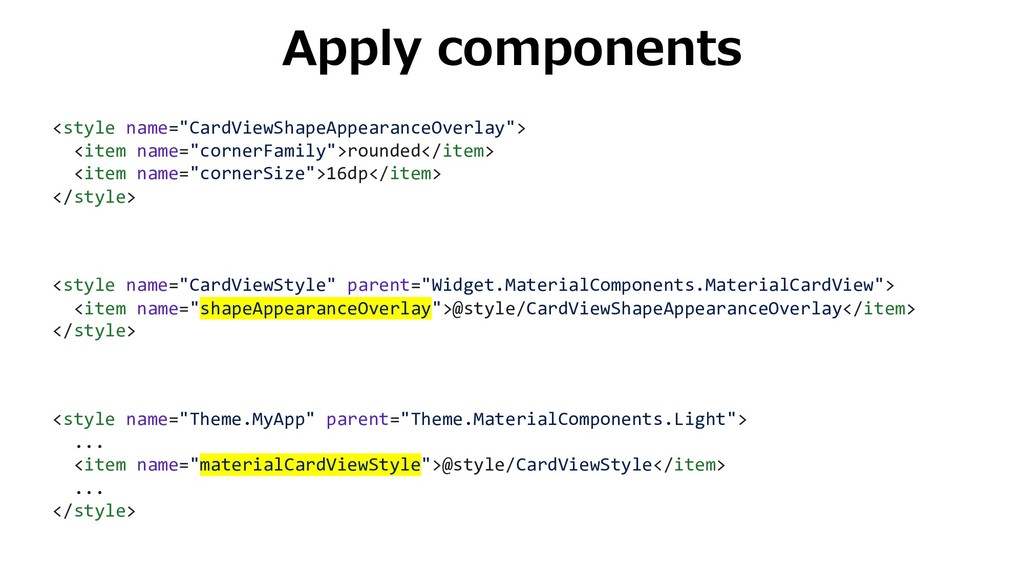
Apply components <style name="CardViewShapeAppearanceOverlay"> <item name="cornerFamily">rounded</item> <item name="cornerSize">16dp</item> </style> <style
name="CardViewStyle" parent="Widget.MaterialComponents.MaterialCardView"> <item name="shapeAppearanceOverlay">@style/CardViewShapeAppearanceOverlay</item> </style> <style name="Theme.MyApp" parent="Theme.MaterialComponents.Light"> ... <item name="materialCardViewStyle">@style/CardViewStyle</item> ... </style>
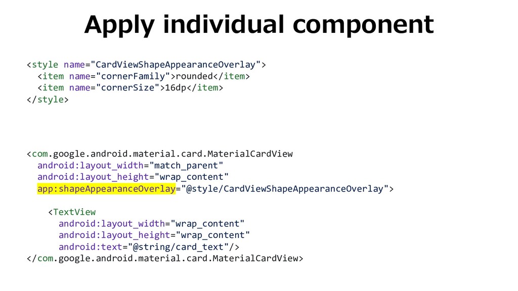
Apply individual component <style name="CardViewShapeAppearanceOverlay"> <item name="cornerFamily">rounded</item> <item name="cornerSize">16dp</item> </style>
<com.google.android.material.card.MaterialCardView android:layout_width="match_parent" android:layout_height="wrap_content" app:shapeAppearanceOverlay="@style/CardViewShapeAppearanceOverlay"> <TextView android:layout_width="wrap_content" android:layout_height="wrap_content" android:text="@string/card_text"/> </com.google.android.material.card.MaterialCardView>
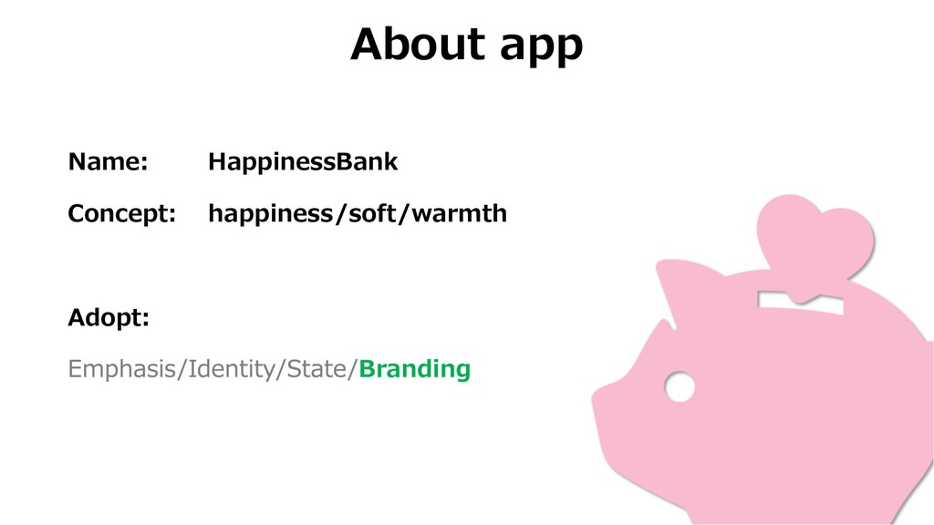
Case study
About app Name: HappinessBank Concept: happiness/soft/warmth Adopt: Branding
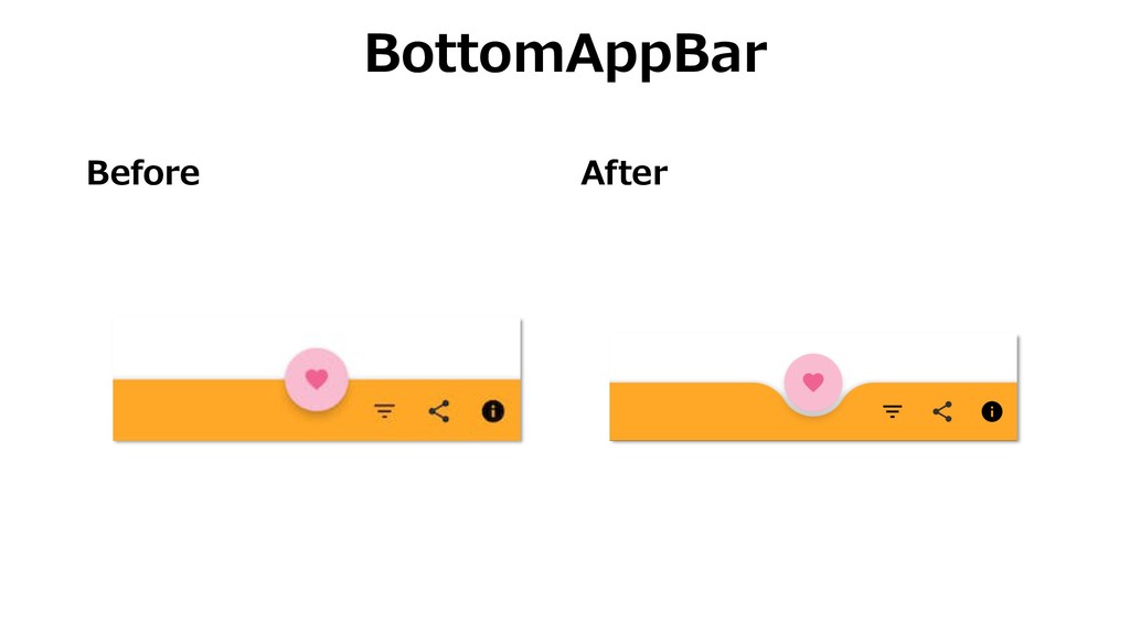
Before After BottomAppBar
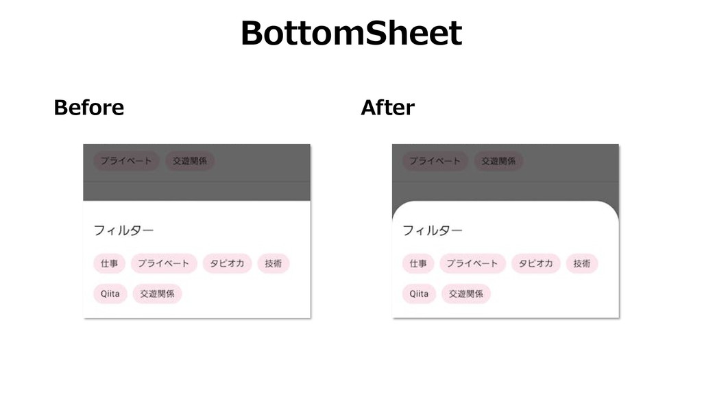
Before After BottomSheet
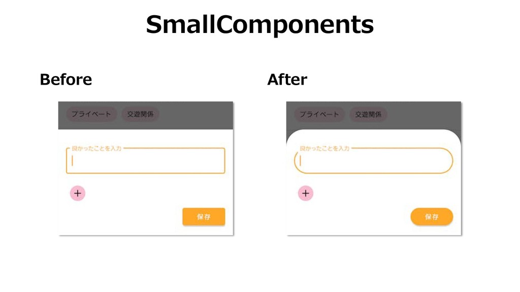
Before After SmallComponents
Summary Shape is the customizable corners. Usage of shape is
Emphasis, Identity, State, and Branding. You can customize it using styles.xml.
Thanks!
 umechanhika
 suguruooki
.jpg) studio_graph
studio_graph
 ukin0k0
 azihsoyn
 danielsogl
 tigertora7571
 mackey0225
 hollycummins
 shukob
 m_seki
 o0h
o0h
 kohzas
 inesmontani
 coloredviolet
 codingconduct
 konakalab
 kastner
 tammyeverts
 erikaheidi
 bermonpainter
 takai
takai
 baasie
 davidcarrasco
 jonyablonski