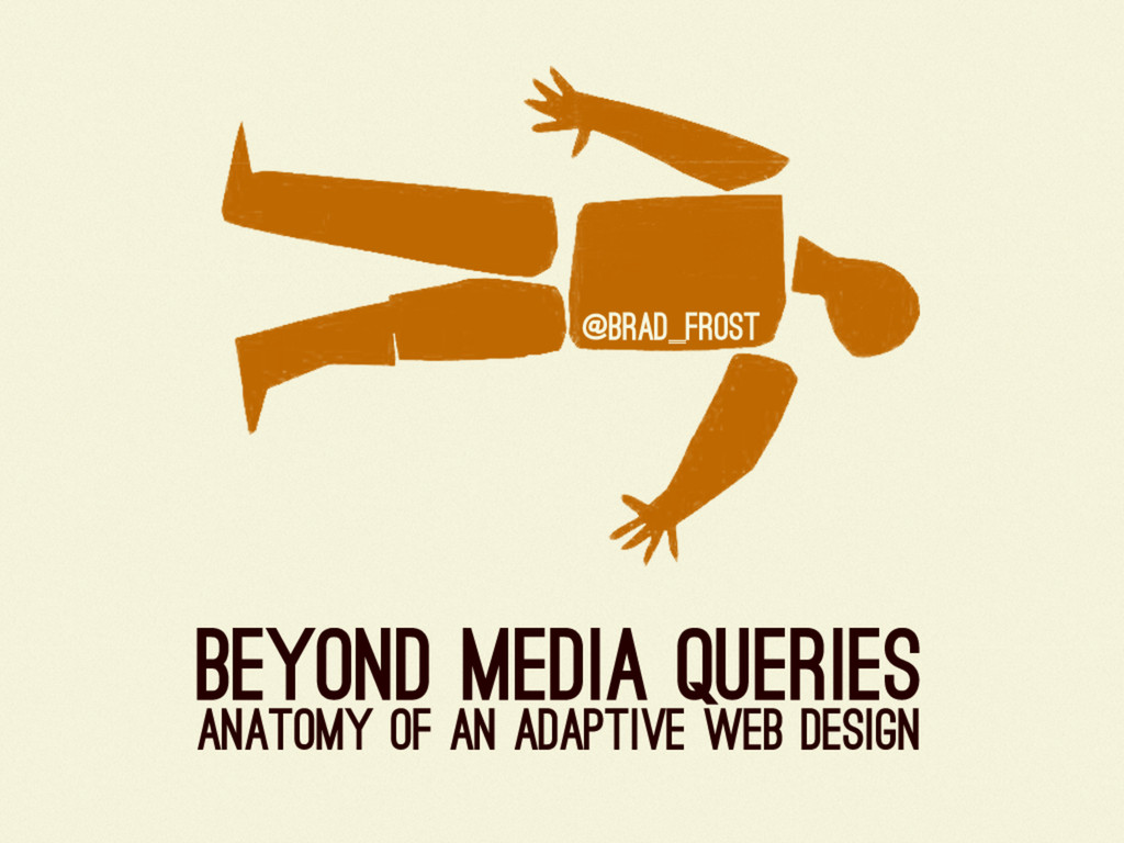
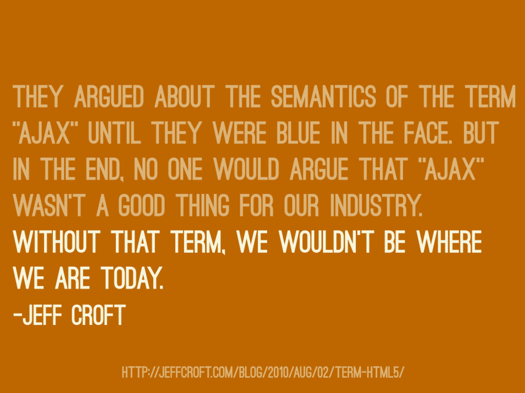
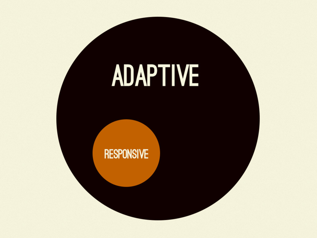
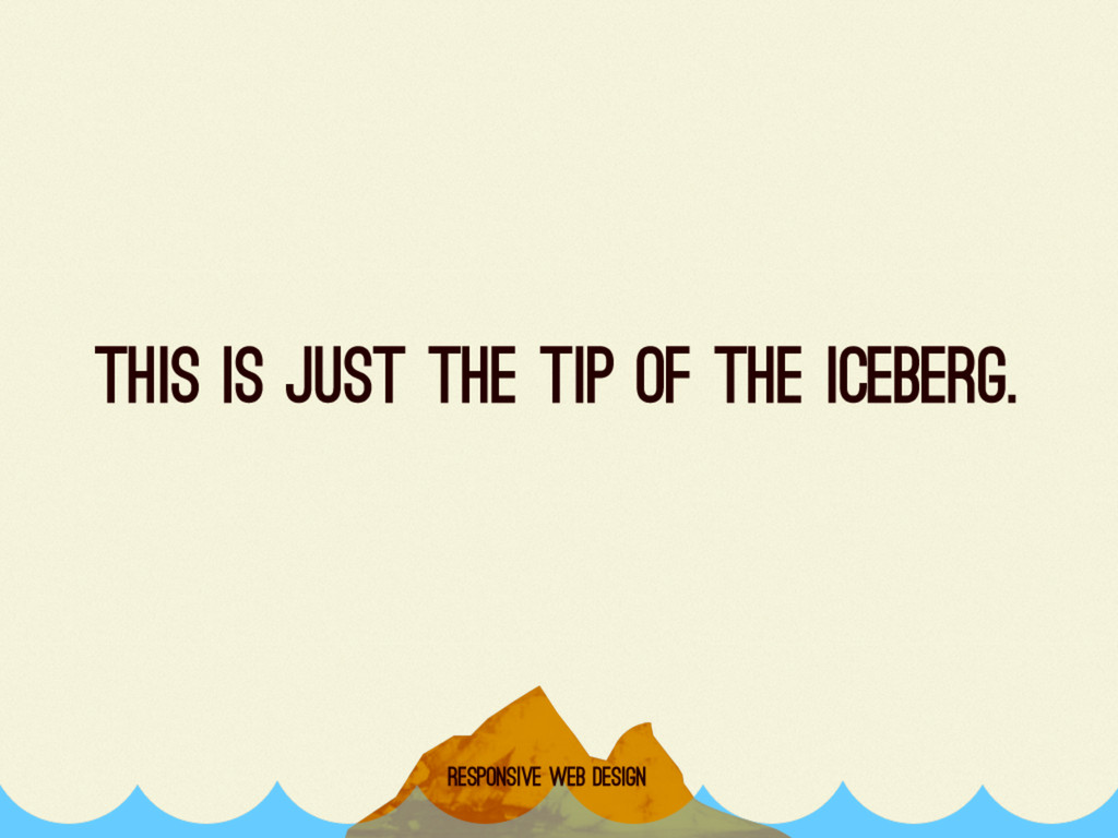
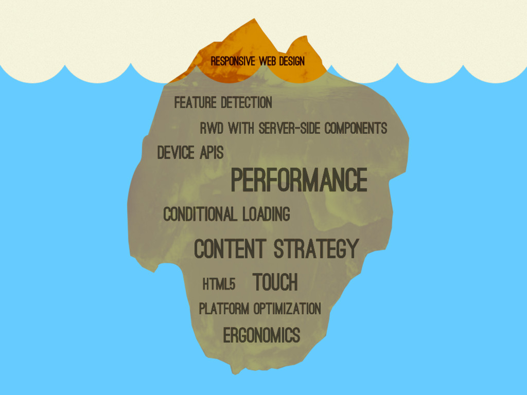
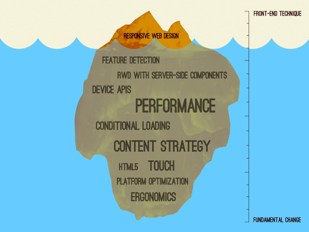
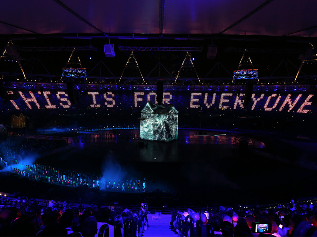
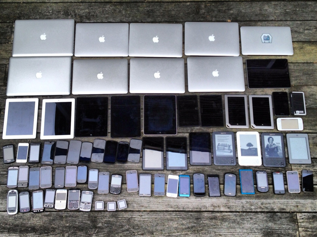
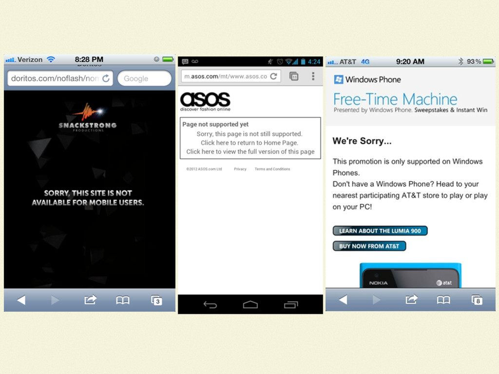
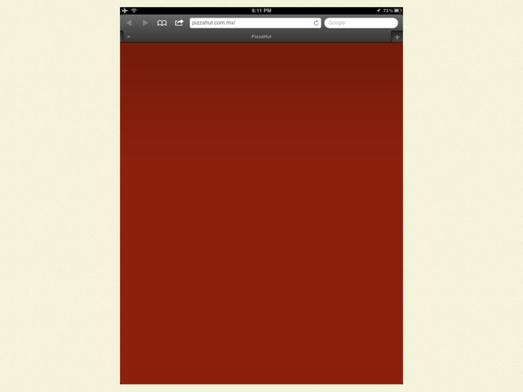
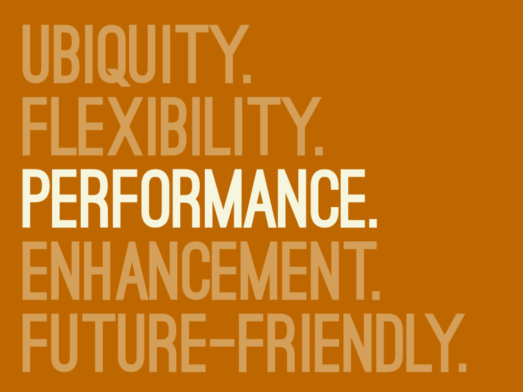
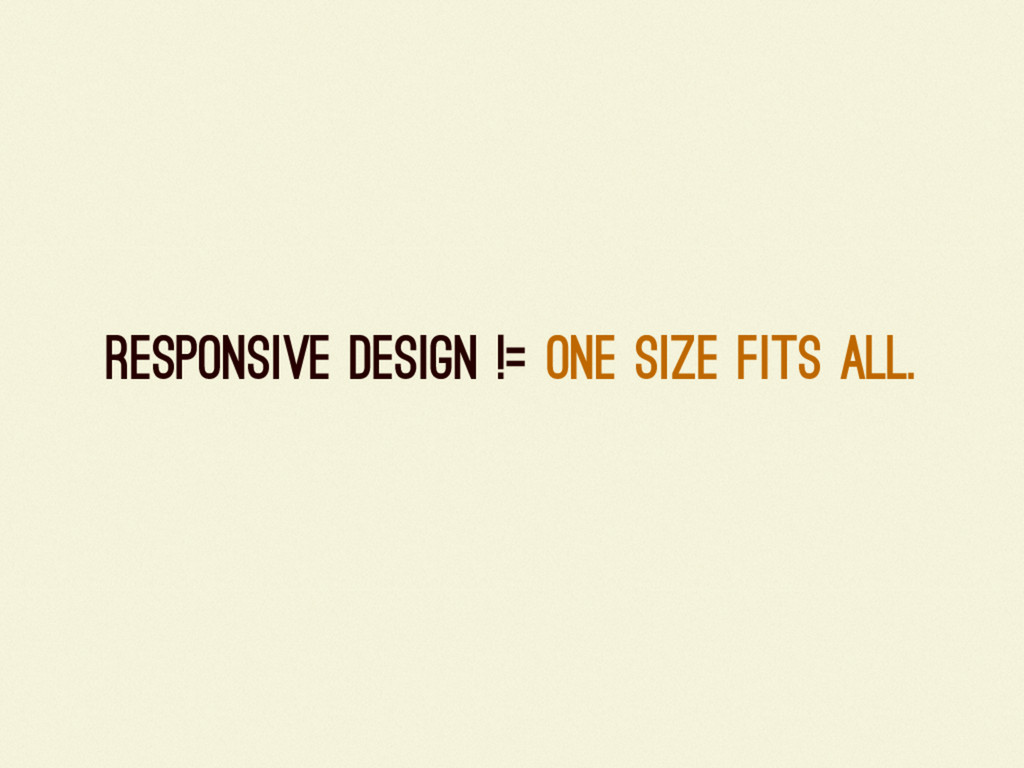
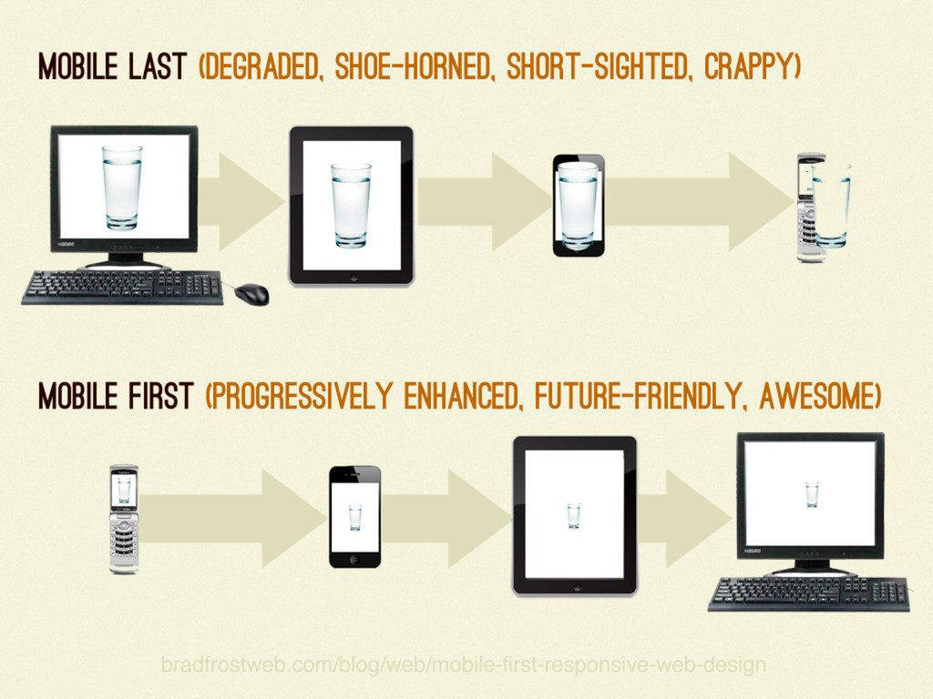
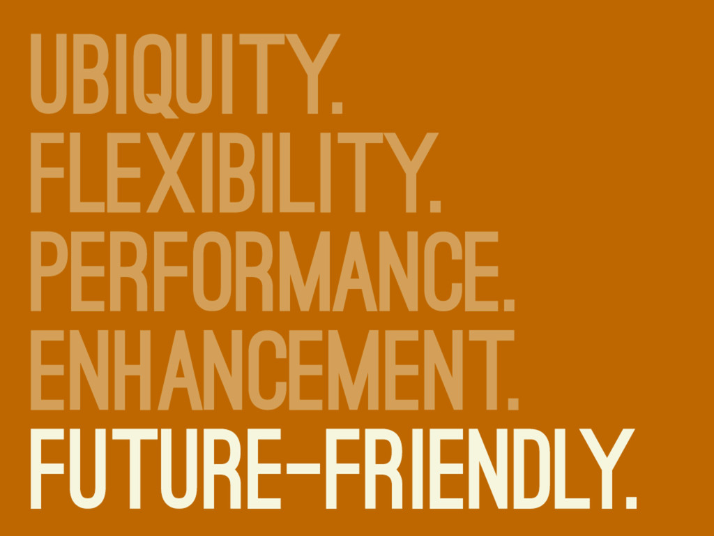
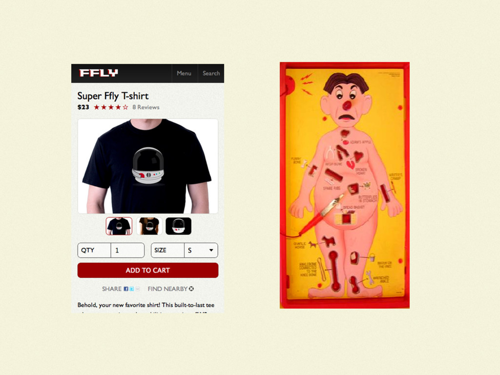
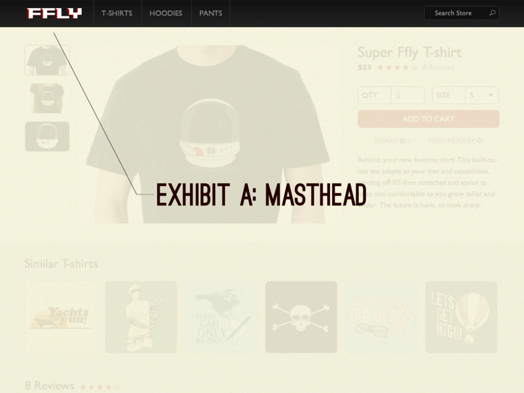
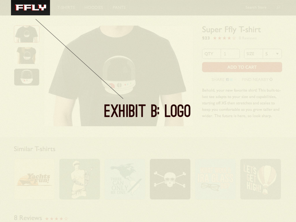
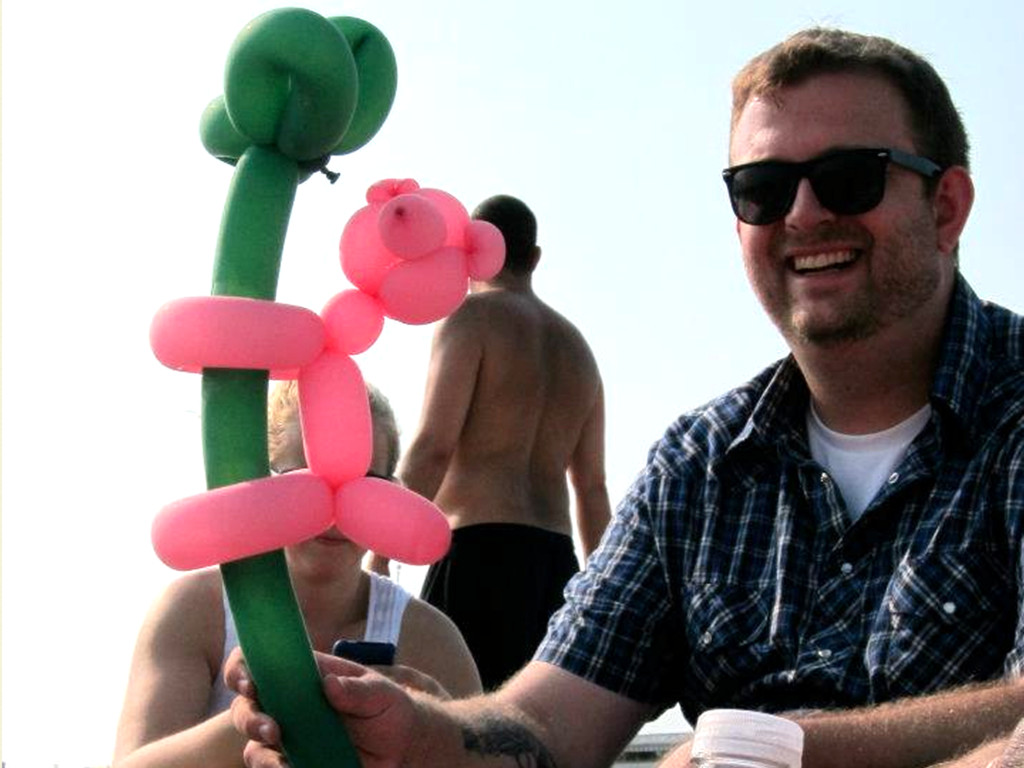
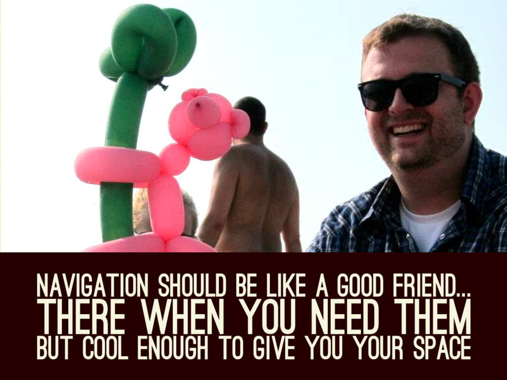
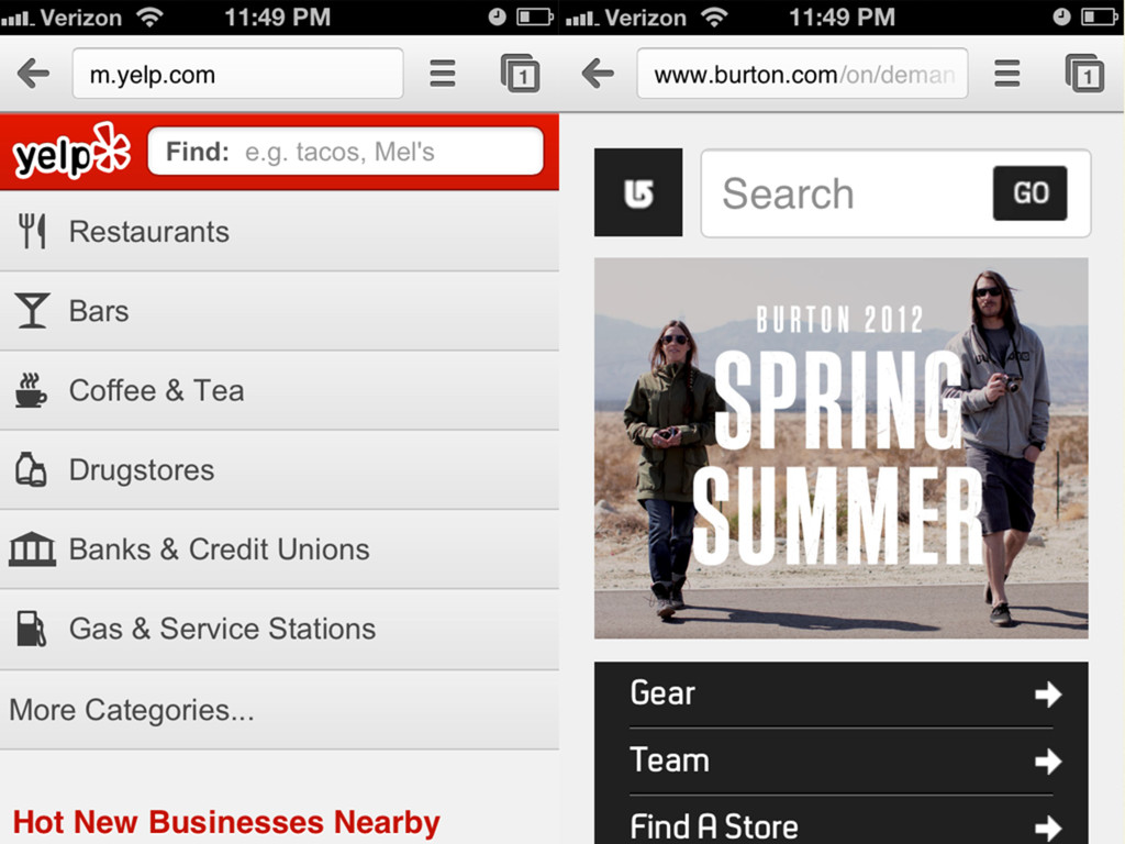
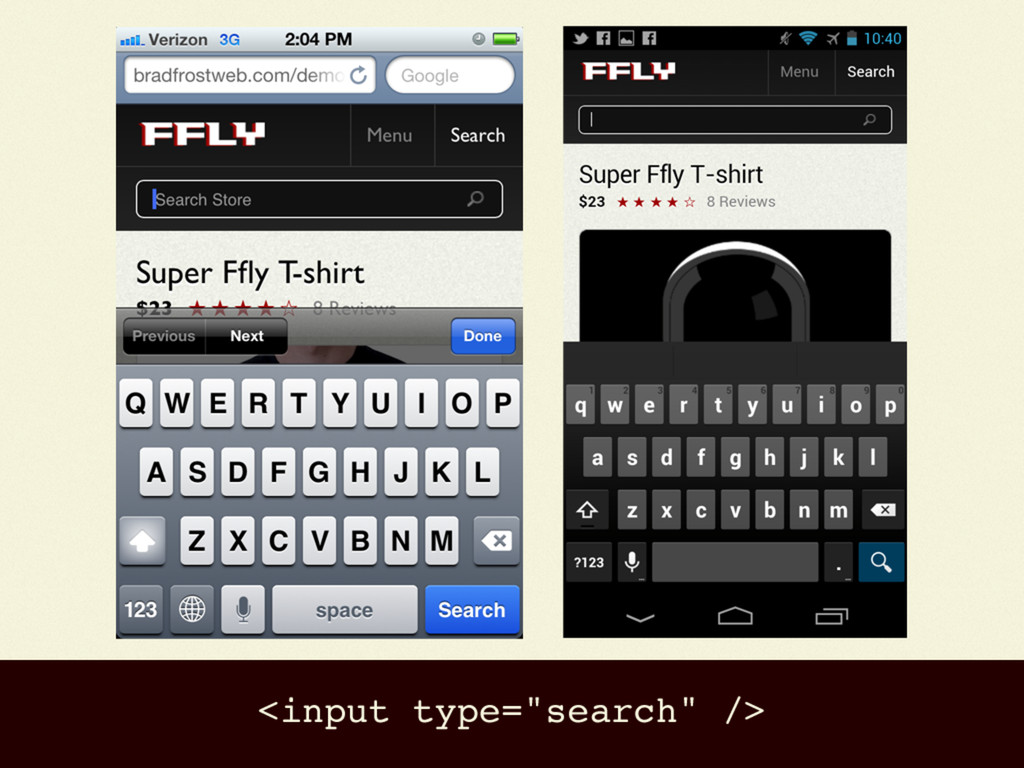
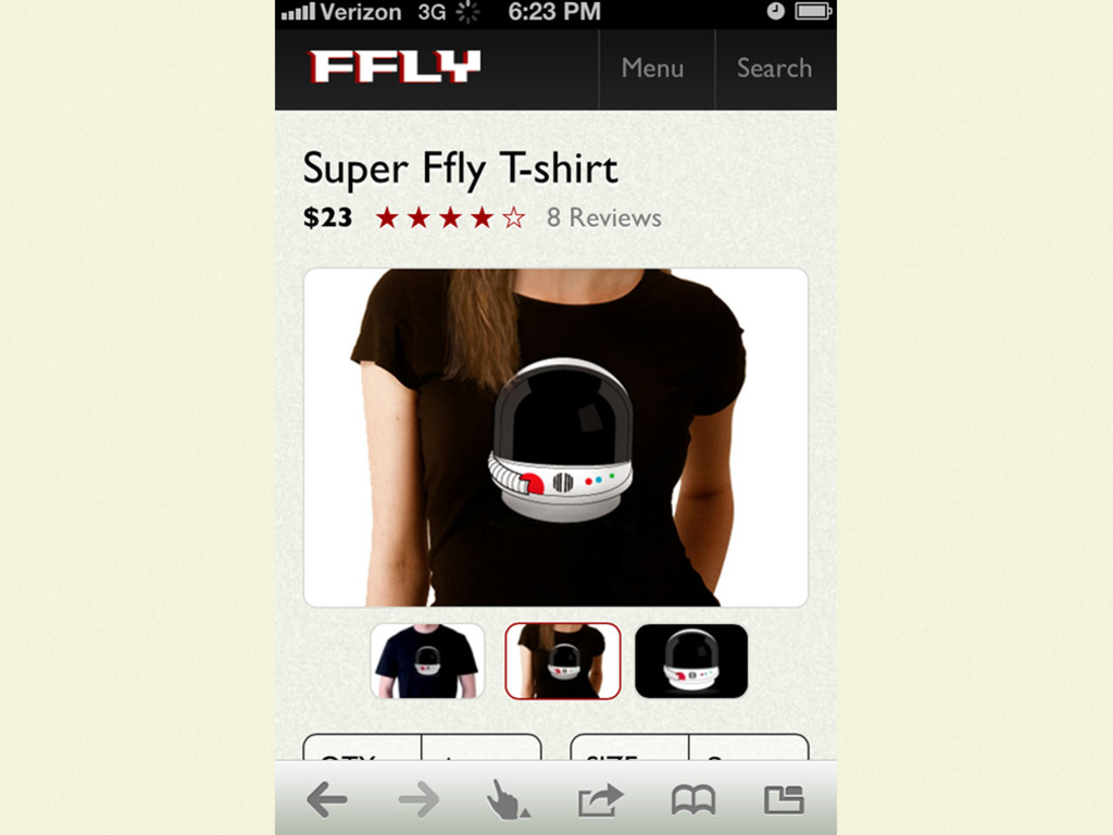
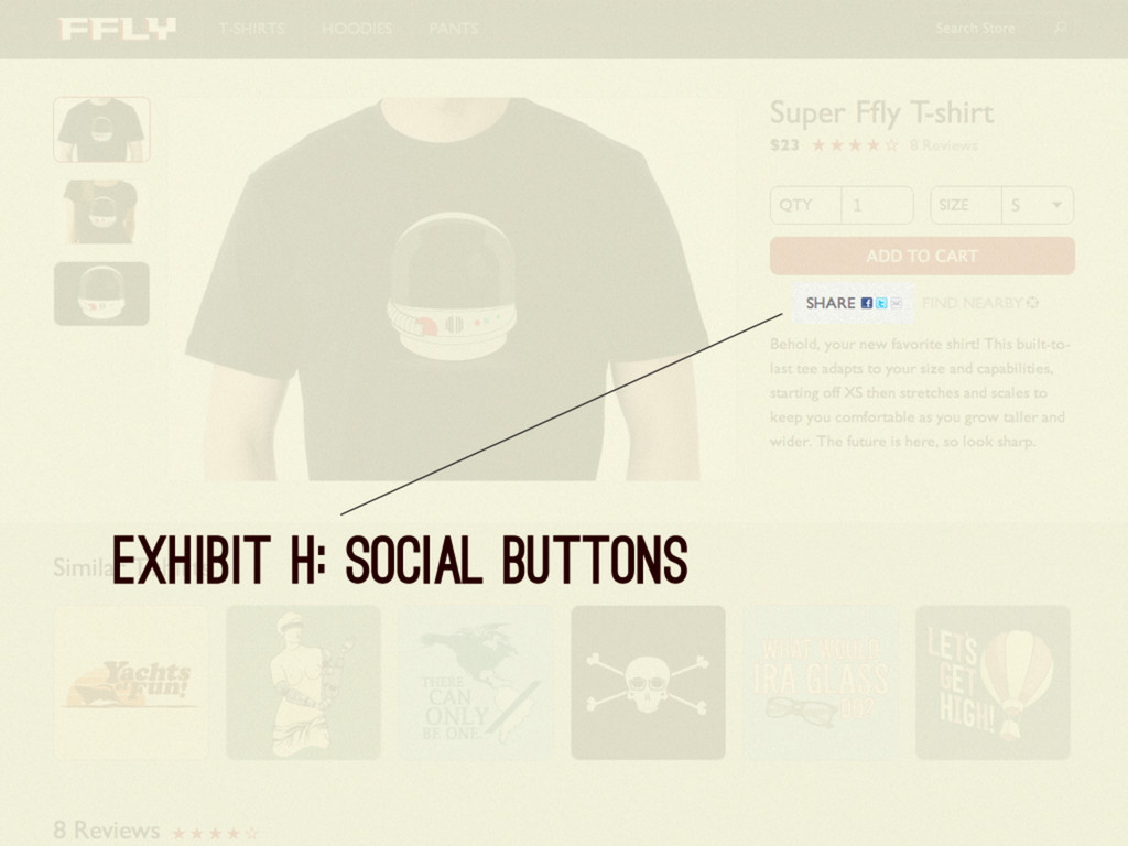
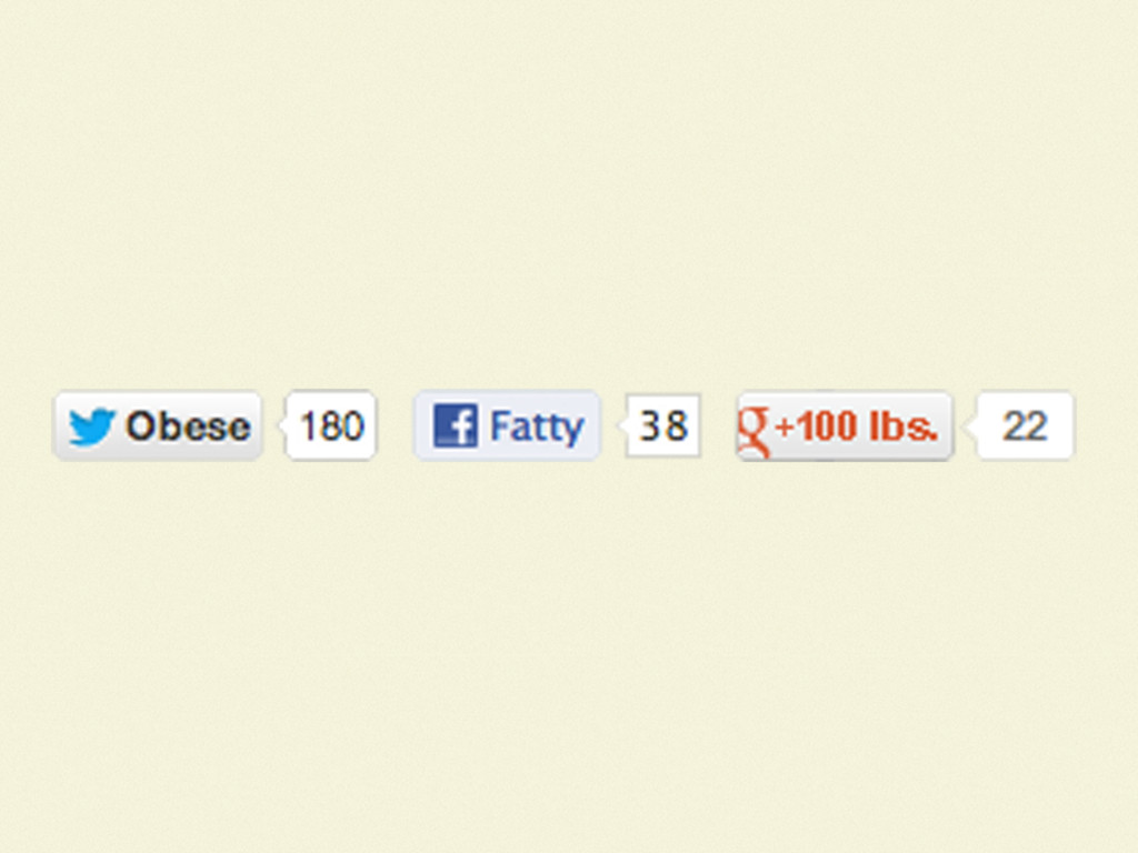
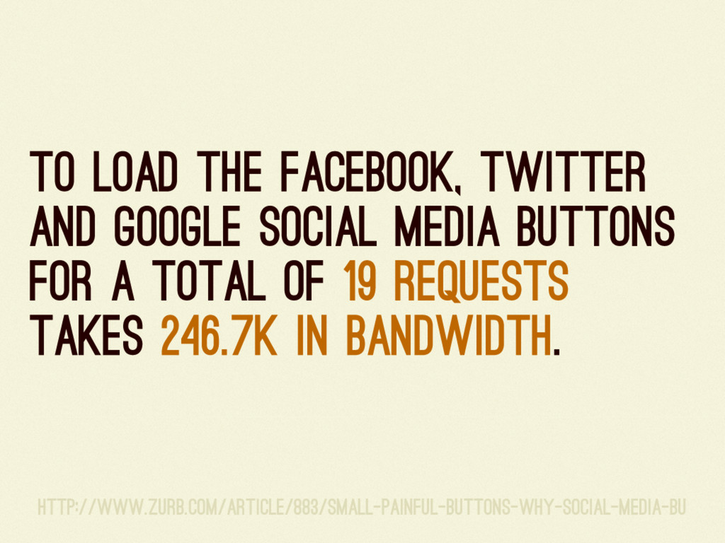
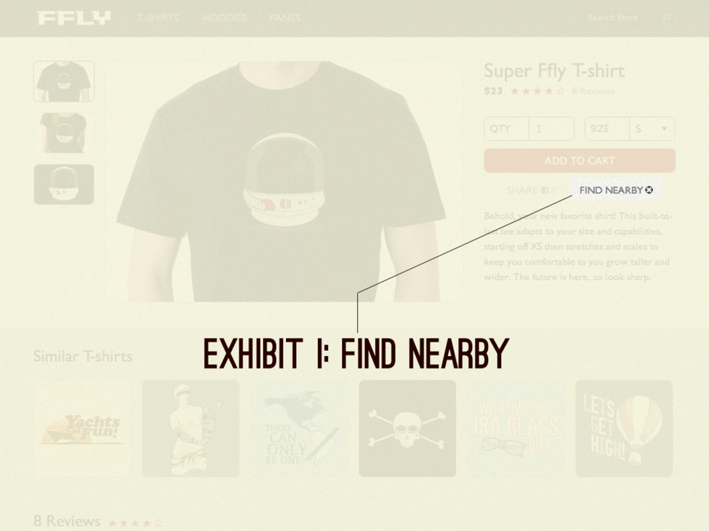
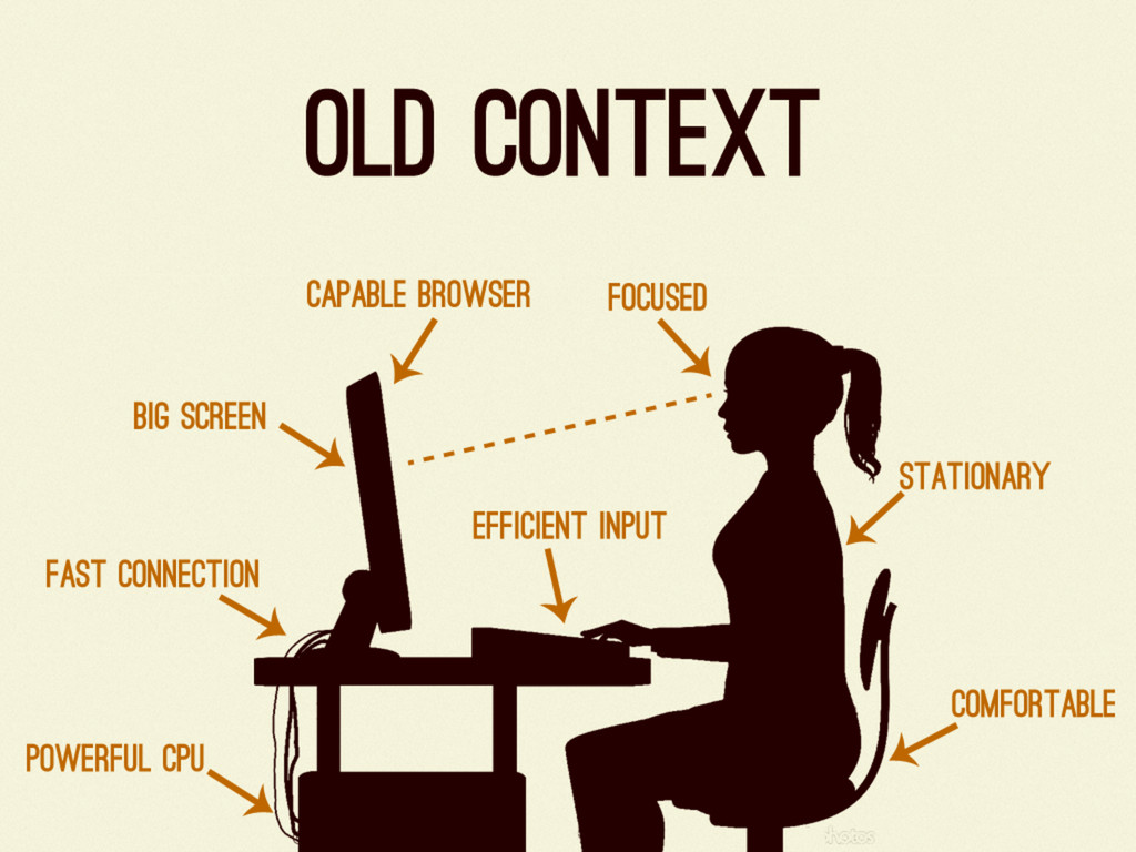
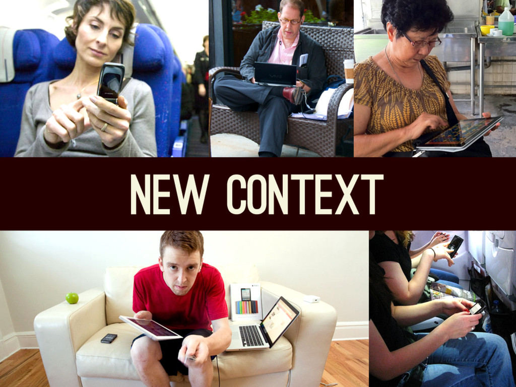
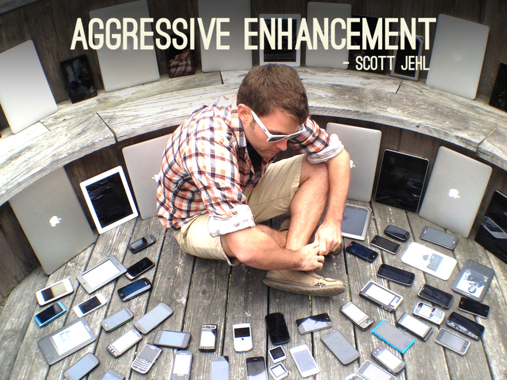
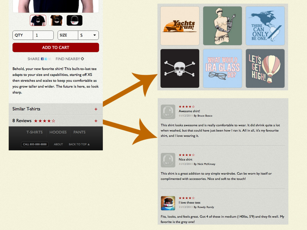
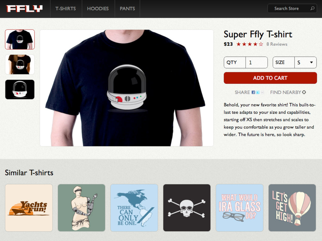
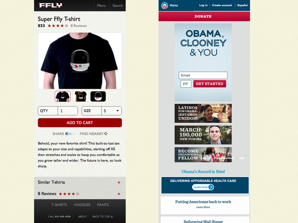
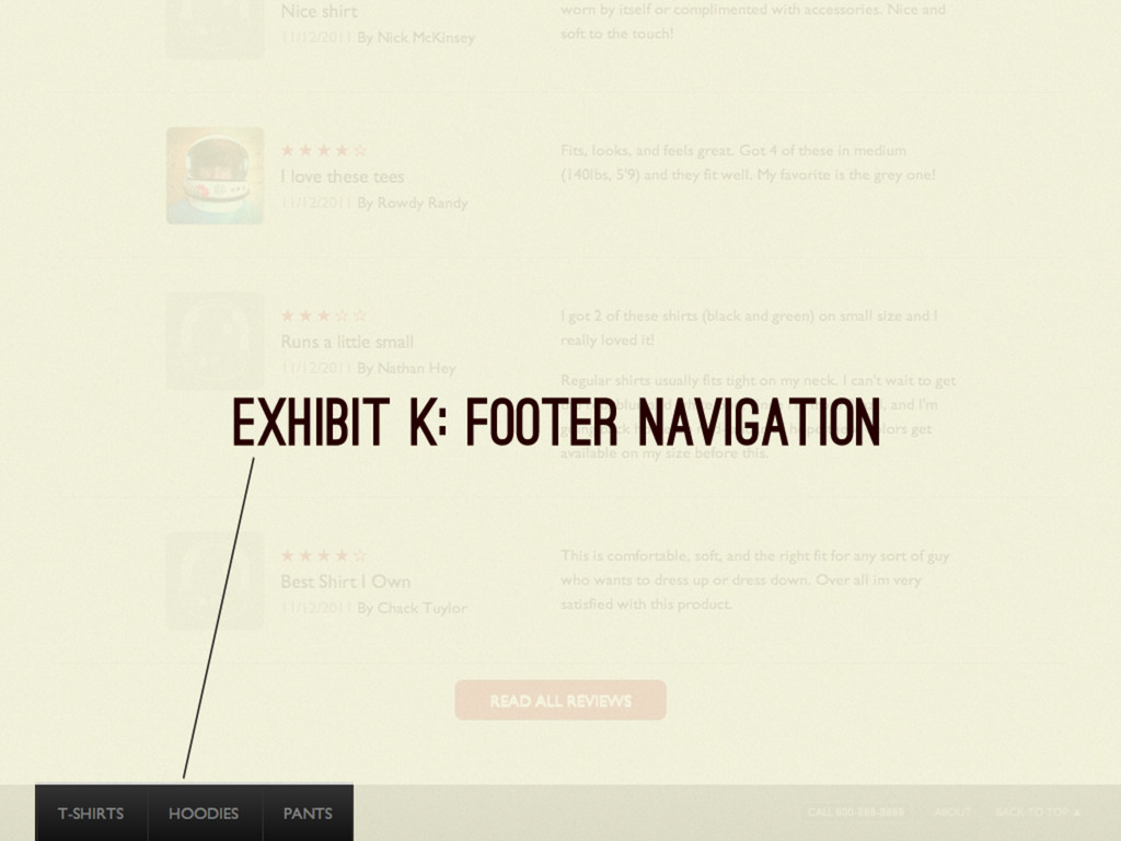
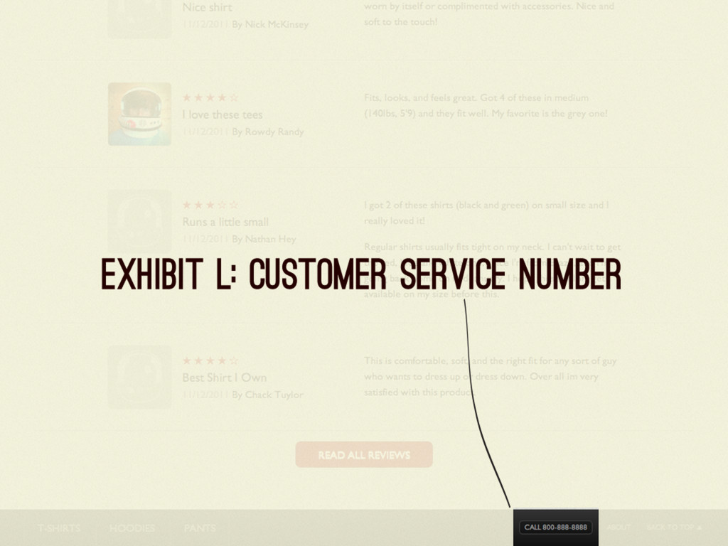
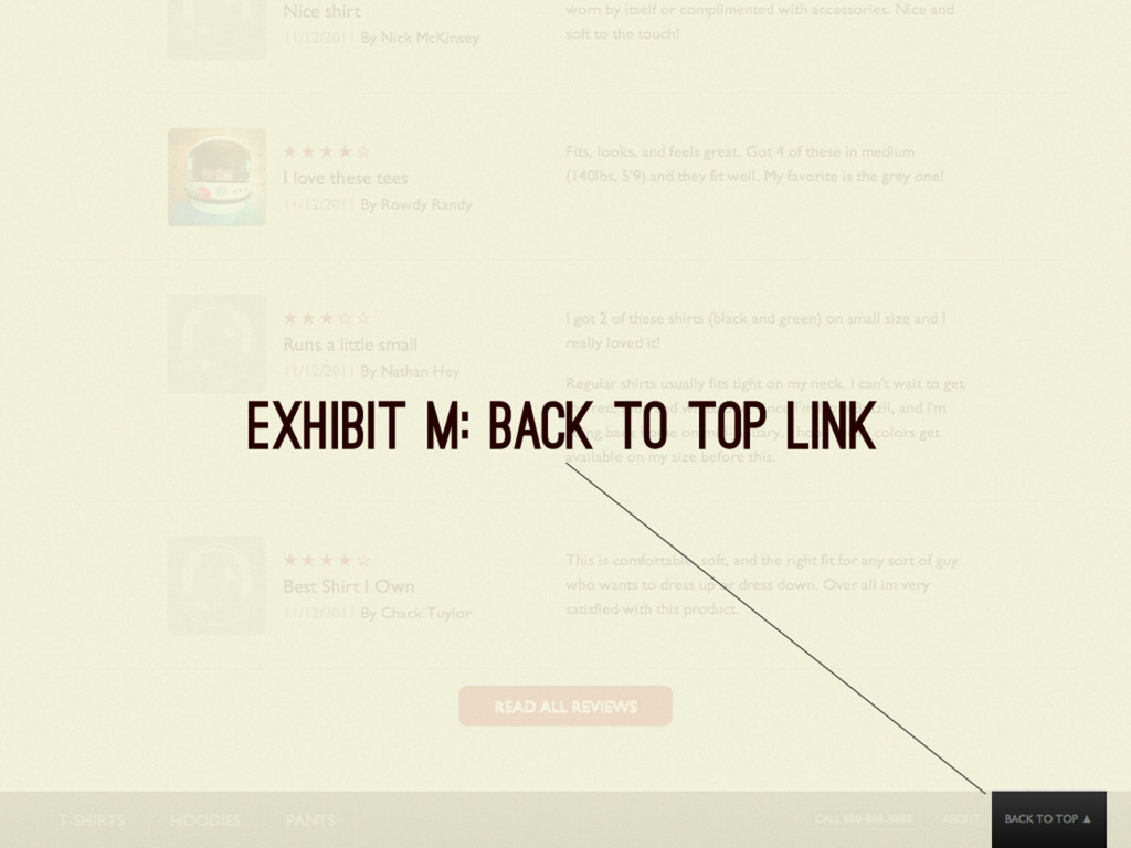
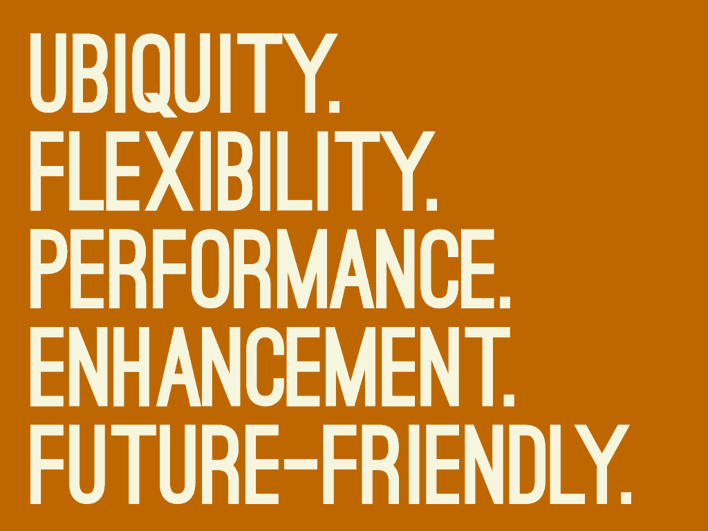
Media queries may be responsive design’s secret sauce, but we know there’s a whole lot more that goes into crafting amazing adaptive experiences. By dissecting an example of a mobile-first responsive design, we can uncover the principles of adaptive design and highlight some considerations for creating contextually-aware web experiences. This goes over emerging mobile web best practices and responsive patterns that can assist in our journey toward a future-friendly web.
 brad_frost
 sakajunquality
 ks91
ks91
 ynisqa1988
 bto
bto
 bitkey
 yuukiyo
 tonkotsuboy_com
 nari_ex
 watany
 genda
genda
 lycorptech_jp
 satohy0323
 mkilby
 davidcarrasco
 marktimemedia
 elsirapls
 keavy
keavy
 aleyda
 schroneko
 uxyall
 geshan
 sferik
 katarinadahlin
 eileencodes