Upgrade to Pro — share decks privately, control downloads, hide ads and more …

Missing parts when designing and implementing A...

Eric Li
November 23, 2024

Missing parts when designing and implementing Android UI

Quite often when designing Android application UI and preparing handoff, there are some items that are usually overlooked. For example, adaptive layout and accessibility. In this talk, I will highlight these items and demonstrate with Jetpack Compose code samples and showcase how adding accessibility support to your layout can also facilitate automatic UI testing.

GDG DevFest 2024 Hong Kong
https://gdg.community.dev/events/details/google-gdg-hong-kong-presents-devfest-2024-hong-kong/

Video recording
https://www.youtube.com/watch?v=ct1b_Xr7IGQ

Eric Li

November 23, 2024
Tweet

Other Decks in Programming

Transcript

  1. About me Eric Li Senior Android Developer @ Crypto.com 9

    yoe in Android development eric.swiftzer.net github.com/ericksli medium.com/@ericksli linkedin.com/in/ericksli
  2. Ambiguity Common sense is not common Examples: • Scrollable region

    • Banner/image size (fixed height/aspect ratio) • Position (relative to another element) • Maximum number of line for text, overflow behavior (e.g. ellipsis, auto size) • Clickable region (esp. when it comes with multiple objects) • Transparency (only for single object or in a group)
  3. States Do not miss out the initial state when presenting

    that screen Think of any kind of edge cases Usually the project may already have some common error handling mechanisms • Showing error dialog with generic error message • Backend API response body may have error code and error message UI components like button usually consist of different states
  4. Failed state Loading placeholder Image loading libraries should allow you

    to customize those loading and failed placeholders
  5. Responsive Support for different device form factors, system features like

    split screen and pop-up view Handle configuration change properly using onSaveInstanceState (SavedStateHandle, rememberSaveable) to hold and restore the UI state Window size classes Edge-to-edge is enforced by default in Android 15+ Use auto layout when preparing mockup in Figma
  6. Internalization and localization Some layouts are not suitable for locales

    with longer text length Use pseudolocales to test the layout with long text and RTL Some regions may have different conventions on certain things
  7. Icon grid with text below is usually problematic in non-Chinese

    languages SMS OTP input field with send OTP button place on the same line
  8. Pseudolocales en-XA and ar-XB for simulating long text in LTR

    and RTL locales using string resources in default locale
  9. val regularLocales = setOf("en", "zh-rHK") val pseudolocales = setOf("en-rXA", "ar-rXB")

    android { defaultConfig { applicationId = "com.example.demo" versionCode = 123 versionName = "123.0" resourceConfigurations.addAll(regularLocales) } buildTypes { getByName("debug") { isDefault = true isDebuggable = true isPseudoLocalesEnabled = true defaultConfig { resourceConfigurations.addAll(regularLocales + pseudolocales) } } } } Enabling psuedolocales in debug build
  10. In many countries, green is for rising and red is

    for falling However, it is not always the case
  11. Minimum size of a clickable area should be 48 ×

    48 dp (Android)/44 × 44 pt (iOS) to ensure accessibility
  12. Standard There is no dedicated international standard specific to mobile

    app accessibility. Mainly adopting the Web Content Accessibility Guidelines (WCAG) for mobile app accessibility Refer to Android and iOS developer documentation for more information
  13. Accessibility Scanner Scans your screen and provides suggestions to improve

    the accessibility of your app, based on: • Content labels • Touch target size • Clickable items • Text and image contrast
  14. TalkBack Screen reader in Android Toggle on/off: Settings > Accessibility

    > TalkBack > Use TalkBack Developer settings: Settings > Accessibility > TalkBack > Settings > Advanced settings > Developer settings Remember to go through the tutorial first
  15. Column( modifier = Modifier.verticalScroll(rememberScrollState()), verticalArrangement = Arrangement.spacedBy(16.dp), ) { Text(

    modifier = Modifier.semantics { heading() }, text = "Heading 1", style = MaterialTheme.typography.headlineLarge, ) Text( text = LoremIpsum(30).values.first(), style = MaterialTheme.typography.bodyLarge, ) Text( modifier = Modifier.semantics { heading() }, text = "Heading 2", style = MaterialTheme.typography.headlineSmall ) Text( text = LoremIpsum(20).values.first(), style = MaterialTheme.typography.bodyLarge ) Text( modifier = Modifier.semantics { heading() }, text = "Heading 3", style = MaterialTheme.typography.headlineSmall ) Text( text = LoremIpsum(50).values.first(), style = MaterialTheme.typography.bodyLarge ) } Heading
  16. Column { MenuItem( imageVector = Icons.Default.Info, heading = "Version", description

    = "1.234", modifier = Modifier.fillMaxWidth(), onClick = null, ) MenuItem( imageVector = Icons.AutoMirrored.Default.ExitToApp, heading = "Sign out", modifier = Modifier.fillMaxWidth(), onClick = {}, ) } Merge descendants
  17. @Composable fun MenuItem( imageVector: ImageVector, heading: String, modifier: Modifier =

    Modifier, description: String? = null, onClick: (() -> Unit)?, ) { val clickableModifier = if (onClick -= null) { Modifier.semantics(mergeDescendants = true) {} } else { Modifier.clickable(role = Role.Button, onClick = onClick) } Row( modifier = modifier .then(clickableModifier) .minimumInteractiveComponentSize() .padding(horizontal = 16.dp, vertical = 8.dp), verticalAlignment = Alignment.CenterVertically, ) { Icon(imageVector = imageVector, contentDescription = null) Spacer(modifier = Modifier.width(8.dp)) Column( verticalArrangement = Arrangement.spacedBy( space = 4.dp, alignment = Alignment.CenterVertically, ), ) { Text(text = heading, style = MaterialTheme.typography.bodyLarge) if (description -= null) { Text(text = description, style = MaterialTheme.typography.bodySmall) } } } } Both semantics with mergeDescendants and clickable modifiers have grouping effect No need to set contentDescription for the Icon because reading aloud the Text content should be good enough
  18. @Composable fun CheckboxWithTextDemo( checked: Boolean, text: String, modifier: Modifier =

    Modifier, onCheckedChange: ((Boolean) -> Unit)?, ) { Row( modifier = modifier, verticalAlignment = Alignment.CenterVertically, ) { Checkbox( checked = checked, onCheckedChange = onCheckedChange, ) Text( modifier = Modifier.weight(1f), text = text, ) } } Checkbox
  19. class MainActivity : ComponentActivity() { override fun onCreate(savedInstanceState: Bundle?) {

    super.onCreate(savedInstanceState) enableEdgeToEdge() setContent { AccessibilityDemoTheme { Scaffold(modifier = Modifier.fillMaxSize()) { innerPadding -> var checked by rememberSaveable { mutableStateOf(false) } CheckboxWithTextDemo( modifier = Modifier.padding(innerPadding), checked = checked, text = LoremIpsum(10).values.first() ) { checked = it } } } } } }
  20. @Composable fun CheckboxWithTextDemo2( checked: Boolean, text: String, modifier: Modifier =

    Modifier, onCheckedChange: ((Boolean) -> Unit)?, ) { Row( modifier = modifier.toggleable( value = checked, role = Role.Checkbox, onValueChange = { onCheckedChange-.invoke(!checked) }, ), verticalAlignment = Alignment.CenterVertically, ) { Checkbox( modifier = Modifier.minimumInteractiveComponentSize(), checked = checked, onCheckedChange = null, ) Text( modifier = Modifier.weight(1f), text = text, ) } }
  21. @Composable fun CheckboxWithTextDemo2( checked: Boolean, text: String, modifier: Modifier =

    Modifier, onCheckedChange: ((Boolean) -> Unit)?, ) { Row( modifier = modifier.toggleable( value = checked, role = Role.Checkbox, onValueChange = { onCheckedChange-.invoke(!checked) }, ), verticalAlignment = Alignment.CenterVertically, ) { Checkbox( modifier = Modifier.minimumInteractiveComponentSize(), checked = checked, onCheckedChange = null, ) Text( modifier = Modifier.weight(1f), text = text, ) } } Keep the Checkbox margins Set to null as the Checkbox right now is for visual only Shift the state and value change callback into toggleable modifier
  22. @Composable fun OptionItem( selected: Boolean, text: String, modifier: Modifier =

    Modifier, onClick: () -> Unit, ) { Row( modifier = modifier.selectable( selected = selected, role = Role.RadioButton, onClick = onClick, ), verticalAlignment = Alignment.CenterVertically, ) { RadioButton( modifier = Modifier.minimumInteractiveComponentSize(), selected = selected, onClick = null, ) Text( modifier = Modifier.weight(1f), text = text, ) } } Keep the RadioButton margins Set to null as the RadioButton right now is for visual only Radio button state and value change callback in selectable modifier Radio button
  23. enum class ShirtSize { XS, S, M, L, XL }

    var selectedSize by rememberSaveable { mutableStateOf<ShirtSize?>(null) } Column(modifier = Modifier.selectableGroup()) { ShirtSize.entries.forEach { OptionItem( selected = selectedSize -= it, text = it.name, onClick = { selectedSize = it }, ) } } Use selectableGroup modifier in the outer container to indicate it is a radio group Does not work for containers like LazyRow, LazyColumn, etc.
  24. val currentContext = LocalContext.current val customTabsUriHandler = remember(currentContext) { CustomTabsUriHandler(currentContext)

    } CompositionLocalProvider(LocalUriHandler provides customTabsUriHandler) { val textLinkStyles = TextLinkStyles(SpanStyle( color = MaterialTheme.colorScheme.primary, textDecoration = TextDecoration.Underline, )) val annotatedString = buildAnnotatedString { append("I agree to ") withLink( link = LinkAnnotation.Url( url = "https:-/example.com/terms", styles = textLinkStyles ) ) { append("Terms and Conditions") } append(" and have read the ") withLink( link = LinkAnnotation.Clickable( tag = "privacy", linkInteractionListener = { Toast.makeText(currentContext, "Clicked Privacy Policy", Toast.LENGTH_SHORT).show() }, styles = textLinkStyles ) ) { append("Privacy Policy") } append(".") } Text(text = annotatedString) } Clickable text LinkAnnotation.Url uses LocalUrHandler to launch the default web browser LinkAnnotation.Clickable uses the given callback lambda to handle the click action Not work for TalkBack
  25. class CustomTabsUriHandler(private val context: Context) : UriHandler { override fun

    openUri(uri: String) { val intent = CustomTabsIntent.Builder().build() intent.launchUrl(context, Uri.parse(uri)) } }
  26. Compose testing JVM test: JUnit 4, with Robolectric Android instrumented

    test: Same tests as JVM test Compose Multiplatform: experimental, selection/assertion syntax are the same
  27. Compose UI testing with Robolectric Put the test class in

    test directory Add the Compose testing for JUnit 4 and Robolectric artifacts for test testImplementation("androidx.compose.ui:ui-test-junit4") testImplementation("org.robolectric:robolectric:4.13")
  28. @Composable fun CheckboxWithTextDemo2( checked: Boolean, text: String, modifier: Modifier =

    Modifier, onCheckedChange: ((Boolean) -> Unit)?, ) { Row( modifier = modifier .toggleable( value = checked, role = Role.Checkbox, onValueChange = { onCheckedChange-.invoke(!checked) }, ), verticalAlignment = Alignment.CenterVertically, ) { Checkbox( modifier = Modifier.minimumInteractiveComponentSize(), checked = checked, onCheckedChange = null, ) Text( modifier = Modifier .weight(1f) .testTag("text"), text = text, ) } } Add testTag modifier to the Text composable function as we are going to assert the text value No need to add testTag modifier to the root composable function as it should be set by the consumer Checkbox example
  29. @RunWith(AndroidJUnit4-:class) class ExampleComposeTest { @get:Rule val composeTestRule = createComposeRule() @Before

    fun setUp() { ShadowLog.stream = System.out } @Test fun checkboxOff() { val onClickCounterState = mutableIntStateOf(0) composeTestRule.setContent { var onClickCounter by onClickCounterState CheckboxWithTextDemo2( modifier = Modifier.testTag("checkboxRow"), checked = false, text = "Testing checkbox", onCheckedChange = { onClickCounter-+ }, ) } composeTestRule.onRoot(useUnmergedTree = true).printToLog("myTag") composeTestRule.onNodeWithTag(testTag = "checkboxRow") .assertIsOff() .performClick() composeTestRule.onNodeWithTag(testTag = "text", true) .assert(hasTextExactly("Testing checkbox")) Assert.assertEquals(1, onClickCounterState.intValue) } } Redirect the log to stdout for debugging the compose hierarchy (optional) Put the things to be rendered in setContent Print the hierarchy for debugging (optional) Since we have used toggleable modifier, then we assert the checkbox state at the root level
  30. D/myTag: printToLog: Printing with useUnmergedTree = 'true' Node #21 at

    (l=0.0, t=0.0, r=320.0, b=48.0)px --Node #22 at (l=0.0, t=0.0, r=320.0, b=48.0)px, Tag: 'checkboxRow' Role = 'Checkbox' Focused = 'false' ToggleableState = 'Off' Actions = [OnClick, RequestFocus] MergeDescendants = 'true' --Node #24 at (l=48.0, t=7.0, r=320.0, b=42.0)px, Tag: 'text' Text = '[Testing checkbox]' Actions = [SetTextSubstitution, ShowTextSubstitution, ClearTextSubstitution, GetTextLayoutResult]
  31. @Test fun list() { val fruits = listOf<Pair<String, Int->( "Apple"

    to 3, "Orange" to 11, "Banana" to 2, "Peach" to 1, "Cherry" to 4, ) composeTestRule.setContent { LazyColumn( modifier = Modifier .height(40.dp) .testTag("list") ) { items(fruits) { Row(modifier = Modifier.testTag("listItem")) { Text(modifier = Modifier.testTag("name"), text = it.first) Text(modifier = Modifier.testTag("qty"), text = it.second.toString()) } } } } composeTestRule.onRoot(useUnmergedTree = true).printToLog("myTag") fruits.forEachIndexed { index, fruit -> composeTestRule.onNodeWithTag("list").performScrollToIndex(index) composeTestRule.onNode( hasTestTag("listItem") and hasAnyChild(hasTestTag("name") and hasTextExactly(fruit.first)) and hasAnyChild(hasTestTag("qty") and hasTextExactly(fruit.second.toString())) ).isDisplayed() } } Intentionally set the height so that not all the list items are rendered in the view hierarchy Scroll to each item to ensure that the item can be found in the view hierarchy before we perform the assertion LazyColumn example
  32. D/myTag: printToLog: Printing with useUnmergedTree = 'true' Node #1 at

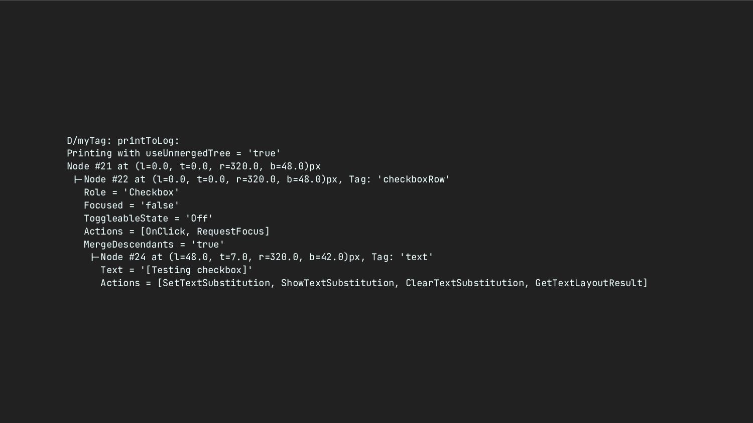
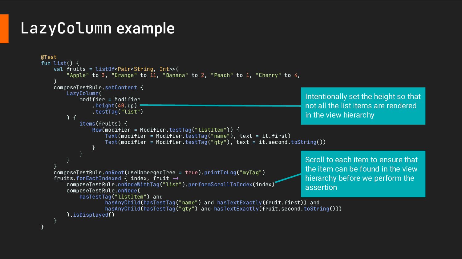
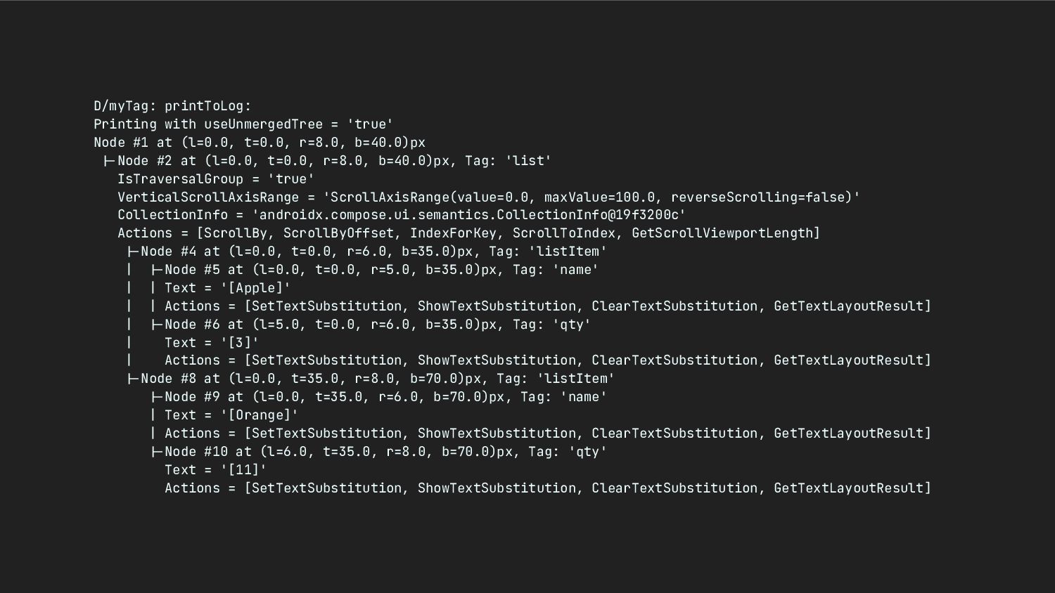
    (l=0.0, t=0.0, r=8.0, b=40.0)px --Node #2 at (l=0.0, t=0.0, r=8.0, b=40.0)px, Tag: 'list' IsTraversalGroup = 'true' VerticalScrollAxisRange = 'ScrollAxisRange(value=0.0, maxValue=100.0, reverseScrolling=false)' CollectionInfo = 'androidx.compose.ui.semantics.CollectionInfo@19f3200c' Actions = [ScrollBy, ScrollByOffset, IndexForKey, ScrollToIndex, GetScrollViewportLength] --Node #4 at (l=0.0, t=0.0, r=6.0, b=35.0)px, Tag: 'listItem' | --Node #5 at (l=0.0, t=0.0, r=5.0, b=35.0)px, Tag: 'name' | | Text = '[Apple]' | | Actions = [SetTextSubstitution, ShowTextSubstitution, ClearTextSubstitution, GetTextLayoutResult] | --Node #6 at (l=5.0, t=0.0, r=6.0, b=35.0)px, Tag: 'qty' | Text = '[3]' | Actions = [SetTextSubstitution, ShowTextSubstitution, ClearTextSubstitution, GetTextLayoutResult] --Node #8 at (l=0.0, t=35.0, r=8.0, b=70.0)px, Tag: 'listItem' --Node #9 at (l=0.0, t=35.0, r=6.0, b=70.0)px, Tag: 'name' | Text = '[Orange]' | Actions = [SetTextSubstitution, ShowTextSubstitution, ClearTextSubstitution, GetTextLayoutResult] --Node #10 at (l=6.0, t=35.0, r=8.0, b=70.0)px, Tag: 'qty' Text = '[11]' Actions = [SetTextSubstitution, ShowTextSubstitution, ClearTextSubstitution, GetTextLayoutResult]
  33. Appium Abstracting both Android and iOS UI automation tests by

    providing common set of API to interact with the UI of both platforms • iOS: XCUITest • Android: UIAutomator2 (An unofficial customization based on UIAutomator) Appium Server Web driver script XCUITest UIAutomator
  34. class MainActivity : ComponentActivity() { override fun onCreate(savedInstanceState: Bundle?) {

    super.onCreate(savedInstanceState) setContent { Column( modifier = Modifier .fillMaxSize() .semantics { testTagsAsResourceId = true }, ) { Button( modifier = Modifier.testTag("exampleButton"), onClick = {}, ) { Text("Button") } } } } } Add this in the outermost composable function that is added to Activity/Fragment/View Add testTag modifier to the composable function that needs to be interacted in Compose UI tests and UI Automator Exposing Compose testTags as resource ID
  35. @Composable fun ConfirmationDialog( onDismissRequest: () -> Unit, ) { Dialog(

    onDismissRequest = onDismissRequest, properties = DialogProperties( usePlatformDefaultWidth = false, decorFitsSystemWindows = false, ), ) { Column( modifier = Modifier .fillMaxSize() .semantics { testTagsAsResourceId = true }, ) { // You contents } } } Need to set testTagsAsResourceId again because Compose will create DecorView and have separated AndroidComposeView for Dialog composable function
  36. UI Automator Viewer Android SDK ships with UI Automator Viewer

    However, it is too old and cannot be launched Solution: Use the forked version
  37. View hierarchies are not the same because UI Automator relies

    on accessibility nodes Image without testTag and contentDescription
  38. Go upper level to get the checked state because we

    have added toggleable modifier to the Row Resource ID does not have application ID as prefix
  39. Summary When preparing Figma mockups: • Use auto layout •

    Think of different edge cases When implementing layouts: • Handle instance state properly • Add accessibility semantics modifiers and use them to indicate the element state
  40. Backend Remote data (HTTP client) Repository Use case ViewModel Activity/

    Fragment/ Composable function Unit test E2E test MockWebServer, JSON (de)serialization Roborazzi screenshot testing, ComposeTestRule, Robolectric Appium Local data (e.g. SQLite database) Integration test In-memory DB (can be JVM test if using SQLDelight) CRUD, triggers, foreign key constraints Instrumentation test JVM test UI test Espresso, ComposeTestRule UI test UI test UI test UI test Unit test Unit test Integration test API test Depends on where you want to start using mock/fake objects (unlikely to include the backend part as it is very difficult to set the precondition) UI test Testing summary What we have discussed
  41. UI layout • Support different screen sizes — Android Developers • Large

    screen app quality — Android Developers • Multi-window support — Android Developers • Display content edge-to-edge in your app — Android Developers • UI Design — Android Developers • Layout — Apple Developer Documentation • Add auto layout to a design— Figma learn • Figma Tutorial: Auto Layout — Master Auto Layout in 15 Minutes • Migrating from the ClickableText composable to LinkAnnotation
  42. Internalization and localization • Styling internationalized text in Android •

    Chinese Mobile App UI Trends • More Chinese Mobile UI Trends • How Chinese Apps Handled Covid-19 • 中国人和外国人用的 App,为什么差别那么大? • Test your app with pseudolocales — Android Developers • Android pseudolocale
  43. Accessibility • W3C Accessibility Standards Overview • Web Accessibility Handbook — Digital

    Policy Office, HKSARG • European accessibility act • Google Accessibility • Accessibility in Jetpack Compose — Android Developers • GitHub: cvs-health/android-compose-accessibility-techniques
  44. UI testing • Test your Compose layout — Android Developers • Testing

    Compose Multiplatform UI — Kotlin Multiplatform Development