Upgrade to Pro
— share decks privately, control downloads, hide ads and more …
Speaker Deck
Features
Speaker Deck
PRO
Sign in
Sign up for free
Search
Search
Prototyping Layout with CSS Grid - RevolutionCo...
Search
Jessica Eldredge
May 18, 2018
Technology
350
1
Share
Embed
Copy iframe code
Copy JS code
Copy link
Start on current slide
Prototyping Layout with CSS Grid - RevolutionConf 2018
Presented at RevolutionConf, May 2018
Jessica Eldredge
May 18, 2018
More Decks by Jessica Eldredge
See All by Jessica Eldredge
Prototyping Layout with CSS Grid - Refresh DC
jessabean
1
490
Sketchnoting: Creative Notes for Technical Content
jessabean
7
1.4k
Front End Badassery with Sass
jessabean
9
410
Other Decks in Technology
See All in Technology
どこまでAIに任せるか 〜確率論と決定論の境界決定〜
shukob
0
460
AI時代におけるエンジニアの新たな役割──FDEとクオリアの探求/登壇資料(戸井田 裕貴)
hacobu
PRO
0
330
AI時代のPlaywright活用(システムテストを自動化する ー 実行エンジンにPla ywrightを選んだ理由)
ynisqa1988
2
950
[Droidcon Orlando '26] The Android Lens: Applying Mobile Forensics to AI Performance
amanda_hinchman
1
110
Devsumi 2026 Summer 人もAIも使える共通基盤を事業の加速装置にする~デザインシステム運用に学ぶ組織レバレッジ~ 渡辺 凌央
legalontechnologies
PRO
1
290
“それは自分の仕事じゃない"を 越えて行け
yuukiyo
1
520
【公開用】AI_Dev_Ex2026_AI_登壇資料
matsuritechnologies
PRO
1
490
AI工学特論: MLOps・継続的評価
asei
5
1.3k
PHPで作って学ぶリアルタイム音声対話AIとWebSocket入門 by ムナカタ
munakata
0
140
StepFunctionsとGraphRAGを活用した暗黙知活用のためのRAG基盤
yakumo
0
140
AI時代の開発生産性を捉え直す — 経営と現場をつなぐ「開発組織のオブザーバビリティ」— / AI Dev Ex Conference 2026
tkyowa
1
1.3k
CDKで書くECSのベストプラクティス、 改めて考え直す2026 #cdkconf2026
makies
3
940
Featured
See All Featured
Creating an realtime collaboration tool: Agile Flush - .NET Oxford
marcduiker
35
2.5k
Build The Right Thing And Hit Your Dates
maggiecrowley
39
3.3k
Evolving SEO for Evolving Search Engines
ryanjones
0
240
Learning to Love Humans: Emotional Interface Design
aarron
275
41k
Exploring the Power of Turbo Streams & Action Cable | RailsConf2023
kevinliebholz
37
6.5k
A Modern Web Designer's Workflow
chriscoyier
698
190k
RailsConf 2023
tenderlove
30
1.5k
The #1 spot is gone: here's how to win anyway
tamaranovitovic
3
1.1k
Optimizing for Happiness
mojombo
378
71k
VelocityConf: Rendering Performance Case Studies
addyosmani
333
25k
[RailsConf 2023] Rails as a piece of cake
palkan
59
6.8k
Data-driven link building: lessons from a $708K investment (BrightonSEO talk)
szymonslowik
1
1.2k
Transcript
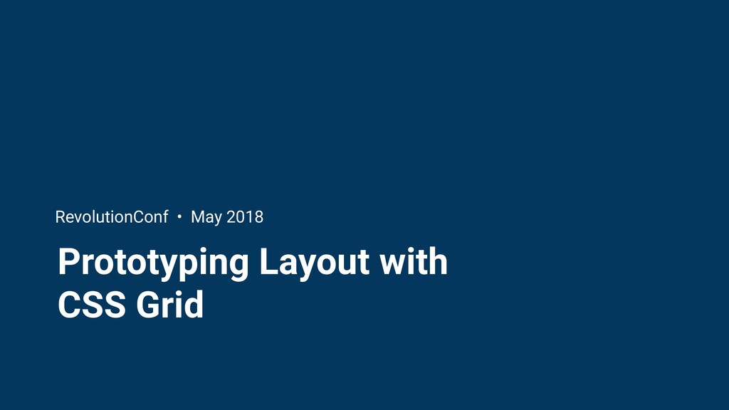
Prototyping Layout with CSS Grid RevolutionConf • May 2018
Hello! Jess Eldredge Senior front-end engineer, Splice @jessabean
Grid systems: the foundation of design
None
None
None
None
Design challenge
None
None
None
Our requirements • Responsive: grid context changes across breakpoints •
Use CSS Grid! • Fallback for browsers that don’t support grid
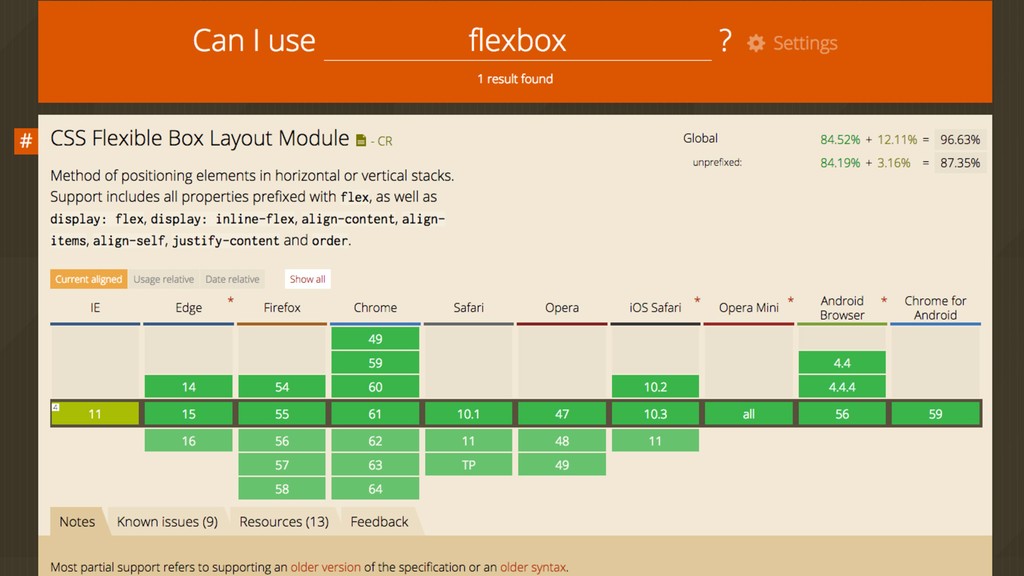
What is CSS Grid Layout?
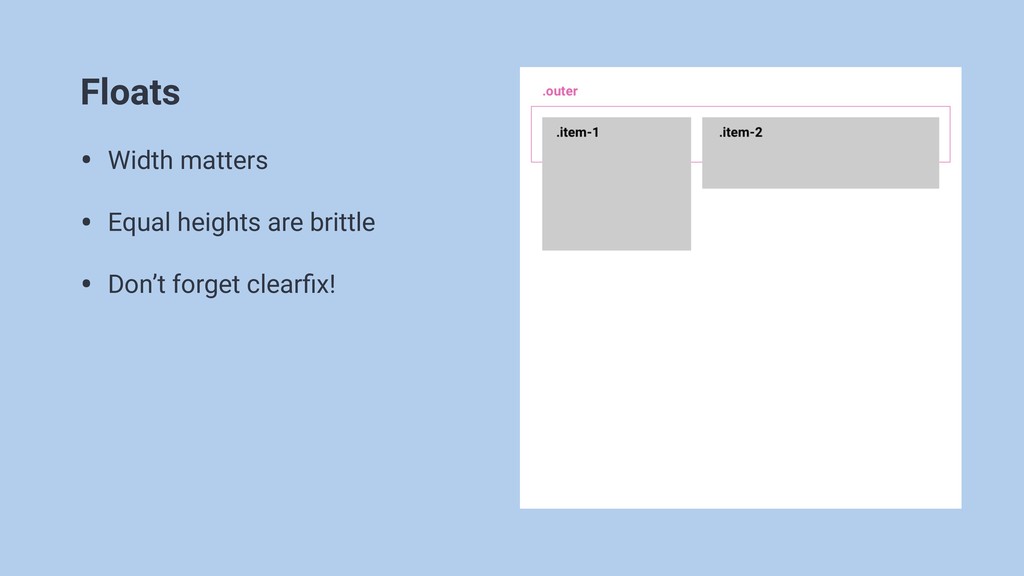
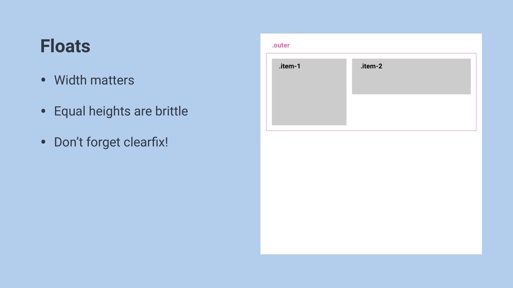
Floats • Width matters • Equal heights are brittle •
Don’t forget clearfix!
Floats • Width matters • Equal heights are brittle •
Don’t forget clearfix!
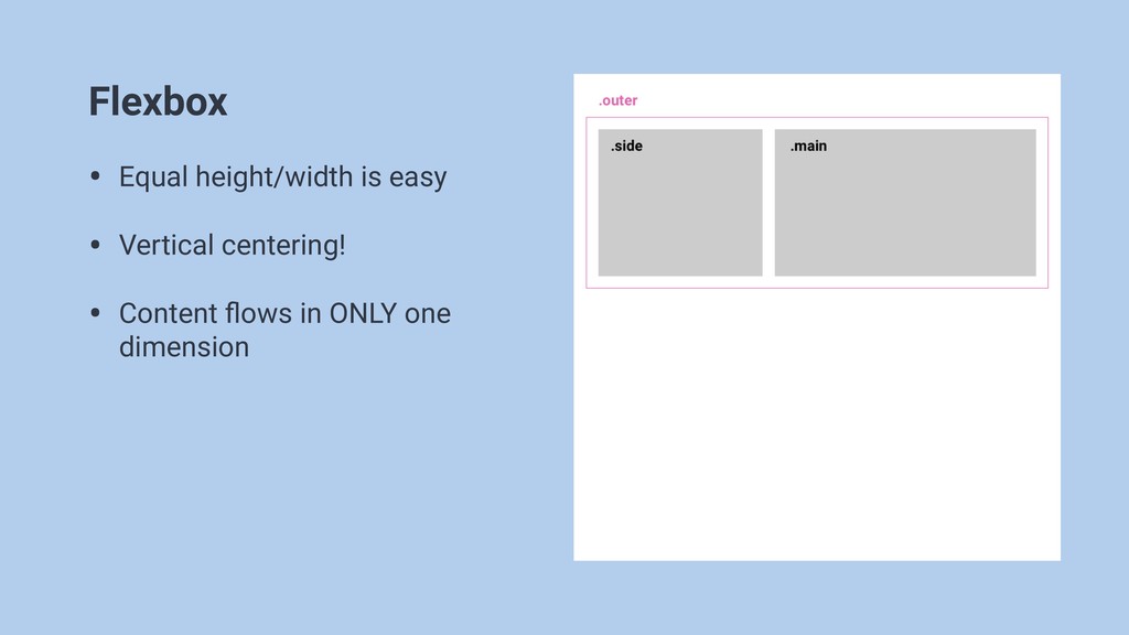
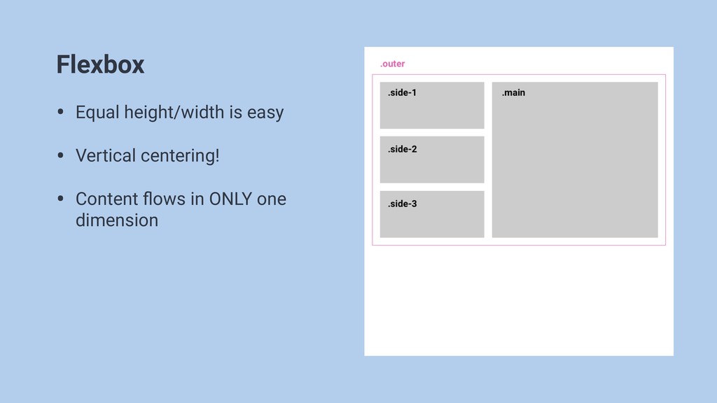
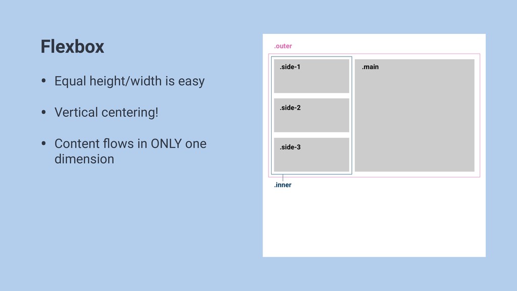
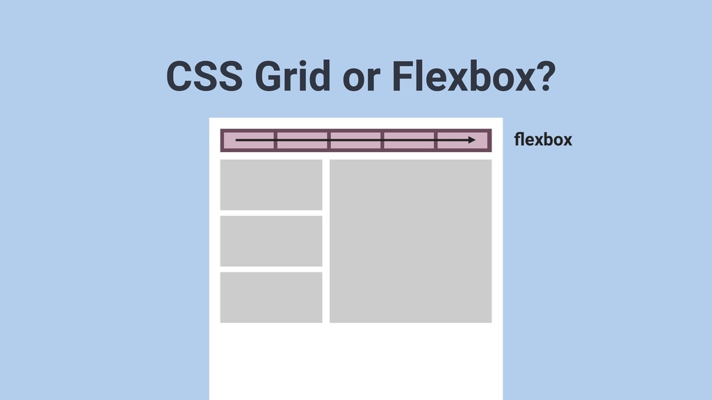
Flexbox • Equal height/width is easy • Vertical centering! •
Content flows in ONLY one dimension
Flexbox • Equal height/width is easy • Vertical centering! •
Content flows in ONLY one dimension
Flexbox • Equal height/width is easy • Vertical centering! •
Content flows in ONLY one dimension
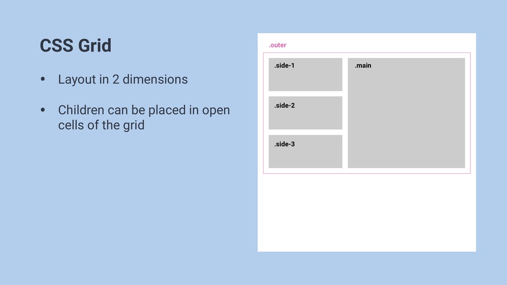
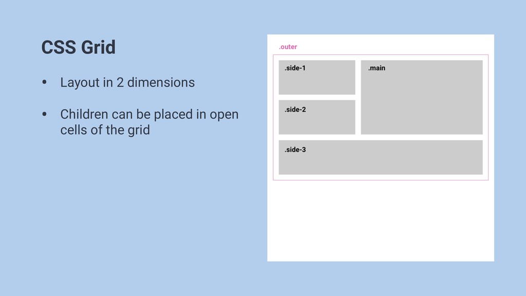
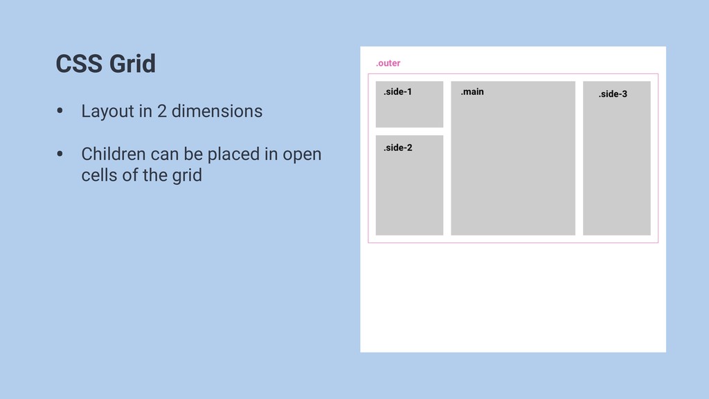
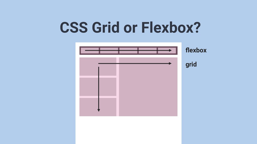
CSS Grid • Layout in 2 dimensions • Children can
be placed in open cells of the grid
CSS Grid • Layout in 2 dimensions • Children can
be placed in open cells of the grid
CSS Grid • Layout in 2 dimensions • Children can
be placed in open cells of the grid
CSS Grid terms
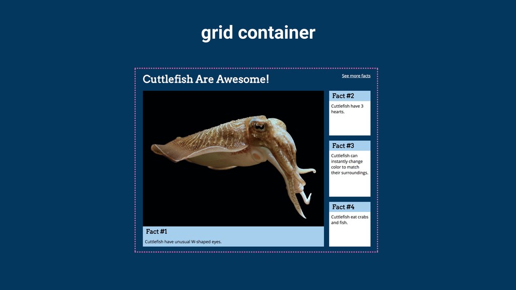
grid container
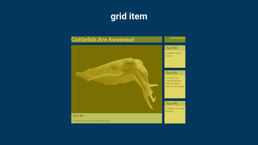
grid item
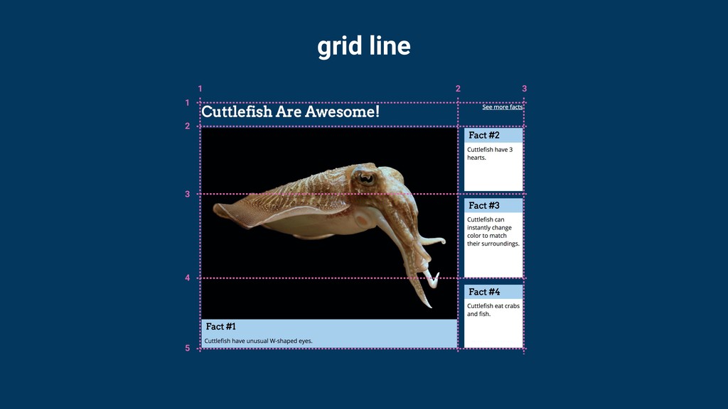
grid line
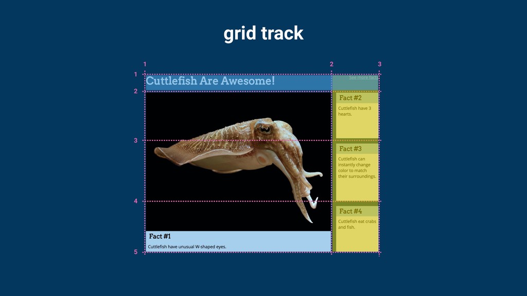
grid track
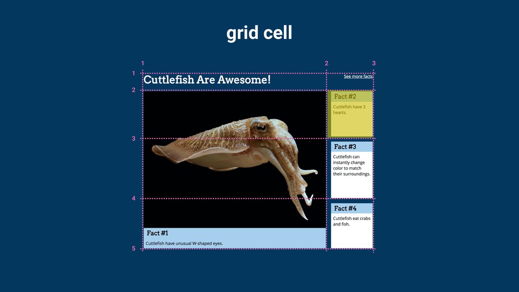
grid cell
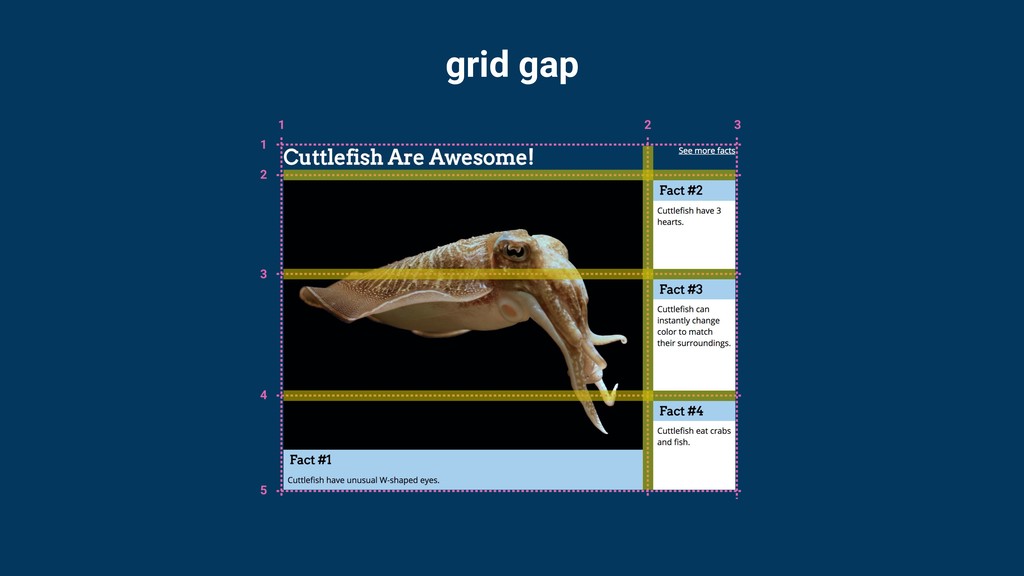
grid gap
grid gap
Setting up the grid
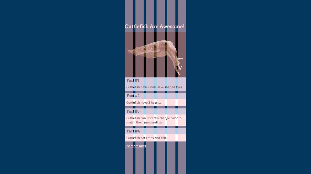
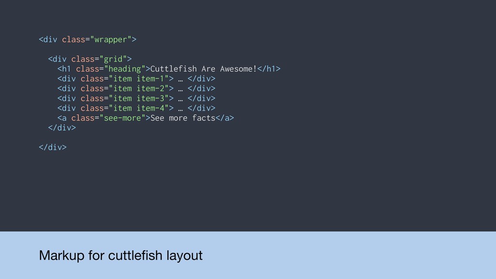
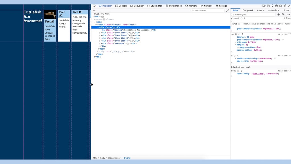
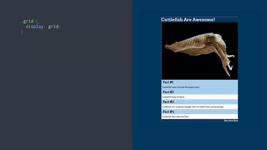
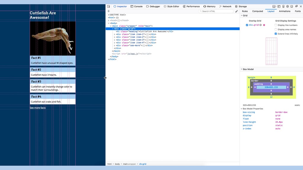
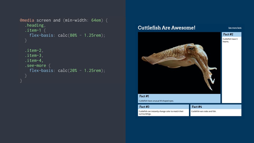
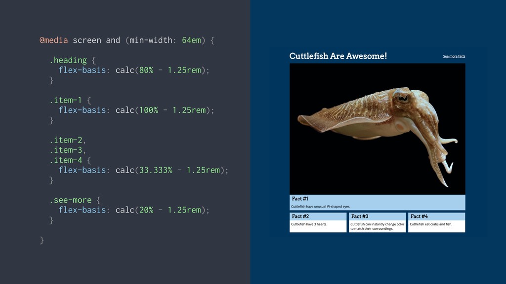
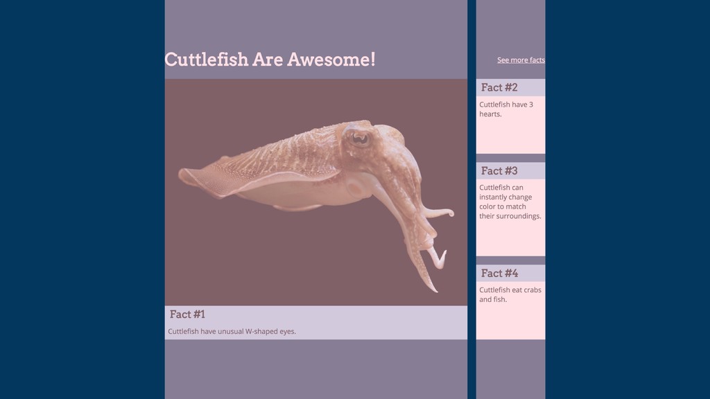
Markup for cuttlefish layout <div class="wrapper"> <div class="grid"> <h1 class="heading">Cuttlefish
Are Awesome!</h1> <div class="item item-1"> … </div> <div class="item item-2"> … </div> <div class="item item-3"> … </div> <div class="item item-4"> … </div> <a class="see-more">See more facts</a> </div> </div>
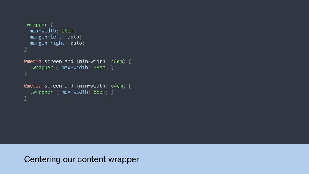
Centering our content wrapper .wrapper { max-width: 20em; margin-left: auto;
margin-right: auto; } @media screen and (min-width: 48em) { .wrapper { max-width: 38em; } } @media screen and (min-width: 64em) { .wrapper { max-width: 55em; } }
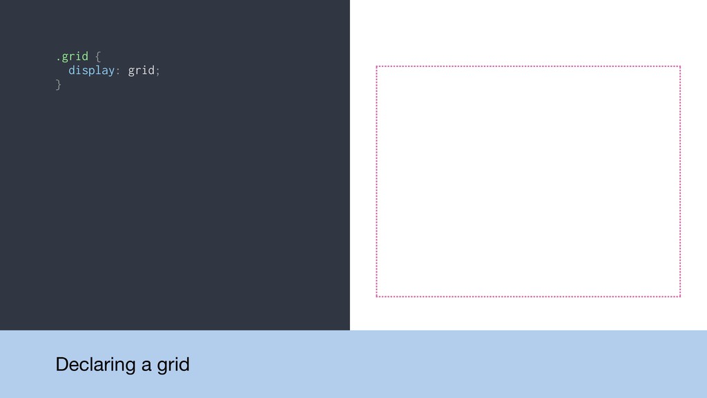
.grid { display: grid; } Declaring a grid
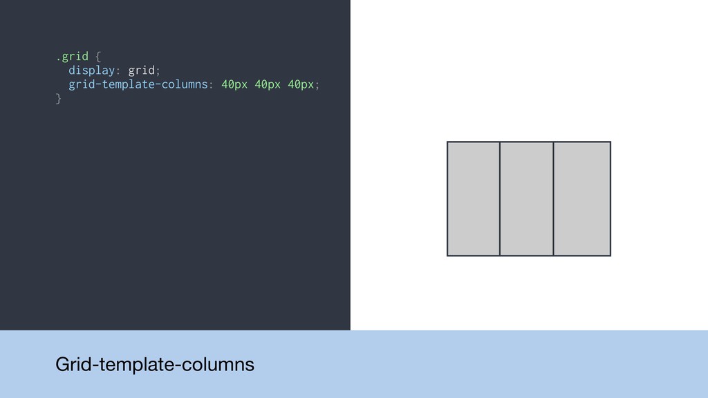
.grid { display: grid; grid-template-columns: 40px 40px 40px; } Grid-template-columns
.grid { display: grid; grid-template-columns: 40px 40px 40px; } .grid
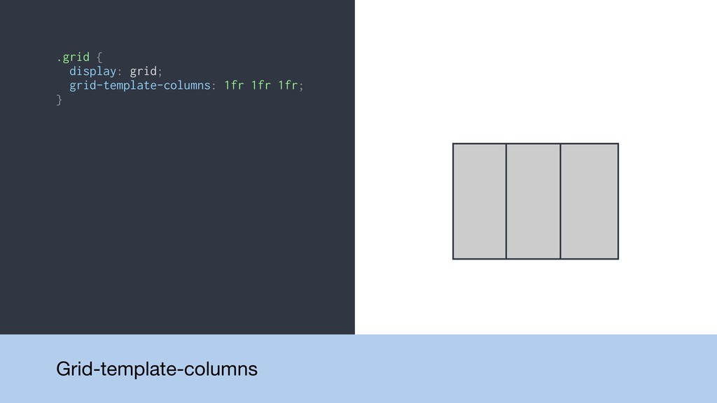
{ display: grid; grid-template-columns: 1fr 1fr 1fr; } Grid-template-columns
.grid { display: grid; grid-template-columns: 40px 40px 40px; } .grid
{ display: grid; grid-template-columns: 1fr 1fr 1fr; } .grid { display: grid; grid-template-columns: 1fr 2fr 1fr; } Grid-template-columns
.grid { display: grid; grid-template-columns: 40px 40px 40px; } .grid
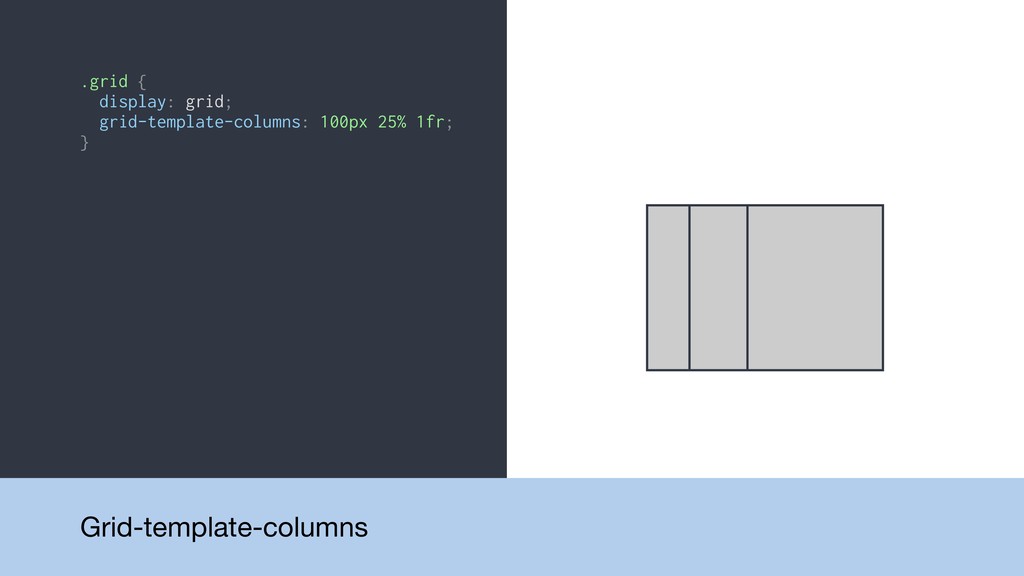
{ display: grid; grid-template-columns: 1fr 1fr 1fr; } .grid { display: grid; grid-template-columns: 1fr 2fr 1fr; } .grid { display: grid; grid-template-columns: 100px 25% 1fr; } Grid-template-columns
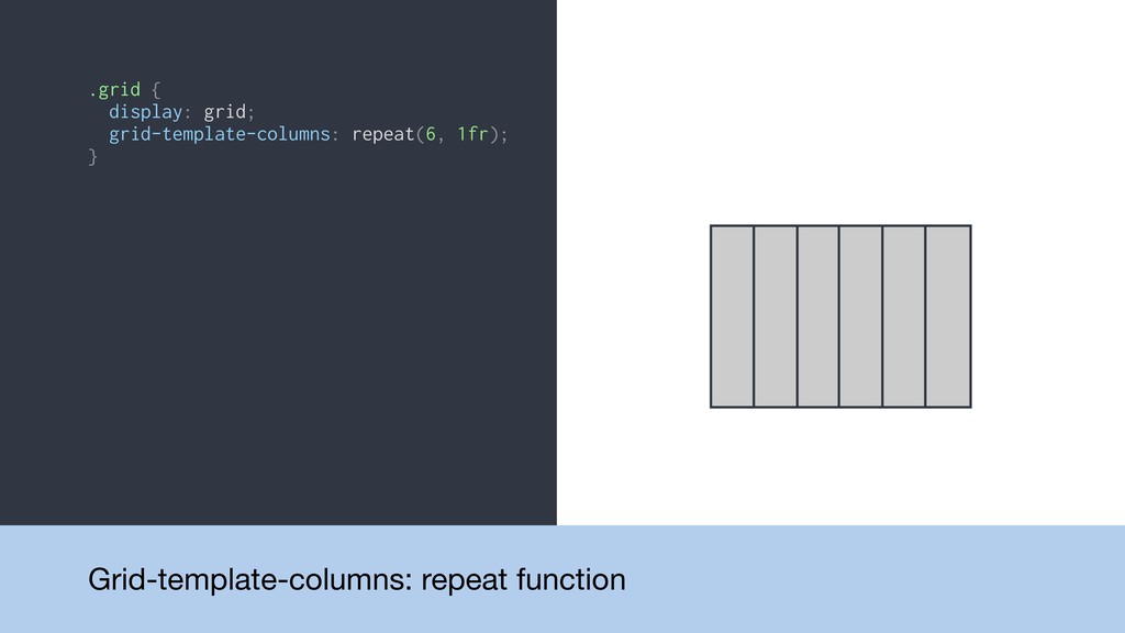
.grid { display: grid; grid-template-columns: repeat(6, 1fr); } Grid-template-columns: repeat
function
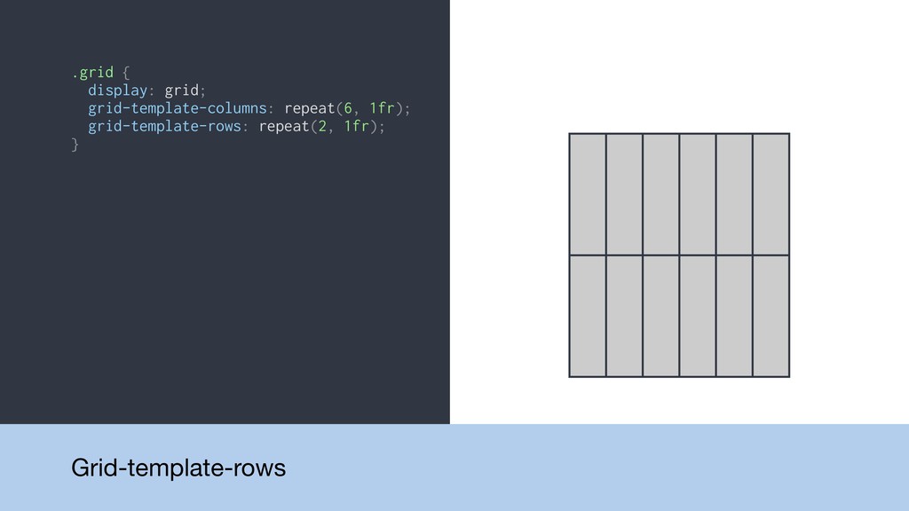
.grid { display: grid; grid-template-columns: repeat(6, 1fr); grid-template-rows: repeat(2, 1fr);
} Grid-template-rows
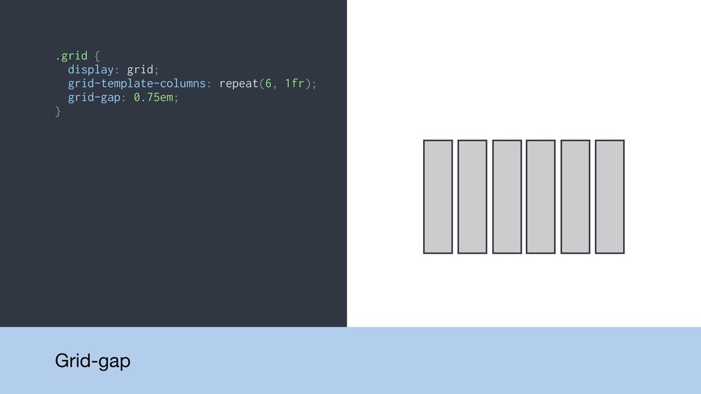
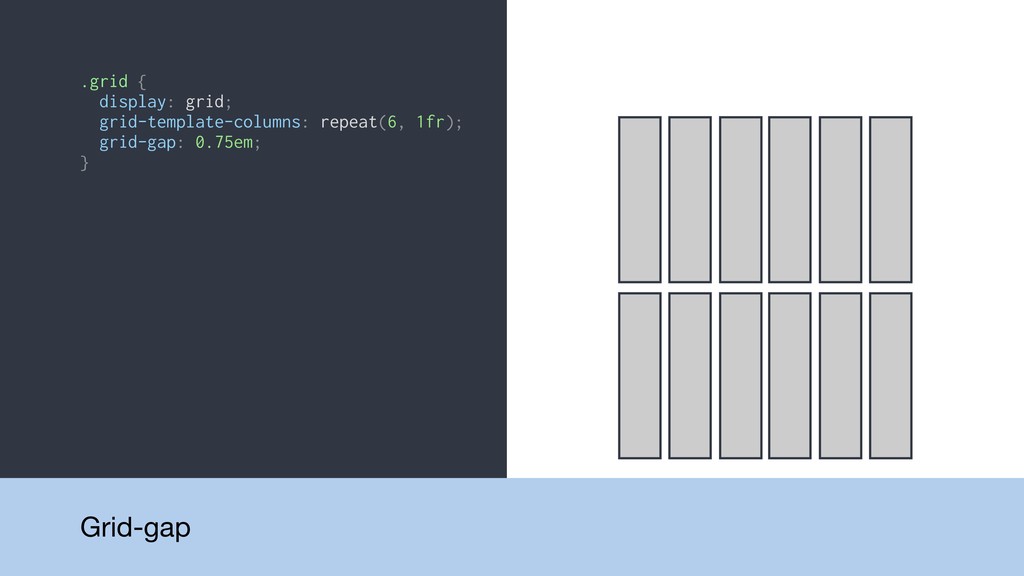
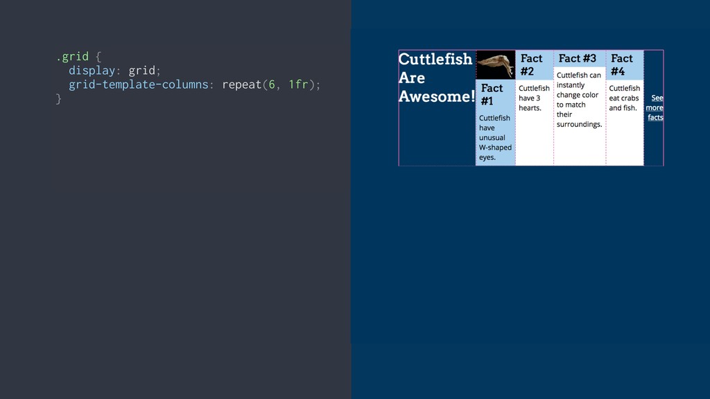
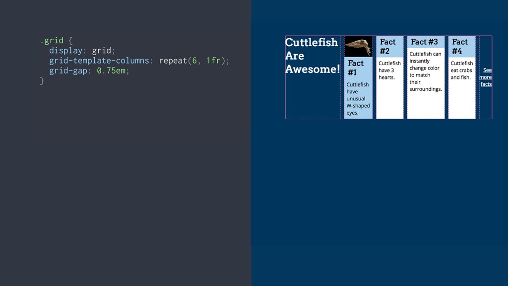
.grid { display: grid; grid-template-columns: repeat(6, 1fr); grid-gap: 0.75em; }
Grid-gap
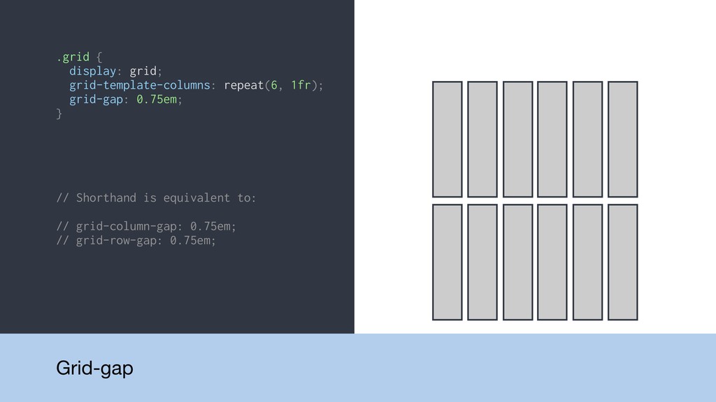
.grid { display: grid; grid-template-columns: repeat(6, 1fr); grid-gap: 0.75em; }
Grid-gap
.grid { display: grid; grid-template-columns: repeat(6, 1fr); grid-gap: 0.75em; }
// Shorthand is equivalent to: // grid-column-gap: 0.75em; // grid-row-gap: 0.75em; Grid-gap
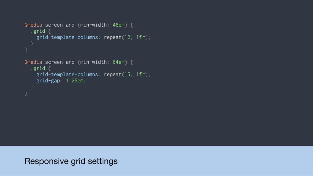
@media screen and (min-width: 48em) { .grid { grid-template-columns: repeat(12,
1fr); } } @media screen and (min-width: 64em) { .grid { grid-template-columns: repeat(15, 1fr); grid-gap: 1.25em; } } Responsive grid settings
DEMO: Basic grid
Placing items on the grid
None
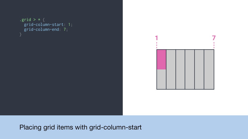
.grid > * { grid-column-start: 1; grid-column-end: 7; } Placing
grid items with grid-column-start
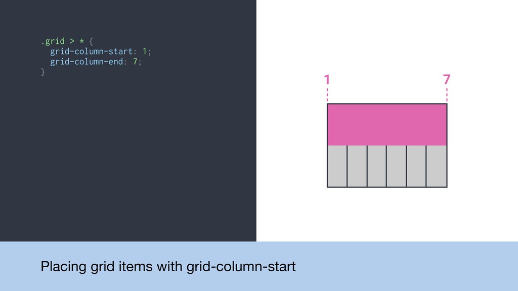
.grid > * { grid-column-start: 1; grid-column-end: 7; } Placing
grid items with grid-column-start
.grid > * { grid-column-start: 1; grid-column-end: 7; } Placing
grid items with grid-column-start
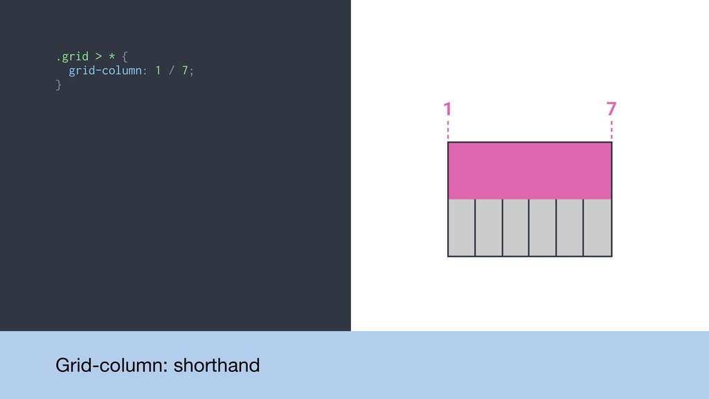
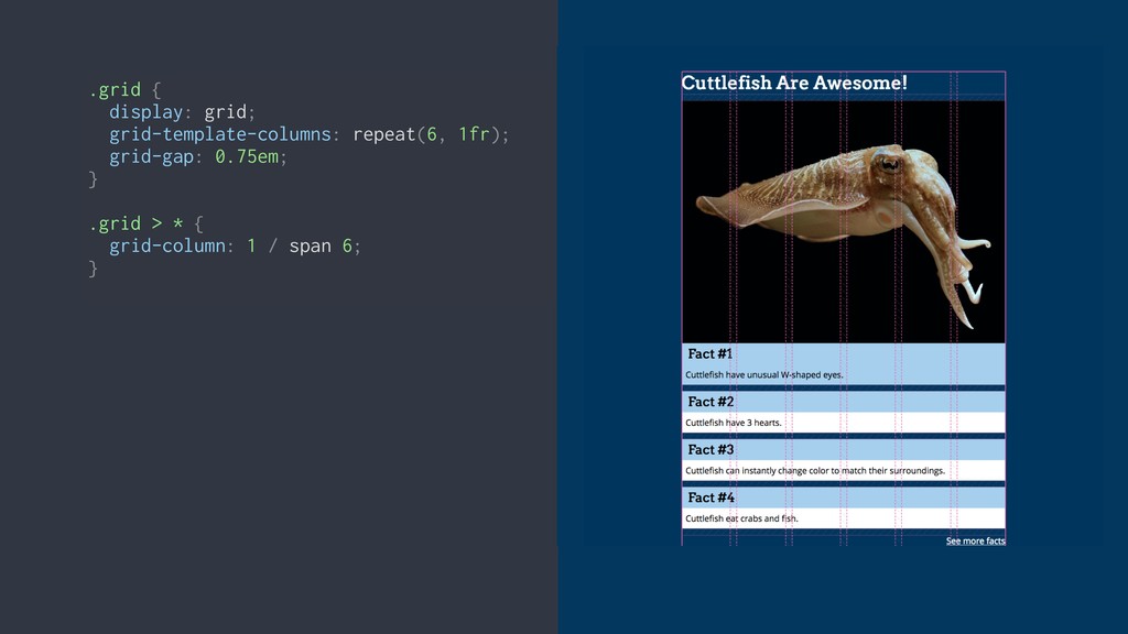
.grid > * { grid-column: 1 / 7; } Grid-column:
shorthand
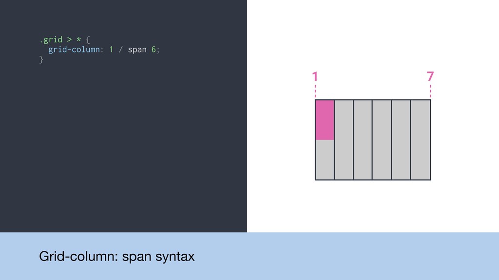
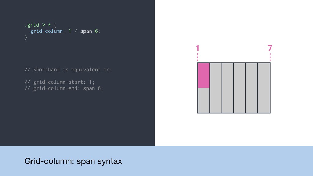
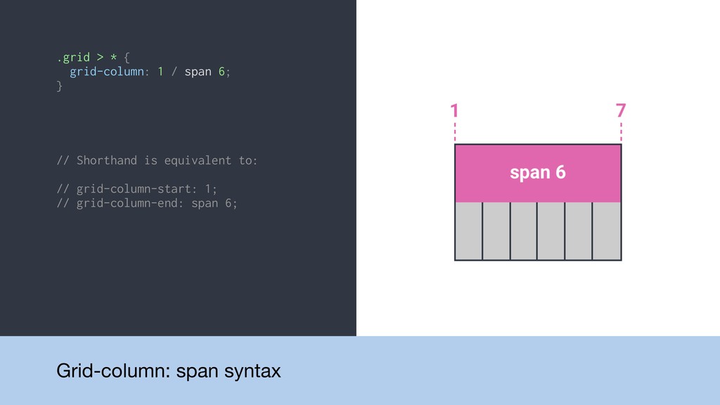
.grid > * { grid-column: 1 / span 6; }
Grid-column: span syntax
.grid > * { grid-column: 1 / span 6; }
// Shorthand is equivalent to: // grid-column-start: 1; // grid-column-end: span 6; Grid-column: span syntax
.grid > * { grid-column: 1 / span 6; }
// Shorthand is equivalent to: // grid-column-start: 1; // grid-column-end: span 6; Grid-column: span syntax
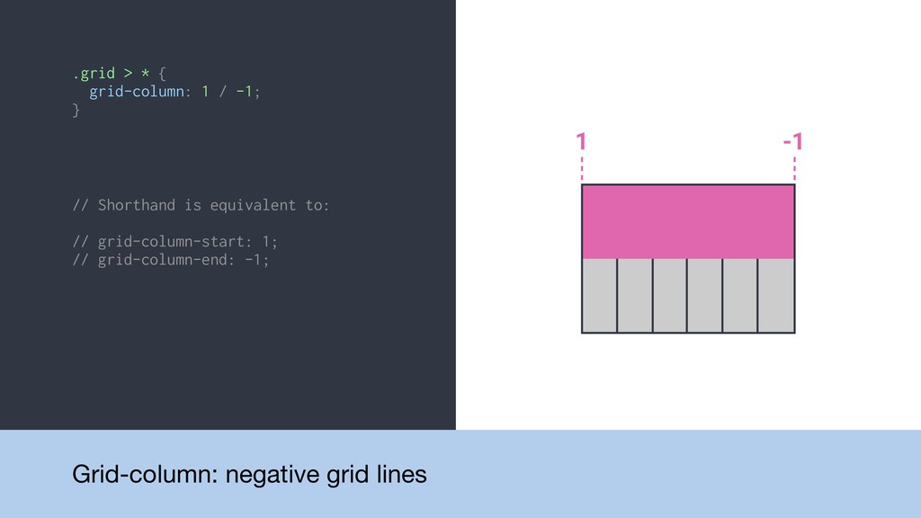
.grid > * { grid-column: 1 / -1; } Grid-column:
negative grid lines
.grid > * { grid-column: 1 / -1; } //
Shorthand is equivalent to: // grid-column-start: 1; // grid-column-end: -1; Grid-column: negative grid lines
.grid { display: grid; }
.grid { display: grid; } .grid { display: grid; grid-template-columns:
repeat(6, 1fr); }
.grid { display: grid; } .grid { display: grid; grid-template-columns:
repeat(6, 1fr); } .grid { display: grid; grid-template-columns: repeat(6, 1fr); grid-gap: 0.75em; }
.grid { display: grid; } .grid { display: grid; grid-template-columns:
repeat(6, 1fr); } .grid { display: grid; grid-template-columns: repeat(6, 1fr); grid-gap: 0.75em; } .grid { display: grid; grid-template-columns: repeat(6, 1fr); grid-gap: 0.75em; } .grid > * { grid-column: 1 / span 6; }
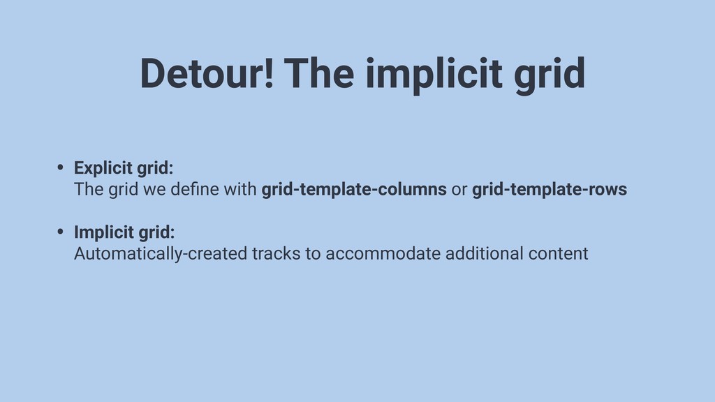
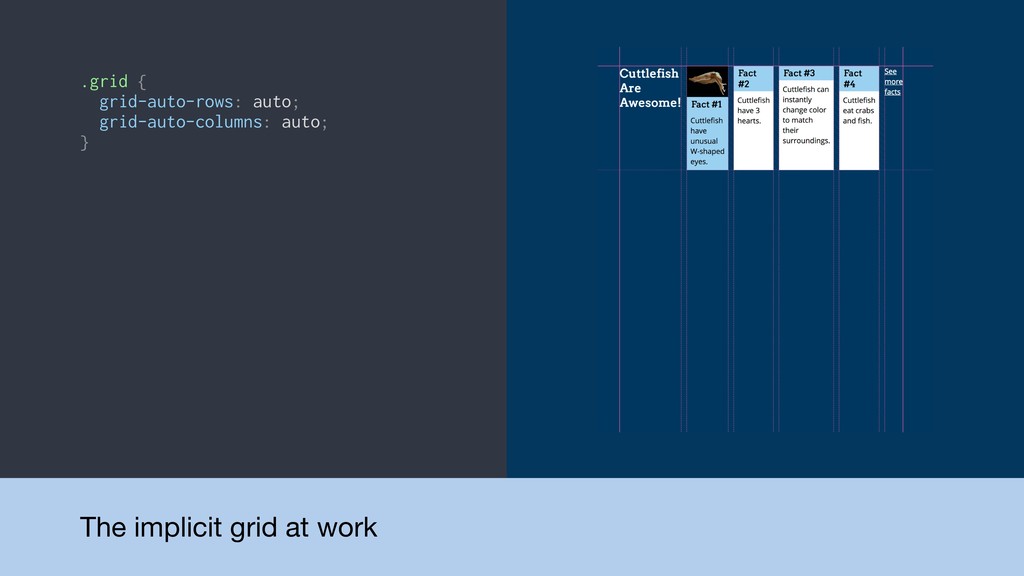
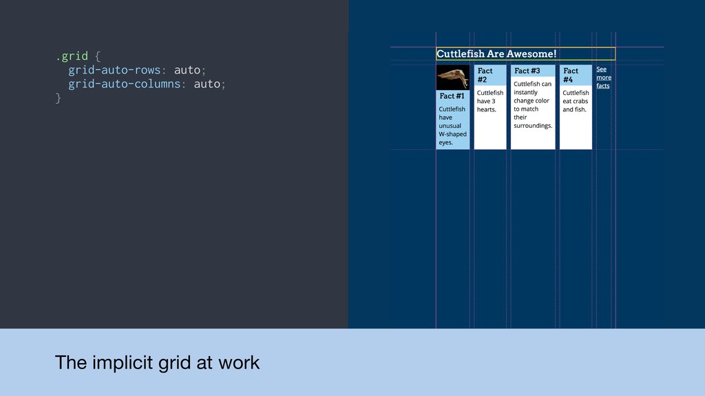
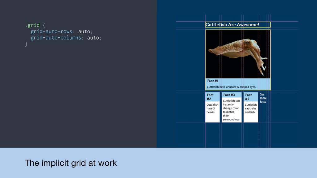
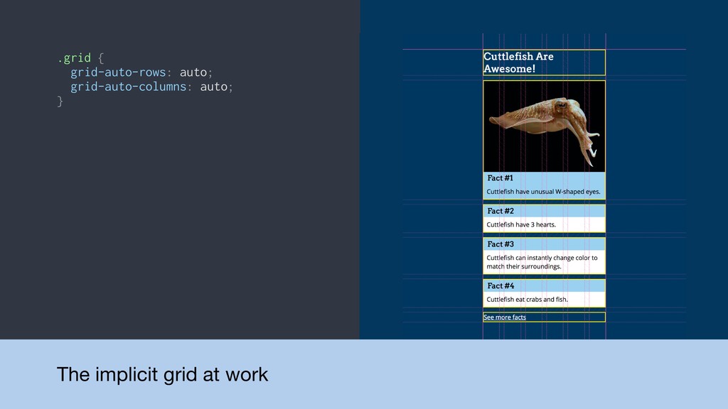
Detour! The implicit grid • Explicit grid: The grid
we define with grid-template-columns or grid-template-rows • Implicit grid: Automatically-created tracks to accommodate additional content
.grid { grid-auto-rows: auto; grid-auto-columns: auto; } The implicit grid
at work
.grid { grid-auto-rows: auto; grid-auto-columns: auto; } The implicit grid
at work
.grid { grid-auto-rows: auto; grid-auto-columns: auto; } The implicit grid
at work
.grid { grid-auto-rows: auto; grid-auto-columns: auto; } The implicit grid
at work
None
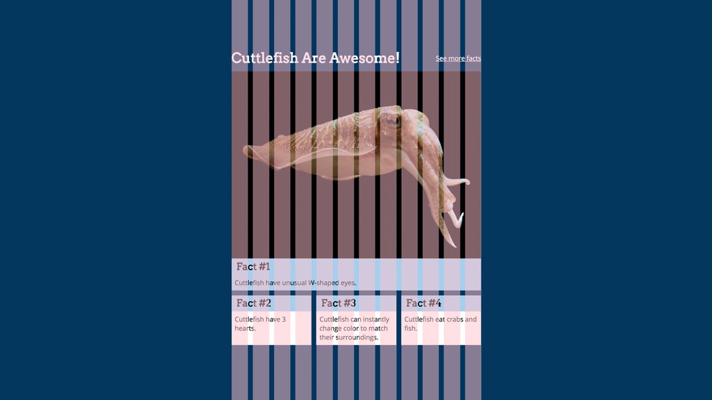
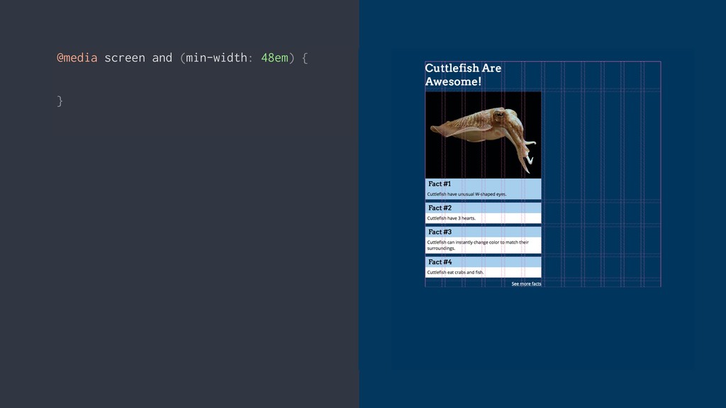
@media screen and (min-width: 48em) { }
@media screen and (min-width: 48em) { } @media screen and
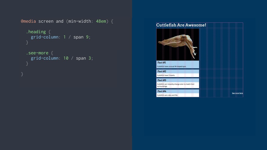
(min-width: 48em) { .heading { grid-column: 1 / span 9; } .see-more { grid-column: 10 / span 3; } }
@media screen and (min-width: 48em) { .heading { grid-column: 1
/ span 9; grid-row: 1; } .see-more { grid-column: 10 / span 3; grid-row: 1; } }
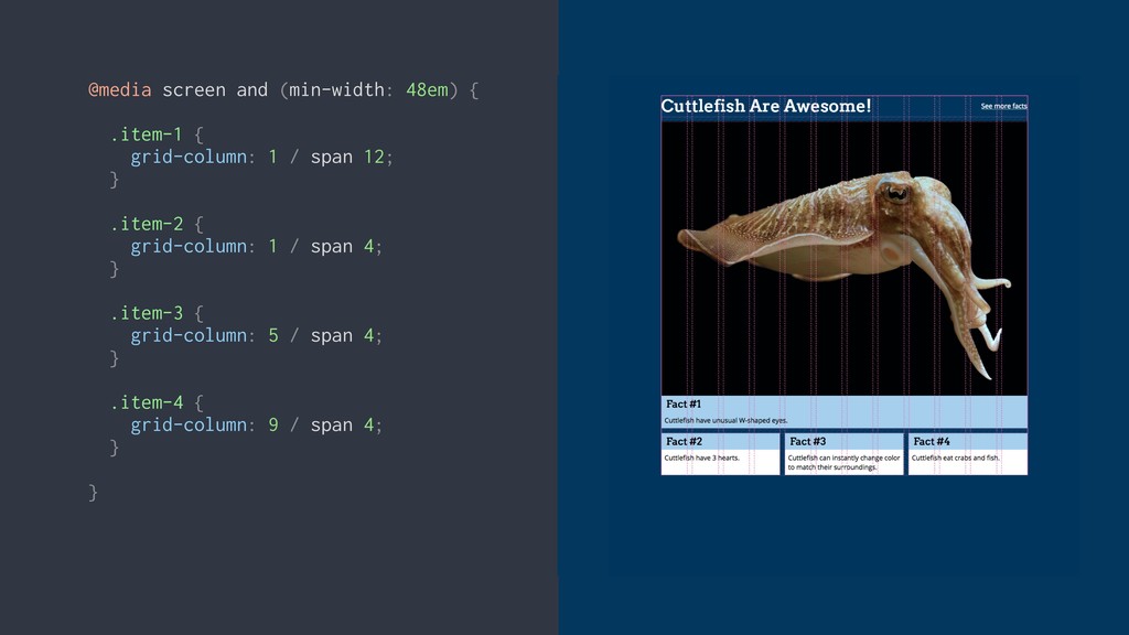
@media screen and (min-width: 48em) { .item-1 { grid-column: 1
/ span 12; } .item-2 { grid-column: 1 / span 4; } .item-3 { grid-column: 5 / span 4; } .item-4 { grid-column: 9 / span 4; } }
None
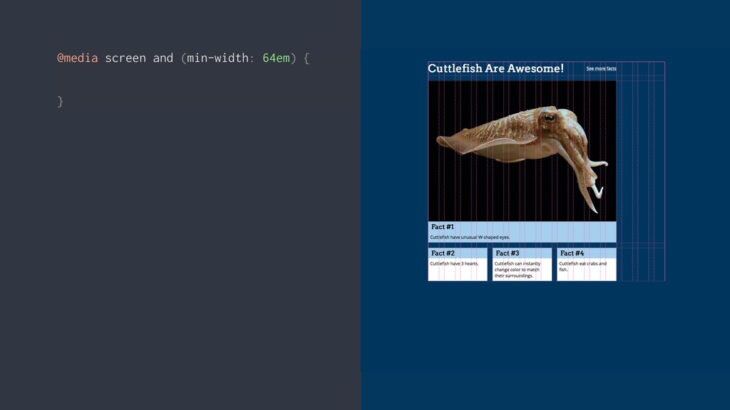
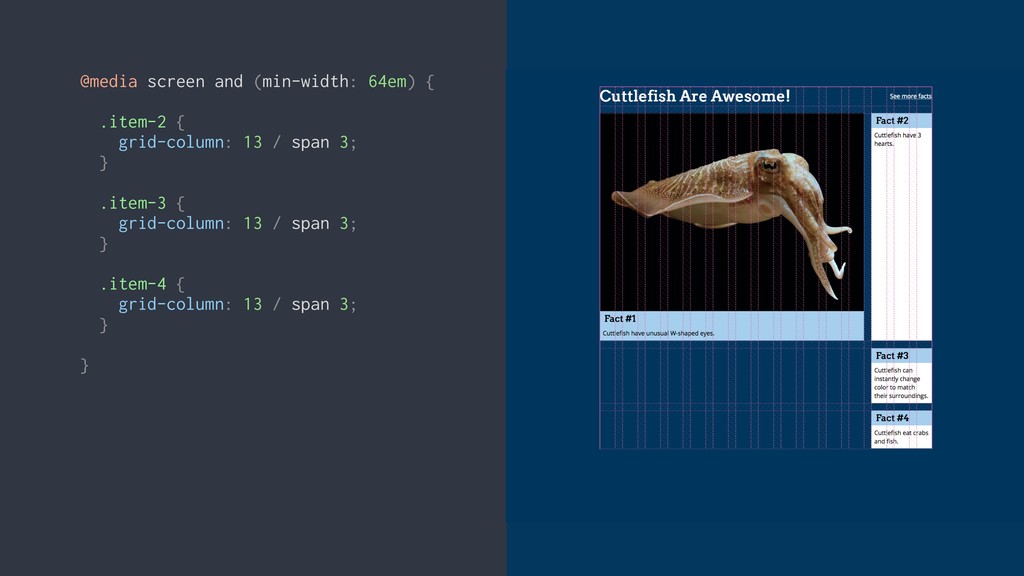
@media screen and (min-width: 64em) { }
@media screen and (min-width: 64em) { } @media screen and
(min-width: 64em) { .heading { grid-column: 1 / span 12; } .see-more { grid-column: 13 / span 3; } }
@media screen and (min-width: 64em) { .item-2 { grid-column: 13
/ span 3; } .item-3 { grid-column: 13 / span 3; } .item-4 { grid-column: 13 / span 3; } }
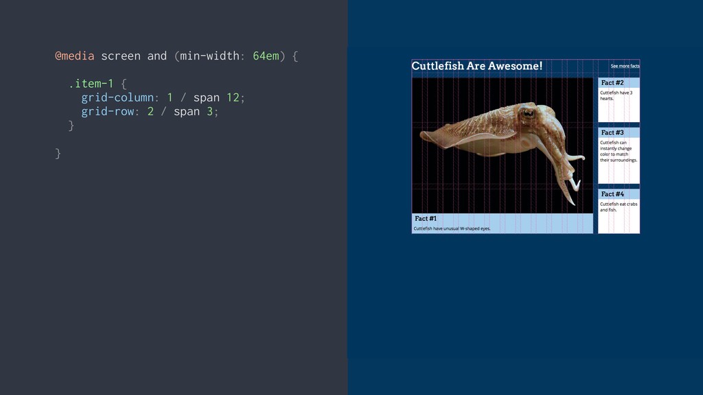
@media screen and (min-width: 64em) { .item-1 { grid-column: 1
/ span 12; grid-row: 2 / span 3; } }
VIDEO: Final grid at all breakpoints
Progressive enhancement
None
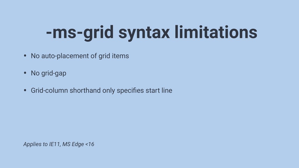
• No auto-placement of grid items • No grid-gap •
Grid-column shorthand only specifies start line -ms-grid syntax limitations Applies to IE11, MS Edge <16
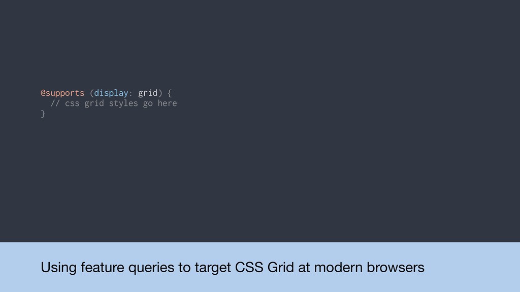
Using feature queries to target CSS Grid at modern browsers
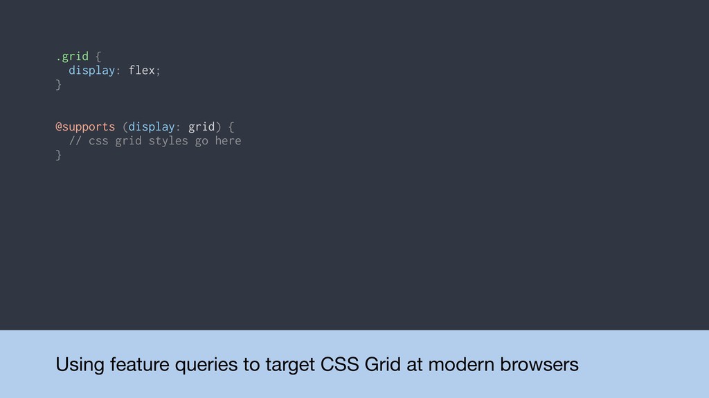
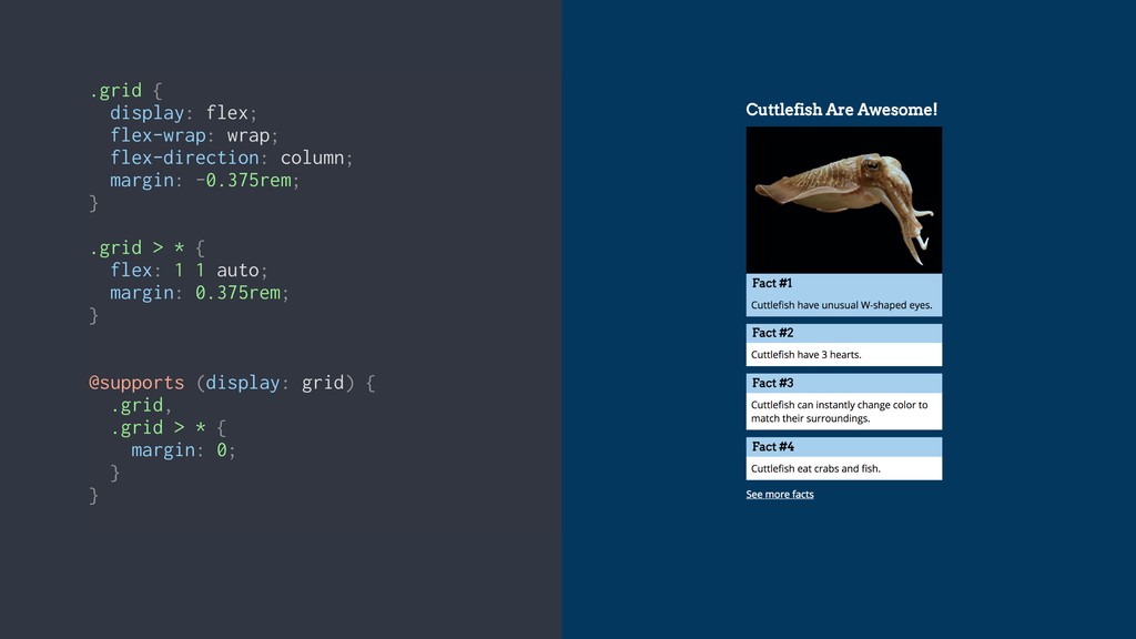
@supports (display: grid) { // css grid styles go here }
Using feature queries to target CSS Grid at modern browsers
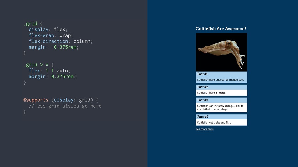
@supports (display: grid) { // css grid styles go here } .grid { display: flex; }
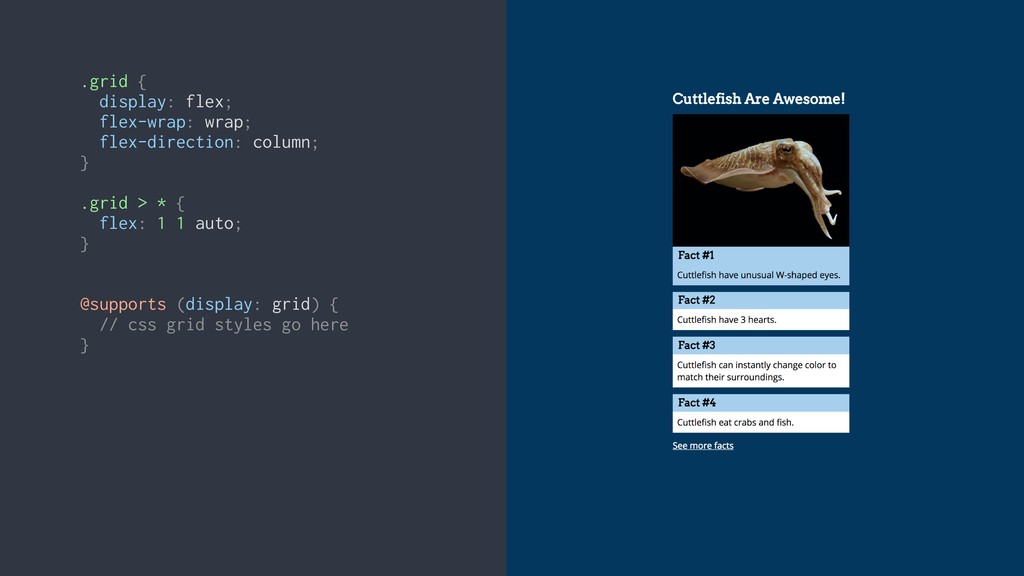
.grid { display: flex; flex-wrap: wrap; flex-direction: column; } .grid
> * { flex: 1 1 auto; } @supports (display: grid) { // css grid styles go here }
.grid { display: flex; flex-wrap: wrap; flex-direction: column; margin: -0.375rem;
} .grid > * { flex: 1 1 auto; margin: 0.375rem; } @supports (display: grid) { // css grid styles go here }
.grid { display: flex; flex-wrap: wrap; flex-direction: column; margin: -0.375rem;
} .grid > * { flex: 1 1 auto; margin: 0.375rem; } @supports (display: grid) { // css grid styles go here } .grid { display: flex; flex-wrap: wrap; flex-direction: column; margin: -0.375rem; } .grid > * { flex: 1 1 auto; margin: 0.375rem; } @supports (display: grid) { .grid, .grid > * { margin: 0; } }
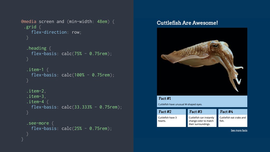
@media screen and (min-width: 48em) { .grid { flex-direction: row;
} .heading { flex-basis: calc(75% - 0.75rem); } .item-1 { flex-basis: calc(100% - 0.75rem); } .item-2, .item-3, .item-4 { flex-basis: calc(33.333% - 0.75rem); } .see-more { flex-basis: calc(25% - 0.75rem); } }
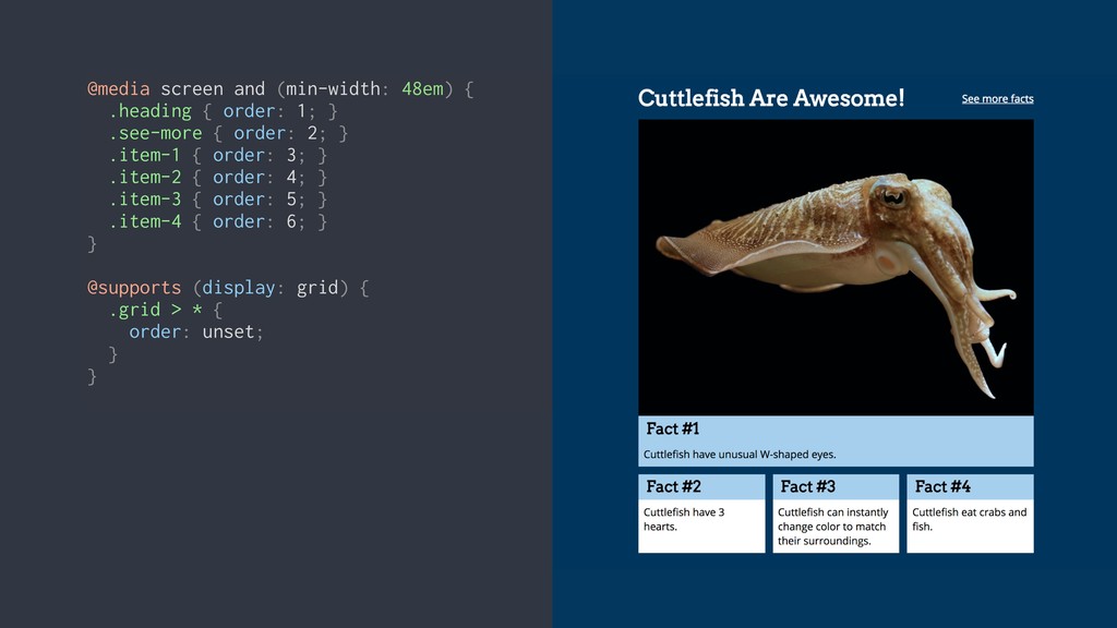
@media screen and (min-width: 48em) { .heading { order: 1;
} .see-more { order: 2; } .item-1 { order: 3; } .item-2 { order: 4; } .item-3 { order: 5; } .item-4 { order: 6; } } @supports (display: grid) { .grid > * { order: unset; } }
@media screen and (min-width: 64em) { .grid { margin: -0.625rem;
} .grid > * { margin: 0.625rem; } }
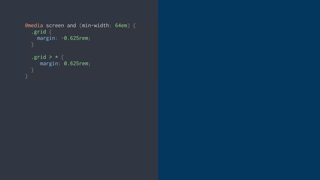
@media screen and (min-width: 64em) { .grid { margin: -0.625rem;
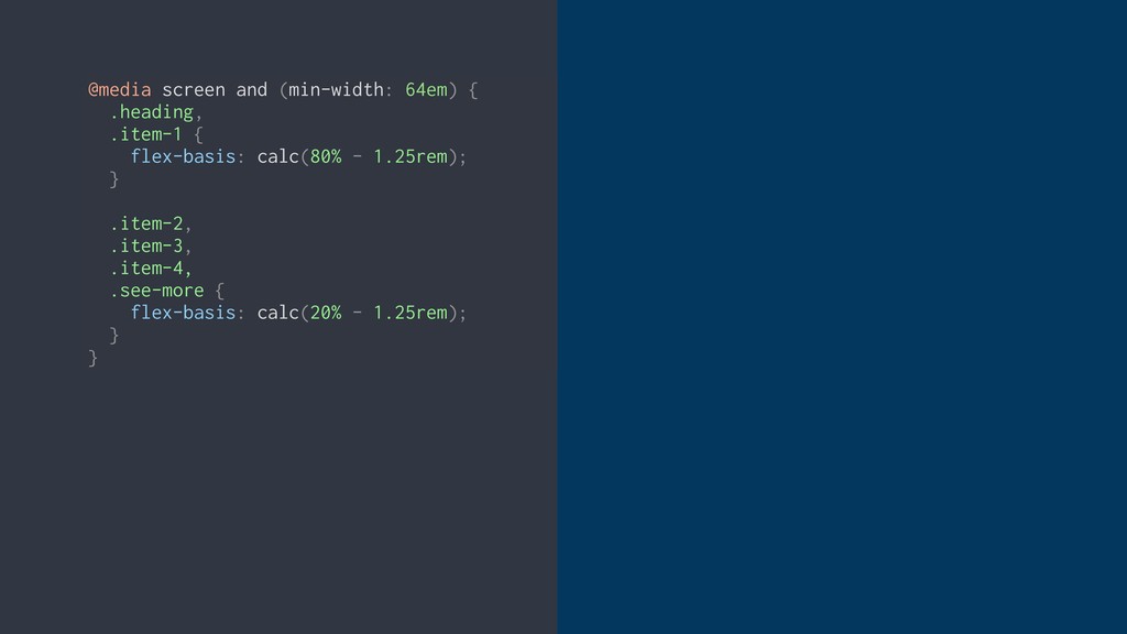
} .grid > * { margin: 0.625rem; } } @media screen and (min-width: 64em) { .heading, .item-1 { flex-basis: calc(80% - 1.25rem); } .item-2, .item-3, .item-4, .see-more { flex-basis: calc(20% - 1.25rem); } }
@media screen and (min-width: 64em) { .grid { margin: -0.625rem;
} .grid > * { margin: 0.625rem; } } @media screen and (min-width: 64em) { .heading, .item-1 { flex-basis: calc(80% - 1.25rem); } .item-2, .item-3, .item-4, .see-more { flex-basis: calc(20% - 1.25rem); } }
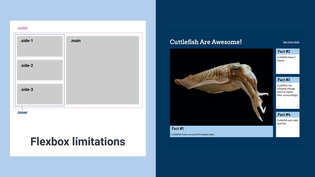
Flexbox limitations
@media screen and (min-width: 64em) { .heading { flex-basis: calc(80%
- 1.25rem); } .item-1 { flex-basis: calc(100% - 1.25rem); } .item-2, .item-3, .item-4 { flex-basis: calc(33.333% - 1.25rem); } .see-more { flex-basis: calc(20% - 1.25rem); } }
There’s a lot more to CSS Grid
• Named column lines • grid-template-area • grid-auto-rows / grid-auto-columns
/ grid-auto-flow • auto-fill & auto-fit • minmax More Grid features
• Source order and semantics are important • Use grid
placement for visual display, but be mindful of document order for speech and keyboard navigation • Tab order will follow document order, not visual order CSS Grid and Accessibility
CSS Grid or Flexbox?
CSS Grid or Flexbox?
CSS Grid or Flexbox?
You can use CSS Grid TODAY
None
None
None
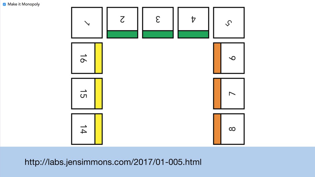
http://labs.jensimmons.com/2017/01-005.html
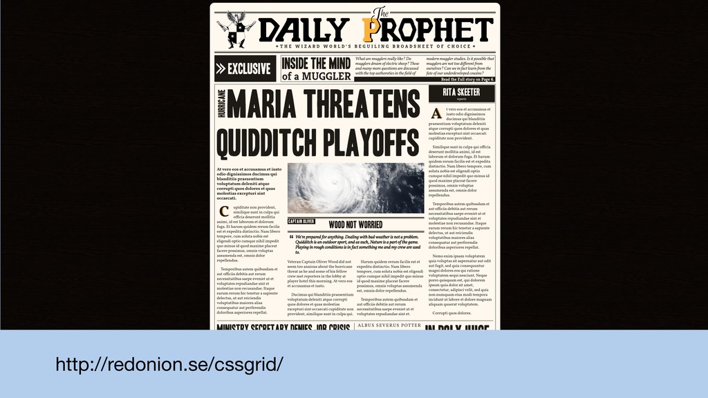
http://redonion.se/cssgrid/
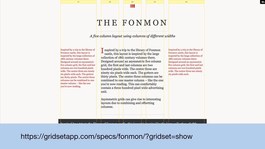
https://gridsetapp.com/specs/fonmon/?gridset=show
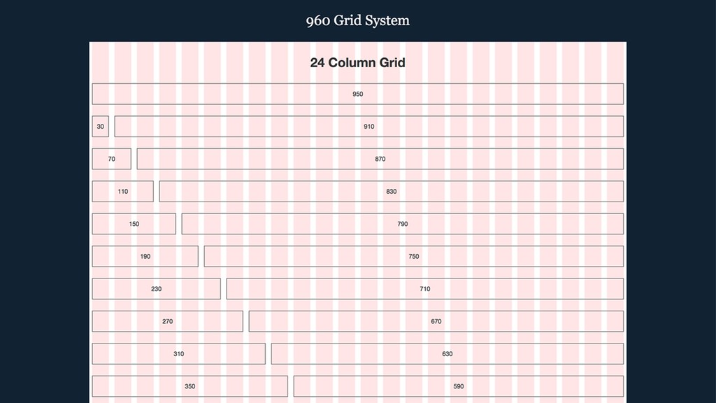
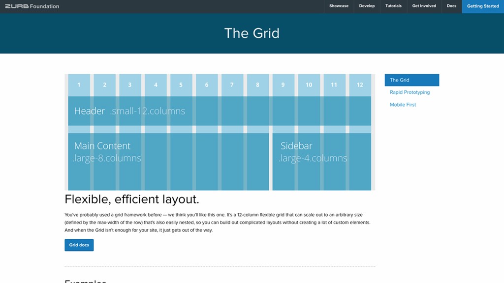
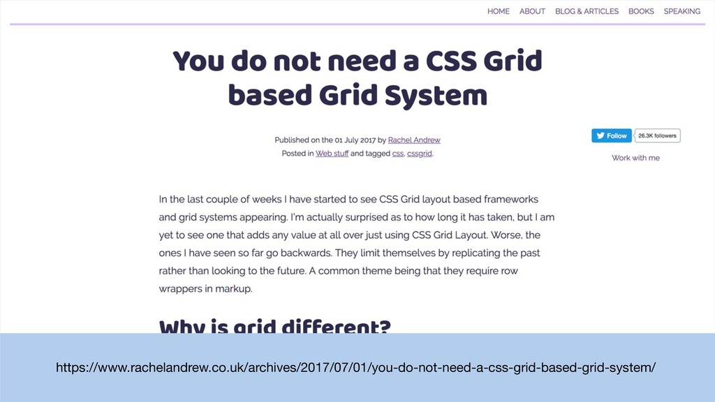
Do we need grid systems?
https://www.rachelandrew.co.uk/archives/2017/07/01/you-do-not-need-a-css-grid-based-grid-system/
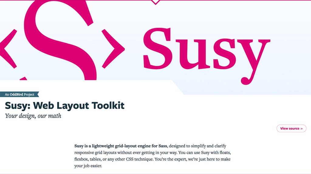
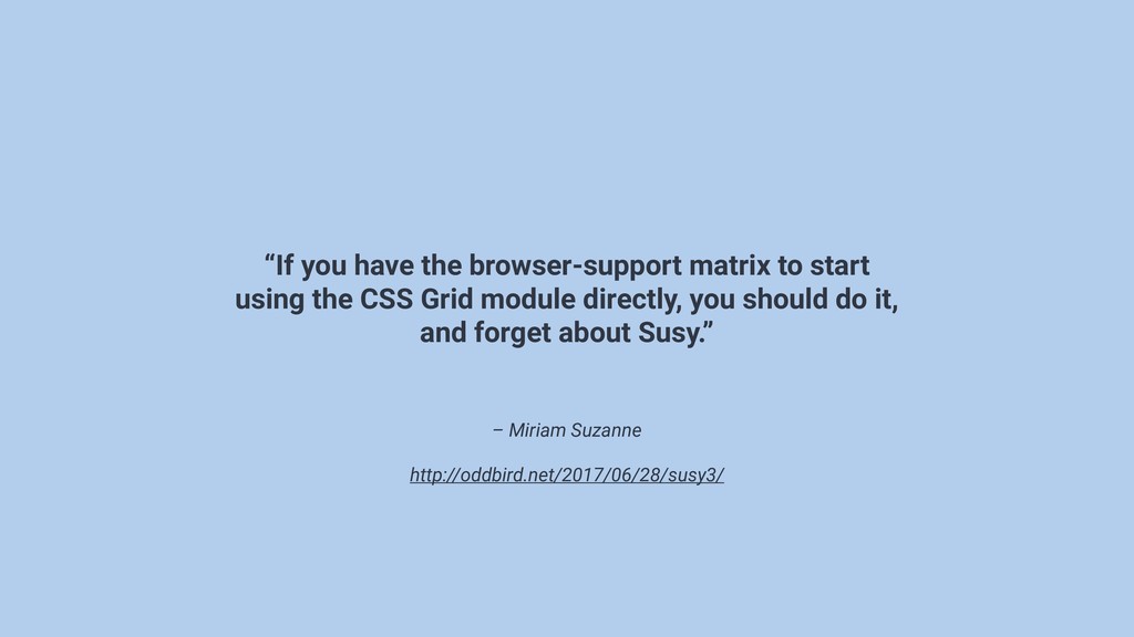
– Miriam Suzanne http://oddbird.net/2017/06/28/susy3/ “If you have the browser-support matrix
to start using the CSS Grid module directly, you should do it, and forget about Susy.”
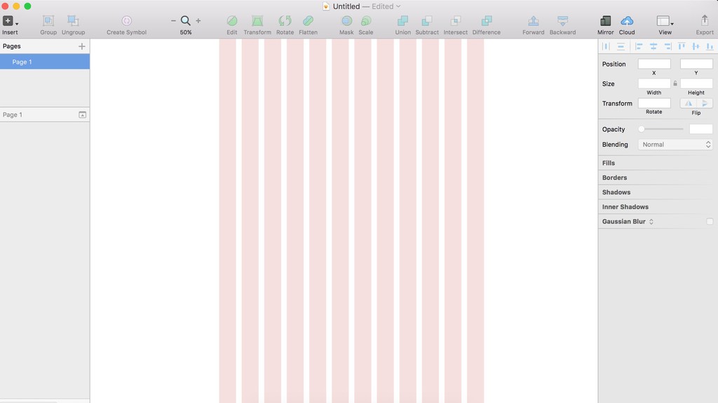
placeholder: screenshot simplified grid for prototype
placeholder: screenshot simplified grid for prototype
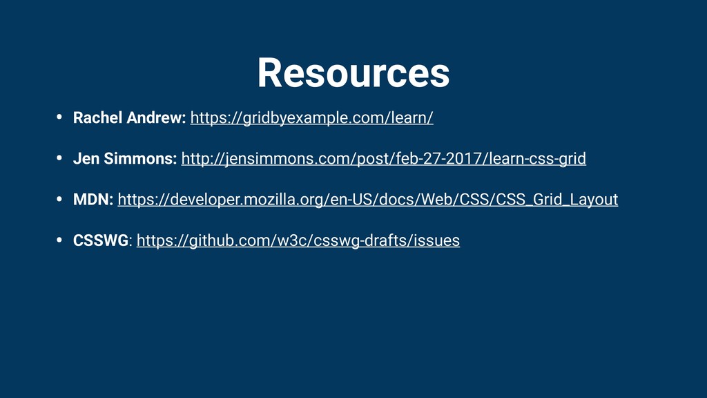
Resources • Rachel Andrew: https://gridbyexample.com/learn/ • Jen Simmons: http://jensimmons.com/post/feb-27-2017/learn-css-grid •
MDN: https://developer.mozilla.org/en-US/docs/Web/CSS/CSS_Grid_Layout • CSSWG: https://github.com/w3c/csswg-drafts/issues
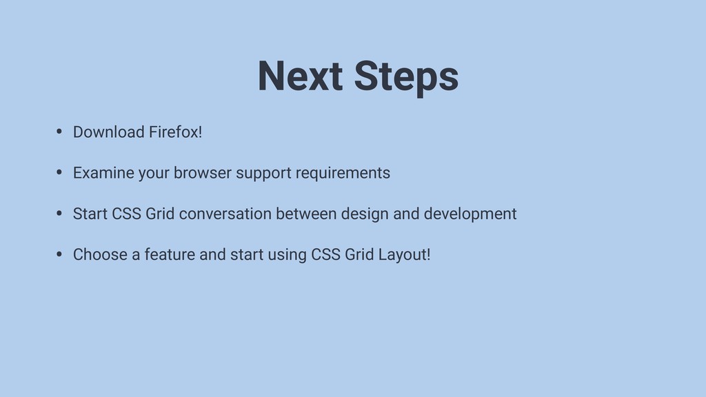
• Download Firefox! • Examine your browser support requirements •
Start CSS Grid conversation between design and development • Choose a feature and start using CSS Grid Layout! Next Steps
None
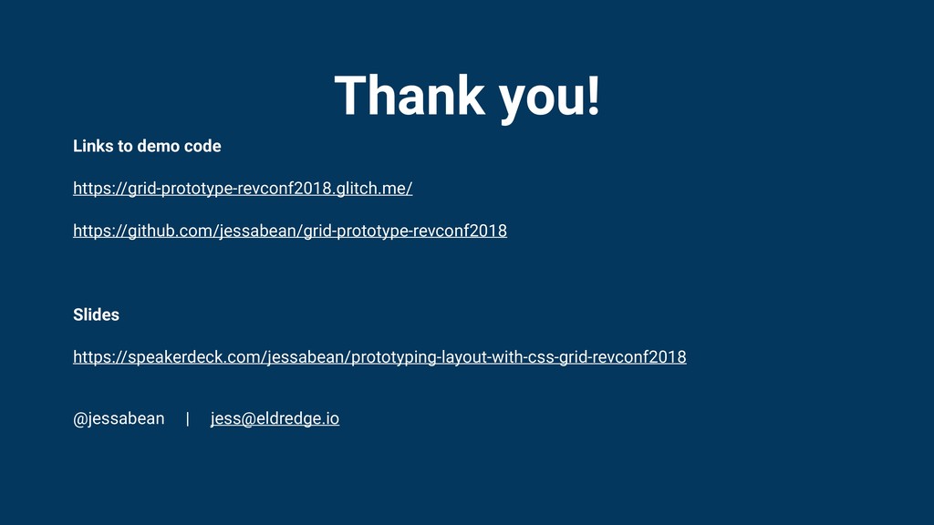
Thank you! Links to demo code https://grid-prototype-revconf2018.glitch.me/ https://github.com/jessabean/grid-prototype-revconf2018 Slides https://speakerdeck.com/jessabean/prototyping-layout-with-css-grid-revconf2018
@jessabean |
[email protected]
 jessabean
 shukob
 hacobu
 ynisqa1988
 amanda_hinchman
 legalontechnologies
 yuukiyo
 matsuritechnologies
 asei
asei
 munakata
 yakumo
 tkyowa
 makies
 marcduiker
 maggiecrowley
 ryanjones
 aarron
 kevinliebholz
 chriscoyier
 tenderlove
 tamaranovitovic
 mojombo
 addyosmani
 palkan
 szymonslowik