Upgrade to Pro — share decks privately, control downloads, hide ads and more …

Prototyping Layout with CSS Grid - Refresh DC

Prototyping Layout with CSS Grid - Refresh DC

Presented at Refresh DC, September 2017

Avatar for Jessica Eldredge

Jessica Eldredge

September 20, 2017
Tweet

More Decks by Jessica Eldredge

Other Decks in Technology

Transcript

  1. Our requirements • Responsive: grid context changes across breakpoints •

    Use CSS Grid! • Fallback for browsers that don’t support grid
  2. Markup for grid 1 <div class="wrapper"> <section class="grid grid-1"> <h2

    class="heading"></h2> <div class="quote quote-1"></div> <div class="quote quote-2"></div> <div class="quote quote-3"></div> <div class="quote quote-4"></div> <div class="see-more"></div> </section> </div>
  3. Centering our content wrapper .wrapper { max-width: 20em; margin-left: auto;

    margin-right: auto; } @media screen and min-width(48em) { .wrapper { max-width: 38em; } } @media screen and min-width(64em) { .wrapper { max-width: 55em; } }
  4. Setting up grid: columns .grid { display: grid; grid-template-columns: 40px

    40px 40px; } 1fr 1fr 1fr; 1fr 2fr 1fr; 100px 25% 1fr;
  5. Setting up grid: rows .grid { display: grid; grid-template-columns: repeat(6,

    1fr); grid-template-rows: repeat(2, 1fr); } // Alternative syntax: // grid-template-rows: 75px 125px; // grid-template-rows: 100px 1fr;
  6. Setting up grid: gutters .grid { display: grid; grid-template-columns: repeat(6,

    1fr); grid-gap: 0.75em; } // Shorthand is equivalent to: // grid-column-gap: 0.75em; // grid-row-gap: 0.75em;
  7. Setting up grid: gutters .grid { display: grid; grid-template-columns: repeat(6,

    1fr); grid-gap: 0.75em; } // Shorthand is equivalent to: // grid-column-gap: 0.75em; // grid-row-gap: 0.75em;
  8. @media screen and (min-width: 48em) { .grid { grid-template-columns: repeat(12,

    1fr); } } @media screen and (min-width: 64em) { .grid { grid-template-columns: repeat(15, 1fr); grid-gap: 1.25em; } } Responsive grid settings
  9. Placing grid items .grid > * { grid-column-start: 1; grid-column-end:

    7; } // Alternative shorthand: // grid-column: 1 / 7;
  10. Placing grid items .grid > * { grid-column-start: 1; grid-column-end:

    7; } // Alternative shorthand: // grid-column: 1 / 7;
  11. Placing grid items .grid > * { grid-column-start: 1; grid-column-end:

    7; } // Alternative shorthand: // grid-column: 1 / 7;
  12. Placing grid items .grid > * { grid-column-start: 1; grid-column-end:

    7; } // Alternative shorthand: // grid-column: 1 / 7;
  13. Shorthand: span syntax .grid > * { grid-column: 1 /

    span 6;
 } // Shorthand is equivalent to: // grid-column-start: 1; // grid-column-end: span 6;
  14. Explicit vs implicit grid .grid { display: grid; grid-template-columns: repeat(6,

    1fr); grid-gap: 0.75em; } .grid > * { grid-column: 1 / span 6; }
  15. Explicit vs implicit grid .grid { display: grid; grid-template-columns: repeat(6,

    1fr); grid-gap: 0.75em; } .grid > * { grid-column: 1 / span 6; }
  16. Explicit vs implicit grid .grid { display: grid; grid-template-columns: repeat(6,

    1fr); grid-gap: 0.75em; } .grid > * { grid-column: 1 / span 6; }
  17. Explicit vs implicit grid .grid { display: grid; grid-template-columns: repeat(6,

    1fr); grid-gap: 0.75em; } .grid > * { grid-column: 1 / span 6; }
  18. Placing first items on the grid .heading { grid-column: 1

    / span 9; } .see-more { grid-column: 10 / span 3; } @media screen and (min-width: 48em)
  19. Placing first items on the grid .heading { grid-column: 1

    / span 9; } .see-more { grid-column: 10 / span 3; } @media screen and (min-width: 48em)
  20. Explicitly place link in the first row .heading { grid-column:

    1 / span 9; grid-row: 1; } .see-more { grid-column: 10 / span 3; grid-row: 1; } @media screen and (min-width: 48em)
  21. Placing quotes on the grid @media screen and (min-width: 48em)

    .quote-1 { grid-column: 1 / span 12; } .quote-2 { grid-column: 1 / span 4; } .quote-3 { grid-column: 5 / span 4; } .quote-4 { grid-column: 9 / span 4; }
  22. Placing quotes on the grid @media screen and (min-width: 48em)

    .quote-1 { grid-column: 1 / span 12; } .quote-2 { grid-column: 1 / span 4; } .quote-3 { grid-column: 5 / span 4; } .quote-4 { grid-column: 9 / span 4; }
  23. Placing heading and link again .heading { grid-column: 1 /

    span 12; } .see-more { grid-column: 13 / span 3; } @media screen and (min-width: 64em)
  24. Placing quotes .quote-1 { grid-column: 1 / span 12; }

    .quote-2 { grid-column: 13 / span 3; } .quote-3 { grid-column: 13 / span 3; } .quote-4 { grid-column: 13 / span 3; } @media screen and (min-width: 64em)
  25. Spanning rows .quote-1 { grid-column: 1 / span 12; grid-row:

    2 / span 3; } @media screen and (min-width: 64em)
  26. Adding flexbox media object <div class="quote quote-1"> <div class="media media-1">

    <div class="media-image"></div> <div class="media-content"></div> </div> </div> .media { display: flex; flex-direction: column; } .media-content { flex: 1 1 auto; } html css
  27. Markup for grid 2 <section class="grid grid-2"> <h2 class="heading"></h2> <div

    class="quote quote-5"> <div class="media media-2"> <div class="media-image"></div> <div class="media-content"></div> </div> </div> <div class="quote quote-6"></div> <div class="quote quote-7"></div> <div class="see-more"></div> </section>
  28. Medium screens: placing quotes .quote-5 { grid-column: 1 / span

    6; } .quote-6 { grid-column: 7 / span 3; } .quote-7 { grid-column: 10 / span 3; } @media screen and (min-width: 48em)
  29. Large screens: placing quotes @media screen and (min-width: 64em) .quote-5

    { grid-column: 9 / span 7; } .quote-6 { grid-column: 1 / span 4; } .quote-7 { grid-column: 5 / span 4; }
  30. CSS Grid auto placement • Explicit grid
 Rules dictated by

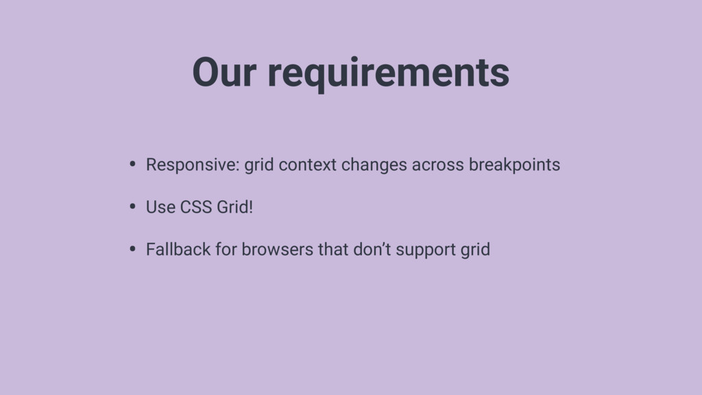
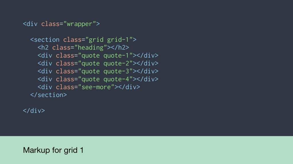
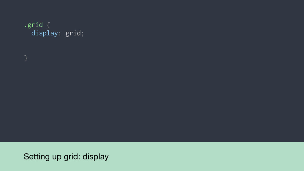
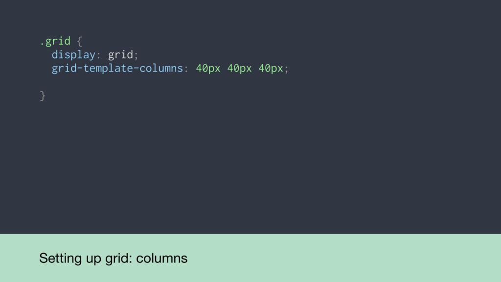
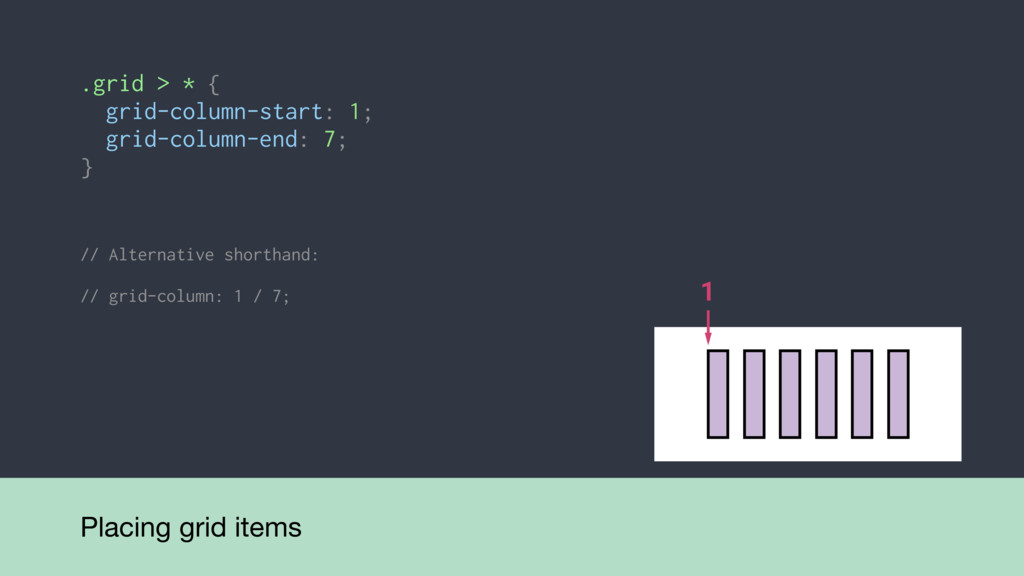
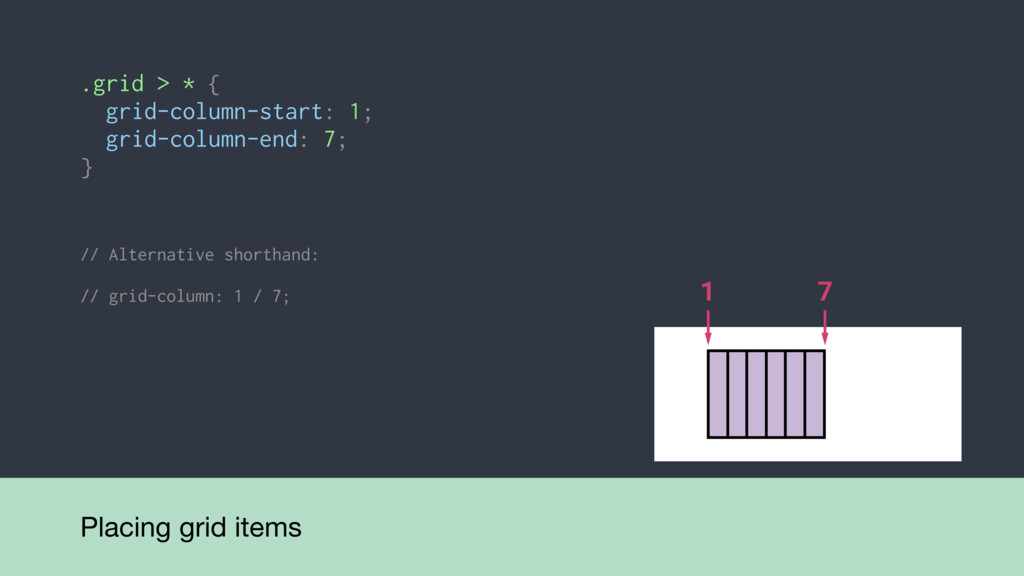
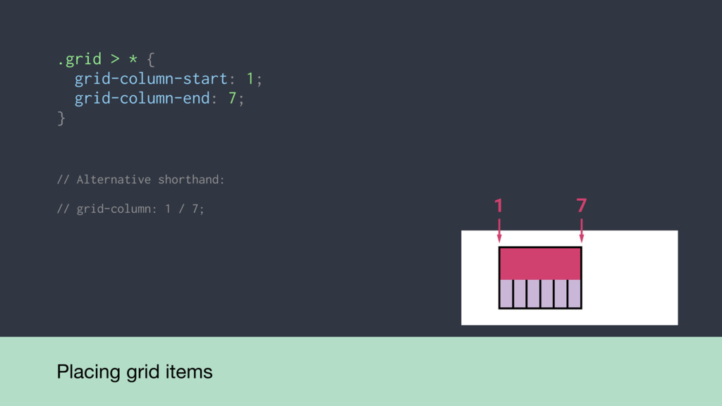
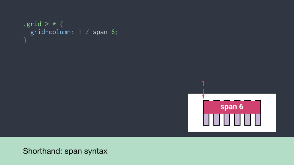
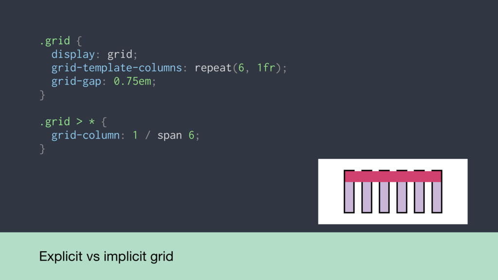
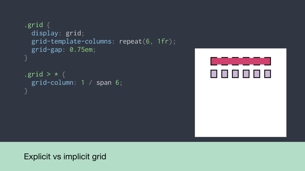
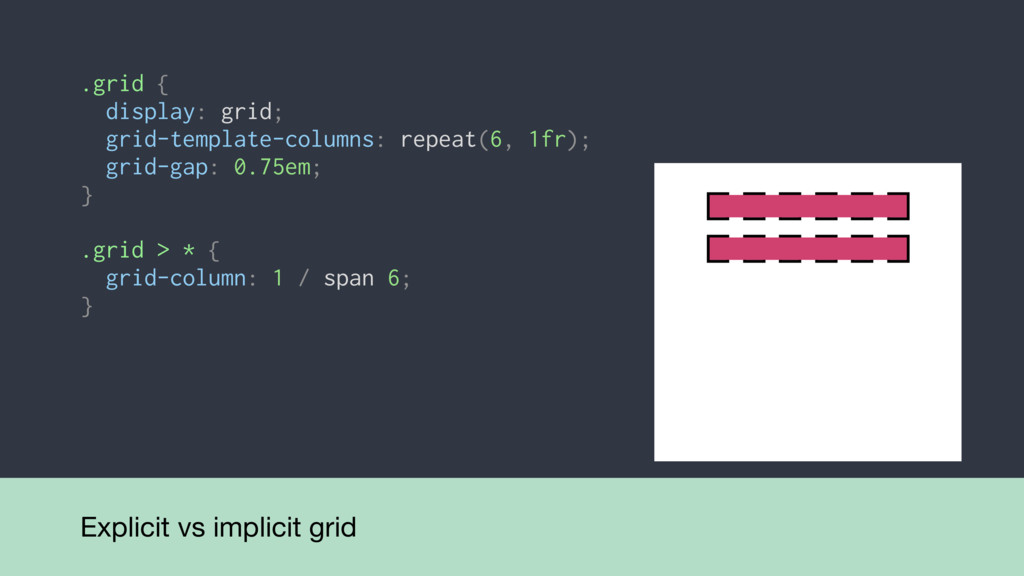
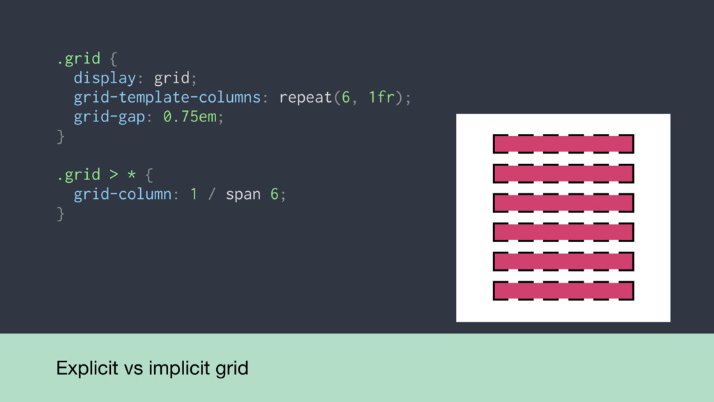
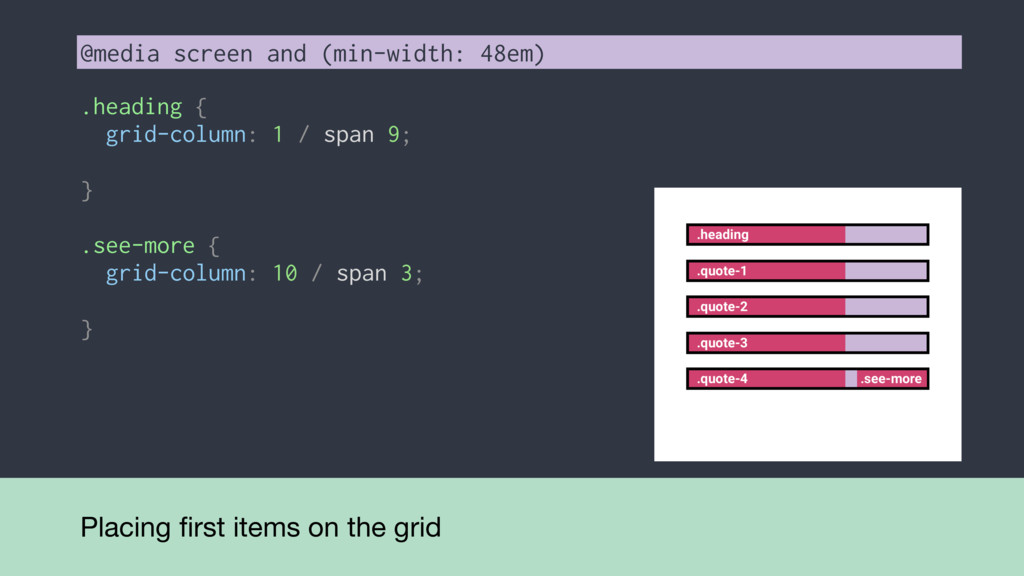
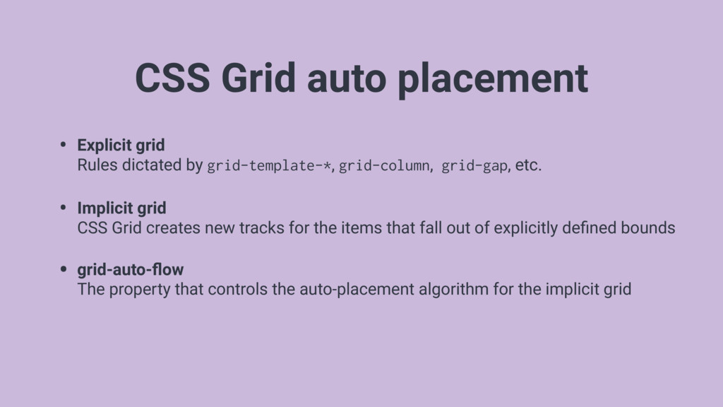
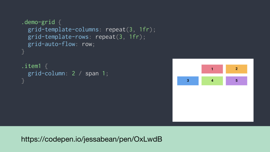
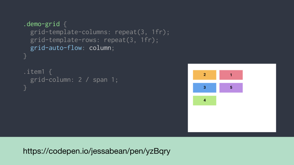
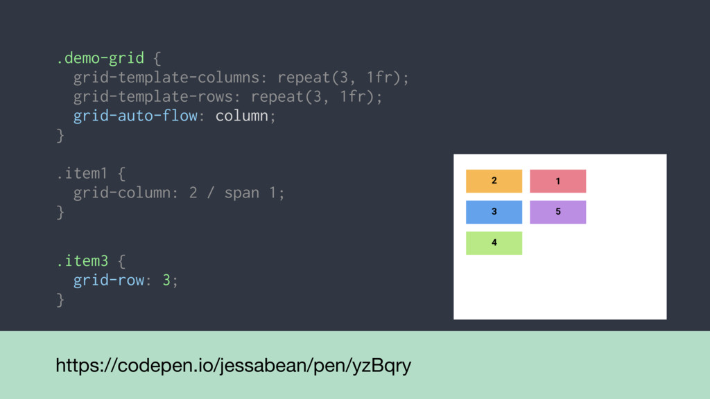
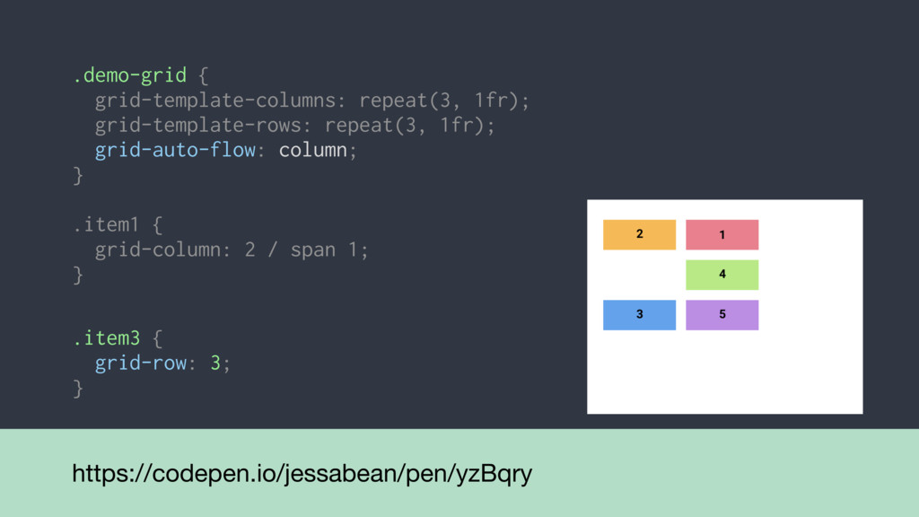
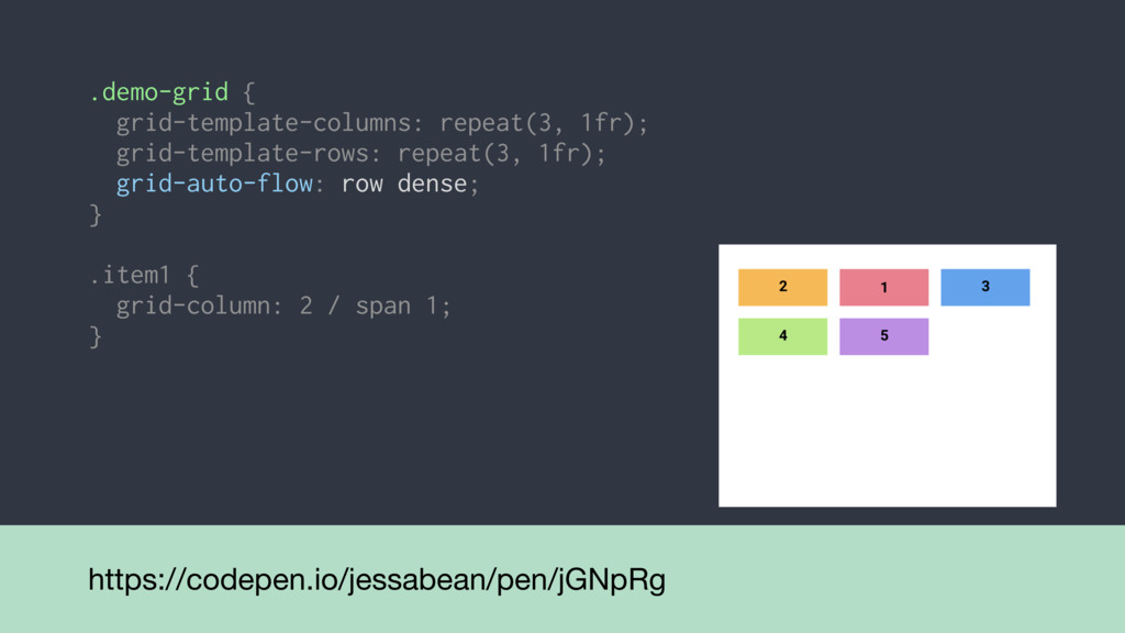
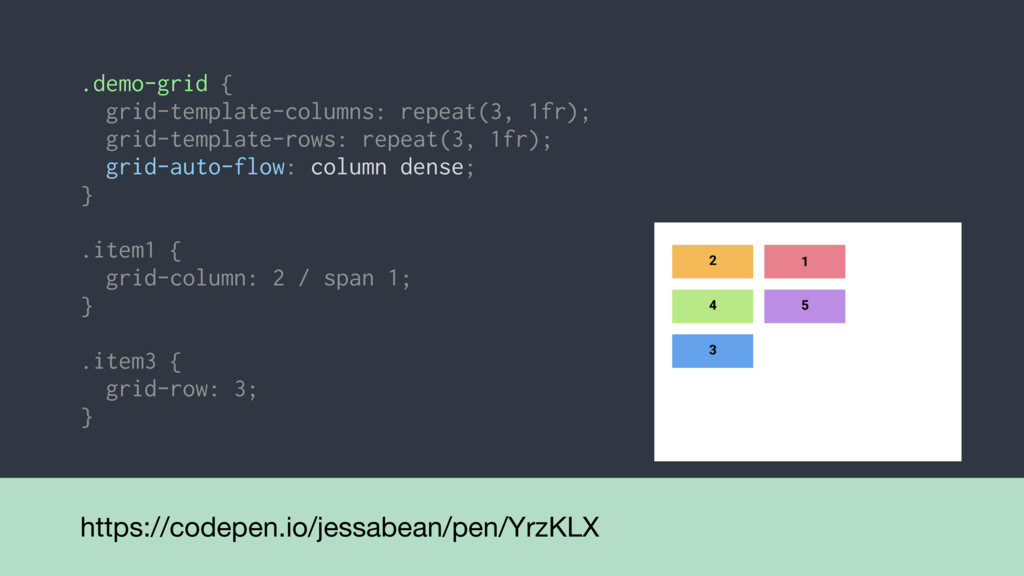
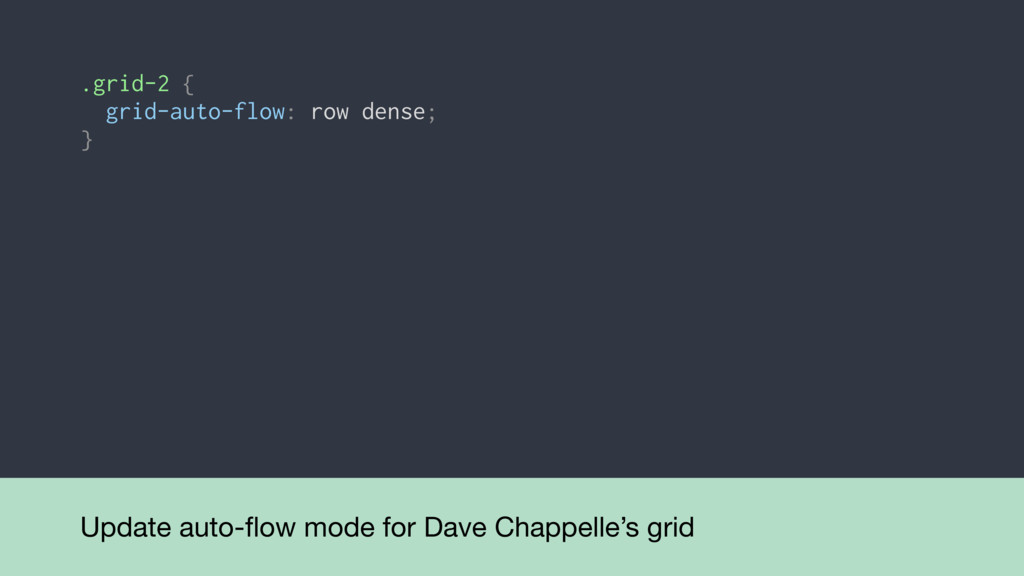
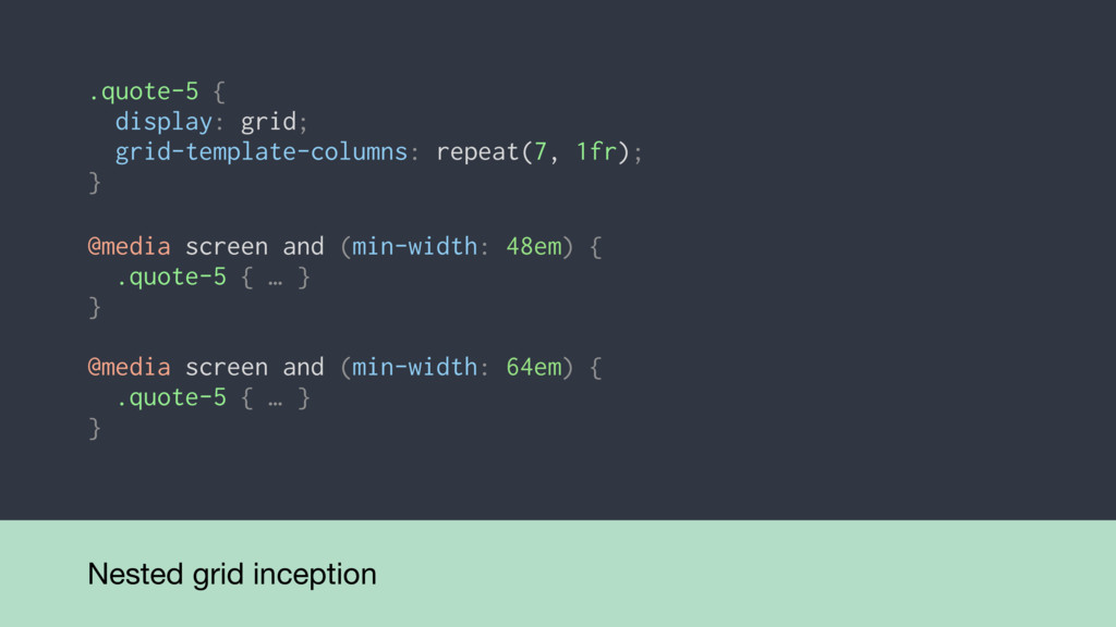
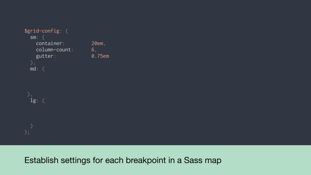
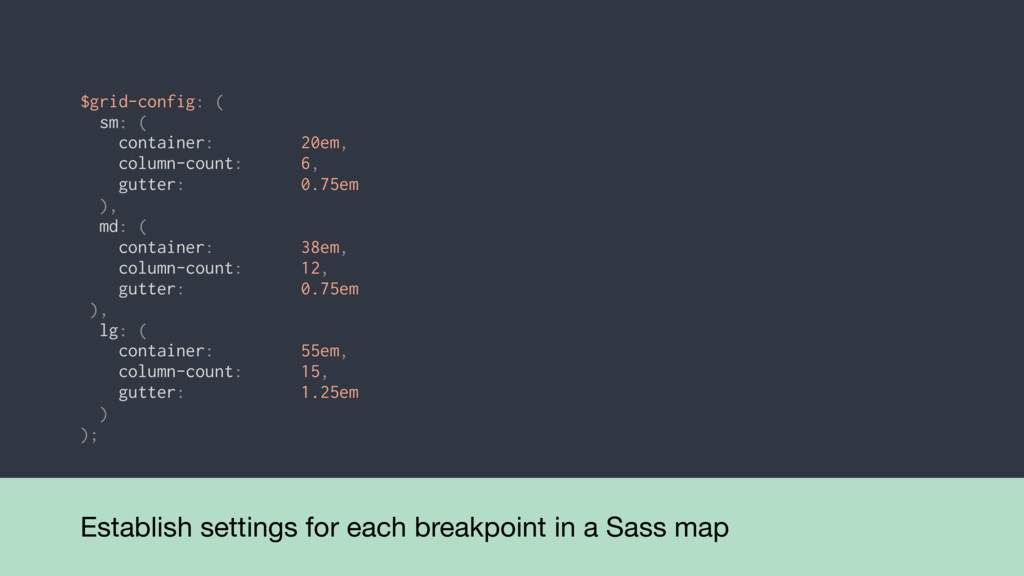
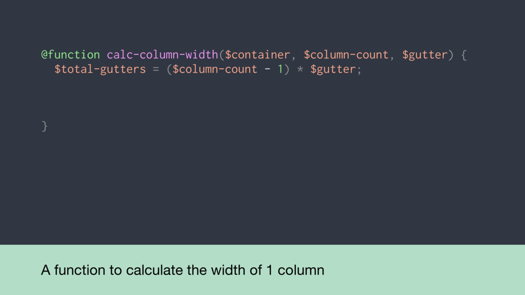
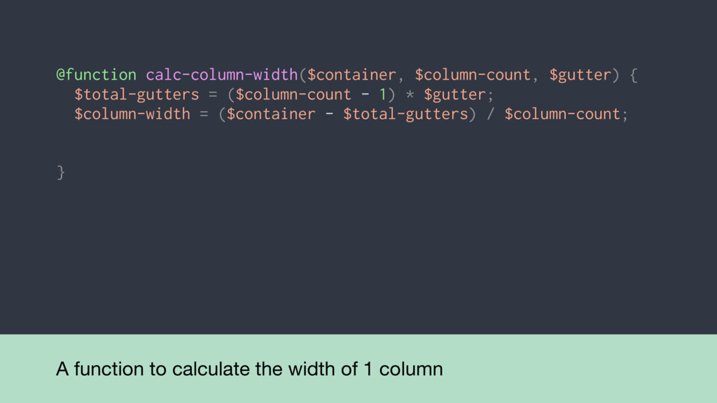
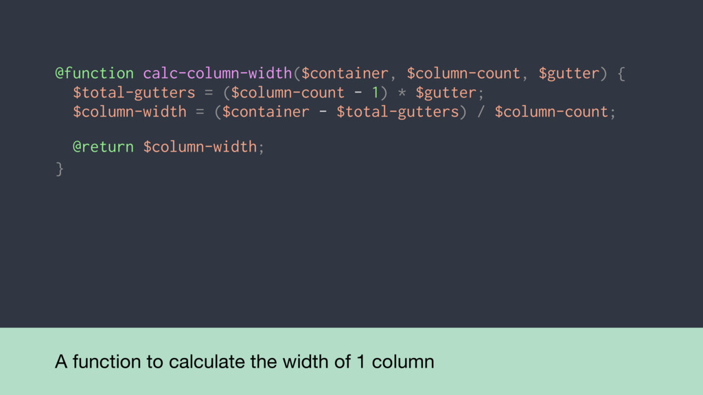
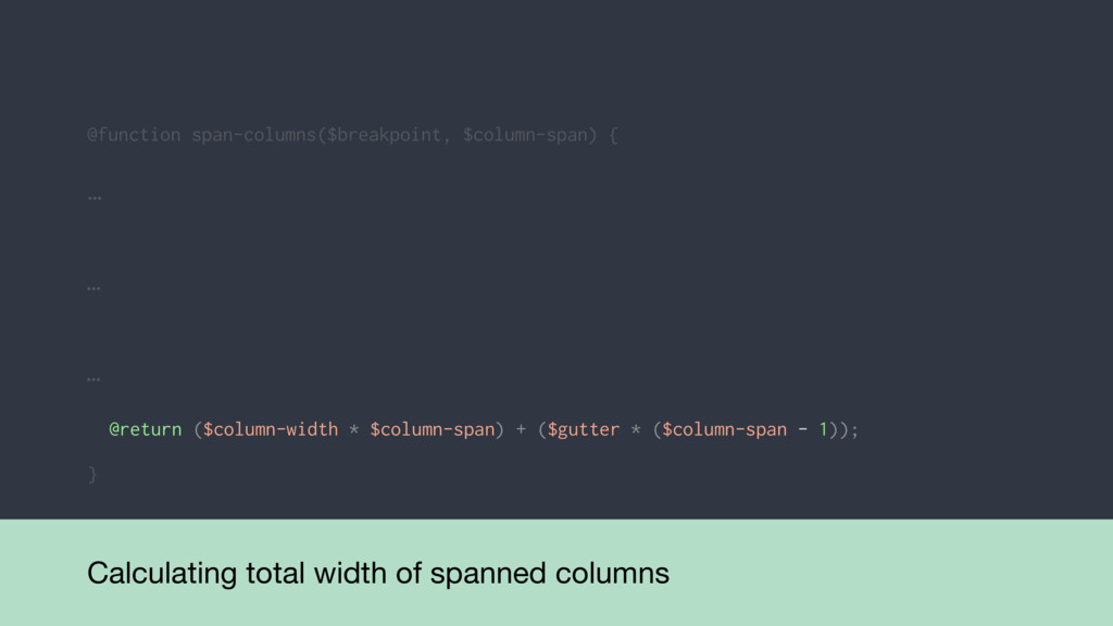
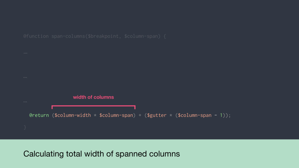
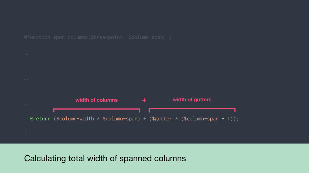
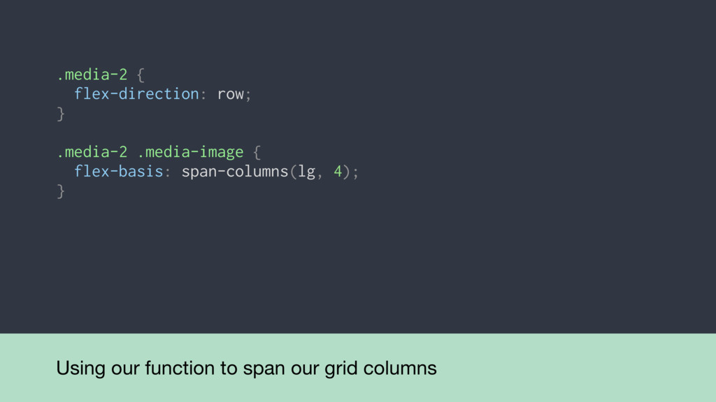
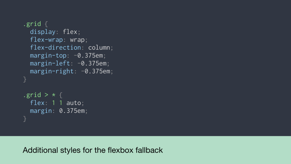
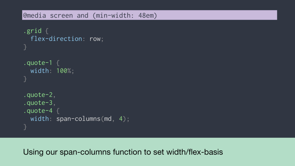
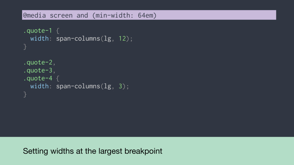
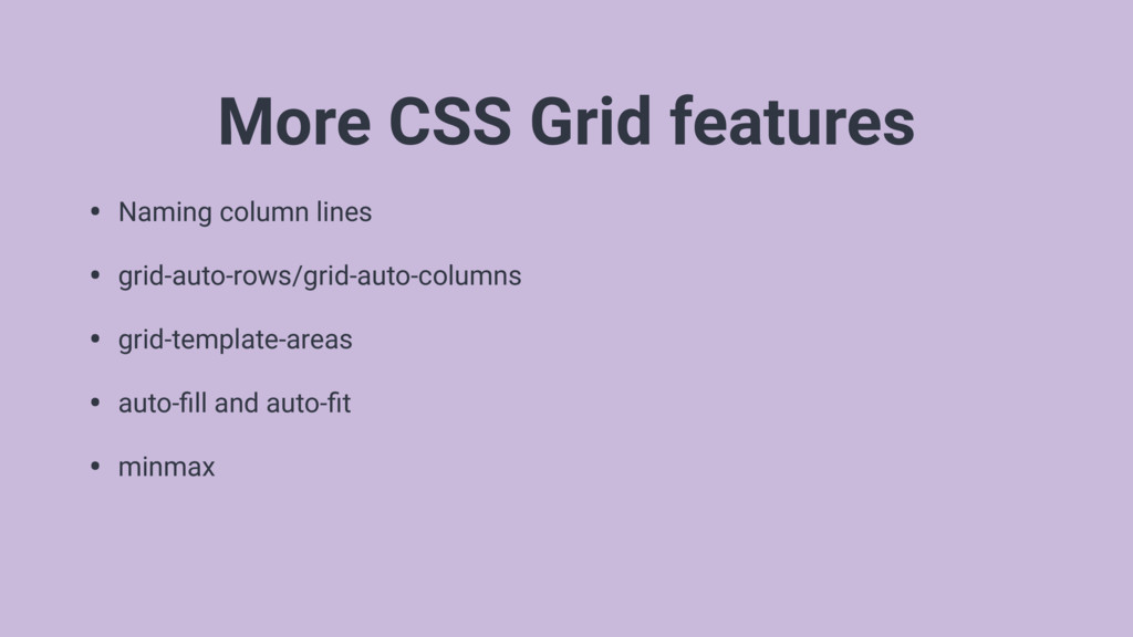
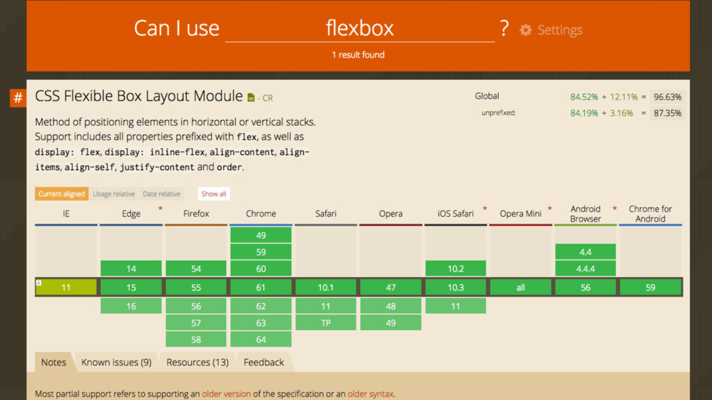
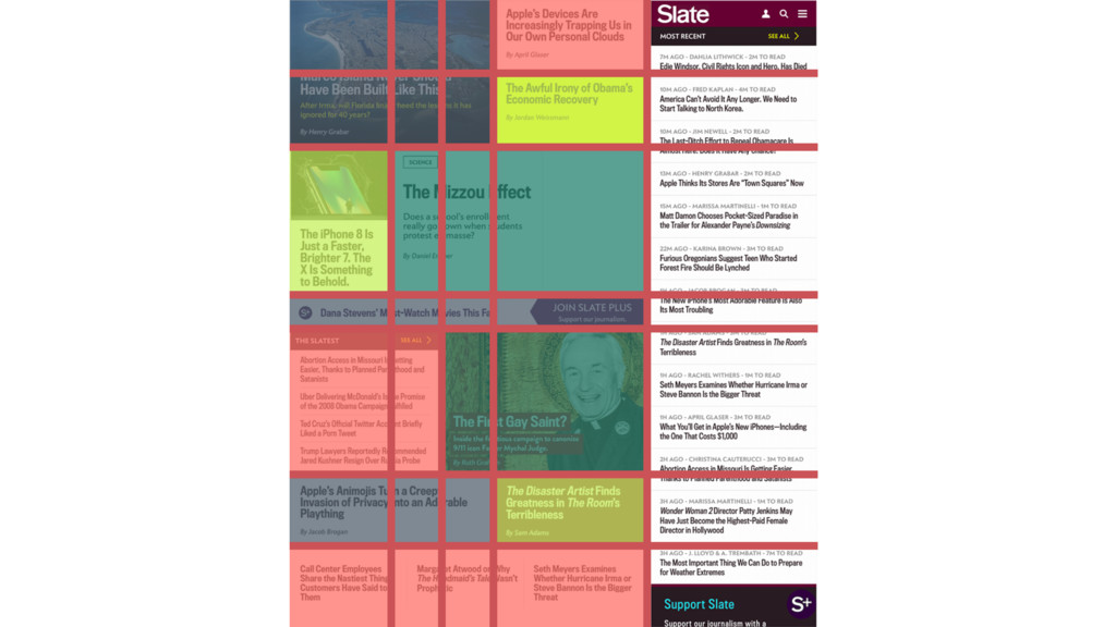
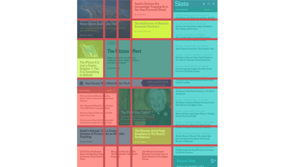
    grid-template-*, grid-column, grid-gap, etc. • Implicit grid
 CSS Grid creates new tracks for the items that fall out of explicitly defined bounds • grid-auto-flow
 The property that controls the auto-placement algorithm for the implicit grid
  31. https://codepen.io/jessabean/pen/yzBqry .item3 { grid-row: 3; } .demo-grid { grid-template-columns: repeat(3,

    1fr); grid-template-rows: repeat(3, 1fr); grid-auto-flow: column; } .item1 { grid-column: 2 / span 1; }
  32. https://codepen.io/jessabean/pen/yzBqry .item3 { grid-row: 3; } .demo-grid { grid-template-columns: repeat(3,

    1fr); grid-template-rows: repeat(3, 1fr); grid-auto-flow: column; } .item1 { grid-column: 2 / span 1; }
  33. Nested grid inception .quote-5 { display: grid; grid-template-columns: repeat(7, 1fr);

    } @media screen and (min-width: 48em) { .quote-5 { … } } @media screen and (min-width: 64em) { .quote-5 { … } }
  34. We need to calculate “1fr” explicitly .grid { grid-template-columns: repeat(6,

    1fr); grid-gap: 0.75em; } @media screen and (min-width: 48em) { .grid { grid-template-columns: repeat(12, 1fr); } } @media screen and (min-width: 64em) { .grid{ grid-template-columns: repeat(15, 1fr); grid-gap: 1.25em; } }
  35. Establish settings for each breakpoint in a Sass map $grid-config:

    ( sm: ( ), md: ( ), lg: ( ) ); container: 20em, column-count: 6, gutter: 0.75em
  36. Establish settings for each breakpoint in a Sass map $grid-config:

    ( sm: ( ), md: ( ), lg: ( ) ); container: 20em, column-count: 6, gutter: 0.75em container: 38em, column-count: 12, gutter: 0.75em container: 55em, column-count: 15, gutter: 1.25em
  37. A function to calculate the width of 1 column @function

    calc-column-width($container, $column-count, $gutter) { }
  38. A function to calculate the width of 1 column @function

    calc-column-width($container, $column-count, $gutter) { } $total-gutters = ($column-count - 1) * $gutter;
  39. A function to calculate the width of 1 column @function

    calc-column-width($container, $column-count, $gutter) { } $total-gutters = ($column-count - 1) * $gutter; $column-width = ($container - $total-gutters) / $column-count;
  40. A function to calculate the width of 1 column @function

    calc-column-width($container, $column-count, $gutter) { } $total-gutters = ($column-count - 1) * $gutter; $column-width = ($container - $total-gutters) / $column-count; @return $column-width;
  41. A function to calculate the column span // Calculate a

    fixed width that spans columns defined by CSS Grid @function span-columns($breakpoint, $column-span) { }
  42. Assigning breakpoint settings object to a variable @function span-columns($breakpoint, $column-span)

    { } // Get the $grid-config settings for the specified breakpoint $settings: map-get($grid-config, $breakpoint); $settings: ( container-width: 20em, column-count: 6, gutter-size: 0.75em )
  43. Fetching container width, column count, and gutter width @function span-columns($breakpoint,

    $column-span) { } … // Get the individual properties nested in the breakpoint $container: map-get($settings, container); $column-count: map-get($settings, column-count); $gutter: map-get($settings, gutter); $container: 20em; $totalcolumns: 6; $gutter: 0.75em;
  44. Using our column width function @function span-columns($breakpoint, $column-span) { }

    … … // Calculate individual column size based on config settings $column-width: calc-column-width($container, $column-count, $gutter);
  45. @function span-columns($breakpoint, $column-span) { } Calculating total width of spanned

    columns @return ($column-width * $column-span) + ($gutter * ($column-span - 1)); … … …
  46. @function span-columns($breakpoint, $column-span) { } Calculating total width of spanned

    columns @return ($column-width * $column-span) + ($gutter * ($column-span - 1)); … … … width of columns
  47. @function span-columns($breakpoint, $column-span) { } Calculating total width of spanned

    columns @return ($column-width * $column-span) + ($gutter * ($column-span - 1)); … … … width of columns width of gutters +
  48. Using our function to span our grid columns .media-2 {

    flex-direction: row; } .media-2 .media-image { flex-basis: span-columns(lg, 4); }
  49. Autoprefixer for CSS Grid: not recommended autoprefixer( { grid: false

    } ); IE limitations No auto-placement of grid items. No grid-gap support. No shorthand support for column start / end. No grid template areas.
  50. Using feature queries to target CSS Grid at modern browsers

    @supports (display: grid) { // css grid styles go here }
  51. Using feature queries to target CSS Grid at modern browsers

    @supports (display: grid) { // css grid styles go here } .grid { display: flex; }
  52. Additional styles for the flexbox fallback .grid { display: flex;

    flex-wrap: wrap; flex-direction: column; margin-top: -0.375em; margin-left: -0.375em; margin-right: -0.375em; } .grid > * { flex: 1 1 auto; margin: 0.375em; }
  53. Using our span-columns function to set width/flex-basis .grid { flex-direction:

    row; } .quote-1 { width: 100%; } .quote-2, .quote-3, .quote-4 { width: span-columns(md, 4); } @media screen and (min-width: 48em)
  54. Setting widths at the largest breakpoint .quote-1 { width: span-columns(lg,

    12); } .quote-2, .quote-3, .quote-4 { width: span-columns(lg, 3); } @media screen and (min-width: 64em)
  55. • Source order and semantics are still important • We

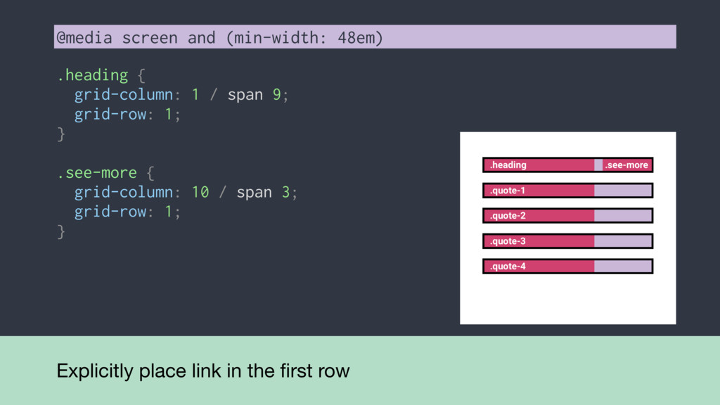
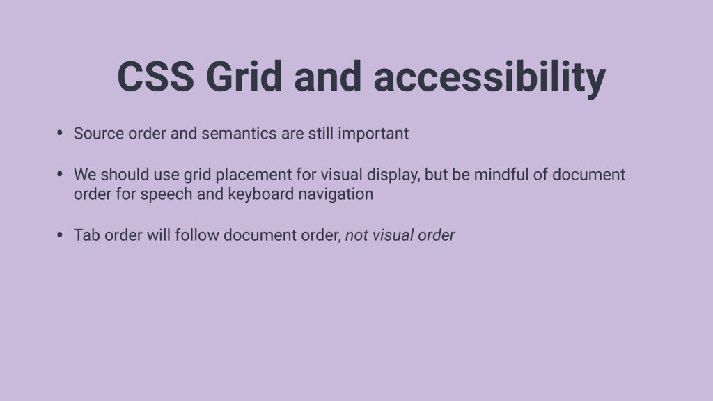
    should use grid placement for visual display, but be mindful of document order for speech and keyboard navigation • Tab order will follow document order, not visual order CSS Grid and accessibility
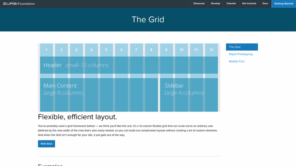
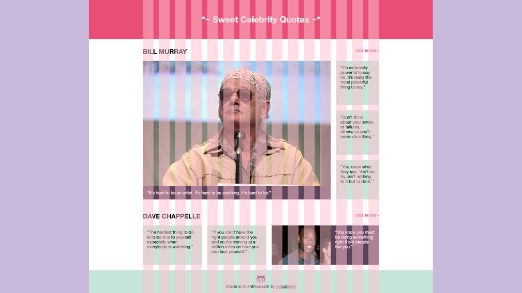
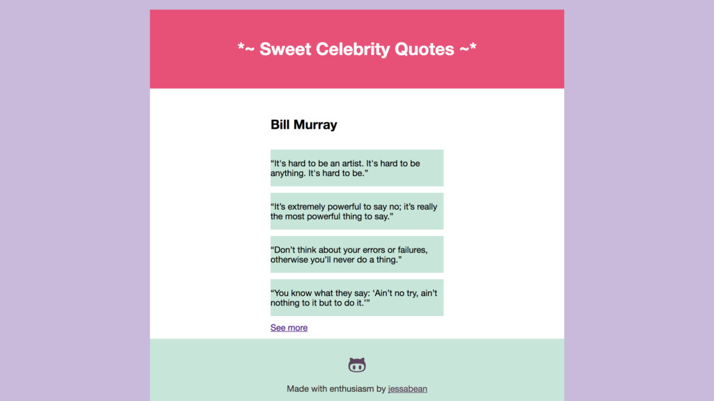
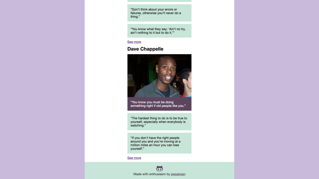
  56. – Miriam Suzanne http://oddbird.net/2017/06/28/susy3/ “If you have the browser-support matrix

    to start using the CSS Grid module directly, you should do it, and forget about Susy.”
  57. Resources • Rachel Andrew: https://gridbyexample.com/learn/ • Jen Simmons: http://jensimmons.com/post/feb-27-2017/learn-css-grid •

    MDN: https://developer.mozilla.org/en-US/docs/Web/CSS/CSS_Grid_Layout • Igalia: https://blogs.igalia.com/mrego/2015/02/25/grid-auto-placement-is-ready/
  58. Thank you! Links to demo code https://glitch.com/~grid-prototype-refresh-dc
 
 https://github.com/jessabean/grid-prototype-refresh-dc Slides

    https://speakerdeck.com/jessabean/prototyping-layout-with-css-grid-refreshdc
 @jessabean | jess@eldredge.io