Upgrade to Pro
— share decks privately, control downloads, hide ads and more …
Speaker Deck
Features
Speaker Deck
PRO
Sign in
Sign up for free
Search
Search
Styling Intro
Search
Max Stoiber
February 28, 2017
Technology
390
3
Share
Styling Intro
React in Flip Flops satyling talk
Max Stoiber
February 28, 2017
More Decks by Max Stoiber
See All by Max Stoiber
Testing React Applications
mxstbr
3
340
Introduction to React.js
mxstbr
1
170
Styling React Applications
mxstbr
2
720
Scaling React.js Applications (short version)
mxstbr
2
430
Scaling React.js Applications
mxstbr
0
430
Offline is the new Black
mxstbr
3
1.1k
Exploring ES6
mxstbr
1
340
Testing React.js Applications
mxstbr
4
720
Other Decks in Technology
See All in Technology
#jawsugyokohama 100 LT11, "My AWS Journey 2011-2026 - kwntravel"
shinichirokawano
0
240
みんなの「データ活用」を支えるストレージ担当から持ち込むAWS活用/コミュニティー設計TIPS 10選~「作れる」より、「続けられる」設計へ~
yoshiki0705
0
150
暗黙知について一歩踏み込んで考える - 暗黙知の4タイプと暗黙考・暗黙動へ
masayamoriofficial
0
1.6k
🀄️ on swiftc
giginet
PRO
0
350
DIPS2.0データに基づく森林管理における無人航空機の利用状況
naokimuroki
1
210
研究開発部メンバーの働き⽅ / Sansan R&D Profile
sansan33
PRO
4
23k
2026年、知っておくべき最新 サーバレスTips10選/serverless-10-tips
slsops
12
4.7k
CloudSec JP #005 後締め ~ソフトウェアサプライチェーン攻撃から開発者のシークレットを守る~
lhazy
0
190
自分のハンドルは自分で握れ! ― 自分のケイパビリティを増やし、メンバーのケイパビリティ獲得を支援する ― / Take the wheel yourself
takaking22
1
400
Bluesky Meetup in Tokyo vol.4 - 2023to2026
shinoharata
0
190
聞き手の目線で考えるプロポーザル
takefumiyoshii
0
400
最初の一歩を踏み出せなかった私が、誰かの背中を押したいと思うようになるまで / give someone a push
mii3king
0
130
Featured
See All Featured
Max Prin - Stacking Signals: How International SEO Comes Together (And Falls Apart)
techseoconnect
PRO
0
140
GitHub's CSS Performance
jonrohan
1032
470k
How to build a perfect <img>
jonoalderson
1
5.4k
Taking LLMs out of the black box: A practical guide to human-in-the-loop distillation
inesmontani
PRO
3
2.1k
Let's Do A Bunch of Simple Stuff to Make Websites Faster
chriscoyier
508
140k
Java REST API Framework Comparison - PWX 2021
mraible
34
9.3k
Put a Button on it: Removing Barriers to Going Fast.
kastner
60
4.2k
Lessons Learnt from Crawling 1000+ Websites
charlesmeaden
PRO
1
1.2k
jQuery: Nuts, Bolts and Bling
dougneiner
66
8.4k
Building Experiences: Design Systems, User Experience, and Full Site Editing
marktimemedia
0
480
Building Applications with DynamoDB
mza
96
7k
Build your cross-platform service in a week with App Engine
jlugia
234
18k
Transcript
Styling React Applications Max Stoiber @mxstbr Open Source Developer, Thinkmill
Let’s talk about styling
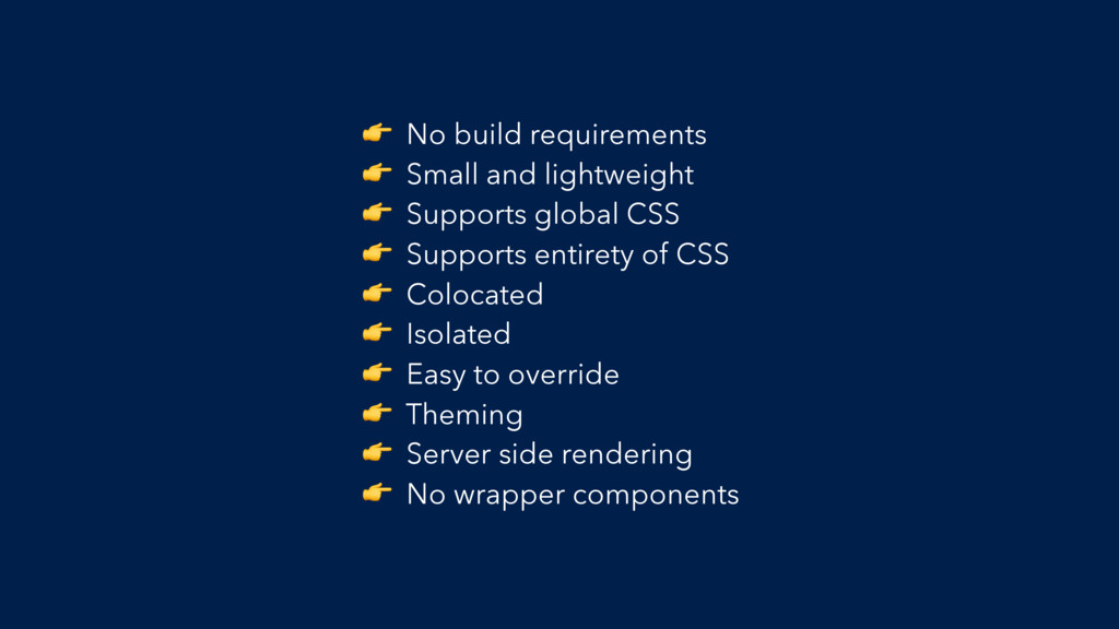
The Checklist
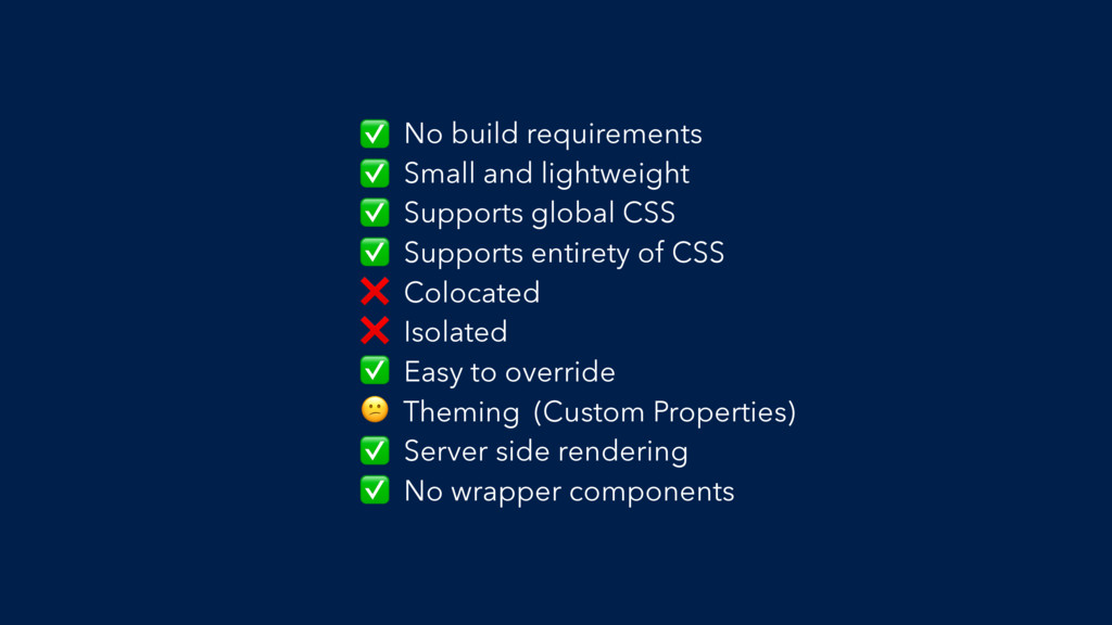
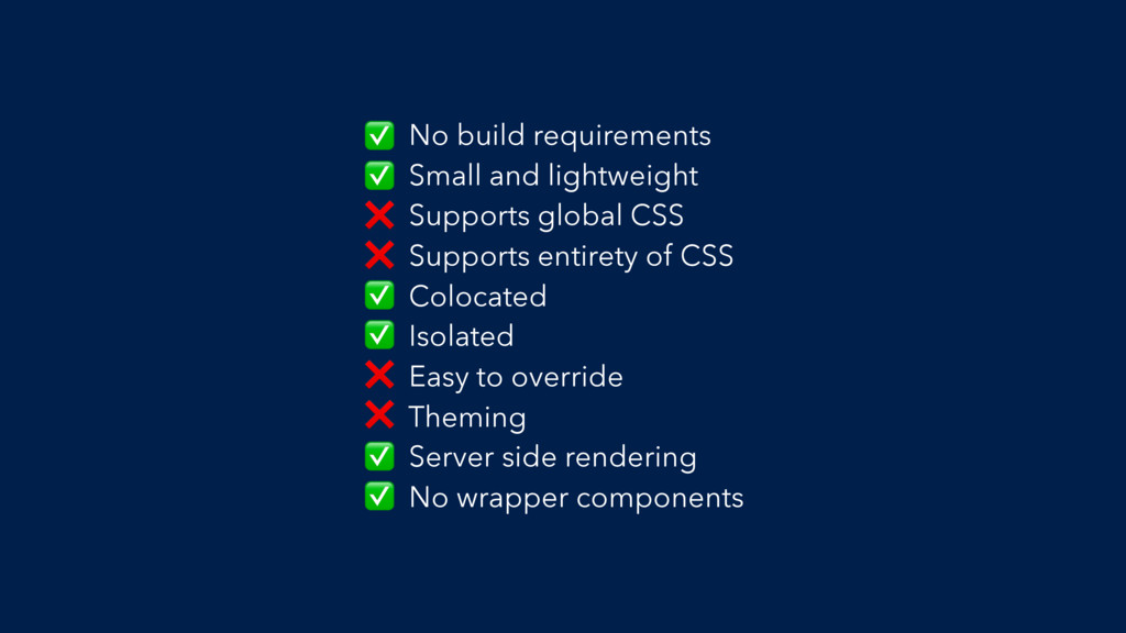
No build requirements Small and lightweight Supports global CSS Supports
entirety of CSS Colocated Isolated Easy to override Theming Server side rendering No wrapper components
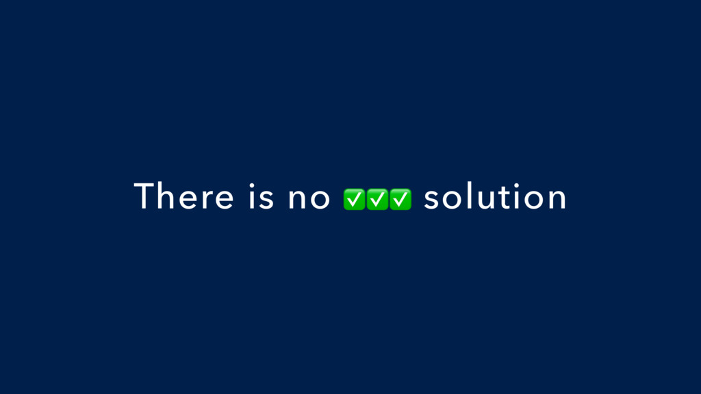
There is no ✅✅✅ solution
Every app is different
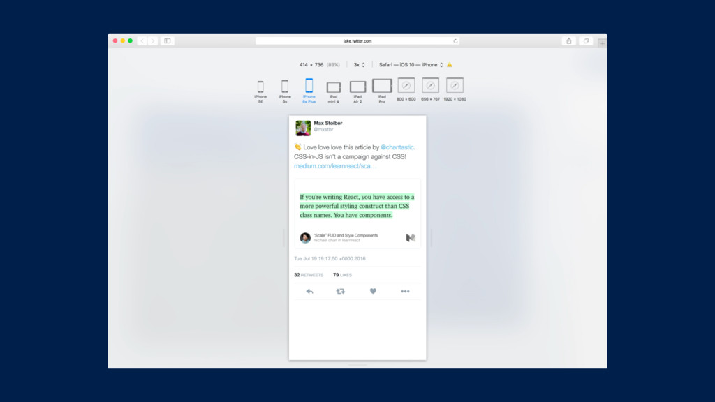
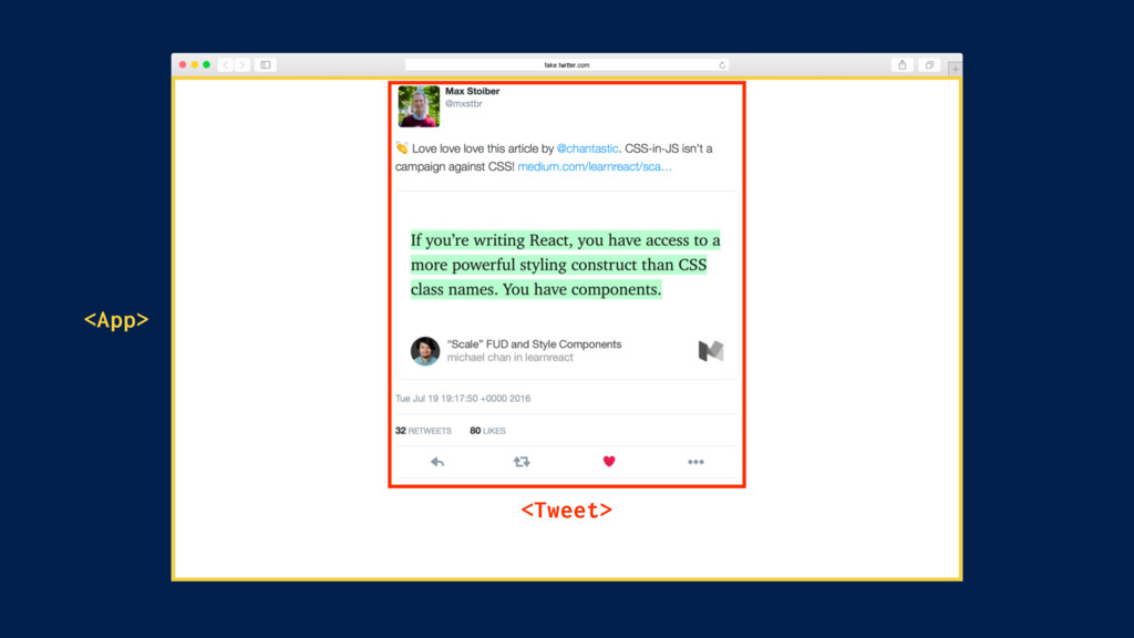
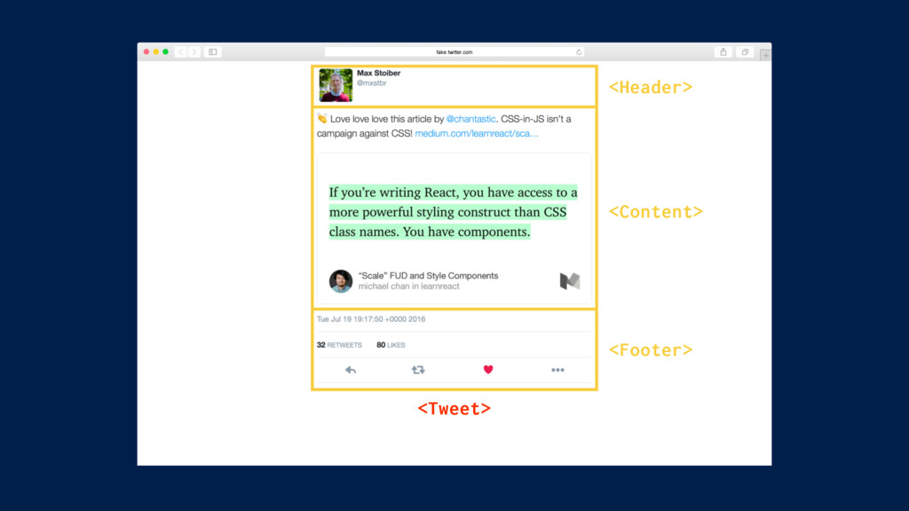
The Example
fake.twitter.com
fake.twitter.com
fake.twitter.com <Tweet> <App>
fake.twitter.com <Tweet> <Header> <Content> <Footer>
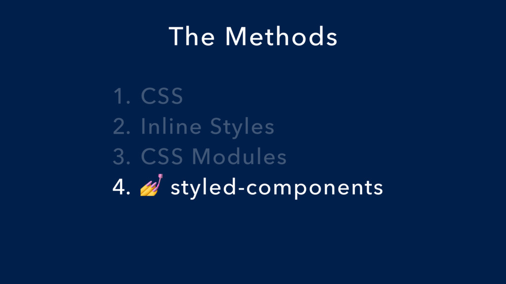
1. CSS 2. Inline Styles 3. CSS Modules 4. styled-components
The Methods
1. CSS 2. Inline Styles 3. CSS Modules 4. styled-components
The Methods
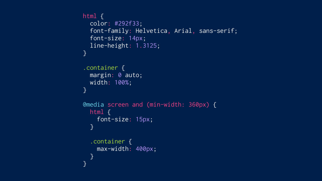
html { color: #292f33; font-family: Helvetica, Arial, sans-serif; font-size: 14px;
line-height: 1.3125; } .container { margin: 0 auto; width: 100%; } @media screen and (min-width: 360px) { html { font-size: 15px; } .container { max-width: 400px; } }
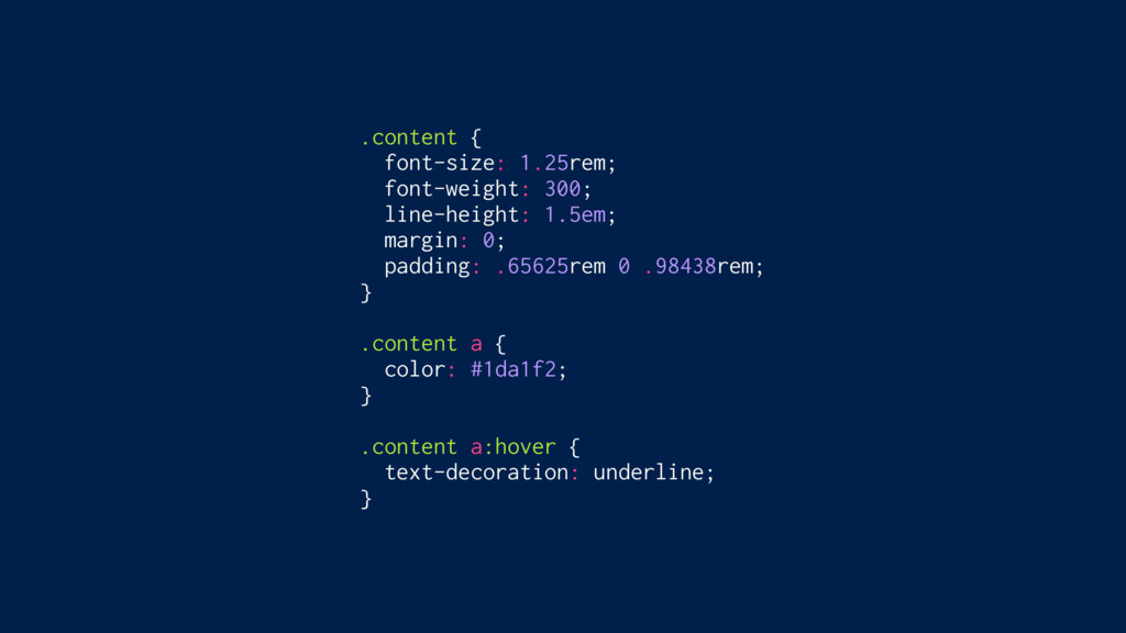
.tweet__content { font-size: 1.25rem; font-weight: 300; line-height: 1.5em; margin: 0;
padding: .65625rem 0 .98438rem; } .tweet__content a { color: #1da1f2; } .tweet__content a:hover { text-decoration: underline; }
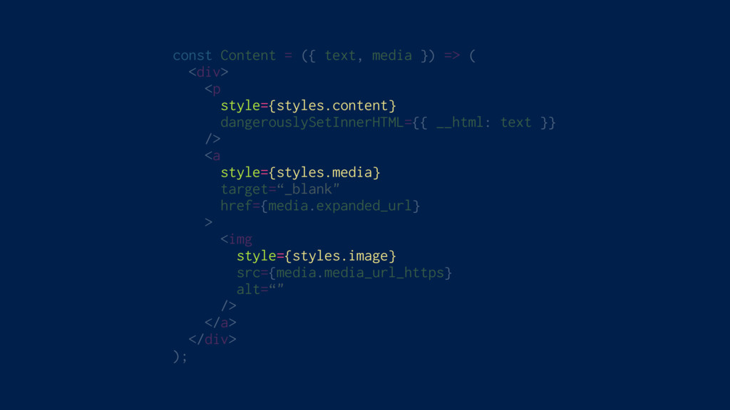
const Content = ({ text, media }) => ( <div>
<p className=“tweet__content" dangerouslySetInnerHTML={{ __html: text }} /> <a className=“tweet__media" target=“_blank" href={media.expanded_url} > <img className=“tweet__image" src={media.media_url_https} alt=“" /> </a> </div> );
No build requirements Small and lightweight Supports global CSS Supports
entirety of CSS Colocated Isolated Easy to override Theming Server side rendering No wrapper components ✅ ✅ ✅ ✅ ❌ ❌ ✅ (Custom Properties) ✅ ✅
1. CSS 2. Inline Styles 3. CSS Modules 4. styled-components
The Methods
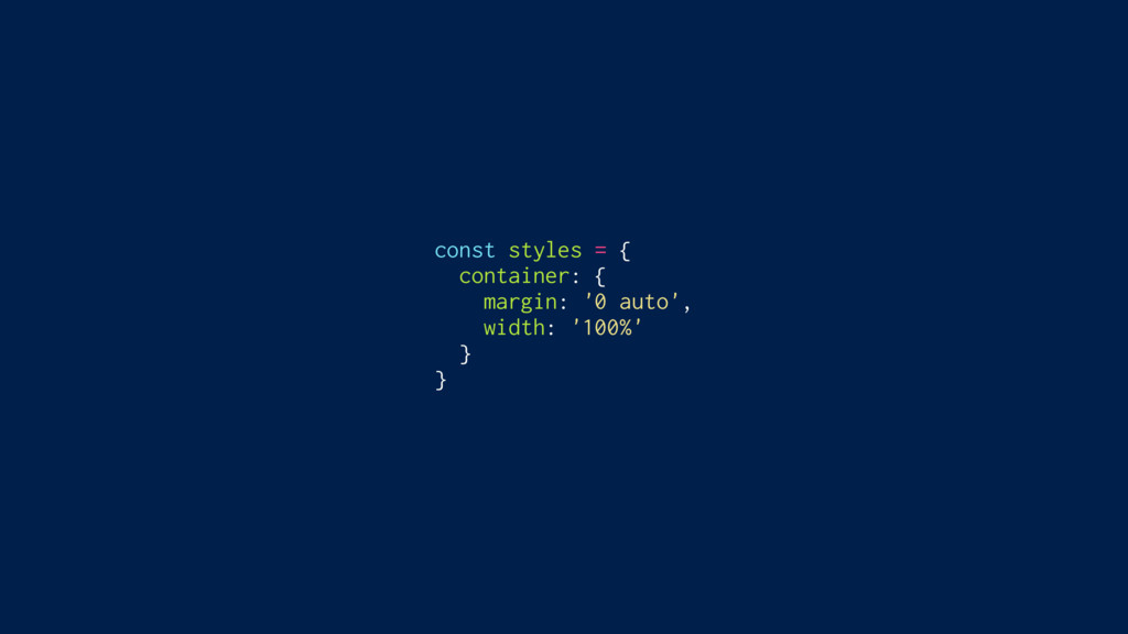
const styles = { container: { margin: '0 auto', width:
'100%' } }
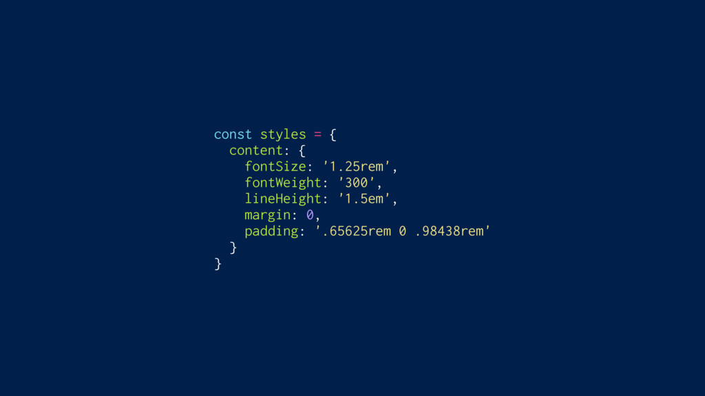
const styles = { content: { fontSize: '1.25rem', fontWeight: '300',
lineHeight: '1.5em', margin: 0, padding: '.65625rem 0 .98438rem' } }
const Content = ({ text, media }) => ( <div>
<p style={styles.content} dangerouslySetInnerHTML={{ __html: text }} /> <a style={styles.media} target=“_blank" href={media.expanded_url} > <img style={styles.image} src={media.media_url_https} alt=“" /> </a> </div> );
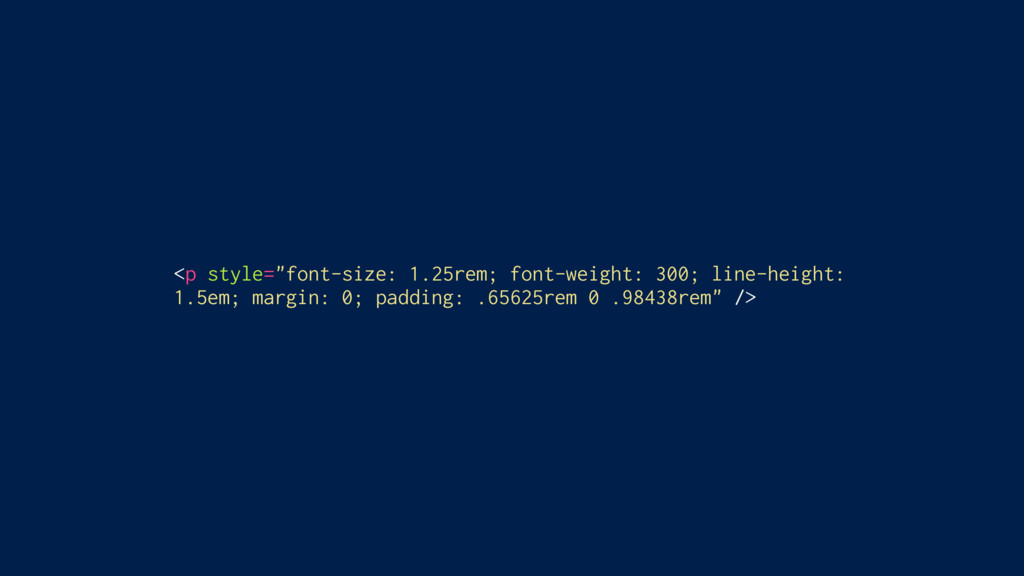
<p style="font-size: 1.25rem; font-weight: 300; line-height: 1.5em; margin: 0; padding:
.65625rem 0 .98438rem" />
No build requirements Small and lightweight Supports global CSS Supports
entirety of CSS Colocated Isolated Easy to override Theming Server side rendering No wrapper components ✅ ✅ ❌ ❌ ✅ ✅ ❌ ❌ ✅ ✅
1. CSS 2. Inline Styles 3. CSS Modules 4. styled-components
The Methods
html { color: #292f33; font-family: Helvetica, Arial, sans-serif; font-size: 14px;
line-height: 1.3125; } .container { margin: 0 auto; width: 100%; } @media screen and (min-width: 360px) { html { font-size: 15px; } .container { max-width: 400px; } }
.content { font-size: 1.25rem; font-weight: 300; line-height: 1.5em; margin: 0;
padding: .65625rem 0 .98438rem; } .content a { color: #1da1f2; } .content a:hover { text-decoration: underline; }
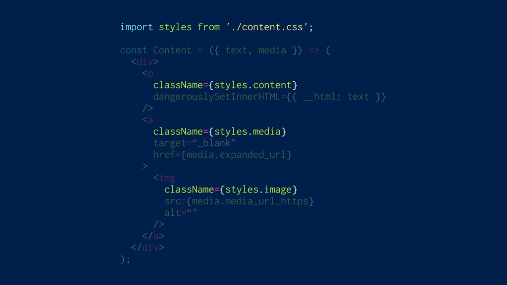
import styles from './content.css'; const Content = ({ text, media
}) => ( <div> <p className={styles.content} dangerouslySetInnerHTML={{ __html: text }} /> <a className={styles.media} target=“_blank" href={media.expanded_url} > <img className={styles.image} src={media.media_url_https} alt=“" /> </a> </div> );
/* content.css */ .content { /* … */ } .content__content__a452s
{ /* … */ } /* home.css */ .content { /* … */ } .home__content__juz65 { /* … */ }
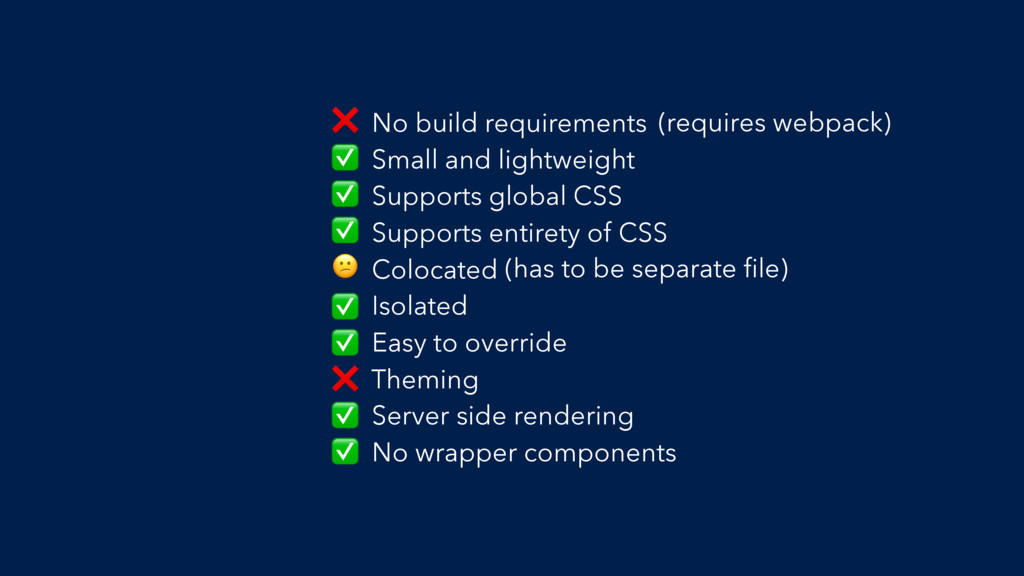
No build requirements Small and lightweight Supports global CSS Supports
entirety of CSS Colocated Isolated Easy to override Theming Server side rendering No wrapper components ❌ (requires webpack) ✅ ✅ ✅ (has to be separate file) ✅ ✅ ❌ ✅ ✅
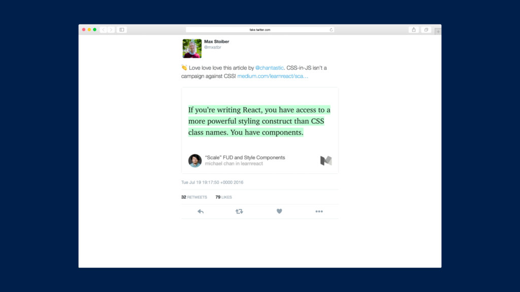
If you’re writing React, you have access to a more
powerful styling construct than CSS class names. You have components.” – Michael Chan, @chantastic “
1. CSS 2. Inline Styles 3. CSS Modules 4. styled-components
The Methods
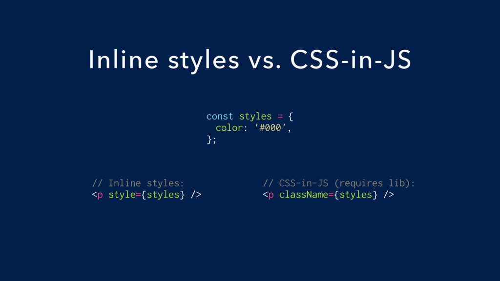
const styles = { color: '#000', }; Inline styles vs.
CSS-in-JS // Inline styles: <p style={styles} /> // CSS-in-JS (requires lib): <p className={styles} />
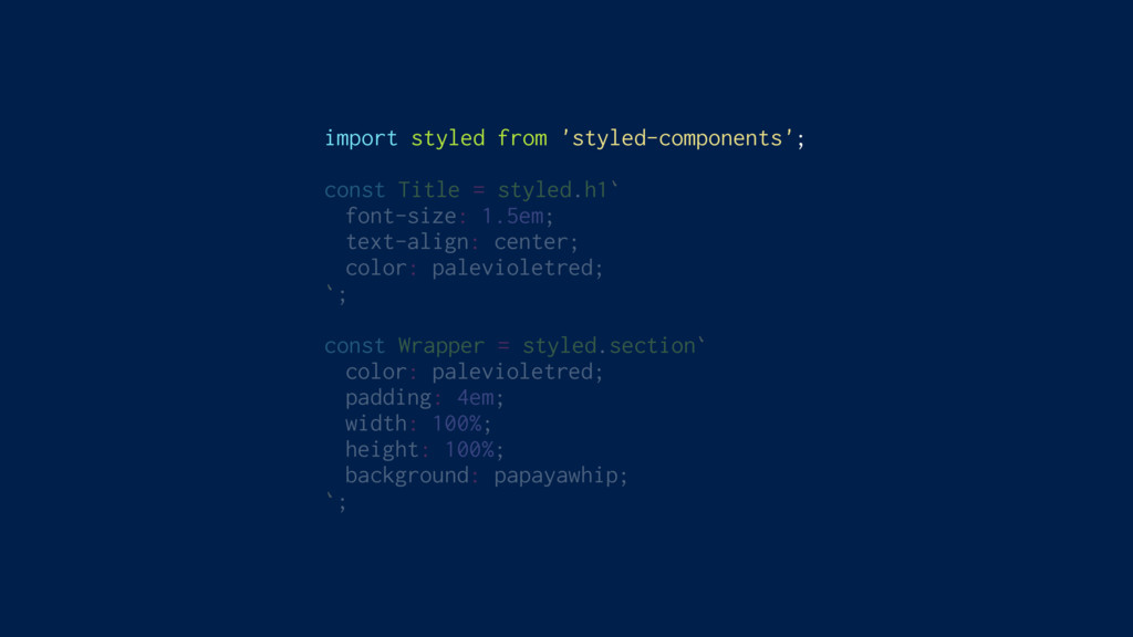
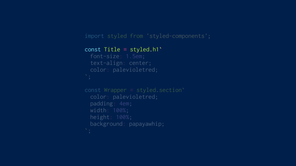
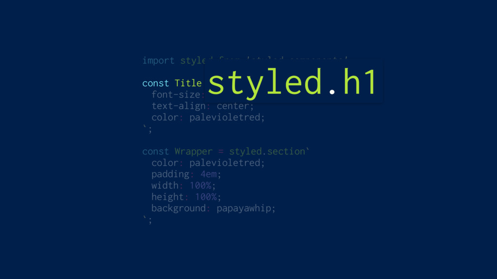
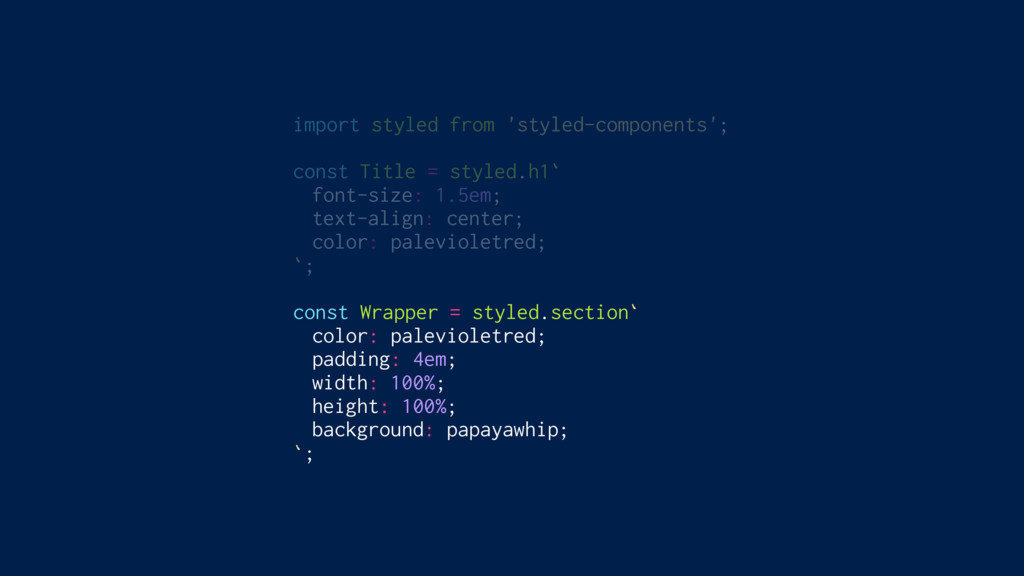
import styled from 'styled-components'; const Title = styled.h1` font-size: 1.5em;
text-align: center; color: palevioletred; `; const Wrapper = styled.section` color: palevioletred; padding: 4em; width: 100%; height: 100%; background: papayawhip; `;
import styled from 'styled-components'; const Title = styled.h1` font-size: 1.5em;
text-align: center; color: palevioletred; `; const Wrapper = styled.section` color: palevioletred; padding: 4em; width: 100%; height: 100%; background: papayawhip; `;
import styled from 'styled-components'; const Title = styled.h1` font-size: 1.5em;
text-align: center; color: palevioletred; `; const Wrapper = styled.section` color: palevioletred; padding: 4em; width: 100%; height: 100%; background: papayawhip; `; styled.h1
import styled from 'styled-components'; const Title = styled.h1` font-size: 1.5em;
text-align: center; color: palevioletred; `; const Wrapper = styled.section` color: palevioletred; padding: 4em; width: 100%; height: 100%; background: papayawhip; `;
import styled from 'styled-components'; const Title = styled.h1` font-size: 1.5em;
text-align: center; color: palevioletred; `; const Wrapper = styled.section` color: palevioletred; padding: 4em; width: 100%; height: 100%; background: papayawhip; `;
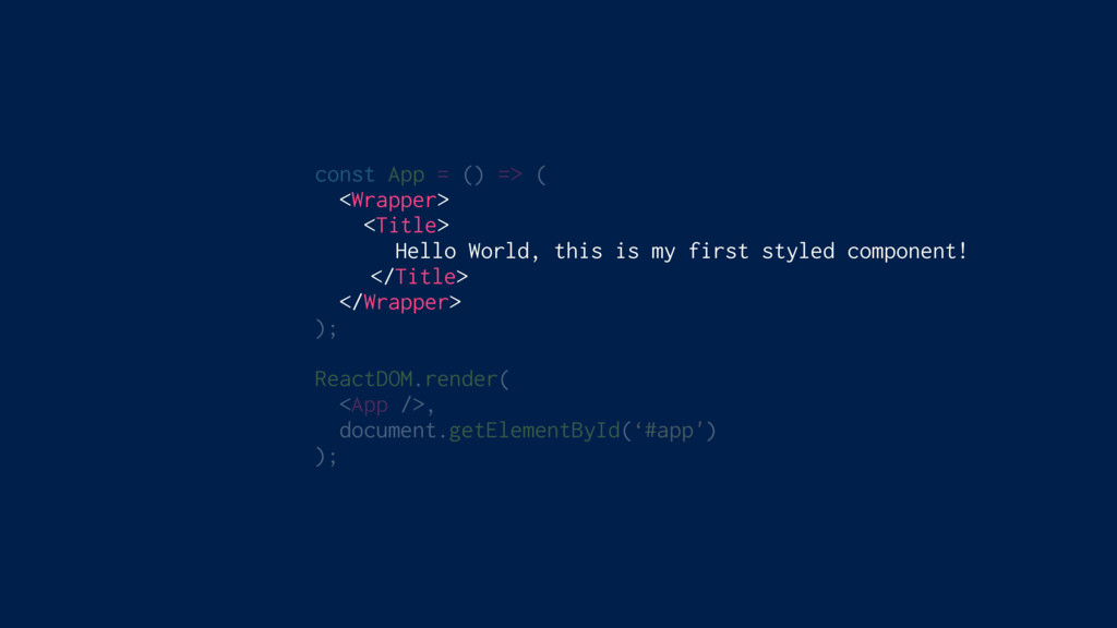
const App = () => ( <Wrapper> <Title> Hello World,
this is my first styled component! </Title> </Wrapper> ); ReactDOM.render( <App />, document.getElementById(‘#app') );
styled-components
Adapting based on props
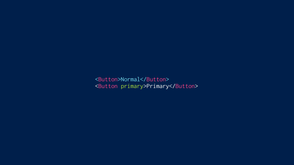
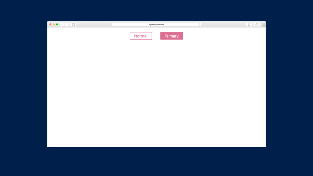
<Button>Normal</Button> <Button primary>Primary</Button>
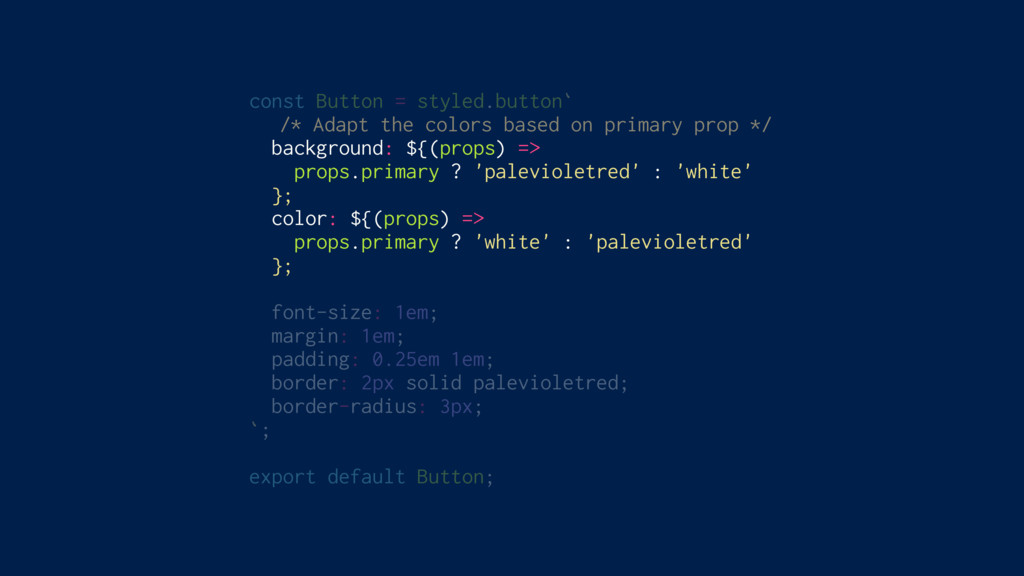
const Button = styled.button` /* Adapt the colors based on
primary prop */ background: ${(props) => props.primary ? 'palevioletred' : 'white' }; color: ${(props) => props.primary ? 'white' : 'palevioletred' }; font-size: 1em; margin: 1em; padding: 0.25em 1em; border: 2px solid palevioletred; border-radius: 3px; `; export default Button;
<Button>Normal</Button> <Button primary>Primary</Button>
styled-components
Theming Built In
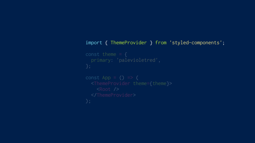
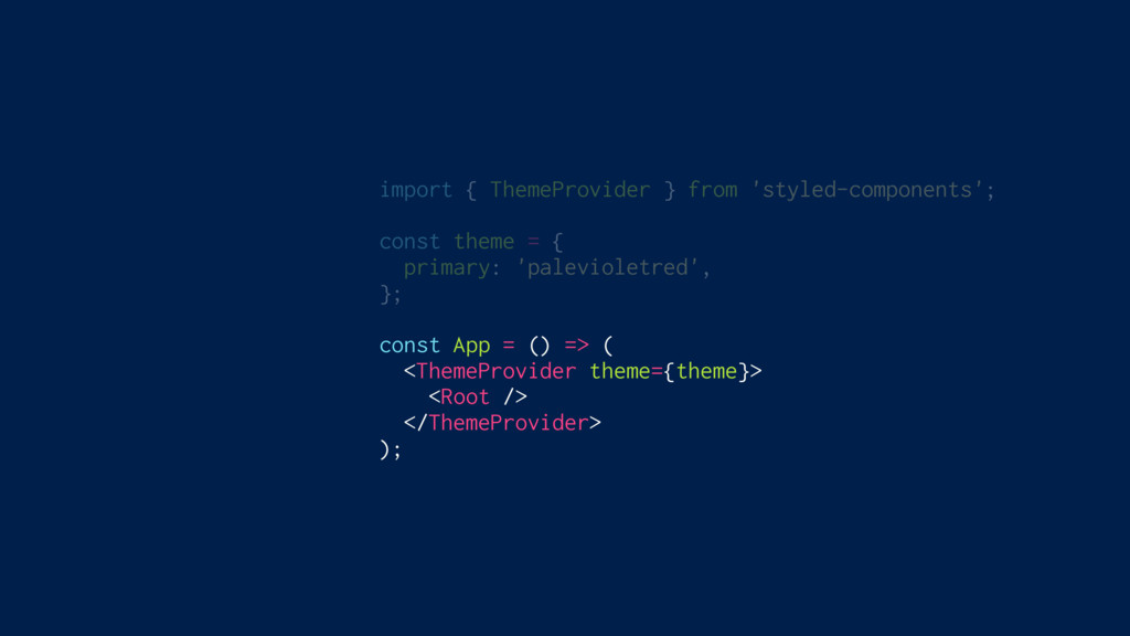
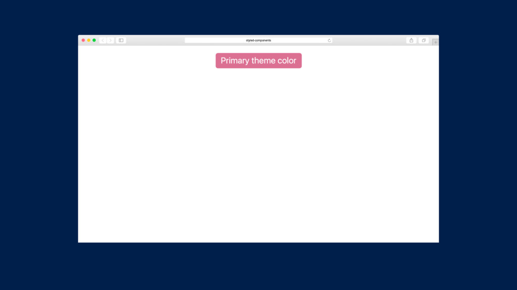
import { ThemeProvider } from 'styled-components'; const theme = {
primary: 'palevioletred', }; const App = () => ( <ThemeProvider theme={theme}> <Root /> </ThemeProvider> );
import { ThemeProvider } from 'styled-components'; const theme = {
primary: 'palevioletred', }; const App = () => ( <ThemeProvider theme={theme}> <Root /> </ThemeProvider> );
import { ThemeProvider } from 'styled-components'; const theme = {
primary: 'palevioletred', }; const App = () => ( <ThemeProvider theme={theme}> <Root /> </ThemeProvider> );
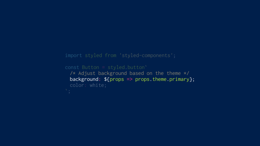
import styled from 'styled-components'; const Button = styled.button` /* Adjust
background based on the theme */ background: ${props => props.theme.primary}; color: white; `;
styled-components
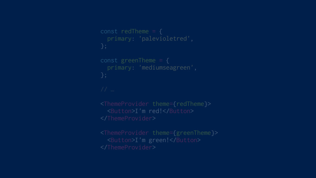
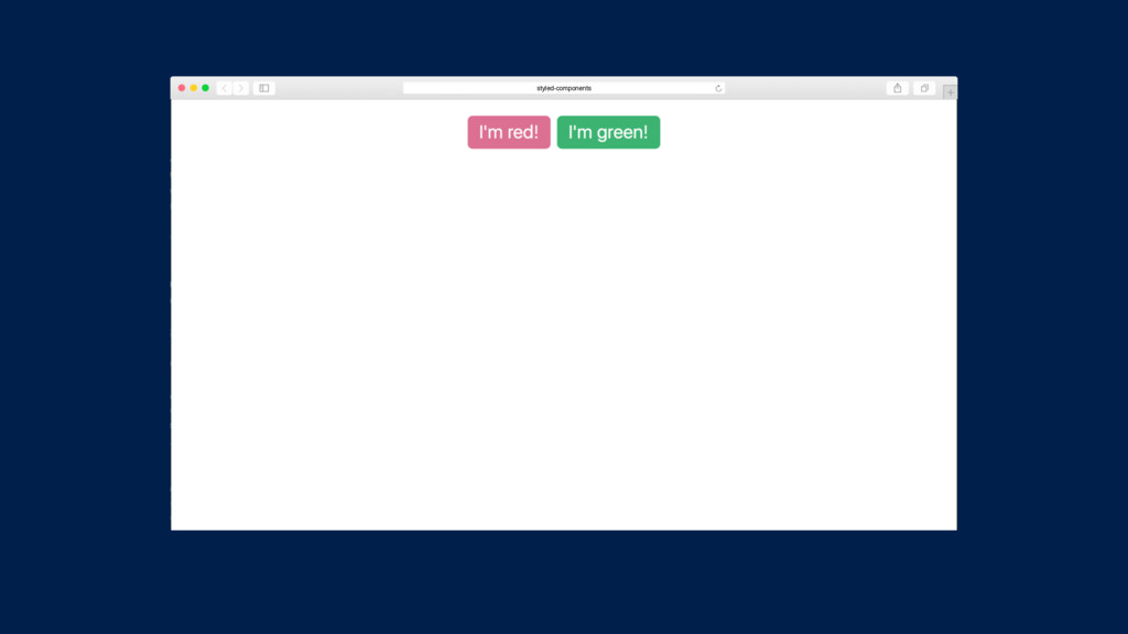
const redTheme = { primary: 'palevioletred', }; const greenTheme =
{ primary: 'mediumseagreen', }; // … <ThemeProvider theme={redTheme}> <Button>I'm red!</Button> </ThemeProvider> <ThemeProvider theme={greenTheme}> <Button>I'm green!</Button> </ThemeProvider>
styled-components
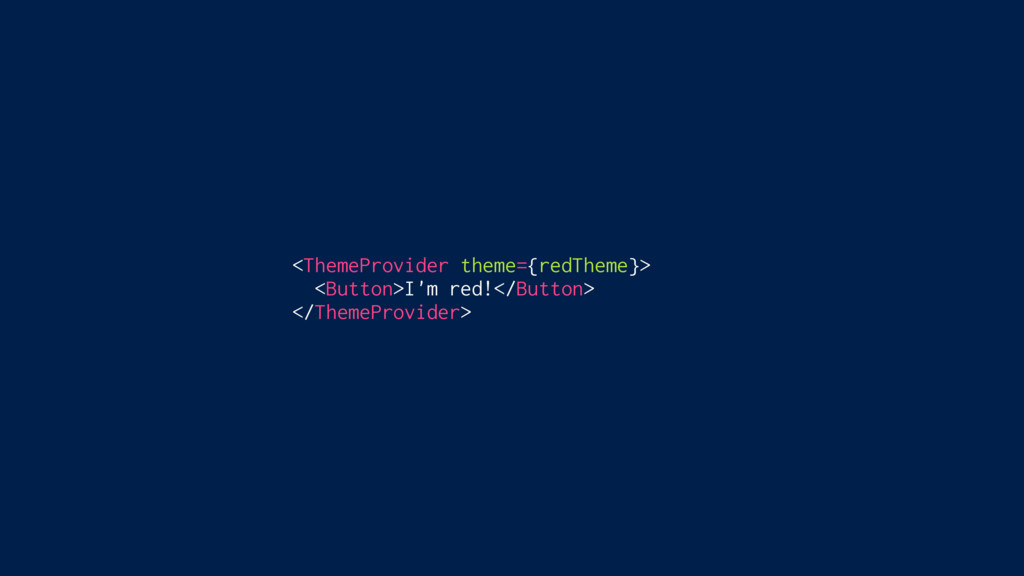
<ThemeProvider theme={redTheme}> <Button>I'm red!</Button> </ThemeProvider>
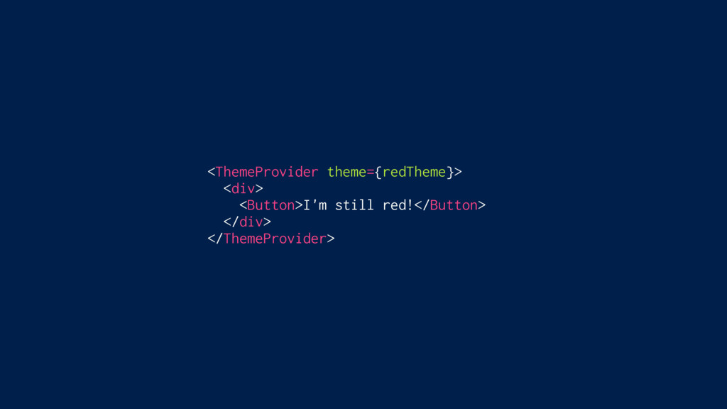
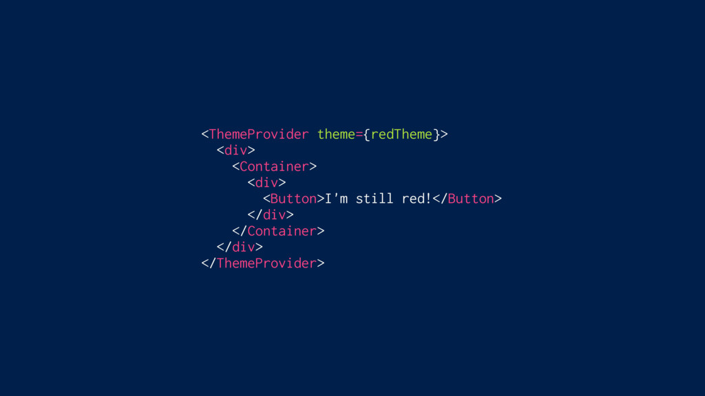
<ThemeProvider theme={redTheme}> <div> <Button>I'm still red!</Button> </div> </ThemeProvider>
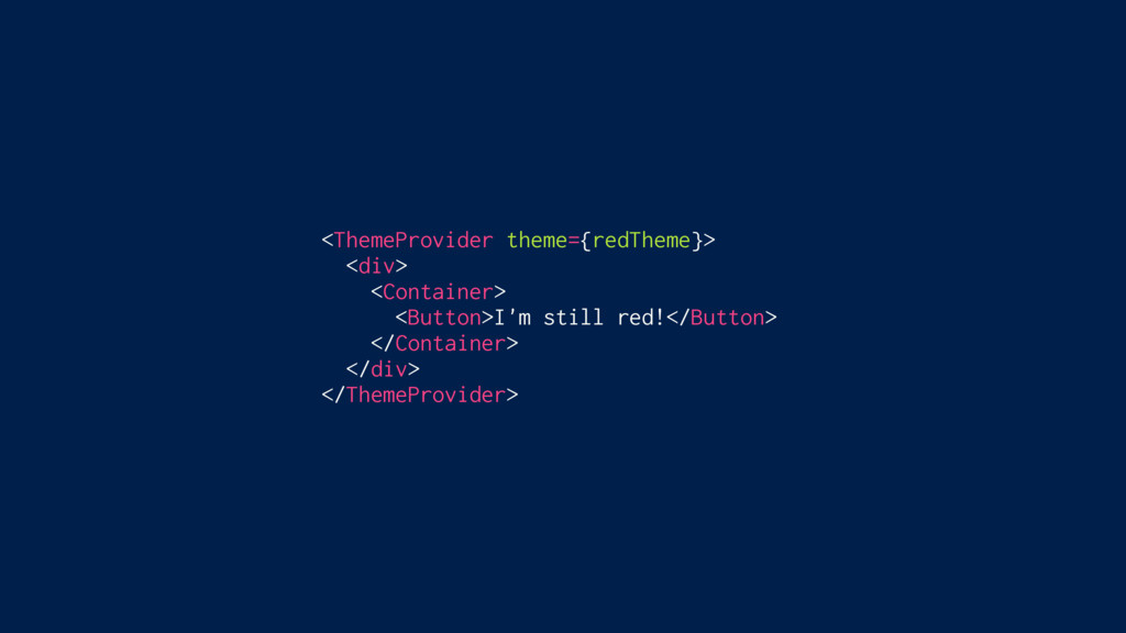
<ThemeProvider theme={redTheme}> <div> <Container> <Button>I'm still red!</Button> </Container> </div> </ThemeProvider>
<ThemeProvider theme={redTheme}> <div> <Container> <div> <Button>I'm still red!</Button> </div> </Container>
</div> </ThemeProvider>
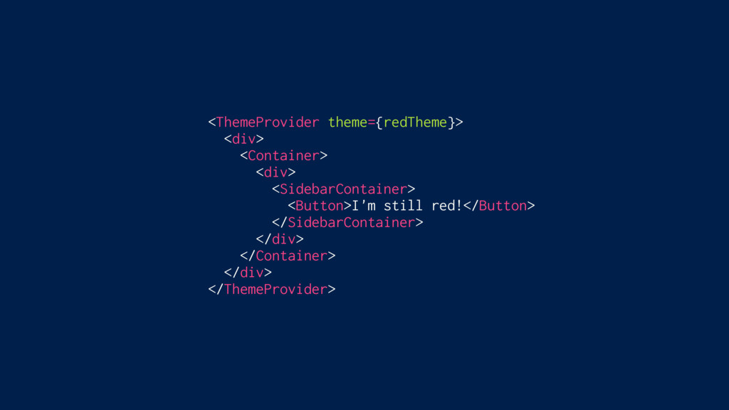
<ThemeProvider theme={redTheme}> <div> <Container> <div> <SidebarContainer> <Button>I'm still red!</Button> </SidebarContainer>
</div> </Container> </div> </ThemeProvider>
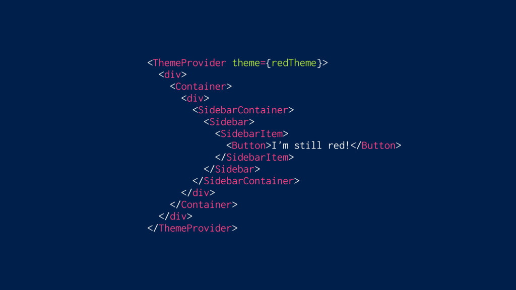
<ThemeProvider theme={redTheme}> <div> <Container> <div> <SidebarContainer> <Sidebar> <Button>I'm still red!</Button>
</Sidebar> </SidebarContainer> </div> </Container> </div> </ThemeProvider>
<ThemeProvider theme={redTheme}> <div> <Container> <div> <SidebarContainer> <Sidebar> <SidebarItem> <Button>I'm still
red!</Button> </SidebarItem> </Sidebar> </SidebarContainer> </div> </Container> </div> </ThemeProvider>
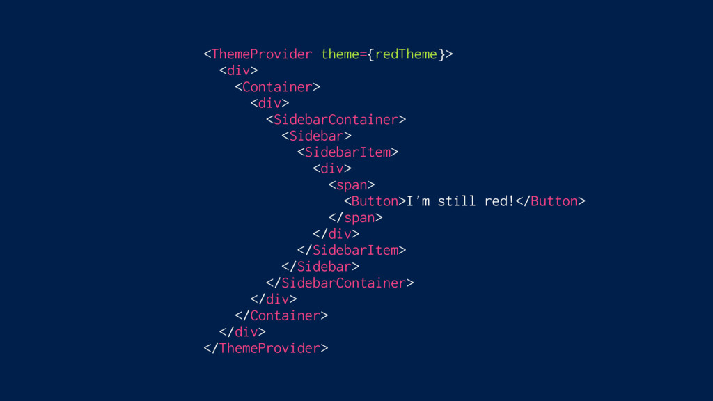
<ThemeProvider theme={redTheme}> <div> <Container> <div> <SidebarContainer> <Sidebar> <SidebarItem> <div> <Button>I'm
still red!</Button> </div> </SidebarItem> </Sidebar> </SidebarContainer> </div> </Container> </div> </ThemeProvider>
<ThemeProvider theme={redTheme}> <div> <Container> <div> <SidebarContainer> <Sidebar> <SidebarItem> <div> <span>
<Button>I'm still red!</Button> </span> </div> </SidebarItem> </Sidebar> </SidebarContainer> </div> </Container> </div> </ThemeProvider>
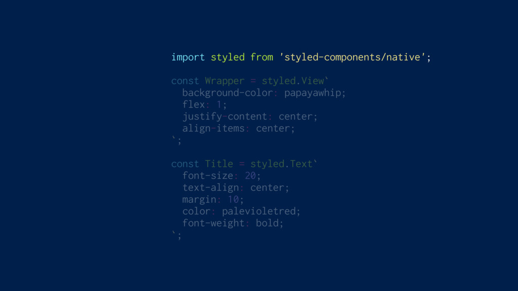
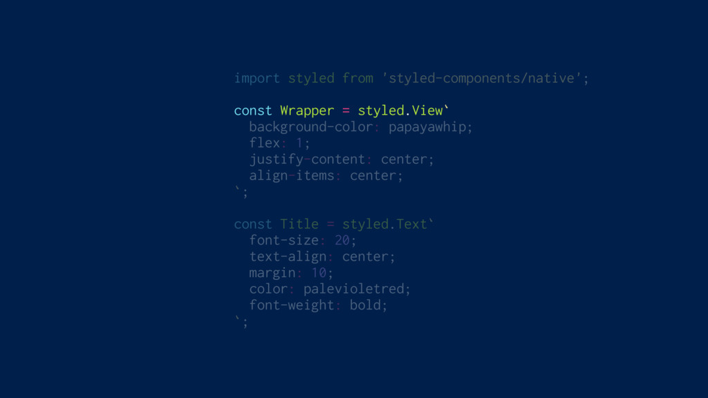
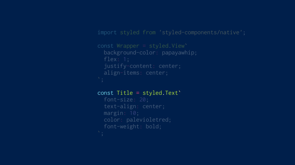
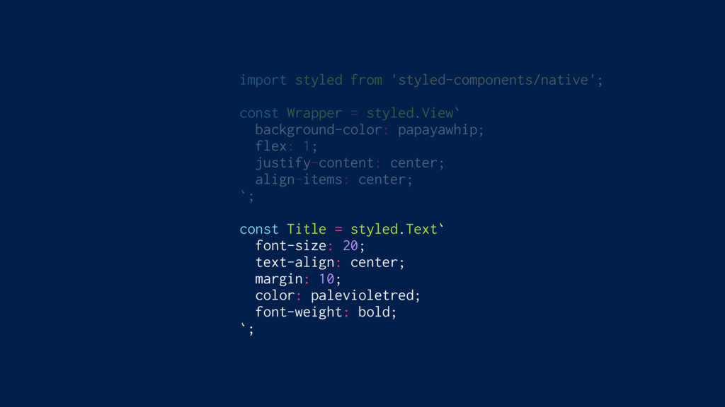
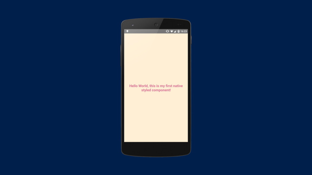
Full ReactNative Support
import styled from 'styled-components/native'; const Wrapper = styled.View` background-color: papayawhip;
flex: 1; justify-content: center; align-items: center; `; const Title = styled.Text` font-size: 20; text-align: center; margin: 10; color: palevioletred; font-weight: bold; `;
import styled from 'styled-components/native'; const Wrapper = styled.View` background-color: papayawhip;
flex: 1; justify-content: center; align-items: center; `; const Title = styled.Text` font-size: 20; text-align: center; margin: 10; color: palevioletred; font-weight: bold; `;
import styled from 'styled-components/native'; const Wrapper = styled.View` background-color: papayawhip;
flex: 1; justify-content: center; align-items: center; `; const Title = styled.Text` font-size: 20; text-align: center; margin: 10; color: palevioletred; font-weight: bold; `;
import styled from 'styled-components/native'; const Wrapper = styled.View` background-color: papayawhip;
flex: 1; justify-content: center; align-items: center; `; const Title = styled.Text` font-size: 20; text-align: center; margin: 10; color: palevioletred; font-weight: bold; `;
import styled from 'styled-components/native'; const Wrapper = styled.View` background-color: papayawhip;
flex: 1; justify-content: center; align-items: center; `; const Title = styled.Text` font-size: 20; text-align: center; margin: 10; color: palevioletred; font-weight: bold; `;
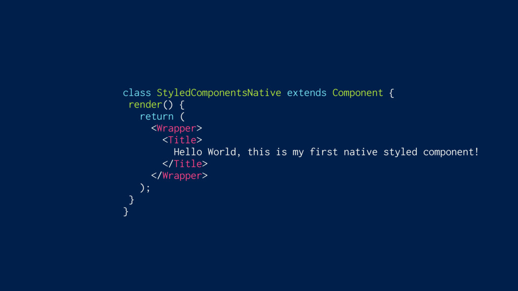
class StyledComponentsNative extends Component { render() { return ( <Wrapper>
<Title> Hello World, this is my first native styled component! </Title> </Wrapper> ); } }
None
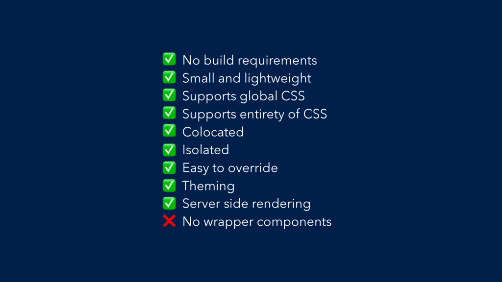
No build requirements Small and lightweight Supports global CSS Supports
entirety of CSS Colocated Isolated Easy to override Theming Server side rendering No wrapper components ✅ ✅ ✅ ✅ ✅ ✅ ✅ ✅ ✅ ❌
Get styling! git checkout 4-styling
 mxstbr
 shinichirokawano
 yoshiki0705
 masayamoriofficial
 giginet
 naokimuroki
 sansan33
 slsops
 lhazy
lhazy
 takaking22
 shinoharata
 takefumiyoshii
 mii3king
 techseoconnect
 jonrohan
 jonoalderson
 inesmontani
 chriscoyier
 mraible
 kastner
 charlesmeaden
 dougneiner
 marktimemedia
 mza
mza
 jlugia