according to en.wikipedia.org Information design is the skill and practice of preparing information so people can use it with efficiency and effectiveness. Where the data is complex or unstructured, a visual representation can express its meaning more clearly to the viewer. information design != information architecture Information design aims to transform data into information and focuses on making it usable and understandable to a wide audience via visual/aural representation. Information architecture aims for good usability by defining the structural design to organise, label and access information.
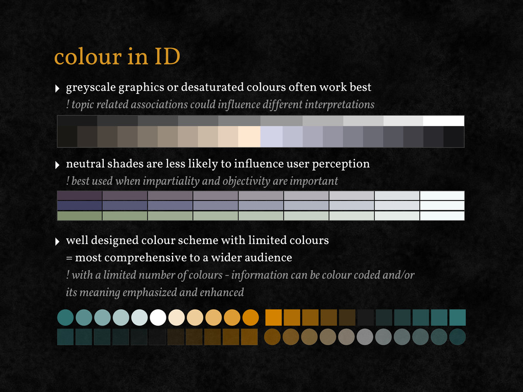
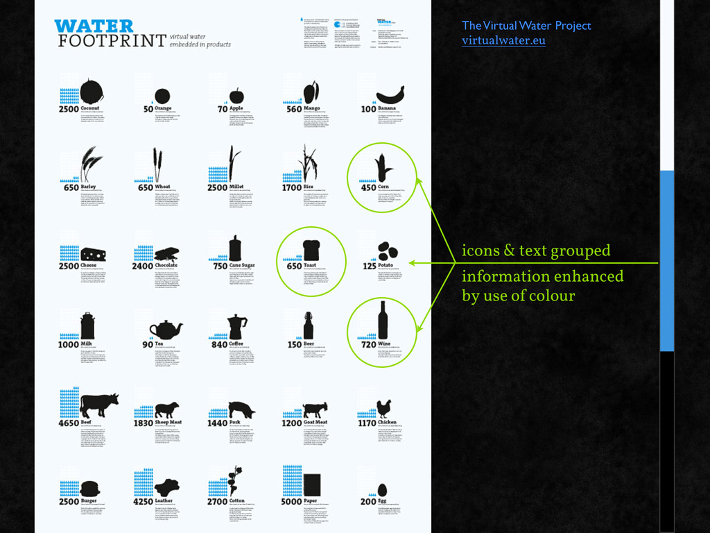
work best ! topic related associations could in!luence di!ferent interpretations ‣ neutral shades are less likely to influence user perception ! best used when impartiality and objectivity are important ‣ well designed colour scheme with limited colours = most comprehensive to a wider audience ! with a limited number of colours - information can be colour coded and/or its meaning emphasized and enhanced
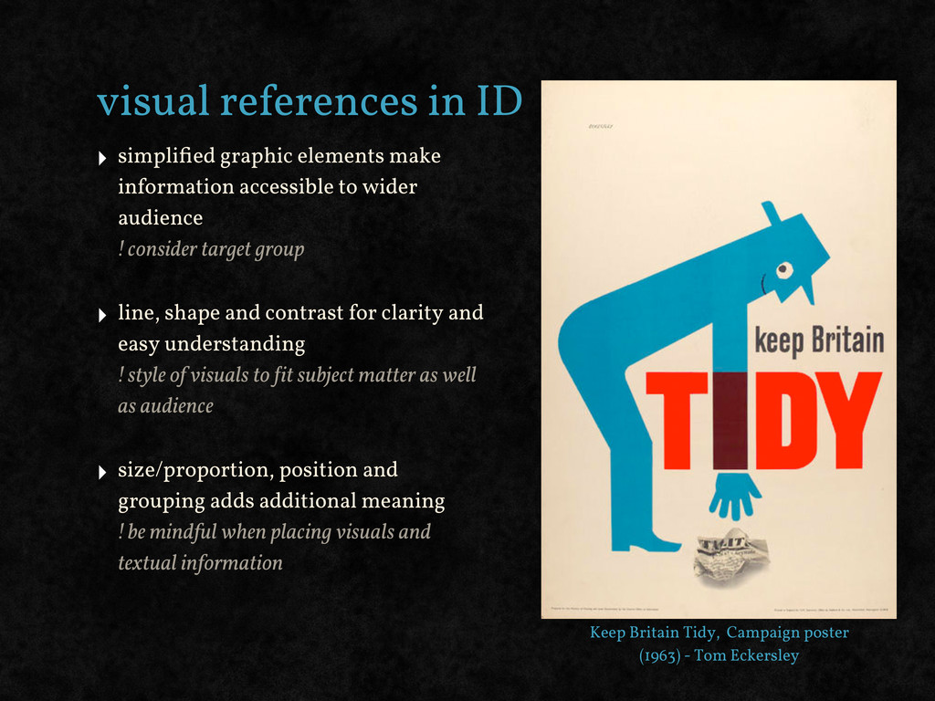
accessible to wider audience ! consider target group ‣ line, shape and contrast for clarity and easy understanding ! style of visuals to !it subject matter as well as audience ‣ size/proportion, position and grouping adds additional meaning ! be mindful when placing visuals and textual information Keep Britain Tidy, Campaign poster (1963) - Tom Eckersley
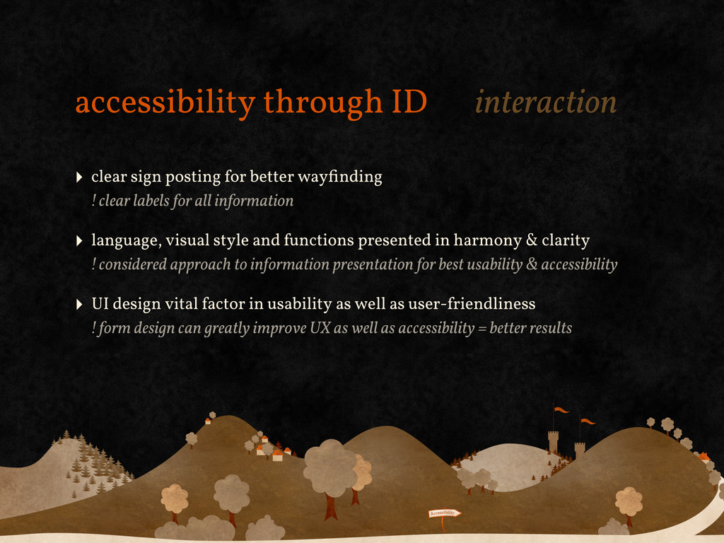
wayfinding ! clear labels for all information ‣ language, visual style and functions presented in harmony & clarity ! considered approach to information presentation for best usability & accessibility ‣ UI design vital factor in usability as well as user-friendliness ! form design can greatly improve UX as well as accessibility = better results
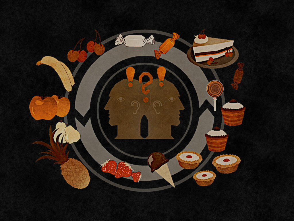
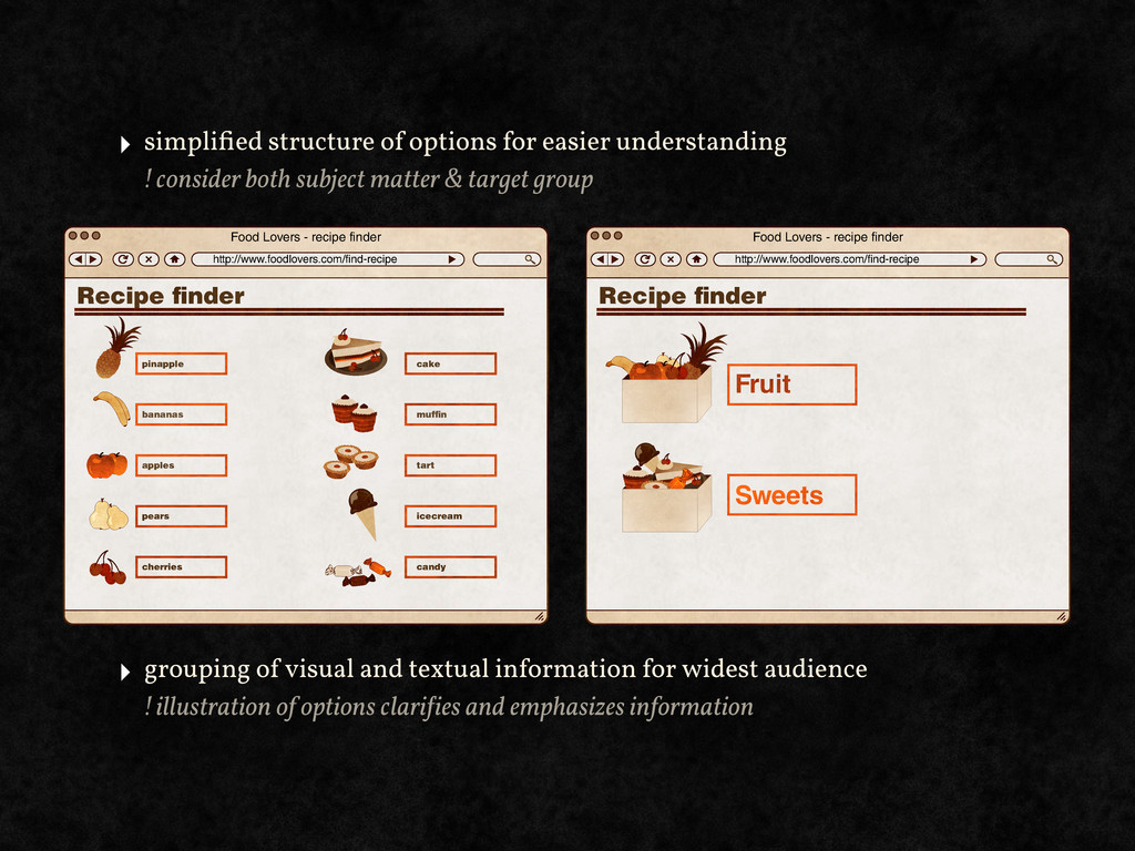
both subject matter & target group Food Lovers - recipe finder http://www.foodlovers.com/find-recipe Recipe nder pinapple cake muf n tart icecream candy bananas apples pears cherries Food Lovers - recipe finder http://www.foodlovers.com/find-recipe Recipe nder Fruit Sweets ‣ grouping of visual and textual information for widest audience ! illustration of options clari!ies and emphasizes information
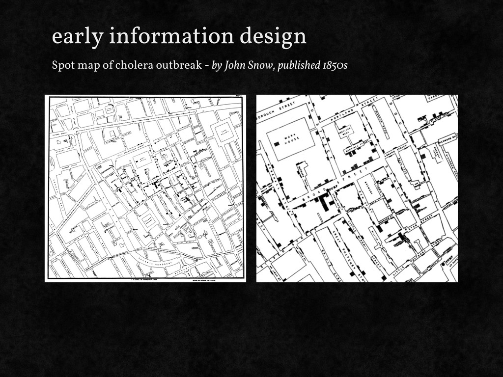
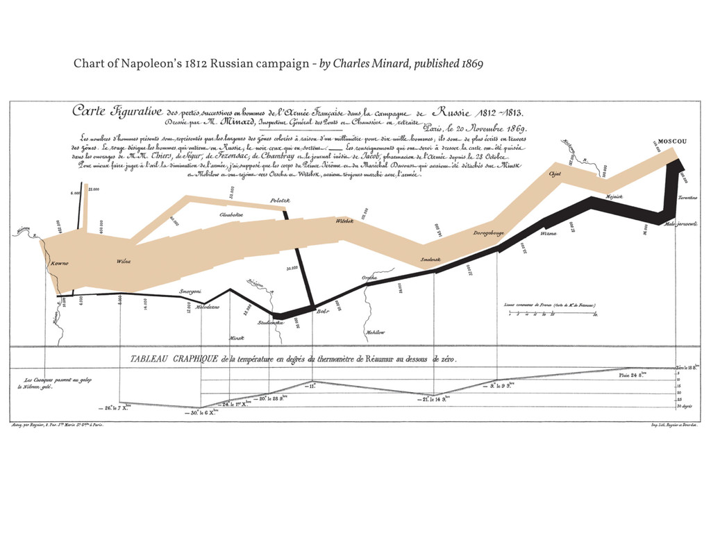
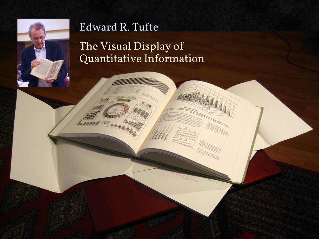
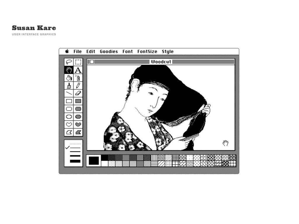
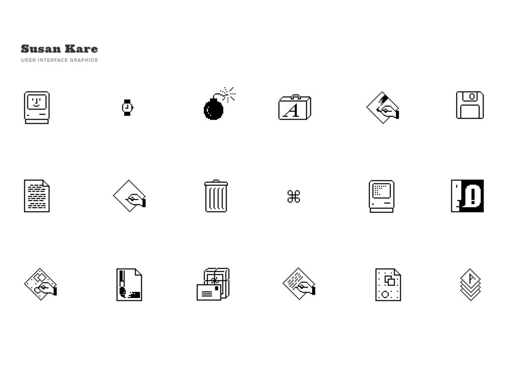
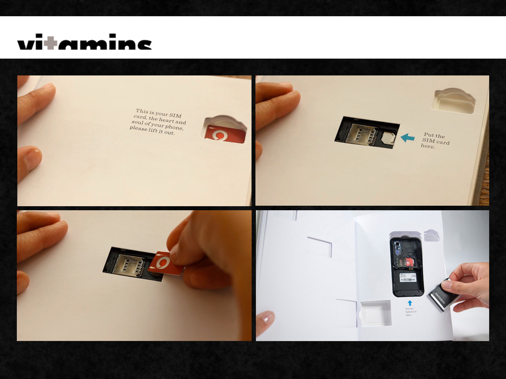
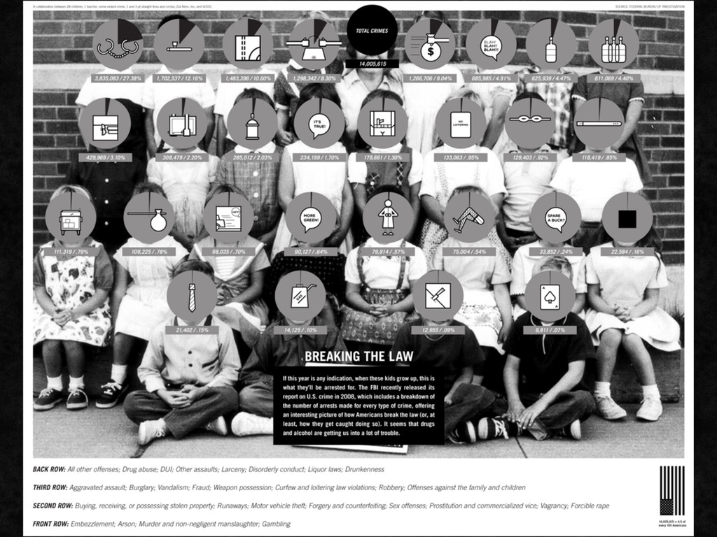
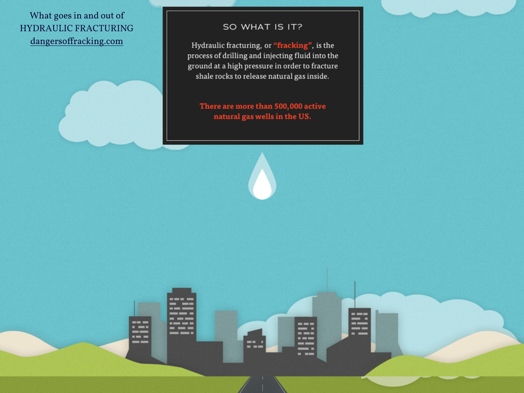
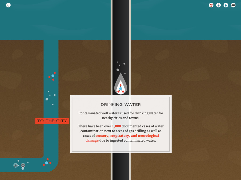
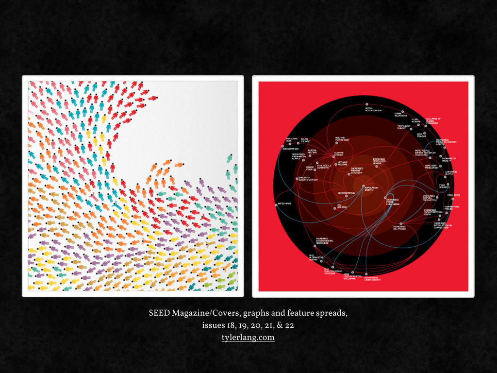
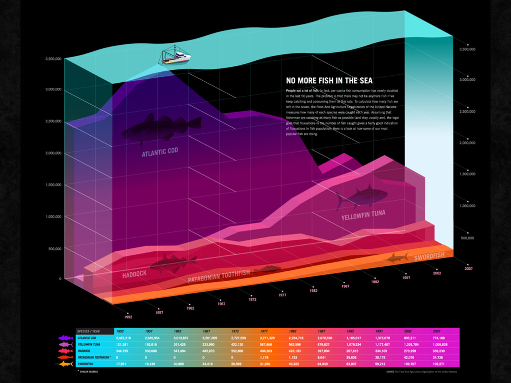
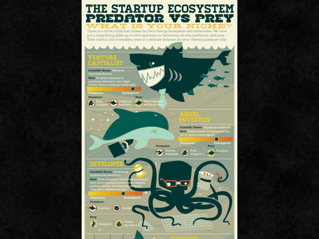
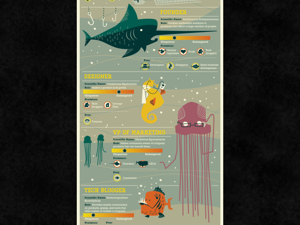
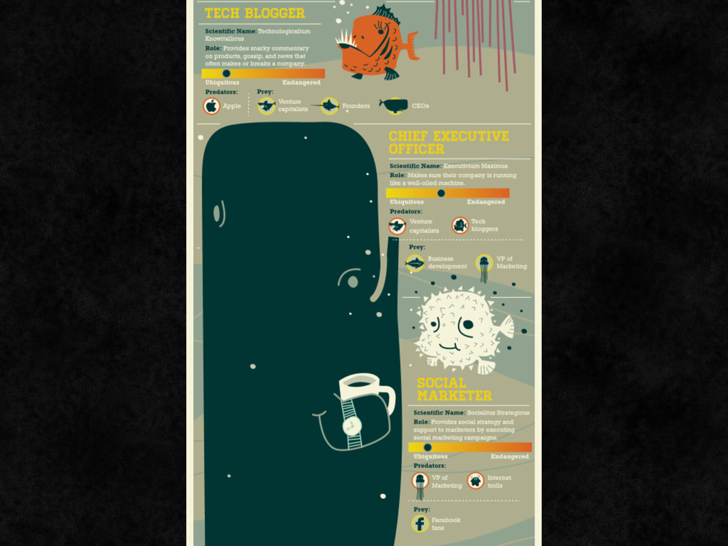
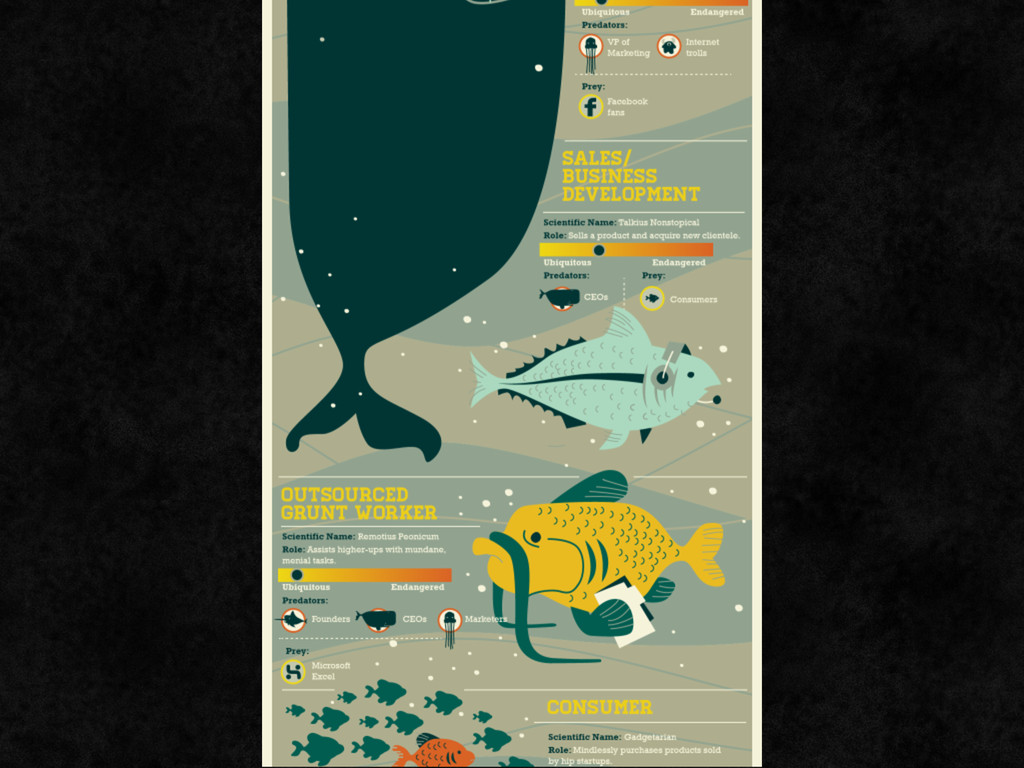
stills from Out of the box, by vitamins design • Spot map of cholera outbreak - by John Snow, published 1850s, via wikimedia • Charles Minard's 1869 chart, via wikimedia • photo: The Visual Display of Quantitative Information by Edward R. Tu#te, by Iwan Gabovitch • photo: Edward Tu#te, via wikimedia • infographic: Transparency: The Most Committed Crimes in the Country on good.is • infographic (poster): The Virtual Water Project - virtualwater.eu • Keep Britain Tidy Campaign poster (1963) - Tom Eckersley • SEED Magazine/Covers, graphs and feature spreads, tylerlang.com • infographic: ‘no more fish in the sea’, via Transparency: Where Are All the Fish? on good.is • infographic: ‘Startup Ecosystem: Predator vs. Prey’, by udemy.com • accessibility graphics, created for Inclusive New Media Design site references • CNN #COP17 ecosphere project • What goes in and out of HYDRAULIC FRACTURING - dangersoffracking.com • huffduffer • Christian Sparrow
![de!inition: information design [referred to as ID throughout this presentation]](https://files.speakerdeck.com/presentations/4f6906e86808e8001f026863/slide_1.jpg)
![Prisca Schmarsow [email protected] graphiceyedea.co.uk @prisca_eyedea](https://files.speakerdeck.com/presentations/4f6906e86808e8001f026863/slide_30.jpg)