Upgrade to Pro — share decks privately, control downloads, hide ads and more …

Front End Workshop 2015

Front End Workshop 2015

After the overview I gave, I went into an hour long talk going over more in-depth topics and did exercises with our summer interns.

Avatar for Rachel Ober

Rachel Ober

June 29, 2015
Tweet

More Decks by Rachel Ober

Other Decks in Programming

Transcript

  1. Agenda • Digging into Sass • Exploring the Rails App

    • Overview of the Pattern Guide • Add new element to the Pattern Guide • Play with CodePen.io • Front End Resources
  2. .sass vs .scss body { font: 100% Helvetica, sans-serif; color:

    #333; } body font: 100% Helvetica, sans-serif color: #333
  3. Variables $font-stack: Helvetica, sans-serif; $primary-color: #333; body { font: 100%

    $font-stack; color: $primary-color; } body { font: 100% Helvetica, sans-serif; color: #333; }
  4. Nesting nav { ul { margin: 0; padding: 0; list-style:

    none; } li { display: inline-block; } a { display: block; padding: 6px 12px; text-decoration: none; } } nav ul { margin: 0; padding: 0; list-style: none; } nav li { display: inline-block; } nav a { display: block; padding: 6px 12px; text-decoration: none; }
  5. Partials & Imports // _reset.scss html, body, ul, ol {

    margin: 0; padding: 0; } // base.scss @import 'reset'; body { font: 100% Helvetica, sans-serif; background-color: #efefef; }
  6. Partials cont. // base.css html, body, ul, ol { margin:

    0; padding: 0; } body { font: 100% Helvetica, sans-serif; background-color: #efefef; }
  7. Mixins @mixin box-sizing( $type: border-box ) { -webkit-box-sizing: $type; -moz-box-sizing:

    $type; -o-box-sizing: $type; -ms-box-sizing: $type; box-sizing: $type; } .border-box { @include box-sizing(border-box); } .border-box { -webkit-box-sizing: border-box; -moz-box-sizing: border-box; -o-box-sizing: border-box; -ms-box-sizing: border-box; box-sizing: border-box; }
  8. @extends & Functions // circle prototype %color-palette-circle { background-clip: padding-box;

    background-color: #a38546; border-radius: 50px; color: #ffffff; display: inline-block; font-size: 16px; height: 100px; line-height: 100px; margin: 0; padding: 0; position: relative; text-align: center; text-decoration: none !important; text-transform: none; width: 100px; } // colors $colors: ( white: #ffffff, black: #000000, driftwood: #a38546, charcoal: #111111, mine-shaft: #333333, emperor: #555555, boulder: #777777, silver: #bbbbbb, alto: #dddddd, gallery: #eeeeee, ); // circle mixin @mixin circle($background-color) { $background-color: $white !default; @extend %color-palette-circle; background-color: $background-color; } // iterate over color map @each $color, $hex in $colors { .color-palette-circle-#{$color} { @include circle($hex) } } // print out colored circles .color-palette-circle-driftwood = "#a38546" .color-palette-circle-charcoal = "#111111" .color-palette-circle-mine-shaft = "#333333" .color-palette-circle-emperor = "#555555" .color-palette-circle-boulder = "#777777" .color-palette-circle-silver = "#bbbbbb" .color-palette-circle-alto = "#dddddd" .color-palette-circle-gallery = "#eeeeee"
  9. app > styles • ▾ app/ • ▸ controllers/ •

    ▸ helpers/ • ▸ javascripts/ • ▸ jobs/ • ▸ models/ • ▸ presenters/ • ▾ styles/ • ▸ admin/ • ▸ compass/ • ▸ controls/ • ▸ design/ • ▸ events/ • ▸ global/ • ▸ ie/ • cmsable_landing_pages.scss • linkshare.scss • messaging.scss • pages.scss • print.scss • qadmin.scss • reply.scss • responsive.scss • screen.scss • styleguide-wip.scss • styleguide.scss • ▸ landing_pages/ • ▸ messaging/ • ▸ mobile/ • ▸ pages/ • ▸ papers/ • ▸ pattern-guide/ • ▸ photos/ • ▸ promos/ • ▸ responsive/ • ▸ static/ • ▸ styleguide/ • ▸ ui/ • ▸ vendor/ • .DS_Store • admin.scss
  10. app > styles • ▾ styles/ • ▸ admin/ •

    ▸ compass/ • ▸ controls/ • ▸ design/ • ▸ events/ • ▸ global/ • ▸ ie/ • ▸ landing_pages/ • ▸ messaging/ • ▸ mobile/ • ▸ pages/ • ▸ papers/ • ▸ pattern-guide/ • ▸ photos/ • ▸ promos/ • ▸ responsive/ • ▸ static/ • ▸ styleguide/ • ▸ ui/ • ▸ vendor/ • admin.scss • cmsable_landing_pages.scss • linkshare.scss • messaging.scss • pages.scss • print.scss • qadmin.scss • reply.scss • responsive.scss • screen.scss • styleguide-wip.scss • styleguide.scss
  11. pages.scss @import "global/mixins"; @import "global/colors"; @import "styleguide/grids"; // Pages @import

    "ui/containers"; @import "pages/reply"; @import "pages/event"; @import "pages/event-design"; @import "pages/account"; @import "pages/credit_cards"; @import "pages/buy_coins"; @import "pages/invoices"; @import "pages/cart/foundation"; @import "pages/cart/line_items"; @import "pages/cart/promo_codes"; @import "pages/postbox"; @import "pages/help"; @import "pages/import"; //continued… @import "pages/logo"; @import "pages/design-credits"; @import "pages/unsubscribe"; @import "pages/promo"; @import "pages/partners"; @import "pages/legacy"; @import "pages/eventbrite"; @import "pages/mobile"; @import "pages/status"; @import "pages/dashboard"; @import “pages/sample_packs";
  12. generated files • ▾ stylesheets/ • ▾ admin/ • github.css

    • promo.css • ▾ design/ • design.css • ▾ mobile/ • simple.css • ▾ pages/ • address_book.css • catalog_collection.css • checkout_workflow.css • delivery.css • duo_auth.css • giveaway.css • holiday-style-guide.css • holiday_landing.css • home.css • host_nav.css • invoice.css • invoice.print.css • landing-banner.css • landing_pages.css • landing_pages_mobile_home.css • lofi_new_reply_page.css • new_reply_page.css • pds_landing.css • relationship_profile.css • sitemap.css • splash.css • yahoo_terms.css • ▾ papers/ • design_partners.css • ▾ pattern-guide/ • pattern-guide.css • ▾ responsive/ • ▾ details/ • details.css • ▾ event_page/ • event_page.css • ▾ paper_browser/ • paper_browser.css • ▾ static/ • app_takeover.css • photos_marketing.css • ▸ vendor/ • admin.css • cmsable_landing_pages.css • linkshare.css • messaging.css • pages.css • print.css • qadmin.css • reply.css • responsive.css • screen.css • styleguide-wip.css • styleguide.css
  13. Pattern Guide • “Modules” of code and style fitting the

    Brand designed to be reusable. • Available as a Ruby gem or npm package to be included in your apps.
  14. Button Prototype %button { @extend .garamond; -webkit-font-smoothing: antialiased; -webkit-touch-callout: none;

    background-clip: padding-box; border: 1px solid transparent; border-radius: 0.2em; cursor: pointer; display: inline-block; font-size: 18px; font-weight: normal; height: 40px; line-height: 42px; // This is a visual fix for lining up the text vertically margin: 0; padding: 0 24px; position: relative; text-align: center; text-decoration: none !important; text-transform: none; vertical-align: middle; @include box-sizing(border-box); @include user-select(none); }
  15. Button Mixin // Mixin for button that can be used

    to create new variants of the // style. // // Cutomizable options: // // $background-color - hex value // $border-color - hex value or "none" // $color - hex value @mixin button($background-color, $border-color, $color) { @extend %button; background-color: $background-color; border-color: $border-color; color: $color !important; @include box-sizing(border-box); &:active, &:hover { @if lightness($background-color) > 90% { background-color: darken($background-color, 5%); } @else if lightness($background-color) >= 20% { background-color: darken($background-color, 15%); } @else { background-color: lighten($background-color, 15%); } } &.is-disabled, &[disabled]{ background-color: $alto; border-color: $silver; color: $silver !important; cursor: default; pointer-events: none; } }
  16. Generating button classes // A dark grey button with white

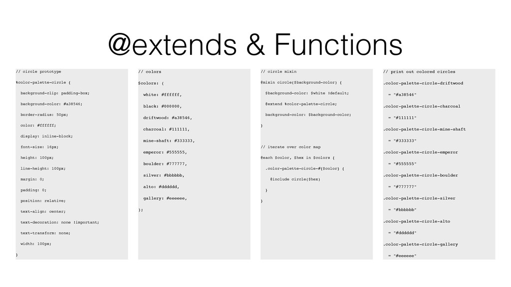
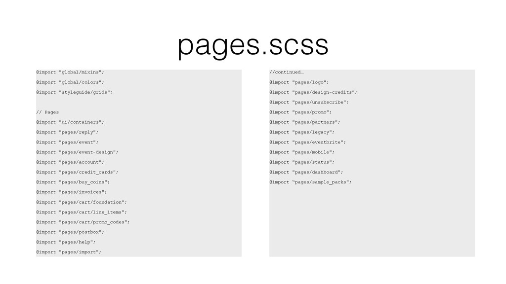
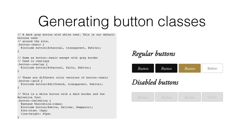
    text. This is our default buttons used // around the site. .button--basic { @include button($charcoal, transparent, $white); } // Same as button--basic except with grey border // Used in overlays .button--overlay { @include button($charcoal, $alto, $white); } // These are different color versions of button--basic .button--gold { @include button($driftwood, transparent, $white); } // This is a white button with a dark border and the Helvetica font .button--helvetica { @extend %helvetica-roman; @include button($white, $silver, $emperor); font-size: 14px; line-height: 40px; }
  17. Front End-y Mailing Lists • JavaScript Weekly • Responsive Design

    Weekly (PP Workshop in a few weeks!) • Web Design Weekly • Front-end Dev Weekly • HTML5 Weekly • CSS Weekly