Upgrade to Pro
— share decks privately, control downloads, hide ads and more …
Speaker Deck
Features
Speaker Deck
PRO
Sign in
Sign up for free
Search
Search
Using Tomorrow's CSS Today
Search
Brian Graves
October 30, 2015
Design
130
2
Share
Embed
Copy iframe code
Copy JS code
Copy link
Start on current slide
Using Tomorrow's CSS Today
Brian Graves
October 30, 2015
More Decks by Brian Graves
See All by Brian Graves
Using Tomorrow's CSS Today
briangraves
0
20k
Using Tomorrow's CSS Today
briangraves
1
150
Using Tomorrow's CSS Today
briangraves
0
340
Using Tomorrow's CSS Today [Email]
briangraves
1
99
Sweating The Small Stuff
briangraves
0
88
Winning the Design Battle on Every Screen
briangraves
0
110
Other Decks in Design
See All in Design
もう迷わない!“なんとなく”を卒業するフォントの選び方【村田俊英】
toshihidemurata
0
760
言幹と言葉(Stems & Leaves)
kakukoki
0
150
where_imagination_ends_ai_begins.pdf
r5ni4
0
240
社長の宿題への回答 「新卒×AI」が生み出す価値
saki822
2
180
つくり方を変えていく | change-how-we-build
mottox2
2
1.4k
絵や写真から学ぶ、要素がもたらす副作用
kspace
0
430
From the Visible Crossroads: Turning Outputs into Outcomes
takaikanako
2
1.5k
【優秀賞+特別賞】くまモン食いしん坊弁当「くまモンの魔法の柑橘弁当」最終審査資料
shoko_seven11
0
220
「見せる」登壇資料デザインの極意
takanorip
4
1.2k
デザインコンテキストのバトンをつなぐ—AI時代のプロダクトマネジメント
kumanoayumi
6
1.2k
セブンデックス プロジェクト事例 / innovation Scenes
sevendex
1
1.4k
Rethinking IFUs: What Board Game Rulebooks Contribute to IFU Usability
deadlinepoet
0
340
Featured
See All Featured
Digital Projects Gone Horribly Wrong (And the UX Pros Who Still Save the Day) - Dean Schuster
uxyall
1
2.1k
Balancing Empowerment & Direction
lara
6
1.2k
Applied NLP in the Age of Generative AI
inesmontani
PRO
4
2.4k
Bridging the Design Gap: How Collaborative Modelling removes blockers to flow between stakeholders and teams @FastFlow conf
baasie
0
620
GitHub's CSS Performance
jonrohan
1033
470k
How STYLIGHT went responsive
nonsquared
100
6.2k
How to Grow Your eCommerce with AI & Automation
katarinadahlin
PRO
1
230
Technical Leadership for Architectural Decision Making
baasie
3
440
Intergalactic Javascript Robots from Outer Space
tanoku
273
27k
[RailsConf 2023 Opening Keynote] The Magic of Rails
eileencodes
31
10k
HDC tutorial
michielstock
2
750
The Director’s Chair: Orchestrating AI for Truly Effective Learning
tmiket
1
220
Transcript
None
Brian Graves @briangraves
None
None
None
None
None
None
None
None
None
None
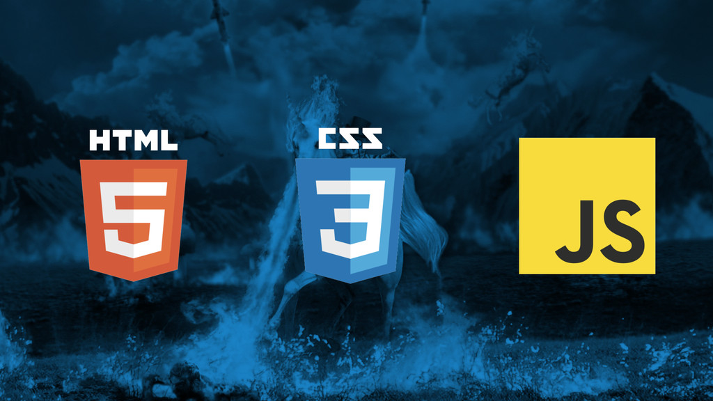
The Web
None
Tables
Absolute Positioning / Floats / Inline-Block
Flexbox / Columns
CSS in 2015 is Amazing.
WHERE HAVE WE BEEN?
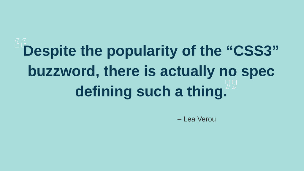
There is No CSS3! And other facts about how standards
are made.
Despite the popularity of the “CSS3” buzzword, there is actually
no spec defining such a thing. – Lea Verou
None
None
Animation
Typography
Layout
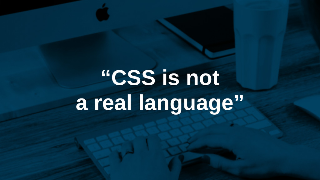
“CSS is not a real language”
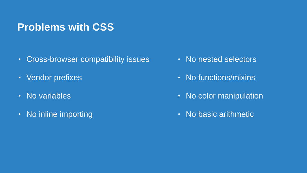
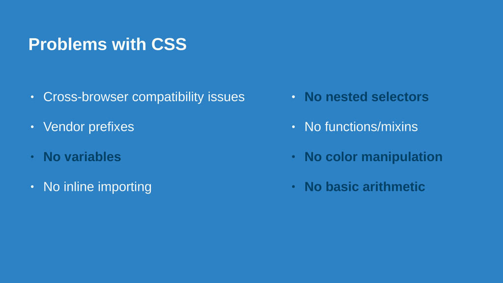
Problems with CSS • Cross-browser compatibility issues • Vendor prefixes
• No variables • No inline importing • No nested selectors • No functions/mixins • No color manipulation • No basic arithmetic
Things That Make Our Lives Easier
Rise of the Preprocessors. How we filled in the gaps.
None
None
None
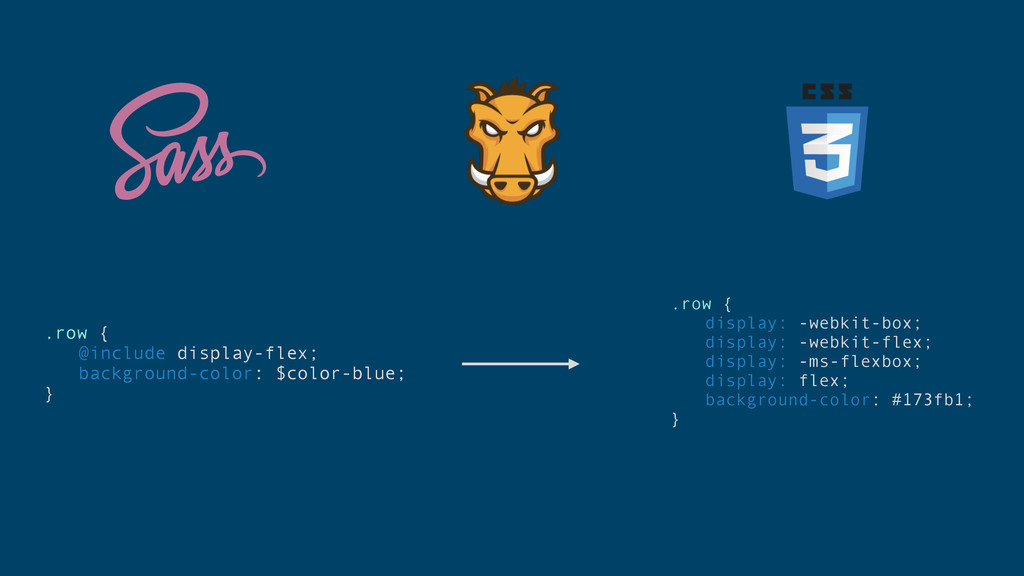
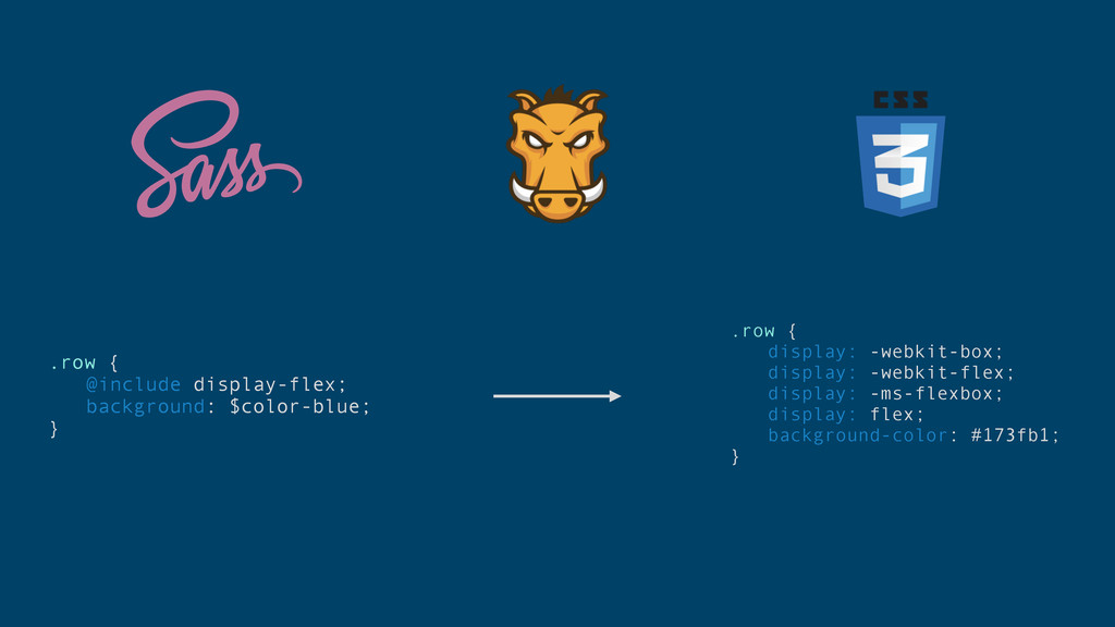
.row { @include display-flex; background-color: $color-blue; } .row { display:
-webkit-box; display: -webkit-flex; display: -ms-flexbox; display: flex; background-color: #173fb1; }
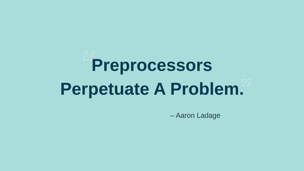
Do Preprocessors Solve The Problem?
Preprocessors Perpetuate A Problem. – Aaron Ladage
More & More Layers of Abstraction
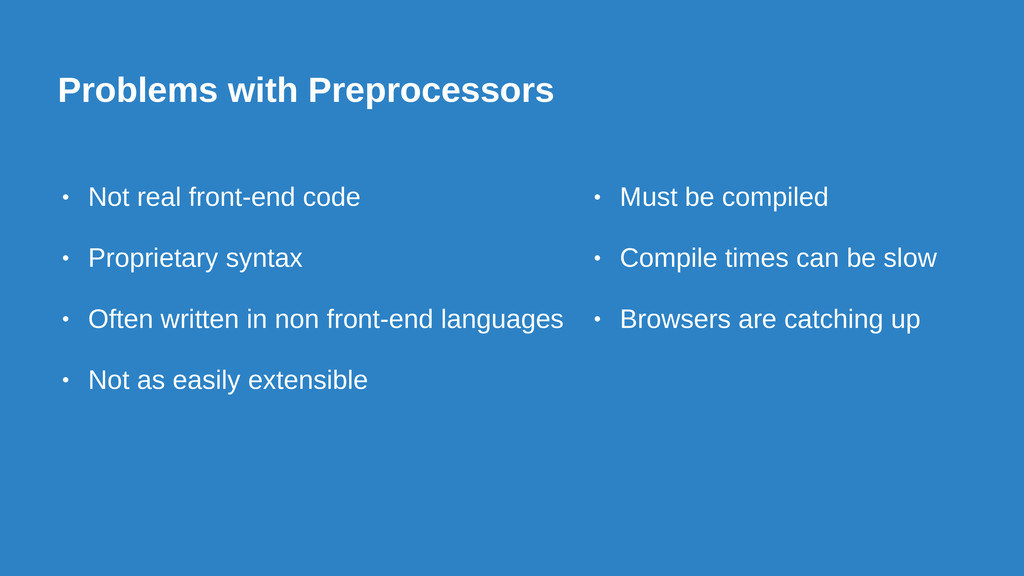
Problems with Preprocessors • Not real front-end code • Proprietary
syntax • Often written in non front-end languages • Not as easily extensible • Must be compiled • Compile times can be slow • Browsers are catching up
Preprocessors? Where we’re going, we don’t need preprocessors.
THE FUTURE OF CSS IS NOW
Variables
Color Functions
Nesting
Custom Media Queries
PostCSS
.row { @include display-flex; background: $color-blue; } .row { display:
-webkit-box; display: -webkit-flex; display: -ms-flexbox; display: flex; background-color: #173fb1; }
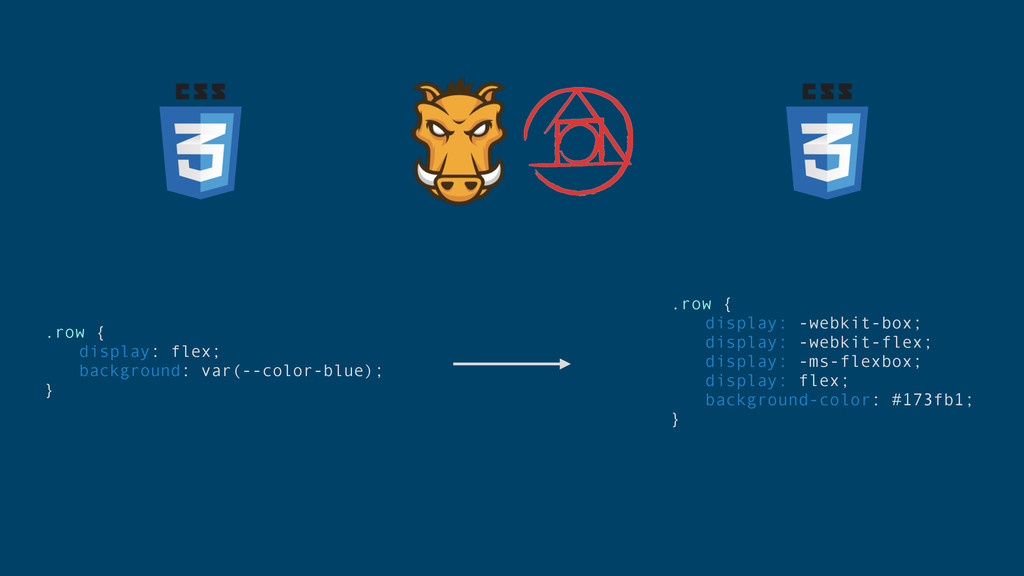
.row { display: flex; background: var(--color-blue); } .row { display:
-webkit-box; display: -webkit-flex; display: -ms-flexbox; display: flex; background-color: #173fb1; }
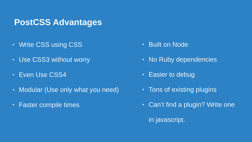
PostCSS Advantages • Write CSS using CSS • Use CSS3
without worry • Even Use CSS4 • Modular (Use only what you need) • Faster compile times • Built on Node • No Ruby dependencies • Easier to debug • Tons of existing plugins • Can’t find a plugin? Write one in javascript.
Autoprefixer
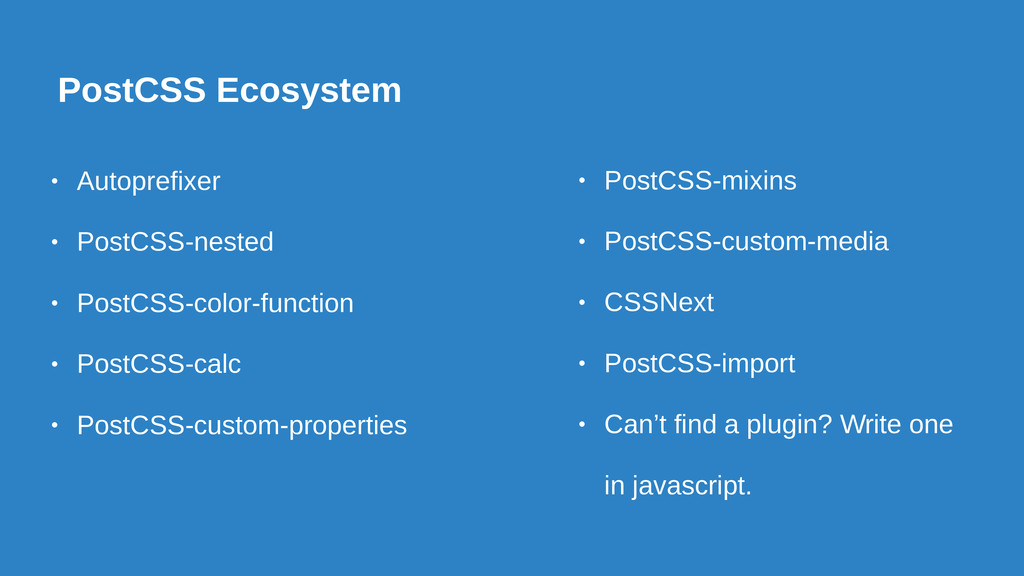
PostCSS Ecosystem • Autoprefixer • PostCSS-nested • PostCSS-color-function • PostCSS-calc
• PostCSS-custom-properties • PostCSS-mixins • PostCSS-custom-media • CSSNext • PostCSS-import • Can’t find a plugin? Write one in javascript.
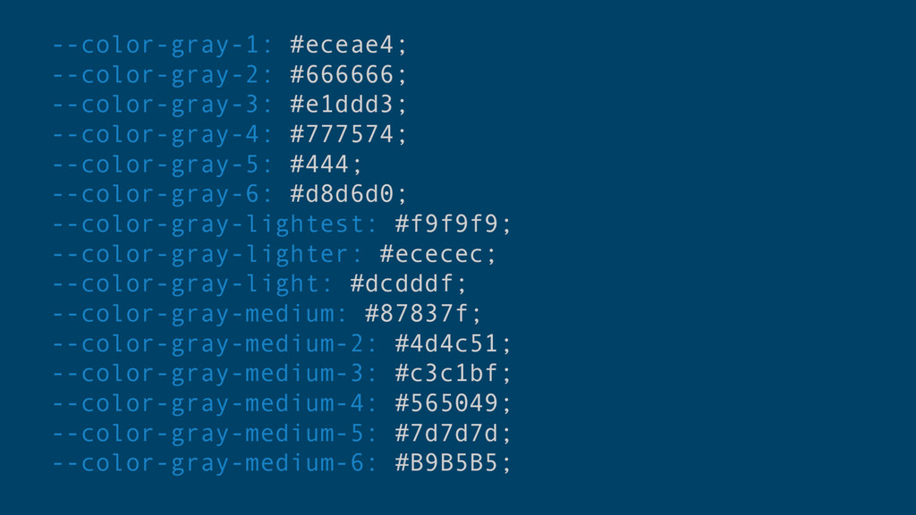
Variables
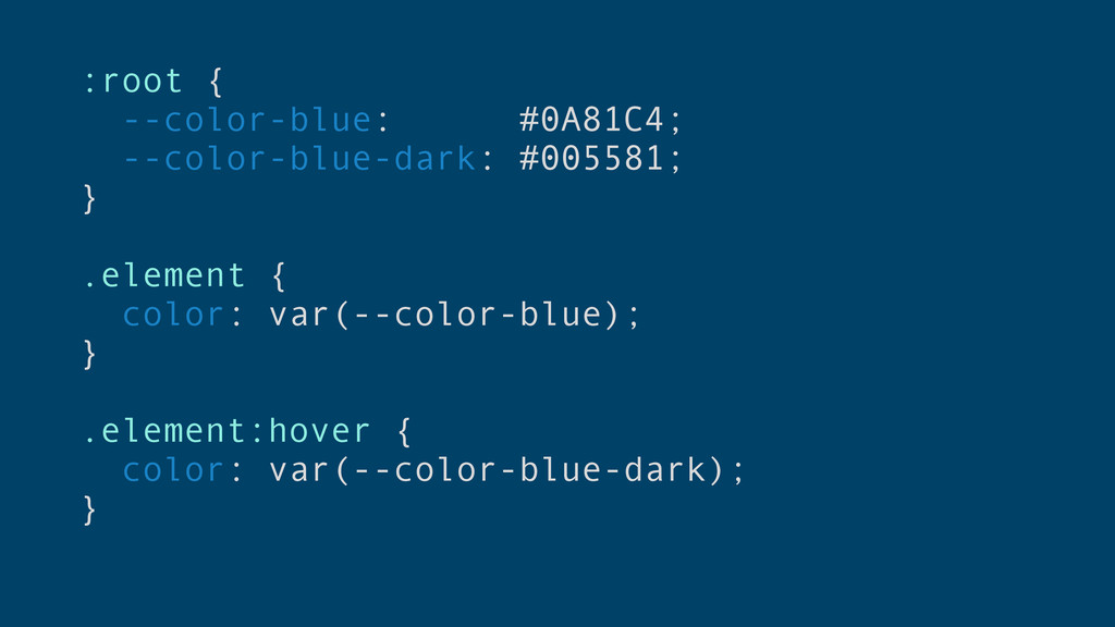
:root { --color-blue: #0A81C4; --color-blue-dark: #005581; } .element { color:
var(--color-blue); } .element:hover { color: var(--color-blue-dark); }
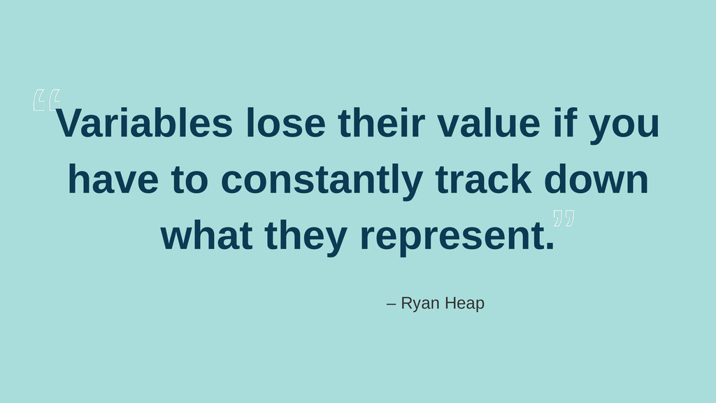
Variables lose their value if you have to constantly track
down what they represent. – Ryan Heap
None
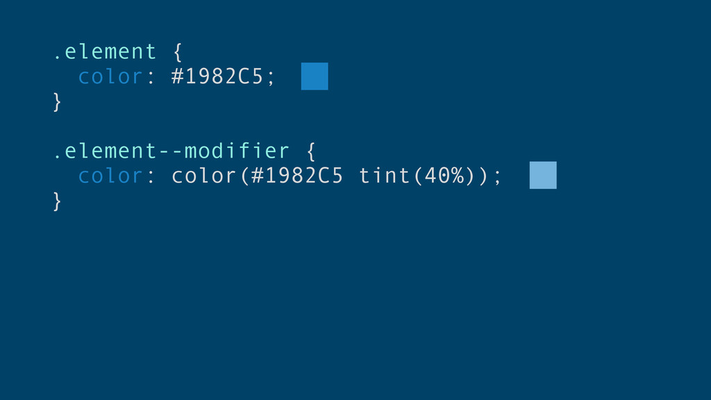
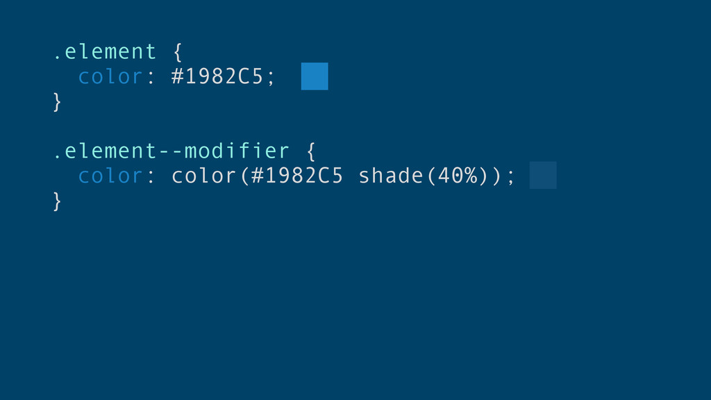
Color Functions
.element { color: #1982C5; } .element--modifier { color: color(#1982C5 tint(40%));
}
.element { color: #1982C5; } .element--modifier { color: color(#1982C5 shade(40%));
}
CSS Color Functions • Tints & Shades • RGBA Adjustment
• HSL/HWB Adjustment • Color Blending (blend & blenda) • Guarantee Contrast
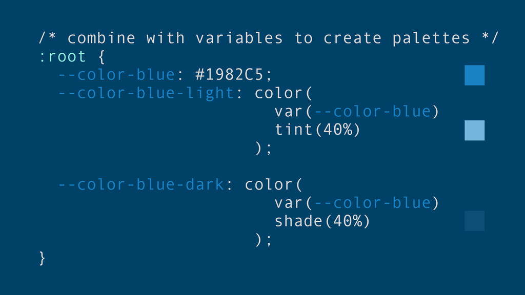
/* combine with variables to create palettes */ :root {
--color-blue: #1982C5; --color-blue-light: color( var(--color-blue) tint(40%) ); --color-blue-dark: color( var(--color-blue) shade(40%) ); }
/* map variables to variables */ :root { --color-text: var(--color-blue);
--color-text-light: color( var(--color-text) tint(40%) ); --color-text-dark: color( var(--color-text) shade(40%) ); }
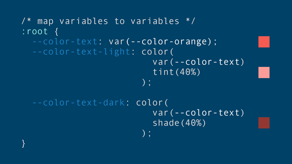
/* map variables to variables */ :root { --color-text: var(--color-orange);
--color-text-light: color( var(--color-text) tint(40%) ); --color-text-dark: color( var(--color-text) shade(40%) ); }
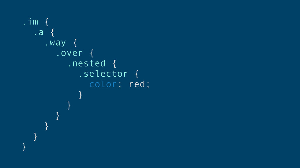
Nesting
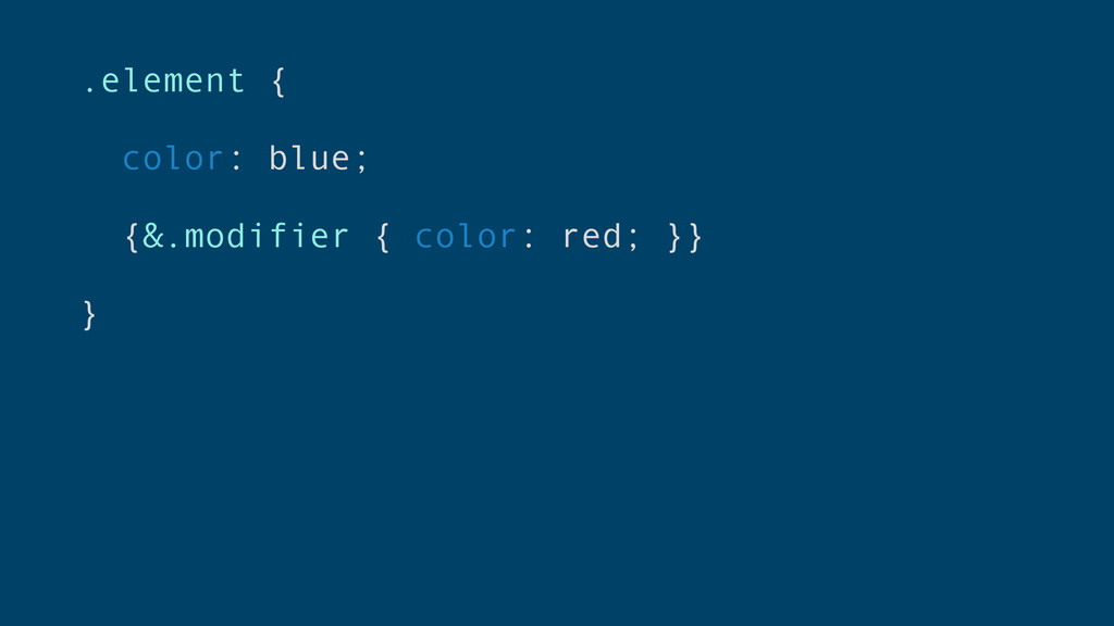
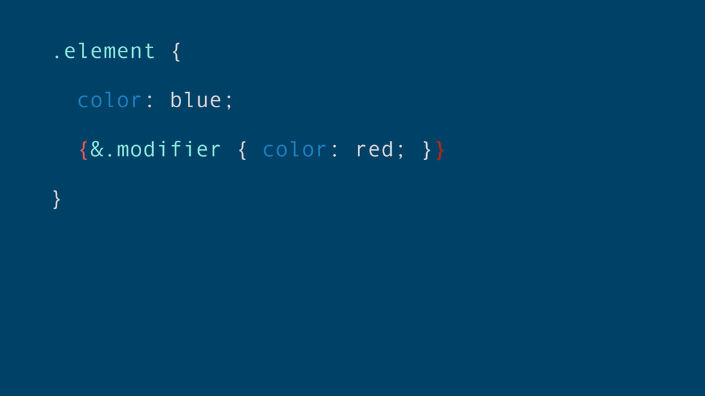
.element { color: blue; {&.modifier { color: red; }} }
.element { color: blue; {&.modifier { color: red; }} }
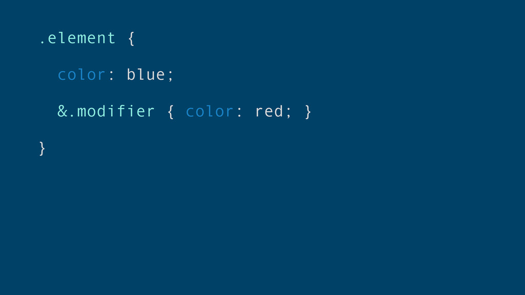
.element { color: blue; &.modifier { color: red; } }
.im { .a { .way { .over { .nested {
.selector { color: red; } } } } } }
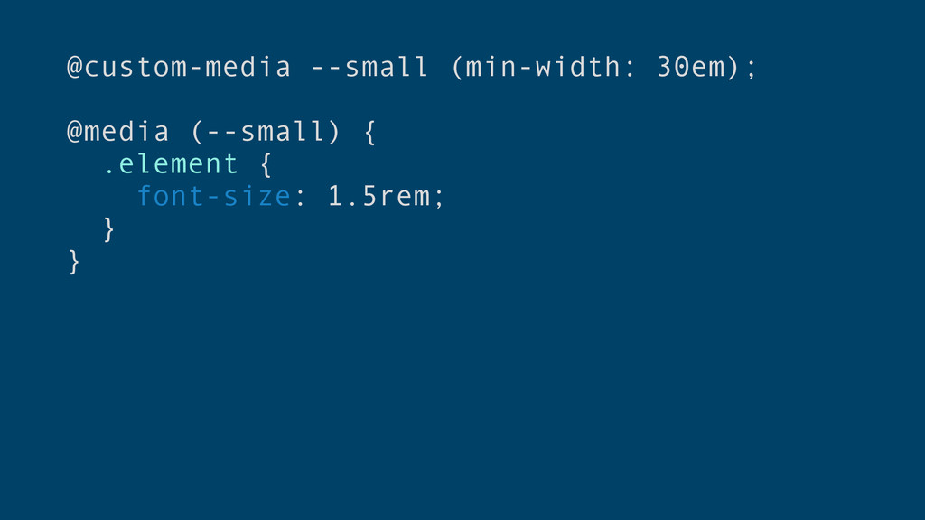
Custom Media Queries
@custom-media --small (min-width: 30em); @media (--small) { .element { font-size:
1.5rem; } }
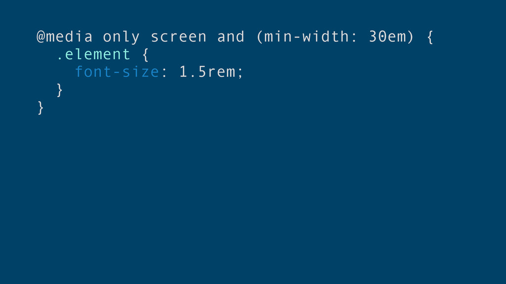
@media only screen and (min-width: 30em) { .element { font-size:
1.5rem; } }
@custom-media --small (min-width: 30em); @media (--small) { .element { font-size:
1.5rem; } }
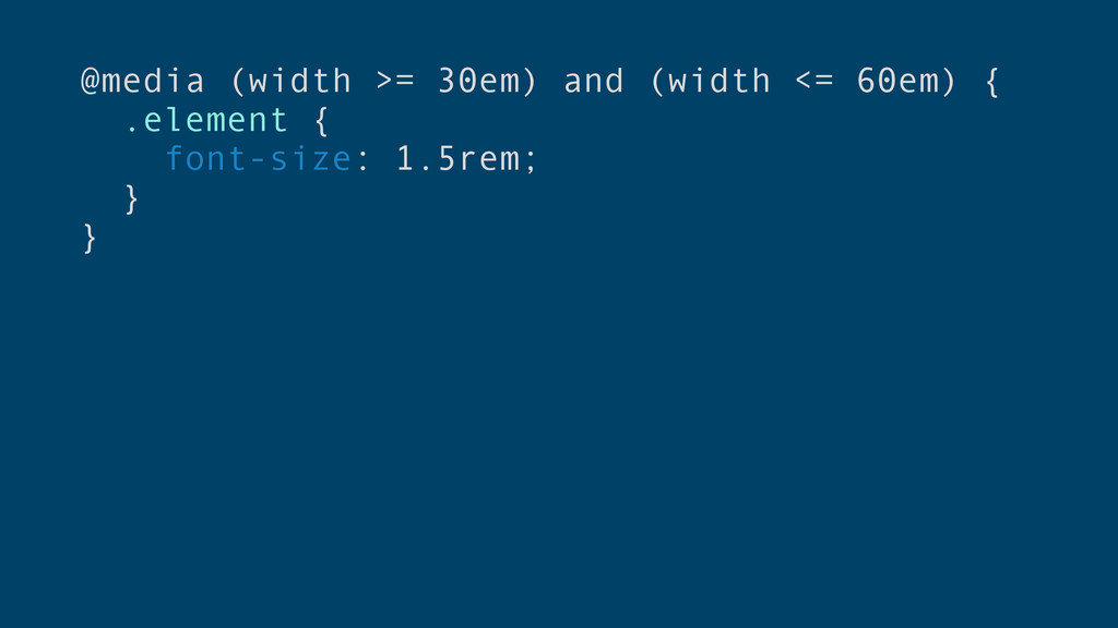
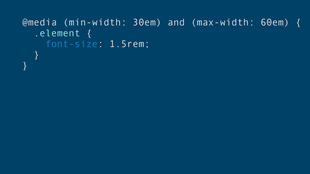
New Media Query Syntax
@media (width >= 30em) and (width <= 60em) { .element
{ font-size: 1.5rem; } }
@media (min-width: 30em) and (max-width: 60em) { .element { font-size:
1.5rem; } }
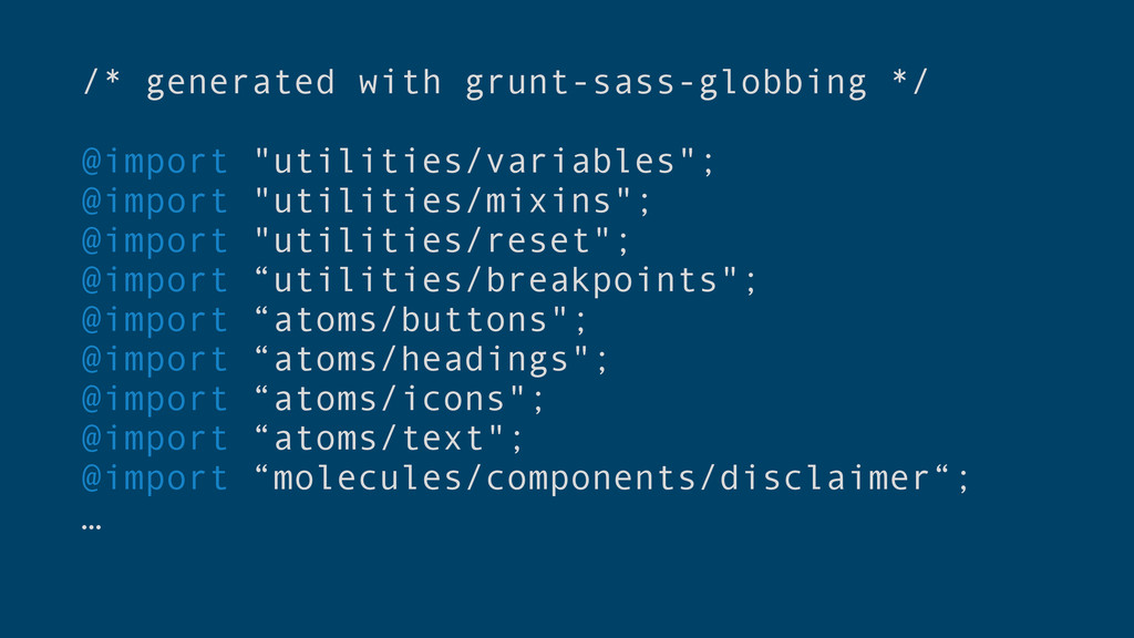
Partials & Globbing
/* generated with grunt-sass-globbing */ @import "utilities/variables"; @import "utilities/mixins"; @import
"utilities/reset"; @import “utilities/breakpoints"; @import “atoms/buttons"; @import “atoms/headings"; @import “atoms/icons"; @import “atoms/text"; @import “molecules/components/disclaimer“; …
Mixins
Problems with CSS • Cross-browser compatibility issues • Vendor prefixes
• No variables • No inline importing • No nested selectors • No functions/mixins • No color manipulation • No basic arithmetic
Problems with CSS • Cross-browser compatibility issues • Vendor prefixes
• No variables • No inline importing • No nested selectors • No functions/mixins • No color manipulation • No basic arithmetic
Problems with CSS • Cross-browser compatibility issues • Vendor prefixes
• No variables • No inline importing • No nested selectors • No functions/mixins • No color manipulation • No basic arithmetic
One Day…
Let’s Get As Close As We Can To The Real
Thing
@briangraves Thank You!
 briangraves
 toshihidemurata
 kakukoki
 r5ni4
r5ni4
 saki822
 mottox2
 kspace
 takaikanako
 shoko_seven11
 takanorip
 kumanoayumi
 sevendex
 deadlinepoet
 uxyall
 lara
lara
 inesmontani
 baasie
 jonrohan
 nonsquared
 katarinadahlin
 tanoku
 eileencodes
 michielstock
 tmiket