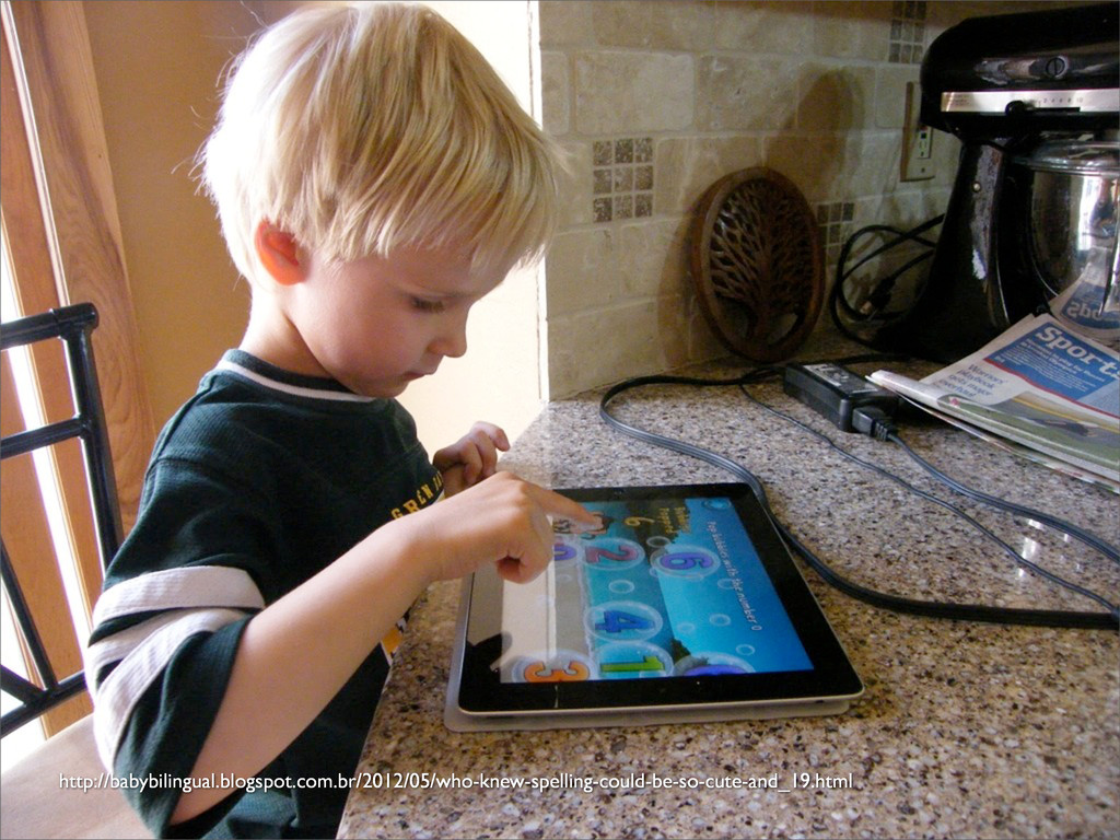
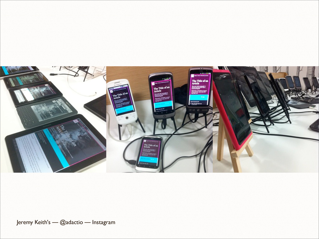
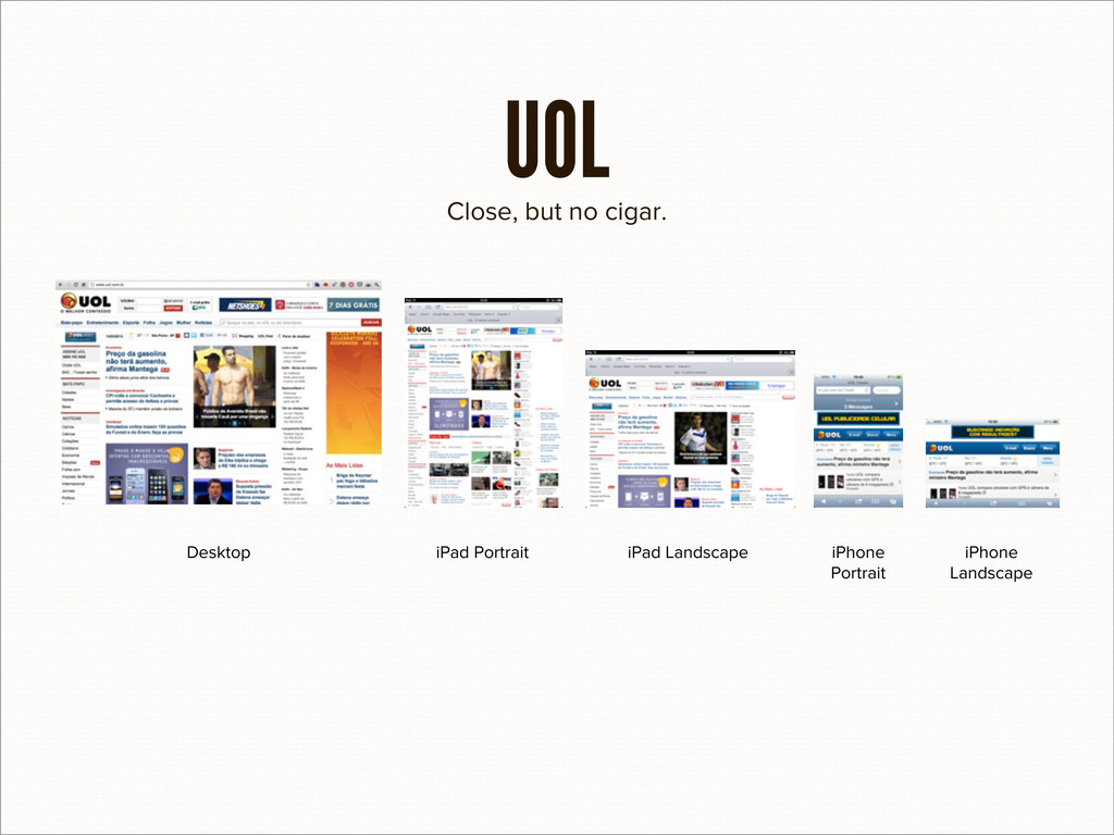
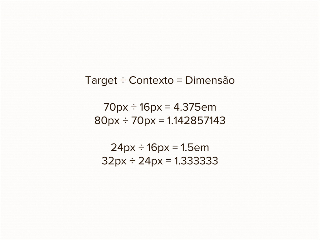
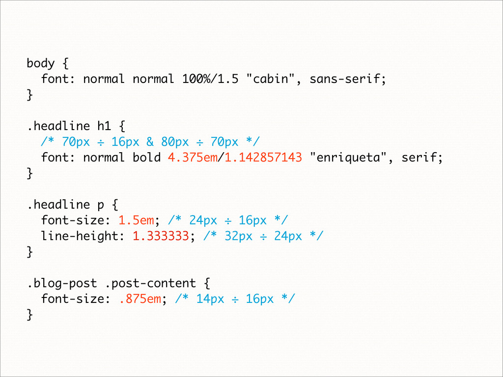
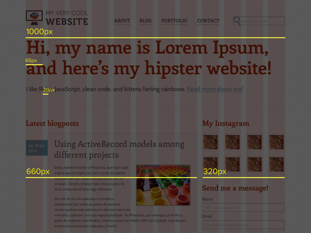
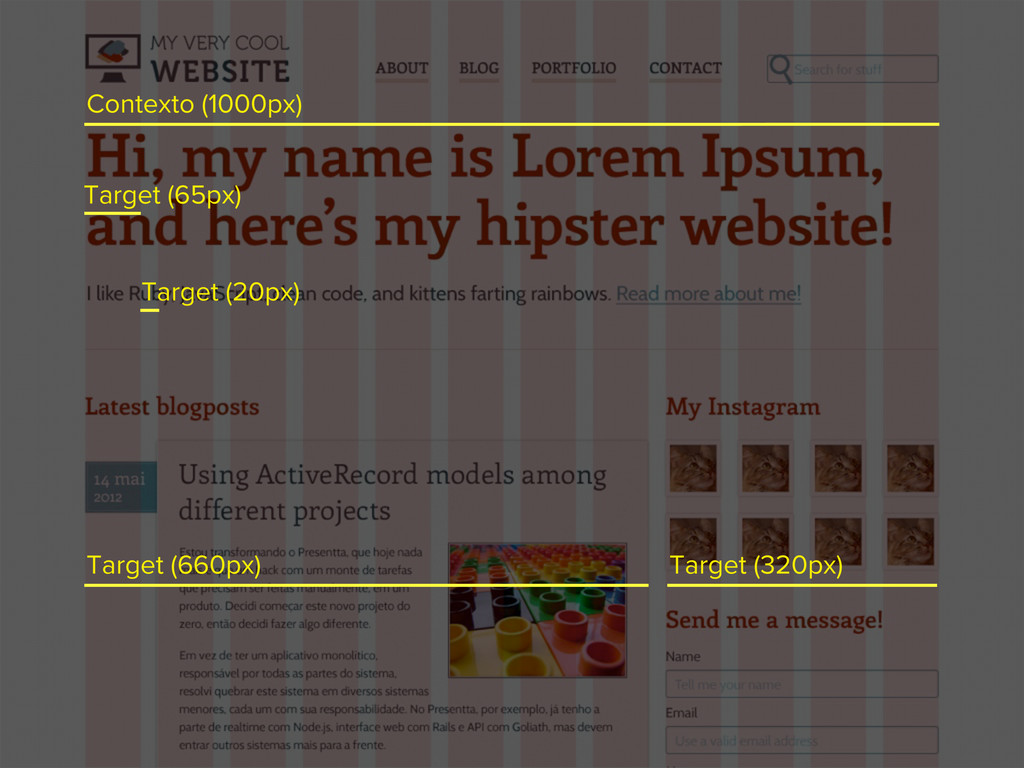
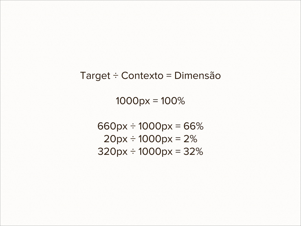
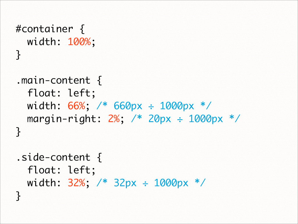
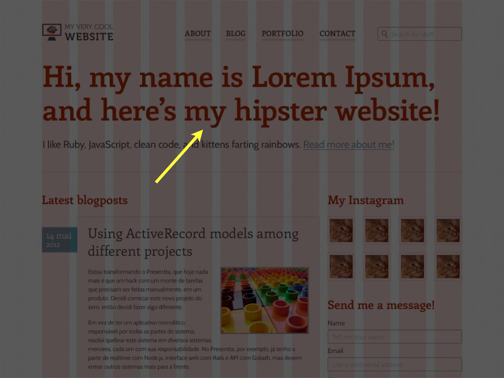
Não é nenhum segredo que o mundo está cada vez mais móvel. As vendas de PCs caíram em 20% desde 2008, e em 2015 é esperado que o acesso à Internet por dispositivos portáteis supere o acesso por desktops. A Web pode ser acessada de qualquer lugar, a qualquer hora. Mas com tantos modelos de dispositivos—tablets, notebooks, netbooks e smartphones—como fazer com que seu produto funcione em todos?
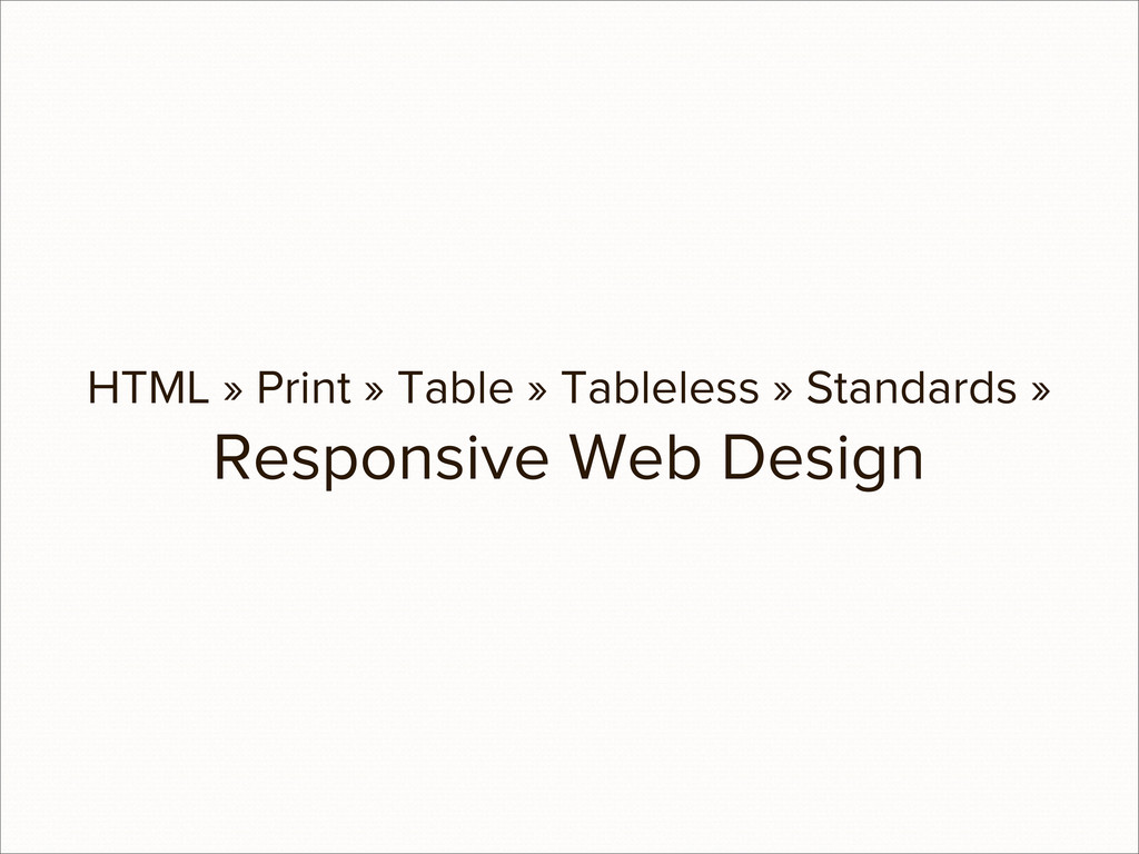
O Responsive Web Design—um conjunto de técnicas e ideologias—promete solucionar este problema, oferecendo o mesmo conteúdo em todas as plataformas, da melhor maneira. Nesta palestra, serão ensinadas técnicas de design, front e back-end para que seu site seja usável e acessível por todos, sem limitar-se a modelos, tamanhos de tela ou versões específicas.
 eshiota
 nrslib
 eitsupi
 o0h
o0h
 mshibuya
 yosuke_furukawa
 vivion
 ryodeveloper
 codeegg
 _fhhmm
 okumin
 minodriven
 rkaga
rkaga
 davetheseo
 iamctodd
 varn
varn
 csswizardry
 jonoalderson
 asonas
 inesmontani
 codingconduct
 charlesmeaden
 szymonslowik
 soudai
 marketingsoph
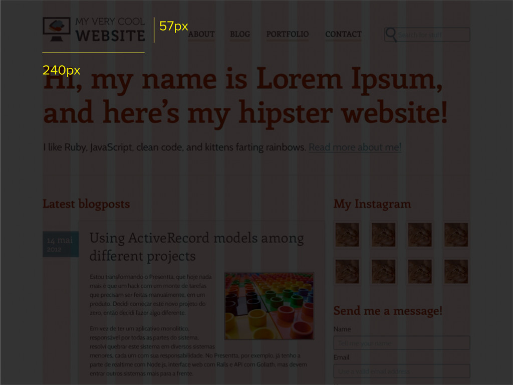
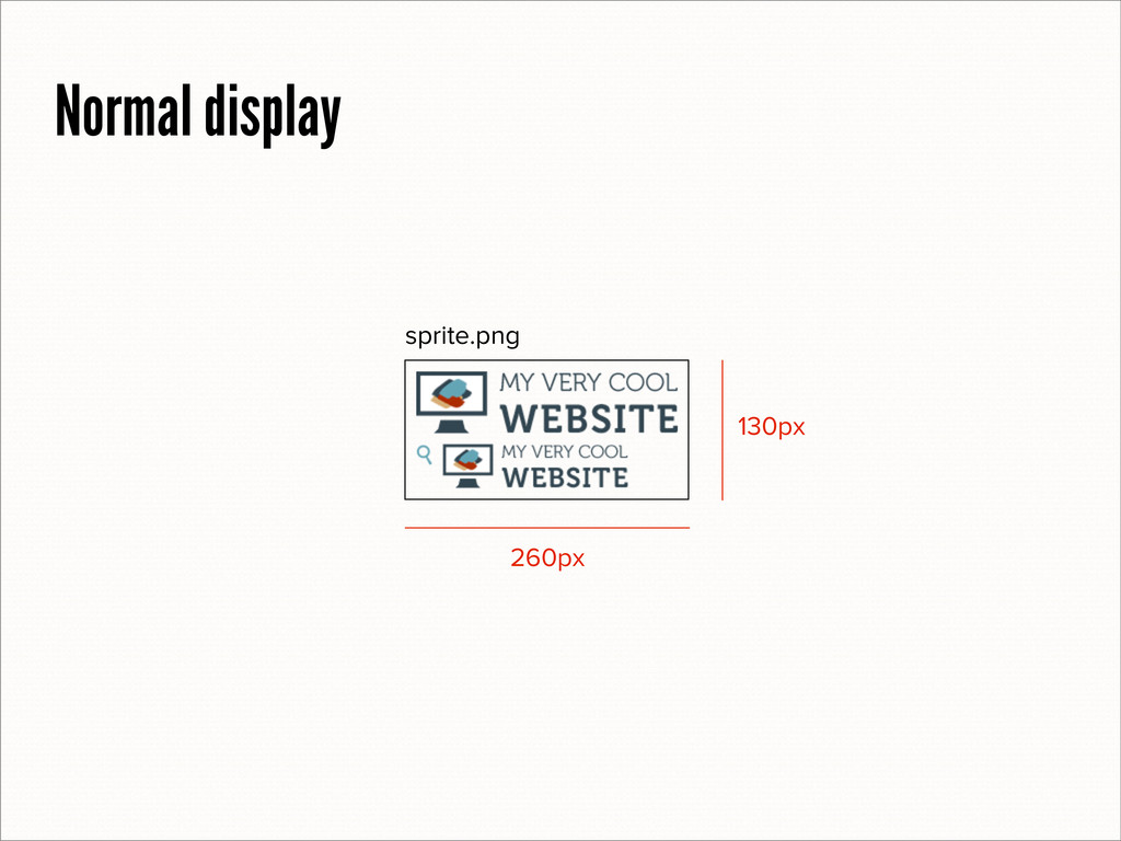
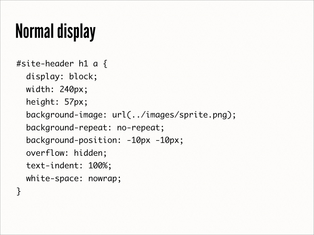
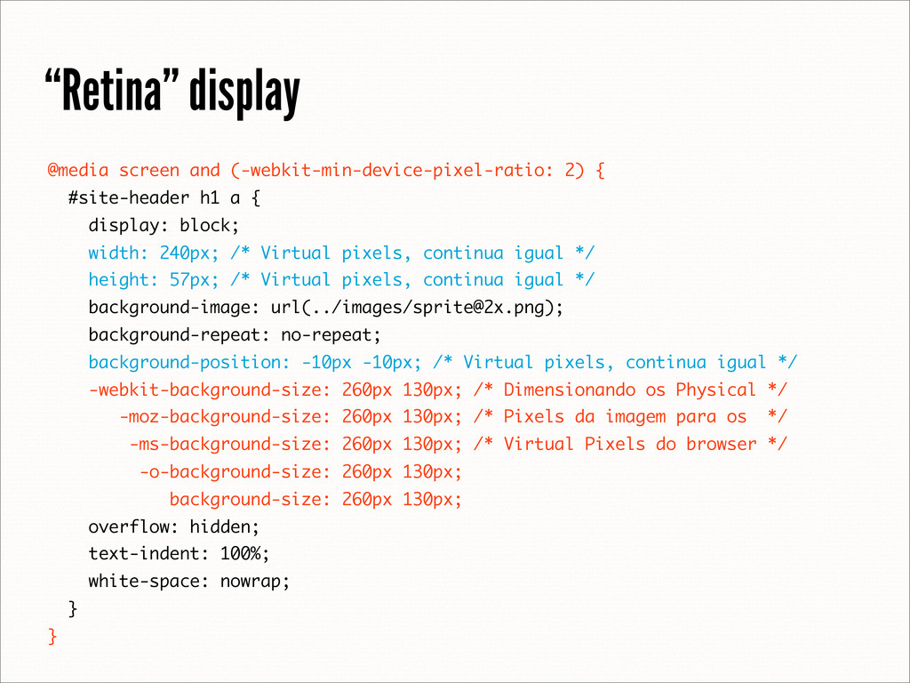
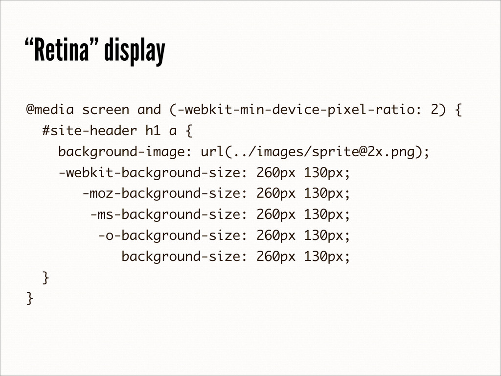
![“Retina” display [email protected] 260px 520px](https://files.speakerdeck.com/presentations/503812d71d81480002028eb8/slide_66.jpg)