Upgrade to Pro
— share decks privately, control downloads, hide ads and more …
Speaker Deck
Features
Speaker Deck
PRO
Sign in
Sign up for free
Search
Search
CSS Modules, CSS Variables and the Future of Re...
Search
Glen Maddern
May 11, 2016
Technology
1.3k
9
Share
Embed
Copy iframe code
Copy JS code
Copy link
Start on current slide
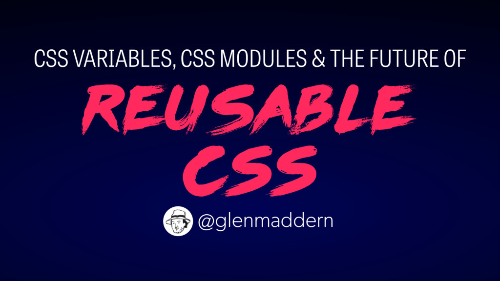
CSS Modules, CSS Variables and the Future of Reusable CSS
Presented at CSSConf Budapest, 2016 <3
Glen Maddern
May 11, 2016
More Decks by Glen Maddern
See All by Glen Maddern
The Road to Styled Components & the Road Ahead
geelen
2
250
The Road to Styled Components
geelen
2
1.5k
Styled Components and the Road to Unification
geelen
2
300
The Future of Reusable CSS
geelen
2
230
Other Decks in Technology
See All in Technology
データエンジニアリングとドメイン駆動設計
masuda220
PRO
14
2.5k
キャリアLT会#3
beli68
2
240
SRENEXT_2026_Chairs__Talks_in_Tamachi.sre.pdf
srenext
1
150
なぜ、あなたのAPIは使われないのか? AX時代の設計原則、ガードレール、運用体制
yokawasa
1
210
Oracle Base Database Service 技術詳細
oracle4engineer
PRO
15
110k
探索・可視化・自動化を一本化 Amazon Quickでデータ活用スピードを上げる方法
koheiyoshikawa
0
170
文字起こし基盤の信頼性
abnoumaru
0
120
データと地図で読む 大井町の「かわるもの、かわらないもの」
yoshiyama_hana
0
150
20260720_クラウド女子会×PyLadiesTokyoコラボ Amazon Bedrock ハンズオン用資料
yuuka51
1
110
なぜ、あなたのエージェントは言うことを聞かないのか
segavvy
1
370
OpenTelemetryにおけるGoのゼロコード・コンパイル時計装について #fukuokago
quiver
0
210
AI x 開発生産性を取り巻く予算戦略と投資対効果
i35_267
7
2.9k
Featured
See All Featured
Exploring anti-patterns in Rails
aemeredith
3
450
Information Architects: The Missing Link in Design Systems
soysaucechin
0
1k
Measuring Dark Social's Impact On Conversion and Attribution
stephenakadiri
2
240
Dominate Local Search Results - an insider guide to GBP, reviews, and Local SEO
greggifford
PRO
0
210
Digital Ethics as a Driver of Design Innovation
axbom
PRO
1
350
StorybookのUI Testing Handbookを読んだ
zakiyama
31
6.9k
The Language of Interfaces
destraynor
162
27k
The World Runs on Bad Software
bkeepers
PRO
72
12k
DBのスキルで生き残る技術 - AI時代におけるテーブル設計の勘所
soudai
PRO
67
56k
The SEO identity crisis: Don't let AI make you average
varn
0
520
A brief & incomplete history of UX Design for the World Wide Web: 1989–2019
jct
2
420
Designing for Timeless Needs
cassininazir
1
400
Transcript
Reusable CSS CSS VARIABLES, CSS MODULES & THE FUTURE OF
@glenmaddern
HELLO BUDAPEST! ♥
Reusable CSS CSS VARIABLES, CSS MODULES & THE FUTURE OF
@glenmaddern
None
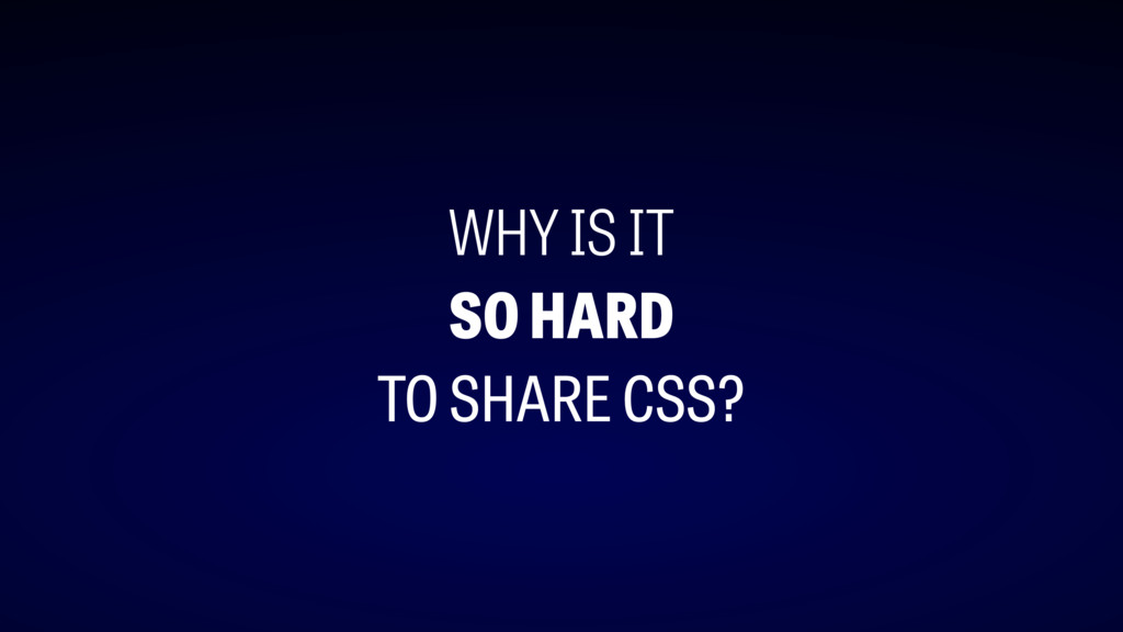
WHY IS IT SO HARD TO SHARE CSS?
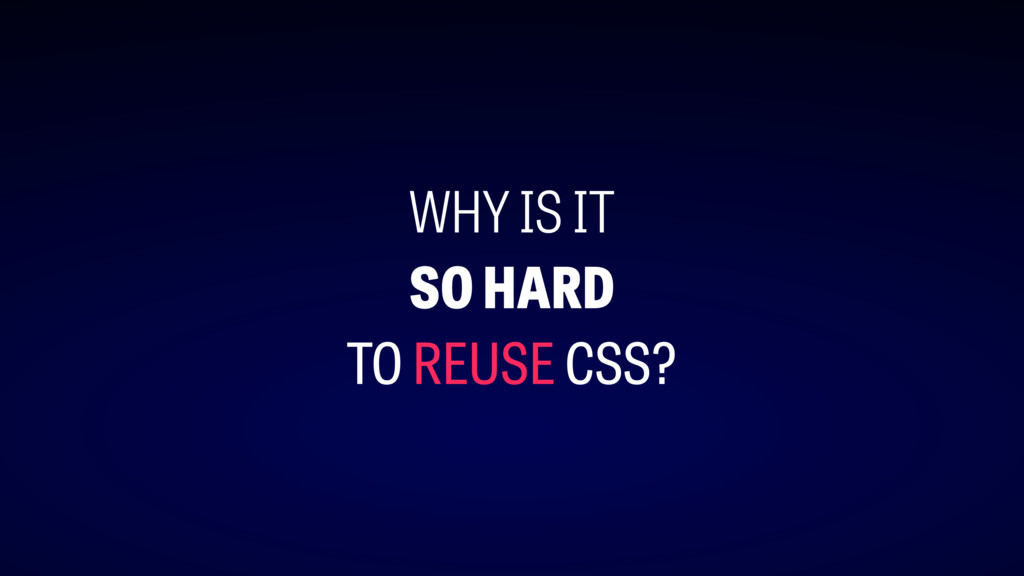
WHY IS IT SO HARD TO REUSE CSS?
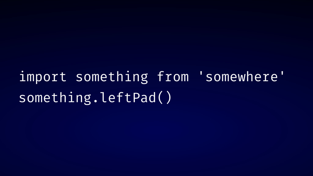
import something from 'somewhere' something.leftPad()
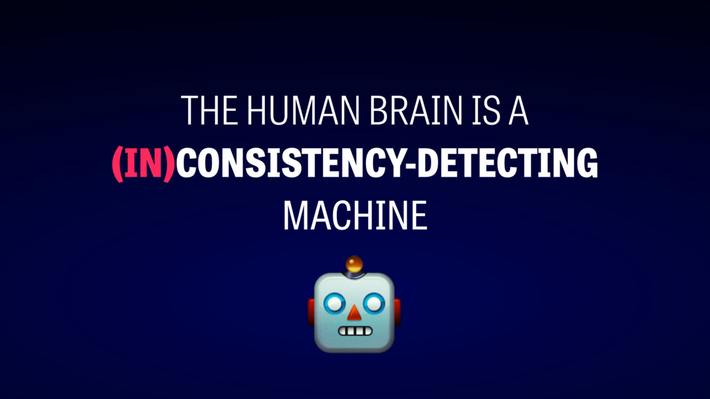
THE HUMAN BRAIN IS A (IN)CONSISTENCY-DETECTING MACHINE
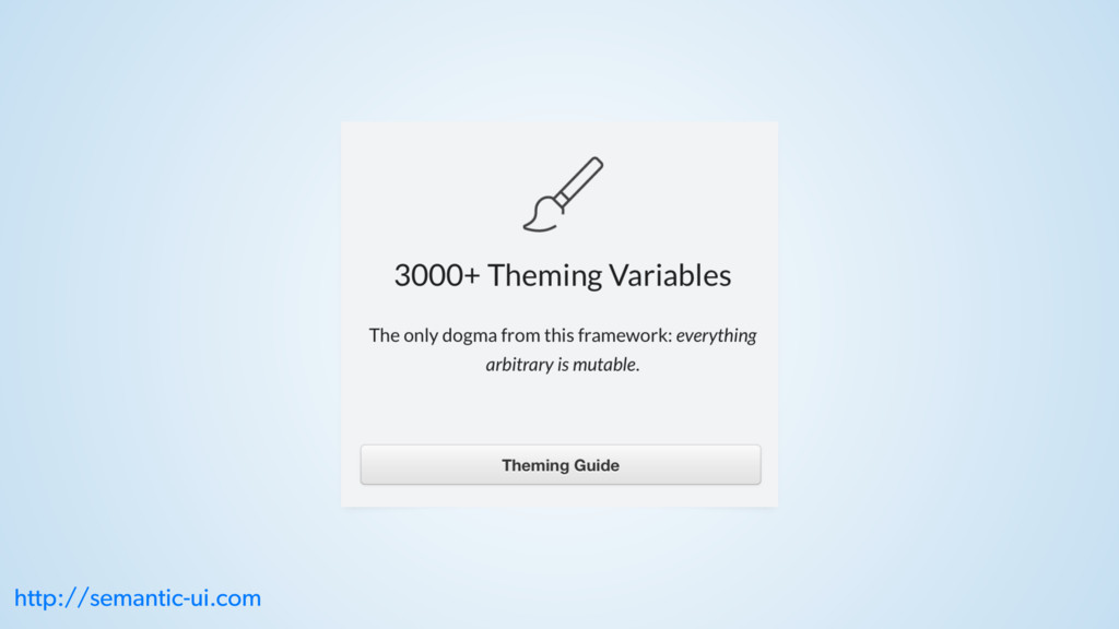
http://semantic-ui.com
http://semantic-ui.com
http://semantic-ui.com
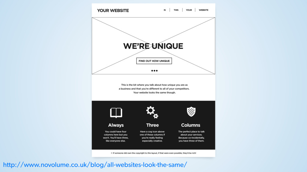
http://www.novolume.co.uk/blog/all-websites-look-the-same/
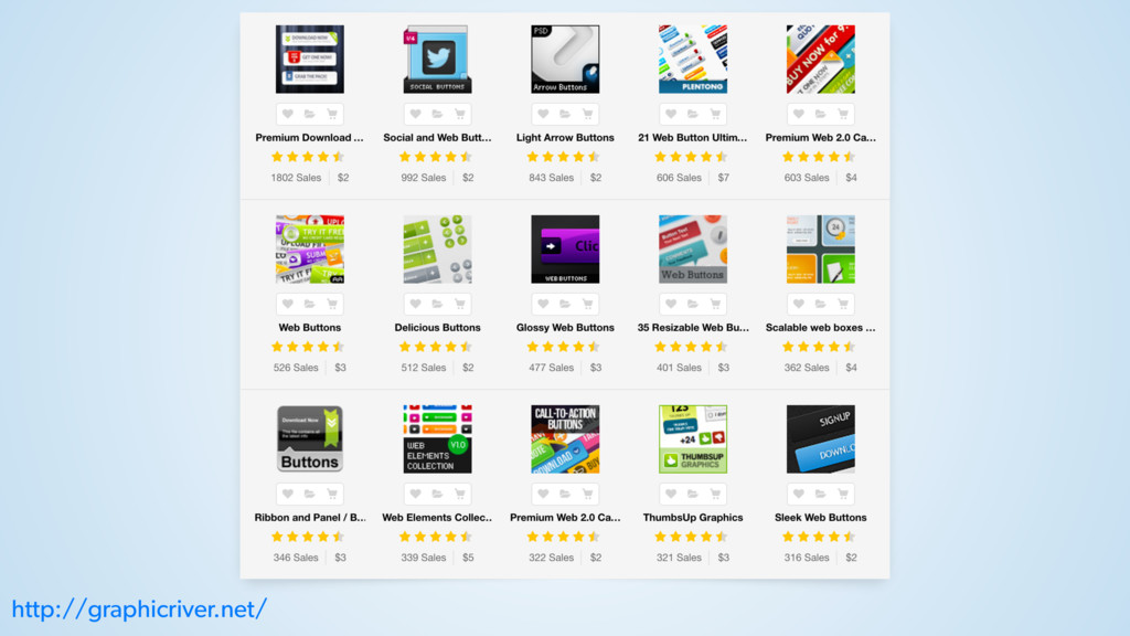
http://graphicriver.net/
None
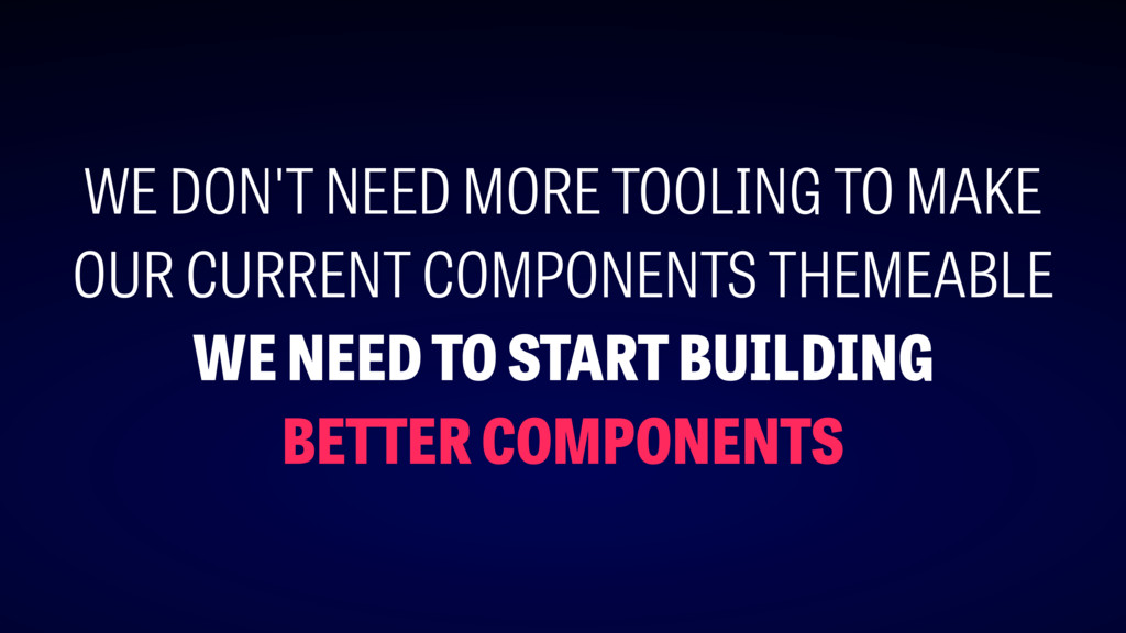
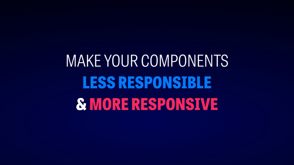
WE DON'T NEED MORE TOOLING TO MAKE OUR CURRENT COMPONENTS
THEMEABLE WE NEED TO START BUILDING BETTER COMPONENTS
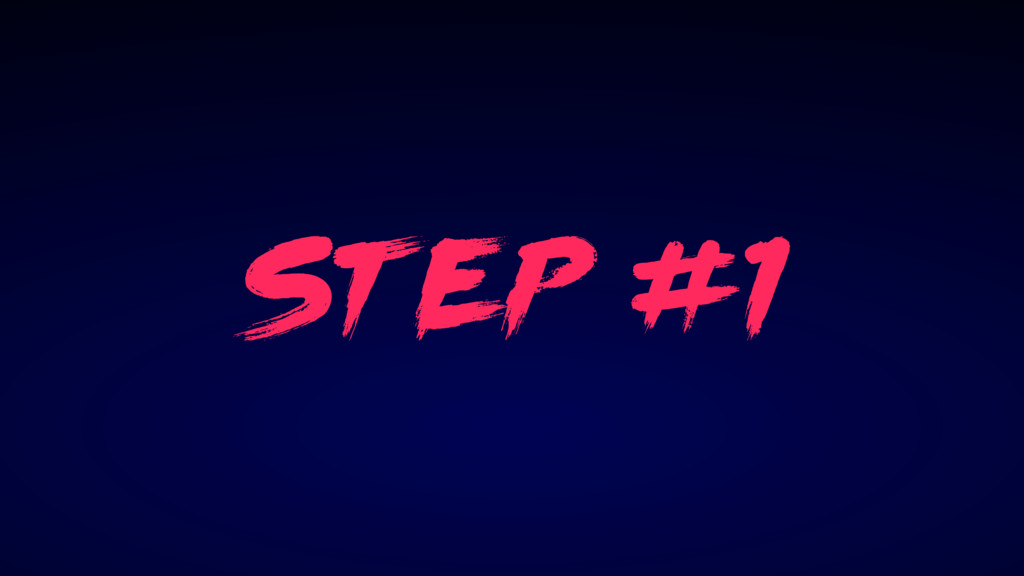
st ep #1
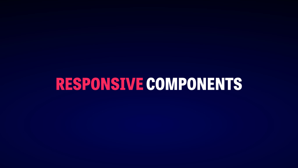
RESPONSIVE COMPONENTS
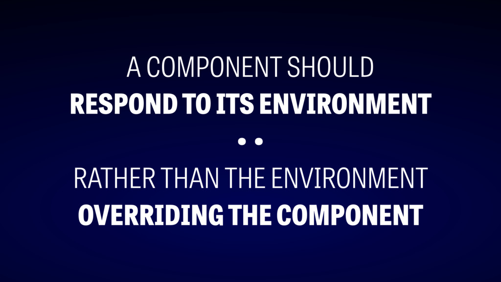
A COMPONENT SHOULD RESPOND TO ITS ENVIRONMENT • • RATHER
THAN THE ENVIRONMENT OVERRIDING THE COMPONENT
OUTSIDE-IN OVERRIDES
https://en.wikipedia.org/wiki/Margaret_Hamilton_(scientist)
http://semantic-ui.com
MAKE YOUR COMPONENTS LESS RESPONSIBLE & MORE RESPONSIVE
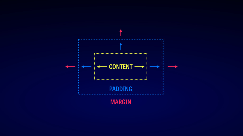
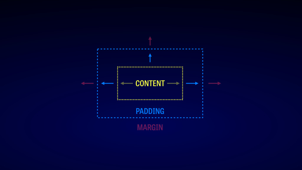
layout
PADDING CONTENT MARGIN
PADDING CONTENT MARGIN
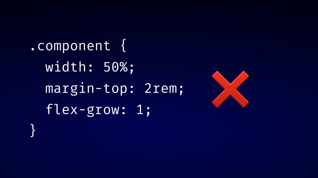
.component { width: 50%; margin-top: 2rem; flex-grow: 1; } ❌
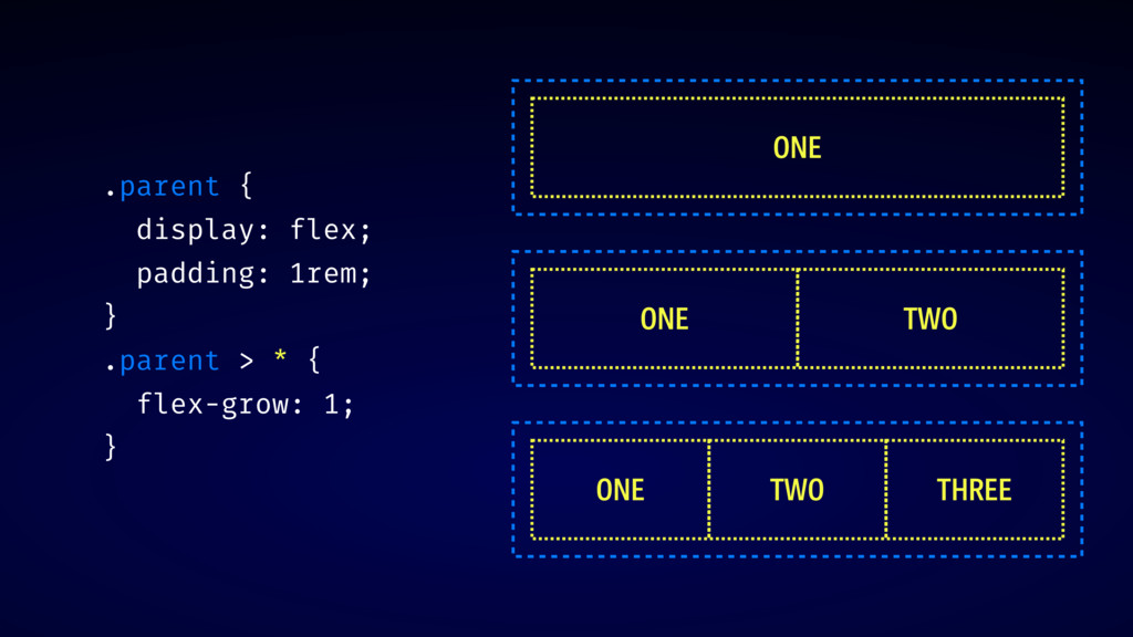
.parent { display: flex; padding: 1rem; } .parent > *
{ flex-grow: 1; } ONE ONE TWO ONE TWO THREE
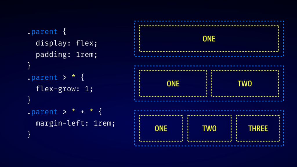
.parent { display: flex; padding: 1rem; } .parent > *
{ flex-grow: 1; } .parent > * + * { margin-left: 1rem; } ONE ONE TWO ONE TWO THREE
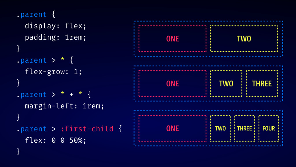
.parent { display: flex; padding: 1rem; } .parent > *
{ flex-grow: 1; } .parent > * + * { margin-left: 1rem; } .parent > :first-child { flex: 0 0 50%; } ONE TWO ONE TWO THREE ONE TWO THREE FOUR
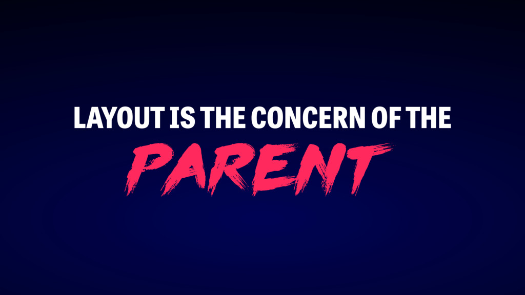
LAYOUT IS THE CONCERN OF THE p arent
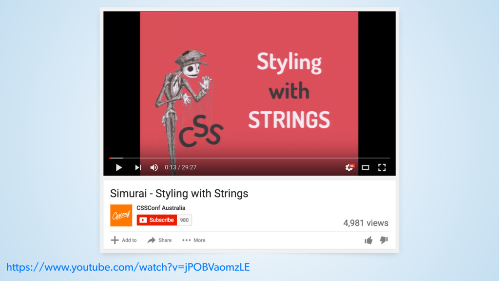
DEMO: CURRENTCOLOR
https://www.youtube.com/watch?v=jPOBVaomzLE
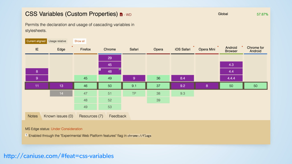
css v ari able s
http://caniuse.com/#feat=css-variables
CSS CUSTOM PROPERTIES CSS VARIABLES =
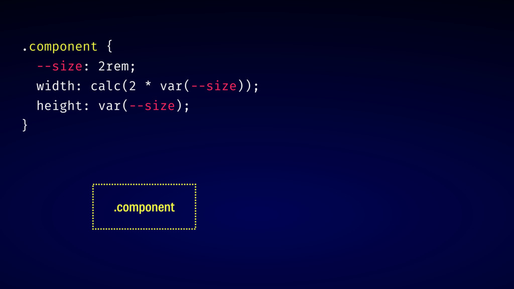
.component { --size: 2rem; width: calc(2 * var(--size)); height: var(--size);
} .component
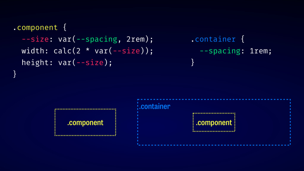
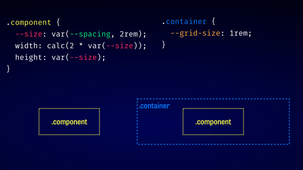
.component { --size: var(--spacing, 2rem); width: calc(2 * var(--size)); height:
var(--size); } .component .container .component .container { --spacing: 1rem; }
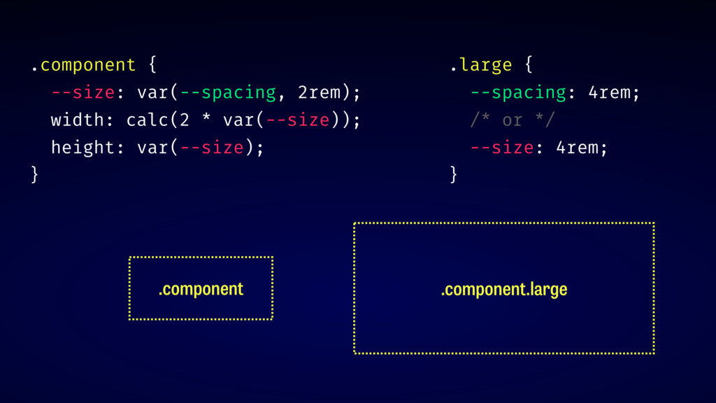
.component { --size: var(--spacing, 2rem); width: calc(2 * var(--size)); height:
var(--size); } .component .component.large .large { --spacing: 4rem; /* or */ --size: 4rem; }
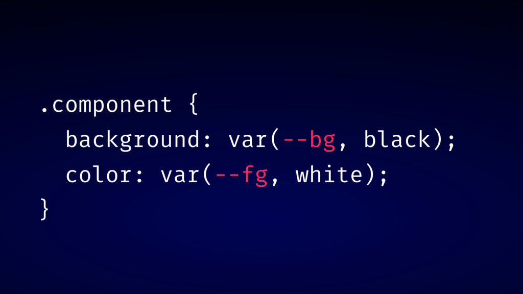
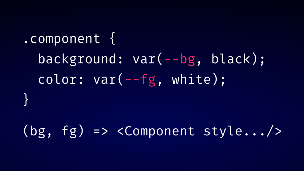
.component { background: var(--bg, black); color: var(--fg, white); }
.component { background: var(--bg, black); color: var(--fg, white); } (bg,
fg) => <Component style.../>
DEMO: INVERTED BUTTON
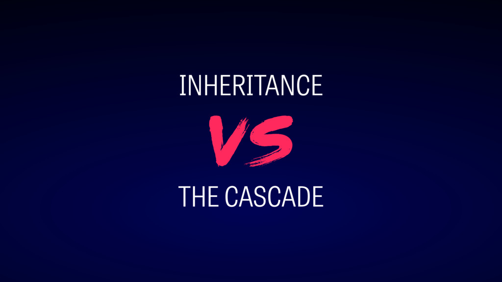
INHERITANCE THE CASCADE vs
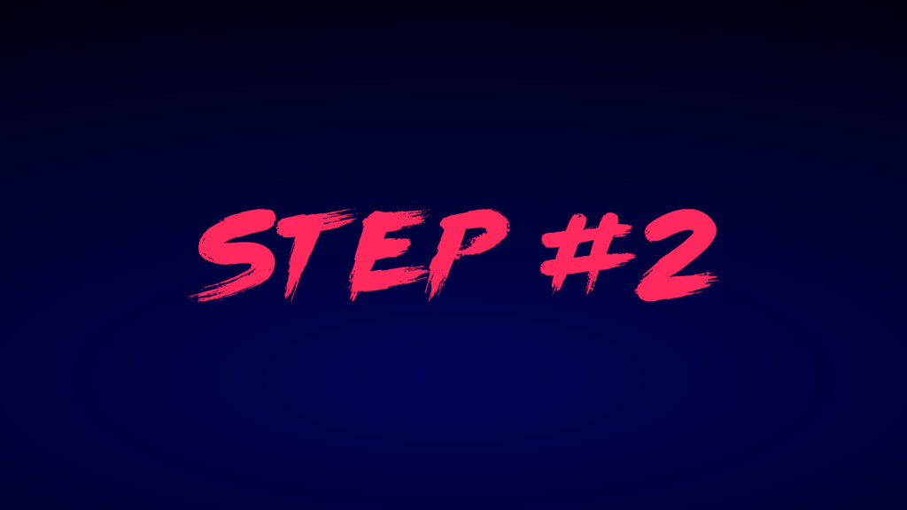
st ep #2
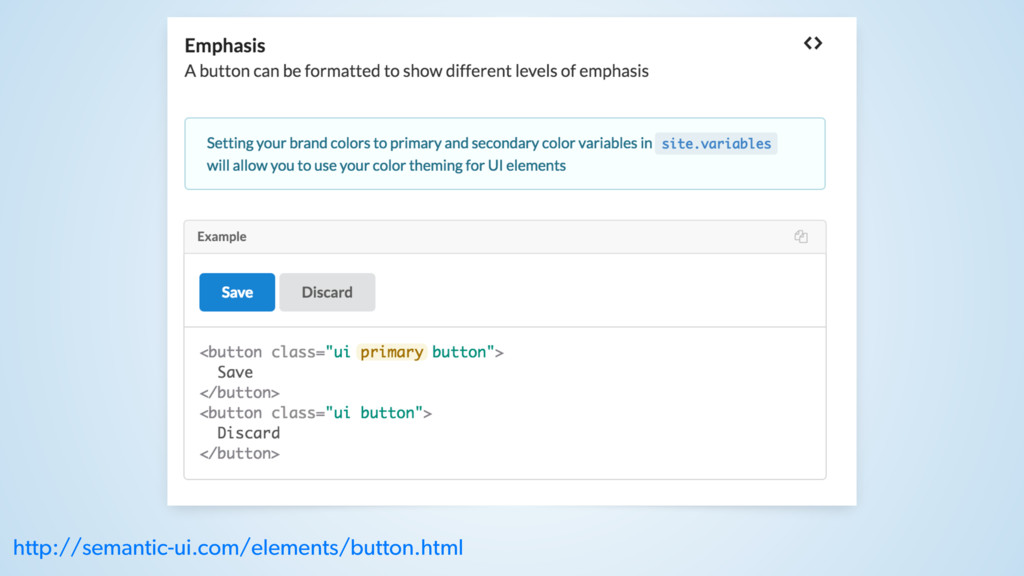
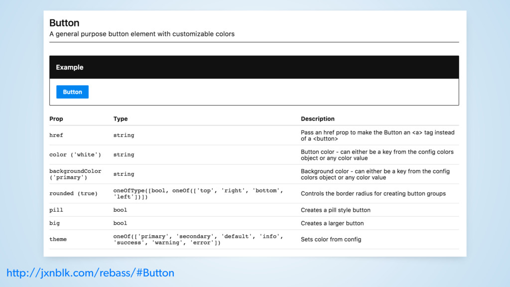
EXPLICIT COMPONENTS
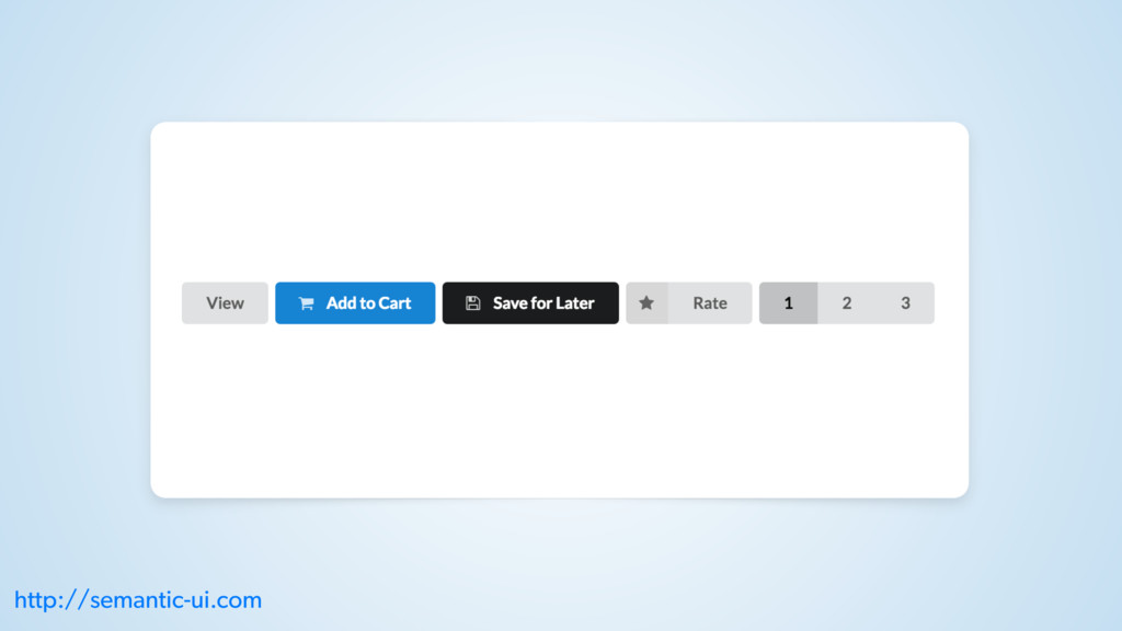
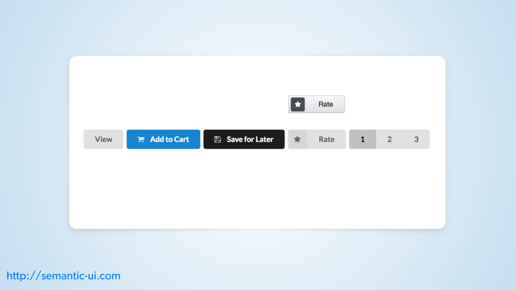
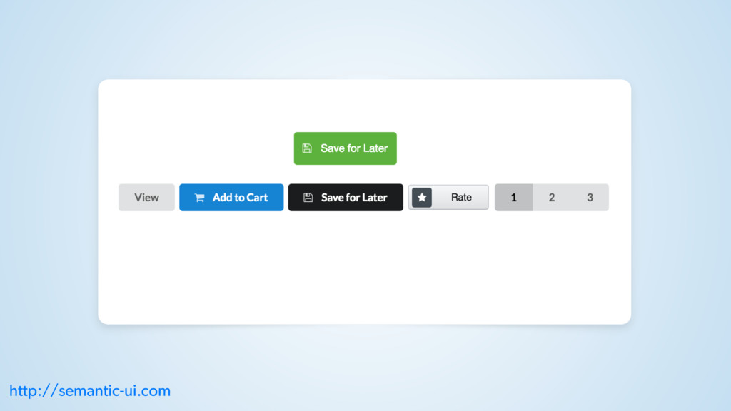
http://semantic-ui.com/elements/button.html
http://jxnblk.com/rebass/#Button
DEMO: DOCUMENTATION
NAMING MISMATCHES?
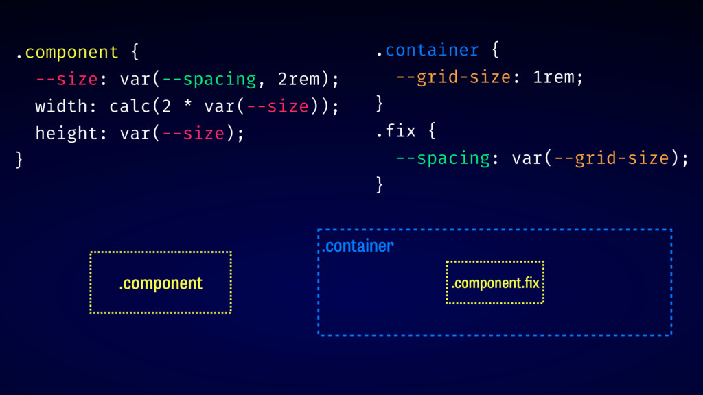
.container .container { --grid-size: 1rem; } .component .component .component {
--size: var(--spacing, 2rem); width: calc(2 * var(--size)); height: var(--size); }
.component .container .component.fix .container { --grid-size: 1rem; } .fix {
--spacing: var(--grid-size); } .component { --size: var(--spacing, 2rem); width: calc(2 * var(--size)); height: var(--size); }
st ep #3
RESILIENT COMPONENTS
w arning: re act
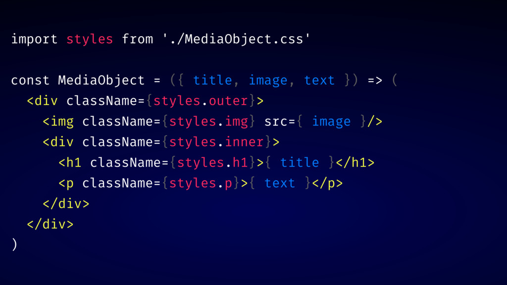
import styles from './MediaObject.css' const MediaObject = ({ title, image,
text }) => ( <div className={styles.outer}> <img className={styles.img} src={ image }/> <div className={styles.inner}> <h1 className={styles.h1}>{ title }</h1> <p className={styles.p}>{ text }</p> </div> </div> )
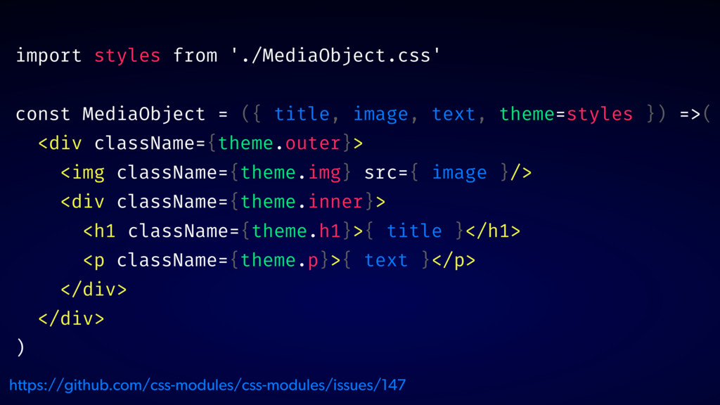
import styles from './MediaObject.css' const MediaObject = ({ title, image,
text, theme=styles }) =>( <div className={theme.outer}> <img className={theme.img} src={ image }/> <div className={theme.inner}> <h1 className={theme.h1}>{ title }</h1> <p className={theme.p}>{ text }</p> </div> </div> ) https://github.com/css-modules/css-modules/issues/147
DEMO: INTERNAL STRUCTURE DOCS
✅ RESPOND TO ENVIRONMENT ✅ USE INTERNAL VARIABLES ✅ EXPOSE
INTERNAL STRUCTURE
t hank you! @glenmaddern
 geelen
 masuda220
 beli68
 srenext
 yokawasa
 oracle4engineer
 koheiyoshikawa
 abnoumaru
 yoshiyama_hana
 yuuka51
 segavvy
 quiver
 i35_267
 aemeredith
 soysaucechin
 stephenakadiri
 greggifford
 axbom
axbom
 zakiyama
 destraynor
 bkeepers
 soudai
 varn
varn
 jct
jct
 cassininazir