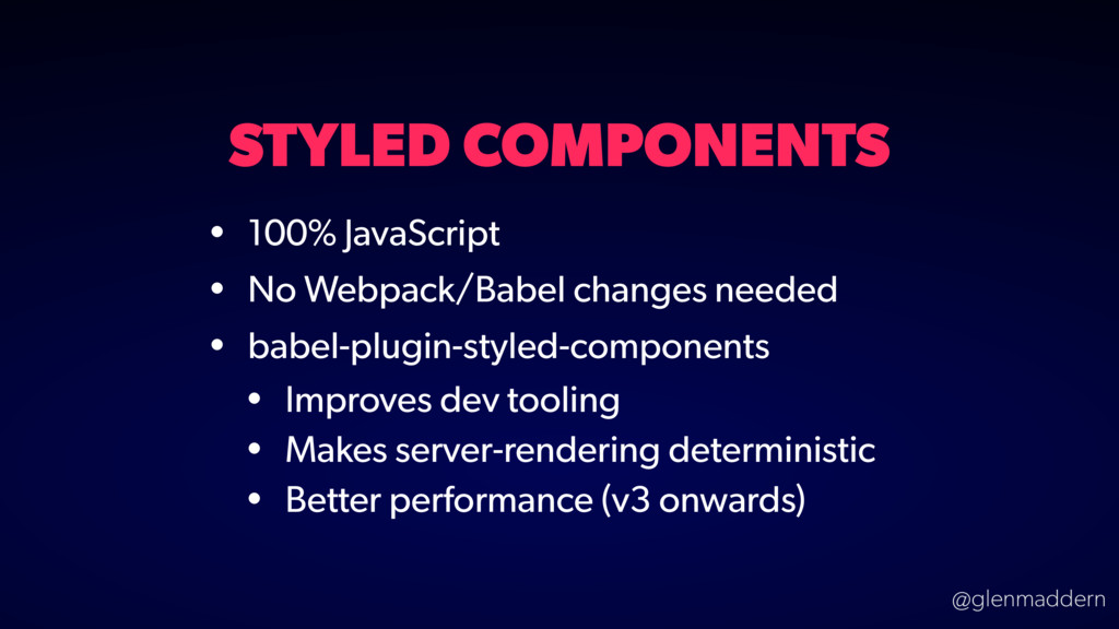
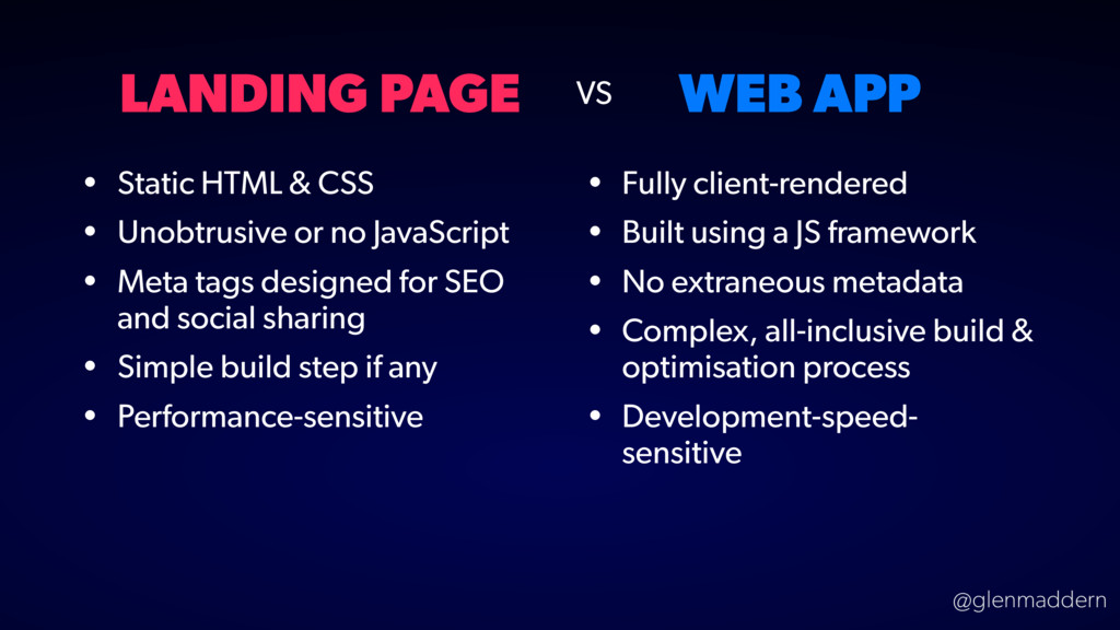
• Unobtrusive or no JavaScript • Meta tags designed for SEO and social sharing • Simple build step if any • Performance-sensitive • Fully client-rendered • Built using a JS framework • No extraneous metadata • Complex, all-inclusive build & optimisation process • Development-speed- sensitive VS
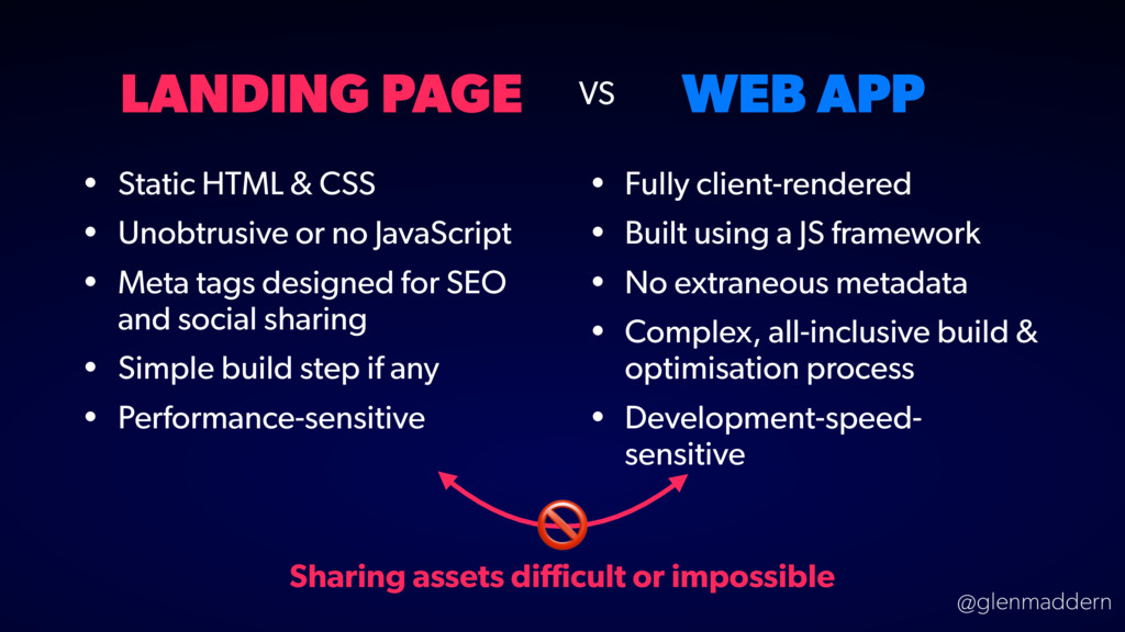
• Unobtrusive or no JavaScript • Meta tags designed for SEO and social sharing • Simple build step if any • Performance-sensitive • Fully client-rendered • Built using a JS framework • No extraneous metadata • Complex, all-inclusive build & optimisation process • Development-speed- sensitive VS Sharing assets difficult or impossible
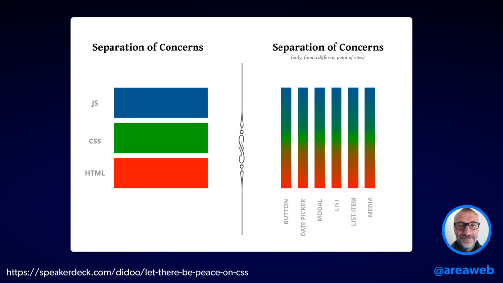
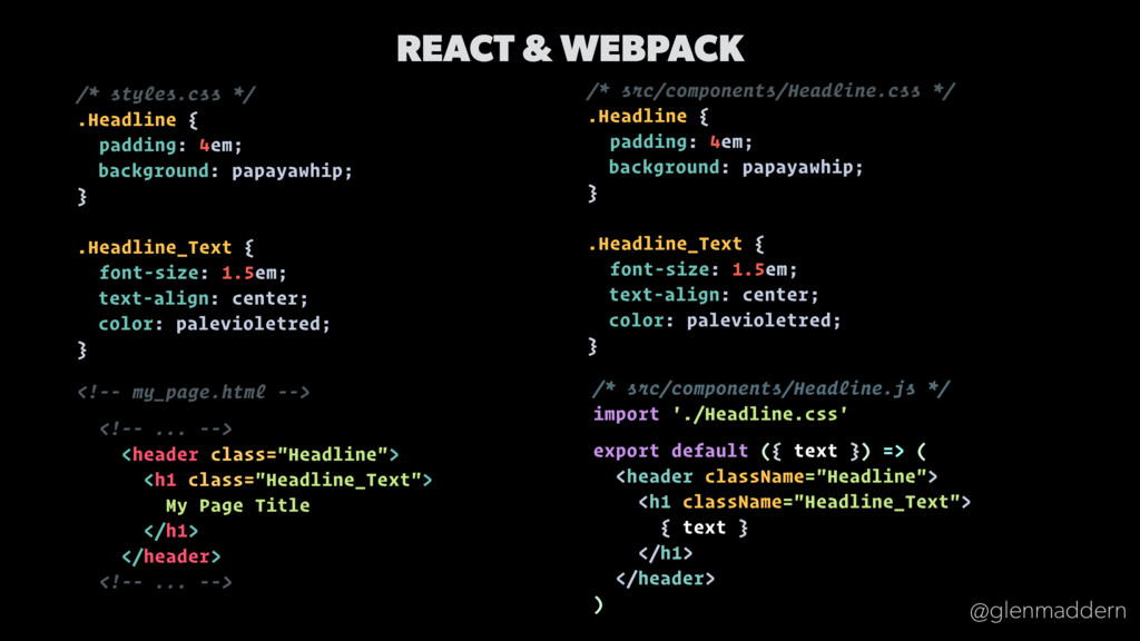
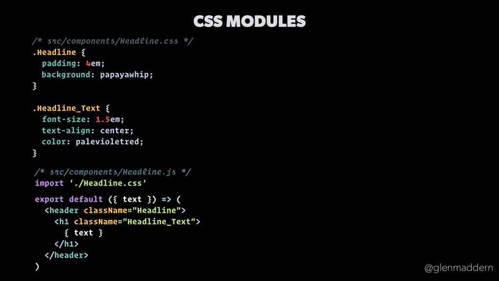
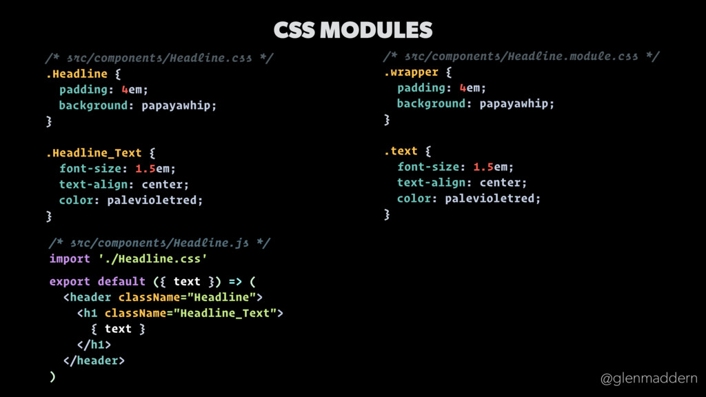
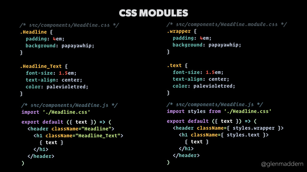
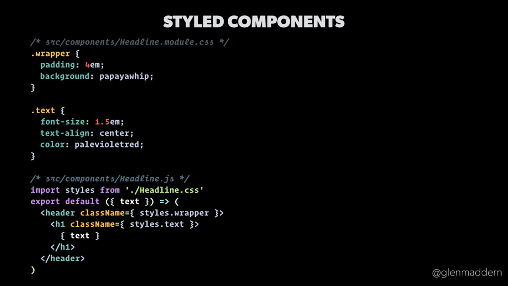
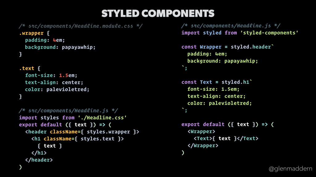
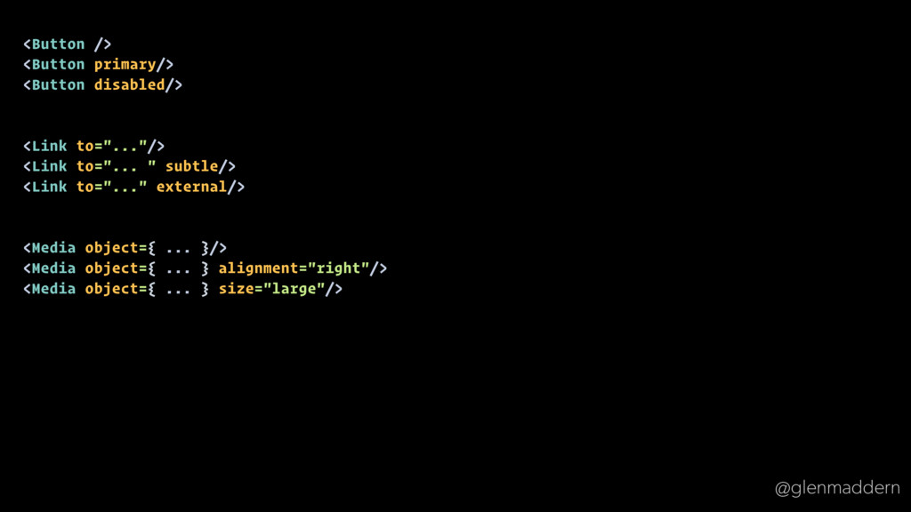
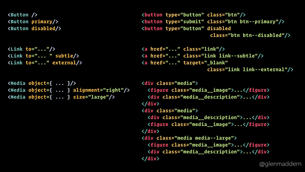
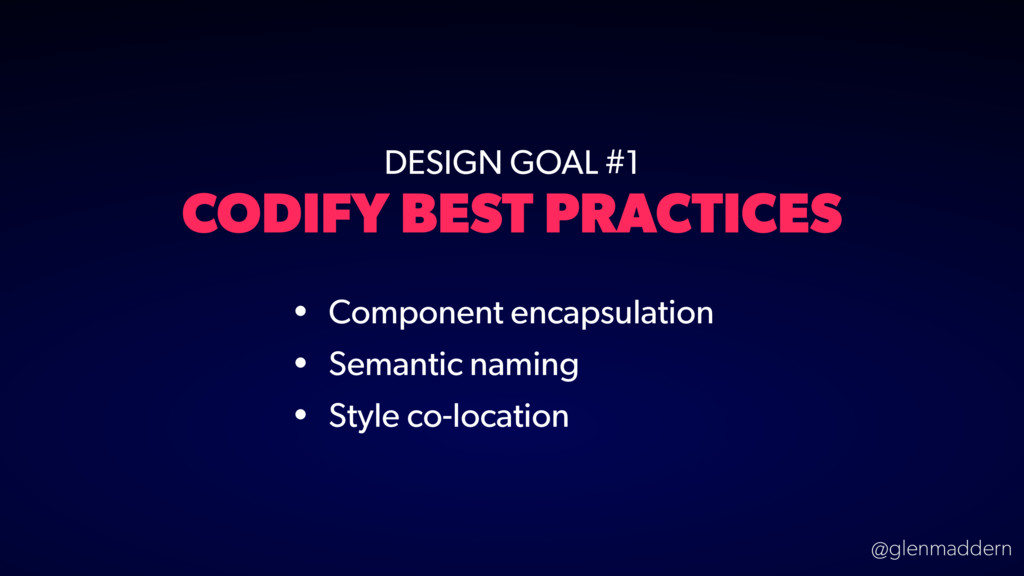
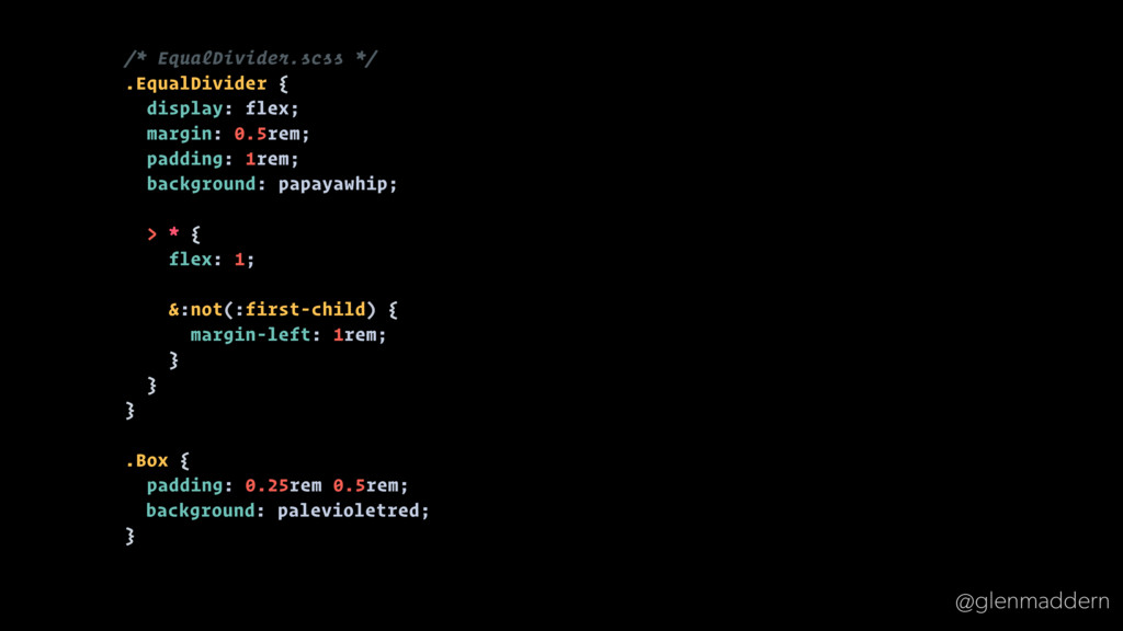
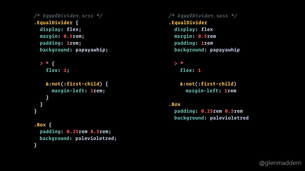
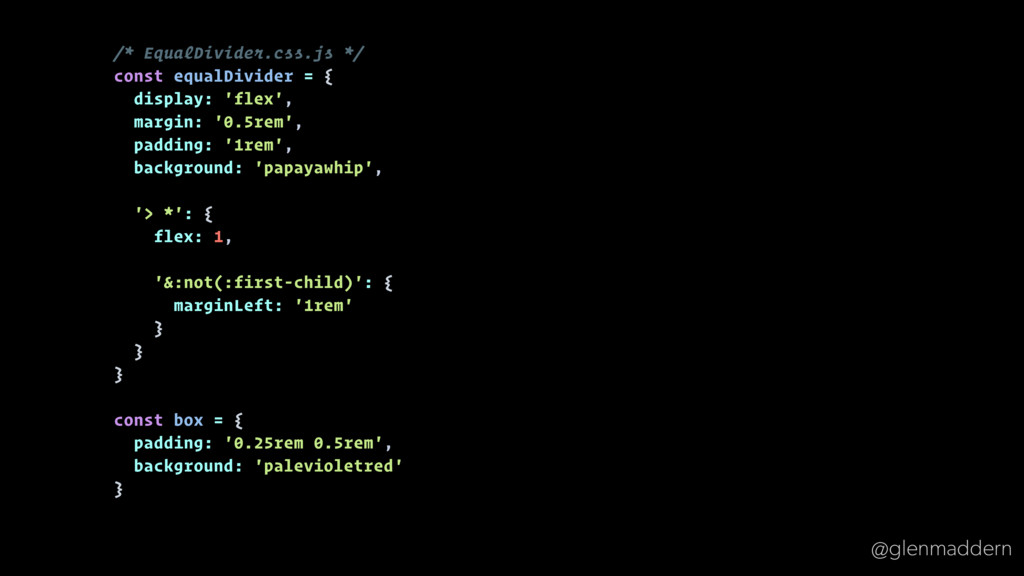
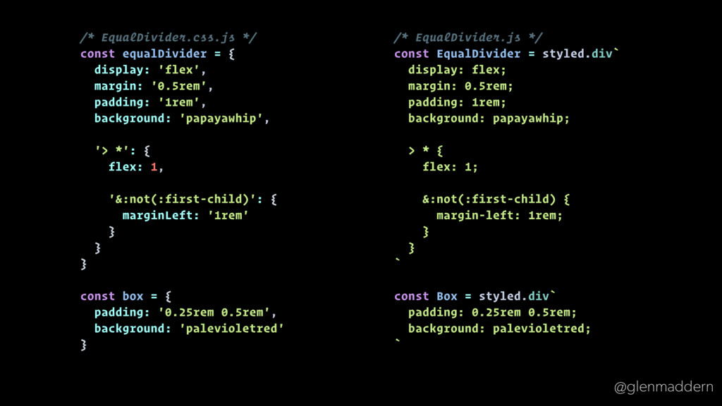
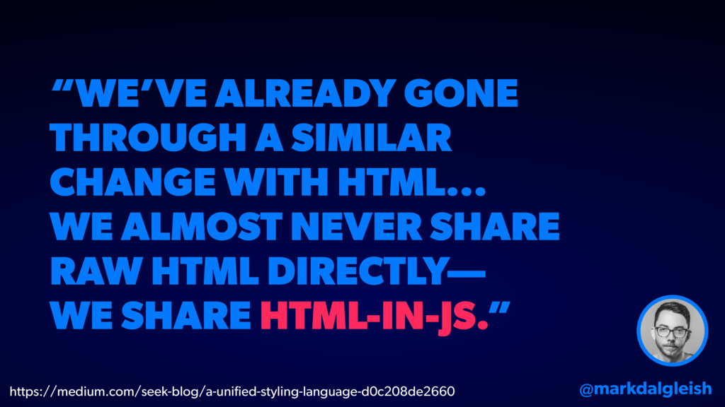
framework • Interactive components built the same way as static ones • Shared build process & optimisations • Real HTML & CSS served to all users • Components, assets, knowledge & workflow now shareable &
 geelen
 nishihira
 nagisa53
 shinkufencer
 hinac0
 jitera
 masuda220
 yokawasa
 mikesorae
 nenonaninu
 rakus_dev
 yuukiyo
 mhrtech
 maggiecrowley
 deanohume
 malarkey
 quramy
 lara
lara
 palkan
 inesmontani
 sergeychernyshev
 honzajavorek
 bkeepers
 stephaniewalter
 bluesmoon
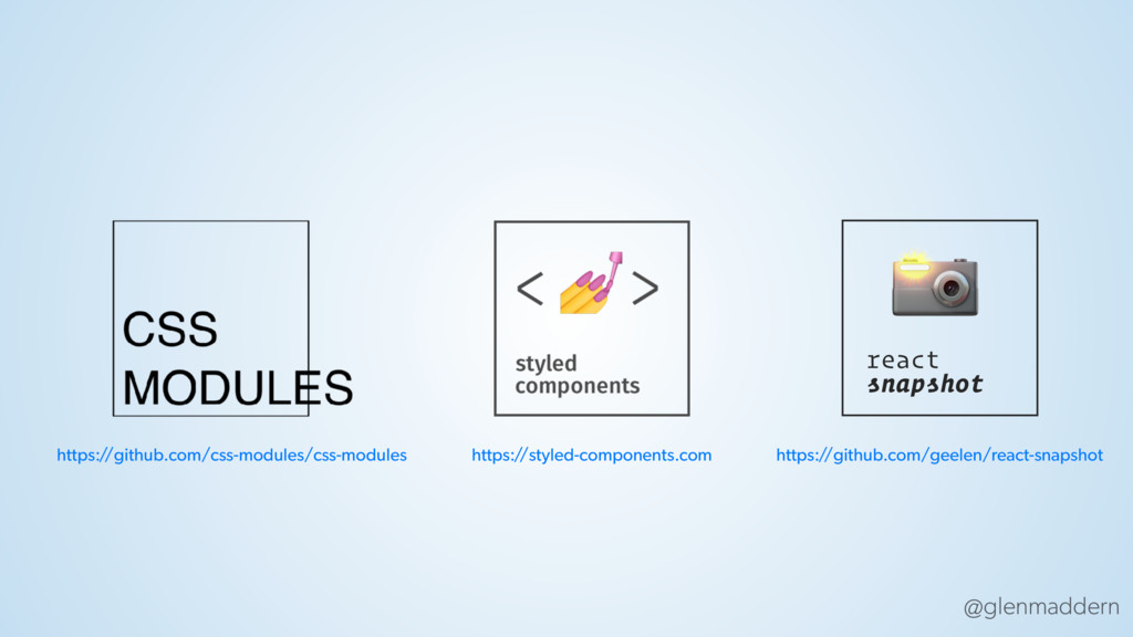