Upgrade to Pro
— share decks privately, control downloads, hide ads and more …
Speaker Deck
Features
Speaker Deck
PRO
Sign in
Sign up for free
Search
Search
Introduction to Material Design
Search
Harsh Dattani
December 14, 2014
Design
180
3
Share
Embed
Copy iframe code
Copy JS code
Copy link
Start on current slide
Introduction to Material Design
Delivered a session on Introduction to Material Design at DevFest Ahmedabad 2014.
Harsh Dattani
December 14, 2014
More Decks by Harsh Dattani
See All by Harsh Dattani
Whats new in Android N
harshdattani
0
67
Developing Secure Android Application
harshdattani
2
380
Guard your Android
harshdattani
0
170
Other Decks in Design
See All in Design
富山デザイン勉強会_デザイントレンド2026.pdf
keita_yoshikawa
3
270
decksh object reference
ajstarks
2
1.7k
デザインコンテキストのバトンをつなぐ—AI時代のプロダクトマネジメント
kumanoayumi
6
1.2k
Of Ordination and Rebellion exploration sketches
rezaline
0
180
「バイブコーディングって何?」から始まった、 AIとの一年間と、その先のこと
seto
0
670
怖くないアクセシビリティ -カウンターカルチャーとしてのアッカン東京-
securecat
1
230
AIスライドデザインを生成する仕組みを社内共有する
kenichiota0711
7
5.7k
Debiasing Your Software Design Decision-Making @ Flowcon '26
baasie
1
130
トランジションの冒険 自分と世界を変える冒険の書 / Transition Adventure
dmattsun
2
210
エンジニアがAI活用してスライドデザインできる世界が来たよ!
kaikou
1
350
2026年の勢い / Momentum for 2026
bebe
0
500
Rethinking IFUs: What Board Game Rulebooks Contribute to IFU Usability
deadlinepoet
0
340
Featured
See All Featured
Un-Boring Meetings
codingconduct
0
350
Tell your own story through comics
letsgokoyo
1
1k
Writing Fast Ruby
sferik
630
63k
Building a Modern Day E-commerce SEO Strategy
aleyda
45
9.1k
Impact Scores and Hybrid Strategies: The future of link building
tamaranovitovic
0
340
Optimizing for Happiness
mojombo
378
71k
How to Ace a Technical Interview
jacobian
281
24k
Ecommerce SEO: The Keys for Success Now & Beyond - #SERPConf2024
aleyda
1
2.1k
Leo the Paperboy
mayatellez
8
1.9k
Conquering PDFs: document understanding beyond plain text
inesmontani
PRO
4
2.9k
Navigating the Design Leadership Dip - Product Design Week Design Leaders+ Conference 2024
apolaine
1
370
DevOps and Value Stream Thinking: Enabling flow, efficiency and business value
helenjbeal
1
260
Transcript
Introduction to Material Design Harsh Dattani
About Me M.Tech Cyber Security Gujarat Forensic Sciences University, Gandhinagar
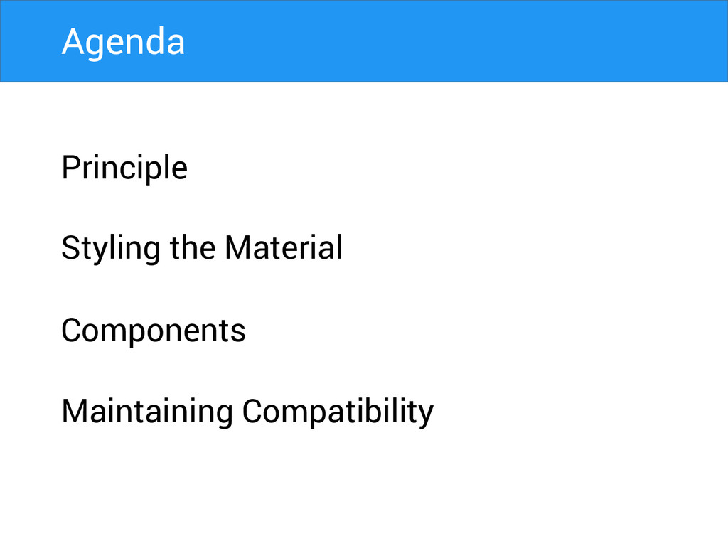
Principle Styling the Material Components Maintaining Compatibility Agenda
A great product experience starts with UX followed by UI.
Both are essential for the product’s success.
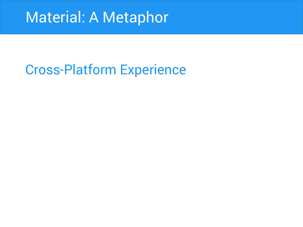
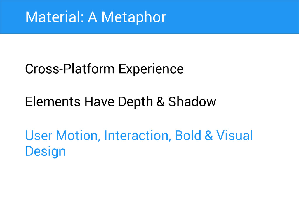
Cross-Platform Experience Material: A Metaphor
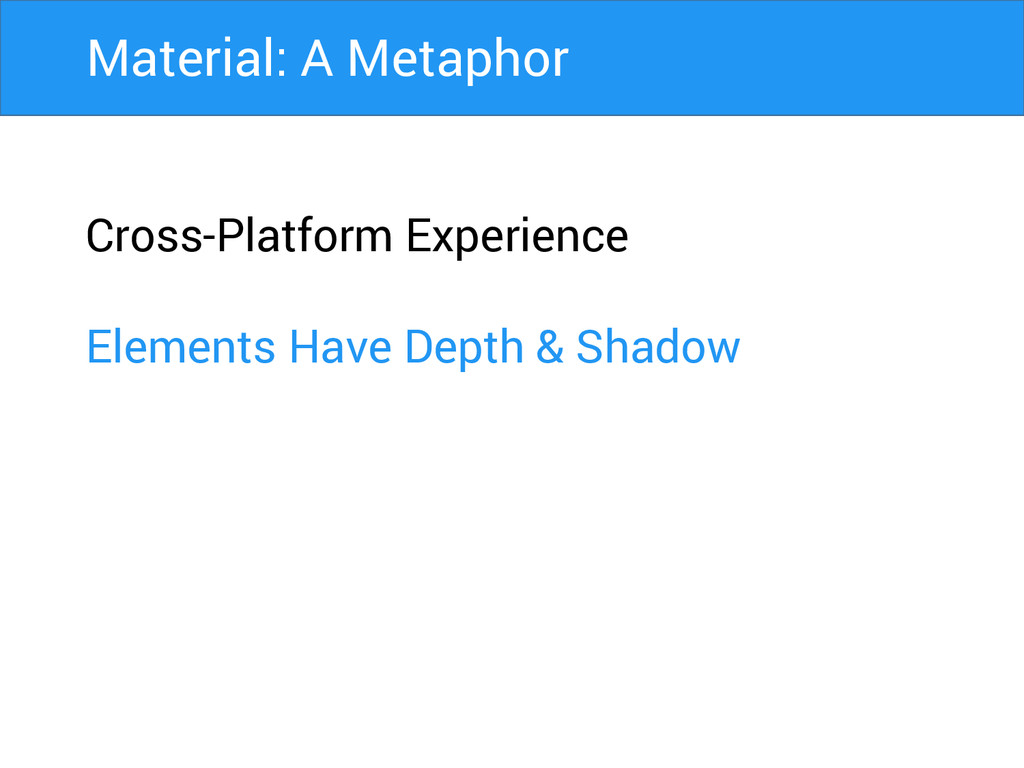
Cross-Platform Experience Elements Have Depth & Shadow Material: A Metaphor
Cross-Platform Experience Elements Have Depth & Shadow User Motion, Interaction,
Bold & Visual Design Material: A Metaphor
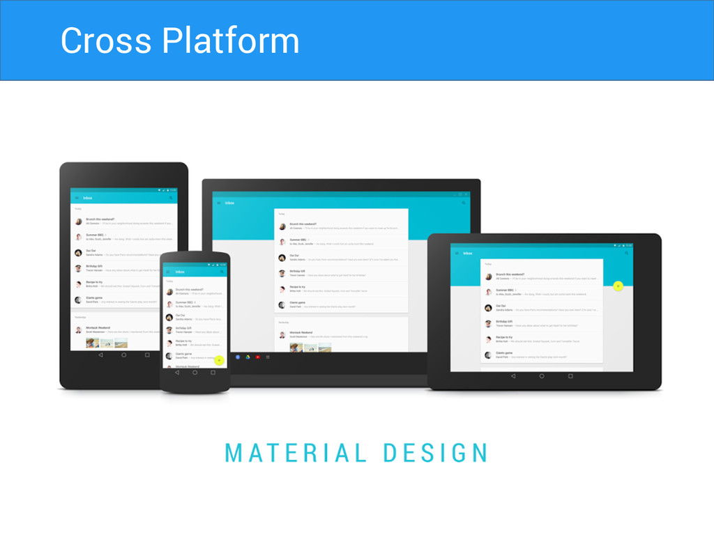
Cross Platform
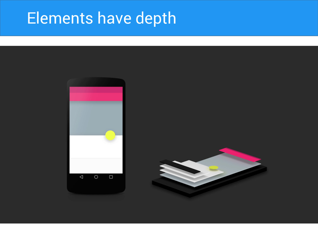
Elements Have Depth Elements have depth
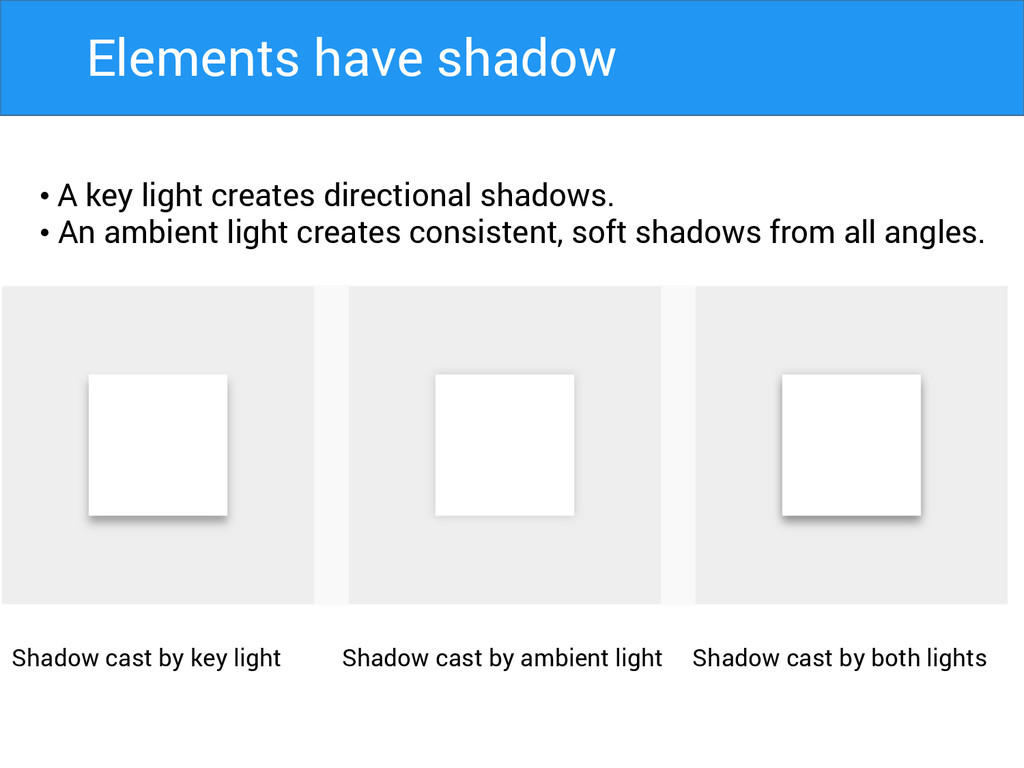
• A key light creates directional shadows. • An ambient
light creates consistent, soft shadows from all angles. Shadow cast by key light Shadow cast by ambient light Shadow cast by both lights Elements have shadow
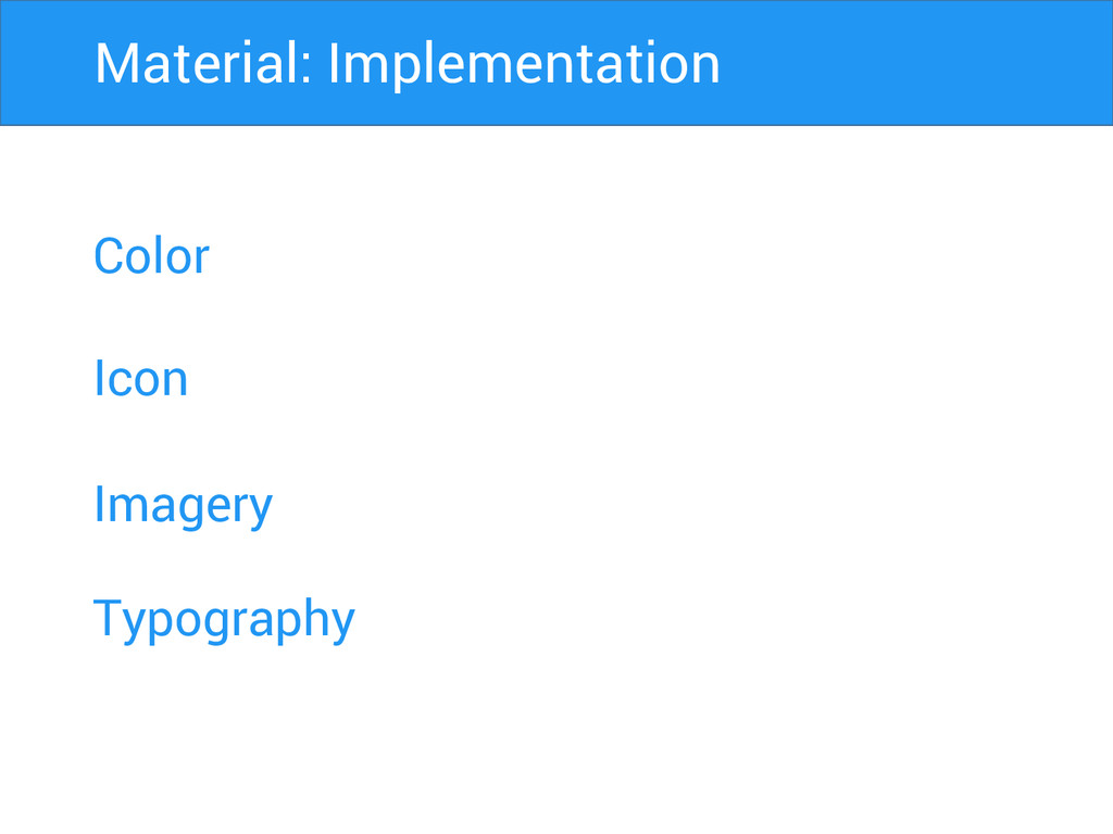
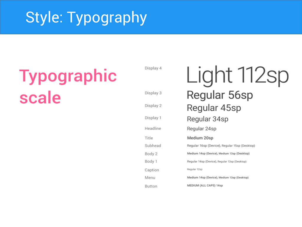
Color Icon Imagery Material: Implementation Typography
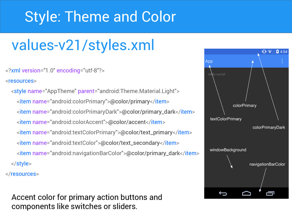
values-v21/styles.xml Accent color for primary action buttons and components like
switches or sliders. Style: Theme and Color <?xml version="1.0" encoding="utf-8"?> <resources> <style name="AppTheme" parent="android:Theme.Material.Light"> <item name="android:colorPrimary">@color/primary</item> <item name="android:colorPrimaryDark">@color/primary_dark</item> <item name="android:colorAccent">@color/accent</item> <item name="android:textColorPrimary">@color/text_primary</item> <item name="android:textColor">@color/text_secondary</item> <item name="android:navigationBarColor">@color/primary_dark</item> </style> </resources>
Primary Secondary Style: Color Palette
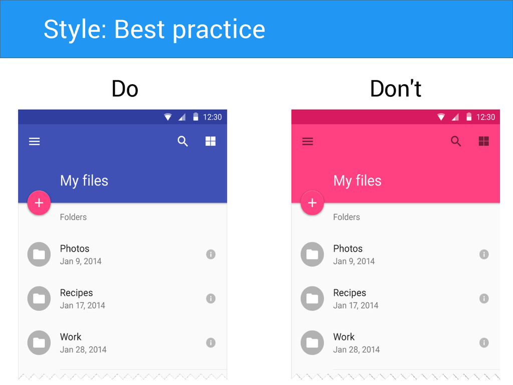
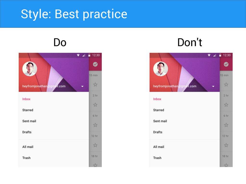
Do Don't Style: Best practice
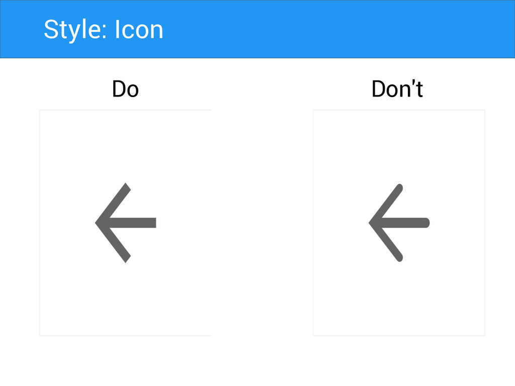
Style: Icon Do Don't
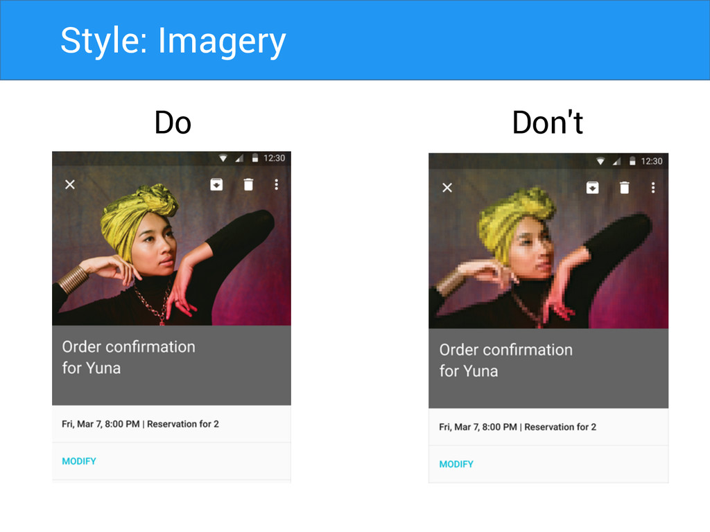
Style: Imagery Do Don't
Style: Best practice Do Don't
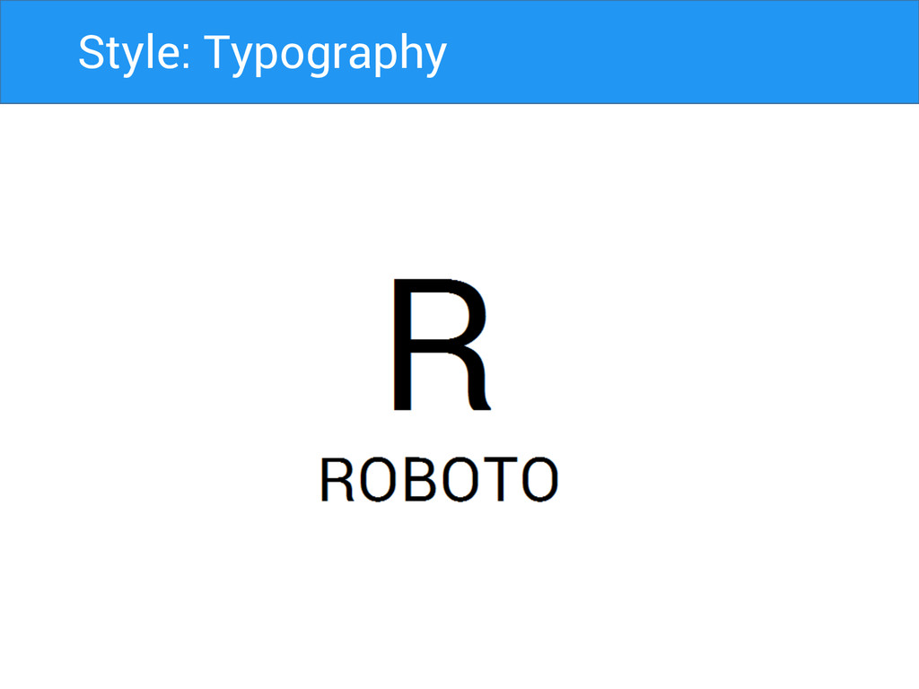
Style: Typography
Style: Typography
Style: Typography
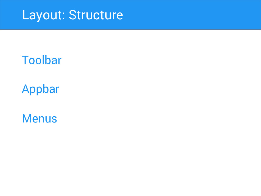
Toolbar Appbar Menus Layout: Structure
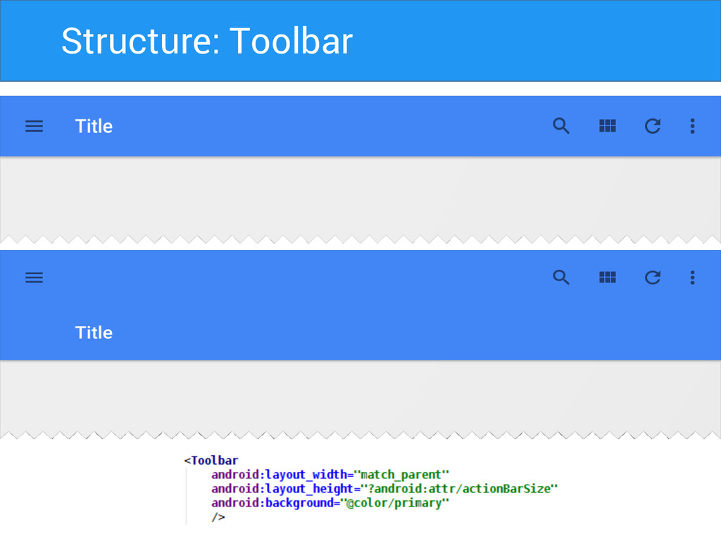
Structure: Toolbar
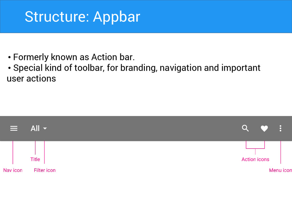
Structure: Appbar • Formerly known as Action bar. • Special
kind of toolbar, for branding, navigation and important user actions
Structure: Appbar Matrics • Mobile Landscape: 48dp • Mobile Portrait:
56dp • Tablet/Desktop: 64dp
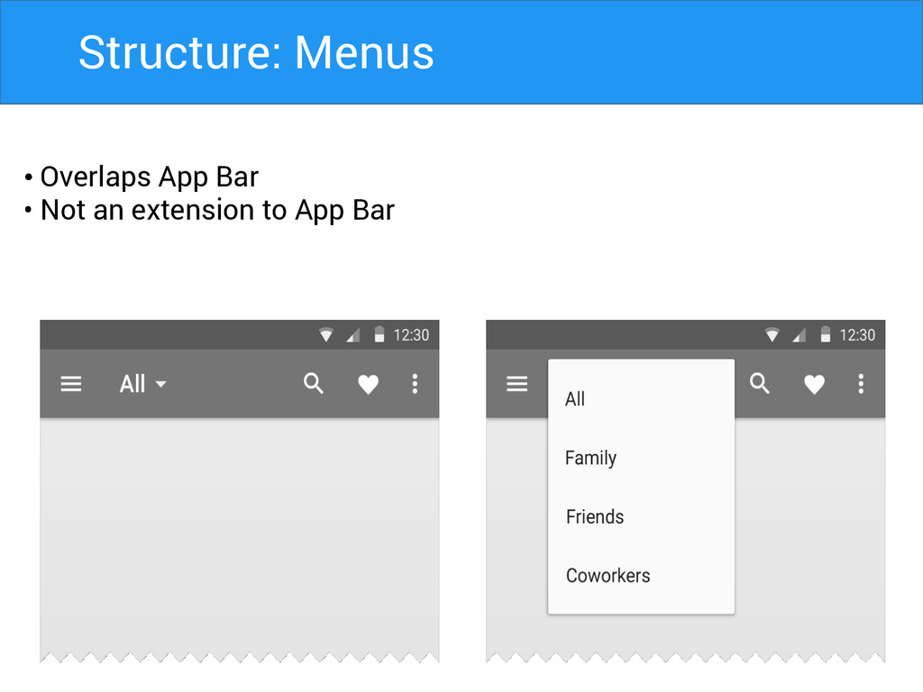
Structure: Menus • Overlaps App Bar • Not an extension
to App Bar
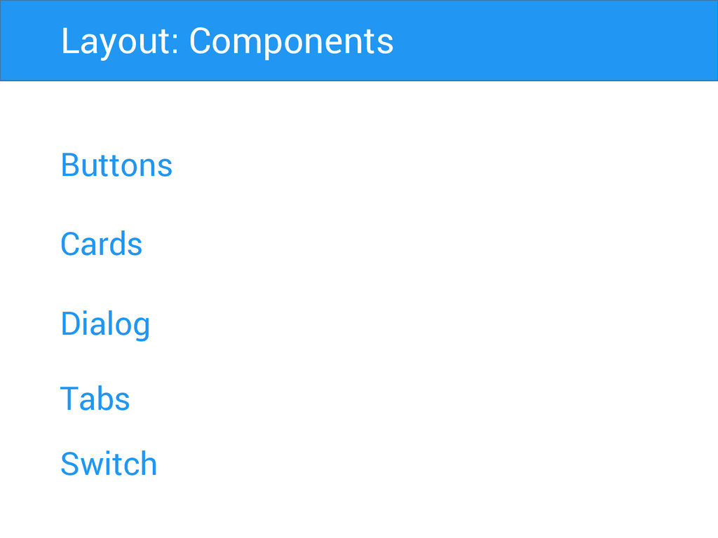
Buttons Cards Dialog Layout: Components Tabs Switch
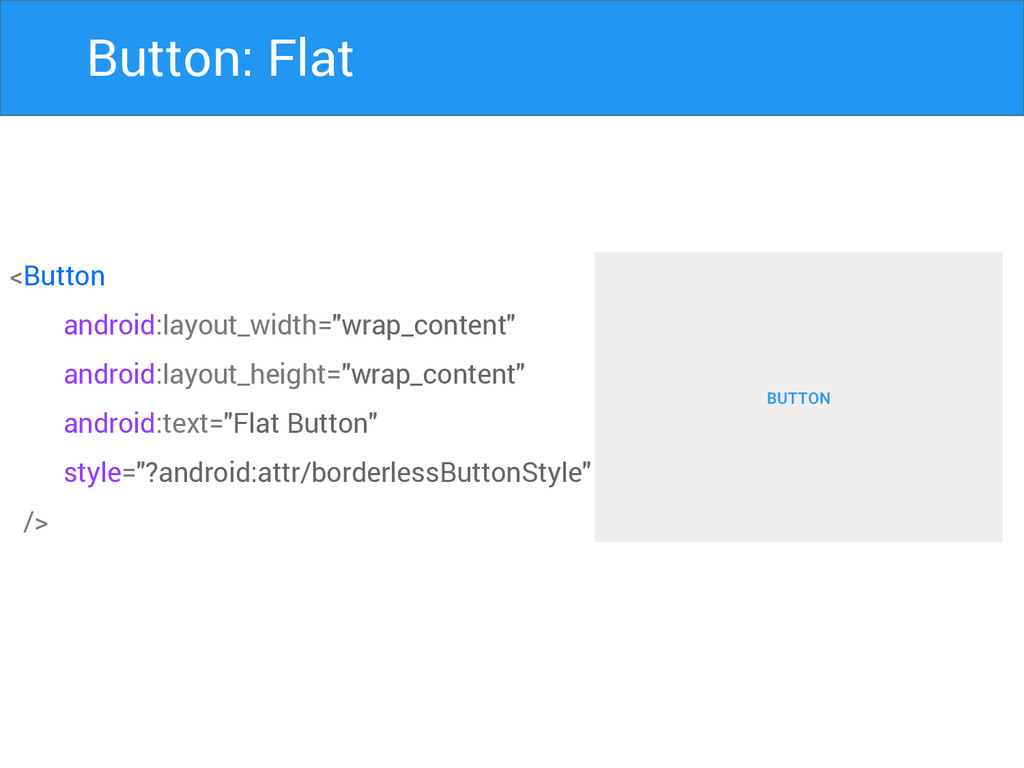
Button: Flat <Button android:layout_width="wrap_content" android:layout_height="wrap_content" android:text="Flat Button" style="?android:attr/borderlessButtonStyle" />
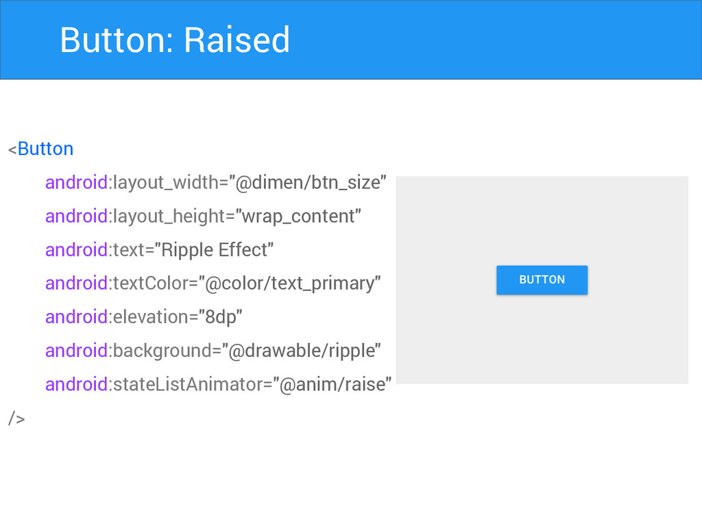
Button: Raised <Button android:layout_width="@dimen/btn_size" android:layout_height="wrap_content" android:text="Ripple Effect" android:textColor="@color/text_primary" android:elevation="8dp" android:background="@drawable/ripple"
android:stateListAnimator="@anim/raise" />
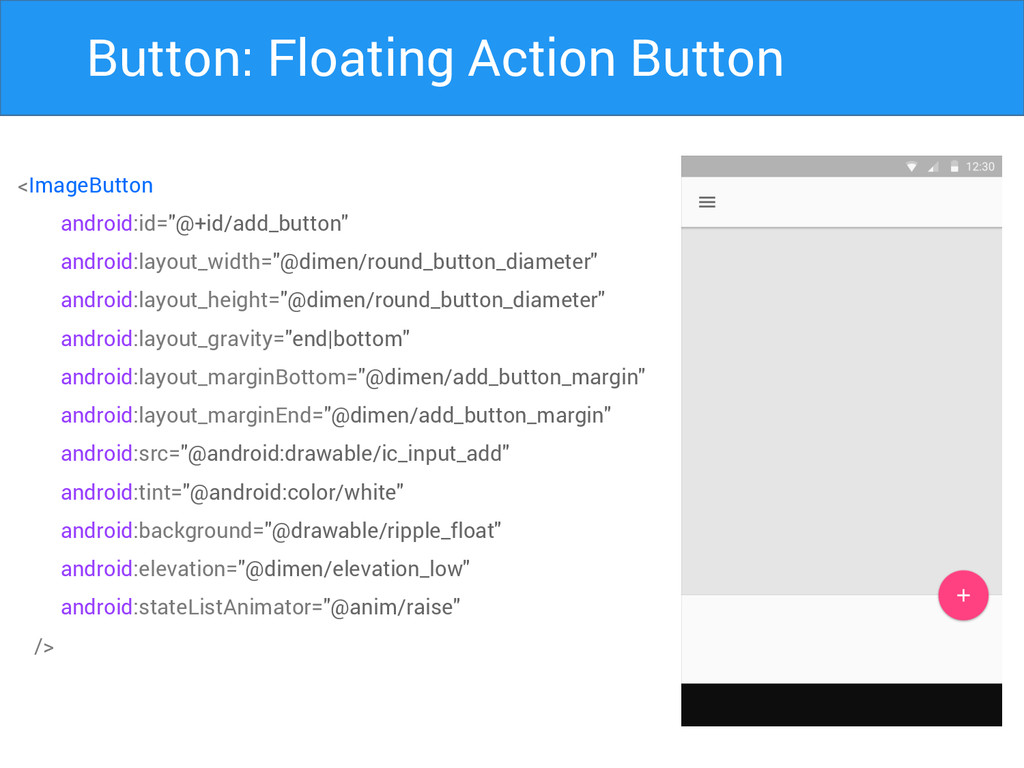
Button: Floating Action Button <ImageButton android:id="@+id/add_button" android:layout_width="@dimen/round_button_diameter" android:layout_height="@dimen/round_button_diameter" android:layout_gravity="end|bottom" android:layout_marginBottom="@dimen/add_button_margin"
android:layout_marginEnd="@dimen/add_button_margin" android:src="@android:drawable/ic_input_add" android:tint="@android:color/white" android:background="@drawable/ripple_float" android:elevation="@dimen/elevation_low" android:stateListAnimator="@anim/raise" />
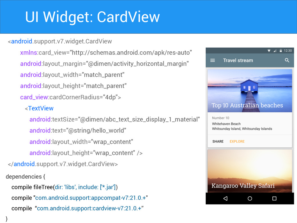
UI Widget: CardView <android.support.v7.widget.CardView xmlns:card_view="http://schemas.android.com/apk/res-auto" android:layout_margin="@dimen/activity_horizontal_margin" android:layout_width="match_parent" android:layout_height="match_parent" card_view:cardCornerRadius="4dp"> <TextView
android:textSize="@dimen/abc_text_size_display_1_material" android:text="@string/hello_world" android:layout_width="wrap_content" android:layout_height="wrap_content" /> </android.support.v7.widget.CardView> dependencies { compile fileTree(dir: 'libs', include: ['*.jar']) compile "com.android.support:appcompat-v7:21.0.+" compile “com.android.support:cardview-v7:21.0.+” }
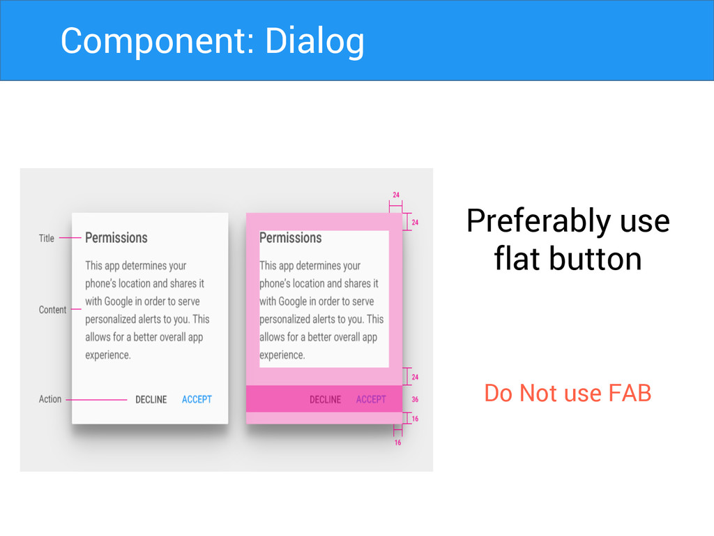
Preferably use flat button Do Not use FAB Component: Dialog
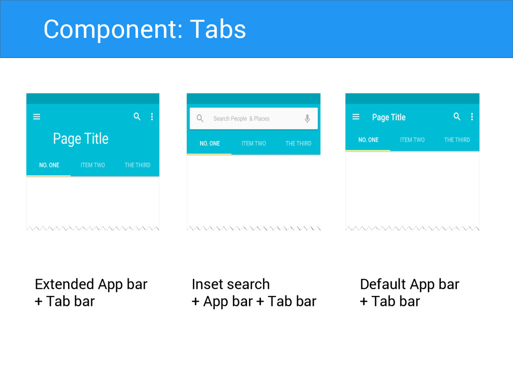
Extended App bar + Tab bar Inset search + App
bar + Tab bar Default App bar + Tab bar Component: Tabs
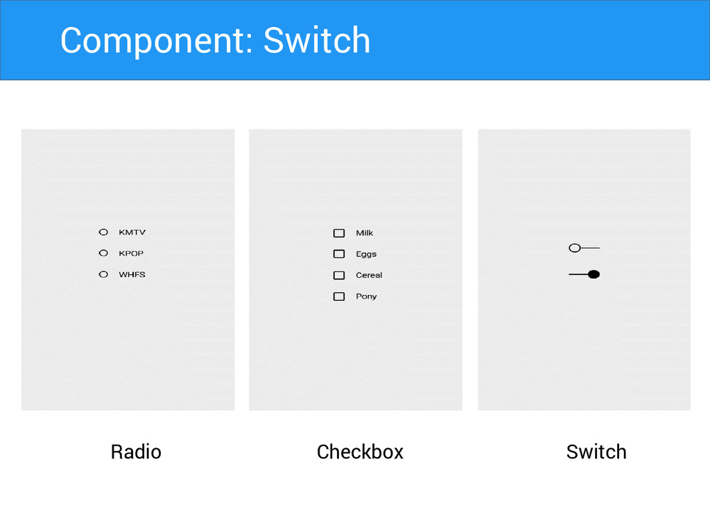
Radio Switch Checkbox Component: Switch
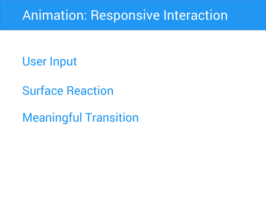
User Input Surface Reaction Animation: Responsive Interaction Meaningful Transition
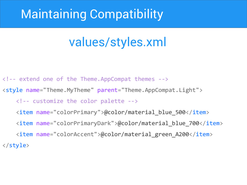
Maintaining Compatibility values/styles.xml <!-- extend one of the Theme.AppCompat themes
--> <style name="Theme.MyTheme" parent="Theme.AppCompat.Light"> <!-- customize the color palette --> <item name="colorPrimary">@color/material_blue_500</item> <item name="colorPrimaryDark">@color/material_blue_700</item> <item name="colorAccent">@color/material_green_A200</item> </style>
Maintaining Compatibility build.gradle dependencies { compile fileTree(dir: 'libs', include: ['*.jar'])
compile "com.android.support:appcompat-v7:21.0.+" compile “com.android.support:cardview-v7:21.0.+” compile “com.android.support:recyclerview-v7:21.0.+” }
Thank You Harsh Dattani @dattaniharsh Google.com/+harshdattani Github.com/harshdattani
 harshdattani
 keita_yoshikawa
 ajstarks
 kumanoayumi
 rezaline
 seto
seto
 securecat
 kenichiota0711
 baasie
 dmattsun
 kaikou
 bebe
bebe
 deadlinepoet
 codingconduct
 letsgokoyo
 sferik
 aleyda
 tamaranovitovic
 mojombo
 jacobian
 mayatellez
 inesmontani
 apolaine
.png) helenjbeal
helenjbeal
![Maintaining Compatibility build.gradle dependencies { compile fileTree(dir: 'libs', include: ['*.jar'])](https://files.speakerdeck.com/presentations/24f26860675101329de64646cf6f404b/slide_35.jpg)