the accessibility of the product and formulating and implementing UI guidelines • LY Corporation Web Accessibility Team • Yahoo! JAPAN UI Guidelines Team • Web Accessibility Infrastructure Committee, Working Group 1 Chairperson • Digital Agency, Accessibility Specialist (part-time)
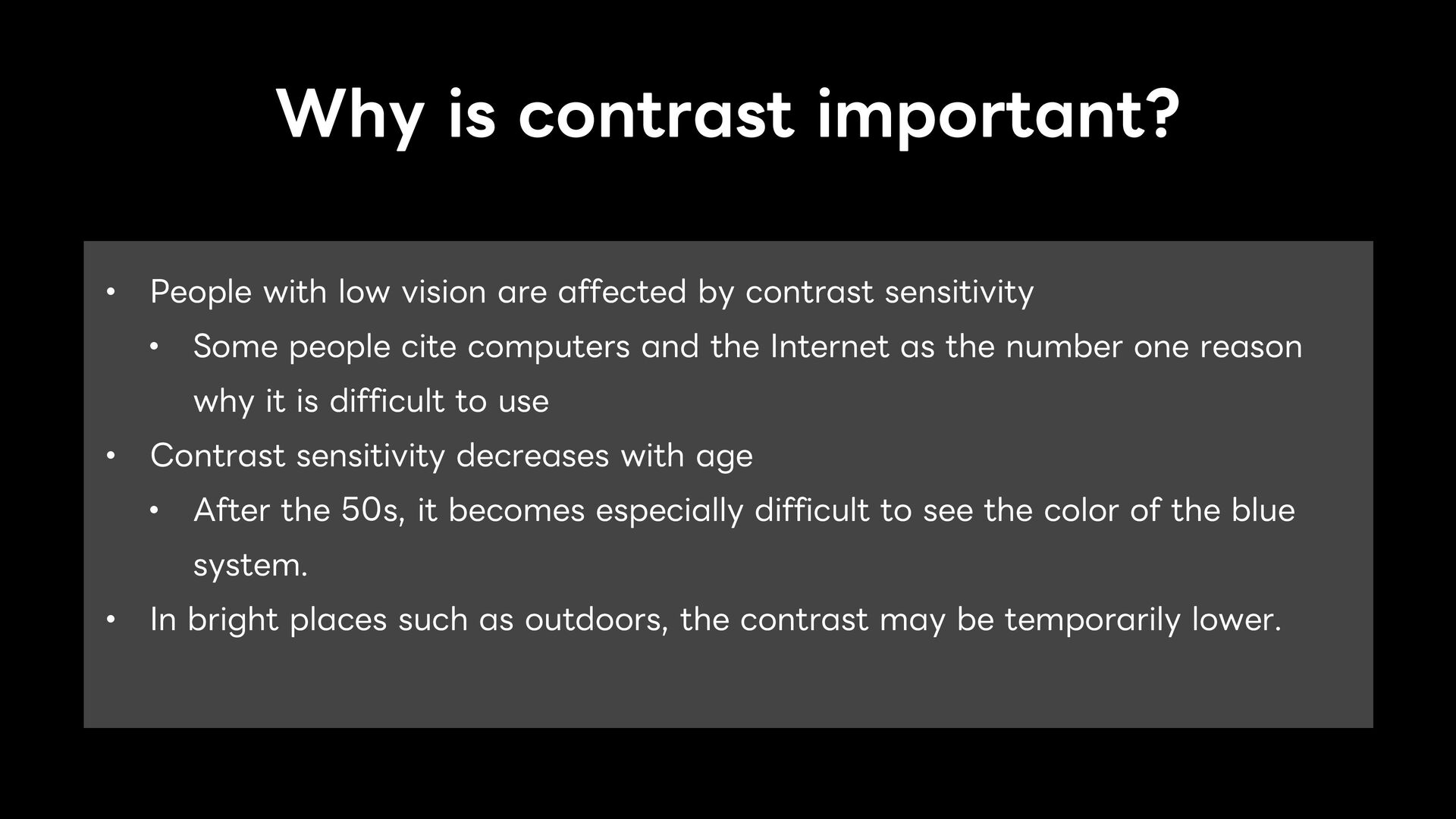
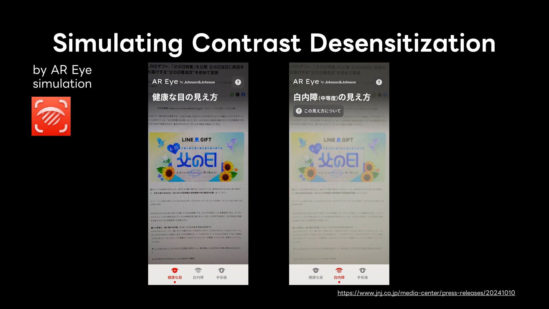
affected by contrast sensitivity • Some people cite computers and the Internet as the number one reason why it is difficult to use • Contrast sensitivity decreases with age • After the 50s, it becomes especially difficult to see the color of the blue system. • In bright places such as outdoors, the contrast may be temporarily lower.
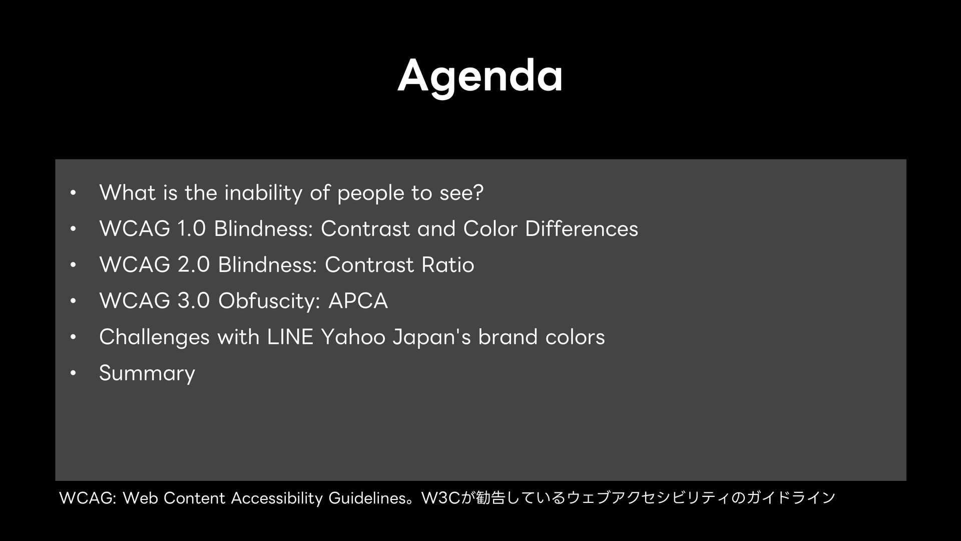
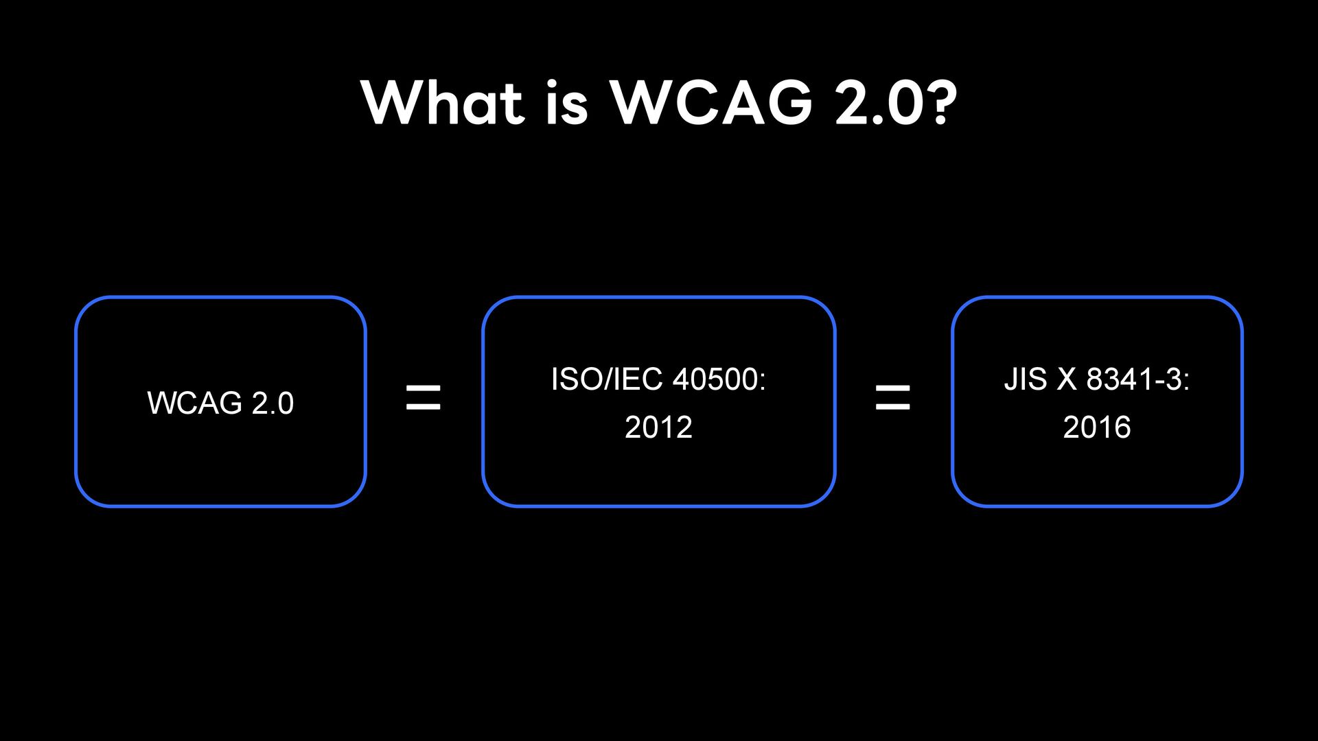
• Guidelines for ensuring the accessibility of web content • Developed and recommended by the W3C • WCAG 1.0 was recommended in 1999 and has been updated from time to time • The latest version is WCAG 2.2, which was recommended for 2023 • WCAG 3.0 is currently being considered
that foreground and background color combinations provide sufficient contrast when viewed by someone having color deficits or when viewed on a black and white screen. • WCAG 2.0 had a single color and contrast criteria. • There were no specific standards https://www.w3.org/TR/WCAG10/
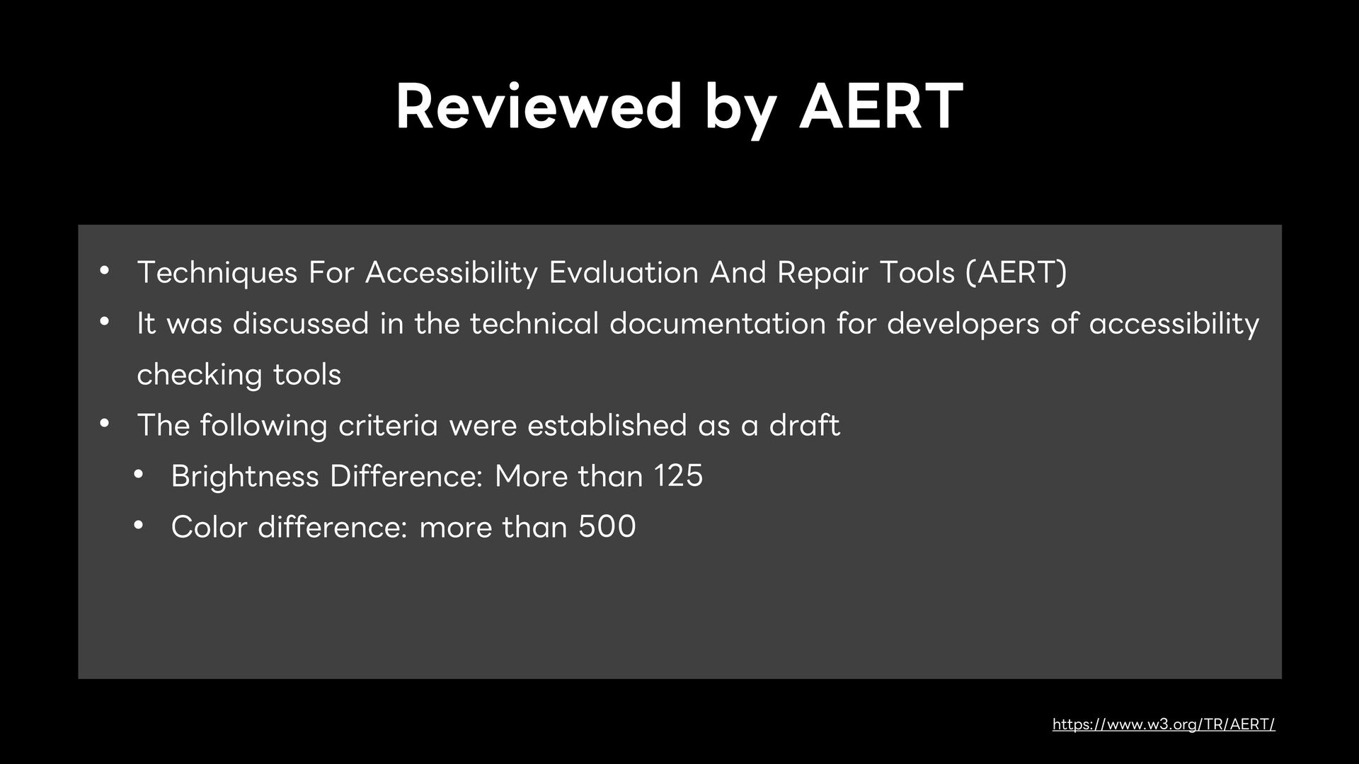
Tools (AERT) • It was discussed in the technical documentation for developers of accessibility checking tools • The following criteria were established as a draft • Brightness Difference: More than 125 • Color difference: more than 500 https://www.w3.org/TR/AERT/
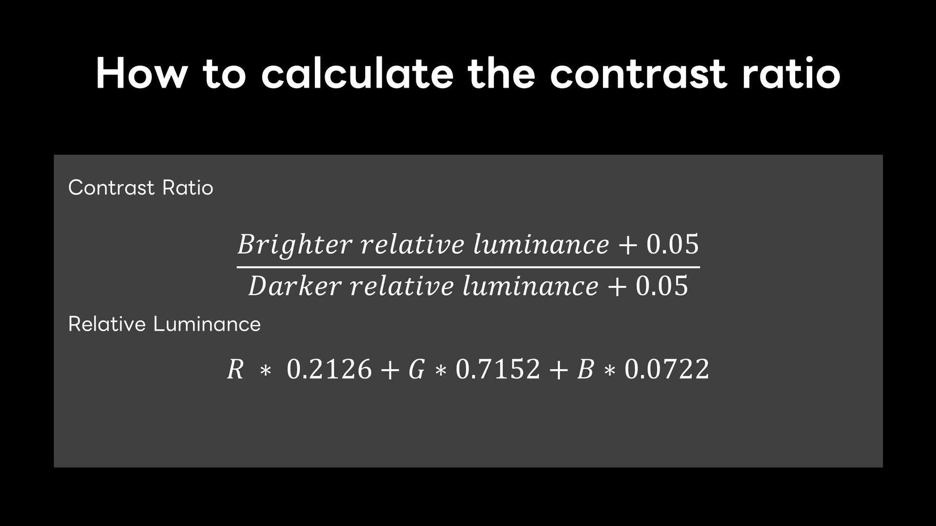
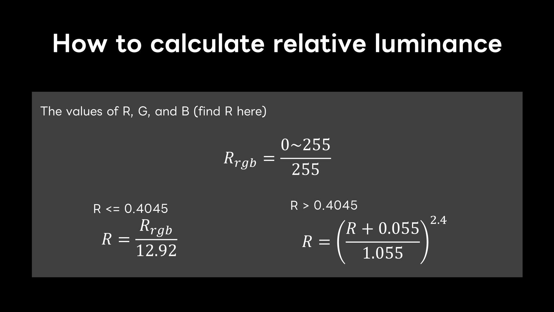
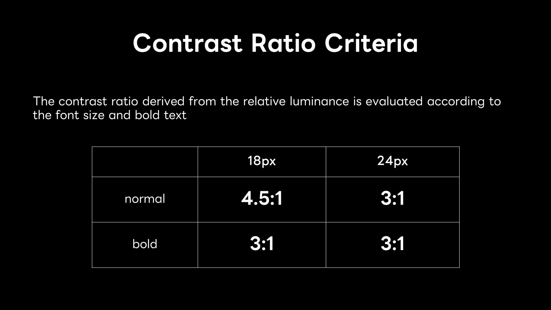
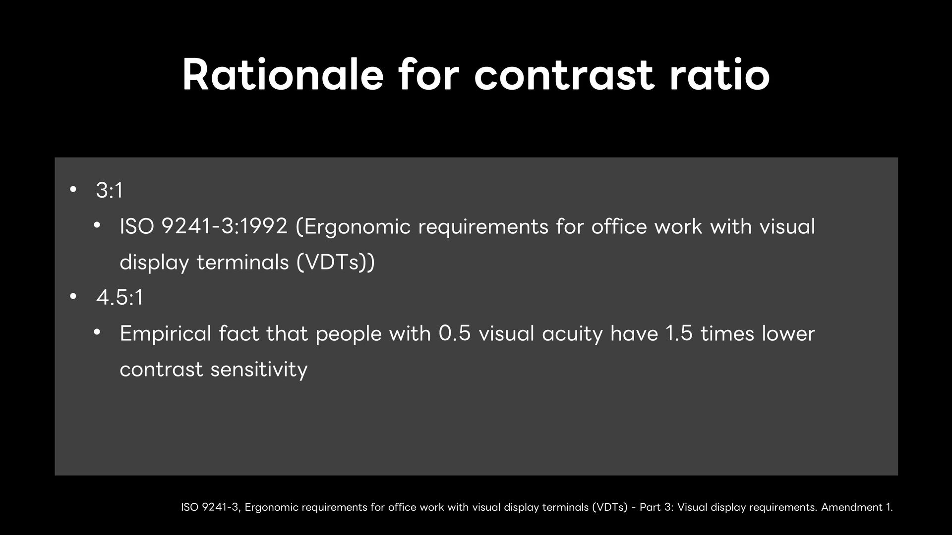
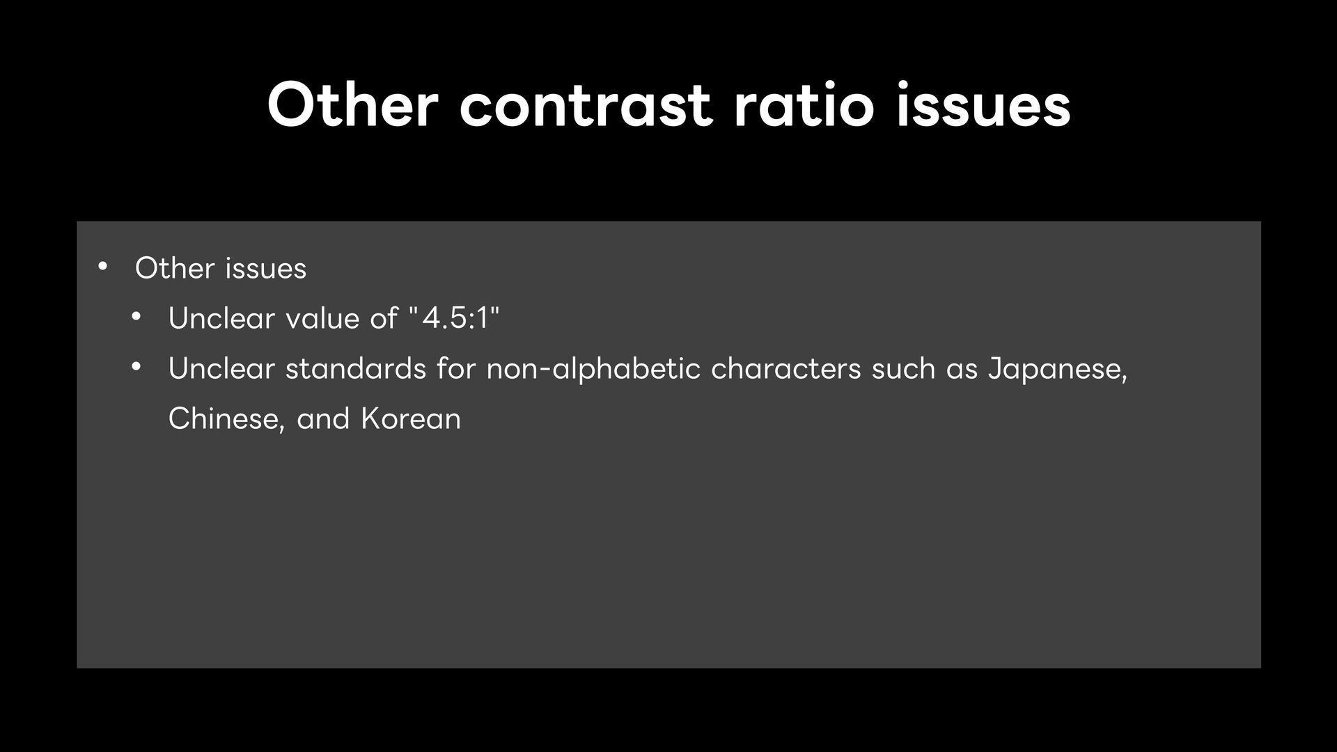
requirements for office work with visual display terminals (VDTs)) • 4.5:1 • Empirical fact that people with 0.5 visual acuity have 1.5 times lower contrast sensitivity ISO 9241-3, Ergonomic requirements for office work with visual display terminals (VDTs) - Part 3: Visual display requirements. Amendment 1.
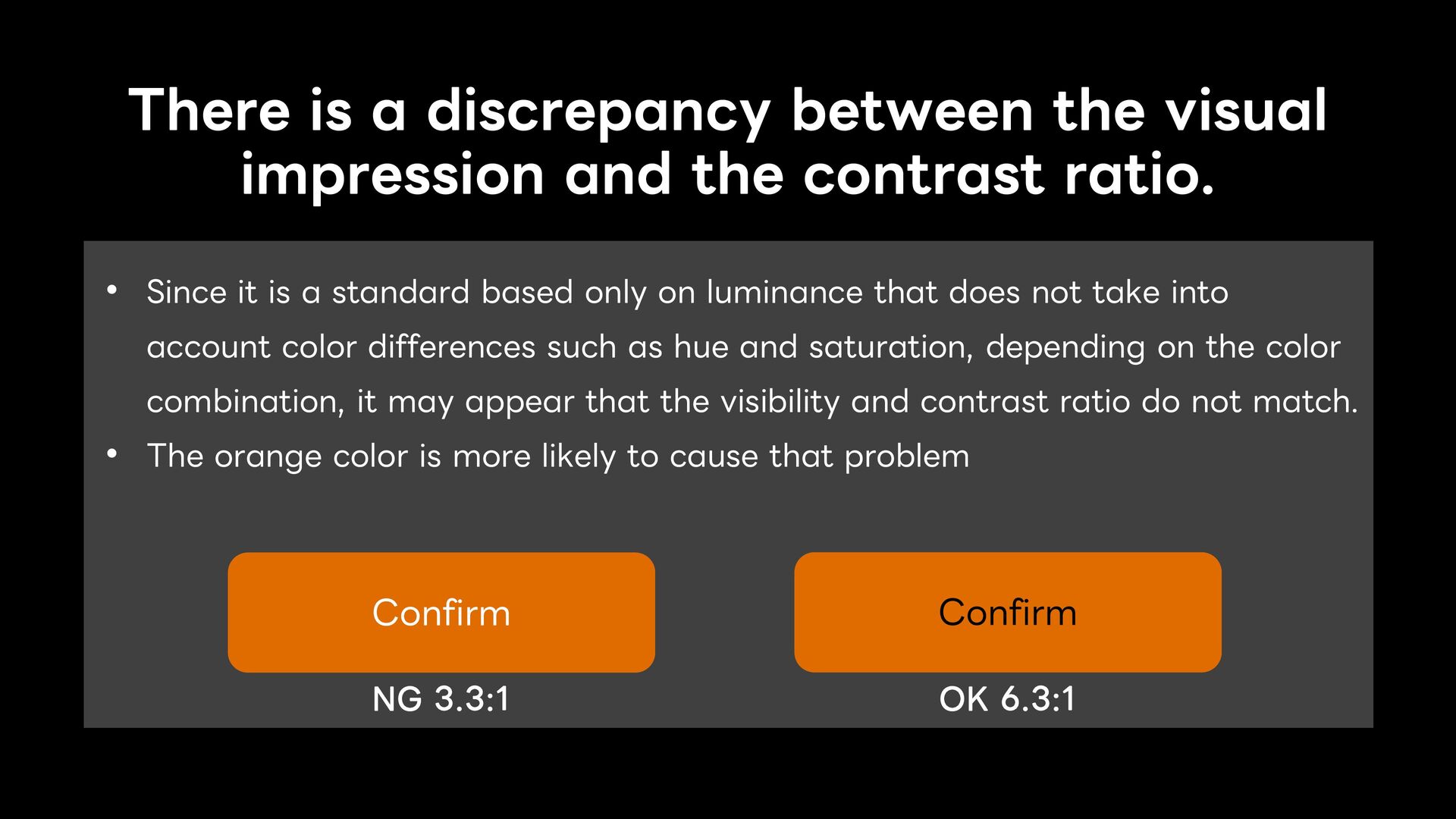
contrast ratio. • Since it is a standard based only on luminance that does not take into account color differences such as hue and saturation, depending on the color combination, it may appear that the visibility and contrast ratio do not match. • The orange color is more likely to cause that problem Confirm NG 3.3:1 Confirm OK 6.3:1
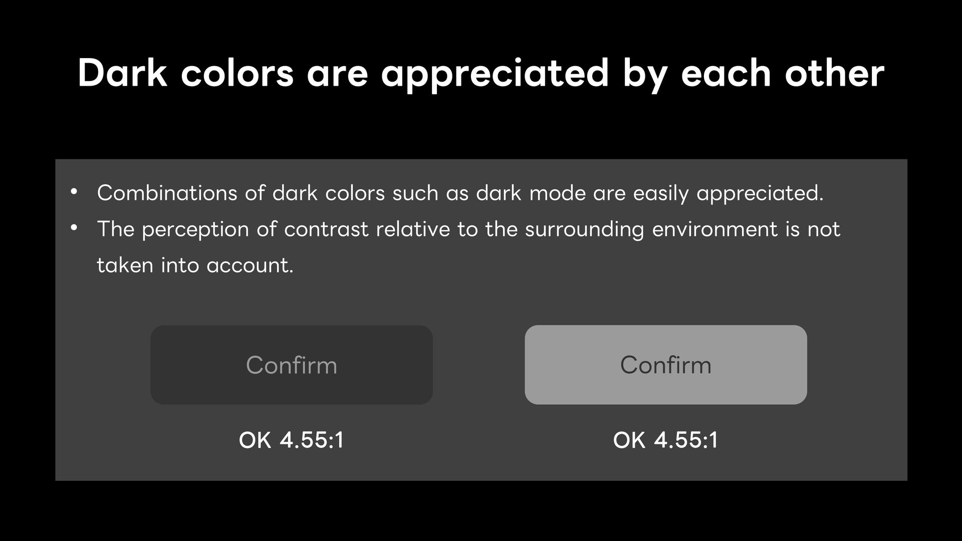
dark colors such as dark mode are easily appreciated. • The perception of contrast relative to the surrounding environment is not taken into account. Confirm OK 4.55:1 Confirm OK 4.55:1
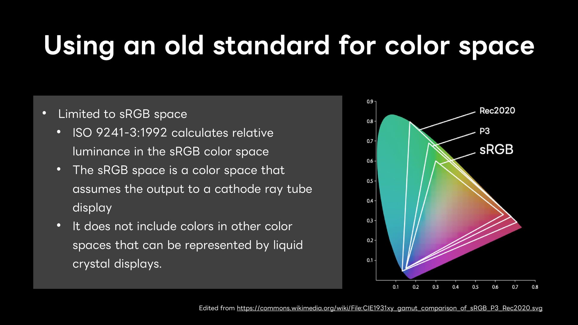
sRGB space • ISO 9241-3:1992 calculates relative luminance in the sRGB color space • The sRGB space is a color space that assumes the output to a cathode ray tube display • It does not include colors in other color spaces that can be represented by liquid crystal displays. Edited from https://commons.wikimedia.org/wiki/File:CIE1931xy_gamut_comparison_of_sRGB_P3_Rec2020.svg
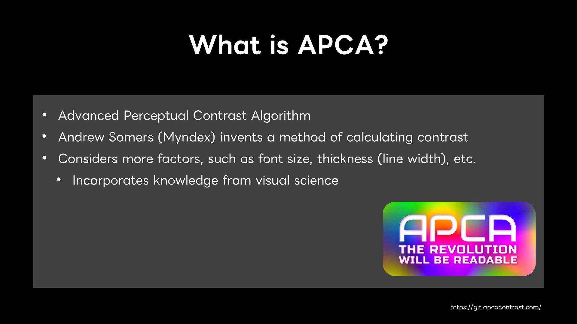
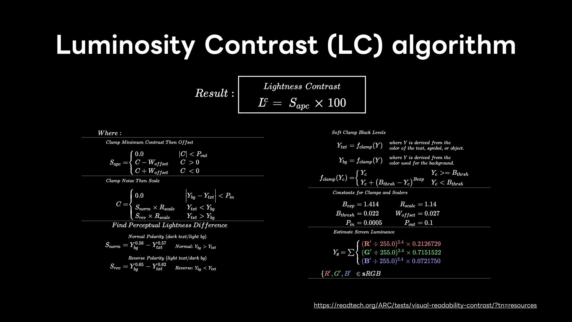
Somers (Myndex) invents a method of calculating contrast • Considers more factors, such as font size, thickness (line width), etc. • Incorporates knowledge from visual science https://git.apcacontrast.com/
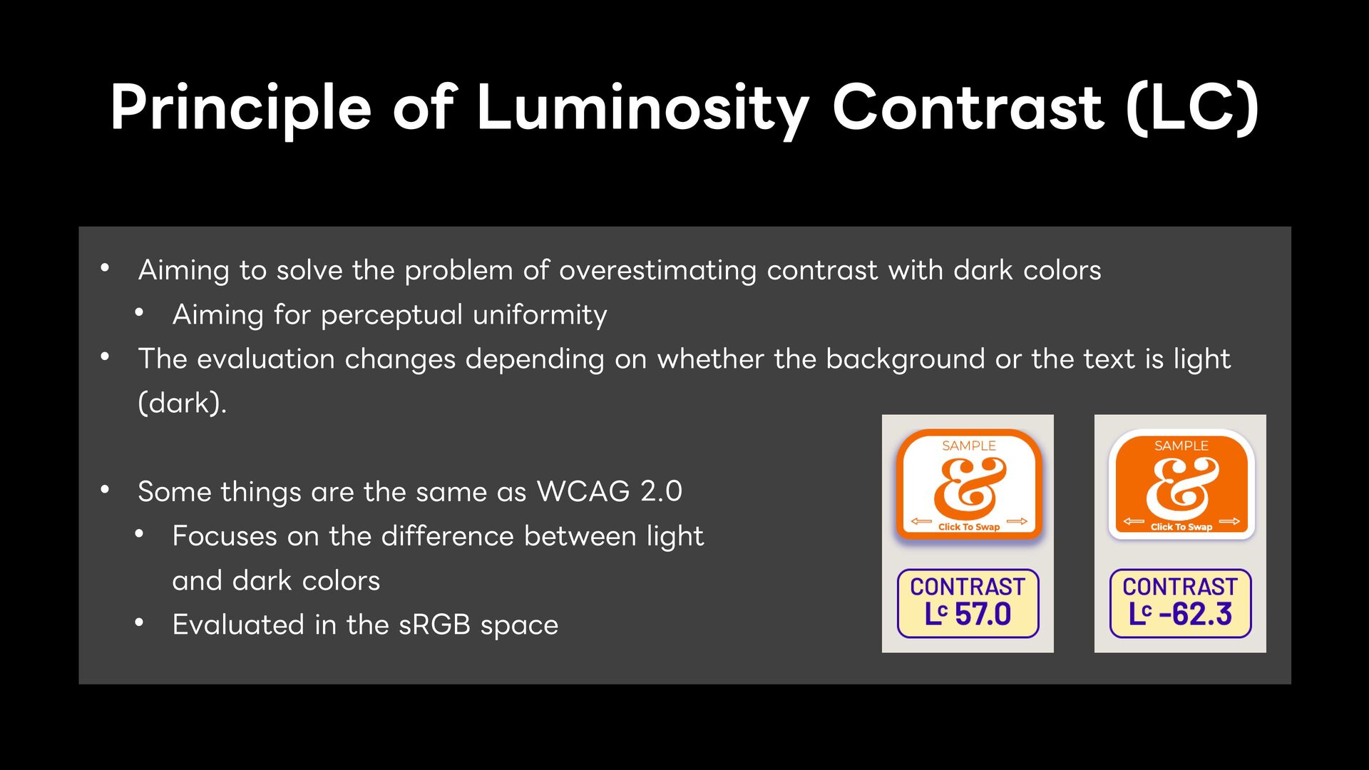
problem of overestimating contrast with dark colors • Aiming for perceptual uniformity • The evaluation changes depending on whether the background or the text is light (dark). • Some things are the same as WCAG 2.0 • Focuses on the difference between light and dark colors • Evaluated in the sRGB space
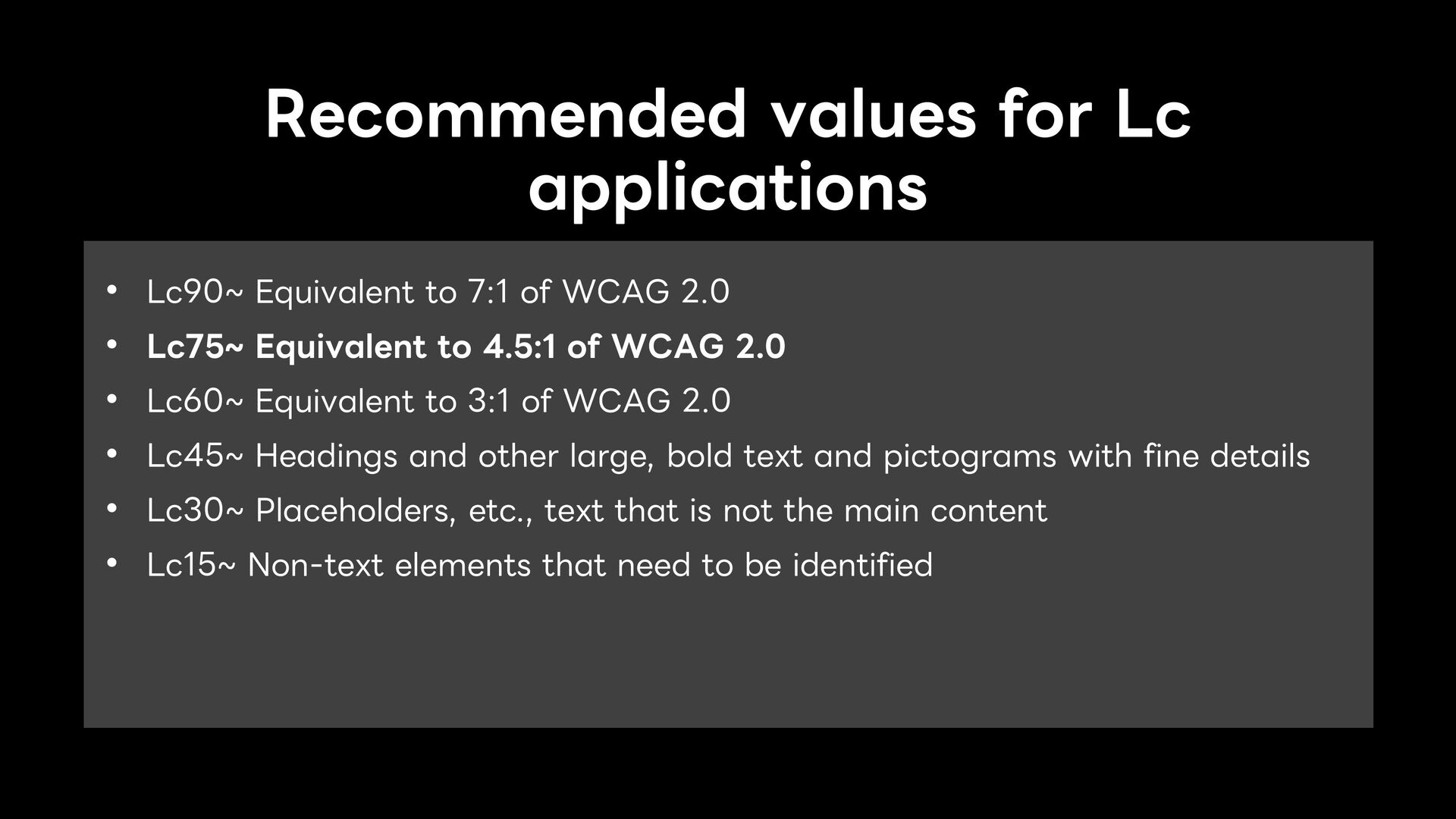
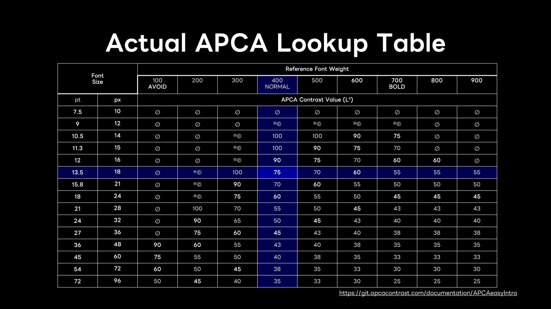
of WCAG 2.0 • Lc75~ Equivalent to 4.5:1 of WCAG 2.0 • Lc60~ Equivalent to 3:1 of WCAG 2.0 • Lc45~ Headings and other large, bold text and pictograms with fine details • Lc30~ Placeholders, etc., text that is not the main content • Lc15~ Non-text elements that need to be identified
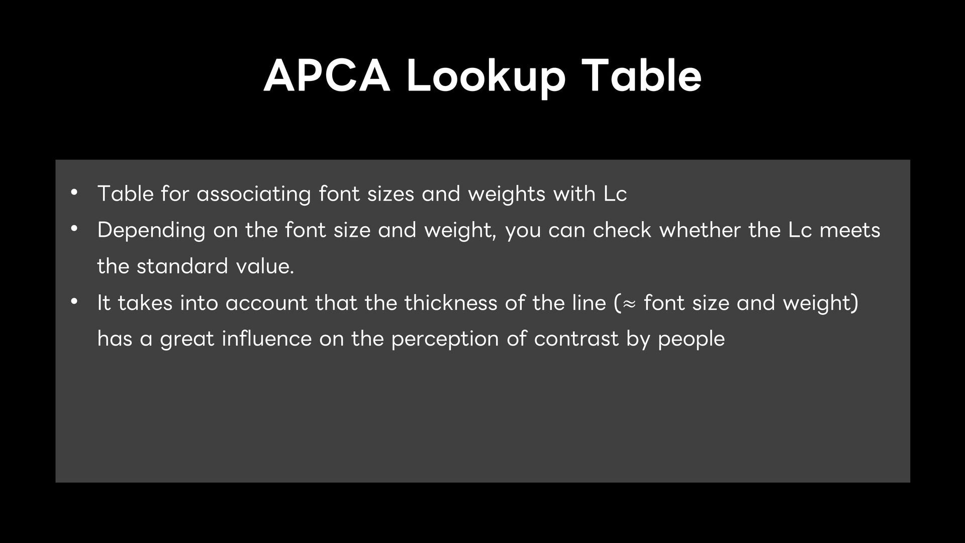
weights with Lc • Depending on the font size and weight, you can check whether the Lc meets the standard value. • It takes into account that the thickness of the line (≈ font size and weight) has a great influence on the perception of contrast by people
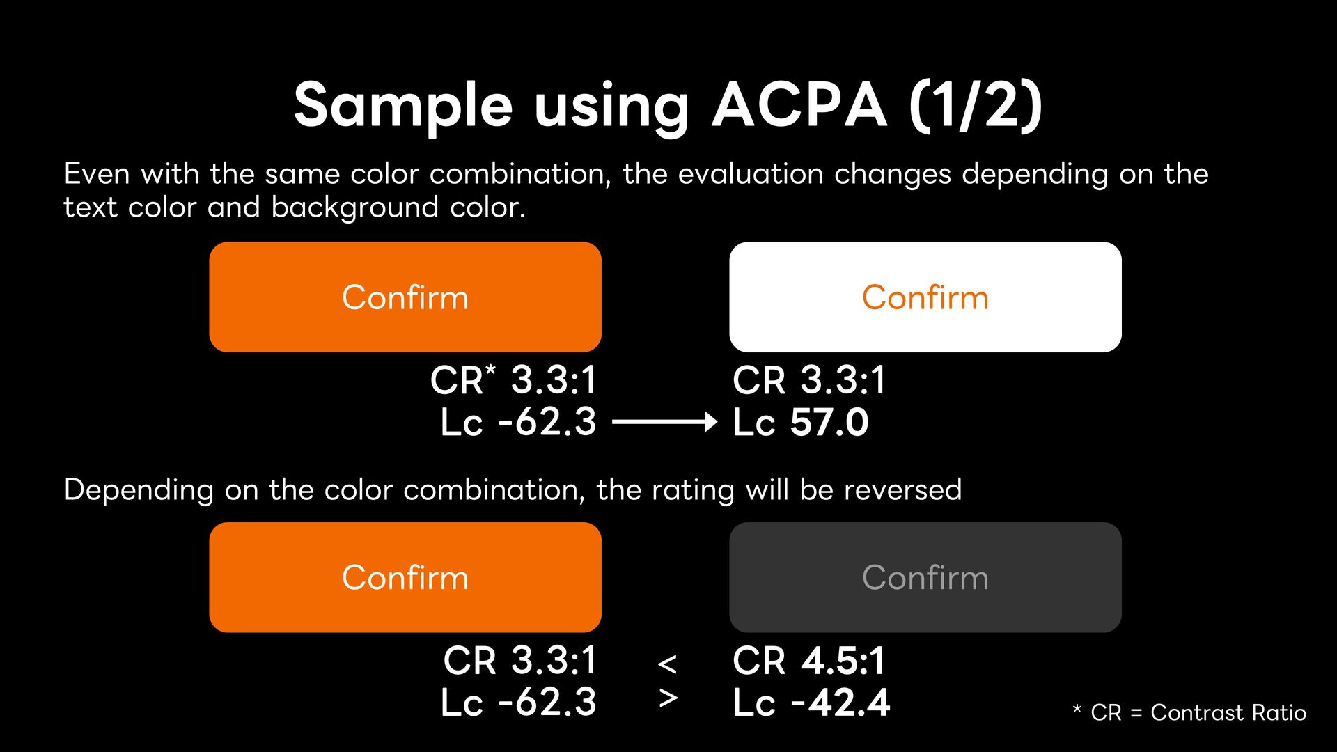
the evaluation changes depending on the text color and background color. Confirm CR* 3.3:1 Lc -62.3 Confirm CR 3.3:1 Lc 57.0 Depending on the color combination, the rating will be reversed Confirm CR 3.3:1 Lc -62.3 < > Confirm CR 4.5:1 Lc -42.4 * CR = Contrast Ratio
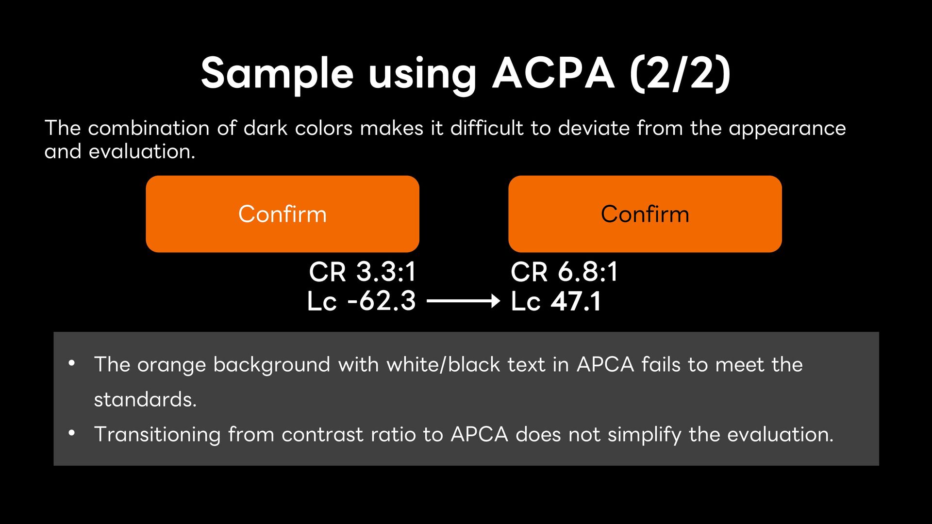
it difficult to deviate from the appearance and evaluation. Confirm CR 3.3:1 Lc -62.3 Confirm CR 6.8:1 Lc 47.1 • The orange background with white/black text in APCA fails to meet the standards. • Transitioning from contrast ratio to APCA does not simplify the evaluation.
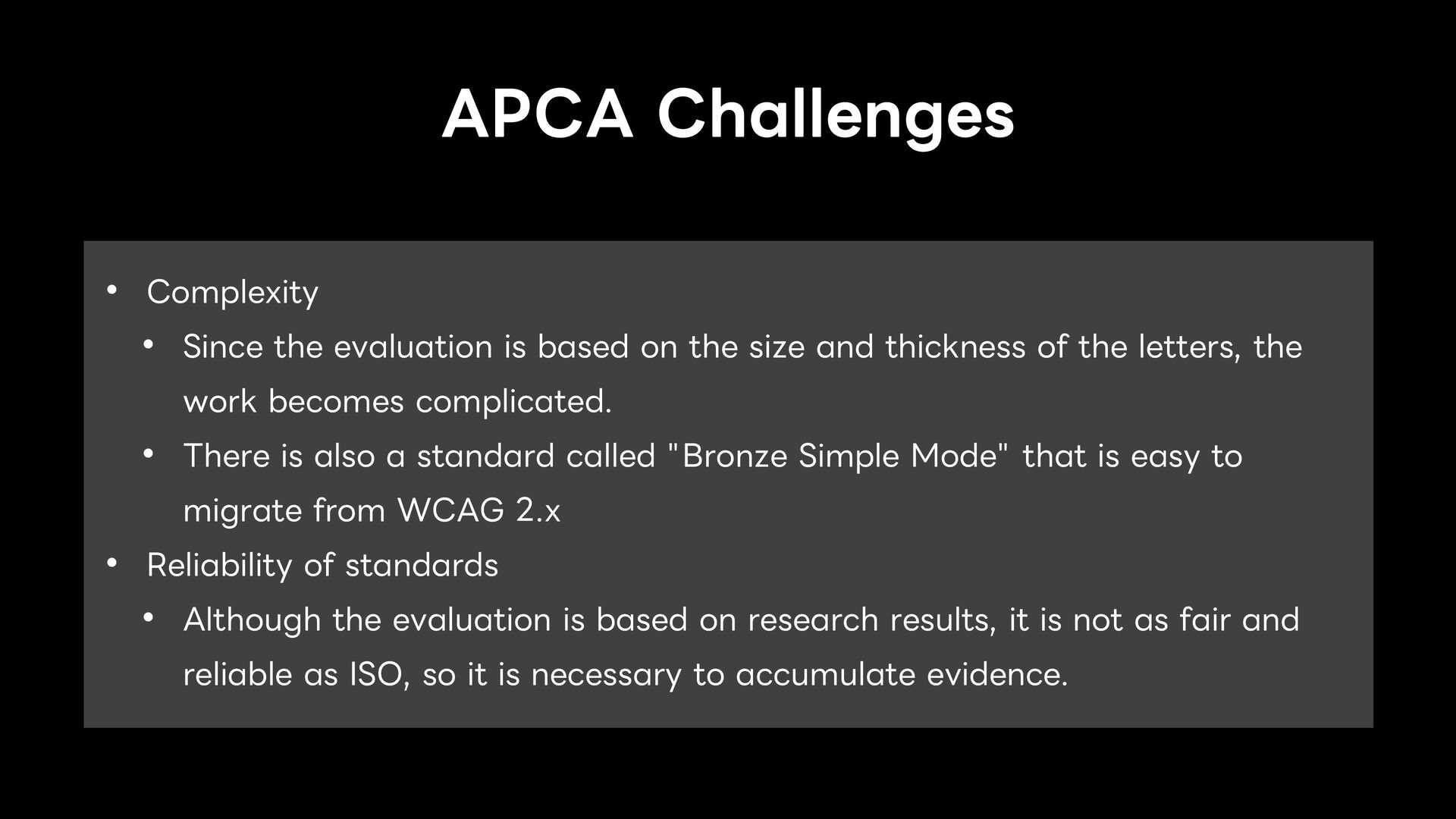
on the size and thickness of the letters, the work becomes complicated. • There is also a standard called "Bronze Simple Mode" that is easy to migrate from WCAG 2.x • Reliability of standards • Although the evaluation is based on research results, it is not as fair and reliable as ISO, so it is necessary to accumulate evidence.
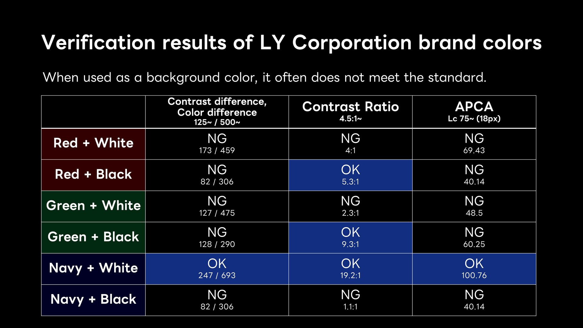
a background color, it often does not meet the standard. Contrast difference, Color difference 125~ / 500~ Contrast Ratio 4.5:1~ APCA Lc 75~ (18px) Red + White NG 173 / 459 NG 4:1 NG 69.43 Red + Black NG 82 / 306 OK 5.3:1 NG 40.14 Green + White NG 127 / 475 NG 2.3:1 NG 48.5 Green + Black NG 128 / 290 OK 9.3:1 NG 60.25 Navy + White OK 247 / 693 OK 19.2:1 OK 100.76 Navy + Black NG 82 / 306 NG 1.1:1 NG 40.14
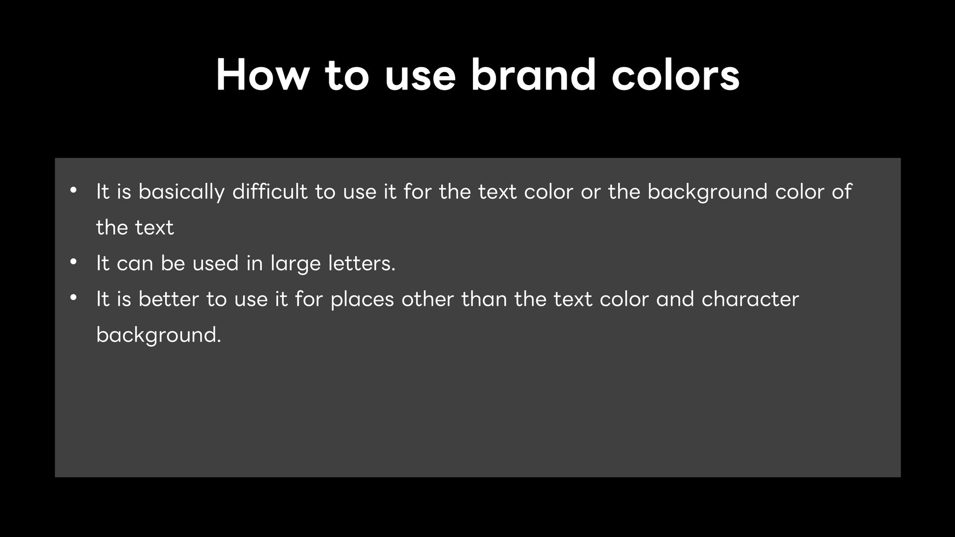
to use it for the text color or the background color of the text • It can be used in large letters. • It is better to use it for places other than the text color and character background.
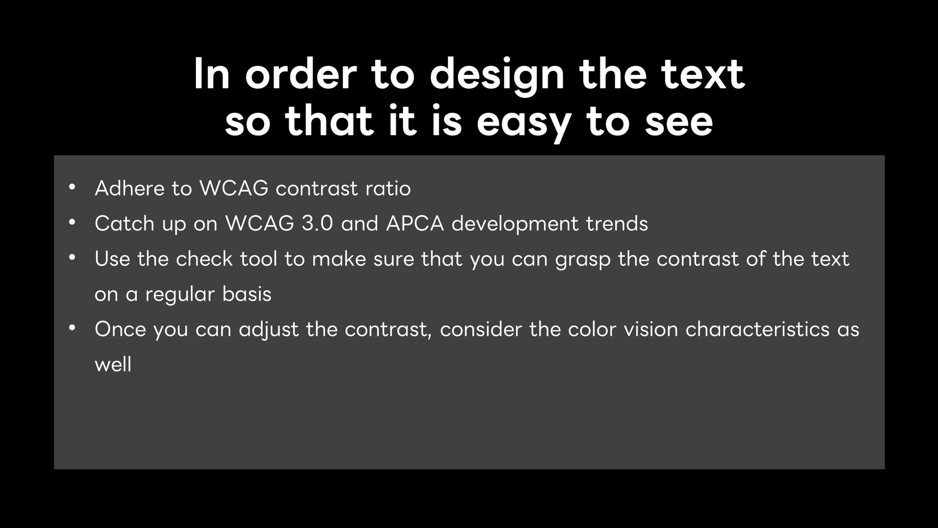
easy to see • Adhere to WCAG contrast ratio • Catch up on WCAG 3.0 and APCA development trends • Use the check tool to make sure that you can grasp the contrast of the text on a regular basis • Once you can adjust the contrast, consider the color vision characteristics as well
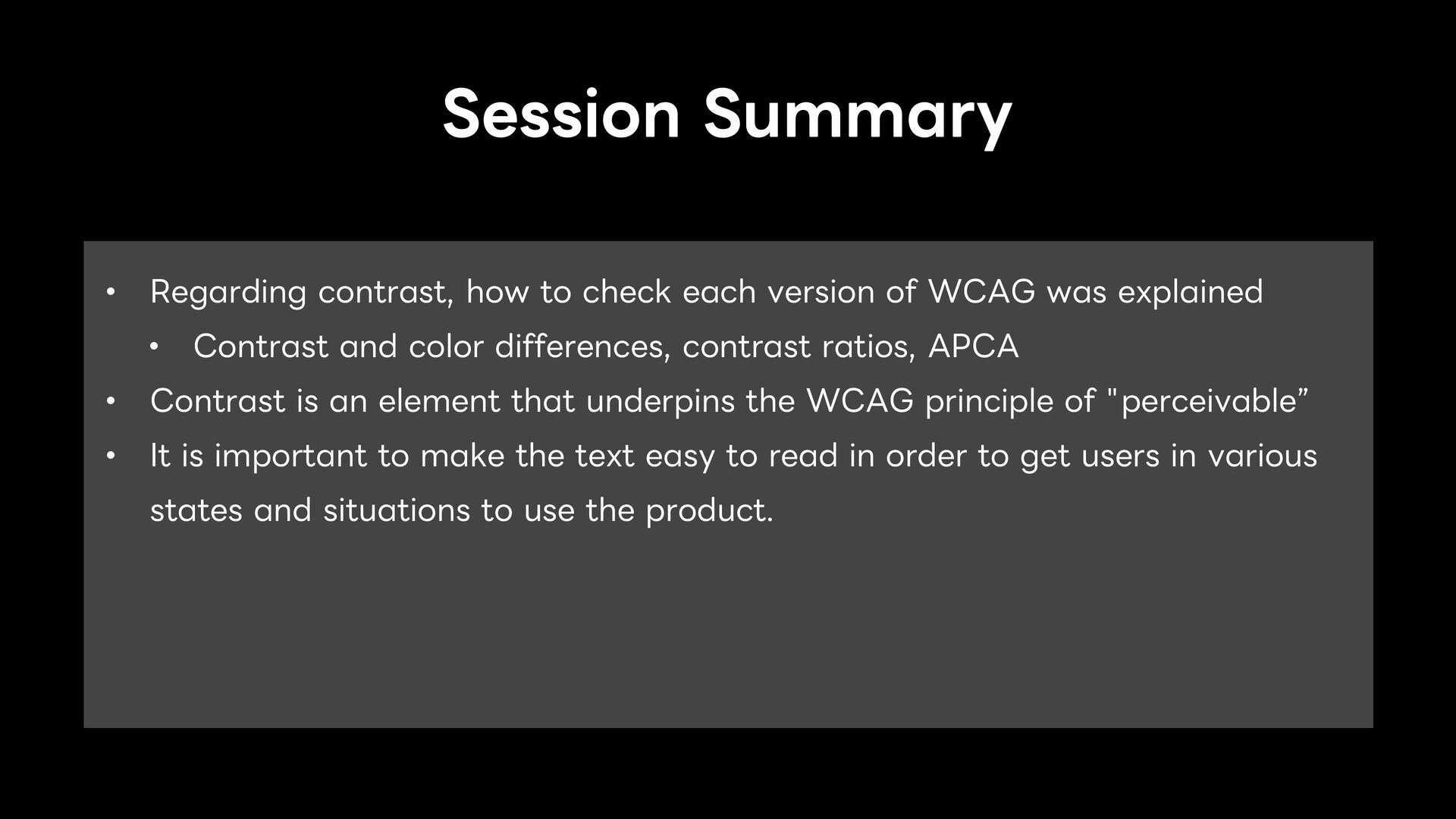
of WCAG was explained • Contrast and color differences, contrast ratios, APCA • Contrast is an element that underpins the WCAG principle of "perceivable” • It is important to make the text easy to read in order to get users in various states and situations to use the product.