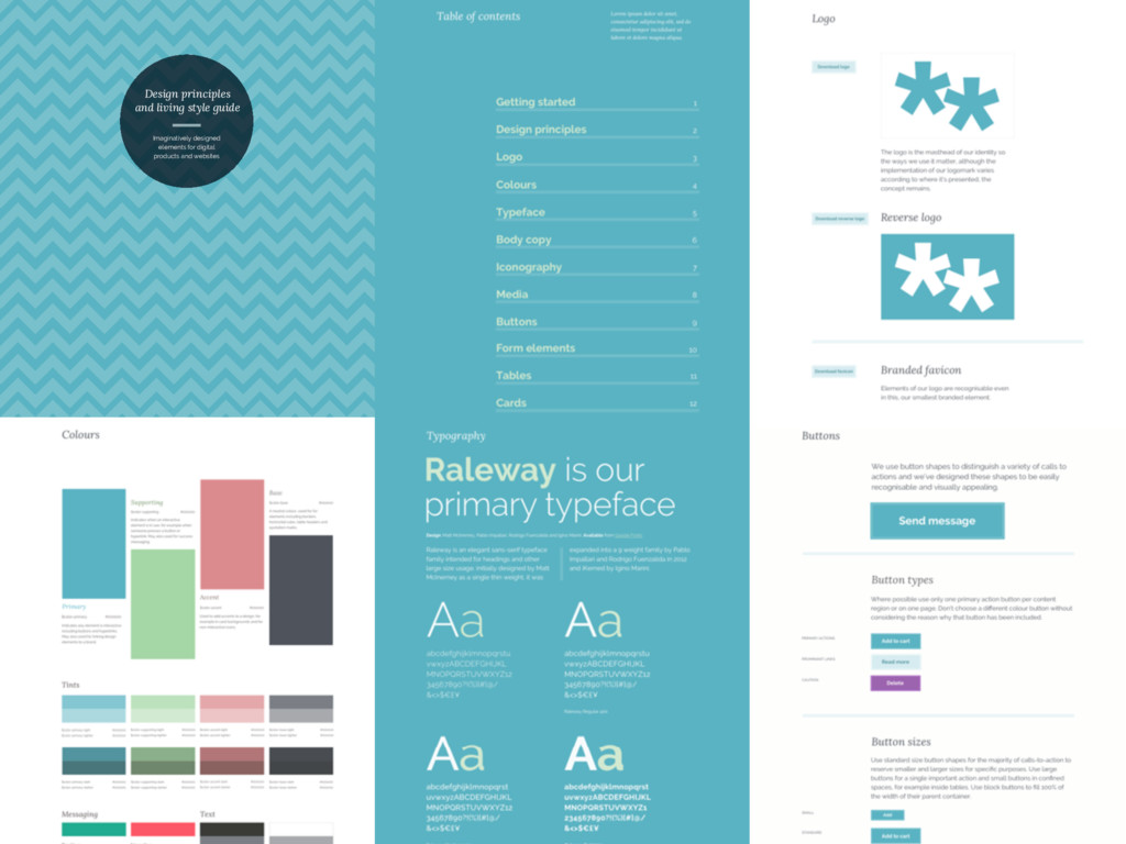
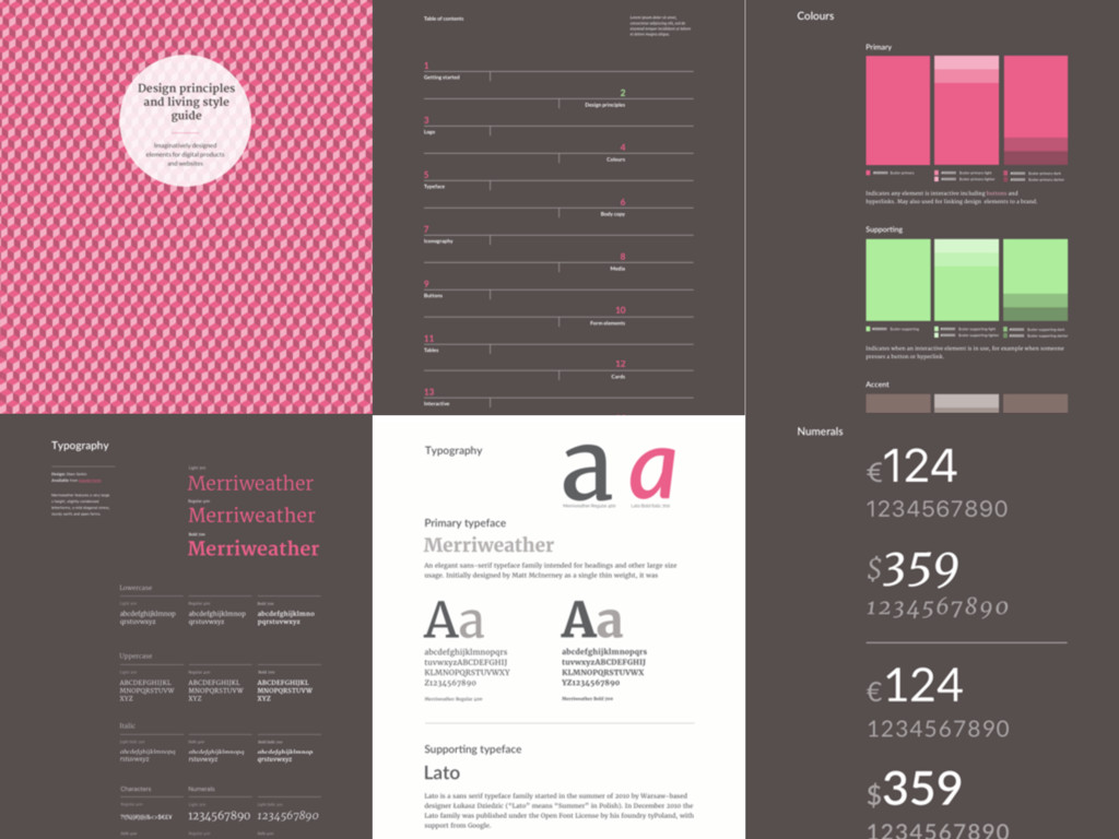
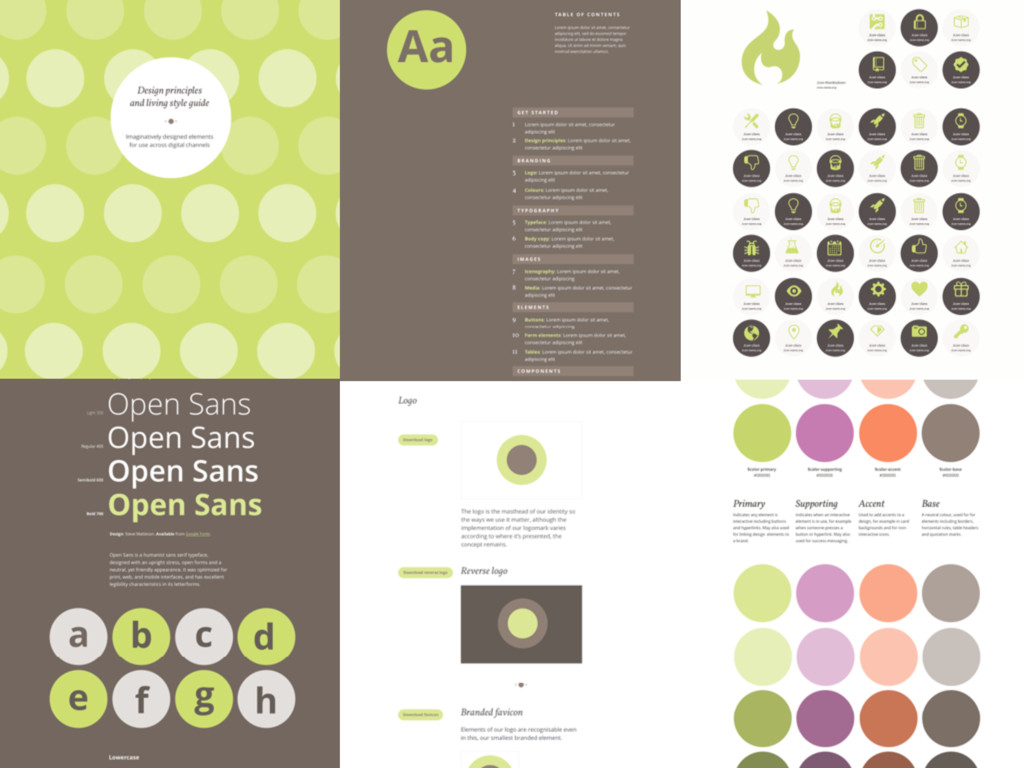
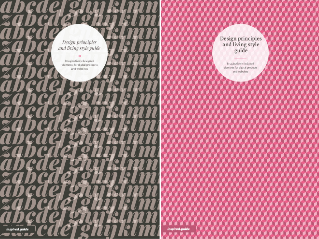
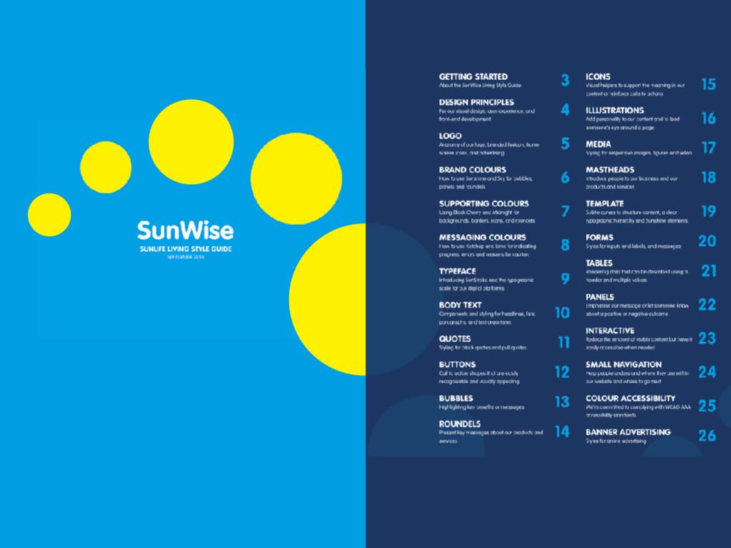
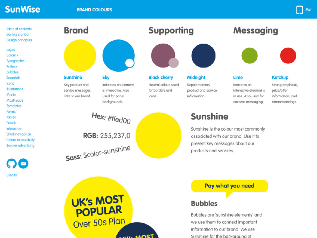
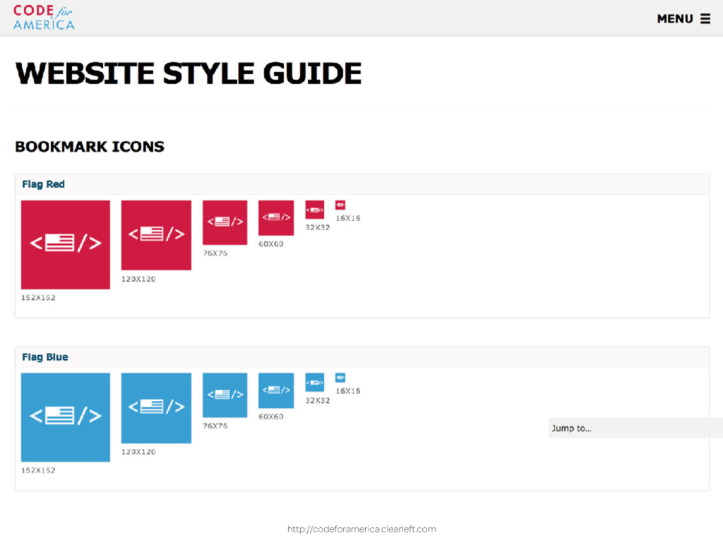
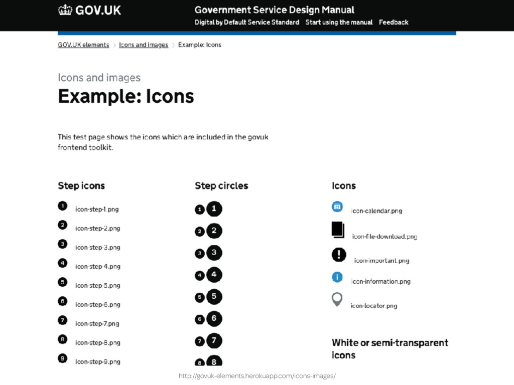
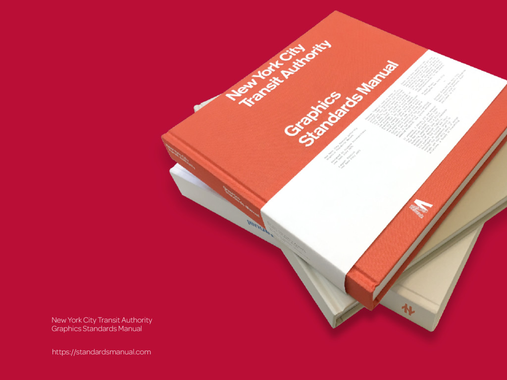
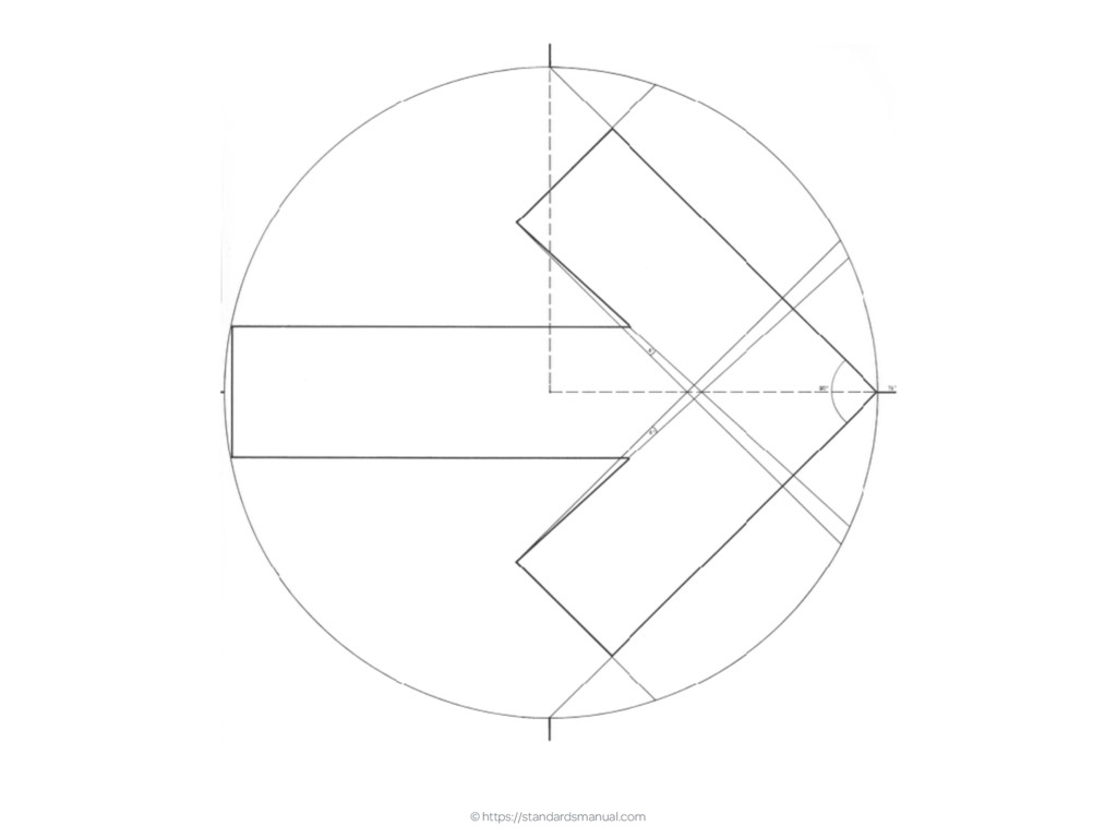
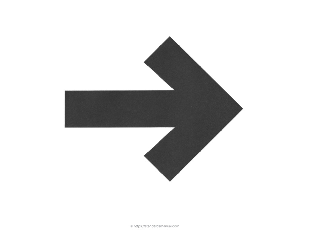
“Style guide” is an umbrella term for several types of design documentation; static style or visual identity guides, voice and tone, front-end code guidelines or component/pattern libraries. These all offer something different but often have something in common. They look ugly enough to have been designed by someone who enjoys configuring a router. In this fast-paced talk, Andy demonstrates ways to improve how style guides look and make them better at communicating design information to creatives without it getting in the way of what technical people need.
 malarkey
 designer_no_pon
 mount_inc
 kitanosirokuma
 a2k
a2k
 kenichiota0711
 bebe
bebe
 kintone
 csswizardry
 happy_ferret153
 lw
lw
 so_kotani
 shikichee
 nikkihalliwell
 skipperchong
 jcasabona
 portentint
 aleyda
 sabderemane
 codingconduct
.png) helenjbeal
helenjbeal
 lynnandtonic
 addyosmani
 axbom
axbom
 tamaranovitovic
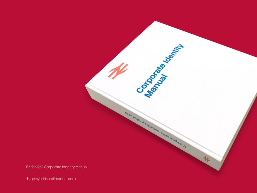
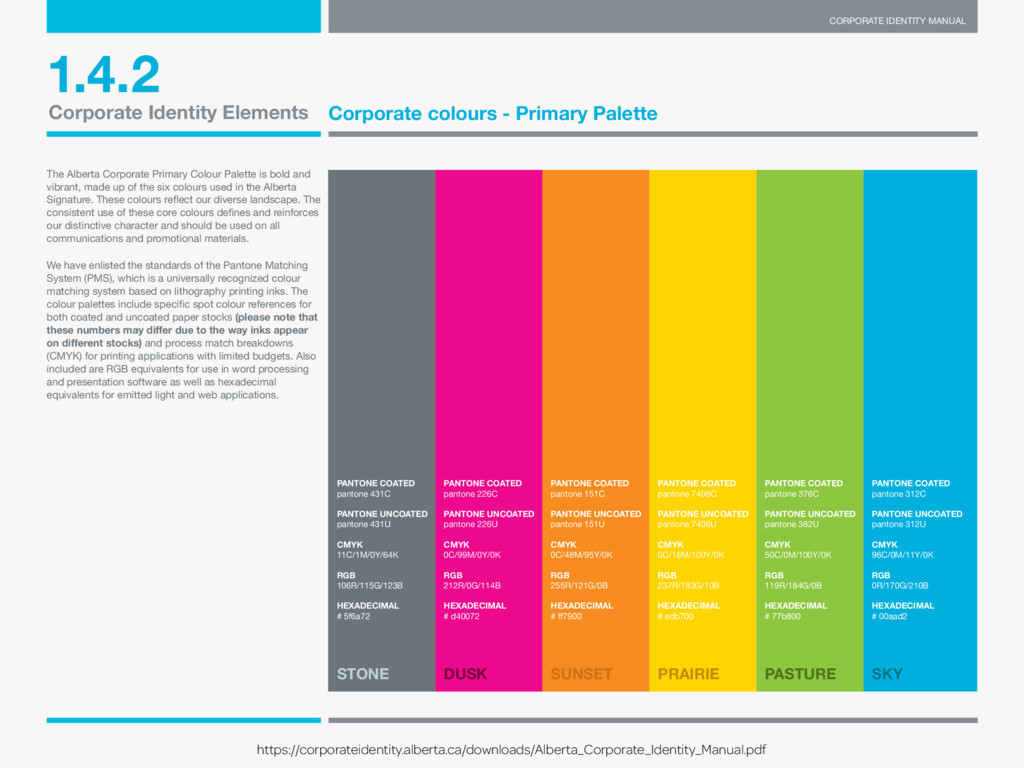
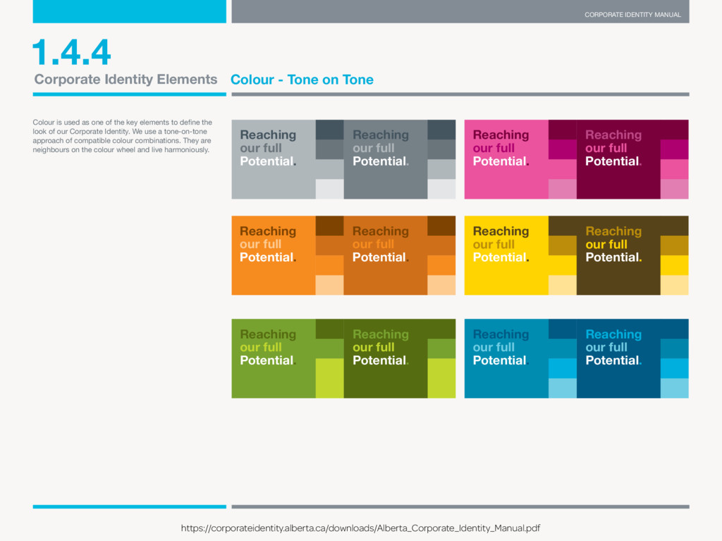
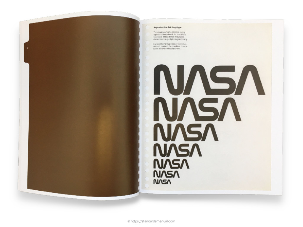
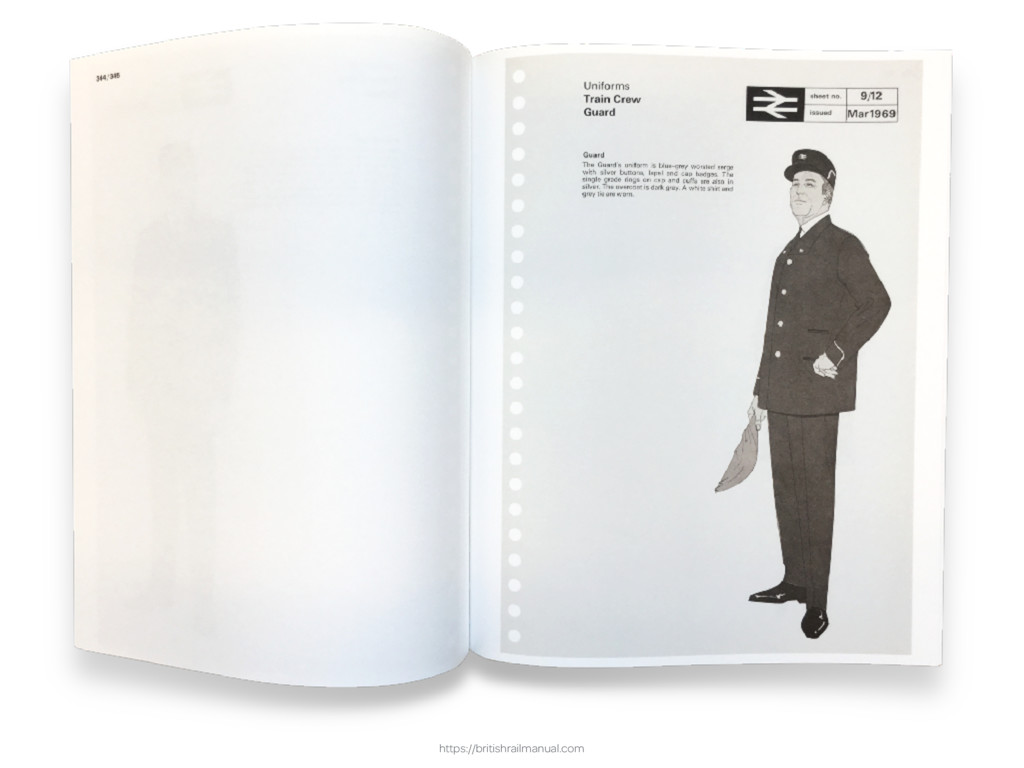
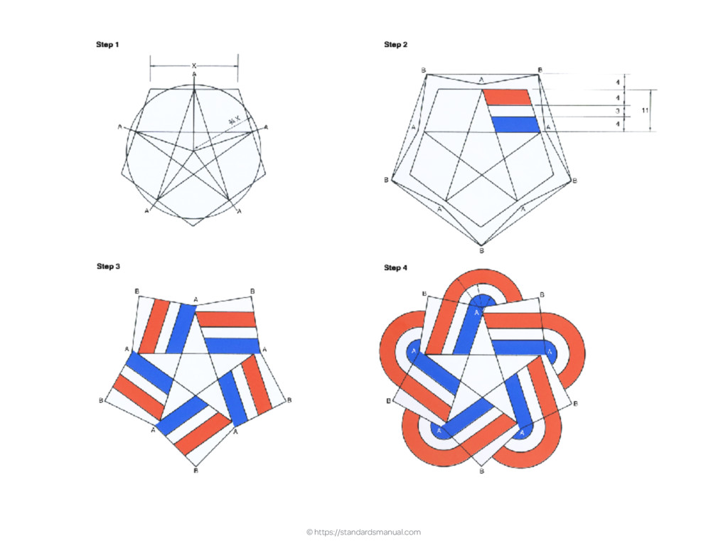
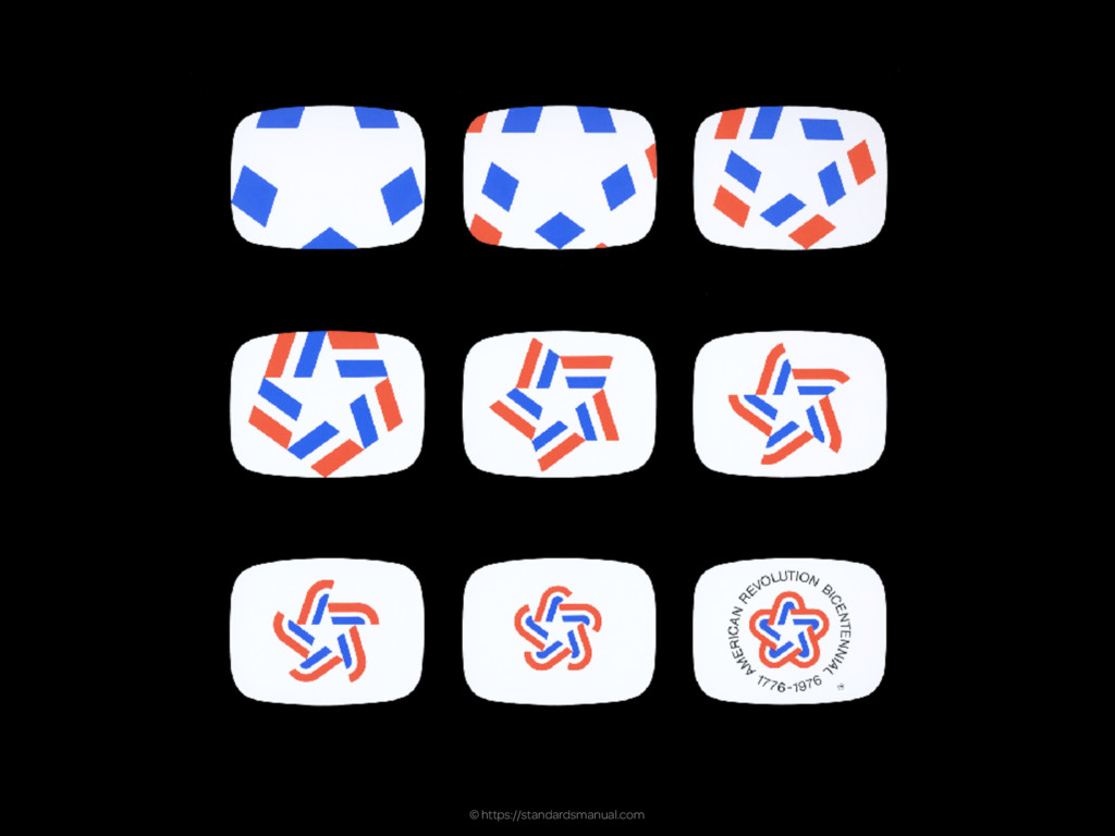
![CORPORATE IDENTITY MANUAL E-mail [email protected] for more information or guidance.](https://files.speakerdeck.com/presentations/d4ca09a6c13845d2a1373d45a12fd0a5/slide_30.jpg)