Upgrade to Pro
— share decks privately, control downloads, hide ads and more …
Speaker Deck
Features
Speaker Deck
PRO
Sign in
Sign up for free
Search
Search
Improving Performance with Responsive Images [j...
Search
newtron
March 15, 2014
Programming
710
4
Share
Embed
Copy iframe code
Copy JS code
Copy link
Start on current slide
Improving Performance with Responsive Images [jQueryTO]
jQueryTO
March 15, 2014
https://github.com/nwtn/pres-respimg-perf-jqueryto
newtron
March 15, 2014
More Decks by newtron
See All by newtron
Universal web design [Accessibility Camp Toronto]
newtron
0
250
Universal web design [HackerYou a11y club]
newtron
0
240
Universal web design [Full Stack Toronto]
newtron
0
280
Information architecture as knowledge translation [World IA Day]
newtron
0
320
Improving performance with responsive (and responsible!) images [CSSDay.io]
newtron
1
410
Universal Web Design: How to create an awesome experience for every user [Open Source Bridge]
newtron
0
300
Improving performance with responsive (and responsible!) images [CSSConf]
newtron
6
740
Universal Web Design: How to create an awesome experience for every user [OpenWest]
newtron
0
300
Improving performance with responsive (and responsible!) images [OpenWest]
newtron
2
390
Other Decks in Programming
See All in Programming
エンジニアにデザインハーネスを 〜デザインプロセスを規定するためのハーネス〜 / Design harness from an engineer's perspective
rkaga
2
1.1k
act1-costs.pdf
sumedhbala
0
180
Semantic Version 単位で戦略を柔軟に変えて、パッケージアップデートを自動化する
daitasu
1
350
はてなアカウント基盤 State of the Union
cockscomb
1
1.3k
TAKTでAI駆動開発の品質を設計する
j5ik2o
7
1.7k
地域 SRE コミュニティ最前線 - ホンマでっかSRE勉強会
tk3fftk
0
170
Vue × Nuxt × Oxc どこまで使える?実運用の現在地
andpad
0
360
そのテスト、説明できますか?~LWテスト戦略FW~のご紹介
nakahara
0
200
symfony/aiとlaravel/boost
77web
0
120
Hatena Engineer Seminar #37「言語モデルの活用に関する研究」
slashnephy
0
500
分散システム、なんですぐ死んでしまうん?耐障害性を高めたいあなたのためのレジリエンスパターン入門
mshibuya
7
4.9k
鹿野さんに聞く!『TypeScriptコードレシピ集』で磨く実践力
tonkotsuboy_com
4
1k
Featured
See All Featured
Testing 201, or: Great Expectations
jmmastey
46
8.2k
Connecting the Dots Between Site Speed, User Experience & Your Business [WebExpo 2025]
tammyeverts
11
960
Efficient Content Optimization with Google Search Console & Apps Script
katarinadahlin
PRO
1
670
The SEO Collaboration Effect
kristinabergwall1
1
500
Un-Boring Meetings
codingconduct
0
330
Test your architecture with Archunit
thirion
1
2.3k
Building AI with AI
inesmontani
PRO
1
1.1k
Redefining SEO in the New Era of Traffic Generation
szymonslowik
1
350
Docker and Python
trallard
47
3.9k
Designing for Timeless Needs
cassininazir
1
280
Crafting Experiences
bethany
1
210
Faster Mobile Websites
deanohume
310
32k
Transcript
None
Improving Performance with Responsive Images jQueryTO March 15, 2014
https://github.com/nwtn/ pres-respimg-perf-jqueryto
“Good performance is good design” Brad Frost
None
None
bradfrostweb.com
“More human beings today have access to a cellphone than
the United Nations says have access to a clean toilet.” Anand Giridharadas, New York Times, April 10 2010
“More human beings today have access to a cellphone than
the United Nations says have access to a clean toilet.” Anand Giridharadas, New York Times, April 10 2010
bradfrostweb.com
bradfrostweb.com
1.A flexible, grid-based layout, 2.Flexible images and media, 3.Media queries,
a module from the CSS3 specification
1.A flexible, grid-based layout, 2.Flexible images and media 3.Media queries,
a module from the CSS3 specification
img { max-width: 100%; }
None
None
A solution Serve one big image and let the browser
scale it
None
None
None
Average web page size: 1,703 KB. Images account
for 1,063 KB, over 62% of total. HTTP Archive, March 1 2014
2x resolution = 4x as many pixels
energy more pixels = more money time
“Good performance is good design” Brad Frost
A better solution Serve an appropriately-sized image to each user
Responsive Images
None
None
None
None
SVG, WebP, JPEG XR
<picture> + srcset: http://picture.responsiveimages.org/ Mozilla: Q1 Blink (Chrome/Opera): Soon Webkit
(Apple, etc.): Also soon? MS: ?
<picture> + srcset: http://picture.responsiveimages.org/ Mozilla Q1 Blink (Chrome/Opera) Soon Webkit
(Apple, etc.) Also soon? MS ?
Client Hints: http://tools.ietf.org/html/draft-grigorik-http-client-hints-01
None
<picture> <!-- art directed sources --> <source media="(min-width: 45em)" src="large.jpg"
/> <source media="(min-width: 18em)" src="med.jpg" /> ! <!-- fallback --> <img src="small.jpg" alt="A rad wolf" /> </picture>
<picture> <!-- art directed sources --> <source media="(min-width: 45em)" src="large.jpg"
/> <source media="(min-width: 18em)" src="med.jpg" /> ! <!-- fallback --> <img src="small.jpg" alt="A rad wolf" /> </picture>
<picture> <!-- art directed sources --> <source media="(min-width: 45em)" src="large.jpg"
/> <source media="(min-width: 18em)" src="med.jpg" /> ! <!-- fallback --> <img src="small.jpg" alt="A rad wolf" /> </picture>
<picture> <!-- art directed sources --> <source media="(min-width: 45em)" src="large.jpg"
/> <source media="(min-width: 18em)" src="med.jpg" /> ! <!-- fallback --> <img src="small.jpg" alt="A rad wolf" /> </picture>
<picture> <!-- art directed sources --> <source media="(min-width: 45em)" src="large.jpg"
/> <source media="(min-width: 18em)" src="med.jpg" /> ! <!-- fallback --> <img src="small.jpg" alt="A rad wolf" /> </picture>
<picture> <!-- art directed sources --> <source media="(min-width: 45em)" src="large.jpg"
/> <source media="(min-width: 18em)" src="med.jpg" /> ! <!-- fallback --> <img src="small.jpg" alt="A rad wolf" /> </picture>
<picture> <!-- art directed sources --> <source media="(min-width: 45em)" src="large.jpg"
/> <source media="(min-width: 18em)" src="med.jpg" /> ! <!-- fallback --> <img src="small.jpg" alt="A rad wolf" /> </picture>
<picture> <!-- art directed sources --> <source media="(min-width: 45em)" src="large.jpg"
/> <source media="(min-width: 18em)" src="med.jpg" /> ! <!-- fallback --> <img src="small.jpg" alt="A rad wolf" /> </picture>
None
<picture> <!-- sources @ different resolutions --> <source srcset="pic1x.jpg 1x,
pic2x.jpg 2x, pic4x.jpg 4x" /> ! <!-- fallback --> <img src="pic1x.jpg" alt="A rad wolf" /> </picture>
<picture> <!-- sources @ different resolutions --> <source srcset="pic1x.jpg 1x,
pic2x.jpg 2x, pic4x.jpg 4x" /> ! <!-- fallback --> <img src="pic1x.jpg" alt="A rad wolf" /> </picture>
<picture> <!-- sources @ different resolutions --> <source srcset="pic1x.jpg 1x,
pic2x.jpg 2x, pic4x.jpg 4x" /> ! <!-- fallback --> <img src="pic1x.jpg" alt="A rad wolf" /> </picture>
<picture> <!-- sources @ different resolutions --> <source srcset="pic1x.jpg 1x,
pic2x.jpg 2x, pic4x.jpg 4x" /> ! <!-- fallback --> <img src="pic1x.jpg" alt="A rad wolf" /> </picture>
<picture> <!-- sources @ different resolutions --> <source srcset="pic1x.jpg 1x,
pic2x.jpg 2x, pic4x.jpg 4x" /> ! <!-- fallback --> <img src="pic1x.jpg" alt="A rad wolf" /> </picture>
<picture> <!-- sources @ different resolutions --> <source srcset="pic1x.jpg 1x,
pic2x.jpg 2x, pic4x.jpg 4x" /> ! <!-- fallback --> <img src="pic1x.jpg" alt="A rad wolf" /> </picture>
None
<img srcset="pic1x.jpg 1x, pic2x.jpg 2x, pic4x.jpg 4x" src="pic1x.jpg" alt="A rad
wolf" />
<img srcset="pic1x.jpg 1x, pic2x.jpg 2x, pic4x.jpg 4x" src="pic1x.jpg" alt="A rad
wolf" />
<img srcset="pic1x.jpg 1x, pic2x.jpg 2x, pic4x.jpg 4x" src="pic1x.jpg" alt="A rad
wolf" />
<img srcset="pic1x.jpg 1x, pic2x.jpg 2x, pic4x.jpg 4x" src="pic1x.jpg" alt="A rad
wolf" />
<img srcset="pic1x.jpg 1x, pic1.5x.jpg 1.5x, pic2x.jpg 2x, pic4x.jpg 4x" src="pic1x.jpg"
alt="A rad wolf" />
None
<picture> <source media="(min-width: 45em)" srcset="large1.jpg 1x, large2.jpg 2x" /> <source
media="(min-width: 18em)" srcset="med1.jpg 1x, med2.jpg 2x" /> <source srcset="small1.jpg 1x, small2.jpg 2x" /> <img src="small1.jpg" alt="A rad wolf" /> </picture>
<picture> <source media="(min-width: 45em)" srcset="large1.jpg 1x, large2.jpg 2x" /> <source
media="(min-width: 18em)" srcset="med1.jpg 1x, med2.jpg 2x" /> <source srcset="small1.jpg 1x, small2.jpg 2x" /> <img src="small1.jpg" alt="A rad wolf" /> </picture>
<picture> <source media="(min-width: 45em)" srcset="large1.jpg 1x, large2.jpg 2x" /> <source
media="(min-width: 18em)" srcset="med1.jpg 1x, med2.jpg 2x" /> <source srcset="small1.jpg 1x, small2.jpg 2x" /> <img src="small1.jpg" alt="A rad wolf" /> </picture>
<picture> <source media="(min-width: 45em)" srcset="large1.jpg 1x, large2.jpg 2x" /> <source
media="(min-width: 18em)" srcset="med1.jpg 1x, med2.jpg 2x" /> <source srcset="small1.jpg 1x, small2.jpg 2x" /> <img src="small1.jpg" alt="A rad wolf" /> </picture>
<picture> <source media="(min-width: 45em)" srcset="large1.jpg 1x, large2.jpg 2x" /> <source
media="(min-width: 18em)" srcset="med1.jpg 1x, med2.jpg 2x" /> <source srcset="small1.jpg 1x, small2.jpg 2x" /> <img src="small1.jpg" alt="A rad wolf" /> </picture>
<picture> <source media="(min-width: 45em)" srcset="large1.jpg 1x, large2.jpg 2x" /> <source
media="(min-width: 18em)" srcset="med1.jpg 1x, med2.jpg 2x" /> <source srcset="small1.jpg 1x, small2.jpg 2x" /> <img src="small1.jpg" alt="A rad wolf" /> </picture>
None
<picture> <source sizes="100%" srcset="pic400.jpg 400w, pic800.jpg 800w, pic1600.jpg 1600w" />
! <img src="pic400.jpg" alt="A rad wolf" /> </picture>
<picture> <source sizes="100%" srcset="pic400.jpg 400w, pic800.jpg 800w, pic1600.jpg 1600w" />
! <img src="pic400.jpg" alt="A rad wolf" /> </picture>
<picture> <source sizes="100%" srcset="pic400.jpg 400w, pic800.jpg 800w, pic1600.jpg 1600w" />
! <img src="pic400.jpg" alt="A rad wolf" /> </picture>
<picture> <source sizes="100%" srcset="pic400.jpg 400w, pic800.jpg 800w, pic1600.jpg 1600w" />
! <img src="pic400.jpg" alt="A rad wolf" /> </picture>
<picture> <source sizes="100%" srcset="pic400.jpg 400w, pic800.jpg 800w, pic1600.jpg 1600w" />
! <img src="pic400.jpg" alt="A rad wolf" /> </picture>
<picture> <source sizes="100%" srcset="pic400.jpg 400w, pic800.jpg 800w, pic1600.jpg 1600w" />
! <img src="pic400.jpg" alt="A rad wolf" /> </picture>
None
<picture> <source sizes="(min-width: 45em) 33%, (min-width: 18em) 50%, 100%" srcset="pic400.jpg
400w, pic800.jpg 800w, pic1600.jpg 1600w" /> ! <img src="pic400.jpg" alt="A rad wolf" /> </picture>
<picture> <source sizes="(min-width: 45em) 33%, (min-width: 18em) 50%, 100%" srcset="pic400.jpg
400w, pic800.jpg 800w, pic1600.jpg 1600w" /> ! <img src="pic400.jpg" alt="A rad wolf" /> </picture>
None
<picture> <source type="image/webp" src="wolf.webp" /> <img src="wolf.jpg" alt="A rad wolf"
/> </picture>
<picture> <source type="image/webp" src="wolf.webp" /> <img src="wolf.jpg" alt="A rad wolf"
/> </picture>
<picture> <source type="image/webp" src="wolf.webp" /> <img src="wolf.jpg" alt="A rad wolf"
/> </picture>
<picture> <source type="image/webp" src="wolf.webp" /> <img src="wolf.jpg" alt="A rad wolf"
/> </picture>
http://picture.responsiveimages.org/
Picturefill by Scott Jehl https://github.com/scottjehl/picturefill
<span data-picture> <span data-source data-srcset="" data-src="" data-type="" data-media=""></span> <noscript> <img
/> </noscript> </span>
<span data-picture> <span data-source data-srcset="" data-src="" data-type="" data-media=""></span> <noscript> <img
/> </noscript> </span>
<span data-picture> <span data-source data-srcset="" data-src="" data-type="" data-media=""></span> <noscript> <img
/> </noscript> </span>
<span data-picture> <span data-source data-srcset="" data-src="" data-type="" data-media=""></span> <noscript> <img
/> </noscript> </span>
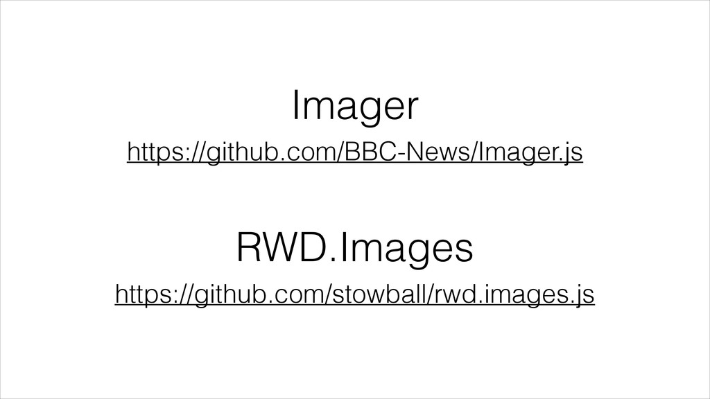
Imager https://github.com/BBC-News/Imager.js RWD.Images https://github.com/stowball/rwd.images.js
Responsible Images:! Responsive Images Resource Priorities Image Optimization Use Fewer
Images Use SVG
Responsible Images:! Responsive Images Resource Priorities Image Optimization Use Fewer
Images Use SVG
None
None
None
Resource Priorities http://www.w3.org/TR/resource-priorities/
Responsible Images:! Responsive Images Resource Priorities Image Optimization Use Fewer
Images Use SVG
Responsible Images:! Responsive Images Resource Priorities Image Optimization Use Fewer
Images Use SVG
ImageOptim-CLI http://jamiemason.github.io/ImageOptim-CLI/
grunt-svgmin https://github.com/sindresorhus/grunt-svgmin Scour https://launchpad.net/scour
Responsible Images:! Responsive Images Resource Priorities Image Optimization Use Fewer
Images Use SVG
Responsible Images:! Responsive Images Resource Priorities Image Optimization Use Fewer
Images Use SVG
Responsible Images:! Responsive Images Resource Priorities Image Optimization Fewer Images
Use SVG
Responsible Images:! Responsive Images Resource Priorities Image Optimization Fewer Images
SVG
Impact
None
None
1,870KB 564KB 3,505KB Images (content) Images (style) Other content
Optimizations • ImageOptim-CLI on all images • WebP • Responsive
images using Picturefill, for DPI- and viewport switching on content images
1,870KB 564KB 3,505KB Images (content) Images (style) Other content
1,870KB 72KB 261KB Images (content) Images (style) Other content
1,870KB 72KB 534KB Images (content) Images (style) Other content
None
“Good performance is good design” Brad Frost
“Responsible images are good design” Dave Newton
David Newton! @newtron on Twitter @nwtn on GitHub
[email protected]
 newtron
 rkaga
rkaga
 sumedhbala
 daitasu
 cockscomb
 j5ik2o
 tk3fftk
 andpad
 nakahara
 77web
77web
 slashnephy
 mshibuya
 tonkotsuboy_com
 jmmastey
 tammyeverts
 katarinadahlin
 kristinabergwall1
 codingconduct
 thirion
 inesmontani
 szymonslowik
 trallard
 cassininazir
 bethany
 deanohume
![David Newton! @newtron on Twitter @nwtn on GitHub [email protected]](https://files.speakerdeck.com/presentations/70e80a308f7c0131941d3e2d8ace8b00/slide_110.jpg)