Upgrade to Pro — share decks privately, control downloads, hide ads and more …

Practical Tips and Tricks to Improve Your Compo...

Practical Tips and Tricks to Improve Your Compose Previews (Droidcon Berlin 2024)

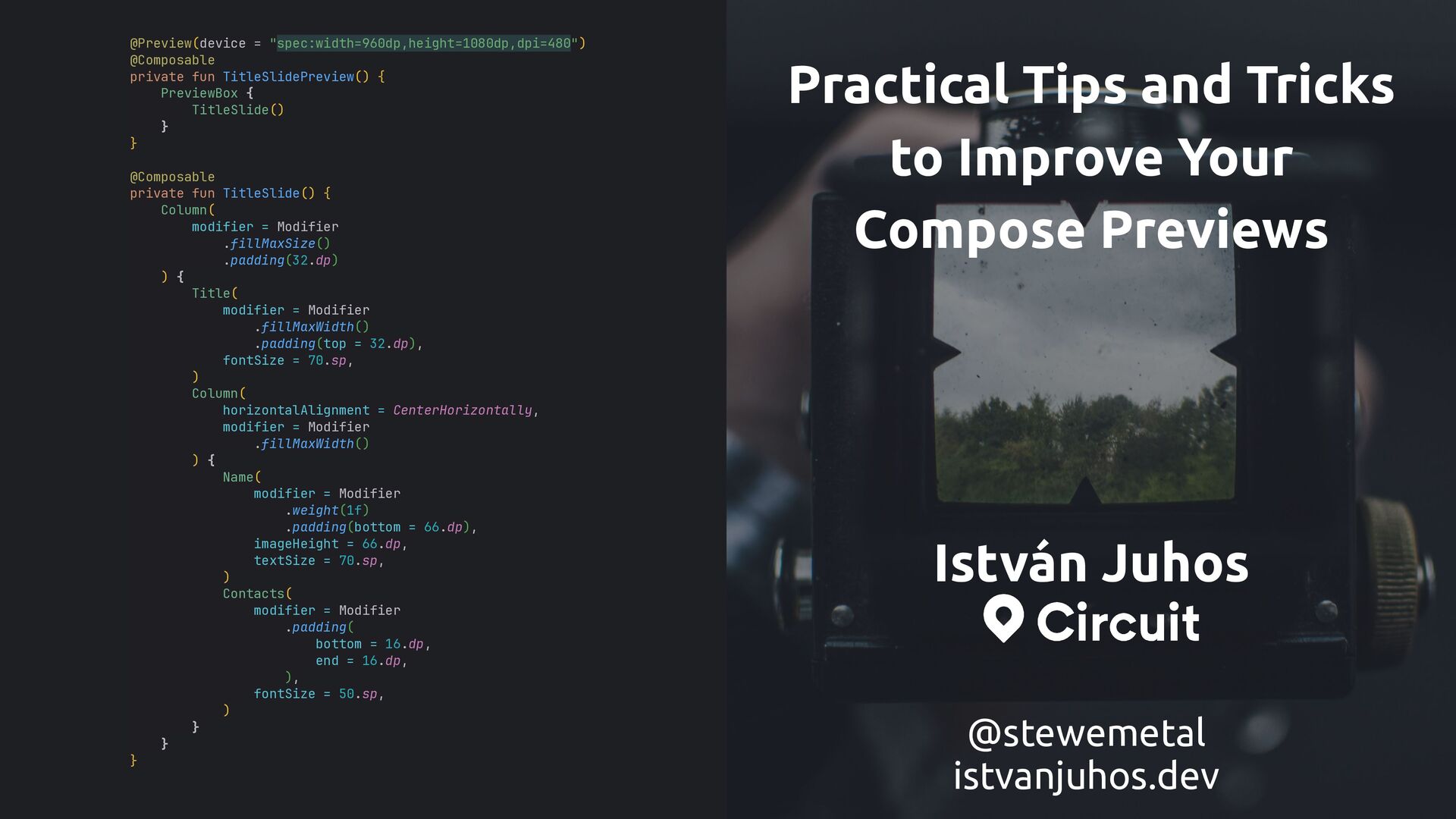
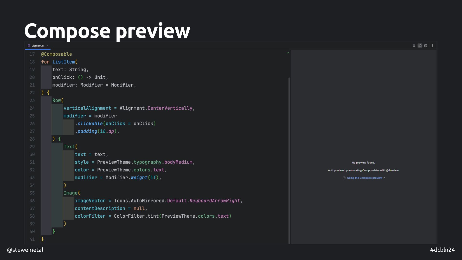
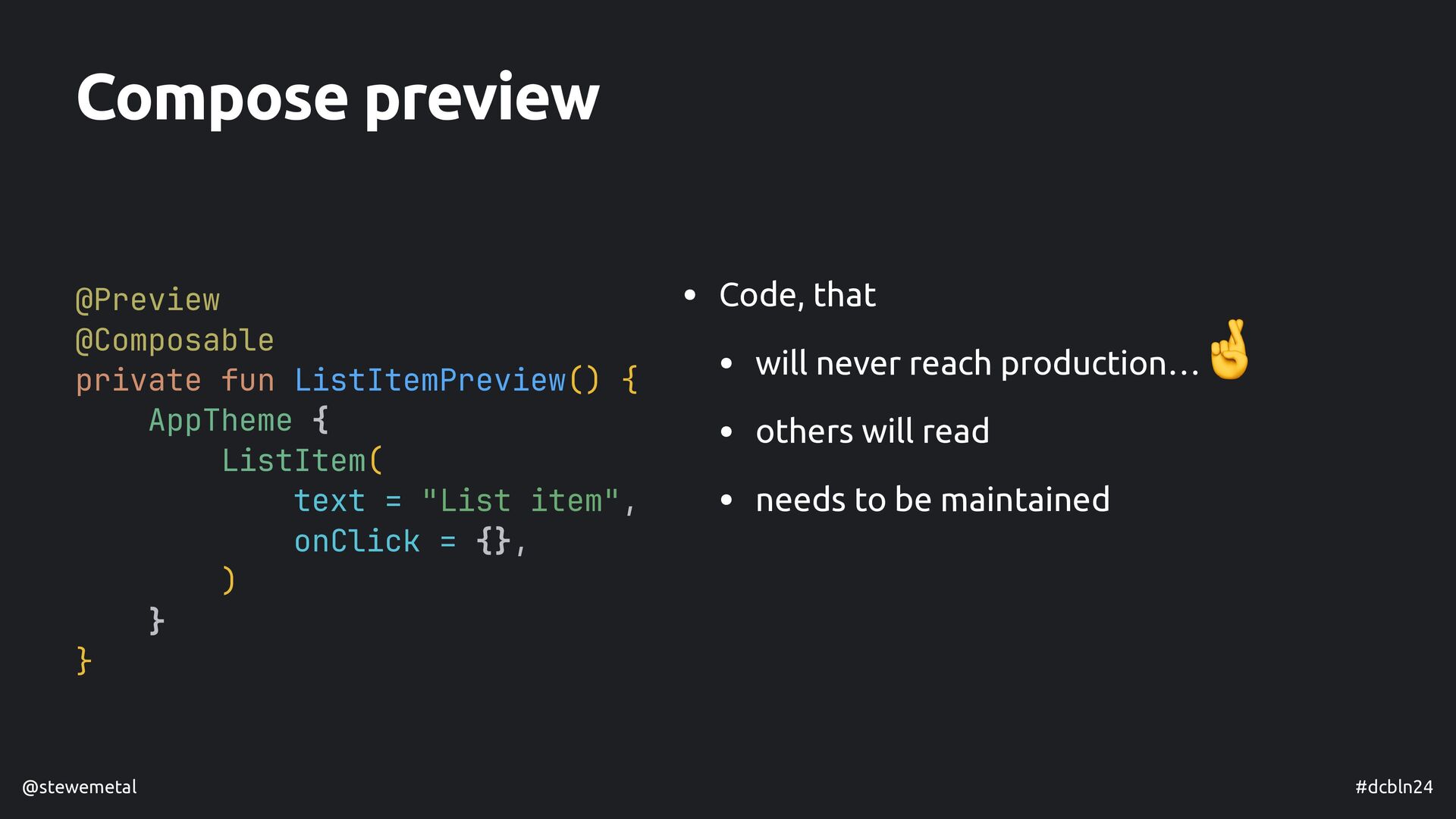
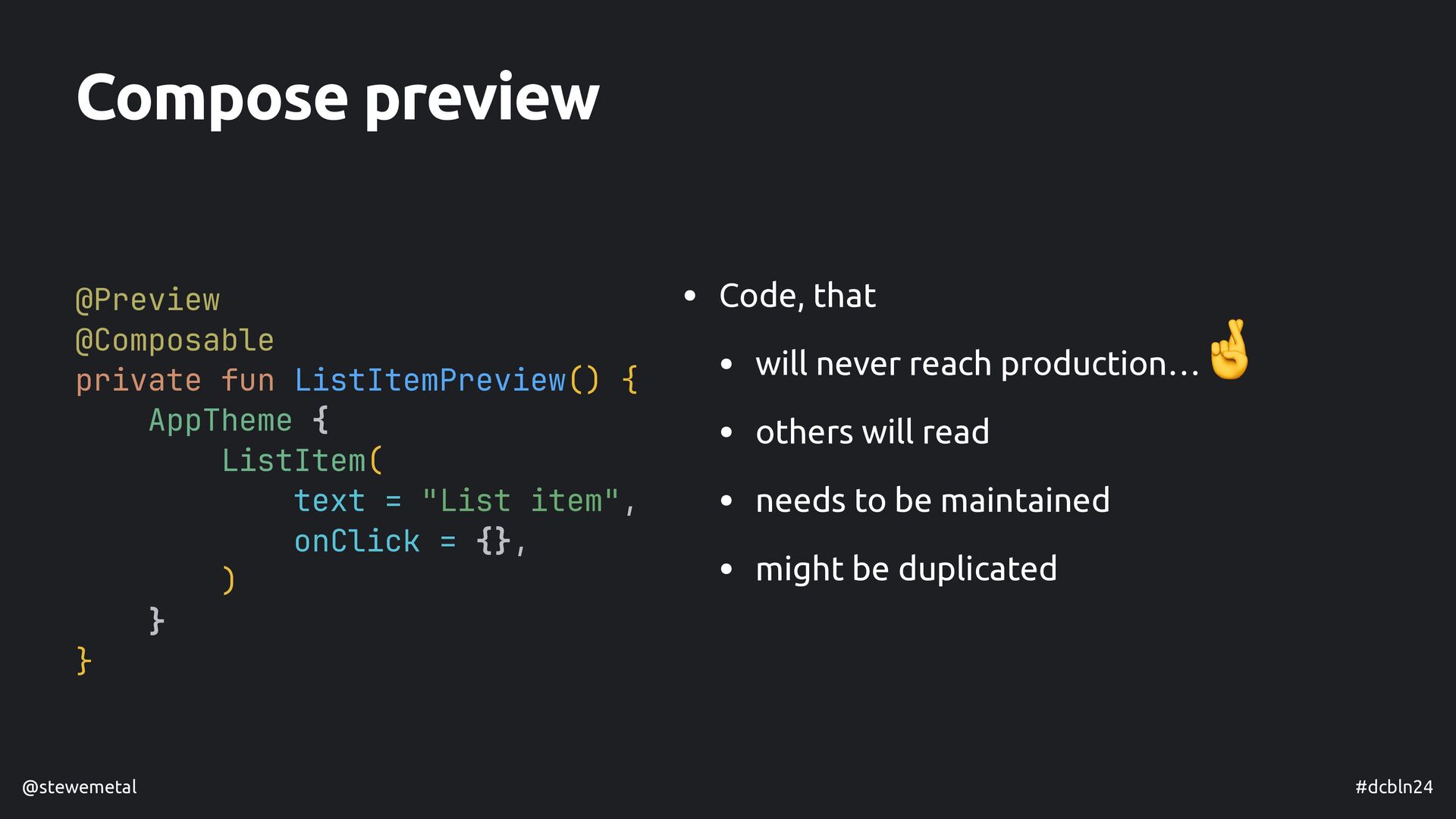
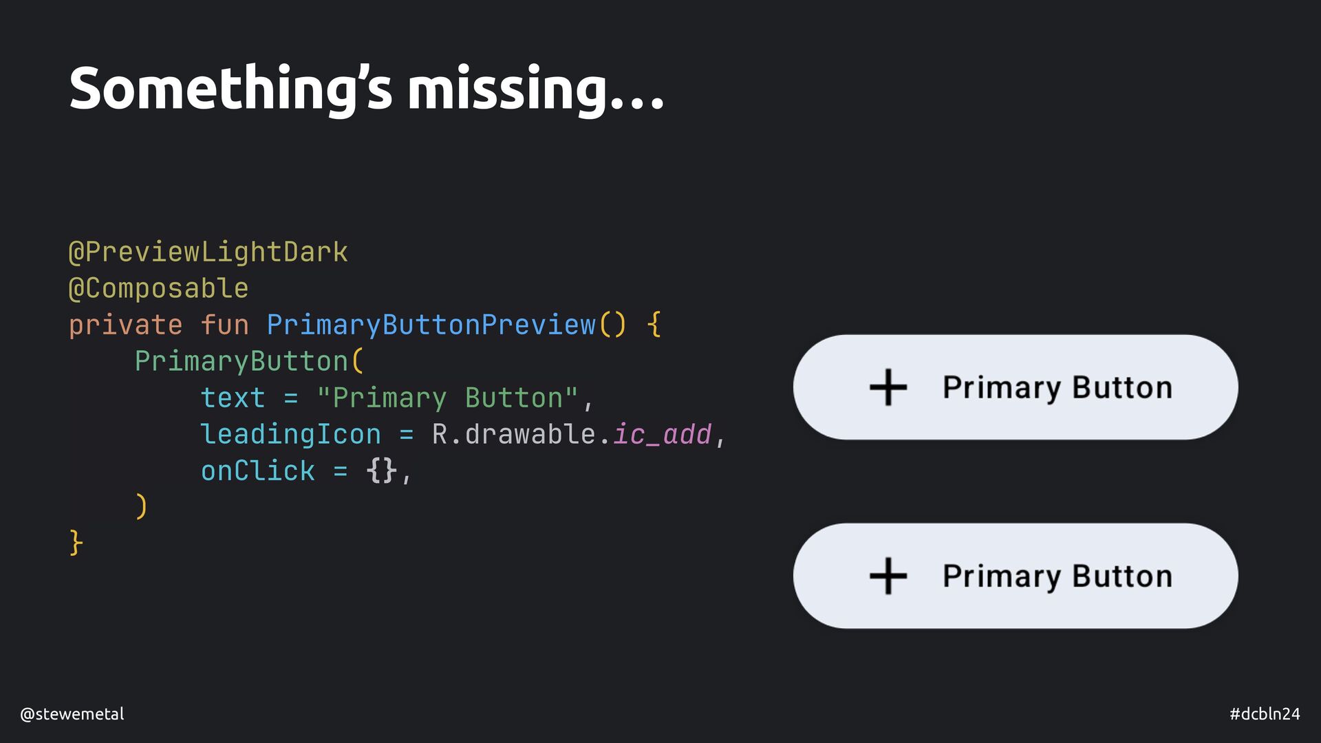
Jetpack Compose Preview is a powerful tool that provides real-time feedback on how our composables are rendered and even on how they behave and animate in certain conditions. While writing useful previews seems like a straightforward task, there are some things that we need to keep in mind. Preview code won't reach users of your app (hopefully!); however, it's more likely that the author of the preview and future peers as well might have to work with them eventually.

This talk will touch on the following topics:
- Recap on the main features and limitations of Compose previews
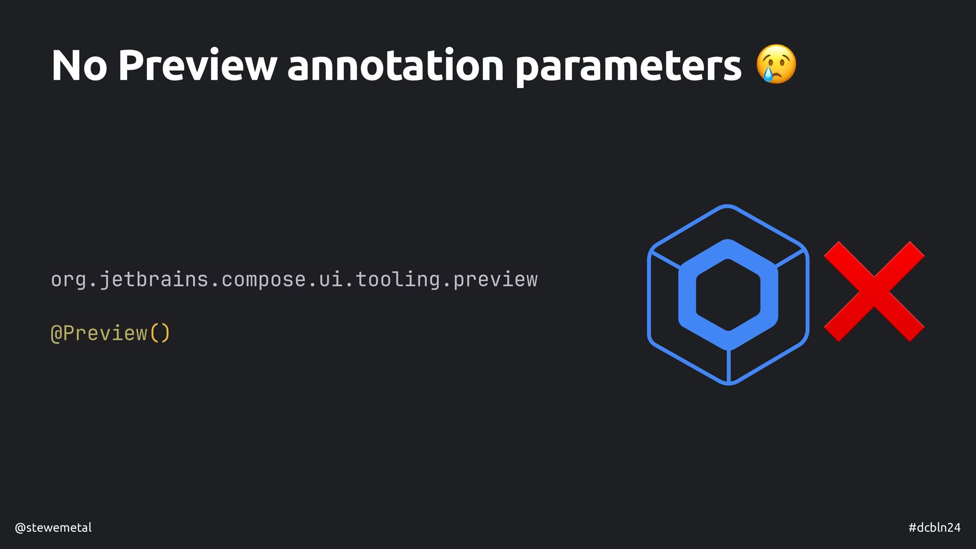
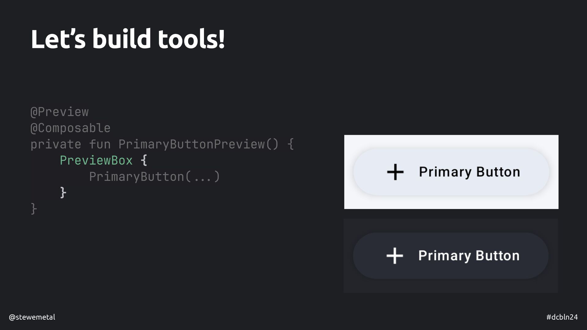
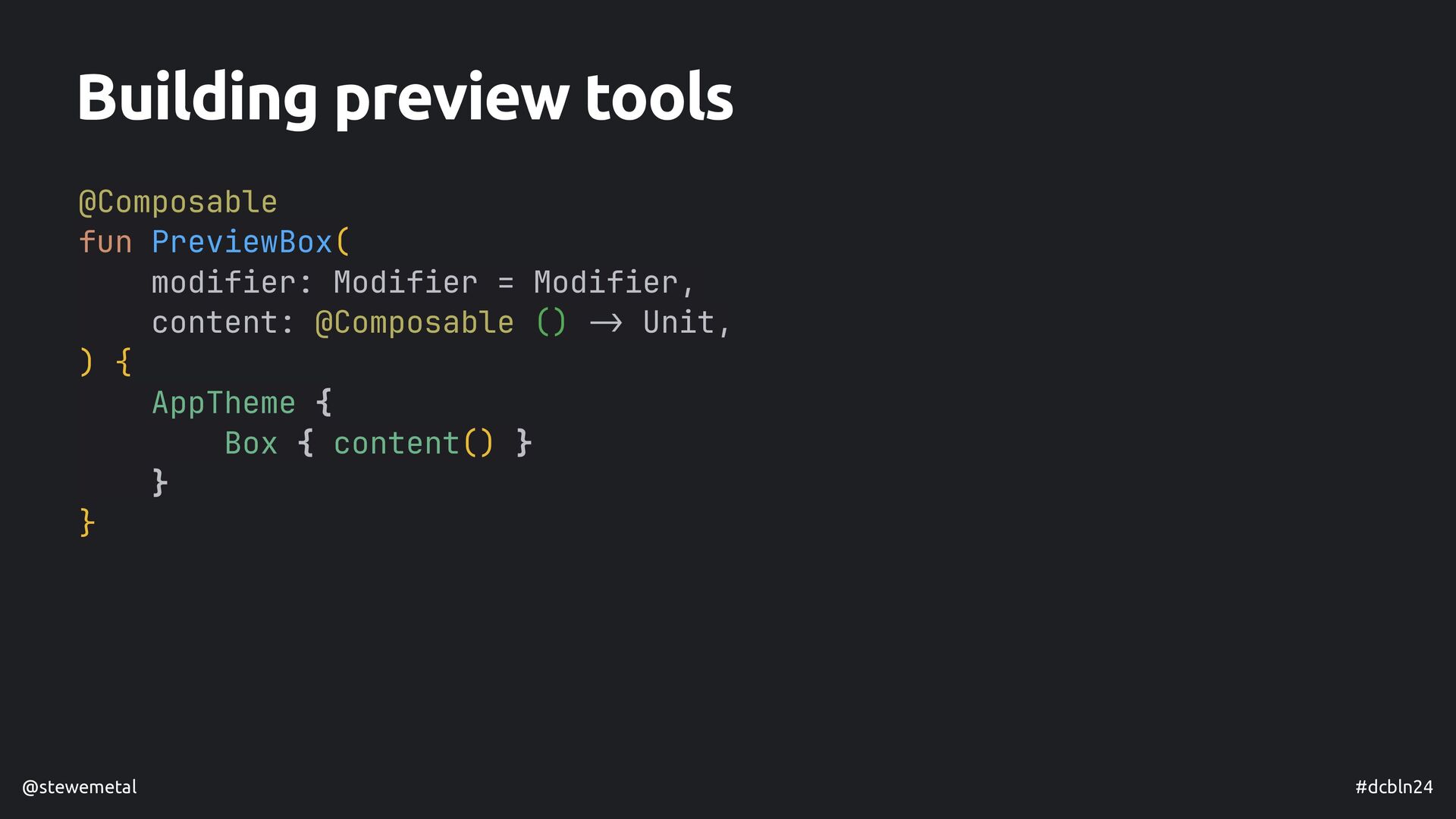
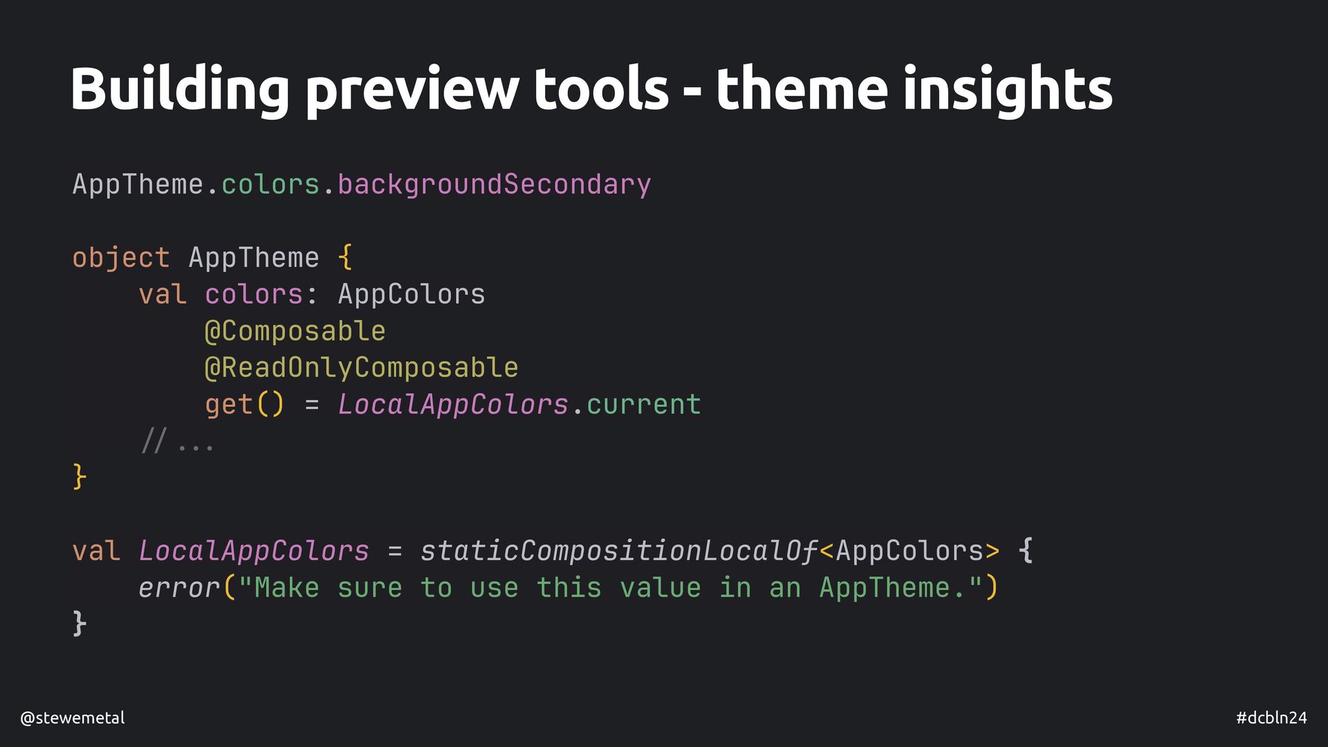
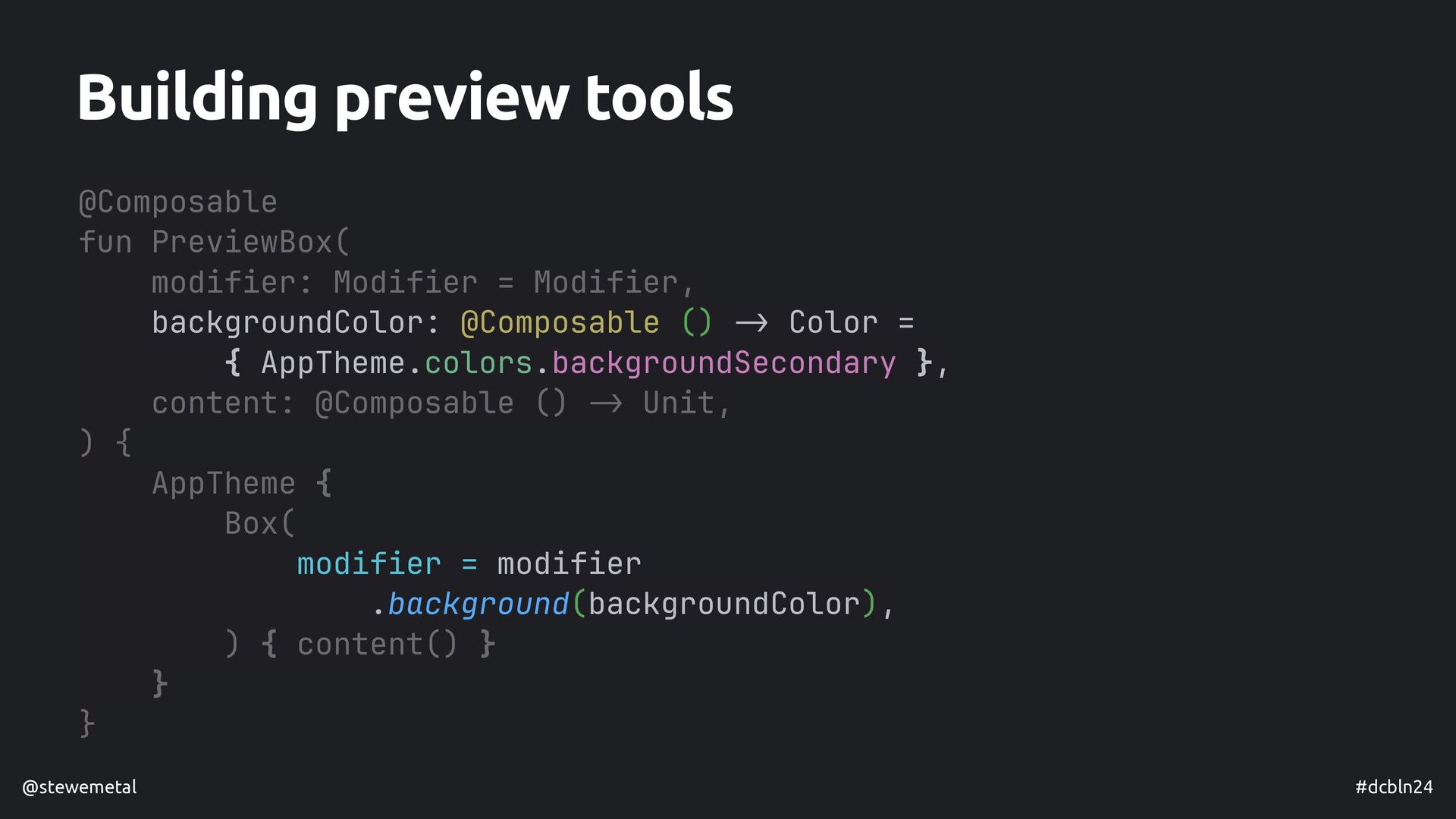
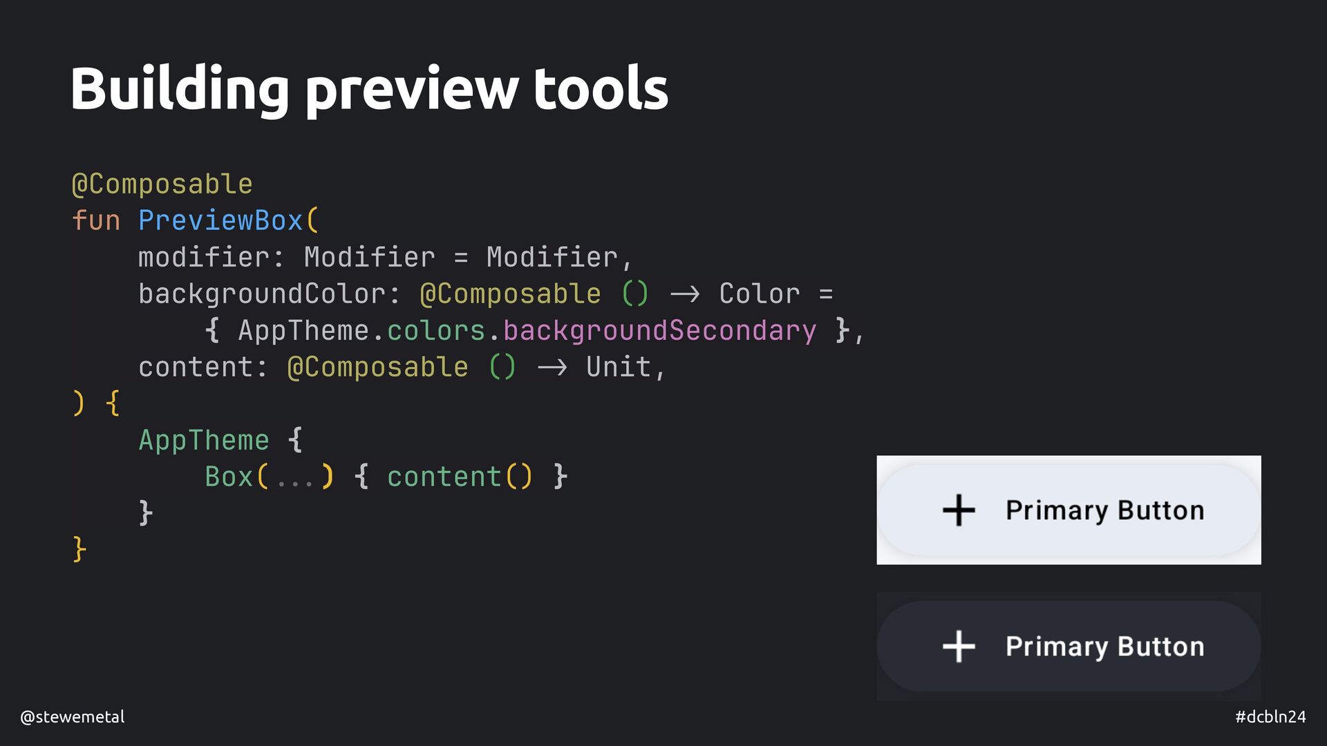
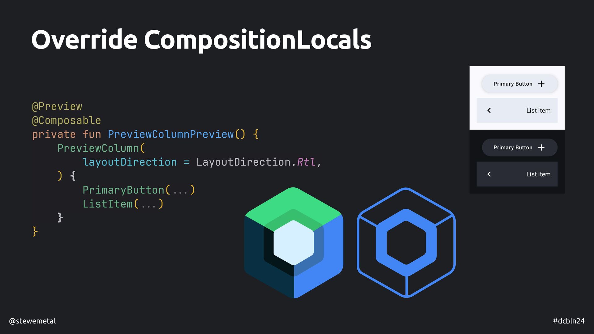
- How we can overcome the limitations of @Preview being an annotation
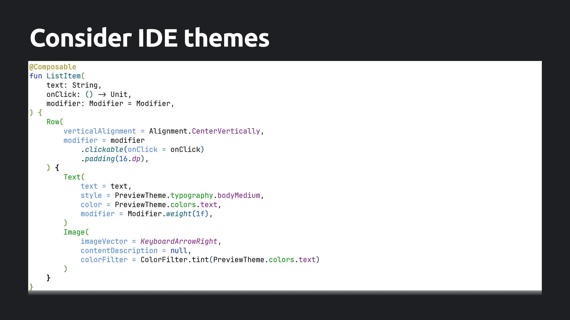
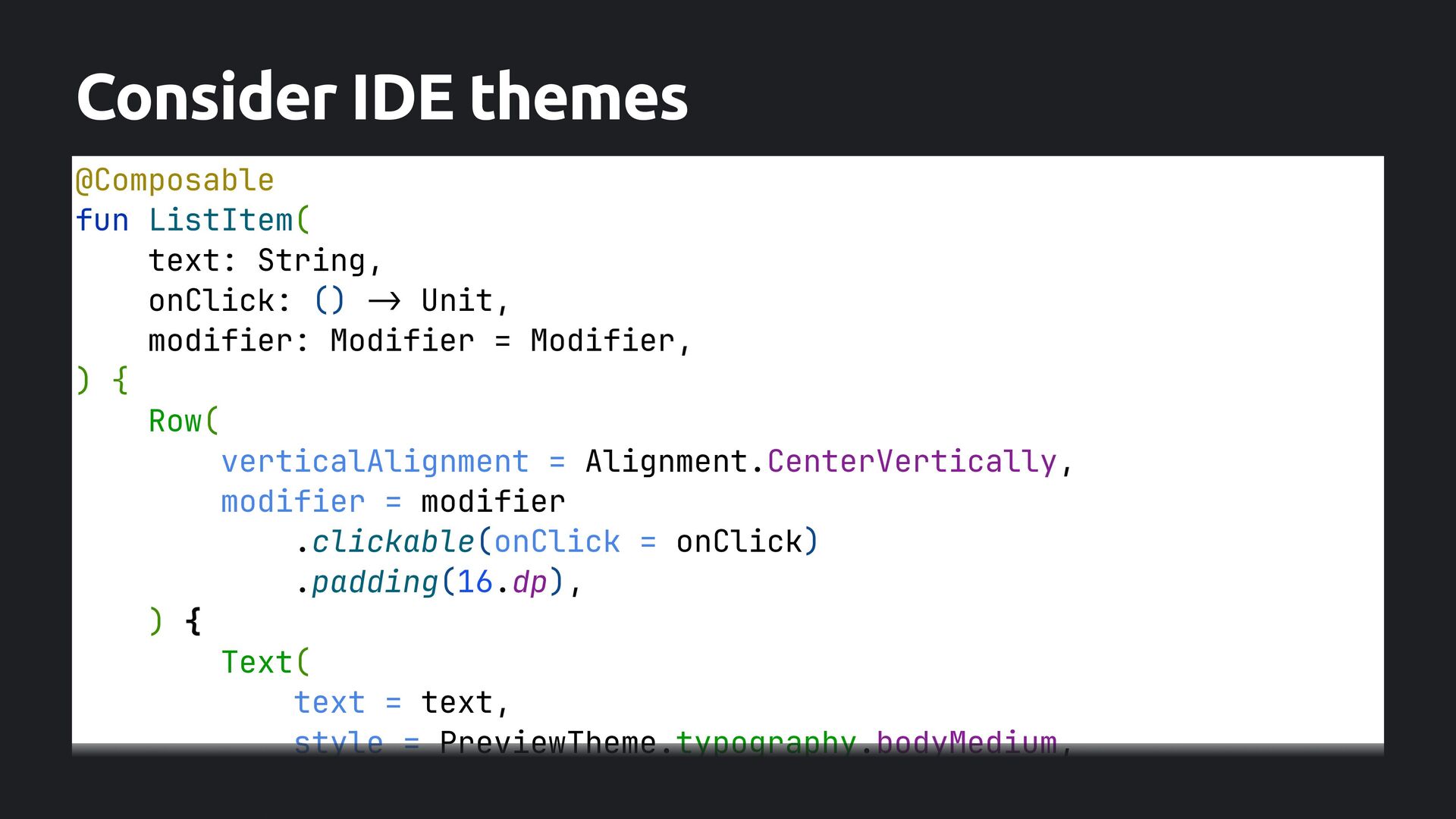
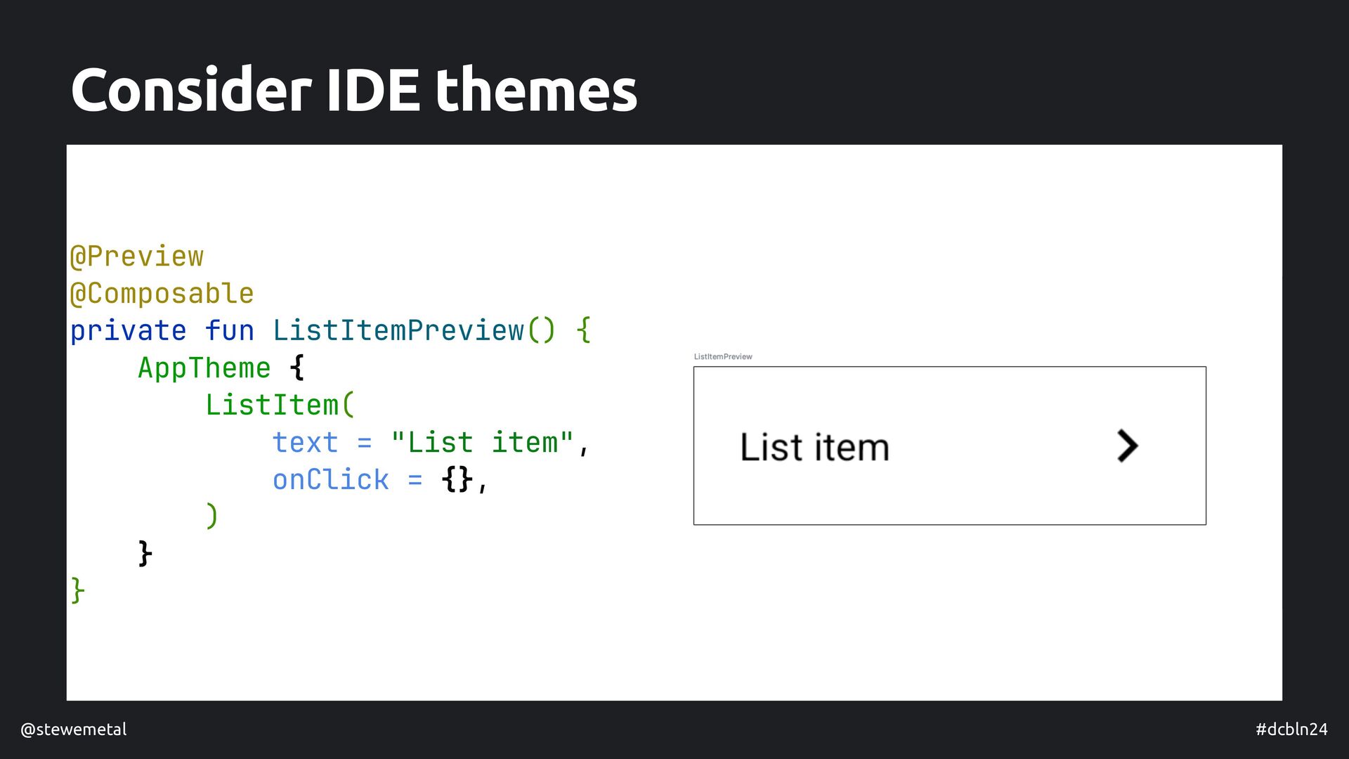
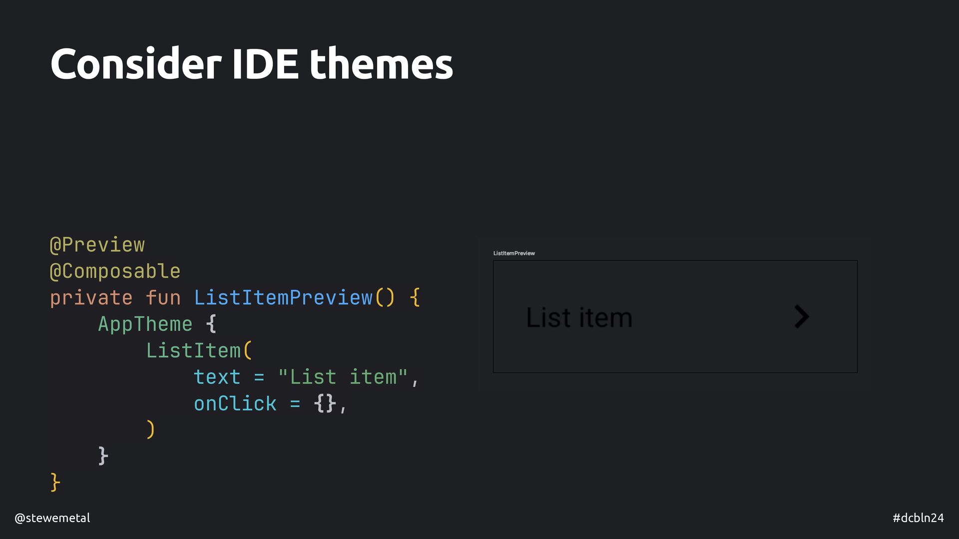
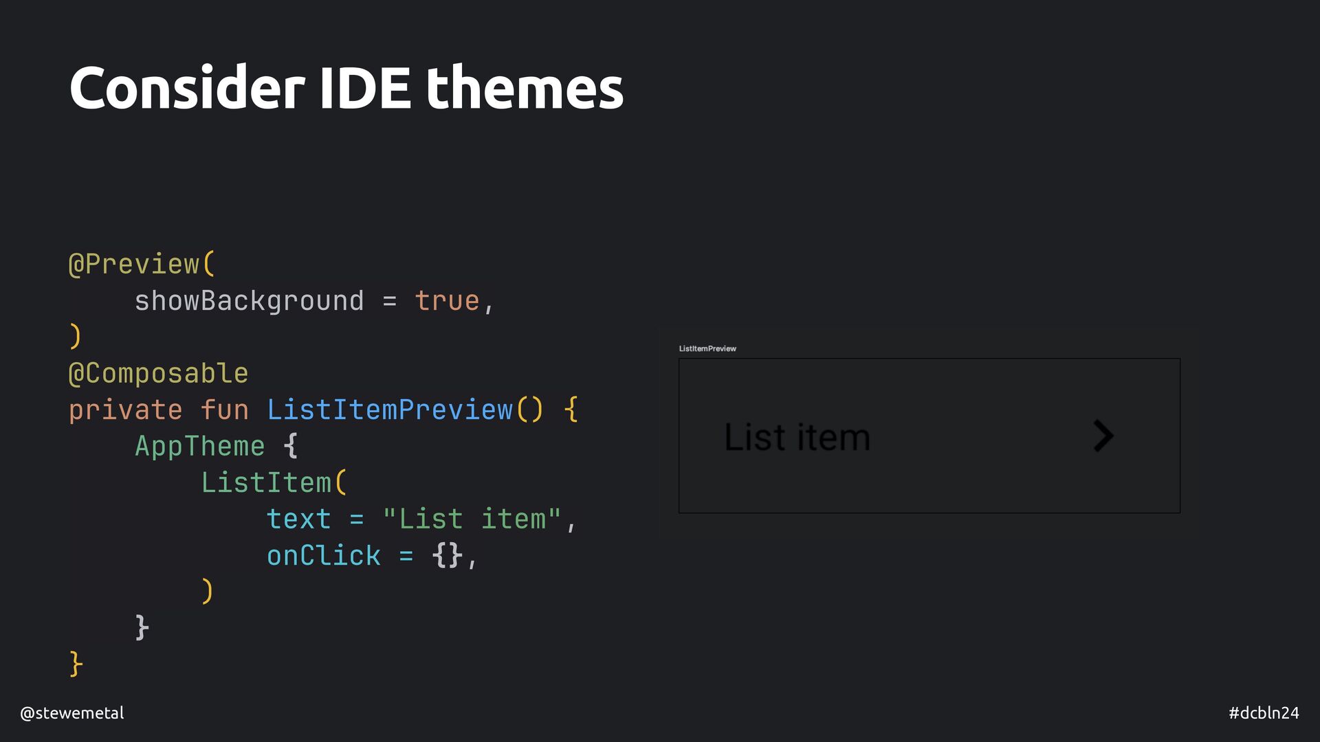
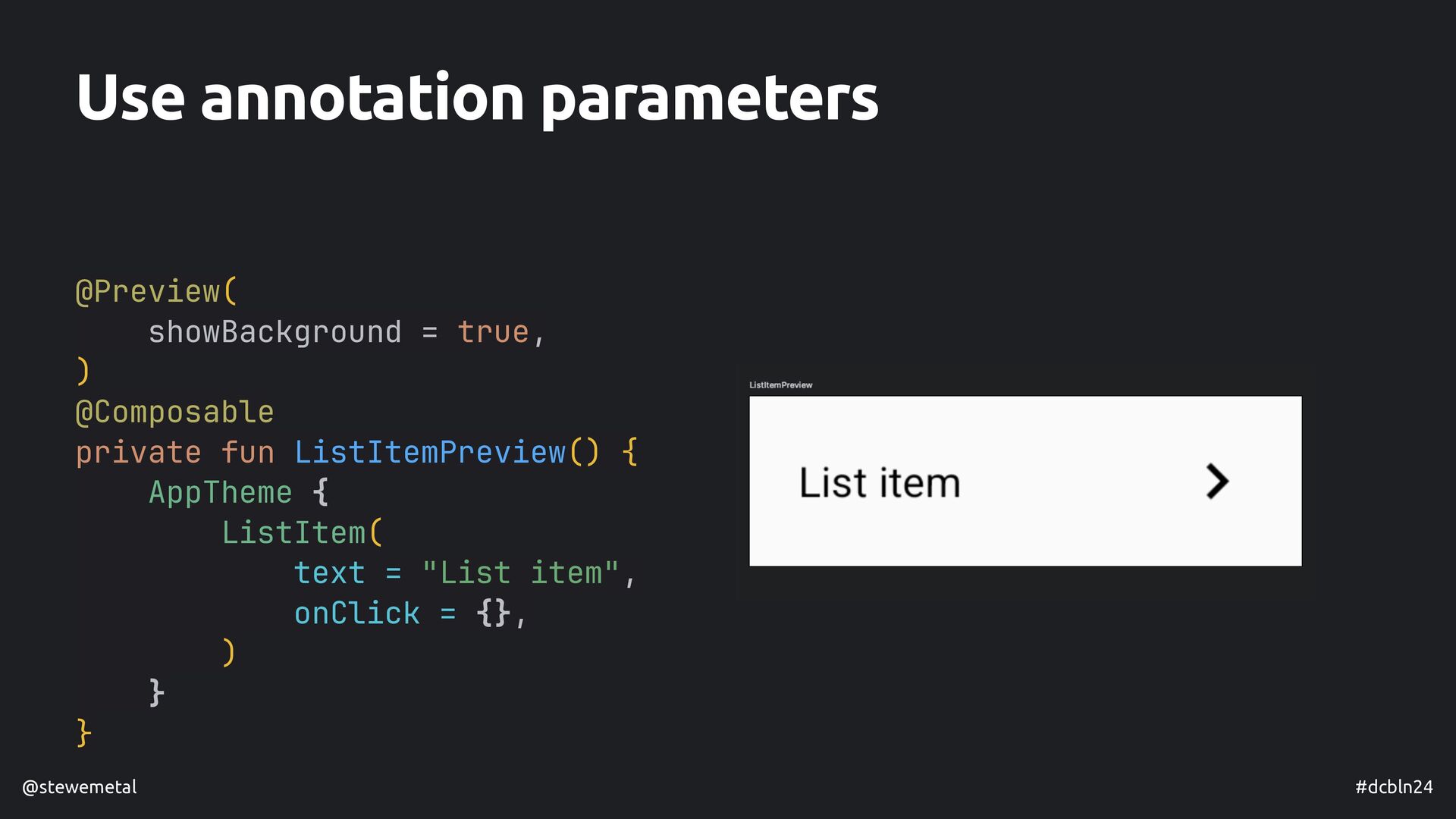
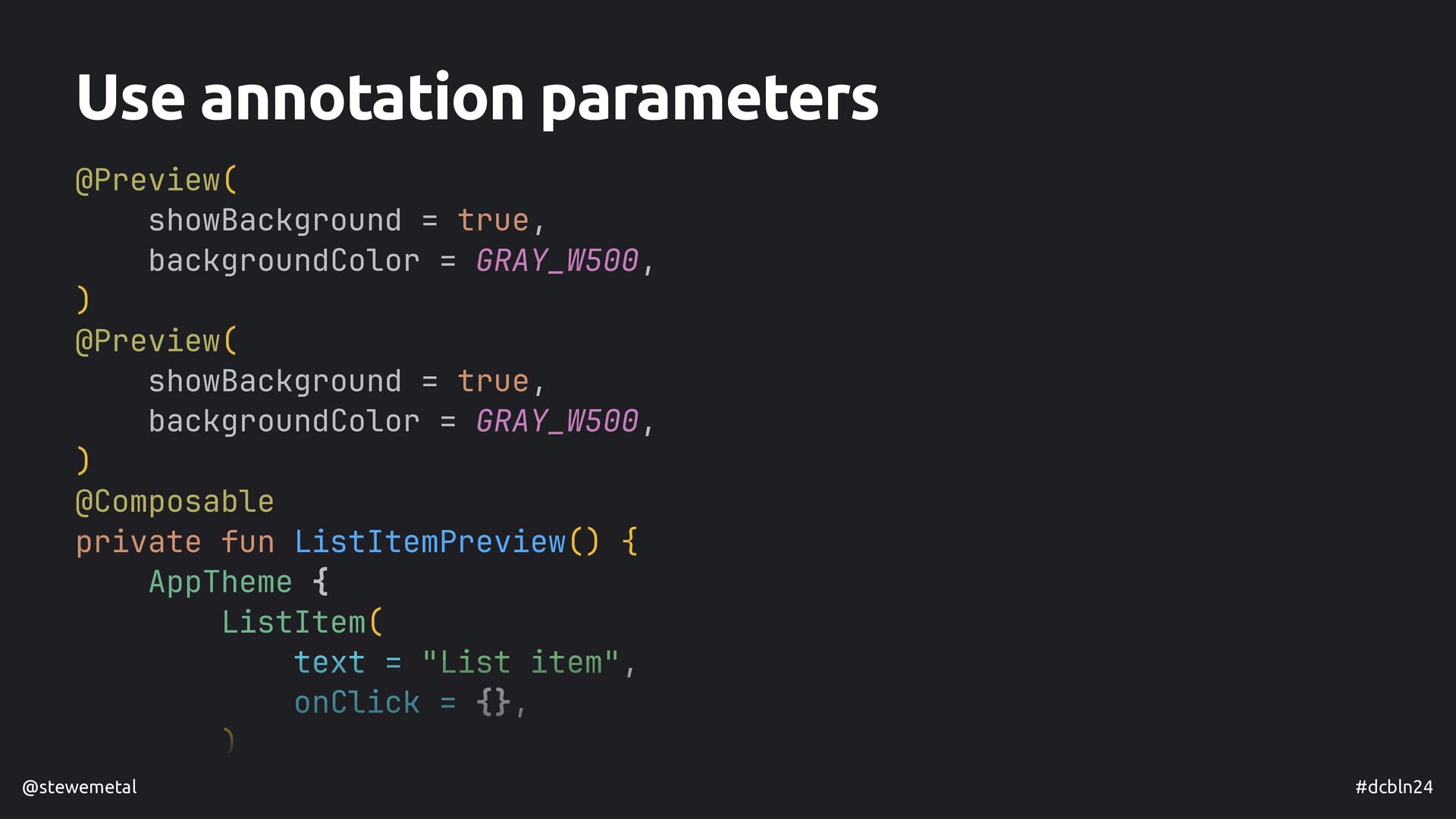
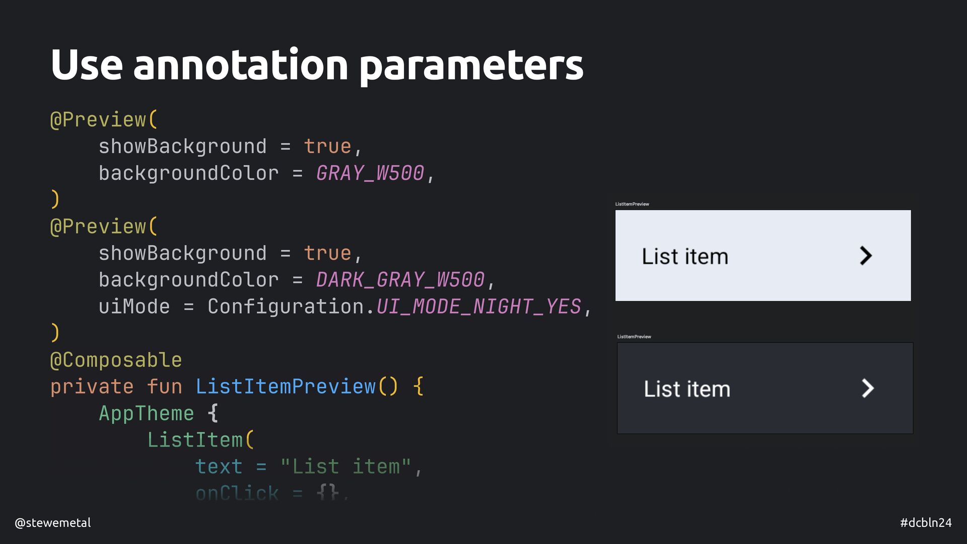
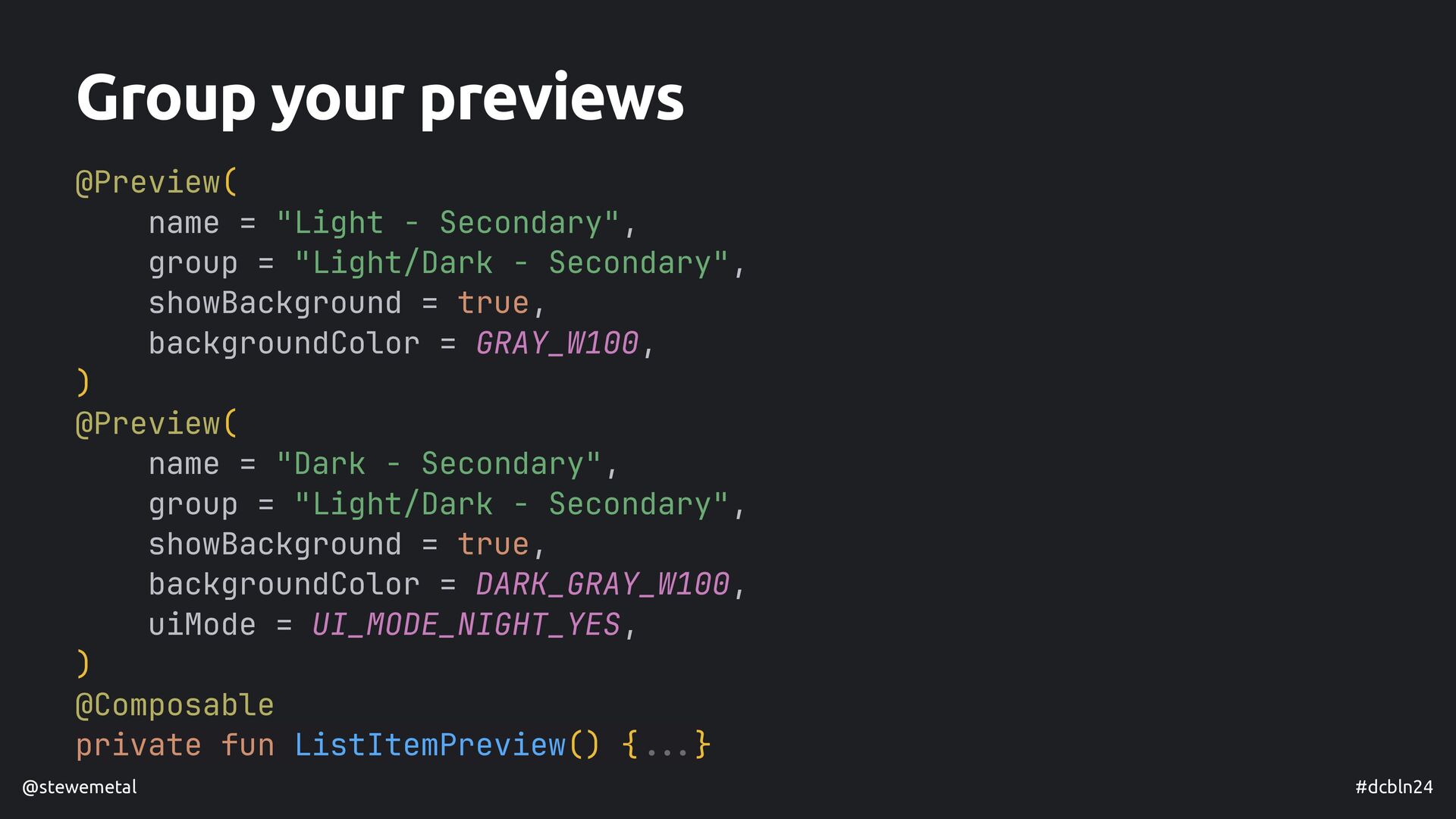
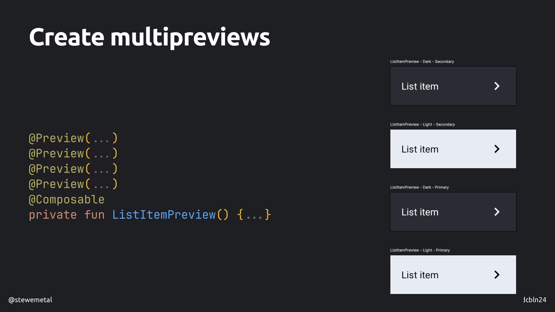
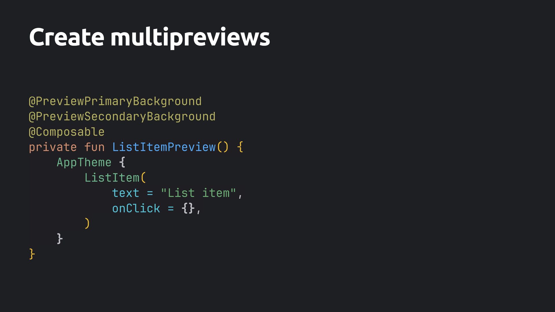
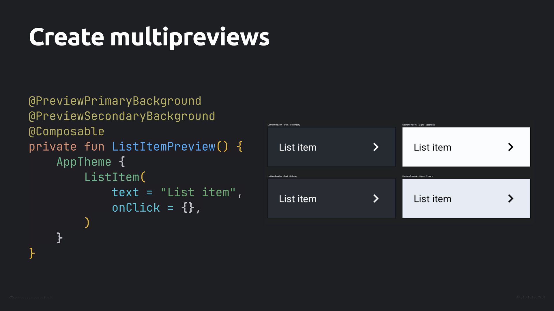
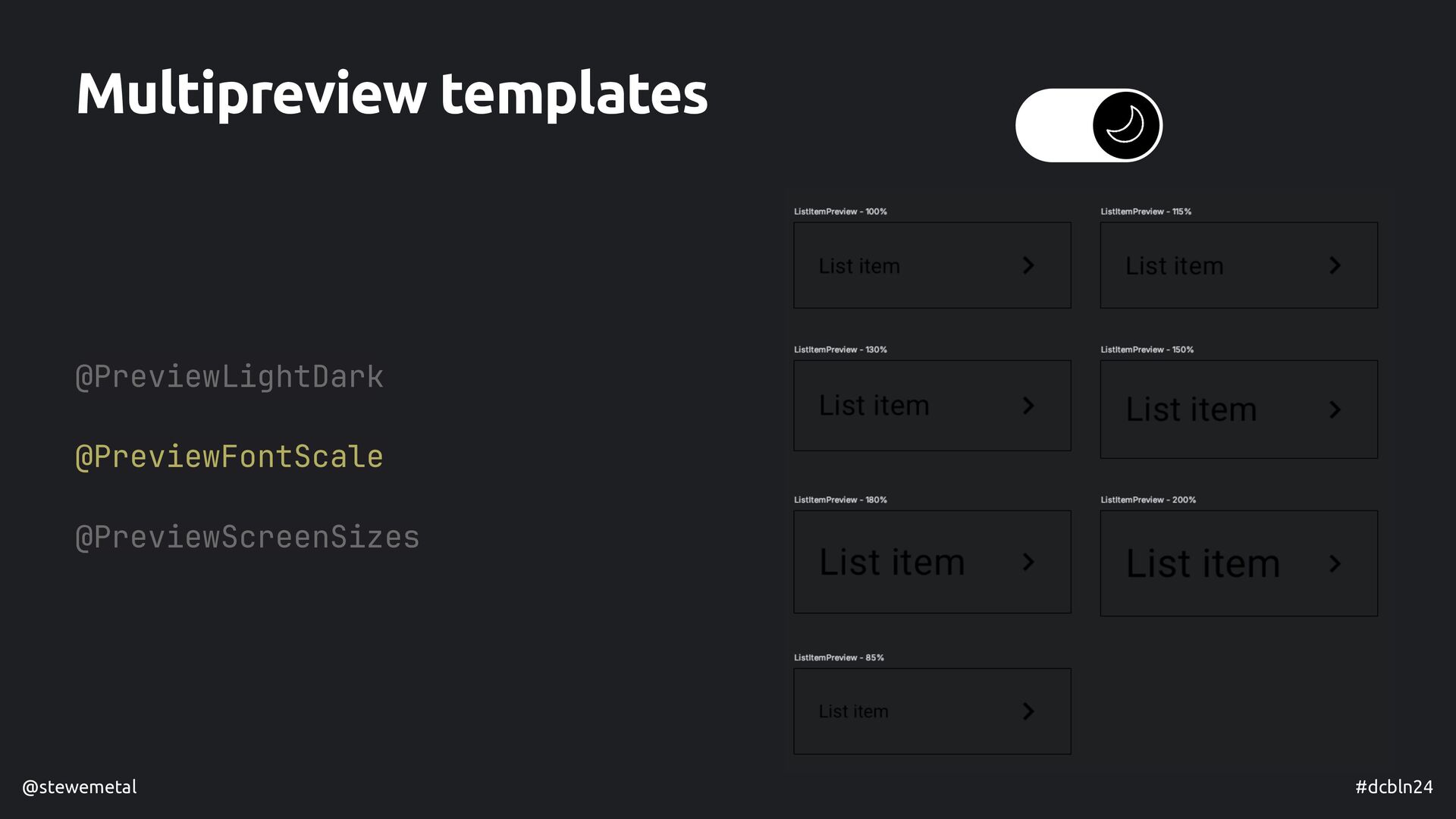
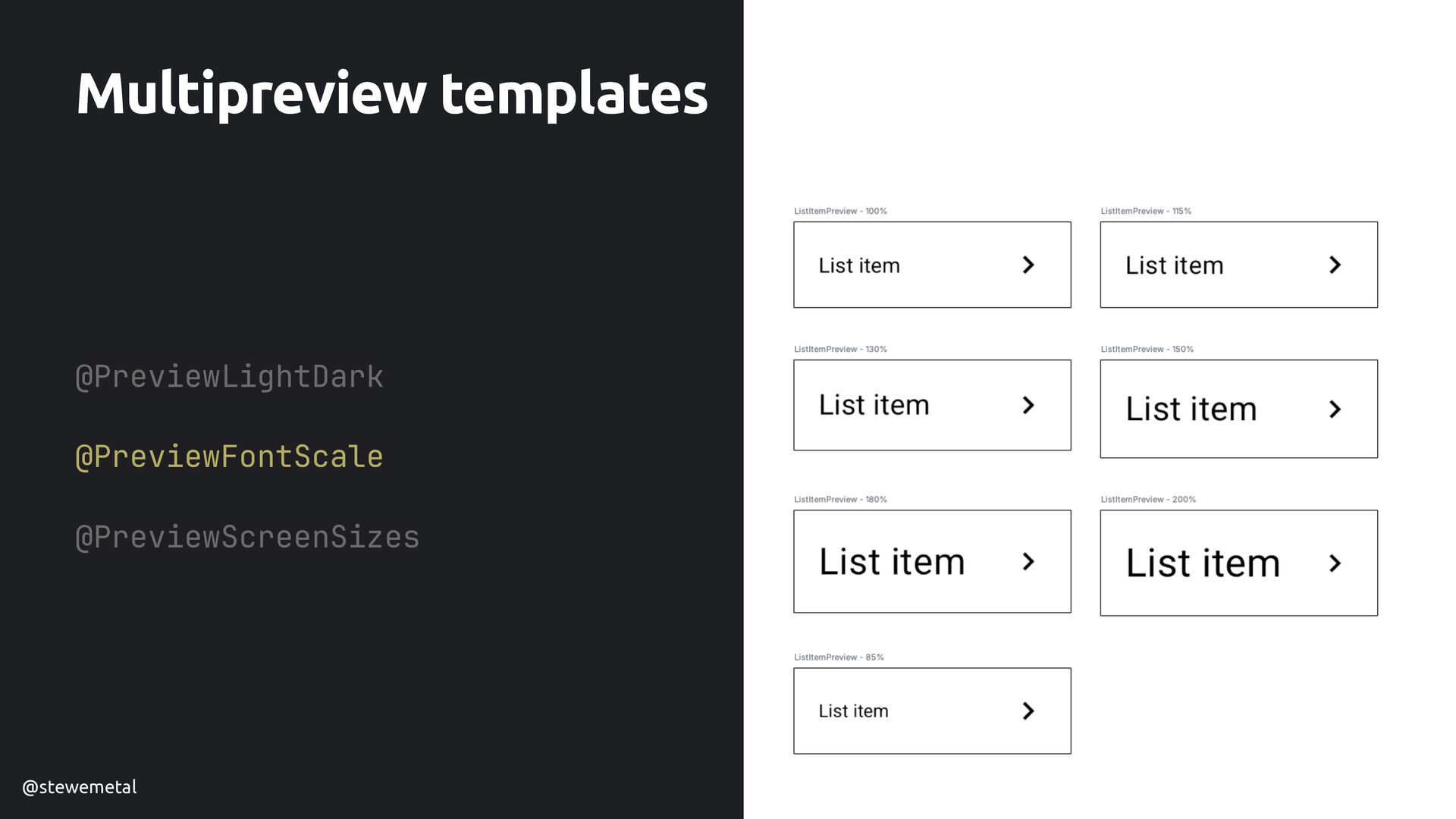
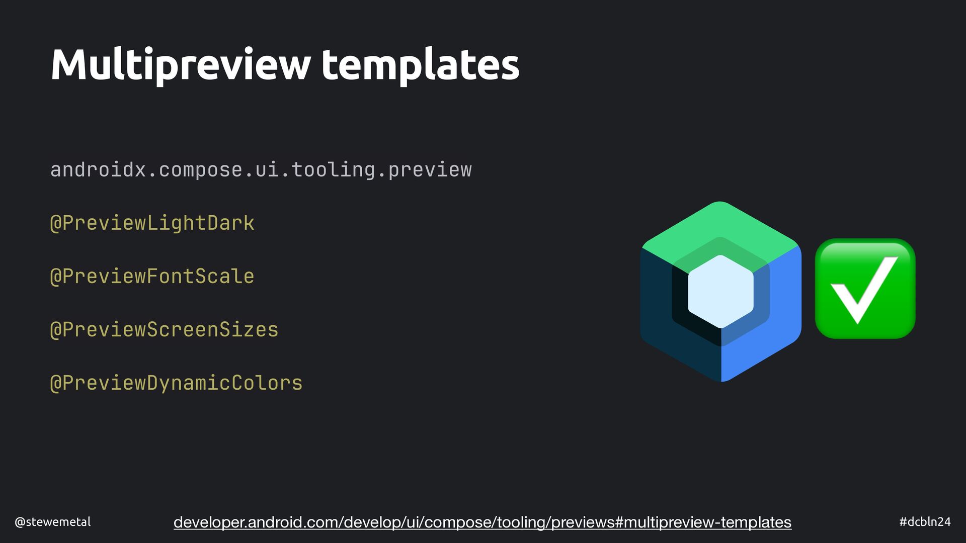
- How we can make our previews developer-friendly
- What we can use our previews for besides checking how our composables are rendered and how they behave

István Juhos

July 04, 2024
Tweet

More Decks by István Juhos

Other Decks in Programming

Transcript

  1. @Preview(device = "spec:width=960dp,height=1080dp,dpi=480") @Composable private fun TitleSlidePreview() { PreviewBox {

    TitleSlide() } } @Composable private fun TitleSlide() { Column( modifier = Modifier .fillMaxSize() .padding(32.dp) ) { Title( modifier = Modifier .fillMaxWidth() .padding(top = 32.dp), fontSize = 70.sp, ) Column( horizontalAlignment = CenterHorizontally, modifier = Modifier .fillMaxWidth() ) { Name( modifier = Modifier .weight(1f) .padding(bottom = 66.dp), imageHeight = 66.dp, textSize = 70.sp, ) Contacts( modifier = Modifier .padding( bottom = 16.dp, end = 16.dp, ), fontSize = 50.sp, ) } } } Practical Tips and Tricks to Improve Your Compose Previews István Juhos @stewemetal istvanjuhos.dev
  2. #dcbln24 @stewemetal @Preview @Composable private fun ListItemPreview() { AppTheme {

    ListItem( text = "List item", onClick = {}, ) } } Compose preview
  3. #dcbln24 @stewemetal @Preview @Composable private fun ListItemPreview() { AppTheme {

    ListItem( text = "List item", onClick = {}, ) } } Compose preview
  4. #dcbln24 @stewemetal @Preview @Composable private fun ListItemPreview() { AppTheme {

    ListItem( text = "List item", onClick = {}, ) } } • Code Compose preview
  5. #dcbln24 @stewemetal • Code, that • will never reach production

    @Preview @Composable private fun ListItemPreview() { AppTheme { ListItem( text = "List item", onClick = {}, ) } } Compose preview
  6. #dcbln24 @stewemetal • Code, that • will never reach productio

    n​ … 🤞 @Preview @Composable private fun ListItemPreview() { AppTheme { ListItem( text = "List item", onClick = {}, ) } } Compose preview
  7. #dcbln24 @stewemetal • Code, that • will never reach production…

    • others will read 🤞 @Preview @Composable private fun ListItemPreview() { AppTheme { ListItem( text = "List item", onClick = {}, ) } } Compose preview
  8. #dcbln24 @stewemetal • Code, that • will never reach production…

    • others will read • needs to be maintained 🤞 @Preview @Composable private fun ListItemPreview() { AppTheme { ListItem( text = "List item", onClick = {}, ) } } Compose preview
  9. #dcbln24 @stewemetal • Code, that • will never reach production…

    • others will read • needs to be maintained • might be duplicated 🤞 @Preview @Composable private fun ListItemPreview() { AppTheme { ListItem( text = "List item", onClick = {}, ) } } Compose preview
  10. #dcbln24 @stewemetal • Code, that • will never reach production…

    • others will read • needs to be maintained • might be duplicated • might be used for other purposes 🤞 @Preview @Composable private fun ListItemPreview() { AppTheme { ListItem( text = "List item", onClick = {}, ) } } Compose preview
  11. #dcbln24 @stewemetal Consider IDE themes @Composable fun ListItem( text: String,

    onClick: () -> Unit, modifier: Modifier = Modifier, ) { Row( verticalAlignment = Alignment.CenterVertically, modifier = modifier .clickable(onClick = onClick) .padding(16.dp), ) { Text( text = text, style = PreviewTheme.typography.bodyMedium, color = PreviewTheme.colors.text, modifier = Modifier.weight(1f), ) Image( imageVector = KeyboardArrowRight, contentDescription = null, colorFilter = ColorFilter.tint(PreviewTheme.colors.text) ) } }
  12. Consider IDE themes • Render Composable functions annotated with @Preview

    @Composable fun ListItem( text: String, onClick: () -> Unit, modifier: Modifier = Modifier, ) { Row( verticalAlignment = Alignment.CenterVertically, modifier = modifier .clickable(onClick = onClick) .padding(16.dp), ) { Text( text = text, style = PreviewTheme.typography.bodyMedium, color = PreviewTheme.colors.text, modifier = Modifier.weight(1f), ) Image( imageVector = KeyboardArrowRight, contentDescription = null, colorFilter = ColorFilter.tint(PreviewTheme.colors.text) ) } }
  13. Consider IDE themes • Render Composable functions annotated with @Preview

    @Composable fun ListItem( text: String, onClick: () -> Unit, modifier: Modifier = Modifier, ) { Row( verticalAlignment = Alignment.CenterVertically, modifier = modifier .clickable(onClick = onClick) .padding(16.dp), ) { Text( text = text, style = PreviewTheme.typography.bodyMedium, color = PreviewTheme.colors.text,
  14. Consider IDE themes • Render Composable functions annotated with @Preview

    @Composable fun ListItem( text: String, onClick: () -> Unit, modifier: Modifier = Modifier, ) { Row( verticalAlignment = Alignment.CenterVertically, modifier = modifier .clickable(onClick = onClick) .padding(16.dp), ) { Text( text = text, style = PreviewTheme.typography.bodyMedium, color = PreviewTheme.colors.text,
  15. #dcbln24 @stewemetal Consider IDE themes @Preview @Composable private fun ListItemPreview()

    { AppTheme { ListItem( text = "List item", onClick = {}, ) } }
  16. #dcbln24 @stewemetal Consider IDE themes @Preview @Composable private fun ListItemPreview()

    { AppTheme { ListItem( text = "List item", onClick = {}, ) } }
  17. #dcbln24 @stewemetal Consider IDE themes @Preview @Composable private fun ListItemPreview()

    { AppTheme { ListItem( text = "List item", onClick = {}, ) } }
  18. #dcbln24 @stewemetal @Preview @Composable private fun ListItemPreview() { AppTheme {

    ListItem( text = "List item", onClick = {}, ) } } Consider IDE themes
  19. #dcbln24 @stewemetal @Preview @Composable private fun ListItemPreview() { AppTheme {

    ListItem( text = "List item", onClick = {}, ) } } Consider IDE themes
  20. #dcbln24 @stewemetal @Preview @Composable private fun ListItemPreview() { AppTheme {

    ListItem( text = "List item", onClick = {}, ) } } Consider IDE themes
  21. #dcbln24 @stewemetal @Preview( showBackground = true, ) @Composable private fun

    ListItemPreview() { AppTheme { ListItem( text = "List item", onClick = {}, ) } } Consider IDE themes
  22. #dcbln24 @stewemetal @Preview( showBackground = true, ) @Composable private fun

    ListItemPreview() { AppTheme { ListItem( text = "List item", onClick = {}, ) } } Consider IDE themes vs
  23. #dcbln24 @stewemetal @Preview( showBackground = true, ) @Composable private fun

    ListItemPreview() { AppTheme { ListItem( text = "List item", onClick = {}, ) } } Use annotation parameters
  24. #dcbln24 @stewemetal @Preview( showBackground = true, ) @Composable private fun

    ListItemPreview() { AppTheme { ListItem( text = "List item", onClick = {}, ) } } Use annotation parameters
  25. #dcbln24 @stewemetal @Preview( showBackground = true, backgroundColor = 0xFF_E7ECF4, )

    @Composable private fun ListItemPreview() { AppTheme { ListItem( text = "List item", onClick = {}, ) } } Use annotation parameters
  26. #dcbln24 @stewemetal @Preview( showBackground = true, backgroundColor = 0xFF_E7ECF4, //

    gray.w500 ) @Composable private fun ListItemPreview() { AppTheme { ListItem( text = "List item", onClick = {}, ) } } Use annotation parameters
  27. #dcbln24 @stewemetal Use annotation parameters @Preview( showBackground = true, backgroundColor

    = GRAY_W500, ) @Composable private fun ListItemPreview() { AppTheme { ListItem( text = "List item", onClick = {}, ) } } const val GRAY_W500 = 0xFF_E7ECF4 ...
  28. #dcbln24 @stewemetal Use annotation parameters @Preview( showBackground = true, backgroundColor

    = GRAY_W500, ) @Composable private fun ListItemPreview() { AppTheme { ListItem( text = "List item", onClick = {}, ) } }
  29. #dcbln24 @stewemetal Use annotation parameters @Preview( showBackground = true, backgroundColor

    = GRAY_W500, uiMode = Configuration.UI_MODE_NIGHT_YES, ) @Composable private fun ListItemPreview() { AppTheme { ListItem( text = "List item", onClick = {}, ) } }
  30. #dcbln24 @stewemetal Use annotation parameters @Preview( showBackground = true, backgroundColor

    = GRAY_W500, ) @Composable private fun ListItemPreview() { AppTheme { ListItem( text = "List item", onClick = {}, ) } }
  31. #dcbln24 @stewemetal Use annotation parameters @Preview( showBackground = true, backgroundColor

    = GRAY_W500, ) @Preview( showBackground = true, backgroundColor = GRAY_W500, ) @Composable private fun ListItemPreview() { AppTheme { ListItem( text = "List item", onClick = {}, )
  32. #dcbln24 @stewemetal Use annotation parameters @Preview( showBackground = true, backgroundColor

    = GRAY_W500, ) @Preview( showBackground = true, backgroundColor = DARK_GRAY_W500, ) @Composable private fun ListItemPreview() { AppTheme { ListItem( text = "List item", onClick = {}, )
  33. #dcbln24 @stewemetal Use annotation parameters @Preview( showBackground = true, backgroundColor

    = GRAY_W500, ) @Preview( showBackground = true, backgroundColor = DARK_GRAY_W500, uiMode = Configuration.UI_MODE_NIGHT_YES, ) @Composable private fun ListItemPreview() { AppTheme { ListItem( text = "List item", onClick = {},
  34. #dcbln24 @stewemetal Use annotation parameters @Preview( showBackground = true, backgroundColor

    = GRAY_W500, ) @Preview( showBackground = true, backgroundColor = DARK_GRAY_W500, uiMode = Configuration.UI_MODE_NIGHT_YES, ) @Composable private fun ListItemPreview() { AppTheme { ListItem( text = "List item", onClick = {},
  35. #dcbln24 @stewemetal @Preview( name = "Light - Primary", group =

    "Light/Dark - Primary", showBackground = true, backgroundColor = GRAY_W500, ) @Preview( name = "Dark - Primary", group = "Light/Dark - Primary”, showBackground = true, backgroundColor = DARK_GRAY_W500, uiMode = UI_MODE_NIGHT_YES, ) @Composable private fun ListItemPreview() { ... } Group your previews
  36. #dcbln24 @stewemetal @Preview( name = "Light - Secondary", group =

    "Light/Dark - Secondary", showBackground = true, backgroundColor = GRAY_W100, ) @Preview( name = "Dark - Secondary", group = "Light/Dark - Secondary", showBackground = true, backgroundColor = DARK_GRAY_W100, uiMode = UI_MODE_NIGHT_YES, ) @Composable private fun ListItemPreview() { ... } Group your previews
  37. #dcbln24 @stewemetal @Preview( ... ) @Preview( ... ) @Preview( ...

    ) @Preview( ... ) @Composable private fun ListItemPreview() { ... } Group your previews
  38. #dcbln24 @stewemetal @Preview( ... ) @Preview( ... ) @Preview( ...

    ) @Preview( ... ) @Composable private fun ListItemPreview() { ... } Group your previews
  39. #dcbln24 @stewemetal @Preview( ... ) @Preview( ... ) @Preview( ...

    ) @Preview( ... ) @Composable private fun ListItemPreview() { ... } Create multipreviews
  40. @Preview( name = "Light - Primary", group = "Light/Dark -

    Primary", showBackground = true, backgroundColor = GRAY_W500, ) @Preview( name = "Dark - Primary", group = "Light/Dark - Primary", showBackground = true, backgroundColor = DARK_GRAY_W500, uiMode = UI_MODE_NIGHT_YES, ) annotation class PreviewPrimaryBackground Create multipreviews
  41. @Preview( name = "Light - Secondary", group = "Light/Dark -

    Secondary", showBackground = true, backgroundColor = GRAY_W100, ) @Preview( name = "Dark - Secondary", group = "Light/Dark - Secondary", showBackground = true, backgroundColor = DARK_GRAY_W100, uiMode = UI_MODE_NIGHT_YES, ) annotation class PreviewSecondaryBackground Create multipreviews
  42. @Preview( name = "Light - Secondary", group = "Light/Dark -

    Secondary", showBackground = true, backgroundColor = GRAY_W100, ) @Preview( name = "Dark - Secondary", group = "Light/Dark - Secondary", showBackground = true, backgroundColor = DARK_GRAY_W100, uiMode = UI_MODE_NIGHT_YES, ) annotation class PreviewSecondaryBackground Create multipreviews
  43. #dcbln24 @stewemetal @Composable private fun ListItemPreview() { AppTheme { ListItem(

    text = "List item", onClick = {}, ) } } Create multipreviews @PreviewPrimaryBackground @PreviewSecondaryBackground annotation class PreviewAllBackgrounds
  44. #dcbln24 @stewemetal @PreviewAllBackgrounds @Composable private fun ListItemPreview() { AppTheme {

    ListItem( text = "List item", onClick = {}, ) } } Create multipreviews @PreviewPrimaryBackground @PreviewSecondaryBackground annotation class PreviewAllBackgrounds
  45. #dcbln24 @stewemetal Multipreview templates androidx.compose.ui.tooling.preview @PreviewLightDark @PreviewFontScale @Previe w​ ScreenSizes

    @PreviewDynamicColors ✅ developer.android.com/develop/ui/compose/tooling/previews#multipreview-templates
  46. #dcbln24 @stewemetal No multipreview support yet @Preview( ... ) @Preview(

    ... ) annotation class PreviewPrimaryBackground @PreviewLightDark @PreviewFontScale @Previe w​ ScreenSizes @PreviewDynamicColors 😢 ❌
  47. #dcbln24 @stewemetal Build custom tools - a new example @Composable

    fun PrimaryButton( text: String, @DrawableRes leadingIcon: Int? = null, onClick: () - > Unit, modifier: Modifier = Modifier ) { Button( colors = ButtonDefaults.buttonColors().copy( containerColor = AppTheme.colors.background, ), elevation = ButtonDefaults.buttonElevation(4.dp), modifier = modifier, onClick = onClick, ) { Row(verticalAlignment = CenterVertically) { leadingIcon ?. let { Image( painter = painterResource(id = leadingIcon), contentDescription = null, colorFilter = ColorFilter.tint(AppTheme.colors.primaryButtonText), modifier = Modifier.size(24.dp) ) } Text( text = text, style = AppTheme.typography.labelMedium, color = AppTheme.colors.primaryButtonText, modifier = Modifier.padding(start = 8.dp) ) } } }
  48. #dcbln24 @stewemetal Let’s build our preview @PreviewLightDark @Composable private fun

    PrimaryButtonPreview() { PrimaryButton( text = "Primary Button", leadingIcon = R.drawable.ic_add, onClick = {}, ) }
  49. #dcbln24 @stewemetal Let’s build our preview @PreviewLightDark @Composable private fun

    PrimaryButtonPreview() { PrimaryButton( text = "Primary Button", leadingIcon = R.drawable.ic_add, onClick = {}, ) }
  50. #dcbln24 @stewemetal Something’s missing… @PreviewLightDark @Composable private fun PrimaryButtonPreview() {

    PrimaryButton( text = "Primary Button", leadingIcon = R.drawable.ic_add, onClick = {}, ) }
  51. #dcbln24 @stewemetal @PreviewLightDark @Composable private fun PrimaryButtonPreview() { AppTheme {

    PrimaryButton( text = "Primary Button", leadingIcon = R.drawable.ic_add, onClick = {} ) } } Something’s missing… the theme 🤦
  52. #dcbln24 @stewemetal @PreviewLightDark @Composable private fun PrimaryButtonPreview() { AppTheme {

    PrimaryButton( text = "Primary Button", leadingIcon = R.drawable.ic_add, onClick = {} ) } } … and options 💧
  53. #dcbln24 @stewemetal @Composable fun PreviewBox( modifier: Modifier = Modifier, content:

    @Composable () -> Unit, ) { AppTheme { content() } } Building preview tools
  54. #dcbln24 @stewemetal @Composable fun PreviewBox( modifier: Modifier = Modifier, content:

    @Composable () -> Unit, ) { AppTheme { Box { content() } } } Building preview tools
  55. #dcbln24 @stewemetal @Composable fun PreviewBox( modifier: Modifier = Modifier, backgroundColor:

    Color = AppTheme.colors.backgroundSecondary, content: @Composable () -> Unit, ) { AppTheme { Box { content() } } } Building preview tools
  56. #dcbln24 @stewemetal @Composable fun PreviewBox( modifier: Modifier = Modifier, backgroundColor:

    Color = AppTheme.colors.backgroundSecondary, content: @Composable () -> Unit, ) { AppTheme { Box( modifier = modifier .background(backgroundColor), ) { content() } } } Building preview tools
  57. #dcbln24 @stewemetal @Composable fun PreviewBox( modifier: Modifier = Modifier, backgroundColor:

    Color = AppTheme.colors.backgroundSecondary, content: @Composable () -> Unit, ) { AppTheme { Box( modifier = modifier .background(backgroundColor), ) { content() } } } Building preview tools
  58. #dcbln24 @stewemetal Building preview tools - theme insights AppTheme.colors.backgroundSecondary object

    AppTheme { val colors: AppColors @Composable @ReadOnlyComposable get() = LocalAppColors.current //... }
  59. #dcbln24 @stewemetal Building preview tools - theme insights AppTheme.colors.backgroundSecondary object

    AppTheme { val colors: AppColors @Composable @ReadOnlyComposable get() = LocalAppColors.current //... } val LocalAppColors = staticCompositionLocalOf<AppColors> { error("Make sure to use this value in an AppTheme.") }
  60. #dcbln24 @stewemetal Building preview tools - theme insights AppTheme.colors.backgroundSecondary object

    AppTheme { val colors: AppColors @Composable @ReadOnlyComposable get() = LocalAppColors.current //... } val LocalAppColors = staticCompositionLocalOf<AppColors> { lightColors() }
  61. #dcbln24 @stewemetal @Composable fun PreviewBox( modifier: Modifier = Modifier, backgroundColor:

    Color = AppTheme.colors.backgroundSecondary, content: @Composable () -> Unit, ) { AppTheme { Box( modifier = modifier .background(backgroundColor), ) { content() } } } Building preview tools
  62. #dcbln24 @stewemetal @Composable fun PreviewBox( modifier: Modifier = Modifier, backgroundColor:

    Color = AppTheme.colors.backgroundSecondary, content: @Composable () -> Unit, ) { AppTheme { Box( modifier = modifier .background(backgroundColor), ) { content() } } } Building preview tools
  63. #dcbln24 @stewemetal @Composable fun PreviewBox( modifier: Modifier = Modifier, backgroundColor:

    @Composable () -> Color = { AppTheme.colors.backgroundSecondary }, content: @Composable () -> Unit, ) { AppTheme { Box( modifier = modifier .background(backgroundColor), ) { content() } } } Building preview tools
  64. #dcbln24 @stewemetal @Composable fun PreviewBox( modifier: Modifier = Modifier, backgroundColor:

    @Composable () -> Color = { AppTheme.colors.backgroundSecondary }, content: @Composable () -> Unit, ) { AppTheme { Box( modifier = modifier .background(backgroundColor()), ) { content() } } } Building preview tools
  65. #dcbln24 @stewemetal @Composable fun PreviewBox( modifier: Modifier = Modifier, backgroundColor:

    @Composable () -> Color = { AppTheme.colors.backgroundSecondary }, content: @Composable () -> Unit, ) { AppTheme { Box( modifier = modifier .background(backgroundColor()), ) { content() } } } Building preview tools
  66. #dcbln24 @stewemetal @Composable fun PreviewBox( modifier: Modifier = Modifier, backgroundColor:

    @Composable () -> Color = { AppTheme.colors.backgroundSecondary }, content: @Composable () -> Unit, ) { AppTheme { Box( ... ) { content() } } } Building preview tools
  67. #dcbln24 @stewemetal @Composable fun PreviewBox( modifier: Modifier = Modifier, backgroundColor:

    @Composable () -> Color = { AppTheme.colors.backgroundSecondary }, paddingValues: PaddingValues = PaddingValues(4.dp), content: @Composable () -> Unit, ) { AppTheme { Box( ... ) { content() } } } Building preview tools
  68. #dcbln24 @stewemetal @Composable fun Previe w​ Box( ... content: @Composable

    () -> Unit, ) { AppTheme { Box( ... ) { content() } } } Building preview tools
  69. #dcbln24 @stewemetal @Composable fun Previe w​ Column( ... content: @Composable

    () -> Unit, ) { AppTheme { Column( ... ) { content() } } } Building preview tools
  70. #dcbln24 @stewemetal Override CompositionLocals @Composable fun PreviewColumn( ... layoutDirection: LayoutDirection

    = LayoutDirection.Ltr, content: @Composable () -> Unit, ) { AppTheme { Column( ... ) { content() } } }
  71. #dcbln24 @stewemetal Override CompositionLocals @Composable fun PreviewColumn( ... layoutDirection: LayoutDirection

    = LayoutDirection.Ltr, content: @Composable () -> Unit, ) { CompositionLocalProvider( LocalLayoutDirection provides layoutDirection, ) { AppTheme { Column( ... ) { content() } } } }
  72. #dcbln24 @stewemetal Override CompositionLocals @PreviewLightDark @Composable private fun PreviewColumnPreview() {

    PreviewColumn( layoutDirection = LayoutDirection.Rtl, ) { PrimaryButton( ... ) ListItem( ... ) } }
  73. #dcbln24 @stewemetal Override CompositionLocals @PreviewLightDark @Composable private fun PreviewColumnPreview() {

    PreviewColumn( layoutDirection = LayoutDirection.Rtl, ) { PrimaryButton( ... ) ListItem( ... ) } }
  74. #dcbln24 @stewemetal Override CompositionLocals @PreviewLightDark @Composable private fun PreviewColumnPreview() {

    PreviewColumn( layoutDirection = LayoutDirection.Rtl, ) { PrimaryButton( .. . ) ListItem( .. . ) } }
  75. #dcbln24 @stewemetal Override CompositionLocals @Preview @Composable private fun PreviewColumnPreview() {

    PreviewColumn( layoutDirection = LayoutDirection.Rtl, ) { PrimaryButton( .. . ) ListItem( .. . ) } }
  76. #dcbln24 @stewemetal Override CompositionLocals @Preview @Composable private fun PreviewColumnPreview() {

    PreviewColumn( layoutDirection = LayoutDirection.Rtl, ) { PrimaryButton( .. . ) ListItem( .. . ) } }
  77. #dcbln24 @stewemetal Some more ideas • Check the behavior of

    components in interactive mode • Use previews for preliminary accessibility checks
  78. #dcbln24 @stewemetal Some more ideas • Check the behavior of

    components in interactive mode • Use previews for preliminary accessibility checks • Generate previews with PreviewParemeterProviders
  79. #dcbln24 @stewemetal Some more ideas • Check the behavior of

    components in interactive mode • Use previews for preliminary accessibility checks • Generate previews with PreviewParemeterProviders • Providing Composables as preview parameters 🤯
  80. #dcbln24 @stewemetal Some more ideas • Check the behavior of

    components in interactive mode • Use previews for preliminary accessibility checks • Generate previews with PreviewParemeterProviders • Providing Composables as preview parameters 🤯 • Use previews to build a component showcase (Showkase)
  81. #dcbln24 @stewemetal Some more ideas • Check the behavior of

    components in interactive mode • Use previews for preliminary accessibility checks • Generate previews with PreviewParemeterProviders • Providing Composables as preview parameters 🤯 • Use previews to build a component showcase (Showkase) • Use previews for screenshot tests
  82. #dcbln24 @stewemetal Some more ideas • Check the behavior of

    components in interactive mode • Use previews for preliminary accessibility checks • Generate previews with PreviewParemeterProviders • Providing Composables as preview parameters 🤯 • Use previews to build a component showcase (Showkase) • Use previews for screenshot tests • Go wild with the tooling as long as it serves a purpose
  83. #dcbln24 @stewemetal Resources • developer.android.com/develop/ui/compose/tooling/previews • developer.android.com/studio/preview/compose-screenshot-testing • developer.android.com/topic/performance/rendering/overdraw •

    github.com/airbnb/Showkase • proandroiddev.com/using-previewparameters-and-providing-composables- to-jetpack-compose-previews-5b1f5a8fe192 • Good old fi eld experience 😅
  84. Practical Tips and Tricks to Improve Your Compose Previews •

    Compose previews are code • Simplify previews as much as possible • Compose custom reusable tools istvanjuhos.dev @stewemetal István Juhos Photo by Glenn Carstens-Peters