Short talk given in various forms as part of CRSP 413 over the past few years. My goal here is to show and tell you a little about presenting effectively with data, and setting up your research life so that presenting effectively becomes easier.
You’re always in a hurry) CRSP 413: Communication in Clinical Research Seminar 2023-09-13 Thomas E. Love, Ph.D. [email protected] https://speakerdeck.com/thomaselove/presenting-effectively-with-data-in-a-hurry
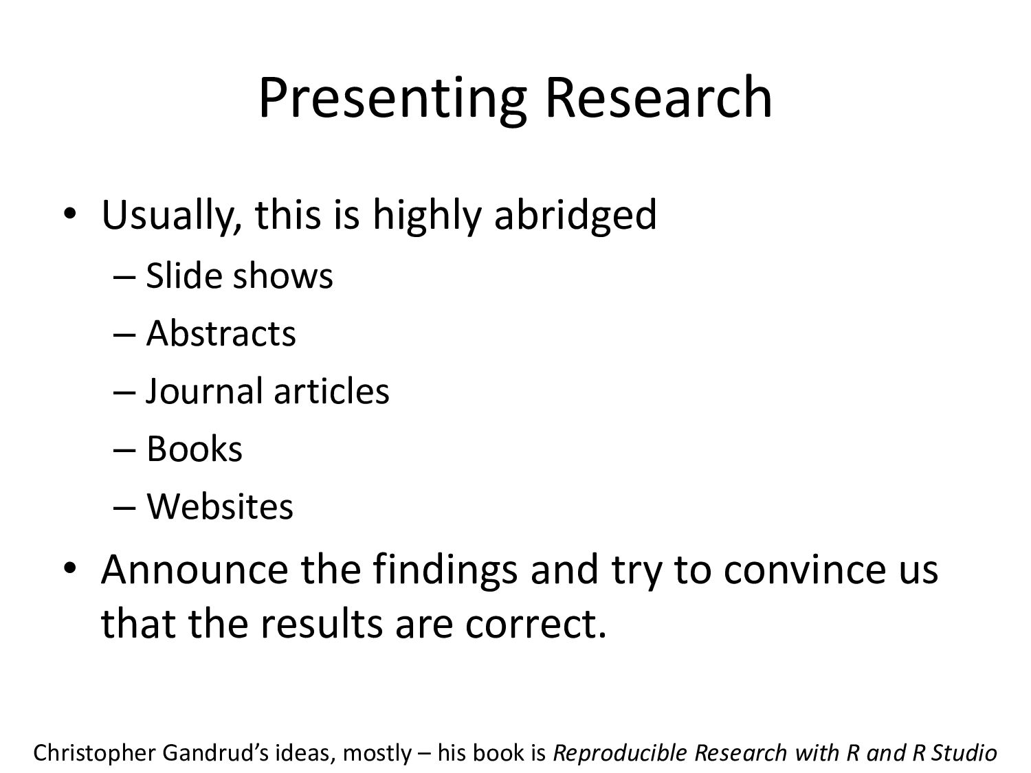
shows – Abstracts – Journal articles – Books – Websites • Announce the findings and try to convince us that the results are correct. Christopher Gandrud’s ideas, mostly – his book is Reproducible Research with R and R Studio
Round, a lot. • Edit, ruthlessly. – One pass through software (“default options”) is never enough. – Better for people to leave the table hungry than stuffed. • Have something to say, and say it clearly. • Some possibilities are never a good choice. I am deeply in Andrew Gelman’s debt – see http://andrewgelman.com/
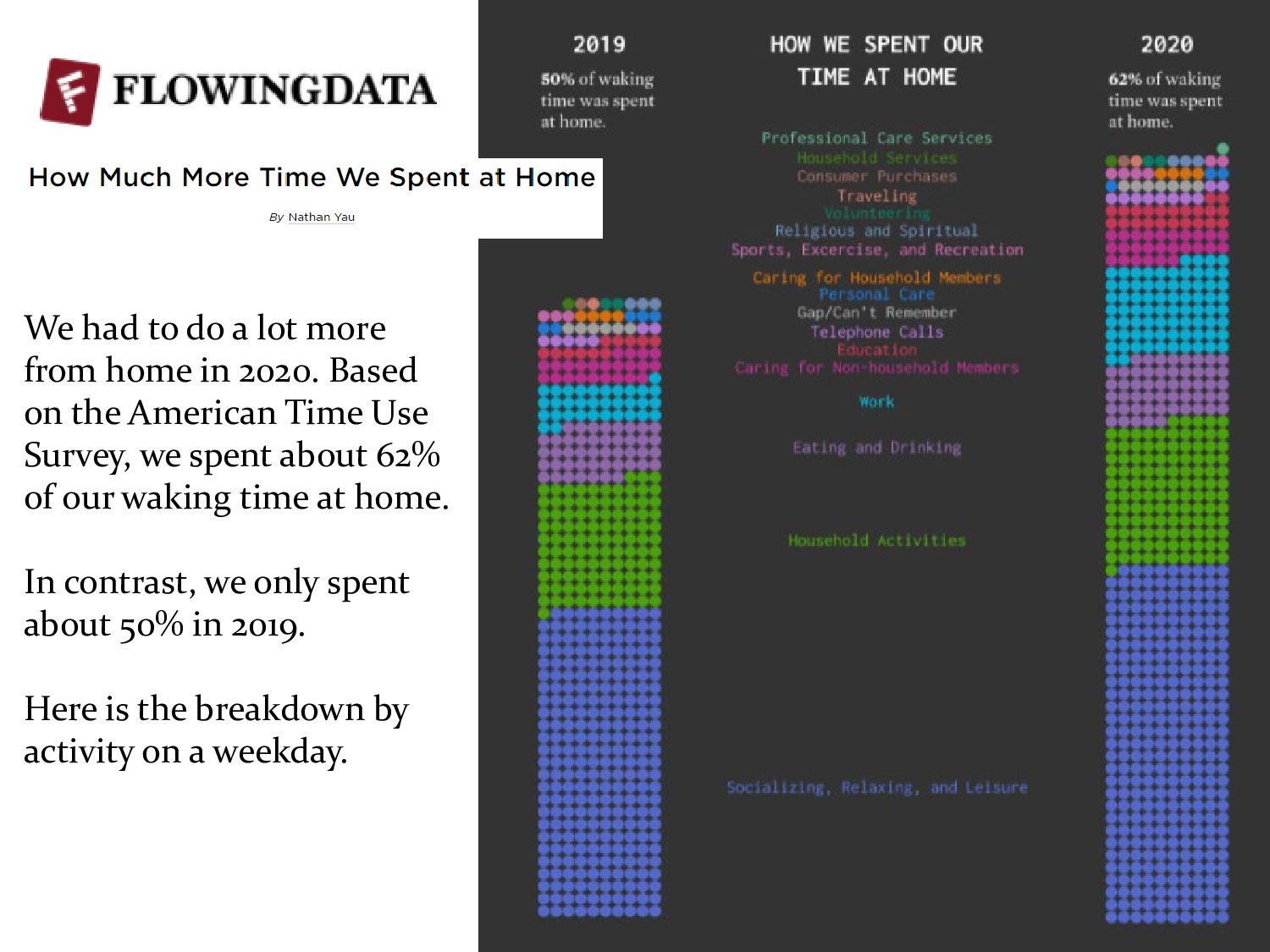
2020. Based on the American Time Use Survey, we spent about 62% of our waking time at home. In contrast, we only spent about 50% in 2019. Here is the breakdown by activity on a weekday.
or relationships visually most prominent? • Are the elements, symbol shapes and colors consistent with their use in previous graphs? • Are all of the graphical elements necessary to convey the relationships? • Are the graphical elements accurately positioned and scaled? http://www.datavis.ca/gallery/index.php
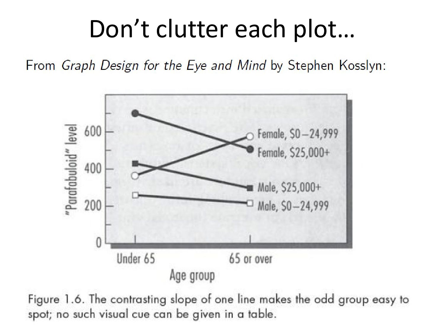
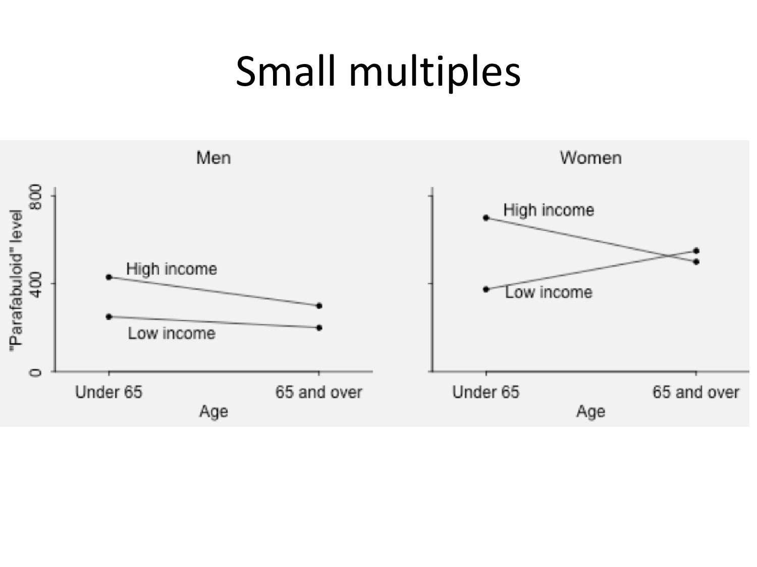
visualization (grabby, visually striking – dramatize the problem to draw the casual viewer in deeper) • Or statistical graphics (reveal patterns and discrepancies for viewers who are already interested in the problem) • Make tradeoffs carefully – meaningful choices.
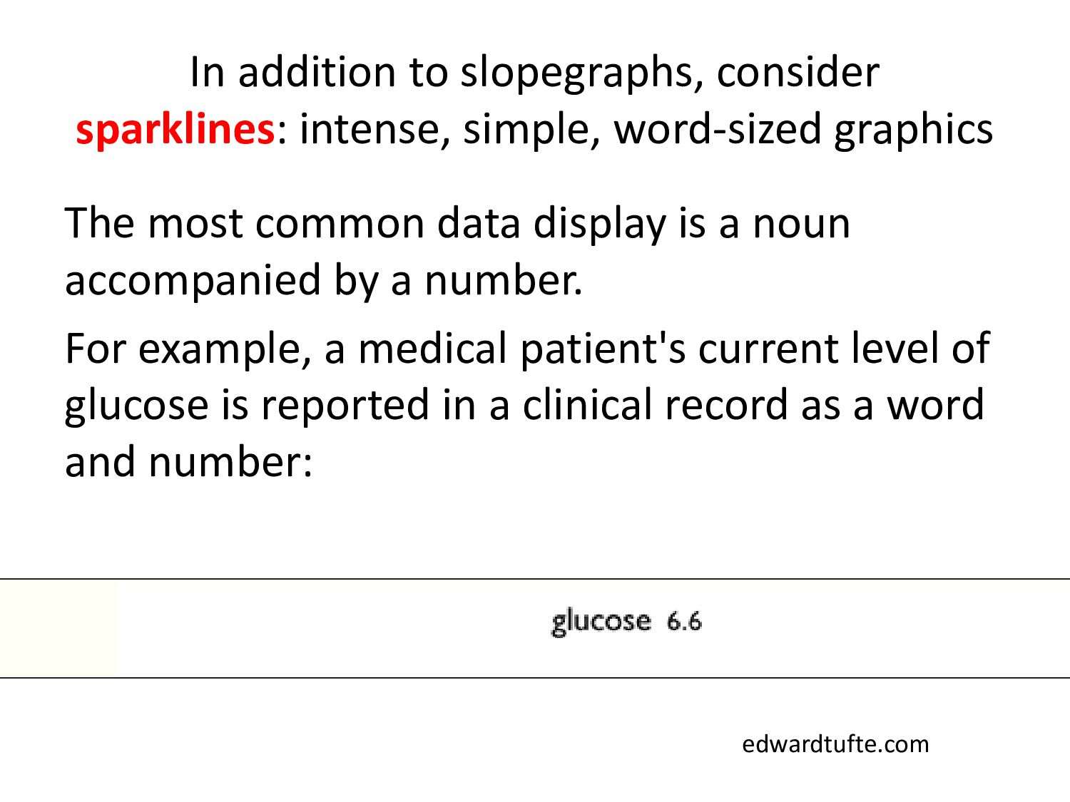
The most common data display is a noun accompanied by a number. For example, a medical patient's current level of glucose is reported in a clinical record as a word and number: edwardtufte.com
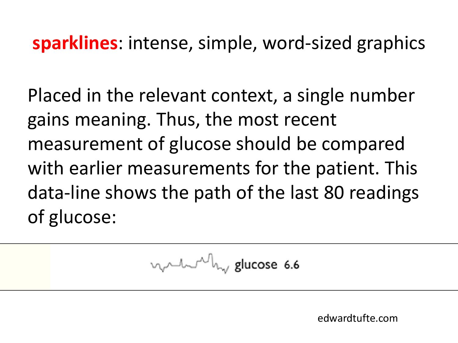
a single number gains meaning. Thus, the most recent measurement of glucose should be compared with earlier measurements for the patient. This data-line shows the path of the last 80 readings of glucose: edwardtufte.com
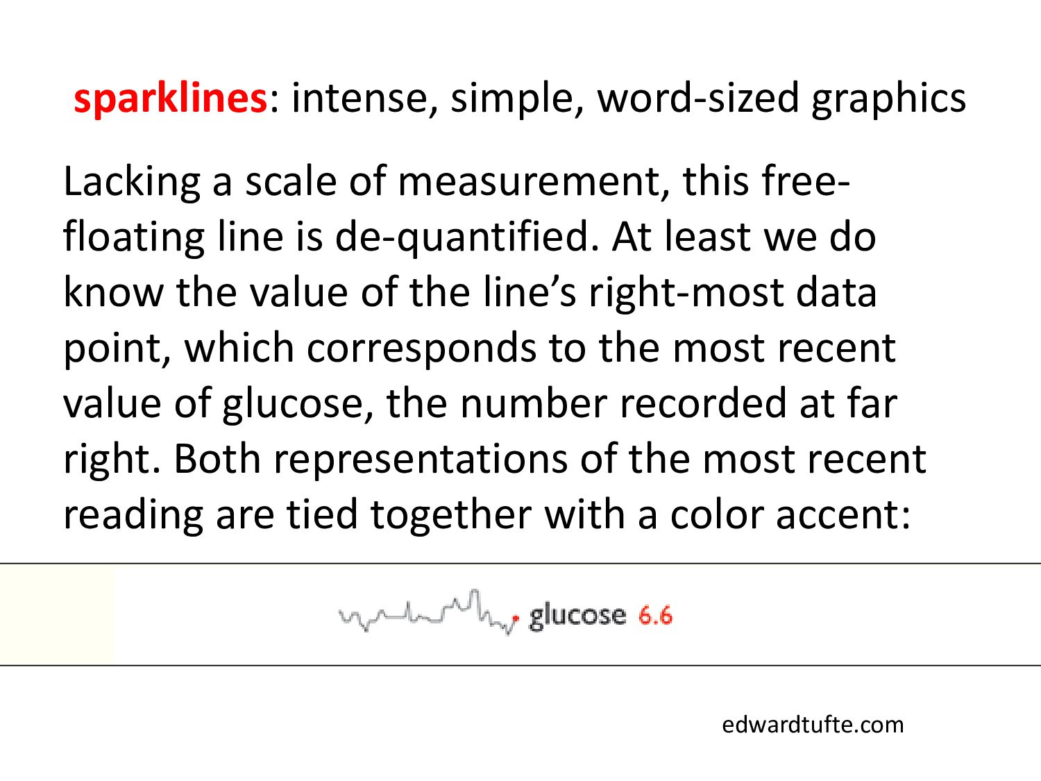
this free- floating line is de-quantified. At least we do know the value of the line’s right-most data point, which corresponds to the most recent value of glucose, the number recorded at far right. Both representations of the most recent reading are tied together with a color accent: edwardtufte.com
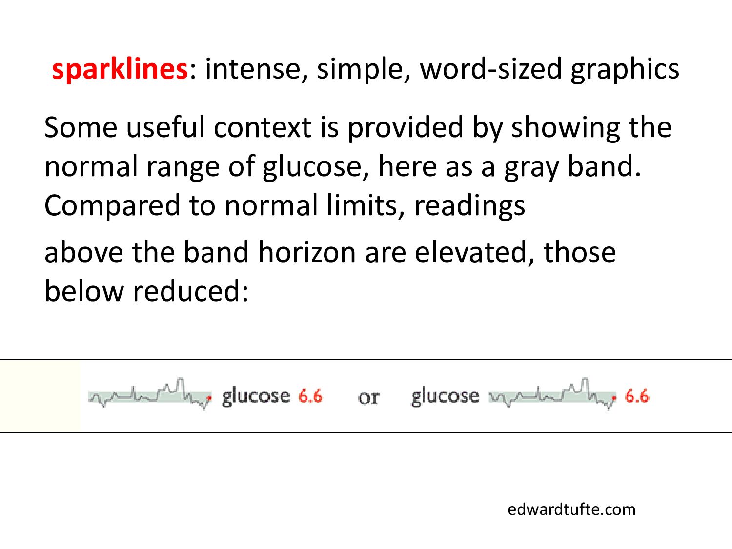
by showing the normal range of glucose, here as a gray band. Compared to normal limits, readings above the band horizon are elevated, those below reduced: edwardtufte.com
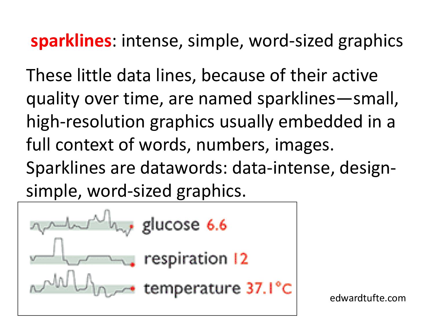
is to detect quickly and assess wayward deviations from normal limits, shown here by visual deviations outside the gray band. Multiplying this format brings in additional data from the medical record; a stack, which can show hundreds of variables and thousands of measurements, allows fast effective parallel comparisons: edwardtufte.com
of their active quality over time, are named sparklines—small, high-resolution graphics usually embedded in a full context of words, numbers, images. Sparklines are datawords: data-intense, design- simple, word-sized graphics. edwardtufte.com
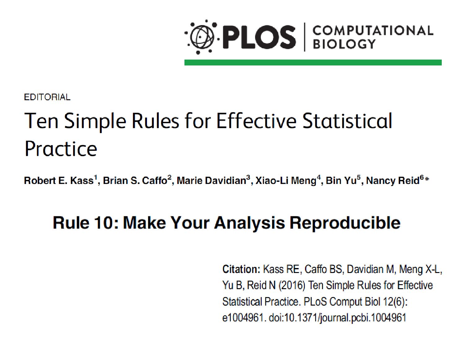
tie specific instructions to data analysis so that scholarship can be recreated, better understood and verified. • This is usually facilitated by literate programming – a document that combines content and data analytic code. • Software? R and RStudio, mostly…
own results • Allow others to reproduce your results • Reproduce an entire report, manuscript, thesis, book, website with a single system command when changes occur in: – Operating system, stat software, graphics engines, source data, derived variables, analysis, interpretation • Save time • Provide the ultimate documentation of work done for a paper, etc. http://biostat.mc.vanderbilt.edu/wiki/pub/Main/ReproducibleResearchTutorial /HarrellScottTutorial-useR2012.pdf
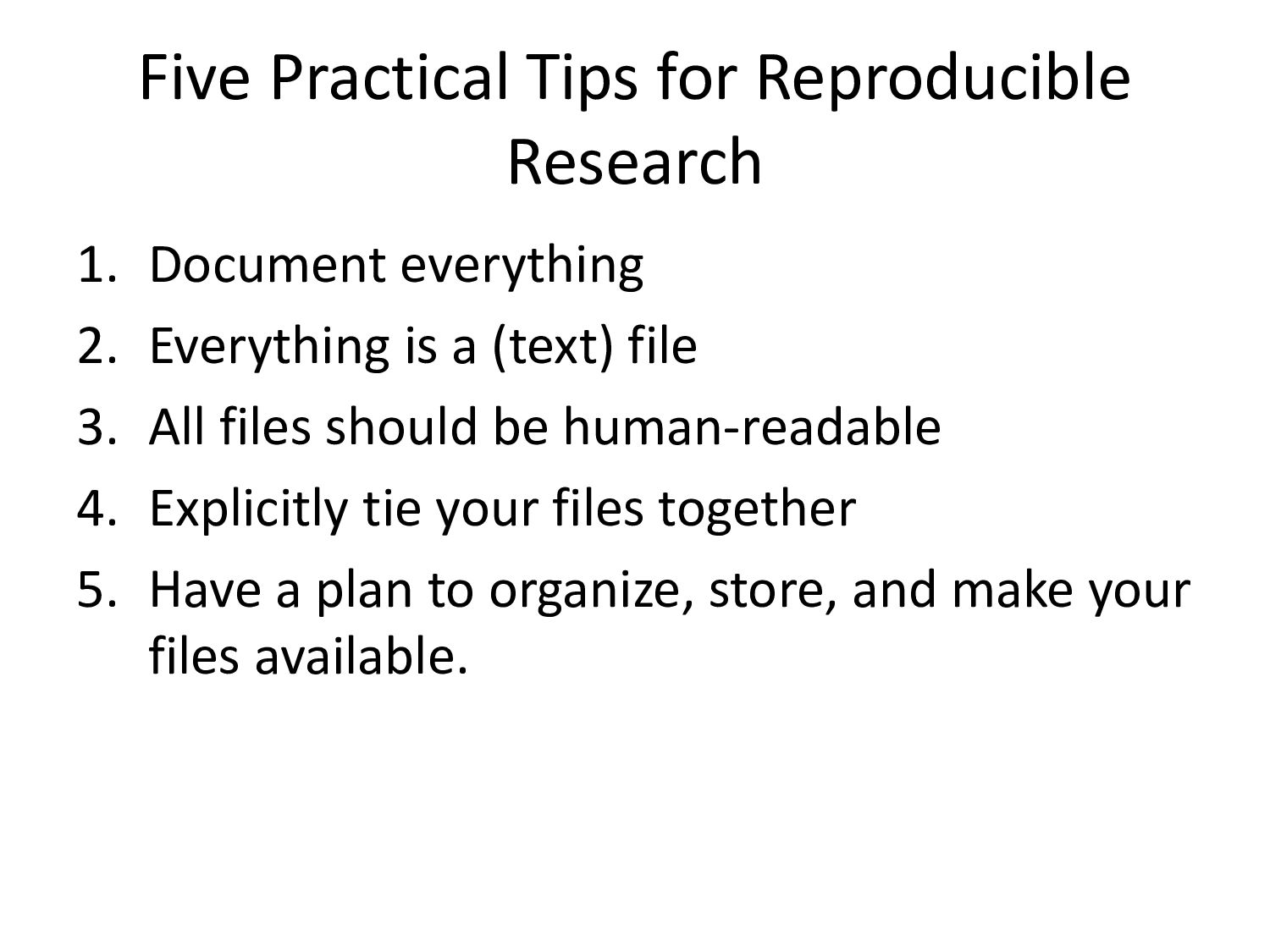
Everything is a (text) file 3. All files should be human-readable 4. Explicitly tie your files together 5. Have a plan to organize, store, and make your files available.
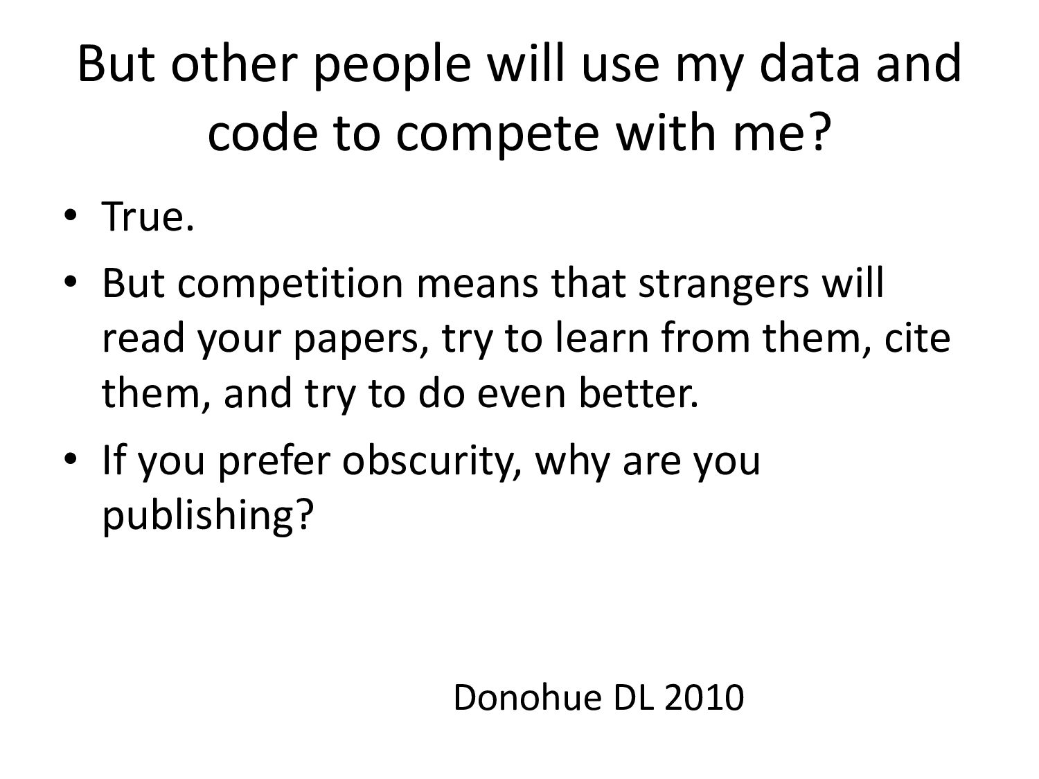
compete with me? • True. • But competition means that strangers will read your papers, try to learn from them, cite them, and try to do even better. • If you prefer obscurity, why are you publishing? Donohue DL 2010
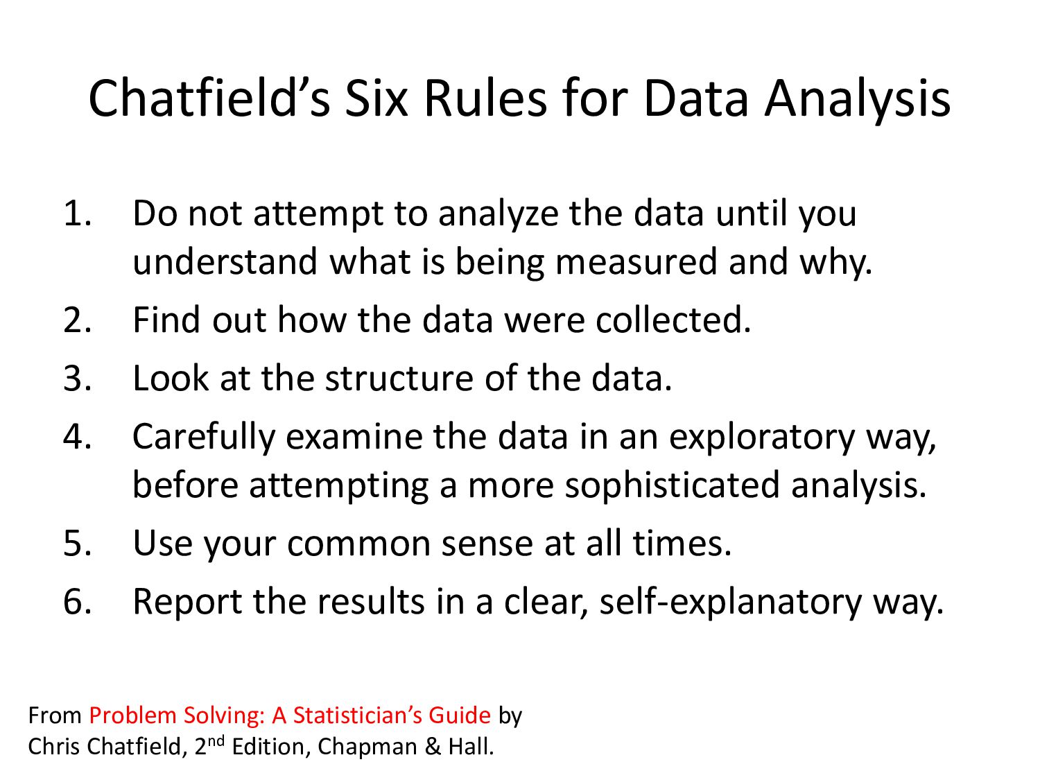
to analyze the data until you understand what is being measured and why. 2. Find out how the data were collected. 3. Look at the structure of the data. 4. Carefully examine the data in an exploratory way, before attempting a more sophisticated analysis. 5. Use your common sense at all times. 6. Report the results in a clear, self-explanatory way. From Problem Solving: A Statistician’s Guide by Chris Chatfield, 2nd Edition, Chapman & Hall.
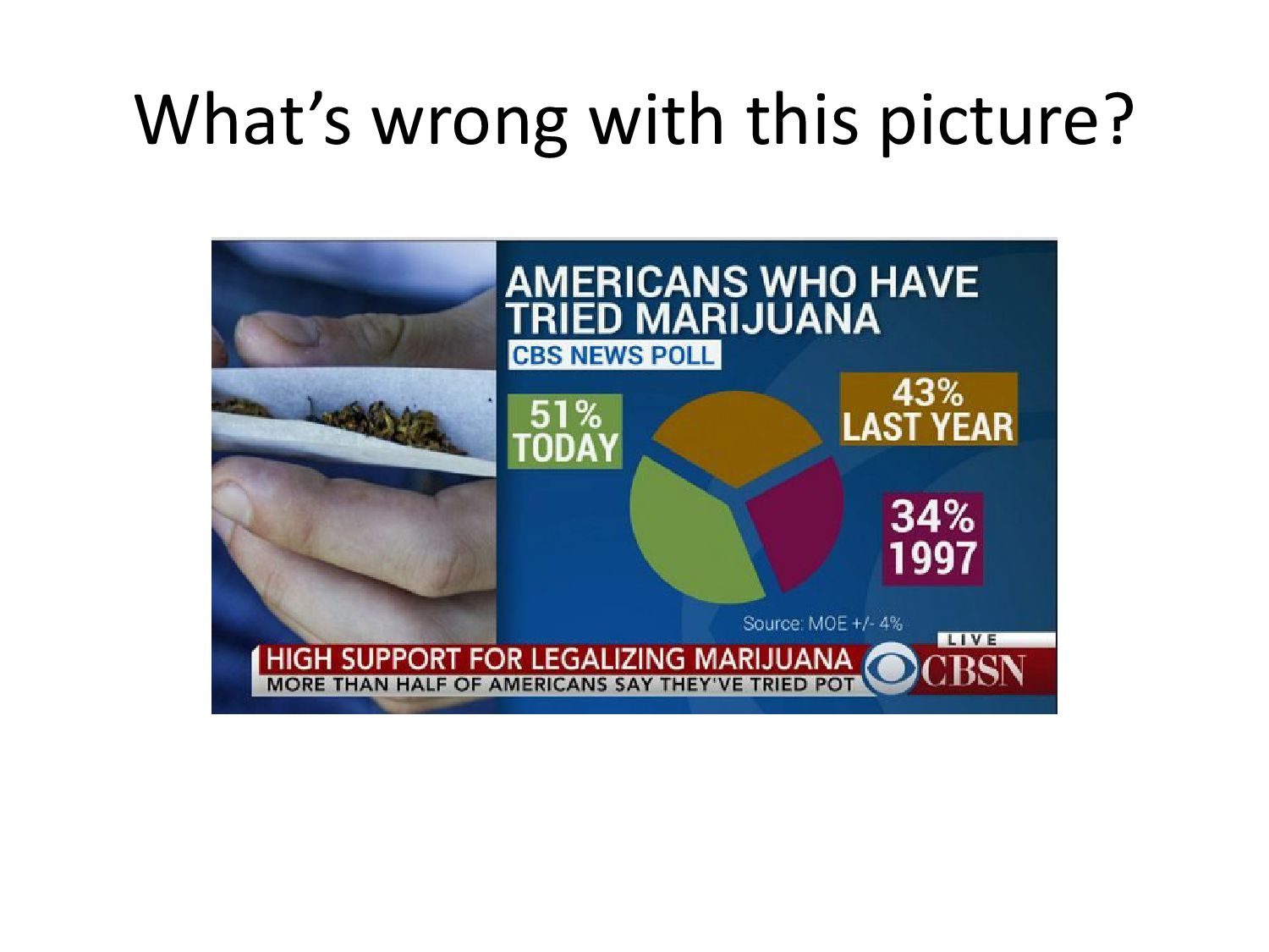
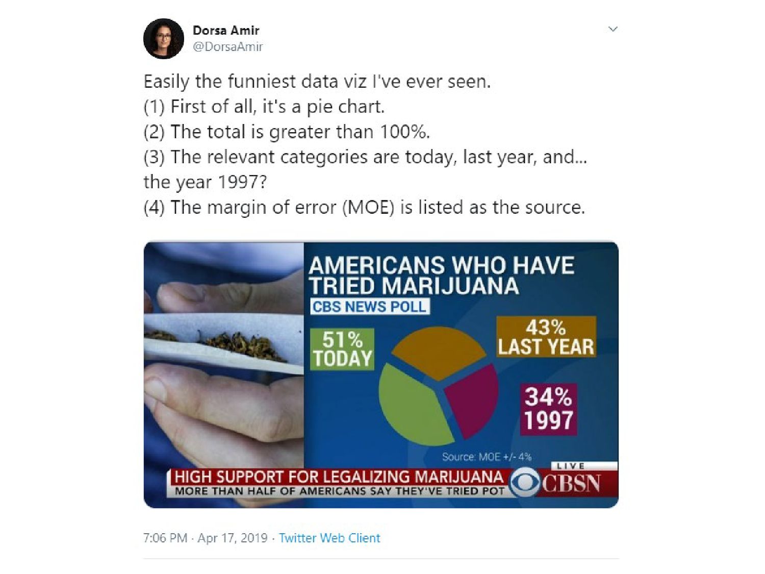
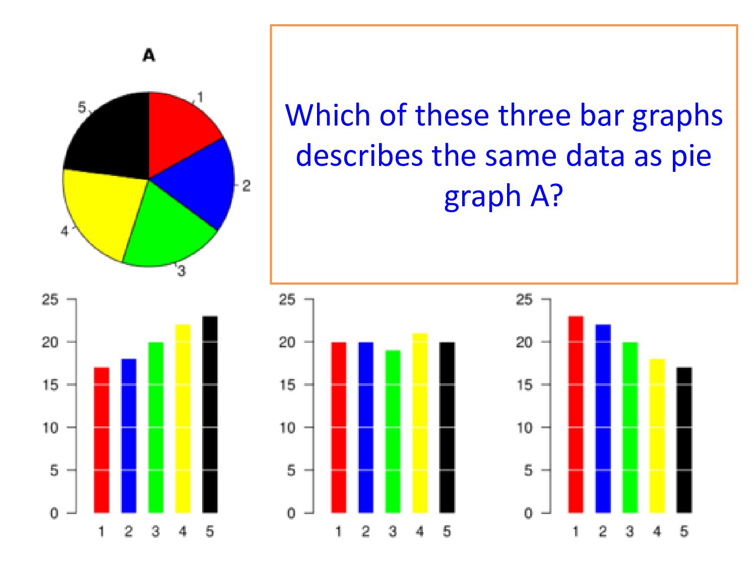
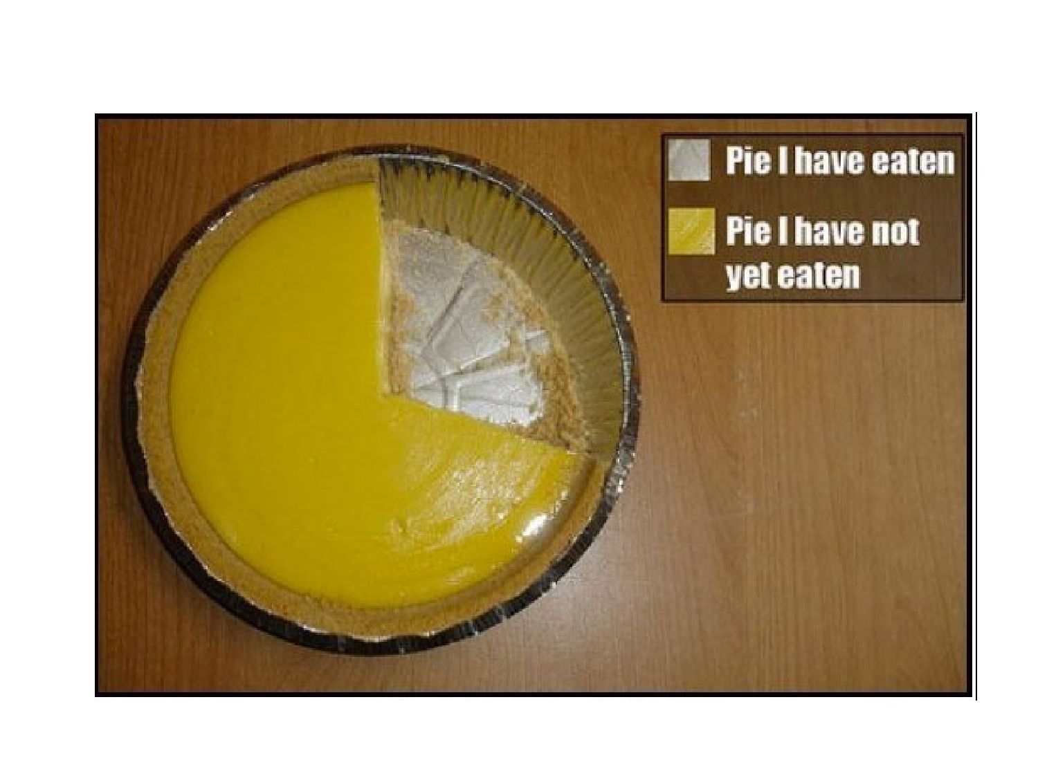
Round, a lot. • Edit, ruthlessly. – One pass through software (“default options”) is never enough. – Better for people to leave the table hungry than stuffed. • Have something to say, and say it clearly. • Stay away from the pie.
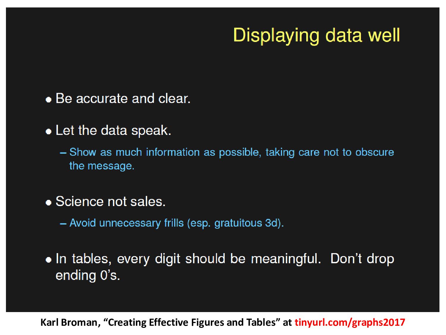
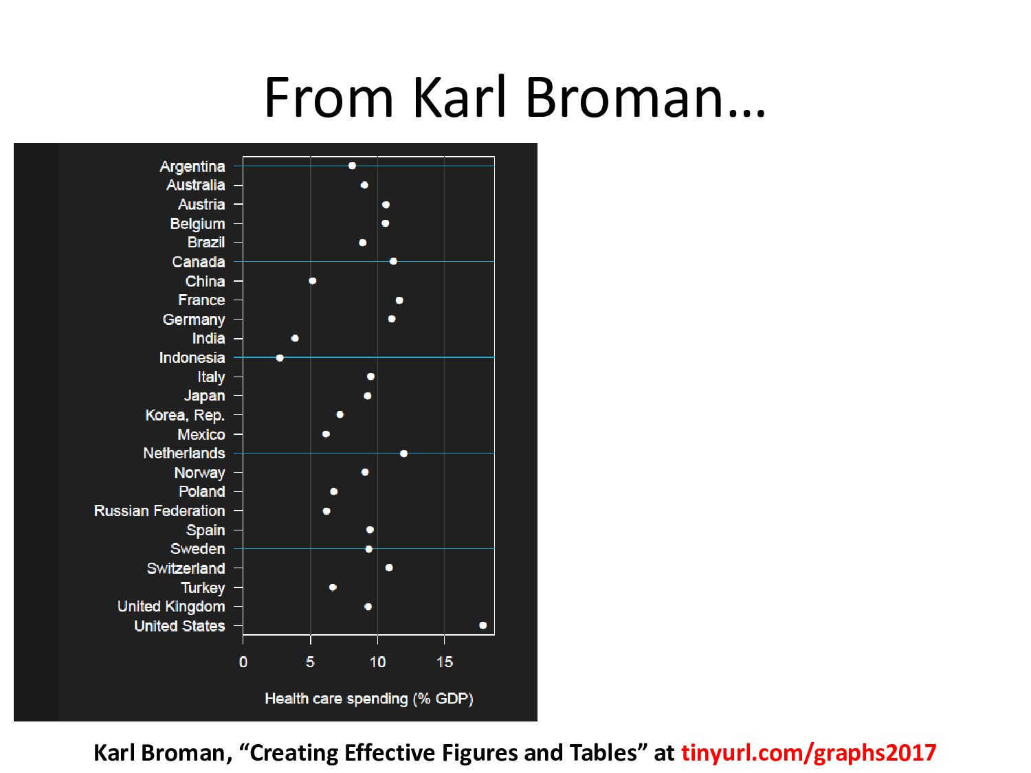
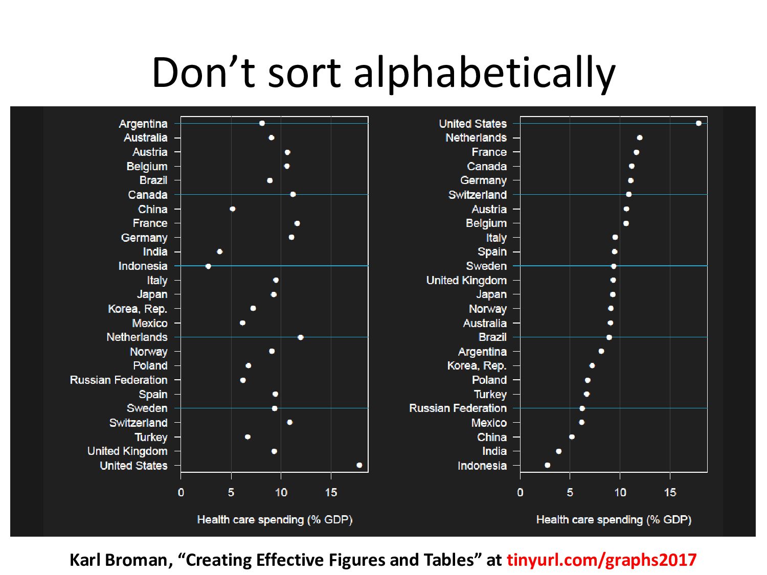
https://speakerdeck.com/thomaselove/presenting-effectively-with-data-in-a-hurry See also: Karl Broman’s “Creating Effective Figures and Tables” (slides) at tinyurl.com/graphs2017
![Statistics is too important to be left to statisticians. [email protected]](https://files.speakerdeck.com/presentations/cbc590fd455e4c6e85336677ed837424/slide_62.jpg)