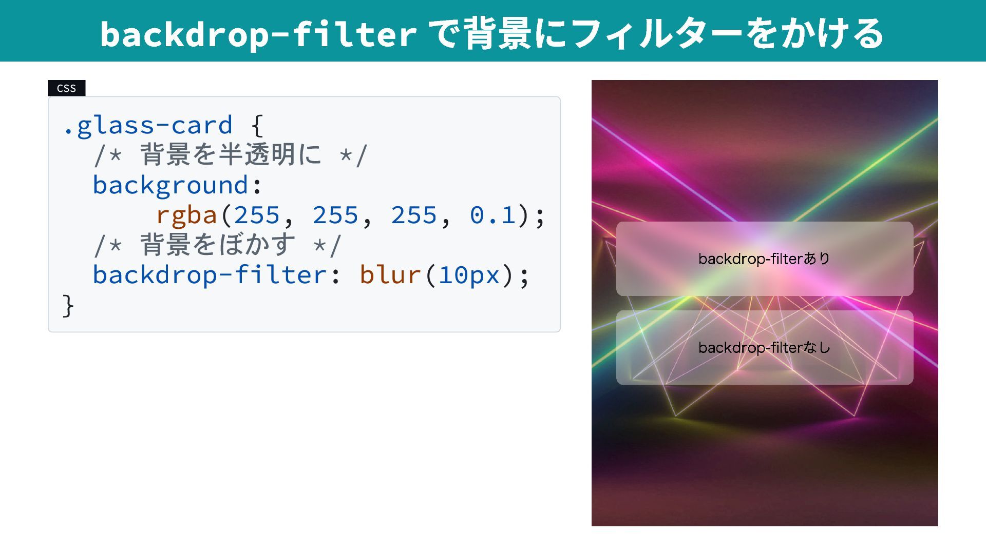
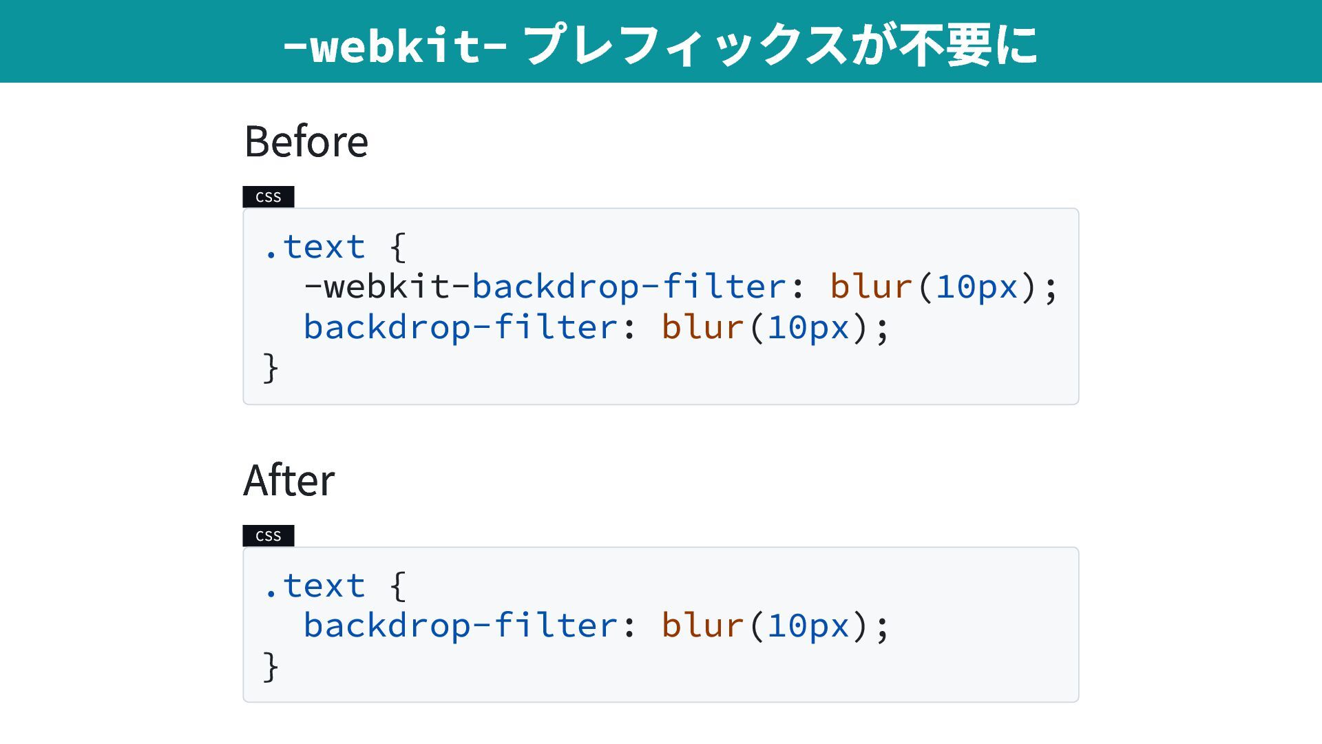
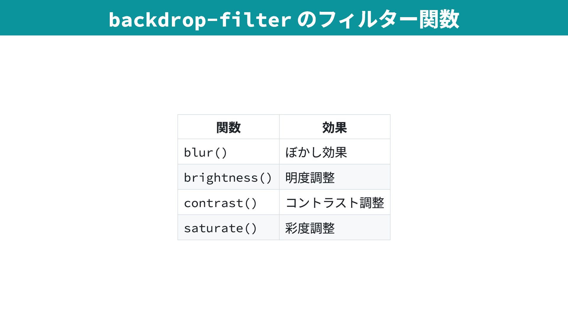
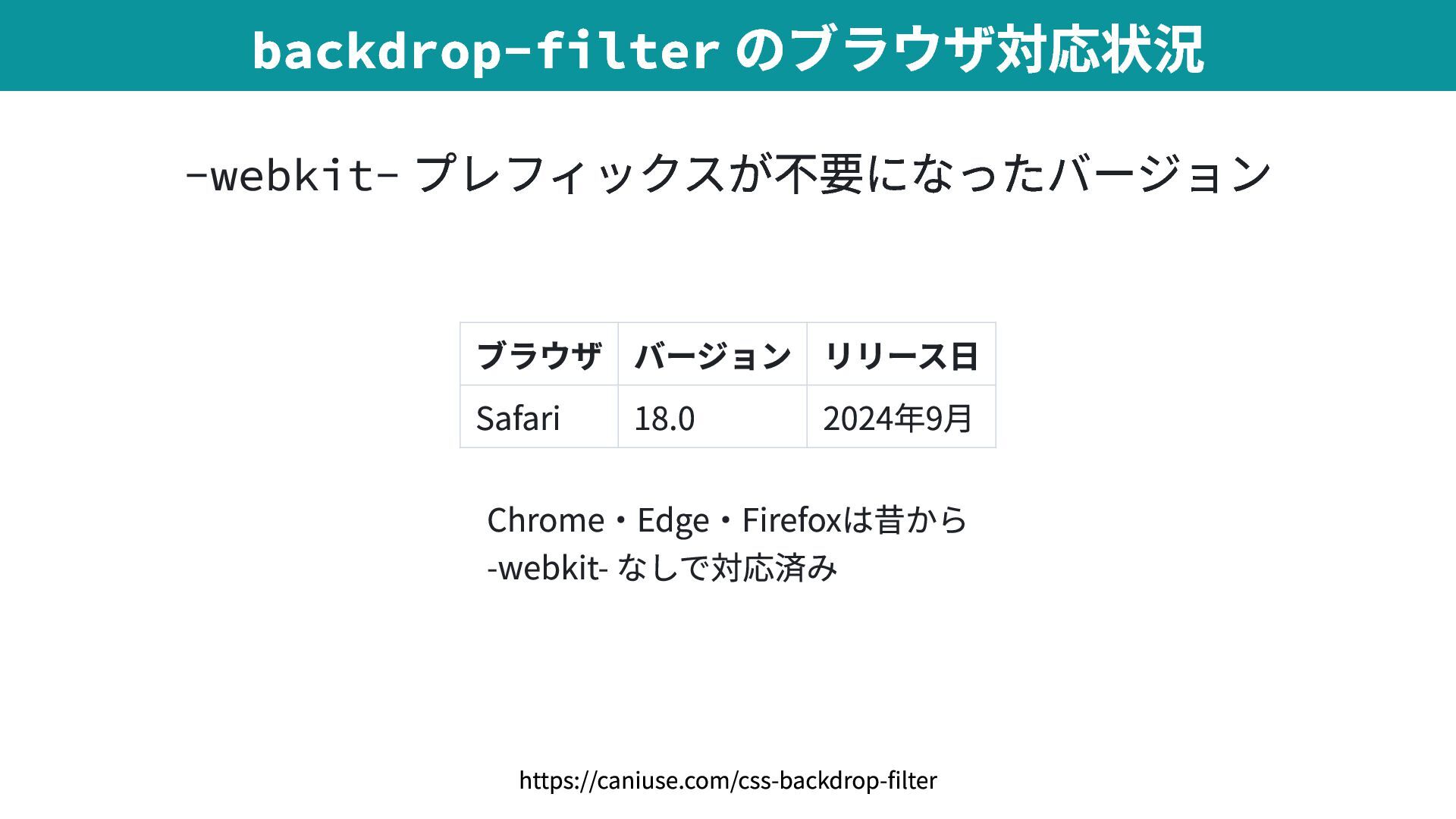
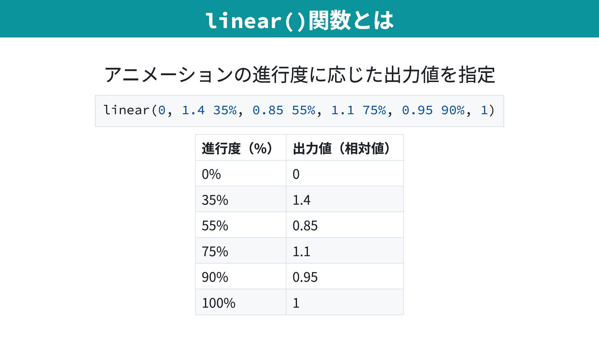
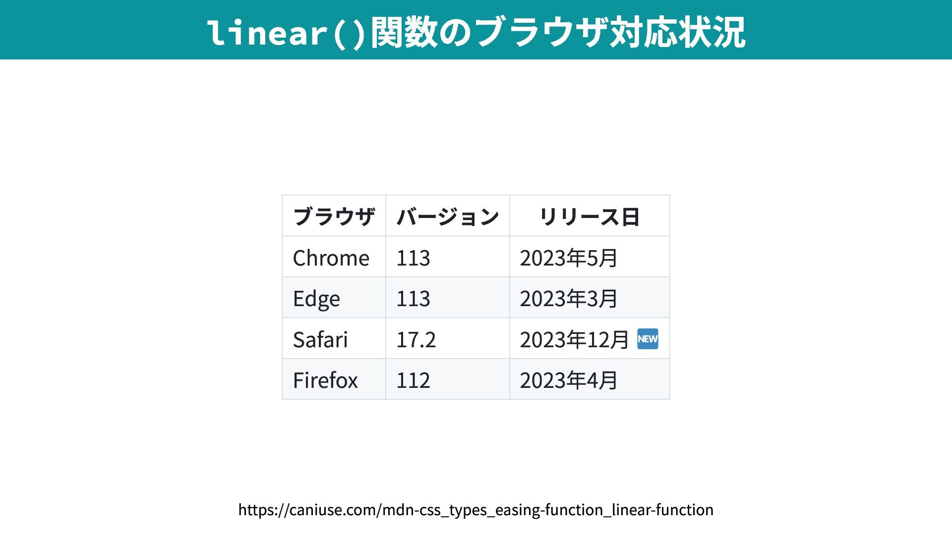
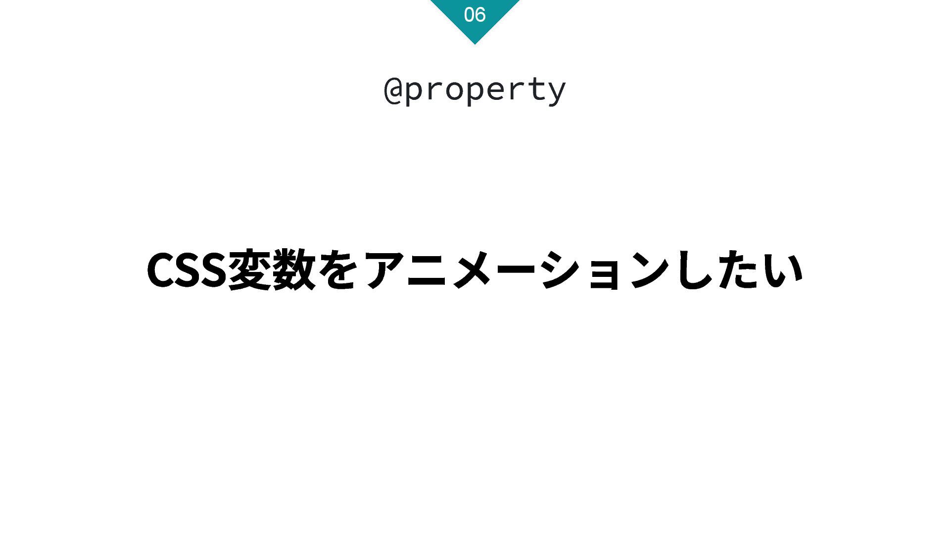
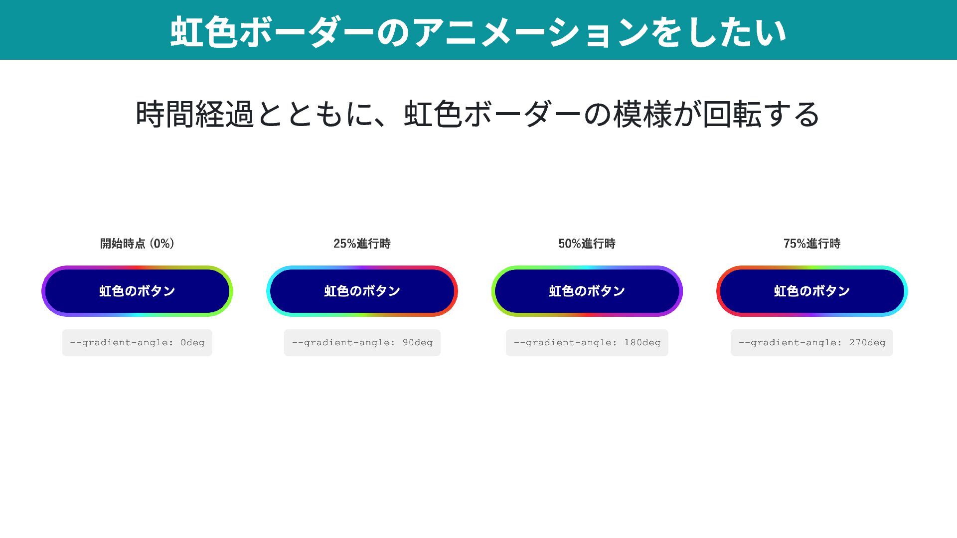
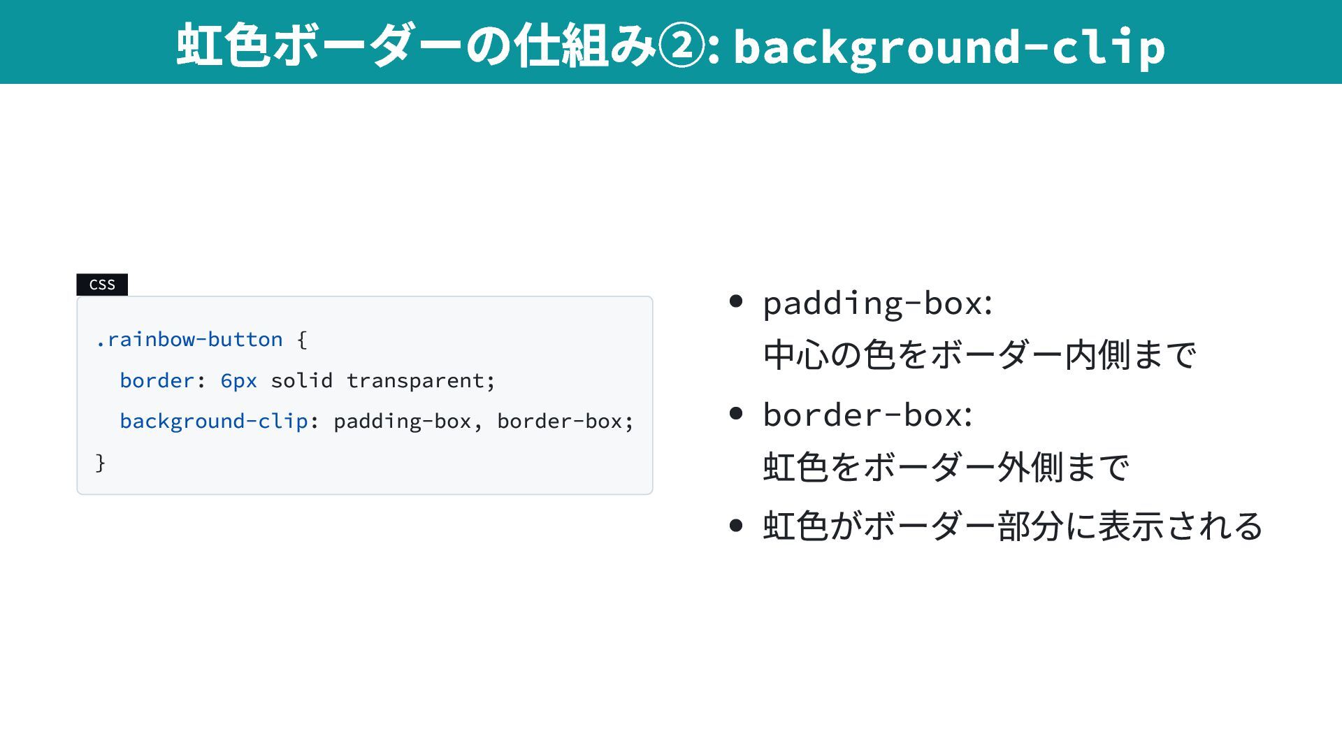
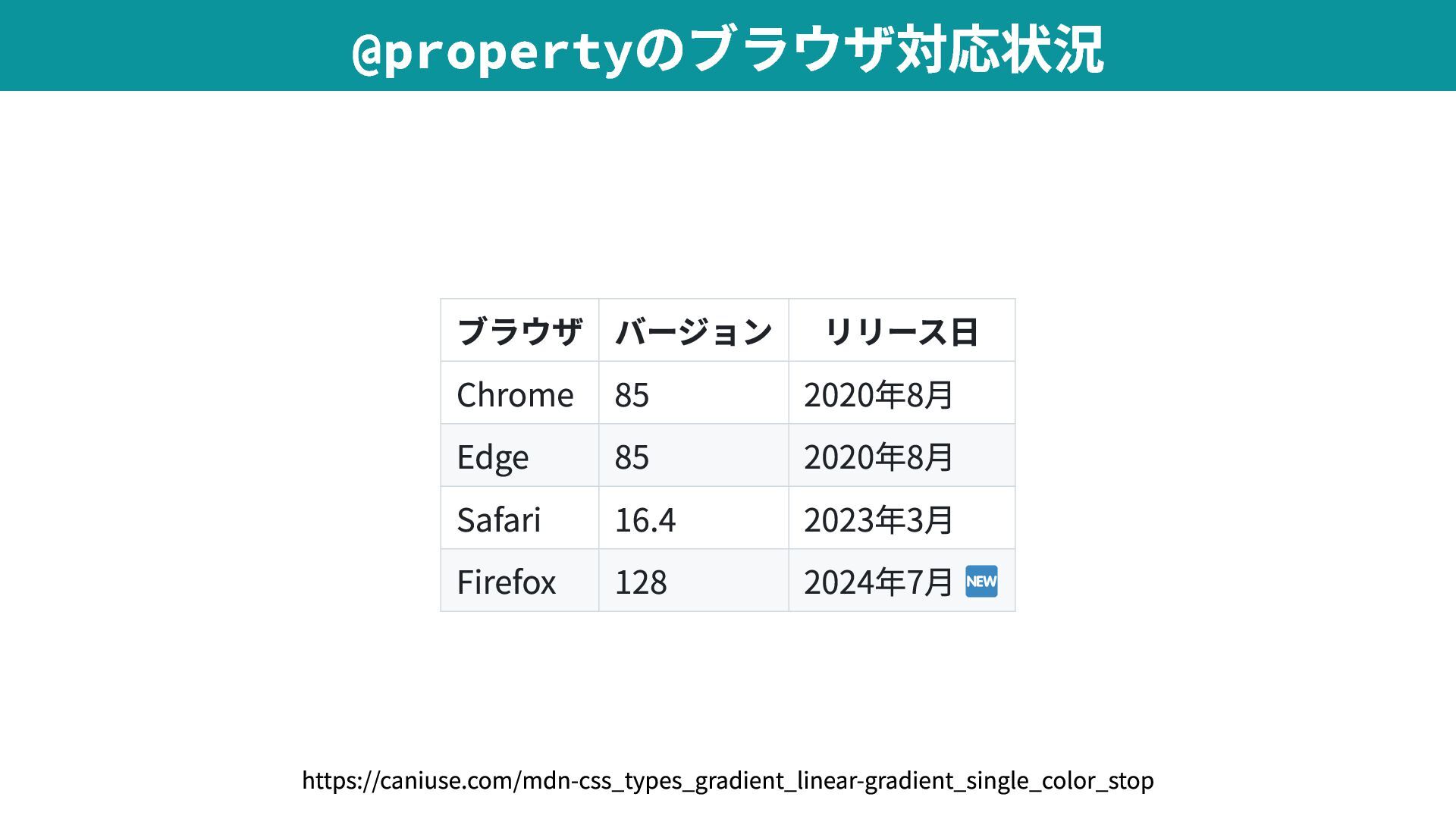
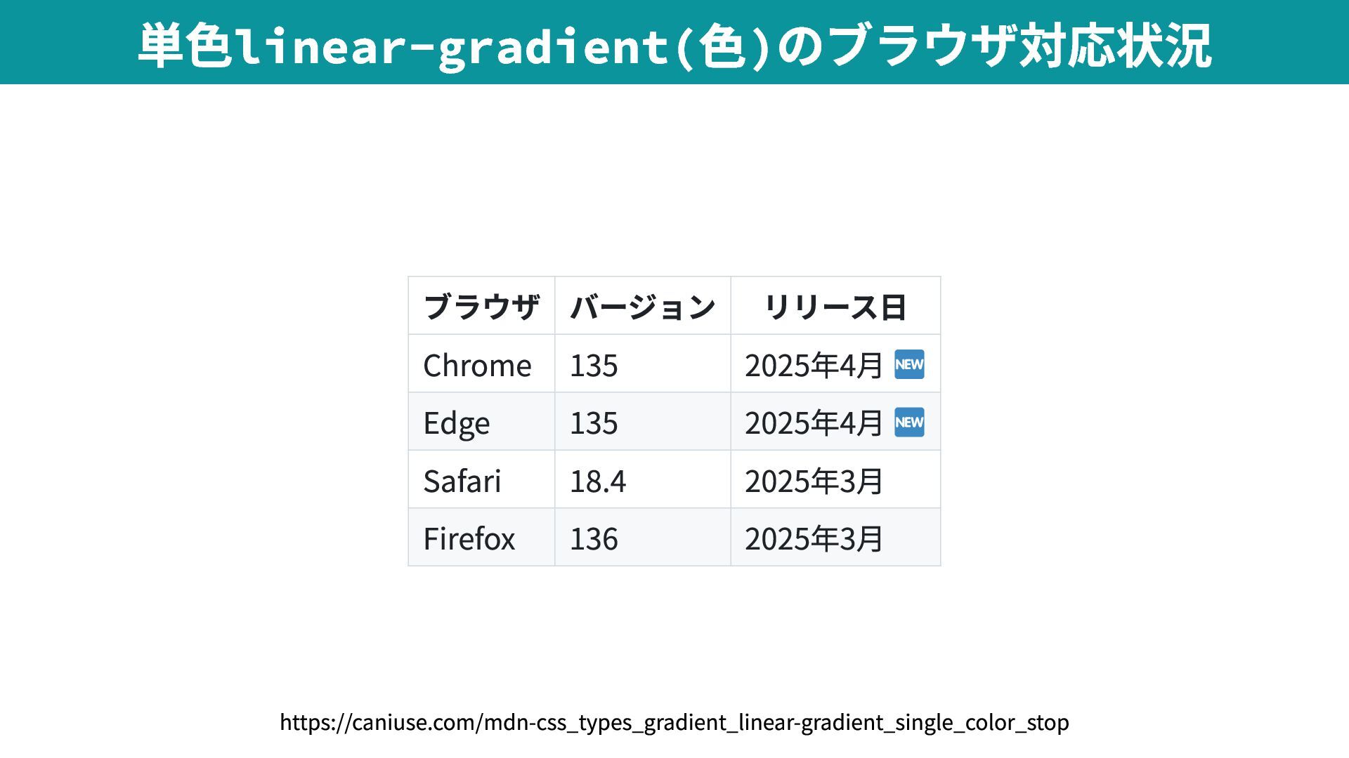
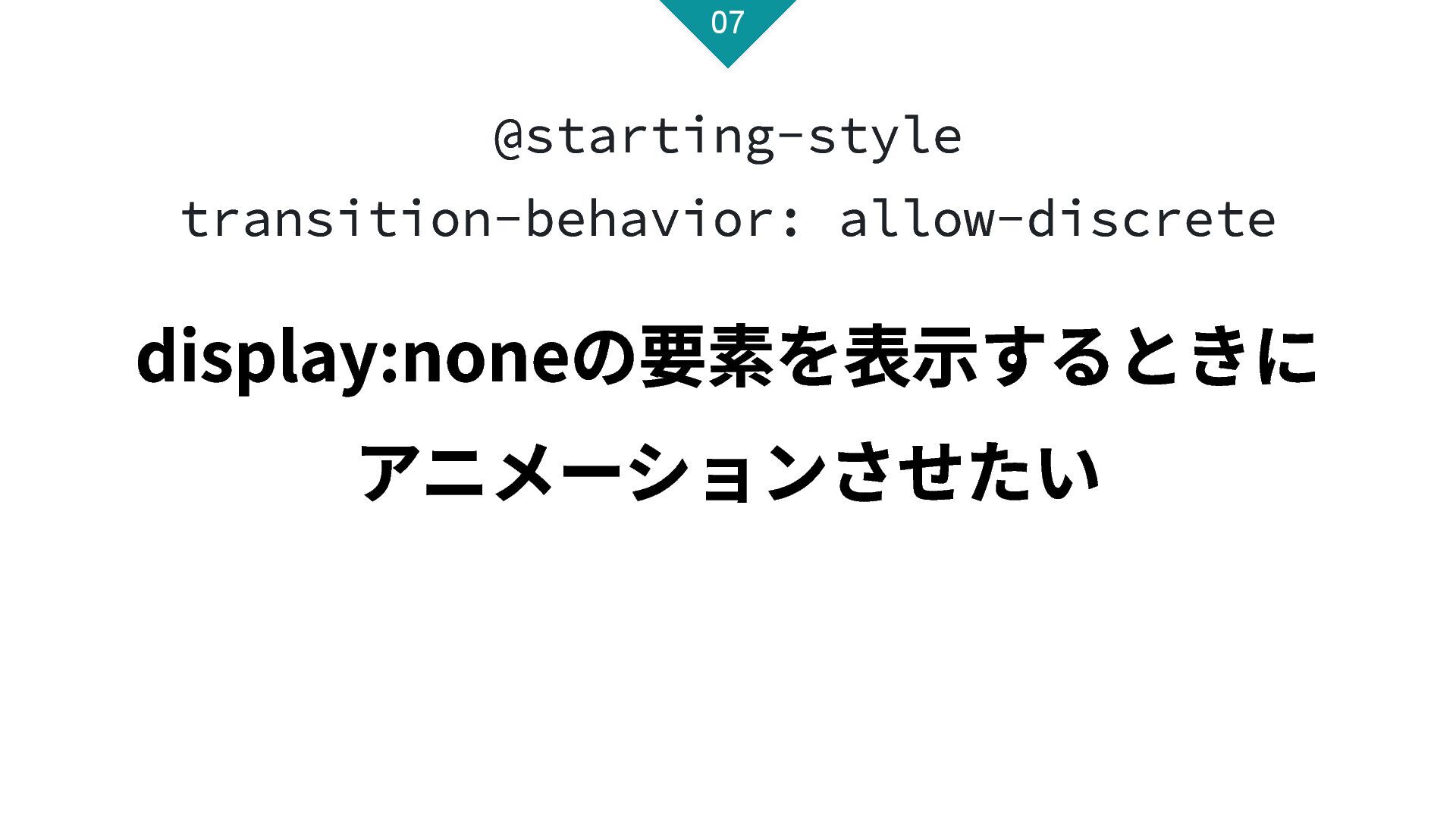
Upgrade to Pro — share decks privately, control downloads, hide ads and more …

CSSの最新トレンド Ver.2025

CSSの最新トレンド Ver.2025

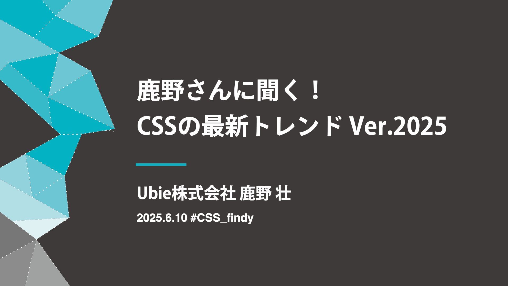
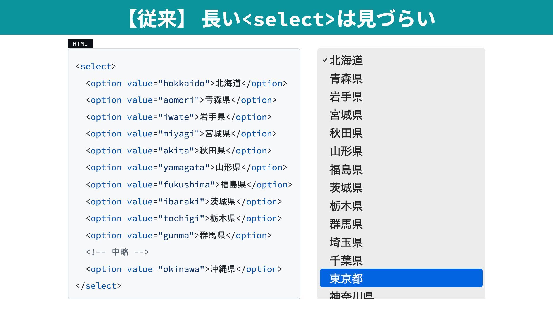
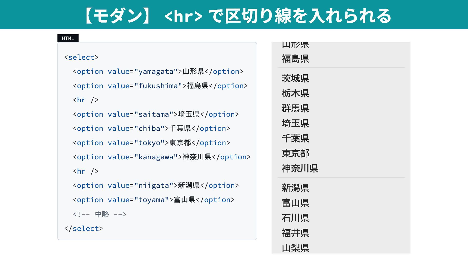
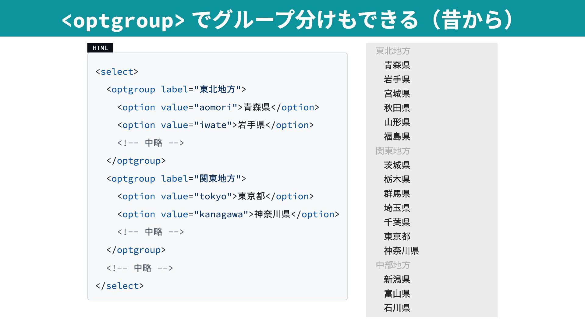
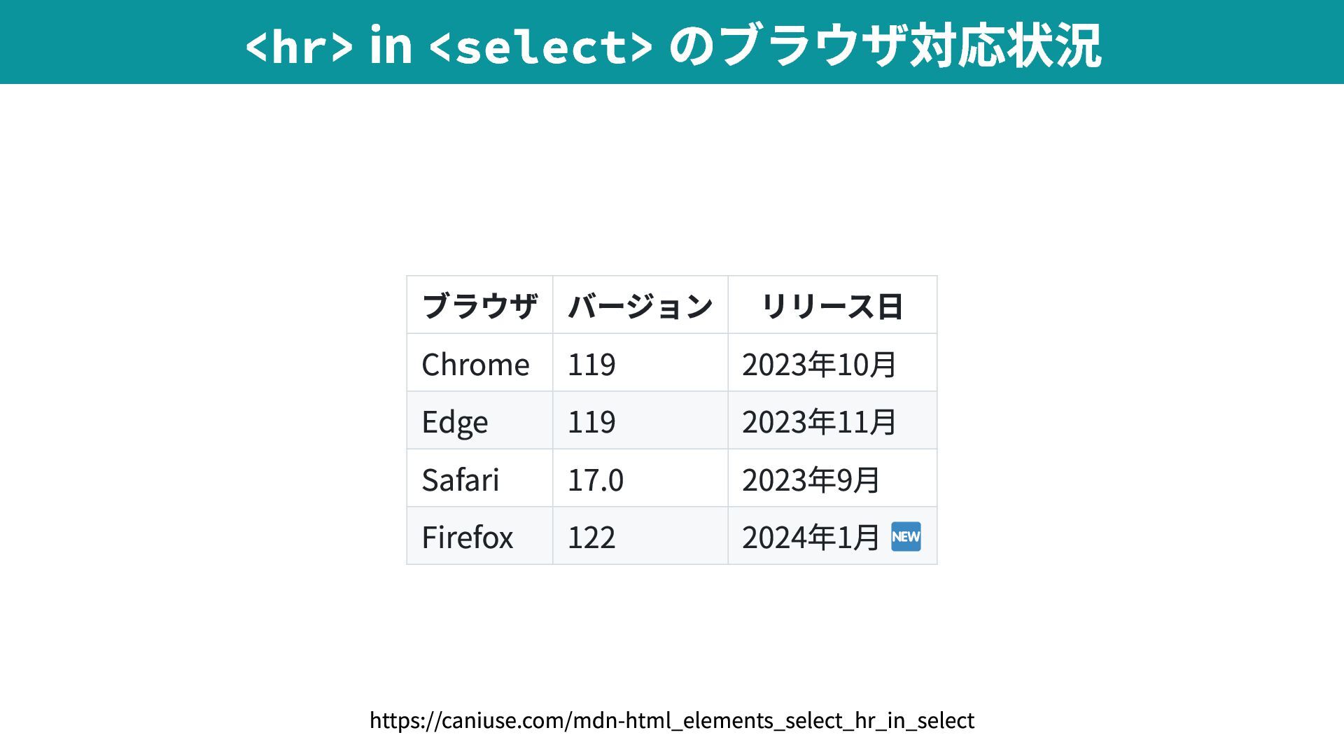
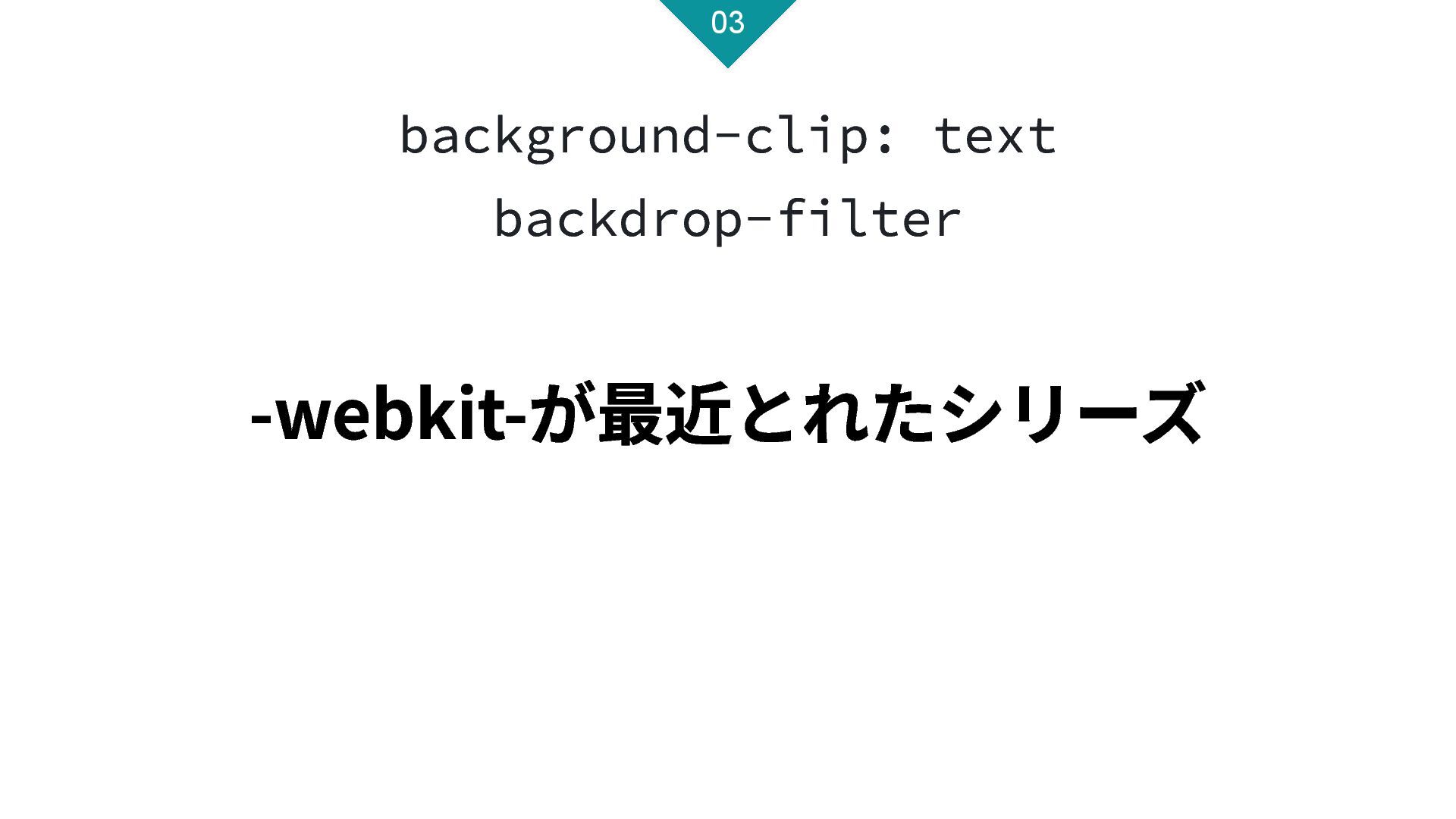
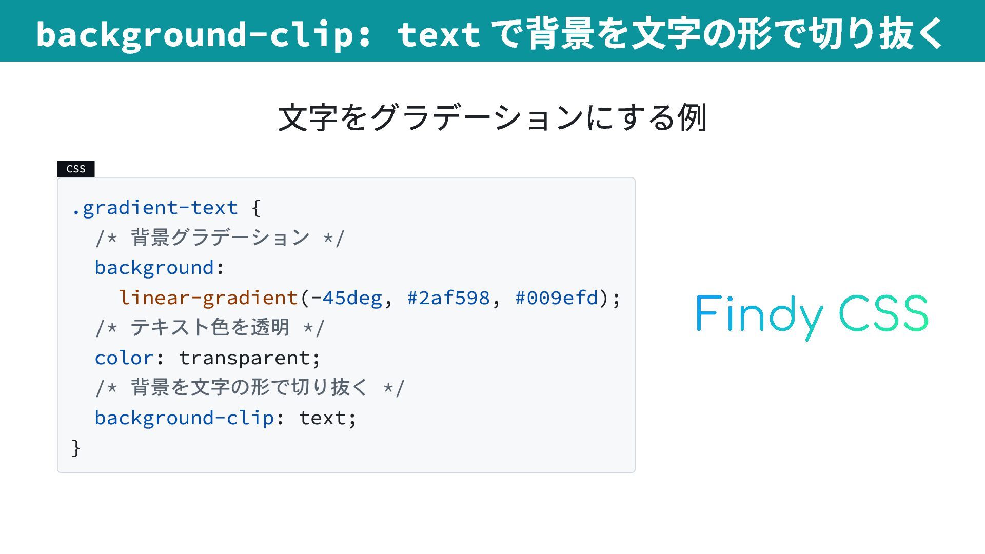
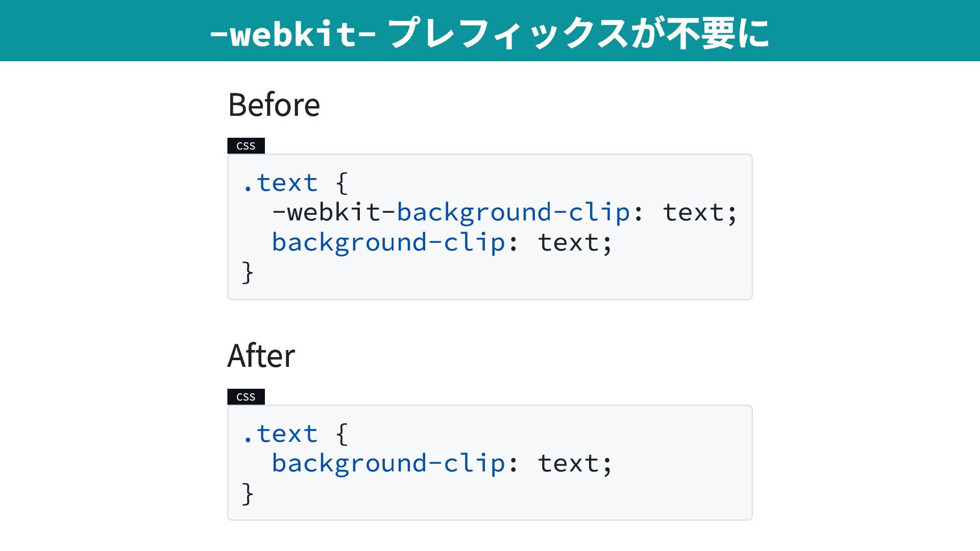
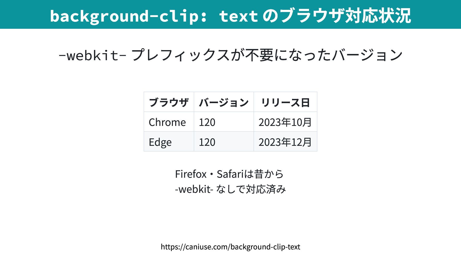
2025/06/10(火)
「鹿野さんに聞く!CSSの最新トレンド Ver.2025」での発表資料です。
https://findy.connpass.com/event/354917/

Avatar for tonkotsuboy_com

tonkotsuboy_com

June 10, 2025
Tweet

More Decks by tonkotsuboy_com

Other Decks in Technology

Transcript

  1. 1. <hr> in <select> 2. ブロックレイアウトでの align-content 3. backdrop-filter とbackground-clip:

    text 4. CSSだけでネスト 5. linear() 6. @property 7. @starting-style 本日の構成
  2. HTML <select> <option value="hokkaido">北海道</option> <option value="aomori">青森県</option> <option value="iwate">岩手県</option> <option value="miyagi">宮城県</option>

    <option value="akita">秋田県</option> <option value="yamagata">山形県</option> <option value="fukushima">福島県</option> <option value="ibaraki">茨城県</option> <option value="tochigi">栃木県</option> <option value="gunma">群馬県</option> <!-- 中略 --> <option value="okinawa">沖縄県</option> </select> 【従来】 長い<select> は見づらい
  3. HTML <select> <option value="yamagata">山形県</option> <option value="fukushima">福島県</option> <hr /> <option value="saitama">埼玉県</option>

    <option value="chiba">千葉県</option> <option value="tokyo">東京都</option> <option value="kanagawa">神奈川県</option> <hr /> <option value="niigata">新潟県</option> <option value="toyama">富山県</option> <!-- 中略 --> </select> 【モダン】 <hr> で区切り線を入れられる
  4. HTML <select> <optgroup label="東北地方"> <option value="aomori">青森県</option> <option value="iwate">岩手県</option> <!-- 中略

    --> </optgroup> <optgroup label="関東地方"> <option value="tokyo">東京都</option> <option value="kanagawa">神奈川県</option> <!-- 中略 --> </optgroup> <!-- 中略 --> </select> <optgroup> でグループ分けもできる(昔から)
  5. ブラウザ バージョン リリース日 Chrome 119 2023年10月 Edge 119 2023年11月 Safari

    17.0 2023年9月 Firefox 122 2024年1月 <hr> in <select> のブラウザ対応状況 https://caniuse.com/mdn-html_elements_select_hr_in_select
  6. 複雑 CSS .box { position: absolute; top: 50%; transform: translateY(-50%);

    } 古い手法 CSS .box { display: table-cell; vertical-align: middle; } FlexboxやGridが必要 CSS .box { display: flex; align-items: center; } 【従来】垂直方向の中央揃えは複雑だった
  7. CSS .box { align-content: center; } start - 上端揃え center

    - 中央揃え end - 下端揃え ※ space-between は動作しない 【モダン】1行で垂直方向の中央揃え
  8. ブラウザ バージョン リリース日 Chrome 123 2024年3月 Edge 123 2024年3月 Safari

    17.4 2024年3月 Firefox 125 2024年4月 ブロックレイアウトでの align-content 対応状況 https://caniuse.com/mdn-css_properties_align-content_block_context
  9. CSS .gradient-text { /* 背景グラデーション */ background: linear-gradient(-45deg, #2af598, #009efd);

    /* テキスト色を透明 */ color: transparent; /* 背景を文字の形で切り抜く */ background-clip: text; } background-clip: text で背景を文字の形で切り抜く 文字をグラデーションにする例
  10. Before CSS .text { -webkit-background-clip: text; background-clip: text; } After

    CSS .text { background-clip: text; } -webkit- プレフィックスが不要に
  11. ブラウザ バージョン リリース日 Chrome 120 2023年10月 Edge 120 2023年12月 Firefox・Safariは昔から

    -webkit- なしで対応済み background-clip: text のブラウザ対応状況 -webkit- プレフィックスが不要になったバージョン https://caniuse.com/background-clip-text
  12. CSS .glass-card { /* 背景を半透明に */ background: rgba(255, 255, 255,

    0.1); /* 背景をぼかす */ backdrop-filter: blur(10px); } backdrop-filter で背景にフィルターをかける
  13. Before CSS .text { -webkit-backdrop-filter: blur(10px); backdrop-filter: blur(10px); } After

    CSS .text { backdrop-filter: blur(10px); } -webkit- プレフィックスが不要に
  14. ブラウザ バージョン リリース日 Safari 18.0 2024年9月 Chrome・Edge・Firefoxは昔から -webkit- なしで対応済み backdrop-filter

    のブラウザ対応状況 -webkit- プレフィックスが不要になったバージョン https://caniuse.com/css-backdrop-filter
  15. CSS .wrapper { .child1, .child2 { color: red; } }

    CSS .link { &:hover, &:active { color: red; } } CSS ネストは、Sass のネストと「ほぼ」同じ https://codepen.io/tonkotsuboy/pen/ExRbPgV
  16. CSS .box { color: blue; @media (width <= 800px) {

    color: red; } } とくに @media や @container のネストが便利
  17. Before CSS section { & h1 { color: red; }

    } After CSS section { h1 { color: red; } } 2023年12月から要素セレクターの前の & が不要に ネストの緩和された構文の更新 https://developer.chrome.com/blog/css-nesting-relaxed-syntax-update?hl=ja
  18. CSS .foo { &__bar { color: red; } } セレクター名の一部を

    & で表現するのは不可能 次のコードは動作しない ジャンプできない・リファクタリングできない・コード検索が手間
  19. ブラウザ バージョン リリース日 Chrome 120 2023年12月 Edge 120 2023年12月 Safari

    17.2 2023年12月 Firefox 117 2023年8月 CSSネストのブラウザ対応状況 https://caniuse.com/css-nesting
  20. CSS .animation-sample { &:hover { animation: bounce-in-manual 0.8s forward; }

    } @keyframes bounce-in-manual { 0% { scale: 1; } 35% { scale: 1.56; } /* 1 + (1.4-1) × 1.4 */ 55% { scale: 1.34; } /* 1 + (1.4-1) × 0.85 */ 75% { scale: 1.44; } /* 1 + (1.4-1) × 1.1 */ 90% { scale: 1.38; } /* 1 + (1.4-1) × 0.95 */ 100% { scale: 1.4; } } :hover が外れたときのアニメーシ ョンをすると、コンテンツ読み込 み時にもアニメーションしてしま う keyframeの記述が煩雑 transition は表現不可能 【従来】animation +@keyframes を使う
  21. CSS .transition-sample { &:hover { transition-timing-function: linear( 0, 1.4 35%,

    0.85 55%, 1.1 75%, 0.95 90%, 1); } } transition で表現できる :hover が外れたときのアニメ ーションをしても、コンテンツ 読み込み時にはアニメーション しない 【モダン】transition +linear() を使う
  22. アニメーションの進行度に応じた出力値を指定 linear(0, 1.4 35%, 0.85 55%, 1.1 75%, 0.95 90%,

    1) 進行度(%) 出力値(相対値) 0% 0 35% 1.4 55% 0.85 75% 1.1 90% 0.95 100% 1 linear() 関数とは
  23. ブラウザ バージョン リリース日 Chrome 113 2023年5月 Edge 113 2023年3月 Safari

    17.2 2023年12月 Firefox 112 2023年4月 linear() 関数のブラウザ対応状況 https://caniuse.com/mdn-css_types_easing-function_linear-function
  24. CSS :root { --box-width: 100px; } .box { width: var(--box-width);

    transition: 1s; } .box:hover { --box-width: 200px; } CSS変数はアニメーションできない ブラウザがCSS変数の型を認識でき ない 値の補間方法がわからない 【従来】CSS変数はアニメーションできない
  25. CSS @property --box-width { syntax: "<length>"; inherits: false; initial-value: 100px;

    } .box { width: var(--box-width); transition: 1s; } .box:hover { --box-width: 200px; } syntax : 値の型(長さ・色・角度な ど) inherits : 継承の可否 initial-value : 初期値 【モダン】@property でCSS変数に型を定義
  26. syntax 説明 例 <length> 長さ 100px , 2em <color> 色

    red , #ff0000 <angle> 角度 45deg , 0.5turn <number> 数値 1.5 , 10 <percentage> パーセント 50% , 100% @property のsyntax で指定できる型
  27. CSS .rainbow-button { background-image: /* 中心の色 */ linear-gradient(navy), /* ボーダーの虹色

    */ conic-gradient(from var(--angle), ...); } カンマ区切りで複数の背景画像指定 内側の色、外側の虹色 linear-gradient は単色指定ができ るようになった 2025年4月から全ブラウザ対応 最初に書いたものが前面に表示される 虹色ボーダーの仕組み①: 複数の背景画像
  28. CSS .rainbow-button { border: 6px solid transparent; background-clip: padding-box, border-box;

    } padding-box : 中心の色をボーダー内側まで border-box : 虹色をボーダー外側まで 虹色がボーダー部分に表示される 虹色ボーダーの仕組み②: background-clip
  29. ブラウザ バージョン リリース日 Chrome 85 2020年8月 Edge 85 2020年8月 Safari

    16.4 2023年3月 Firefox 128 2024年7月 @property のブラウザ対応状況 https://caniuse.com/mdn-css_types_gradient_linear-gradient_single_color_stop
  30. ブラウザ バージョン リリース日 Chrome 135 2025年4月 Edge 135 2025年4月 Safari

    18.4 2025年3月 Firefox 136 2025年3月 単色linear-gradient(色) のブラウザ対応状況 https://caniuse.com/mdn-css_types_gradient_linear-gradient_single_color_stop
  31. CSS .box { display: none; /* 初期状態 */ opacity: 0;

    transition: 0.4s; } .box.open { display: block; opacity: 1; /* blockになった瞬間のスタイル */ @starting-style { opacity: 0; } } 1. 要素がdisplay:block になる 2. opacity: 0 になる 3. opacity: 1 に向かってアニメーションする 【モダン】@starting-style で開始時のスタイルを指定
  32. CSS .box { display: none; opacity: 0; transition-duration: 0.4s; transition-behavior:

    allow-discrete; } .box.open { display: block; opacity: 1; } 1. opacity が0.4sかけて0 に なる 2. display: none になる allow-discrete の効果で、 display: none が遅延される 【モダン】allow-discrete
  33. CSS .box { display: none; opacity: 0; transition: 0.4s allow-discrete;

    } .box.open { display: block; opacity: 1; @starting-style { opacity: 0; } } 表示時 @starting-style の効果で アニメーション 非表示時 allow-discrete の効果で アニメーション allow-discrete と@starting-style を組み合わせる
  34. ブラウザ バージョン リリース日 Chrome 117 2023年9月 Edge 117 2023年9月 Safari

    17.5 2024年5月 Firefox 129 2024年8月 ブラウザ対応状況: @starting-style https://caniuse.com/mdn-css_at-rules_starting-style
  35. ブラウザ 対応状況 バージョン リリース日 Chrome ◯ 117 2023年9月 Edge ◯

    117 2023年9月 Safari ◯ 18.0 2024年9月 Firefox ✕ - - ブラウザ対応状況: display 変更時の allow-discrete https://caniuse.com/mdn-css_properties_display_is_transitionable
  36. HTML <select> <option value="yamagata">山形県</option> <option value="fukushima">福島県</option> <hr /> <option value="saitama">埼玉県</option>

    <option value="chiba">千葉県</option> <hr /> <option value="niigata">新潟県</option> <option value="toyama">富山県</option> <!-- 中略 --> </select> 1. <hr> in <select> セレクトボックス内で区切り線を表示
  37. CSS .text { background: linear-gradient(...); background-clip: text; color: transparent; }

    3-1. background-clip: text の-webkit- 不要化 テキストグラデーションを簡単に実現
  38. CSS .container { .child { color: red; } @media (width

    <= 800px) { color: blue; } } 4. CSSのネスト Sassを使わず入れ子にできる
  39. CSS .box { transition-timing-function: linear( 0, 1.4 35%, 0.85 55%,

    1.1 75%, 0.95 90%, 1 ); } 5. linear() イージング関数 複雑なバウンスアニメーションを簡潔に記述
  40. CSS変数をアニメーションできるように CSS @property --gradient-angle { syntax: "<angle>"; } .rainbow-border {

    background: conic-gradient(from var(--gradient-angle), ... ); animation: 2s rotate infinite linear; } 6. @property