Upgrade to Pro
— share decks privately, control downloads, hide ads and more …
Speaker Deck
Features
Speaker Deck
PRO
Sign in
Sign up for free
Search
Search
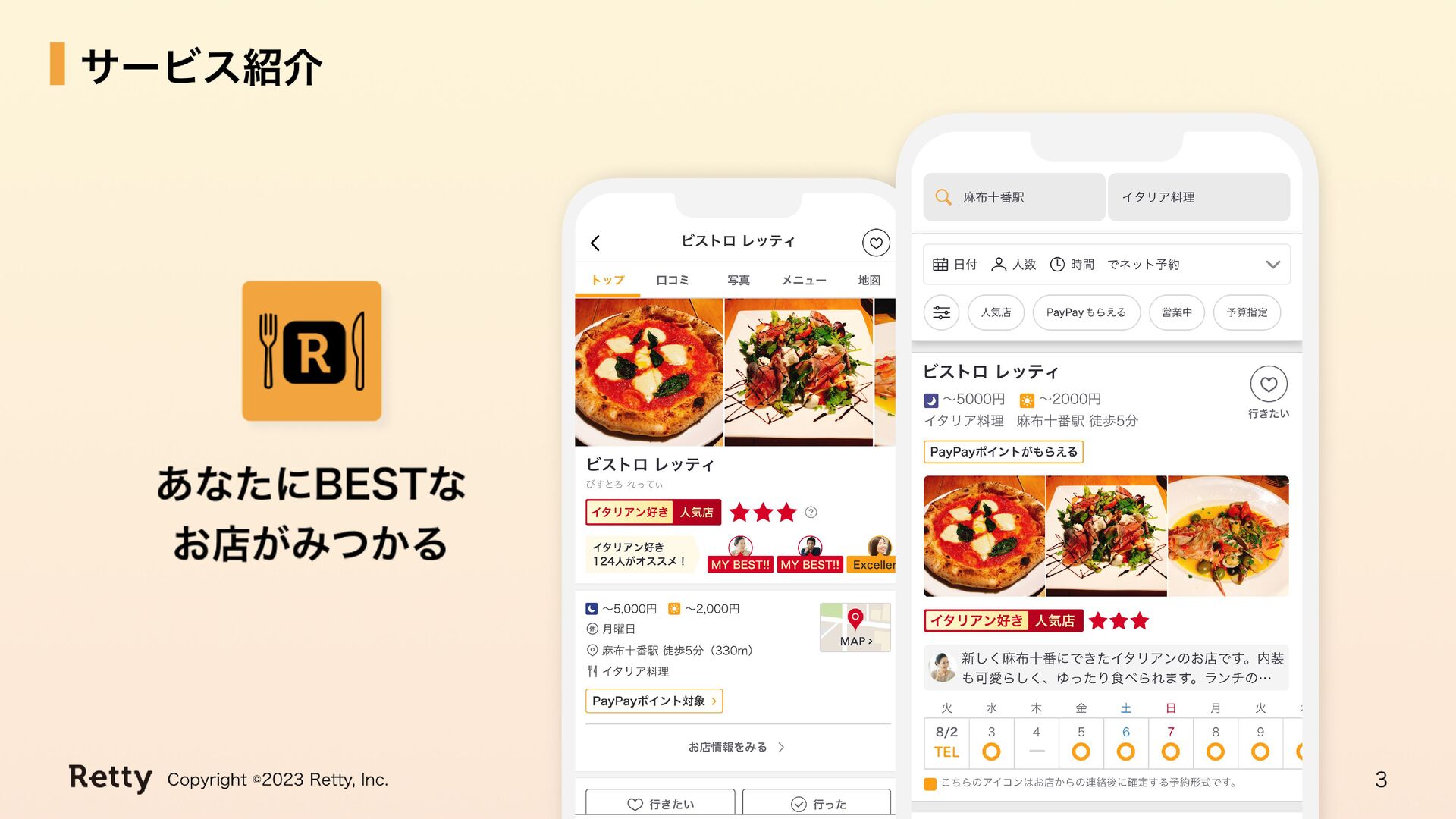
Rettyとオレンジの歩み
Search
yuri
August 09, 2023
Design
1.2k
1
Share
Embed
Copy iframe code
Copy JS code
Copy link
Start on current slide
Rettyとオレンジの歩み
yuri
August 09, 2023
Other Decks in Design
See All in Design
Rethinking IFUs: What Board Game Rulebooks Contribute to IFU Usability
deadlinepoet
0
330
再設計される業務 - AIにより再設計される "デザインワークフロー" / AI Ops Lab #2 Redesigned orkflows
kgsi
0
760
ClaudeCodeでマーケターの課題を解決する
kenichiota0711
11
14k
社長の宿題への回答 「新卒×AI」が生み出す価値
saki822
2
170
研修担当者が一番伸びた 熊本市役所✕AI『泥臭いAI研修』のワークショップ設計について
garyuten
2
420
デザインとフロントエンドの境界が融ける Claude Code × Figma
littlebusters
2
3.1k
広い関与の可能性に どう向き合うのか? 私たちは。|Timee MarketingDesign 2026-06-18
bebe
0
240
20260215独立行政法人科学技術振興機構(JST) 社会技術研究開発センター(RISTEX)ケアが根づく社会システム _公開シンポジウム
a2k
1
220
AIスライド生成を進化させるMDファイル
kenichiota0711
1
1.4k
生成AIの不確実性を価値に変える、「ビズリーチ」の体験設計 / KNOTS2026
visional_engineering_and_design
6
1.3k
PAMPHLET.pdf
mhand01
0
1k
2026年5月24日Redesigner Career Jamご参加者様ご案内資料
base
PRO
0
200
Featured
See All Featured
Pawsitive SEO: Lessons from My Dog (and Many Mistakes) on Thriving as a Consultant in the Age of AI
davidcarrasco
0
180
JAMstack: Web Apps at Ludicrous Speed - All Things Open 2022
reverentgeek
1
490
Breaking role norms: Why Content Design is so much more than writing copy - Taylor Woolridge
uxyall
0
340
How to audit for AI Accessibility on your Front & Back End
davetheseo
0
460
Tips & Tricks on How to Get Your First Job In Tech
honzajavorek
1
550
How to build an LLM SEO readiness audit: a practical framework
nmsamuel
1
800
Claude Code のすすめ
schroneko
67
230k
Build your cross-platform service in a week with App Engine
jlugia
234
18k
Statistics for Hackers
jakevdp
799
230k
Noah Learner - AI + Me: how we built a GSC Bulk Export data pipeline
techseoconnect
PRO
0
210
JavaScript: Past, Present, and Future - NDC Porto 2020
reverentgeek
52
6k
Avoiding the “Bad Training, Faster” Trap in the Age of AI
tmiket
0
190
Transcript
Rettyとオレンジの歩み 2023.8.8 デザイナー 松園 友里
自己紹介 松園 友里 2022年8月にジョイン。 ネット予約チームでweb上の店舗トップや 予約フォームの体験改善を行っている。 仮説から施策立案、デザインまで関わり 体験はもちろん、数値(CVR)も右肩に上げることに貢献。 前Q、チームとしてMVPを受賞。
None
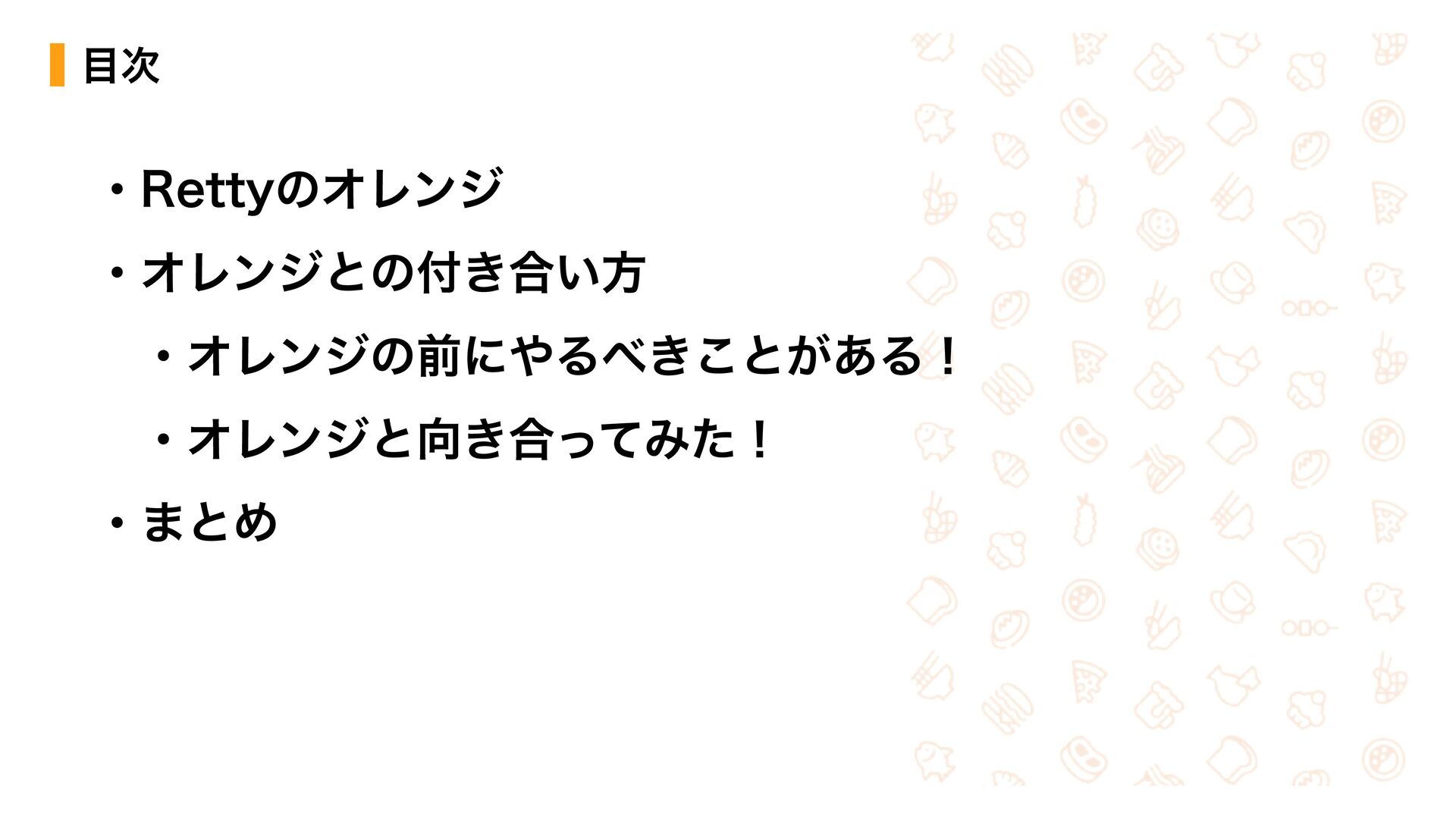
目次 ・Rettyのオレンジ ・オレンジとの付き合い方 ・オレンジの前にやるべきことがある! ・オレンジと向き合ってみた! ・まとめ
Rettyのオレンジ
#FFA014 2.04.....
オレンジとの付き合い方
オレンジの前に やるべきことがある!
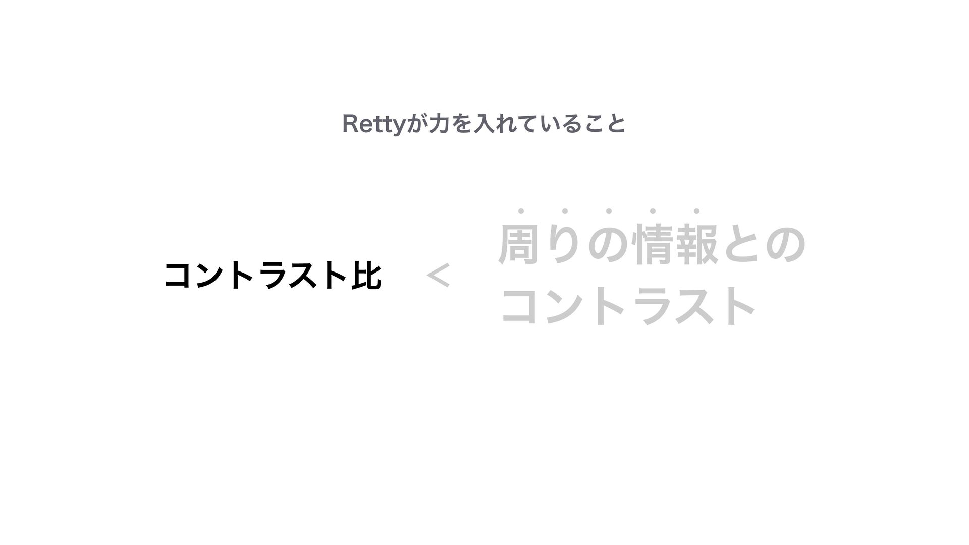
コントラスト比 < 周りの情報との コントラスト Rettyが力を入れていること
周りの情報との コントラスト Rettyが力を入れていること
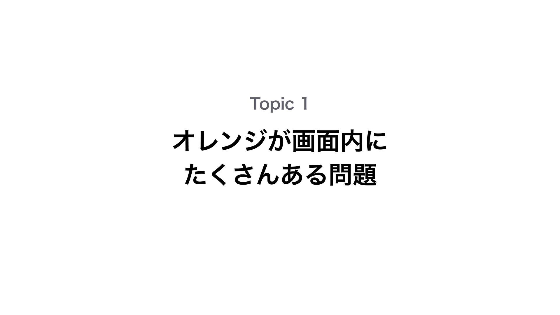
オレンジが画面内に たくさんある問題 Topic 1
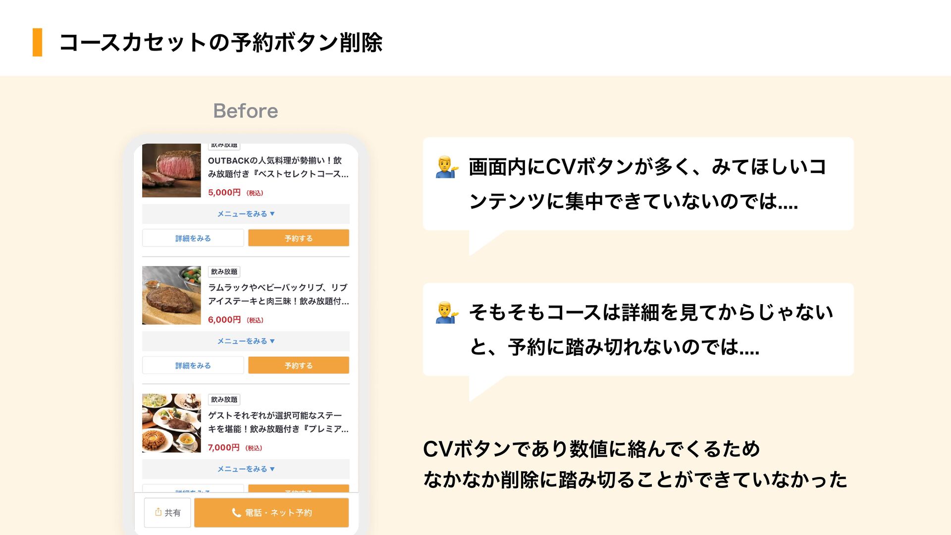
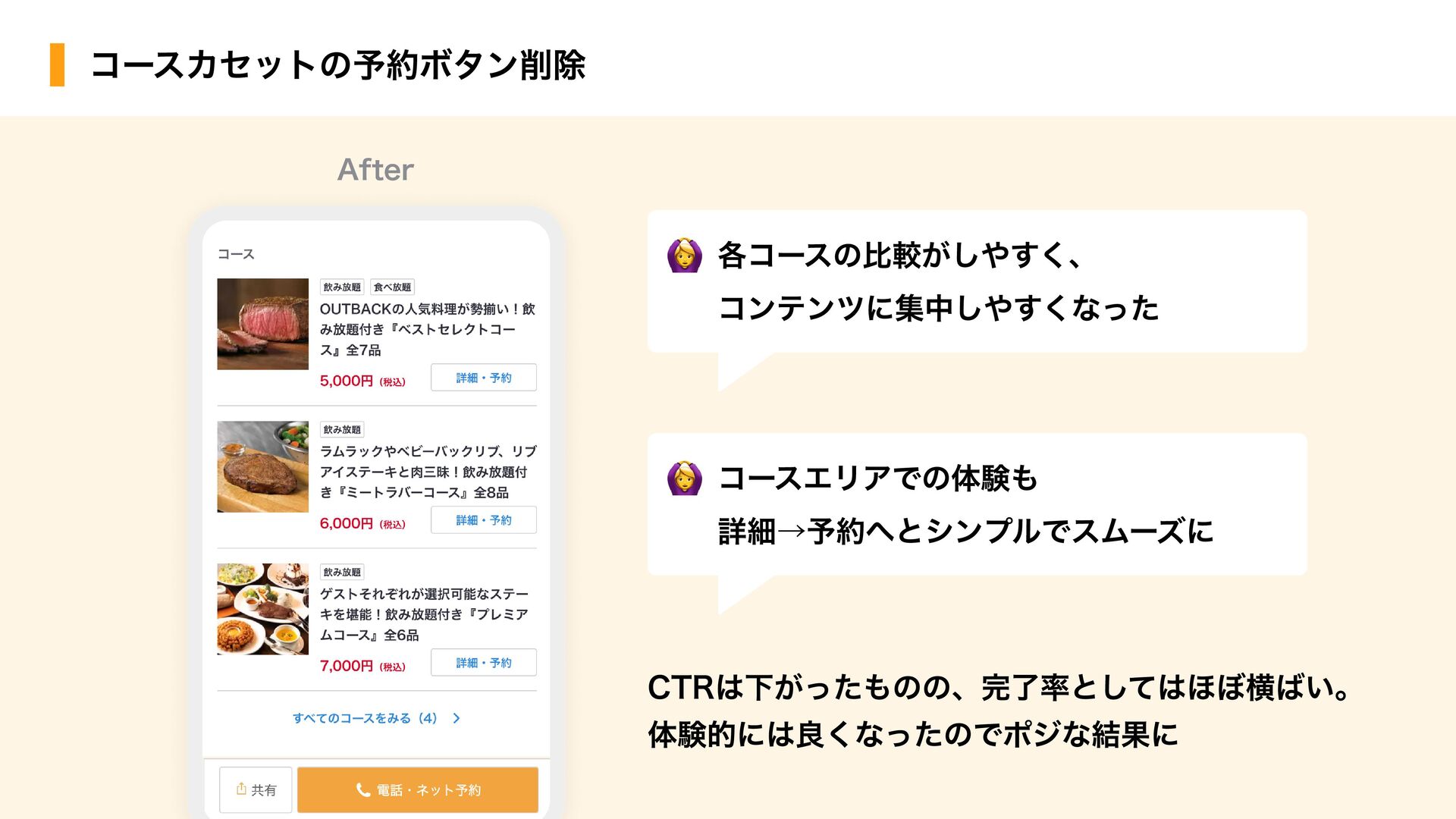
コースカセットの予約ボタン削除 CVボタンであり数値に絡んでくるため なかなか削除に踏み切ることができていなかった Before 画面内にCVボタンが多く、みてほしいコ ンテンツに集中できていないのでは.... そもそもコースは詳細を見てからじゃない と、予約に踏み切れないのでは....
CTRは下がったものの、完了率としてはほぼ横ばい。 体験的には良くなったのでポジな結果に 各コースの比較がしやすく、 コンテンツに集中しやすくなった コースエリアでの体験も 詳細→予約へとシンプルでスムーズに コースカセットの予約ボタン削除 After
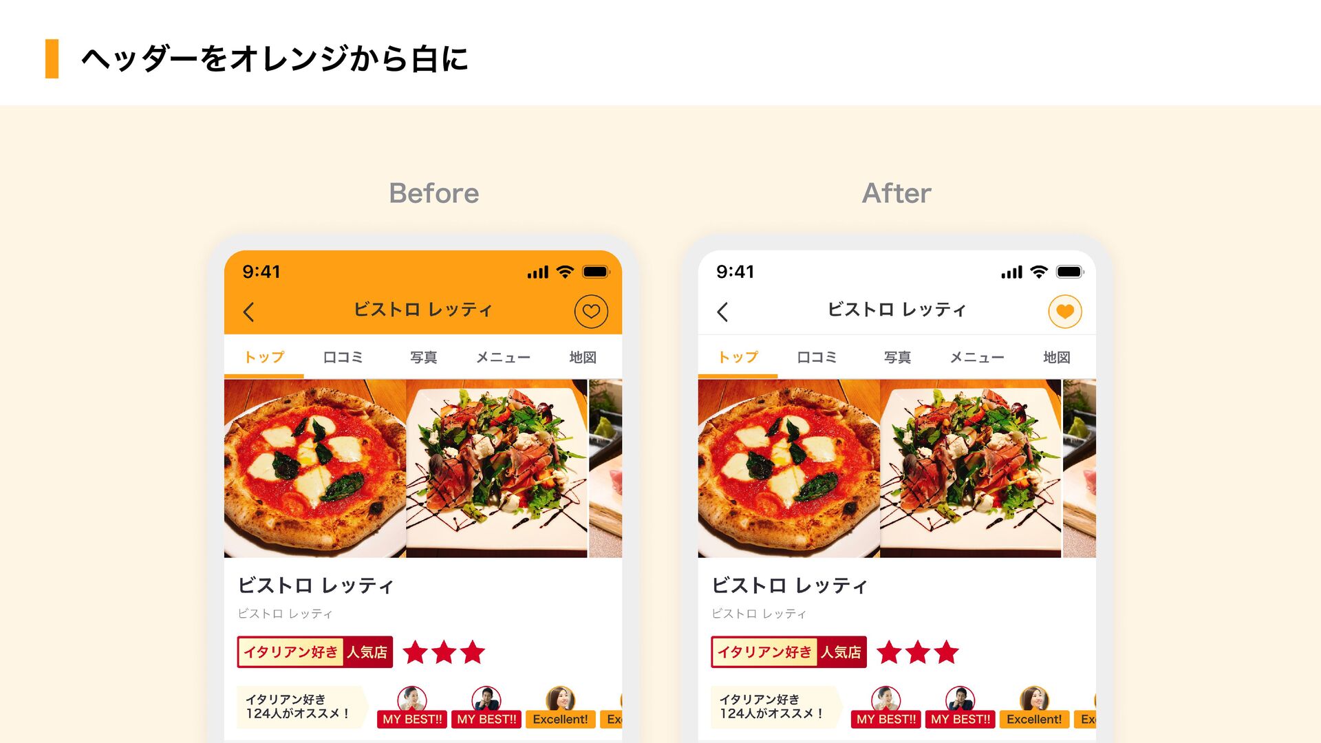
Before After ヘッダーをオレンジから白に
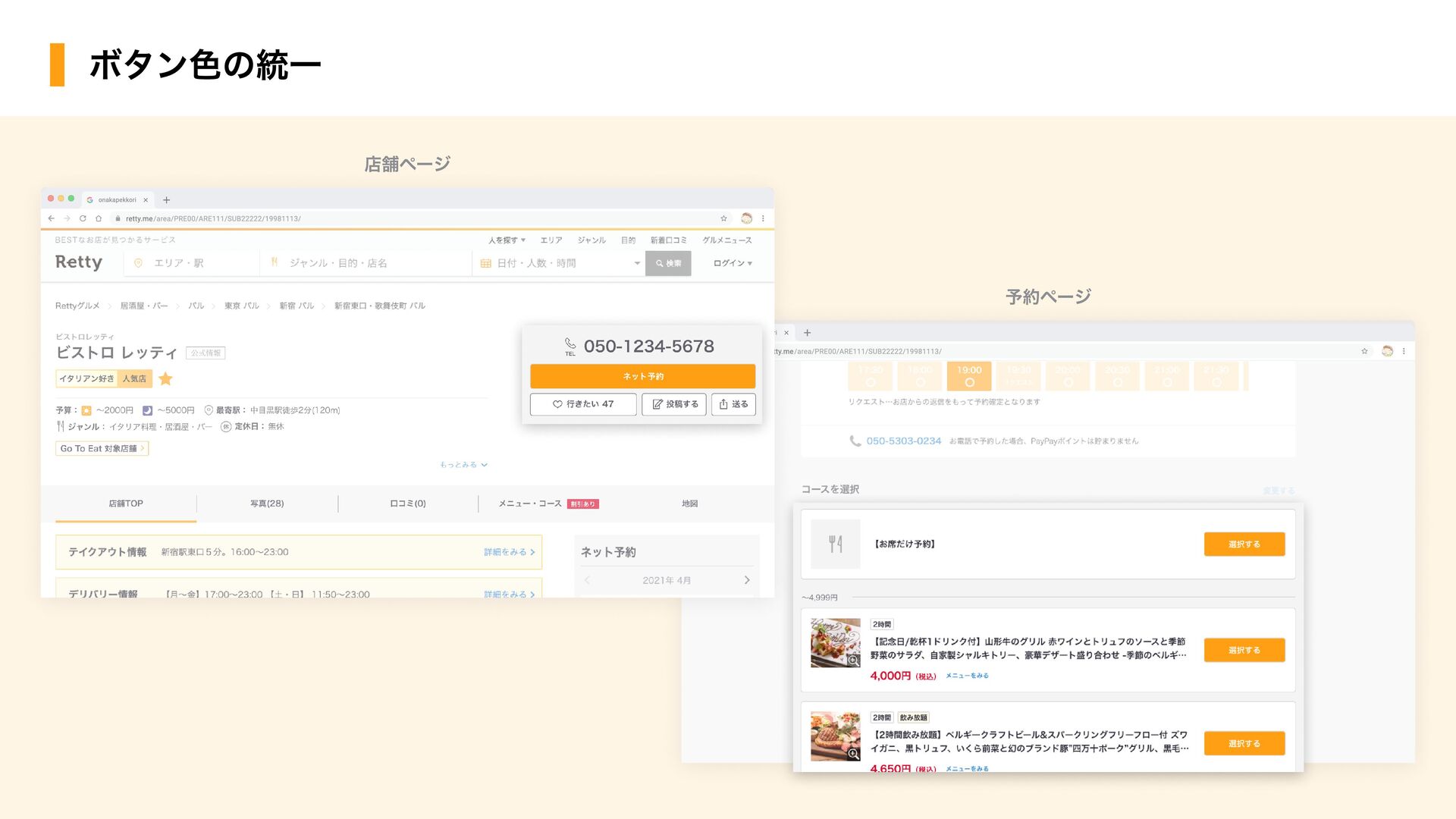
CVボタンの色が緑とオレンジの 2種類存在する問題 Topic 2
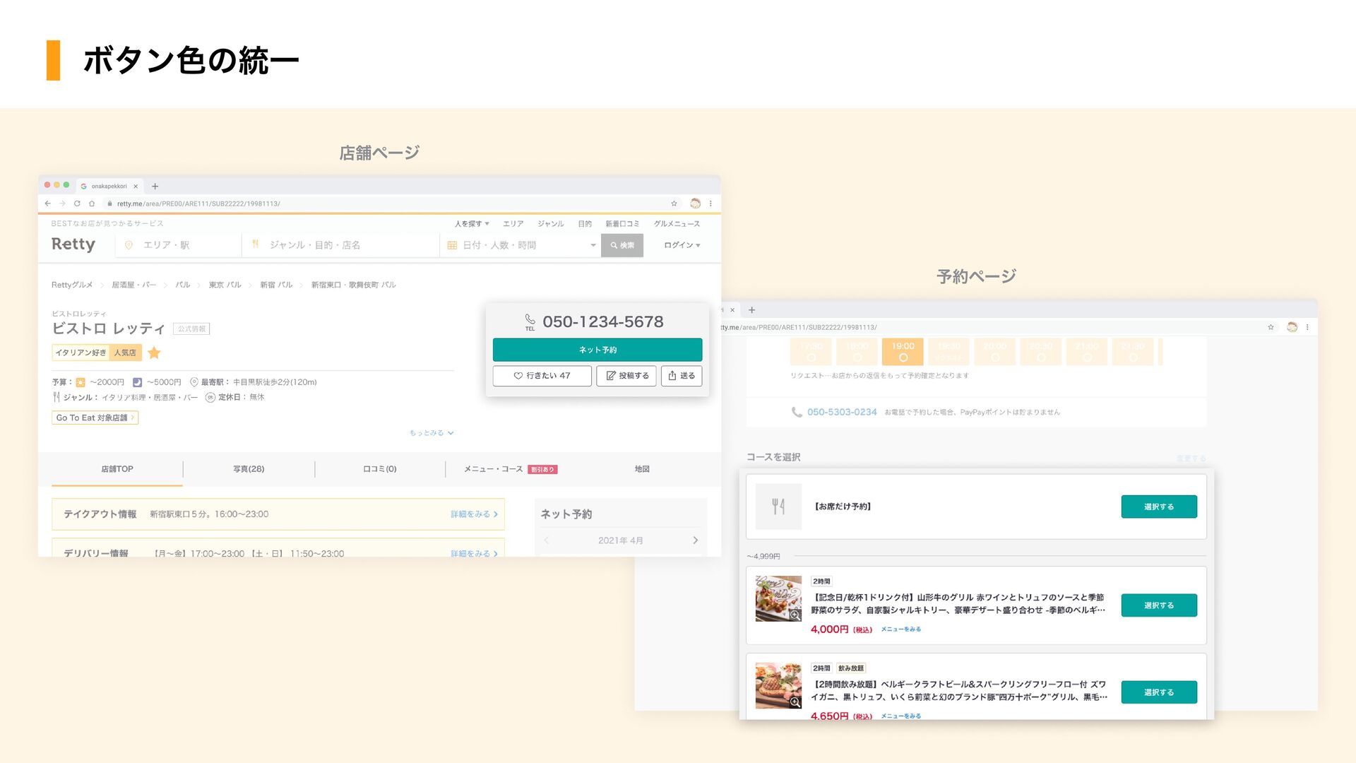
ボタン色の統一 retty.me/area/PRE00/ARE111/SUB22222/19981113/ retty.me/area/PRE00/ARE111/SUB22222/19981113/ onakapekkori retty.me/area/PRE00/ARE111/SUB22222/19981113/ retty.me/area/PRE00/ARE111/SUB22222/19981113/ onakapekkori 店舗ページ 予約ページ
ボタン色の統一 retty.me/area/PRE00/ARE111/SUB22222/19981113/ retty.me/area/PRE00/ARE111/SUB22222/19981113/ onakapekkori retty.me/area/PRE00/ARE111/SUB22222/19981113/ retty.me/area/PRE00/ARE111/SUB22222/19981113/ onakapekkori 店舗ページ 予約ページ
ボタン色の統一 retty.me/area/PRE00/ARE111/SUB22222/19981113/ retty.me/area/PRE00/ARE111/SUB22222/19981113/ onakapekkori retty.me/area/PRE00/ARE111/SUB22222/19981113/ retty.me/area/PRE00/ARE111/SUB22222/19981113/ onakapekkori 店舗ページ 予約ページ
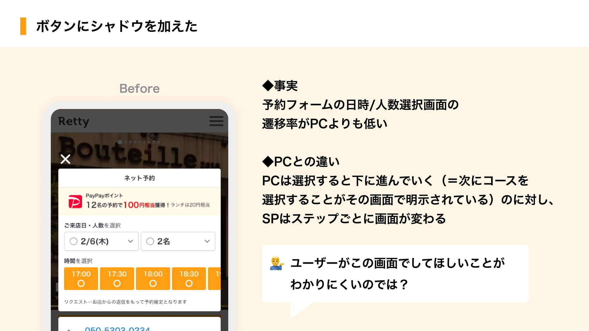
ユーザー視点で 押しやすさのコントラストを Topic 3
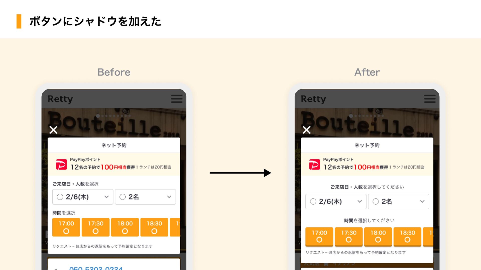
ユーザーがこの画面でしてほしいことが わかりにくいのでは? ボタンにシャドウを加えた Before ◆事実 予約フォームの日時/人数選択画面の 遷移率がPCよりも低い ◆PCとの違い PCは選択すると下に進んでいく(=次にコースを 選択することがその画面で明示されている)のに対し、
SPはステップごとに画面が変わる
Before ボタンにシャドウを加えた After
Before ボタンにシャドウを加えた After 前Qの予約フォーム内での施策で 効果が一番高かった!!!!
1. ノイズになっているオレンジの削除 2. コンテンツのプライマリーカラーの統一 3. ボタン自体の強調 周りの情報とのコントラストまとめ
オレンジと 向き合ってみた!
コントラスト比 Rettyが力を入れていること
グラデーションで 打倒!コントラスト比
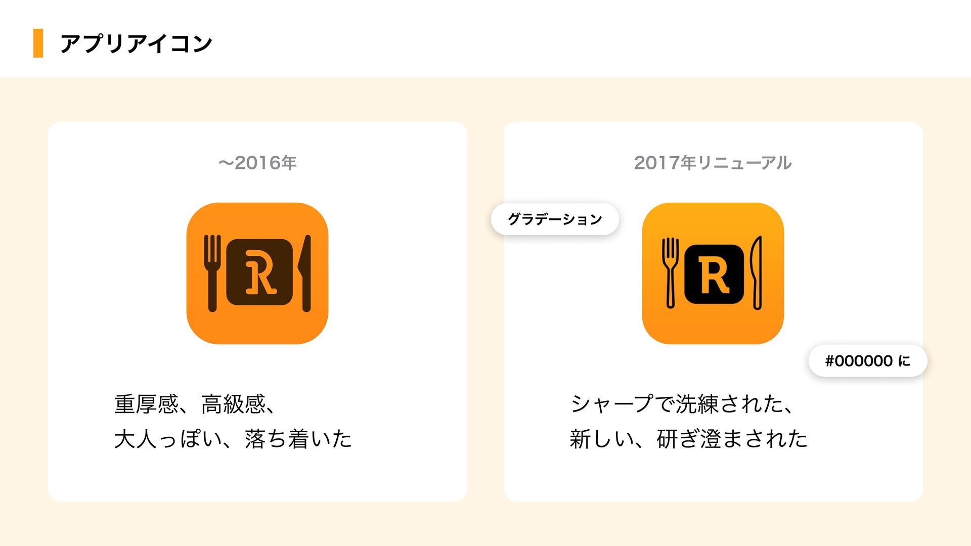
アプリアイコン 〜2016年 2017年リニューアル 重厚感、高級感、 大人っぽい、落ち着いた シャープで洗練された、 新しい、研ぎ澄まされた #000000 に #000000
に グラデーション グラデーション
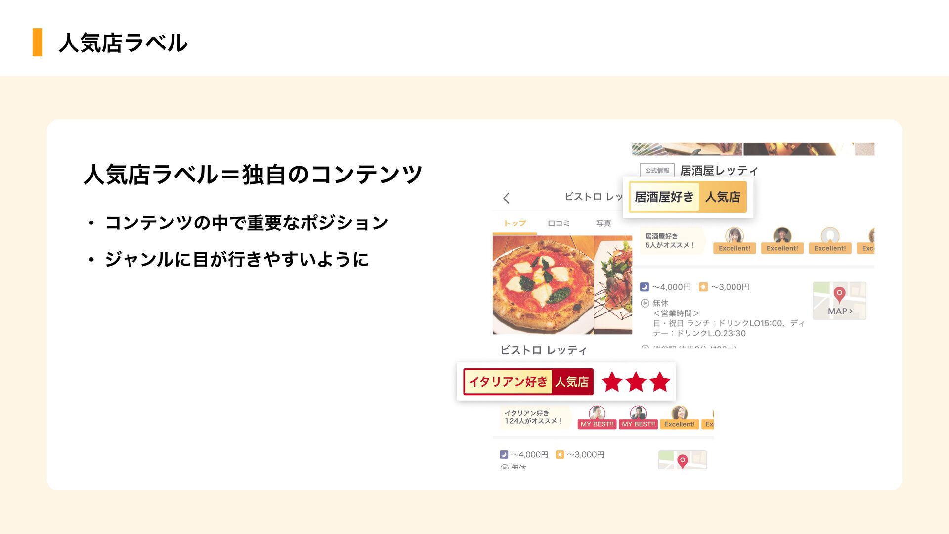
人気店ラベル 人気店ラベル そのジャンルに詳しいユーザーさん達のオススメから 厳選されたお店のみにつくラベル Rettyの人気店とは? Rettyのユーザーさんの中には特定のジャンルに詳しい方々 がいる。Rettyの人気店は、食に詳しいユーザーの皆さんの オススメが集まることで作られる。 ※ 投稿数・好きなジャンルは2021年11月時点のものです
人気店ラベル 人気店ラベル=独自のコンテンツ ・コンテンツの中で重要なポジション ・ジャンルに目が行きやすいように
1. Rettyの体験として重要なものは コントラスト比を保つように工夫 2. グラフィックのテクニックで 視認性を確保する 配色によってオレンジの弱点を克服 ボタンはかなりハードルが高いので、他の部分から改善していく コントラスト比のまとめ
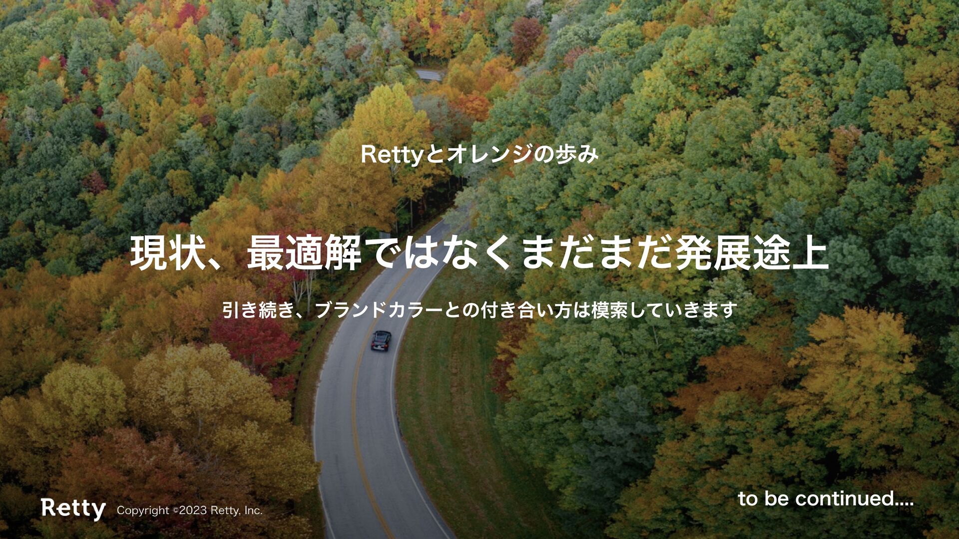
現状、最適解ではなくまだまだ発展途上 Rettyとオレンジの歩み 引き続き、ブランドカラーとの付き合い方は模索していきます to be continued....
ありがとうございました! ぜひRetty使ってみてください!