Upgrade to Pro
— share decks privately, control downloads, hide ads and more …
Speaker Deck
Features
Speaker Deck
PRO
Sign in
Sign up for free
Search
Search
Responsive in the Wild
Search
Sponsored
·
Ship Features Fearlessly
Turn features on and off without deploys. Used by thousands of Ruby developers.
→
Mark Zeman
June 25, 2014
Programming
3.8k
1
Share
Embed
Copy iframe code
Copy JS code
Copy link
Start on current slide
Responsive in the Wild
Deck from Velocity 2014 Lightning Demo.
Mark Zeman
June 25, 2014
More Decks by Mark Zeman
See All by Mark Zeman
Speed Matters
zeman
7
78k
Other Decks in Programming
See All in Programming
SREの積み重ねがAI駆動開発のガードレールになった ― 7つの実践/SRE Guardrails The 7
tomoyakitaura
8
4.4k
Terraform標準の組織で AWS CDKをどう使うか
mu7889yoon
0
280
PHP初心者セッション2026 〜生成AIでは見えない裏側を知る:今だからLAMPを通して仕組みを学ぶ〜
kashioka
0
490
Welcome to the "Parametricity" 🏙️ − Generic だけど Specific な世界 −
guvalif
PRO
1
170
なぜ関数型プログラミングで「型」と「証明」が語られるのか #fp_matsuri
kajitack
3
950
LaravelLive Japan の裏方のすべて — 第188回 PHP勉強会@東京 (2026-06-24)
suguruooki
2
150
act2-costs.pdf
sumedhbala
0
110
act1-costs.pdf
sumedhbala
0
230
鹿野さんに聞く!『TypeScriptコードレシピ集』で磨く実践力
tonkotsuboy_com
4
1.1k
PHP に部分適用が来るぞ!……ところで何それ?おいしいの? #phpcon / phpcon-2026
shogogg
0
240
どこまでゆるくて許されるのか
tk3fftk
0
500
PHPだって関数型したい 〜できること、できないこと〜 / fp-in-php
jsoizo
0
210
Featured
See All Featured
Principles of Awesome APIs and How to Build Them.
keavy
128
18k
CSS Pre-Processors: Stylus, Less & Sass
bermonpainter
360
30k
The Success of Rails: Ensuring Growth for the Next 100 Years
eileencodes
47
8.2k
How to Build an AI Search Optimization Roadmap - Criteria and Steps to Take #SEOIRL
aleyda
1
2.1k
Jamie Indigo - Trashchat’s Guide to Black Boxes: Technical SEO Tactics for LLMs
techseoconnect
PRO
0
370
Leveraging LLMs for student feedback in introductory data science courses - posit::conf(2025)
minecr
1
320
Efficient Content Optimization with Google Search Console & Apps Script
katarinadahlin
PRO
1
730
From π to Pie charts
rasagy
0
240
Bridging the Design Gap: How Collaborative Modelling removes blockers to flow between stakeholders and teams @FastFlow conf
baasie
0
610
Taking LLMs out of the black box: A practical guide to human-in-the-loop distillation
inesmontani
PRO
3
2.3k
Tips & Tricks on How to Get Your First Job In Tech
honzajavorek
1
600
The Cost Of JavaScript in 2023
addyosmani
55
10k
Transcript
Responsive in the wild
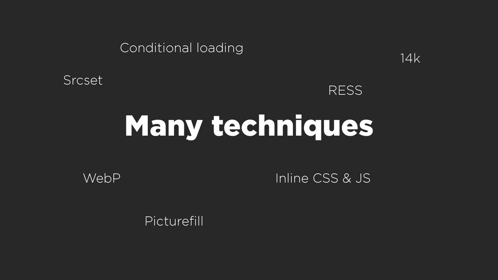
Many techniques Picturefill Inline CSS & JS Conditional loading WebP
RESS 14k Srcset
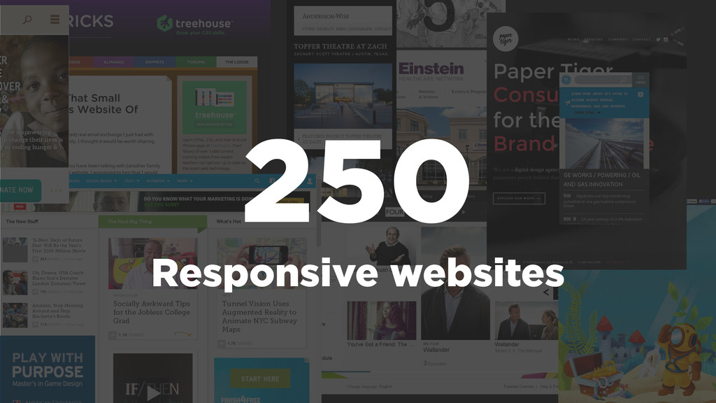
250 Responsive websites
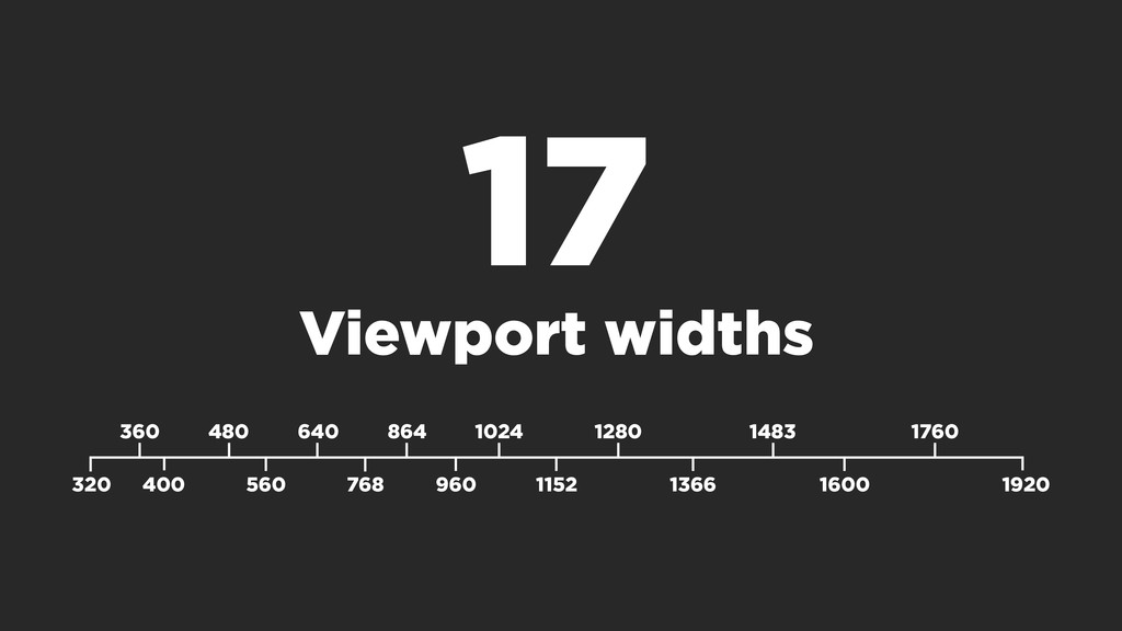
17 Viewport widths 1024 1366 320 1920 360 400 480
560 640 768 864 960 1152 1280 1483 1600 1760
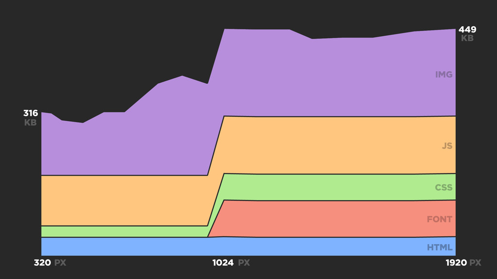
449 316 320 1920 IMG JS CSS FONT HTML KB
KB PX PX PX 1024
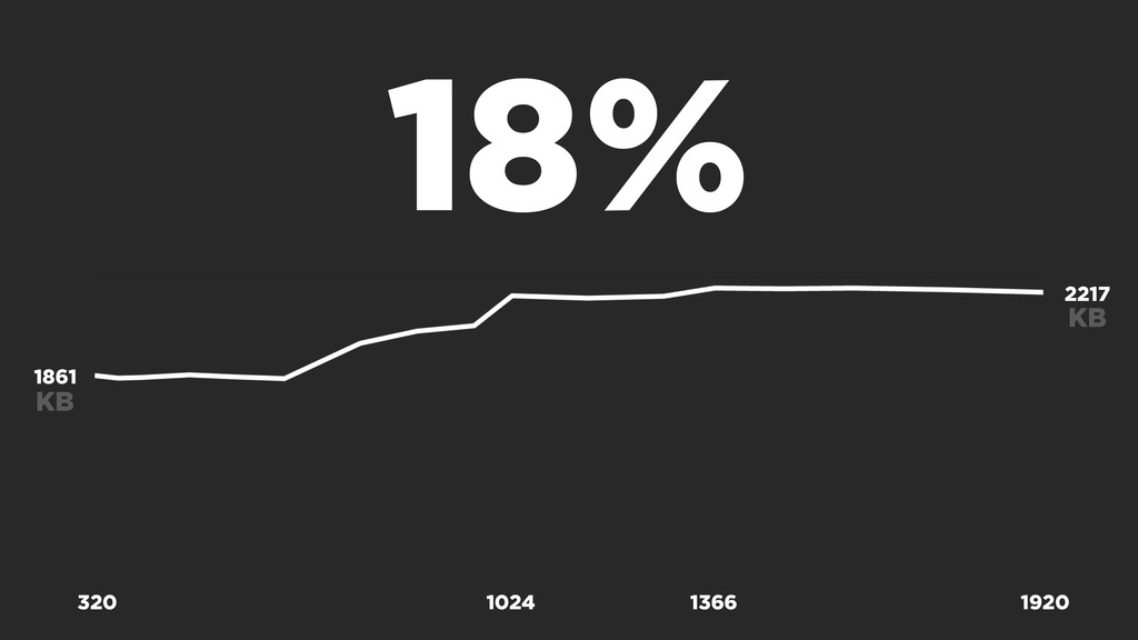
1024 1366 2217 KB 1861 KB 18% 320 1920
None
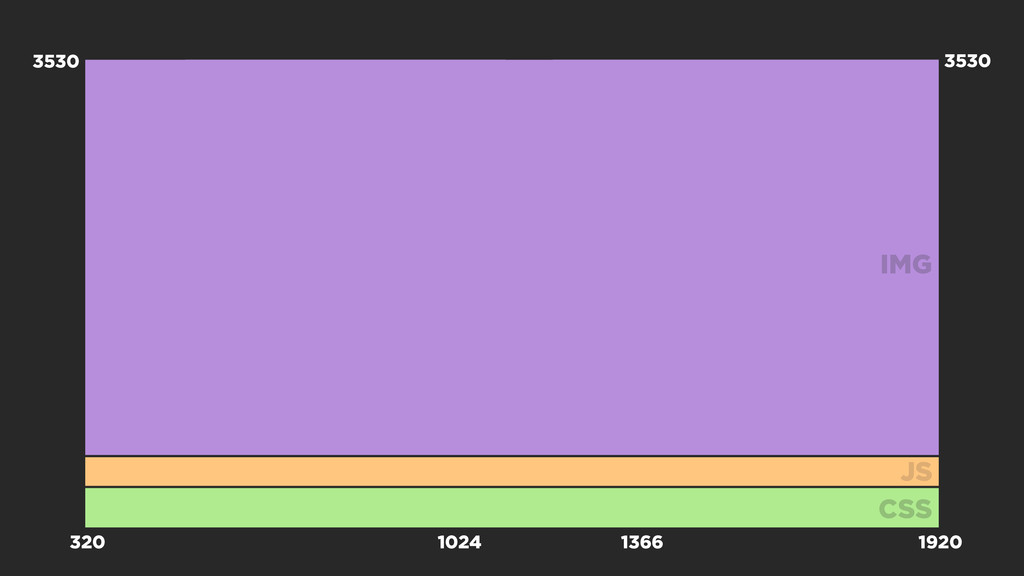
38% FLATLINE
1024 1366 320 1920 IMG JS CSS 3530 3530
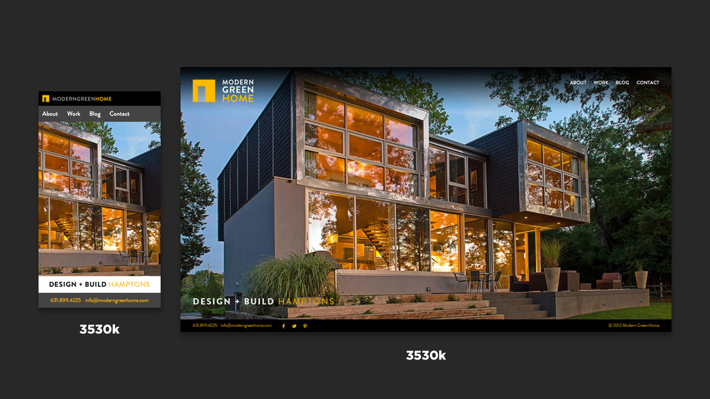
3530k 3530k
38% 55% IMAGES
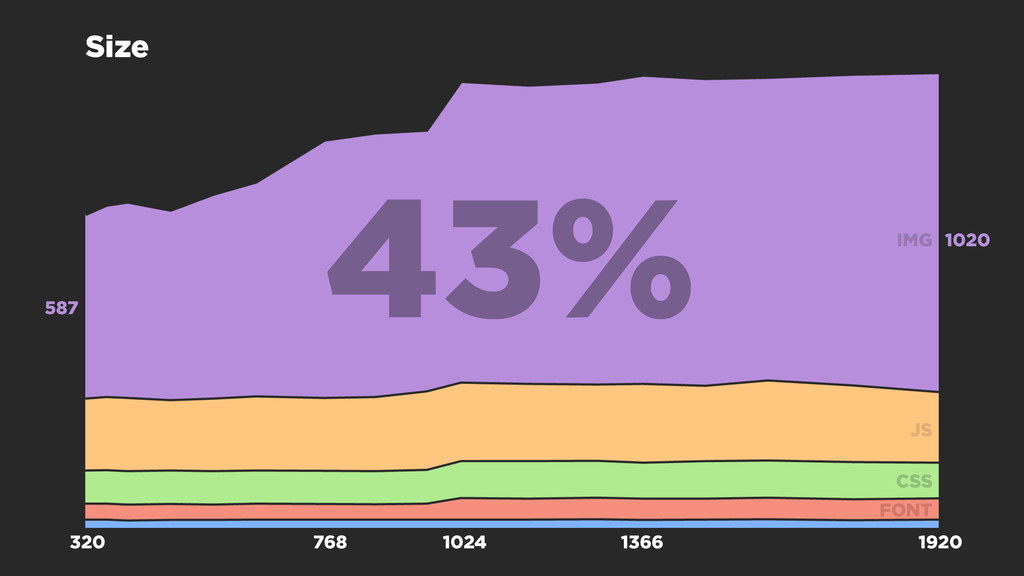
1024 1366 1020 587 43% 768 320 1920 IMG JS
CSS FONT Size
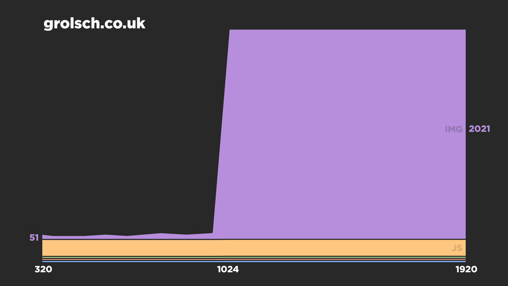
1024 2021 51 grolsch.co.uk 320 1920 IMG JS
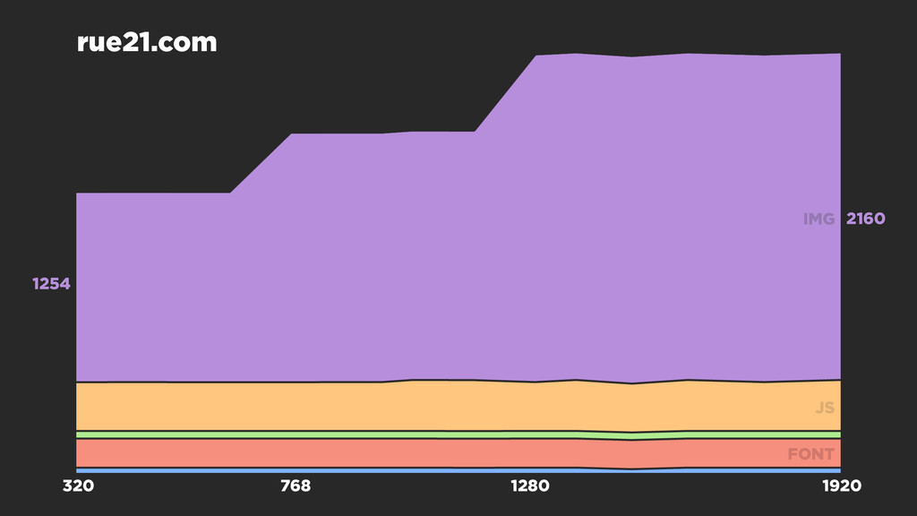
768 1280 2160 1254 rue21.com 320 1920 IMG JS FONT
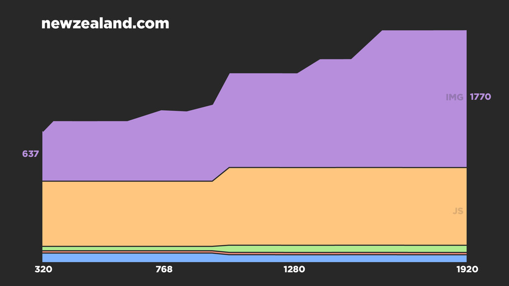
768 1280 1770 637 newzealand.com 320 1920 IMG JS
=!
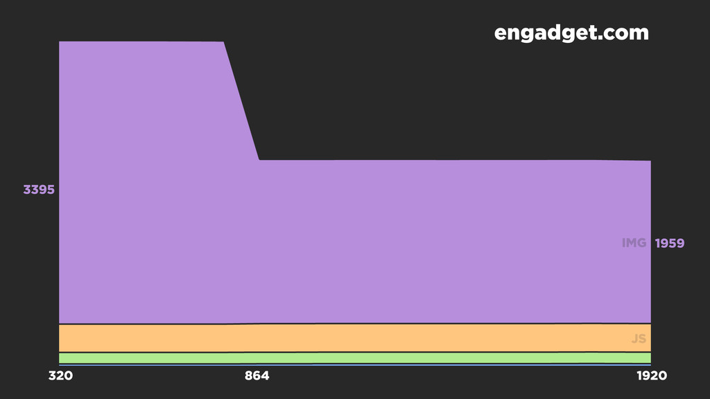
864 1959 3395 engadget.com 320 1920 IMG JS
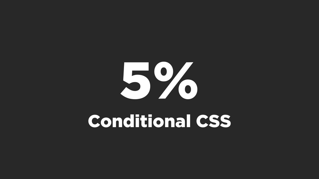
5% Conditional CSS
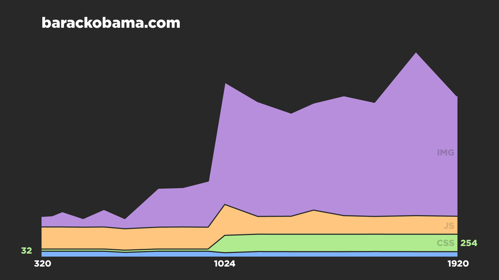
1024 254 32 barackobama.com 320 1920 IMG JS CSS
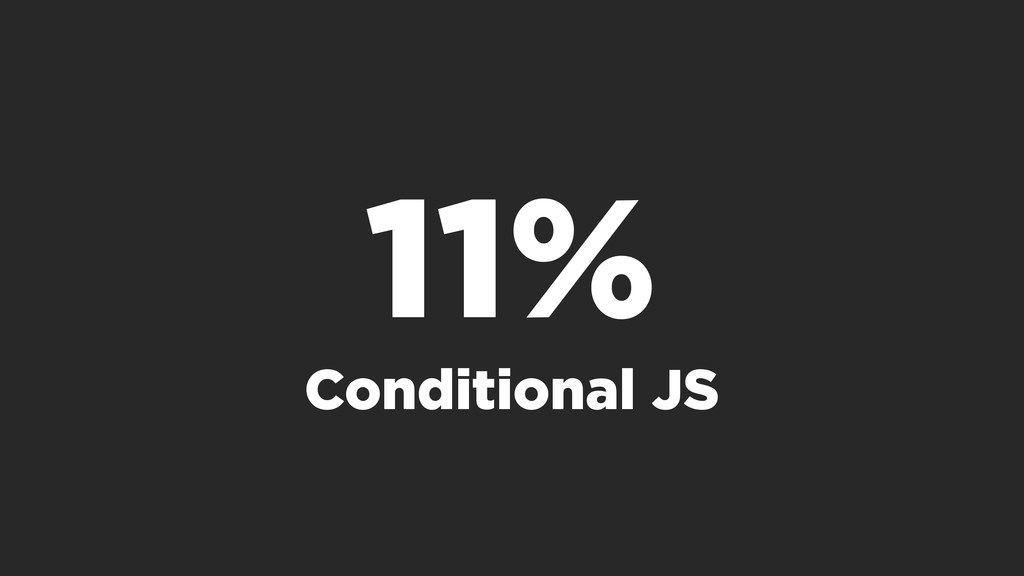
11% Conditional JS
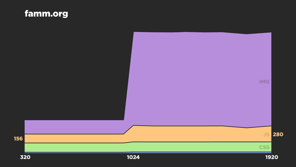
1024 280 156 famm.org 320 1920 IMG JS CSS
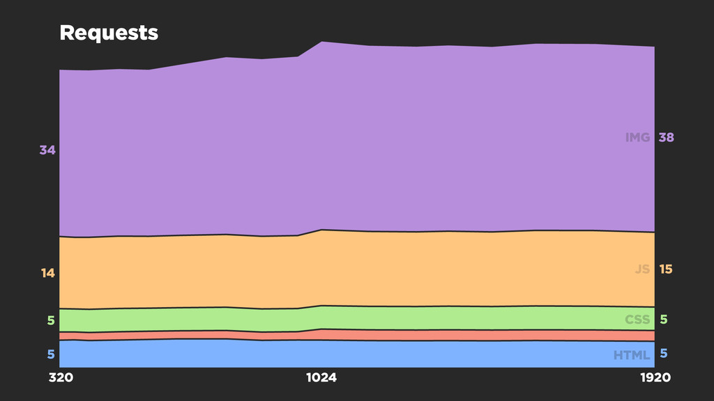
1024 38 14 320 1920 IMG JS CSS HTML 34
15 Requests 5 5 5 5
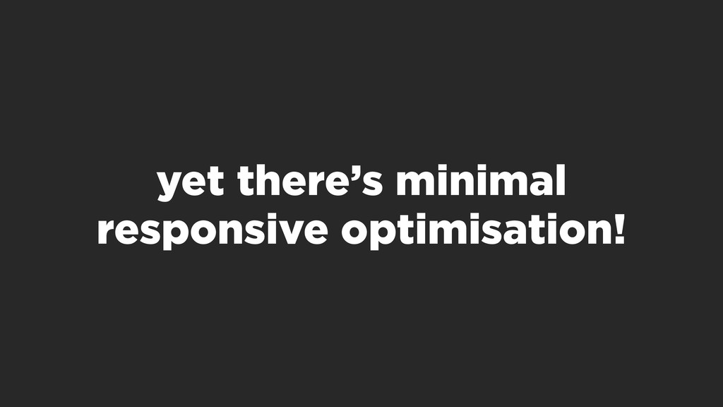
Mobile is nearing 50%
yet there’s minimal responsive optimisation!
None
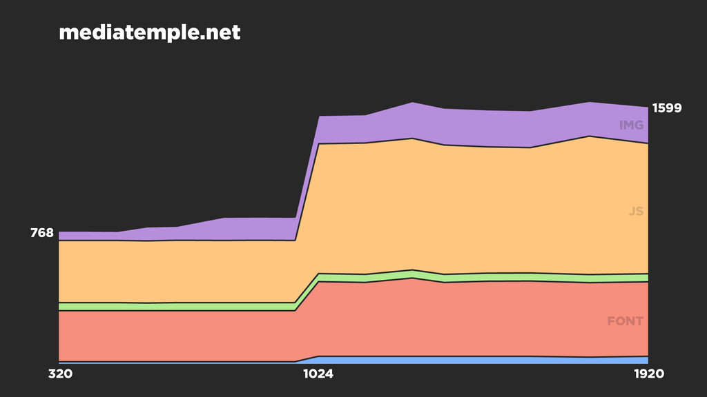
1024 1599 768 mediatemple.net 320 1920 IMG JS FONT
speedcurve.com/blog @MarkZeman FRONT-END PERFORMANCE MONITORING
[email protected]
 zeman
zeman
 tomoyakitaura
 mu7889yoon
 kashioka
 guvalif
 kajitack
 suguruooki
 sumedhbala
 tonkotsuboy_com
 shogogg
 tk3fftk
 jsoizo
 keavy
keavy
 bermonpainter
 eileencodes
 aleyda
 techseoconnect
 minecr
 katarinadahlin
 rasagy
 baasie
 inesmontani
 honzajavorek
 addyosmani
![speedcurve.com/blog @MarkZeman FRONT-END PERFORMANCE MONITORING [email protected]](https://files.speakerdeck.com/presentations/61b543b0dec80131ffee2ad9291baba4/slide_26.jpg)