Upgrade to Pro
— share decks privately, control downloads, hide ads and more …
Speaker Deck
Features
Speaker Deck
PRO
Sign in
Sign up for free
Search
Search
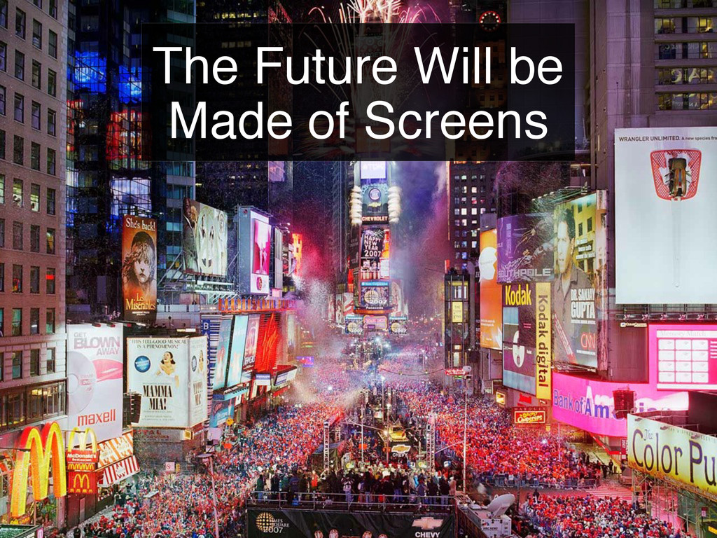
The Future Will be Made of Screens
Search
binx
February 24, 2012
320
3
Share
Embed
Copy iframe code
Copy JS code
Copy link
Start on current slide
The Future Will be Made of Screens
Presented at the February 2012 Designers & Geeks Meeup
binx
February 24, 2012
More Decks by binx
See All by binx
On the Importance of Iteration
binx
0
140
Designing for Spacecraft Operations
binx
2
650
Place and Space
binx
0
550
Error: Success
binx
0
550
Peak Visualization?
binx
1
620
The Data Visualization Hustle
binx
2
490
People, Not Users
binx
2
270
Data Collection and Memory
binx
1
250
The Road To Code
binx
1
420
Featured
See All Featured
SEOcharity - Dark patterns in SEO and UX: How to avoid them and build a more ethical web
sarafernandez
0
220
Keith and Marios Guide to Fast Websites
keithpitt
413
23k
CoffeeScript is Beautiful & I Never Want to Write Plain JavaScript Again
sstephenson
162
16k
Winning Ecommerce Organic Search in an AI Era - #searchnstuff2025
aleyda
1
2.1k
<Decoding/> the Language of Devs - We Love SEO 2024
nikkihalliwell
1
270
The Web Performance Landscape in 2024 [PerfNow 2024]
tammyeverts
12
1.2k
Paper Plane
katiecoart
PRO
1
52k
Believing is Seeing
oripsolob
1
160
30 Presentation Tips
portentint
PRO
1
340
How to train your dragon (web standard)
notwaldorf
97
6.7k
A brief & incomplete history of UX Design for the World Wide Web: 1989–2019
jct
2
410
SEO for Brand Visibility & Recognition
aleyda
0
4.6k
Transcript
The Future Will be Made of Screens
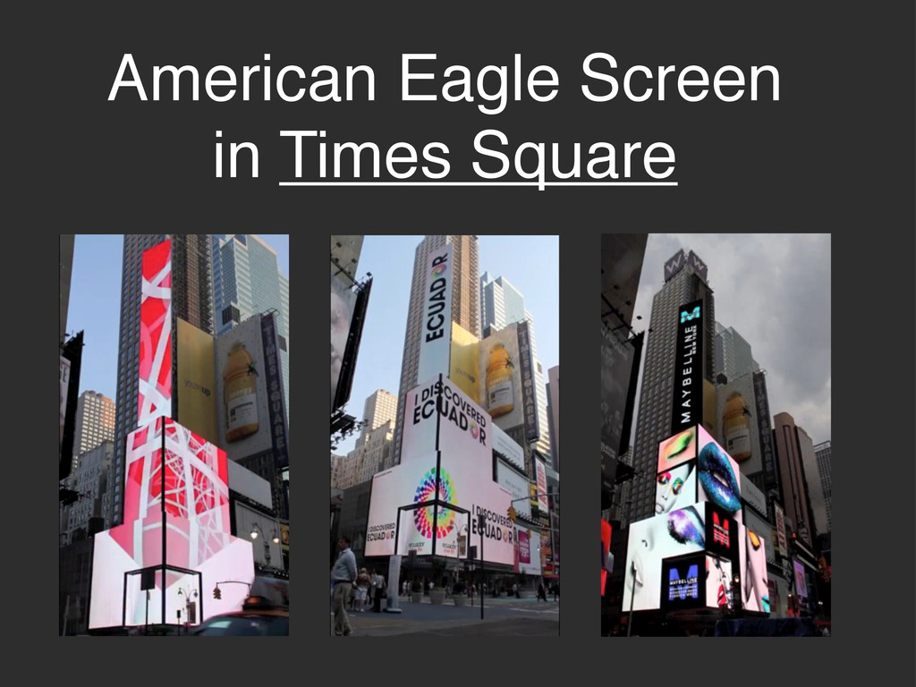
American Eagle Screen in Times Square
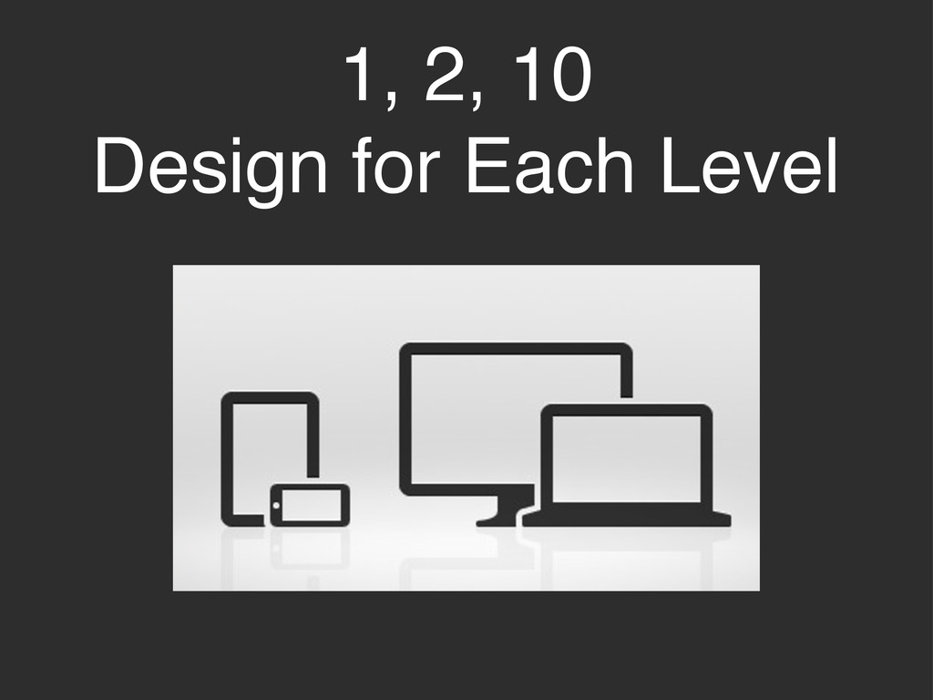
1, 2, 10 Design for Each Level
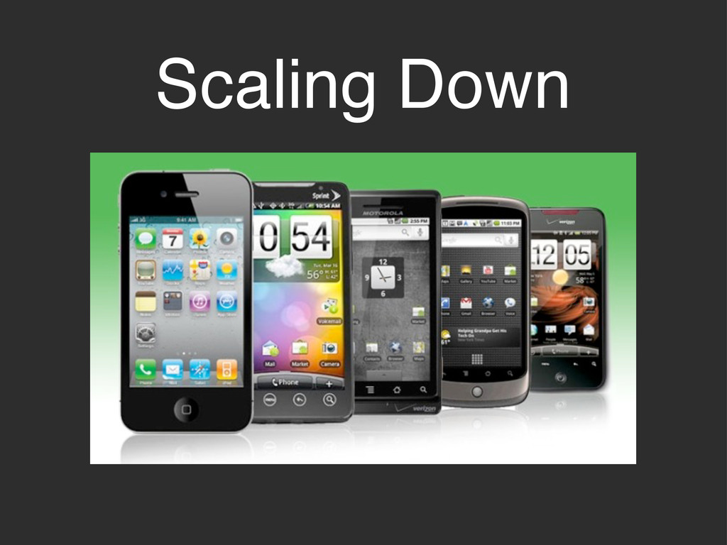
Scaling Down
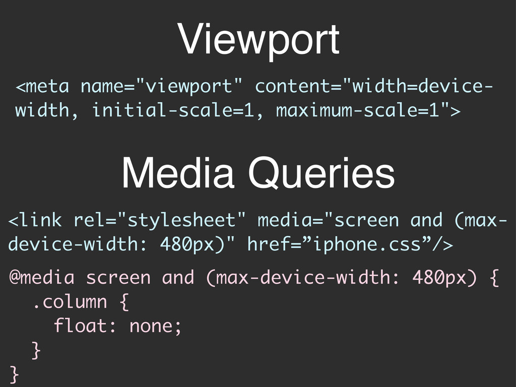
Viewport <link rel="stylesheet" media="screen and (max- device-width: 480px)" href=”iphone.css”/> <meta
name="viewport" content="width=device- width, initial-scale=1, maximum-scale=1"> @media screen and (max-device-width: 480px) { .column { float: none; } } Media Queries
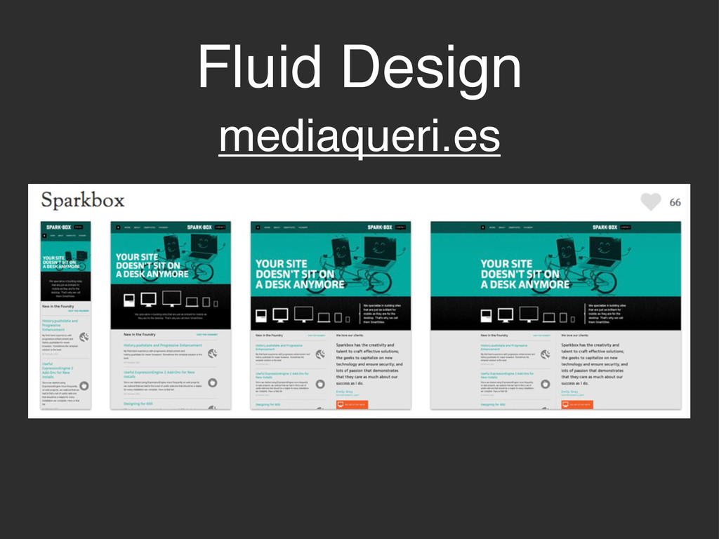
Fluid Design mediaqueri.es
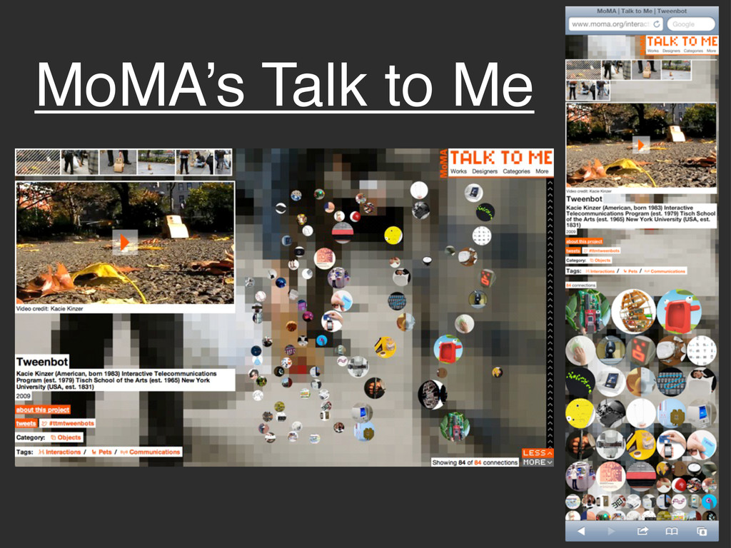
MoMA’s Talk to Me
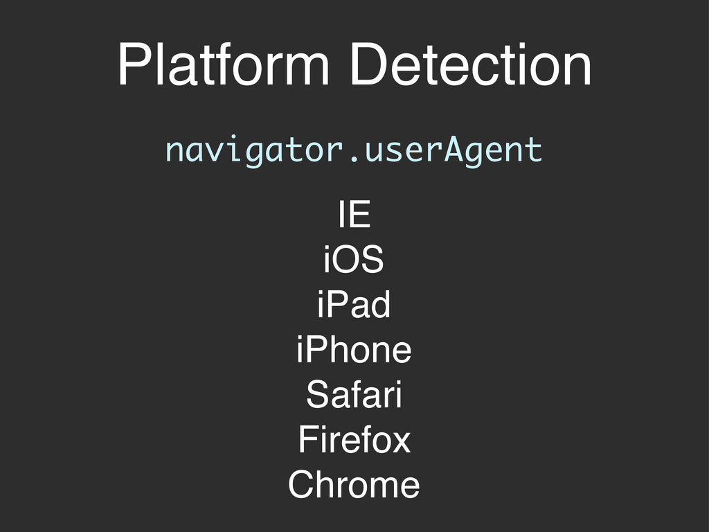
Platform Detection navigator.userAgent IE iOS iPad iPhone Safari Firefox Chrome
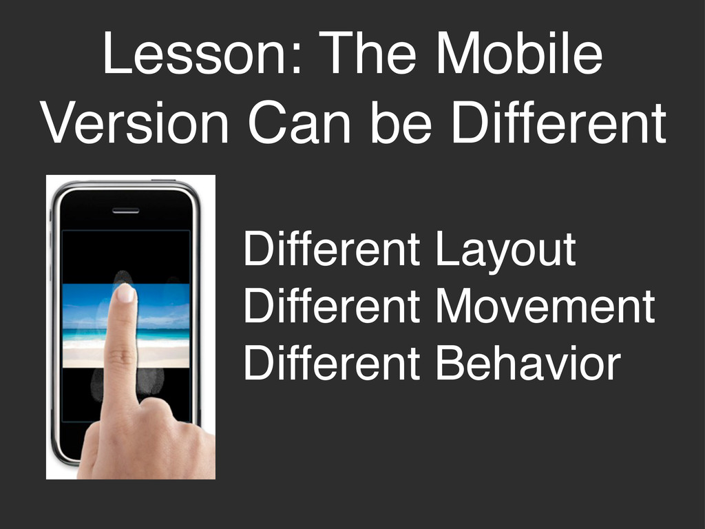
Lesson: The Mobile Version Can be Different Different Layout Different
Movement Different Behavior
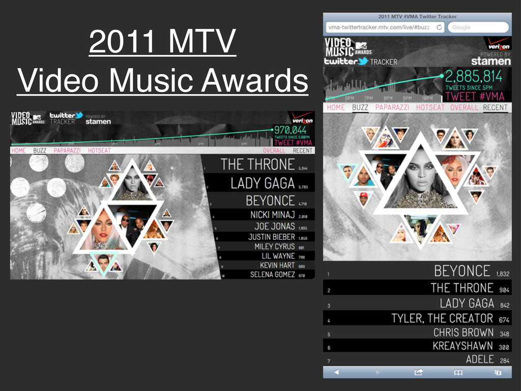
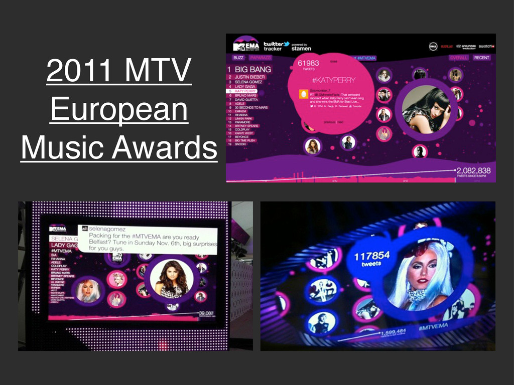
2011 MTV Video Music Awards
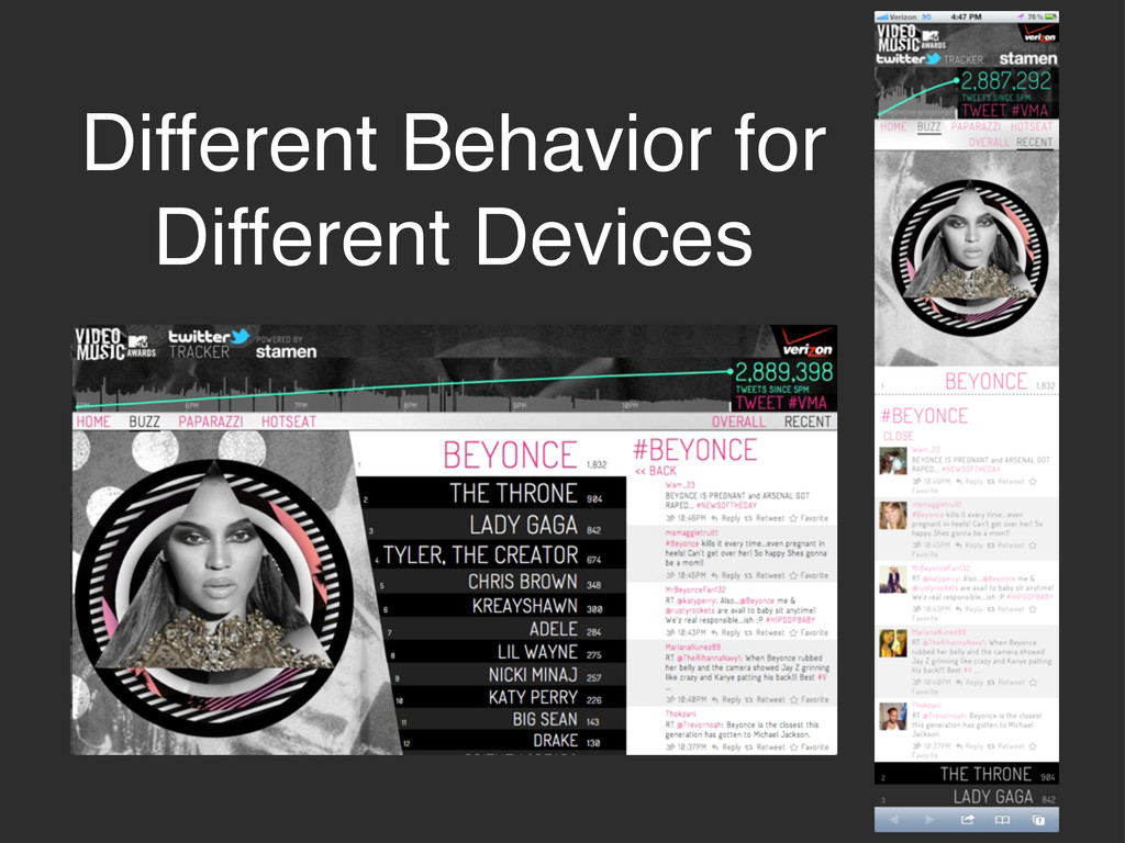
Different Behavior for Different Devices
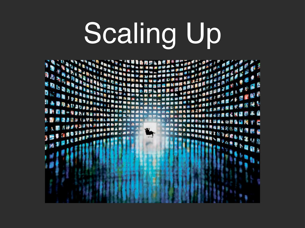
Scaling Up
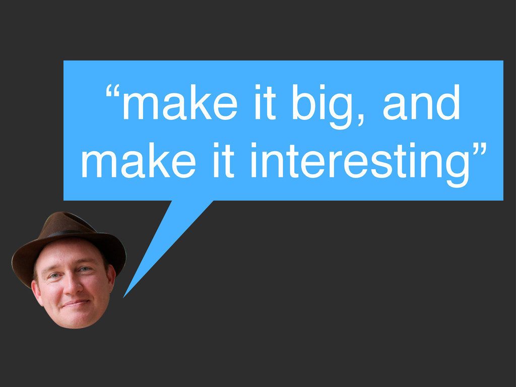
“make it big, and make it interesting”
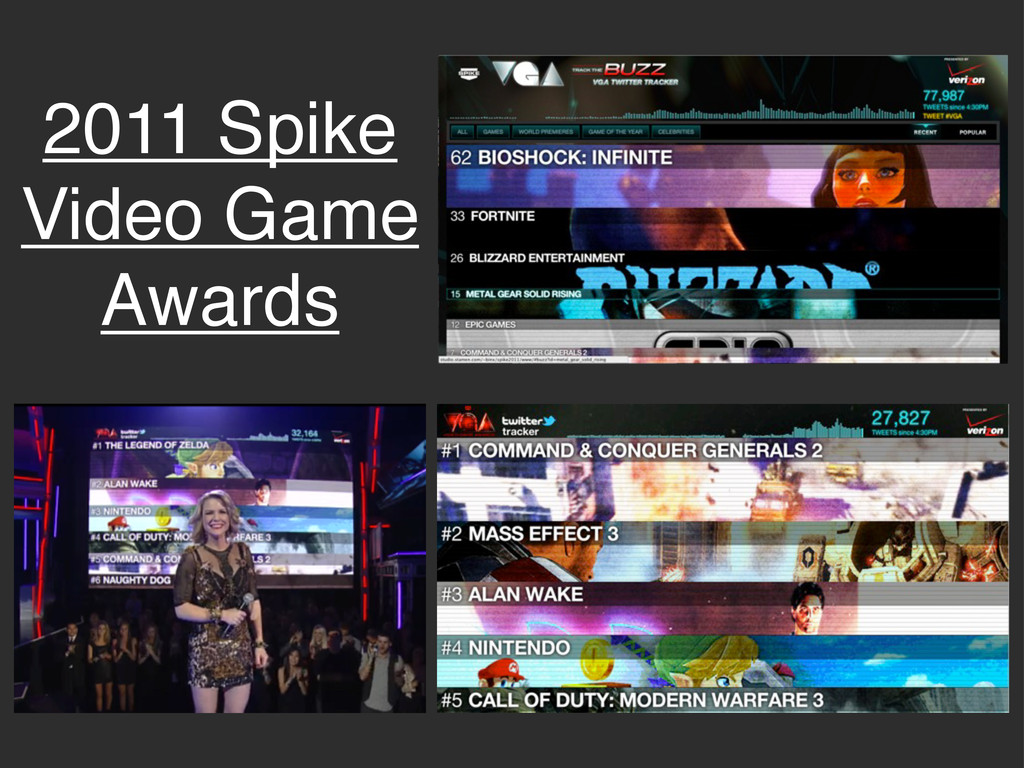
2011 Spike Video Game Awards
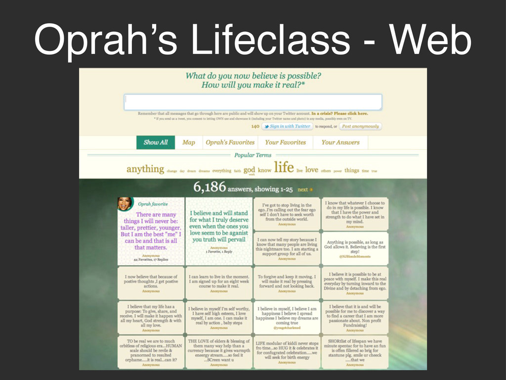
Oprah’s Lifeclass - Web
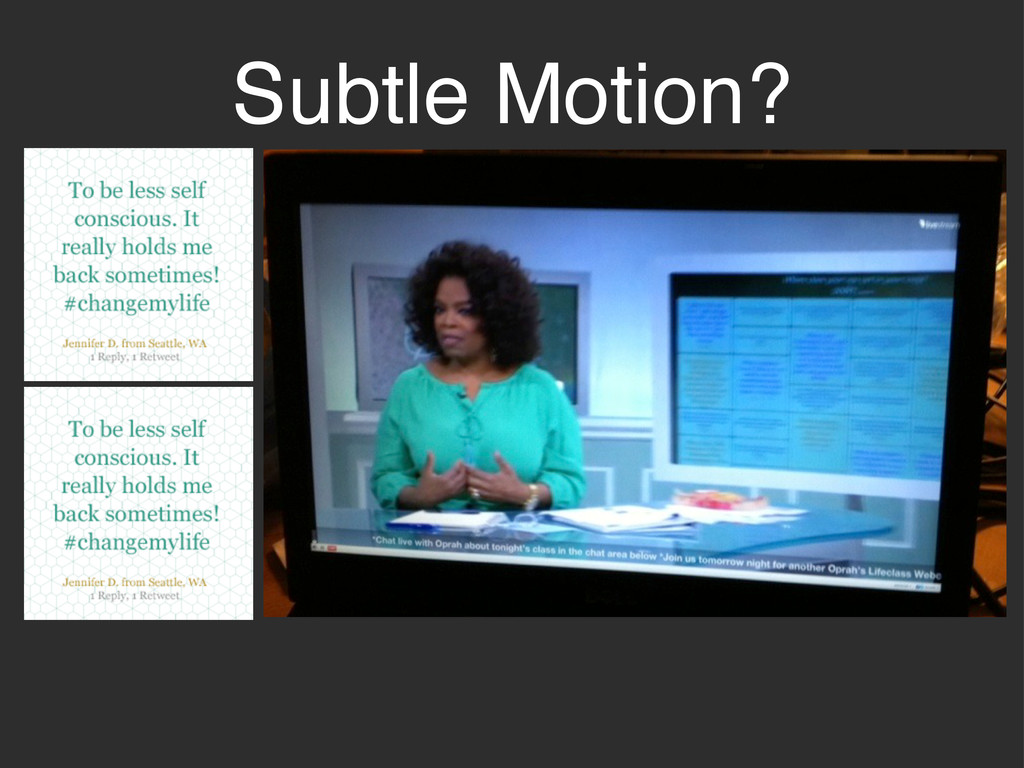
Subtle Motion?
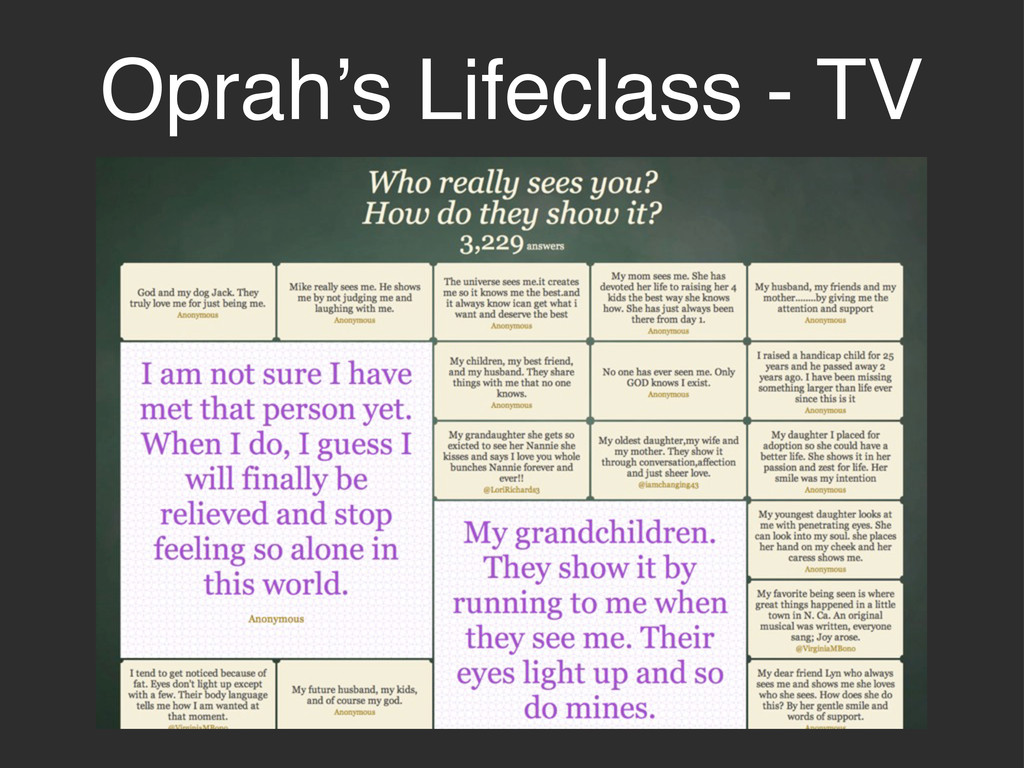
Oprah’s Lifeclass - TV
2011 MTV European Music Awards
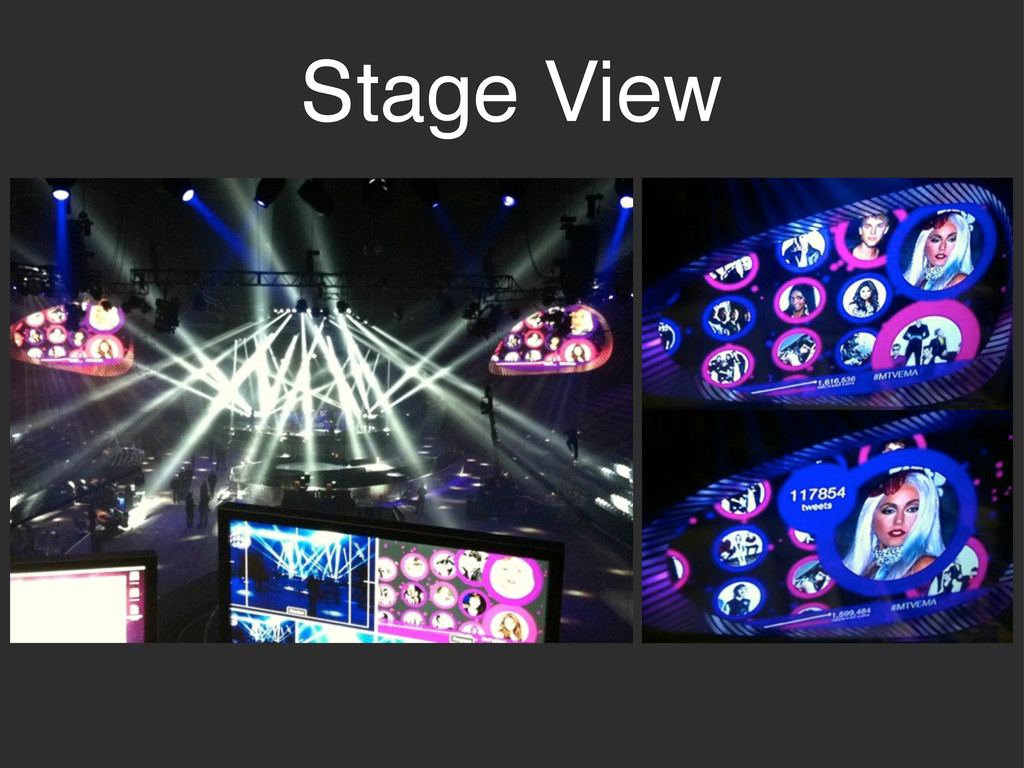
Stage View
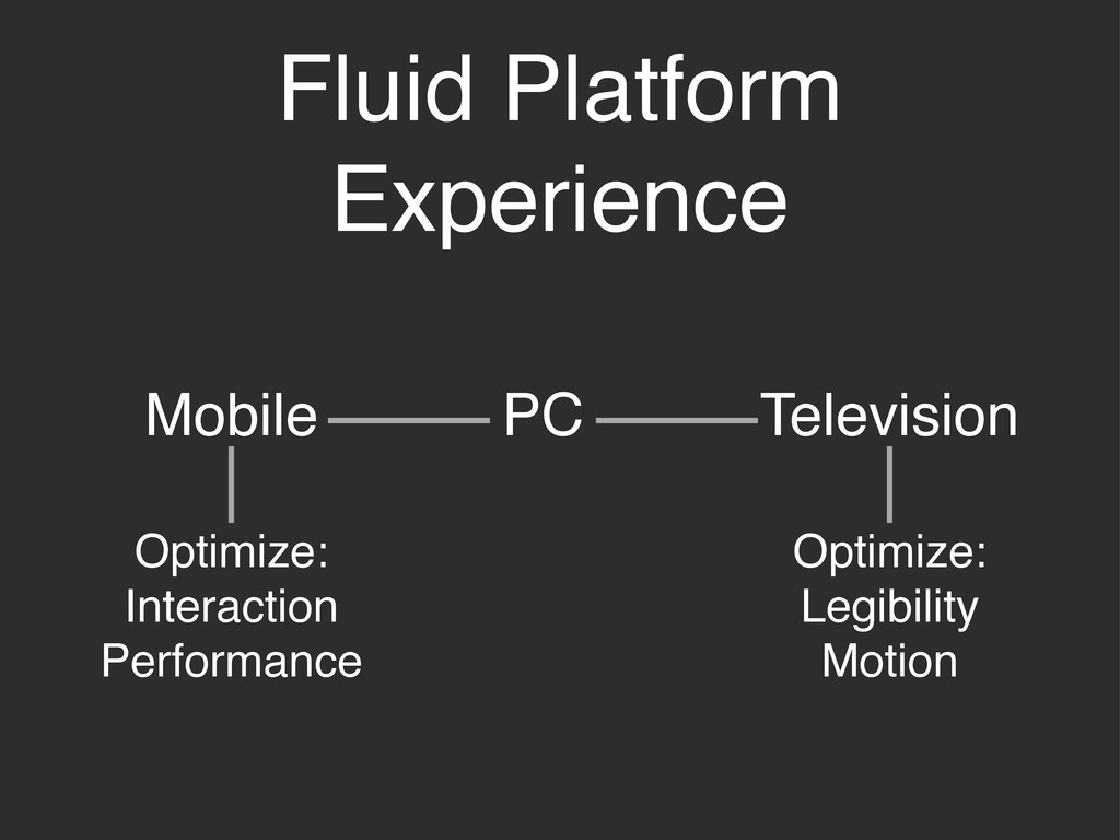
Fluid Platform Experience PC Mobile Television Optimize: Interaction Performance Optimize:
Legibility Motion
None
Thanks!
[email protected]
@rachelbinx
 binx
binx
 sarafernandez
 keithpitt
 sstephenson
 aleyda
 nikkihalliwell
 tammyeverts
 katiecoart
 oripsolob
 portentint
 notwaldorf
 jct
jct
![Thanks! [email protected] @rachelbinx](https://files.speakerdeck.com/presentations/4f47ebb408476d00220014a6/slide_21.jpg)