Upgrade to Pro
— share decks privately, control downloads, hide ads and more …
Speaker Deck
Features
Speaker Deck
PRO
Sign in
Sign up for free
Search
Search
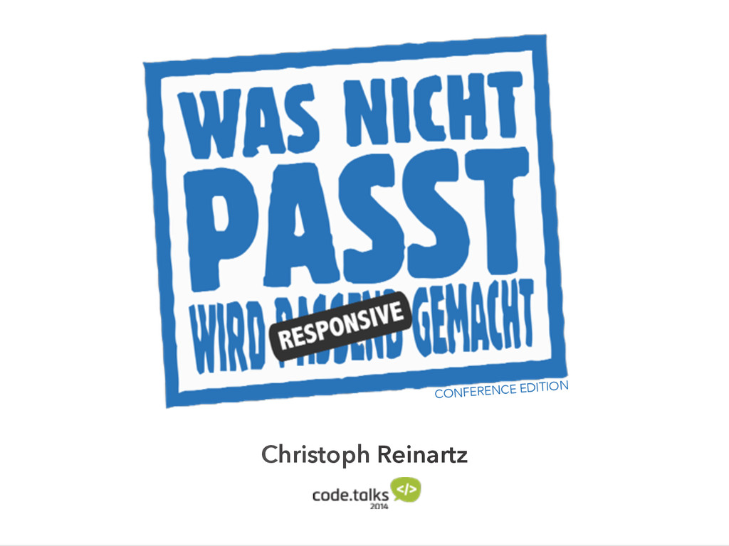
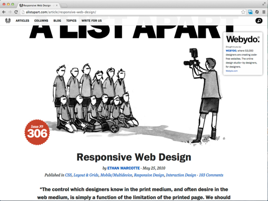
Was nicht passt wird responsive gemacht - confe...
Search
Christoph Reinartz
October 10, 2014
Technology
89
0
Share
Embed
Copy iframe code
Copy JS code
Copy link
Start on current slide
Was nicht passt wird responsive gemacht - conference edition
the slides from my responsive presentation at code.talks 2014 in hamburg
Christoph Reinartz
October 10, 2014
More Decks by Christoph Reinartz
See All by Christoph Reinartz
Lessons learned from running a Design System or How to escape a filter bubble
creinartz
1
410
From Engineering to Product - A True Story
creinartz
0
540
Design Systems Engineering - Scaling User Interfaces @trivago
creinartz
1
710
Design Systems Engineering - Scaling User Interfaces @trivago
creinartz
1
370
Rebuilding an aircraft on the fly
creinartz
2
980
Rebuilding an aircraft on the fly
creinartz
0
250
Rebuilding an aircraft on the fly
creinartz
1
240
Large Scale CSS Refactoring
creinartz
3
890
Large Scale CSS Refactoring
creinartz
0
970
Other Decks in Technology
See All in Technology
AI時代の闇と光
tatsuya1970
0
110
SRE本の知られざる名シーン / The Hidden Gems of Google SRE Book
nari_ex
1
420
脱金融のフューチャー・デザイン / Future Design Beyond Finance
ks91
PRO
0
160
AI時代の開発生産性は、個人技からチーム設計へ
moongift
PRO
4
2.3k
AIが実装を自走する時代の認知負債との戦い
lycorptech_jp
PRO
0
140
そのドキュメント、自動化しませんか?
yuksew
1
290
Terraform共通モジュールをチーム横断で“変えられる”運用へ ― リリースと適用の分離
kekke_n
1
3.3k
CSに"SLO"は要らない、経営層に"99.9%"は伝わらない - SREを全社に"翻訳"する3原則
cscengineer
PRO
1
5k
OPENLOGI Company Profile for engineer
hr01
1
74k
2年前に削除したPHPクラスが、 ある日突然決済をエラーにした
ykagano
1
280
Amplify Gen2でbackend.tsにCDKを定義する/しない事によるCDKの挙動の違いとユースケース
smt7174
1
390
関数型の考えを TypeScript に持ち込んで、テストしやすい純粋関数を増やす / Pure at the Core, Effects at the Edge: Bringing Functional Thinking into TypeScript
kaminashi
2
130
Featured
See All Featured
個人開発の失敗を避けるイケてる考え方 / tips for indie hackers
panda_program
123
22k
Fireside Chat
paigeccino
42
4k
How To Stay Up To Date on Web Technology
chriscoyier
790
250k
HU Berlin: Industrial-Strength Natural Language Processing with spaCy and Prodigy
inesmontani
PRO
0
530
Beyond borders and beyond the search box: How to win the global "messy middle" with AI-driven SEO
davidcarrasco
3
180
Efficient Content Optimization with Google Search Console & Apps Script
katarinadahlin
PRO
1
720
What's in a price? How to price your products and services
michaelherold
247
13k
RailsConf 2023
tenderlove
30
1.5k
Unsuck your backbone
ammeep
672
58k
エンジニアに許された特別な時間の終わり
watany
108
250k
Cheating the UX When There Is Nothing More to Optimize - PixelPioneers
stephaniewalter
287
14k
What’s in a name? Adding method to the madness
productmarketing
PRO
24
4.1k
Transcript
Christoph Reinartz CONFERENCE EDITION
@pistenprinz
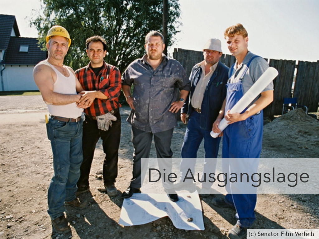
Die Ausgangslage (c) Senator Film Verleih
https://www.flickr.com/photos/glenscott/509720363
https://www.flickr.com/photos/lukew/10430507184/
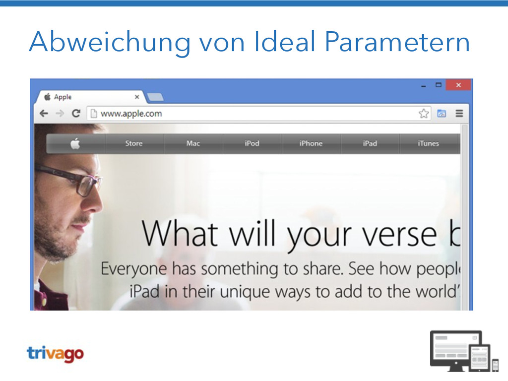
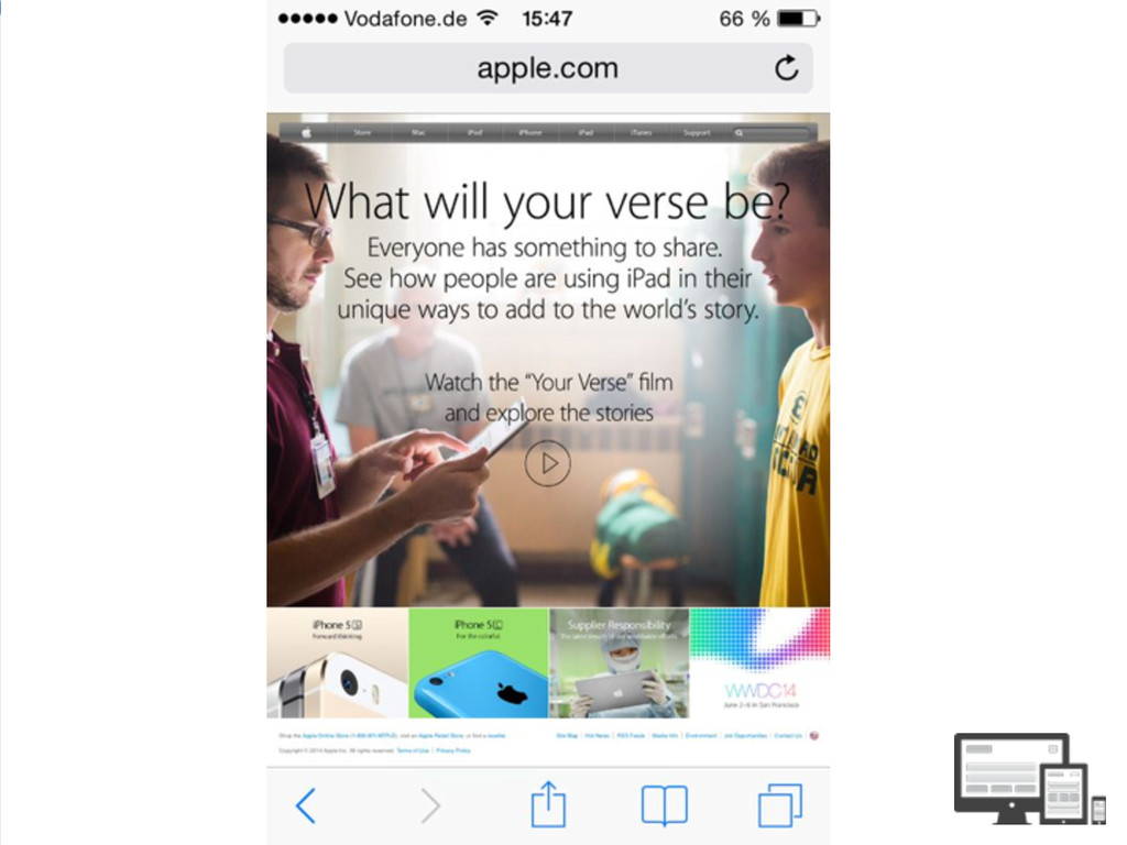
Abweichung von Ideal Parametern
None
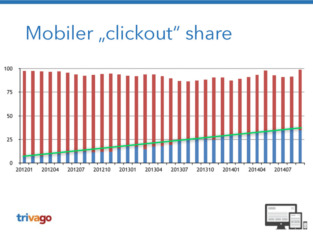
Mobiler traffic
Mobiler „clickout“ share
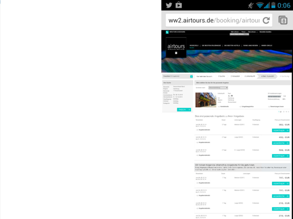
Der klassische Ansatz • 2 Webseiten • Desktop-Seite • speziell
auf mobile Geräte angepasste mobile Seite • Redirect auf m. * je nach User-Agent
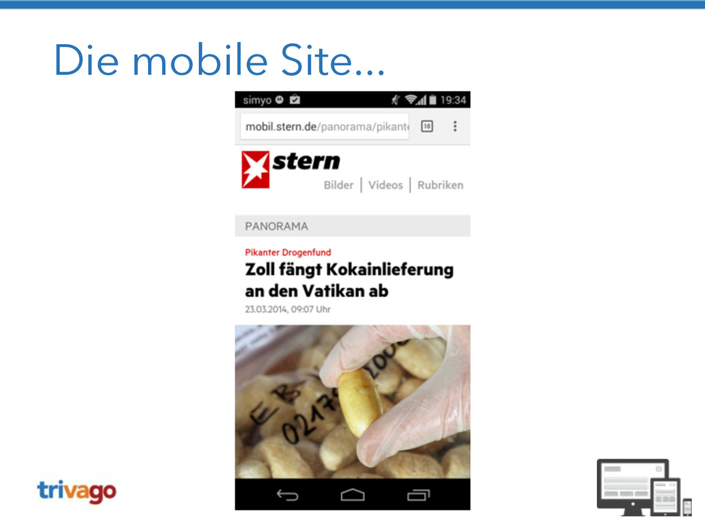
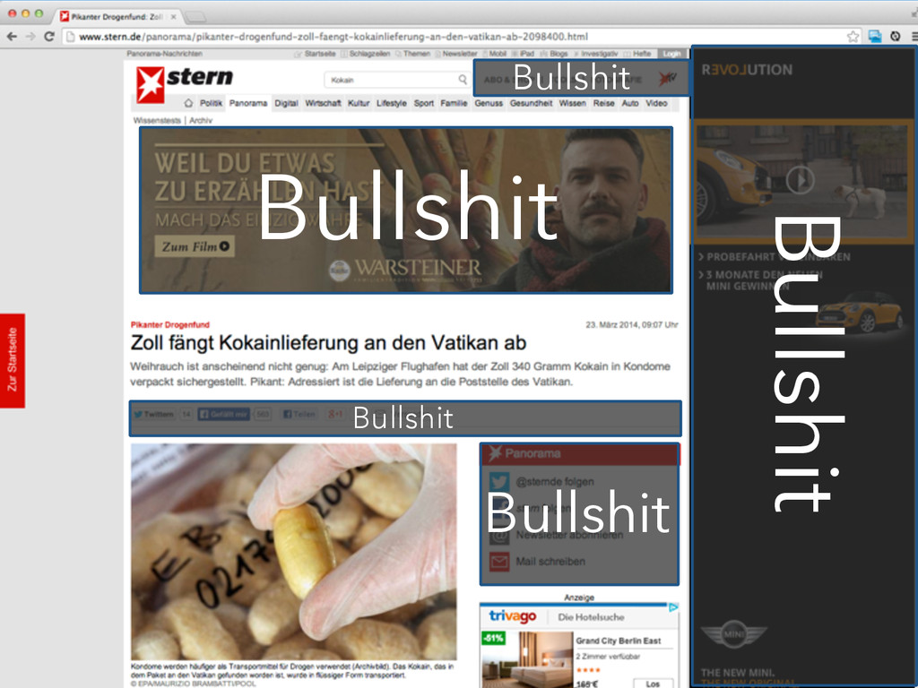
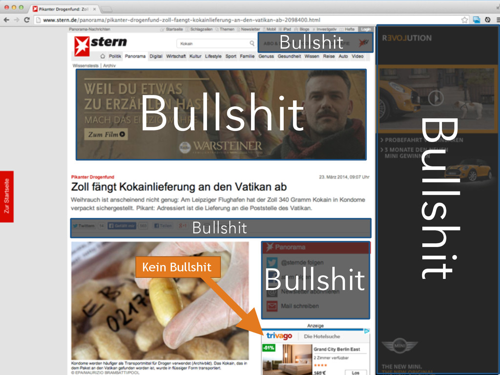
Die mobile Site...
Die mobile Site...
None
Bullshit
Bullshit Bullshit Bullshit Bullshit Bullshit
Bullshit Bullshit Bullshit Bullshit Bullshit Kein Bullshit
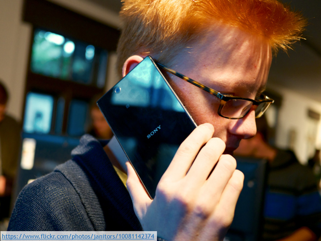
https://www.flickr.com/photos/janitors/10081142374
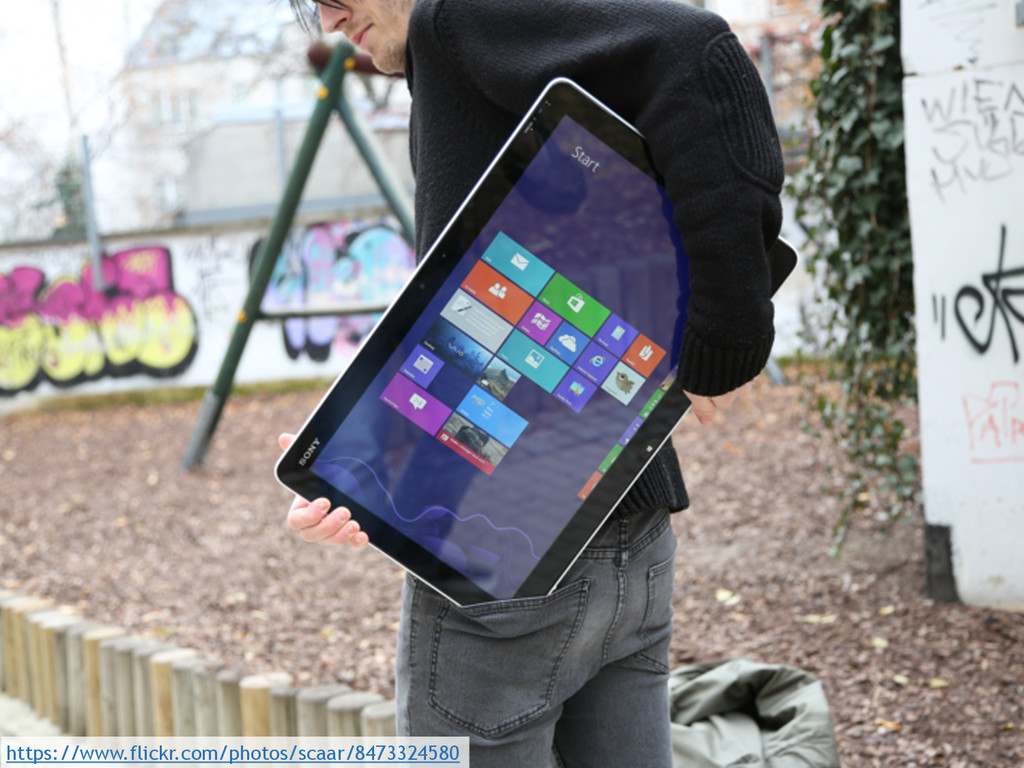
https://www.flickr.com/photos/scaar/8473324580
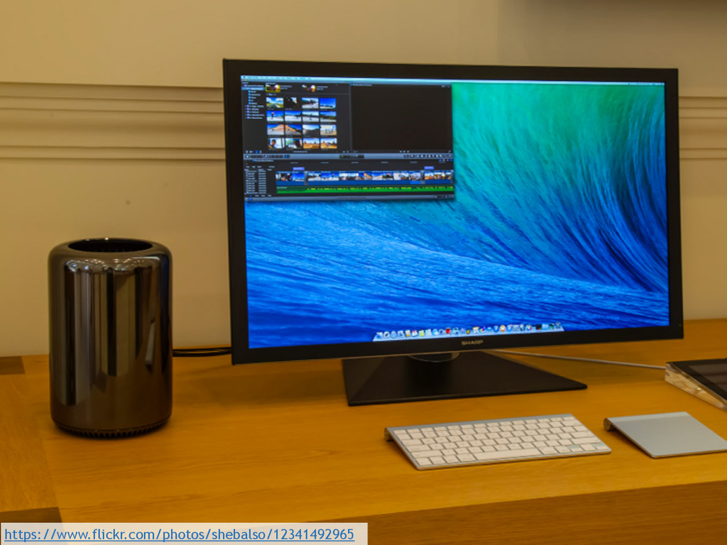
https://www.flickr.com/photos/shebalso/12341492965
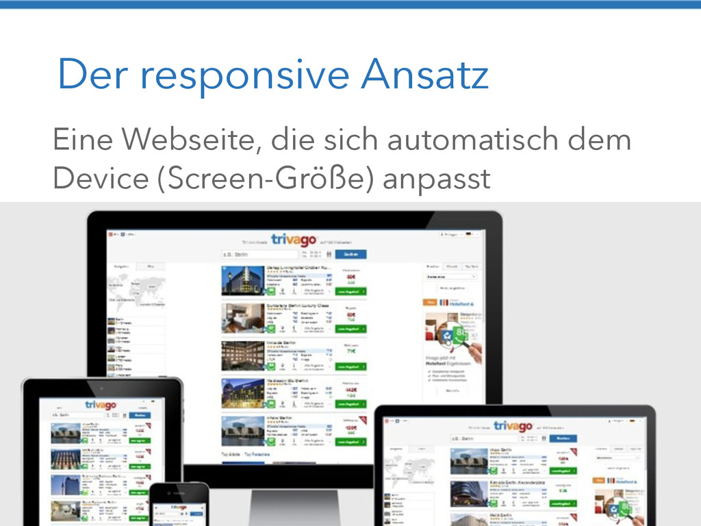
Der responsive Ansatz Eine Webseite, die sich automatisch dem Device
(Screen-Größe) anpasst
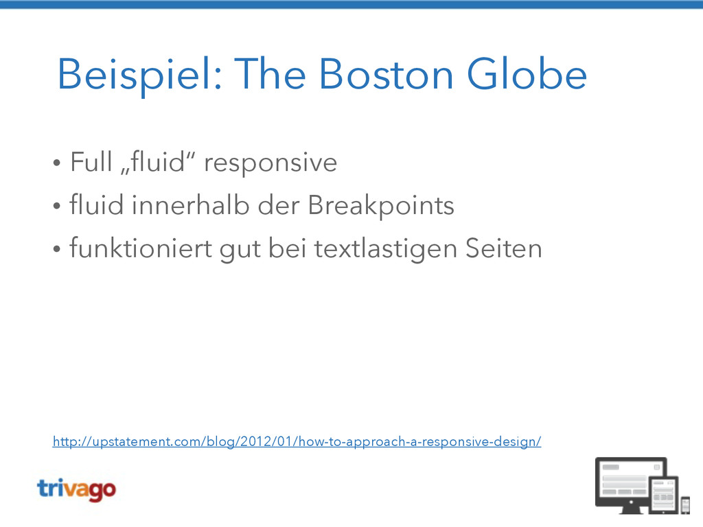
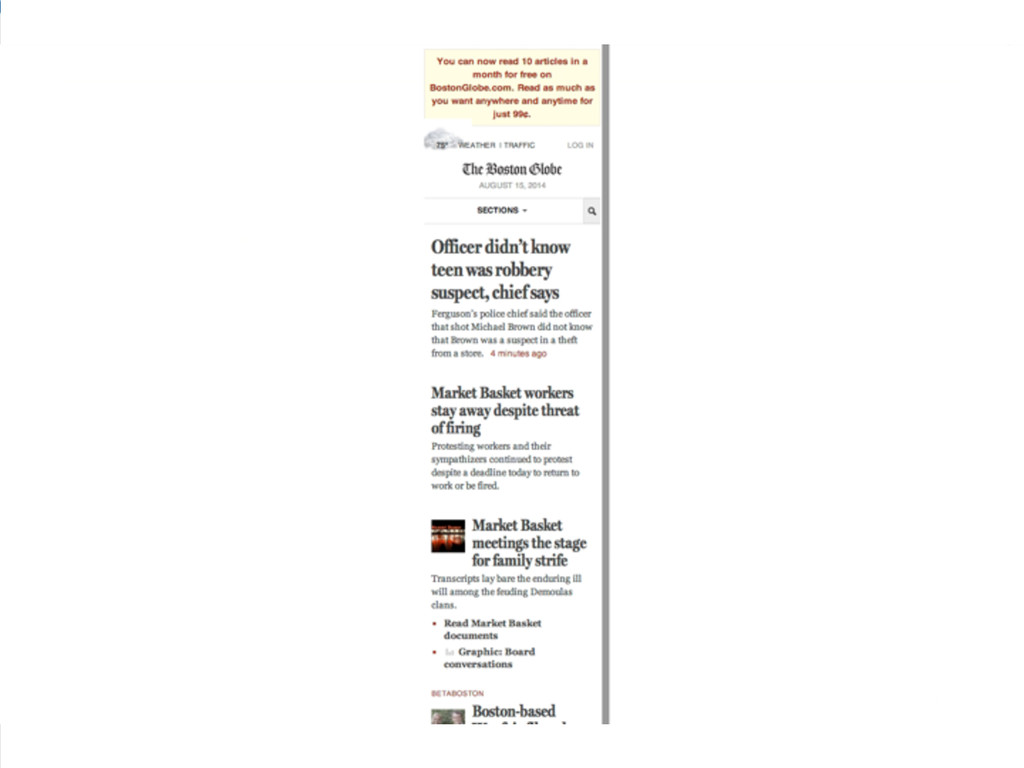
Beispiel: The Boston Globe • Full „fluid“ responsive • fluid
innerhalb der Breakpoints • funktioniert gut bei textlastigen Seiten http://upstatement.com/blog/2012/01/how-to-approach-a-responsive-design/
None
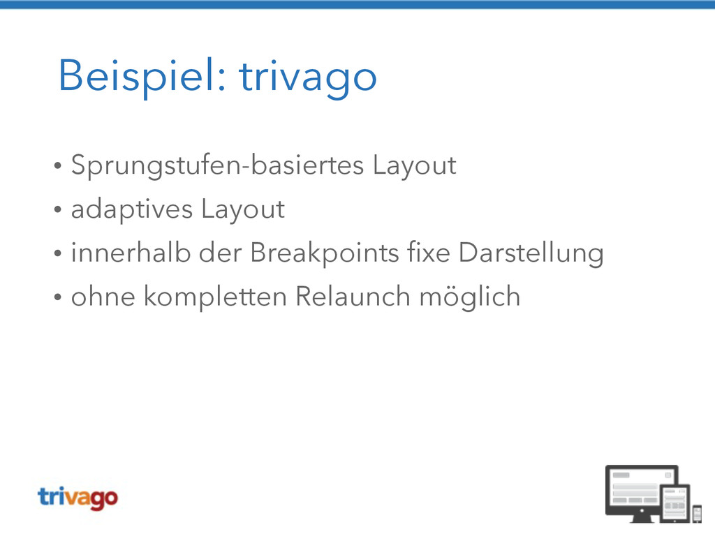
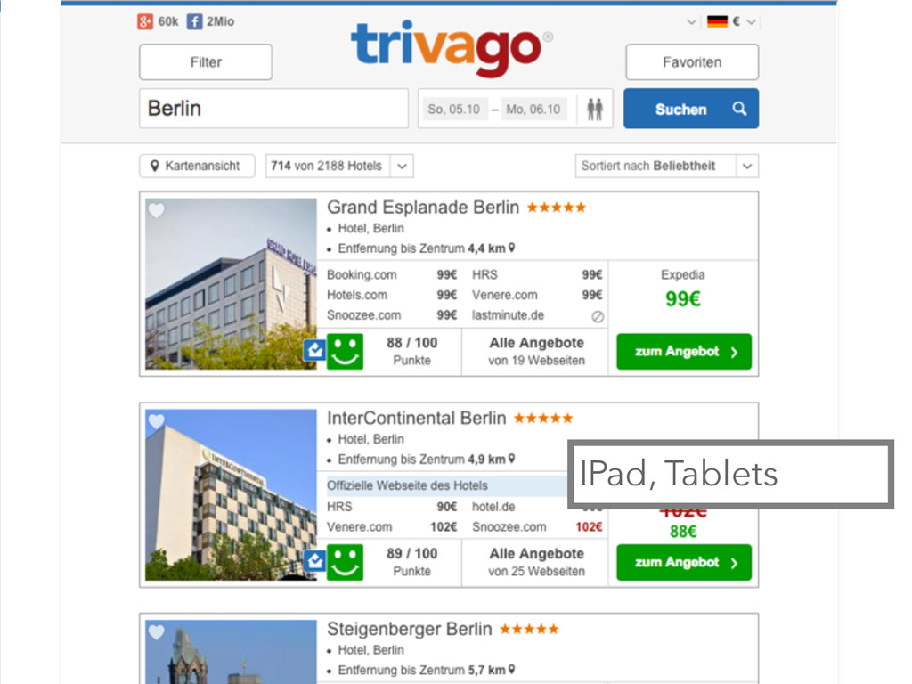
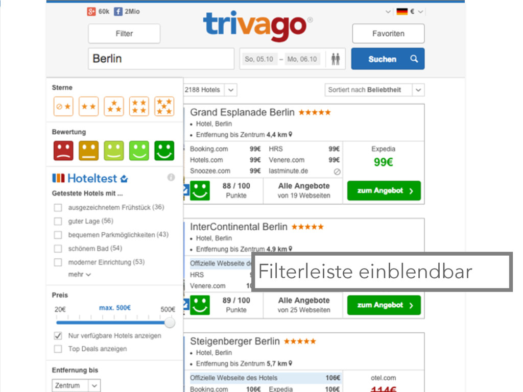
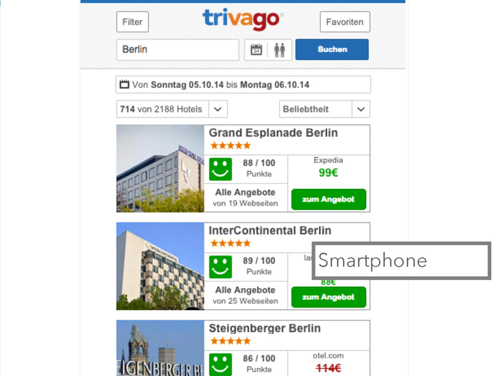
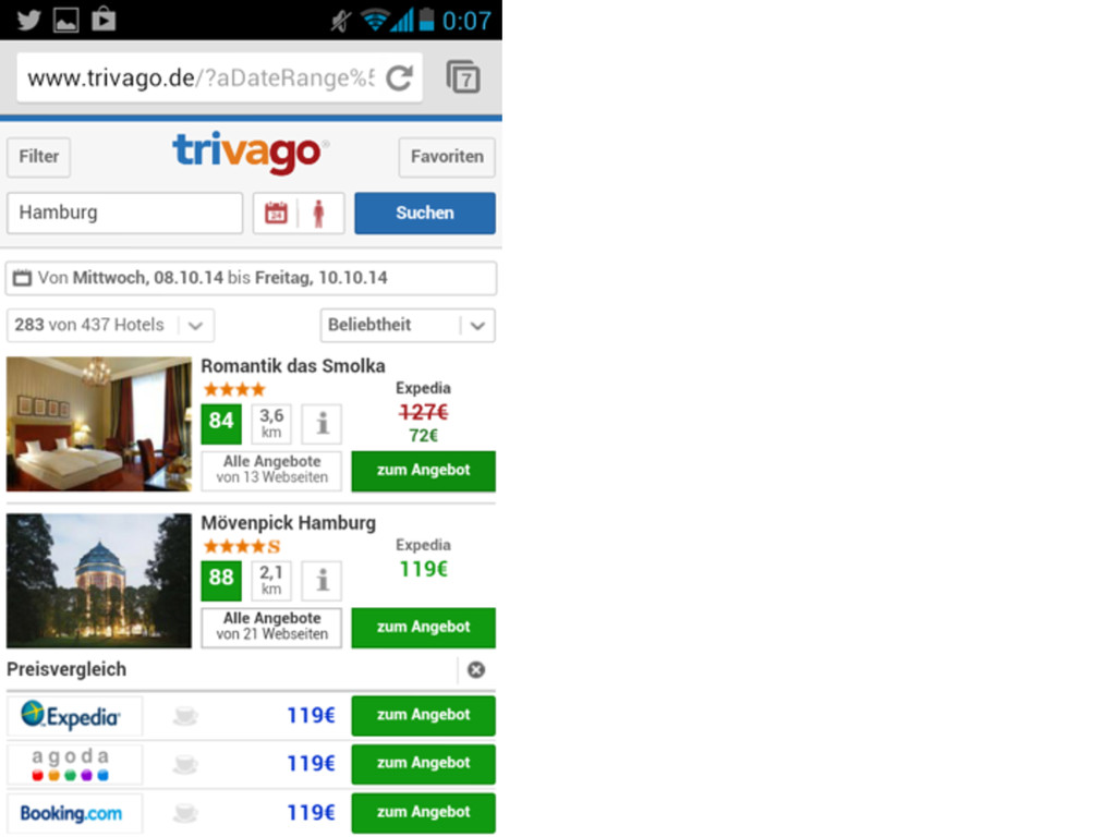
Beispiel: trivago • Sprungstufen-basiertes Layout • adaptives Layout • innerhalb
der Breakpoints fixe Darstellung • ohne kompletten Relaunch möglich
Desktop, iMac, Laptop
Landscape Tablet, Netbook
IPad, Tablets
Filterleiste einblendbar
Smartphone
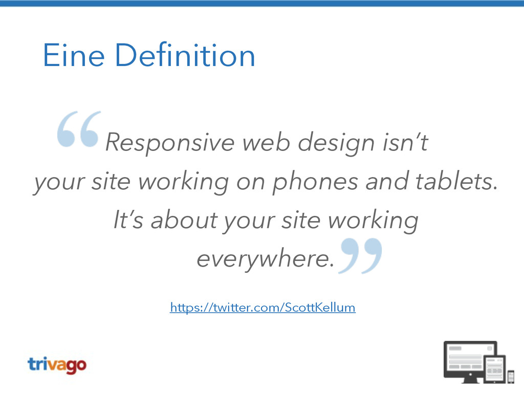
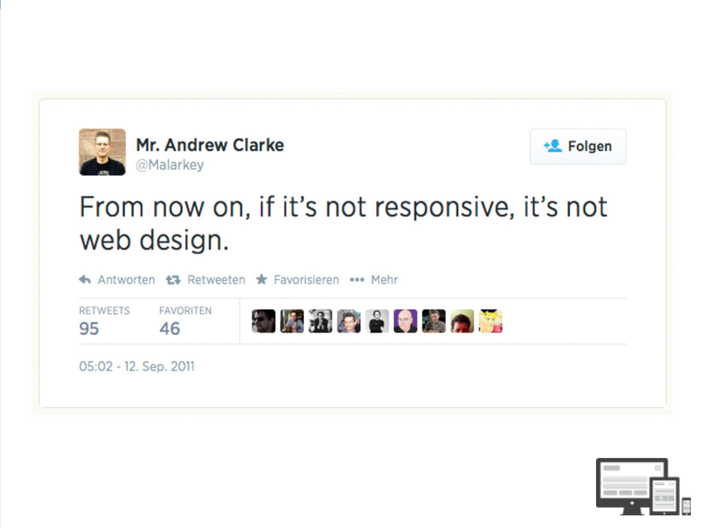
Eine Definition Responsive web design isn’t your site working on
phones and tablets. It’s about your site working everywhere. https://twitter.com/ScottKellum
Ich würde sagen dat passt! (c) Senator Film Verleih
None
None
None
None
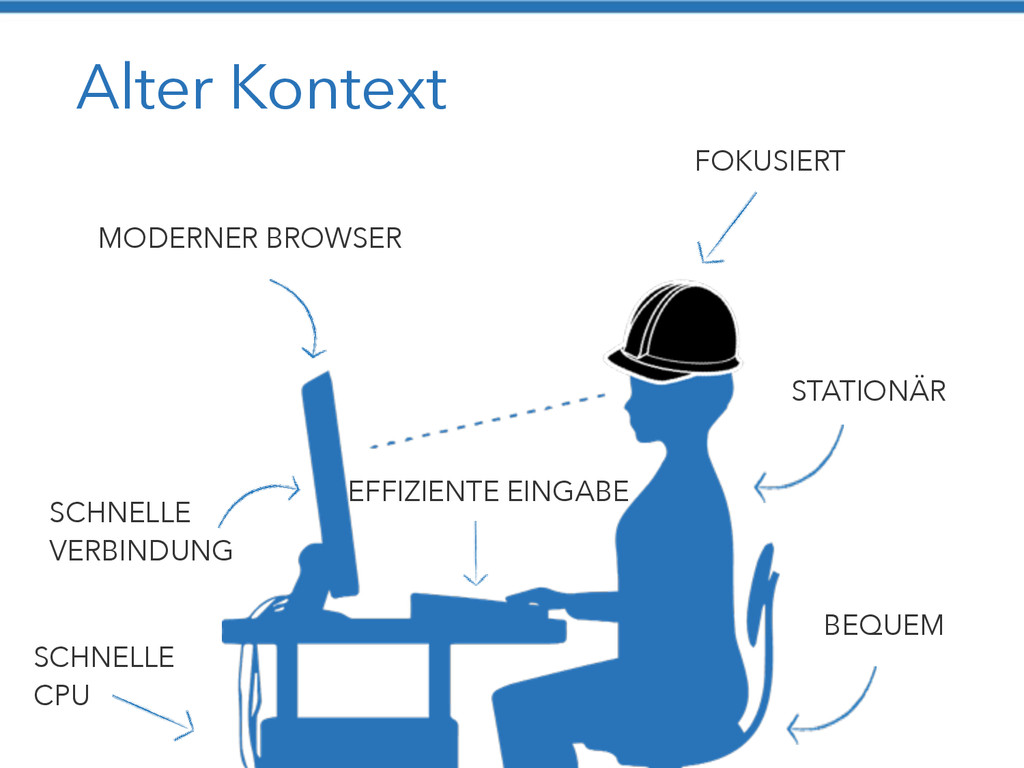
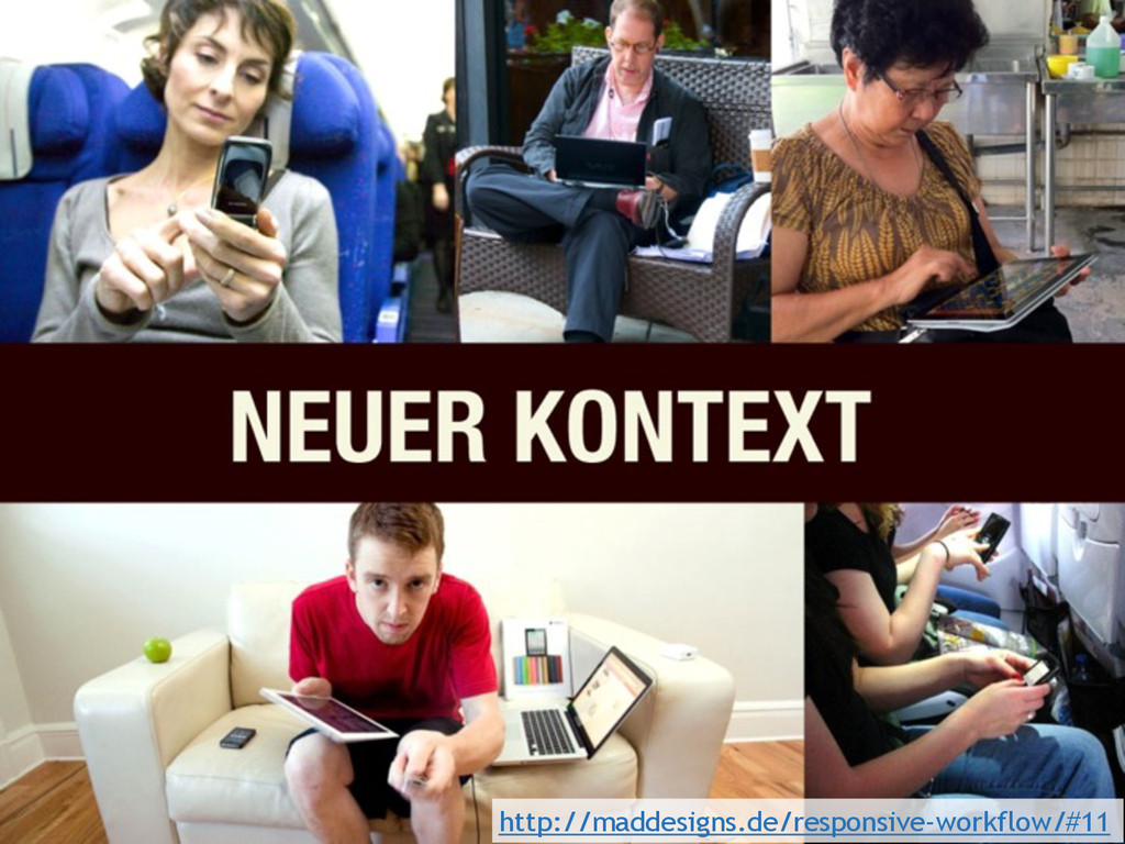
Alter Kontext MODERNER BROWSER FOKUSIERT STATIONÄR BEQUEM SCHNELLE VERBINDUNG SCHNELLE
CPU EFFIZIENTE EINGABE
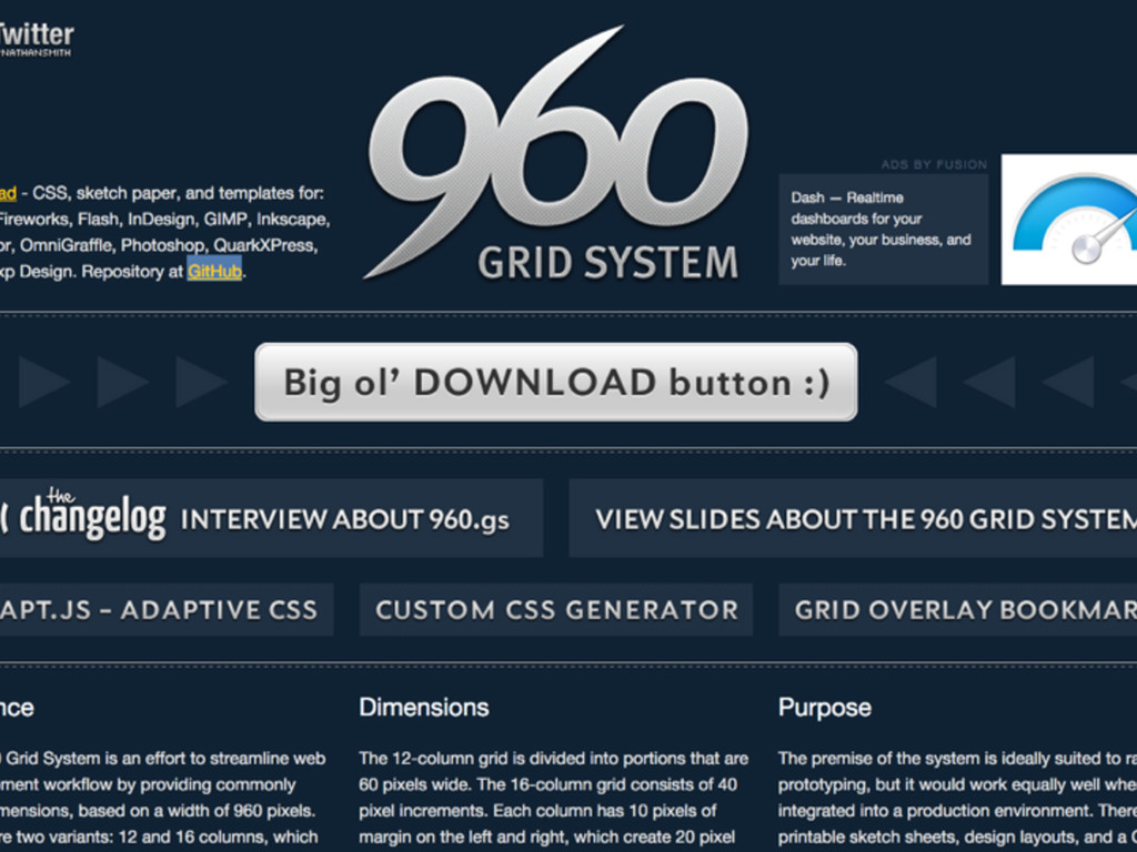
960 https://www.flickr.com/photos/tomwachtel/14015354802
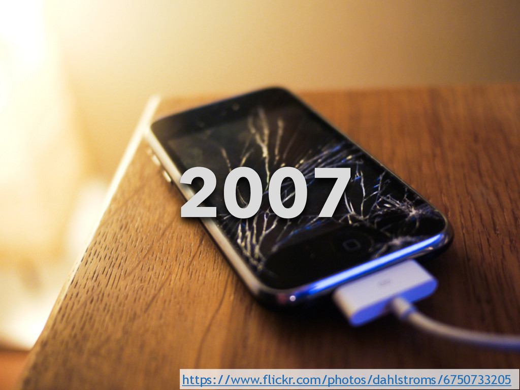
2007 https://www.flickr.com/photos/dahlstroms/6750733205
http://maddesigns.de/responsive-workflow/#11
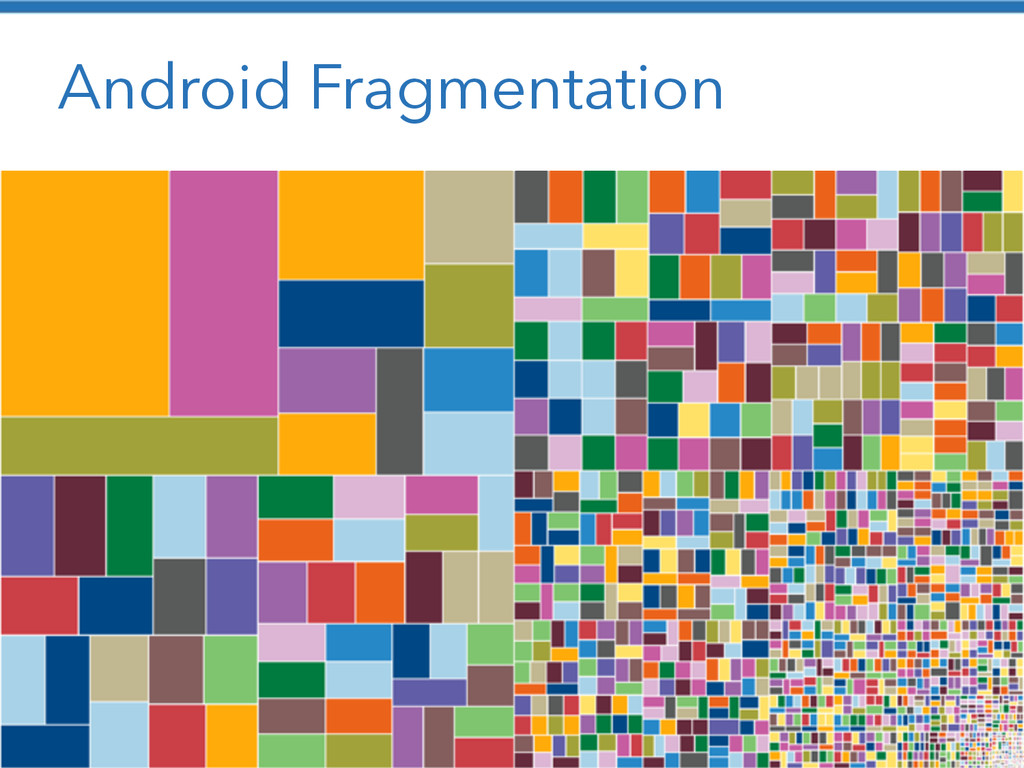
Android Fragmentation http://bradfrostweb.com/blog/web/responsive-web-design-missing-the-point/
None
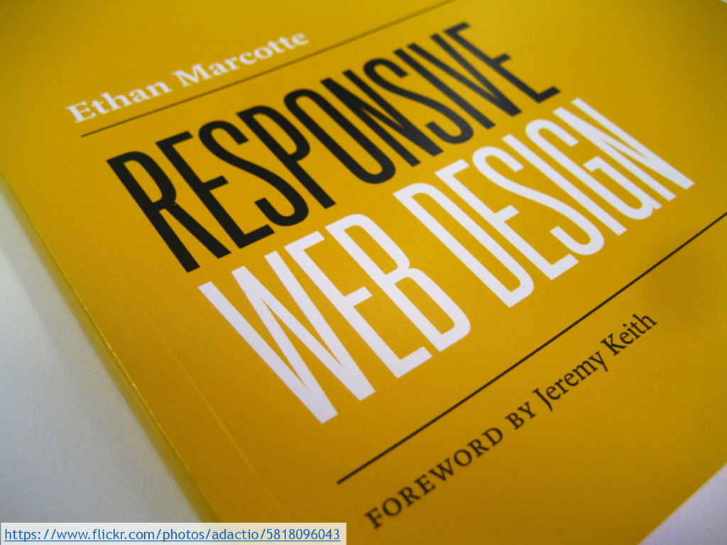
https://www.flickr.com/photos/adactio/5818096043
None
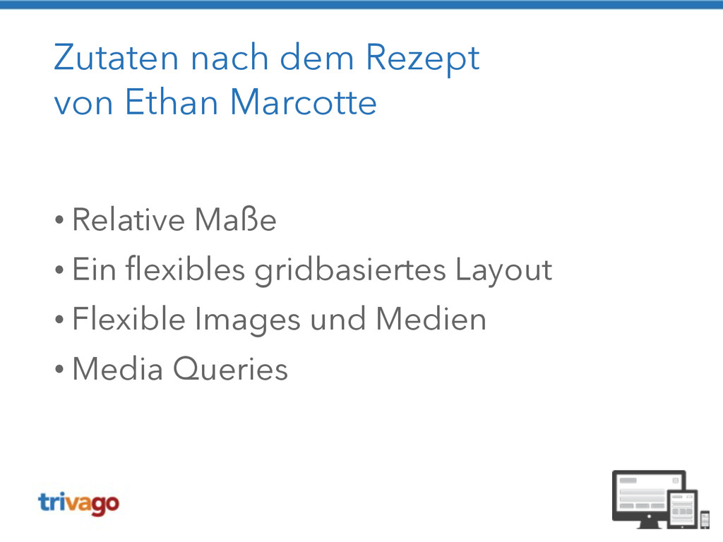
Zutaten nach dem Rezept von Ethan Marcotte ! •
Relative Maße • Ein flexibles gridbasiertes Layout • Flexible Images und Medien • Media Queries
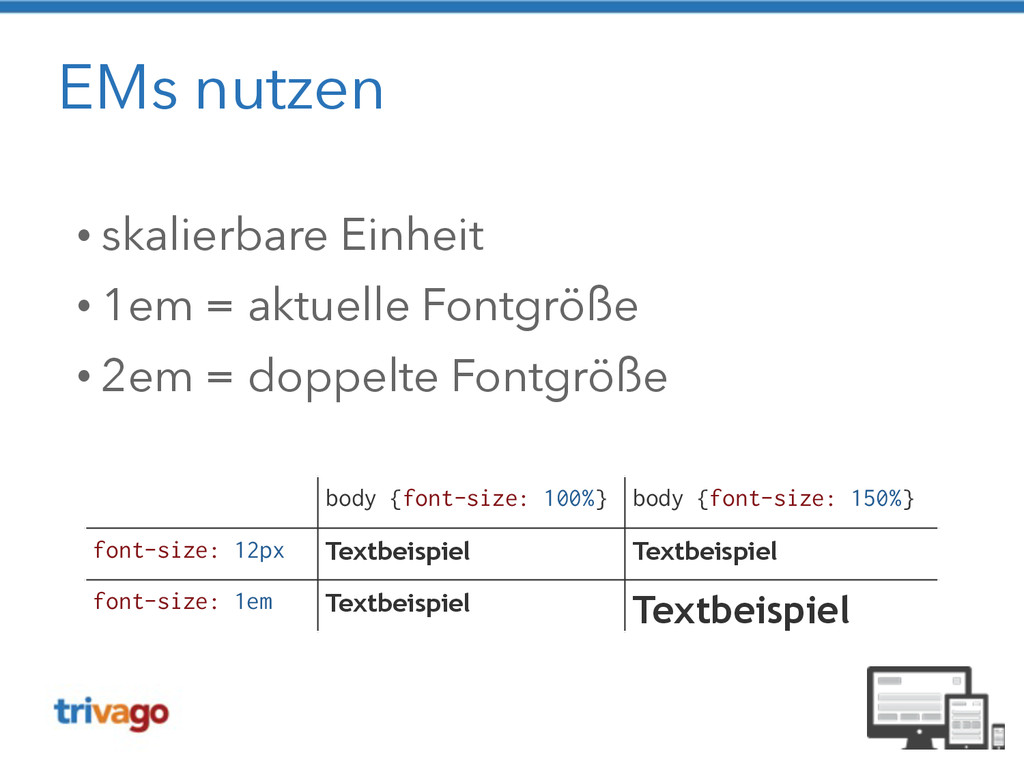
EMs nutzen • skalierbare Einheit • 1em = aktuelle Fontgröße
• 2em = doppelte Fontgröße body {font-size: 100%} body {font-size: 150%} font-size: 12px Textbeispiel Textbeispiel font-size: 1em Textbeispiel Textbeispiel
None
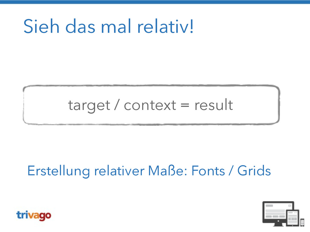
Sieh das mal relativ! ! ! target / context =
result Erstellung relativer Maße: Fonts / Grids
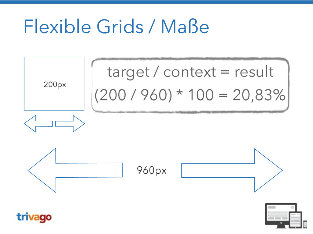
Flexible Grids / Maße 960px 200px target / context =
result (200 / 960) * 100 = 20,83%
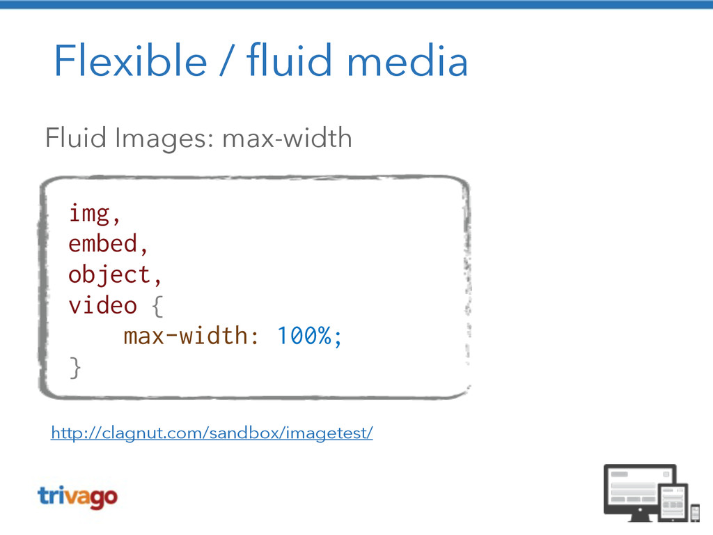
Flexible / fluid media Fluid Images: max-width http://clagnut.com/sandbox/imagetest/ img, embed,
object, video { max-width: 100%; }
Flexible / fluid media
Flexible / fluid media
Flexible / fluid media
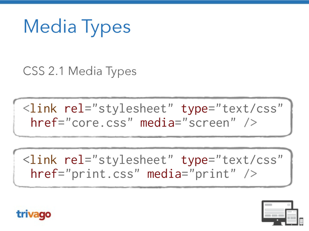
Media Types CSS 2.1 Media Types ! <link rel="stylesheet" type="text/css"
href="core.css" media="screen" /> ! <link rel="stylesheet" type="text/css" href="print.css" media="print" />
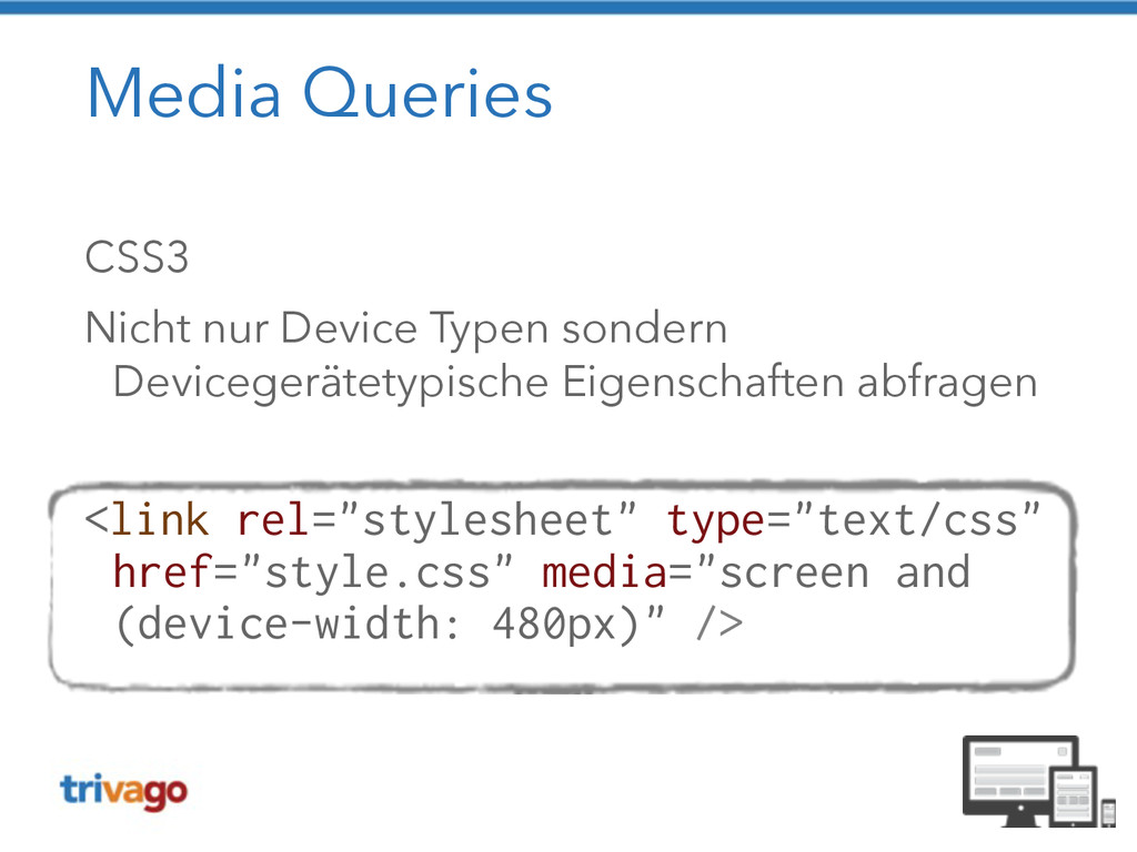
Media Queries CSS3 Nicht nur Device Typen sondern Devicegerätetypische Eigenschaften
abfragen ! <link rel="stylesheet" type="text/css" href="style.css" media="screen and (device-width: 480px)" />
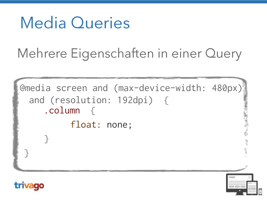
Media Queries Mehrere Eigenschaften in einer Query ! @media screen
and (max-device-width: 480px) and (resolution: 192dpi) { .column { float: none; } }
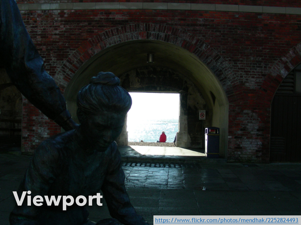
Viewport https://www.flickr.com/photos/mendhak/2252824493
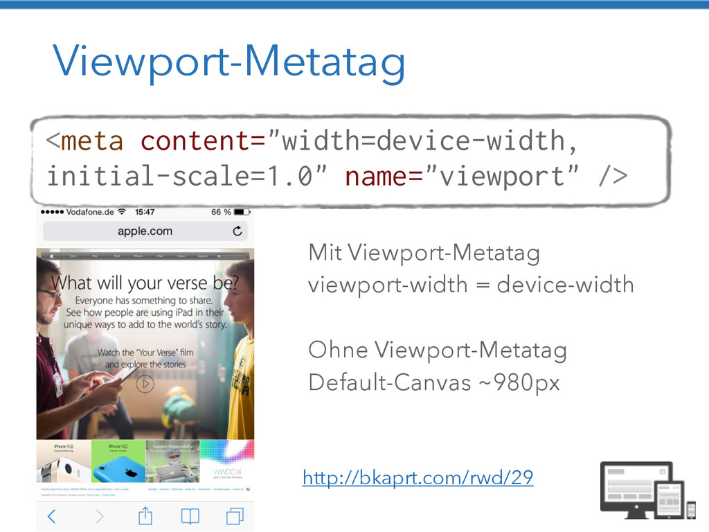
Viewport-Metatag <meta content="width=device-width, initial-scale=1.0" name="viewport" /> Mit Viewport-Metatag viewport-width =
device-width ! Ohne Viewport-Metatag Default-Canvas ~980px http://bkaprt.com/rwd/29
Klassischer Workflow http://blog.meltmedia.com/2013/04/a-clients-prep-guide-for-a- responsive-project/
Responsive Workflow http://blog.meltmedia.com/2013/04/a-clients-prep-guide-for-a- responsive-project/
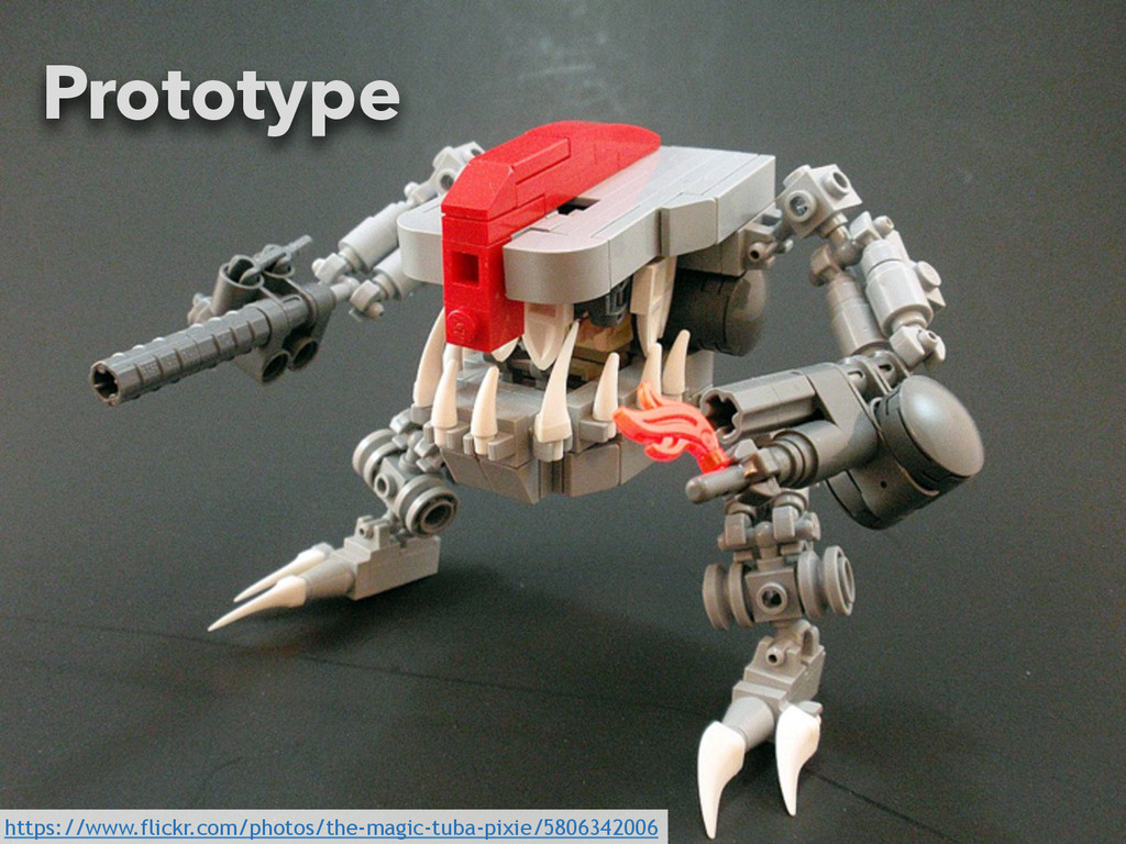
59 https://www.flickr.com/photos/the-magic-tuba-pixie/5806342006 Prototype
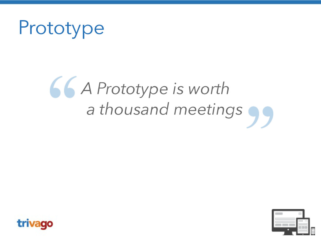
Prototype A Prototype is worth a thousand meetings
Aus der Praxis (c) Senator Film Verleih
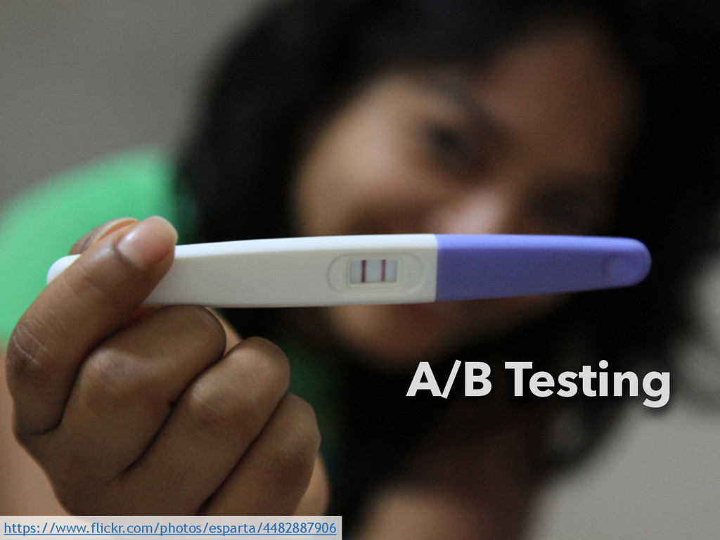
A/B Testing https://www.flickr.com/photos/esparta/4482887906
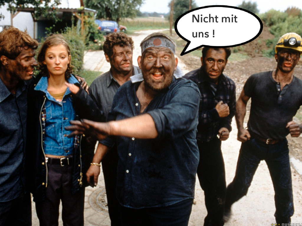
Der User schlägt zurück
Der User schlägt zurück Nicht mit uns !
Der User schlägt zurück https://www.flickr.com/photos/95284782@N06/8880500036
Jawohl, dat passt! (c) Senator Film Verleih
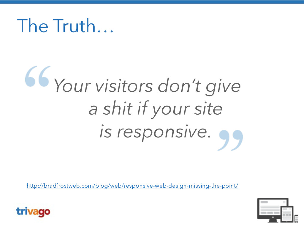
The Truth… Your visitors don’t give a shit if
your site is responsive. http://bradfrostweb.com/blog/web/responsive-web-design-missing-the-point/
None
None
None
So doch nicht !!
Mobile Strategie You May Be Losing Users If Responsive
Web Design Is Your Only Mobile Strategy http://www.smashingmagazine.com/2014/07/22/responsive-web-design-should-not-be-your-only-mobile-strategy/
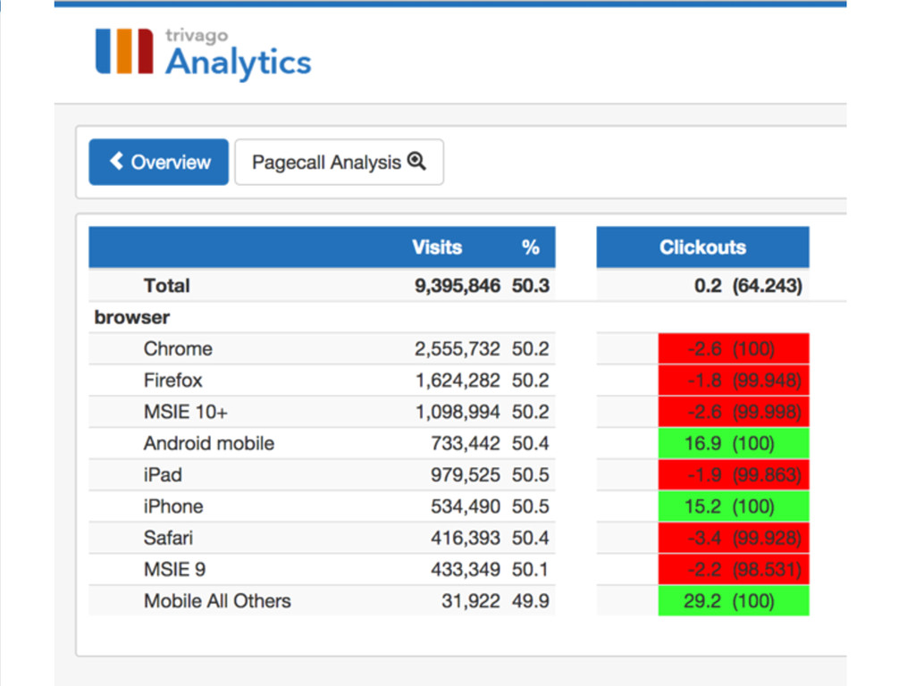
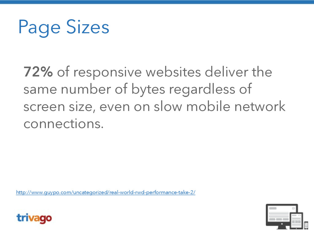
Page Sizes 72% of responsive websites deliver the same number
of bytes regardless of screen size, even on slow mobile network connections. http://www.guypo.com/uncategorized/real-world-rwd-performance-take-2/
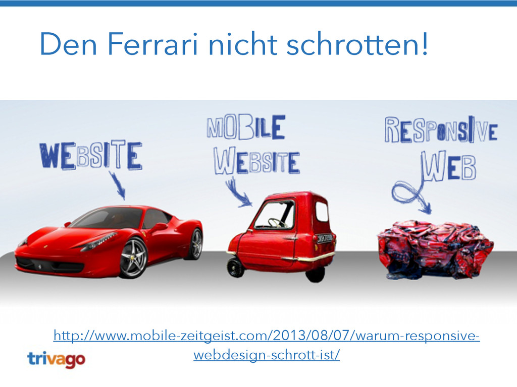
Den Ferrari nicht schrotten! http://www.mobile-zeitgeist.com/2013/08/07/warum-responsive- webdesign-schrott-ist/
Verbesserungen https://www.flickr.com/photos/91173606@N00/3448611327
Gleiche URL, aber andere Struktur https://www.flickr.com/photos/chrisdlugosz/3402955869
Mobile First Ansatz wählen https://www.flickr.com/photos/pixel_boogie/3451813645
Content First https://www.flickr.com/photos/klara/4236116910
Performance messen / verbessern https://www.flickr.com/photos/aussiegall/286709039
Auf echten Devices testen https://www.flickr.com/photos/hysysk/4042285394
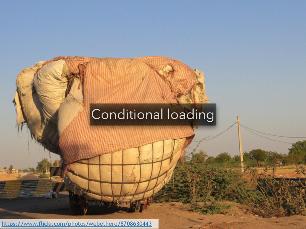
Conditional loading https://www.flickr.com/photos/webethere/8708630443
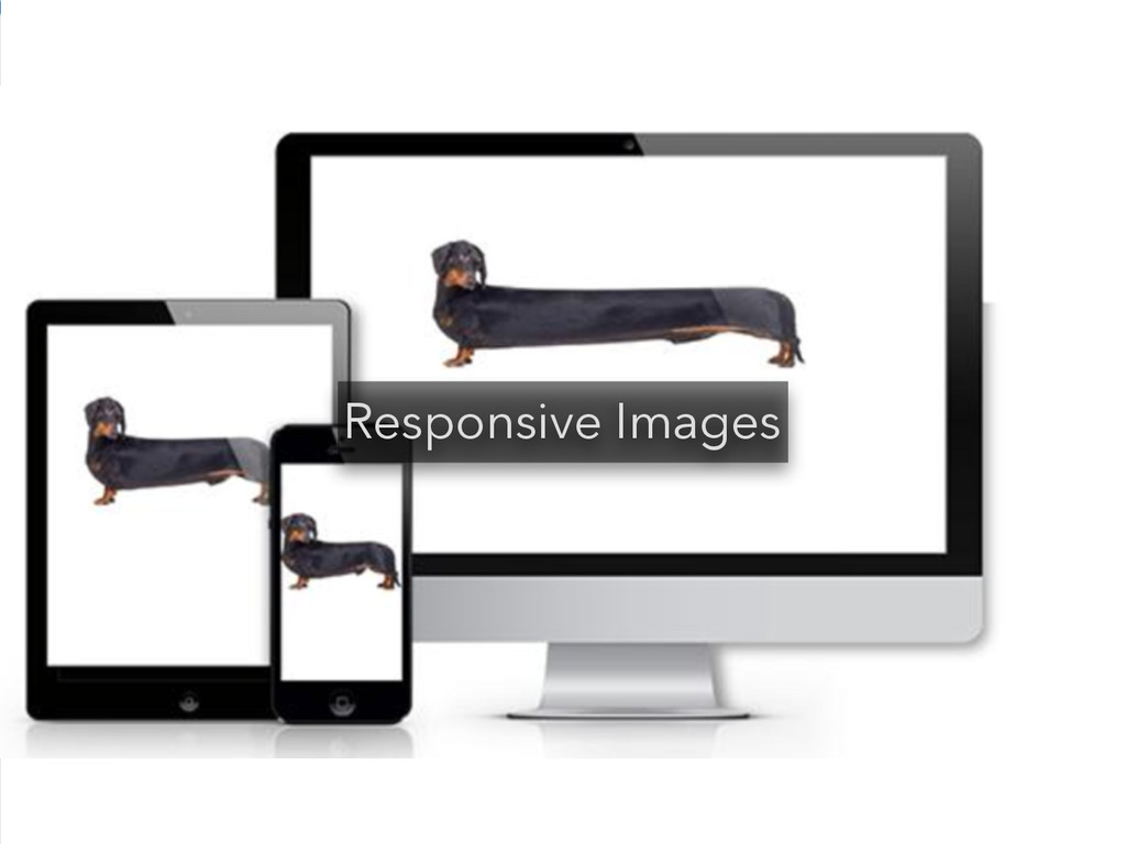
Responsive Images
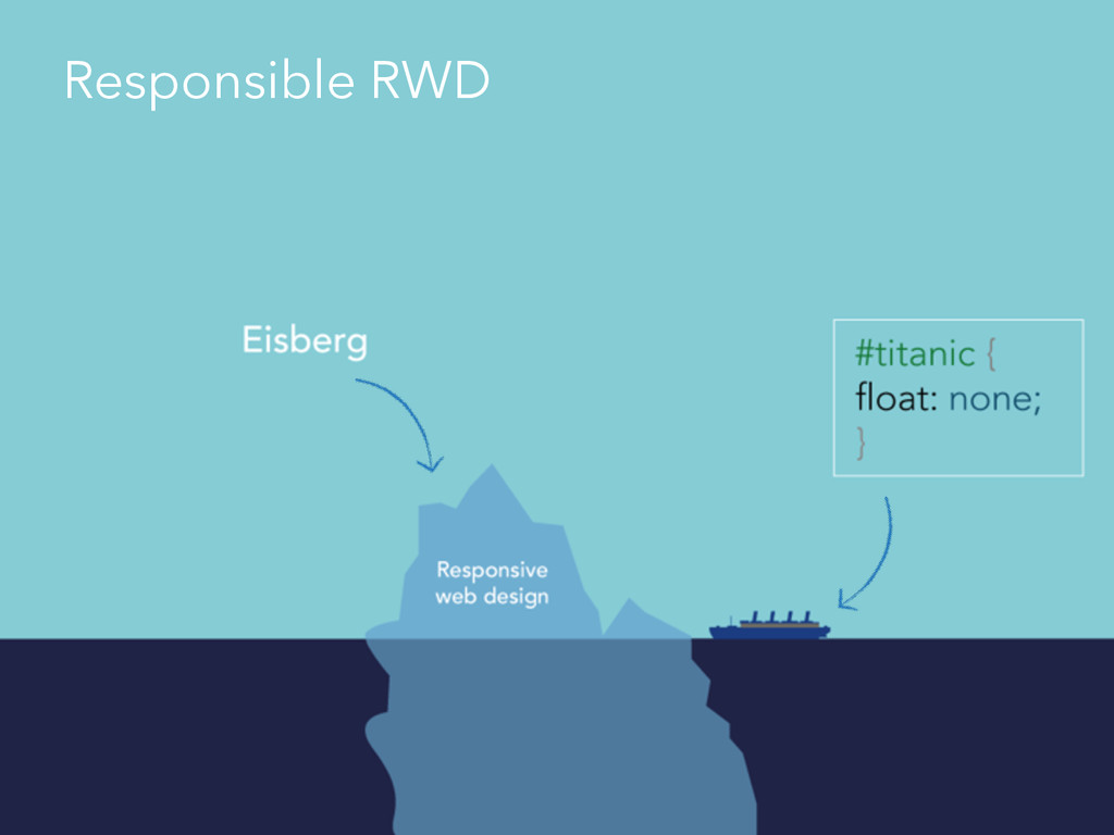
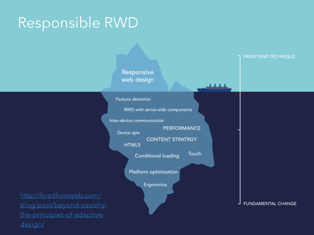
Responsible RWD
http://bradfrostweb.com/ blog/post/beyond-squishy- the-principles-of-adaptive- design/ Responsible RWD
Ich habe fertig! !
Danke! Prosit! (c) Senator Film Verleih
Vielen Dank an Senator Film Verleih
 creinartz
 tatsuya1970
 nari_ex
 ks91
ks91
 moongift
 lycorptech_jp
 yuksew
 kekke_n
 cscengineer
 hr01
hr01
 ykagano
 smt7174
 kaminashi
 panda_program
 paigeccino
 chriscoyier
 inesmontani
 davidcarrasco
 katarinadahlin
 michaelherold
 tenderlove
 ammeep
 watany
 stephaniewalter
 productmarketing