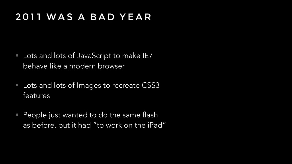
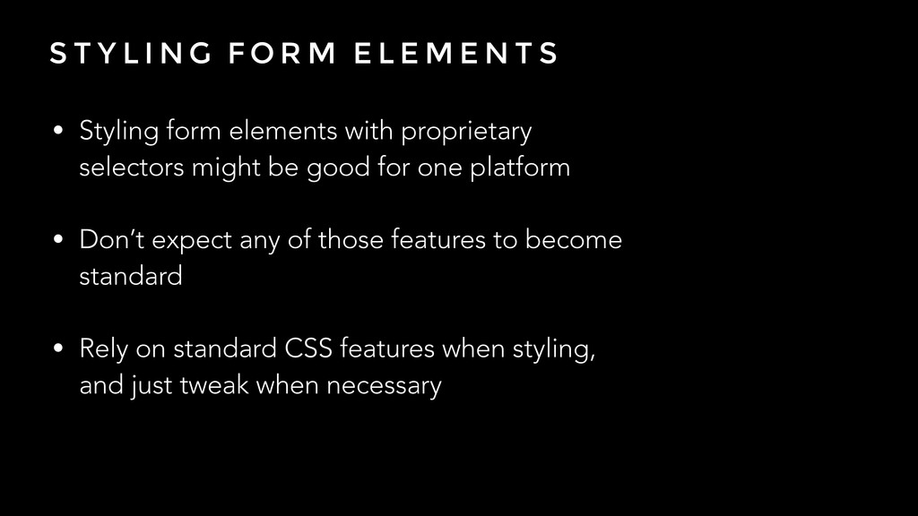
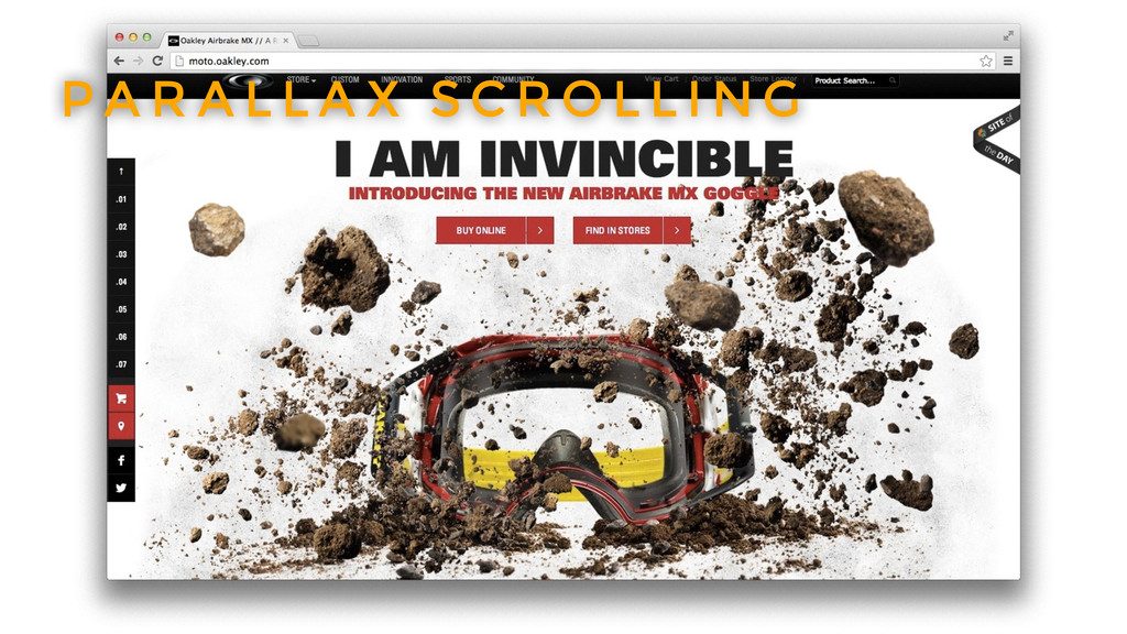
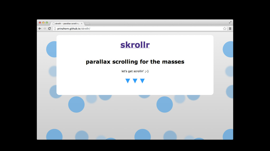
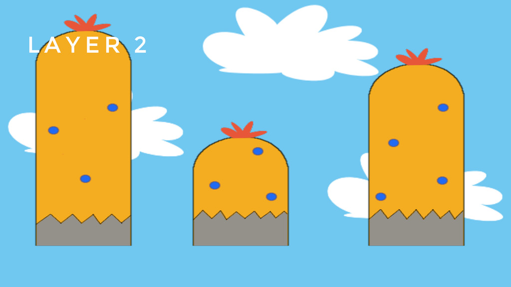
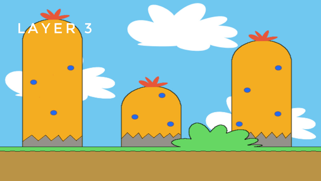
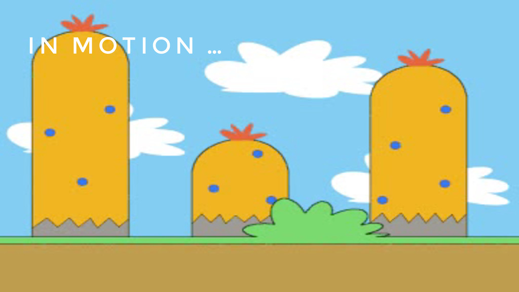
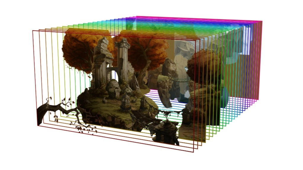
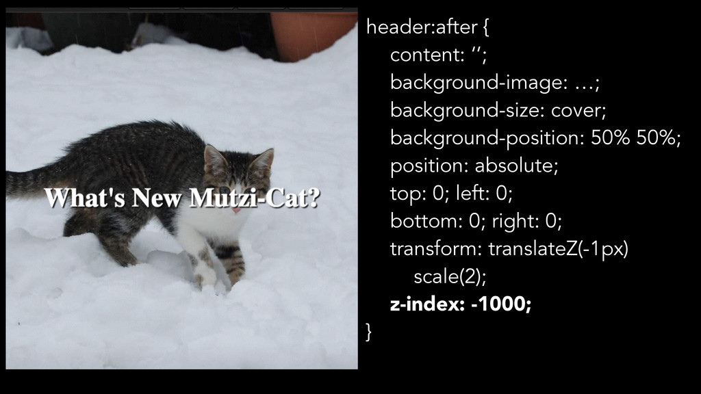
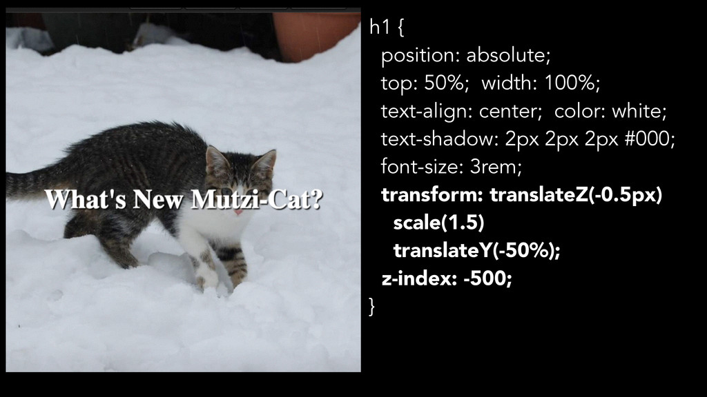
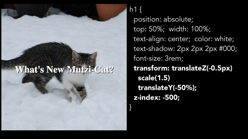
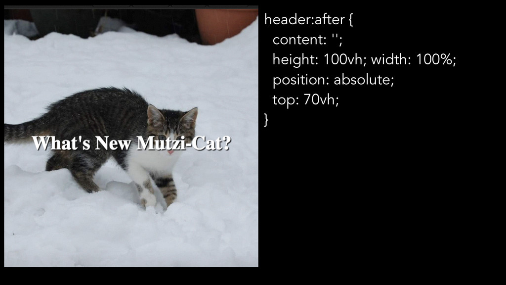
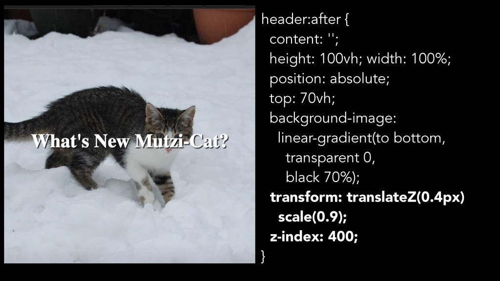
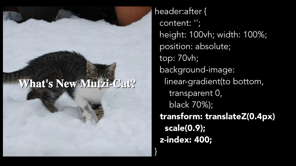
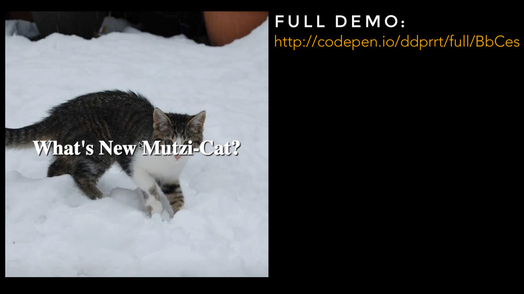
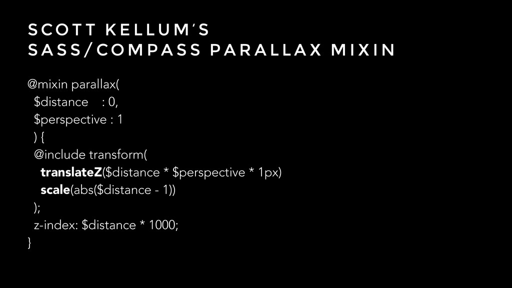
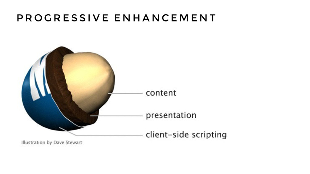
My slides from this year's webinale. Why use JavaScript when the web platform is capable of doing a lot more than you think. We'll look at how to style custom forms and what you can use input elements for, as well as find a natural way of doing Parallax Scrolling just in pure CSS.
 ddprrt
 mikesorae
 alchemy1115
 watany
 miyukki
 segavvy
 srenext
 fossamagna
 amanda_hinchman
 hiracky16
 kimichan
 nenonaninu
 oracle4engineer
 aleyda
 62gerente
 madoxten
 csswizardry
 brettharned
 axbom
axbom
 gurzu
gurzu
 ianozsvald
 szymonslowik
 mayatellez
 thirion
 pedronauck
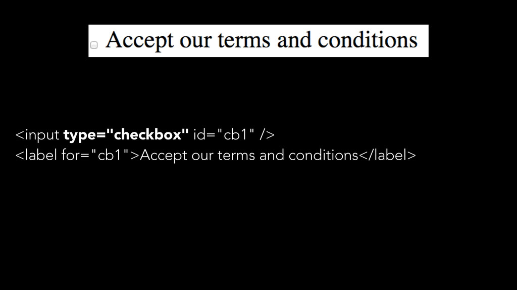
![input[type="checkbox"] { position: absolute; left: -100%; top: -100%; opacity: 0;](https://files.speakerdeck.com/presentations/afdc3470ccaf01314d352e9db9bb7146/slide_25.jpg)
![input[type="checkbox"] + label:before { content: ''; position: absolute; width: 30px;](https://files.speakerdeck.com/presentations/afdc3470ccaf01314d352e9db9bb7146/slide_26.jpg)
![input[type="checkbox"]:checked + label:before { content: '\2713'; text-align: center; }](https://files.speakerdeck.com/presentations/afdc3470ccaf01314d352e9db9bb7146/slide_27.jpg)
![input[type="checkbox"]:focus + label:before { outline: 3px solid blue; }](https://files.speakerdeck.com/presentations/afdc3470ccaf01314d352e9db9bb7146/slide_28.jpg)
![input[type="checkbox"]:focus + label:before { outline: 3px solid blue; } F](https://files.speakerdeck.com/presentations/afdc3470ccaf01314d352e9db9bb7146/slide_29.jpg)