Upgrade to Pro
— share decks privately, control downloads, hide ads and more …
Speaker Deck
Features
Speaker Deck
PRO
Sign in
Sign up for free
Search
Search
TopAppBar Composableをカスタムする
Search
Hunachi
April 04, 2025
Technology
440
0
Share
Embed
Copy iframe code
Copy JS code
Copy link
Start on current slide
TopAppBar Composableをカスタムする
Material3対応のTopAppBar Composableを使いたいけど、デフォルトのUIからカスタムしたい!そんな方向けのスライドです。
Hunachi
April 04, 2025
More Decks by Hunachi
See All by Hunachi
PDF Viewer作成の今までとこれから
hunachi
0
5.1k
Google Play ポリシー対応周りの整理/改善をしてみた
hunachi
1
440
レビューダイアログ機能の取り組みAndroid編 / Review Dialog for Android
hunachi
1
2.3k
Git Hands On for my lab.
hunachi
0
130
Google I/O 2018’s Extensions🦔
hunachi
1
2.9k
ML Kitはいいぞ!
hunachi
0
900
Paging Library は便利だぞ!
hunachi
1
500
Androidについて.
hunachi
0
150
Other Decks in Technology
See All in Technology
「守りたい体験」を渡すだけで E2E を生成させられるようになった話
hinac0
0
190
穢れた技術選定について
watany
17
5.5k
ruby.wasmとPicoRuby.wasmに対応した仮想DOMライブラリを作ってる話 #kaigieffect_kaigi
sue445
PRO
0
150
公式ドキュメントの歩き方etc
coco_se
1
120
個人開発で育てる「大規模設計の苗床」 - AI時代の1人開発から始める業務への知識接続 / The Seedbed for Large-Scale Design - From AI-Era Solo Projects to Professional Knowledge
bitkey
PRO
1
280
壊して学ぶAWS CDK: そのcdk deployで消えるもの、残るもの
k_adachi_01
1
400
しぶいSRE: サーバから見えない障害にどう向き合うか。ラストワンマイルのデバッグ実践 / Shibui SRE
kanny
13
6.5k
Compose 新機能総まとめ / What's New in Jetpack Compose
yanzm
0
320
Network Firewallやっていき!
news_it_enj
0
170
AIレビューはどこまで任せられるのか?自動化と人が背負うレビューの境界
sansantech
PRO
3
1.1k
OPENLOGI Company Profile for engineer
hr01
1
74k
はじめてのWDM
miyukichi_ospf
1
150
Featured
See All Featured
Utilizing Notion as your number one productivity tool
mfonobong
4
420
Cheating the UX When There Is Nothing More to Optimize - PixelPioneers
stephaniewalter
287
14k
Leadership Guide Workshop - DevTernity 2021
reverentgeek
1
320
How to Build an AI Search Optimization Roadmap - Criteria and Steps to Take #SEOIRL
aleyda
1
2.1k
Lightning Talk: Beautiful Slides for Beginners
inesmontani
PRO
2
610
Heart Work Chapter 1 - Part 1
lfama
PRO
8
36k
From π to Pie charts
rasagy
0
240
Reflections from 52 weeks, 52 projects
jeffersonlam
356
21k
Building the Perfect Custom Keyboard
takai
2
810
New Earth Scene 8
popppiees
3
2.4k
Git: the NoSQL Database
bkeepers
PRO
432
67k
Ten Tips & Tricks for a 🌱 transition
stuffmc
0
150
Transcript
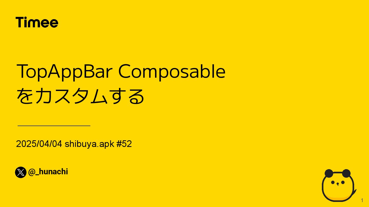
2025/04/04 shibuya.apk #52 TopAppBar Composable をカスタムする @_hunachi 1
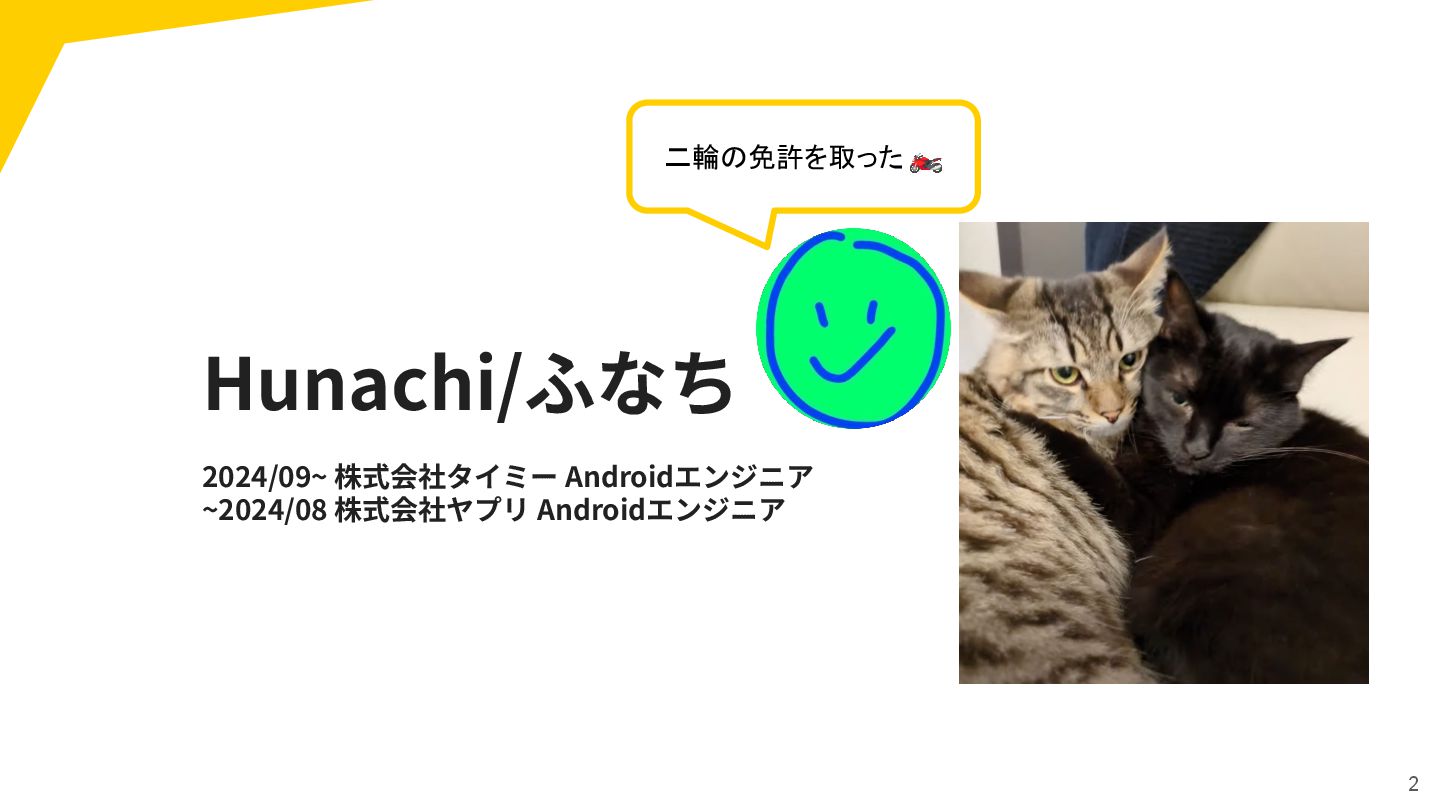
Hunachi/ふなち 2024/09~ 株式会社タイミー Androidエンジニア ~2024/08 株式会社ヤプリ Androidエンジニア 2 二輪の免許を取った 🏍
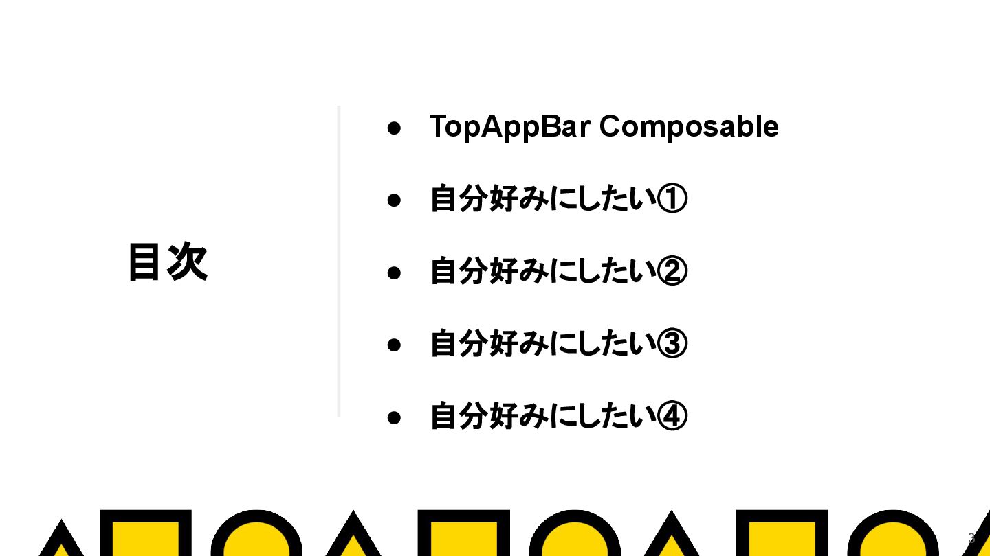
目次 • TopAppBar Composable • 自分好みにしたい① • 自分好みにしたい② • 自分好みにしたい③
• 自分好みにしたい④ 3
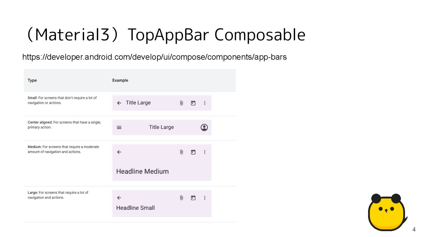
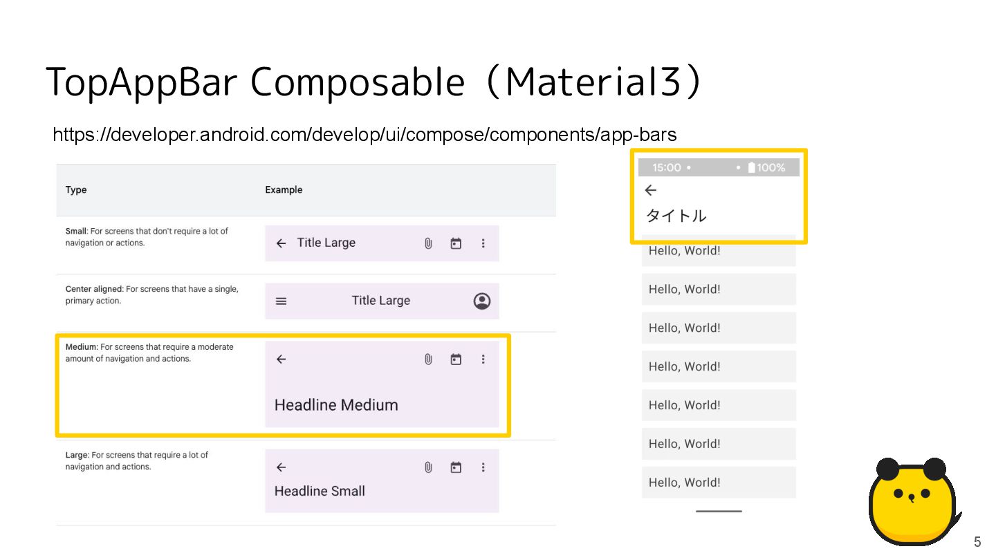
(Material3)TopAppBar Composable 4 https://developer.android.com/develop/ui/compose/components/app-bars
TopAppBar Composable(Material3) 5 https://developer.android.com/develop/ui/compose/components/app-bars
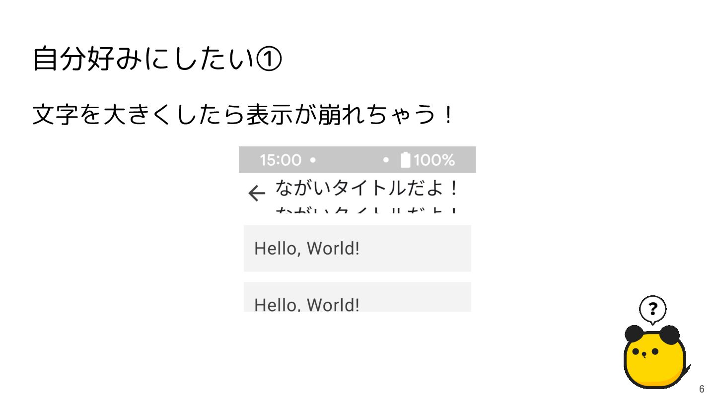
自分好みにしたい① 6 文字を大きくしたら表示が崩れちゃう!
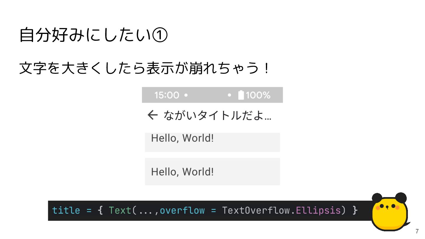
自分好みにしたい① 7 文字を大きくしたら表示が崩れちゃう! title = { Text(**.,overflow = TextOverflow.Ellipsis) }
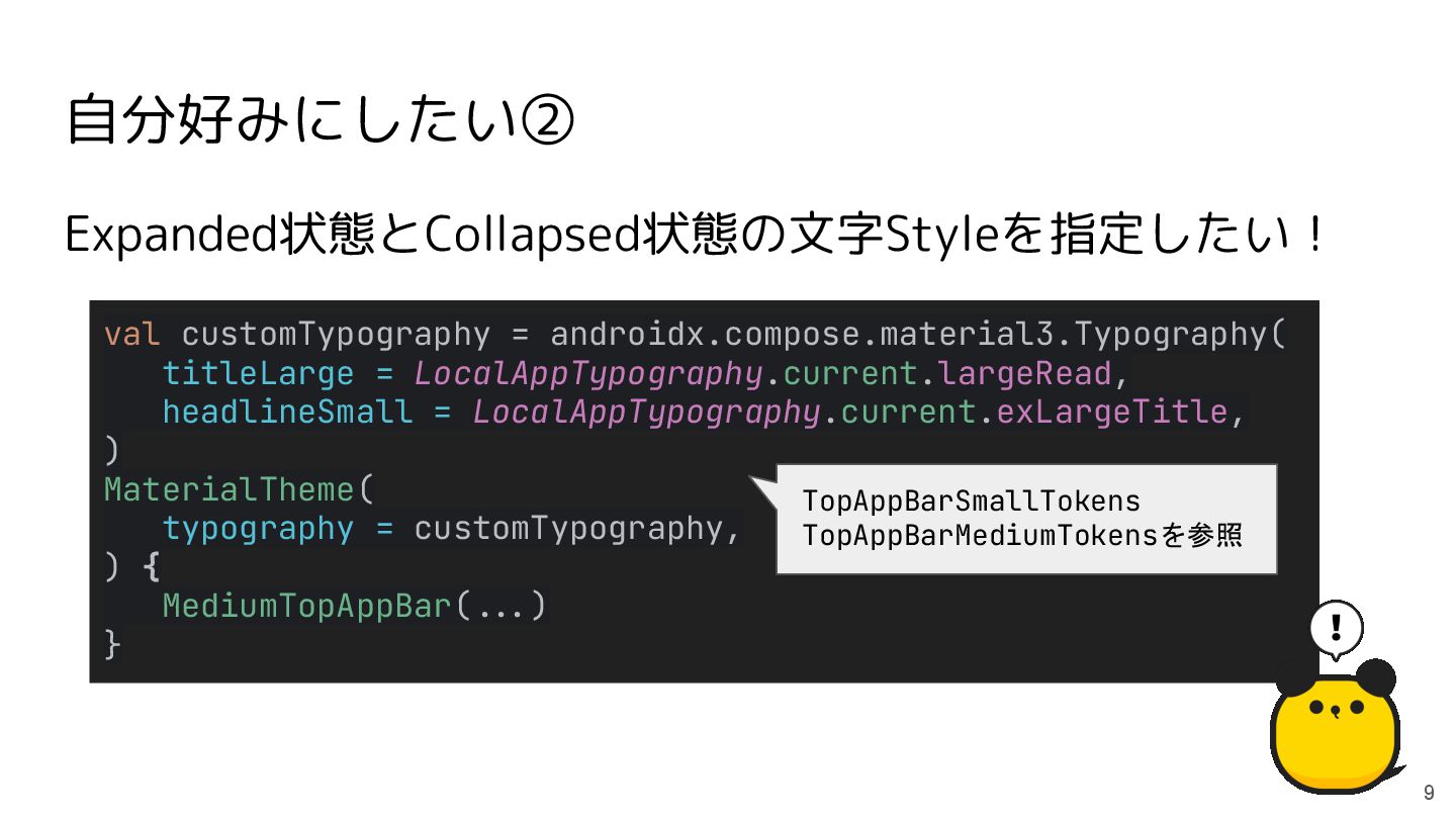
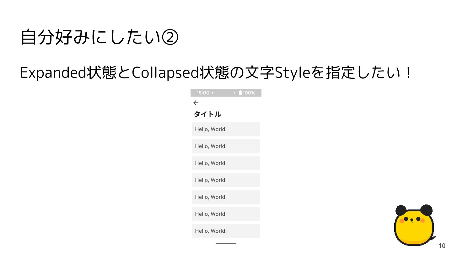
自分好みにしたい② 8 Expanded状態とCollapsed状態の文字Styleを指定したい!
自分好みにしたい② 9 Expanded状態とCollapsed状態の文字Styleを指定したい! val customTypography = androidx.compose.material3.Typography( titleLarge = LocalAppTypography.current.largeRead,
headlineSmall = LocalAppTypography.current.exLargeTitle, ) MaterialTheme( typography = customTypography, ) { MediumTopAppBar(**.) } TopAppBarSmallTokens TopAppBarMediumTokensを参照
Expanded状態とCollapsed状態の文字Styleを指定したい! 自分好みにしたい② 10
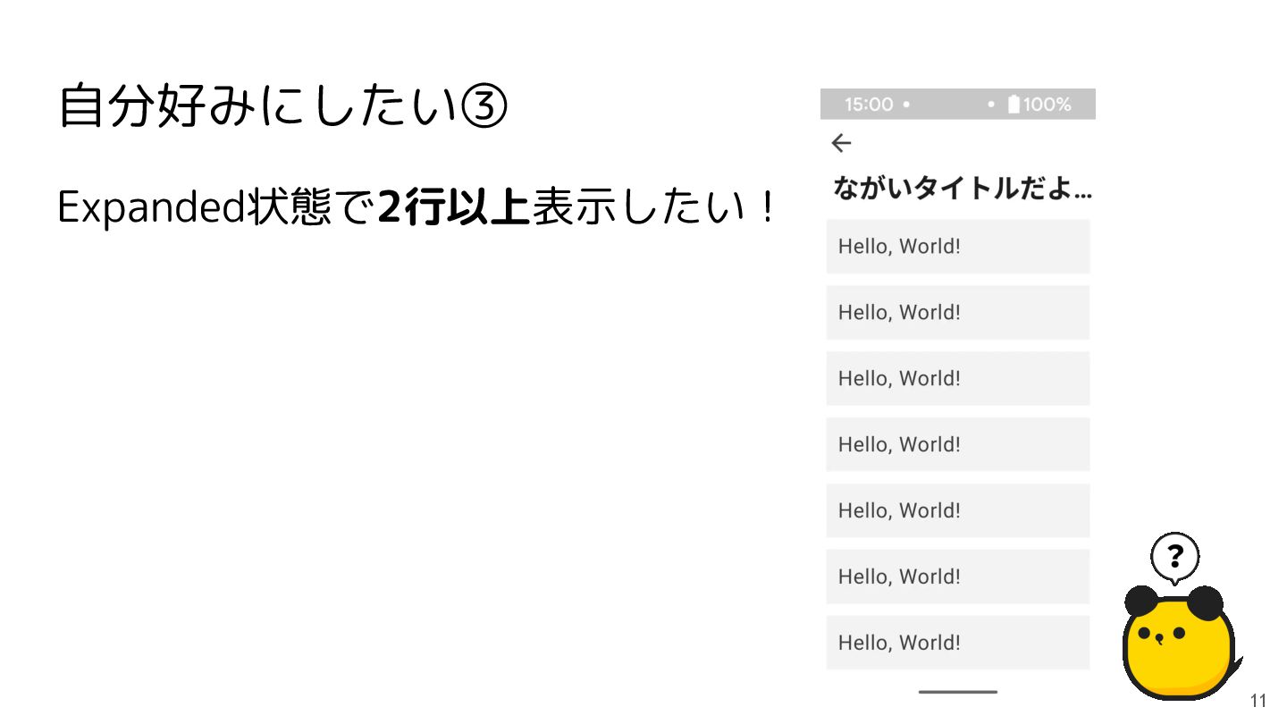
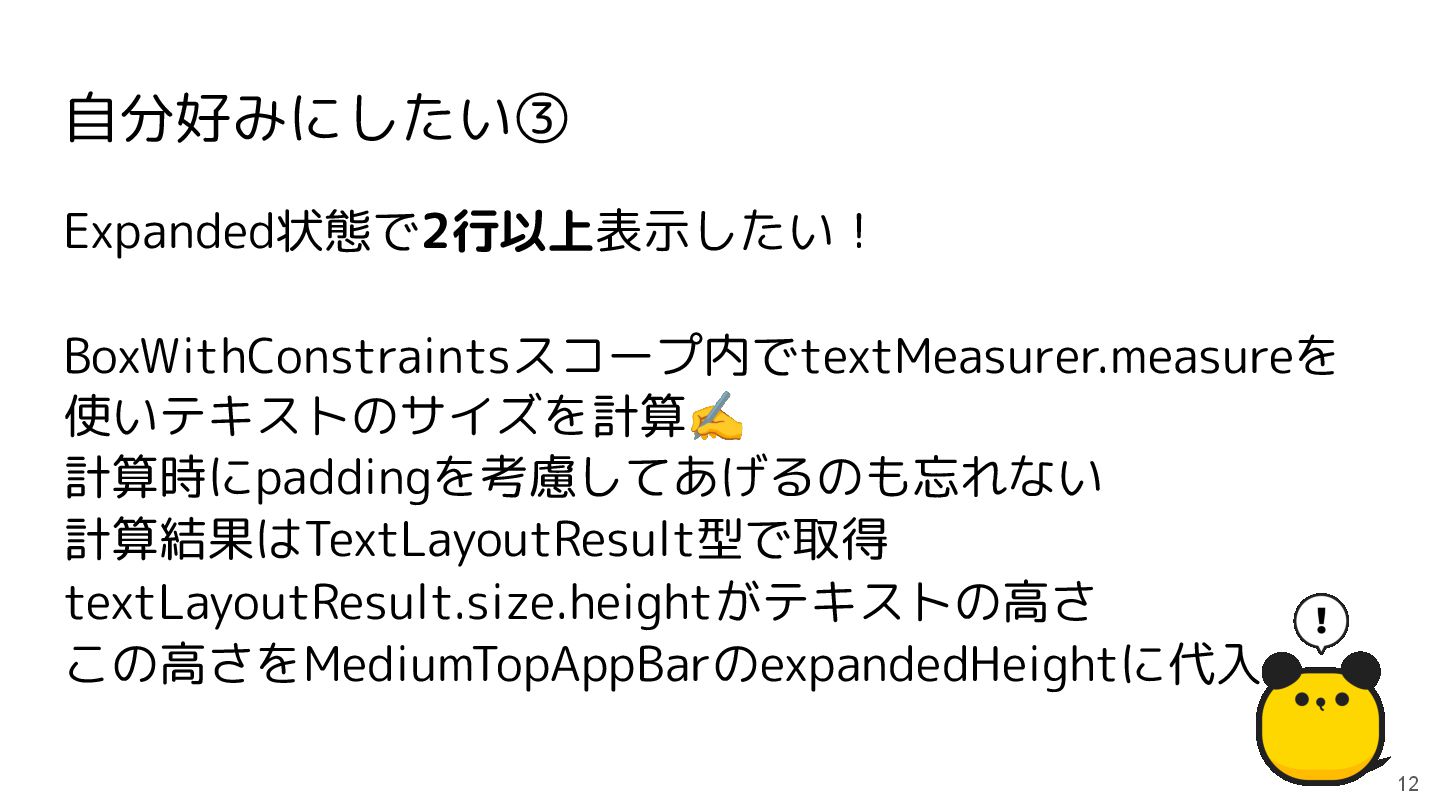
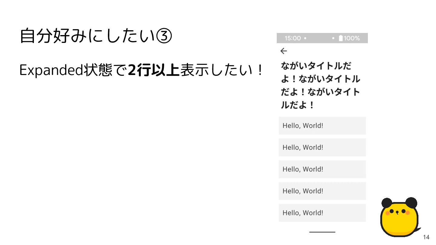
Expanded状態で2行以上表示したい! 自分好みにしたい③ 11
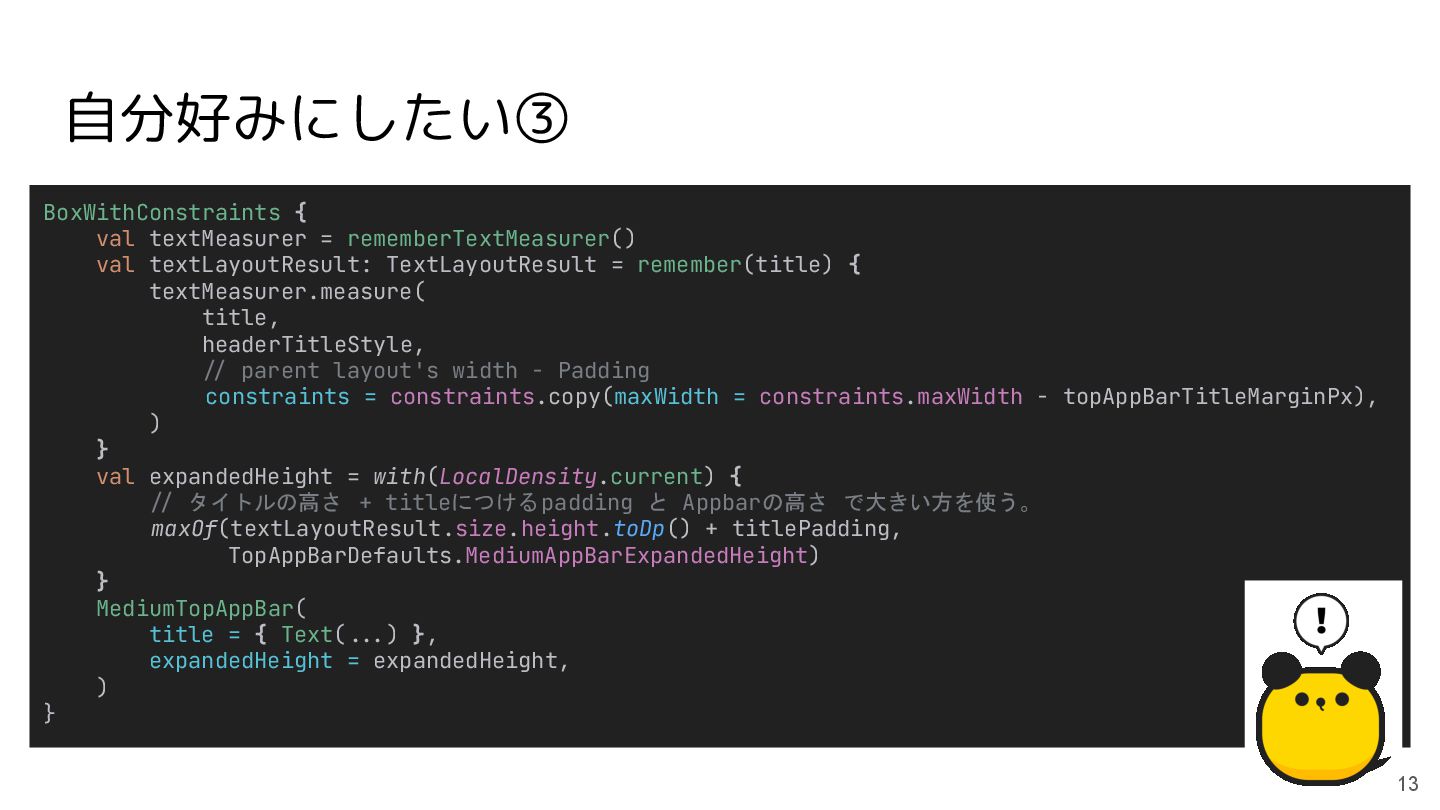
自分好みにしたい③ 12 Expanded状態で2行以上表示したい! BoxWithConstraintsスコープ内でtextMeasurer.measureを 使いテキストのサイズを計算✍ 計算時にpaddingを考慮してあげるのも忘れない 計算結果はTextLayoutResult型で取得 textLayoutResult.size.heightがテキストの高さ この高さをMediumTopAppBarのexpandedHeightに代入
BoxWithConstraints { val textMeasurer = rememberTextMeasurer() val textLayoutResult: TextLayoutResult =
remember(title) { textMeasurer.measure( title, headerTitleStyle, */ parent layout's width - Padding constraints = constraints.copy(maxWidth = constraints.maxWidth - topAppBarTitleMarginPx), ) } val expandedHeight = with(LocalDensity.current) { */ タイトルの高さ + titleにつけるpadding と Appbarの高さ で大きい方を使う。 maxOf(textLayoutResult.size.height.toDp() + titlePadding, TopAppBarDefaults.MediumAppBarExpandedHeight) } MediumTopAppBar( title = { Text(**.) }, expandedHeight = expandedHeight, ) } 自分好みにしたい③ 13
自分好みにしたい③ 14 Expanded状態で2行以上表示したい!
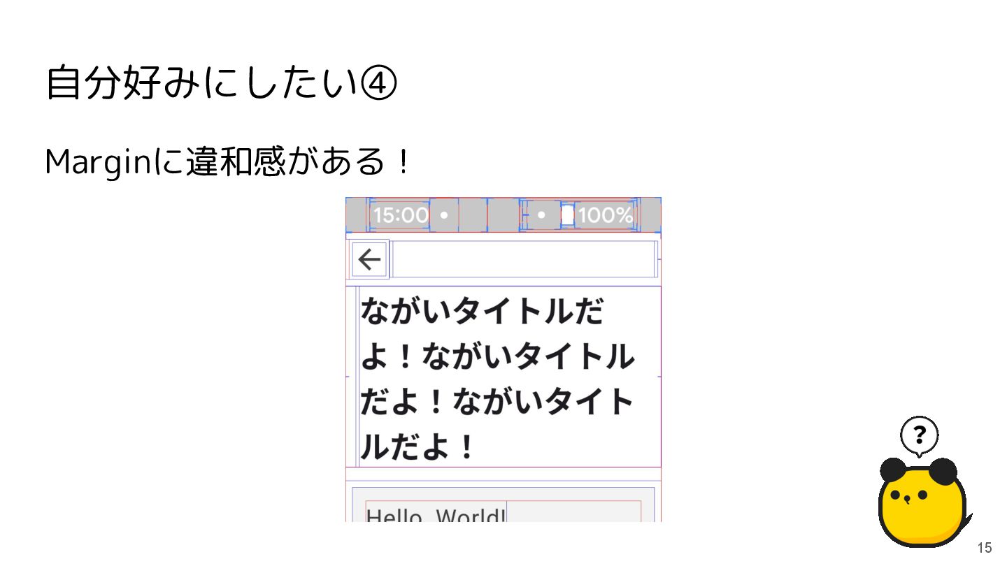
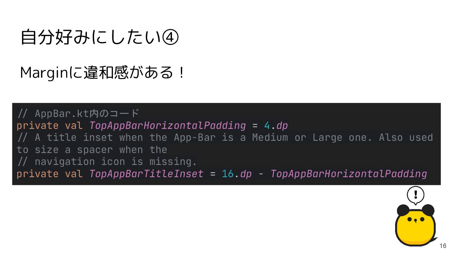
自分好みにしたい④ 15 Marginに違和感がある!
自分好みにしたい④ 16 Marginに違和感がある! */ AppBar.kt内のコード private val TopAppBarHorizontalPadding = 4.dp
*/ A title inset when the App-Bar is a Medium or Large one. Also used to size a spacer when the */ navigation icon is missing. private val TopAppBarTitleInset = 16.dp - TopAppBarHorizontalPadding
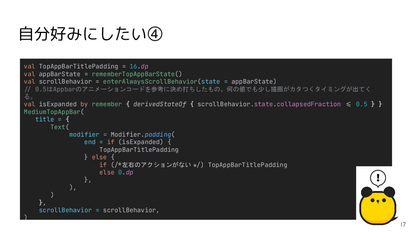
val TopAppBarTitlePadding = 16.dp val appBarState = rememberTopAppBarState() val scrollBehavior
= enterAlwaysScrollBehavior(state = appBarState) */ 0.5はAppbarのアニメーションコードを参考に決め打ちしたもの。何の値でも少し描画がカタつくタイミングが出てく る。 val isExpanded by remember { derivedStateOf { scrollBehavior.state.collapsedFraction *= 0.5 } } MediumTopAppBar( title = { Text( modifier = Modifier.padding( end = if (isExpanded) { TopAppBarTitlePadding } else { if (**左右のアクションがない */) TopAppBarTitlePadding else 0.dp }, ), ) }, scrollBehavior = scrollBehavior, ) 自分好みにしたい④ 17
自分好みにしたい④ 18 Marginに違和感がある!
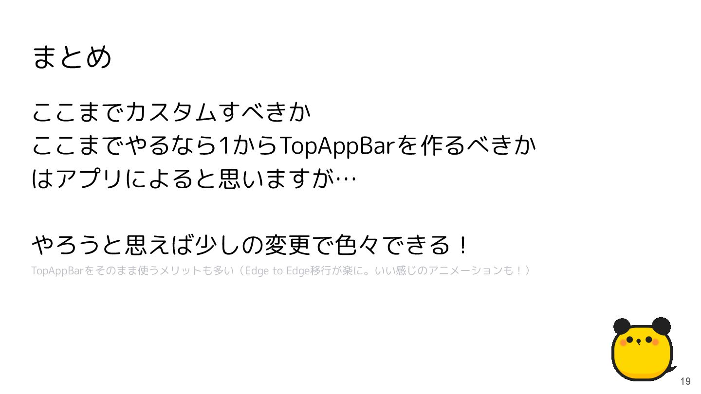
まとめ 19 ここまでカスタムすべきか ここまでやるなら1からTopAppBarを作るべきか はアプリによると思いますが… やろうと思えば少しの変更で色々できる! TopAppBarをそのまま使うメリットも多い(Edge to Edge移行が楽に。いい感じのアニメーションも!)
 hunachi
 hinac0
 watany
 sue445
 coco_se
 bitkey
 k_adachi_01
 kanny
kanny
 yanzm
yanzm
 news_it_enj
 sansantech
 hr01
hr01
 miyukichi_ospf
 mfonobong
 stephaniewalter
 reverentgeek
 aleyda
 inesmontani
 lfama
lfama
 rasagy
 jeffersonlam
 takai
takai
 popppiees
 bkeepers
 stuffmc