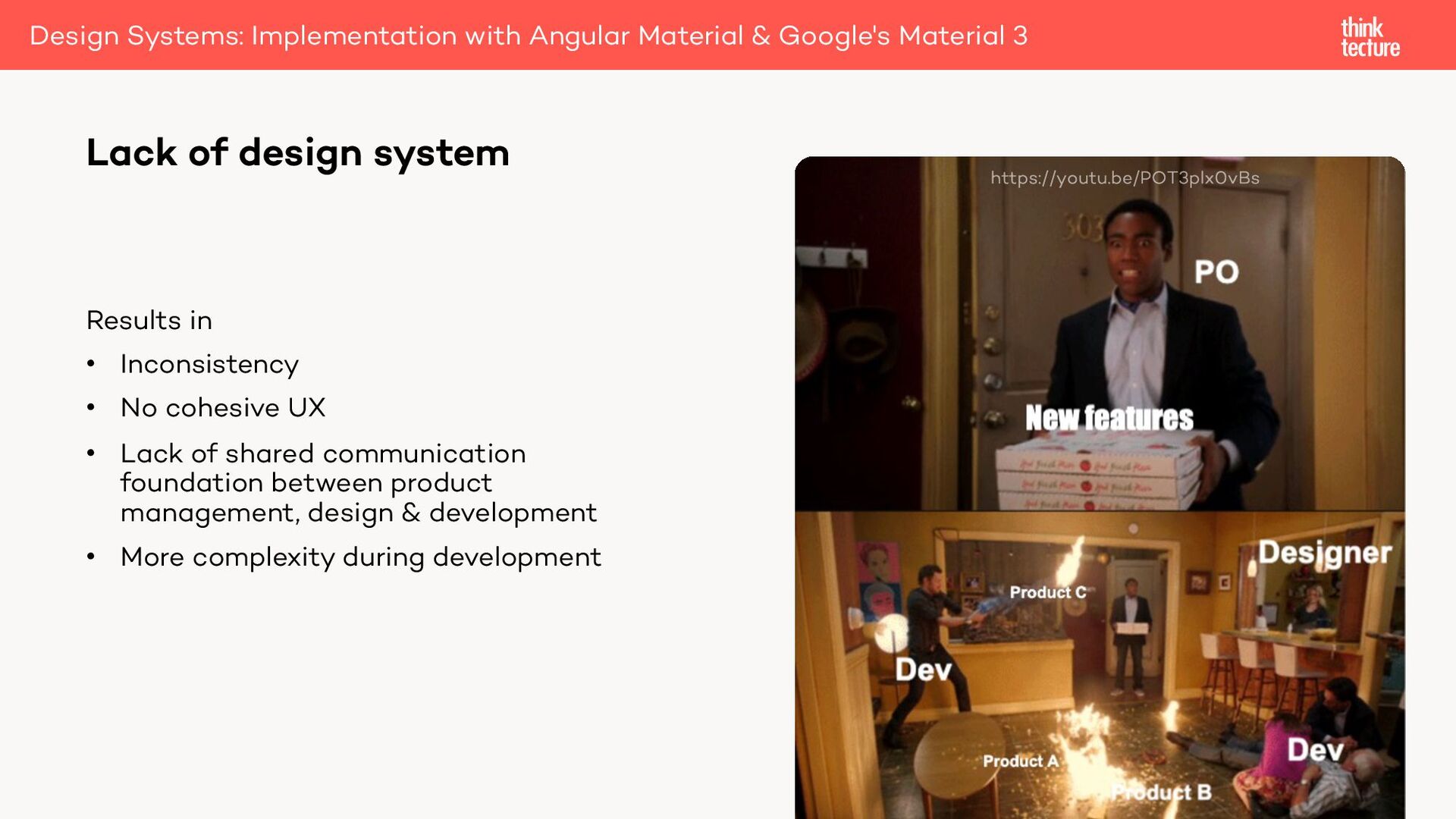
Lack of design system Results in • Inconsistency • No cohesive UX • Lack of shared communication foundation between product management, design & development • More complexity during development
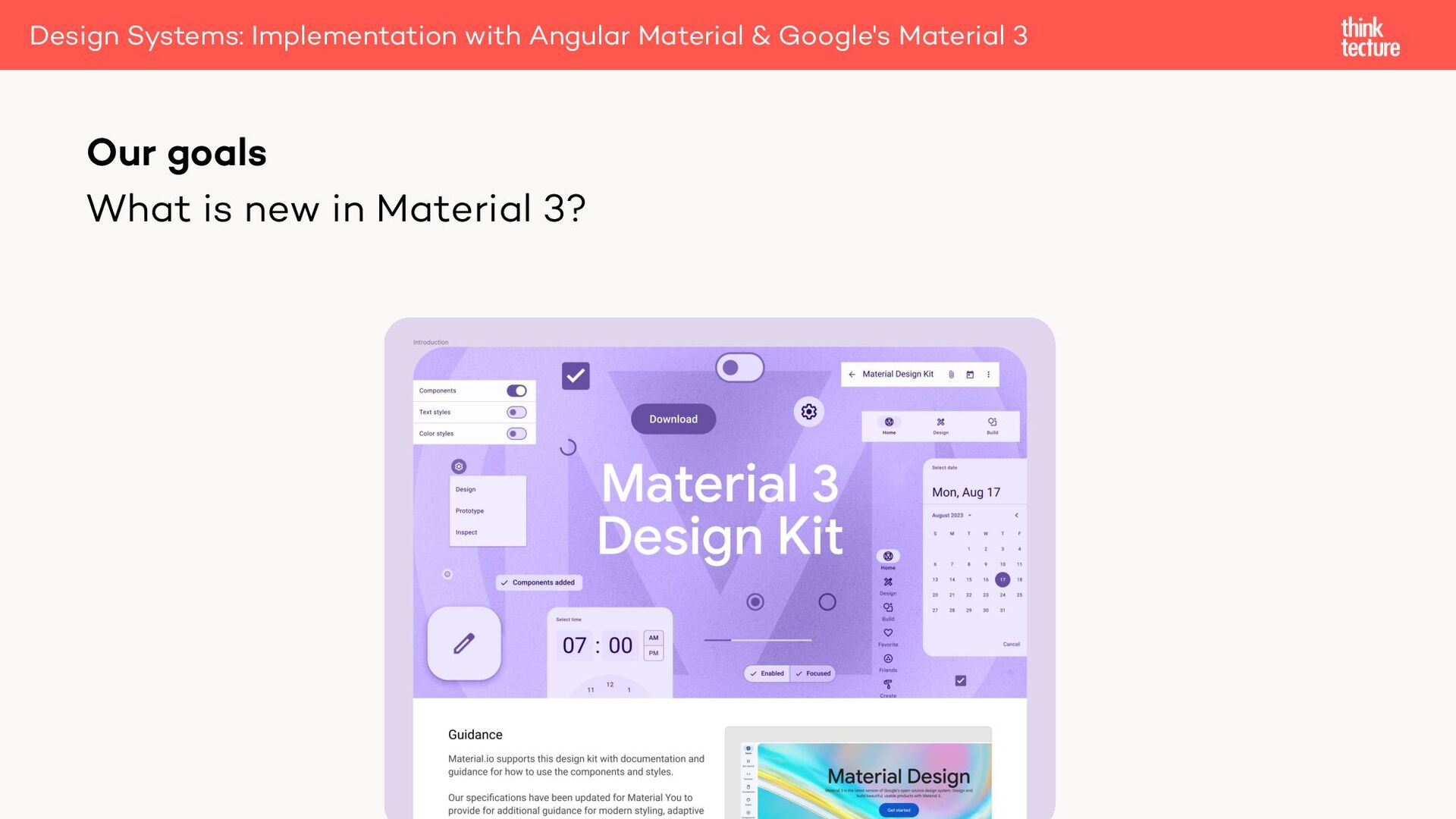
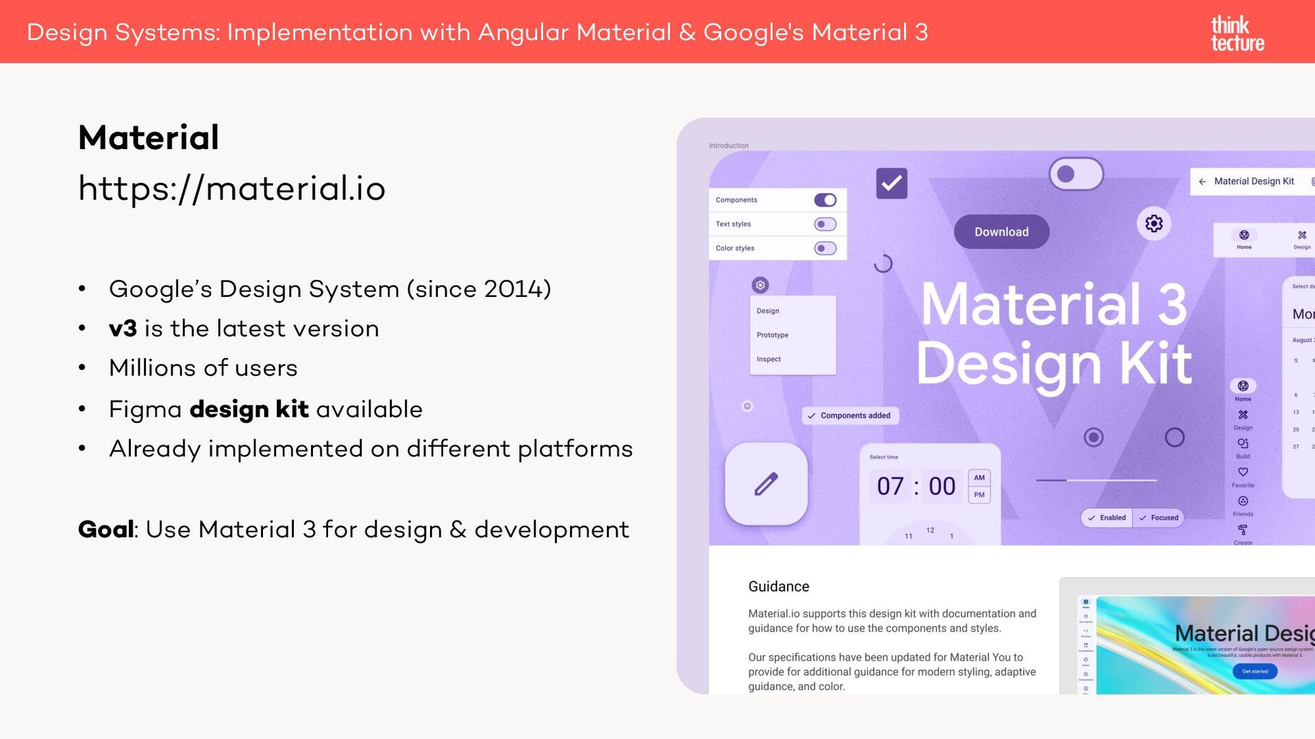
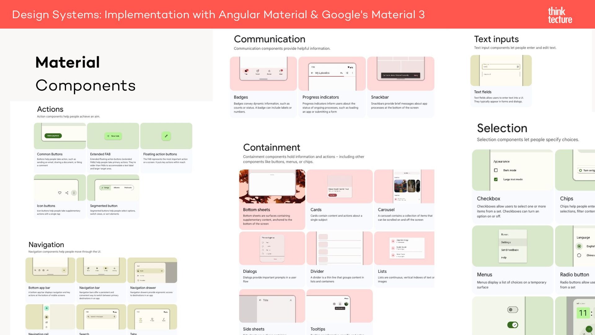
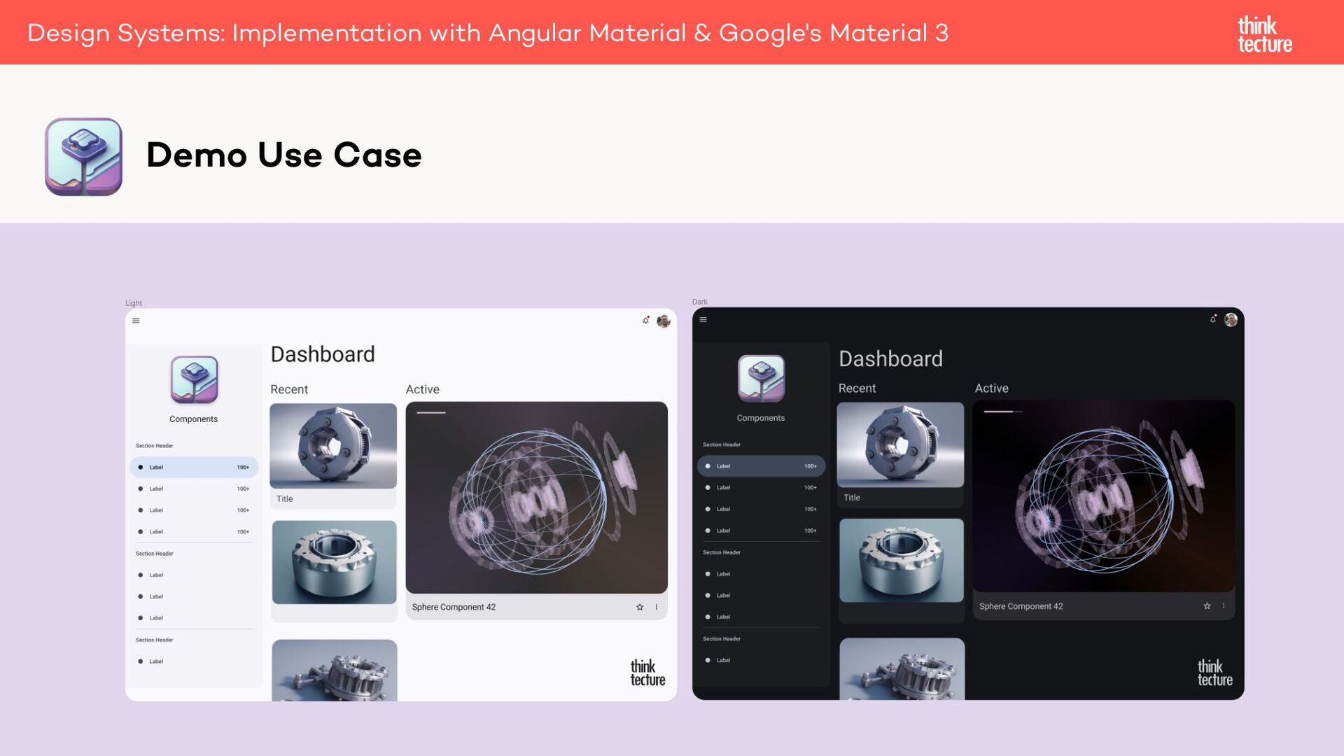
the latest version • Millions of users • Figma design kit available • Already implemented on different platforms Goal: Use Material 3 for design & development Material Design Systems: Implementation with Angular Material & Google's Material 3
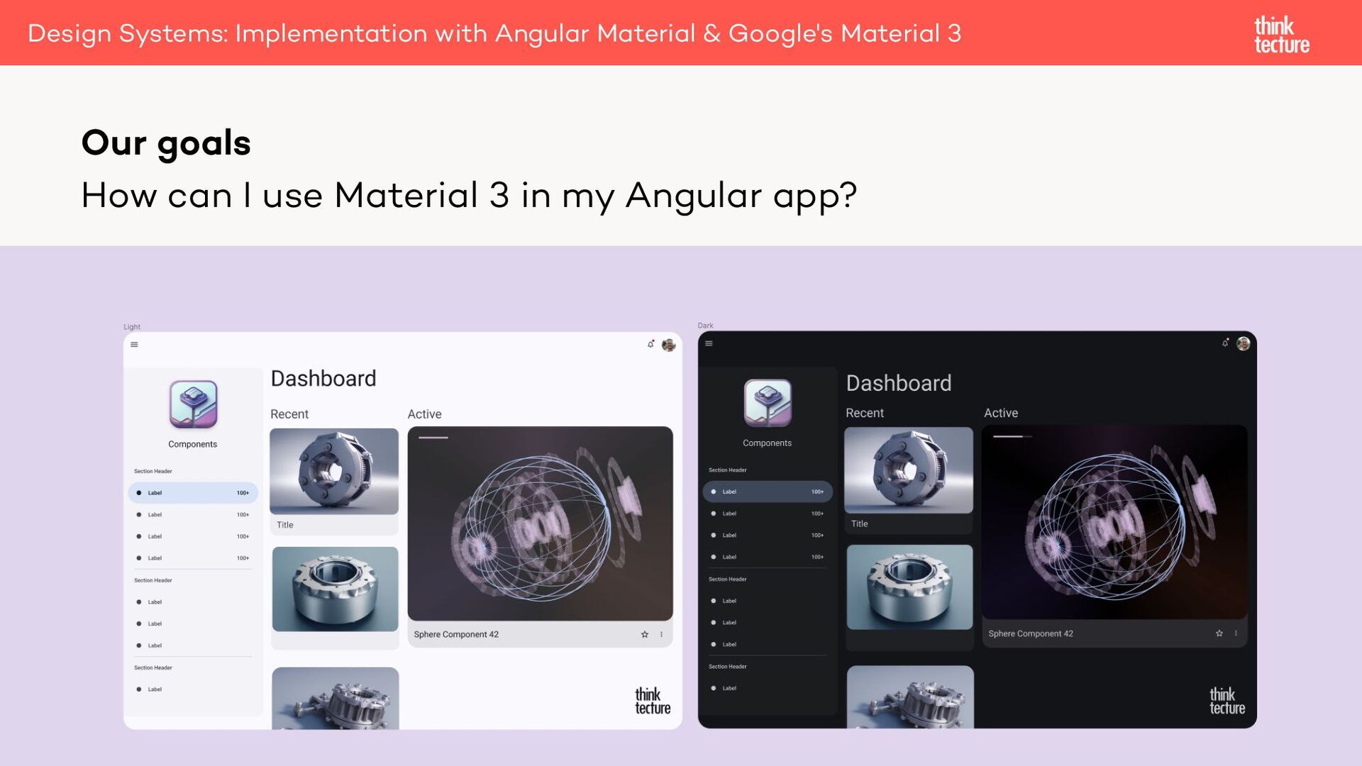
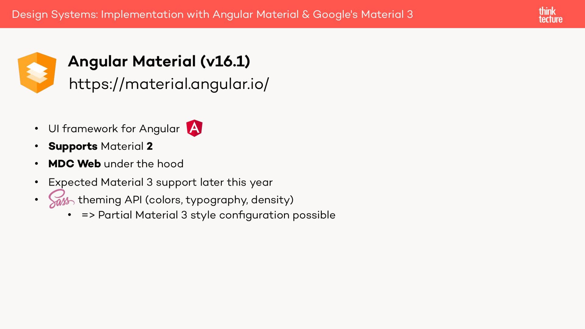
• MDC Web under the hood • Expected Material 3 support later this year • theming API (colors, typography, density) • => Partial Material 3 style configuration possible Angular Material (v16.1) Design Systems: Implementation with Angular Material & Google's Material 3
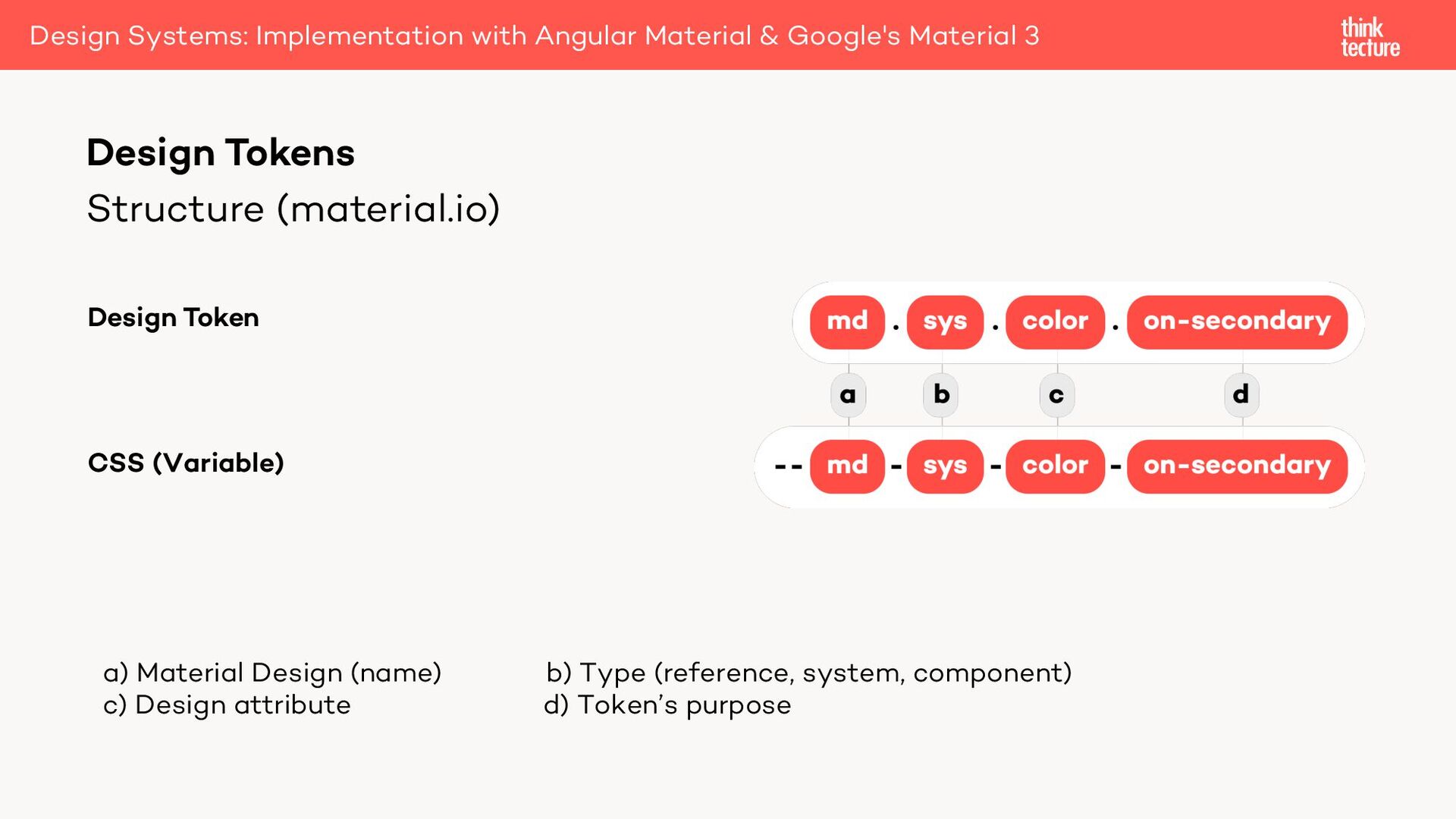
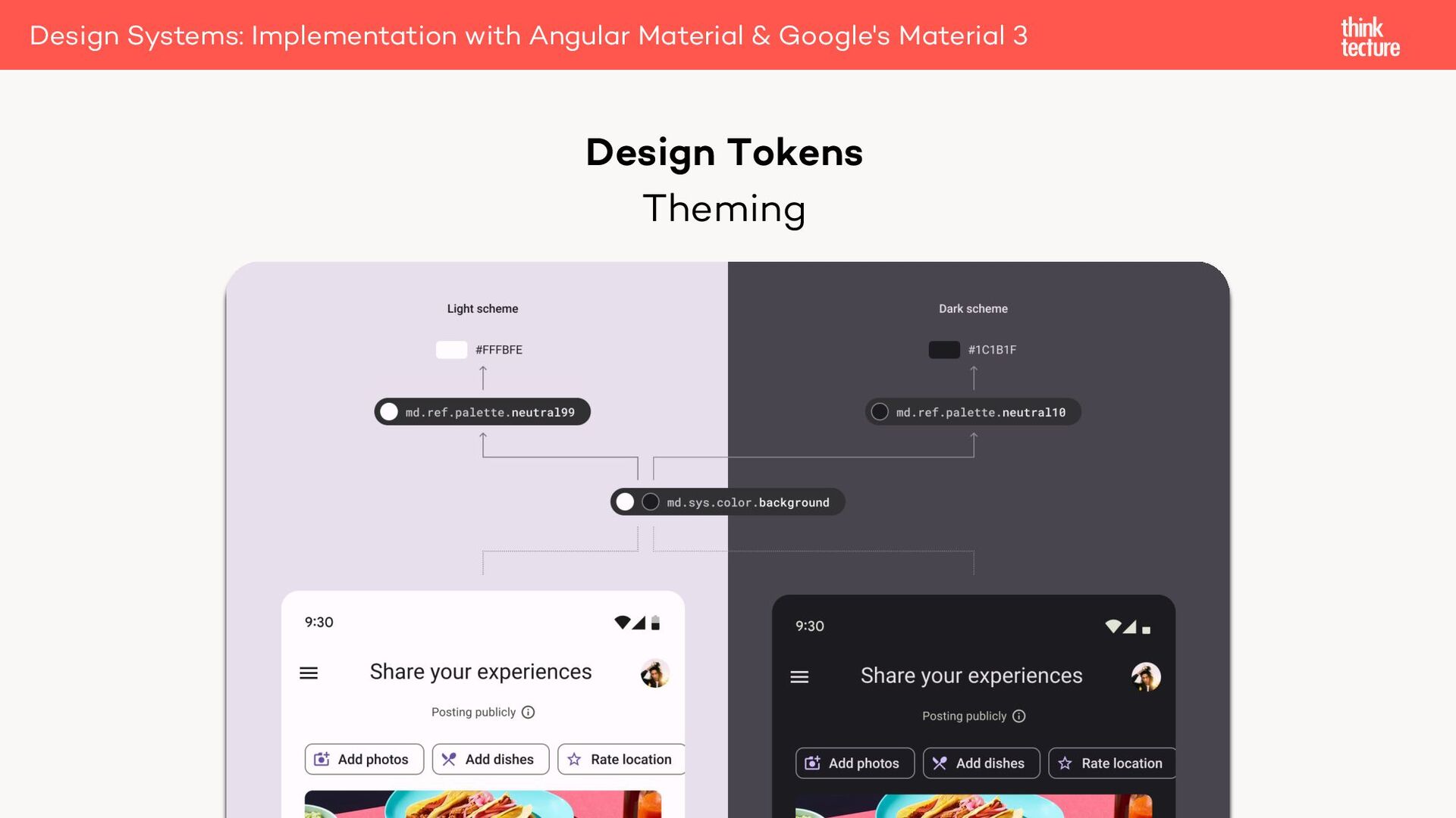
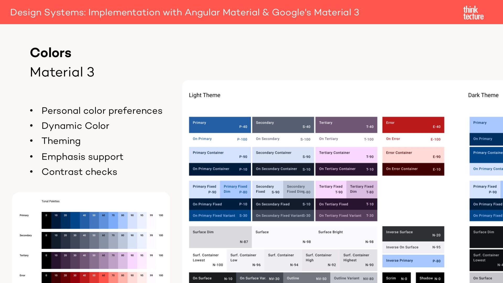
& Google's Material 3 Design Token CSS (Variable) a) Material Design (name) b) Type (reference, system, component) c) Design attribute d) Token’s purpose
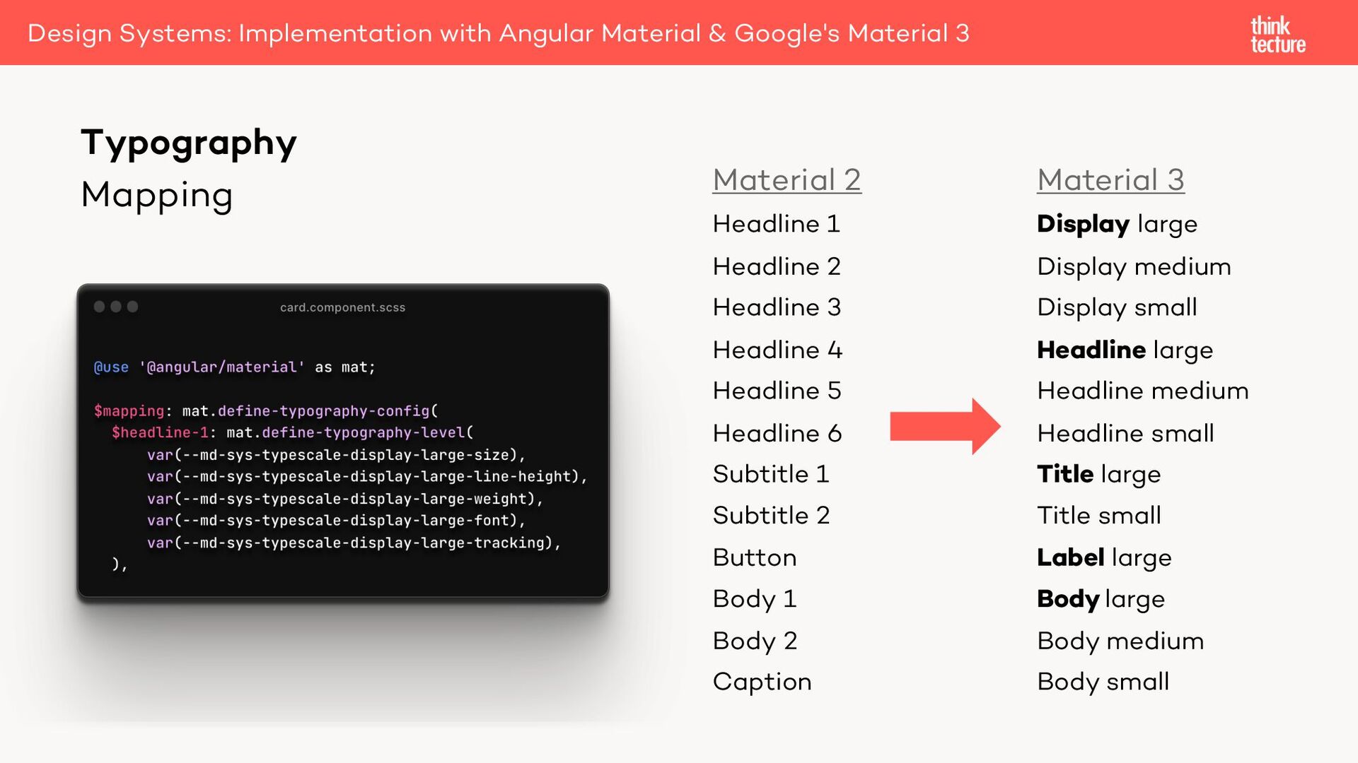
large Headline medium Headline small Title large Title small Label large Body large Body medium Body small Material 2 Headline 1 Headline 2 Headline 3 Headline 4 Headline 5 Headline 6 Subtitle 1 Subtitle 2 Button Body 1 Body 2 Caption Typography Design Systems: Implementation with Angular Material & Google's Material 3
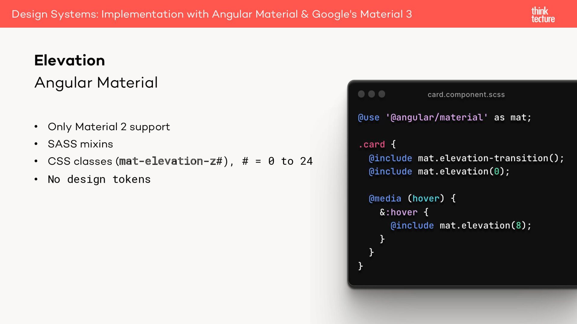
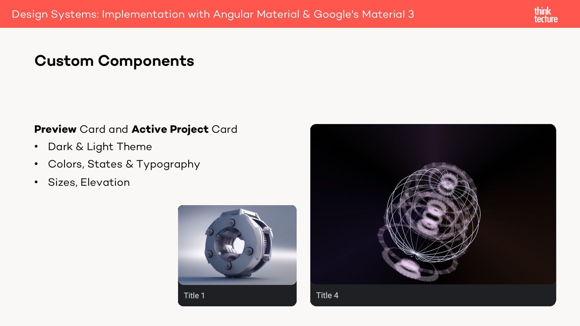
(0dp to 24dp) • Highlighting (Dark theme) • Colors • 6 levels (0 to 12dp) • No shadows Elevation Design Systems: Implementation with Angular Material & Google's Material 3
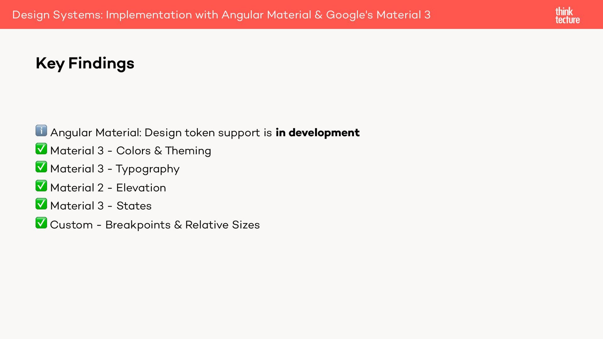
Material 3 - Colors & Theming ✅ Material 3 - Typography ✅ Material 2 - Elevation ✅ Material 3 - States ✅ Custom - Breakpoints & Relative Sizes Key Findings Design Systems: Implementation with Angular Material & Google's Material 3
 SiteGround - Reliable hosting with speed, security, and support you can count on.
 konstantindenerz
 _fhhmm
.png) yuriko1211
yuriko1211
 maroon1st
 pizzacat83
 handlename
 mizchi
 codmoninc
 minodriven
 shogogg
 hjmkth
 seike460
 hayama17
 pedronauck
 retrage
 mongodb
 kastner
 madoxten
 signer
.jpg) cargoodrich
cargoodrich
 lindahogenes
 oripsolob
 trishagee
 rasmusluckow
 katiecoart