Upgrade to Pro — share decks privately, control downloads, hide ads and more …

Modular CSS v2 (CSS-in-JS edition)

Modular CSS v2 (CSS-in-JS edition)

Slides of my evolved "Modular CSS" talk from React Alicante

Avatar for Andrey Okonetchnikov

Andrey Okonetchnikov

September 29, 2017
Tweet

More Decks by Andrey Okonetchnikov

Other Decks in Programming

Transcript

  1. • Logic • HTML • Styles Button • Logic •

    HTML • Styles • Logic • HTML • Styles
  2. • Logic • HTML • Styles Button • Logic •

    HTML • Styles • Logic • HTML • Styles Global styles
  3. • Logic • HTML • Styles Button • Logic •

    HTML • Styles • Logic • HTML • Styles Global styles
  4. Global CSS 1 .btn { 2 /* styles for button

    */ 3 } 4 5 .active { 6 /* styles for active button */ 7 background-color: blue; 8 } 9 10 .label { 11 /* styles for button label */ 12 } 1 .star { 2 /* styles for star */ 3 } 4 5 .active { 6 /* styles for active star 7 background-color: orange; 8 } 9
  5. <ul class="nav"> <li class="nav__item nav__item_active"> <a class="nav__link">One</a> </li> <li class="nav__item">

    <a class="nav__link">Two</a> </li> <li class="nav__item"> <a class="nav__link">Three</a> </li> </ul>
  6. .nav __item { padding: 4px 10px; color: black; } .nav

    __item_active { font-weight: bold; background: #ffc7c7; } .navigation __item { padding: 4px 10px; color: black; } .navigation __item_active { font-weight: bold; background: #ffc7c7; }
  7. +

  8. Before: BEM-style const Button = ({ children }) => (

    <button className="Button"> <span className="Button __label"> { children } </span> </button> )
  9. After: CSS-modules import styles from './Button.css' const Button = ({

    children }) => ( <button className={styles.button}> <span className={styles.label}> { children } </span> </button> )
  10. After: CSS-modules import styles from './Button.css' const Button = ({

    children }) => ( <button className={styles.button}> <span className={styles.label}> { children } </span> </button> )
  11. Before: BEM-style /* Button.css */ .Button { /* general rules

    */ } .Button --disabled { /* disabled rules */ } .Button --active { /* active rules */ } .Button __label { /* label rules */ }
  12. After: CSS-modules /* Button.css */ .root { /* general rules

    */ } .disabled { /* disabled rules */ } .active { /* active rules */ } .label { /* label rules */ }
  13. The result 1 styles: { 2 root: "Button __root __abc5436",

    3 disabled: "Button __disabled __def65 4 active: "Button __active __1638bcd", 5 label: "Button __label __5dfg462" 5 } 1 /* Button.css */ 2 3 .root { } 4 .disabled { } 5 .active { } 6 .label { }
  14. CSS-modules import styles from './Button.css' const Button = ({ children

    }) => ( <button className={styles.button}> <span className={styles.label}> { children } </span> </button> )
  15. CSS-modules ✅ Explicit imports ✅ Scoped & fast selectors ✅

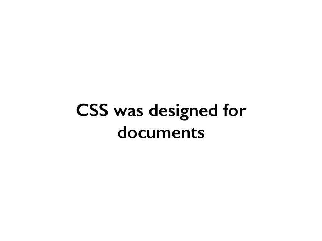
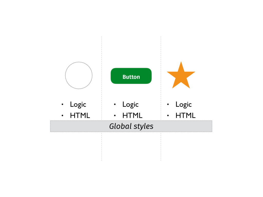
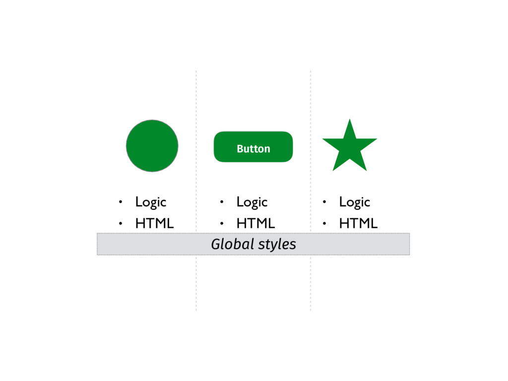
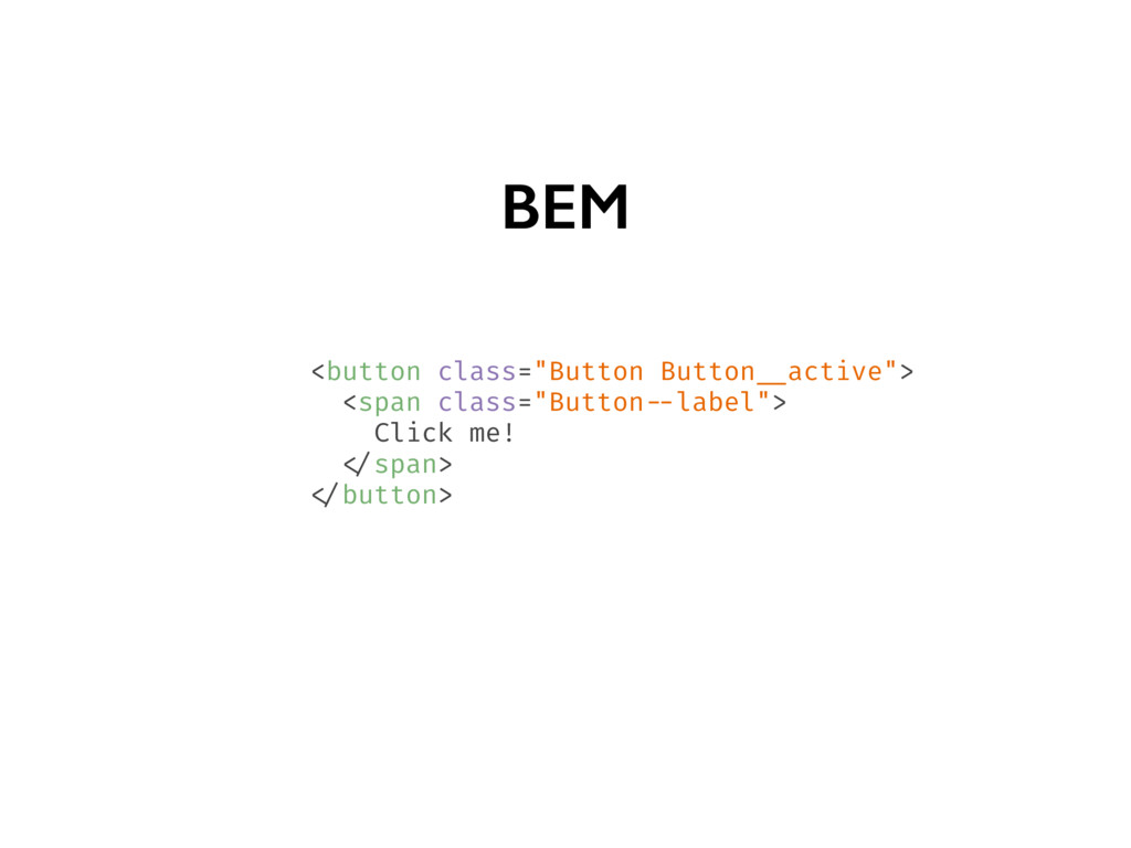
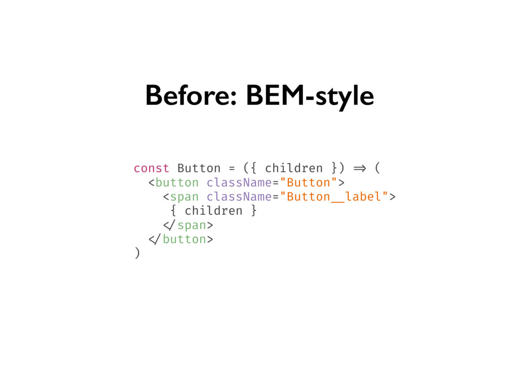
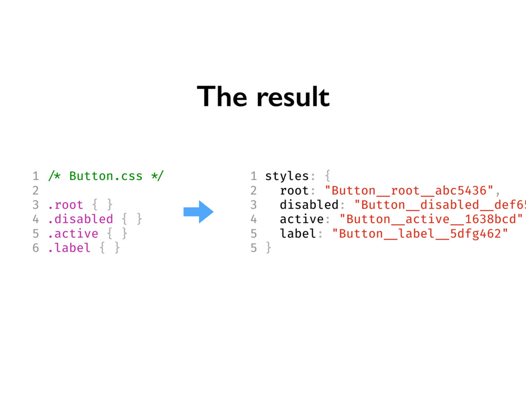
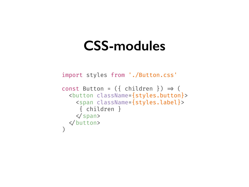
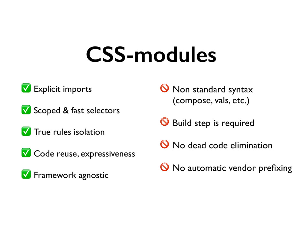
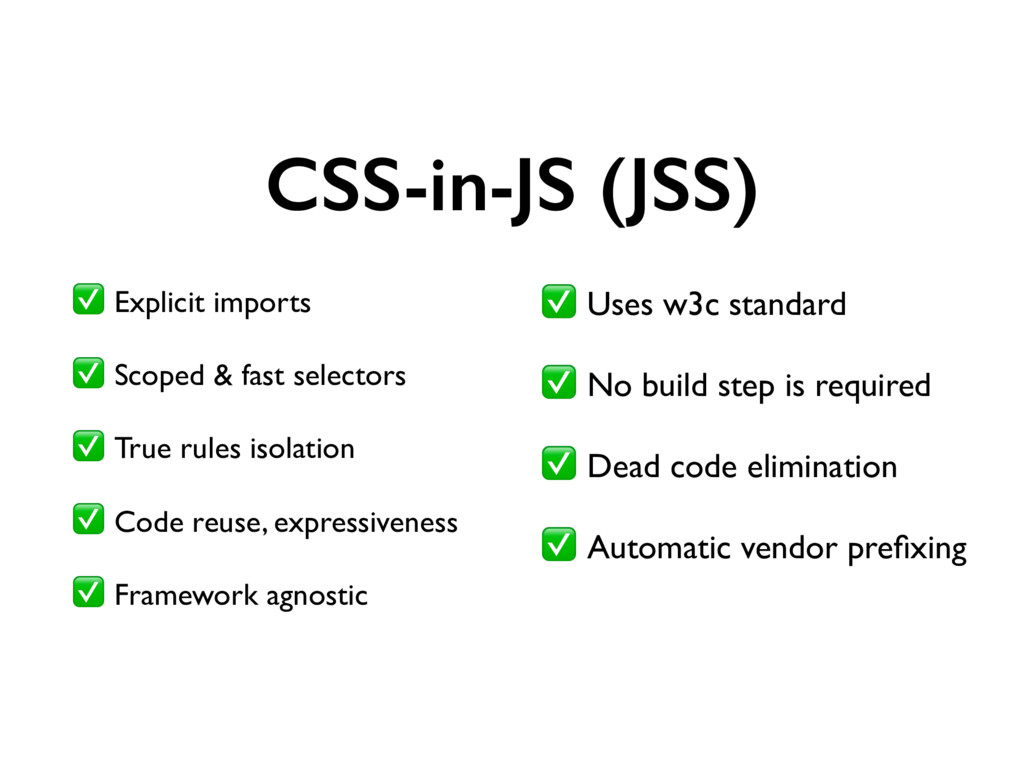
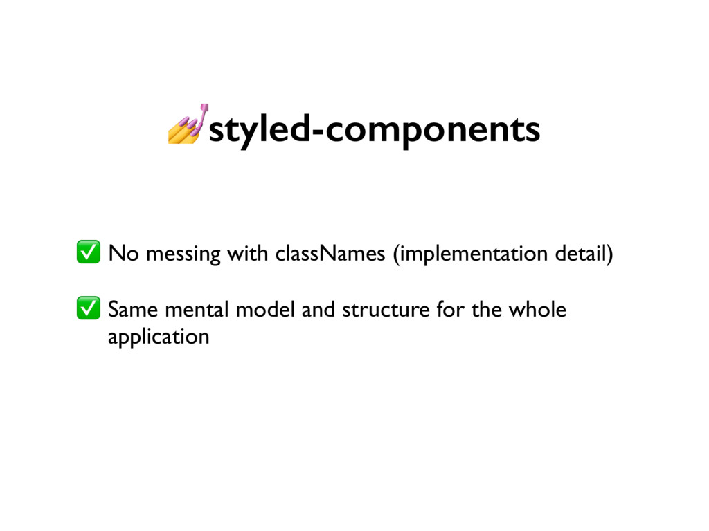
    True rules isolation ✅ Code reuse, expressiveness ✅ Framework agnostic Non standard syntax (compose, vals, etc.) Build step is required No dead code elimination No automatic vendor prefixing
  16. +

  17. export const styles = { button: { padding: '10px', '&:hover':

    { background: 'blue' } }, '@media (min-width: 1024px)': { button: { padding: '20px' } } }
  18. Before: CSS-modules import styles from './Button.css' const Button = ({

    children }) => ( <button className={styles.button}> <span className={styles.label}> { children } </span> </button> )
  19. After: JSS import injectSheet from 'react-jss' import styles from './styles'

    const Button = ({ classes, children }) => ( <button className={classes.button}> <span className={classes.label}> {children} </span> </button> ) export default injectSheet(styles)(Button)
  20. CSS-in-JS (JSS) ✅ Explicit imports ✅ Scoped & fast selectors

    ✅ True rules isolation ✅ Code reuse, expressiveness ✅ Framework agnostic ✅ Uses w3c standard ✅ No build step is required ✅ Dead code elimination ✅ Automatic vendor prefixing
  21. // Create a Title component that'll render an <h1> tag

    with some styles const Title = styled.h1` font-size: 1.5em; text-align: center; color: palevioletred; `; render( <Title> Hello React Alicante! </Title> );
  22. const Button = styled.button` /* Adapt the colors based on

    primary prop */ background: ${props => props.primary ? 'palevioletred' : 'white'}; color: ${props => props.primary ? 'white' : 'palevioletred'}; font-size: 1em; margin: 1em; padding: 0.25em 1em; border: 2px solid palevioletred; border-radius: 3px; `; render( <div> <Button>Normal </Button> <Button primary>Primary </Button> </div> );
  23. styled-components ✅ No messing with classNames (implementation detail) ✅ Same

    mental model and structure for the whole application
  24. styled-components for react-native import styled from 'styled-components/native'; const StyledView =

    styled.View` background-color: papayawhip; `; const StyledText = styled.Text` color: palevioletred; `; class MyReactNativeComponent extends React.Component { render() { return ( <StyledView> <StyledText>Hello World! </StyledText> </StyledView> ) } }
  25. import React from 'react'; import {AppRegistry, Pano, Text, View} from

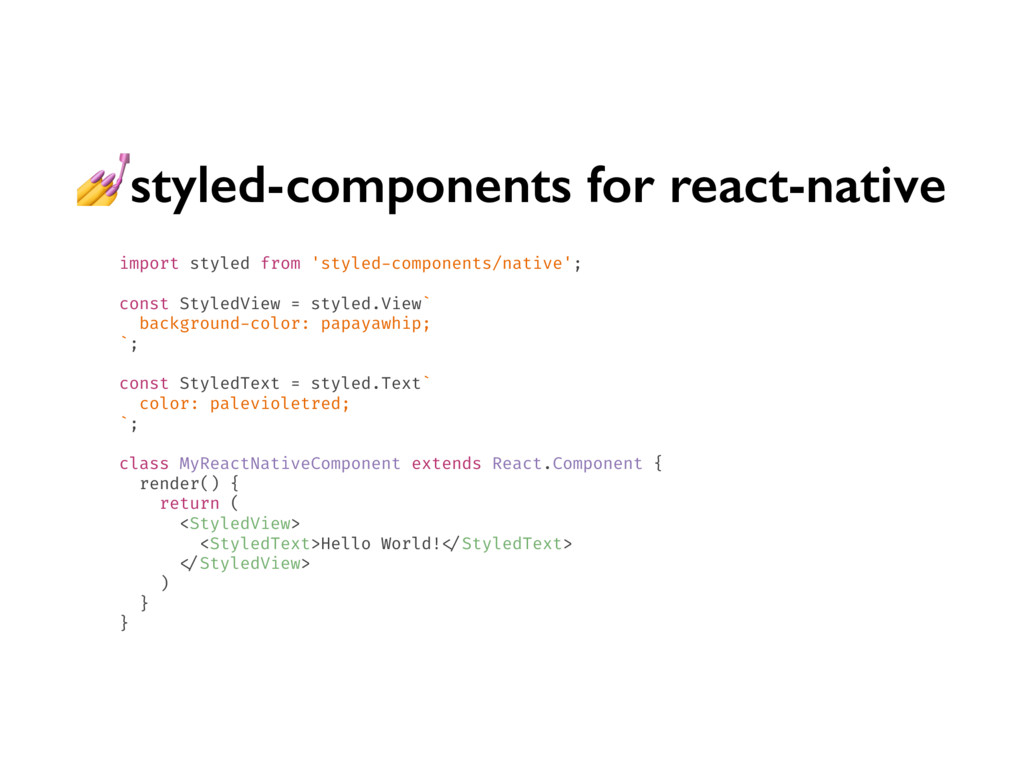
    'react-vr'; class WelcomeToVR extends React.Component { render() { // Displays "hello" text on top of a loaded 360 panorama image. // Text is 0.8 meters in size and is centered three meters in front of you. return ( <View> <Pano source={asset('chess-world.jpg')} /> <Text style={{ fontSize: 0.8, layoutOrigin: [0.5, 0.5], transform: [{translate: [0, 0, -3]}], }}> hello </Text> </View> ); } }; AppRegistry.registerComponent('WelcomeToVR', () => WelcomeToVR);
  26. import { css } from 'glamor' const title = css({

    fontSize: '1.8em', fontFamily: 'Comic Sans MS', color: 'blue' }) console.log(title) // → 'css-1pyvz'
  27. https://meiert.com/en/blog/20170531/70-percent-css-repetition/ “In CSS, we repeat ourselves too much. While it’s

    absolutely, practically possible to limit declaration repetition to 10– 20%, reality averages 72% (median 66%).”
  28. Tachyons <article class="pa3 pa5-ns"> <h1 class="f3 f1-m f-headline-l"> Title </h1>

    <p class="measure lh-copy"> Lorem ipsum dolor sit amet. </p> </article>
  29. …but uses very simple API import {styled} from 'styletron-react'; const

    Panel = styled('div', (props) => ({ backgroundColor: props.alert ? 'orange' : 'lightblue', fontSize: '12px' })); <Panel alert>Danger! </Panel>
  30. Lists const colorArray = ["red", "yellow", "green"]; for (let color

    of colorArray) { console.log(color); } $colorList: "red", "yellow", "green"; @each $color in $colorList { @debug $color; }
  31. Functions function PrintMe(firstArg, ...theRest) { console.log(firstArg, theRest); } @mixin funCircle($size,

    $gradient ...) { width: $size; height: $size; background: radial-gradient($gradient); }
  32. // Styles as object usage const styles = { background:

    lighten(0.2, '#CCCD64'), background: lighten(0.2, 'rgba(204,205,100,0.7)'), } // styled-components usage const div = styled.div` background: ${lighten(0.2, '#FFCD64')}; background: ${lighten(0.2, 'rgba(204,205,100,0.7)')}; ` // Output element { background: "#e5e6b1"; background: "rgba(229,230,177,0.7)"; }
  33. styled-jsx export default () => ( <div> <p>only this paragraph

    will be red </p> <style jsx>{` p { color: red; } `} </style> </div> )
  34. styled-jsx import _JSXStyle from 'styled-jsx/style' export default () => (

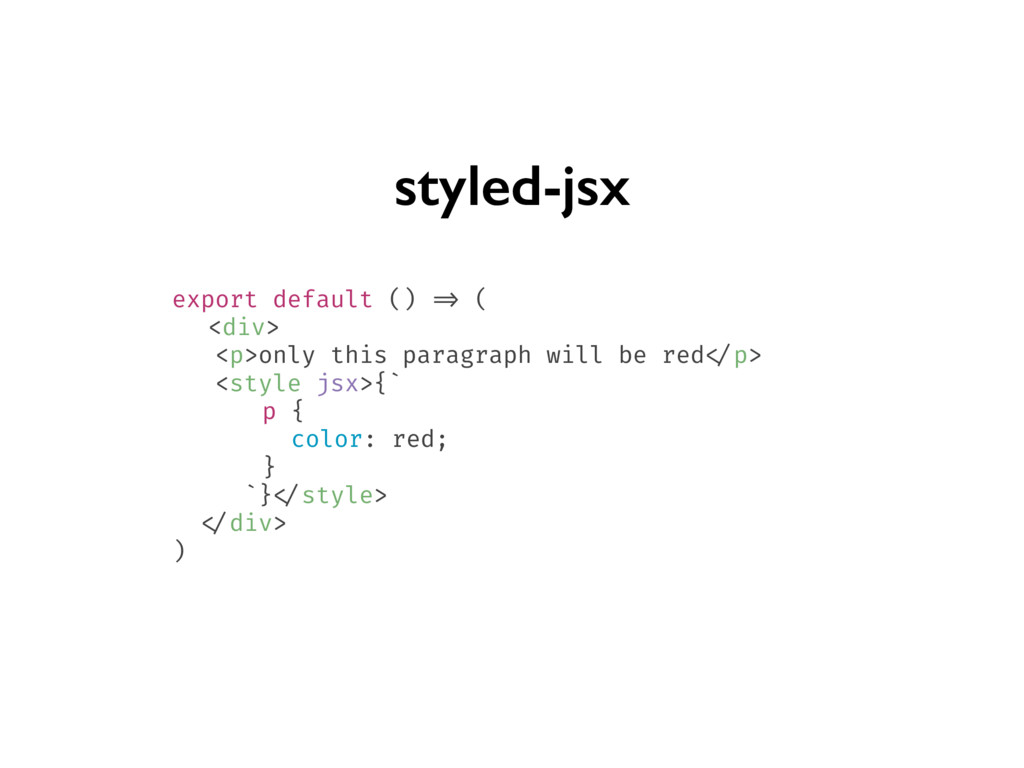
    <div data-jsx='cn2o3j'> <p data-jsx='cn2o3j'>only this paragraph will get the style :) </p> <_JSXStyle styleId='cn2o3j' css={`p[data-jsx=cn2o3j] {color: red;}`} /> </div> )
  35. https://adactio.com/journal/12571 “It is simple in the sense of “not complex”,

    but that doesn’t mean it’s easy. Mistaking “simple” for “easy” will only lead to heartache.”
  36. Critical CSS with <> import { renderToString } from 'react-dom/server'

    import { ServerStyleSheet } from 'styled-components' const sheet = new ServerStyleSheet() const html = renderToString(sheet.collectStyles(<YourApp />)) const css = sheet.getStyleTags()
  37. https://medium.com/seek-blog/a-unified-styling-language- d0c208de2660 “If you build your app with progressive enhancement

    in mind, despite being written entirely in JavaScript, it might not require JavaScript on the client at all.”