Share
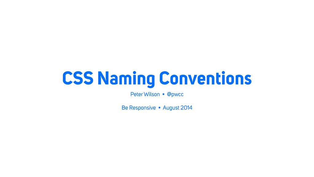
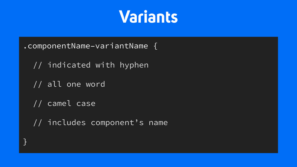
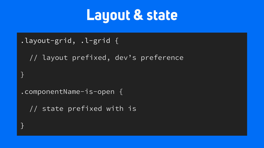
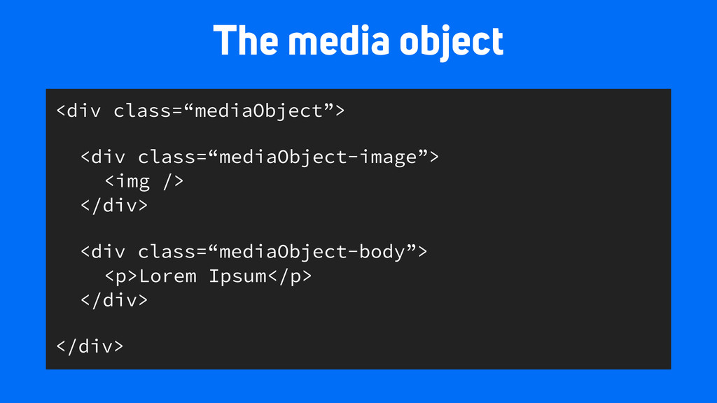
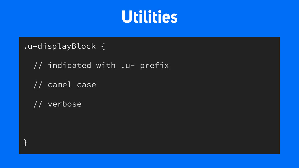
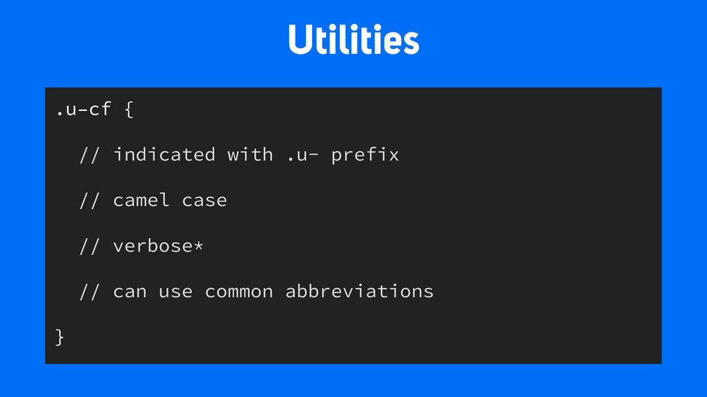
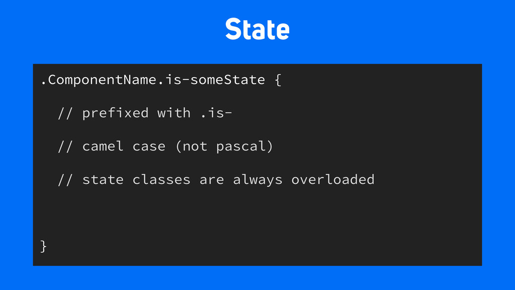
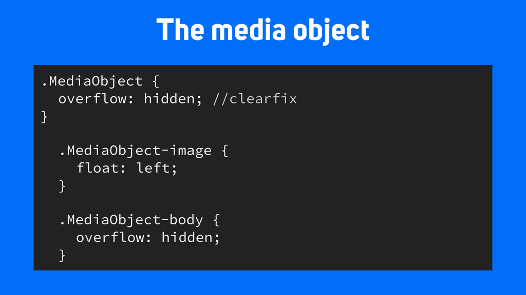
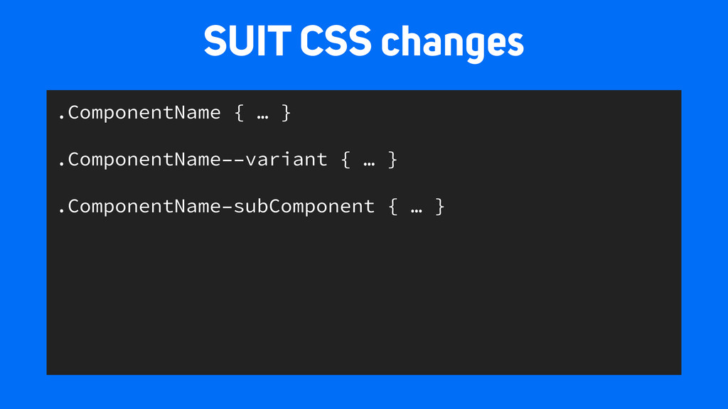
This talk compares several naming conventions and the pros and cons of each. From here, we’ll look how these benefits can be applied from the beginning of a project and assist the design process.
 peterwilsoncc
 news_it_enj
 genda
genda
 moongift
 ardbeg1958
 smt7174
 eiei114
 kintotechdev
 nttcom
 rakus_dev
 yuukiyo
 prgckwb
 soudai
 chrislema
 seathinner
 gurzu
gurzu
 jakevdp
 chriscoyier
 soysaucechin
 wjessup
 marktimemedia
 philnash
 chrisshort
 aleyda