Upgrade to Pro — share decks privately, control downloads, hide ads and more …

Introduction to Data Storytelling

Rasagy Sharma
August 18, 2020

Introduction to Data Storytelling

A short workshop on Data Storytelling, last conducted for MIT ID Pune’s Grad Show.

The talk covered various topics, like:
· The need for communicating data as stories
· Example Case Studies of Data Stories by Gramener
· Glimpse into my Data Art projects
· Data Storytelling Process by Gramener
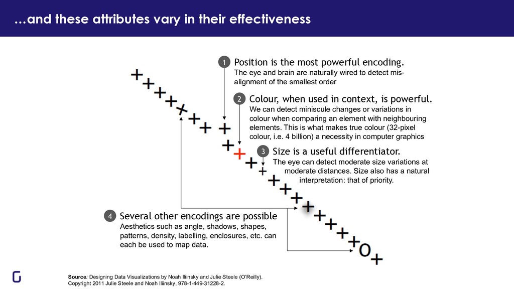
· Impact of Visual Perception & Memory on data visualization
· Frameworks for choosing the right chart for the right audience
· More resources to learn data storytelling

Rasagy Sharma

August 18, 2020
Tweet

More Decks by Rasagy Sharma

Other Decks in Design

Transcript

  1. How many numbers are above 100? 23 32 71 72

    58 87 11 77 70 16 17 21 56 44 68 51 84 20 60 40 37 8 107 14 12 41 69 14 18 71 62 55 59 64 33 55 71 58 103 92 101 56 45 34 43 15 73 78 6 93 39 53 22 26 26 94 60 82 99 74 11 12 36 67 70 71 97 59 73 99 75 74 69 69 51 48 2 66 92 98 15 10 41 58 104 94 92 84 74 82 12 52 10 57 33 77 88 81 81 91 15 56 25 30 21 7 66 66 78 87 29 23 5 34 11 96 74 99 99 88 37 10 43 15 50 71 65 60 101 98 46 34 19 102 57 70 95 84 63 91 3 34 39 37 60 81 65 63 9 71 48 46 25 50 22 64 91 76 71 79
  2. How many numbers are below 10? 23 32 71 72

    58 87 11 77 70 16 17 21 56 44 68 51 84 20 60 40 37 8 107 14 12 41 69 14 18 71 62 55 59 64 33 55 71 58 103 92 101 56 45 34 43 15 73 78 6 93 39 53 22 26 26 94 60 82 99 74 11 12 36 67 70 71 97 59 73 99 75 74 69 69 51 48 2 66 92 98 15 10 41 58 104 94 92 84 74 82 12 52 10 57 33 77 88 81 81 91 15 56 25 30 21 7 66 66 78 87 29 23 5 34 11 96 74 99 99 88 37 10 43 15 50 71 65 60 101 98 46 34 19 102 57 70 95 84 63 91 3 34 39 37 60 81 65 63 9 71 48 46 25 50 22 64 91 76 71 79
  3. Which quadrant has the highest total? 23 32 71 72

    58 87 11 77 70 16 17 21 56 44 68 51 84 20 60 40 37 8 107 14 12 41 69 14 18 71 62 55 59 64 33 55 71 58 103 92 101 56 45 34 43 15 73 78 6 93 39 53 22 26 26 94 60 82 99 74 11 12 36 67 70 71 97 59 73 99 75 74 69 69 51 48 2 66 92 98 15 10 41 58 104 94 92 84 74 82 12 52 10 57 33 77 88 81 81 91 15 56 25 30 21 7 66 66 78 87 29 23 5 34 11 96 74 99 99 88 37 10 43 15 50 71 65 60 101 98 46 34 19 102 57 70 95 84 63 91 3 34 39 37 60 81 65 63 9 71 48 46 25 50 22 64 91 76 71 79
  4. 23 32 71 72 58 87 11 77 70 16

    17 21 56 44 68 51 84 20 60 40 37 8 107 14 12 41 69 14 18 71 62 55 59 64 33 55 71 58 103 92 101 56 45 34 43 15 73 78 6 93 39 53 22 26 26 94 60 82 99 74 11 12 36 67 70 71 97 59 73 99 75 74 69 69 51 48 2 66 92 98 15 10 41 58 104 94 92 84 74 82 12 52 10 57 33 77 88 81 81 91 15 56 25 30 21 7 66 66 78 87 29 23 5 34 11 96 74 99 99 88 37 10 43 15 50 71 65 60 101 98 46 34 19 102 57 70 95 84 63 91 3 34 39 37 60 81 65 63 9 71 48 46 25 50 22 64 91 76 71 79 How many numbers are above 100?
  5. How many numbers are below 10? 23 32 71 72

    58 87 11 77 70 16 17 21 56 44 68 51 84 20 60 40 37 8 107 14 12 41 69 14 18 71 62 55 59 64 33 55 71 58 103 92 101 56 45 34 43 15 73 78 6 93 39 53 22 26 26 94 60 82 99 74 11 12 36 67 70 71 97 59 73 99 75 74 69 69 51 48 2 66 92 98 15 10 41 58 104 94 92 84 74 82 12 52 10 57 33 77 88 81 81 91 15 56 25 30 21 7 66 66 78 87 29 23 5 34 11 96 74 99 99 88 37 10 43 15 50 71 65 60 101 98 46 34 19 102 57 70 95 84 63 91 3 34 39 37 60 81 65 63 9 71 48 46 25 50 22 64 91 76 71 79
  6. Which quadrant has the highest total? 23 32 71 72

    58 87 11 77 70 16 17 21 56 44 68 51 84 20 60 40 37 8 107 14 12 41 69 14 18 71 62 55 59 64 33 55 71 58 103 92 101 56 45 34 43 15 73 78 6 93 39 53 22 26 26 94 60 82 99 74 11 12 36 67 70 71 97 59 73 99 75 74 69 69 51 48 2 66 92 98 15 10 41 58 104 94 92 84 74 82 12 52 10 57 33 77 88 81 81 91 15 56 25 30 21 7 66 66 78 87 29 23 5 34 11 96 74 99 99 88 37 10 43 15 50 71 65 60 101 98 46 34 19 102 57 70 95 84 63 91 3 34 39 37 60 81 65 63 9 71 48 46 25 50 22 64 91 76 71 79
  7. Visually representing data helps us to see patterns in the

    data quickly “The greatest value of a picture is when it forces us to notice what we never expected to see.” — John Tukey 11 Datasauras dataset, animated by Autodesk Research
  8. Stories have a huge impact on humans 12 Storytelling has

    a 30X Return on Investment Rob Walker and Joshua Glenn auctioned common items like mugs, golf balls, toys, etc. The item descriptions were stories purpose-written by 200+ contributing writers. Items that were bought for $250 sold for over $8,000 – a return of over 3,000% for storytelling! Stories are memorable and viral People remember stories. They’ll act on them. People share stories. That enables collective action. We analyze data to improve people’s decision making. For this to be effective, data stories are needed more than ever before.
  9. Visual data storytelling is a critical skill for data scientists,

    analysts & managers 13 Share your data & analysis as data stories Whenever you share inferences from data – whether it’s as a presentation, or an email or document with your analysis, or as a dashboard – craft it as a story. This session will give you a glimpse of some of the data stories we’ve created at Gramener, and how you can make these yourself. But analysts present their work, not their message Data scientists present their analysis – what they did, and what they found. That’s not what the audience needs. Audiences need a message that tells them what to do, and why. Told in an engaging way. As a story.
  10. …but the overload of data in today’s age makes this

    critical “Every second of every day, our senses bring in way too much data than we can possibly process in our brains.” – Peter Diamandis Data Storytelling helps make sense of this data 15 Data never sleeps Infographic by Domo
  11. With the growth of self-service BI, 85% of companies have

    lost track of how many dashboards they generated What QUESTION does the dashboard answer? Is the ANSWER evident from the dashboard? What ACTION should the user take now? BUT 3 THINGS ARE UNCLEAR ON MOST DASHBOARDS 16
  12. This is a dataset (1975 – 1990) that has been

    around for several years and has been studied extensively. Yet, a visualization can reveal patterns that are neither obvious nor well known. For example, • Are birthdays uniformly distributed? • Do doctors or parents exercise the C-section option to move dates? • Is there any day of the month that has unusually high or low births? • Are there any months with relatively high or low births? Very high births in September. But this is fairly well known. Most conceptions happen during the winter holiday season Relatively few births during the Christmas and Thanksgiving holidays, as well as New Year and Independence Day. Most people prefer not to have children on the 13th of any month, given that it’s an unlucky day Some special days like April Fool’s day are avoided, but Valentine’s Day is quite popular More births Fewer births … on average, for each day of the year (from 1975 to 1990) Let’s look at 15 years of US Birth Data https://gramener.com/posters/Birthdays.pdf
  13. The pattern in India is quite different https://gramener.com/posters/Birthdays.pdf This is

    a birth date dataset that’s obtained from school admission data for over 10 million children. When we compare this with births in the US, we see none of the same patterns. For example, • Is there an aversion to the 13th or is there a local cultural nuance? • Are holidays avoided for births? • Which months have a higher propensity for births, and why? • Are there any patterns not found in the US data? Very few children are born in the month of August, and thereafter. Most births are concentrated in the first half of the year We see a large number of children born on the 5th, 10th, 15th, 20th and 25th of each month – that is, round numbered dates Such round numbered patterns a typical indication of fraud. Here, birthdates are brought forward to aid early school admission More births Fewer births … on average, for each day of the year (from 2007 to 2013)
  14. This adversely impacts children’s marks https://gramener.com/posters/Birthdays.pdf It’s a well-established fact

    that older children tend to do better at school in most activities. Since many children have had their birth dates brought forward, these younger children suffer. The average marks of children “born” on the 1st, 5th, 10th, 15th etc.. of the month tend to score lower marks. • Are holidays avoided for births? • Which months have a higher propensity for births, and why? • Are there any patterns not found in the US data? Higher marks Lower marks … on average, for children born on a given day of the year (from 2007 to 2013) Children “born” on round numbered days score lower marks on average, due to a higher proportion of younger children
  15. Seeing the best & the worst of the best 21

    Sachin R Tendulkar Sourav C Ganguly Rahul Dravid Mohammad Azharuddin Yuvraj Singh Virender Sehwag Mahendra S Dhoni Alaysinhji D Jadeja Navjot S Sidhu Gautam Gambhir Krishnamachari Srikkanth Kapil Dev Dillip B Vengsarkar Suresh K Raina Ravishankar J Shastri Sunil M Gavaskar Mohammad Kaif Virat Kohli Vinod G Kambli Vangipurappu V S Laxman Rabindra R Singh Sanjay V Manjrekar Mohinder Amarnath Manoj M Prabhakar Rohit G Sharma Irfan K Pathan Nayan R Mongia Ajit B Agarkar Dinesh Mongia Harbhajan Singh Krishna K D Karthik Sandeep M Patil Anil Kumble Yashpal Sharma Javagal Srinath Hemang K Badani Yusuf K Pathan Robin V Uthappa Raman Lamba Zaheer Khan Ravindra A Jadeja Pathiv A Patel Sadagopan Ramesh Roger M H Binny Woorkeri V Raman Sunil B Joshi Kiran S More Praveen K Amre Ashok Malhotra Chetan Sharma
  16. European brewery identified €15 m cost savings after consolidating vendors

    22 A leading European brewery’s plants purchased commodity raw materials from several vendors each – and had low volume discounts. Plants also placed multiple orders placed every week, leading to higher logistics cost. Gramener built a custom analytics solution that showed how each plant performed compared to peers – shaming those with poor performance. With this, they identified savings of €15 m — which the plant managers couldn’t refute. €15 m 40% savings potential identified annually vendor based reduction identified
  17. Global airline reduced cargo turnaround time by 15% with scenario

    modeling 23 SEE LIVE DEMO A global airline company took up a service level agreement to deliver cargo from the flight to the warehouse in under 1.5 hours. This target was 15% lower than their current best. Several factors affect cargo delay across airports. Availability of forklifts, staff size, cargo type, part shipment, and many others. Altering any of these is expensive and takes long. Gramener built a visual analytics solution that showed where cargo was delayed. This allowed the airline to reduce the turnaround time by 15% from 1.76 hrs to 1.5 hrs. The worst-case turnaround time also reduced by 34% from 2.9 hrs to 1.92 hrs. 15% 34% cargo turnaround time reduction (from 1.76 to 1.5 hrs) reduction in worst-case turnaround time Evening Morning Night Fri Mon Sat Sun Thu Tue Wed FAH N70 RPP TDS ZDH 20-40% 40-60% 60-80% <20% Full Recovery times are neutral during the evening and morning shifts (mornings are slightly worse), night times are the best. Recovery times are worst on Fridays, and best on Saturdays & Wednesdays. Specifically, Friday mornings are particularly bad. So are Thursday mornings. The FAH product category has the best recovery time, while ZDH is much worse. However, RPP on Sundays is unusually slow. Part shipped products tend to perform worse than full-shipments. Specifically the <20% and 40-60% part-shipments. This is especially problematic for ZDH Product category Part shipment Weekday Shift This slide is best viewed in slideshow mode. The animations tell a story that isn’t obvious on the static version.
  18. Pharma IT&SM team saves €7.8 m by reducing delay in

    service requests 25 SEE LIVE DEMO The IT & SM team of a large multinational wanted to understand the status of their service request delays, and the drivers of delay. This would also drive the decision on whether service management would remain in-house. We analyzed every stage of services requests and visually represented how the requests flow and how long they are stuck at different stages. The analysis showed the problem as rework – not efficiency. This reversed their strategy of optimization in favor of a better screening. €7.9 m 22% effort reduction due to reduced service management itme reduction in service request time identified
  19. World Bank used data stories to clarify impact of technology

    on innovation 26 SEE LIVE DEMO The World Bank approached us to help communicating data stories from their economic development indicator data. Specifically: which countries have similar levels of innovation? Does technology drive innovation? Gramener collated the diverse datasets and clustered the countries based on similarity of economic indicators. We then ran a series of visual analytics that showed the impact of one on another – annotated with narrative explanations. We discovered that innovation is enabled by access to latest technology and reliance on professional management. But it does not align with appetite for entrepreneurship in high income countries. This interactive is featured on the World Bank website. 1.3 m 75% viewers read this interactive data story (as of Mar 2020) more people concluded the when shown the data story
  20. Data stories can help communicate the data science process https://gramener.com/cluster/cluster-census-2011-district

    Poor Rural, uneducated agri workers. Young population with low income and asset ownership. Mostly in Bihar, Jharkhand, UP, MP. Breakout Rural, educated agri workers poised for skilled labor. Higher asset ownership. Parts of UP, Bihar, MP. Aspirant Regions with skilled labor pools but low purchasing power. Cusp of economic development. Mostly WB, Odisha, parts of UP Owner Regions with unskilled labor but high economic prosperity (landlords, etc..) Mostly AP, TN, parts of Karnataka, Gujarat Business Lower education but working in skilled jobs, and prosperous. Typical of business communities. Parts of Gujarat, TN, Urban UP, Punjab, etc. Rich Urban educated population working in skilled jobs. All metros, large cities, parts of Kerala, TN Skilled Poorer Richer Unskilled Skilled Uneducated Educated Uneducated Educated Unskilled Purchasing power Skilled jobs Education Poor Breakout Aspirant Owner Business Rich The 6 clusters are Previously, the client was treating contiguous regions as a homogenous entity, from a channel content perspective. To deliver targeted content, we divided India into 6 clusters based on their demographic behavior. Specifically, three composite indices were created based on the economic development lifecycle: • Education (literacy, higher education) that leads to... • Skilled jobs (in mfg. or services) that leads to... • Purchasing power (higher income, asset ownership) Districts were divided (at the average cut-off) by:
  21. Data stories can lead to higher engagement & answer new

    questions A large FMCG organization wanted to create a visualization to review sales performance across geographies, channels and products for their board meetings. Gramener built an interactive slide deck that allowed users to drill-down within powerpoint. Dynamic presentations led to a complete revamp of the entire structure of board presentations. 28 https://gramener.com/fmcg/ Worldwide: $288 mn UK: 87.0 Stores: 34.4 Product 9: 6.2 Product 10: 5.4 Product 7: 5.1 Product 15: 4.8 Product 8: 3.1 Product 14: 2.1 Partners: 29.2 Product 15: 6.7 Product 17: 4.1 Product 6: 3.4 Product 1: 3.2 Product 7: 2.9 Product 11: 2.4 Direct: 23.5 Product 17: 5.2 Product 8: 4.4 Product 16: 4.0 Product 14: 2.5 Product 1: 2.5 Japan: 71.9 Stores: 25.9 Product 14: 6.0 Product 7: 5.4 Product 11: 4.0 Product 17: 2.8 Partners: 25.5 Product 8: 8.2 Product 11: 3.6 Product 16: 3.3 Product 1: 3.1 Product 9: 2.0 Direct: 20.5 Product 11: 5.2 Product 15: 4.5 P roduct 14: 2.8 Product 9: 2.3 China: 65.6 Partners: 27.3 Product 10: 8.0 Product 3: 7.1 Product 15: 3.0 Product 2: 2.1 Product 8: 2.0 Direct: 19.6 Product 3: 5.5 Product 2: 4.7 Product 8: 2.6 Product 17: 2.1 Stores: 18.7 Product 10: 5.4 Product 14: 2.2 Product 7: 2.1 Product 15: 2.0 India: 46.6 Stores: 17.5 Product 16: 6.8 Direct: 15.6 Product 10: 3.4 Product 16: 2.9 Product 17: 2.5 Product 7: 2.4 Partners: 13.4 Product 8: 2.5 Product 7: 2.3 US: 17.0 Partners: 6.0 Product 10: 4.4 Direct: 5.8 Product 11: 3.9 Stores: 5.3 Product 11: 3.8 Worldwide $288.0mn A: Accelerate $68.9mn B: Build $77.2mn C: Cut down $141.9mn
  22. Interactive data stories with comics can turn your analysis into

    a fun quiz https://blog.gramener.com/data-comics-storytelling-for-business-decisions/
  23. Data stories can spark questions that you may have never

    asked 32 http://rasagy.in/VisualizingTrains/
  24. You have data. You have analysis. Now, narrate your story.

    Understand the audience & intent Find insights Storyline Design data stories
  25. We use these steps to go from data to a

    data story: 35 Who is your audience? They determine the story What is their problem? That defines your analysis Find the right analysis to solve the problem Filter for big, useful, surprising insights Start with the takeaway. Summarize your entire story Add supporting analyses as a tree Pick a format based on how your audience will consume the story Pick a visual design based on the takeaway Annotate to explain & engage. Use four types of narratives
  26. DO IT: Who is the audience for your analysis? q

    Role: _____________ Be specific. “Head of sales”, not “executive” q Example name: ______________ Name a real person. “Jim Fry”, not “any sales head”. Different people want different things from the same data. Given sales data: • The Board: “Predict next quarter’s sales” • Product head: “Which product grew the most?” • Sales head: “Did we meet our target?” They are not interested in each others’ questions. Who is your audience? They determine the story
  27. DO IT: Write it in this structure “[Person, Role] is

    in [situation], and faces this [problem]. By taking [action], she can drive [impact].” Example John, the Marketing head, person, role must create a region-wise budget, situation and doesn’t know the region-wise RoI. problem By prioritizing the region, action she can maximize ROI. impact For each person, answer the following questions: 1. What’s their situation? 2. What problems do they face? 3. What action can they take? 4. What is the impact of this action? What is their problem? That defines your analysis
  28. Here are three examples in real life 38 Purchasing Commodities

    Cargo Delay Customer Churn Person, Role Adam, the purchasing head of a leading European brewery Cris, the operations head of a leading US airline Ravi, the marketing manager of an Asian telecom company Situation had plants that purchased commodities from several vendors. Discounts were low. Number of weekly orders were high. had an SLA to deliver cargo from the flight to the warehouse in under 1.5 hours – 15% lower than their current best performance. Found that the cost of replacing customers was thrice the cost of retention. Problem But he didn’t know which plants and commodities were a problem. Every plant denied it. But she didn’t know what were the biggest drivers of this delay – people, assets, or type of cargo. But he didn’t know which customers to make offers to in order to retain them. Action By consolidating vendors and reducing order frequency, By adding resources only to the largest levers of delay, By predicting which customer was likely to churn, Impact they could increase their discounts and reduce logistics cost. she could reduce turnaround time with the lowest spend. they could tailor a retention offer and reduce re-acquisition cost.
  29. Filter for big, useful, surprising insights DO IT: Rate each

    analysis against B.U.S. Filter the analyses using this checklist IS THE INSIGHT BIG IS THE INSIGHT USEFUL IS THE INSIGHT SURPRISING We want a result that substantially changes the outcome. Can they take an action that improves their objective? What should they do next? Is it non-obvious? Does it overturn an existing belief, or bring consensus? Example B U S There are twice as many restaurants in NYC than any other city ü ü û Sales increased in every region except our largest branch, which dipped by 0.1% û ü ü Increase in rainfall increases the sale of umbrellas, and is the biggest driver of our sales ü û û
  30. Here are the analyses & filters for the problems we

    saw earlier 40 Purchasing Commodities B U S Cargo Delay B U S Customer Churn B U S The most common commodity was ordered 10 times a week across 2.4 vendors Fragile cargo is a big factor in the delay, with a 20% impact Number of inbound calls does not impact churn. The number of orders is correlated with the number of vendors. Reducing one will reduce the other Fridays are when cargo is delayed the most Customers who haven’t made any calls in the last 15 days are the most likely to churn Plant P126 was the plant with the most violations, especially on largest commodity Trained staff and forklifts impact delay the most Customers making infrequent calls, recharging small amounts infrequently, are most at risk
  31. Here are the analyses & filters for the problems we

    saw earlier 41 Purchasing Commodities B U S Cargo Delay B U S Customer Churn B U S The most common commodity was ordered 10 times a week across 2.4 vendors Fragile cargo is a big factor in the delay, with a 20% impact B S Number of inbound calls does not impact churn. S The number of orders is correlated with the number of vendors. Reducing one will reduce the other U Fridays are when cargo is delayed the most Customers who haven’t made any calls in the last 15 days are the most likely to churn B Plant P126 was the plant with the most violations, especially on largest commodity B U Trained staff and forklifts impact delay the most B U S Customers making infrequent calls, recharging small amounts infrequently, are most at risk B U S
  32. DO IT: Write your takeaway as one sentence What’s the

    one thing you want the audience to remember from your story? What’s the one message that the audience should take away? CHECK IT: Verify these yourself q Is it a single, complete, sentence? q Does it deliver what you want the audience to remember? q Will your audience care a lot about this? Close your eyes. Think of a childhood tale. Summarize the moral of the story in one line We easily we remember these stories and their summary as a moral several years later. Close your eyes. Think of a business presentation from last week. Can you easily summarize the message in one line? Stories are designed around a moral. A single takeaway. An “elevator pitch” It’s a one-sentence summary of the most important message for the audience. Start with the takeaway. Summarize your entire story 42
  33. Here is the storyline for the analyses we saw earlier

    43 Purchasing Commodities Cargo Delay Customer Churn Takeaway Focus on reducing the number of vendors products ICG (in P126), FRS (in P121) and SWB (in P074) for a potential 40% reduction in logistics & vendor cost. To reduce the TAT to 1.5 hours at Airport XYZ, increase the number of forklifts from 1 to 2, and the number of trained staff from 4 to 6 If a customer has not called in the last 5-14 days, and they have made only 1 recharge under $20 last quarter, make them an offer to retain them. Supporting points ICG spend is among the highest, at €6.9m. P126 typically orders 40 times a week, often from 15-20 vendors. The number of forklifts is the biggest driver of TAT. Each forklift typically reduces TAT by 15-30%. The biggest driver of retention is when the customer made the outgoing call. The 5-14 days bucket has the highest variation. FRS spend is €3.2m. P121 orders from 3 vendors 8-14 times a week. Total staff count does not impact TAT. Increasing trained staff has a more tangible impact of ~5-10% per person. Customers who make at most 1 recharge under $20 are 280% more likely to churn than others.
  34. Human memory is continuously capturing & forgetting information 46 Iconic

    Memory Working Memory Long-term Memory Attention Retrieval Maintenance Rehearsal 1-3 seconds 15- 30 seconds 1 second -Lifetime Pre-attentive Processing even before we pay attention Can hold and process between 5-9 chunks of information Information is stored by repeated application or through rehearsal Unattended information is lost Unrehearsed information is lost Some information may be lost by overtime Encoding
  35. Visual perception as the ability to interpret the surrounding environment

    by processing information that is contained in visible light. Introduction to Data Storytelling by Rasagy Sharma
  36. Some visual attributes are noticed before we actively pay attention

    to them 4 categories of pre-attentive visual attributes. Form | Colour | Spatial Position | Movement
  37. Source: Designing Data Visualizations by Noah Iliinsky and Julie Steele

    (O’Reilly). Copyright 2011 Julie Steele and Noah Iliinsky, 978-1-449-31228-2. Position is the most powerful encoding. The eye and brain are naturally wired to detect mis- alignment of the smallest order 1 Colour, when used in context, is powerful. We can detect miniscule changes or variations in colour when comparing an element with neighbouring elements. This is what makes true colour (32-pixel colour, i.e. 4 billion) a necessity in computer graphics 2 Size is a useful differentiator. The eye can detect moderate size variations at moderate distances. Size also has a natural interpretation: that of priority. 3 Several other encodings are possible Aesthetics such as angle, shadows, shapes, patterns, density, labelling, enclosures, etc. can each be used to map data. 4 …and these attributes vary in their effectiveness
  38. Let’s start small: visualize two numbers (2 & 8) from

    today’s date Sketch it out or watch others on Invision Freehand 50 Check the link in chat: https://gramener.invisionapp.com/freehand/document/PJDgyGxVU
  39. Guidelines on Visual Encodings List what you want to convey

    about the data. (remember the data relationships) If multiple things, sort these in order of importance Shortlist the pre attentive attributes that can be used for the above relationships. Map these attributes to the messages. Quick validation - self & with team
  40. Pick a visual design based on the takeaway 59 Deviation

    Change- over-Time Spatial Ranking Correlation Part-to- Whole Flow Magnitude Distribution
  41. How the data should be interpreted decides the type of

    chart to be used 60 Help people explore data Showcase high/low performance Explain drivers of performance https://gramener.github.io/visual-vocabulary-vega/ Deviation Emphasise variations (+/-) from a fixed reference point. Typically the reference point is zero but it can also be a target or a long- term average. Change-over-Time Give emphasis to changing trends. These can be short (intra-day) movements or extended series traversing decades or centuries. Spatial Used only when precise locations or geographical patterns in data are more important to the reader than anything else. Ranking Use where an item's position in an ordered list is more important than its absolute or relative value. Correlation Show the relationship between two or more variables. Part-to-Whole Show how a single entity can be broken down into its component elements. Flow Show the reader volumes or intensity of movement between two or more states or conditions. These might be logical sequences or geographical locations Magnitude Show size comparisons. These can be relative (just being able to see larger/bigger) or absolute (need to see fine differences). Distribution Show values in a dataset and how often they occur. The shape (or skew) of a distribution can be a memorable way of highlighting the lack of uniformity or equality in the data.
  42. Annotate to explain & engage. Use four types of narratives

    Remember “SEAR”: Summarize, Explain, Annotate, Recommend 62 0 5,000 10,000 15,000 20,000 0 5 10 15 20 25 30 35 40 45 50 55 60 65 70 75 80 85 90 95 100 Marks # students Teachers add marks to stop some students from failing This chart shows Class 10 students’ English marks in Tamil Nadu, India, in 2011. The X-axis has the mark a student has scored. The Y-axis has the # of students who scored that mark. Large number of students score exactly 35 marks Few (but not 0) students fail at 31-34 marks What’s unusual Large number of students score 35 marks. Few (but not 0) students score between 30-35 Only some students get this benefit. Identify a fair policy that will be applied consistently. Summarize the visual in its title Don’t describe the chart. Don’t write the user’s question. Write the answer itself. Like a headline. Explain & interpret the visual How should the user read it? What do you say when you talk through it? Explain what the visual is. Then the axes. Then its contents. Then the inference. Recommend an action How should I act on this? You need to change the audience. (Otherwise, you made no difference.) Annotate essential elements What should the user focus their eyes on? Point it out, or highlight it with colors Interpret what they’re seeing – in words. This is a bell curve. But the spike at 35 (the mark at which students pass) is unusual. Teachers must be adding marks to some of the students who are likely to fail by a small margin. No one scores 0-4 marks
  43. In summary, here are the 9 steps to go from

    data to a data story 63 Who is your audience? They determine the story What is their problem? That defines your analysis Find the right analysis to solve the problem Filter for big, useful, surprising insights Start with the takeaway. Summarize your entire story Add supporting analyses as a tree Pick a format based on how your audience will consume the story Pick a visual design based on the takeaway Annotate to explain & engage. Use four types of narratives
  44. Recommended Resources Books to read • Resonate - Nancy Duarte

    • Storytelling with Data - Cole Nussbaumer Knaflic • Truthful Art - Alberto Cairo • Design of everyday things - Don Norman • Back of the napkin - Dan Roam Data Storytelling at Gramener 1. Solutions on Gramener site: https://gramener.com/solutions/ 2. Gramener’s Blog https://blog.gramener.com/ 3. Gramener’s upcoming webinars: https://linkedin.com/company/ gramener/ Tools to learn • Paper & Pen (Collaborative) • Excel • Tableau & PowerBI • JS (D3, Vega, Plot.ly) • Python (Bokeh/Matplotlib) • R (ggplot) • Raw graphs • Illustrator / Sketch / Figma You can find me (Rasagy) on Twitter/LinkedIn/Instagram 65
  45. “Most of us need to listen to the music to

    understand how beautiful it is. But often that’s how we present statistics: we just show the notes, we don’t play the music.” — Hans Rosling Introduction to Data Storytelling by Rasagy Sharma