Upgrade to Pro
— share decks privately, control downloads, hide ads and more …
Speaker Deck
Features
Speaker Deck
PRO
Sign in
Sign up for free
Search
Search
The CSS of Tomorrow (revised)
Search
Peter Gasston
October 22, 2012
Programming
31k
116
Share
Embed
Copy iframe code
Copy JS code
Copy link
Start on current slide
The CSS of Tomorrow (revised)
London Web Standards, October 2012
Peter Gasston
October 22, 2012
More Decks by Peter Gasston
See All by Peter Gasston
People Don’t Change
stopsatgreen
0
230
Your Reality Here
stopsatgreen
0
140
Growing Up, Getting Serious - #SotB6
stopsatgreen
1
390
Growing Up, Getting Serious
stopsatgreen
0
130
Surveying the Landscape — November 2016
stopsatgreen
1
210
Surveying the Landscape - Fronteers
stopsatgreen
2
530
The Web vs. The Browser
stopsatgreen
0
240
Surveying the Landscape Sept. 2016
stopsatgreen
1
470
Surveying the Landscape
stopsatgreen
4
920
Other Decks in Programming
See All in Programming
5分で問診!Composer セキュリティ健康診断
codmoninc
0
560
ソフトウェア設計に溶けるインフラ ― AWS CDK のインフラ認識論
konokenj
2
620
GitHubCopilotCLIのスラッシュコマンドを自作してみる
htkym
0
100
PHPだって関数型したい 〜できること、できないこと〜 / fp-in-php
jsoizo
1
240
Welcome to the "Parametricity" 🏙️ − Generic だけど Specific な世界 −
guvalif
PRO
1
180
Android CLI
fornewid
0
120
型も通る、synthも通る、それでも危ない 〜AIのCDKの権限とコストを機械で検証する〜 / It Passes Type Checks, It Passes Synth Checks, but It’s Still Risky — Automatically Verifying Permissions and Costs in AI’s CDK —
seike460
PRO
1
410
ITヒヤリハットを整理してみた ~ライフサイクルと原因から考える再発防止策~
koukimiura
1
110
광주소프트웨어마이스터고등학교 DevFest 특강 - 바이브 코딩 시대에서 주니어 개발자로 살아남는 방법
utilforever
1
150
えっ!!コードを読まずに開発を!?
hananouchi
0
230
信頼性について考えてみる(SRE NEXT 2026 miniLT)
hayama17
0
210
The Past, Present, and Future of Enterprise Java
ivargrimstad
0
370
Featured
See All Featured
Let's Do A Bunch of Simple Stuff to Make Websites Faster
chriscoyier
508
140k
Between Models and Reality
mayunak
4
380
実際に使うSQLの書き方 徹底解説 / pgcon21j-tutorial
soudai
PRO
201
75k
30 Presentation Tips
portentint
PRO
1
350
The Pragmatic Product Professional
lauravandoore
37
7.4k
AI Search: Where Are We & What Can We Do About It?
aleyda
0
7.7k
The innovator’s Mindset - Leading Through an Era of Exponential Change - McGill University 2025
jdejongh
PRO
1
220
AI in Enterprises - Java and Open Source to the Rescue
ivargrimstad
0
1.4k
How STYLIGHT went responsive
nonsquared
100
6.2k
Build your cross-platform service in a week with App Engine
jlugia
234
18k
Art, The Web, and Tiny UX
lynnandtonic
304
22k
Easily Structure & Communicate Ideas using Wireframe
afnizarnur
194
17k
Transcript
Peter Gasston @stopsatgreen http://broken-links.com
The CSS of Tomorrow
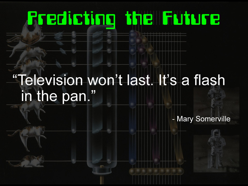
Predicting the Future “Television won’t last. It’s a flash in
the pan.” - Mary Somerville
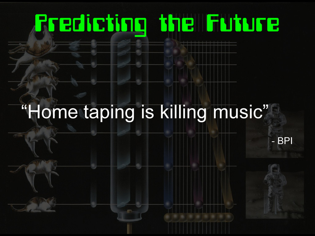
Predicting the Future “Home taping is killing music” - BPI
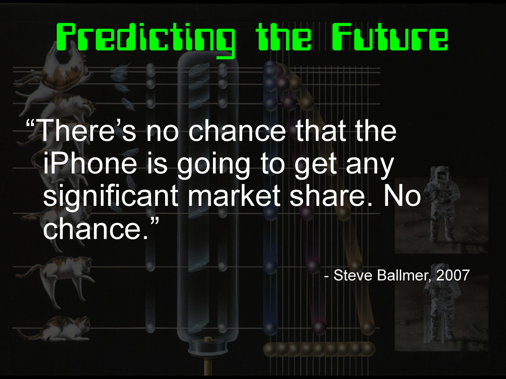
Predicting the Future “There’s no chance that the iPhone is
going to get any significant market share. No chance.” - Steve Ballmer, 2007
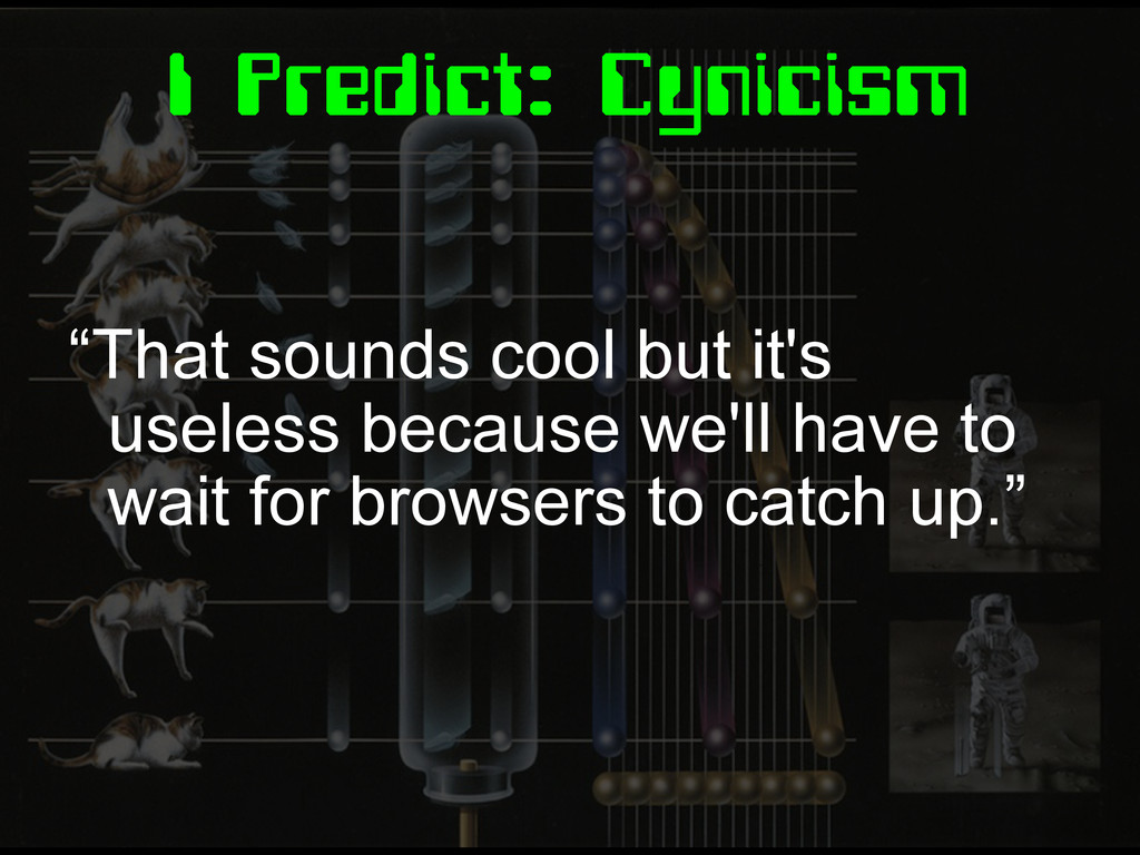
I Predict: Cynicism “That sounds cool but it's useless because
we'll have to wait for browsers to catch up.”
The CSS of Tomorrow
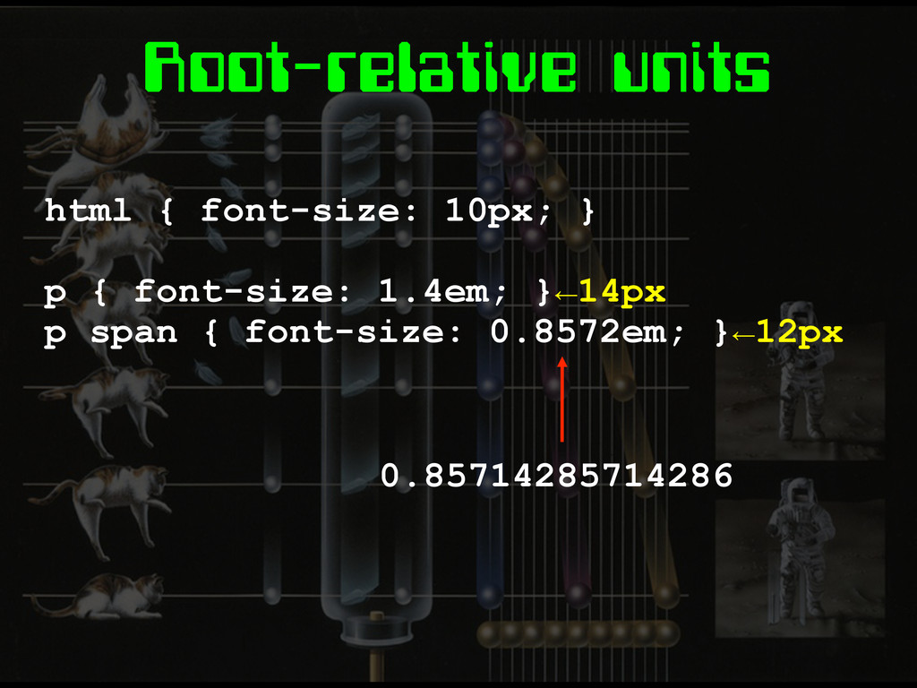
Root-relative units html { font-size: 10px; } p { font-size:
1.4em; }←14px p span { font-size: 0.8572em; }←12px 0.85714285714286
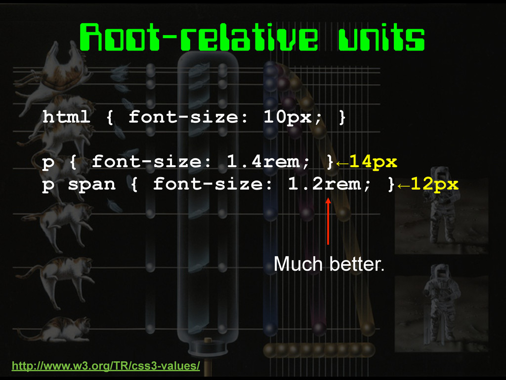
Root-relative units html { font-size: 10px; } p { font-size:
1.4rem; }←14px p span { font-size: 1.2rem; }←12px Much better. http://www.w3.org/TR/css3-values/
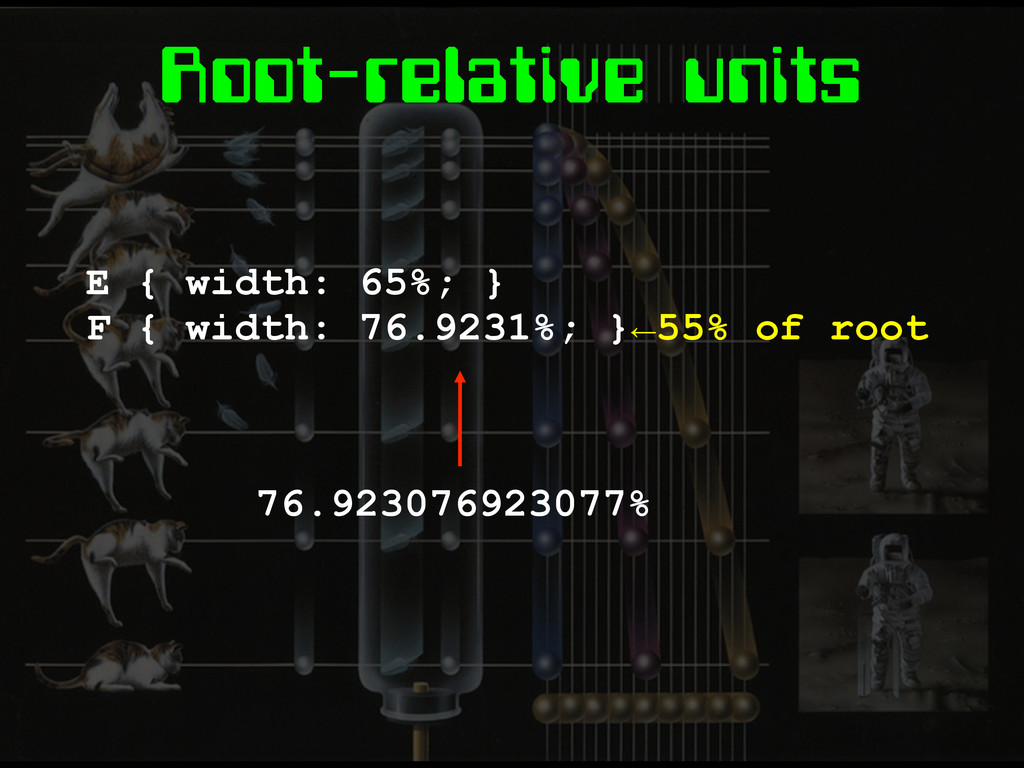
Root-relative units E { width: 65%; } F { width:
76.9231%; }←55% of root 76.923076923077%
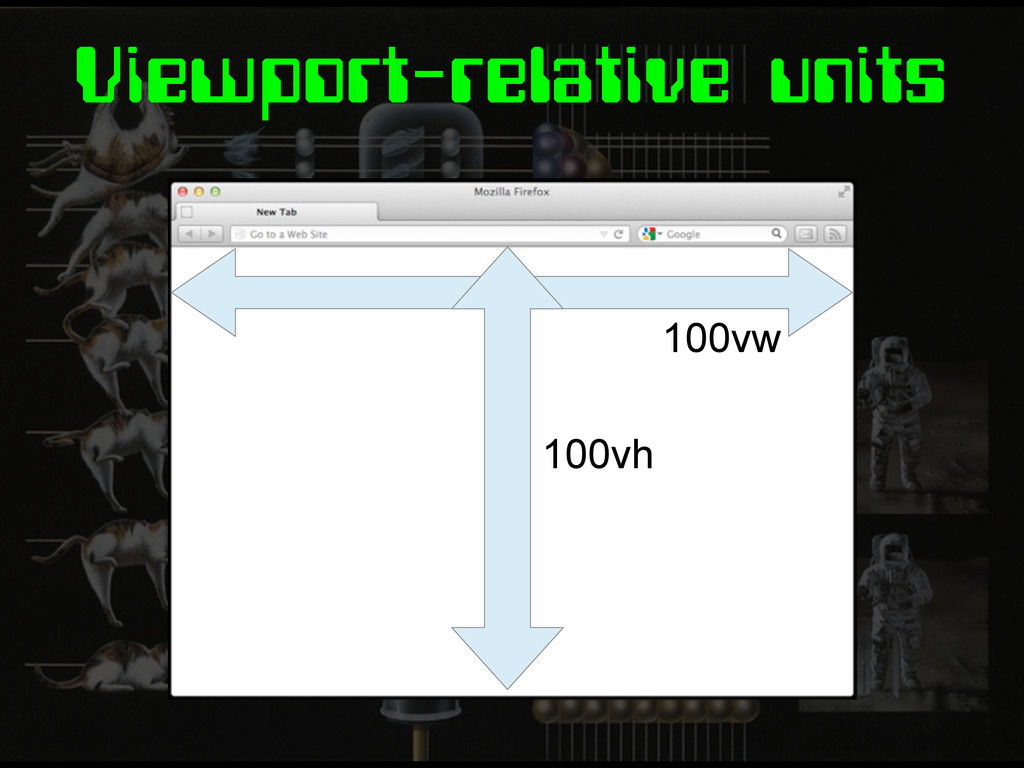
Viewport-relative units 100vw 100vh
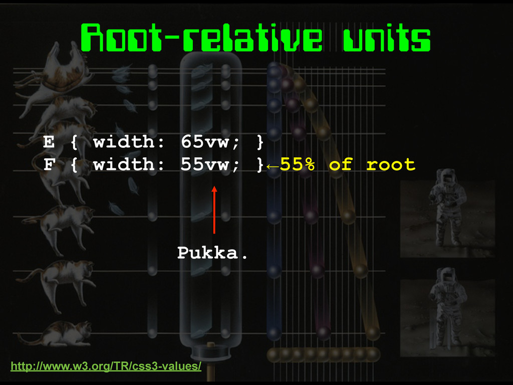
Root-relative units E { width: 65vw; } F { width:
55vw; }←55% of root Pukka. http://www.w3.org/TR/css3-values/
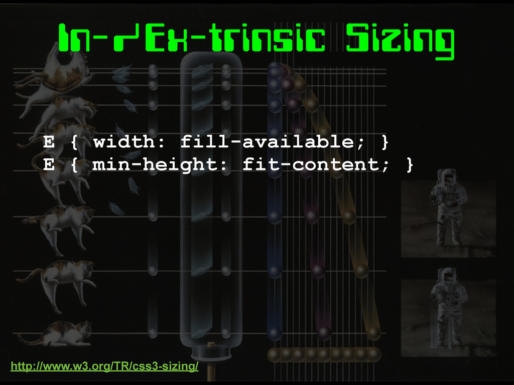
In-/Ex-trinsic Sizing E { width: fill-available; } E { min-height:
fit-content; } http://www.w3.org/TR/css3-sizing/
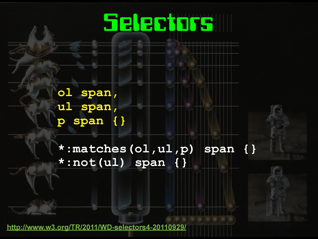
Selectors ol span, ul span, p span {} *:matches(ol,ul,p) span
{} *:not(ul) span {} http://www.w3.org/TR/2011/WD-selectors4-20110929/
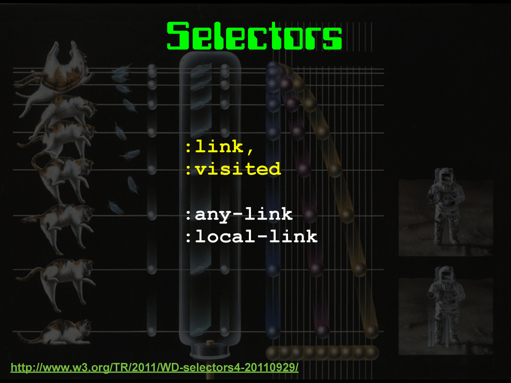
Selectors :link, :visited :any-link :local-link http://www.w3.org/TR/2011/WD-selectors4-20110929/
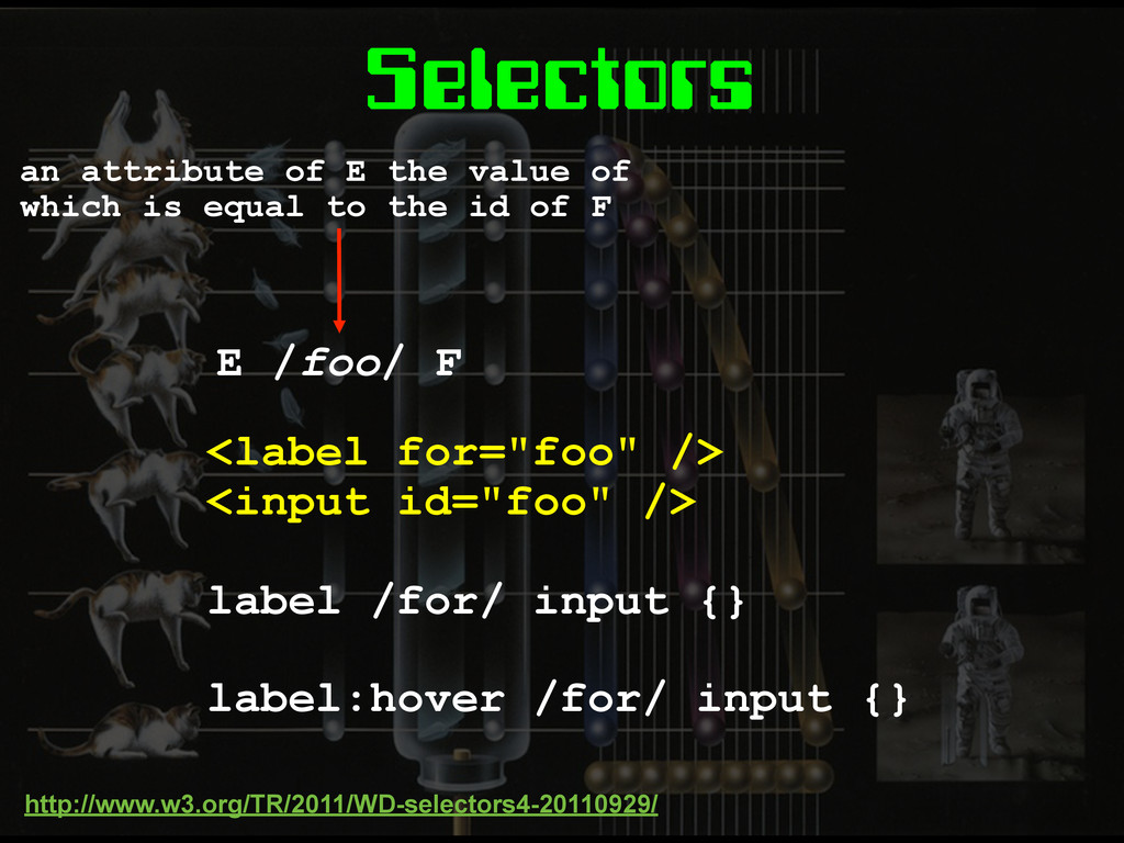
Selectors <label for="foo" /> <input id="foo" /> label /for/ input
{} label:hover /for/ input {} http://www.w3.org/TR/2011/WD-selectors4-20110929/ an attribute of E the value of which is equal to the id of F E /foo/ F
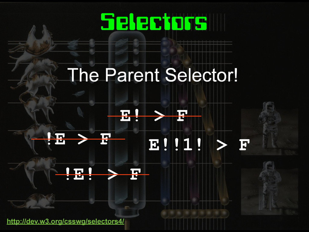
Selectors E! > F !E > F !E! > F
E!!1! > F The Parent Selector! http://dev.w3.org/csswg/selectors4/
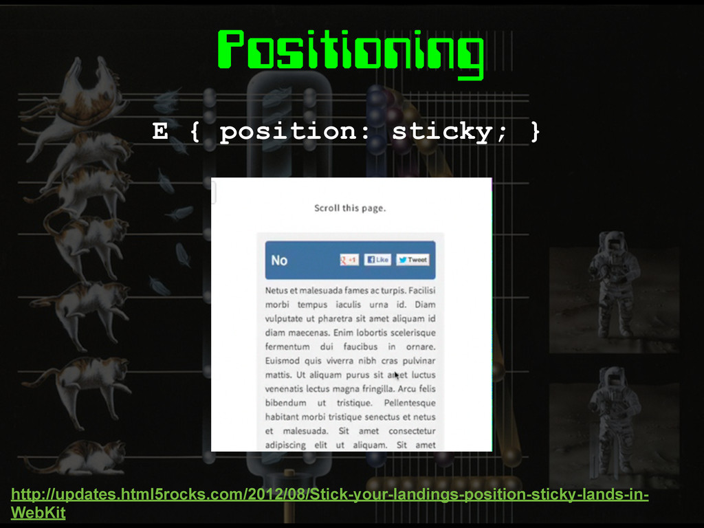
Positioning E { position: sticky; } http://updates.html5rocks.com/2012/08/Stick-your-landings-position-sticky-lands-in- WebKit
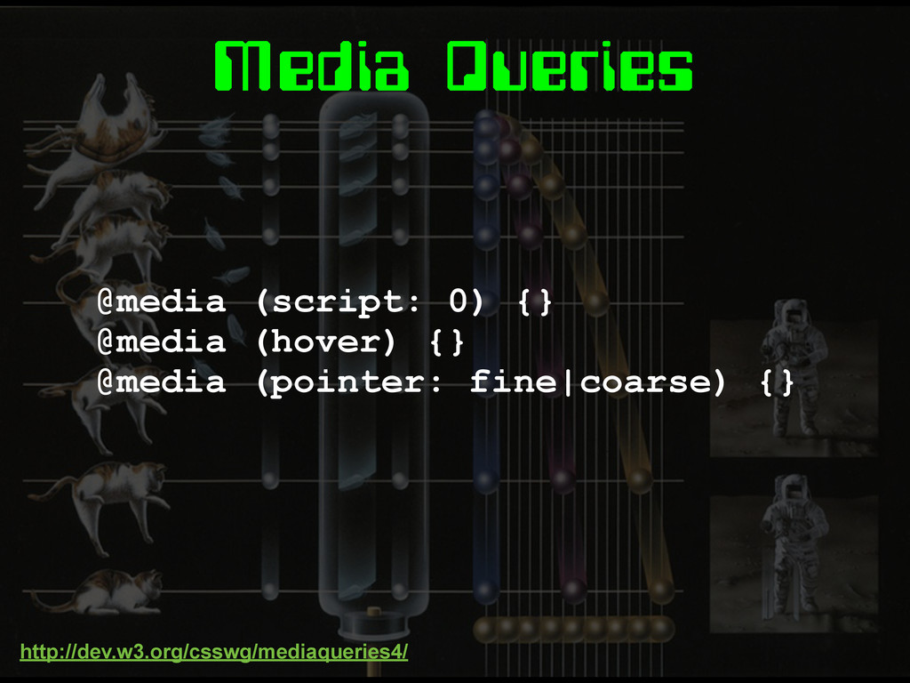
Media Queries
Media Queries @media (script: 0) {} @media (hover) {} @media
(pointer: fine|coarse) {} http://dev.w3.org/csswg/mediaqueries4/
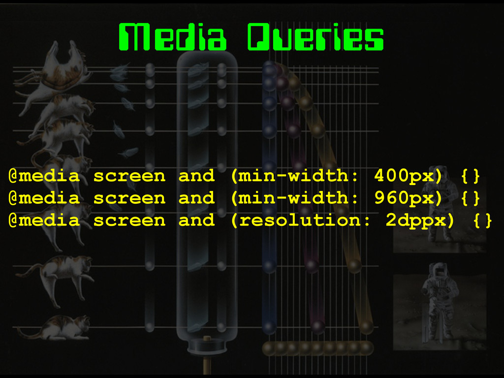
Media Queries @media screen and (min-width: 400px) {} @media screen
and (min-width: 960px) {} @media screen and (resolution: 2dppx) {}
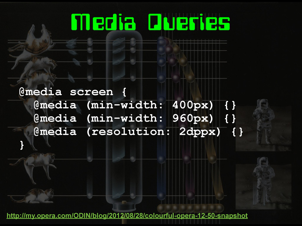
Media Queries @media screen { @media (min-width: 400px) {} @media
(min-width: 960px) {} @media (resolution: 2dppx) {} } http://my.opera.com/ODIN/blog/2012/08/28/colourful-opera-12-50-snapshot
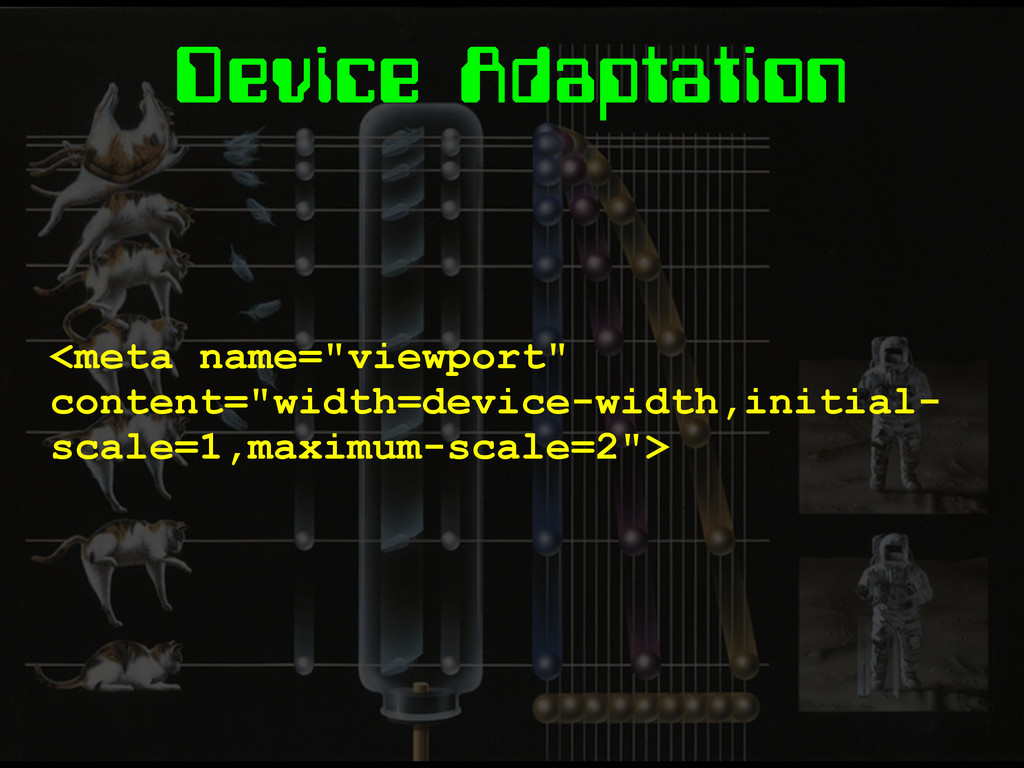
Device Adaptation <meta name="viewport" content="width=device-width,initial- scale=1,maximum-scale=2">
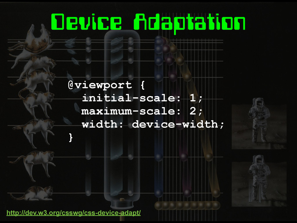
Device Adaptation @viewport { initial-scale: 1; maximum-scale: 2; width: device-width;
} http://dev.w3.org/csswg/css-device-adapt/
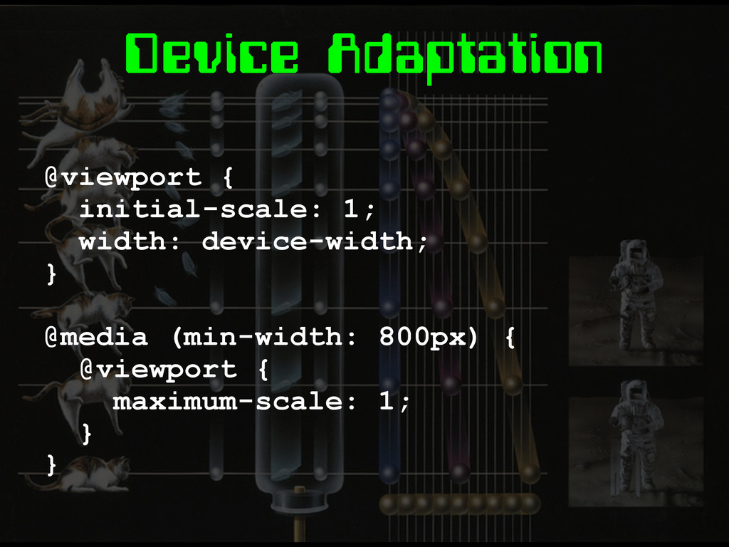
Device Adaptation @viewport { initial-scale: 1; width: device-width; } @media
(min-width: 800px) { @viewport { maximum-scale: 1; } }
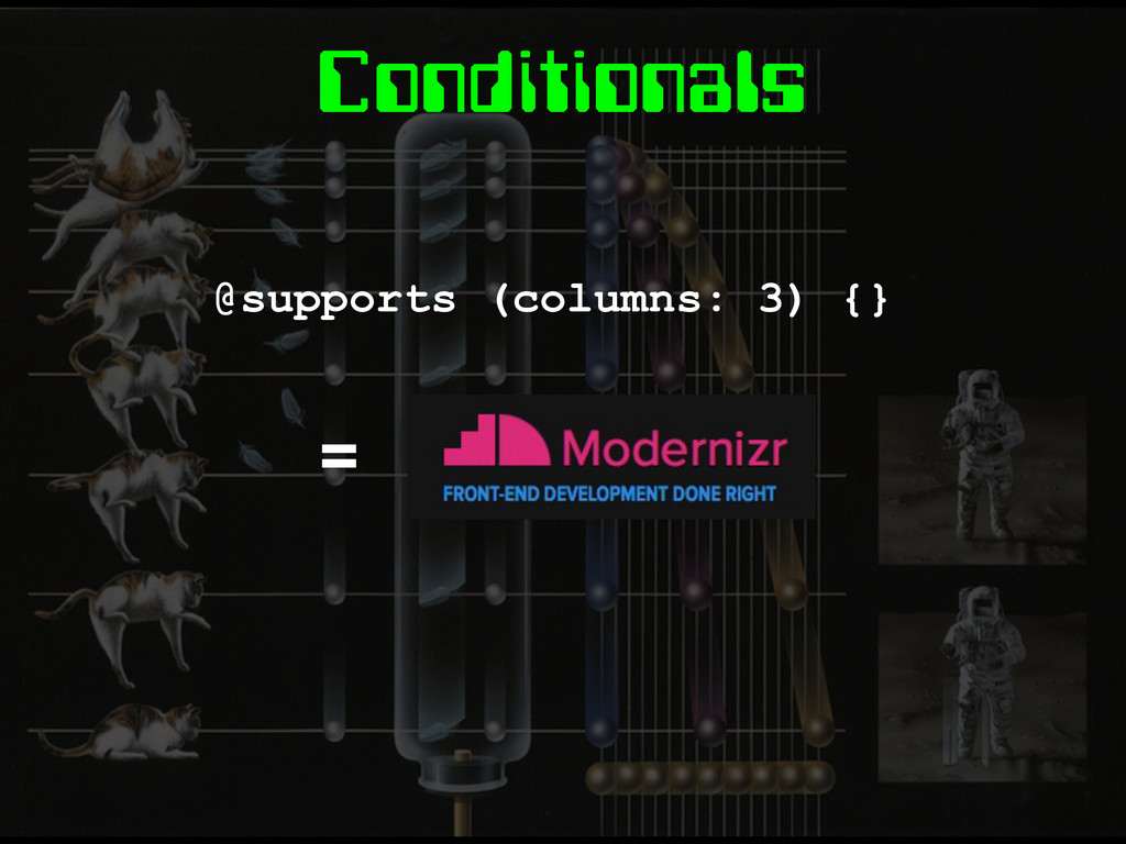
Conditionals @supports (columns: 3) {} =
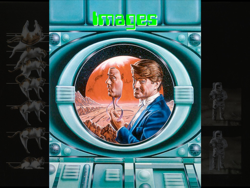
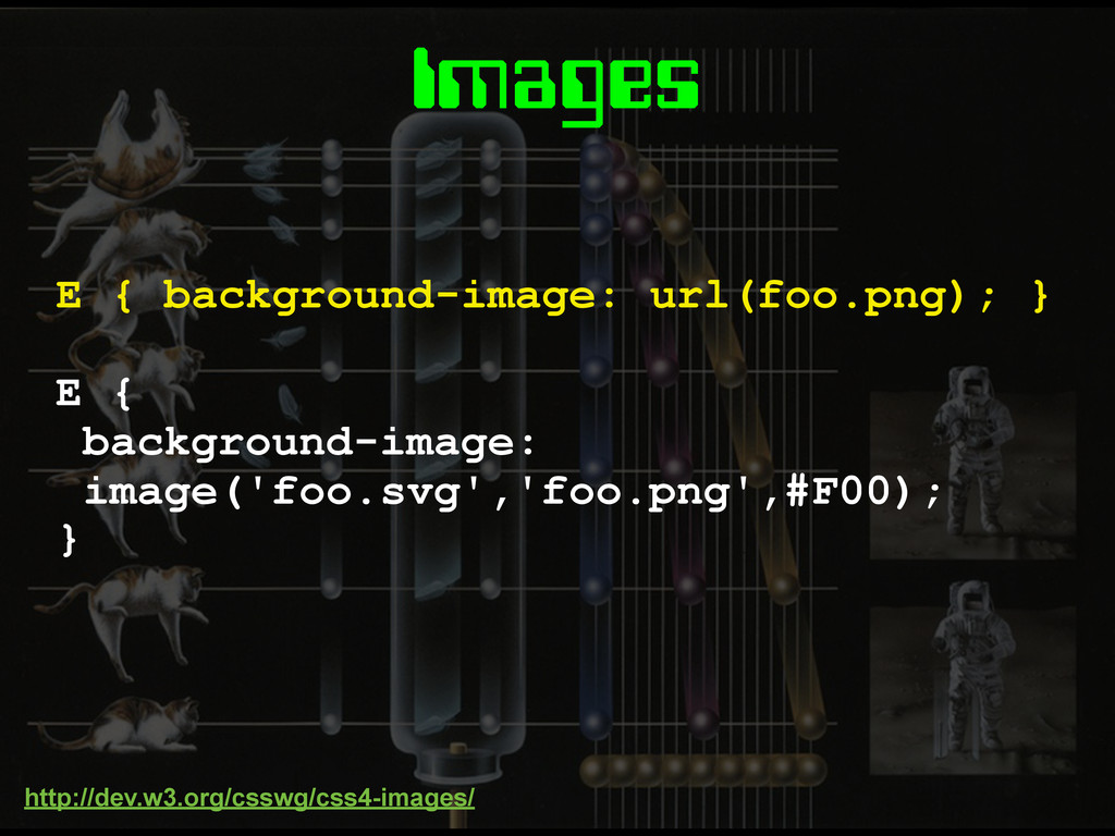
Images
Images E { background-image: image('foo.svg','foo.png',#F00); } E { background-image: url(foo.png);
} http://dev.w3.org/csswg/css4-images/
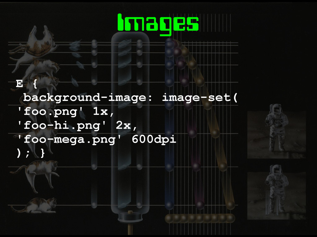
Images E { background-image: image-set( 'foo.png' 1x, 'foo-hi.png' 2x, 'foo-mega.png'
600dpi ); }
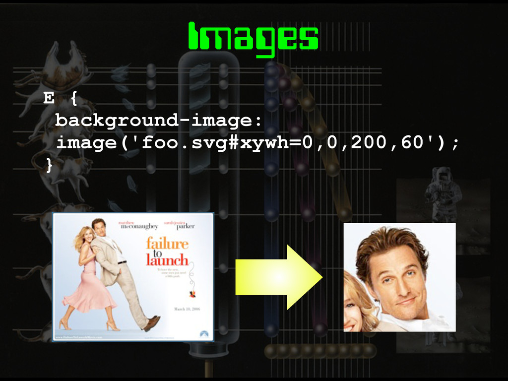
Images E { background-image: image('foo.svg#xywh=0,0,200,60'); }
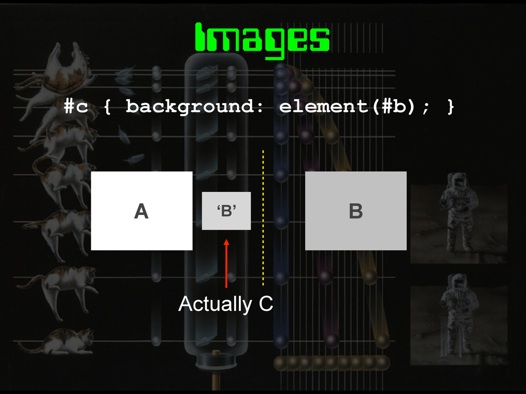
Images #c { background: element(#b); } ‘B’ Actually C A
B
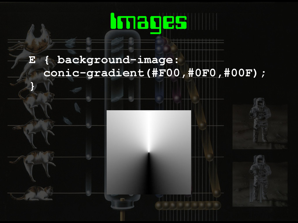
Images E { background-image: conic-gradient(#F00,#0F0,#00F); }
Layout
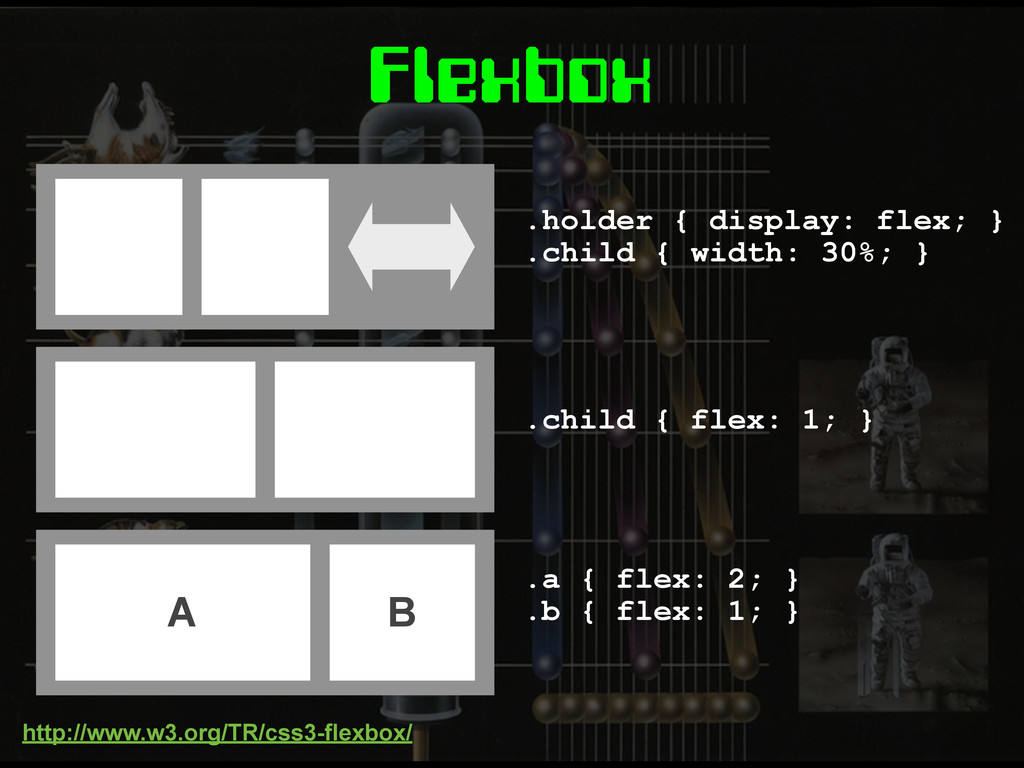
Flexbox
.holder { display: flex; } .child { width: 30%; }
.child { flex: 1; } A B .a { flex: 2; } .b { flex: 1; } Flexbox http://www.w3.org/TR/css3-flexbox/
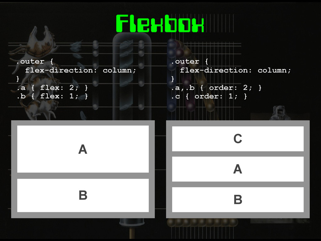
Flexbox C A B .outer { flex-direction: column; } .a,.b
{ order: 2; } .c { order: 1; } A B .outer { flex-direction: column; } .a { flex: 2; } .b { flex: 1; }
Grid Layout
Grid Layout E { display: grid; grid-definition-columns: 1fr 1fr 2fr;
} E { grid-definition-columns: 1fr 1fr 2fr; grid-definition-rows: 10em auto 40px; } http://dev.w3.org/csswg/css3-grid-layout/
Grid Layout F { grid-column-position: 2; grid-row-position: 2; } A
B .a { grid-column: 2 2; } .b { grid-row-span: 3; }
Grid Templates E { grid-template: 'head head head' 'nav main
main' 'foot foot foot'; } .a { grid-area: 'head'; } .b { grid-area: 'main'; } A B
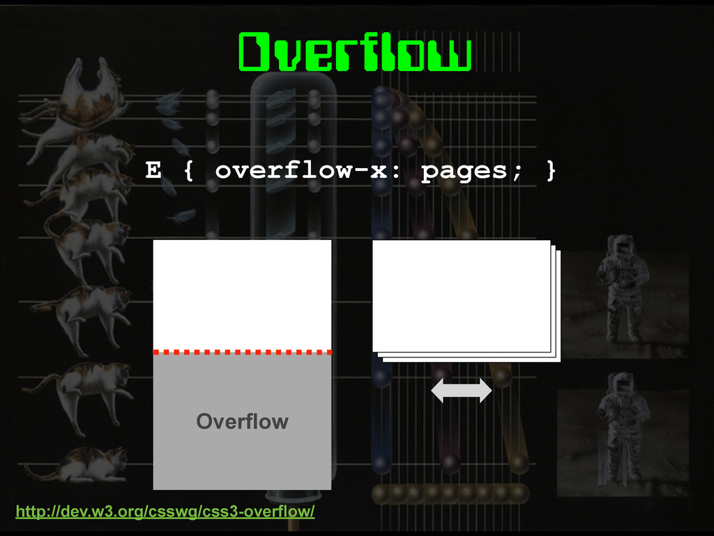
Overflow E { overflow-x: pages; } Overflow http://dev.w3.org/csswg/css3-overflow/
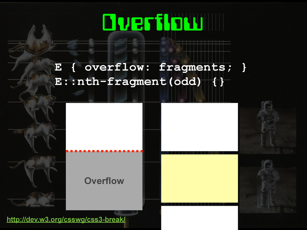
Overflow E { overflow: fragments; } E::nth-fragment(odd) {} http://dev.w3.org/csswg/css3-break/ Overflow
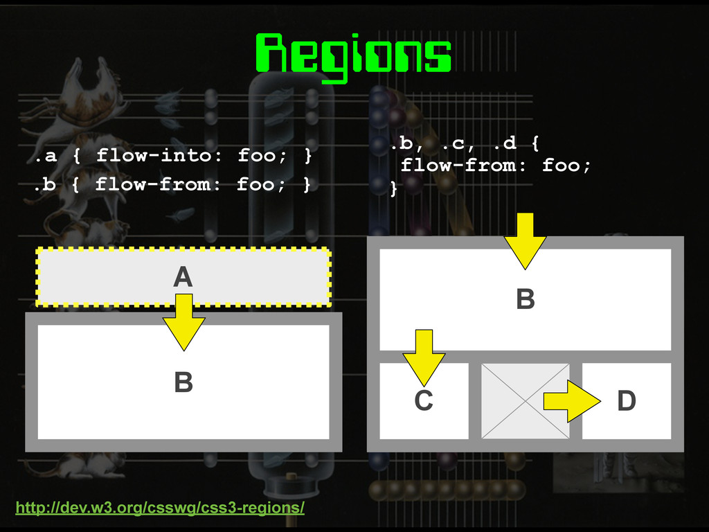
Regions A .a { flow-into: foo; } B C D
.b, .c, .d { flow-from: foo; } B .b { flow-from: foo; } http://dev.w3.org/csswg/css3-regions/
None
Exclusions & Shapes E { position: absolute; } wrap-flow: both;
http://dev.w3.org/csswg/css3-exclusions/
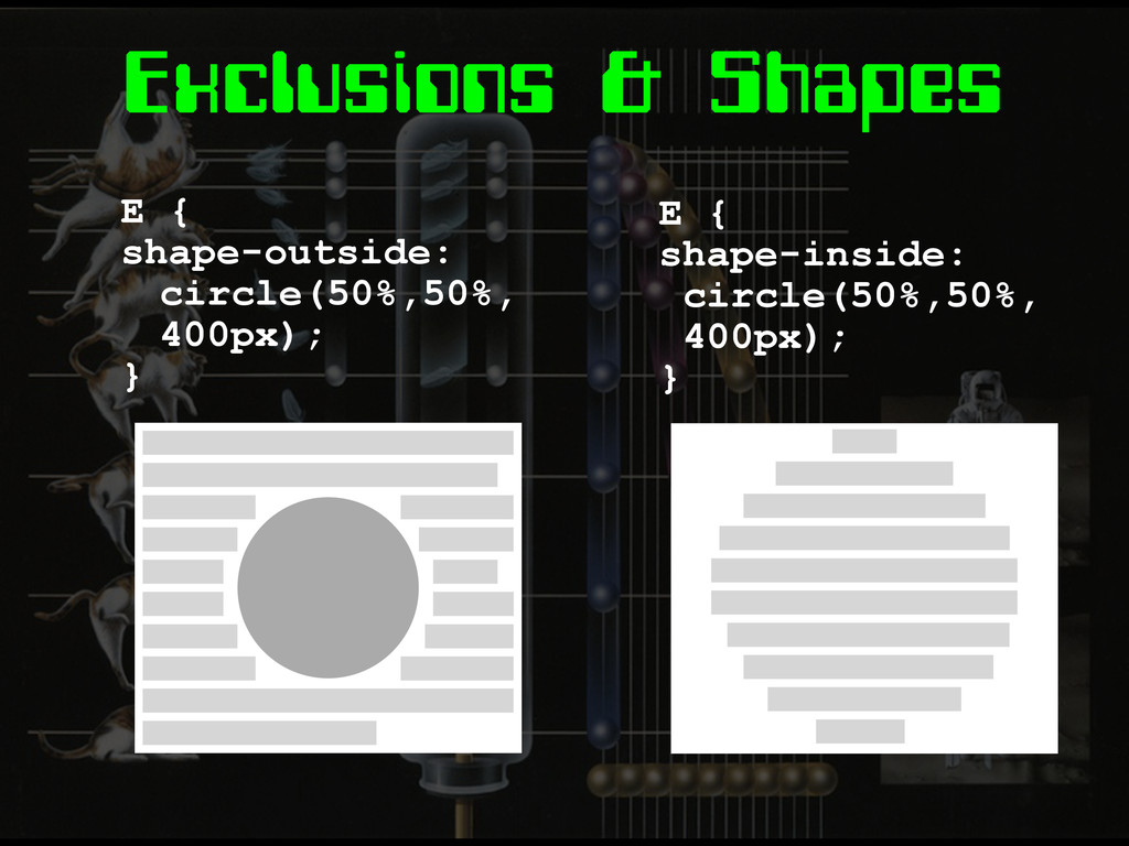
Exclusions & Shapes E { shape-outside: circle(50%,50%, 400px); } E
{ shape-inside: circle(50%,50%, 400px); }
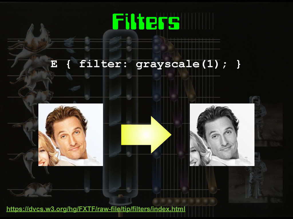
Filters E { filter: grayscale(1); } https://dvcs.w3.org/hg/FXTF/raw-file/tip/filters/index.html
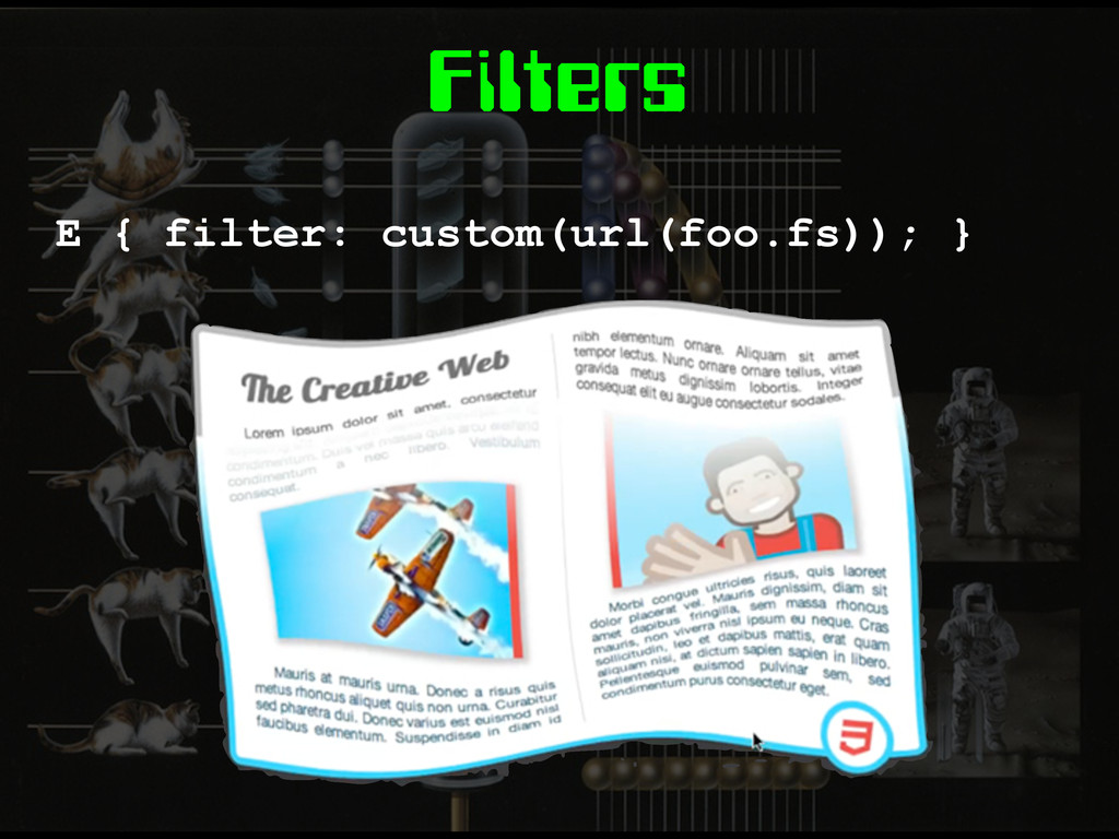
Filters E { filter: custom(url(foo.fs)); }
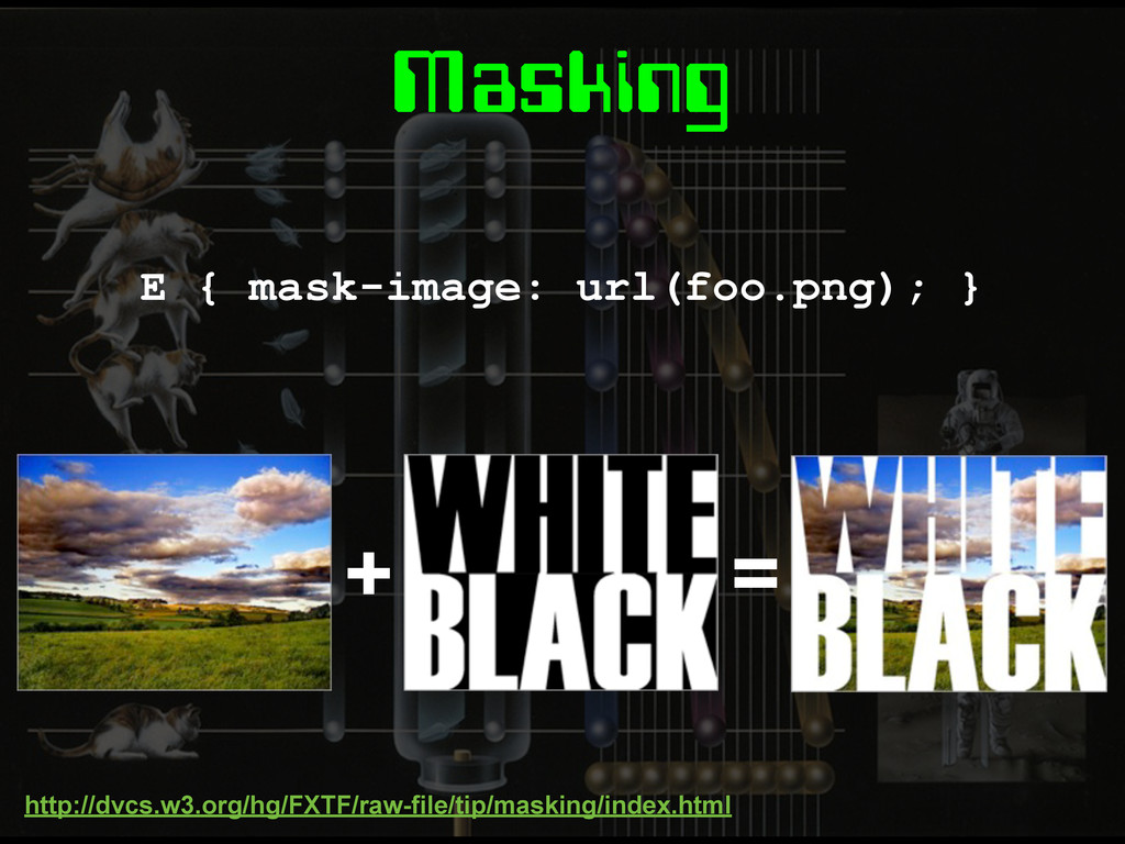
Masking E { mask-image: url(foo.png); } http://dvcs.w3.org/hg/FXTF/raw-file/tip/masking/index.html + =
Masking E { clip-path: circle(50%,50%,200px); }
Pre-processors
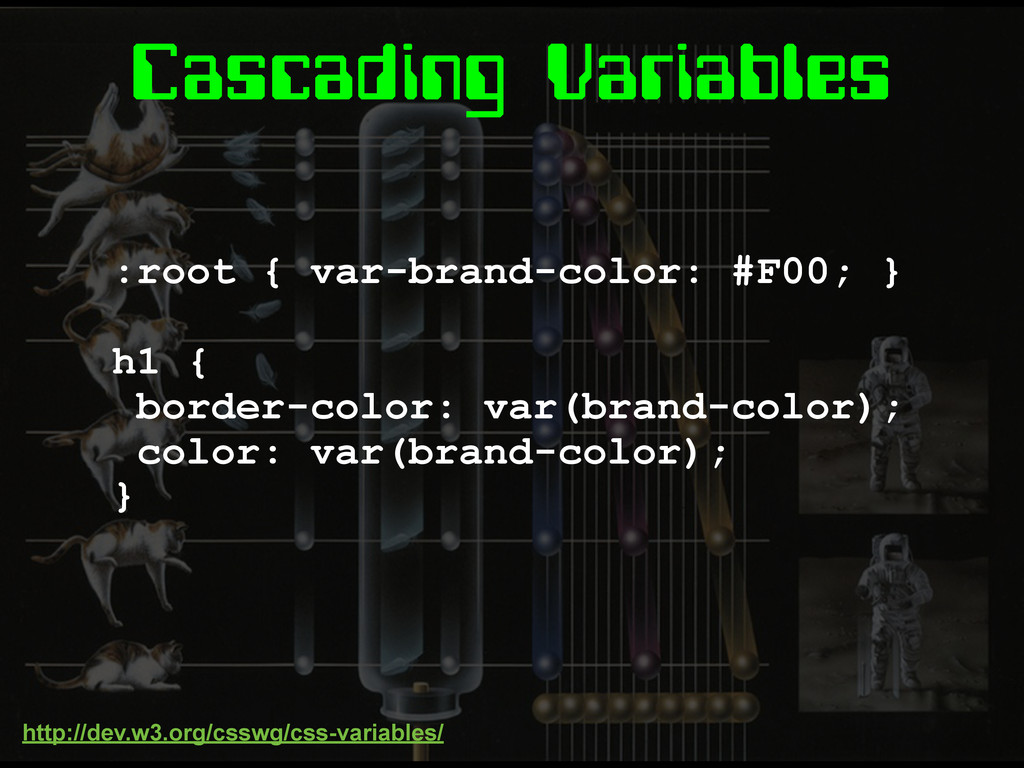
Cascading Variables :root { var-brand-color: #F00; } h1 { border-color:
var(brand-color); color: var(brand-color); } http://dev.w3.org/csswg/css-variables/
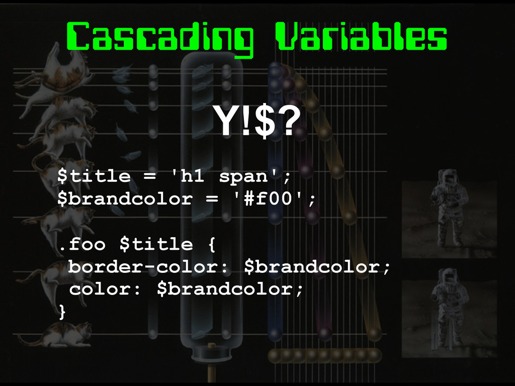
Cascading Variables Y!$? $title = 'h1 span'; $brandcolor = '#f00';
.foo $title { border-color: $brandcolor; color: $brandcolor; }
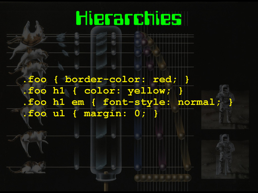
Hierarchies .foo { border-color: red; } .foo h1 { color:
yellow; } .foo h1 em { font-style: normal; } .foo ul { margin: 0; }
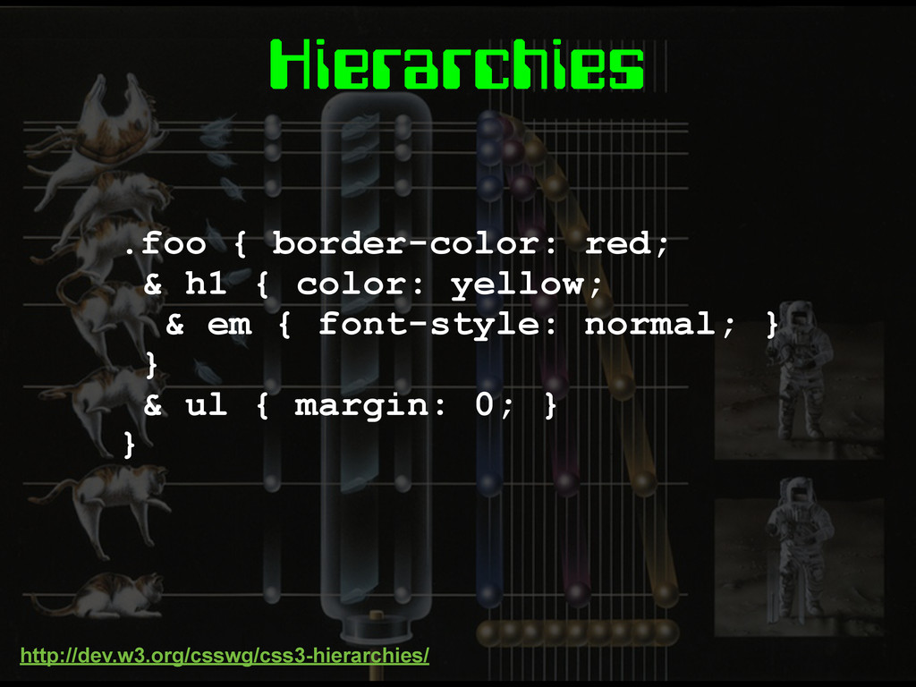
Hierarchies .foo { border-color: red; & h1 { color: yellow;
& em { font-style: normal; } } & ul { margin: 0; } } http://dev.w3.org/csswg/css3-hierarchies/
Mixins TBC
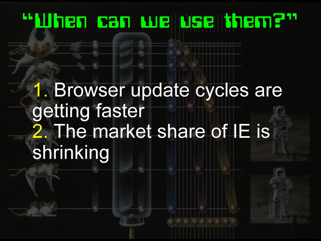
“When can we use them?” 1. Browser update cycles are
getting faster 2. The market share of IE is shrinking
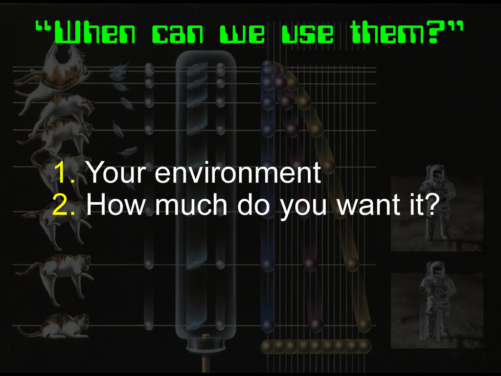
“When can we use them?” 1. Your environment 2. How
much do you want it?
Fin.
None
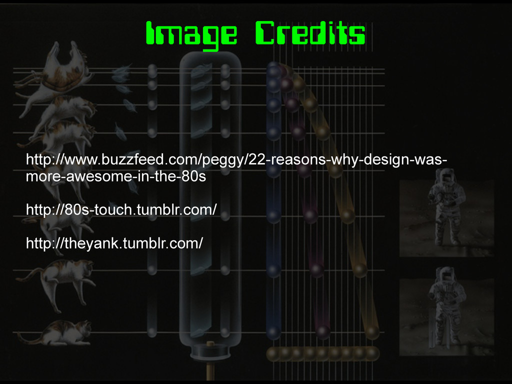
Image Credits http://www.buzzfeed.com/peggy/22-reasons-why-design-was- more-awesome-in-the-80s http://80s-touch.tumblr.com/ http://theyank.tumblr.com/
 stopsatgreen
 codmoninc
 konokenj
 htkym
htkym
 jsoizo
 guvalif
 fornewid
 seike460
 koukimiura
 utilforever
 hananouchi
 hayama17
 ivargrimstad
 chriscoyier
 mayunak
 soudai
 portentint
 lauravandoore
 aleyda
 jdejongh
 nonsquared
 jlugia
 lynnandtonic
 afnizarnur