Upgrade to Pro
— share decks privately, control downloads, hide ads and more …
Speaker Deck
Features
Speaker Deck
PRO
Sign in
Sign up for free
Search
Search
Responsive Web Design: Everything has Changed
Search
Sponsored
·
Ship Features Fearlessly
Turn features on and off without deploys. Used by thousands of Ruby developers.
→
Swwweet
June 17, 2012
Technology
760
6
Share
Embed
Copy iframe code
Copy JS code
Copy link
Start on current slide
Responsive Web Design: Everything has Changed
Presentation by @htmlboy at Drupal Developers Day Barcelona 2012.
Swwweet
June 17, 2012
More Decks by Swwweet
See All by Swwweet
Wonders from the Full Stack Fest website
swwweet
1
400
How to be the best web designer in the world.
swwweet
6
1.3k
Design for loading
swwweet
5
590
Mobile First: as difficult as doing things right
swwweet
225
10k
One Size Fits None
swwweet
12
920
One Size Fits None - From the Front 2013
swwweet
2
770
Responsively Responsive
swwweet
23
1.7k
La letra con píxel entra
swwweet
0
1.2k
The future of code
swwweet
4
670
Other Decks in Technology
See All in Technology
AmplifyHostingConstructからSSRフレームワークのためのホスティング設計を考察する/amplify-hosting-construct
fossamagna
1
290
kaonavi Tech Night#1
kaonavi
0
150
伝票作成AIエージェントを支える、LLMOpsとインフラの選択肢 / AICon2026_takeda
rakus_dev
0
260
非定型なドキュメントを効率よくリファクタする 〜えぇ!?仕様書27本の移行が1日で終わったって!?〜
subroh0508
2
610
生成 AI 時代にいま一度「問い合わせ」について考えてみる
kazzpapa3
1
120
第67回コンピュータビジョン勉強会CVPR2026読会前編
tsukamotokenji
0
160
ゴールデンパスは敷いただけでは道にならない ─ 企画部門のエンジニアが技術標準を事業価値に変えるまで
mhrtech
1
260
AI工学特論: MLOps・継続的評価
asei
4
350
Type-safe IaC for Dart
coborinai
0
180
AI Coding Agent時代のcdk-nagガードレール 〜組織ルールを強制CIで守り抜く設計の挑戦〜
mhrtech
3
500
AIとハーネスで育てるトランスコンパイラ / 20260722 Yasushi Katayama
shift_evolve
PRO
3
760
Playwright × AI Agent でE2Eテストはどう変わるか AI駆動テストの可能性と実用検証の結果
taiga7543
2
770
Featured
See All Featured
KATA
mclloyd
PRO
35
15k
Being A Developer After 40
akosma
91
590k
A Guide to Academic Writing Using Generative AI - A Workshop
ks91
PRO
1
350
Max Prin - Stacking Signals: How International SEO Comes Together (And Falls Apart)
techseoconnect
PRO
0
320
How to Talk to Developers About Accessibility
jct
2
420
Sam Torres - BigQuery for SEOs
techseoconnect
PRO
0
440
Keith and Marios Guide to Fast Websites
keithpitt
413
23k
SEO Brein meetup: CTRL+C is not how to scale international SEO
lindahogenes
1
2.8k
Leveraging LLMs for student feedback in introductory data science courses - posit::conf(2025)
minecr
1
320
Future Trends and Review - Lecture 12 - Web Technologies (1019888BNR)
signer
PRO
0
3.6k
SEO in 2025: How to Prepare for the Future of Search
ipullrank
3
3.6k
Game over? The fight for quality and originality in the time of robots
wayneb77
1
220
Transcript
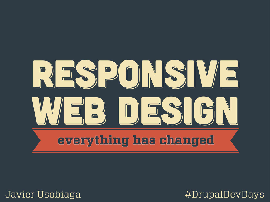
RESPoNSIVE WEB DESIGN RESPoNSIVE WEB DESIGN RESPoNSIVE WEB DESIGN everything
has changed Javier Usobiaga #DrupalDevDays
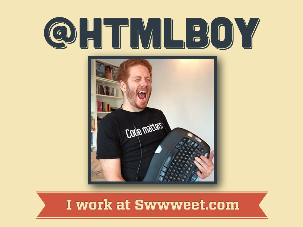
@htmlboy @htmlboy @htmlboy I work at Swwweet.com
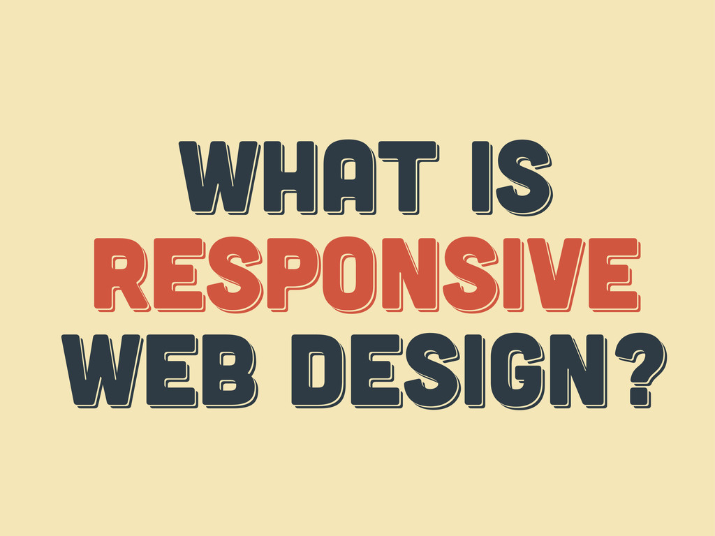
WHAT IS responsive web design? WHAT IS responsive web design?
WHAT IS respoNsive web design?
WHAT IS THE web? WHAT IS THE web? WHAT IS
THE web?
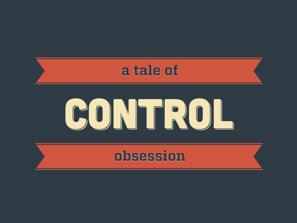
CONTROL CONTROL CONTROL a tale of obsession
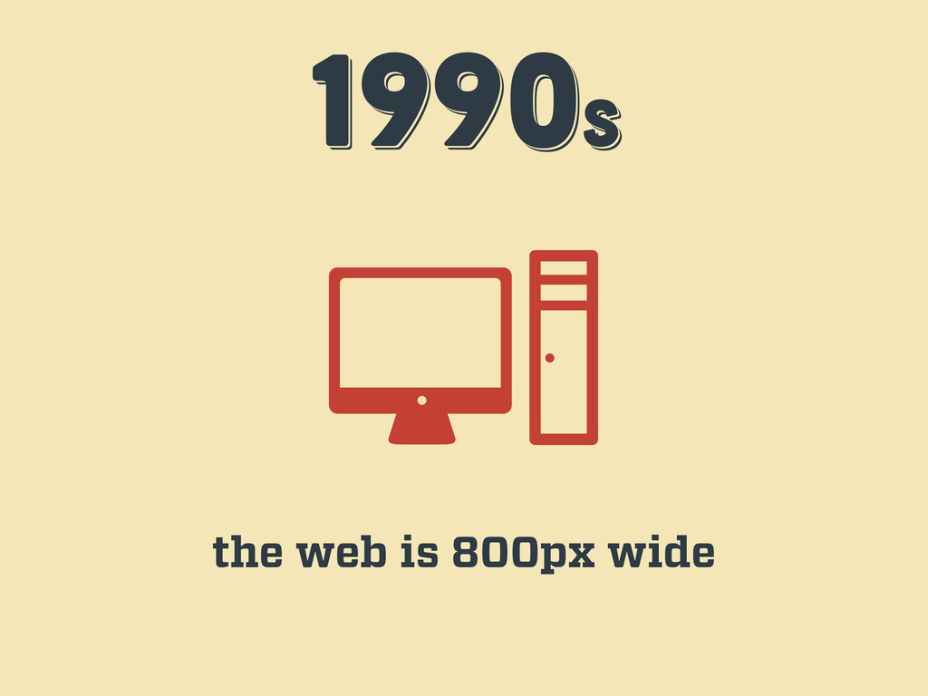
1990s 1990s 1990s the web is 800px wide
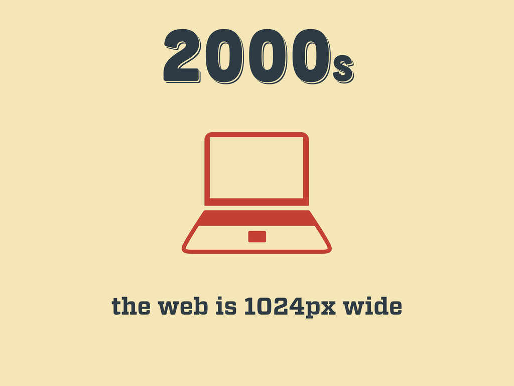
2000s 2000s 2000s the web is 1024px wide
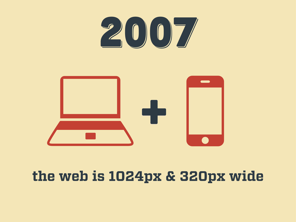
2007 2007 2007 + the web is 1024px & 320px
wide
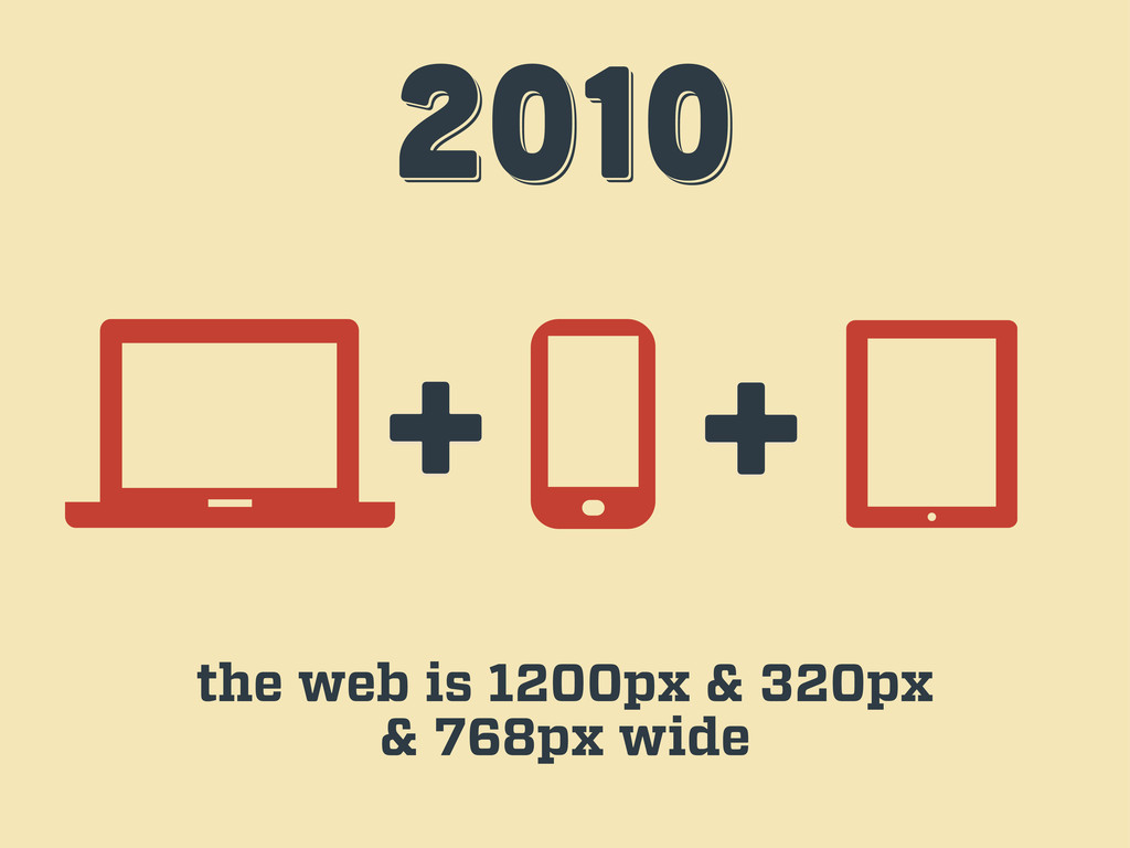
2010 2010 2010 + + the web is 1200px &
320px & 768px wide
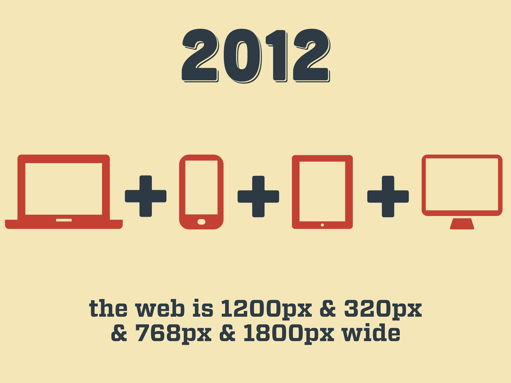
2012 2012 2012 + + the web is 1200px &
320px & 768px & 1800px wide +
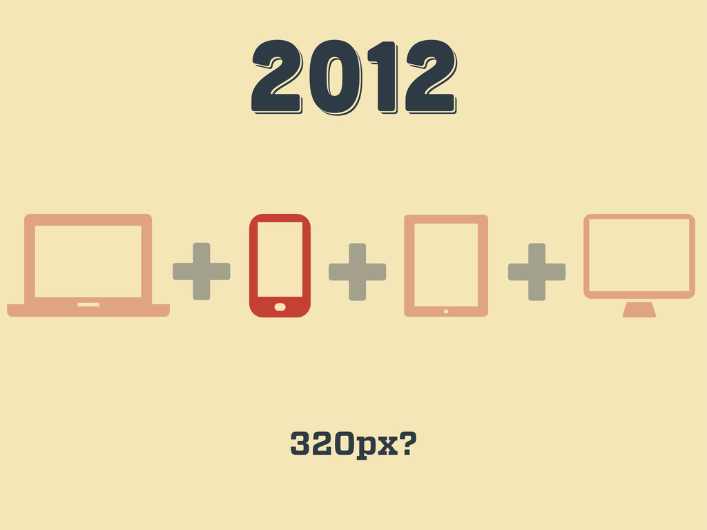
2012 2012 2012 + + 320px? +
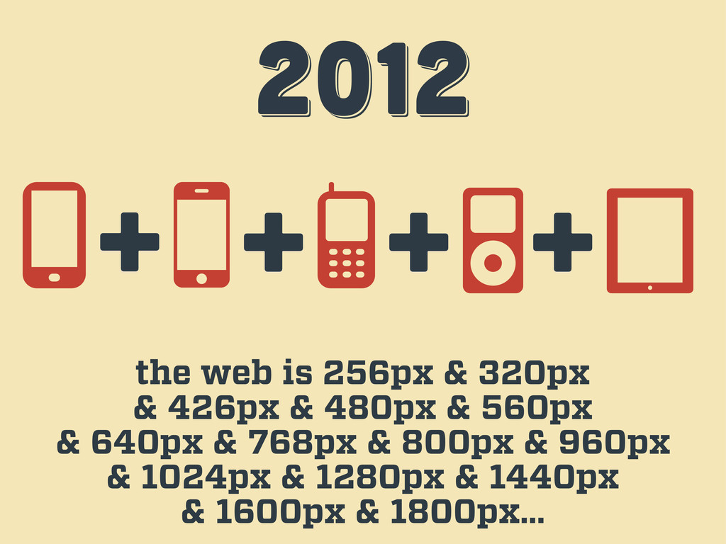
2012 2012 2012 the web is 256px & 320px &
426px & 480px & 560px & 640px & 768px & 800px & 960px & 1024px & 1280px & 1440px & 1600px & 1800px… + + + +
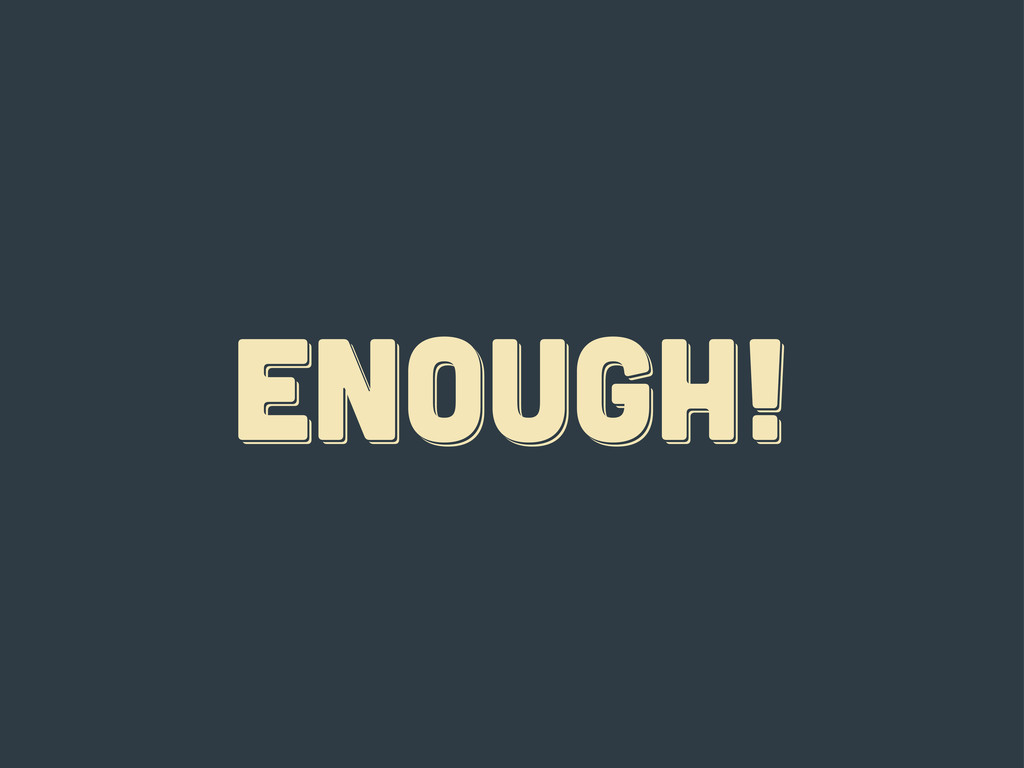
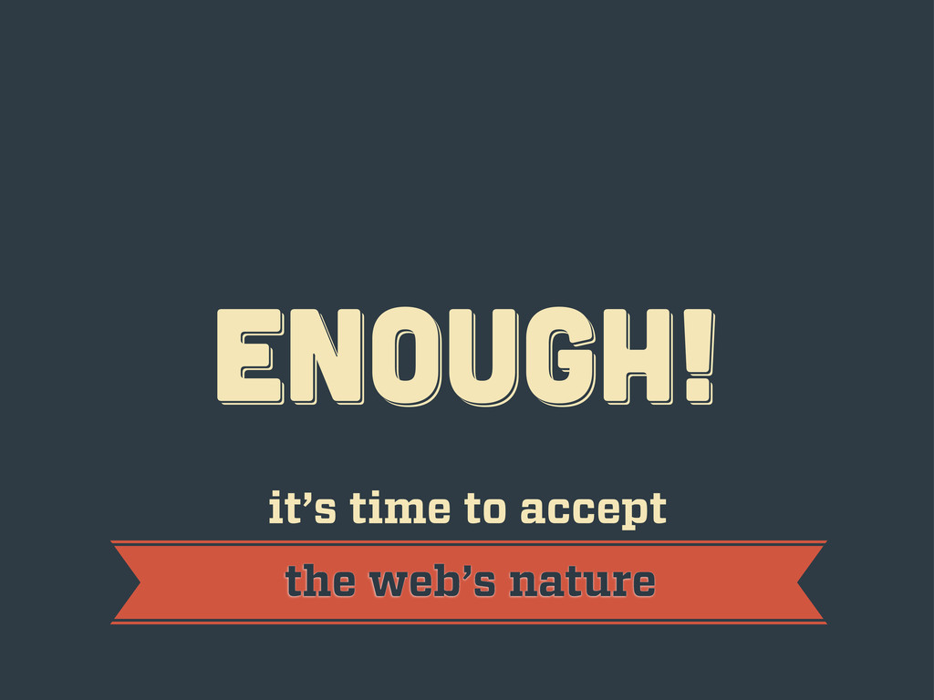
ENOUGH! ENOUGH! ENOUGH!
ENOUGH! ENOUGH! ENOUGH! it’s time to accept the web’s nature
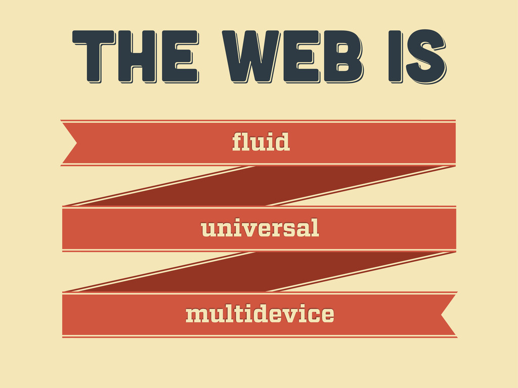
THE WEB IS THE WEB IS THE WEB IS fluid
universal multidevice
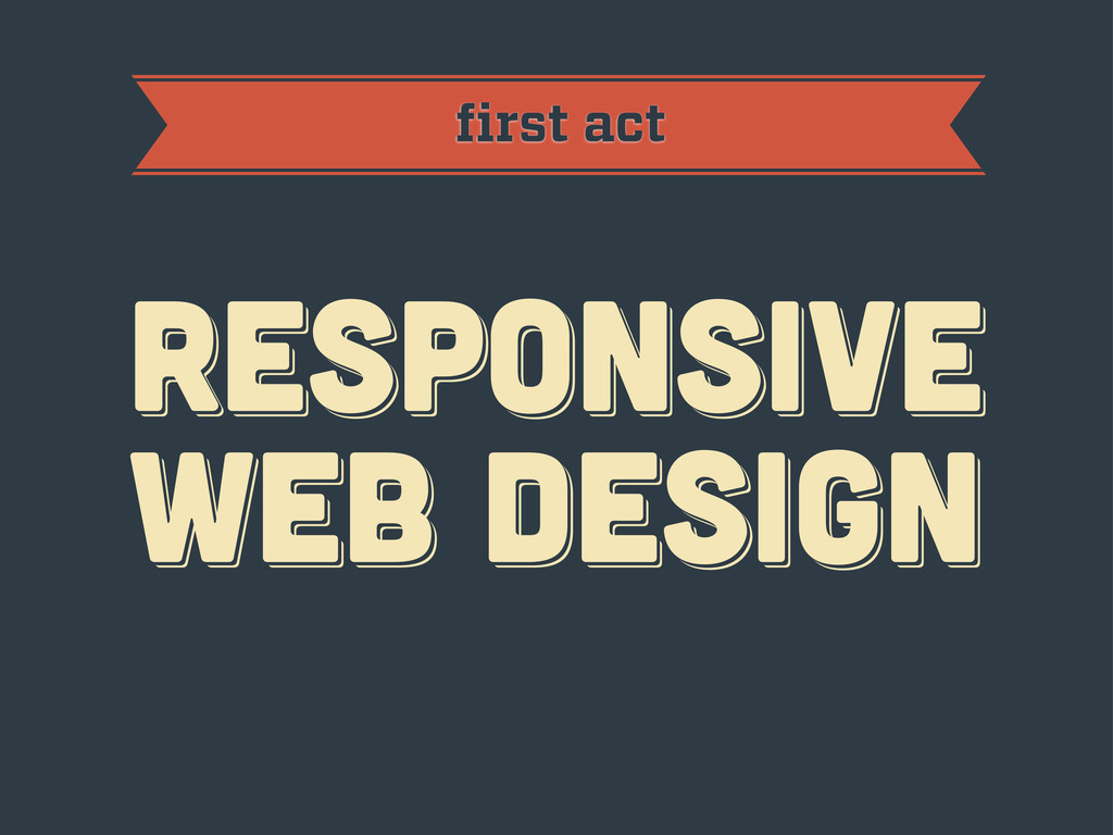
first act RESPoNSIVE WEB DESIGN RESPoNSIVE WEB DESIGN RESPoNSIVE WEB
DESIGN
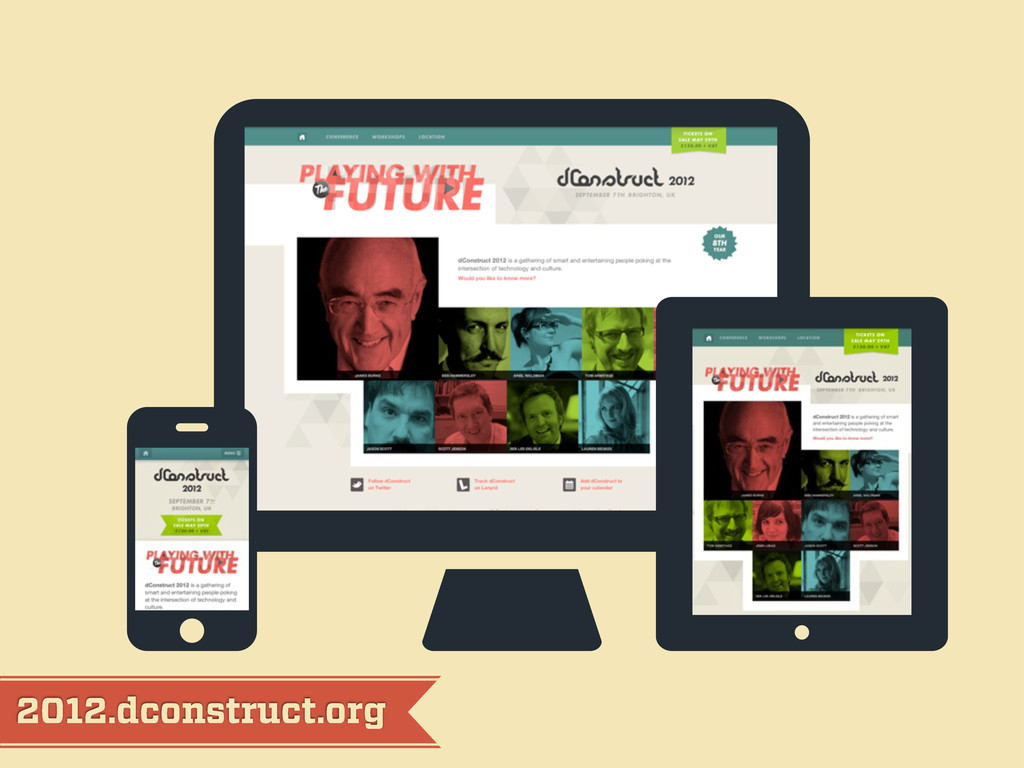
2012.dconstruct.org
mediaqueri.es
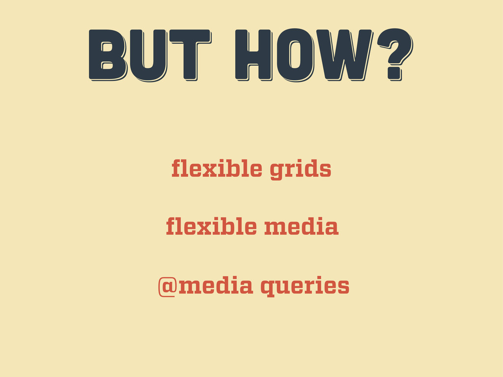
BUT HOW? BUT HOW? BUT HOW? flexible grids flexible media
@media queries
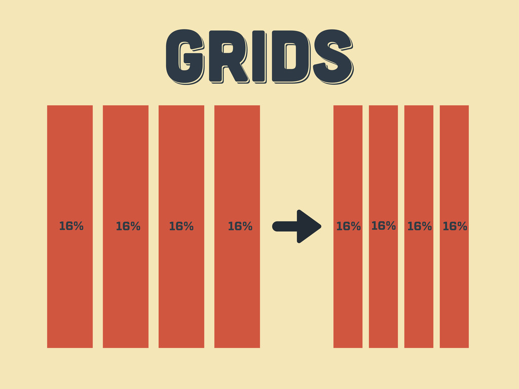
GRIDS GRIDS GRIDS 16% 16% 16% 16% 16% 16% 16%
16%
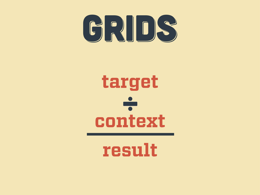
target context ÷ result GRIDS GRIDS GRIDS
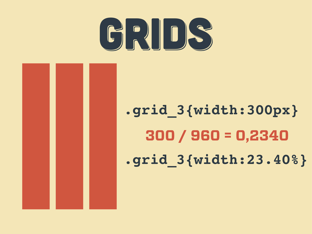
.grid_3{width:300px} 300 / 960 = 0,2340 .grid_3{width:23.40%} GRIDS GRIDS GRIDS
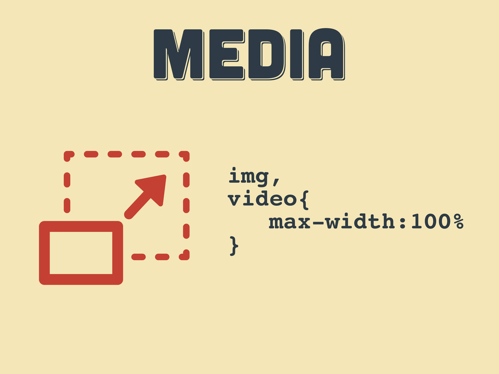
MEDIA MEDIA MEDIA img, video{ max-width:100% }
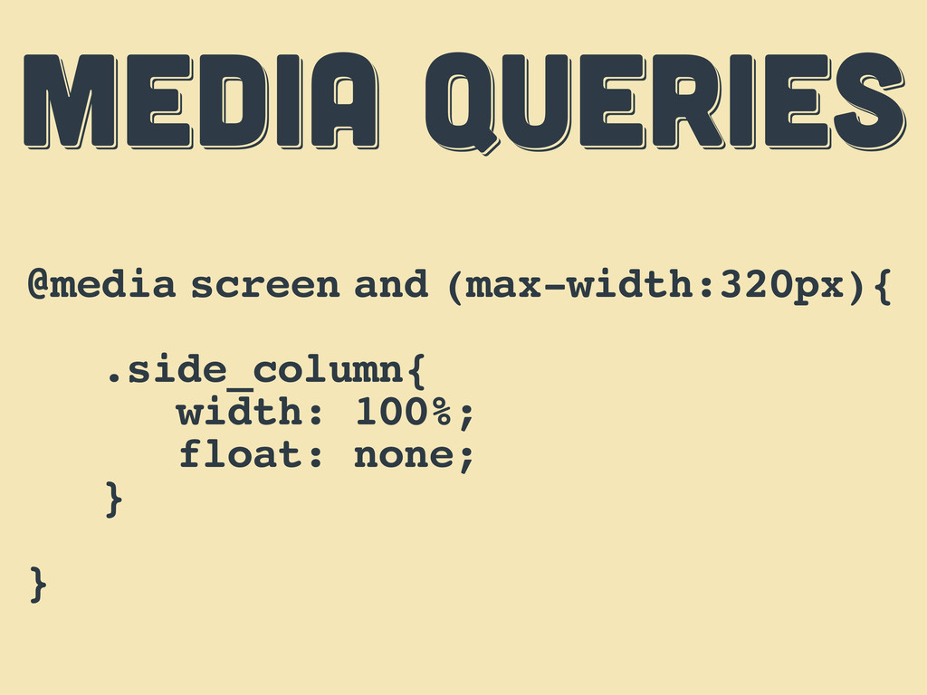
MEDIA QUERIES MEDIA QUERIES MEDIA QUERIES @media screen and (max-width:320px){
.side_column{ width: 100%; float: none; } }
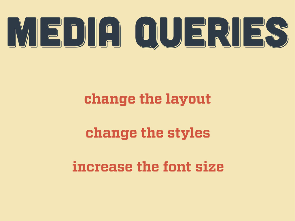
MEDIA QUERIES MEDIA QUERIES MEDIA QUERIES change the layout change
the styles increase the font size
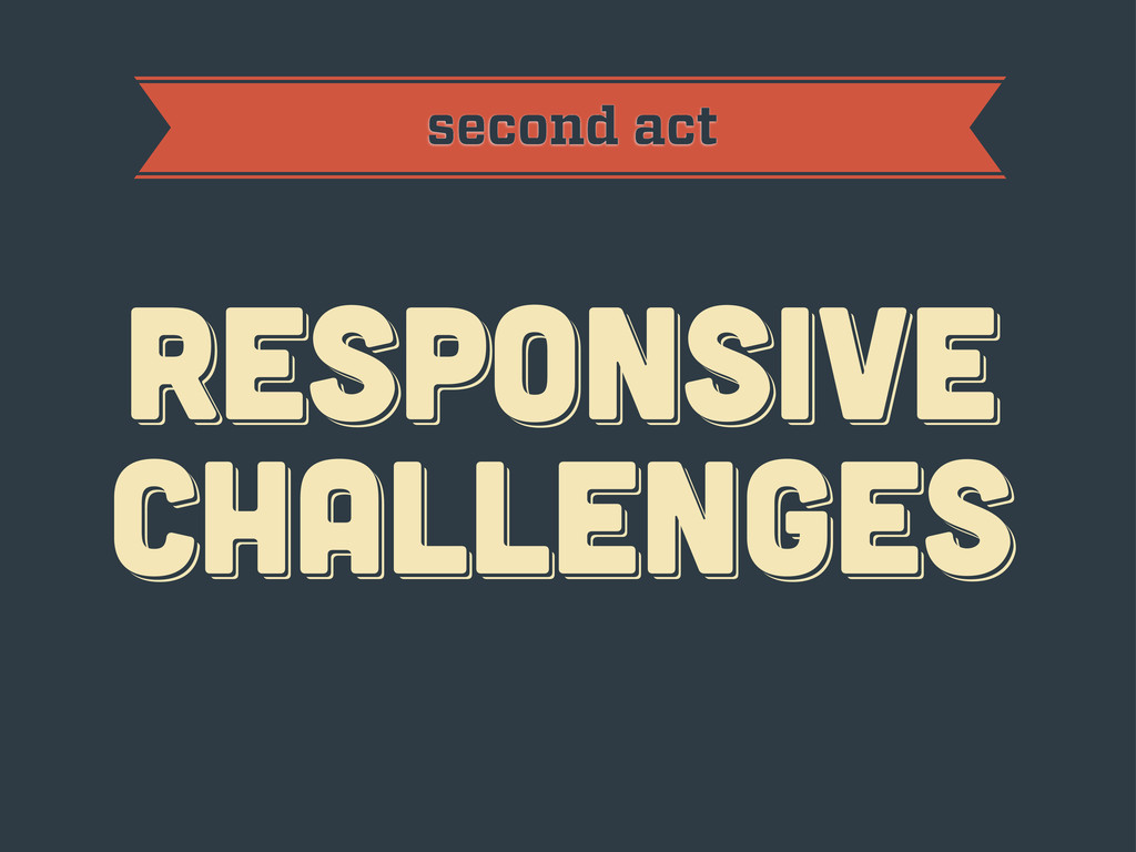
RESPoNSIVE challenges RESPoNSIVE challenges Responsive challenges second act
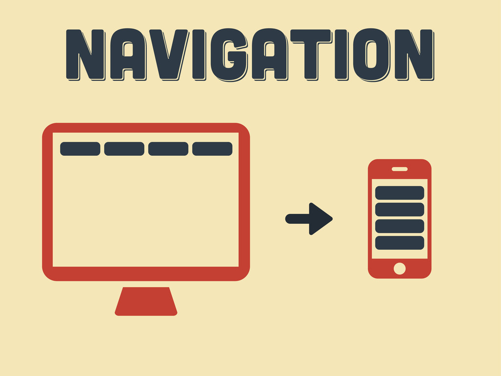
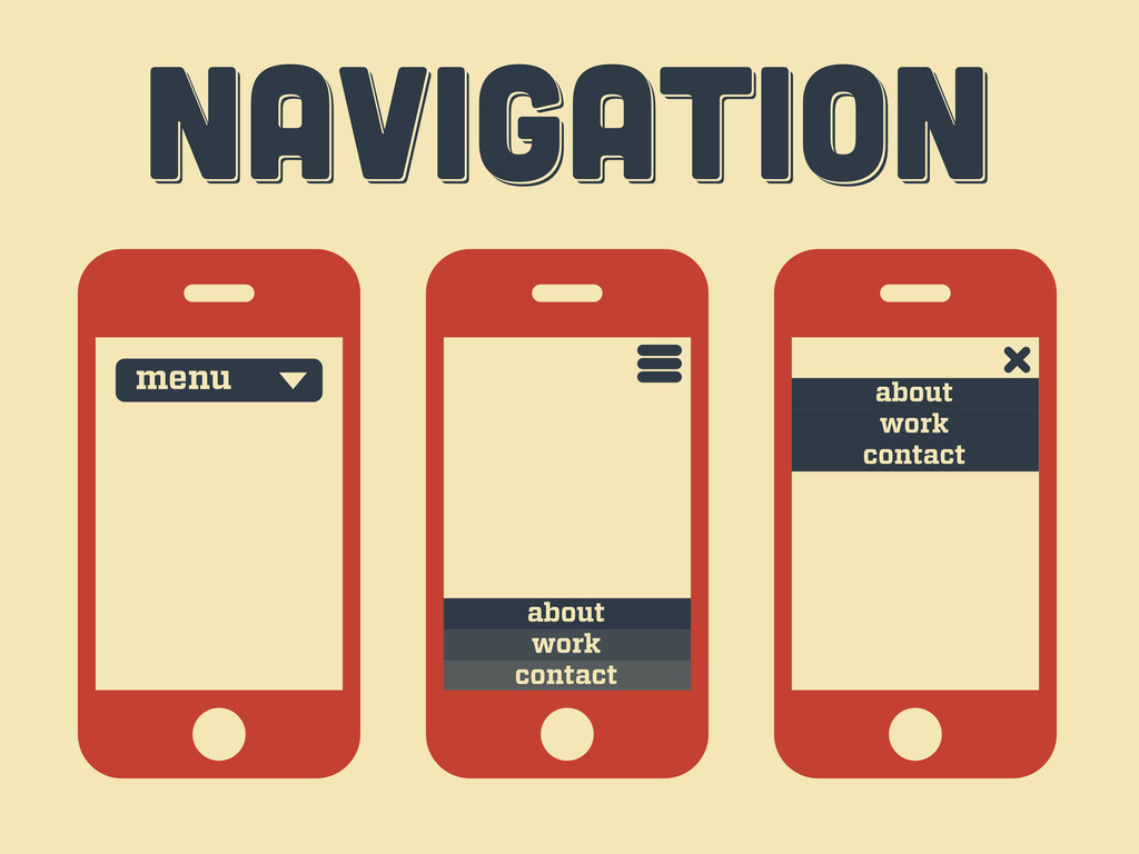
Navigation Navigation Navigation
Navigation Navigation Navigation menu contact work about contact work about
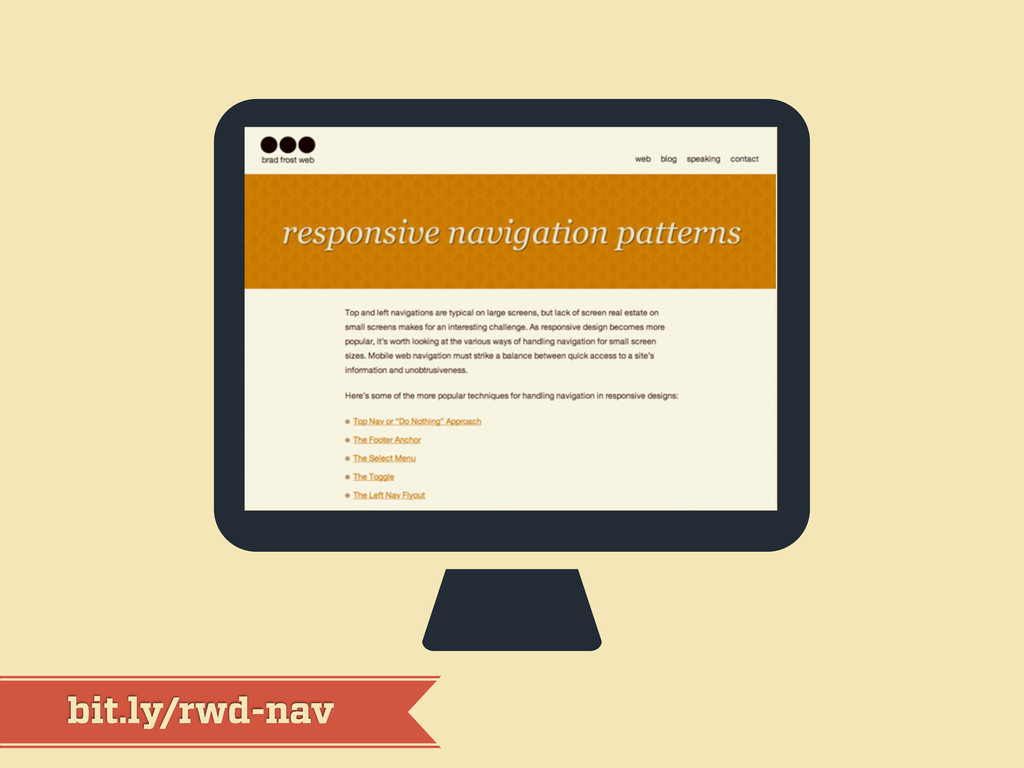
bit.ly/rwd-nav
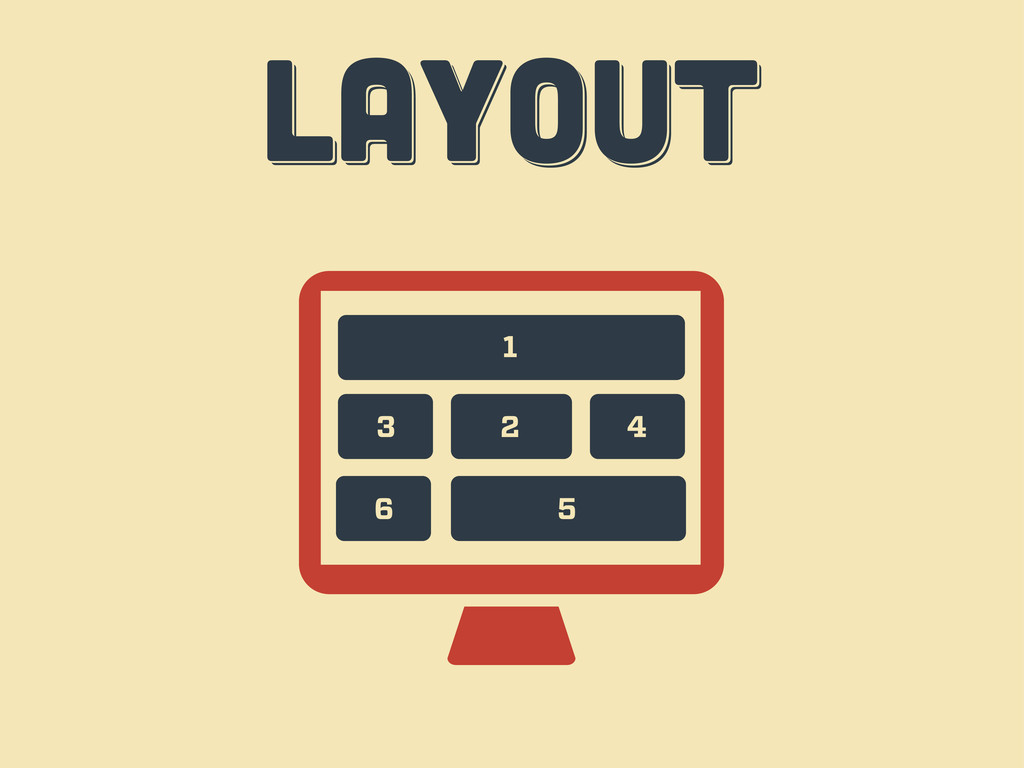
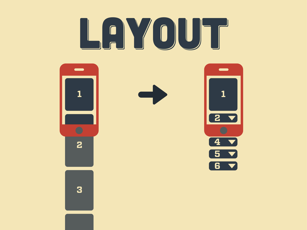
LAYOUT LAYOUT layout 1 2 3 4 6 5
3 2 LAYOUT LAYOUT layout 1 3 1 2 4
5 6
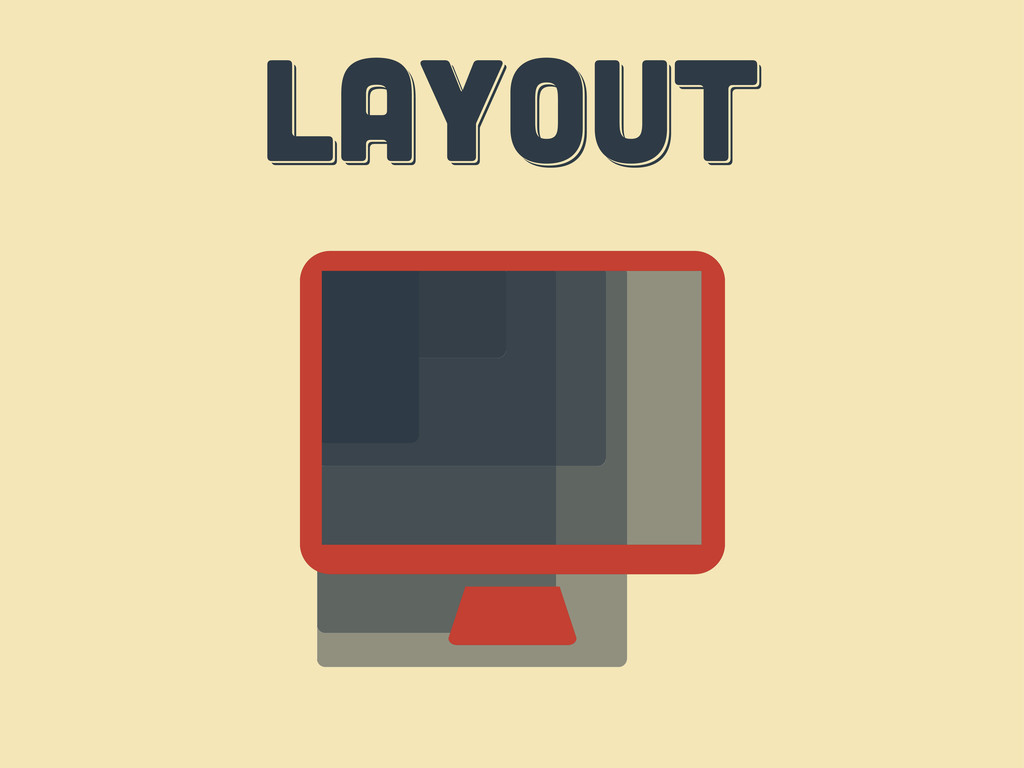
LAYOUT LAYOUT layout
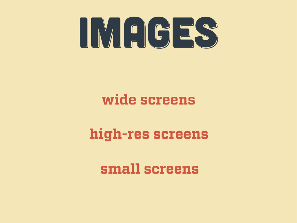
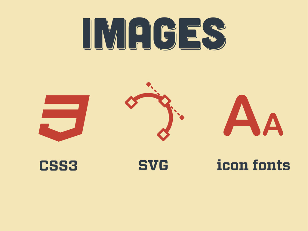
IMAGES IMAGES images wide screens high-res screens small screens
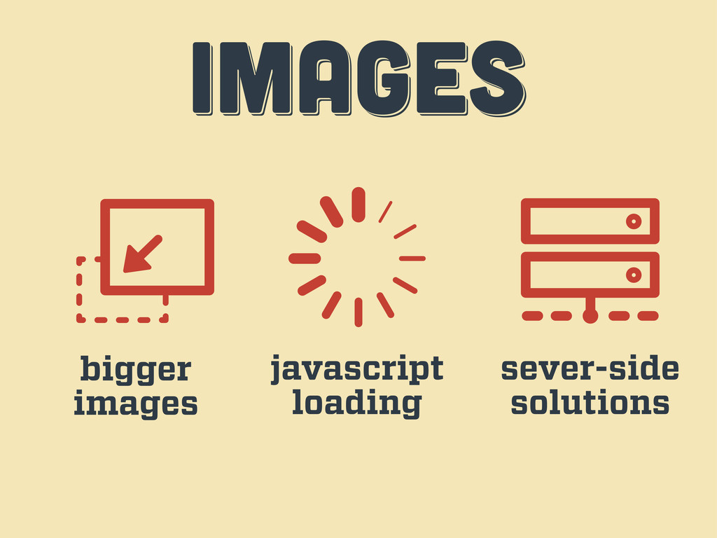
IMAGES IMAGES images bigger images javascript loading sever-side solutions
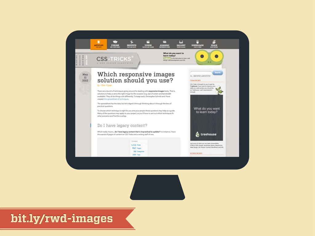
bit.ly/rwd-images
IMAGES IMAGES images CSS3 SVG icon fonts
workflow workflow workflow third act
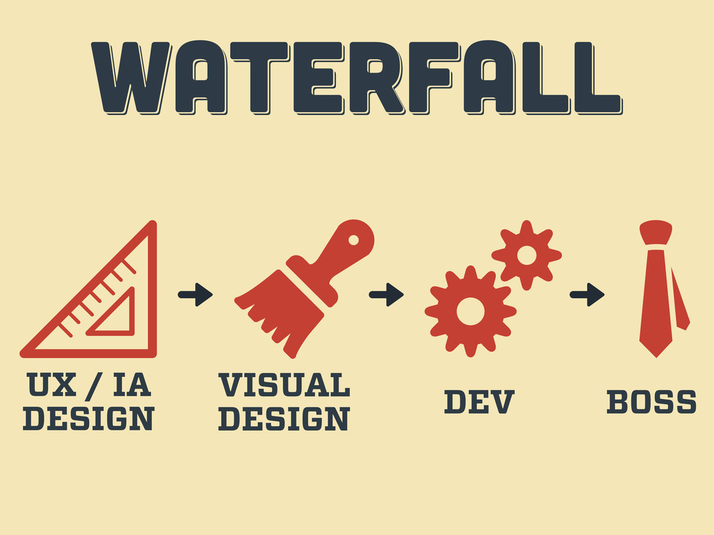
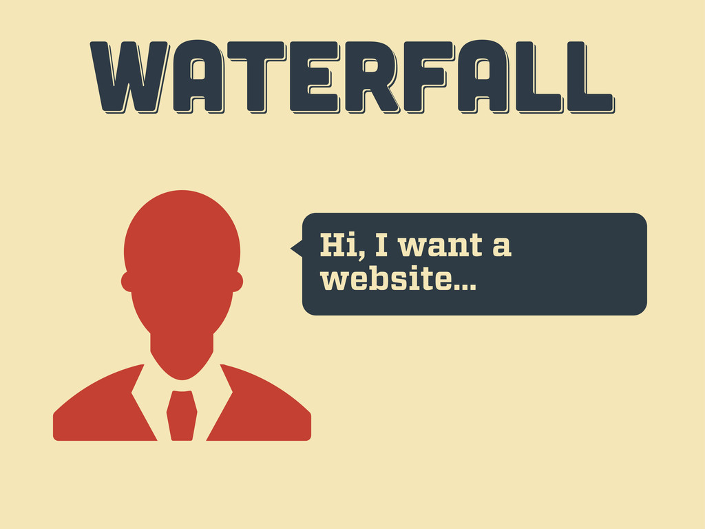
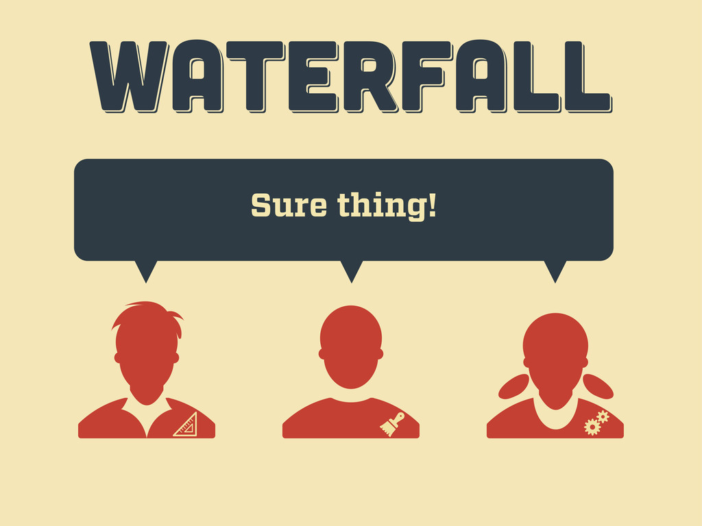
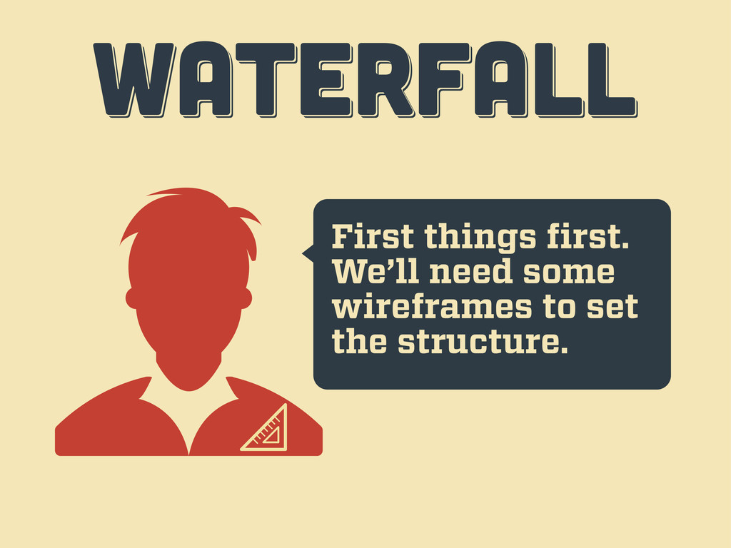
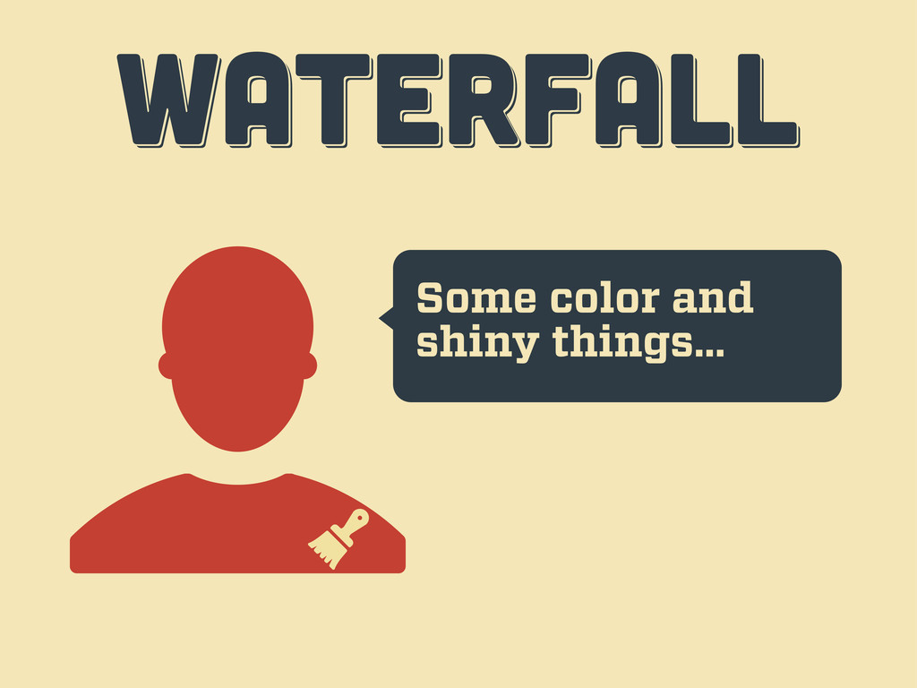
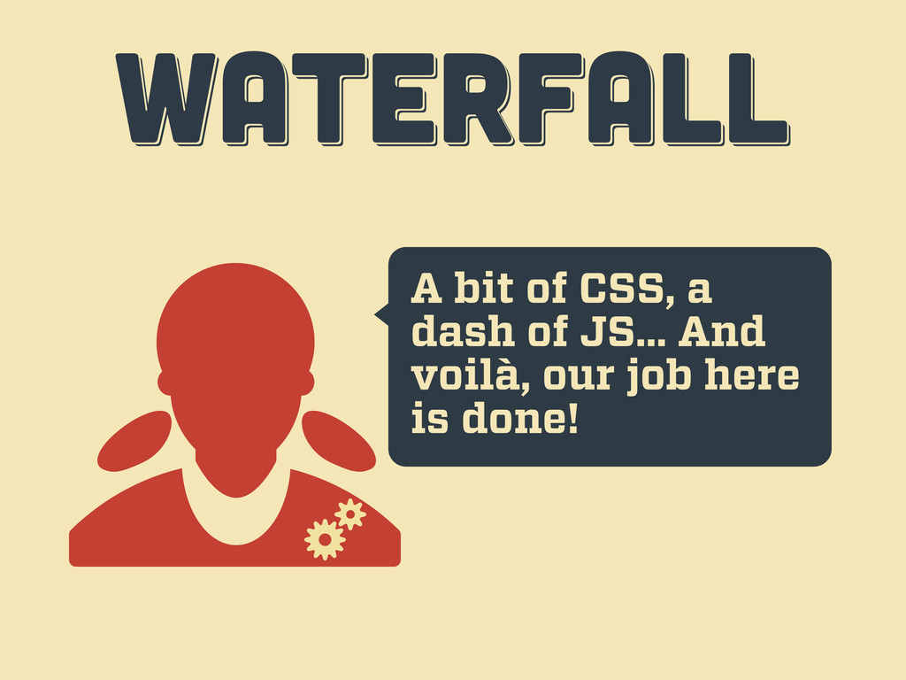
WATERFALL WATERFALL WATERFALL UX / IA DESIGN VISUAL DESIGN DEV
BOSS
Hi, I want a website… WATERFALL WATERFALL WATERFALL
Sure thing! WATERFALL WATERFALL WATERFALL
First things first. We’ll need some wireframes to set the
structure. WATERFALL WATERFALL WATERFALL
Some color and shiny things… WATERFALL WATERFALL WATERFALL
A bit of CSS, a dash of JS... And voilà,
our job here is done! WATERFALL WATERFALL WATERFALL
Er... guys... WATERFALL WATERFALL WATERFALL
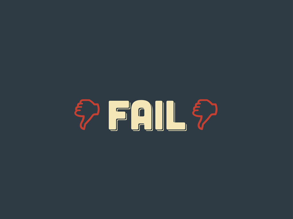
FAIL fail Fail
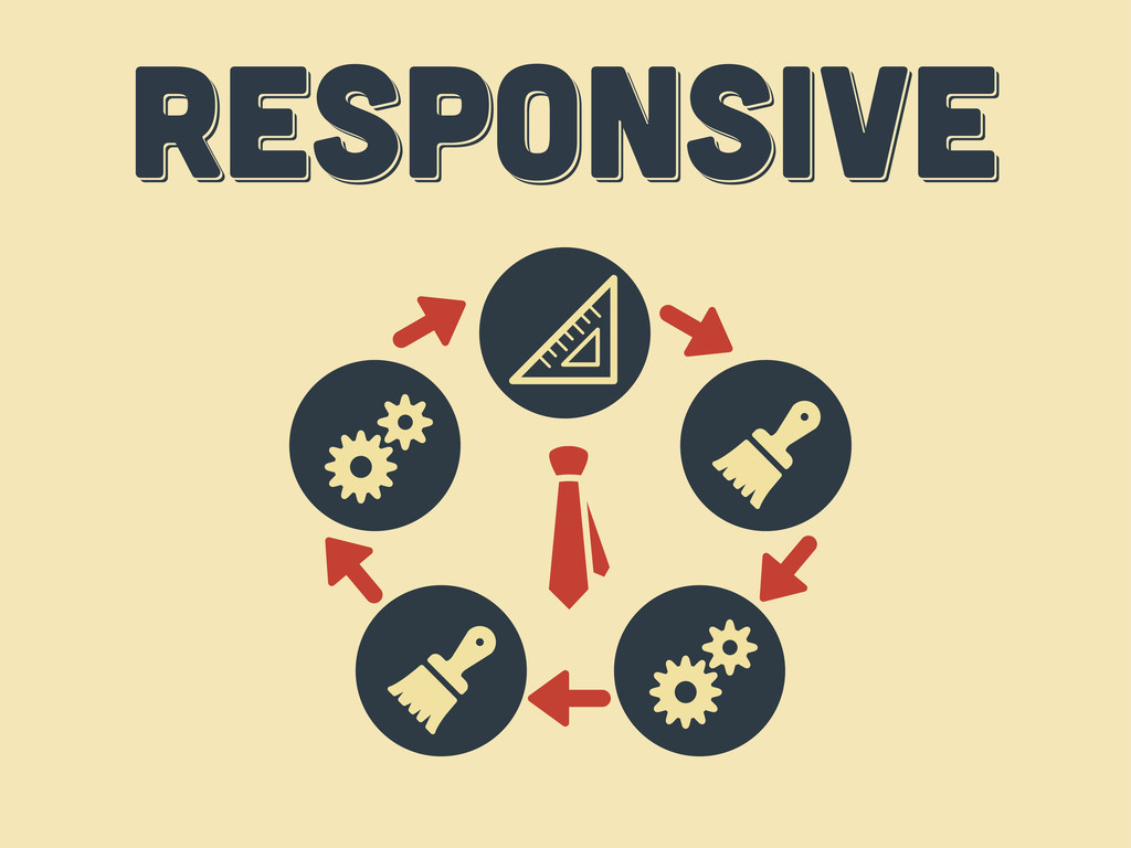
responsive responsive Responsive
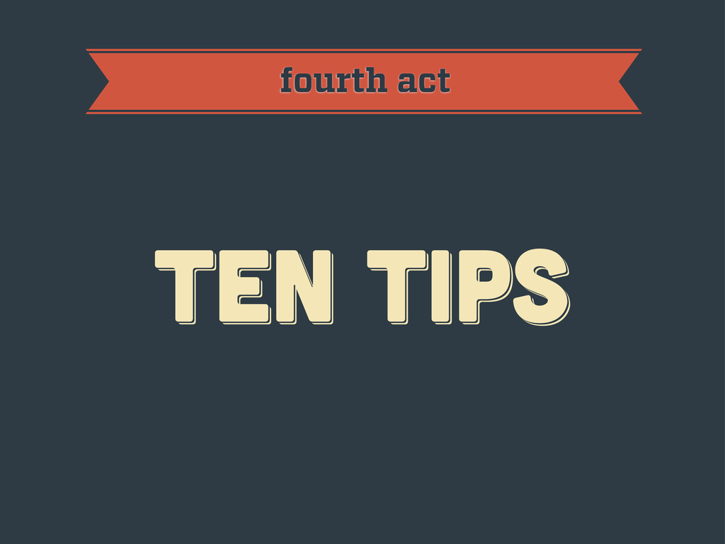
ten tips ten tips ten tips fourth act
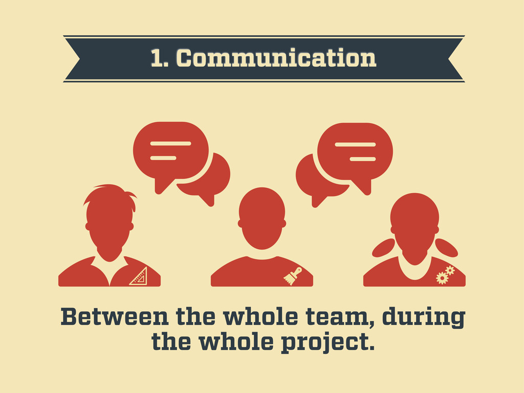
1. Communication Between the whole team, during the whole project.
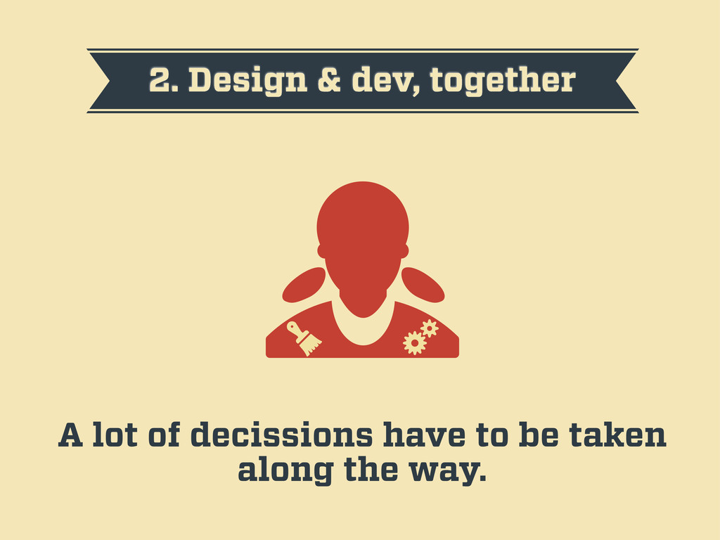
2. Design & dev, together A lot of decissions have
to be taken along the way.
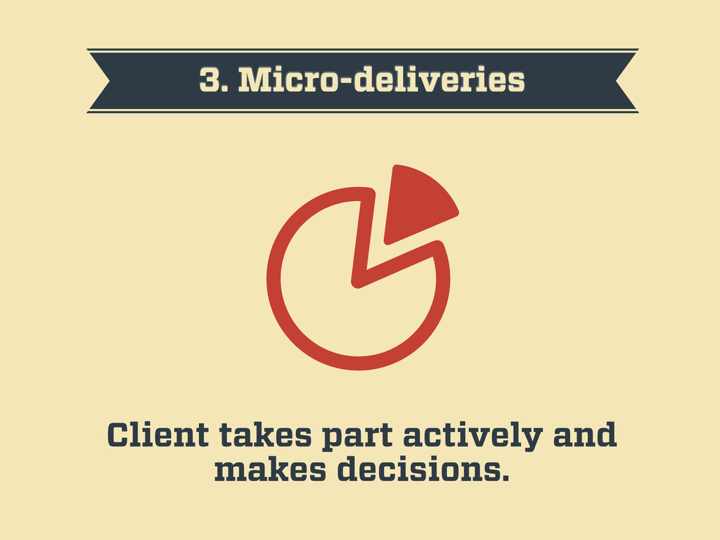
3. Micro-deliveries Client takes part actively and makes decisions.
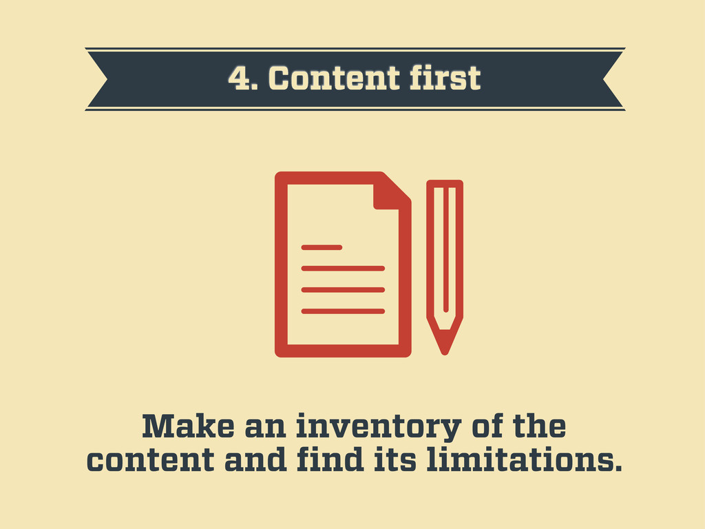
4. Content first Make an inventory of the content and
find its limitations.
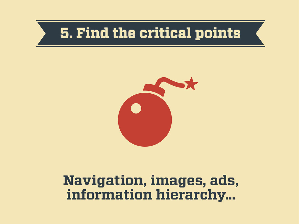
5. Find the critical points Navigation, images, ads, information hierarchy…
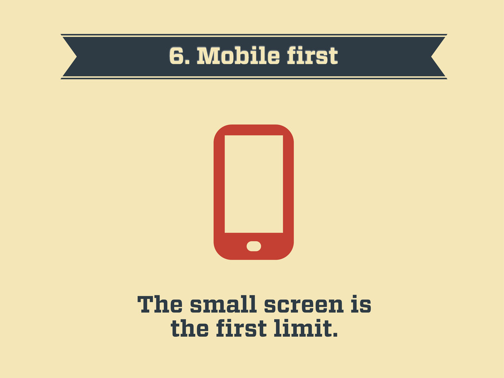
6. Mobile first The small screen is the first limit.
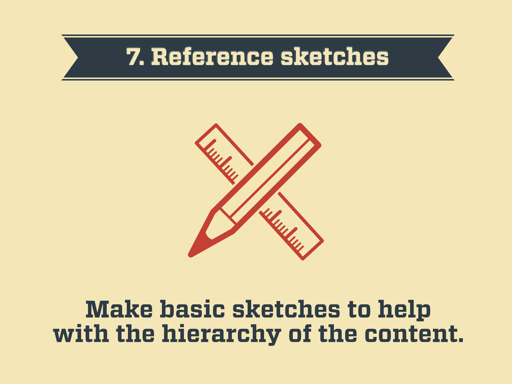
7. Reference sketches Make basic sketches to help with the
hierarchy of the content.
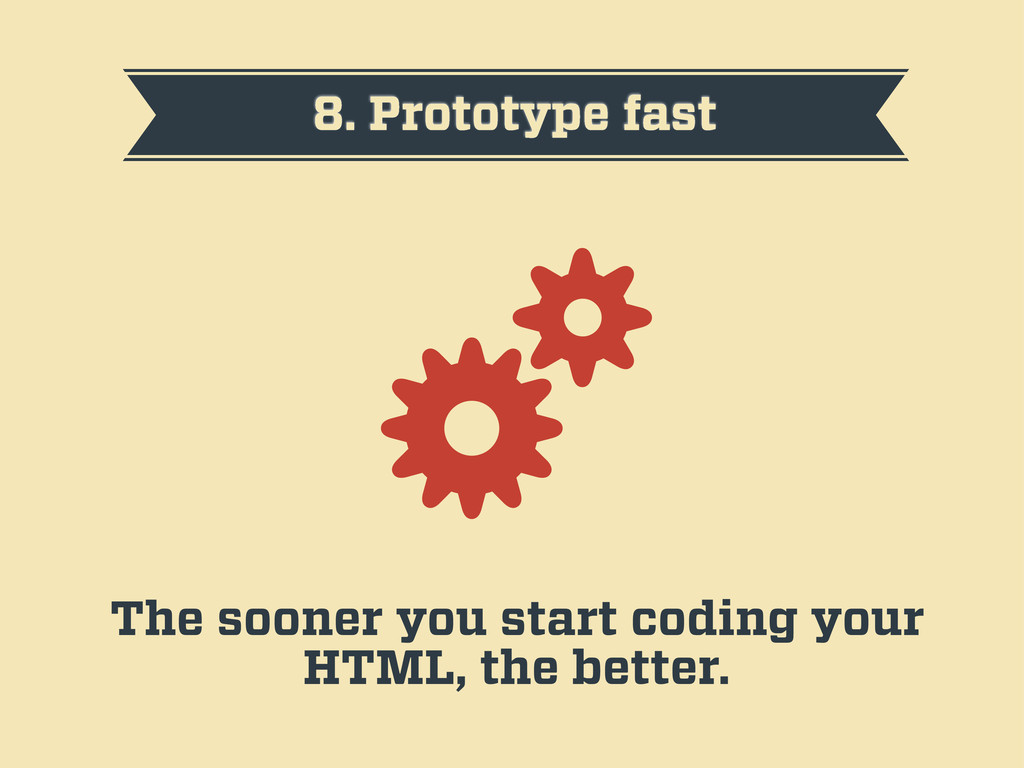
8. Prototype fast The sooner you start coding your HTML,
the better.
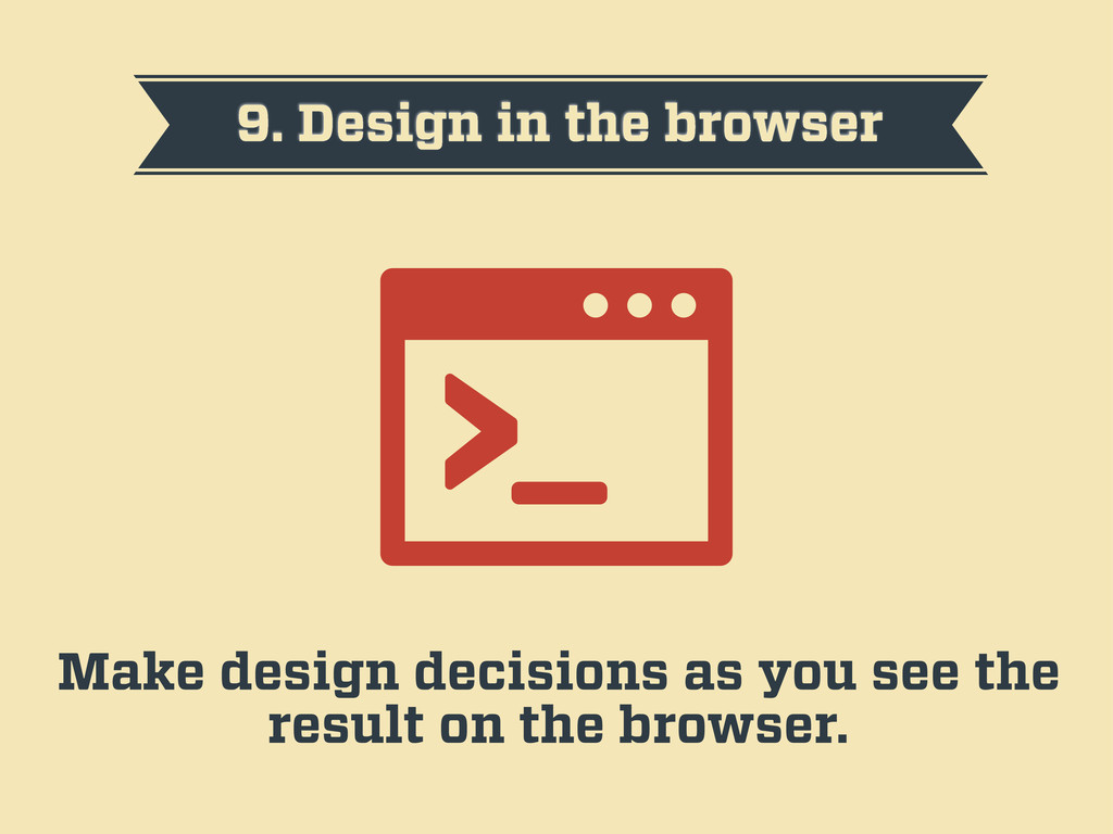
9. Design in the browser Make design decisions as you
see the result on the browser.
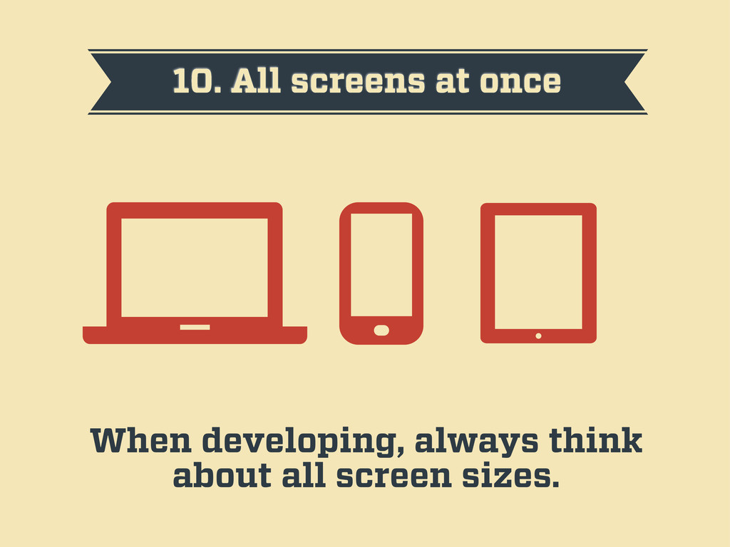
10. All screens at once When developing, always think about
all screen sizes.
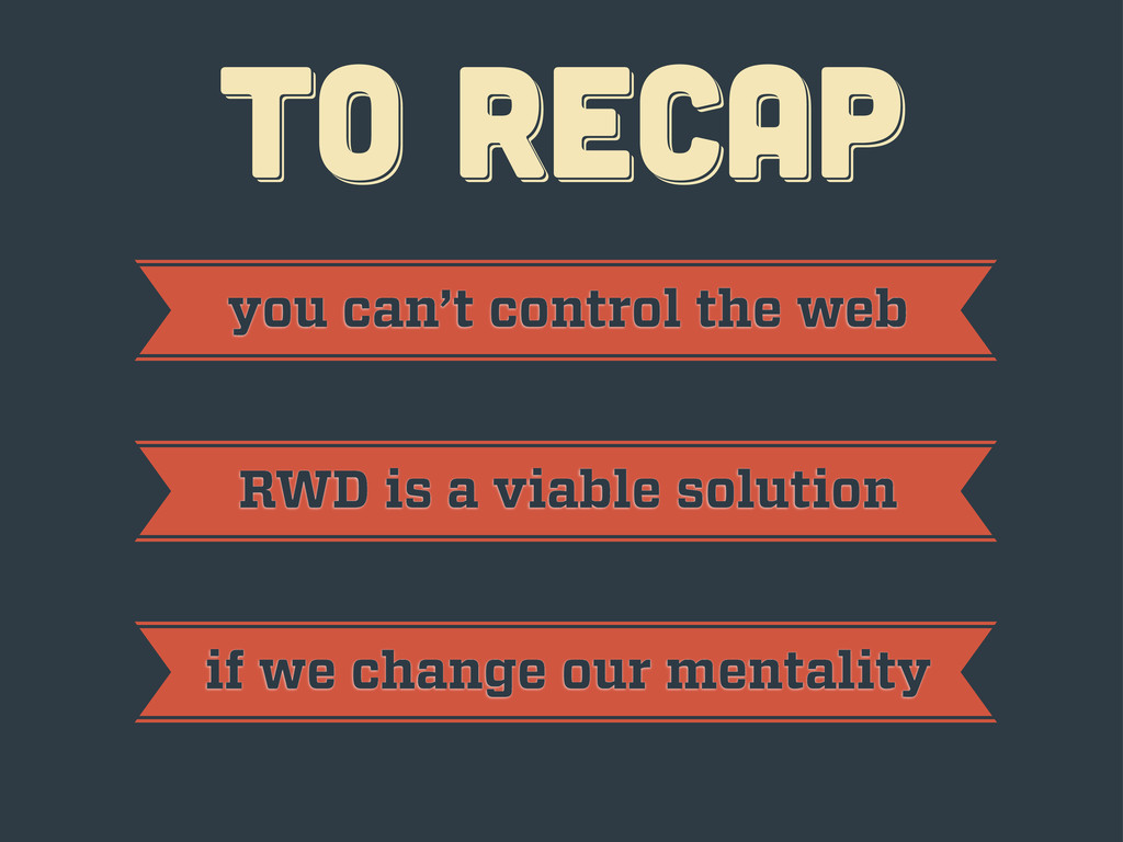
TO RECAP TO RECAP TO RECAP
TO RECAP TO RECAP TO RECAP you can’t control the
web
TO RECAP TO RECAP TO RECAP you can’t control the
web RWD is a viable solution
TO RECAP TO RECAP TO RECAP you can’t control the
web RWD is a viable solution if we change our mentality
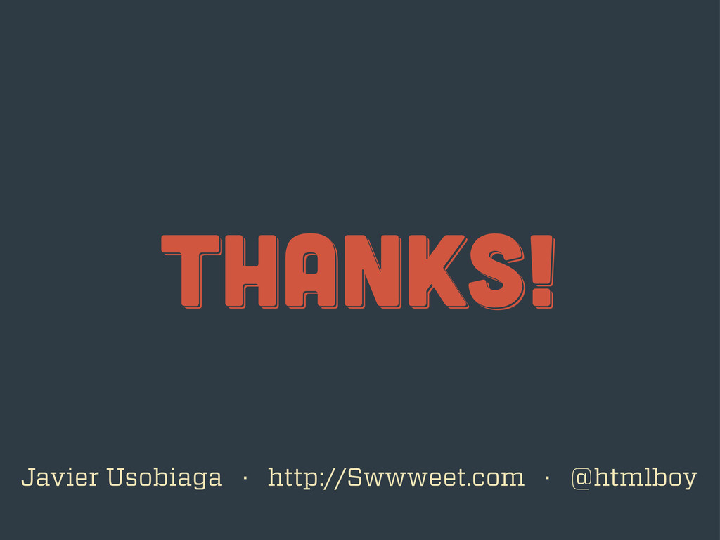
thanks! thanks! thanks! Javier Usobiaga · http://Swwweet.com · @htmlboy
 swwweet
 fossamagna
 kaonavi
 rakus_dev
 subroh0508
 kazzpapa3
 tsukamotokenji
 mhrtech
 asei
asei
 coborinai
 shift_evolve
 taiga7543
 mclloyd
 akosma
 ks91
ks91
 techseoconnect
 jct
jct
 keithpitt
 lindahogenes
 minecr
 signer
 ipullrank
 wayneb77