Upgrade to Pro
— share decks privately, control downloads, hide ads and more …
Speaker Deck
Features
Speaker Deck
PRO
Sign in
Sign up for free
Search
Search
Responsive Design
Search
Andy Hume
November 13, 2011
Technology
1.4k
23
Share
Embed
Copy iframe code
Copy JS code
Copy link
Start on current slide
Responsive Design
Practical approaches to building responsive websites
Andy Hume
November 13, 2011
More Decks by Andy Hume
See All by Andy Hume
Architecting resilient front-ends, jQuery UK, 2015
andyhume
2
1.2k
Building for performance and resilience
andyhume
5
1.3k
Architecting resilient front ends
andyhume
3
930
Guardian Responsive Design, SmashingConf 2013
andyhume
6
720
Web Fonts as a Progressive Enhancement, Ampersand 2013
andyhume
2
840
Anatomy of a responsive page load, WhiskyWeb 2013
andyhume
10
2k
Breaking News & Breaking Software, SyncConf 2013
andyhume
0
350
Anatomy of a responsive page load, Responsive Day Out 2013
andyhume
23
3.4k
Responsive Guardian
andyhume
21
1.2k
Other Decks in Technology
See All in Technology
しぶいSRE: サーバから見えない障害にどう向き合うか。ラストワンマイルのデバッグ実践 / Shibui SRE
kanny
12
5.4k
AI駆動開発におけるQAエンジニアの役割事例 〜AI駆動開発の現場から〜
kobayashiyorimitsu
0
420
AWS Summit の片隅で、体育座りしながらコミュニティがにぎわう理由を考えた
k_adachi_01
2
360
証券システムを10年Scalaで作り続けるということ - 関数型まつり2026
krrrr38
3
780
NDIAS CTF 2026 問題解説会資料
bata_24
0
180
SRE Lounge Hiroshimaへの招待
grimoh
0
480
小さいから、全部わかる。— 常駐AI "xangi" のすすめ
sugupoko
0
280
「ちゃんとやっている」は独りよがりだった ― 不安に寄り添うインシデント対応へ / Towards incident response that addresses anxieties
chmikata
1
4.1k
デジタル・デザイン:次の50年を描く「進化する青写真」
y150saya
0
840
ruby.wasmとPicoRuby.wasmに対応した仮想DOMライブラリを作ってる話 #kaigieffect_kaigi
sue445
PRO
0
100
DMM.com 購入改善推進チーム におけるCodeRabbitを用いた レビューフロー改善の一例
ysknsid25
2
560
型は壁、Rustでもバグを直すな、表現できなくせよ
nwiizo
12
1.9k
Featured
See All Featured
Reality Check: Gamification 10 Years Later
codingconduct
0
2.2k
B2B Lead Gen: Tactics, Traps & Triumph
marketingsoph
0
170
GitHub's CSS Performance
jonrohan
1033
470k
Utilizing Notion as your number one productivity tool
mfonobong
4
350
Building the Perfect Custom Keyboard
takai
2
810
Beyond borders and beyond the search box: How to win the global "messy middle" with AI-driven SEO
davidcarrasco
3
180
JavaScript: Past, Present, and Future - NDC Porto 2020
reverentgeek
52
6k
Kristin Tynski - Automating Marketing Tasks With AI
techseoconnect
PRO
0
280
First, design no harm
axbom
PRO
2
1.2k
Helping Users Find Their Own Way: Creating Modern Search Experiences
danielanewman
31
3.2k
Hiding What from Whom? A Critical Review of the History of Programming languages for Music
tomoyanonymous
3
890
The Illustrated Children's Guide to Kubernetes
chrisshort
51
52k
Transcript
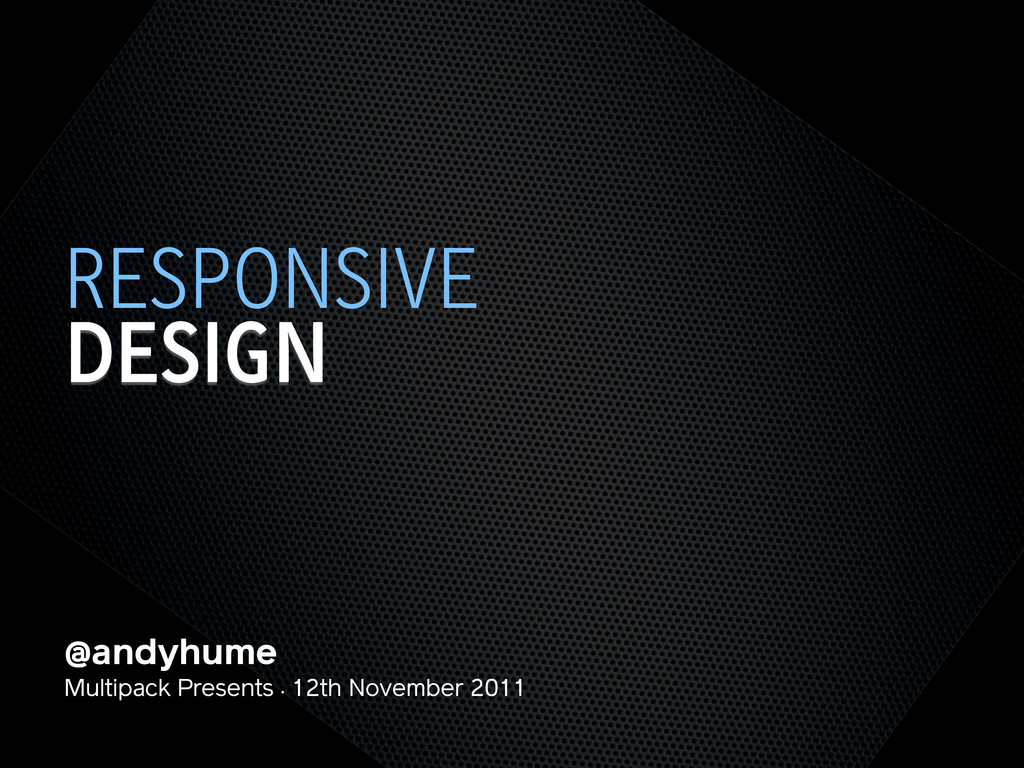
@andyhume Multipack Presents • 12th November 2011 DESIGN RESPONSIVE
@andyhume Multipack Presents • 12th November 2011 DESIGN RESPONSIVE
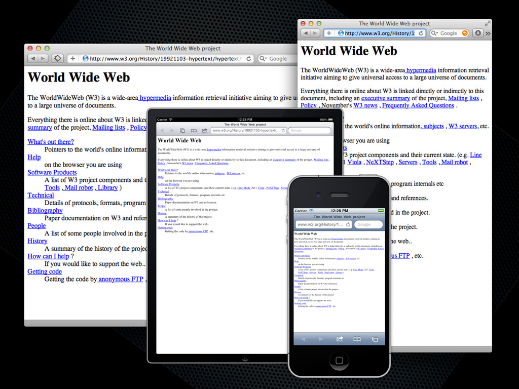
None
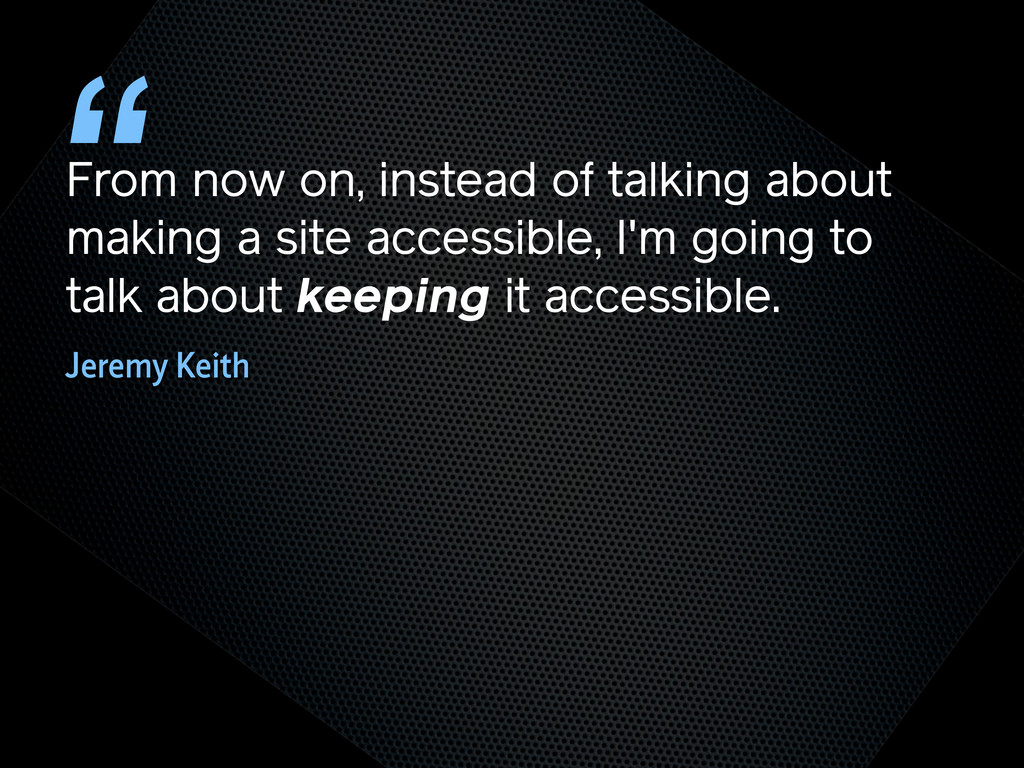
From now on, instead of talking about making a site
accessible, I'm going to talk about keeping it accessible. “ Jeremy Keith
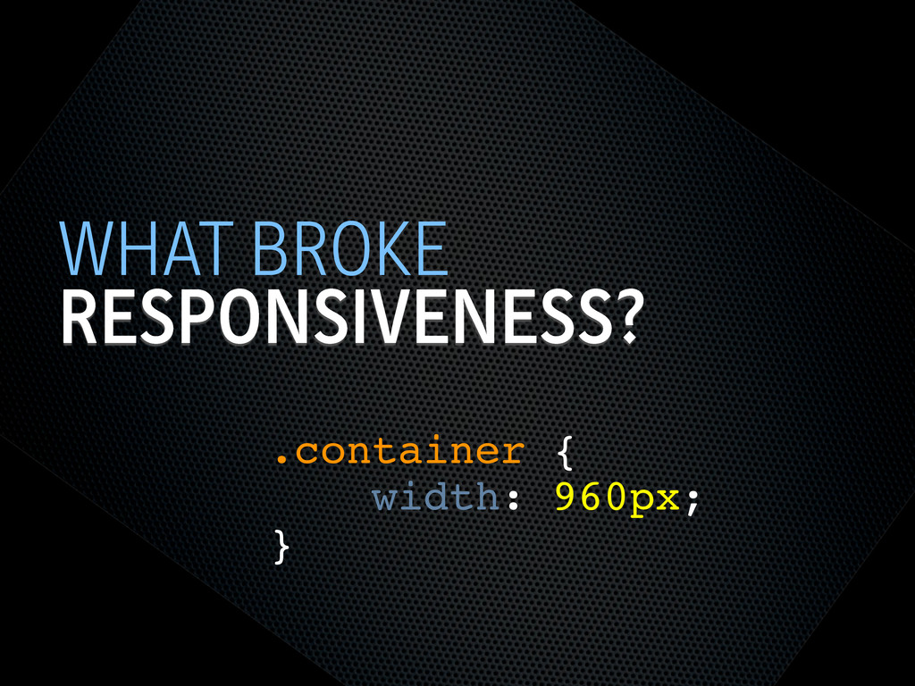
TRY NOT TO BREAK IT? THE WEB WORKS
RESPONSIVENESS? WHAT BROKE .container { width: 960px; }
SEMANTIC HTML STEPS[0]
OOCSS STEPS[1] Loosely couple content styling from layout styling <link
rel="stylesheet" href="core.css">
CORE.CSS STEPS[4] .product .title { font-size: 1em; } @media screen
and (min-width: 60em) { .product .title { font-size: 1.4em; } } Keep modules together
SELECTOR QUERIES? STEPS[4] <div class="product" data-squery="min-width: 400px=wide max-width:10em=small"> <p>Content here</p>
</div> Adapt content based on container width https://github.com/ahume/selector-queries
SELECTOR QUERIES? STEPS[4] .product img { max-width: 100%; } .product.wide
img { // greater than 400px float: left; margin-right: 1em; max-width: auto; } Adapt content based on container width https://github.com/ahume/selector-queries
NAVIGATION STEPS[2]
NAVIGATION STEPS[2]
ADDING LAYOUT STEPS[3] <link rel="stylesheet" href="core.css"> <link rel="stylesheet" href="layout.css" media="screen
and (min-width:40em)"> Loosely couple content styling from layout styling
IE <9 STEPS[5] Send full ‘desktop’ layout <link rel="stylesheet" href="core.css">
<link rel="stylesheet" href="layout.css" media="screen and (min-width:40em)"> <!--[if lt IE 9]> <link rel="stylesheet" href="layout.css" media="screen"> <![endif]-->
IE <9 STEPS[5] Send full ‘desktop’ layout - but not
to mobile <link rel="stylesheet" href="core.css"> <link rel="stylesheet" href="layout.css" media="screen and (min-width:40em)"> <!--[if lt IE 9] & !(IEMobile)]> <link rel="stylesheet" href="layout.css" media="screen"> <![endif]-->
IE <9 STEPS[5] Send full ‘desktop’ layout - or not
<link rel="stylesheet" href="core.css"> <link rel="stylesheet" href="layout.css" media="screen and (min-width:40em)"> <!--[if lt IE 9] & !(IEMobile) & (gt IE6)]> <link rel="stylesheet" href="layout.css" media="screen"> <![endif]-->
IE <9 STEPS[5] Polyfill media queries <script rel="respond.js"></script> https://github.com/scottjehl/Respond
VIEWPORT STEPS[6] Set layout viewport width to the device width
<meta name="viewport" content="width=device-width, initial-scale=1.0">
VIEWPORT STEPS[6] W3C Syntax: coming soon http://dev.w3.org/csswg/css-device-adapt/ @viewport { width:
device-width; zoom: 1.0; }
IMAGES STEPS[7] Shrinking img { max-width: 100%; }
RESPONSIVE IMAGES STEPS[7] Small image by default Don’t download both
RESPONSIVE IMAGES STEPS[7] Client-side solutions https://github.com/filamentgroup/Responsive-Images https://github.com/ahume/Responsive-Images https://github.com/allmarkedup/responsive-images-alt
RESPONSIVE IMAGES STEPS[7] Here and now? src.sencha.io <img src="http://src.sencha.io/http://andyhume.net/ u.jpg">
RESPONSIVE IMAGES STEPS[7] Here and now? Image replacement <div class="logo">
<img src="logo.png" alt="Company name"> </div> .logo { background-image: url(logo-large.png); } .logo img { position: absolute; left: -9999px; }
SVG STEPS[8] Same approaches to support as responsive images
ENHANCING CONTENT STEPS[9] What’s core content?
ENHANCING CONTENT STEPS[9]
ENHANCING CONTENT STEPS[9]
ENHANCING CONTENT STEPS[9] if ($(document).width() > 640) { ! $.get('path/to/html',
function(data) { ! ! $('[role="complementary"]').append(data); ! }); } What’s core content?
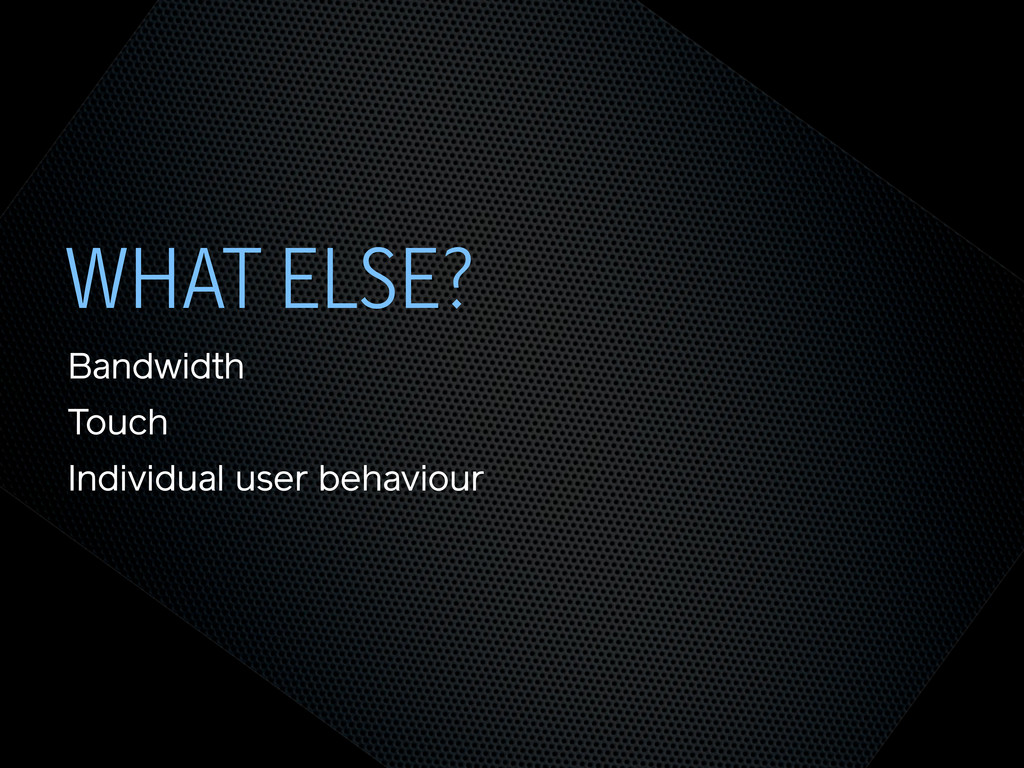
WHAT ELSE? Bandwidth Touch Individual user behaviour
THE END @andyhume Multipack Presents • 12th November 2011
 andyhume
 kanny
kanny
 kobayashiyorimitsu
 k_adachi_01
 krrrr38
 bata_24
 grimoh
 sugupoko
 chmikata
 y150saya
 sue445
 ysknsid25
 nwiizo
 codingconduct
 marketingsoph
 jonrohan
 mfonobong
 takai
takai
 davidcarrasco
 reverentgeek
 techseoconnect
 axbom
axbom
 danielanewman
 tomoyanonymous
 chrisshort
![SEMANTIC HTML STEPS[0]](https://files.speakerdeck.com/presentations/4ec011cd70a8050051006edf/slide_6.jpg)
![OOCSS STEPS[1] Loosely couple content styling from layout styling <link](https://files.speakerdeck.com/presentations/4ec011cd70a8050051006edf/slide_7.jpg)
![CORE.CSS STEPS[4] .product .title { font-size: 1em; } @media screen](https://files.speakerdeck.com/presentations/4ec011cd70a8050051006edf/slide_8.jpg)
![SELECTOR QUERIES? STEPS[4] <div class="product" data-squery="min-width: 400px=wide max-width:10em=small"> <p>Content here</p>](https://files.speakerdeck.com/presentations/4ec011cd70a8050051006edf/slide_9.jpg)
![SELECTOR QUERIES? STEPS[4] .product img { max-width: 100%; } .product.wide](https://files.speakerdeck.com/presentations/4ec011cd70a8050051006edf/slide_10.jpg)
![NAVIGATION STEPS[2]](https://files.speakerdeck.com/presentations/4ec011cd70a8050051006edf/slide_11.jpg)
![NAVIGATION STEPS[2]](https://files.speakerdeck.com/presentations/4ec011cd70a8050051006edf/slide_12.jpg)
![ADDING LAYOUT STEPS[3] <link rel="stylesheet" href="core.css"> <link rel="stylesheet" href="layout.css" media="screen](https://files.speakerdeck.com/presentations/4ec011cd70a8050051006edf/slide_13.jpg)
![IE <9 STEPS[5] Send full ‘desktop’ layout <link rel="stylesheet" href="core.css">](https://files.speakerdeck.com/presentations/4ec011cd70a8050051006edf/slide_14.jpg)
![IE <9 STEPS[5] Send full ‘desktop’ layout - but not](https://files.speakerdeck.com/presentations/4ec011cd70a8050051006edf/slide_15.jpg)
![IE <9 STEPS[5] Send full ‘desktop’ layout - or not](https://files.speakerdeck.com/presentations/4ec011cd70a8050051006edf/slide_16.jpg)
![IE <9 STEPS[5] Polyfill media queries <script rel="respond.js"></script> https://github.com/scottjehl/Respond](https://files.speakerdeck.com/presentations/4ec011cd70a8050051006edf/slide_17.jpg)
![VIEWPORT STEPS[6] Set layout viewport width to the device width](https://files.speakerdeck.com/presentations/4ec011cd70a8050051006edf/slide_18.jpg)
![VIEWPORT STEPS[6] W3C Syntax: coming soon http://dev.w3.org/csswg/css-device-adapt/ @viewport { width:](https://files.speakerdeck.com/presentations/4ec011cd70a8050051006edf/slide_19.jpg)
![IMAGES STEPS[7] Shrinking img { max-width: 100%; }](https://files.speakerdeck.com/presentations/4ec011cd70a8050051006edf/slide_20.jpg)
![RESPONSIVE IMAGES STEPS[7] Small image by default Don’t download both](https://files.speakerdeck.com/presentations/4ec011cd70a8050051006edf/slide_21.jpg)
![RESPONSIVE IMAGES STEPS[7] Client-side solutions https://github.com/filamentgroup/Responsive-Images https://github.com/ahume/Responsive-Images https://github.com/allmarkedup/responsive-images-alt](https://files.speakerdeck.com/presentations/4ec011cd70a8050051006edf/slide_22.jpg)
![RESPONSIVE IMAGES STEPS[7] Here and now? src.sencha.io <img src="http://src.sencha.io/http://andyhume.net/ u.jpg">](https://files.speakerdeck.com/presentations/4ec011cd70a8050051006edf/slide_23.jpg)
![RESPONSIVE IMAGES STEPS[7] Here and now? Image replacement <div class="logo">](https://files.speakerdeck.com/presentations/4ec011cd70a8050051006edf/slide_24.jpg)
![SVG STEPS[8] Same approaches to support as responsive images](https://files.speakerdeck.com/presentations/4ec011cd70a8050051006edf/slide_25.jpg)
![ENHANCING CONTENT STEPS[9] What’s core content?](https://files.speakerdeck.com/presentations/4ec011cd70a8050051006edf/slide_26.jpg)
![ENHANCING CONTENT STEPS[9]](https://files.speakerdeck.com/presentations/4ec011cd70a8050051006edf/slide_27.jpg)
![ENHANCING CONTENT STEPS[9]](https://files.speakerdeck.com/presentations/4ec011cd70a8050051006edf/slide_28.jpg)
![ENHANCING CONTENT STEPS[9] if ($(document).width() > 640) { ! $.get('path/to/html',](https://files.speakerdeck.com/presentations/4ec011cd70a8050051006edf/slide_29.jpg)