Upgrade to Pro
— share decks privately, control downloads, hide ads and more …
Speaker Deck
Features
Speaker Deck
PRO
Sign in
Sign up for free
Search
Search
QCMerge 2012 - I am Designer (and so can you!)
Search
Sponsored
·
Ship Features Fearlessly
Turn features on and off without deploys. Used by thousands of Ruby developers.
→
Justine
May 11, 2012
Design
350
9
Share
Embed
Copy iframe code
Copy JS code
Copy link
Start on current slide
QCMerge 2012 - I am Designer (and so can you!)
Design workshop for the QCMerge in Cincinnati, Ohio.
Justine
May 11, 2012
More Decks by Justine
See All by Justine
I am Designer (and so can you!) -- Ruby User Group Berlin
ctrlaltjustine
1
180
Ruby Conf Argentina - Put Away The Knives: We Can Work Together!
ctrlaltjustine
0
140
Eurucamp - Put Away the Knives: We Can Work Together
ctrlaltjustine
1
450
CCAD College Preview Talk
ctrlaltjustine
2
190
I Am Designer (and so can you!)
ctrlaltjustine
6
300
Ruby Conf Uruguay - I Am Designer (and so can you!)
ctrlaltjustine
11
550
CodeMash 13 - I am Designer and so can you!
ctrlaltjustine
5
300
Transitioning from Print to Web
ctrlaltjustine
1
250
ScotRubyConf 2012 - I am Designer (and so can you!)
ctrlaltjustine
13
740
Other Decks in Design
See All in Design
30分でわかるインサイトマネジメント(2025年12月バージョン)
centou
1
690
Drawing for Animation
lynteo
2
310
開発・制作におけるUI・UXデザインの重要性について~UI・UXデザインってなんだろう~
yamasaku
0
130
AIスライド生成を進化させるMDファイル
kenichiota0711
1
1.4k
怖くないアクセシビリティ -カウンターカルチャーとしてのアッカン東京-
securecat
1
220
Figma MCPを活用するためのデザインハンドブック
vivion
8
19k
デザインの文脈を理解する:エンジニアがデザインカンファレンスに参加して得た学びと気づき
hypebeans
0
240
デザイナーが主導権を握る、AI協業の本音と実践
satosio
7
3.4k
「おすすめ」はなぜ信用されないのか - 信頼を築くUI/UX設計
ryu1013
0
160
少人数チームで_使われるプロダクトにたどり着くための_デザインハーネス.pdf
nishame
1
940
where_imagination_ends_ai_begins.pdf
r5ni4
0
200
Signull 団体説明資料
signull
0
700
Featured
See All Featured
4 Signs Your Business is Dying
shpigford
187
22k
Pawsitive SEO: Lessons from My Dog (and Many Mistakes) on Thriving as a Consultant in the Age of AI
davidcarrasco
0
180
WCS-LA-2024
lcolladotor
0
680
HTML-Aware ERB: The Path to Reactive Rendering @ RubyCon 2026, Rimini, Italy
marcoroth
2
310
The SEO Collaboration Effect
kristinabergwall1
1
500
The Organizational Zoo: Understanding Human Behavior Agility Through Metaphoric Constructive Conversations (based on the works of Arthur Shelley, Ph.D)
kimpetersen
PRO
0
380
KATA
mclloyd
PRO
35
15k
How to train your dragon (web standard)
notwaldorf
97
6.7k
Reality Check: Gamification 10 Years Later
codingconduct
0
2.2k
We Are The Robots
honzajavorek
0
270
Navigating the moral maze — ethical principles for Al-driven product design
skipperchong
2
410
10 Git Anti Patterns You Should be Aware of
lemiorhan
PRO
659
62k
Transcript
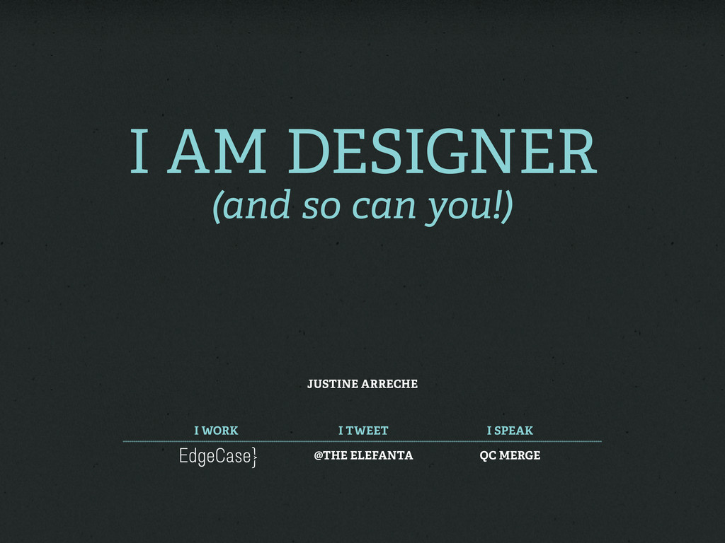
I am Designer (and so can you!) Justine Arreche I
work I tweet I speak @The Elefanta QC MERGE
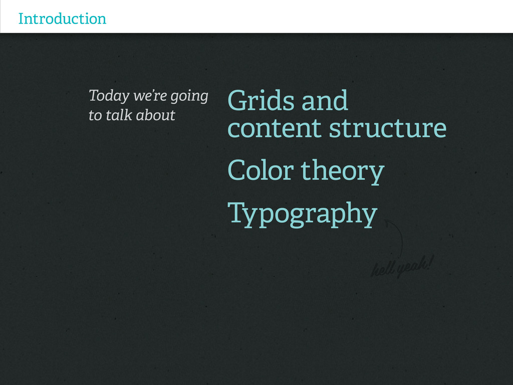
Introduction Today we’re going to talk about Grids and content
structure Color theory Typography
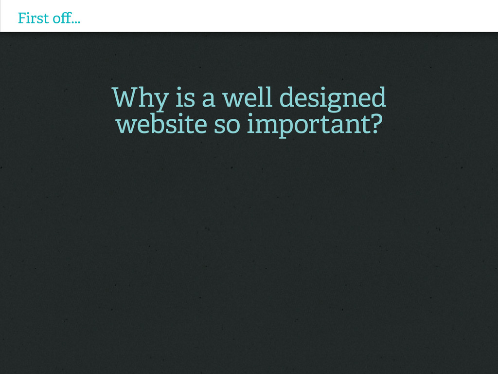
First off... Why is a well designed website so important?
First off... Why is a well designed website so important?
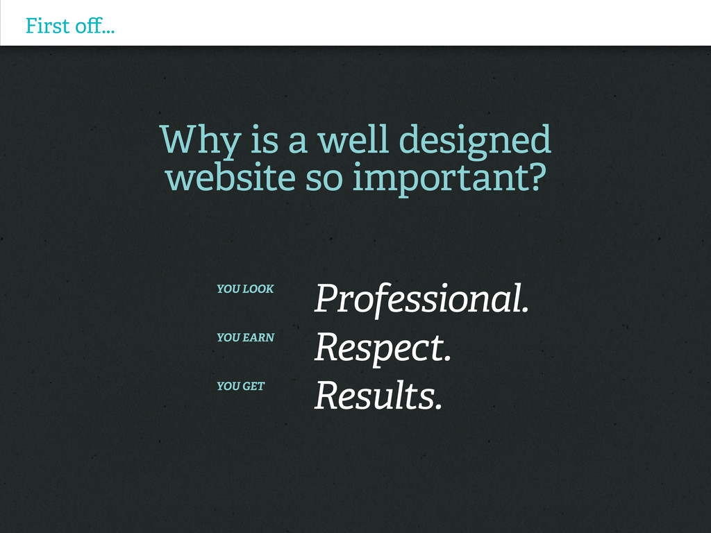
You look Professional. You earn Respect. You get Results.
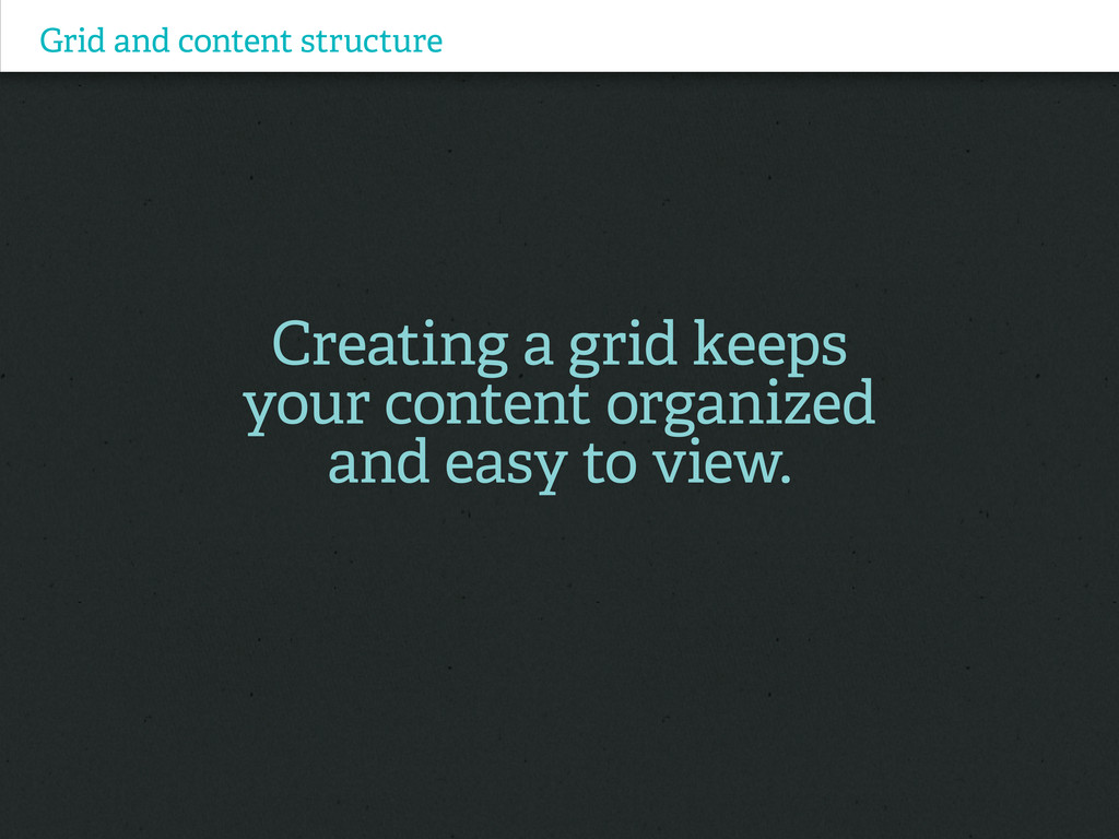
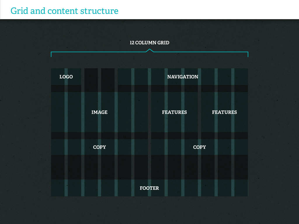
Grid and content structure Creating a grid keeps your content
organized and easy to view.
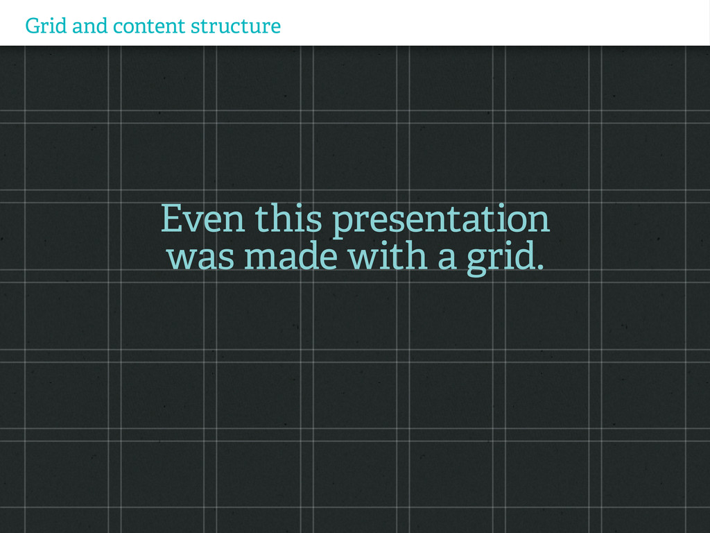
Grid and content structure Even this presentation was made with
a grid.
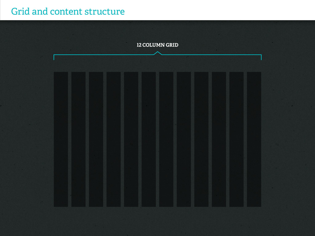
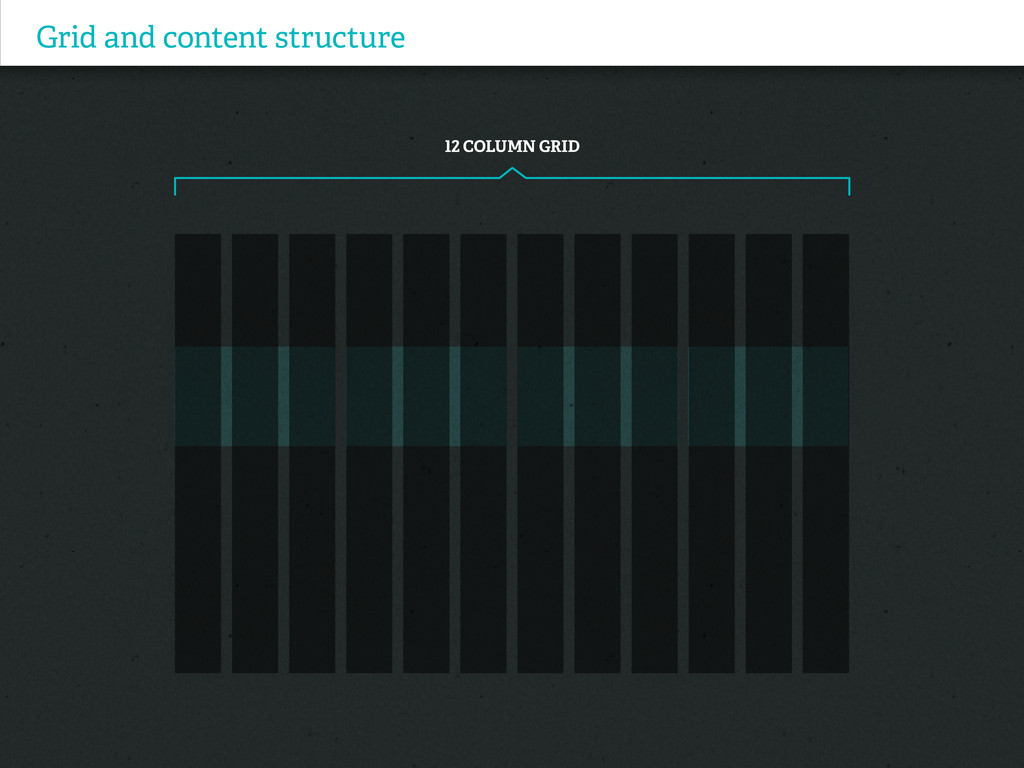
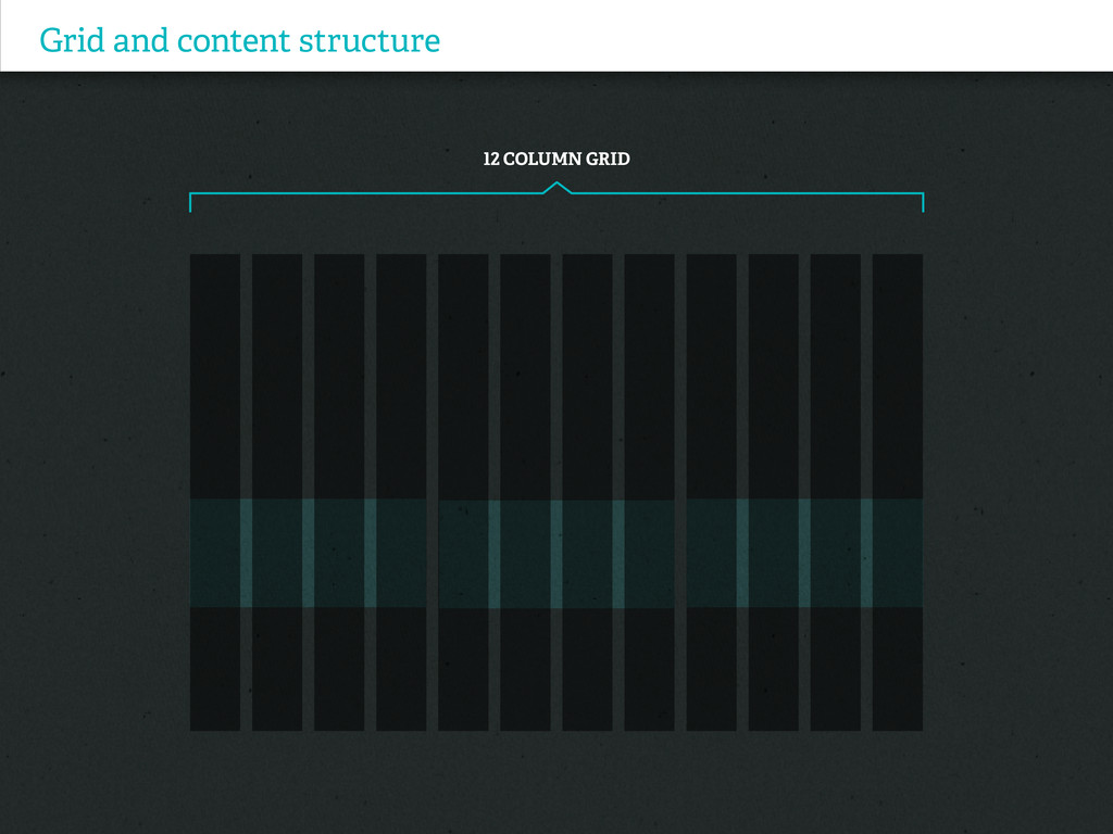
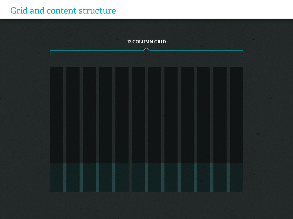
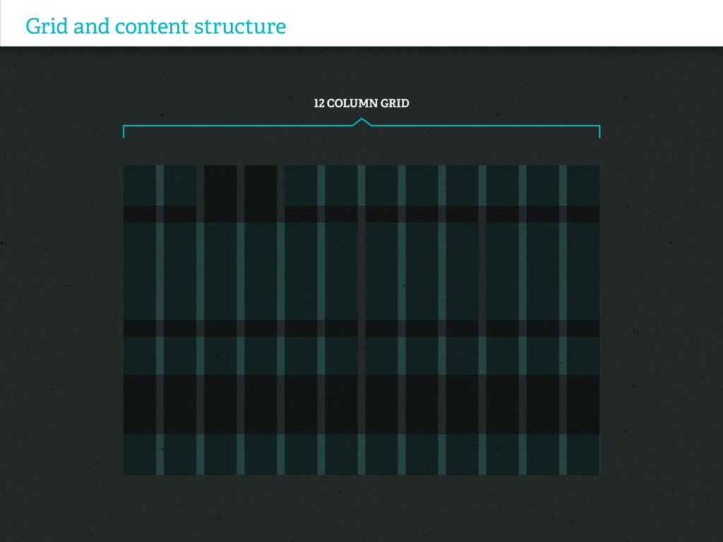
Grid and content structure 12 Column Grid
Grid and content structure 12 Column Grid
Grid and content structure 12 Column Grid
Grid and content structure 12 Column Grid
Grid and content structure 12 Column Grid
Grid and content structure 12 Column Grid
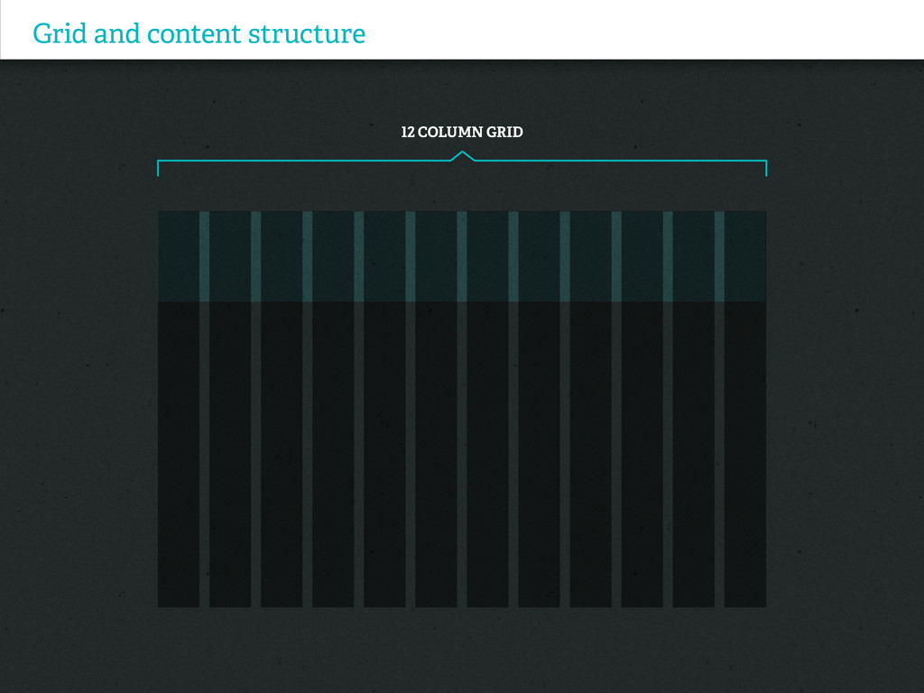
Grid and content structure 12 Column Grid LOGO IMAGE COPY
COPY FEATURES FEATURES NAVIGATION FOOTER
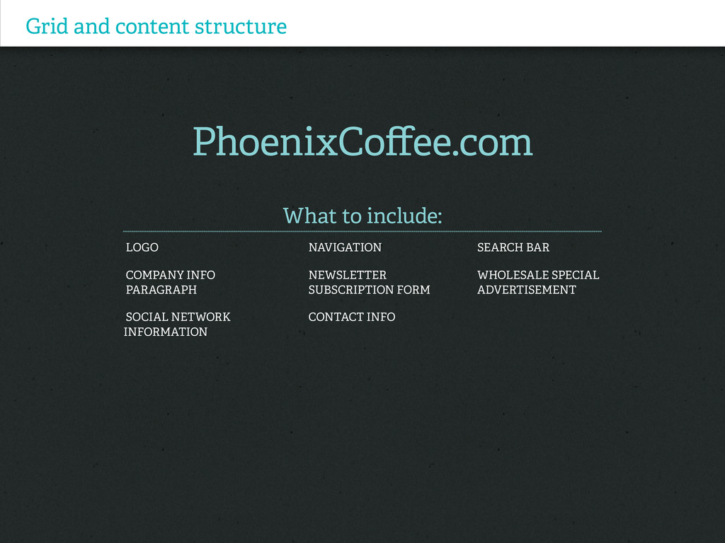
Grid and content structure PhoenixCoffee.com What to include: Logo Navigation
Search bar Company info Newsletter Wholesale special paragraph subscription form advertisement Social Network Contact info Information
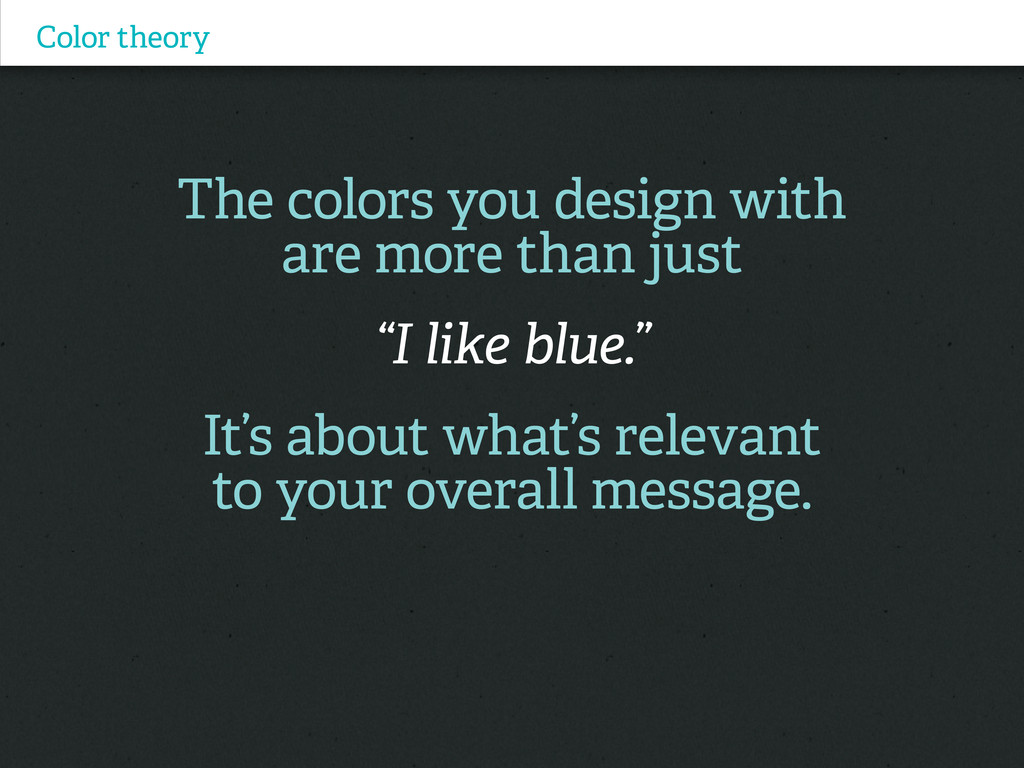
Color theory The colors you design with are more than
just “I like blue.” It’s about what’s relevant to your overall message.
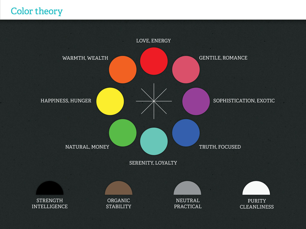
Color theory PURITY CLEANLINESS LOVE, ENERGY SERENITY, LOYALTY TRUTH, FOCUSED
Gentile, Romance WARMTH, WEALTH HAPPINESS, HUNGER Sophistication, Exotic Natural, Money STRENGTH INTELLIGENCE Organic STABILITY NEUTRAL Practical
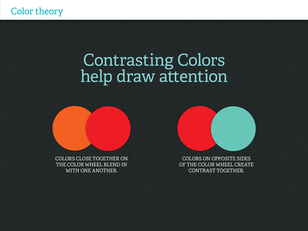
Contrasting Colors help draw attention Color theory COLORS CLOSE TOGETHER
ON THE COLOR WHEEL blend in with one another. Colors on opposite sides of the color wheel create contrast together.
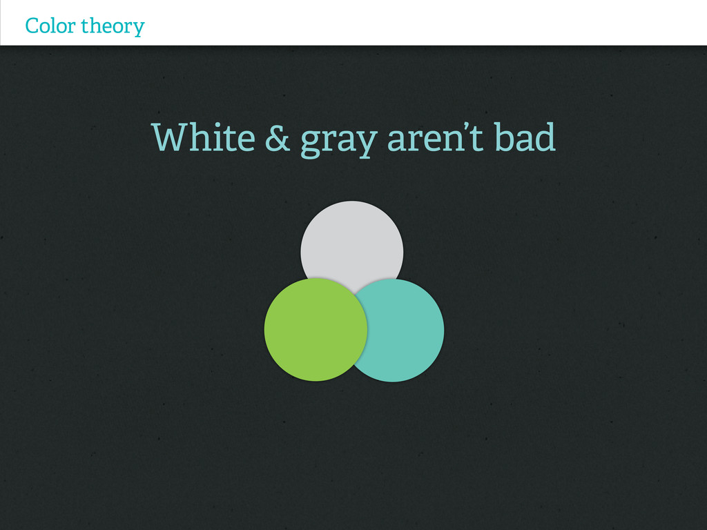
White & gray aren’t bad Color theory
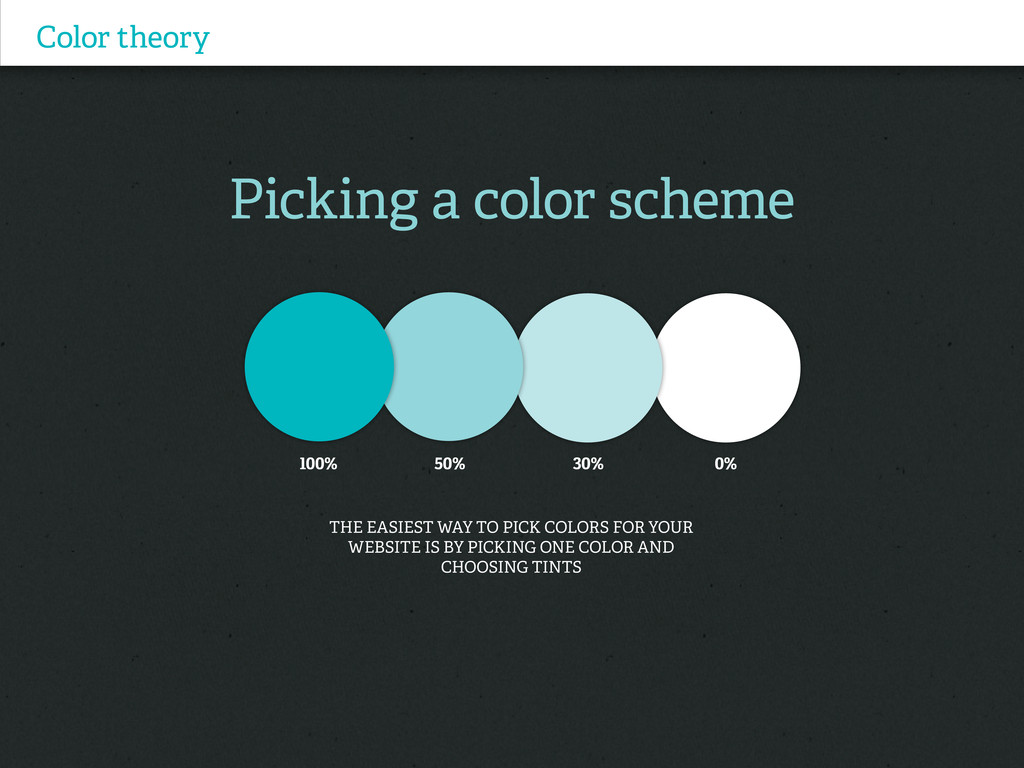
Picking a color scheme Color theory The easiest way to
pick colors for your website is by picking one color and choosing tints 100% 50% 30% 0%
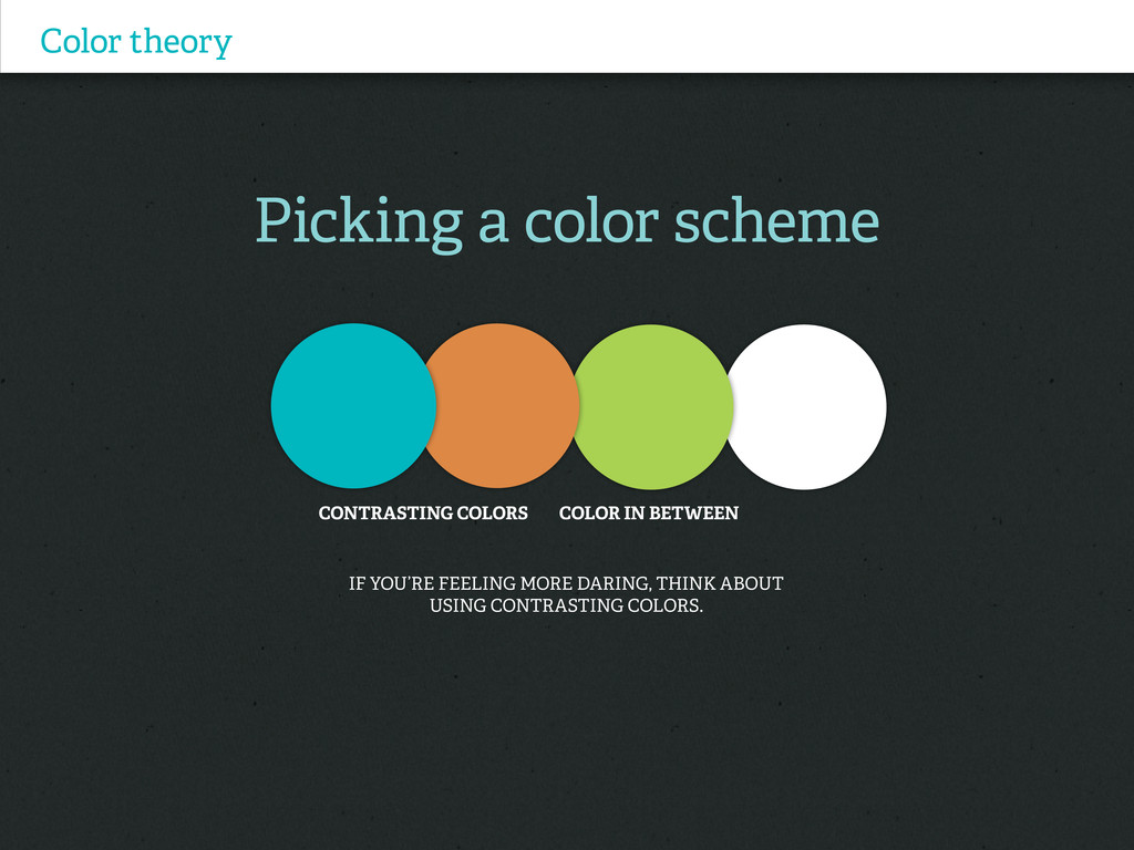
Picking a color scheme Color theory If you’re feeling more
daring, think about using contrasting colors. CONTRASTING COLORS COLOR IN BETWEEN
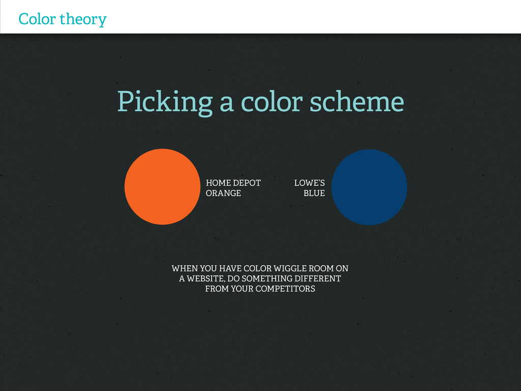
Picking a color scheme Color theory When you have color
wiggle room on a website, do something different from your competitors HOME DEPOT ORANGE Lowe’s Blue
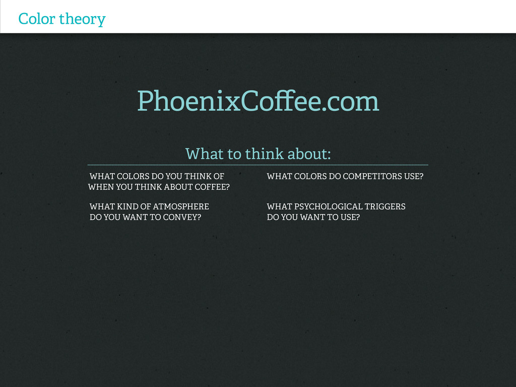
Color theory PhoenixCoffee.com What to think about: What colors do
YOU Think of What colors do competitors use? WHEN you think about coffee? What kind of atmosphere What psychological triggers do you want to convey? Do you want to use?
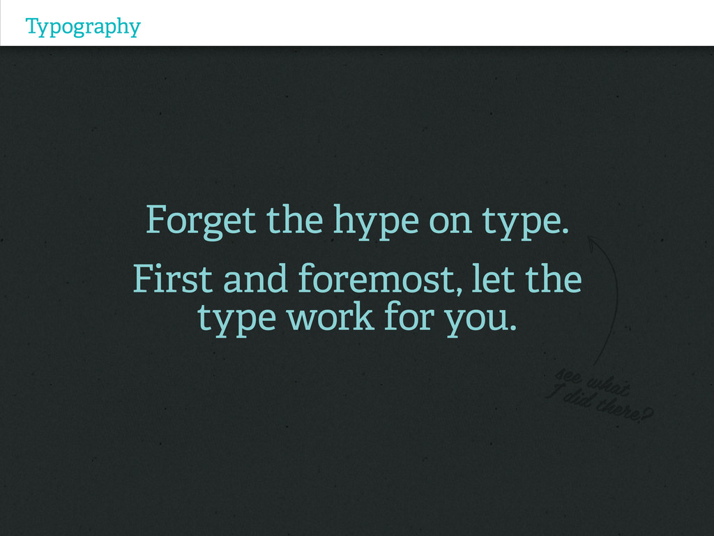
Typography Forget the hype on type. First and foremost, let
the type work for you.
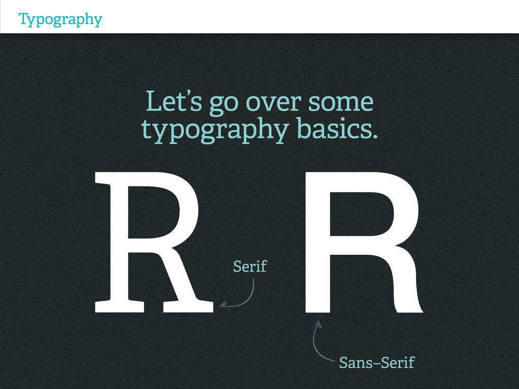
Typography Let’s go over some typography basics. Serif Sans–Serif
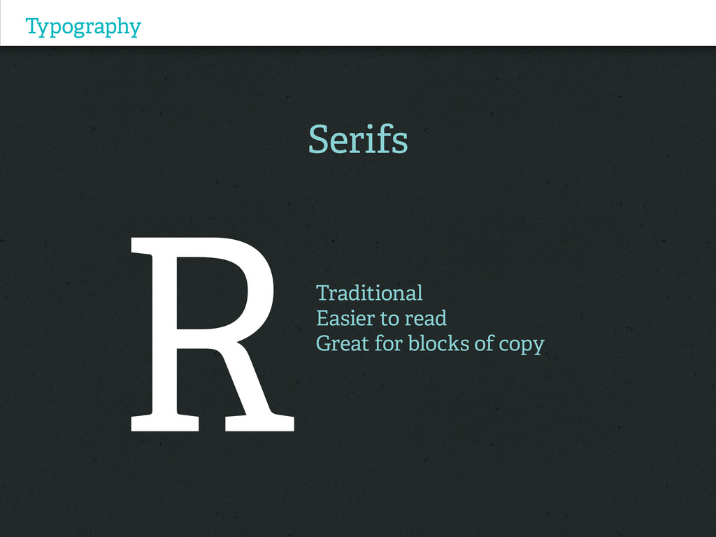
Typography Serifs Traditional Easier to read Great for blocks of
copy
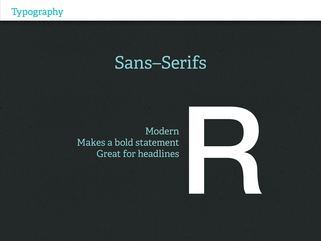
Typography Sans–Serifs Modern Makes a bold statement Great for headlines
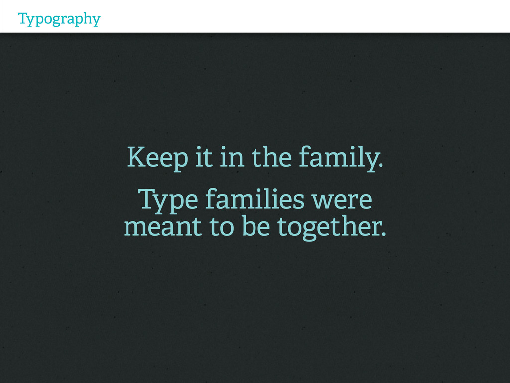
Typography Keep it in the family. Type families were meant
to be together.
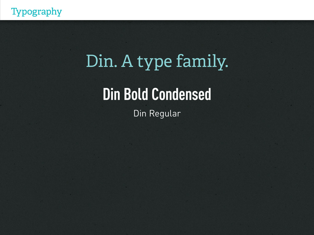
Typography Din. A type family. Din Bold Condensed Din Regular
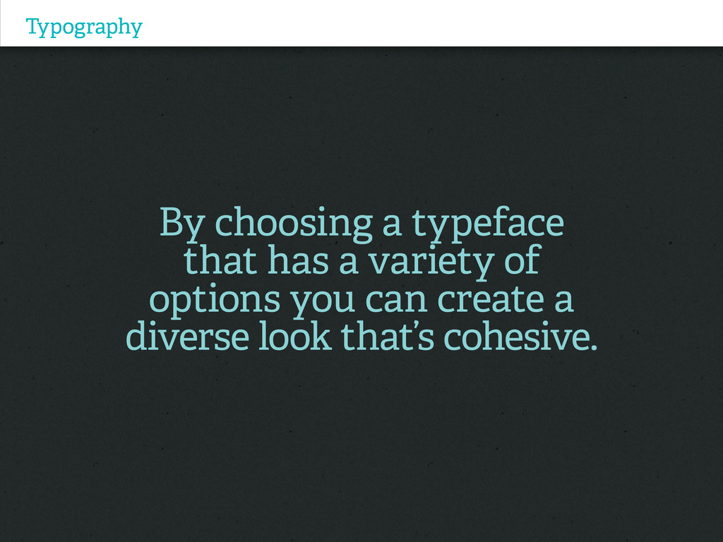
Typography By choosing a typeface that has a variety of
options you can create a diverse look that’s cohesive.
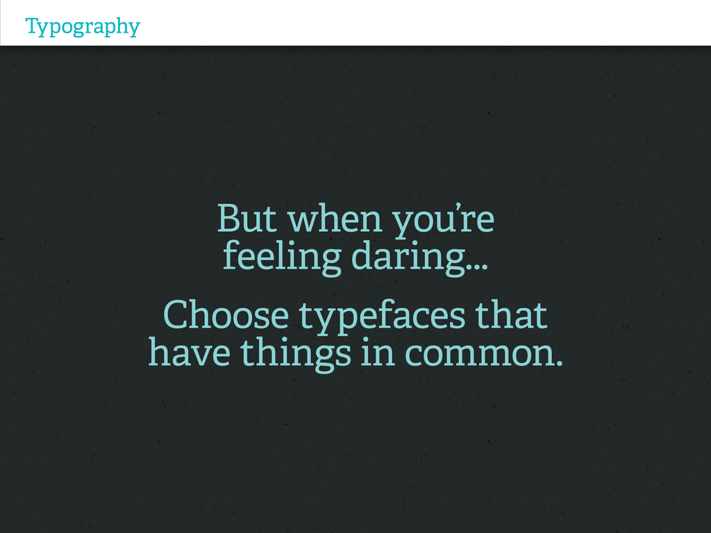
Typography But when you’re feeling daring... Choose typefaces that have
things in common.
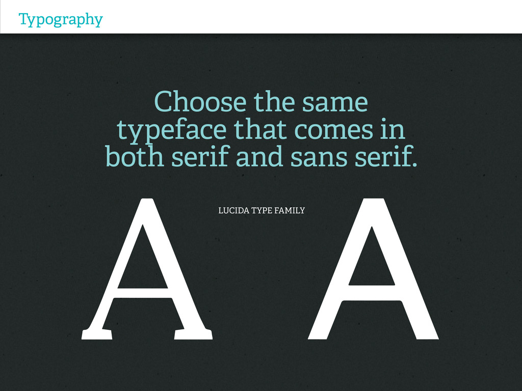
Typography Choose the same typeface that comes in both serif
and sans serif. LUCIDA TYPE FAMILY
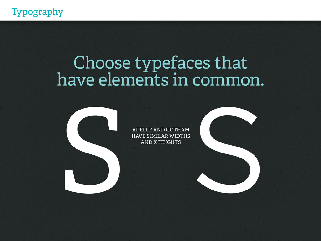
Typography Choose typefaces that have elements in common. ADelle and
Gotham have SIMILAR WIDTHS and x-heights
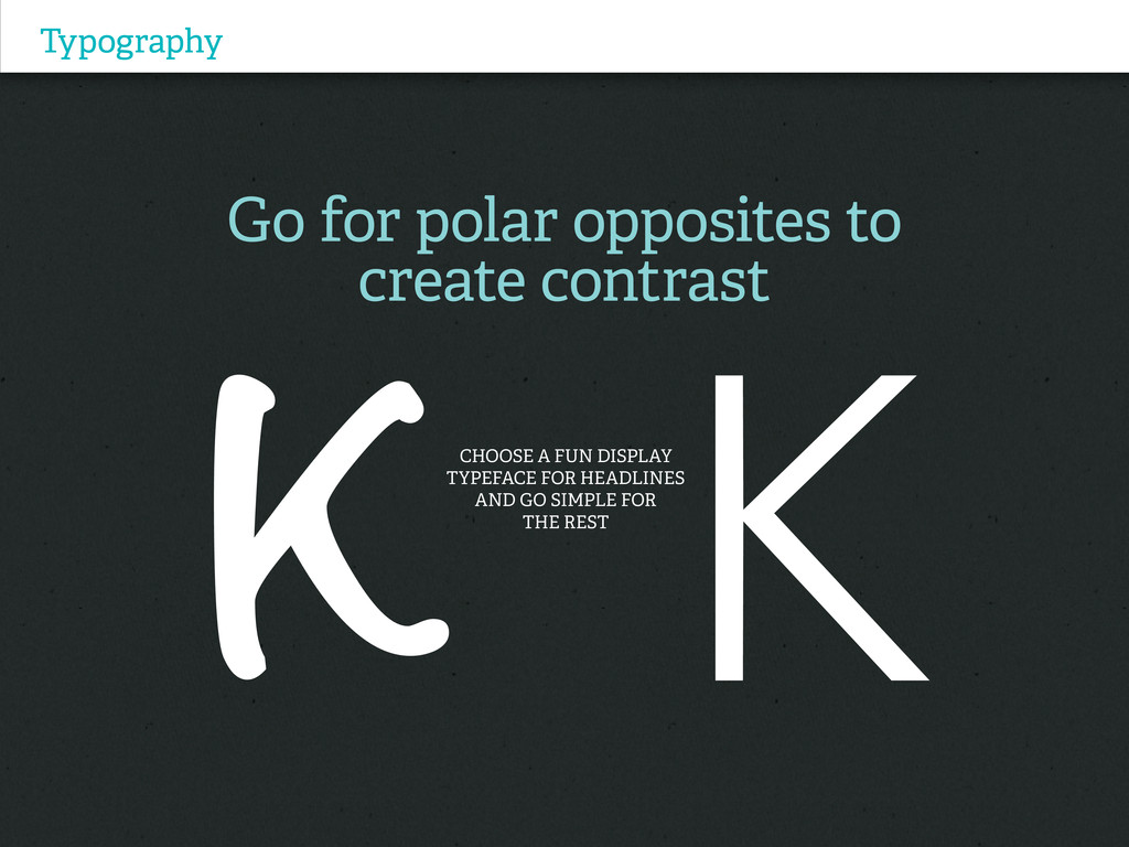
Typography Go for polar opposites to create contrast Choose a
fun display typeface for headlines and go simple for the rest
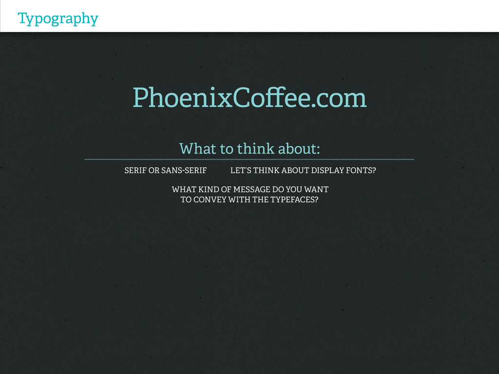
Typography PhoenixCoffee.com What to think about: Serif or Sans-serif Let’s
think about display fonts? What kind of message do you want to convey with the typefaces?
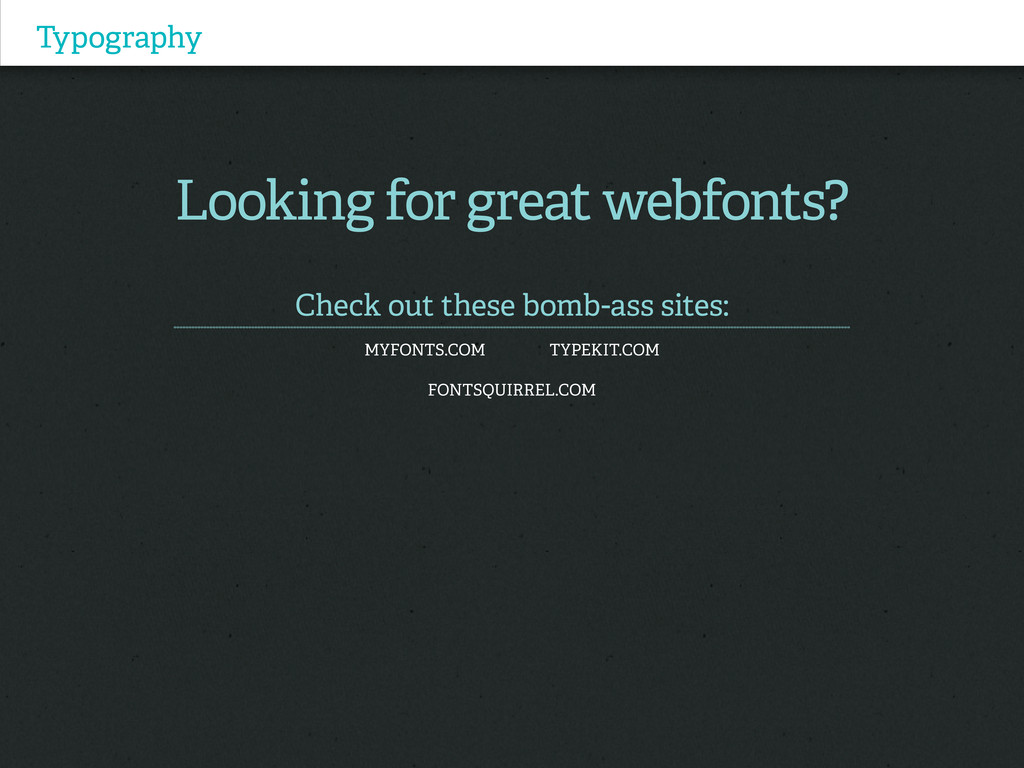
Typography Looking for great webfonts? Check out these bomb-ass sites:
myfonts.com typekit.com Fontsquirrel.com
Thanks (you’re the bomb diggity) Justine Arreche I work I
tweet I Design @The Elefanta The Elefanta.com