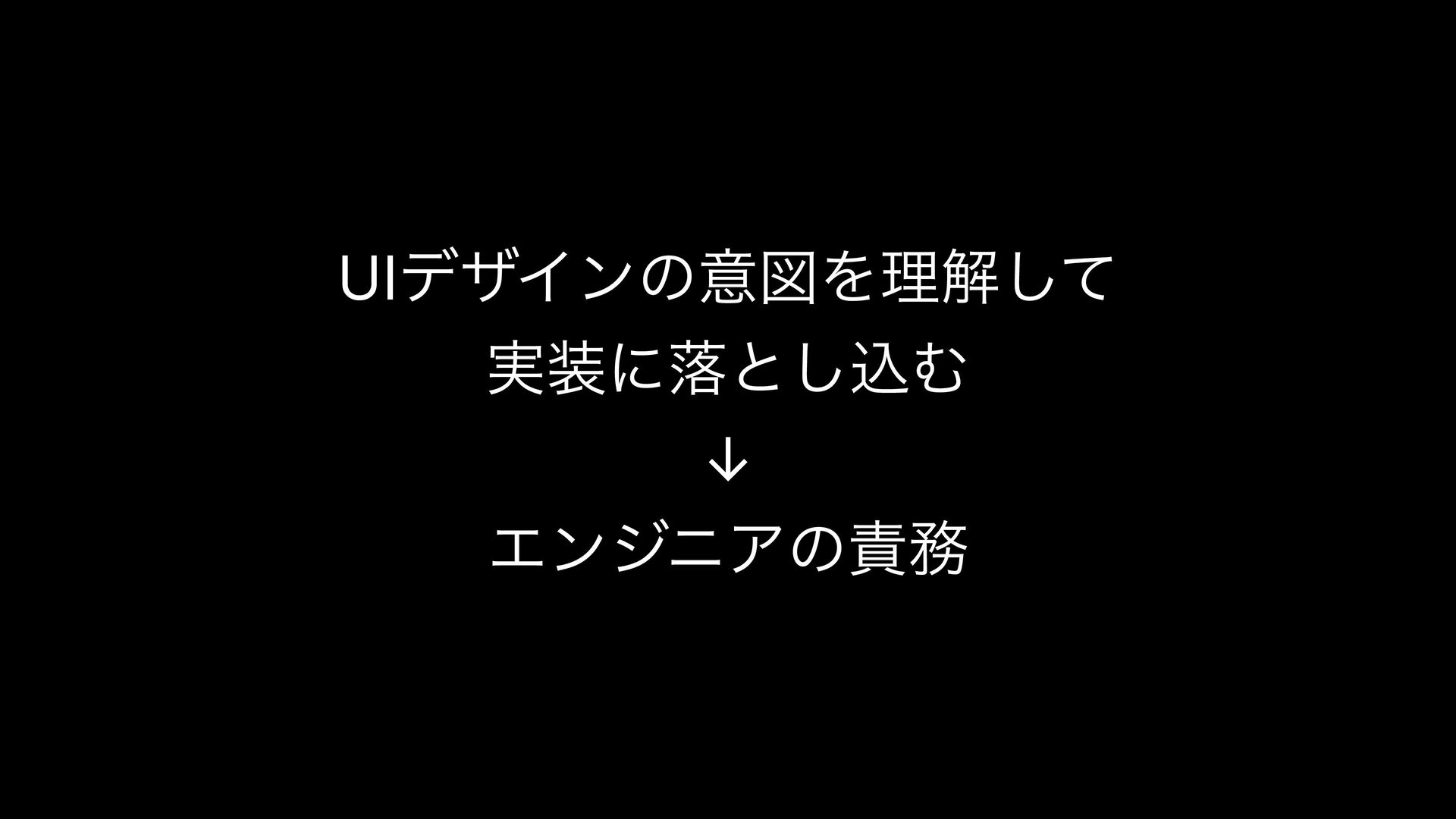
just empty spaces—they are intentionally used blank areas!* To understand the meaning of margins, you first need some basic knowledge of cognitive psychology, so I’ll explain briefly.
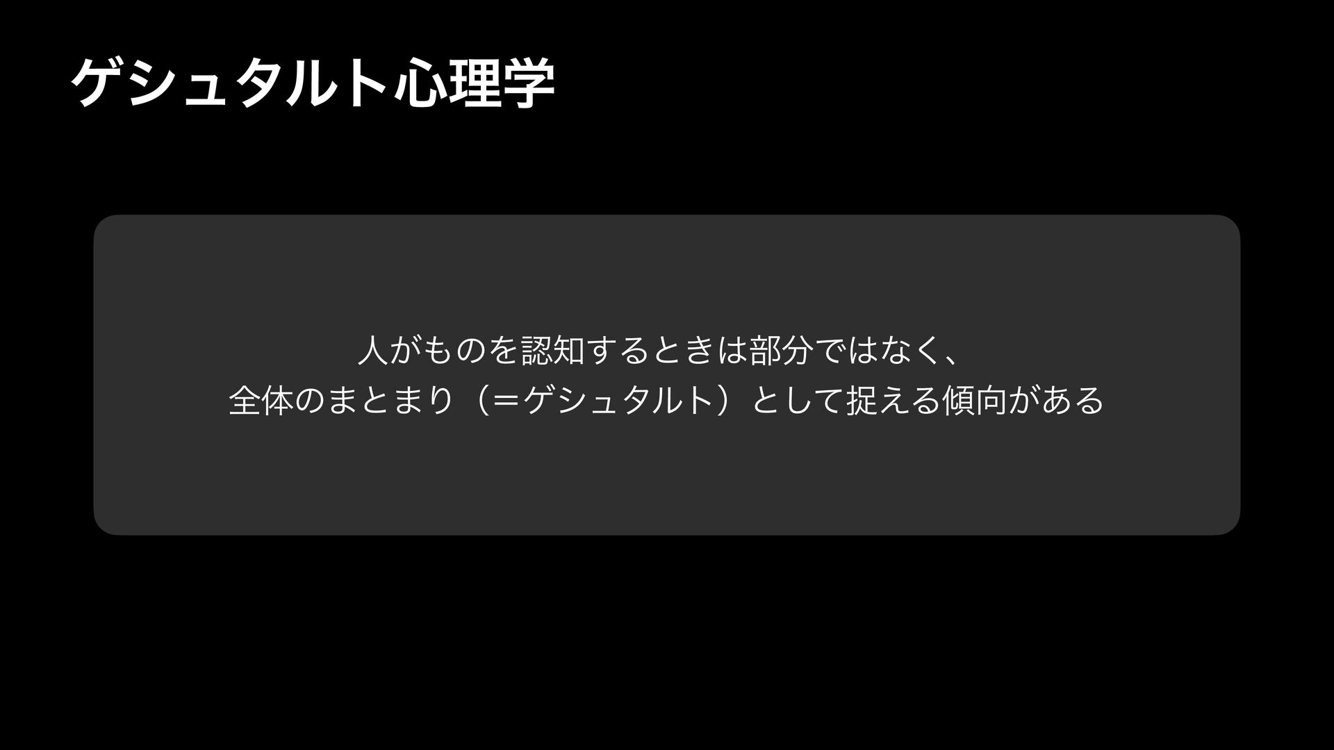
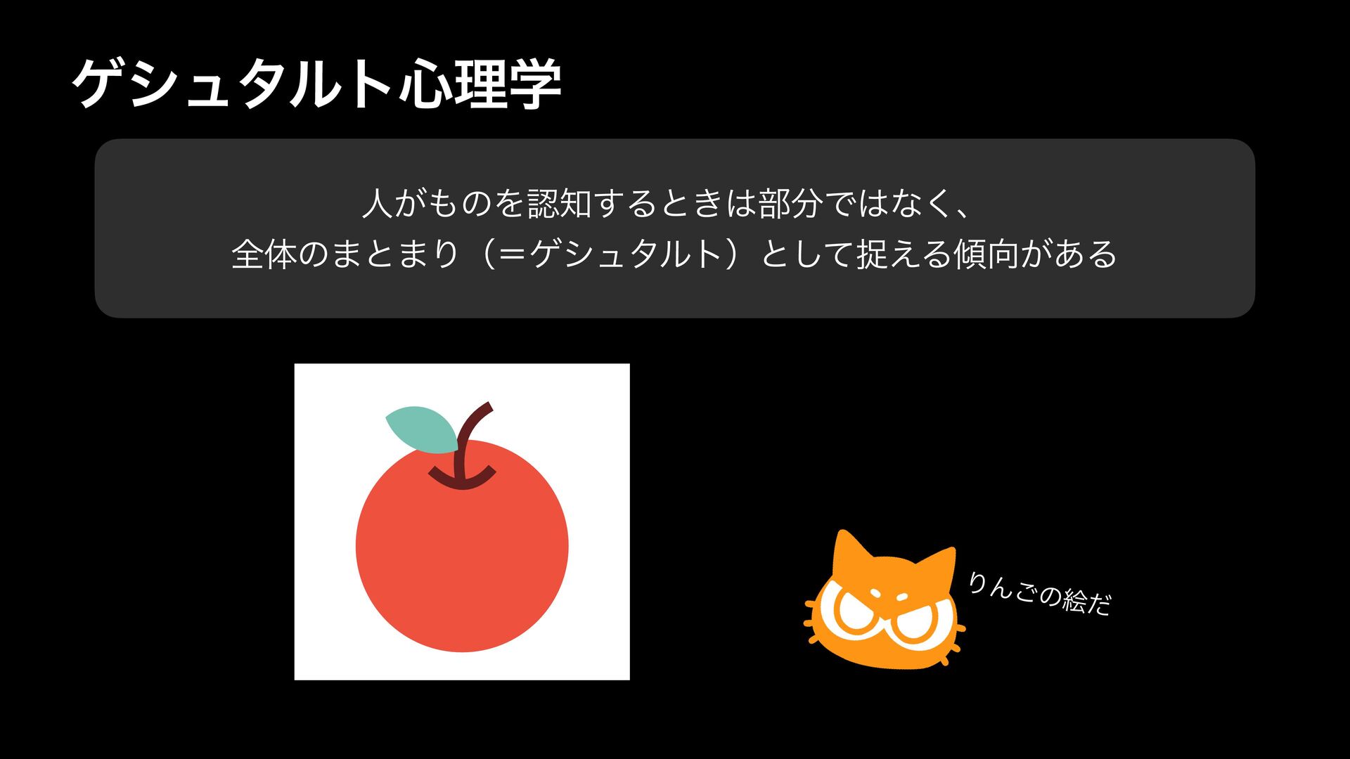
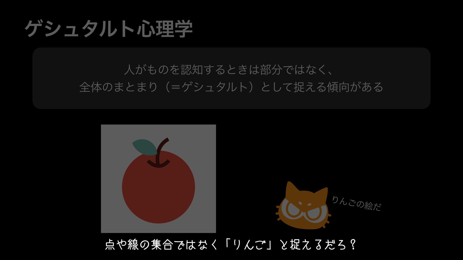
psychology. Gestalt psychology is based on the fundamental idea that "when people perceive things, they tend to see them not as individual parts, but as a unified whole (a "Gestalt")."
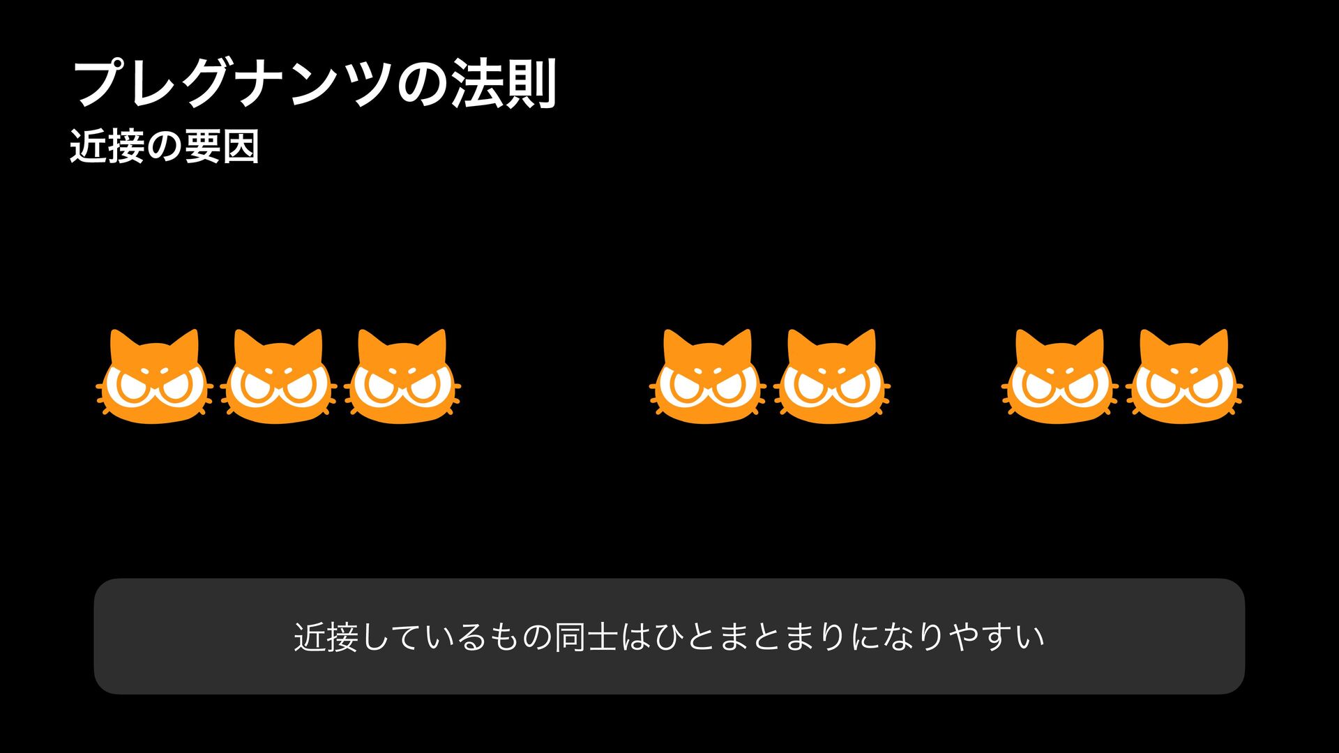
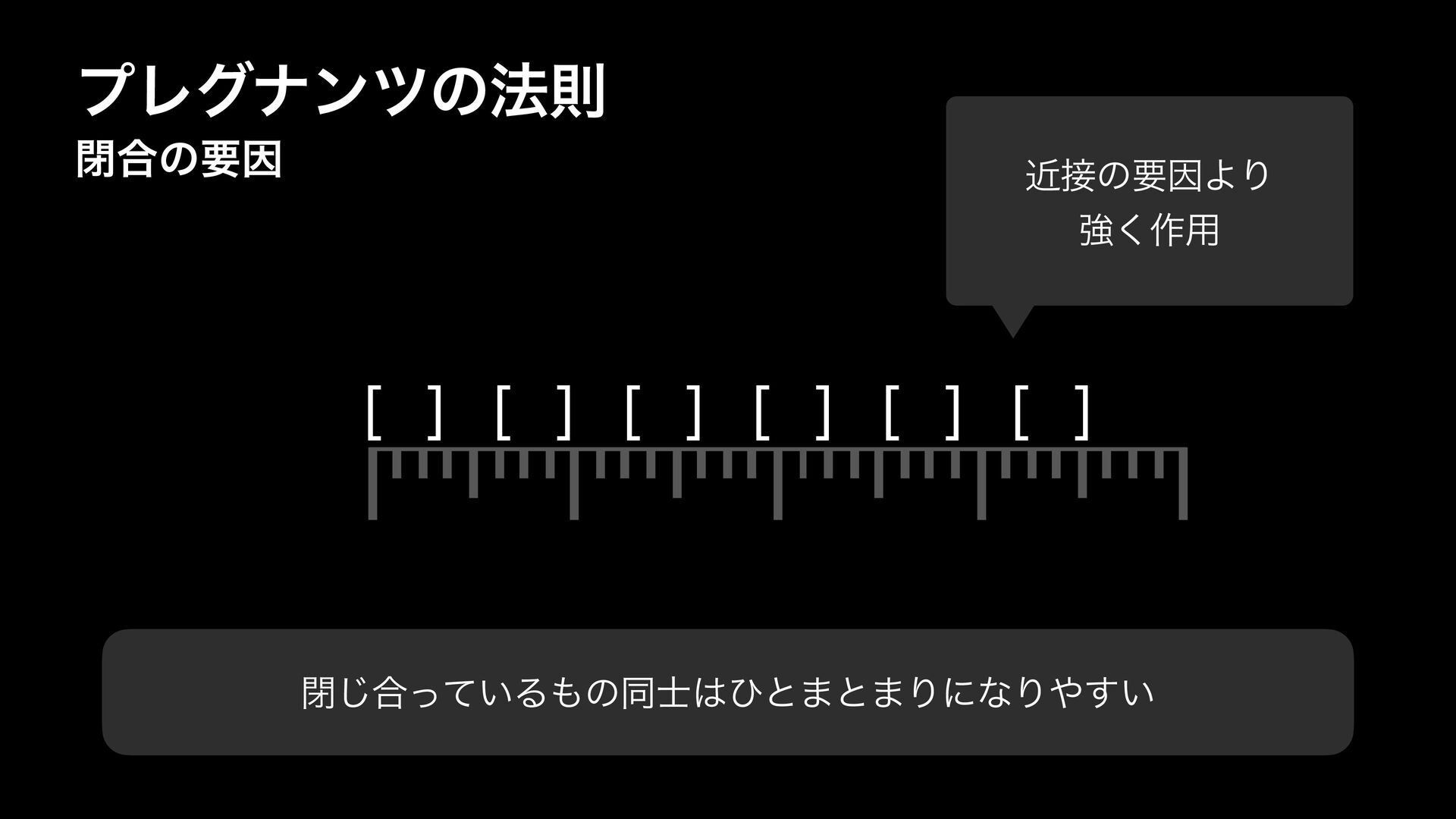
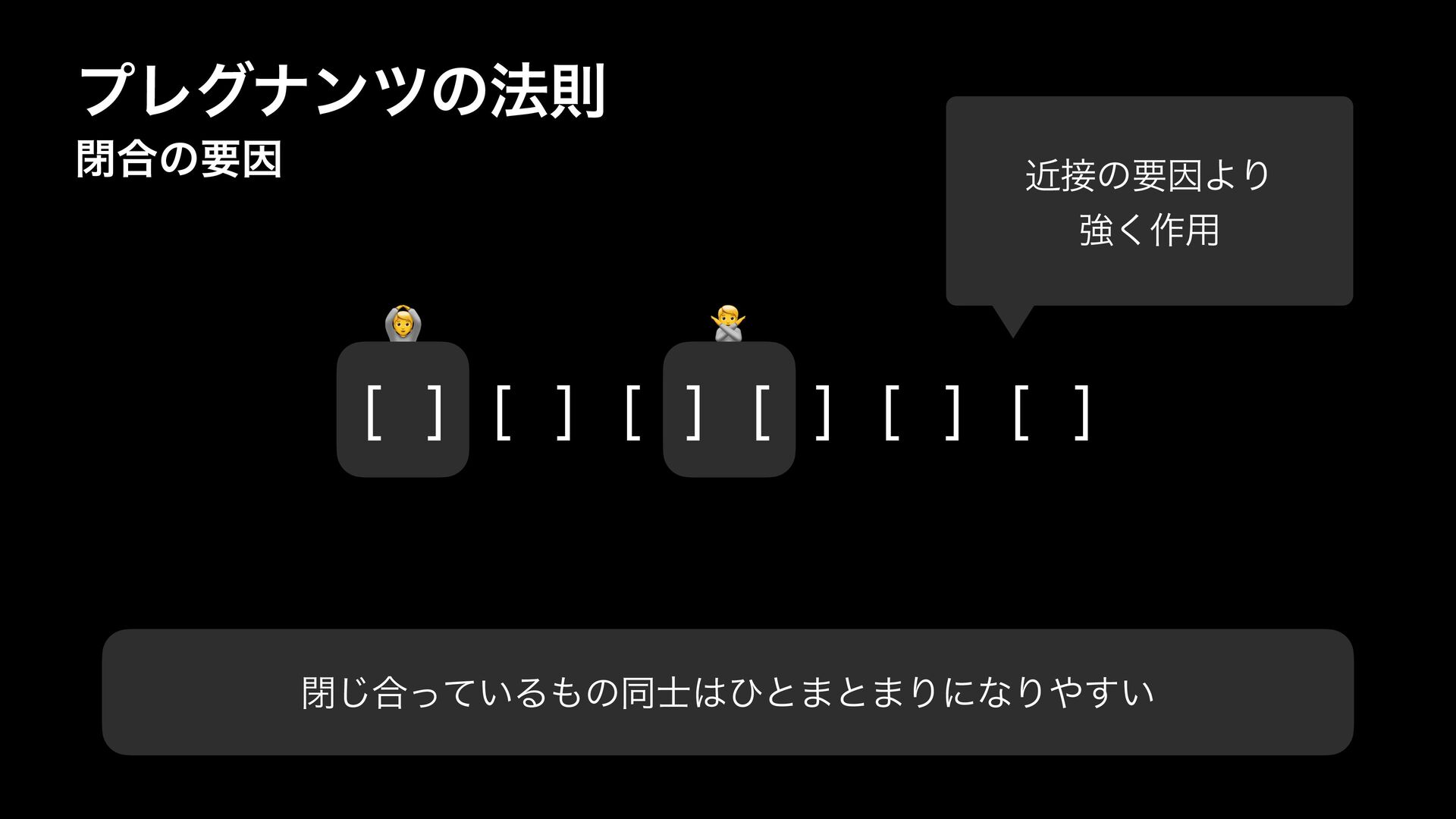
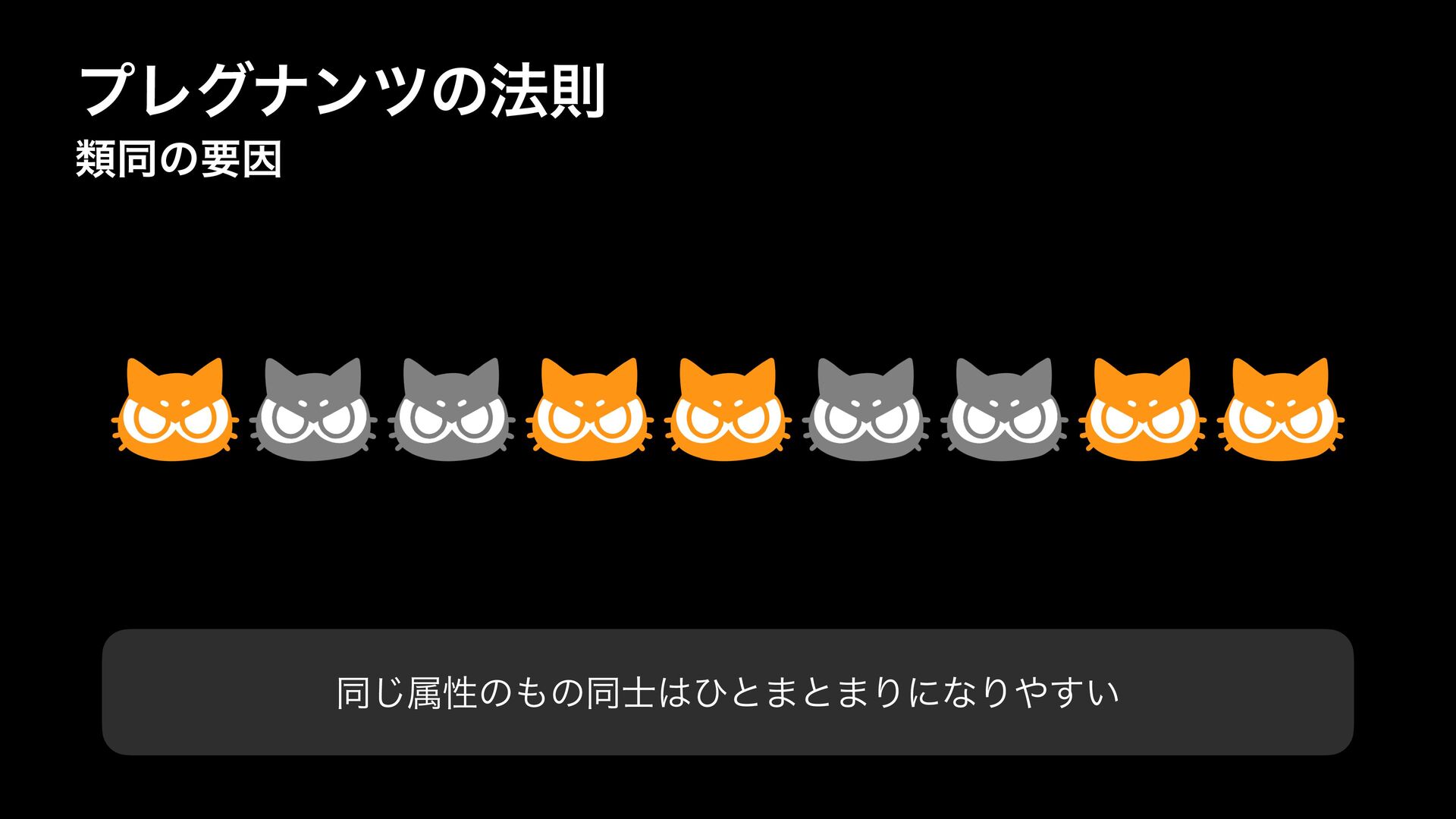
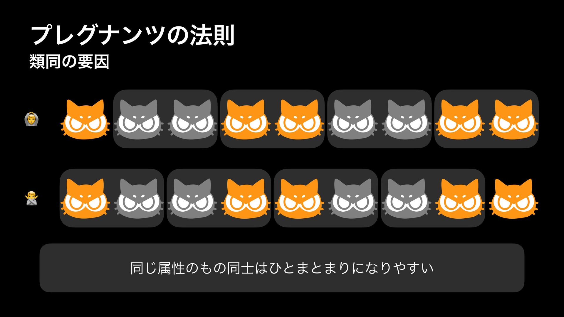
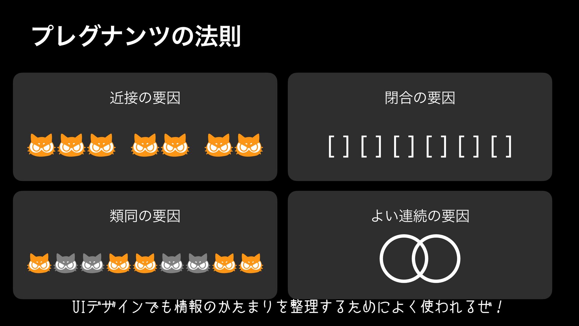
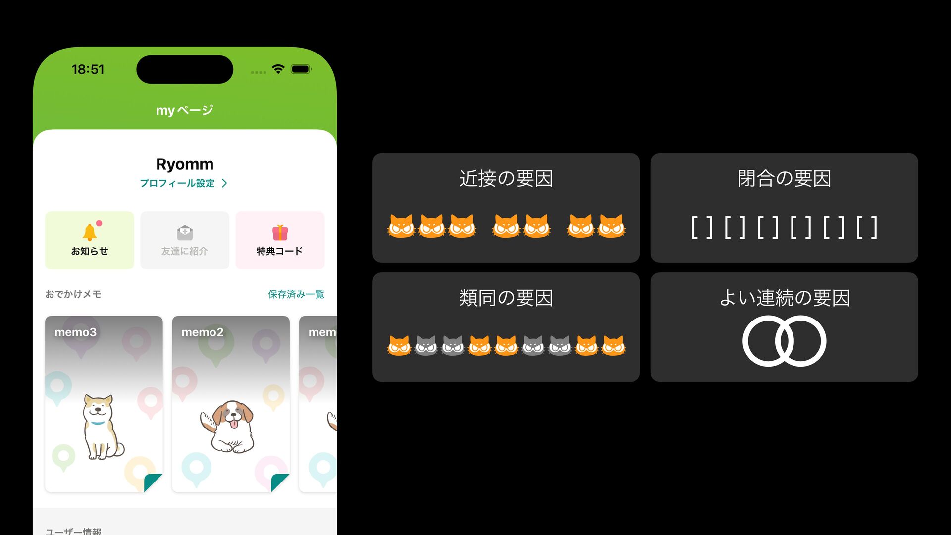
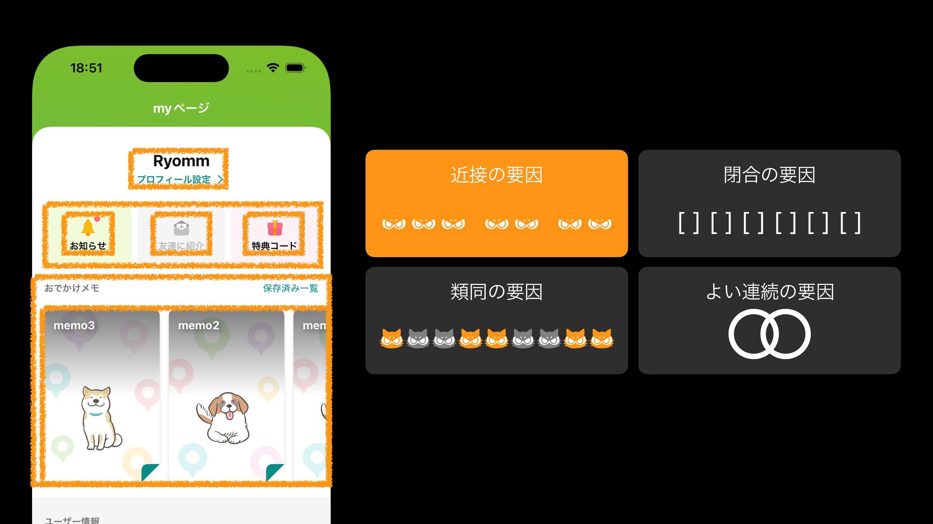
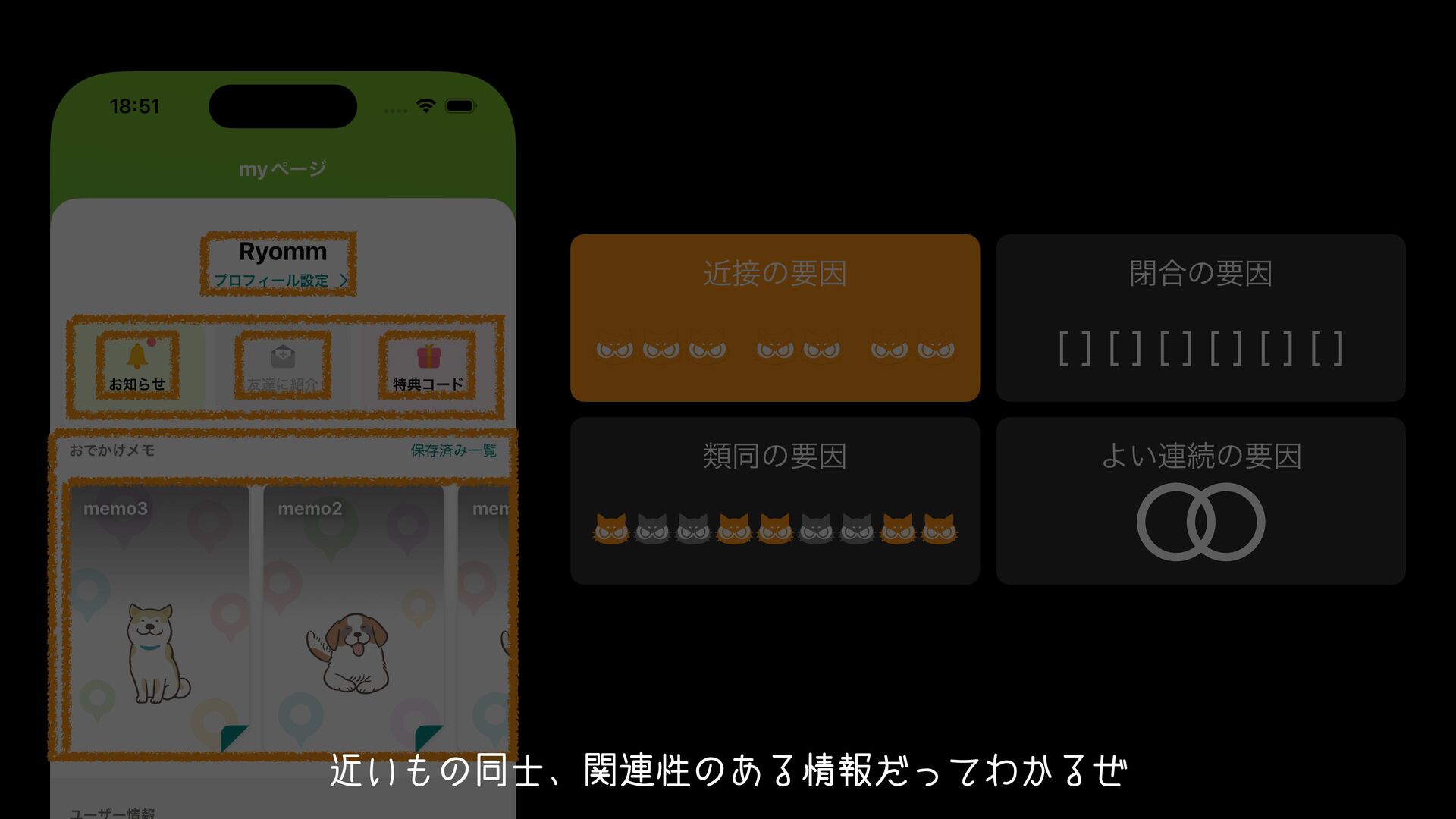
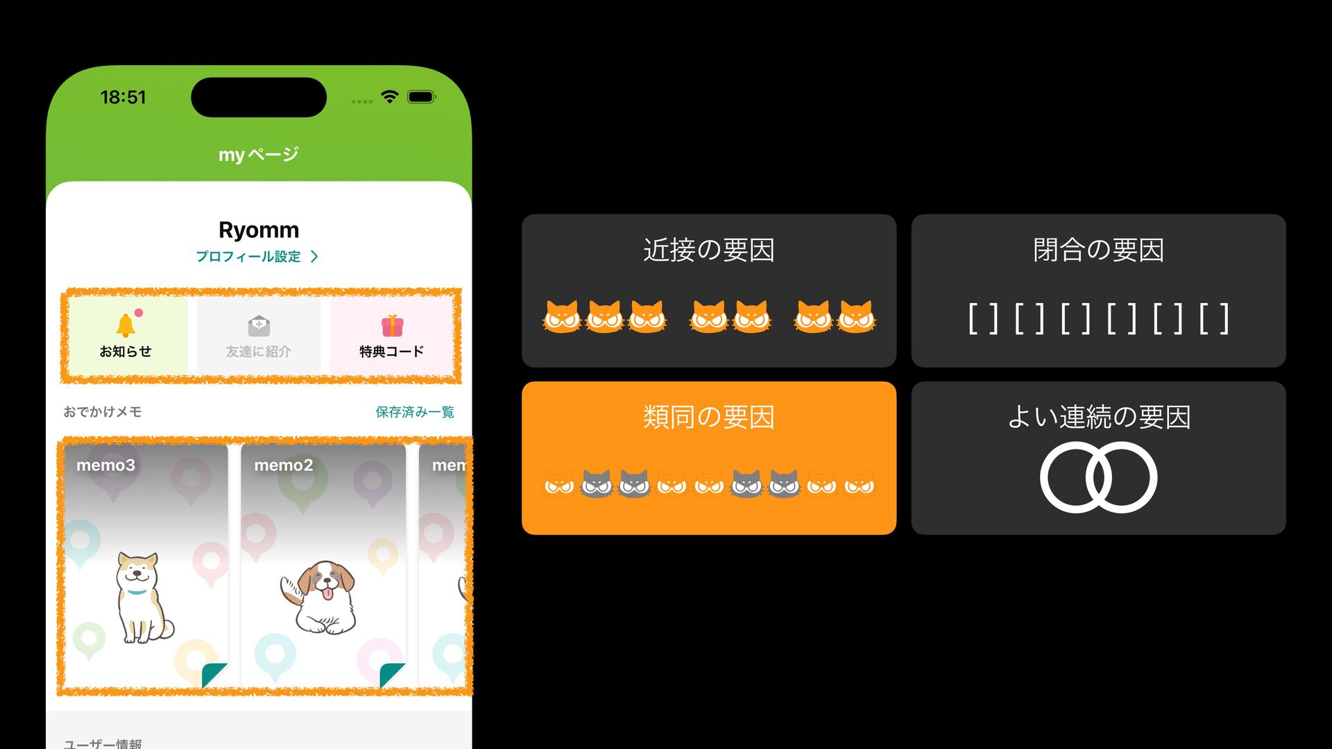
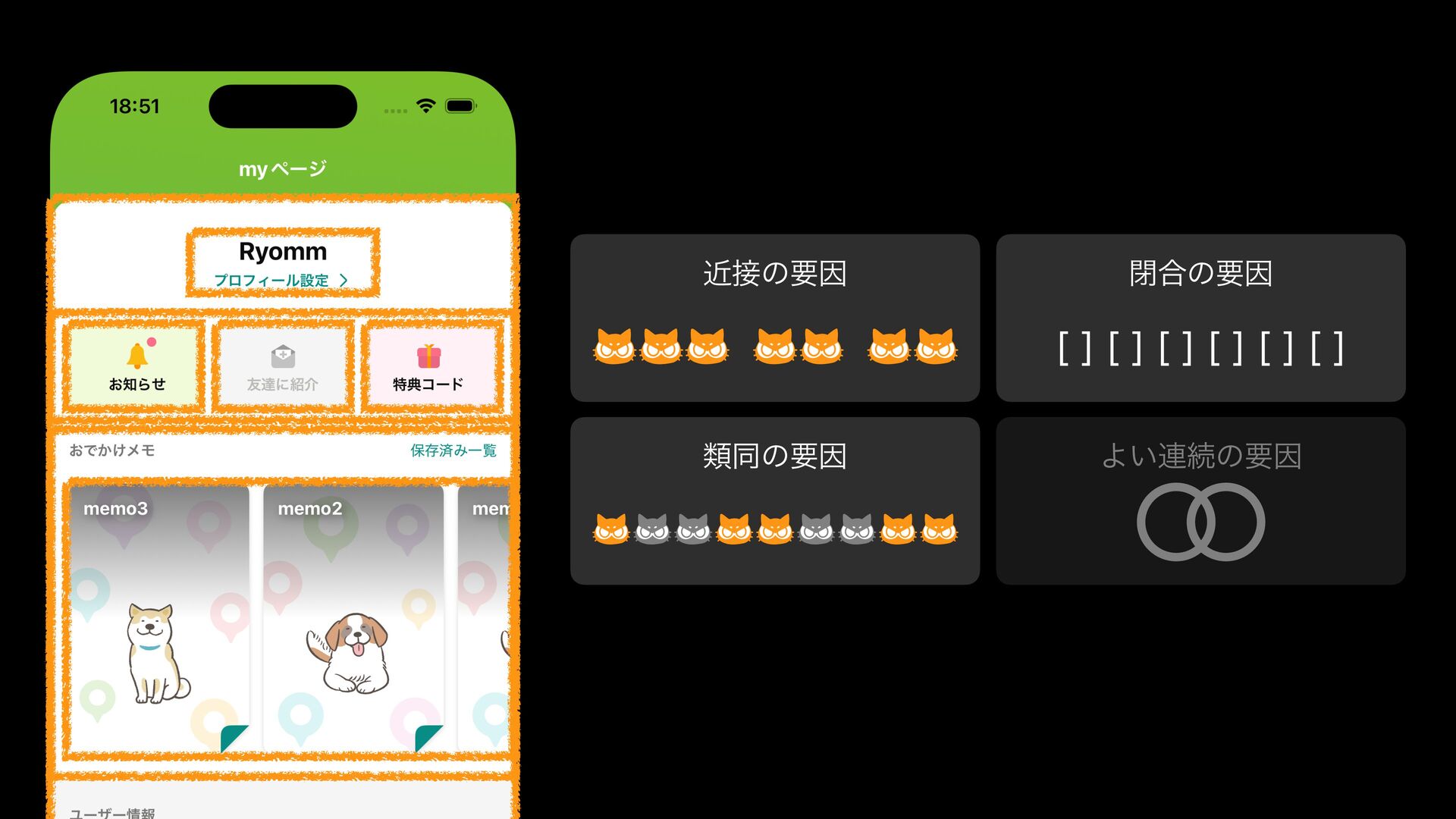
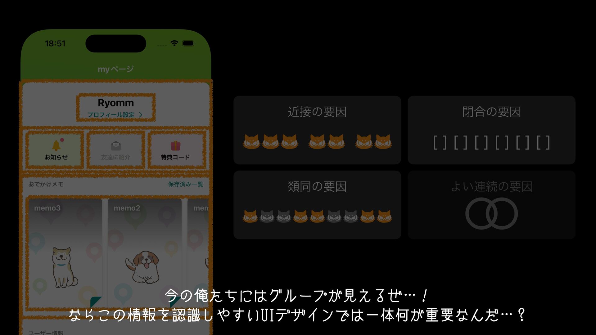
"the law of Prägnanz" which describes a phenomenon in human perception grouping. Let me introduce the four main factors. First, there is the "Law of proximity". Objects that are close to each other tend to be perceived as a group.
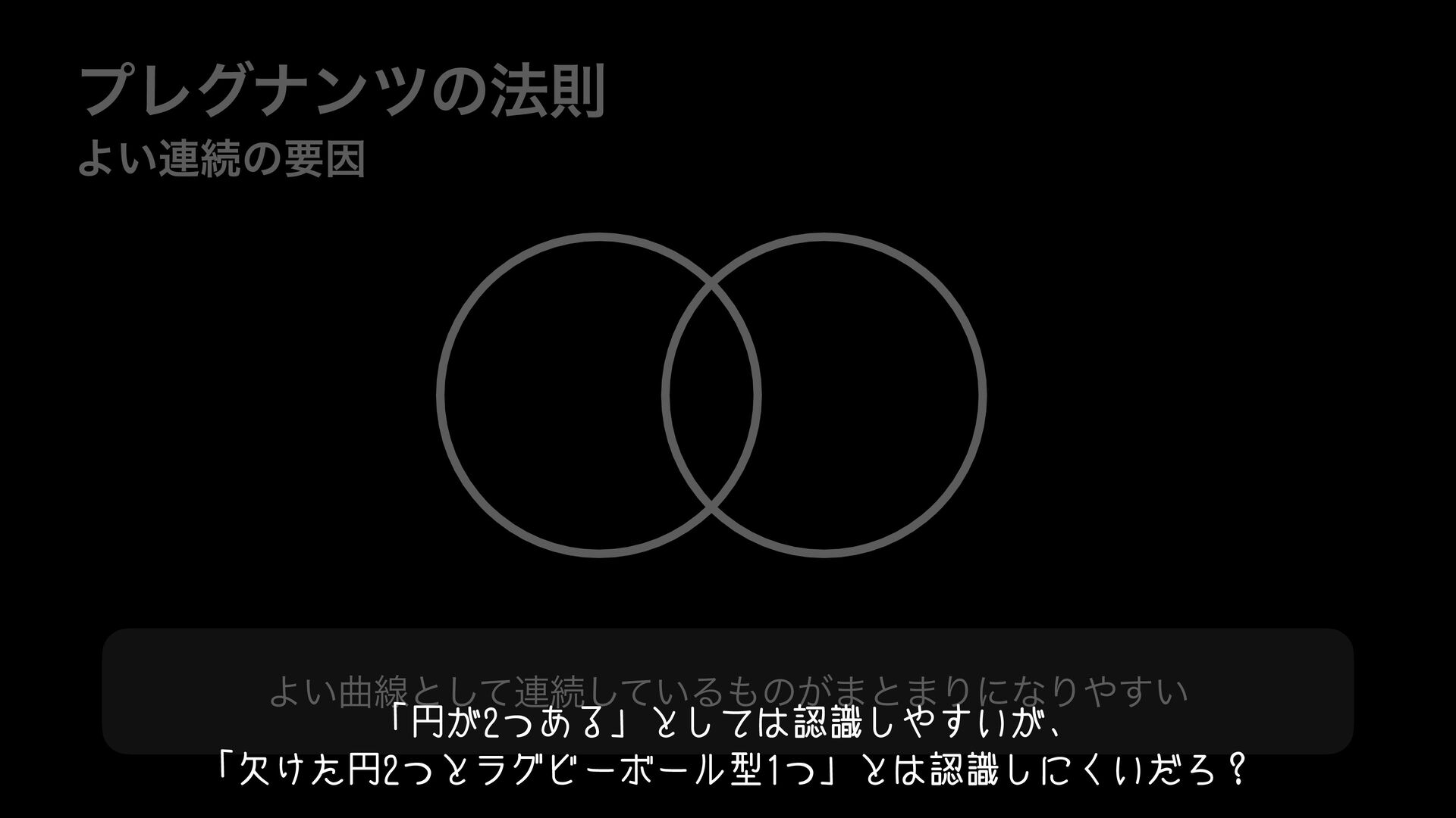
black-and-white and colored ones, but seeing them as alternating pairs of color and black-and-white, or black-and-white and color, feels a bit unnatural.
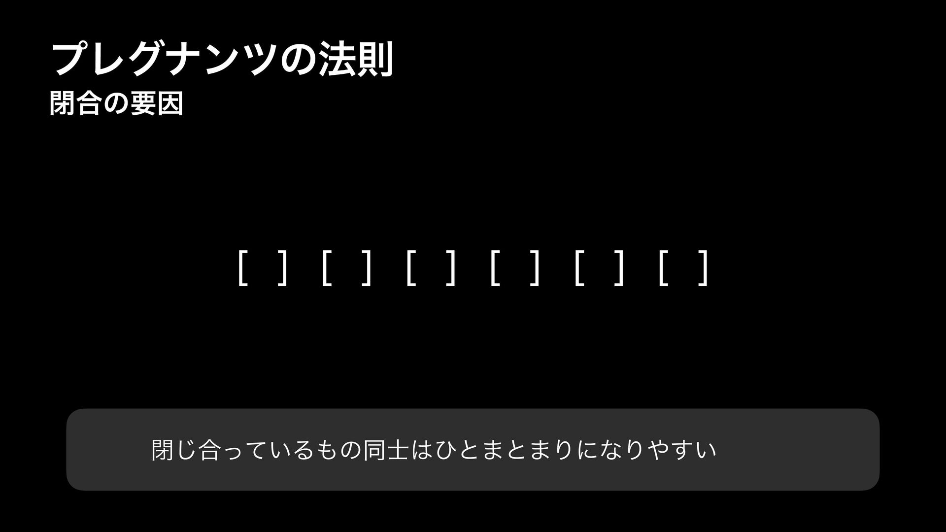
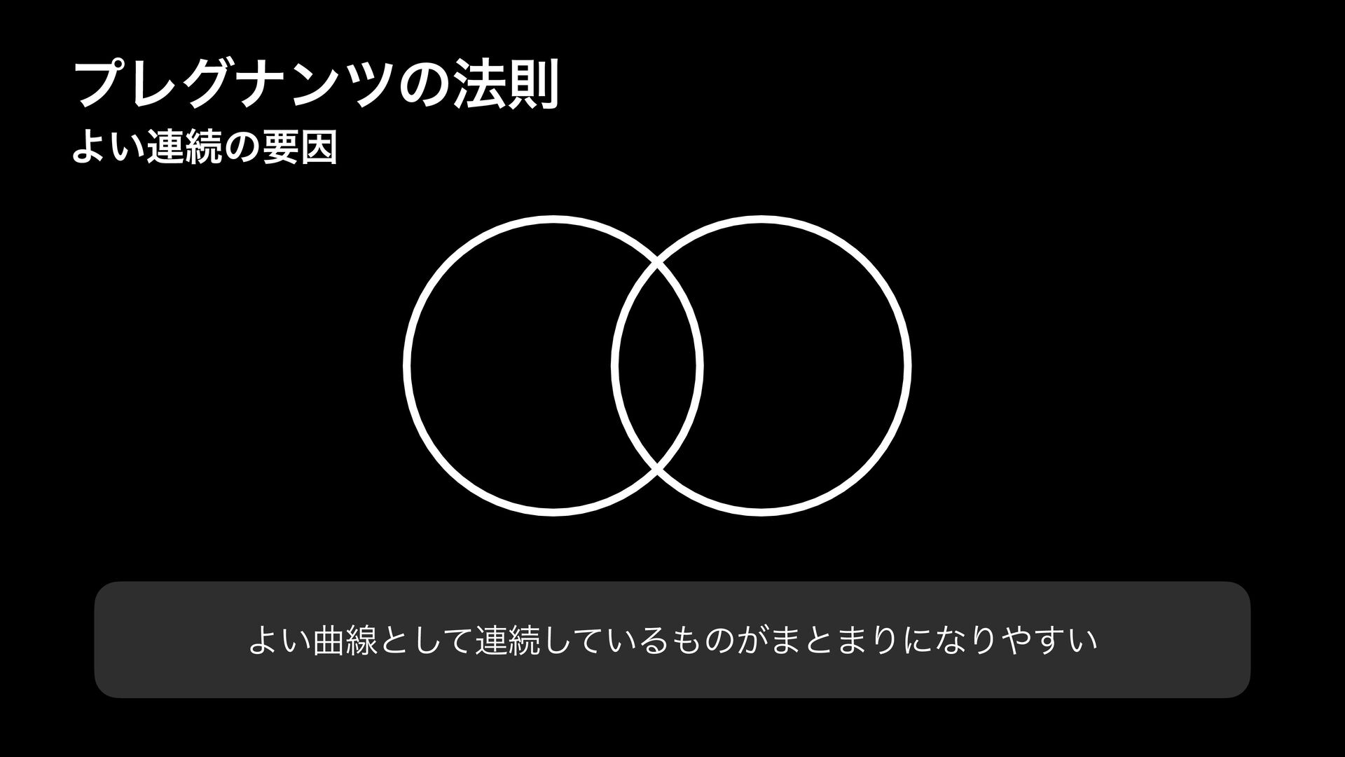
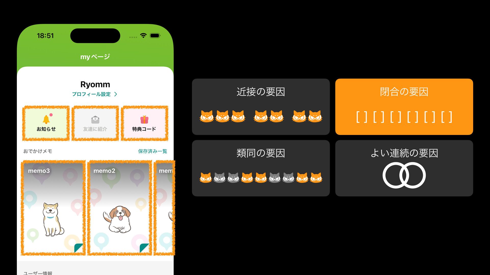
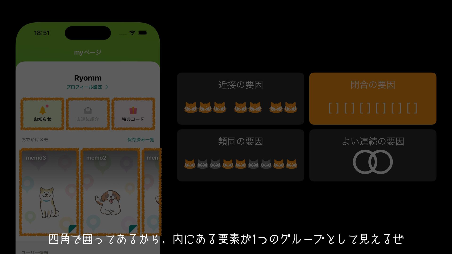
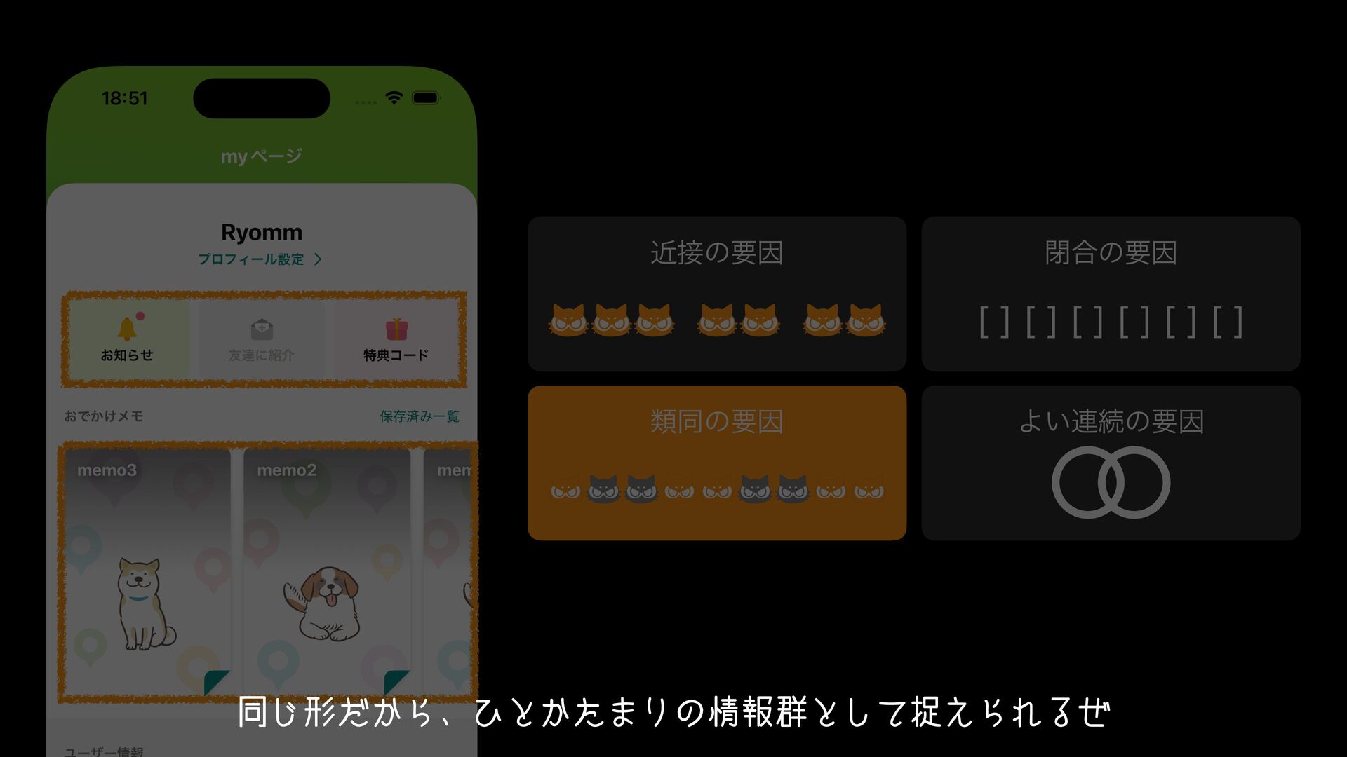
curve tend to be perceived as a group. For example, in this illustration, people are likely to recognize it as "two circles," rather than as "two incomplete circles and one rugby ball shape."
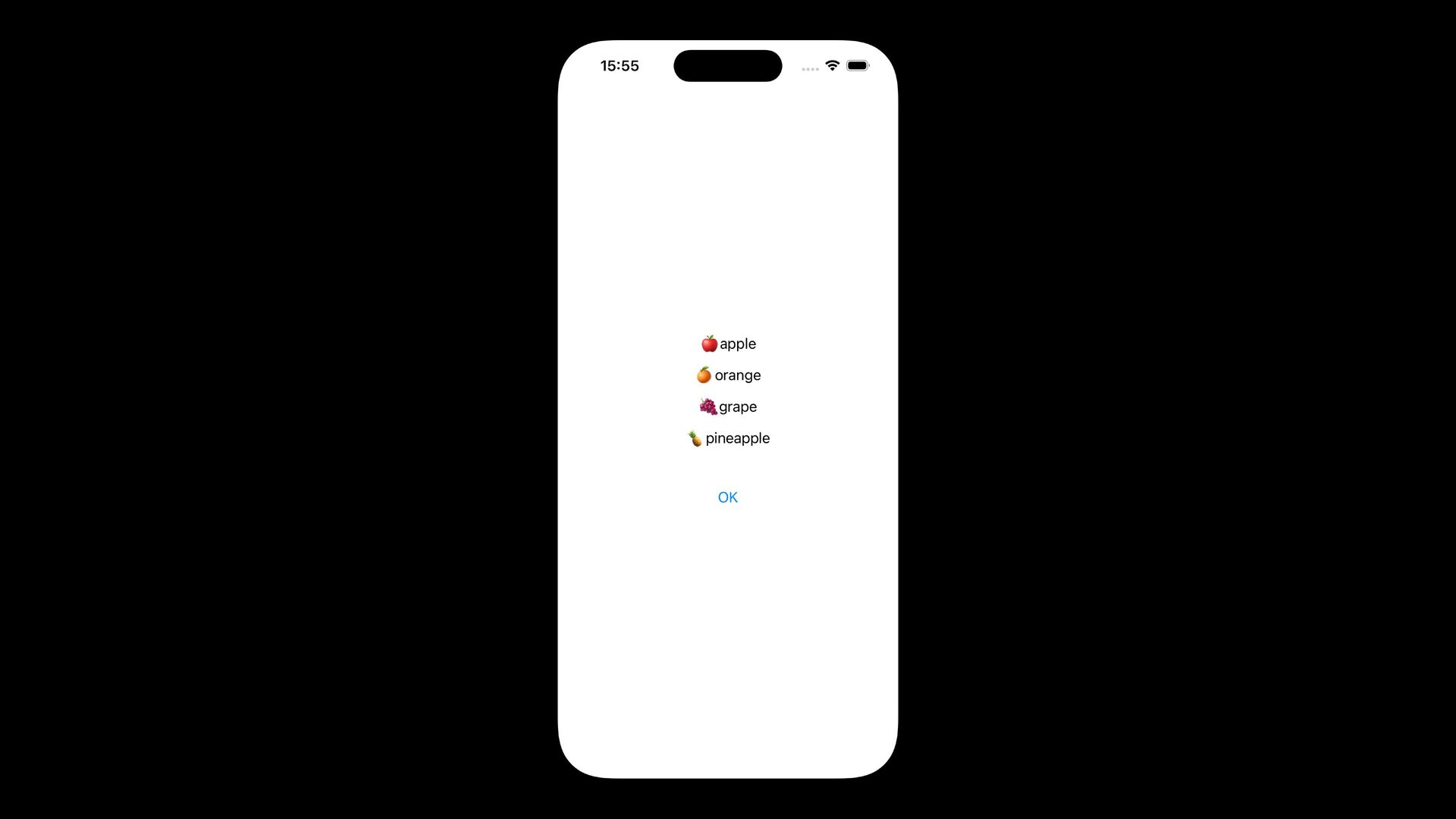
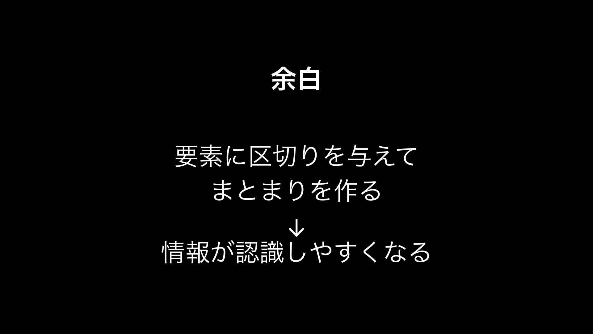
blank areas.* You understand the meaning of the statement at the beginning now, right? When a wide margin is given, it indicates that the items belong to different groups, and when margins are evenly distributed, it means those elements are of equal importance or information.
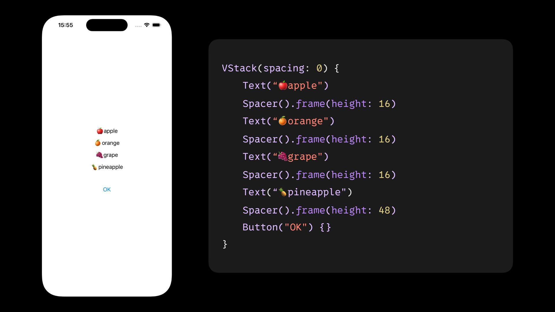
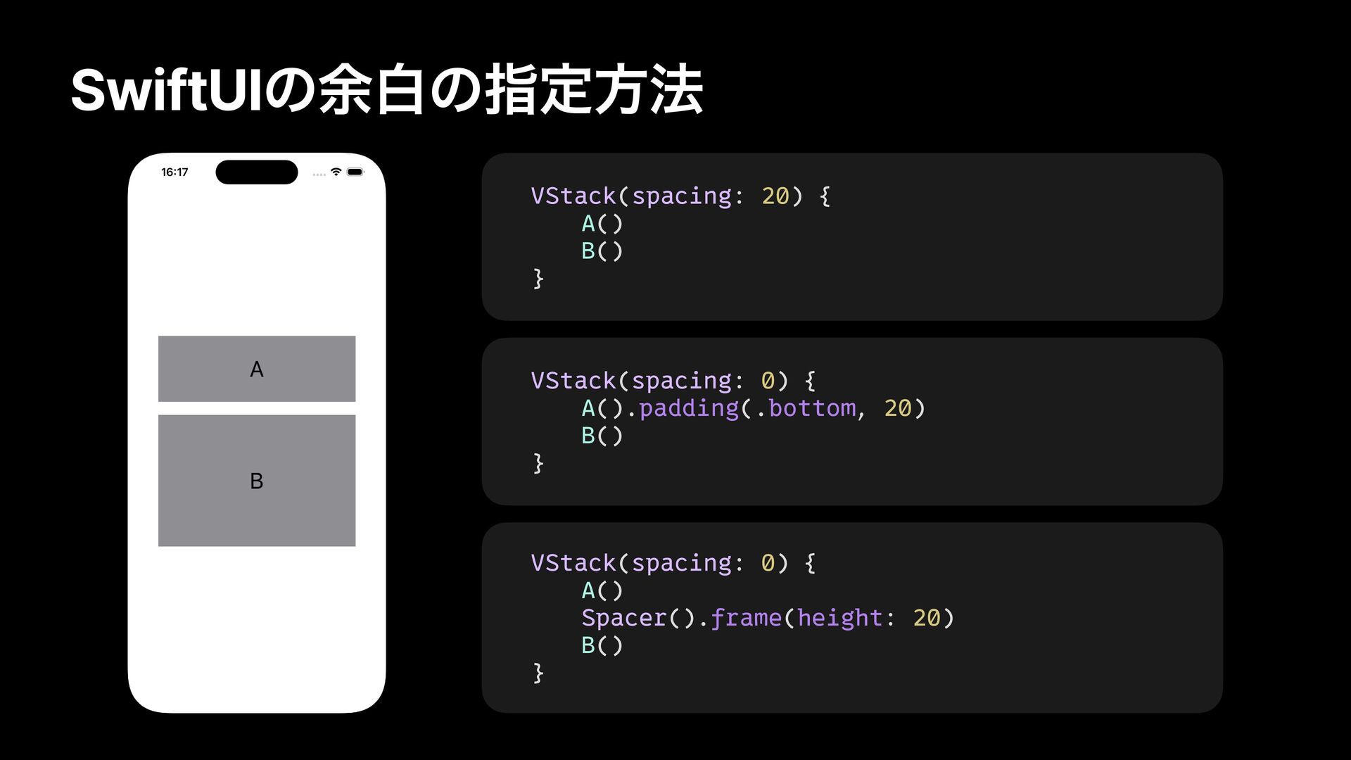
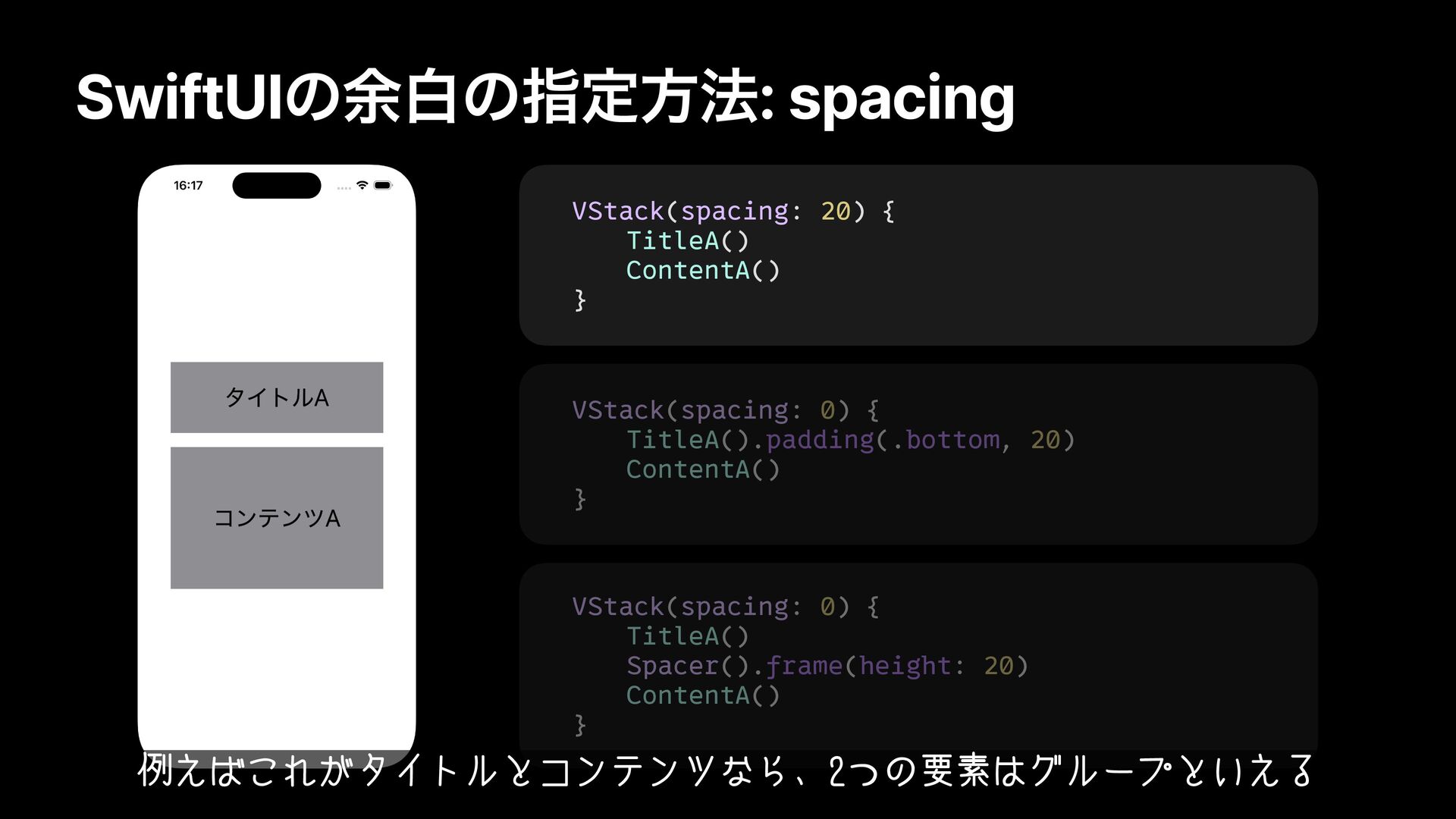
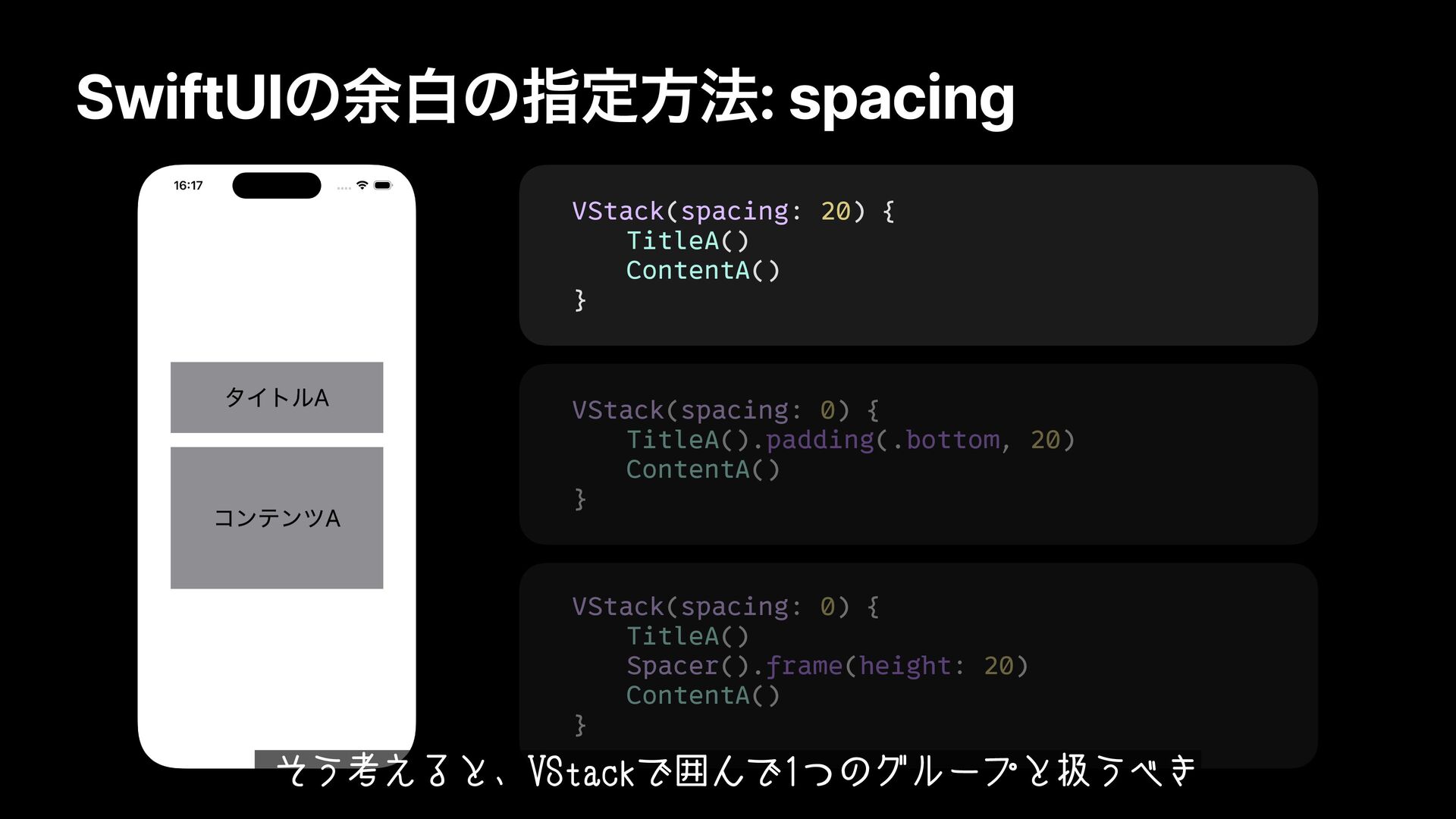
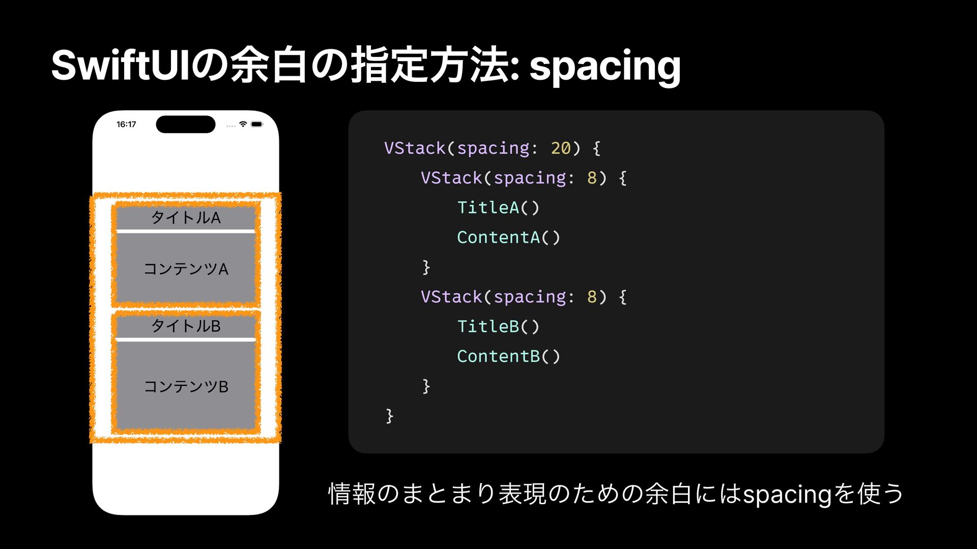
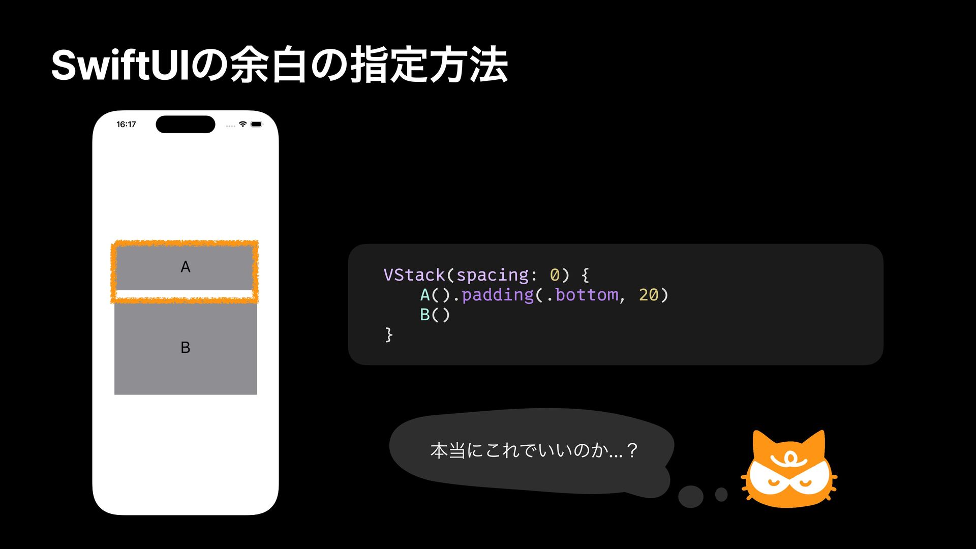
Title A and Content A form one group, and Title B and Content B form another group. If these two groups have the same level of information granularity, you should wrap them in a VStack and give them uniform spacing.
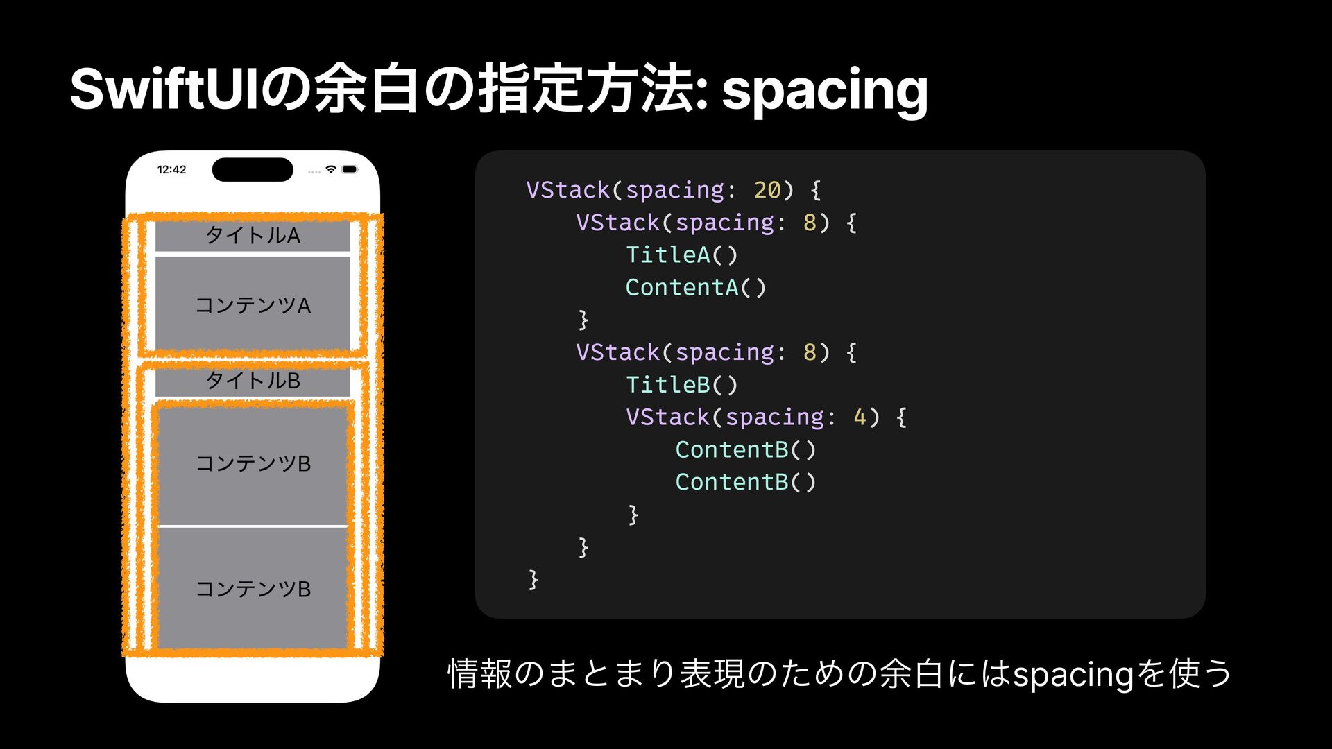
elements. Can you see that the size of the margins represents the grouping of each set of elements? - The margin between the title and the content is always 8pt, so if you see an 8pt margin, you can recognize that it’s between a title and its content. - The outer VStack consistently applies a 20pt margin, so if there’s a 20pt margin, you can recognize that it indicates a change of section. - Each content element is given a uniform 4pt margin. No matter how many content elements are added, if they are separated by 4pt, you can recognize that they belong to the content of Title B. In this way, you should use the spacing property of VStack or HStack to create whitespace that expresses the grouping of information, and group information appropriately.
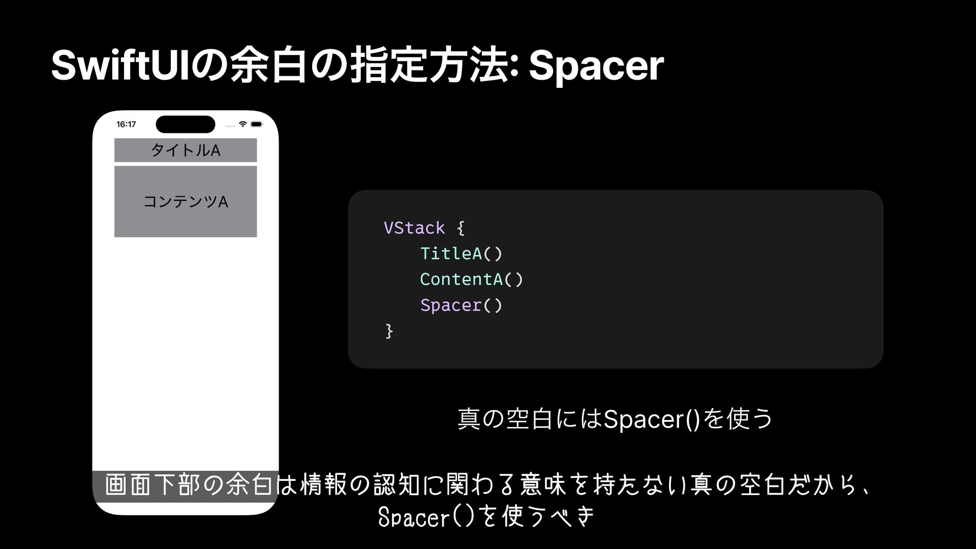
this screen is just empty space that doesn't have any meaning related to information recognition. For this kind of true empty space, it's a good idea to use Spacer().
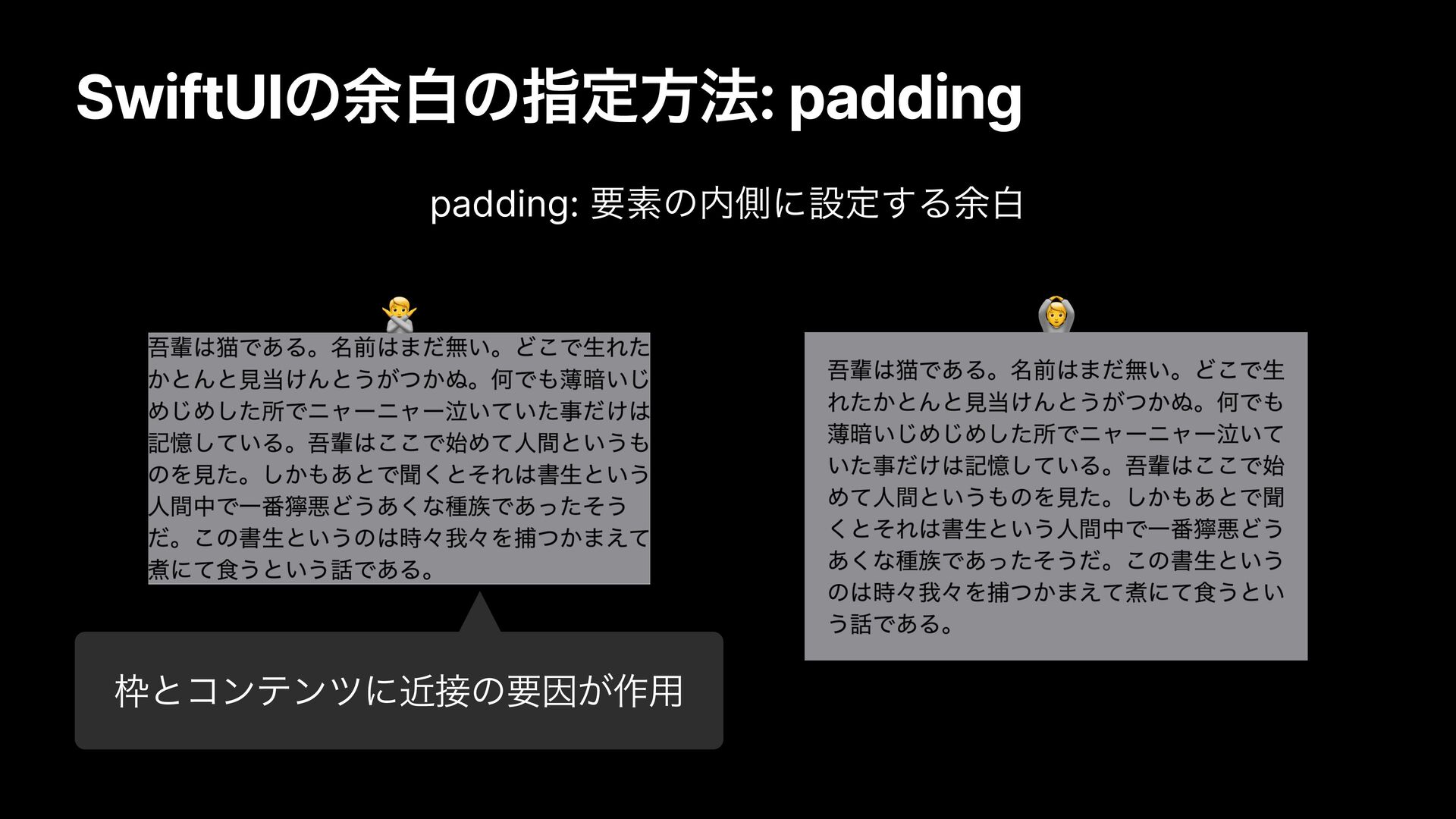
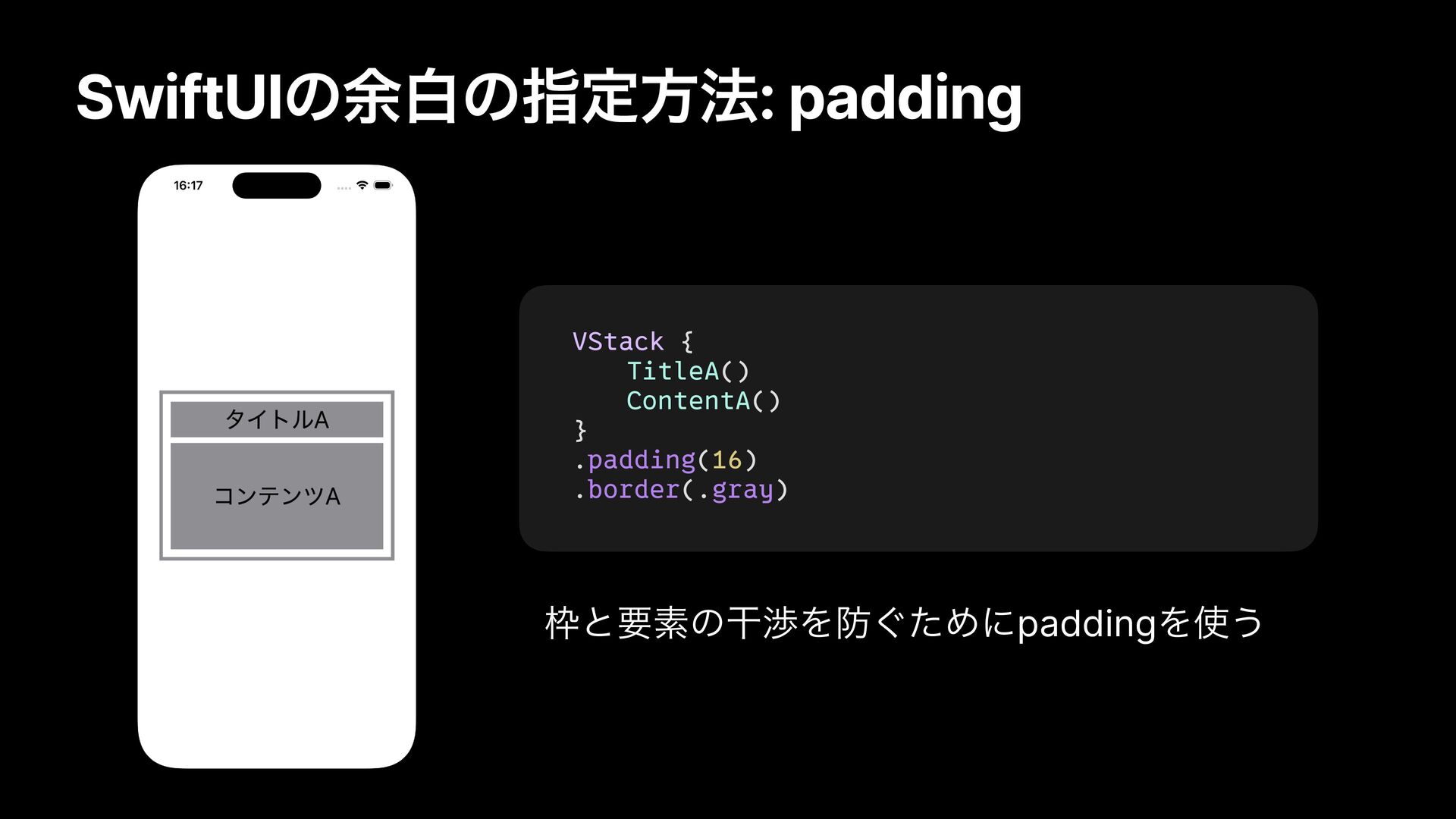
an element." Since borders are also considered elements, the proximity between the border and the text can make it harder to read. To prevent this, adding space inside the element (padding) makes it easier to recognize and read.
is treated as the range of element A. Before you implement it, please consider whether this way of adding padding is actually appropriate and whether it aligns with the design intent.
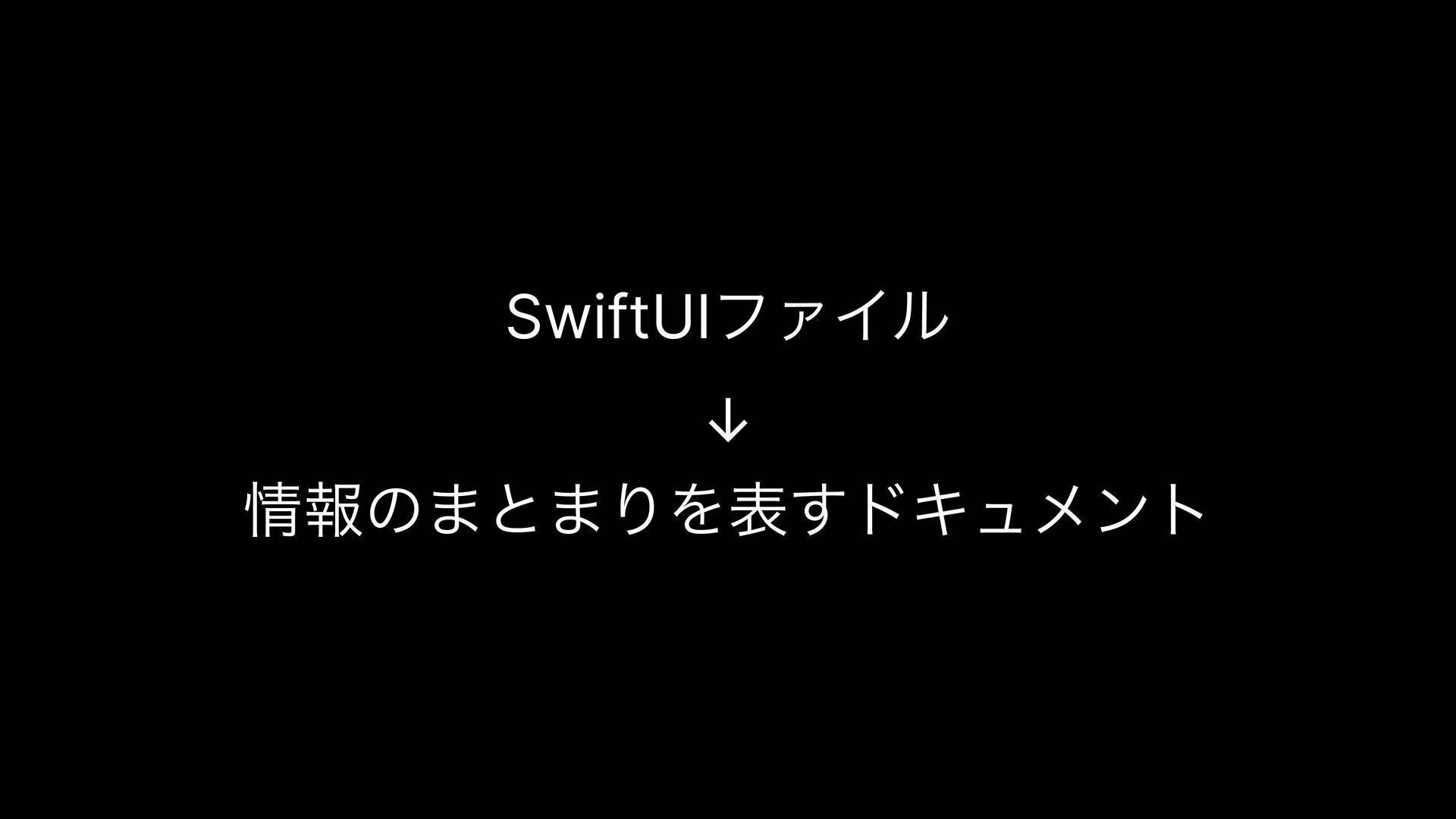
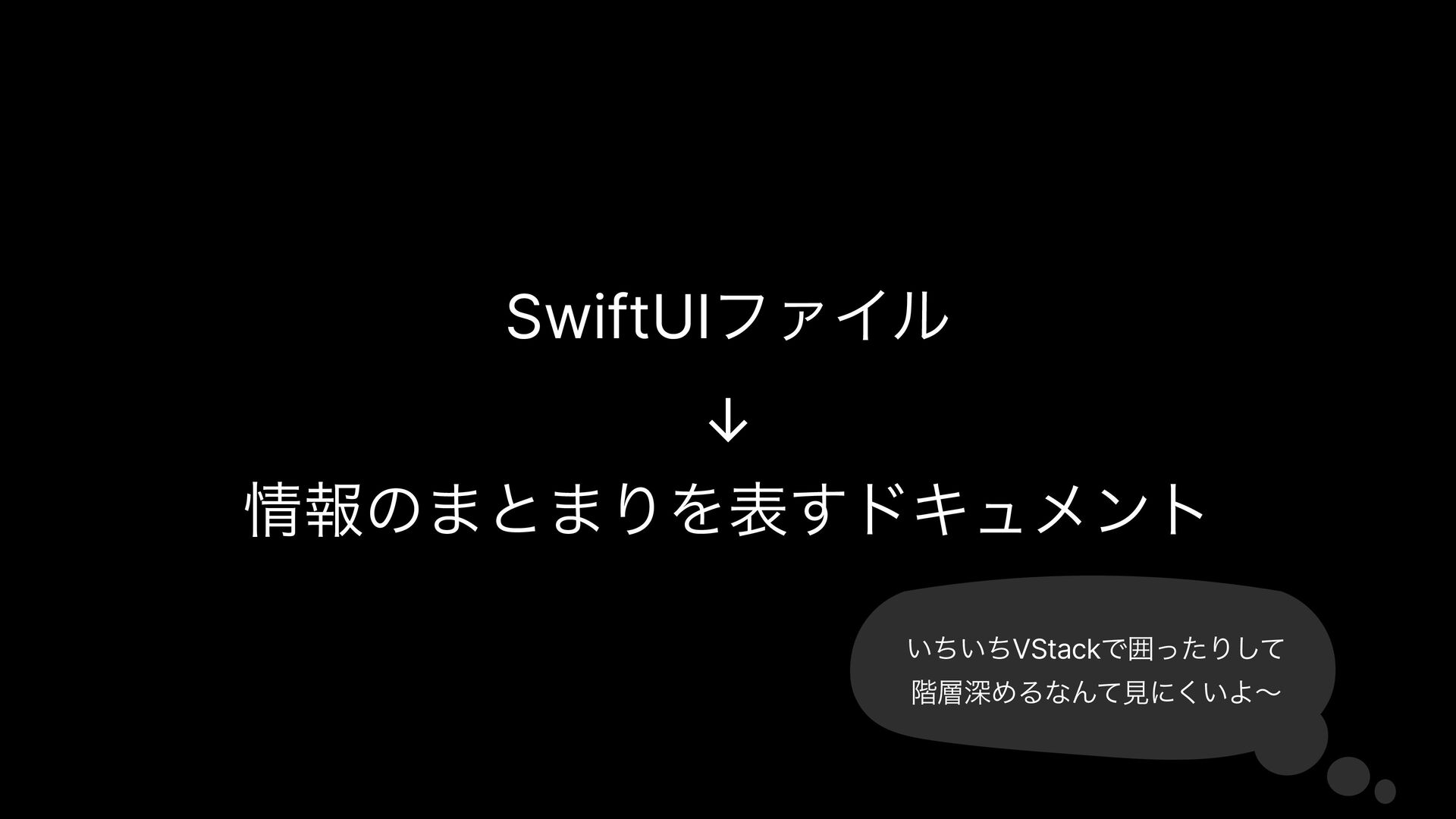
with SwiftUI involves laying out groups and hierarchies of information? You can think of a SwiftUI file as a document that represents a collection of related information.