Upgrade to Pro
— share decks privately, control downloads, hide ads and more …
Speaker Deck
Sign up for free
Menu
Search
Features
All features
Private URLs
Password Protection
Custom URLS
Scheduled publishing
Remove Branding
Restrict embedding
Deck Collections
Notes
Features
All features
Private URLs
Password Protection
Custom URLS
Scheduled publishing
Remove Branding
Restrict embedding
Deck Collections
Notes
Explore
Featured decks
Featured speakers
Programming
Technology
Storyboards
Explore
Featured decks
Featured speakers
Programming
Technology
Storyboards
Pricing
Search
Sign in
Sign up for free
The CSS of Tomorrow
Search
Sponsored
·
SiteGround - Reliable hosting with speed, security, and support you can count on.
→
Peter Gasston
September 07, 2012
Technology
2.6k
8
Share
Embed
Copy iframe code
Copy JS code
Copy link
Start on current slide
The CSS of Tomorrow
Canvas conference, 7 September 2012. #canvasconf
Peter Gasston
September 07, 2012
More Decks by Peter Gasston
See All by Peter Gasston
People Don’t Change
stopsatgreen
0
250
Your Reality Here
stopsatgreen
0
160
Growing Up, Getting Serious - #SotB6
stopsatgreen
1
400
Growing Up, Getting Serious
stopsatgreen
0
140
Surveying the Landscape — November 2016
stopsatgreen
1
230
Surveying the Landscape - Fronteers
stopsatgreen
2
550
The Web vs. The Browser
stopsatgreen
0
260
Surveying the Landscape Sept. 2016
stopsatgreen
1
490
Surveying the Landscape
stopsatgreen
4
940
Other Decks in Technology
See All in Technology
専門領域のAIをどう評価するか
bengo4com
2
360
Classmethod Company Deck
satoshi7
1
770
Metadata - Section 1: HTML Basics
mohab1
0
140
Webの常識が通じないHTMLメールのダークモード
teamlab
PRO
0
150
Temporal 最高!でも改めて「日付」について調べたら人類の負債すぎる件
riyaamemiya
0
210
フィンテック養成勉強会#68
finengine
0
180
dbt Semantic Layerで進めるenechainのデータ民主化
akizhou
1
160
『SAR衛星データ解析入門』の ご紹介とその応用
syuchimu
0
130
事業成長とデータ活用を止めないためのマネジメントへ挑戦
hiracky16
0
420
フロントエンドカンファレンス関西2026 - 速すぎるUIに、待ち時間を
teamlab
PRO
0
210
Railsで挑む大量データ永続化 〜600億件を永続化するための設計とボトルネックとの戦い〜
occhi
1
1k
古い指輪から広がった JAVA コミュニティ とのつながり
yamad
0
130
Featured
See All Featured
jQuery: Nuts, Bolts and Bling
dougneiner
66
8.6k
Design in an AI World
tapps
1
360
Designing Experiences People Love
moore
143
24k
The Illustrated Children's Guide to Kubernetes
chrisshort
51
53k
Large-scale JavaScript Application Architecture
addyosmani
516
110k
My Coaching Mixtape
mlcsv
0
360
Making the Leap to Tech Lead
cromwellryan
135
10k
Stop Working from a Prison Cell
hatefulcrawdad
274
21k
SEOcharity - Dark patterns in SEO and UX: How to avoid them and build a more ethical web
sarafernandez
0
310
How to Create Impact in a Changing Tech Landscape [PerfNow 2023]
tammyeverts
56
3.5k
The Organizational Zoo: Understanding Human Behavior Agility Through Metaphoric Constructive Conversations (based on the works of Arthur Shelley, Ph.D)
kimpetersen
PRO
0
500
Why Our Code Smells
bkeepers
PRO
340
58k
Transcript
Peter Gasston @stopsatgreen http://broken-links.com
The CSS of Tomorrow
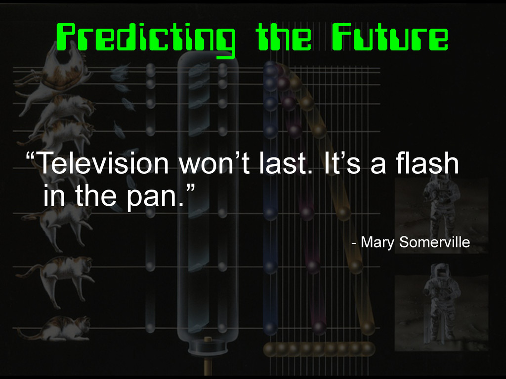
Predicting the Future “Television won’t last. It’s a flash in
the pan.” - Mary Somerville
Predicting the Future “Home taping is killing music” - BPI
Predicting the Future “There’s no chance that the iPhone is
going to get any significant market share. No chance.” - Steve Ballmer, 2007
I Predict: Cynicism “That sounds cool but it's useless because
we'll have to wait for browsers to catch up.”
The CSS of Tomorrow
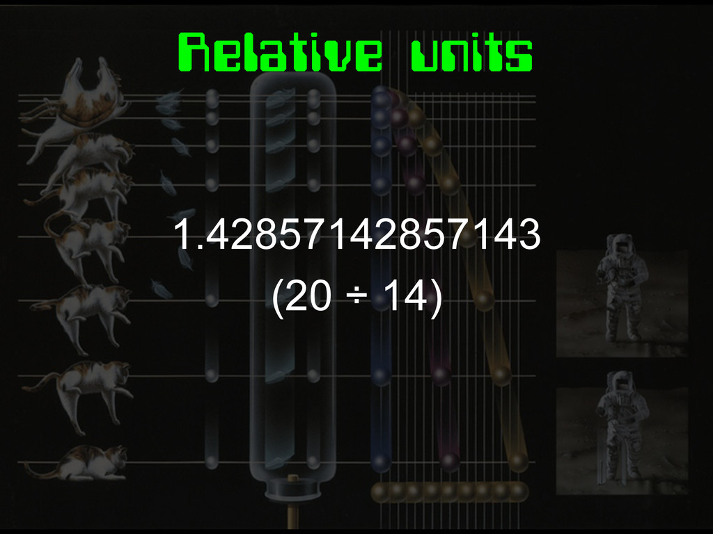
1.42857142857143 (20 ÷ 14) Relative units
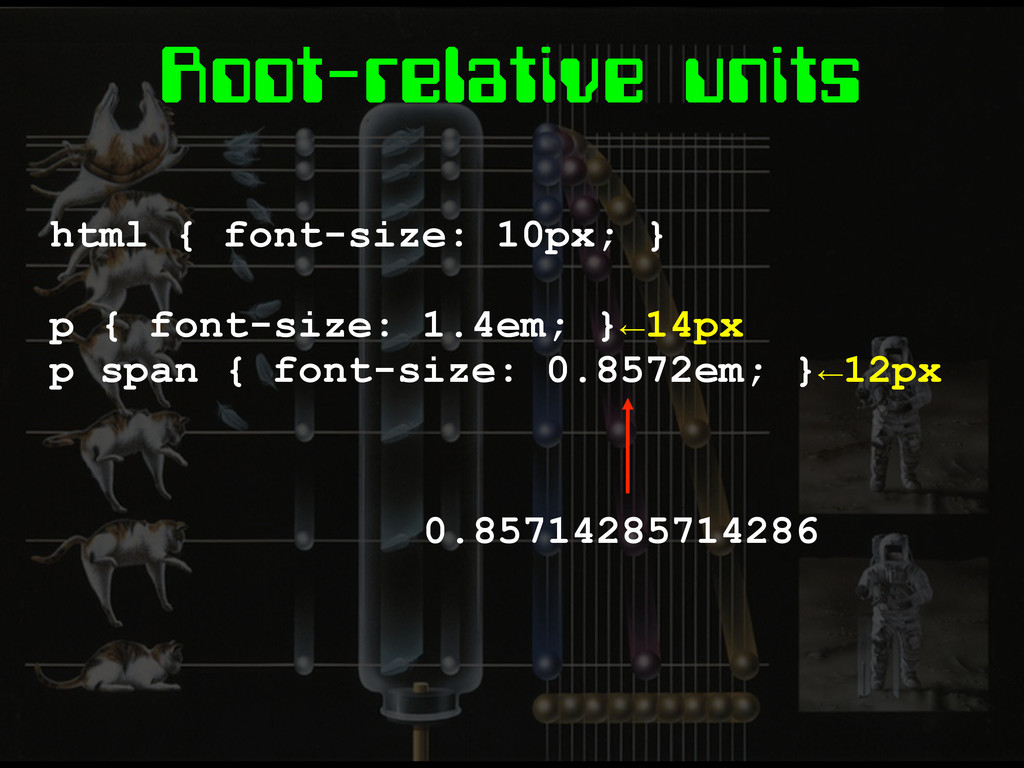
Root-relative units html { font-size: 10px; } p { font-size:
1.4em; }←14px p span { font-size: 0.8572em; }←12px 0.85714285714286
None
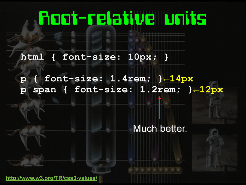
Root-relative units html { font-size: 10px; } p { font-size:
1.4rem; }←14px p span { font-size: 1.2rem; }←12px Much better. http://www.w3.org/TR/css3-values/
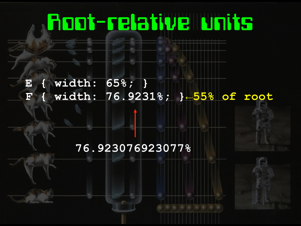
Root-relative units E { width: 65%; } F { width:
76.9231%; }←55% of root 76.923076923077%
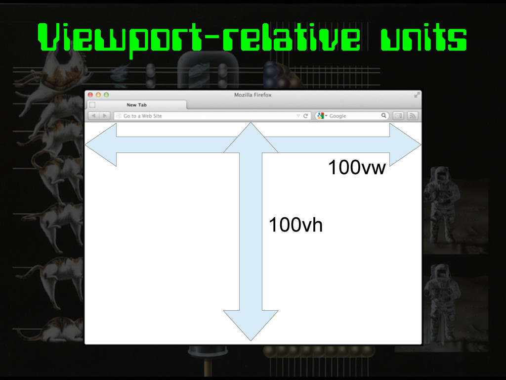
Viewport-relative units 100vw 100vh
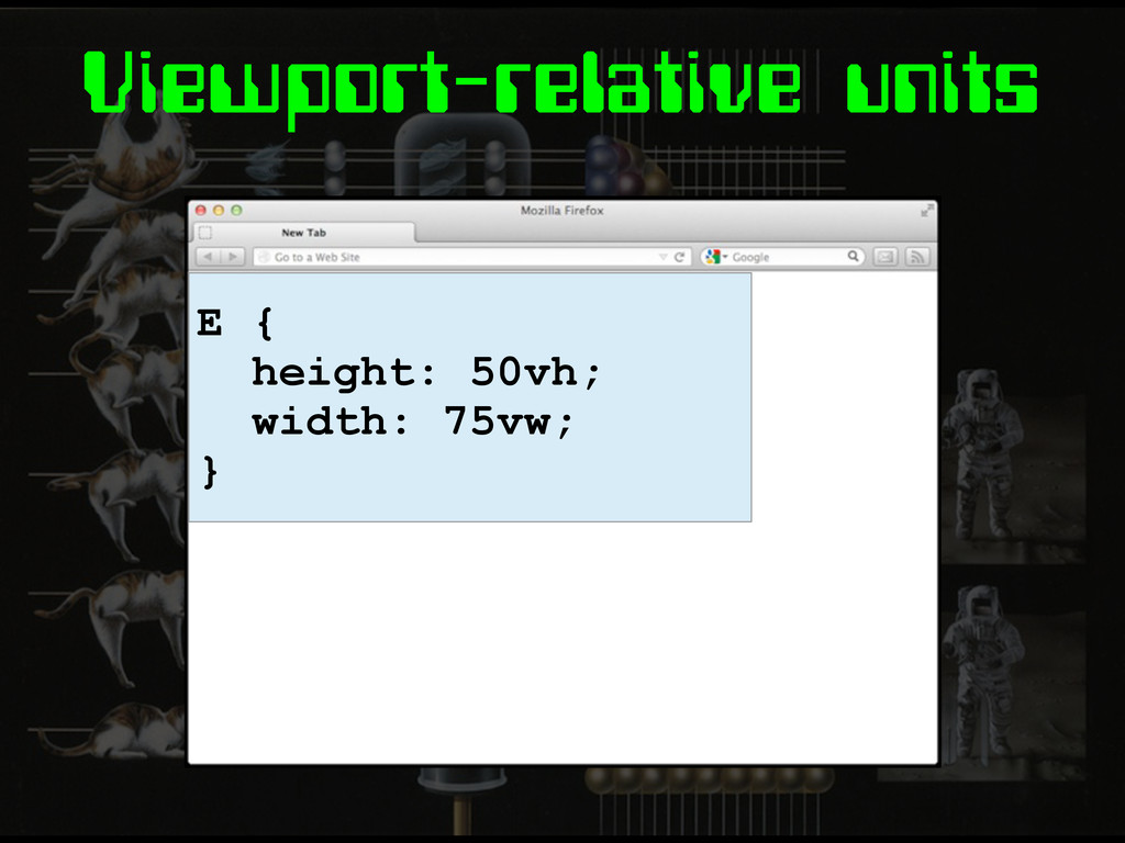
Viewport-relative units E { height: 50vh; width: 75vw; }
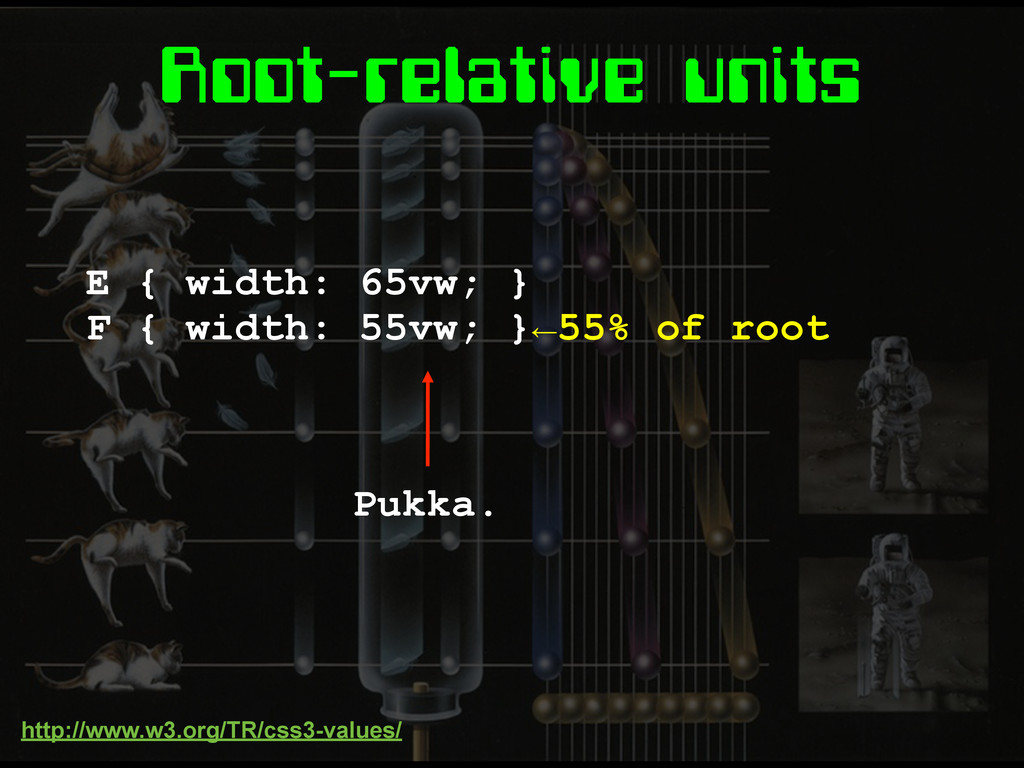
Root-relative units E { width: 65vw; } F { width:
55vw; }←55% of root Pukka. http://www.w3.org/TR/css3-values/
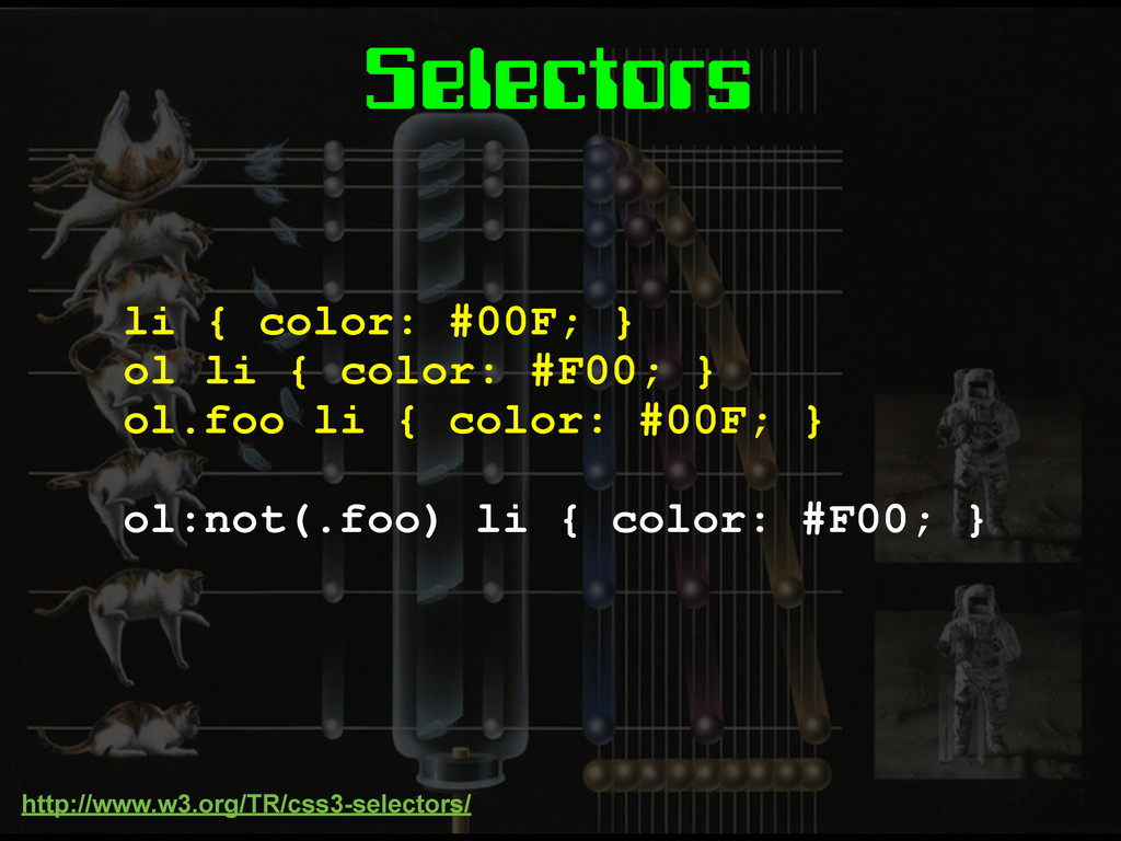
Selectors li { color: #00F; } ol li { color:
#F00; } ol.foo li { color: #00F; } ol:not(.foo) li { color: #F00; } http://www.w3.org/TR/css3-selectors/
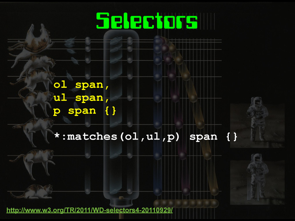
Selectors ol span, ul span, p span {} *:matches(ol,ul,p) span
{} http://www.w3.org/TR/2011/WD-selectors4-20110929/
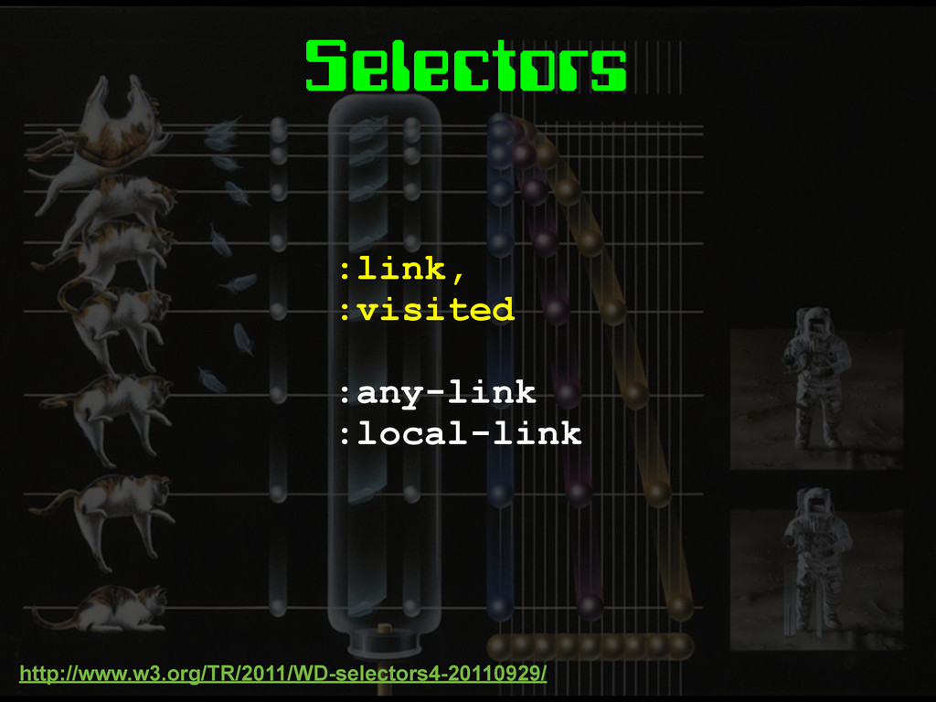
Selectors :link, :visited :any-link :local-link http://www.w3.org/TR/2011/WD-selectors4-20110929/
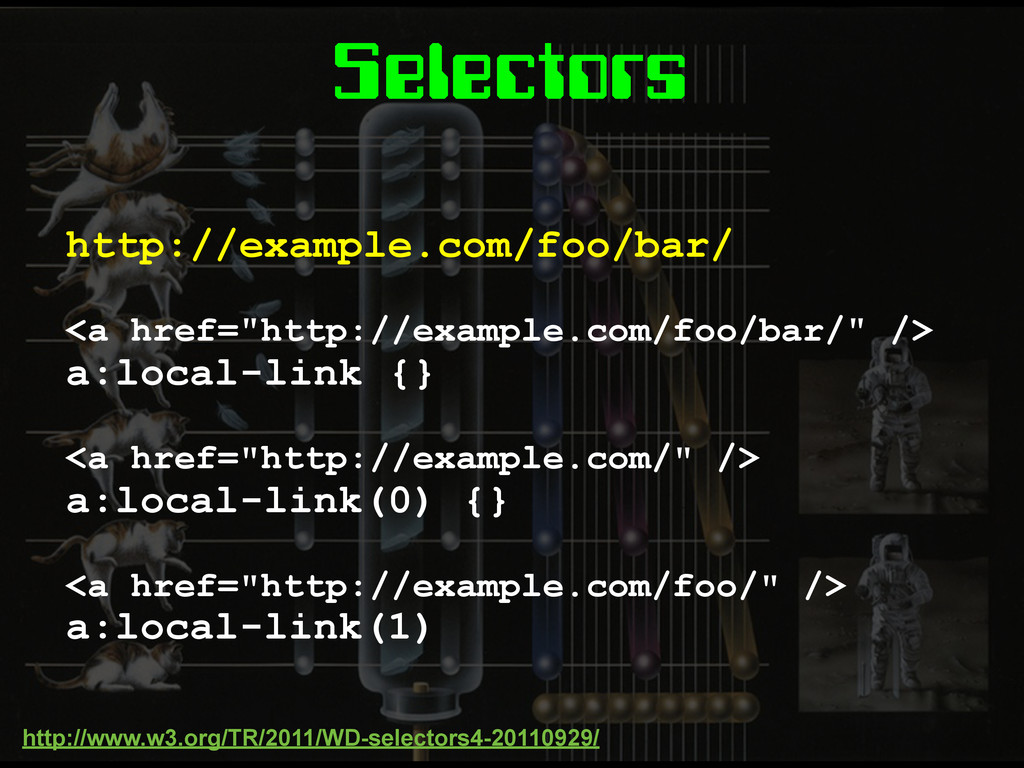
Selectors http://example.com/foo/bar/ <a href="http://example.com/foo/bar/" /> a:local-link {} <a href="http://example.com/" />
a:local-link(0) {} <a href="http://example.com/foo/" /> a:local-link(1) http://www.w3.org/TR/2011/WD-selectors4-20110929/
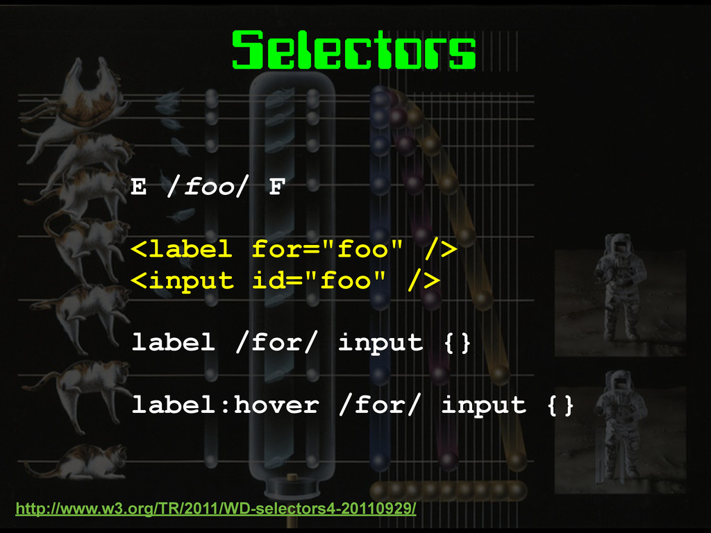
Selectors E /foo/ F <label for="foo" /> <input id="foo" />
label /for/ input {} label:hover /for/ input {} http://www.w3.org/TR/2011/WD-selectors4-20110929/
Selectors E! > F !E > F !E! > F
E!!1! > F The Parent Selector! http://dev.w3.org/csswg/selectors4/
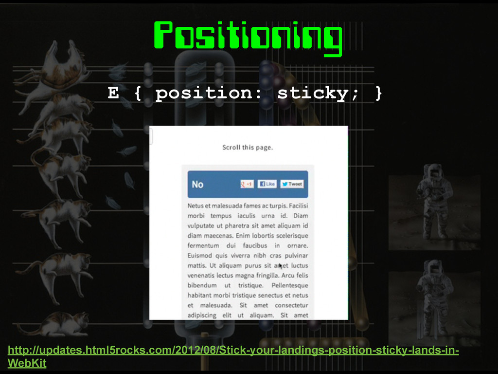
Positioning E { position: sticky; } http://updates.html5rocks.com/2012/08/Stick-your-landings-position-sticky-lands-in- WebKit
Media Queries
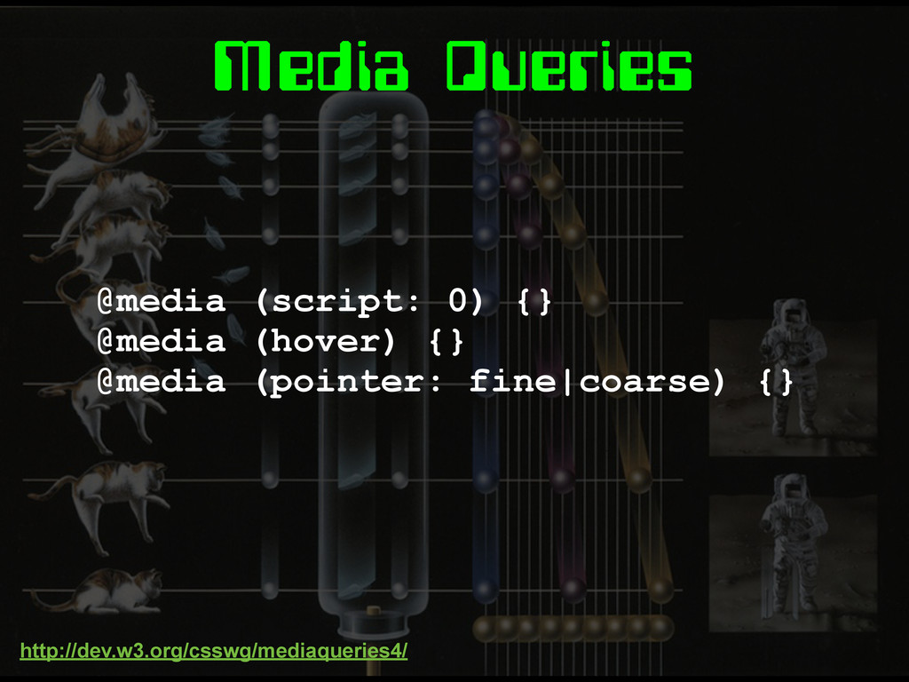
Media Queries @media (script: 0) {} @media (hover) {} @media
(pointer: fine|coarse) {} http://dev.w3.org/csswg/mediaqueries4/
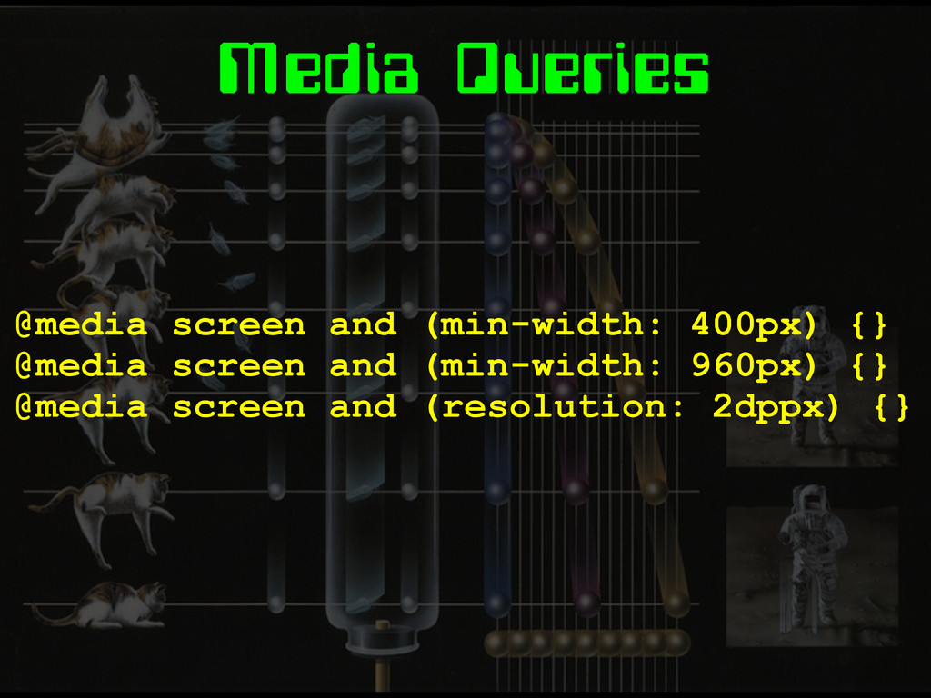
Media Queries @media screen and (min-width: 400px) {} @media screen
and (min-width: 960px) {} @media screen and (resolution: 2dppx) {}
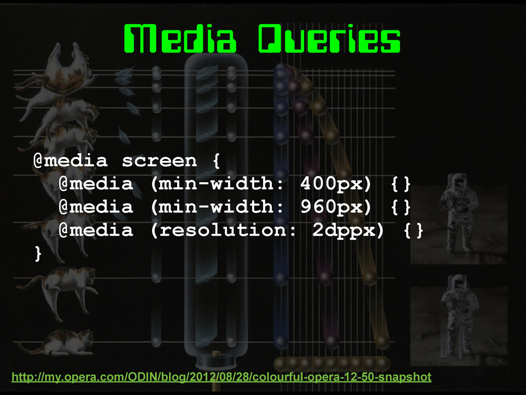
Media Queries @media screen { @media (min-width: 400px) {} @media
(min-width: 960px) {} @media (resolution: 2dppx) {} } http://my.opera.com/ODIN/blog/2012/08/28/colourful-opera-12-50-snapshot
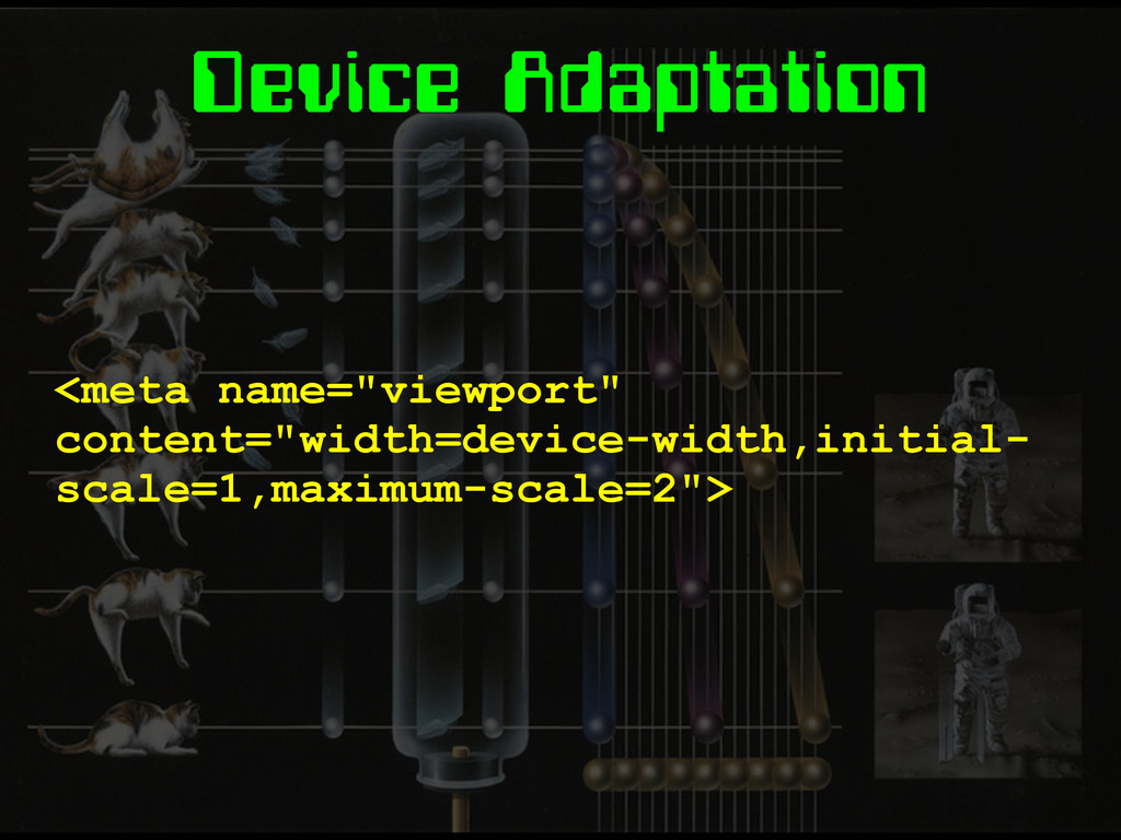
Device Adaptation <meta name="viewport" content="width=device-width,initial- scale=1,maximum-scale=2">
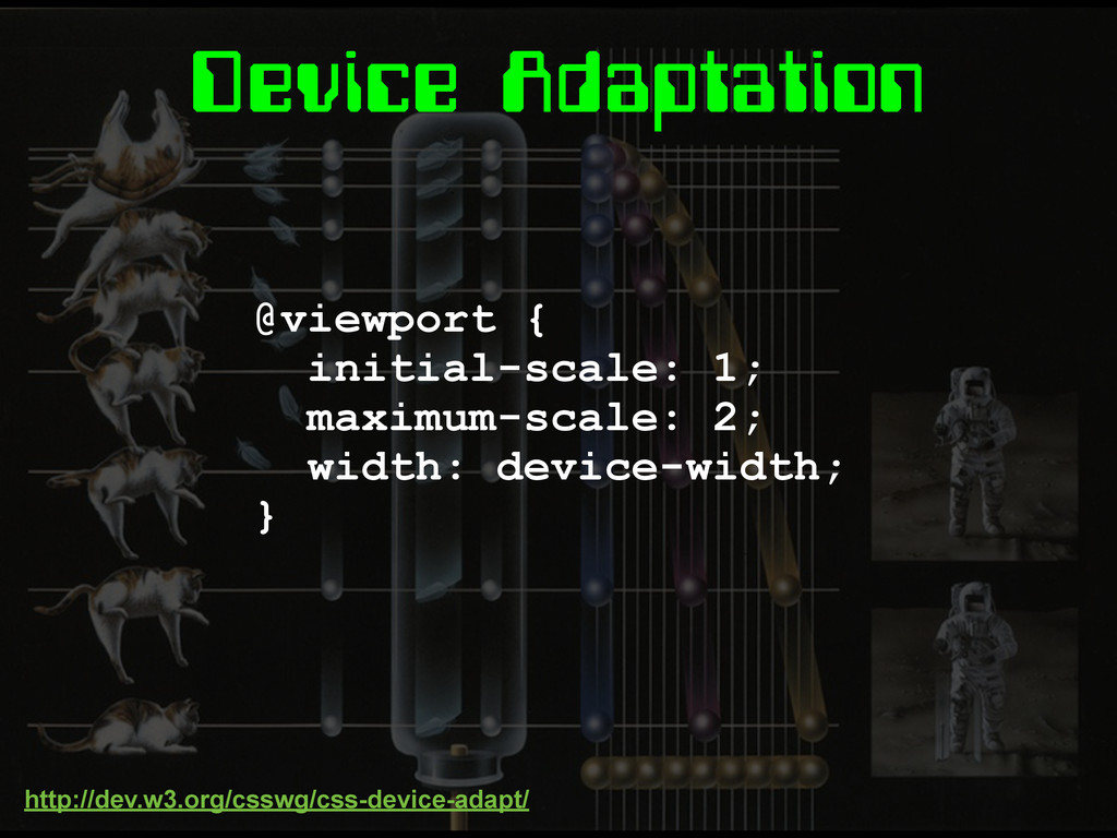
Device Adaptation @viewport { initial-scale: 1; maximum-scale: 2; width: device-width;
} http://dev.w3.org/csswg/css-device-adapt/
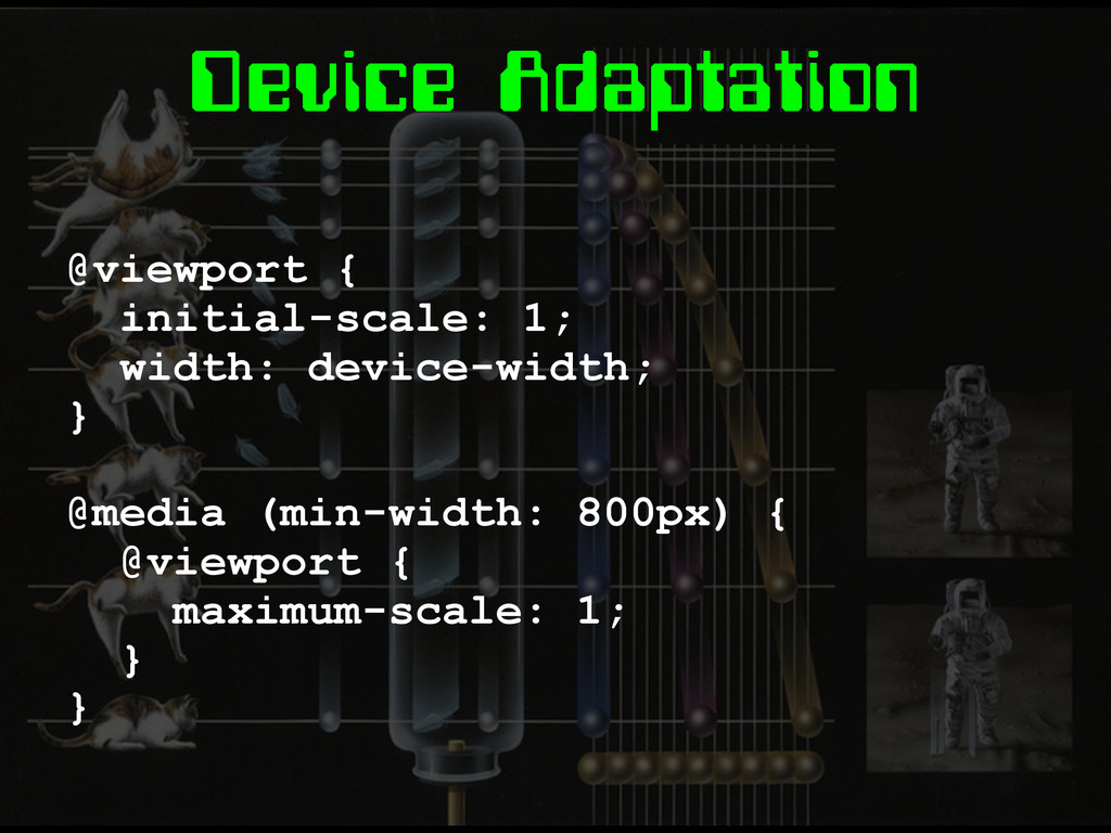
Device Adaptation @viewport { initial-scale: 1; width: device-width; } @media
(min-width: 800px) { @viewport { maximum-scale: 1; } }
Conditionals @document url('http://foo.com/bar/') {} @document url-prefix('http://foo.com/') {} @document domain('foo.com') {}
@document regexp('http://foo.com//[a-zA-Z]| \d{3,}/') {} Regular expressions in CSS. Finally! http://www.w3.org/TR/css3-conditional/
Conditionals @supports (columns: 3) {} =
Images
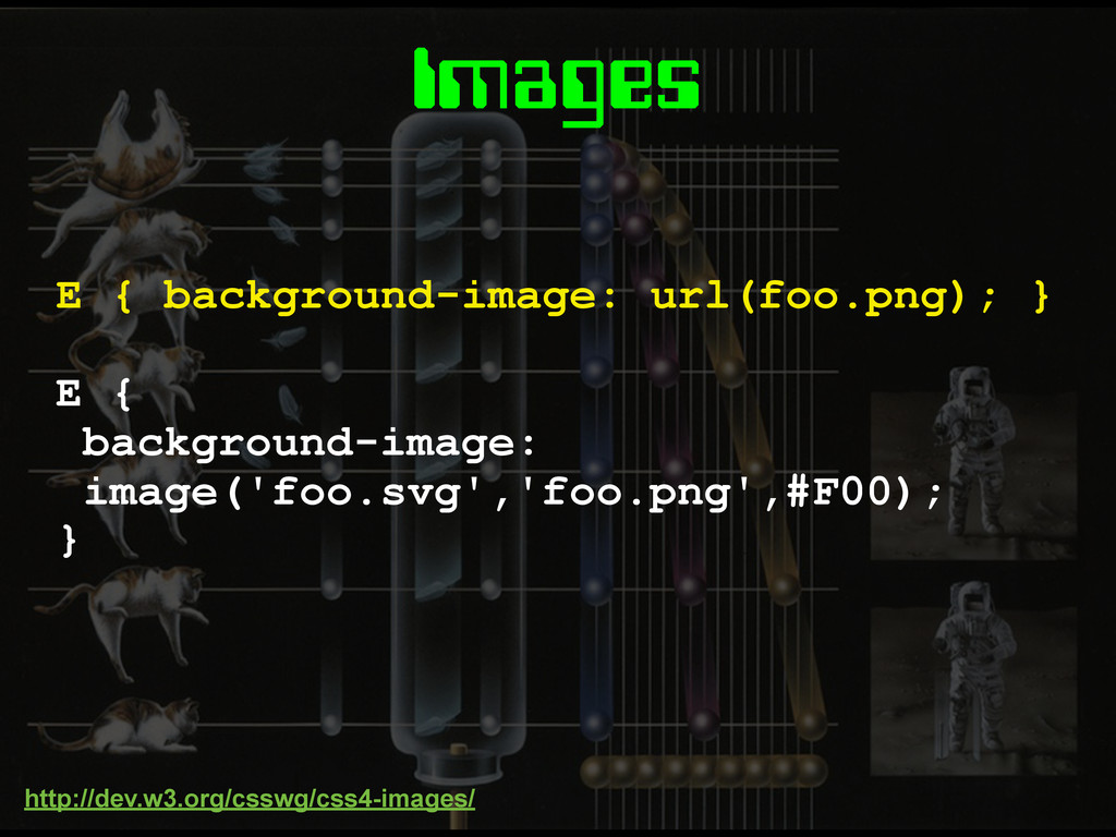
Images E { background-image: image('foo.svg','foo.png',#F00); } E { background-image: url(foo.png);
} http://dev.w3.org/csswg/css4-images/
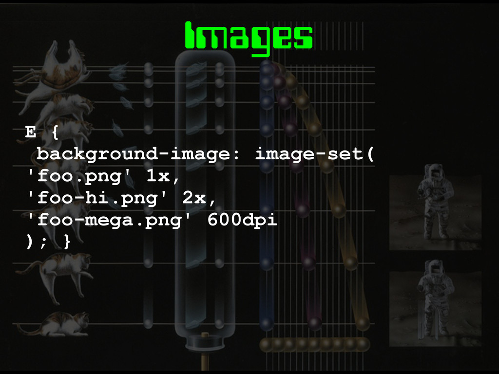
Images E { background-image: image-set( 'foo.png' 1x, 'foo-hi.png' 2x, 'foo-mega.png'
600dpi ); }
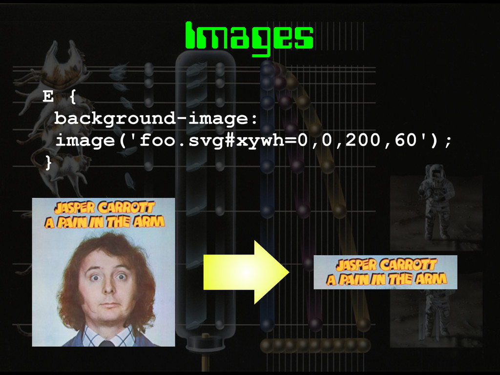
Images E { background-image: image('foo.svg#xywh=0,0,200,60'); }
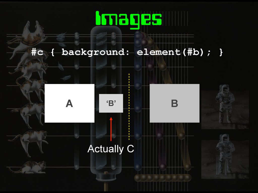
Images #c { background: element(#b); } ‘B’ Actually C A
B
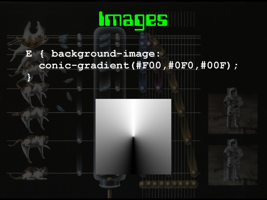
Images E { background-image: conic-gradient(#F00,#0F0,#00F); }
Layout
Flexbox
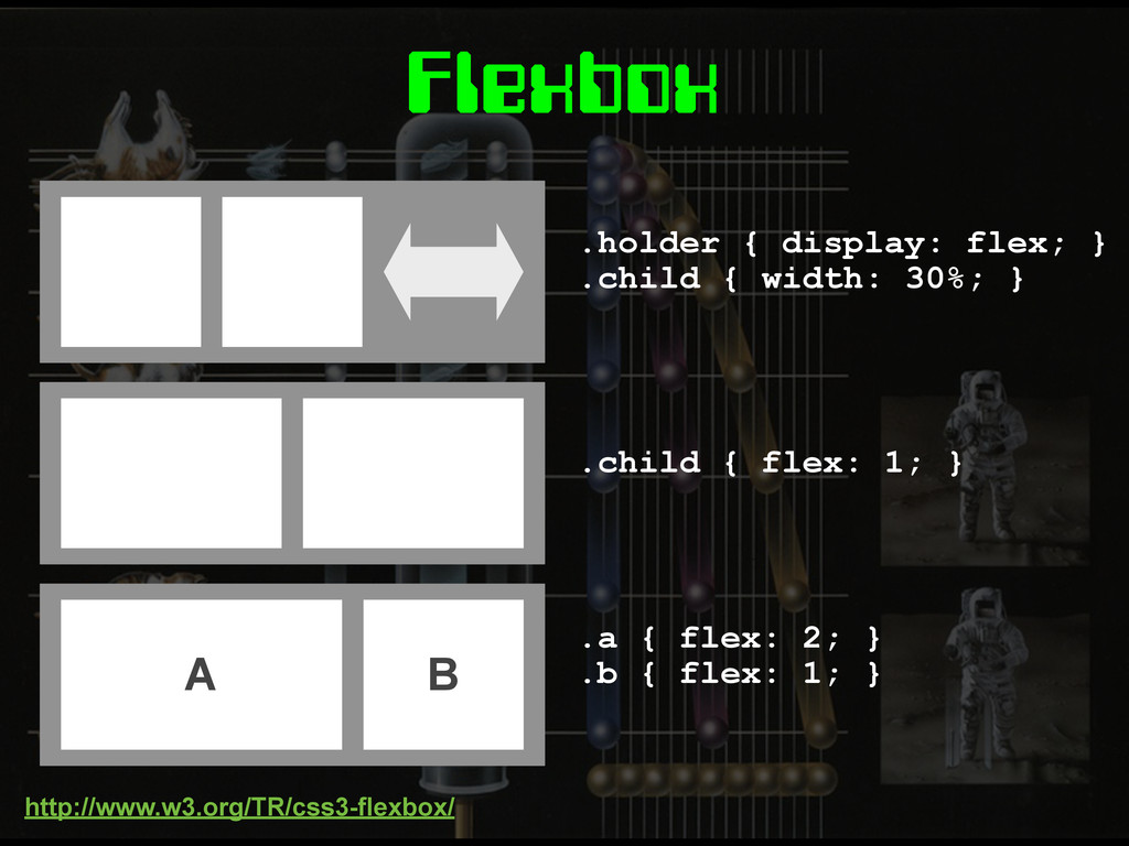
.holder { display: flex; } .child { width: 30%; }
.child { flex: 1; } A B .a { flex: 2; } .b { flex: 1; } Flexbox http://www.w3.org/TR/css3-flexbox/
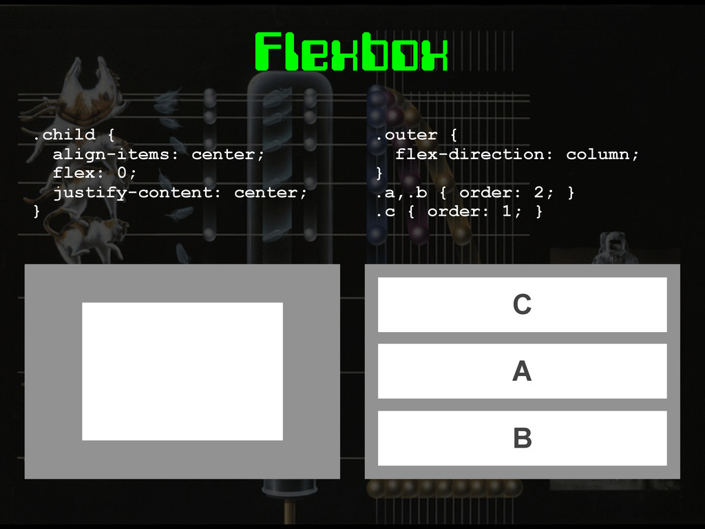
Flexbox .child { align-items: center; flex: 0; justify-content: center; }
C A B .outer { flex-direction: column; } .a,.b { order: 2; } .c { order: 1; }
Grid Layout
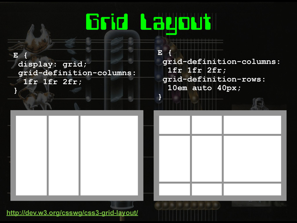
Grid Layout E { display: grid; grid-definition-columns: 1fr 1fr 2fr;
} E { grid-definition-columns: 1fr 1fr 2fr; grid-definition-rows: 10em auto 40px; } http://dev.w3.org/csswg/css3-grid-layout/
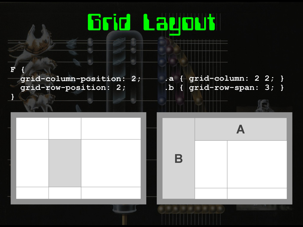
Grid Layout F { grid-column-position: 2; grid-row-position: 2; } A
B .a { grid-column: 2 2; } .b { grid-row-span: 3; }
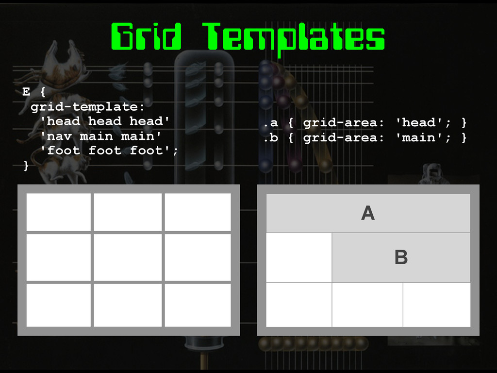
Grid Templates E { grid-template: 'head head head' 'nav main
main' 'foot foot foot'; } .a { grid-area: 'head'; } .b { grid-area: 'main'; } A B
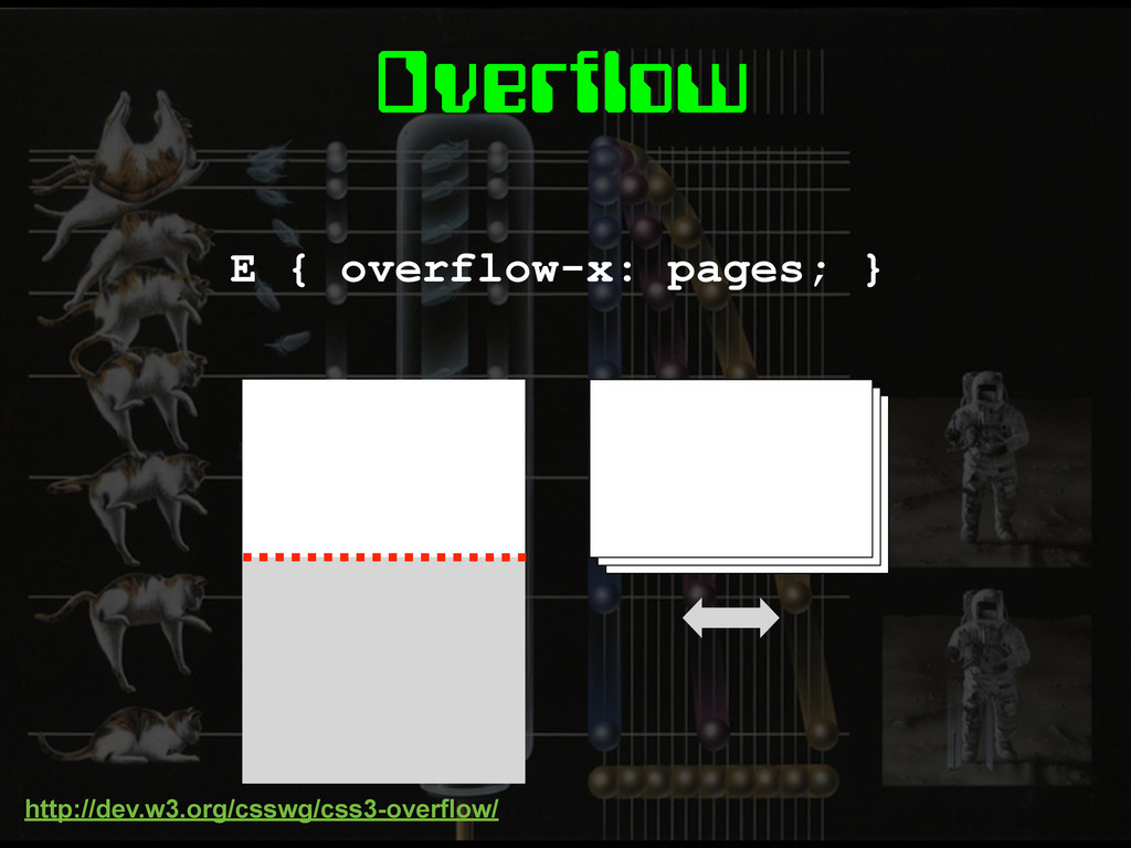
Overflow E { overflow-x: pages; } http://dev.w3.org/csswg/css3-overflow/
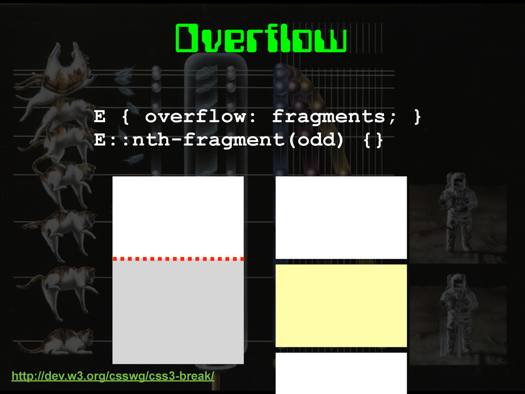
Overflow E { overflow: fragments; } E::nth-fragment(odd) {} http://dev.w3.org/csswg/css3-break/
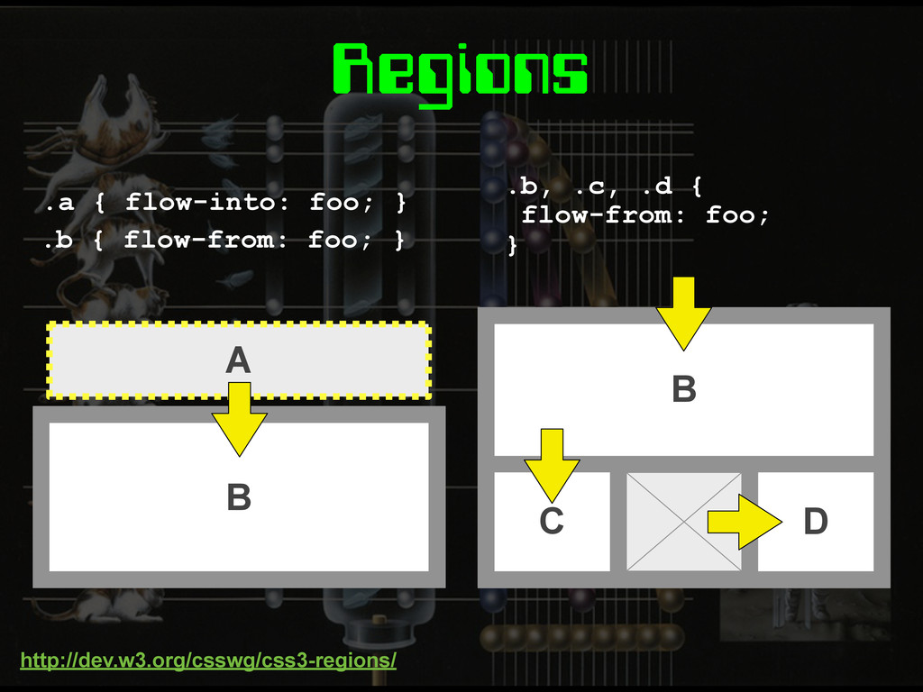
Regions A .a { flow-into: foo; } B C D
.b, .c, .d { flow-from: foo; } B .b { flow-from: foo; } http://dev.w3.org/csswg/css3-regions/
None
Exclusions & Shapes E { position: absolute; } wrap-flow: both;
http://dev.w3.org/csswg/css3-exclusions/
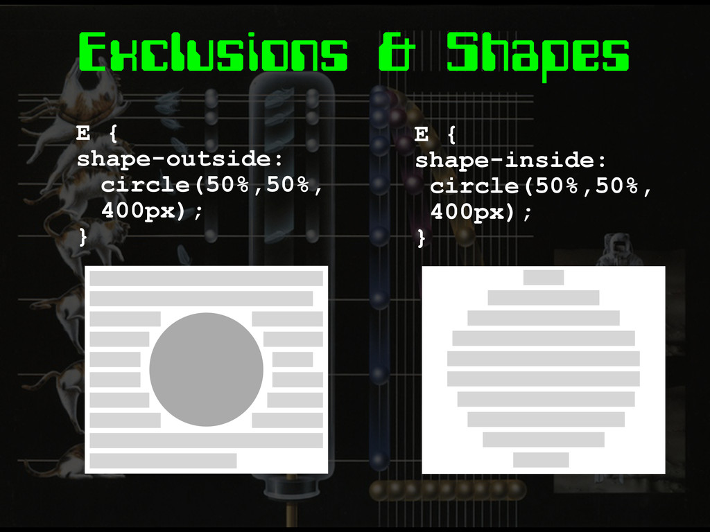
Exclusions & Shapes E { shape-outside: circle(50%,50%, 400px); } E
{ shape-inside: circle(50%,50%, 400px); }
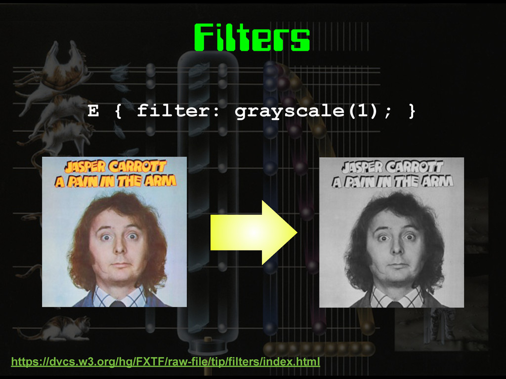
Filters E { filter: grayscale(1); } https://dvcs.w3.org/hg/FXTF/raw-file/tip/filters/index.html
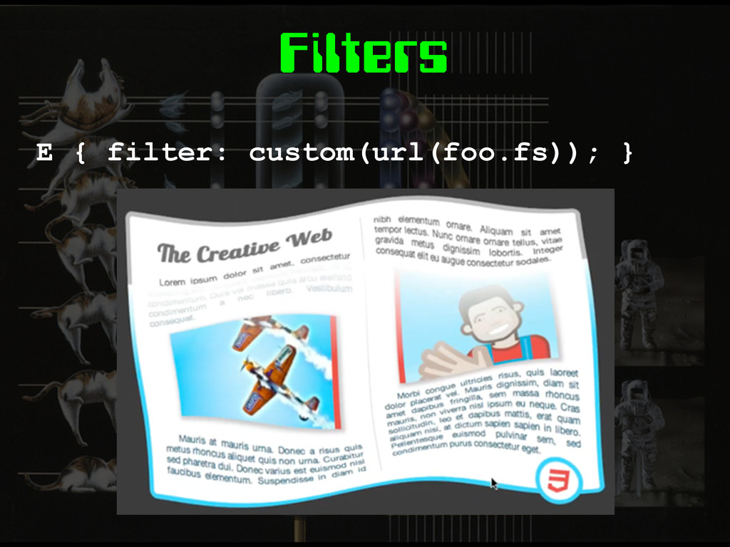
Filters E { filter: custom(url(foo.fs)); }
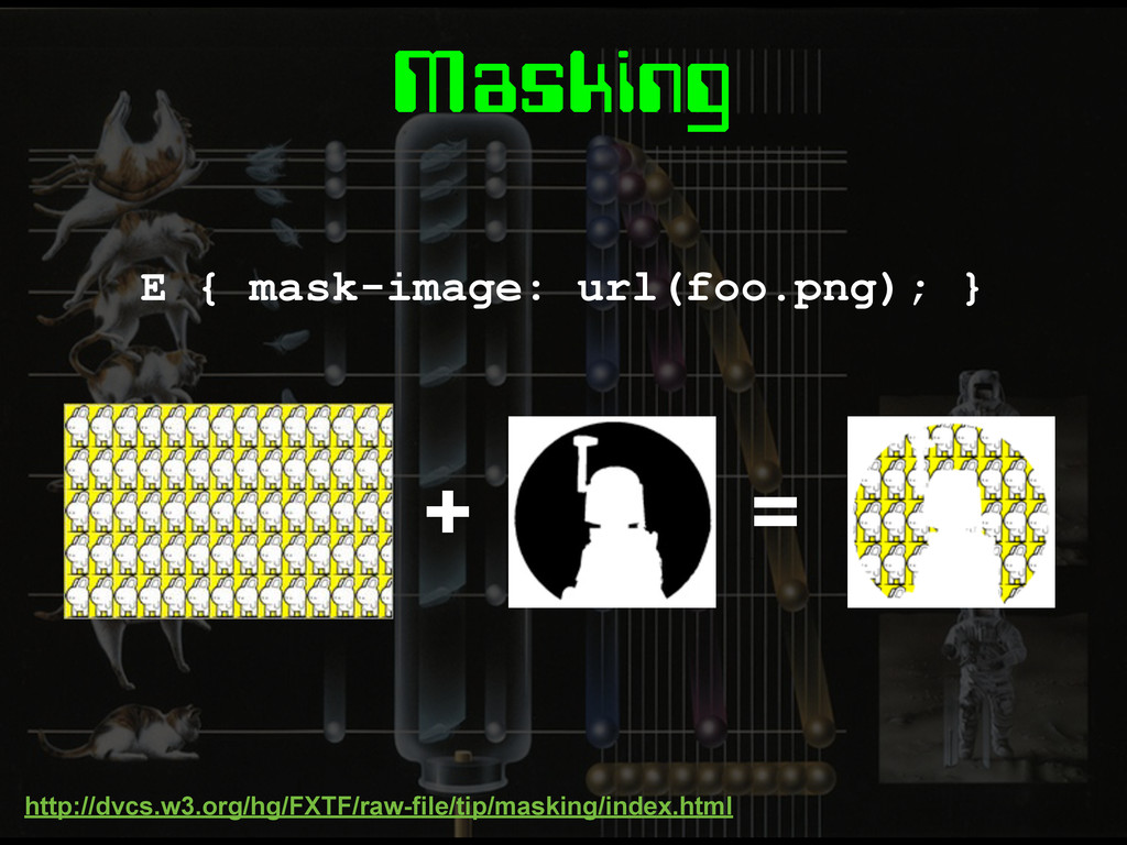
Masking E { mask-image: url(foo.png); } + = http://dvcs.w3.org/hg/FXTF/raw-file/tip/masking/index.html
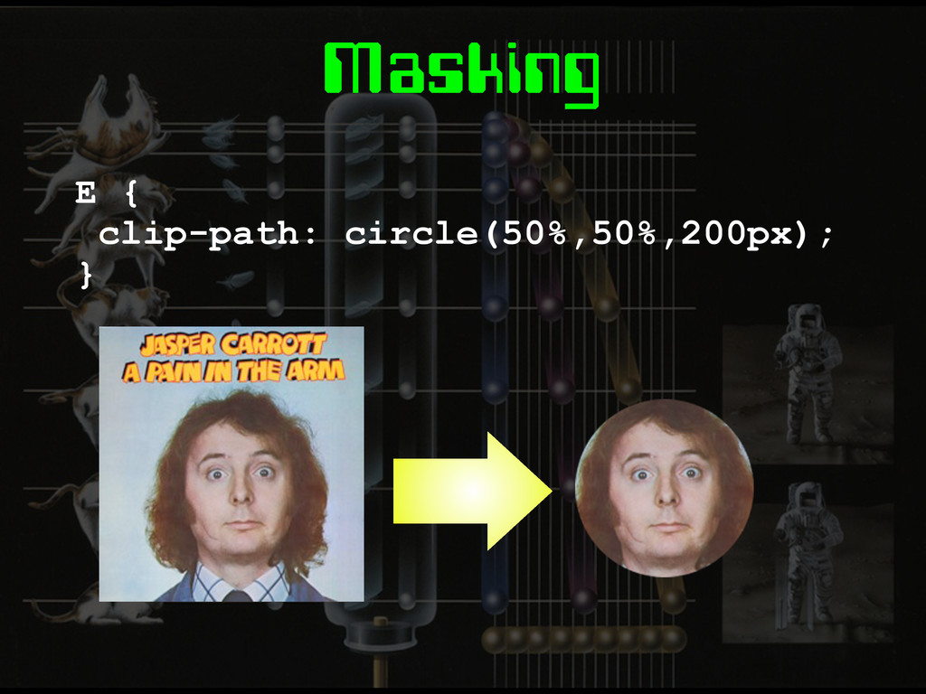
Masking E { clip-path: circle(50%,50%,200px); }
Pre-processors
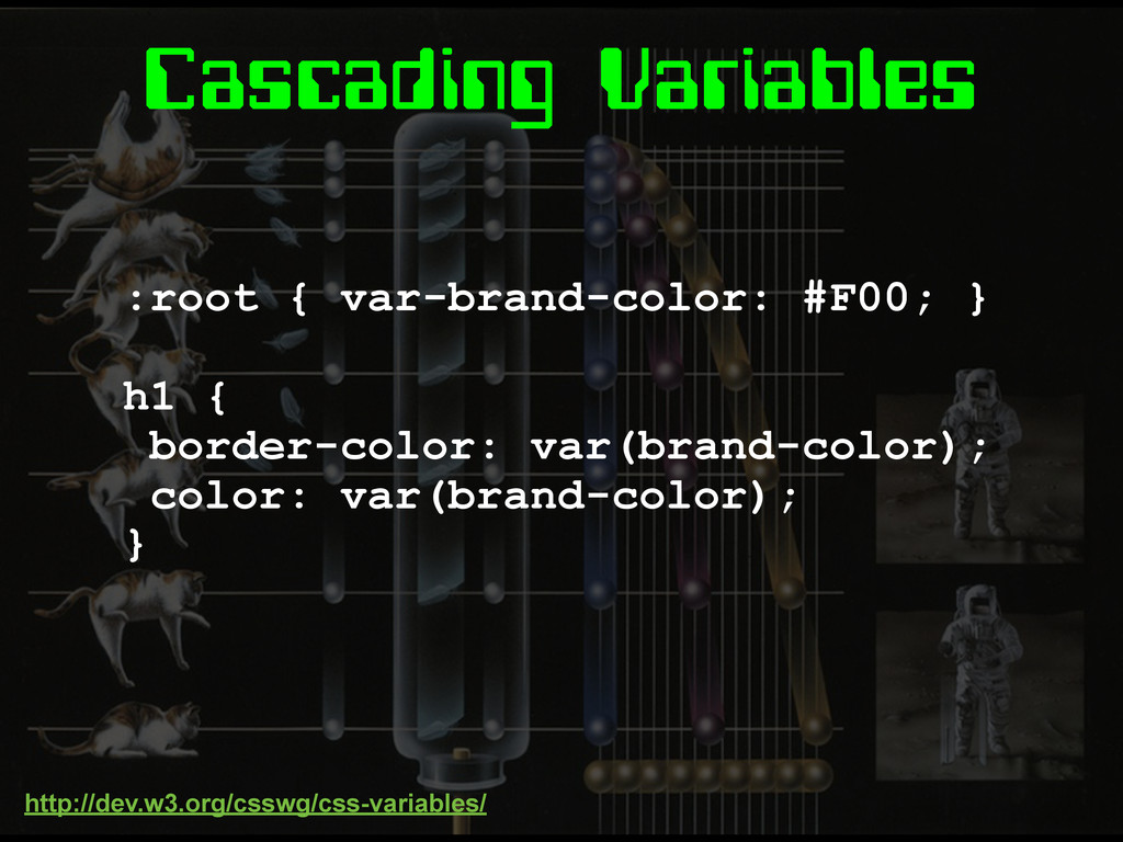
Cascading Variables :root { var-brand-color: #F00; } h1 { border-color:
var(brand-color); color: var(brand-color); } http://dev.w3.org/csswg/css-variables/
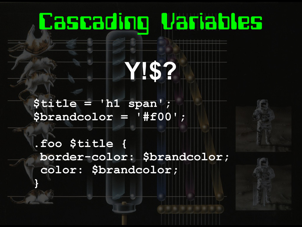
Cascading Variables Y!$? $title = 'h1 span'; $brandcolor = '#f00';
.foo $title { border-color: $brandcolor; color: $brandcolor; }
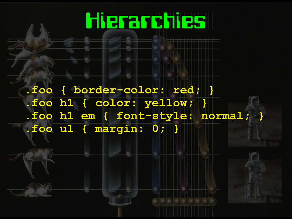
Hierarchies .foo { border-color: red; } .foo h1 { color:
yellow; } .foo h1 em { font-style: normal; } .foo ul { margin: 0; }
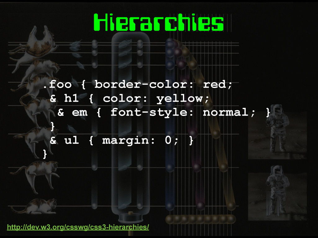
Hierarchies .foo { border-color: red; & h1 { color: yellow;
& em { font-style: normal; } } & ul { margin: 0; } } http://dev.w3.org/csswg/css3-hierarchies/
Mixins TBC
“When can we use them?” 1. Browser update cycles are
getting faster 2. The market share of IE is shrinking
“When can we use them?” 1. Your environment 2. How
much do you want it?
Fin.
Image Credits http://www.buzzfeed.com/peggy/22-reasons-why-design-was- more-awesome-in-the-80s http://80s-touch.tumblr.com/ http://theyank.tumblr.com/

 SiteGround - Reliable hosting with speed, security, and support you can count on.


 stopsatgreen
 bengo4com
 satoshi7
 mohab1
 teamlab
 riyaamemiya
 finengine
 akizhou
 syuchimu
 hiracky16
 occhi
occhi
.png) yamad
yamad
 dougneiner
 tapps
tapps
 moore
moore
 chrisshort
 addyosmani
 mlcsv
mlcsv
 cromwellryan
 hatefulcrawdad
 sarafernandez
 tammyeverts
 kimpetersen
 bkeepers